Class Project - Maynooth Furniture
UPDATES:
Project 1 - Sept 2019
Project 2 - 2 Oct 2019
Project 3 - 3 Oct 2019
Project 4 - 4 Oct 2019
Project 5 - 7 Oct 2019
Project 6 - 8 Oct 2019
Project 7 - 9 Oct 2019
Project 8 - 10 Oct 2019
Project 9 - 15 Oct 2019
Project 10 - 24 Oct 2019
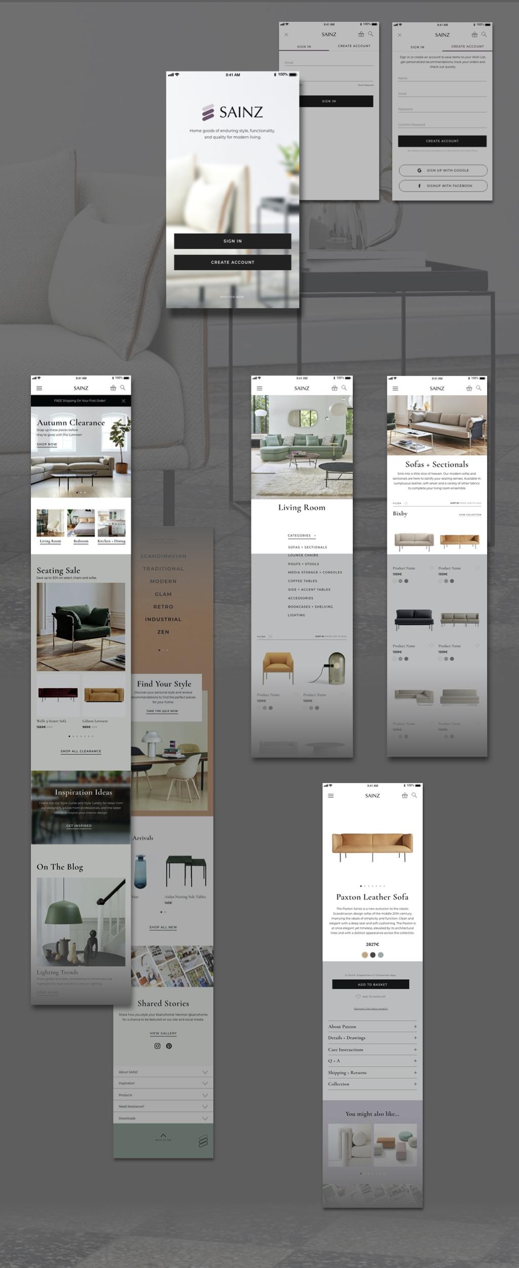
PROJECT 10 - MOBILE APP
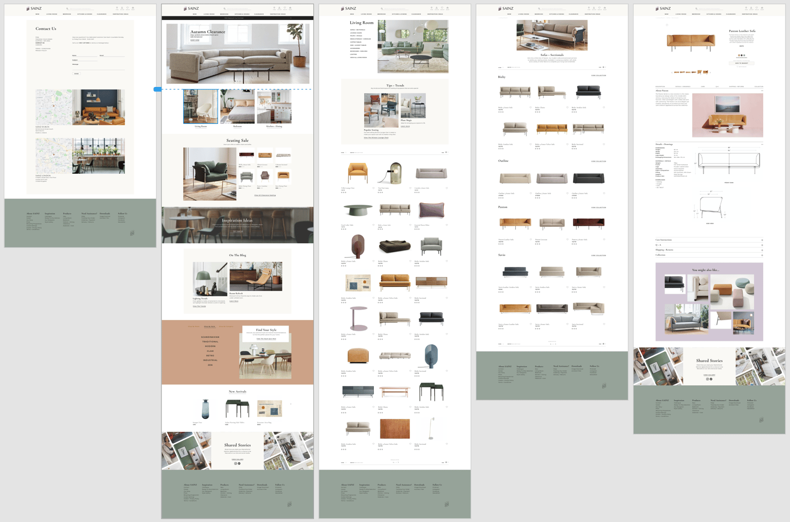
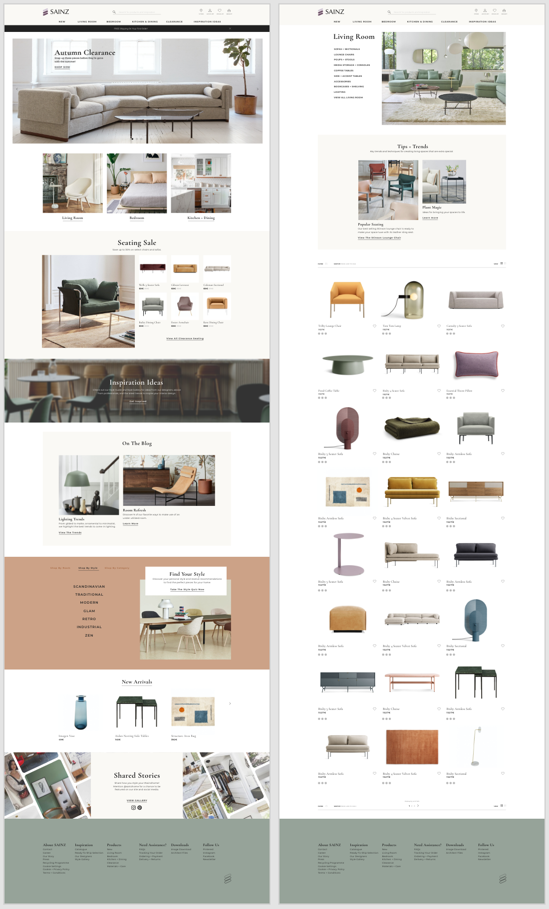
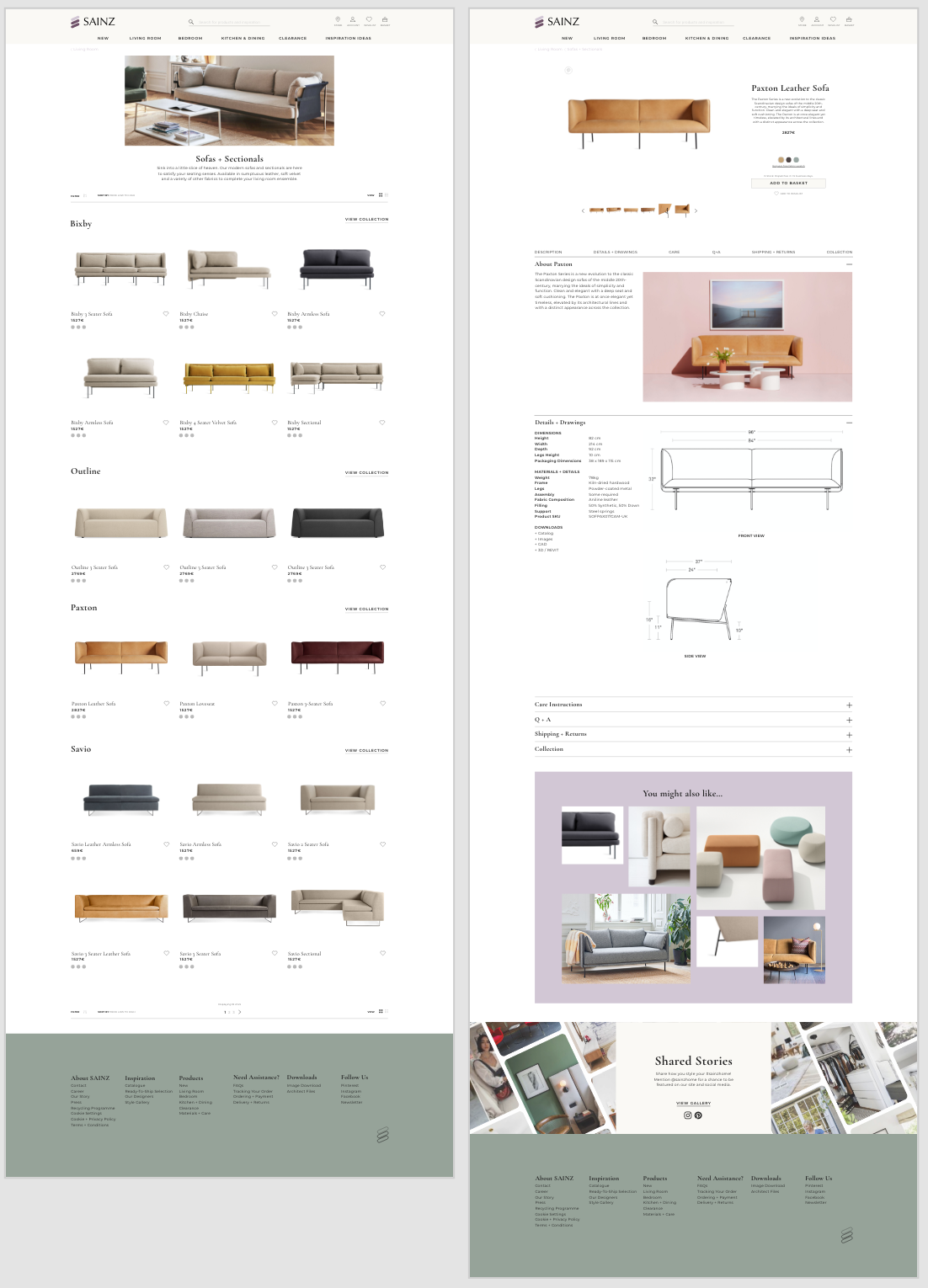
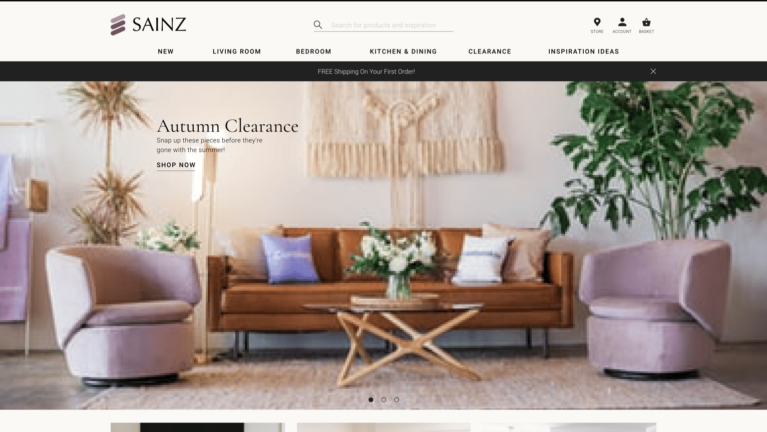
PROJECT 9 - HIGH FIDELITY MOCKUP
The high fidelity mock up combines an understanding of Katherine, our 50 year old Dublin-based executive, with some research on color theory and current aesthetic trends in e-commerce websites, as well as personal preferences from my experience as a professional interior designer. The overall appearance of the site is quiet, minimal, and elegant, allowing the product to stand out instead of competing with it. Things to note include:
- Several points along home page to begin user action flow (arrival at desired page/action point within 3 or less clicks)
- Shopping Flow (in order from top to bottom): Top Nav links, repeated Section links Living Room/Bedroom/Kitchen+Dining, Sale items (Katherine is budget conscious), Shop by Room/Style/Category slider in coral band, New Arrivals, Footer links
- Inspiration Flow: Top Nav, Inspiration banner, Blog articles for style/trend tips (Katherine is style conscious and "loves to browse style guides online"), Find your Style quiz, Shared Stories with Pinterest feed in background (Katherine "uses Pinterest to gather her design ideas"), Footer links
- Clear point of filter/sort/view of products at top and bottom of category and product type pages.
- Each product can be favorited to a wishlist (heart symbol), giving user ability to keep track of desirable products. Brand can then push more recommended items or send email reminders regarding items on their wishlist.
- Product images can be saved to Pinterest with each image on site offering pin icon at hover. (Katherine can save any site image to her Pinterest boards).
- Recommended/Similar items shown in mood board style format similar to Pinterest feed (as seen on lavender background on sofa product page).
PROJECT 8 - DRAW YOUR OWN ICONS
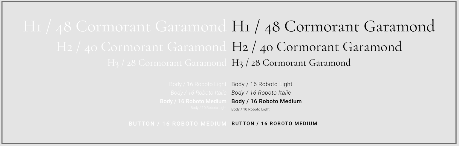
PROJECT 7 - TEXT / BUTTONS
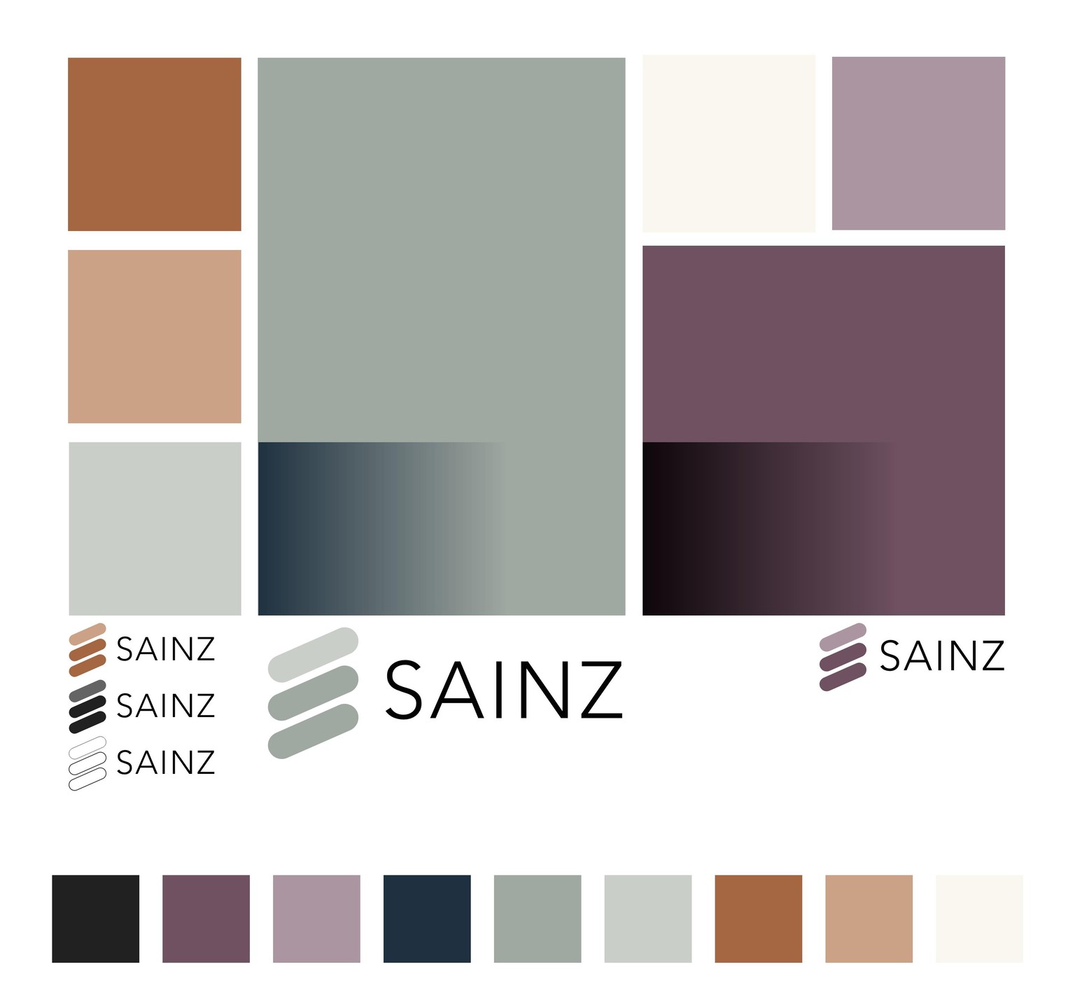
PROJECT 6 - COLOR PALETTE / RECOLOR LOGO
I decided to change the logo slightly and used a different name to create a unique identity for the project. (Typeface used for name is not final)
Research was done to find colors preferred by the age groups around client persona (50yo female), which indicated primarily blues and purples followed by red/orange and green, as well as current color and style trends in the UK where the target audience resides (scandinavian/nordic, midcentury, warm neutrals).
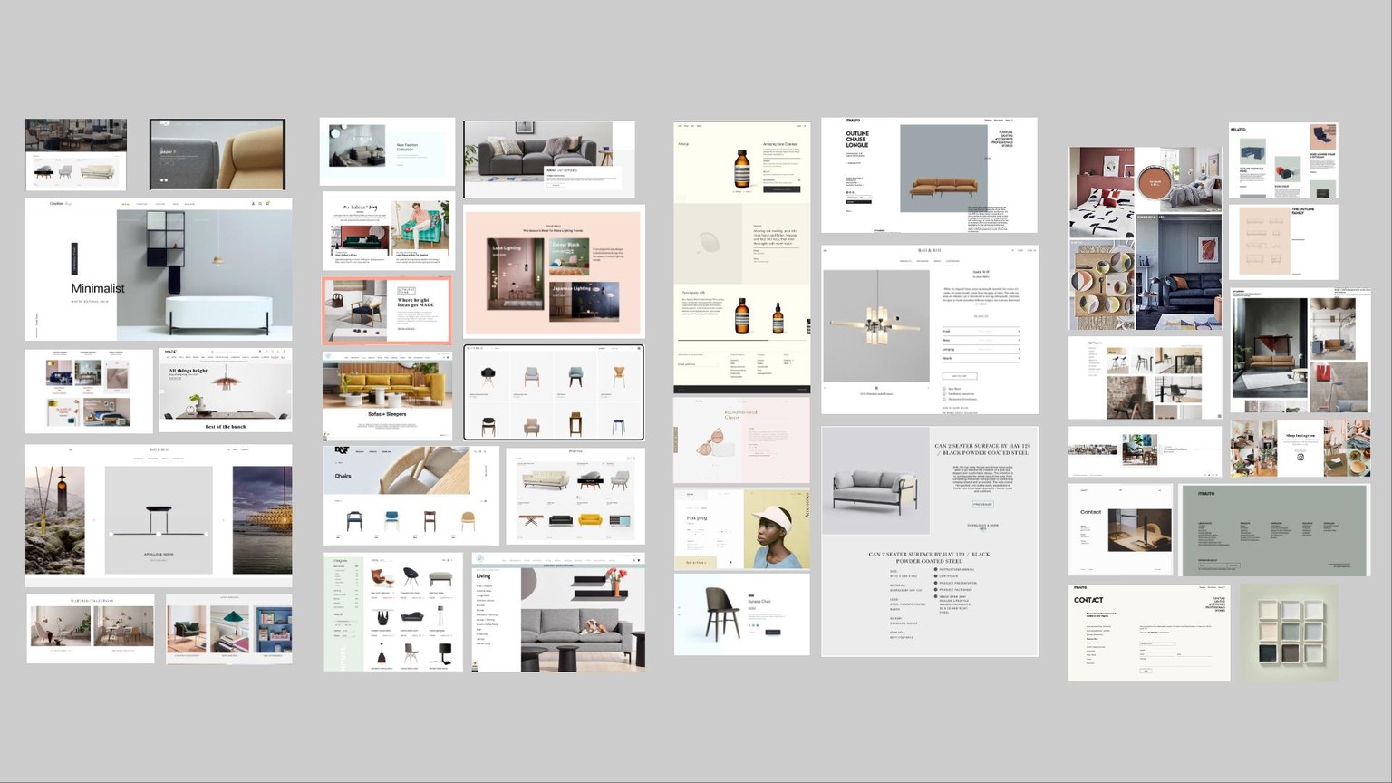
PROJECT 5 - MOOD BOARD
Mood board is divided into four sections from right to left showing preferred/recommended ideas:
Far left: Home page + section divisions on home page
Left middle: Article posts/headlines with img. + category page appearances
Right middle: Product page
Far right: Related products/product family display, social media call out, + color
A common aesthetic emerged of minimalism, large image and color blocks / clean rectilinear geometries, quiet and elegant typography, and pastel tints and muted tones.
PROJECT 4 - INTERACTIVE PROTOTYPE, VIDEO DEMONSTRATION
Adobe link to interactive page for review
Vimeo video below and linked for interaction demo
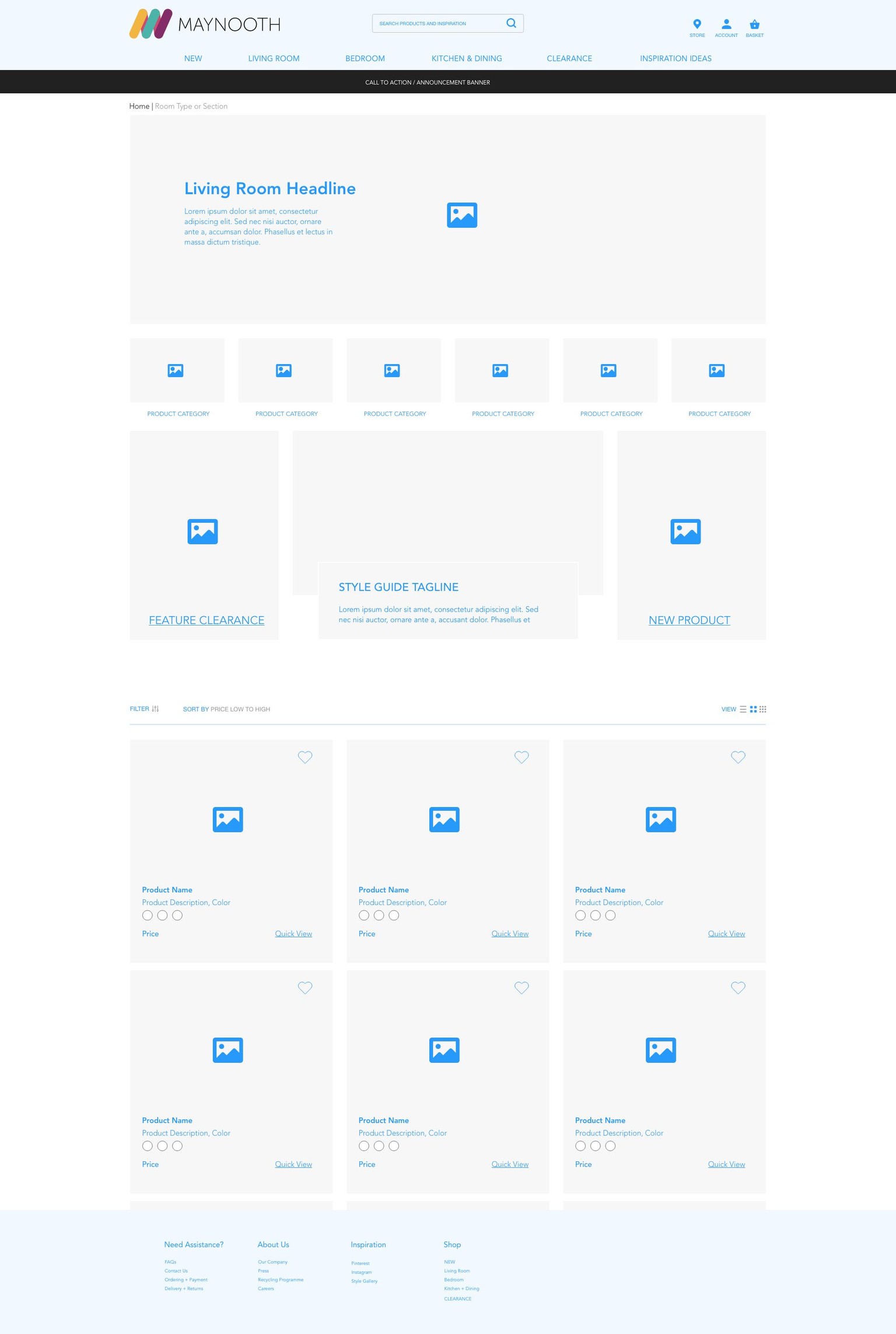
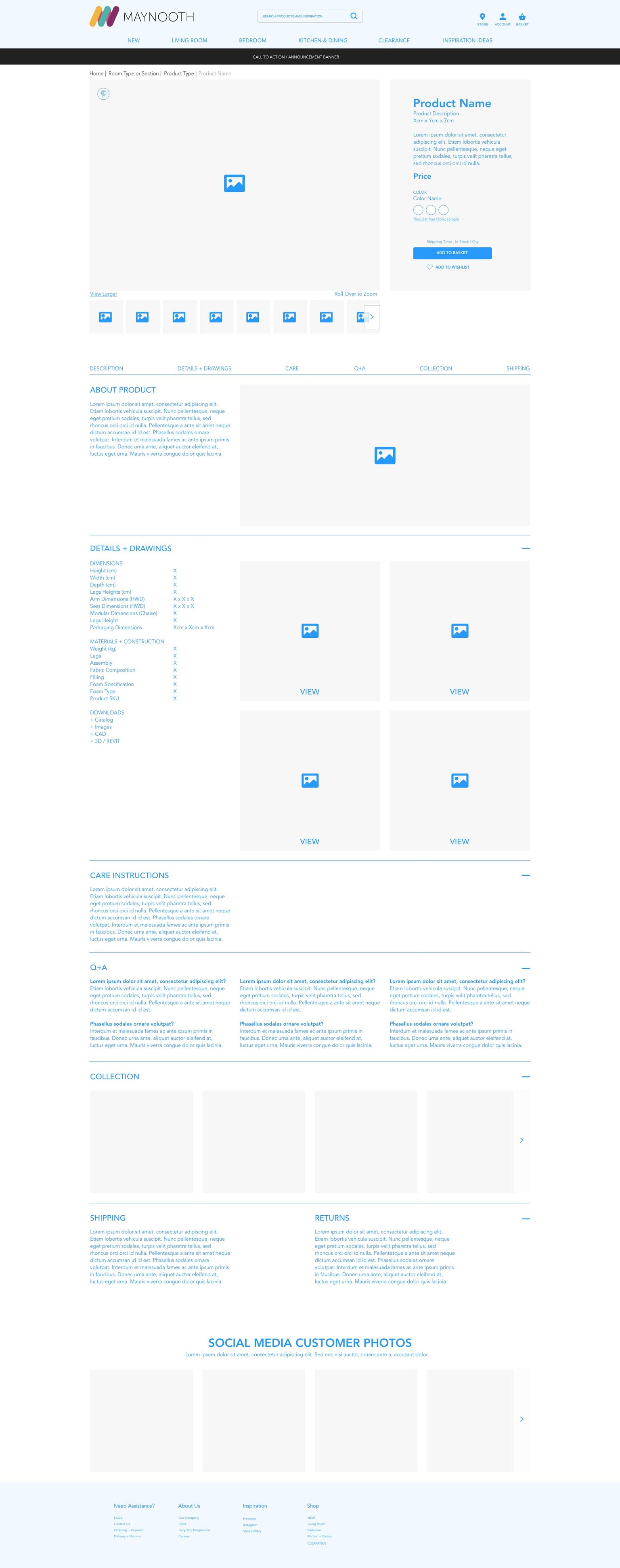
PROJECT 3
Overall Interaction view
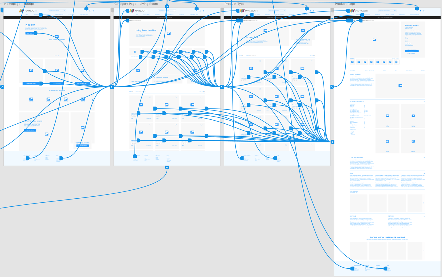
Interaction between Living Room Category page to Product Type page
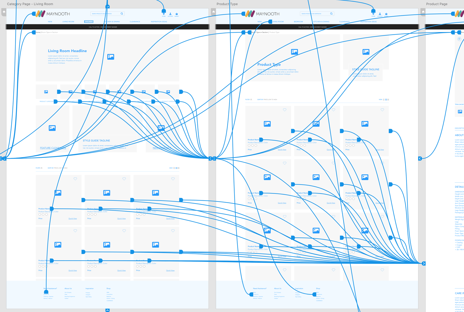
Revised Artboards
- Used a grid and 12-column layout to get precise spacing
- Category page, Product Type page, and Product page have string of links at top to provide users easy method for escape to a specific previous page. Less information to hold in memory and improves navigation.
- Additional products to load as user scrolls down, similar to Pinterest experience (keeping user persona in mind).
- All product images can be pinned to Pinterest for user to add to mood boards.
- Included social media photos at bottom of product page for user to get inspiration and see styling approach from others who have purchased the product.
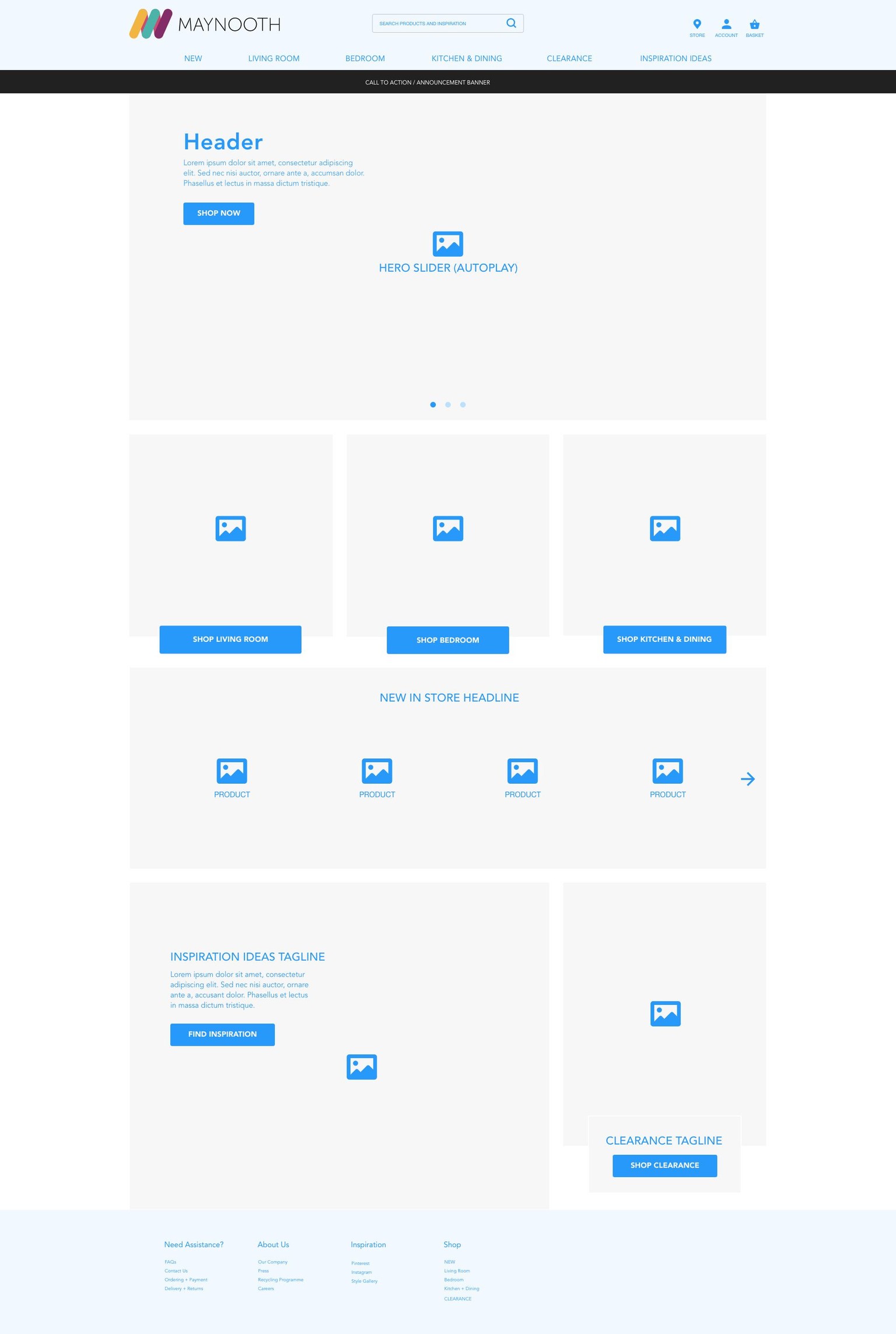
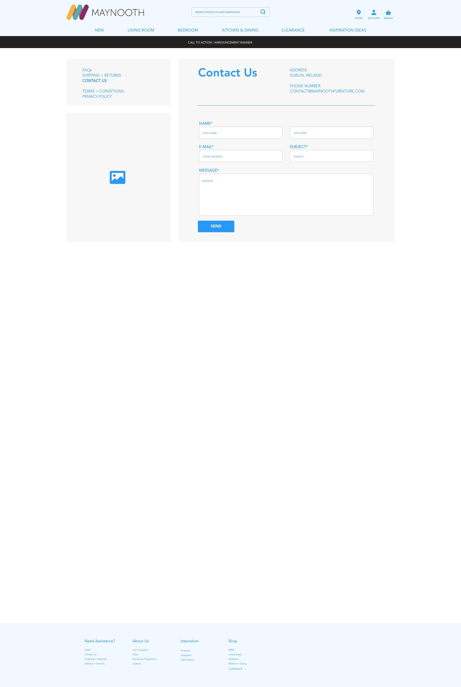
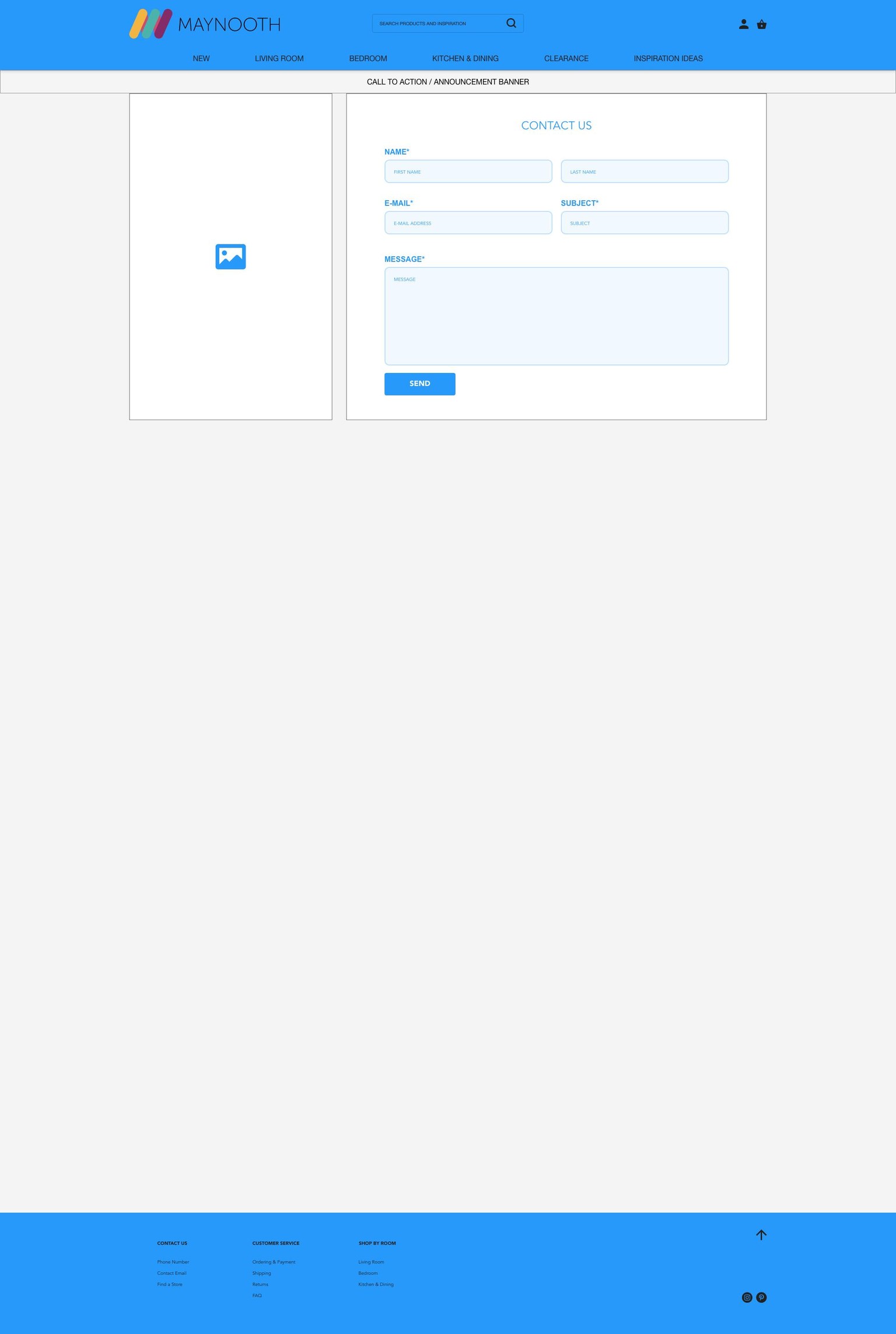
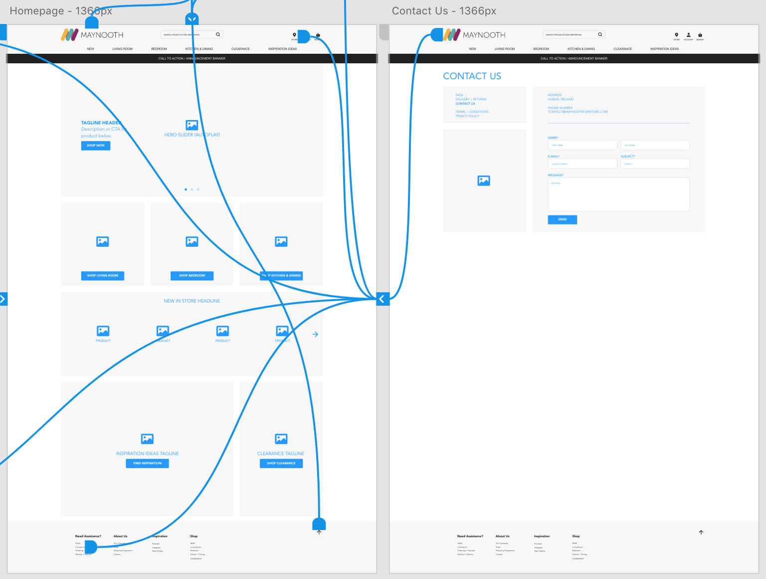
PROJECT 2 - PROTOTYPE
- Progressed the colors to be closer to desired end result.
- Revised and added Footer content; Added store Info icon to Nav Header for more immediate visibility/access.
- Changed Contact Us to full page to be more similar to competitor/inspiration pages.
- Playing with scroll to top arrow/effect, but might end up using on only product pages that contain greater amounts of content.
(Not shown is Navigation dummy page off to left hence the additional arrows.)
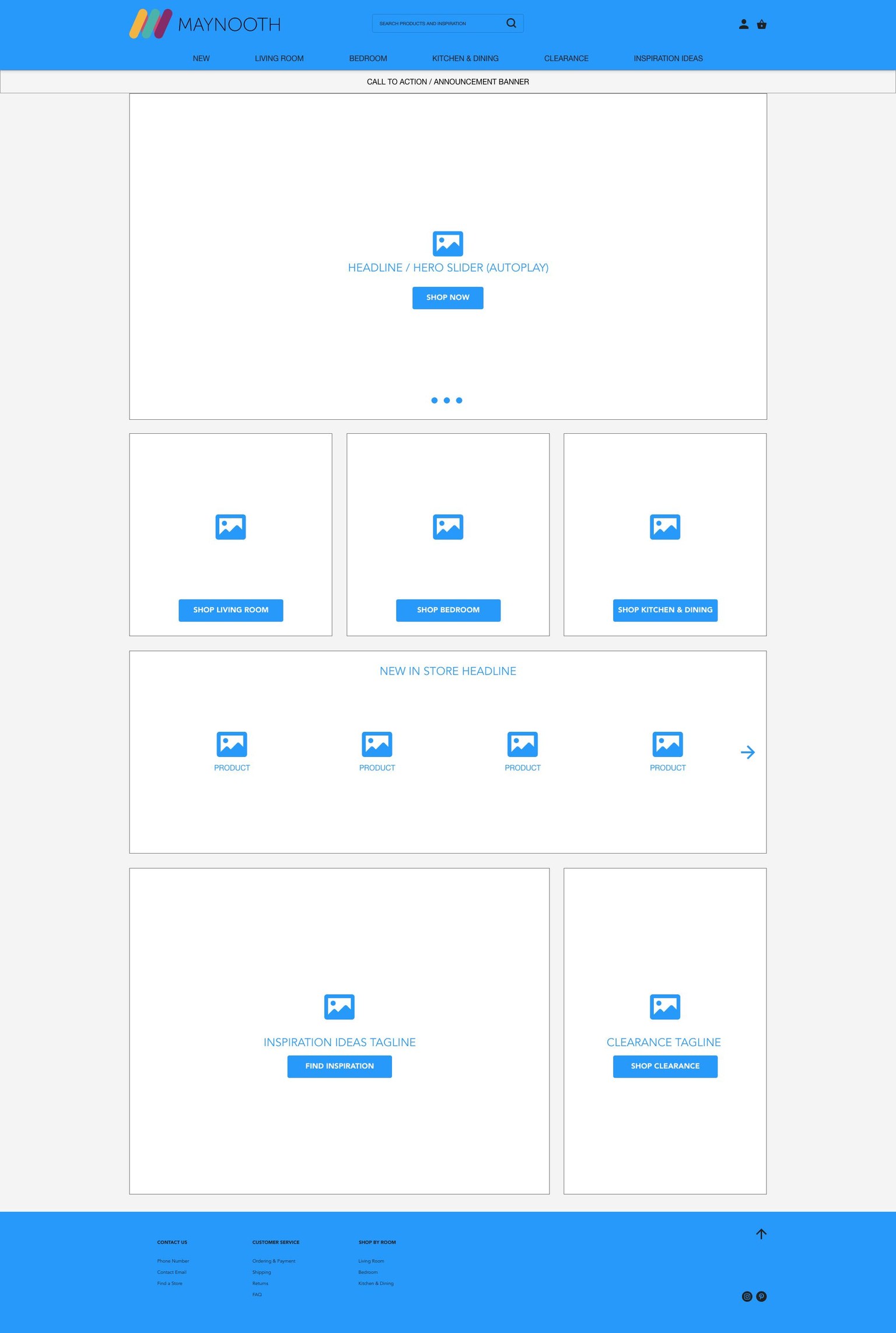
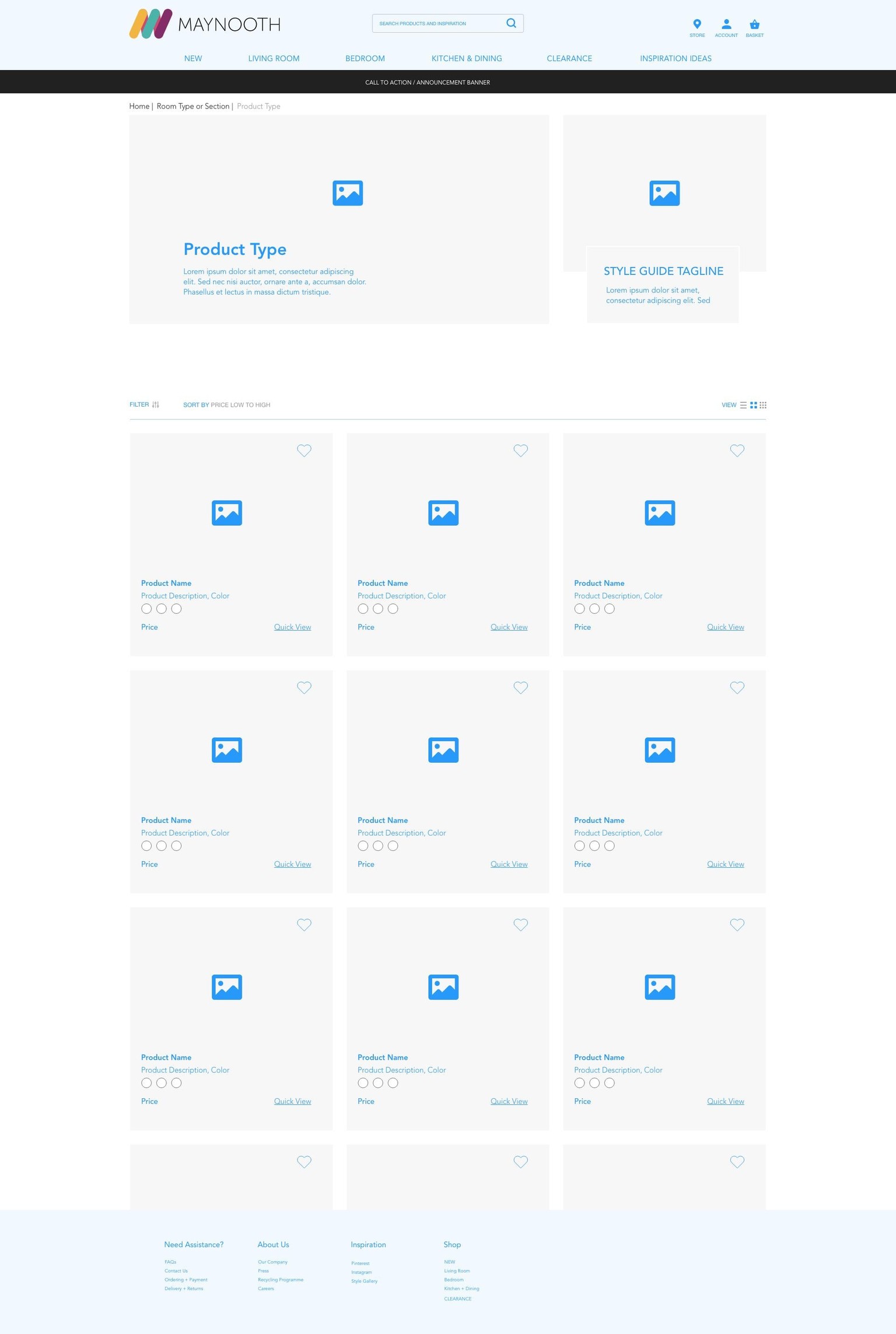
PROJECT 1 - WIREFRAME
First digital UX wireframe ever! I had fun making this.
I wasn't sure how simple and basic to keep this initial project. I had started creating buttons as underlined text, as I based it on those seen on made.com's website and preferred that look. However, I then backtracked to standard looking buttons thinking it might be unclear to the client whether those were buttons or simply und
erlined text. Additionally, I wasn't sure whether I could start playing with content boxes overlaying or place the buttons in a particular location.
As for the use of color, I kept the basic wireframe blue even though my designer brain really wanted to start using what I think could be the color for the header/footer or accent colors based on the brand.
QUESTIONS:
Is it best to avoid application of particular colors and styling of buttons/boxes at this stage to avoid distracting the client? Is this best to just get the basic content in or can we get a little more creative?
Are the social media logos contained in circles in the footer too dissimilar/inconsistent in appearance with the account and basket logos in the header?
Thanks!