Business Card UX Designer
I want my card to be made from an off-white cotton paper that has a certain thickness to it. As the card will be two sided and printed using letterpress, it will be duplexed.
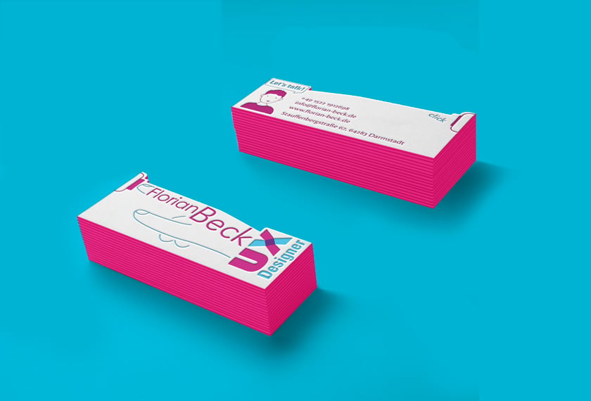
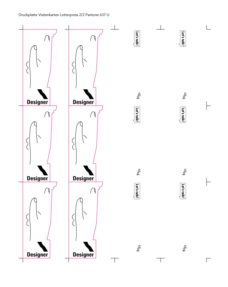
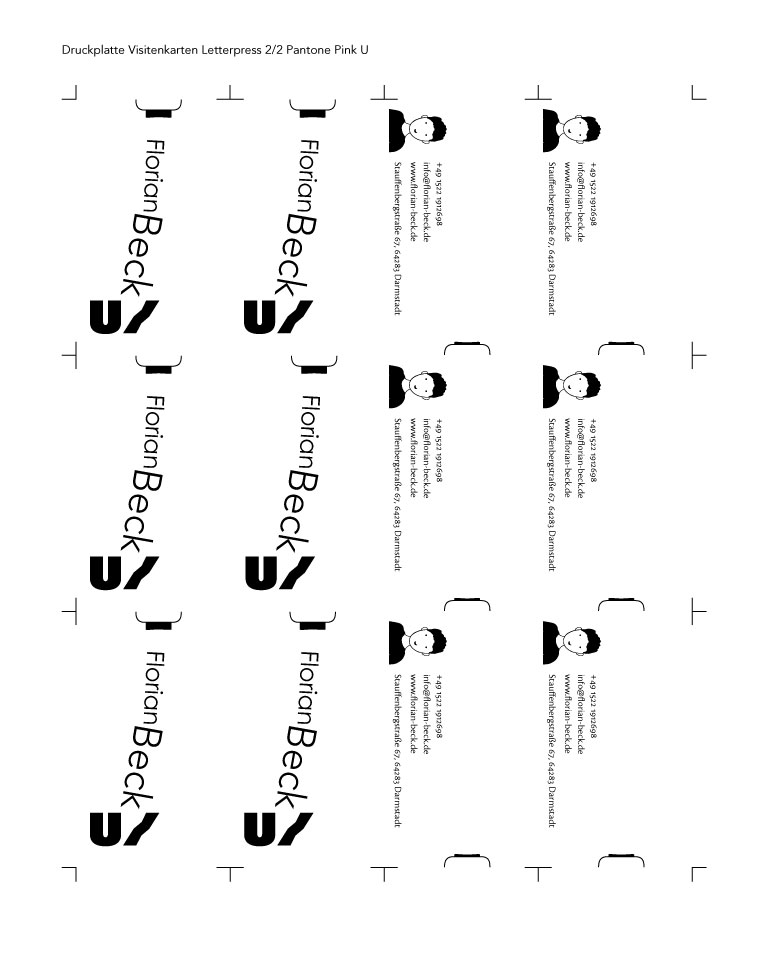
The card will be edge painted with the pink colour from my colour scheme. Regarding colors I decided to go with a Pantone Pink U and a Pantone 637 U (a light blue) in a 2/2 print.
Also, the card will be die cut to a custom form, supporting the visual storytelling involved.
For the fonts, I mixed them based on their position on the card and visual appearance, to ensure everything visually fits together and is well readable. As I wanted to achieve a modern look, I used only sans-serif fonts. In the end I ended up with Century Gothic (first name), Avenir LT (»click« and last name), Cronos Pro (the contact information) and Univers (all visual accents, like »UX Designer« and »Let's talk!«).
The X of the UX also features an overprint section where the two legs cross each other.
I have already layed out the card design for printing. I decided to mix the front and back on the plates, so only two plates and two setup processes are needed. Also, the sheet can just be cut in half after printing, front and back glued together and then the final cards be die cut.
Thank you very much for this delightful class! I've learned a lot and had a lot of fun working on this card design, too!