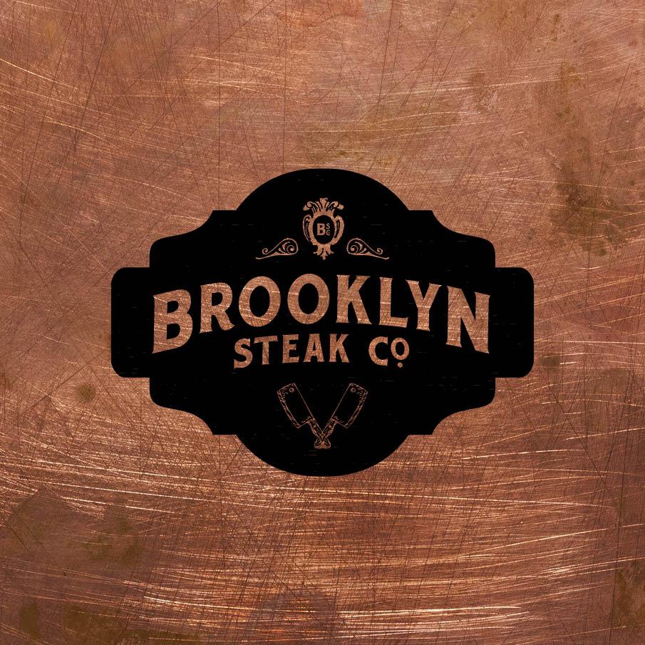
Brooklyn Steak Co.
See the final branding here.
____
Hey there,
This class comes at a perfect time. I'm working on the branding of a steakhouse in Brooklyn's Midwood area. It's a side project that came out of eating at the restuarant and realizing that if the ambiance were to match up with the food it would make a great combo. They make a perfect steak and the chef gets adventurous with his dishes (think Pepper Crusted Filet Mignon, Togue in Cheek, Chocolate and Peanut Butter Mousse).
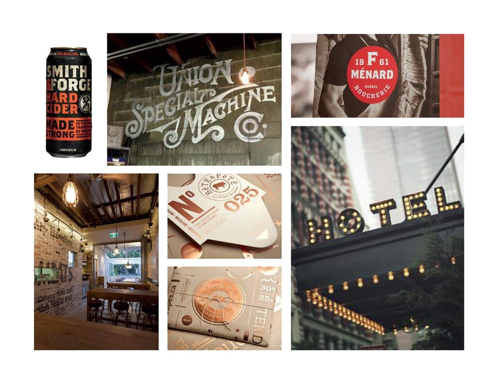
Here's some moodboards of the direction I'm heading in:
Keywords: Brooklyn attitude meets fine dining // industrial // masculine
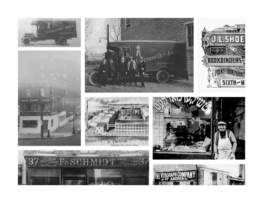
I was looking for history of the place and hit a gold mine when I discovered that accross the street is the location of the former Vitagraph Co. of America who were one of the first to create silent film in the U.S. I would like to take inspiration for the logotype from the Vitagraph truck (top center image — photo take around the corner from the restaurant's location).
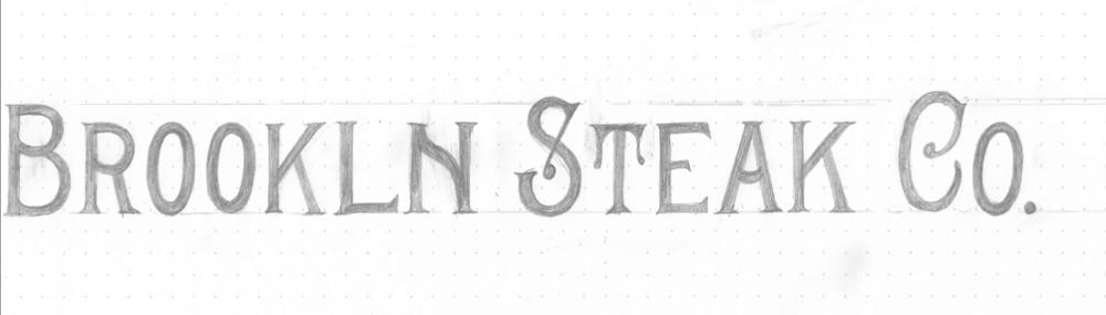
Logo Wordmark
Sketch:
Photoshop touchups/live trace:
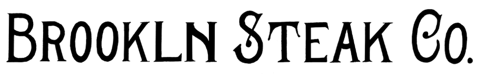
Vectorizing: (work in progress, any vectorizing tips would be greatly appreciated)
______
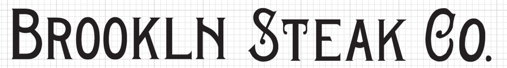
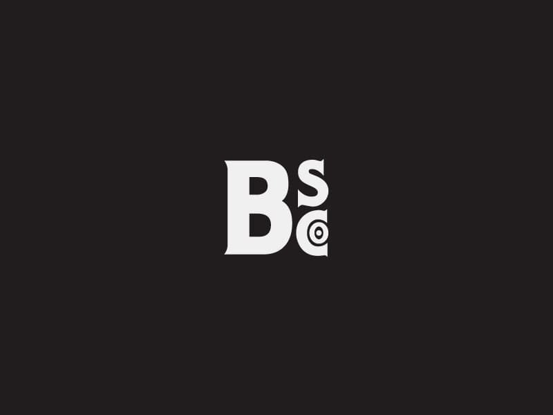
Update:
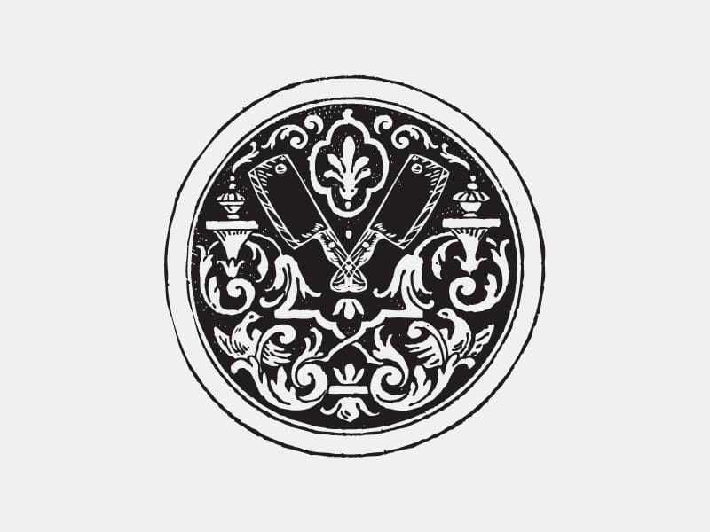
This is the latest I've got. I dropped the handmade type for the LHF Hensler font because I was having trouble with it, but I may go back and try to make it work. BS co. mark seems pretty solid to me, I hope it'll pass through the approval stage. I'd go stamp happy with that :) Next up is trying to make more of a developed crest/seal out of the logo which will include the address.
______
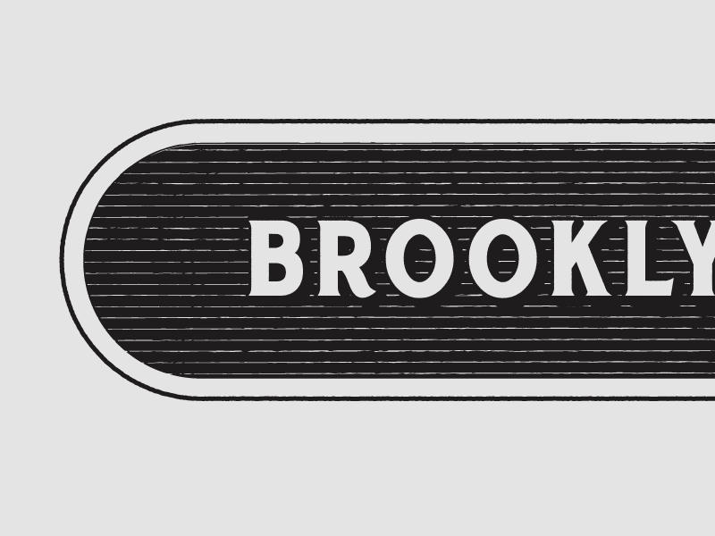
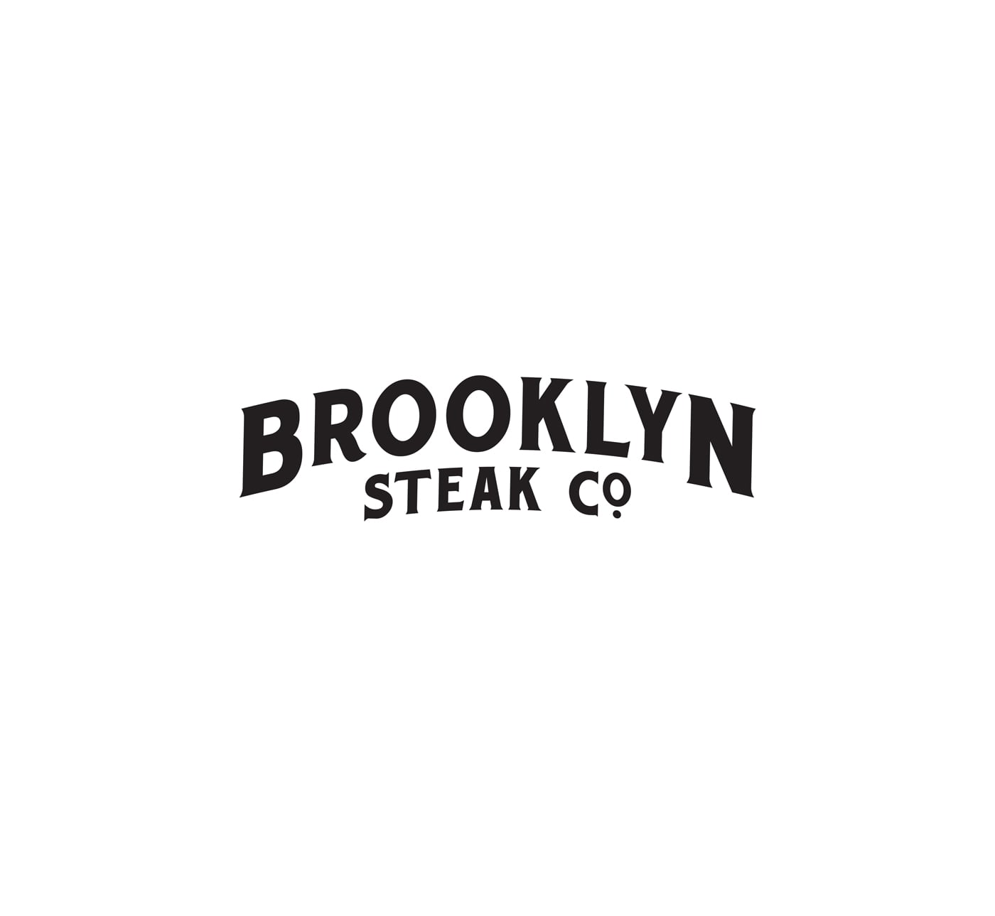
Update July 26:
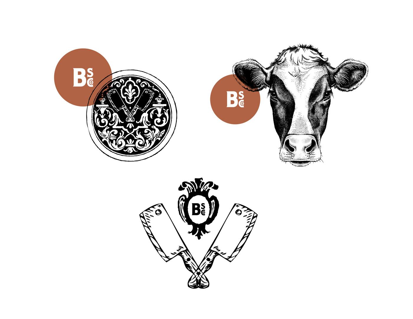
The logo needed to be developed further, it lacked personality and wasn't reflective of the location's rich history. After playing around for quite some time, I ended up with a marquee shaped logo which has a theatrical feel, still masculine, emphasizes Brooklyn and can (hopefully) stand the test of time.
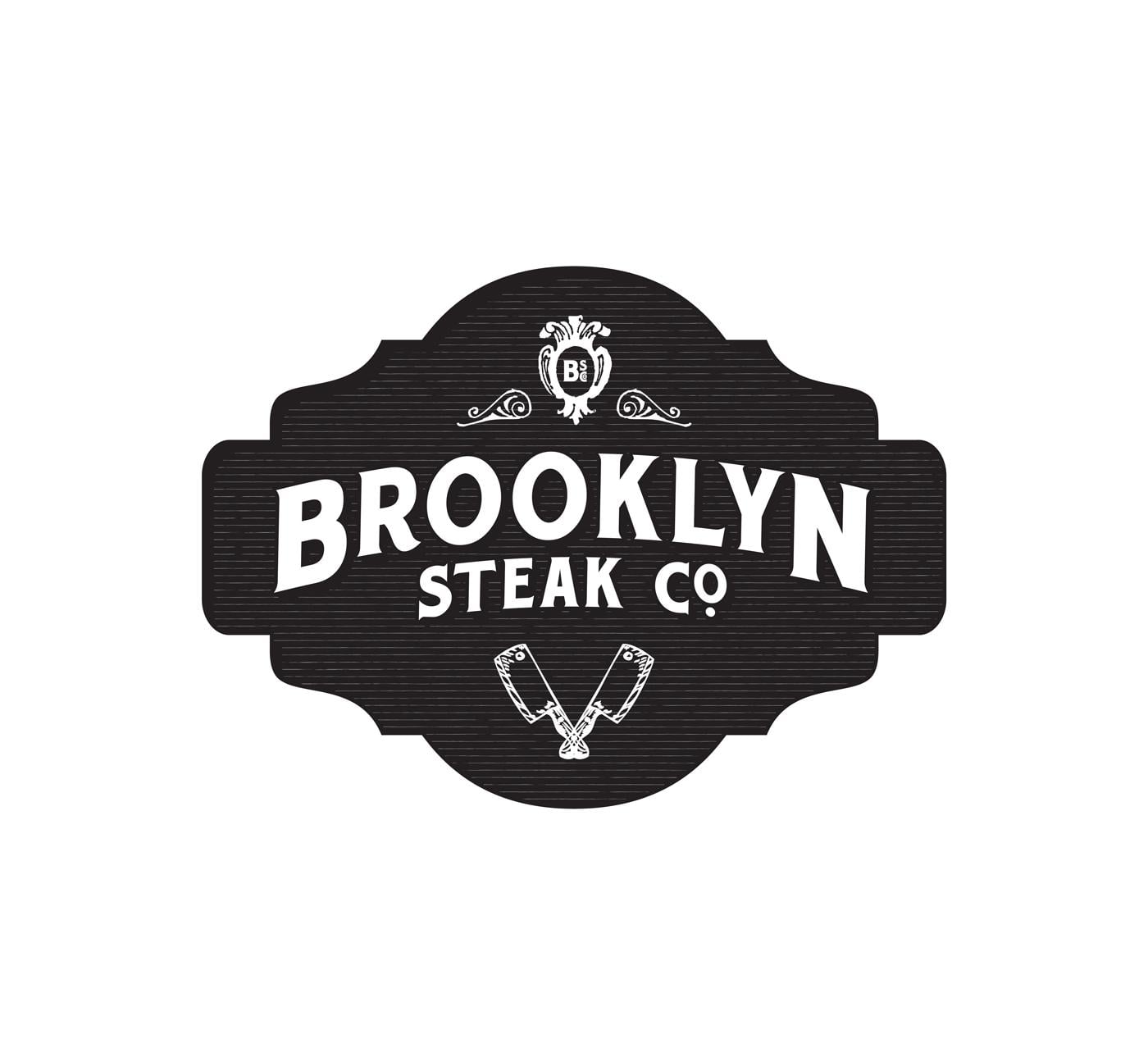
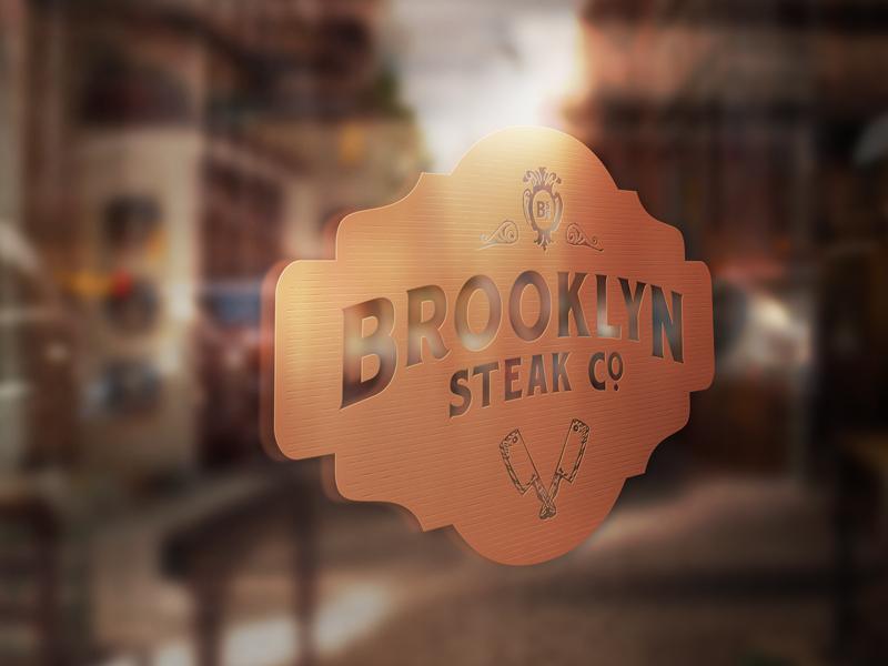
Logo mockup on store front in copper foil
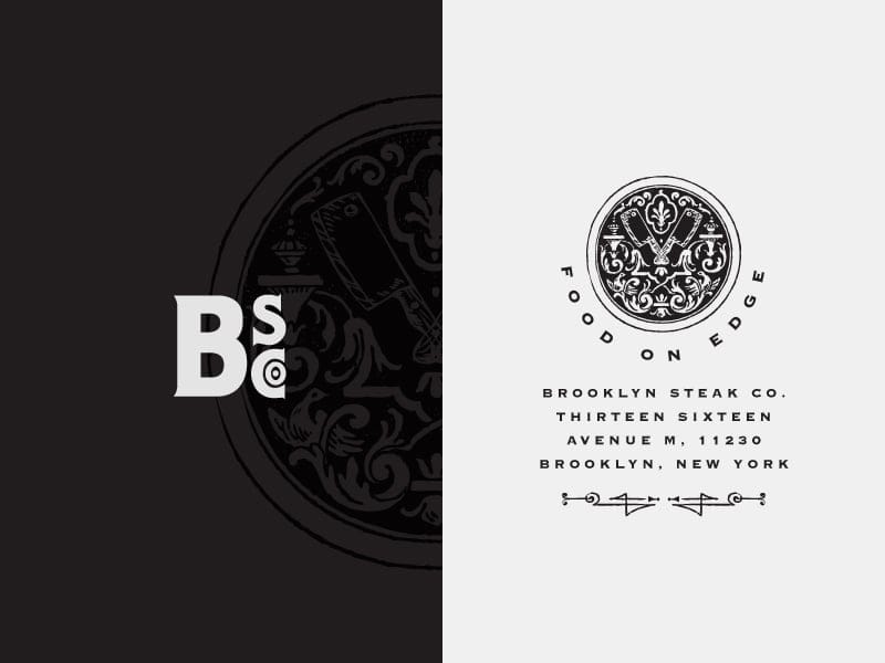
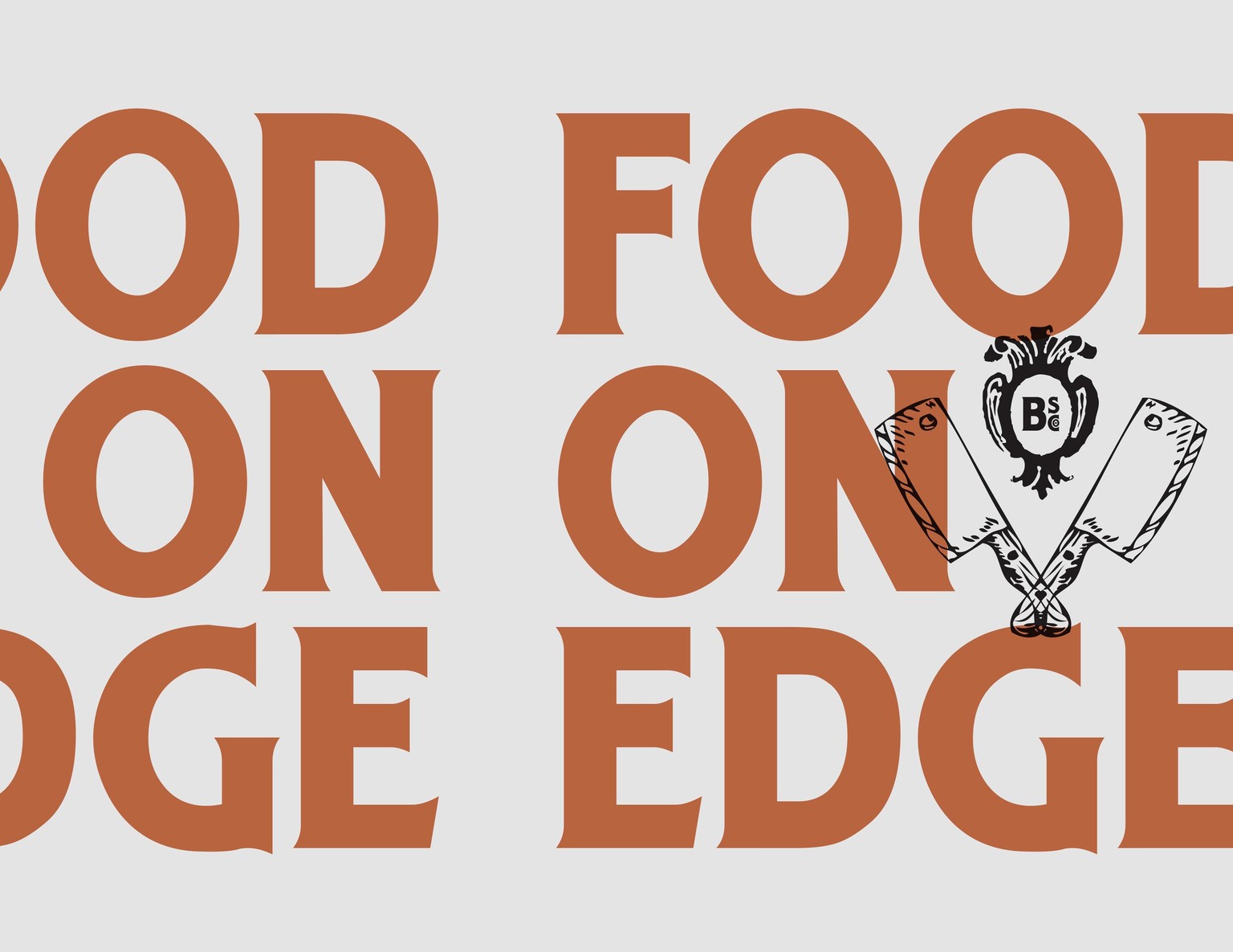
Tagline 'Food on Edge' is reflective of the adventurous menu and Brooklyn attitude
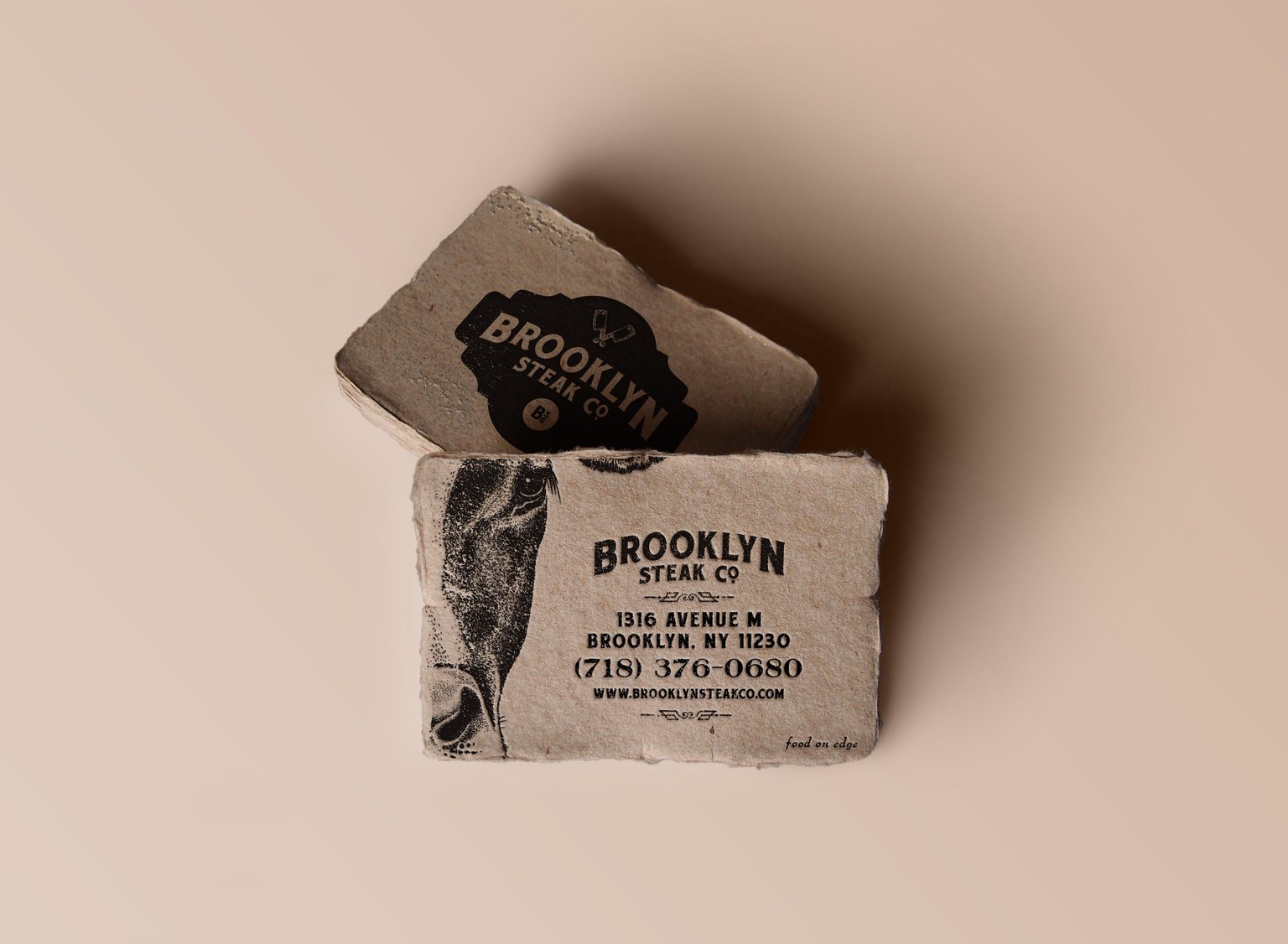
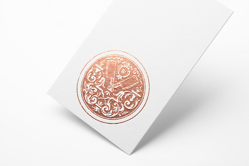
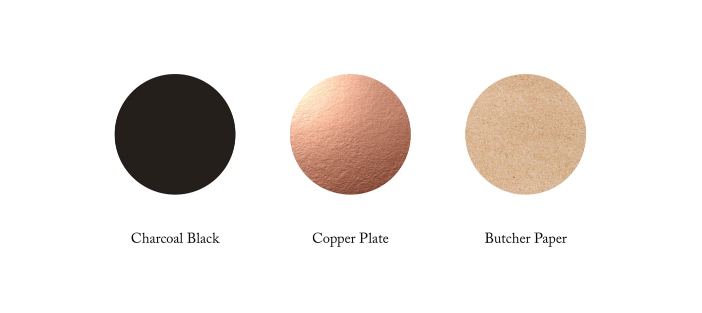
Mockups of printing techniques and paper quality (kraft paper, copper foil)
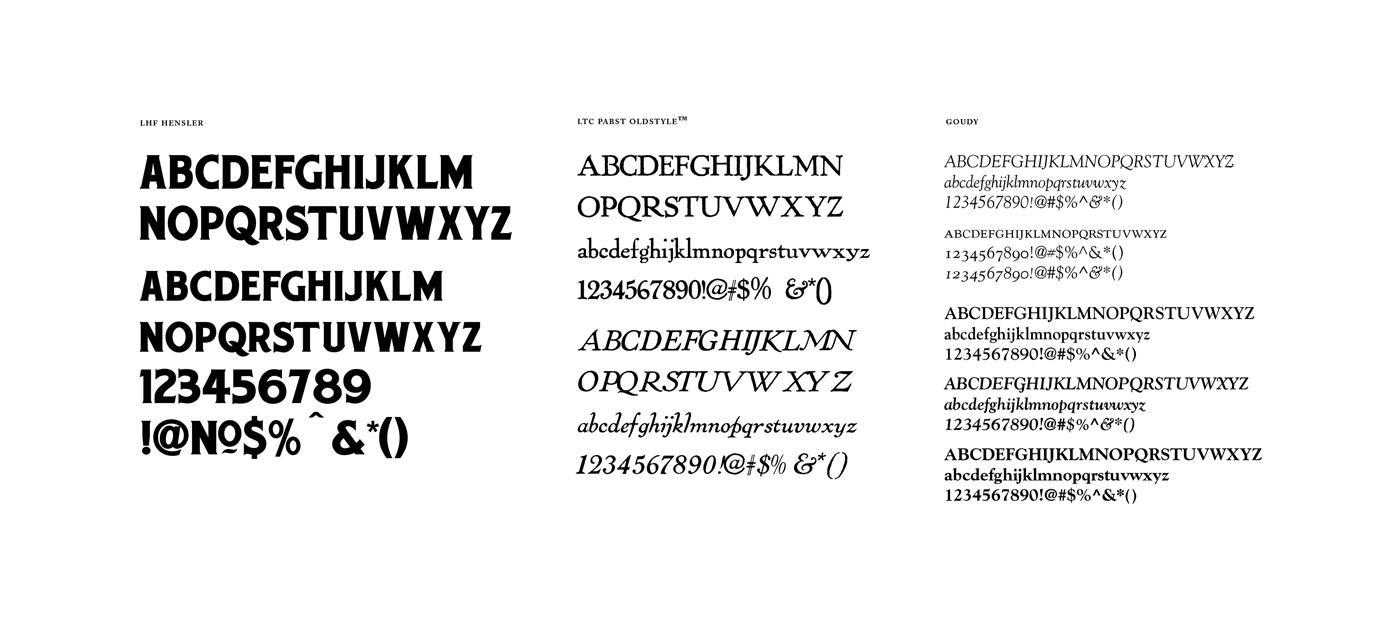
Colors & Type. For typography I wanted fonts from the early 20th century, around the same time that the Vitagraph company was in use. So after geeking out on type histroy I landed on Frederic Goudy (circa 1915) and chose 3 of his font families for the type system . LTC Pabst Olstyle was originally created for a Brewery company. Goudy named after the man himself, an easy to read serif — good for the menus and body copy. Copperplate has a variety of weights and widths and when mixed together can have that beautiful vintage vibe.
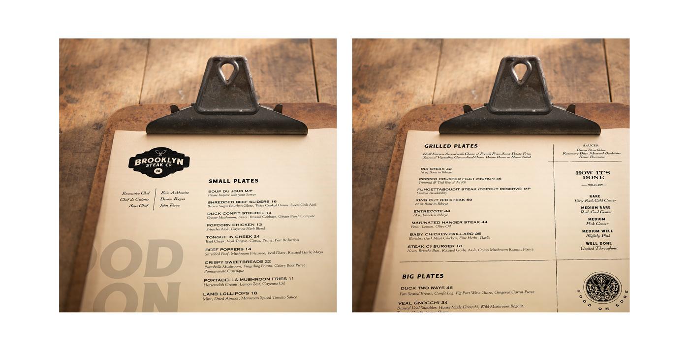
Menu designed by my uber talented friend Mush Kanner
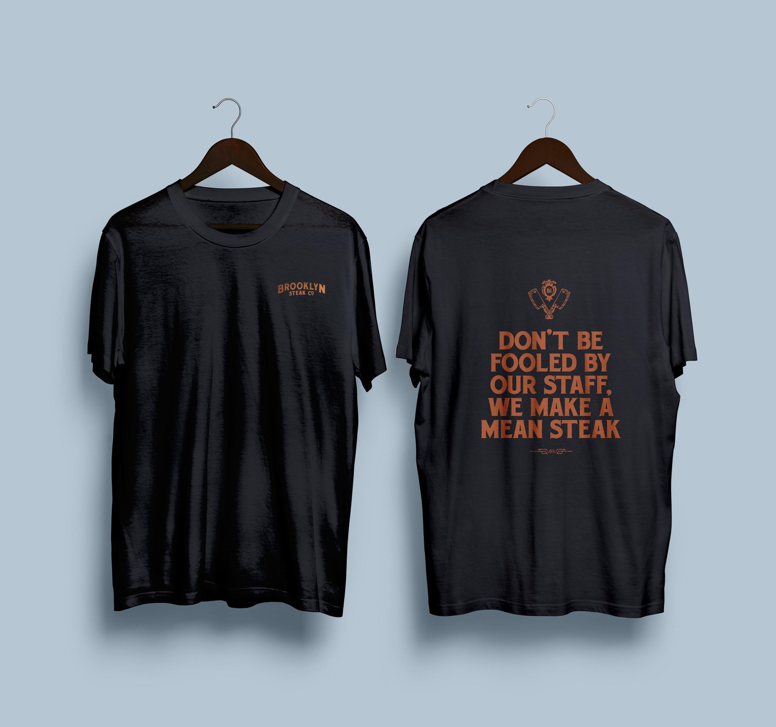
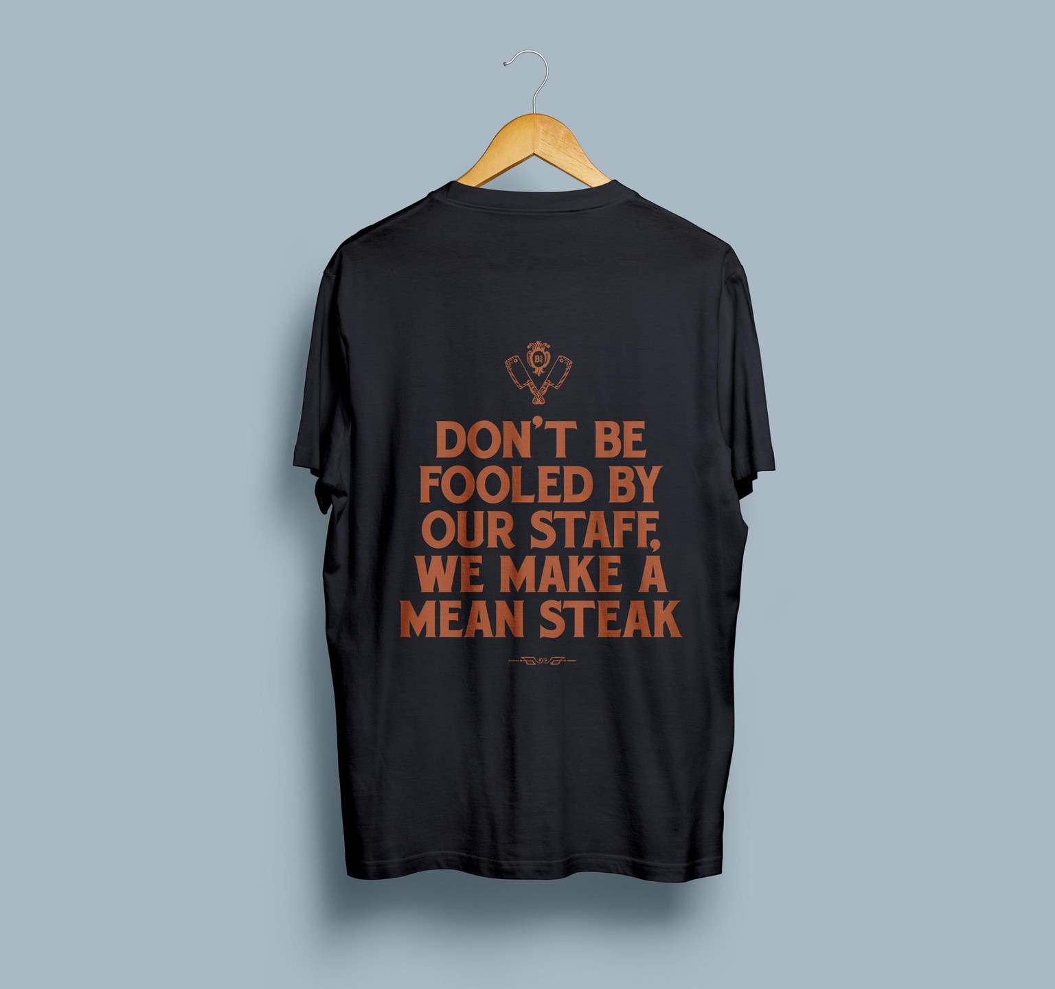
Tshirts for the staff (words by Yudi Lewis)
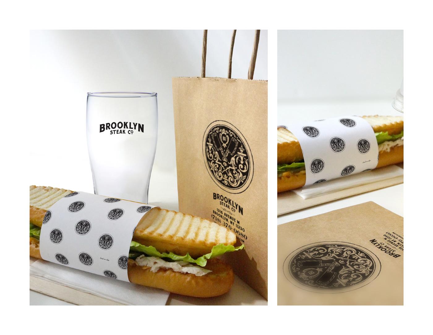
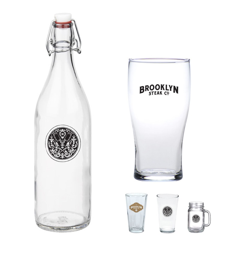
Design elements and custom glassware options
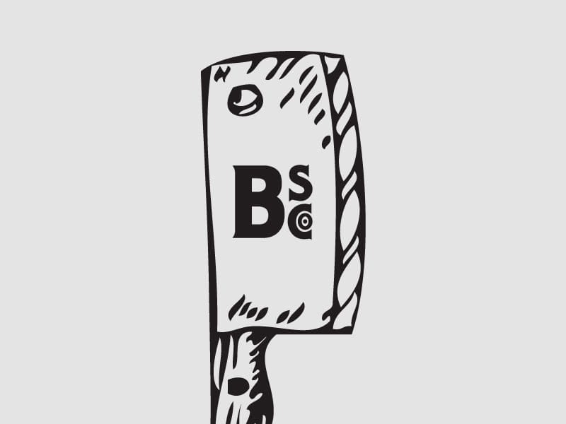
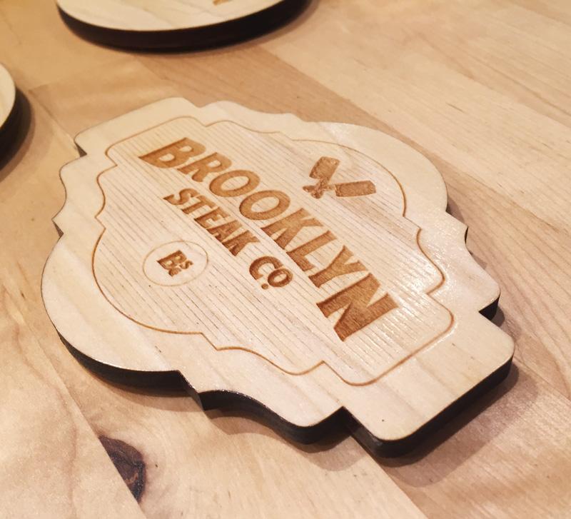
Had the logo branded onto wooden coasters by laserbranding.net (the logo is a slightly earlier version) — nothing like holding the logo in hand and the smell of freshly shellacked wood.
___
Update 12/2: