Blue Hen Cafe
Recently I was introduced to a local restaurant in St Augustine, Florida called the Yardbird Cafe. The atmosphere was very southern and friendly, and the food was quite simply delicious. As I was sitting there sipping my coffee, I couldn't help but imagine the possibilities that a fun re-branding project would bring along. So here we go...
First thing's first - I had to figure out what in the world a "yardbird" was. Had to consult the urban dictionary for this one:
"A slang term for the common chicken, generally after being prepared as a meal."
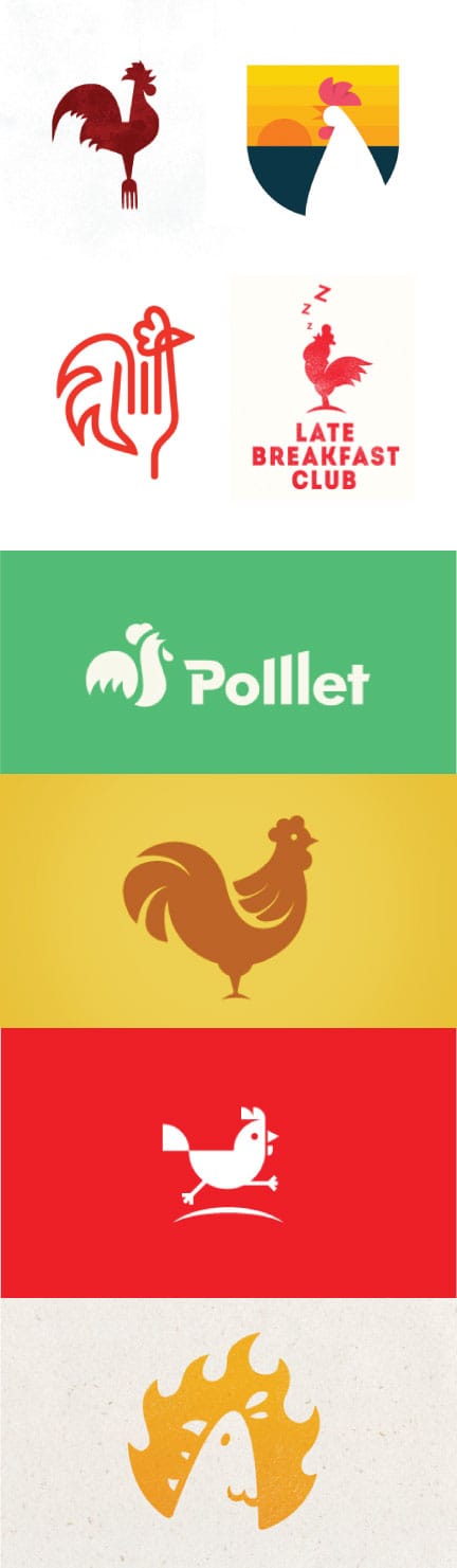
So now that I have my restaurant and my animal, it's time to get cookin' on the design process. Here are some really inspiring examples I found from Dribbble:
Mind-Mapping
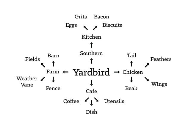
Chicken-Scratch
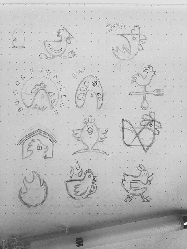
Time to put the pencil to the paper! Using my keywords from above, I started spewing out some rough ideas onto my new dot-grid sketchbook (which I highly recommend, btw). For me the greatest challenge was getting the animal to play nicely with the concept of the cafe/diner. Check out what I have so far, and I welcome any feedback you all can share.
Mo Chickens
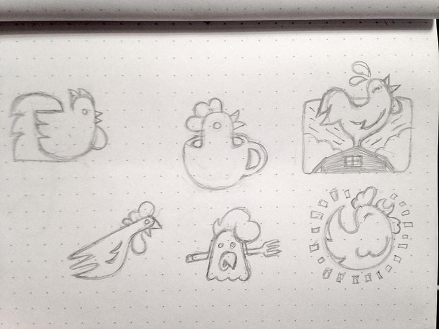
Closing In
Finally arrived at a good place with this project, and here is the concept I came up with...
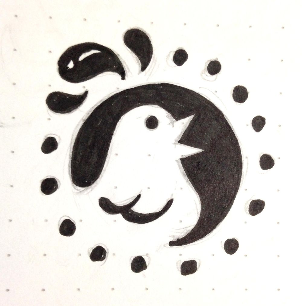
I really dig how the chicken is reversed out inside the shape of the sun, and the top feathers are outside the circle. The sun rays have some continuation going on because they lead your eyes around the piece, and also help to close the gap where the bottom of the chicken emerges from the sun. I utlimately settled on the sun because it felt more appropriate for the location of St. Augustine, Florida. It's not far from the beach, and most of the food served falls under the breakfast menu, so it ties nicely together with sunrise, too. Going to bring this into Illustrator and begin running it through the vector process.
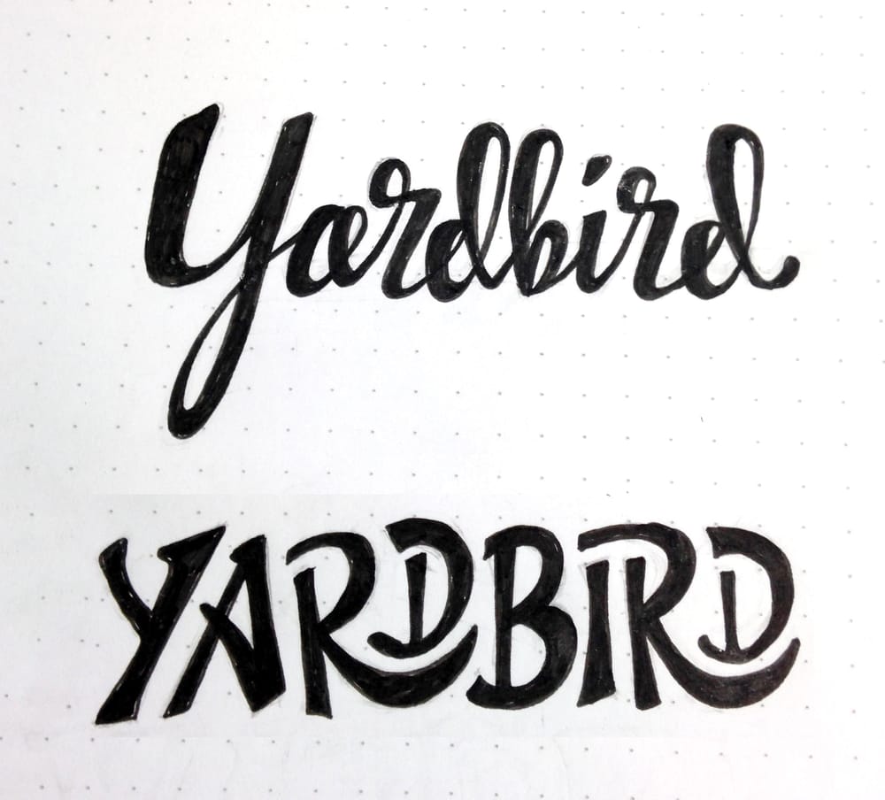
Also had the chance to play around with a couple hand-lettered variations for the main name, check it out:
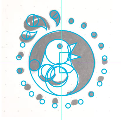
Vector Process
Lots of circles were used to create this graphic! Here is a process shot with all the crazy shapes/lines for your viewing pleasure:
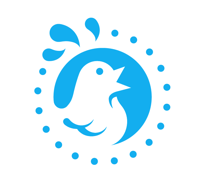
And with a little Pathfinder magic...ta-daaa!
Going forward I would like to start playing with some colors and textures for this guy, so in the meantime feel free to blast me with suggestions!
Colors & Type
Kind of leaning towards the gold and burnt orange/red options for this brand. I think it will all work nicely as a one color, but I wanted to explore some color combos as well.
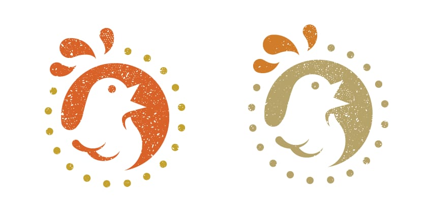
Breaking News
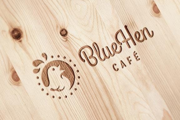
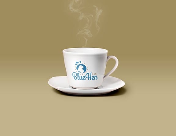
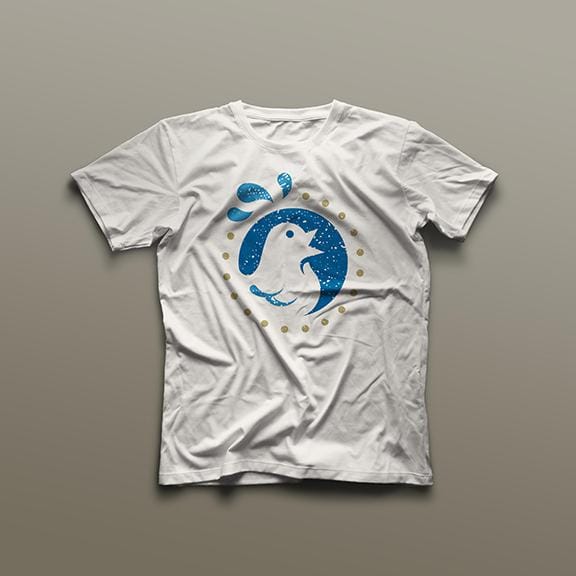
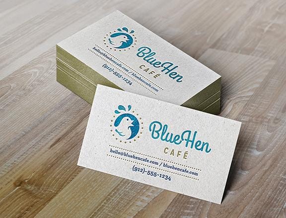
So I just found out that this cafe has changed their name recently, but ultimately I think the illustration still fits nicely. The new title will be the "Blue Hen Cafe," so same bird with new colors and text.
And, here is where I have landed based on the new name change...what do you guys think?
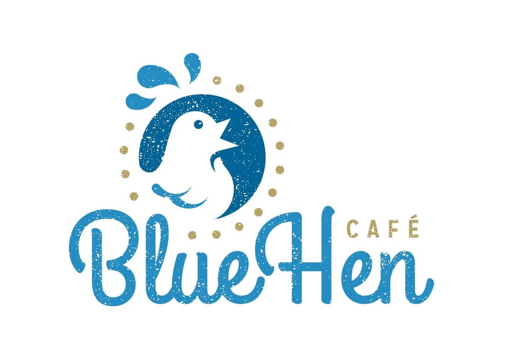
Going to wrap up this project with some mockups - thanks for following along!