Berry + Orange Ice Cream
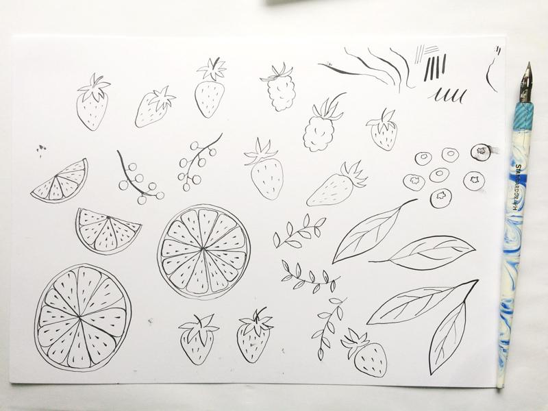
I decided to create a summery, light recipe illustration, and what would fit better than ice cream for that? I knew I wanted to have a lot of small, colorful food icons, so I decided on drawing berries and orange slices, along with some decorative leaves and an ice cream bowl.
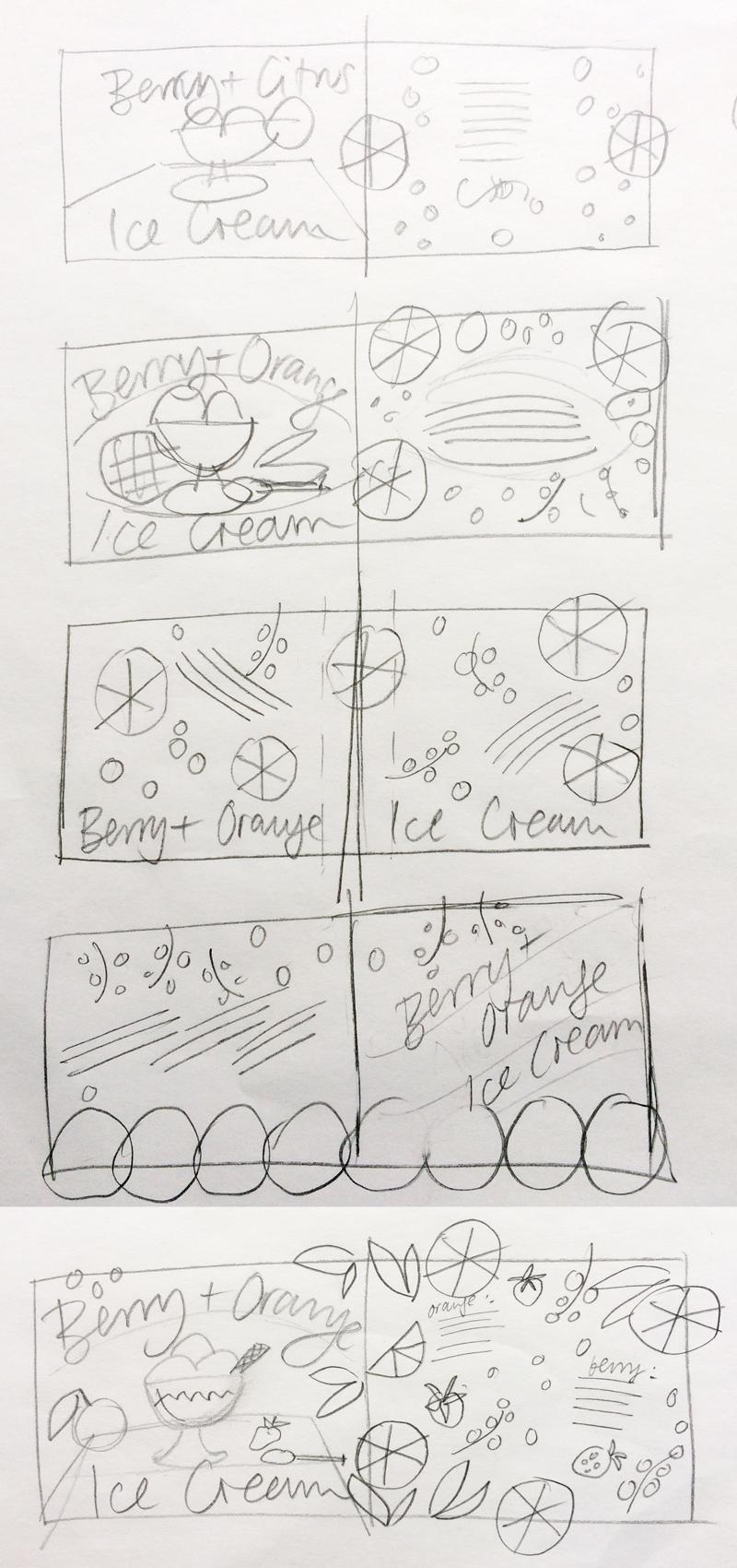
As for the layout, I went with a tumble of different ingredients which makes the layout feel fresh and light.
Then I drew many different food icons to have something to choose from later.
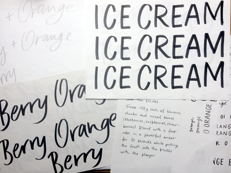
As for the lettering, I went through several stages of experimenting and ended up with a casual pencil & brush lettering style for the title, and informal script done with a dip nib for the recipe text. I sometimes try out different styles when assembling the layout, so it’s good to have several versions of the lettering at hand, even if it means more work.
The layout for this illustration is quite loose, so that helped me when assembling it to a pleasing composition. It’s good practice to create smart objects from your elements, so that you don’t lose quality when resizing them. Putting all the elements in different layer groups is a good way to keep an overview.
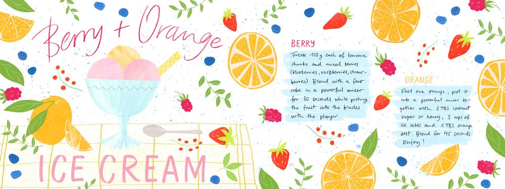
I’m really happy with the result - I was going for a light, inviting recipe with a summery feel that emphasizes the fresh fruits used in it, and I feel the lettering and the simple textures help to transport the vibe that I was going for.