Beauty And The Beast
I decided on choosing Beauty And The Beast because my agent was going to a book fair in Italy and although I always dreamed about creating book covers, I've never done one before, and I had only 3 days to deliver at least one for him. So I enjoyed very much Jessica's idea of making a cover based on the novelization of a movie, and I did the same with Beauty And The Beast from 2017 with the awesome Emma Watson as Belle because I wouldn't have to read a book, but watch a 2-hour movie, so this could spare me some time.
NOTE: I don't have an iPad, so everything was created with the classic pencil/paper and finalized digitally in Adobe Illustrator and Photoshop.
My very messy brainstorming process is a mixture of English and Portuguese (Brazilian person here), so some of the words I highlighted are:
- Roses
- Belle
- Candles
- Yellow dress
- Books
- Ornaments
- Curtains
- Twigs
- Mirror
- Snow
I also paused a lot the film to draw some objects and things that I could use in the future.
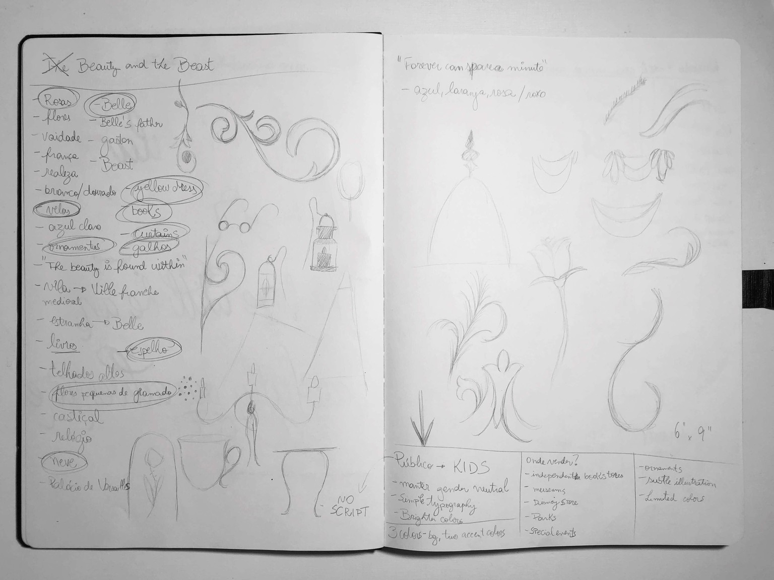
The audience at first would be very small children, but I noticed that I couldn't explore as much as I wanted to for such small kids, so my audience could easily be 11-18 yo, and probably a special edition of the book.
Thumbnails:
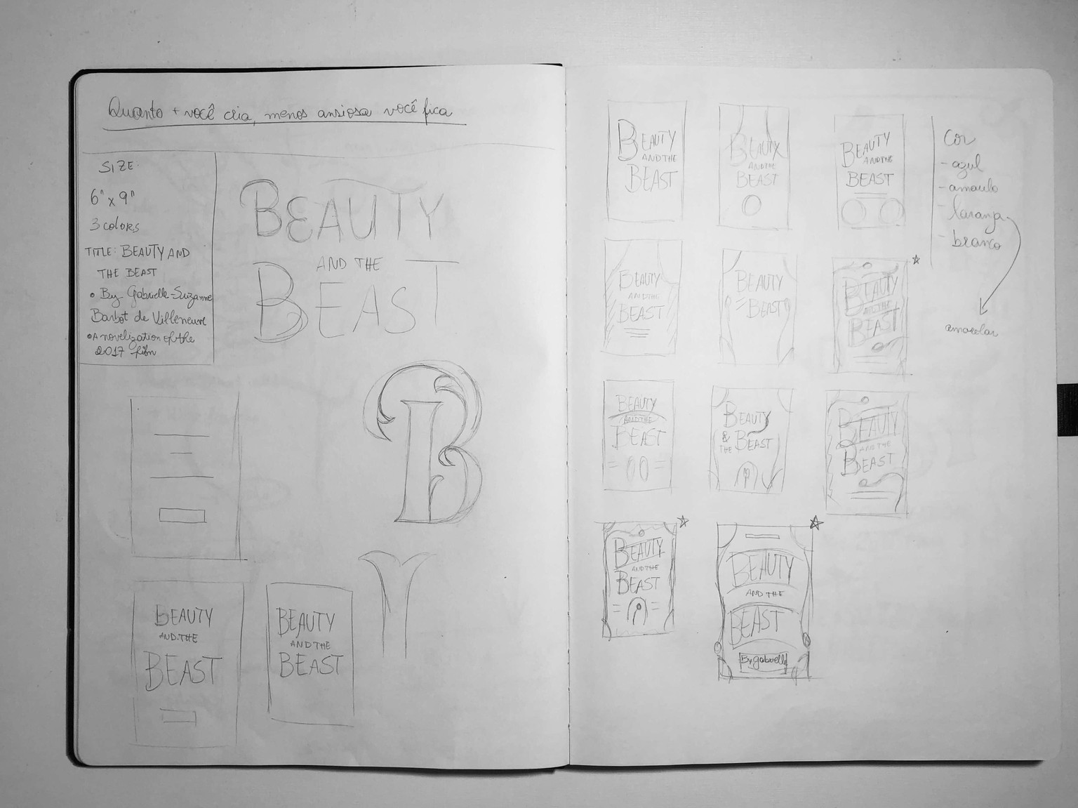
I liked a lot the ones with the stars, but I confess the first starred one was my favorite, and I felt I could explore a lot with that, but I insisted on drawing again the three starred ones to think better (next photo, on the left).
My initial plan was to create finalized sketches with all three options, but I was running out of time (remember? 3 days!) and I would have only a day for the vector work, so I chose the first one (next photo, on the right).
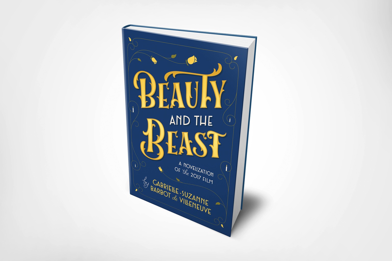
So the lettering for the title I chose because of the very big and fancy style of ornaments of the castle. I didn't choose a script style for the title because of the audience and because I intended to put a lot of ornaments, so I think a script style could be a bit confusing.
The art déco typeface I chose because although the story was created way before the Art Déco even exists, it's a story based in France with also a French author, so I thought that style could fit in a very interesting way on the cover.
Jessica's told in one of the videos about making the ornaments and decorations at last, and this changed EVERYTHING for me, so I could focus on everything that's more important and the ornaments were a lot easier to create.
I also put some candles by the end of each ornament on the frame, because of the huge amount of candles that castle had, and some leaves with roses, for obvious reasons of Beauty And The Beast. Haha!
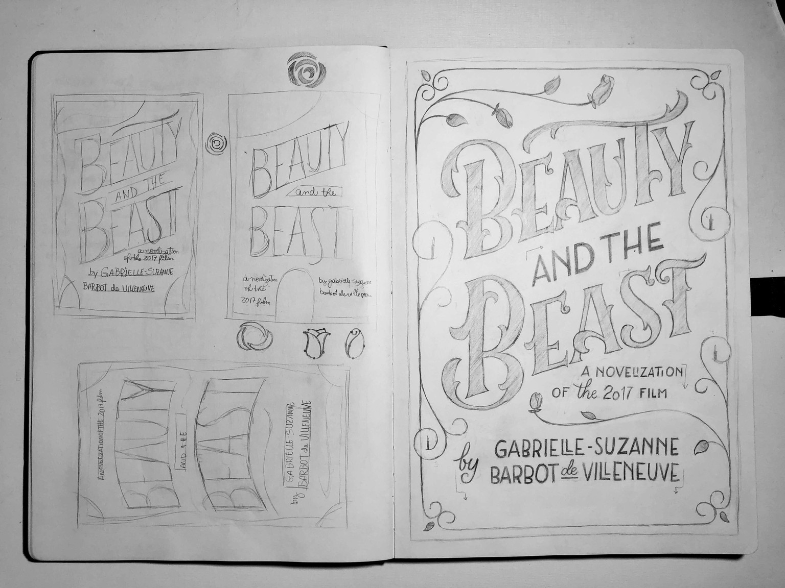
That sketch isn't perfect, and an iPad was missed here to make some small adjustments like the ones I noted with arrows on the picture above.
I also made some last minute drawing of the rose I'd use because I had never drawn a rose on vector before, so I even put some hypothetical anchor points on it to understand how I'd do it (picture above).
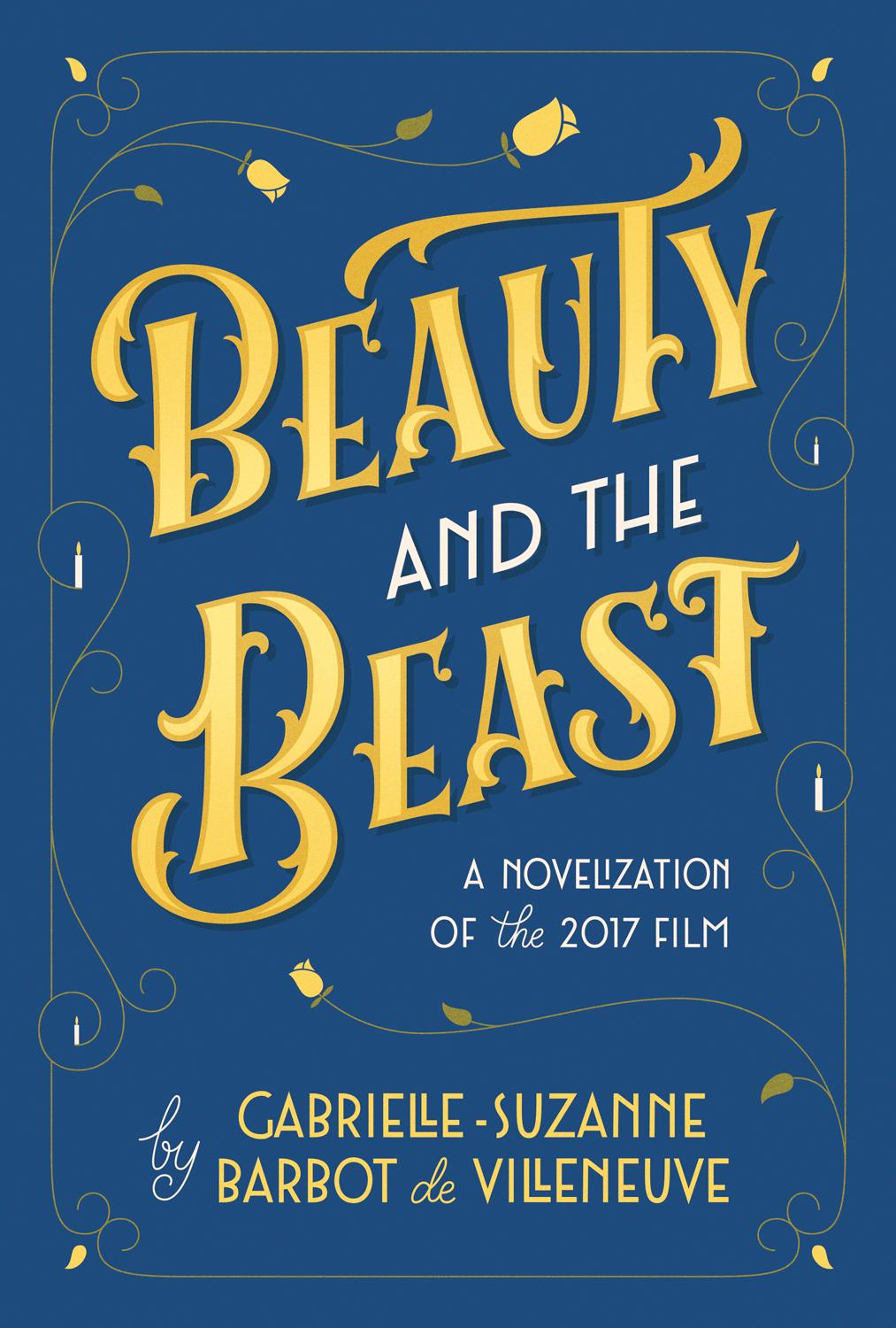
By the end, I decided that a color palette with blue and yellow could fit a lot with the theme of the film, because of Belle and Beast's clothes.
My next update will be the spine because I really want to make one for this book, but I finished only the cover on time to the agent, so now I can think on the spine with a rested mind and bigger deadline. :)
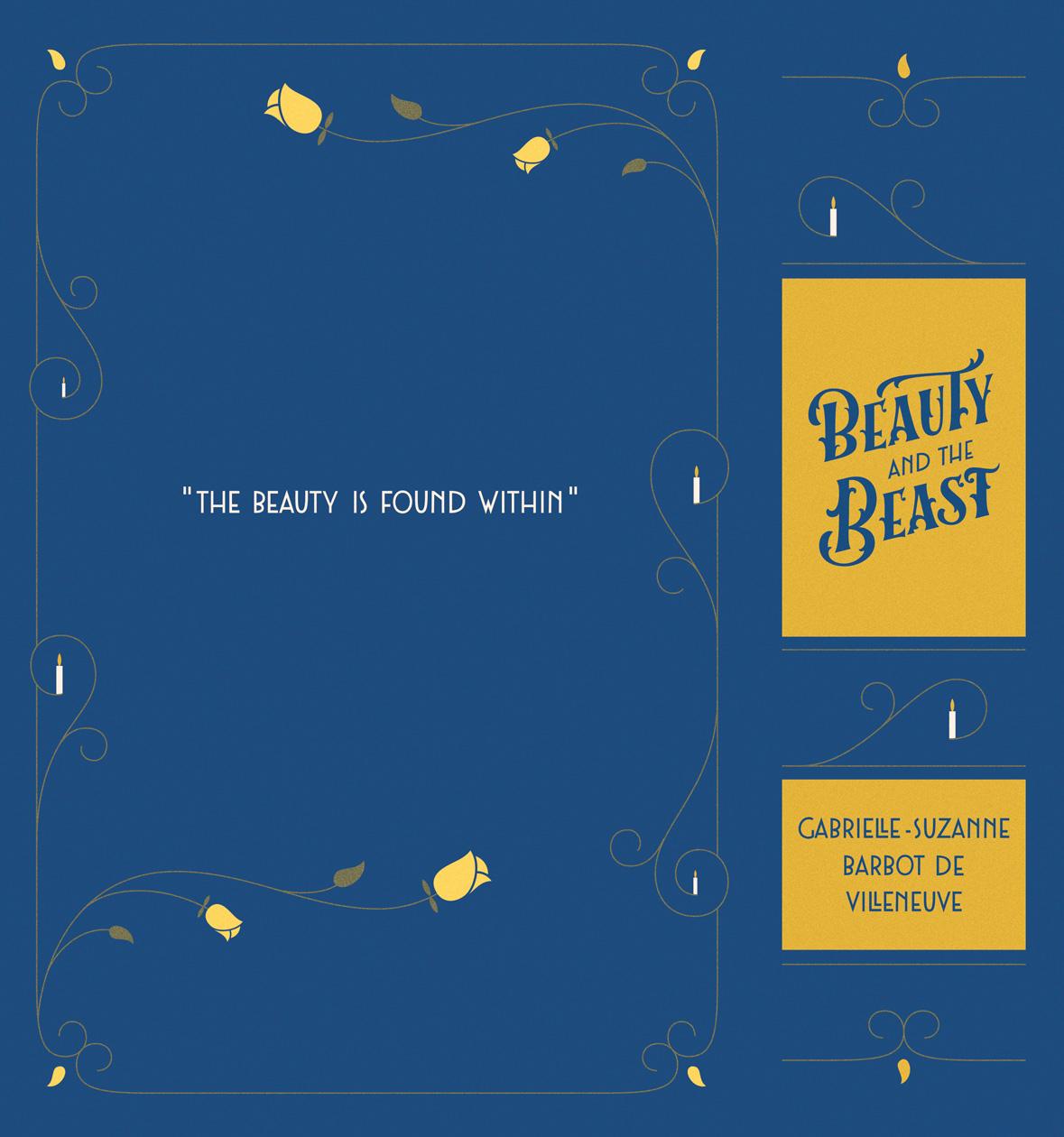
SO, here's the spine and the back cover!
For the back, I chose this sentence as a quote and as the only information in the whole back just because I visited some bookshops here and I really liked this kind of version as a special edition for classic novels. So I used it with the frame of the cover replicated and mirrored on the back.
About the spine, I struggled a bit with it because I had never made a spine before, so I looked on Jessica's classics for Barnes & Noble and also some other references I had in mind. I liked this style of creating the spine already thinking that the book will be vertical when putting on a bookcase, but I chose only one color for the title because I wanted it to be recognized easily when looking at a certain distance.
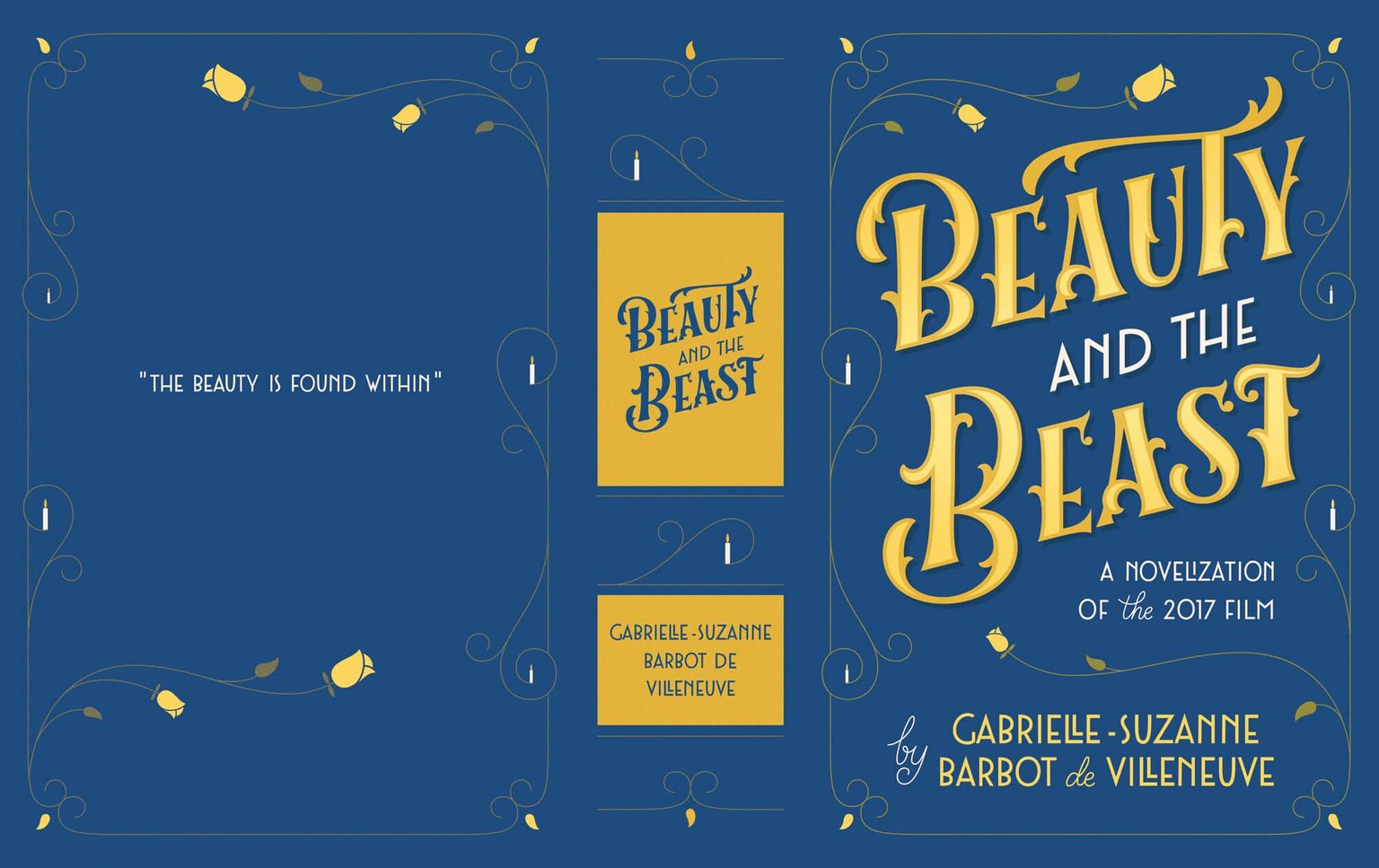
Below you can check out the entire work:
I enjoyed very much creating this, and I learned a hell lot more than I thought I could. Also, because of the course's creative process + the deadline I had to make it, now I can create WAY quicker than before and my eye is now very well trained for technical stuff. :)
If you'd like to see more of my work, I've been posting it on IG Stories, so you can follow me there: @isabelladeliao