Balance, Proportion, Emphasis, Unity, Variety
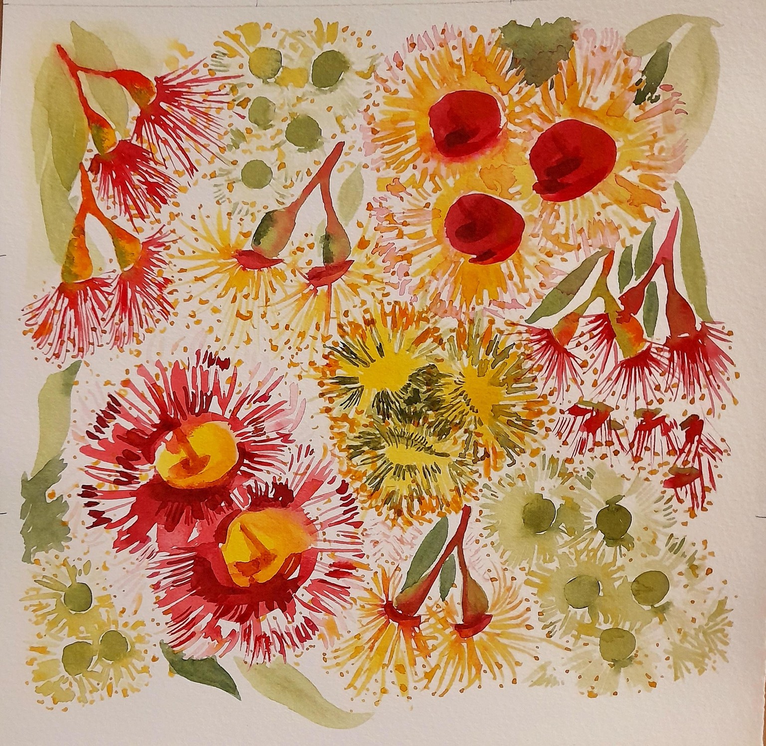
For my final project I decided on another composition of Positional Variety using gum blossoms as the theme - think I went a little overboard with the dots but am so enjoying painting a flower type I really love and always thought too difficult to tackle. :)
Now to consider what to do for my final project :)
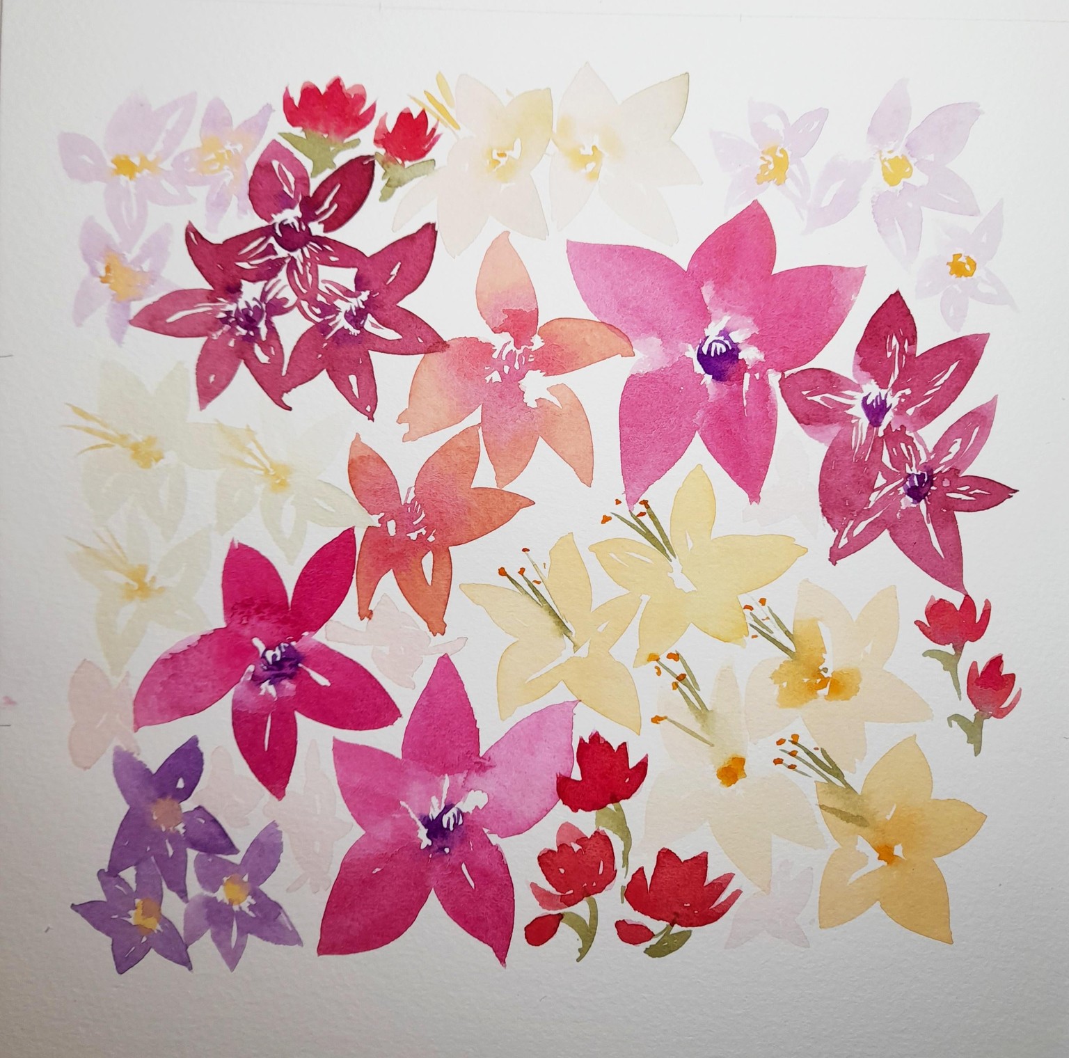
Below, Variety - my own theme and composition using Philotheca wildflowers (I prefer my daisies!)
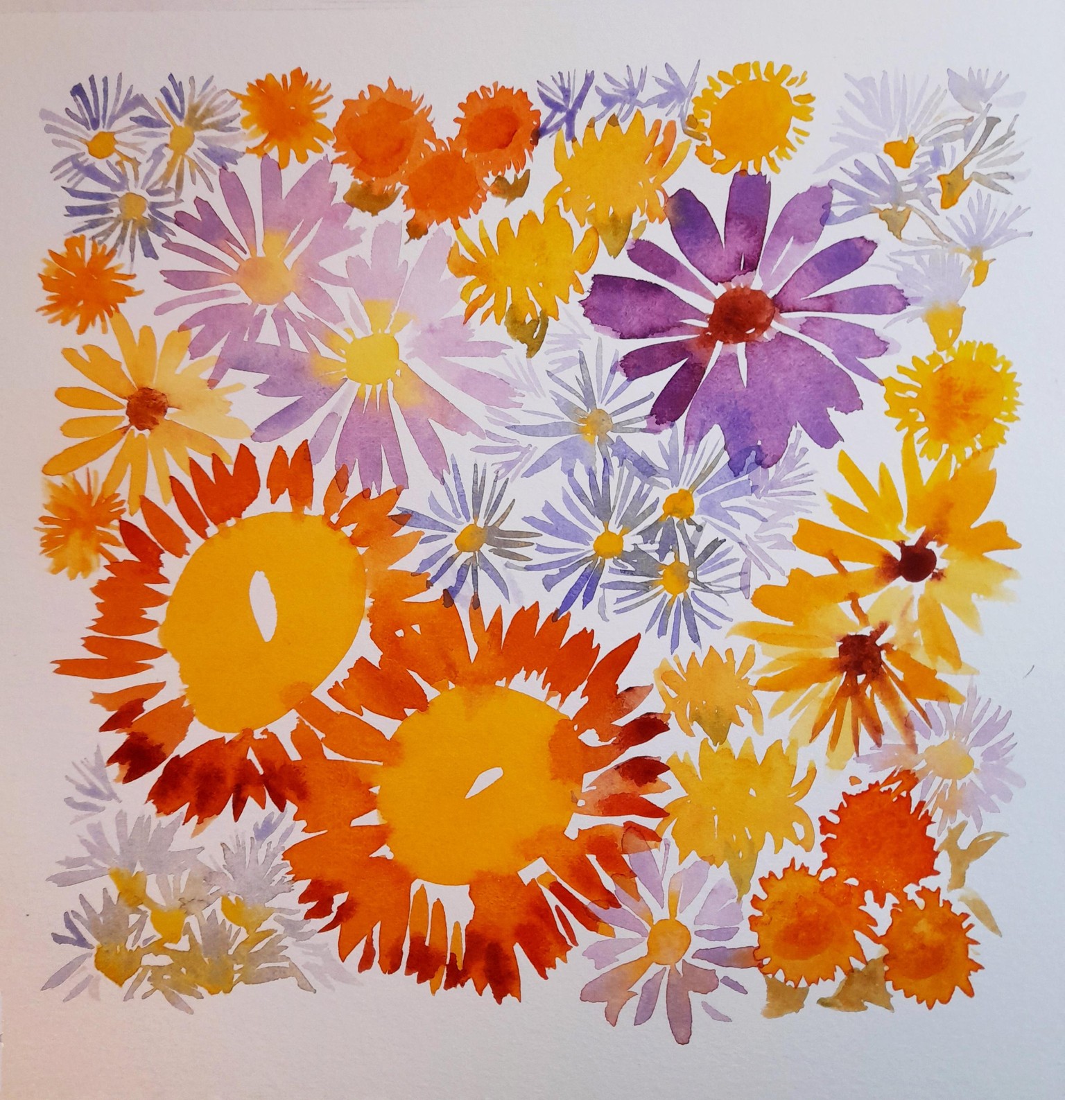
Below, Variety - daisies as per Natalie's theme, this was fun
Unity: This has been my favourite style so far. Really loved painting the gum blossoms, but this technique with the dark background looks amazing and adding the salt on the leaves adds a fun texture!
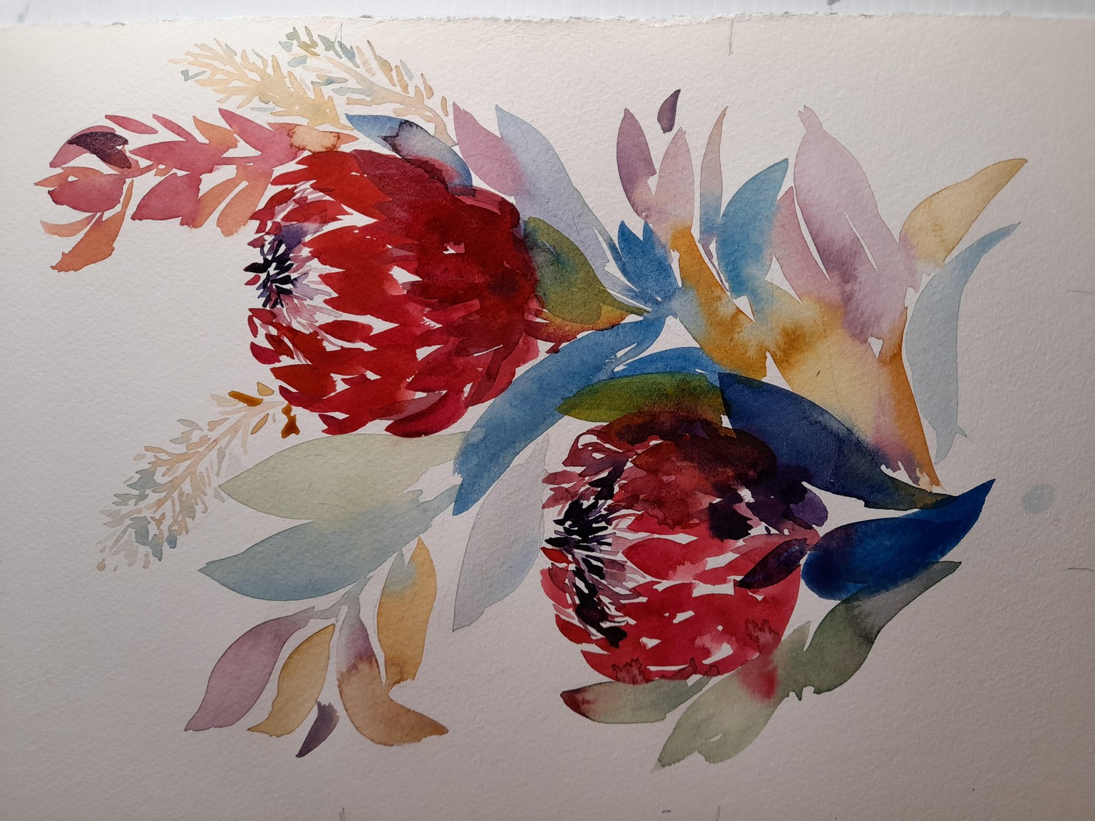
Below, Unity Silver Princess gum blossoms using my own composition in the style Natalie demonstrated.
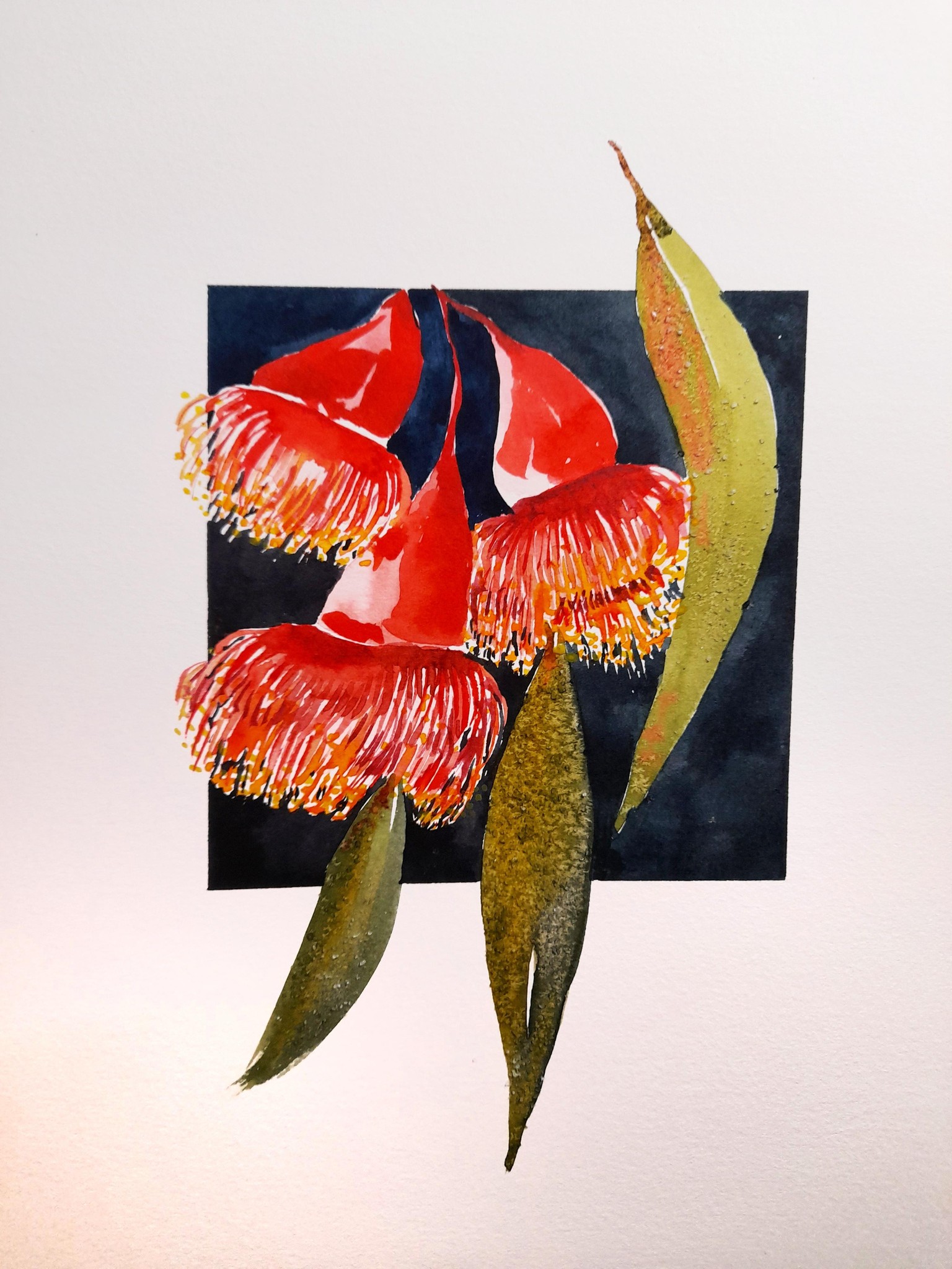
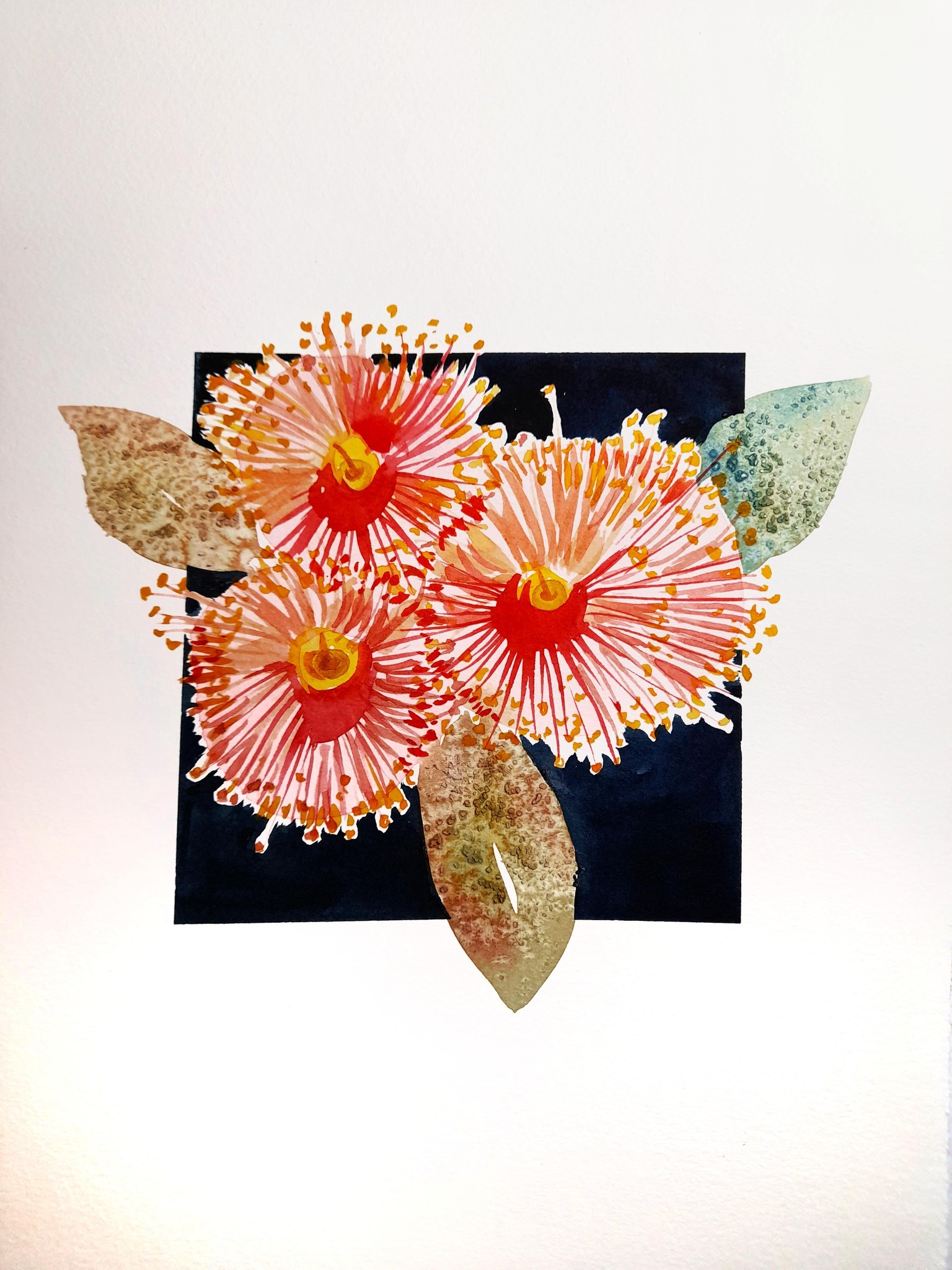
Below, Unity gum blossoms following along with Natalie's example.
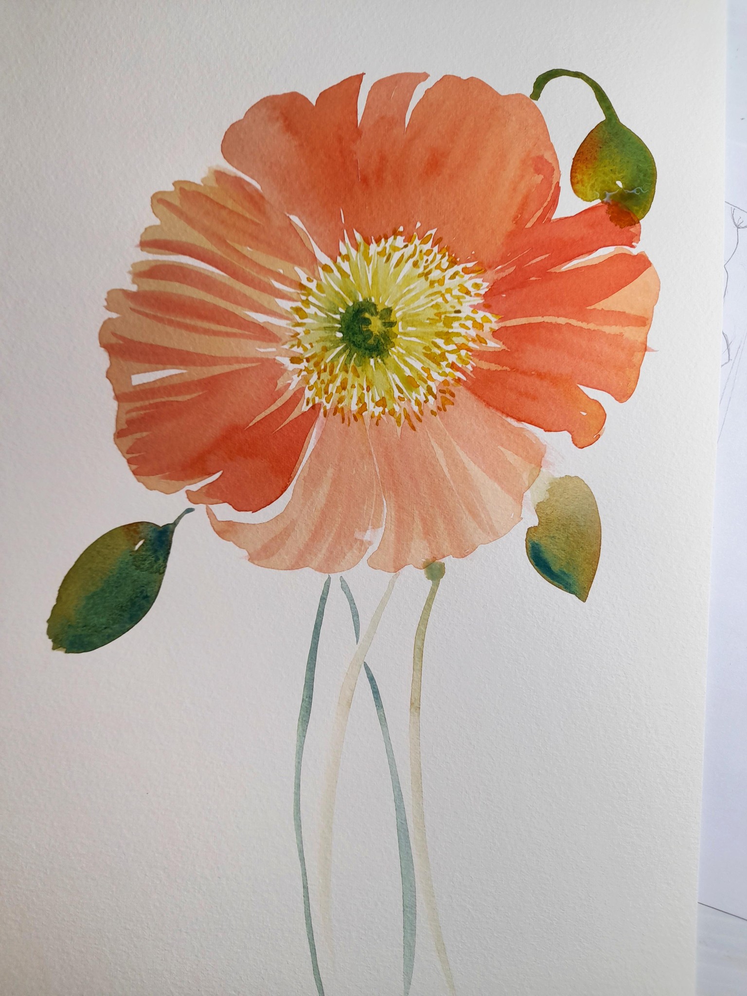
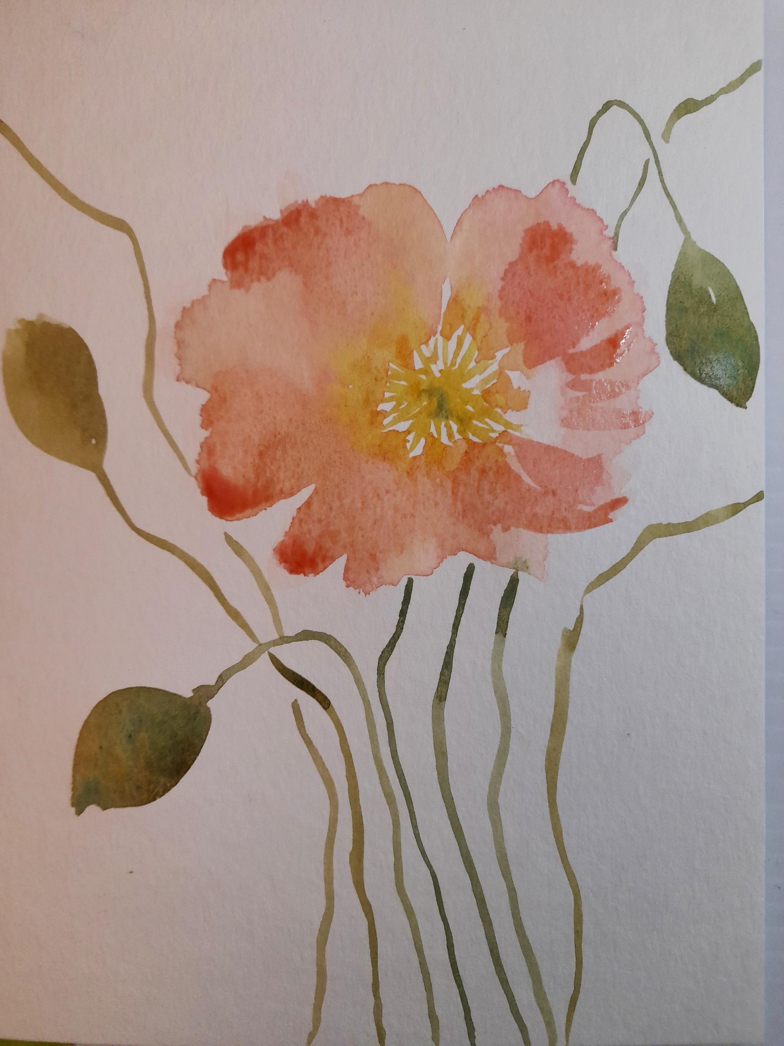
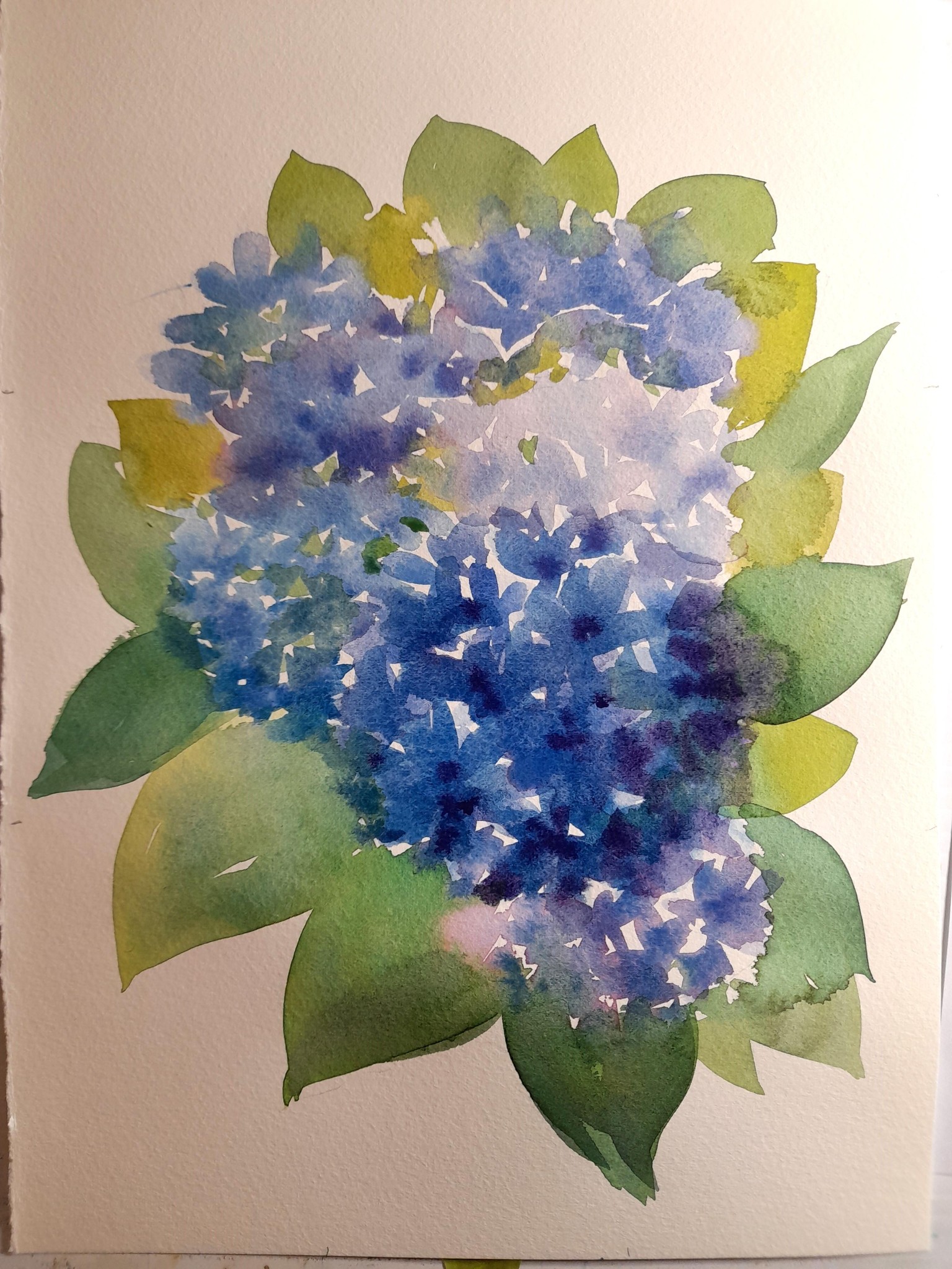
Natalie, thanks for your reply with suggestions about things I could try with my hydrangea. I gave it a go (several times) without much success - just couldn't get it to work. Decided to move on to the next one - much happier painting poppies :) It was really interesting seeing that you started with the centre of the flower - in my first attempt I did completely the opposite and did the centre after the petals, which didn't work very well!!
So many useful tips in your demo, too many to mention - but one I really liked was doing the stems in a pale tone so they don't dominate too much.
I also found one of your previous classes with practicing brush strokes - I really need to do more of that for variation and brush control.
Thanks again. Learning so much!
Below, 2nd attempt at Emphasis - after the demo
Below, 1st attempt at Emphasis - before watching Natalie's demo
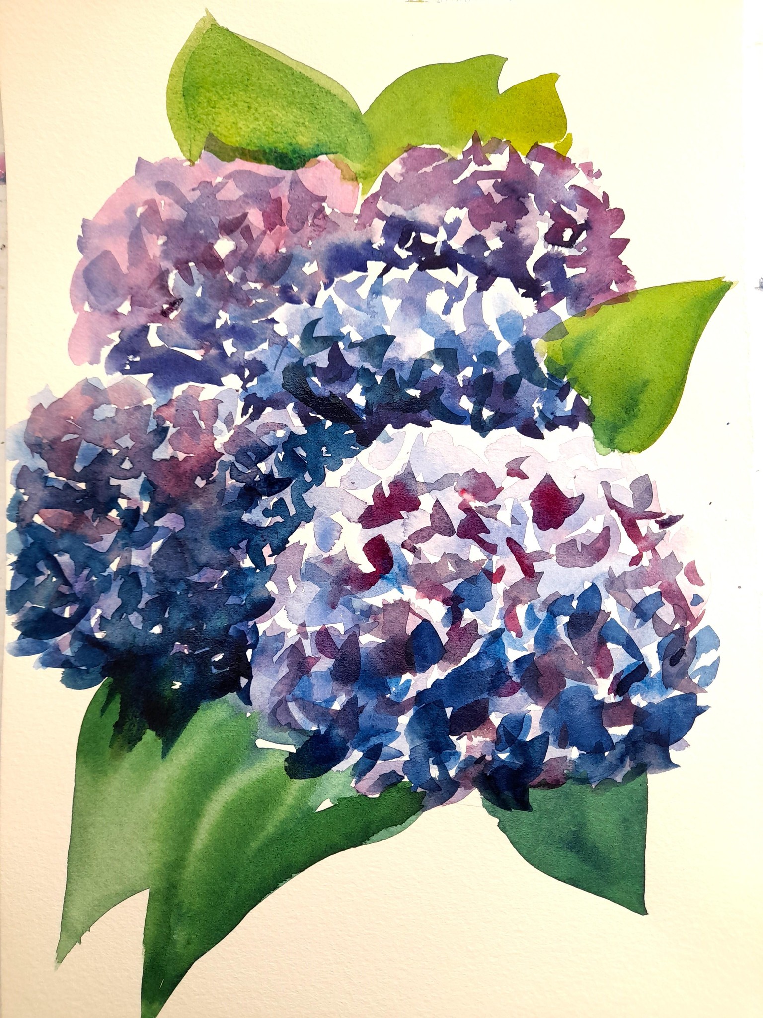
Below, 3rd attempt at proportion - running the hydrangea off the page.
Not sure I have the hang of this one yet, especially painting hydrangea!!
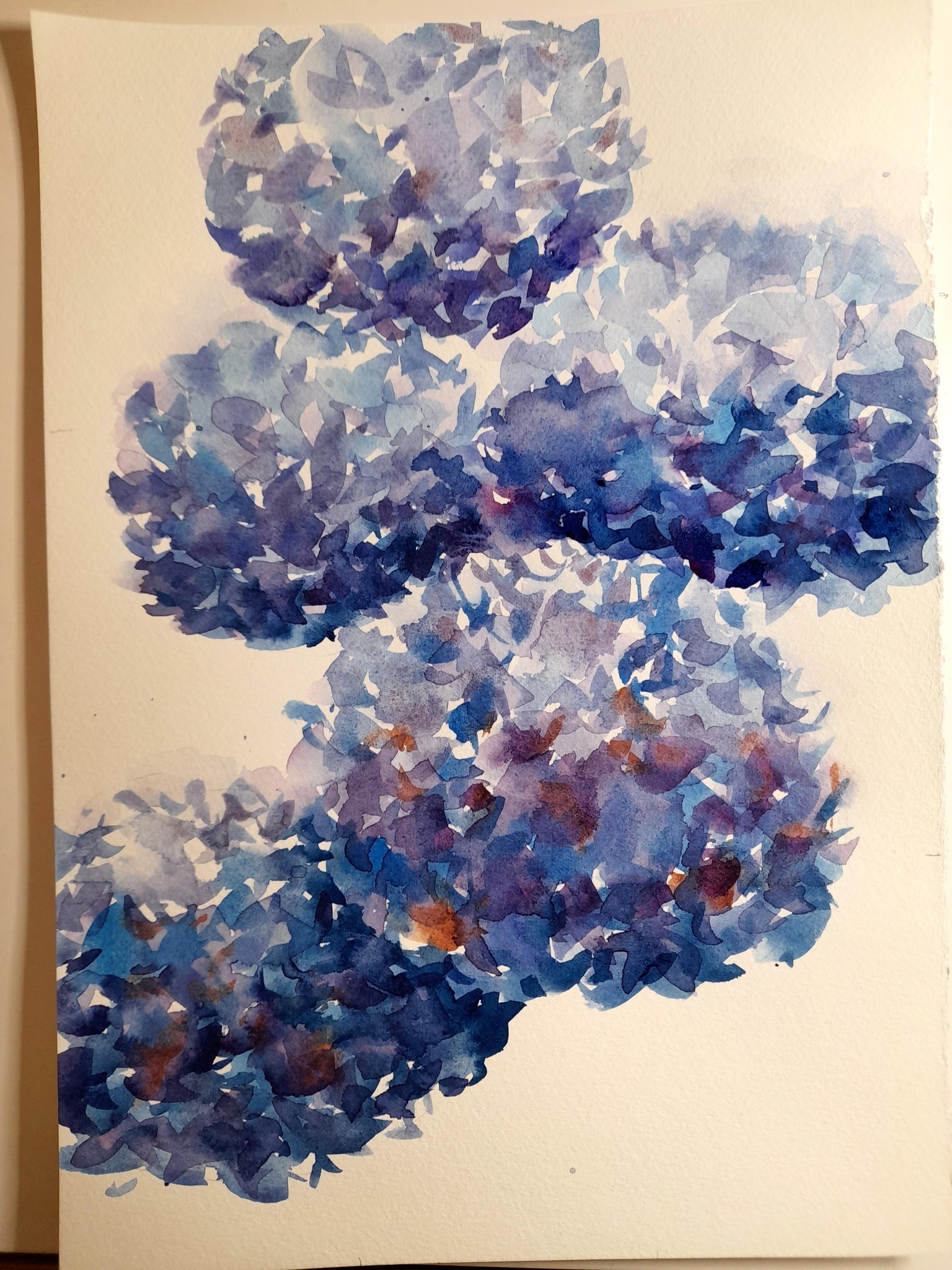
I did freak out painting the hydrangea without watching your demo. What a mess! Being brave and posting photos even though I'm not happy with them. In the first one, couldn't work out how to make a distinction between the flower heads, and then the leaves just went all wrong. With my second one, it still didn't go so well - I kept adding more darks to try and make it work. It ended up very 'heavy' feeling which wasn't at all what I was attempting - haha. I also had problems placing the leaves.
Natalie, I'm interested in your thoughts on my 'dominant' composition arrangement and perhaps how I could improve it. I want to have another go at this one, more in the loose style you approached painting the hydrangea.
Below, 2nd attempt at Proportion
Below, first attempt at Proportion
Below my 2nd attempt at Balance
 This course so far is amazing Natalie. I took you literally and stopped the video to play with the cut outs and do my first painting. Then I had a second attempt. Loving the content and your explanations a lot!
The photos have loaded sideways - below is my first attempt, the cover image is my second attempt (both should be rotated right but I can't seem to work out if I can do that here)