Artwork Flat Lays
Phase 1: Hello! I'm Elisa, watercolor and sketch artist :) I took this class because I was curious about doing flay lay photo. Also I realized that my Instagram isn't cohesive in style and feel and I have never quite taken it seriously. I have a mix of personal and non personal (work) photos which made me wonder if that's okay?
After taking Anna's class I began to think about the look and feel that I want for my photos that convey creativity and would inspire others to make art.
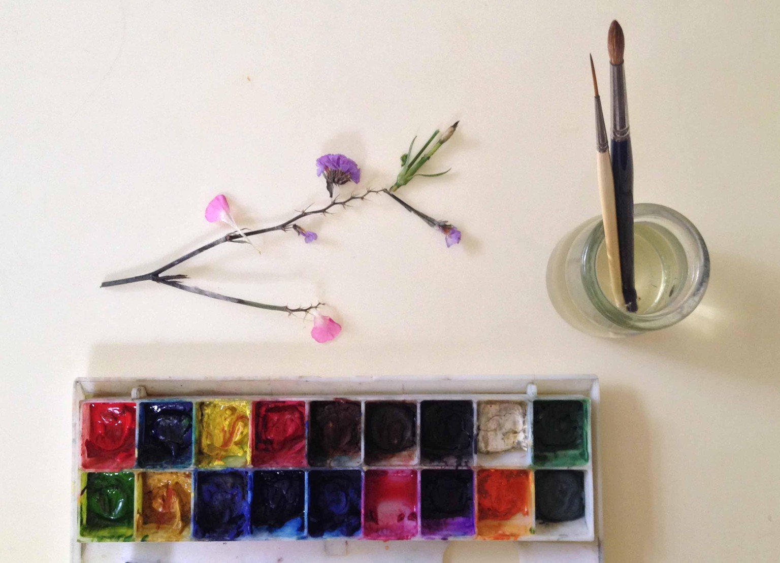
Above is a flat lay I did previously. I like to include nature in my photos like leaves, dried flowers, shells. I want to just experiment and get a feel as i practice on doing flat lays. My theme will be art materials, my paintings and nature elements. I am thinking of wood as background (chopping board idea by Anna was fantastic!) Looking forward for the next phase. Thank you Anna for this class.
***
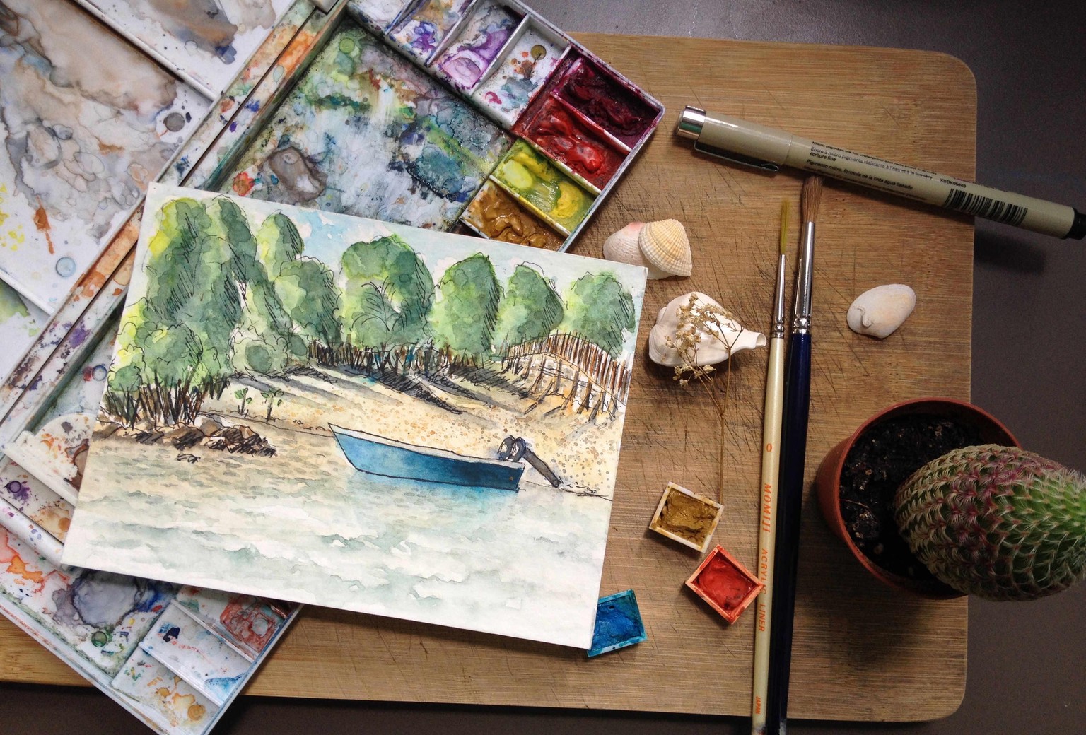
Phase 2: I have sketched a beach scene on location and have painted it. Now I want to create a flat lay of it and include elements that resonate with the piece. So I grabbed a wooden chopping board for background, the painting, materials that I used to create the piece (paints, palette, pen, brushes), shells, cactus plant and a dried flower. I may change my mind with regards to some of the elements but I think most of the things will be included in my flat lay photograph. Comments are welcome! :)
***
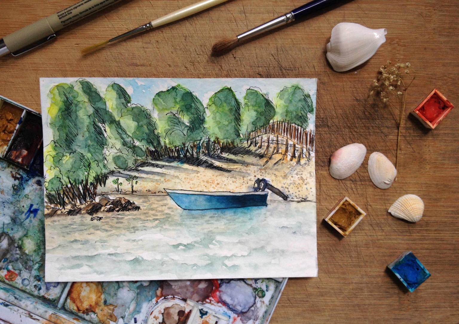
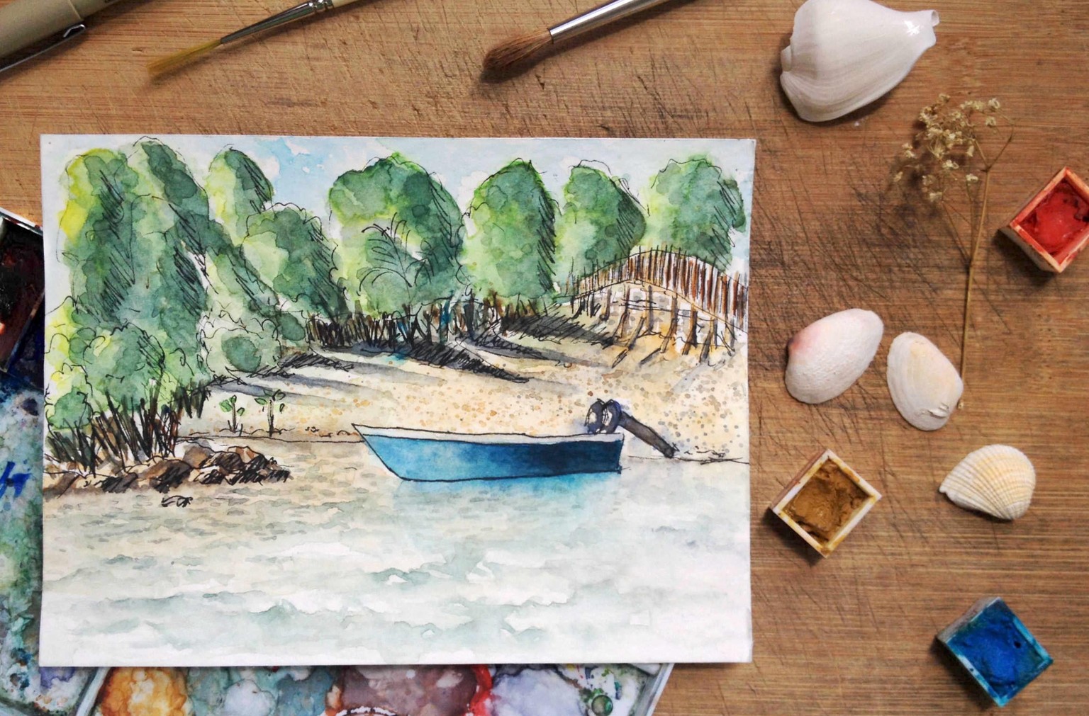
Phase 3: This is the fun part for me--arranging the elements--adding and subtracting until I can see that the artwork is the "hero" and that the look and feel of the photograph conveys an emotion that I intend. I know it's supposed to be just 3 images but I have 4! Talk about being addicted to composing flat lays! ;D I would appreciate feedback and letting me know which of the images is your favorite and why! Thank you!
Image 1
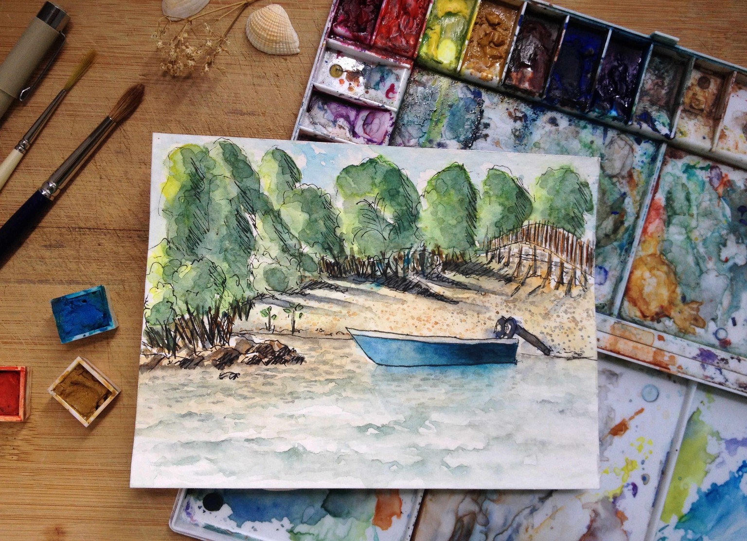
Image 2
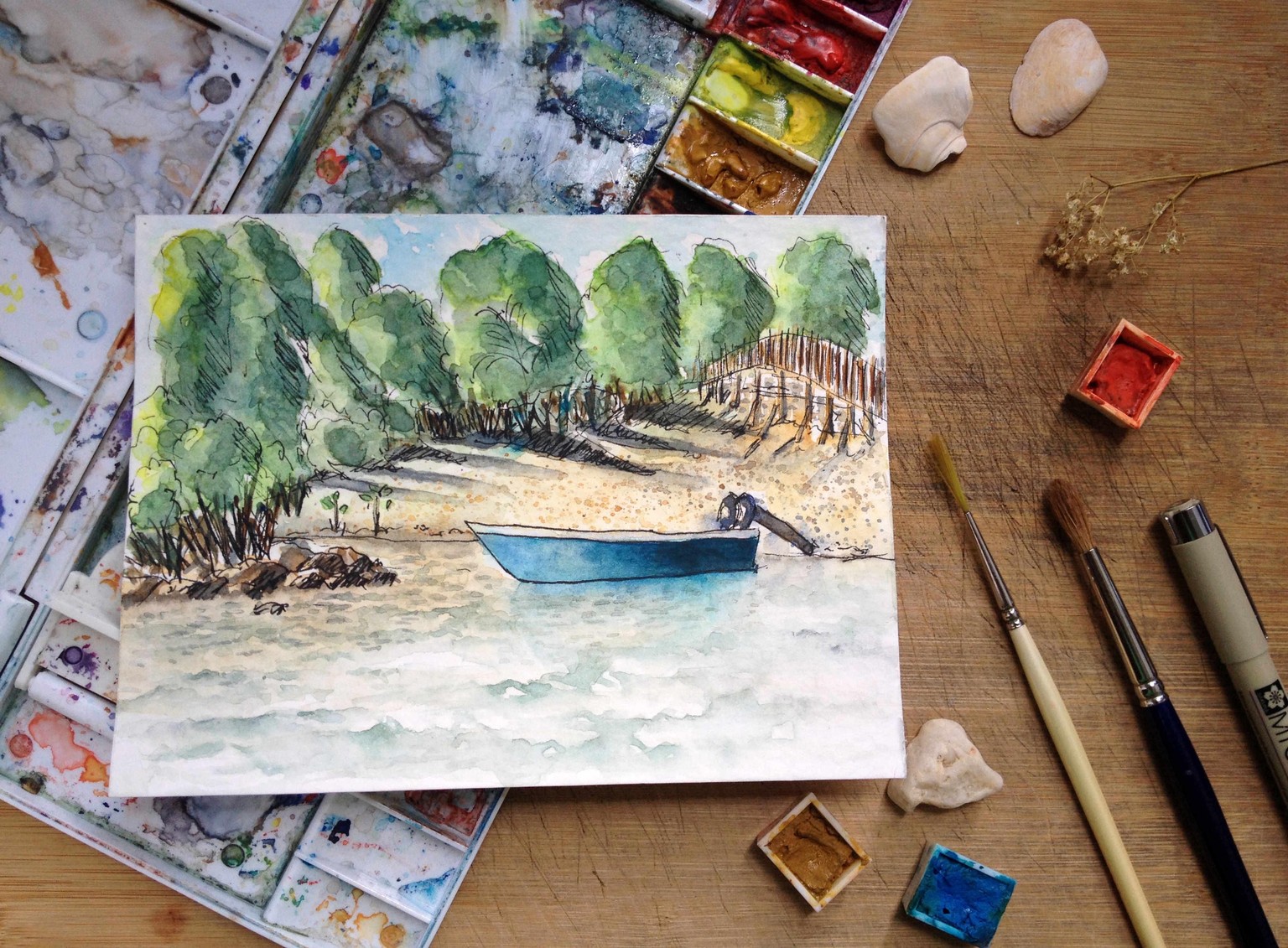
Image 3
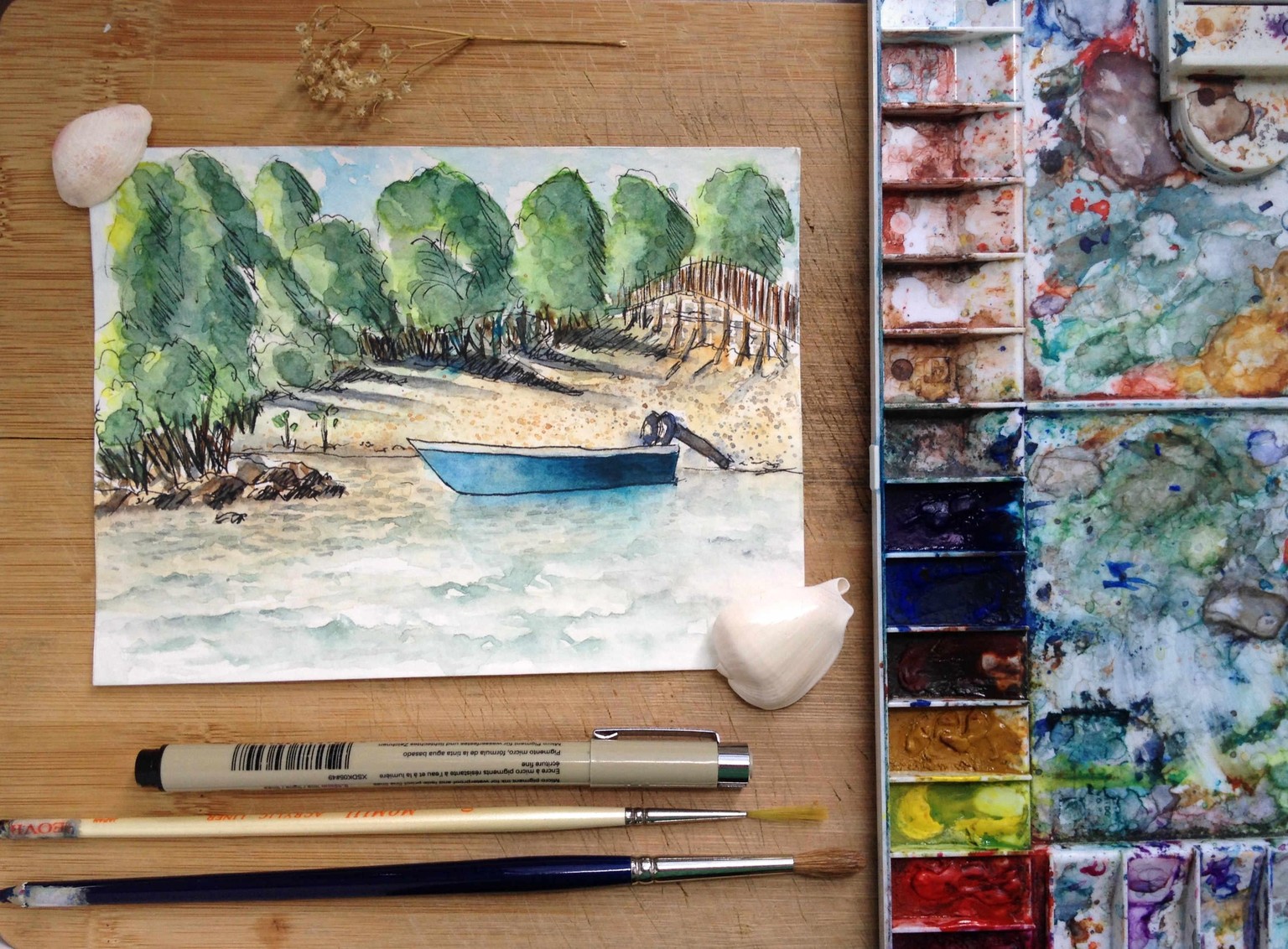
Image 4
**
Phase 4: Thank you Anna for being so relevant and so helpful in your feedback. Because of that I have learned to see my photos with fresh eyes and realized that yes, it was a bit cluttered. The painting might be in the center but it was surrounded with a lot of props that made it look so busy..too much. I agree that Image 3 and 4 are the less busy ones... and in the end I edited the Image 4. I crop the unwanted areas, edit the levels, curves and white balance.
Below is the final Image 4:
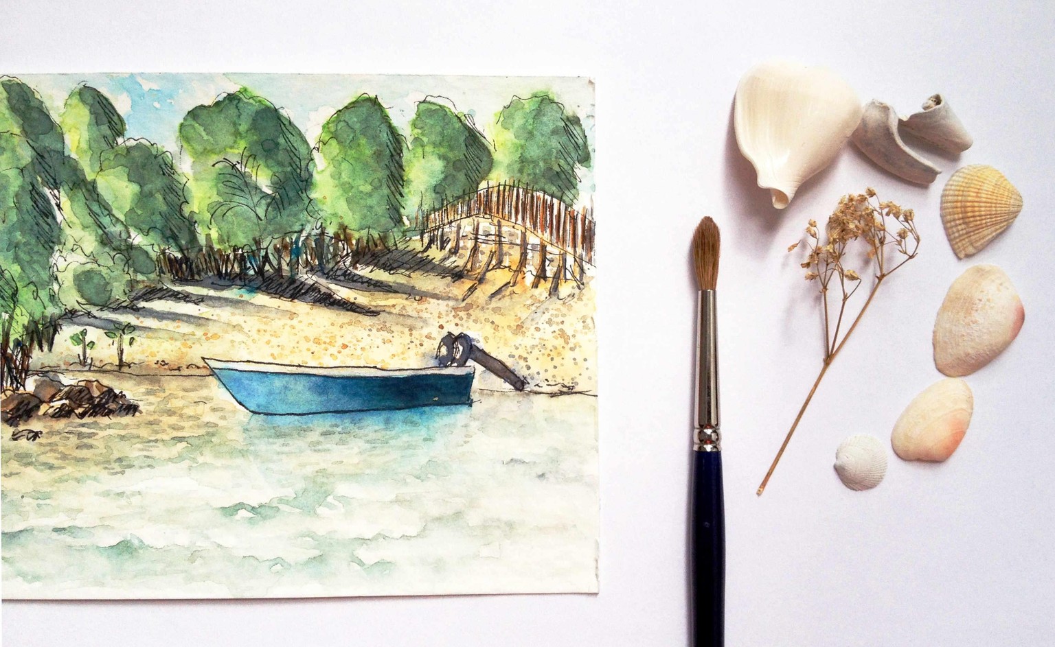
I also tried placing the painting on white background (white sketchbook paper) and use simple props as suggested by Anna. I added shells and a dried flower and edited the image as well.
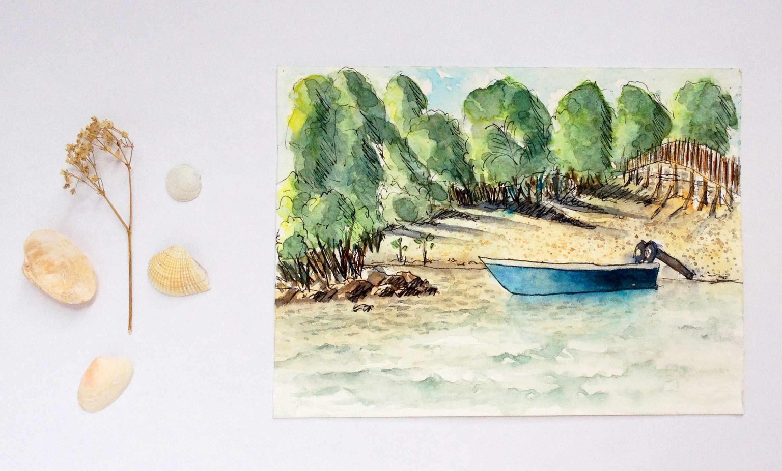
I also tried cropping the image by using just two thirds of it and allowing the last third to focus on the props. I am not used to doing this though I have tried before. I tried different angles like slanted but it doesn't look so well. In the end I decided for just straight.. I'm not sure if I did right...
I have learned so much during this workshop..and have enjoyed the process too! I look forward for your inputs, Anna and from my classmates as well. Take care!
PS* Thank you Anna for the explanation about the focus. I tried your suggestion which is to take the photo away to get more focus. The result was the photo became crisper. I want the whole painting to be the focus therefore tapping to focus isn't applicable to me as of the moment. Thanks for all the help!!!