Andreina
Hello there! This is my second course with Martina and my first time attempting a hand lettering style :)
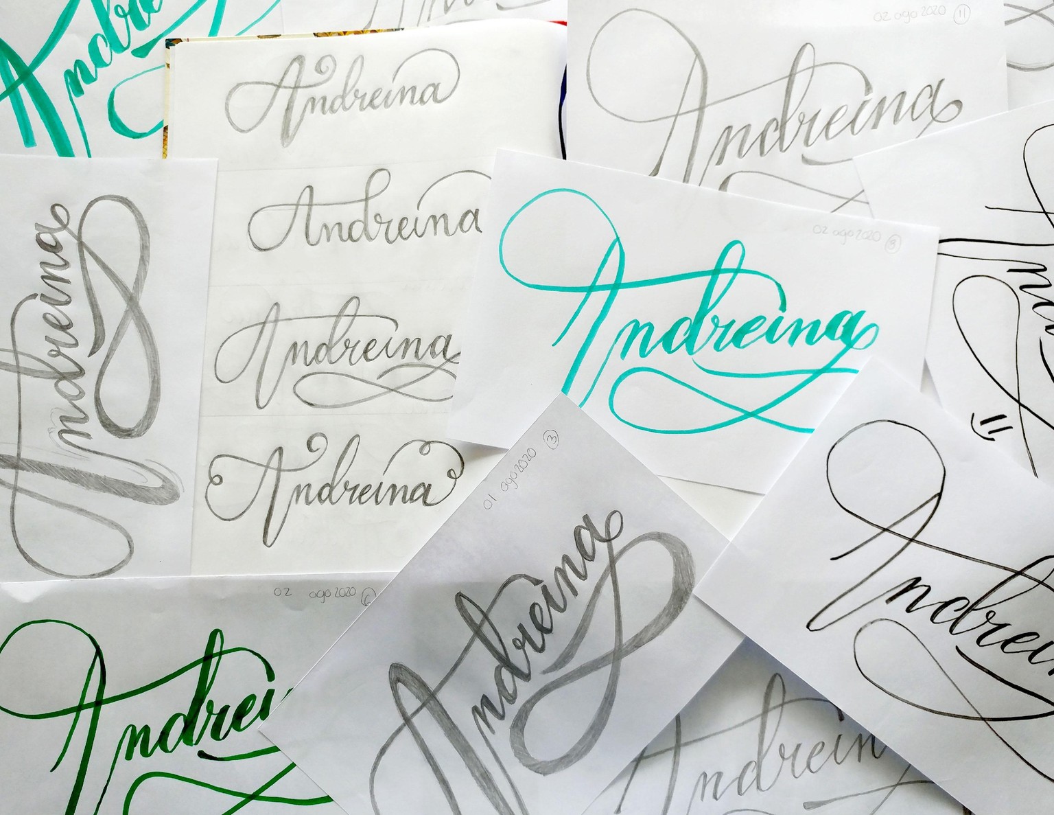
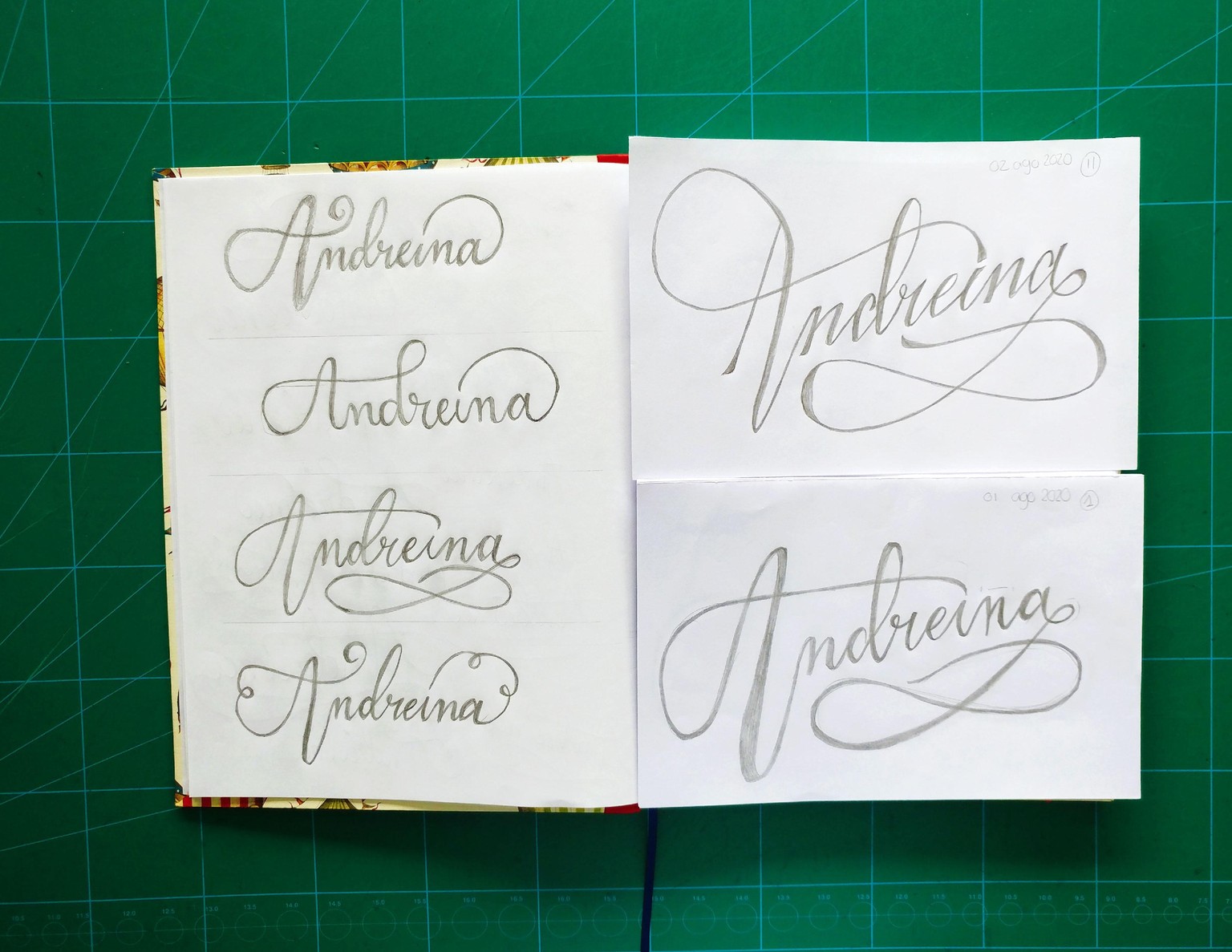
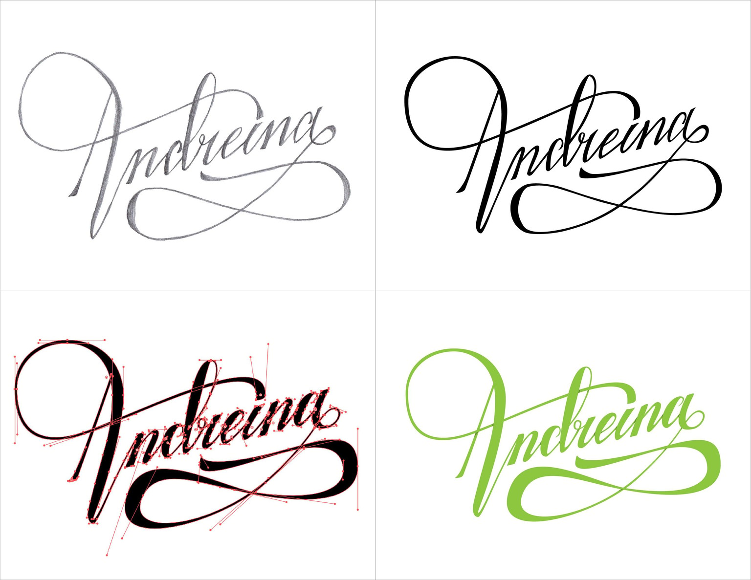
Sketches: I did a lot of sketches with different tools, but mostly just pencil. Started with variations to see what I liked most and chose one to keep on refining until I was content enough to scan. On the bottom right is the first sketch and on the top right is the final refinement before digital.
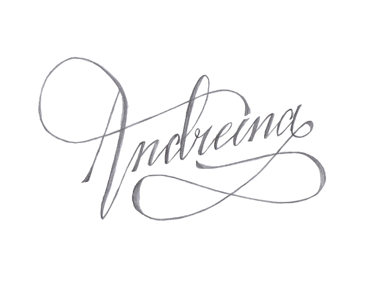
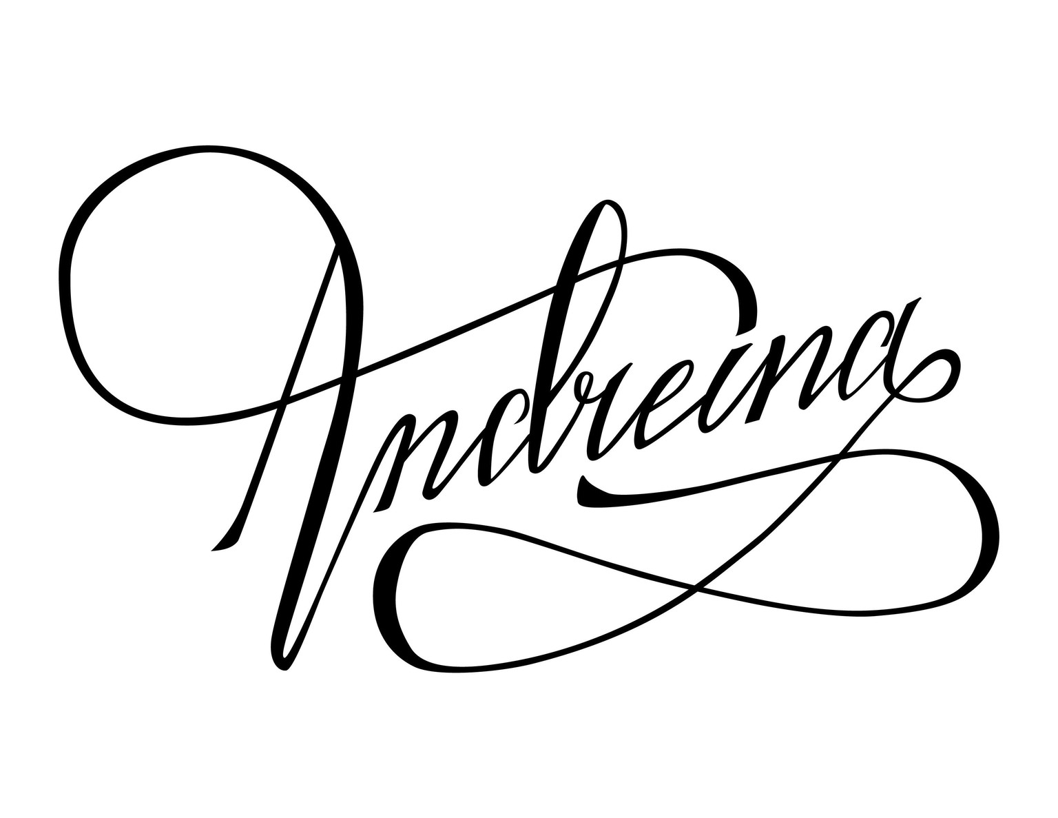
The final sketch
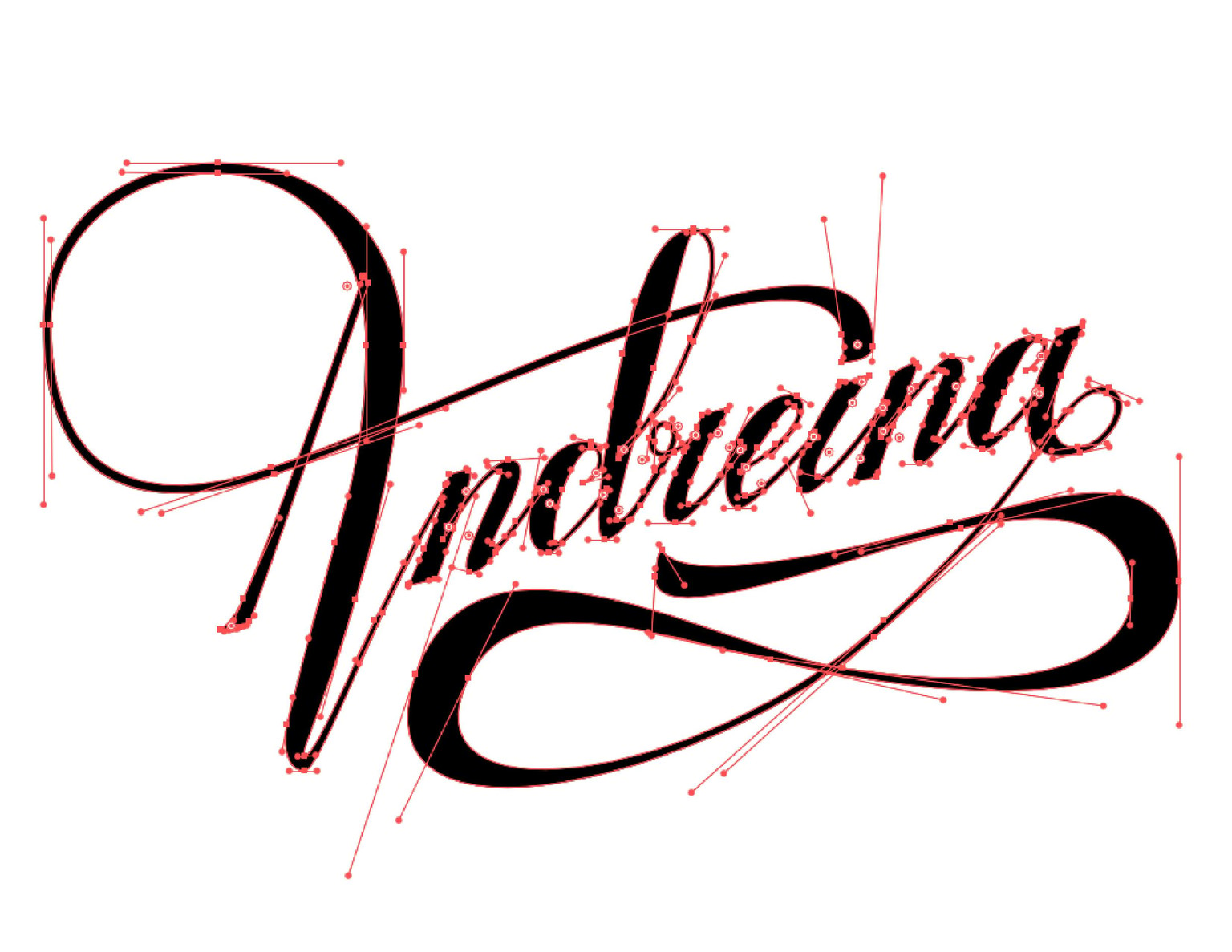
Vectorization: I honestly have a hard time with bezier curves and anchor points but I think I'm sloooowly getting better. Anyway, this was the first digital sketch.
I printed it after some corrections (sorry for the strips, my printer did something weird) and tried to find as many details to improve as I could. Obviously my "n"s weren't very similar, so that was something important to work on.
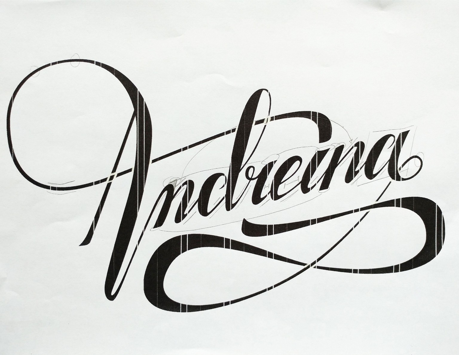
After that I refined it as much as possible with attention to those details.
I decided to stop eventually because I was gonna keep going on forever... and started to play with some shadows to see if it looked good.
Here's a comparison of the stages:
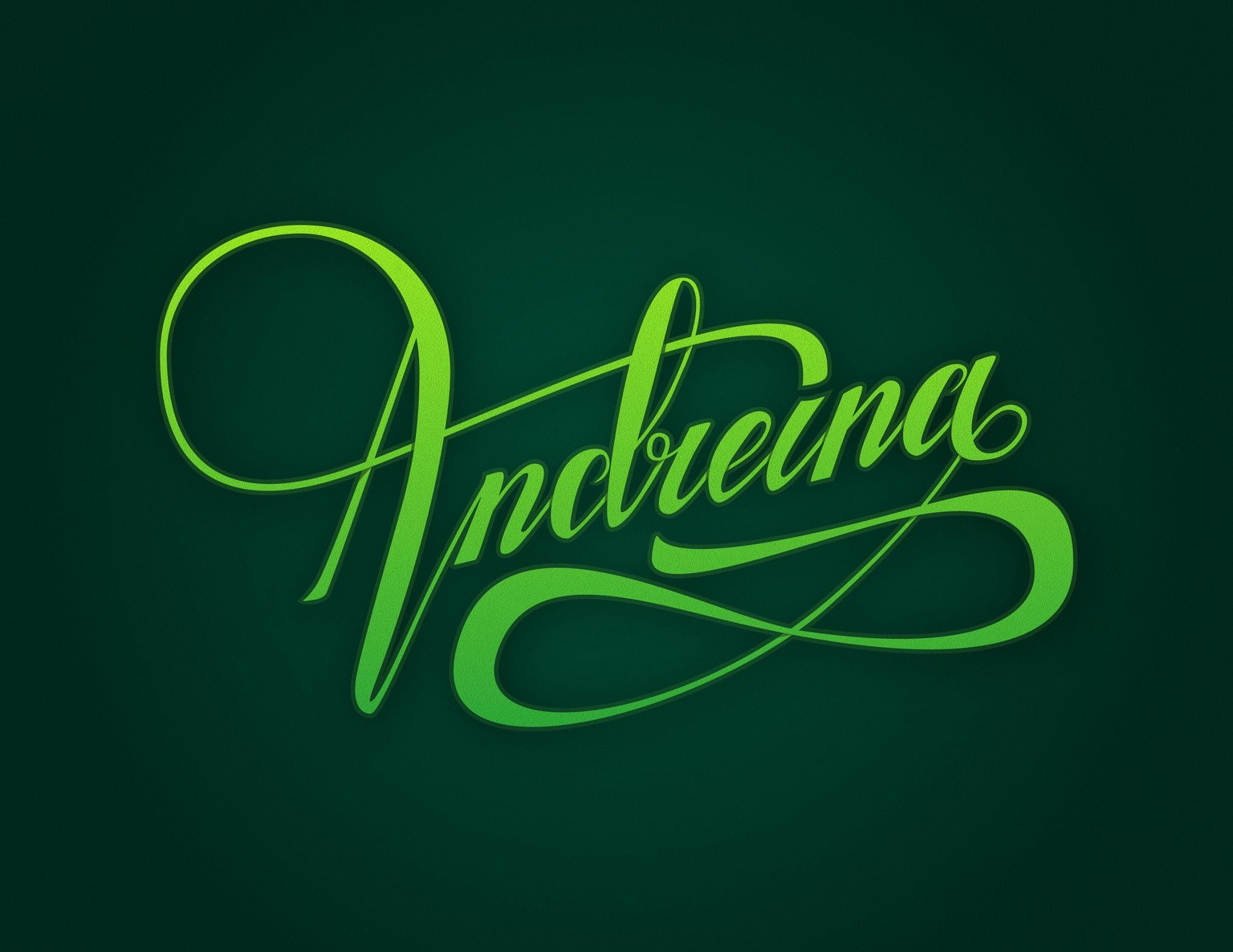
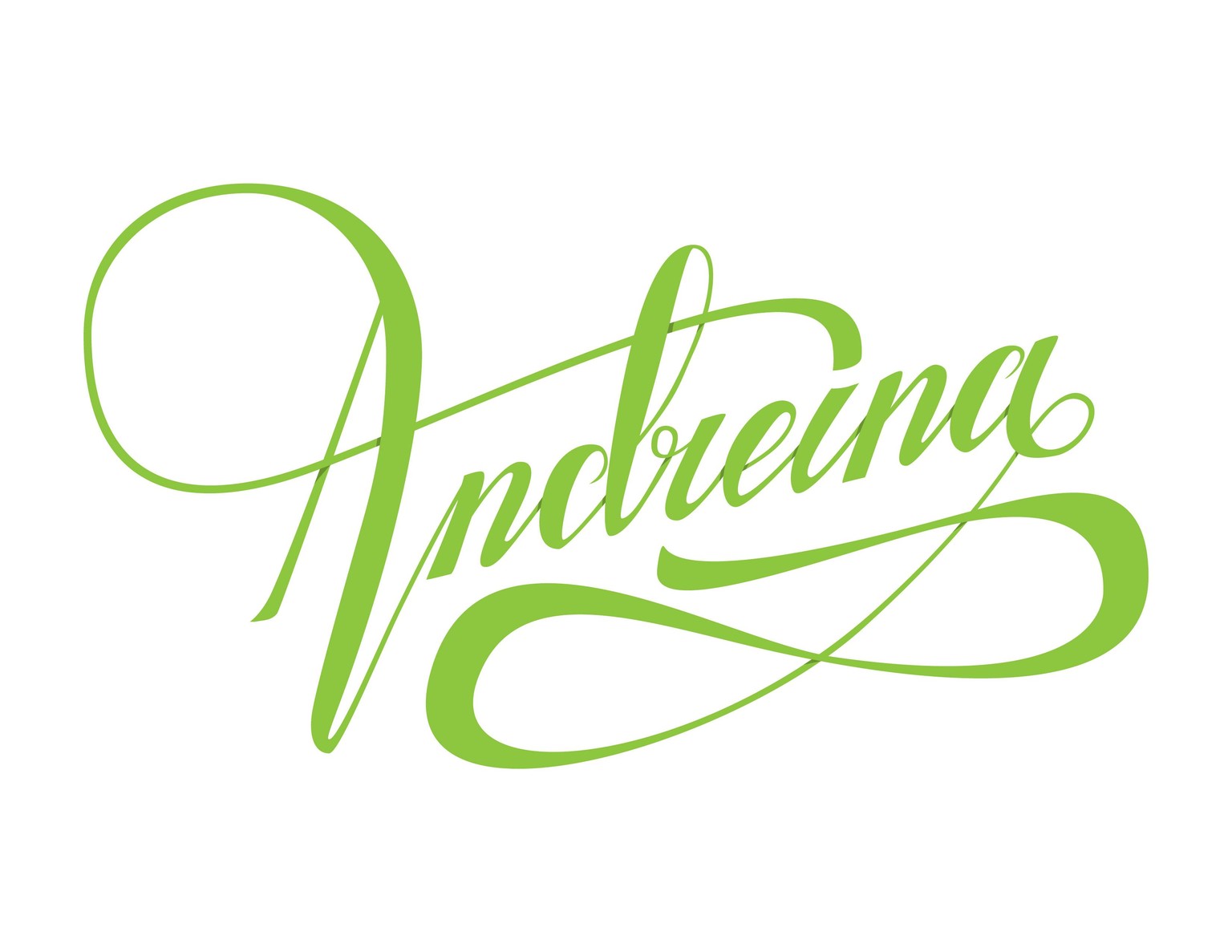
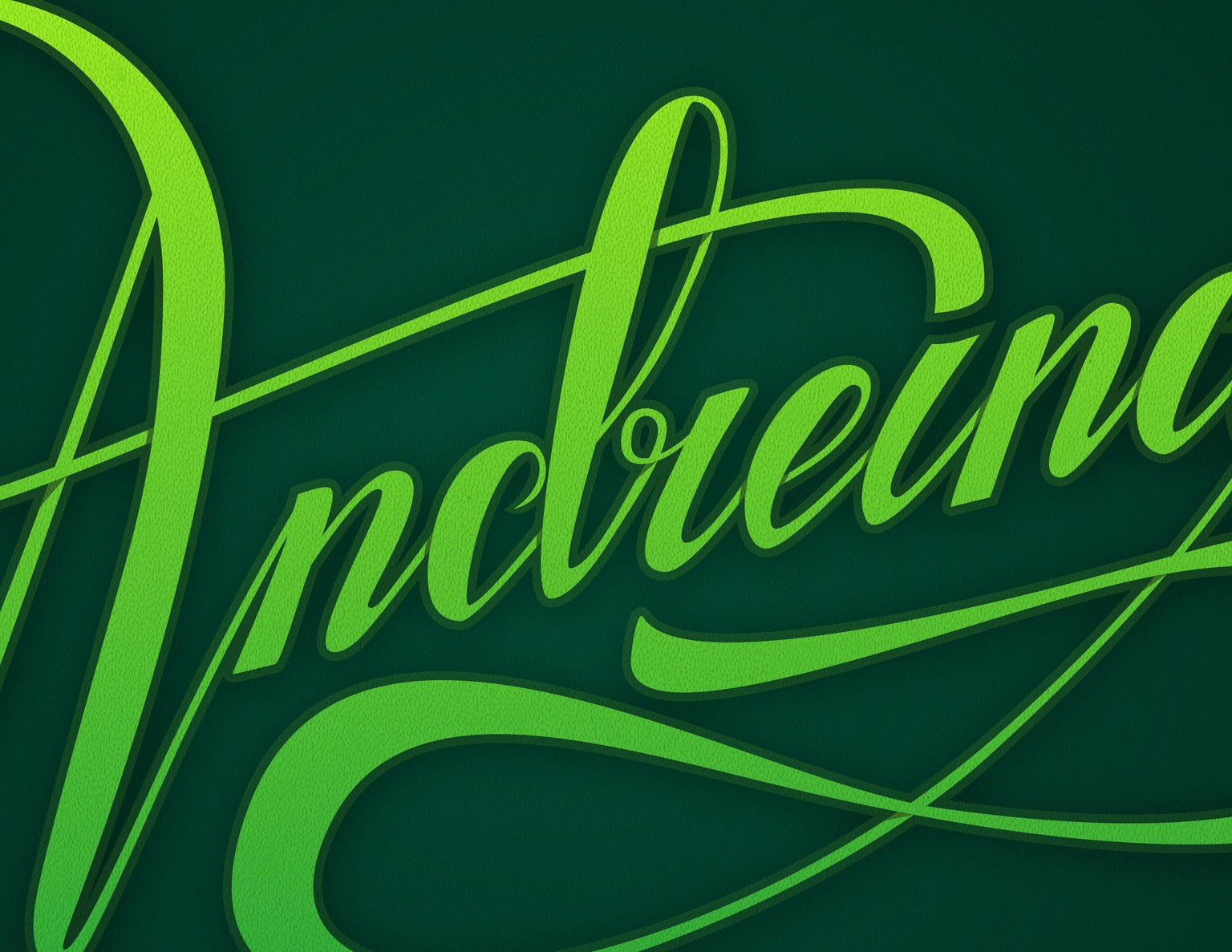
Final details: I wanted it to have a lemony look so I used green shades, gradients and added a little bit of texture. Here's a more detailed look:
And the final piece :) Still a lot of room for improvement but hey, better done than perfect, right?