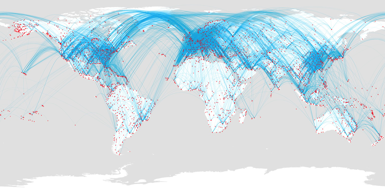
Airport routes
Hello everyone!
I want to thank Nicholas for this introduction to Processing. I've always wanted to learn some programming basics, but, as a designer with a visual mind, I've always found it a frustrating and tedious activity... until now. This tutorial sparked a lot of interest in me about programming, and ended up with me studying a great book by Daniel Shiffman, "Learnin Processing".
The surprising part is that I found it really fun to do, almost addictive. I found myself waiting to go home just to study some programming, and I started enjoying the process of solving problems incrementally as much as the outcome.
So, I started following the tutoral and I came up with this poster.
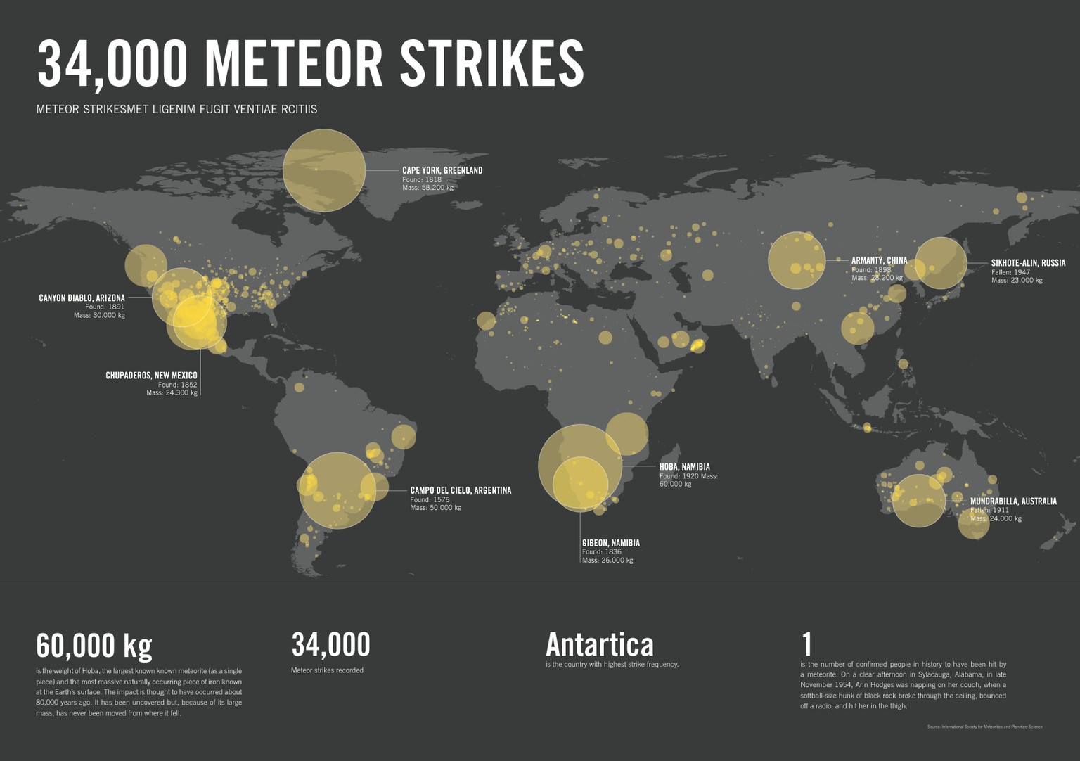
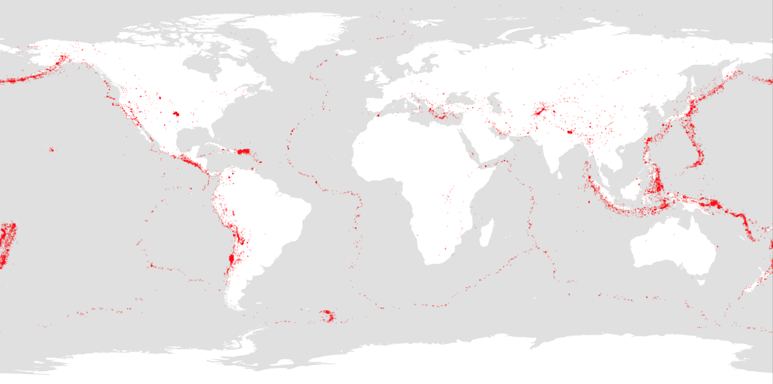
After that I worked with other data sets found in the references. In this poster I visualized the earthquake data set.
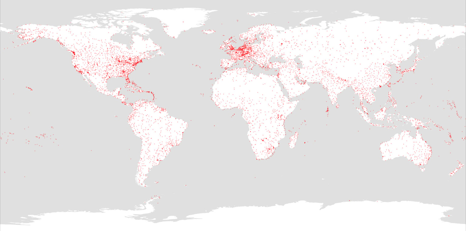
In this one I visualized the airports in the world.
This little successes gave me a lot of confidence about how easy it is to visualize data... until I tried to stand on my feet and do something different.
In openflights.org, apart from a data set with the coordinates of the airports, there is one other data set about the routes from airport to airport. I decided to visualize those routes, and I soon realized that I lacked the bases.
So I bought the book "Learning Processign", by Daniel Shiffman, and I started studying the basics of programming. After days of work I finally managed to create the visualization that I wanted. The excitment I felt after seeing the first drafts is hard to describe!
This is the first result, that look like a nuclear apocalypse.
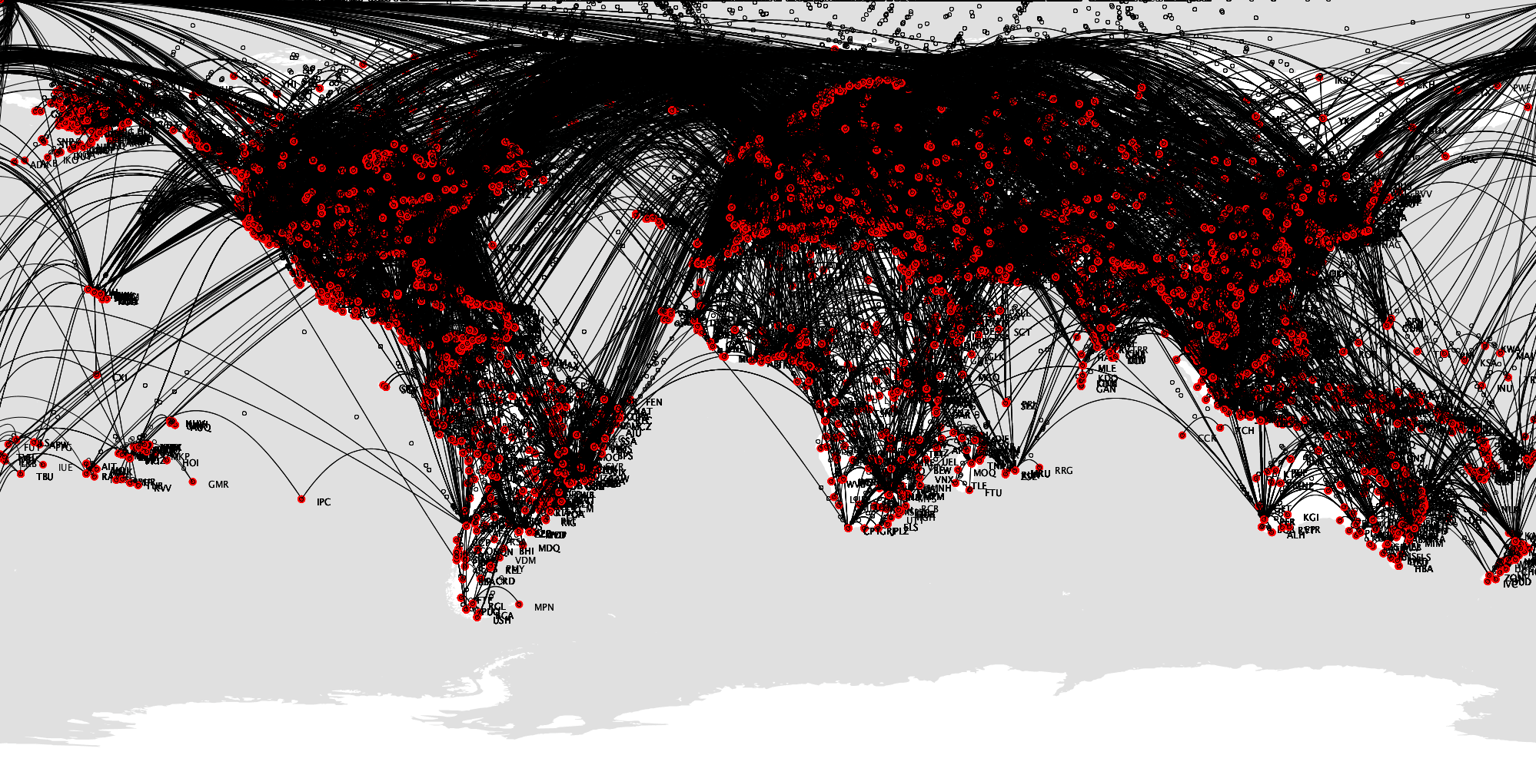
The code compares the "airports" and "routes" data sets in a series of nested loops. In some cases I had to cheat a little bit.
It took me quite some time to write the code that describes the routes. The flights from the Americas to Asia are usually towards west, so I wrote some lines of code that direct those flights towards the left border of the map and make them appear on the right side, just like Pacman does when he reaches a border. Also, I wrote some lines that prevent the lines from going off the top part of the canvas.
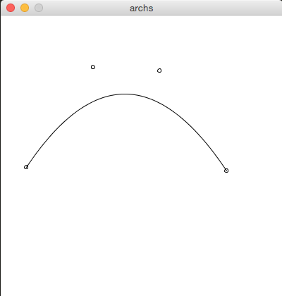
Here an example of the interactive mini program. the sad face is nothing but a bezier curve with the control point visualized.
Unfortunately the PDF file is too heavy (20MB) to work with it in Illustrator, so unfortunately I couldn't work on any post production. I think It still looks kind of rad.
Thanks for reading!