Adobe Illustrator Essential Training
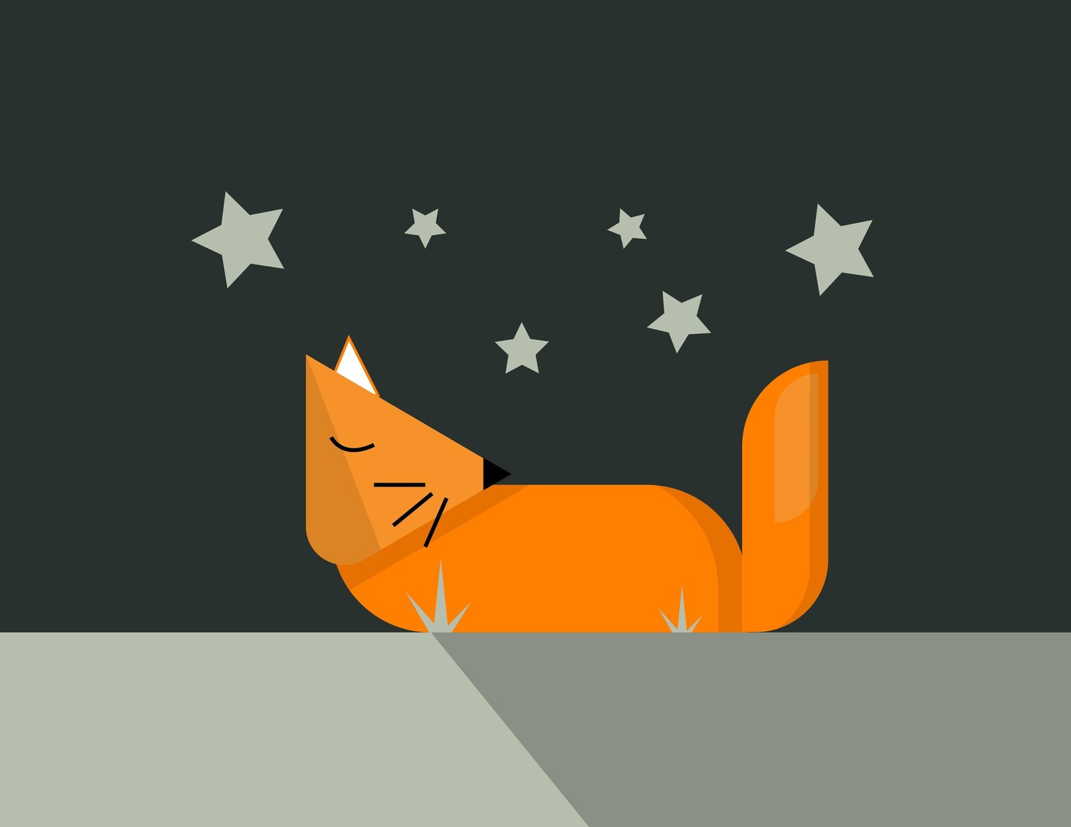
This fox was made up of shapes which were then carved out with the shape builder tool. A shadow was casted to refine the drawing, using the same shape builder tool.
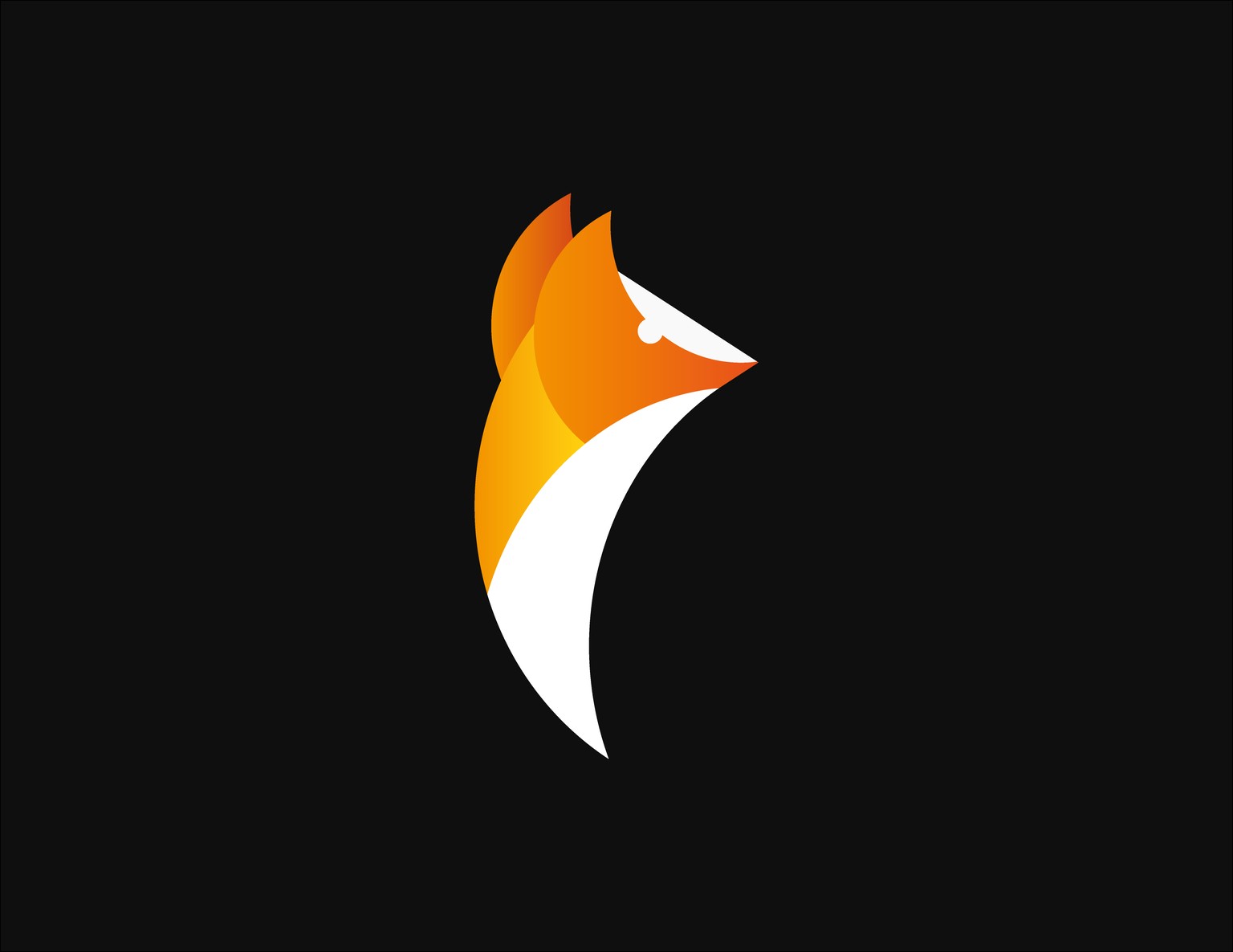
Project 2: Shape Blender Fox
Following from the previous project this was another version of a fox using the shape blender tool but made from more simple shapes. There are triangles, circles and squares, no custom shapes were made here. To complete this simplistic logo vibe I applied a gradient to give a more professional colouring.

Project 2B: Shape Blender Swan
I was asked to create a vectorised swan from a sketch provided by Dan using the shape blender tool. This time there was nothing to follow along to, I made the decisions of what shapes to place and which to remove.
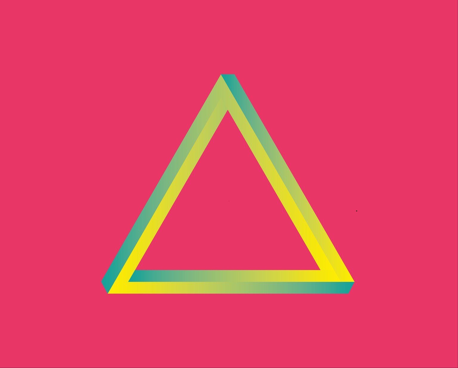
I was asked to follow along the tutorial to create a custom logo shape and then apply my own choice of colours. I decided to apply a gradient fill to create a 3D shadowy feel, I learnt this approach following a YouTube video.
Project 4: Using the pen and curvature tool
I always struggled with the pen and curvature tool but this tutorial enabled me to turn sketches into finalised vector shapes. I transitioned from pen to curvature tool when appropriate as sometimes I found another tool easier to control.
I struggled with this task as I didn't want to over do it with too many quirky brushes and lines. Usually when I apply these doodle effects onto an image I illustrate using a Wacom tablet and my digital brushes, however maybe this is a technique I can use in the future.
Project 6: Drawing lines with the width tool
I haven't quite perfected lettering with the width tool yet. I struggled to get sections exactly as wide as I wanted. I think I'll need to practice some more until I'm confidently able to use this tool.
Project 7: Curve type around a path
Although I didn't apply the flip curve tip here I am still happy with this design. The shape of the dog fits well with the circular type, maybe it's hard to read when it curves upwards and downwards. All in all this is a helpful technique which I can imagine working well with logos.
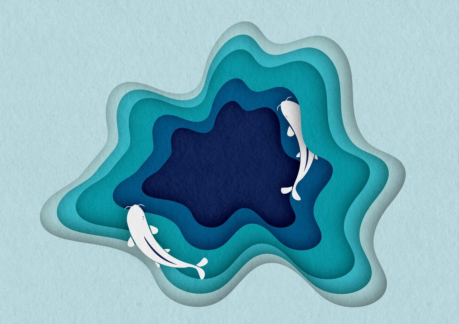
Project 8: Cut holes in shapes
This project was made using the compound path tool as followed from the tutorial. I went a step further and put the design into context, not just a random pile of shapes layered onto each other but two fishing swimming in the depth of the sea. To give this a further cut out artwork effect I applied a paper card texture to make it look more hand crafted and delicate.
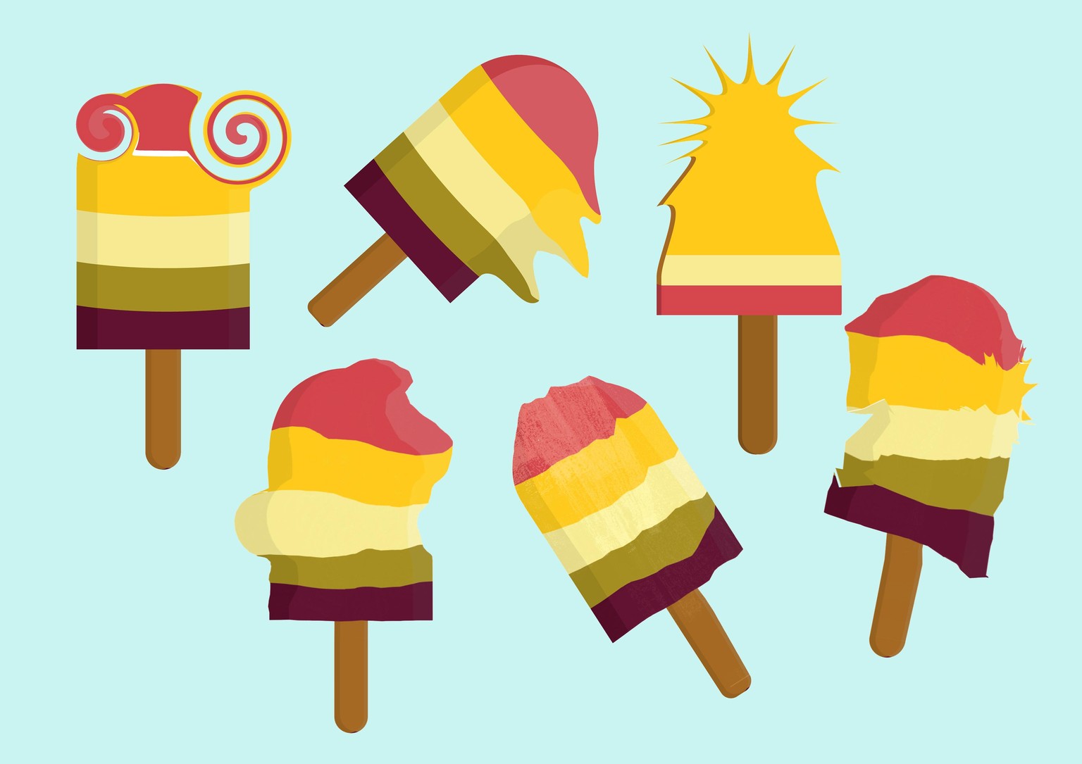
Project 9:Making things liquid and distorted
I'm not too sure where I would apply these effects but I think they could be useful in the future. Maybe the twirl tool could create a decorative border for an invitation, the warp tool can create a dripping visual. It would be interesting to see if people have used these techniques professionally before, how are they subtly used without looking too crazy and funky. I think its best to have as little layers as possible when using these warp tools, otherwise the colours go all over the place and get mismatched.
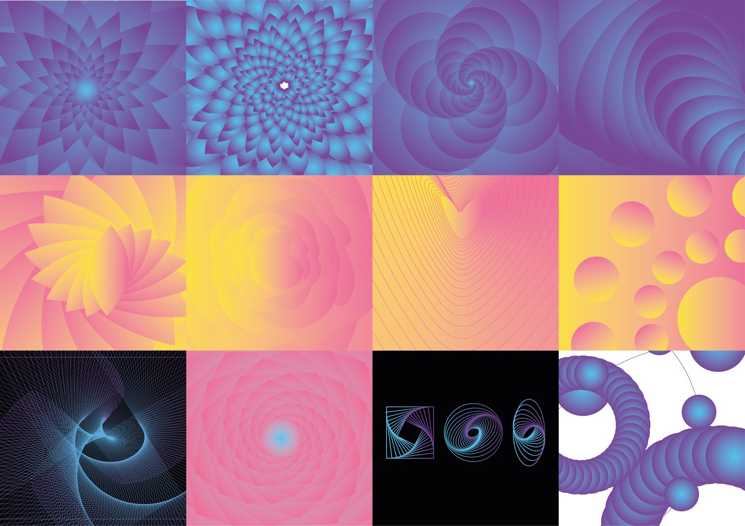
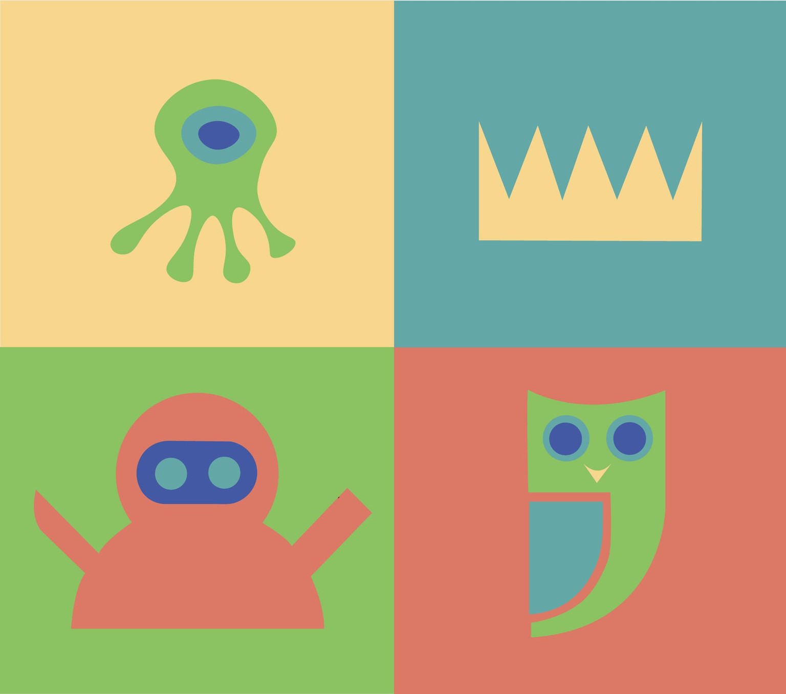
Project 10: Amazing repeating shapes
For this project I kept on duplicating shapes, changing their angle, size, position each time to create funky patterns. Additionally to Dans course I watched a few youtube videos to pick up some more complicated designs (middle right, bottom left and the two bottom rights). It's a very useful tool, in the past I would have manually copied and changed the sizing ect.
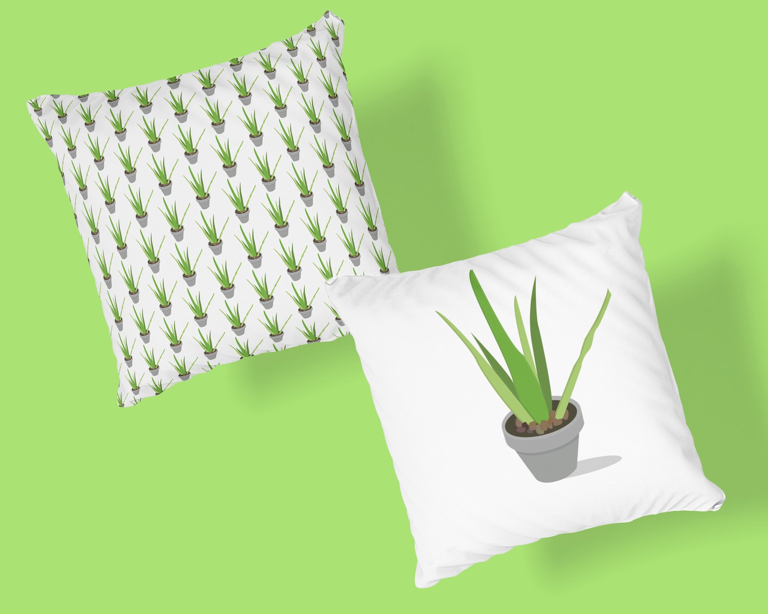
Project 11: Repeating Pattern
I've made patterns in the past but I didn't know there were so many pattern options, I wouldn't mind making my own patterns for prints or cushions. I turned an illustration I made into a pattern, it doesn't work so well with all the long leaves but I thought I'd show it anyway.
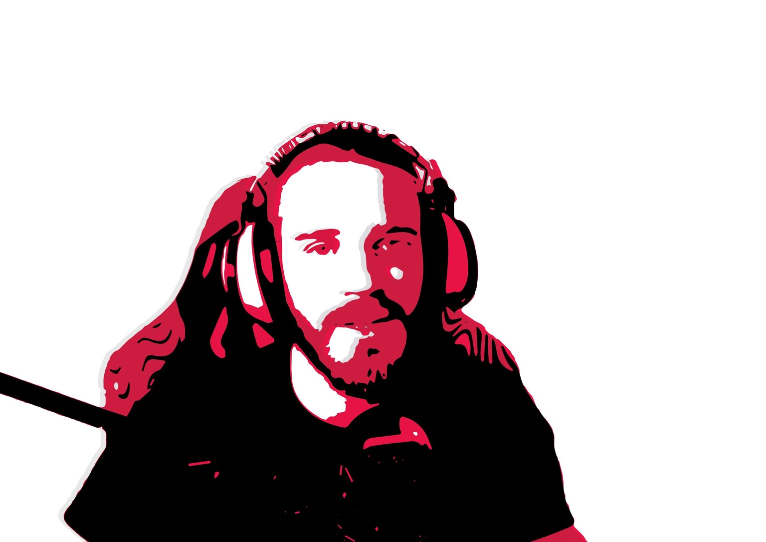
Project 12: Vectorizing an image
Naturally I just had to use an image of Pewdiepie for this project, to celebrate that he's back? Anyway I started in Photoshop and removed the background and then turned the image into a black and white logo image trace. The threshold balance was the hardest part because if it was too high all you would see is black but if it was too low it just looked like an egg on a page. I used the famous Pewdiepie colours to incorporate his theme. That's all there is to it