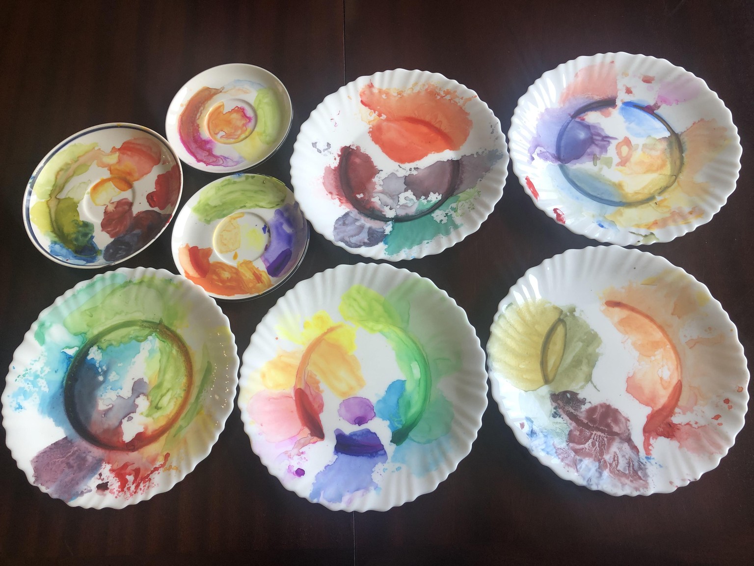
7 Mandalas, 11 Primary Colors to make almost 100 Colors!
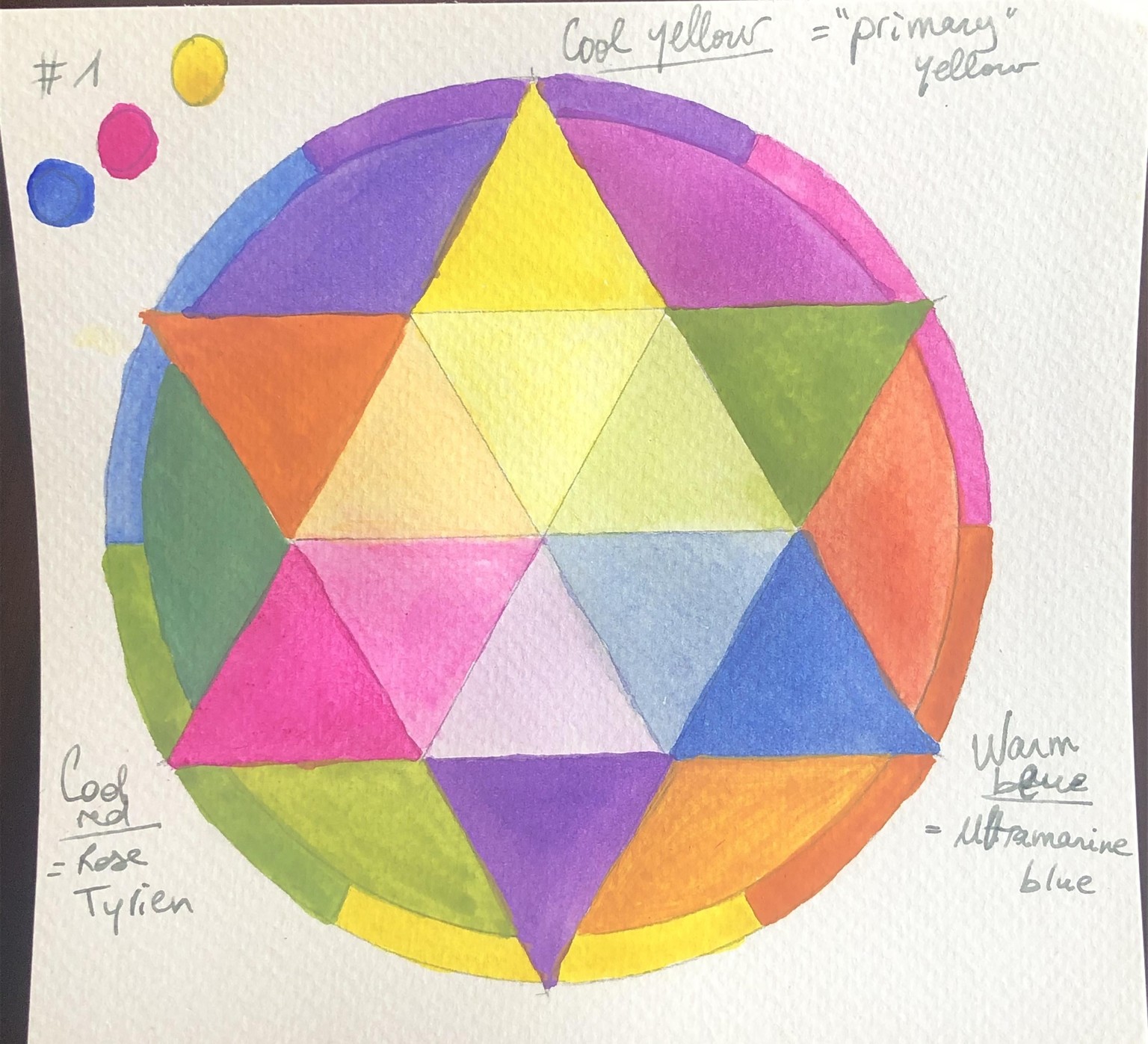
Thank you for this class, Chris! You were right, I was going to love this one. I first made your Color Wheel Mandalas #1, 2 and 3.
#1: Cool yellow is my 'primary' yellow (close to Naples yellow, it actually looks colder in the picture), cool red is Rose Tyrien and warm blue is Ultramarine Blue.
#2: Warm yellow is cadmium yellow, warm red is vermilion and cool blue is phthalo blue.

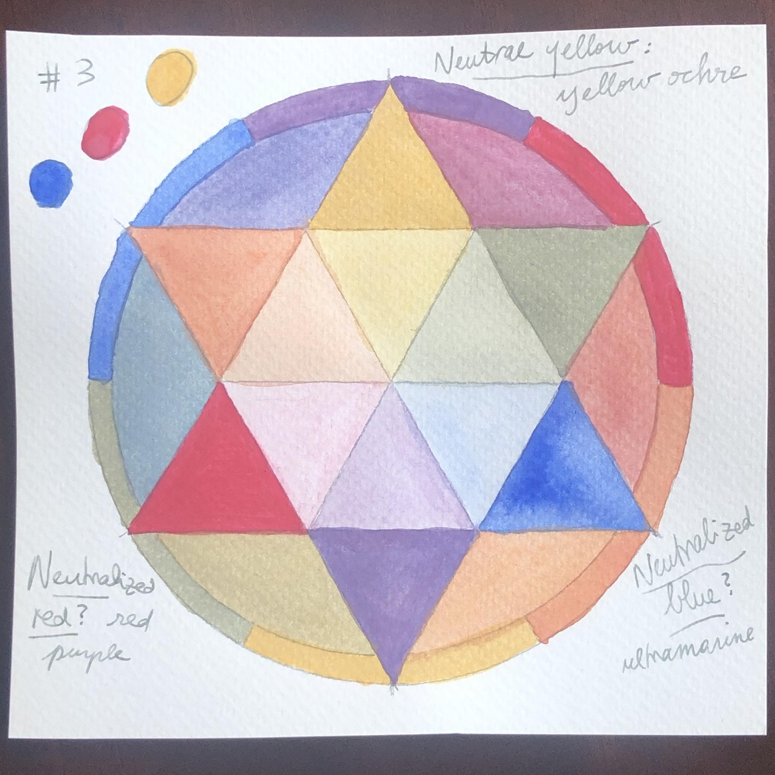
#3: Neutrals: yellow is yellow ochre, red is 'red purple' and I had no clue what to use for neutralized blue, so I used ultramarine again. It did work, in the sense that the whole mandala looks 'neutralized' to me with these colors. Wondering though what other blue would have been 'more neutralized'.
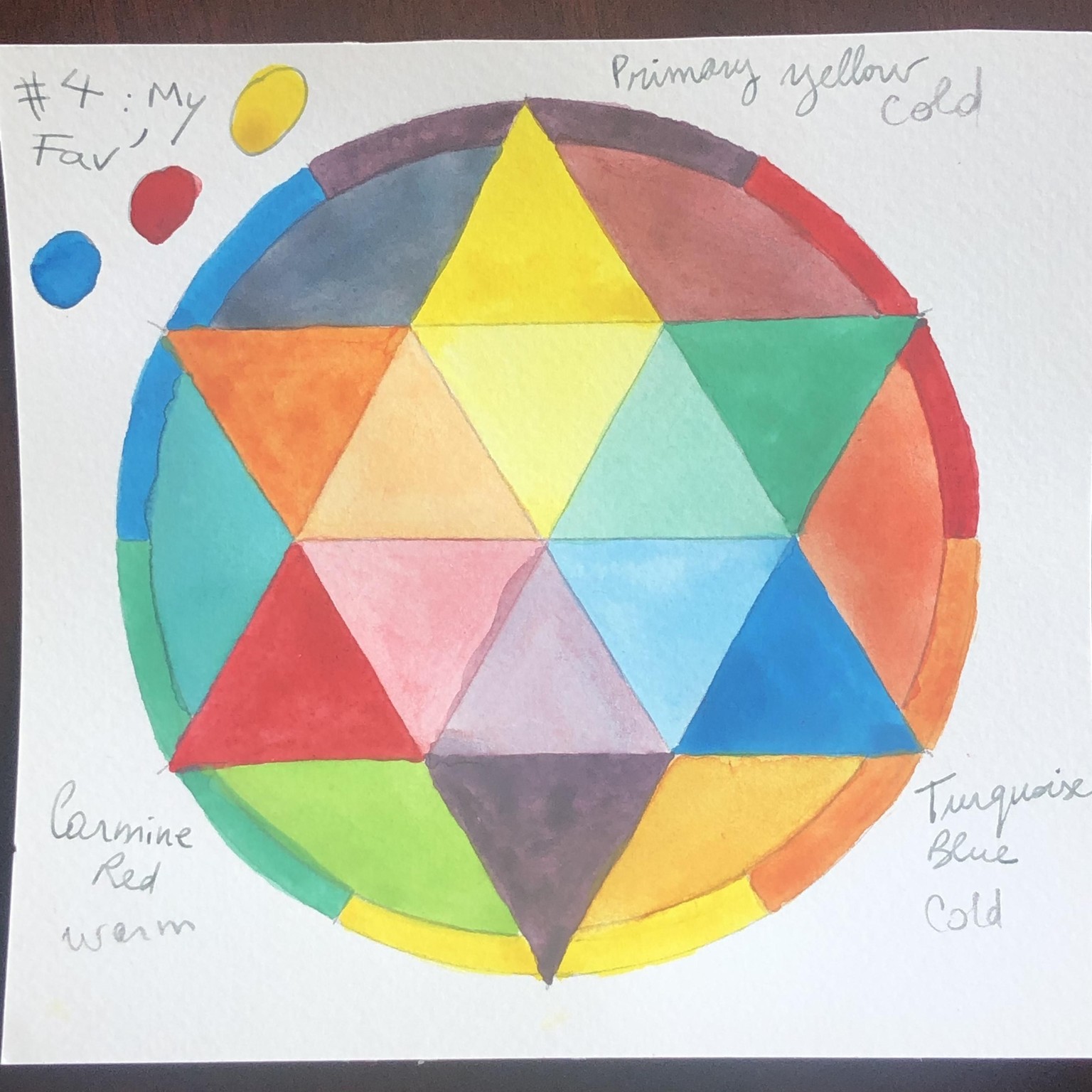
#4: Then just decided to make my own 'favorite'. I find it very vibrant, which is what I really like. My yellow is cold (Primary yellow), red is warm (Carmine) and blue is cold (Turquoise). All secondary and tertiary colors speak to me!
Then I got super curious about how it would look like with only cold primary colors, then only warm primary colors.
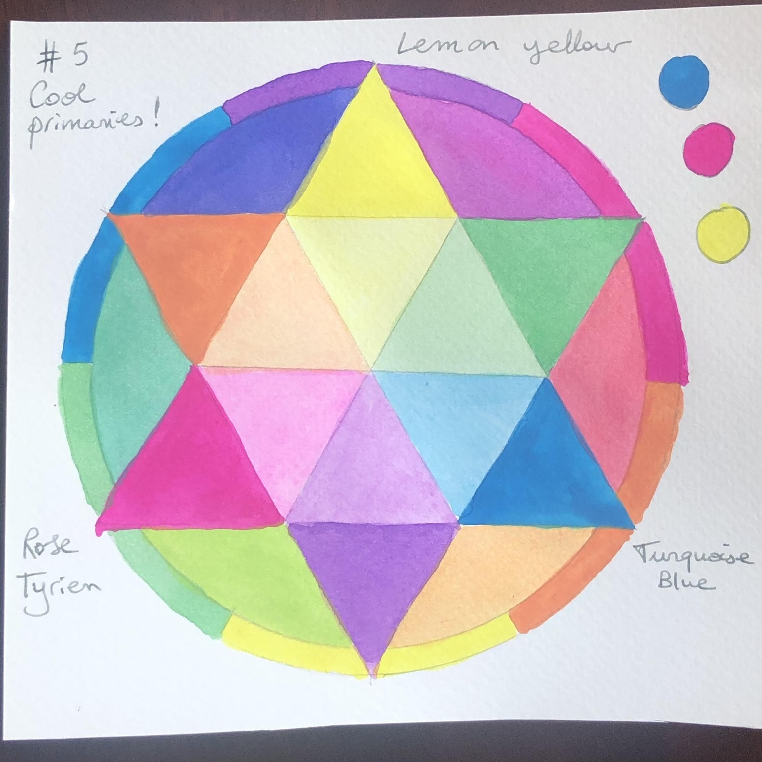
# 5: all cold colors. Pretty easy: lemon yellow, rose tyrian and turquoise blue. All in all, this looks almost fluorescent to my eye!
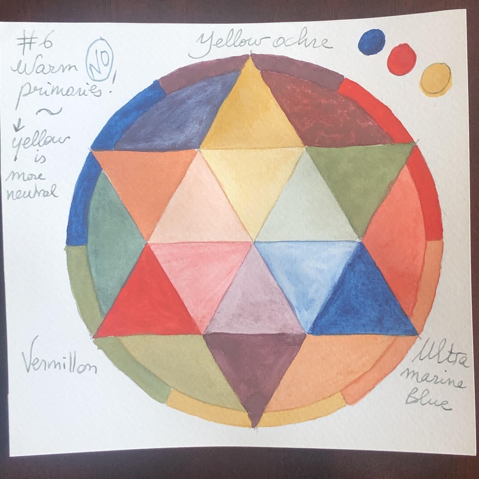
#6: I thought I was getting all warm primary colors: yellow ochre, vermilion red and ultramarine blue. But: after making the whole wheel, I found it quite neutralized. Then I realized the yellow ochre was the yellow we used in wheel #3.
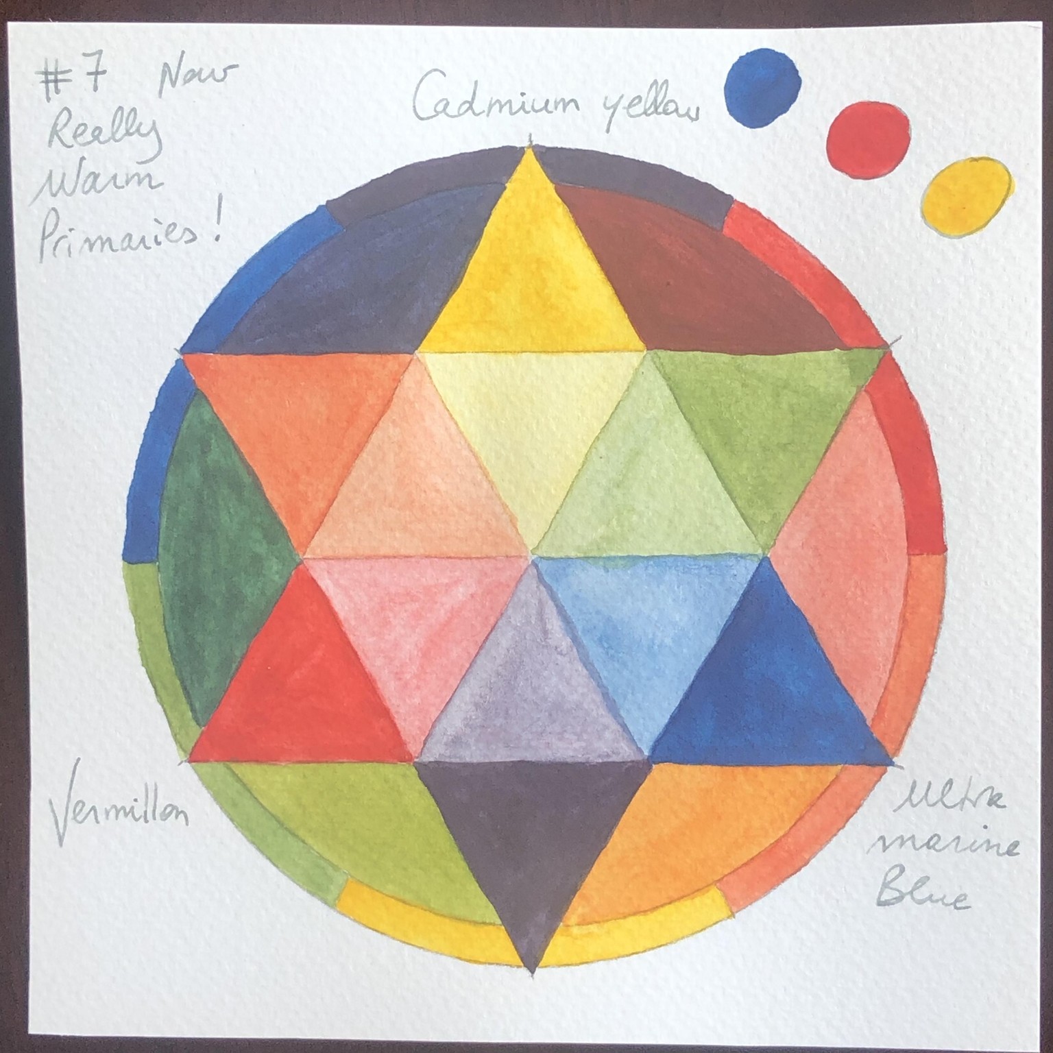
#7: So I decided to make one more wheel, this time really with only warm colors: cadmium yellow, vermilion red and ultramarine blue. What a difference! I find it almost as vibrant as my favorite #4.
I really learned a lot with these mandalas and had so much fun! Also, would you look at all the palettes I used, all that color!