Transcripts
1. Youtube Thumbnail Creation Course Preview: Hi, and welcome to this marketing masterclass
where it's all about the perfect
due to sampling. My name is Peter. I've been working
in the field of video editing and design
for more than 15 years. And I'm really
looking forward to sharing my experience with you. More than 1 billion h of video content are consumed
on YouTube every single day. And believe it or not, the number one most
important aspect for a successful video
is the thumping. Whether you want to jump on
the most promising train of the 21st century and
start profiting from YouTube's enormous one
potential or jewelry or established content
creator looking to boost your click-through
rate to higher dimensions. With this course,
I've come to comment. First of all, we'll
take a look at some astonishing and even
quite surprising statistics about YouTube in general. Then we'll dive
into the theory of thumbnails and consider
every individual element, fonts, images, colors, and they are
proven best practices. With this in mind, we will analyze and distinguish between different niches and start to create thumbnails
that will extend out. And we will do so not only for several very unequal topics, but also by using two completely different methods of which one is absolutely free. Also, I will discuss equipment and tools that
were simply tasks. And the course even
comes with a handout as well as downloadable design
elements for your day. Now, it's up to you. Take joy YouTube thumbnails
to the next level, and I'll see you in the course.
2. The World of Youtube: Statistics, Development and Outlook: So let's start this course with some incredible statistics
and numbers about the size, as well as the
ever-growing potential of YouTube as a
platform in general. Now, first of all, to
give you the overview, YouTube is the second
most trafficked website worldwide, just after Google. And YouTube even also is the second largest search engine worldwide, Also after Google. Now, there's different ways of dealing with your competitors. And in this case, what happened is that Google simply bought YouTube in 2006
for $1.65 billion. And to finish off
this very first chart with the little overview, YouTube also is the second most popular social
media platform out there, in this case, just
after Facebook. Now, let's continue and speak
about users statistics. First of all, currently
there are over 2.6 billion people worldwide
visiting the platform on a monthly basis. Meaning they are
bringing up YouTube at least once per month. And this makes up for 122
million daily active users. And this number has a
very high probability of still continue to grow, as I will show you in
just a matter of seconds, when we want to consider the general user development
over the last year or so. But before doing so, let's bring up
some more effects. First of all, over, 81% of the global internet
population has already visited and use YouTube. And currently there are more than 51 million
active YouTube channels. And here you go. As
already mentioned, this is the monthly user
development statistics over the last couple of years, of course, in billions. And it started with 0.8 billion people visiting
on a monthly basis in 2012 and making its
way all the way up to 2.6 billion people in
2021 is of course, this is our last
point of reference. We are currently in Q4, last quarter of 2022. And I can definitely imagine that a lot of people will visit YouTube in the upcoming days
and weeks of this year. Now what can we take away as an owner of our
YouTube channel? Creating our own YouTube videos, and finally creating thumbnails
from this statistics. First of all, it is very, very clear that
the arena is full, so there are millions
of people out there on the platform
potentially viewing our videos. So all we gotta do is making
our way to the catwalk, the pitch, and showing our
video to the visitors. Basically, it's all the same on Amazon where you
have millions of people daily who are willing to throw away their money
or buy some products. And all you got to make
sure is that your rank high and get placed
on the shop window. And the shop window. This is basically what our
thumbnail does for us. And we've got to make sure that inside the shop window we want to arrange elements
in a nice way. We want to show up
or elements that will really stand out from all the other shop
windows and make sure that our users
enter the shop, in this case, to
view our videos. So that's what we're going
to cover in this course. And now let's continue
with some more statistics and speak about the video
content on YouTube. So first of all, we've got 500 h of videos
uploaded per minute, so definitely unable
to watch them all. Then secondly, there's
approximately 1 billion h of video content
consumed per day. And also there are 5 billion
videos watched per day. So now it's your task to
quickly tell me what then is the average video
length of a video uploaded to YouTube if we've got 1 billion h watched and 5
billion of videos watched. So I'll give you 5
s for that 1321. And of course, the
average video length will then be 12 min. But don't worry, this won't escalate to a math course
and therefore it has quickly continue with the
demographics statistics. At, in general, we've
got 54% of users mail, while 46% of YouTube users
of visitors are female. And most users will fall
into the age group 25 to 34, which is also the age
group that I will rank in. If we want to see it
in some more details. Here we go for some
more statistics. In green, you can
see the male users. In red, you can see
the female users. Of course, those bars 25 to
34 are the biggest bars. And also, as we won't have the users below 18
include it in this case, this is where the percentages
won't add up to 100%. But you can see that we've
got growing numbers till the age group 25 to 34
and then falling numbers. With rising age groups. Now this might be
quite interesting for you to see in general, but of course, it's a very, very big task and a
very promising one for you to analyze your very
personal YouTube Statistics, your personal channels
data in terms of, of course, their agenda distribution as well as
their age distribution to see how you can get better with your channel
and how you can create even a better content. But still, I think it's
very interesting to see the general distribution
of active YouTube users. Here we've got the top
ten countries by the way, for YouTube users, with the
biggest one being in the air. In general, of course,
all those countries are countries with
high population. We got USA on second place, and then my country, Germany on position eight, with Vietnam closing
this one with 54 million users per month. So this was about
the demographics. And now let's move
on and consider another very
interesting statistic which deals with the
aspect of money. So in general, YouTube's global advertising revenue
in the last year, 2021 was approximately
$28.8 billion. Now, this not only as a
very, very huge number, but it also meant
a 46.6 per cent year-on-year
increase with regard to the previous Europe 2020. And to bring up even more data, here you can see the
annual development of revenue starting in 2010 with only $0.8 billion. Of course, a number that
I personally wouldn't be more than happy to
take away for myself. But what this one clearly
states and show us is the increase every
single year until then finally arriving at $28.8 billion for the last year, 2021. Now, this definitely
shows that first of all, there's a lot of money in circulation when it comes
to the platform, YouTube. And this also means that
there's a lot of money to be shared with the
creators on YouTube. So you of course, want to make sure that you either
get your foot into this game in the
upcoming month and years. All you want to make
sure that you will really stay in this
game and continue to earn your fair share of the whole money in circulation. So, with those numbers in mind, let's move on and speak about
it some more statistics. And in this case, deals
with different devices. In this moment in
time, first of all, 3.4 adults report that they are watching YouTube on
their mobile devices. And also 70% of global YouTube
watch time already happens on smartphones
and tablets. And if you ask me, I feel
like this number will only continue to grow in
the years to come. As I feel like it
gets more and more optimized for a
smartphone usage. And also you have
the YouTube shorts. So personally, I really think
that this number will only continue to grow in the
months and years to come. Now, what can we take away
from those statistics? When it comes to our
topic of thumbnails, we want to make sure that
we really optimize for small devices such
as smartphones. So thereby we want to
have clear structures, both elements and all
those different things. I don't want to say
too much as we have a whole section Dealing
with every single element. But for now, what we want
to take away and have in mind are those numbers and the high demand and high usage of YouTube when it comes to
smartphones and tablets. Also, mobile users
report that they visit more pages
as desktop users. This is also an
experience that I personally can definitely share. In this case, it's 4.63
pages per YouTube visit on a mobile device versus 2.84 pages per view on
the desktop version. So you really feel like
the whole action is a lot faster on your mobile device. And also at this moment in time, Android users will
spend an average of 23.7 h per month on YouTube, which definitely is a lot. It's 40-50 min every single day. Lastly, we want to speak about
some versions statistics. And the first one is, I feel is a very, very interesting one
because it actually states that more
than 70% of what we watch on YouTube is determined by the YouTube
recommendation algorithm. This first of all,
definitely show us that the algorithm is a
very powerful tool. And secondly, that the algorithm also knows us as a
person quite well, what we need to get
shown and recommended in order to spend some more
time on the platform. Also, there's another
quite interesting effects. And this says that
20% of viewers will actually leave your video if it hasn't hooked them
in the first 10 s. This is definitely
one of the reasons why a lot of
YouTubers, some app, or at least give some hints to the upcoming video content
inside the first 10 s. So of course, you only have one chance to make
your first impression. And before we even can get or give the viewer the chance
to even leave our video. We want to make sure that we get the click two-hour video. And this of course, can be done and achieved with our thumbnail. Now what all those statistics, and especially these conversions statistics and the last one here state is that the first impression is
absolutely essential. And with this in mind, let's now leave the whole
YouTube in general space and continue with a deeper dive towards the whole topic
of YouTube thumbnails. So therefore, I want to see
you again in the next video.
3. The Importance of Thumbnails: Now let's continue
and really highlight the significance and importance of thumbnails in particular. To put it very clear why our
thumbnails so important. Now, first of all, as I've already mentioned
in the last video, your first impression
really matters. And this first impression even
is the lasting impression. And we definitely want to make sure that with
our first impression, meaning with the thumbnail, we create a good
connection to the viewer. Also, as YouTube is a
very visual platform, the image is way more important
than the text element. And in this case, this
means our thumbnail is even more important
than the video title. And also generally spoken
images are perceived 60,000 times faster than texts. This, by the way, is
also the reason why e.g. prose, when they have
some sort of competitions and need to remember a lot
of data or a lot of numbers. They try to create
some stories in their heads because the brain
really works in images. So that's another reason why thumbnails definitely are very, very important for us. Also, they of course, build anticipation towards
your video content. And you can really imagine
them as sort of your billboard and your one and only chance
to really pitch your video. Imagine that you have, maybe you spend
weeks, if not months, on a specific video already created great and
awesome content. And now why should you not spend another 15 min or maybe
even hour to create a great thumbnail and
even really attract those people to see
your grade video. Also, thumbnails are
really unimportant to us when it comes to
your own channel branding. So you want to make
sure that you really stick to a consistent designing. Make your channel and
your videos recognizable. And you can do so, of course, by creating great and
consistent designed thumbnails. Also, thumbnails
away from YouTube, work as a placeholder. Imagine you put your video into an email or
some sort of topic, gets Googles and
your video will be shown in all those
different scenarios, your thumb will be seen. So even far away from YouTube, you want to make sure that your thumbnail is included
on different platforms. And therefore, we really want to create a very great
and engaging one. Now, leaving this slide, I want to summarize one
more time the effect of a great thumbnail in sort
of a flowchart view. So starting on the
left side with the already mentioned
great thumbnail. This of course, is our
main goal of the course. And we have this great thumbnail
and what this will lead to an increased
click-through rate. Now, this of course means that the percentage of
people really click on our video with regard to those that see our thumbnail
will get higher. And this of course then means
more views for our video. And now we have entered a cycle
because more video views, of course, mean a
higher engagement. And higher engagement will boost the YouTube
recommendation algorithm. Now, we have already seen
in the previous video that this recommendation
algorithm really is a very, very important tool as
it's responsible for over 70% of YouTube watch time. Of course, a boosted
recommendation algorithm will again lead and
create more views. On the right side,
we've got our circle, and on the left
side we've got our two to enter this circle. So we definitely want
to make sure to have a great thumbnail which
will increase our CTR, create more of use,
higher engagement. And then finally, a boost
the recommendation algorithm to then of course again
create more views. So with this in mind,
we want to leave this part and now really dive into the thumbnail creation focused on every
individual element. And that's what we're going
to cover in the next video.
4. Elements in Focus: Fonts, Words, Images, Colors and more: Alright, so now we'd
really like to focus on each and every
individual element that makes up for
a great thumbnail. Now here you can already see a nice thumbnail or let's say, a nice composition of elements that builds
up a great thumbnail. And what we want to do
now is browse through all the different shapes and
texts that you can see here. And quickly mentioned,
they're really best practices for
them to be included. I will always mark the element
under consideration in green and we want to begin
with your main image. Here on the right
side, of course, in green you can
see the main image right in the center
of our thumbnail. Now, first of all,
what you want to make sure and what you
need to have in mind, of course, is that
your main image will be your center
of attention. It will be seen first
and it will draw most of the attention
from your viewer. They abide. What we want to make sure
is that we will evoke a connection or an emotion from our potential viewer to really
get them catched and make them interested in what's
coming up inside our video. Also, what has been proven to work very good is to show face, facial expressions
in your main image, and especially show
strong emotions, such as sadness, anger, and joy. Now, I'll give you a
couple of seconds to guess what of those three
emotions will actually have the
very best results so far and analyzed in
different statistics. So will it be either
a sadness, anger, or joy to show in your
main image that will draw the most attention and results in the best
click-through rate. Also, what we can do is show the main topic of our
video in this main image. Now here what you can see on
the right side is basically just the shape of me
with a strong emotion. But as e.g. you want to do a review for a drone or maybe a review for, let's say an iPhone or whatever. Then of course,
you can also show the product under consideration
here in your main image, or maybe you as a person
holding that product. That's of course, also
a possibility display, apart from simply showing the person with a
strong emotion. Also, you could give a
hint to result and e.g. blur that result, draw some attention and
create interest. For your upcoming video. It has been shown
and proven that over 70% of popular thumbnails
feature a human face. And now to give the result
from what I'd like to ask you regarding the emotion
of sadness, anger, enjoy. It really has been proven
that thumbnails with actually sad emotions have the
highest chance of success. Now, those points in mind for our main image that
we also of course, would like to be placed in the real center
of our thumbnail. Let's now move on and
regard texts and fonts. Again, of course,
you can see them highlighted on the left
side in the green color. That's the text.
And first of all, to put it very general, it has been shown
that it's recommended to include text to
your thumbnail. Now this is also a
point that I already mentioned in the last
video that when e.g. you don't even give
your video title, let's say in an email
where you simply want to link your video by showing the thumbnail or by
showing a general image that you want to make sure
that even the thumbnail alone, whether it's text, makes clear what this
video will be about, or at least creates some
interests to watch this video. Next point, it has
been analyzed in terms of your actual text content
inside the thumbnail. To be best practice
not to fully replicate your whole video title and thereby gift
double information. But to either summarize it or even better built on
your video title. So for now, maybe
let's imagine you, let say did a set of experiment, two month of options trading or something similar to that, then your video title
could be something like, I tried options trading
for two months, my experience and results. And your actual text inside the thumbnail could be something like I made this in that amount of dollars and you want
to blur out the number. Or maybe you write something like this trick, save my money. At least you want to make sure
that the text itself will stand out and be engaging
enough to create a click. And also of course, it should build up or add
to your actual video title. So that's just a quick example. And basically the
next point here adds up to that example
because of course we want to give a hint to our
video content or bring up a question that really creates interests and give
us that click. From our potential viewer. Next, we have some
design additions. In this case, what we want
to make sure is that we will choose bold letters and a
really, really clear font. Let's have in mind, again, what we have mentioned in the last video that we
really want to focus on an optimized for small
devices such as smartphones. Therefore, of course,
we want to include bold letters that are
really easy to read. Also, we want to
have our element, our texts elements stand out from the background
and environment by maybe adding a shape or a different color in the
background of our texts. This is what you can see here inside the image
behind our text, which is now of course in green
because I highlighted it, because we are currently
speaking about it. But in general, I have included this red shape here behind
the text that has originally, originally been created in wide. So therefore, it is
really very easy to read. And also with the shape
and the background, we have made it even more clear and have added this nice
little structure that we're now also going to consider inside the colors
and shapes slides. So therefore, let's move
over to that slide. And you can of course, see those shape elements
marked in green. And what I've also added to
this slide here is basically the edge around our main image that is now also
highlighted in green. So we will consider that
as well on this slide. First of all, of course, what is very important
is that we will stick with our general color
scheme to create those shapes and really built up a recognition factor and build up our channel and
video branding. Also, we want to use a bright and expressive colors that are really easy to see, easy to recognize, and
include heavy contrasts. Just have a look one
more time to our texts. Of course now as the text
is written in orange and my shape here is
now marked in green. The text is very hard
to see, but in general, this is a very nice
possibility to add even more contrast and
to make your texts even easier to read by
really adding up a heavy contrasts here for our final shape
behind the text. And also add a contrast
to maybe the edge around your main image to really make that main image stand
out from the background. Therefore, we also want to avoid too much fading and
unclear structures. We really want to have very, very clear edges and
therefore make it easy to read and easy
to see what has been shown inside our thumbnail. We want to use
shapes and blocks. That's what I also
already teaser to segregate our elements
and support our branding. So of course, with the colors, we can support and
build up our branding. And with e.g. the edges, even around our main image, we can make sure that we have a very clear
structure and really separate all those
different elements. Of course, inside this course, I will also show
you how to build up those edges and create the edges around our main
image with both methods. Methods, meaning
we want to do so inside After Effects
and also in the part, including only free methods that will be a part or
a sector where I'll show you how to build up the
edges around our main image. In general, we want
to stick with 22 max, three different main colors. And this of course, is
only true if it does not completely mismatched your
actual video content. So of course, if, let's say your video is about the brightest video of
all time or whatever, then there might be a small exception where
you can use a more colors. But in general, as we want to have our branding
and we really want to be very clear with our
structures at a bias that you use two to three main
colors for your text, shapes, general coloring
of your thumbnail. Last but not least,
let's consider symbols and some
additional elements. Here on the right side, basically everything apart
from our main image or shapes and our text is part
of this section. So we have this
green arrow here. We have the similar
texts and we have the additional element
on the right site. So first of all, depending
on our main image, this has already been mentioned
in the main image part. We can give more hints to our video content with
additional elements. So now S domain image is basically just meet
with a strong emotion. If this is e.g. a. Product review,
then you could give the product here
on the right side inside this additional element. Or if you're talking
about YouTube, as in this case, for this thumbnail,
then you could give the additional
element on the right side. But if your main image, in this case is the
product itself, then you could also get rid of the additional element
and really fully concentrate on
only that product. So it really depends whether your actual main image
already fully covers the thumbnail and what you
actually did decide to show inside the main element. Also, my advice would be, and it had, it had, it has also already
been shown to be the most successful strategy is to have a very
balanced thumbnail. Meaning if you have, just like now the text here on the left side with our
main image in the center, that you want to add
an additional image to really have a balanced
overall structure. And the same amount of elements on the left as well
as on the right side. And really create this nice
and clear distribution of elements. Symbols like errors
or icons can read a really nice detail
to create interests. E.g. if you have this
era moving down, if you have done
your stock analysis or your options trading, whatever this of course, creates some extra interest for our potential viewers and add up to our main images emotion or make the emotion
even more clear. And the last point
that I wanted to include in this
slide is that you should at least
generally consider to include your logo,
your thumbnails. For this one, there's
really no general advice. I've made the experience that is basically just a matter
of personal taste. Whether we, whether you
would like your logo to be placed inside
your thumbnails. But of course, if
you decide to do so, then what you want to make
sure is that you stick to a consistent style and
consistent logo placement. So if you have your logo, Let's say placed on the lower left side of your thumbnail, then you really wanna do so in all your upcoming thumbnails. But as already mentioned, in this case, there's no
general best practice. It's just basically your
decision whether you want to include your logo inside
the thumbnail or not. So that's it for
this presentation. We've talked, talked about every individual elements
and their best practices. And now we want to continue
with another summary, giving all the
important tips and hints for your perfect subnet. And this presentation that's now upcoming is also part of
the course resources. Meaning you can
download it and really use it for yourself to look up the most important
strategic tips and also some general structures
about thumbnails. So therefore, see you again
in the upcoming video.
5. Thumbnail Success Parameters in a Nutshell: In this video, I
want to summarize one more time the most
important elements and aspects on your road of really creating that perfect
YouTube thumbnail design. And I want to do so by
eliciting the top ten off thumbnail success parameters in a very clear structure
inside this presentation. Also as already mentioned, this presentation can be downloaded so you
can really use it, check it out one more time. And in any case, you want to look up some of those parameters as well
as some general data. And this general data is
what I'd like to start with. So first of all, let me say
it one more time that 90%, the best performing videos on YouTube really have
a custom thumbnail, meaning that you won't choose this automatically
generated thumbnail by your YouTube video content, but you will really create
a custom thumbnail to be a lot more successful in
order to be able to do so, what you need to make sure is that your account is verified. So this step must be done and
accomplished in order for you to be able to upload
custom thumbnails. Now, let's speak
about file size and aspect ratio to create
your thumbnail. First of all, of
course, you want to create it in an image file, meaning it should be
a PNG or JPEG file. It can also be a GIF file, but my advice would be for
you to go with PNG or JPEG. Also, the 16 to nine
ratio will work best. And as recommended
file or pixel size, it will be 1288 times 720. So this will be the file
size that you and we in the following tutorials
want to create our thumbnails. And also the final file size has to be lower
than two megabyte. So this just to go ahead and
start with some basic data. And now let's start
with the top ten list. So first of all, let's speak
about some general rules. Now, the first one will
be that you want to make your thumbnail represent and visually connect
to your content. Of course, all those different
points have already been sort of t-shirt and underlined
in the previous videos, but now we really want to put
them into a top ten list. And the first point will
be that we really want to visually connect our content. Secondly, we want
the thumbnail to be, of course, expressive
and attention grabbing. So as mentioned, this thumbnail is our
shop window and of course the shop window mass grab the attention of our
potential of us. We need to stand out because
the viewers can not guess or imagine the content or how
great our final video will be. And therefore, all we got is the video title as
well as the thumbnail. And most important, as I've
also already shown to you, because YouTube is
a visual platform, our brain works
with visual data, and we really want this visual data to
convince the viewer. So therefore, we need
to make our thumb and expressive and
attention grabbing. Third in line is that we want
to choose and stick with a consistent style when we
try to create our thumbnails. This again comes with connection to the
topic of branding. And of course, we want our
channel to be consistent and really represent
our own content, and we want our videos
to be recognizable. And the fourth point
here is that we want the thumbnail to
be optimized for. First of all, now of
course, all devices, but in general or
most important, we want it to be optimized for smartphones and small devices. And if we really optimized
for small devices, then we will definitely
create a thumbnail. They can also very well
be seen and analyzed for, of course, desktop devices. So the special focus should
be on small mobile screens. And those are basically
the first four points here inside our general
thumbnail rules. Now let's go ahead
and one more time. Underline the importance
of specific elements. So the fifth point
will be that we want our thumbnail to be built
around one main element, which can be, as
I've shown to you, our face with a strong emotion. Or it might as well be a
product if we're speaking about reviews or whatever
might be the case. Now, the sixth point
is that we want to definitely include texts
inside our thumbnails. And with regard to the
content of the text, we wanted to combine
and built on the video. So we don't want to
reproduce the video title. We don't want to be boring for the viewer to sort of
create this double information, but we want to create even more interests in
connection with our video title. Make our potential of us. Think about what
might be the content, what might be the result, and give some hints,
but of course, not release any full results. And the next point in line
is that we want to avoid truly fonts as well as
some unclear structured, but it's unclear structures, but we really want to use. Bold and clear. Let us this also of course, comes in connection with our aim of optimizing
for small devices, of making it very
quickly accessible, very quickly to understand, and to transfer into what we'd like to show
on our thumbnail. Now therefore, of course, we also want to use
striking colors, heavy contrasts, or
comes in connection with really introducing
those clear structures. Very easy to understand and
to read texts and images. We want to complete our
thumbnail with small symbols that even improve
our engagement. We also want to use shapes, e.g. in the background of our text. To make the structures
even more clear, we might use arrows, icons, etc, to draw
even more attention. And increase, maybe by just 1%, but increase the
click-through rate one more time by, as mentioned, using small shapes and
symbols and point number ten, the last one is that you should consider
adding your logo. This one more time,
just to list for you, basically it's your decision. There is no general rule
which is more successful. But of course, if
you decide to do so, then do it in a
consistent style. Here we go with some extra. So therefore, I changed
the numbers to letters. And letter number a will be that if a generally matches
your channels topics, then think about being personal and really
showing your face. It has been proven, and it gets proven every
single time when analyzed, that showing your face has
the best possibilities, has the best engagement
your personal, you create a stronger
connection with your audience. And you can even use your face to convey
a strong emotion. We have talked about
that strong emotion, being anger, sadness,
or even being happy. Being said, is the
strongest one. But of course, definitely
you are not limited to only crying inside
your thumbnails. Here you see basically a
thumbnail without a face. And this one can be transferred
by using me in this case, being sad or being surprised
about a result or whatever. At least we create some
interests for our viewer. Also with the letter B, use colored edges as shown to you in the previous video
to really stand out, strengthen your branding and create even clearer structures. Also, use shaped texts backgrounds to add contrast
and really draw attention. And if you take a look at the development of the thumbnail
here on the lower side, from the left one without any picture to the
one in the middle. And now even adding
some more structure, some more shapes than this really further enhances and brings our thumbnail
to the next level. We have a very clear structure. We can see our text even better, and we can also really see
the image even better with this red shape around me
as a person and even more. Also, one more time, underlines and
strengthens the colors and the branding of our channel. Last but not least, apart from other things that
I just mentioned to you, all the basic general
success data or the proven best practices for every individual
element and so on. Really important is that
you add your own spice. So apart from all
that's been mentioned, tried to add your own spice. And this can be done by every single element that
has just been mentioned. There are creators that
even try B and create their very own individual style by only using a special font, which might be just
a little too early, but not too much definitely. But that's their way of really establishing an
individualist style. So be creative at
your unique style. And again, this can be
done with the font, with the coloring,
with shapes, effect. Try to be creative and really apart from all
the general rules, create your very own style. So if again, you take a
look at this thumbnail, which is definitely a
very good thumbnail. So we have a clear text. We have a good strong emotion for our main image
in the middle. Also, we have this YouTube
icon on the right side. So this might be something
about, about YouTube, how we add no, devastated with YouTube and
the last time, whatever. But we can even bring this to
our individual style, e.g. if you are a content creator and you're working
with Premier Pro, whatever video editing software. And you write
something like why I changed to Premier Pro
and you should too. Then maybe this gives a
hint that of course we want to consider different
video editing software. And we want to
connect this topic of video editing to the thumbnail, which in this case might
be a bad signal or whatever to create
even more interests and to make our
thumbnail really stand out and be definitely
individual. This now was just
one idea of me. Of course. This now should be
transferred from this YouTube image on the right side to maybe
Premiere Pro or whatever. But I do not know,
just wanted to connect the video title to a general effect
that has also been added to really create
an additional space, which in this case can be
done with this bad signal. Or if you imagine
that we could also transfer this thumbnail
here in the middle, maybe to a cartoon effects. You are a designer. You read something
like why drawing my newest picture almost
made me quit YouTube. And you transfer
your whole thumb here into a cartoon style. So just be individual, tried to give your own spice, which is definitely
another very, very important step
that needs to be mentioned here inside
this presentation. So that's basically it. We got ten points. We've got some extras.
And of course you, on the last slide,
you want to see that you add your own spice. And with all this in mind,
let's now move ahead. Go along and see you
again in the next video.
6. Researching and Analyzing a Niche: With all our theory from the
previous videos in mind, let's now go ahead and
complete this knowledge by doing a little deep dive
here a directly on YouTube. And for now, I've opened up my VPN pretending to be
in the United States. But of course this applies basically for every
single country, wherever you currently
are on the word. And right now, this is just the basic YouTube page
here in anonymous and mode. So what you can see
here is basically an and personalized
view of YouTube. And I have opened up
different categories here just to show you that, of course we have some, some general steps, some general rules that apply for a
thumbnail to be successful. Justice, e.g.
showing a face will definitely make your chances
of succeeding higher. But still we need
to differentiate, of course, between a very
different categories. And all those
different categories have different elements and different highlights
they want to focus on for a thumbnail to have a
very high chances to succeed. And I have just opened up some tips here to show
you the differences. So for now let's maybe start
with the gaming category. And I have just typed FIFA 23 ridges are very
popular game here. Football game. And let's
start with that tab. And what you can see here, apart from this very first one, which is just an advertisement, is that the whole category
seems to be very, very bright. So definitely not only the
two to three main colors that I've mentioned
in the last videos. But still we can find some elements of what we
have spoken about meaning. Almost every time
we have a face with a very strong facial expression of interest is here or here, this person in shock,
this person thinking. So a person really trying
to create some interests for the upcoming video just as here as well and also here. So that's definitely an element that we have talked about which will increase your
potential viewers. And also here you can see this little edge
around the person to really highlighted
apart from the background. The same can be seen
here just a little bit. And in some cases we also
have edit text elements which do not fully replicate our title above sort of
give you another hint. Maybe ask a question
here to just create higher engagement so we
can find some elements. But as mentioned, all in all, the whole gaming industry, to be honest, seems
to be a very bright. But also when analyzing
your special category, you will find that in
a very natural way, you can sort of see what thumbnails wheelbarrow work best and how to really
create those thumbnails. And as e.g. in this game, all the elements are
themselves very, very bright, just
like these cards, it will be a very natural way
to create your thumbnails, thereby also in a bright way. Nonetheless here as
well for the texts e.g. what you can see is that we
have those edges here to make the text visible in
front of our background. Also, the font itself
seems to be very clear. So all in all, there's definitely some elements that we have already
talked about. And in general, when speaking about showing your
face in this case, it's also, of course, question of whether or how much you already have established
as a personal brand. If you feel like you have
analyzed that people searching for this term gets to view your video because
of the game itself, rather than because of
you as a personal brand. Then of course, you can
also focus on elements of the game that have newly
been established or whatever. But of course, if you are already an established
personal brand, then you definitely want to make sure to include
your face here to create a higher
click through rate. Now a very different niche. Apart from this seemingly
very bright one here is e.g. the cinematic Trevor one. If you open up this one, you'll see that we
have really very, very clear structure, a
minimalist design here. Almost every time all we see
is basically the landscape, maybe with very small, but of course still clear
text elements such as here or with this
Slovenia video. So definitely you wanna do your analysis on what
you want to cover. And in this case, with those travel videos, as they really have
a high focus on the content, on the landscape. It seems to be not as important to show and
include your face, but also the same applies here. If you have a high
established personal brand, then you still want
to include your face, I'd say to further increase
your CTR in this one here. But still a very, very different from the gaming one that we
have checked out before. Now another one here
focusing on product reviews, might open up with research for best creator laptop
of this year. Then we'll see that, of course in a lot
of those videos, we have the product and
focus that I've already mentioned that you can then use as a main image
just like e.g. here. Here it's a combination with the person
and some laptops. Here we also have
the person with the strong emotion again
showing two different laptops. And here again we have. Some different laptops in focus. But if you check out
the text element again, then what you can
see here is that in both cases or in all cases
that we can currently see, we have very clear
fonts that are easy to read also
on small devices. And even in this case, we have the shape here in the background to create
higher contrast and to really make the text
stand out and be easily visible and readable. And in most of the cases, we also have the texts to
add up and to not fully replicate our video title. Now here what you can see, this seems to be the same
guy as this one here. So he has a very clear structure
of using his thumbnails. He's in the middle himself with a very clear and strong
emotion creating interests. And then he has those
two different laptops here that he maybe wants to compare or
that he wants to focus and highlight on. So this is another niche shear focusing on product reviews. And then for the last one, Let's maybe search for best
stocks to buy in this year. And this seemingly seems
to be the closest one to all the different hints that
I've currently given you and the family that I
have created so far. Because of course here again, we have very clear
texts that create interests by focusing on
very few significant words. By these, we have a person with very, very strong emotion. In this case also, we have
the edges around the person. Although I personally would put the person in the middle of create maybe a little higher
contrast just as key. Just the same here as well. So we could create higher
contrast for the person, but we have strong
significant words by these, we even have the
additional element, the arrow to create
further interests. Here we have added a
small little number. And again, those persons show strong emotions or try
to create interest. For our video. That's basically it, the
way I would do it as really go too deep
dive into your niche. What you could also of course do is maybe create
some filters here. If you are doing a video
on a very trendy theme, which is just right
now up-to-date. So maybe you want to
focus and bring down all the different videos to
just uploaded this week. Check out how the fears of
those thumbnails move here. And then of course, every single time I tried to add your very individual spice. And what you can also
always do to sort of create some ideas
and see what works. Is you open up the platform
Canva that will definitely speak about later on when
doing the second method, which is a very free run
to create our thumbnail. But you can open
up that platform, search for thumbnail, and you'll find a
YouTube thumbnail. We want to open up that one. Now we are here in
the design tool. As mentioned. We'll do an
analysis and of course, the creation of our thumbnail later on here inside this one. But you will find a lot of different templates here and get some inspiration for what might work for a very
different categories. Just like here, we have
our math tips, e.g. which is also very
minimalist design focusing on only
those two colors. Then here we have the person
with the strong emotion. Also we have our shape here
and background of the text. So general, of course, feel free to also browse those different
templates here and then end up with
all the analysis you've done here
directly on YouTube. Now, this together and
in combination with all the theoretical steps
that we have talked about, are now really hour methods of doing and creating
a perfect thumbnail. And therefore, we
now want to close the whole theoretical part and really start creating those grade and
engaging thumbnails. And therefore, I'll see you
again in the upcoming video.
7. Setting up a Greenscreen and Taking the Perfect Shot: Welcome to the second part of this course,
the practical one, where we now want to
go ahead and start to really create those thumbnails
together from scratch. And as already mentioned, we want to do so including
different methods. Now before we therefore
take our laptop or PC, put together the
different elements too, then finally create
our thumbnail. What we need to do,
first of all, of course, is to take a photo of
ourselves because of course, we want that one
to be included in the thumbnail and maybe
even show some of those strong emotions
that we have seen to be working very good in our
theoretical part of the course. Of course, there are
different methods, a lot of ways to take
that photo and finally, include that one
in our thumbnail. But what all methods
have in common is that for the final photo, we only want our body
to be included and all the other elements of
the original shot should be excluded and keyed out because
we then want to add up the thumbnail with
some virtual elements such as text element, maybe some additional
elements and colors. So therefore, inside this video, what I want to show you is some different methods on how you might take that photo and continue working with while all the different
methods will be covered in the upcoming videos. So don't worry whether you
have a green screen or not. We'll cover all the
different original shots in the upcoming videos. Maybe to start off with, I'll show you the
method that maybe requires the most equipment, the most additional equipment, and then we browse down
until then finally, basically only taken a
shot that we will then continue working on in
the upcoming video. So first of all, please don't be confused as I've opened up another software that so far hasn't been covered
in this course. It's the OBS Studio. And I've opened up that one
because of several reasons. First of all, I can
show you a method where I can take a quick thumbnail or a very quick photo of myself. We can then cover. And also maybe it's quite
interesting to see as this software really is my
basic software to record. On one hand my courses
and on the other hand, even a lot of my YouTube videos. So maybe let us directly start inside the software
and it gives you a very quick overview on what
the software can do for us. Basically, it's a screen
recording software. And of course what I'm currently recording is first of all, my laptop screen and then add it up with my additional
webcam here in HD webcam that will make the picture here on the lower
right side of the scene. And now as this
software is also always giving me a preview of the
current scene here on top. And right now, as I'm showing the software inside the screen, this is why the
whole scene will be replicated basically
infinitely times. So I hope you're
not too confused. If I maybe switch for a second to a normal browser window, then here we are back with the very standard view on
how you can see this course. So it's made up of
different sources. First of all, we have
the video source, which is the HD webcam here, making the picture of myself. Then we have the audio source. This is the microphone in this case that I'm
recording with. And of course we have the screen here making up the whole scene. And inside this OBS Studio, basically why I'm
showing you this is that you can set up a
lot of different scenes. And it's also the main reason why I'm using a green screen. Because of course right now I'm sitting in front of my webcam, while directly behind myself, there is a green screen. And the screen screen is then covered with an effect inside this video source to fully
replace the green color. Now here I have also
made up a lot of different scene so I can
directly switch and e.g. even show my mobile screen by using a shortcut
that I've created. And here you can see the mobile. And maybe I could go ahead
and show you something inside an application and continue explaining what I'm
doing or whatever. And just show you what I'm
doing on my mobile screen. And for this scene,
what I've also done is lower the opacity or lowered the colors for
the laptop recording. So back to the Internet
window here you can see the full focus really
is on my molar right now. Also, I could switch
up to another scene. And now the focus should be on both my mobile screen as
well as the browser window. So that again, I could
directly go ahead, maybe show some statistics
inside the browser, continue explaining something
on my mobile screen. And the very nice thing
is that I can switch directly while recording my
video insight OBS Studio. So that's how I'm
basically building up my YouTube videos. And therefore I even have the
whole YouTube intro as well as ultra are included here
as an individual scene. Meaning if I switch
to those scenes, then for a couple of seconds
you won't see myself, you won't hear myself. But the full screen will be covered only for
this YouTube intro. Intro. So that's basically my way
of working and creating a YouTube video live without having the necessity
to then afterwards, doing all those cards, creating different scenes
because it can really be done. Life Year inside the software. Now to make the transition to our aim of creating a
thumbnail and first of all, a photo of ourselves. I also have a scene here, which is called thumbnail. And now I can quickly
change to that scene. And what you'll see
here is that I'm now covered in the full frame. And behind myself, there
is only this green wall. So what I've done is again, I take my HD webcam, key out the green color, then add up another
virtual green color, and then just take a
screenshot of that scene. So I can show you that
here in the main scene. All I need to do is
right-click that one and choose screenshot. And of course, then I have the
thumbnail scene activated. I choose screenshot, make a move and show a
strong emotion, whatever, and then
take a screenshot. So that will be the first
method on how we can achieve and really very quickly
create a photo of ourselves. Basically, we don't
even have to stand up, get away from our laptop, but we can do so directly
here in front of my setting. So what's needs to be bought for those thumbnails senior to work is you need to have a green
screen behind you yourself. And in this case, I'm also using an additional
webcam and HD webcam. But of course it
might also work with the standard webcam
or your laptop, e.g. if you open up the camera
tool on your laptop, that right now my normal
initial webcam will open up. This is where you have the
black screen here on top because it's covered
by my HD webcam. Here we have the
original one back. Of course the quality
is a little lower and you can see the green
screen here behind myself. But basically you could
also now grab a photo, grab a screenshot, and then continue working with that one. So that's the first method, including a green screen. And I'll show you
the green-screen later on with another method. Method. And the second thing you need or might need as an HD webcam. Now back to our main scene and we'll continue with
the second method. And this is the method
that I personally use to take my thumbnail shots. And by the way, also to create all my course
intro videos. And I'll show you that one
with an example picture. Here you go. This is just myself
standing in front of the very same green screen that I'm currently
recording with. And also what I've added is two extra light sources to
create some better conditions. So you'll see one
light source here on the lower right side and another one here on
the lower left side. So what this will do is it creates a really
nice green screen. Any shadows and
great light effects already here on the main seem. So that's the second method. I just turned my green
screen for night in-degrees, do some thumbnails. And if you've got your next
videos already in mind, then you might even take
a lot of different shots, different emotions, and you
have all those thumbnails covered and you can continue working with different emotions. So for this one, what
you would need in best-case is the very
same green screen. In this case, you can
really pull it up and it stands very nicely without creating any scratches
or whatever. So you have a very clear
picture that can then easily be transferred into the scene that we can continue
working with. And additionally, you
might also choose to buy some additional
light sources that will just make your afterward a little easier and
you don't need to pay too much attention on
additional color correction. If you don't have
a green screen or additional light sources and no problem because
the third option, I can also show you
that one would be to just take a picture of yourself basically
in front of a wall. And this method will also be covered in the
upcoming videos. So all we gotta do is
place ourselves basically in front of an all white wall
and we'll take a picture. Also in this one, there's no
additional light sources. So you can really see the
lighting is a little worse, but as mentioned,
no need to worry. We'll also cover that one and create a very nice
thumbnail out of that. So those are basically all the three different methods that I want to include
in this course. First one directly taken a
screenshot with your webcam. Second one, placing
a green screen, taken a screenshot in this case just with
your mobile phone, which I'm pretty sure of is capable enough of
shooting a knife, a nice HD picture. And the third one will be used your very same
mobile phone to just create a shot in front
of the white wall. I will include all
three shots for you, all three example shots
inside the course resources. If you want, you can
work with those and see how different shots and different original
photos work out for you. So there will be
an example photo of this one just in
front of the wall. That would be an
example photo of myself with the webcam
and that will be an example photo of myself standing in front of
the green screen. I hope this was helpful for you. We got the original shots, you even got a little insight on how I'm creating my courses, as well as my YouTube videos
here inside of Adobe, inside of the OBS Studio. And therefore, we can now close this video and I'll see
you again in the next one.
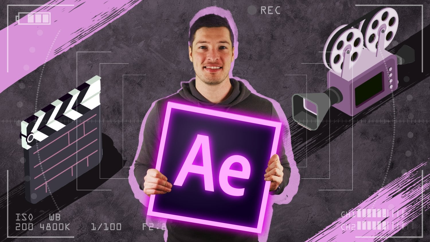
8. Keying the Greenscreen with Adobe After Effects: Let's get into Adobe
After Effects. And in this video we
want to start and deal with two of the three
example pictures. And basically those will be
the two pictures where we have actually used a green
screen to create them. And of course, our final goal of this video then
will be to cut out the green areas and
really be left over with only the person inside
the original pictures. So for the first setup, we got the green
screen underscore one as well as
green-screen underscore two example pictures. Those are just two different
pictures in the same setup. We're only the person is
showing different emotions. We will deal with
that setup first and then we'll also
quickly consider the webcam snapshot
that has been taken directly in OBS Studio. And remember for that one, the original green screen has
already been replaced with an effect directly
in OBS Studio. And other added was adding
another, let's say, a virtual green-screen
with this new green solid that you can here
see behind the person. And for both of those
methods and setup will find a very quick way on how to
get rid of the green areas. Now before we'll dive
into that topic, let we quickly mentioned that
of course now this won't be a full course on how to use Adobe After Effects
because first of all, it would be way
too much content. And then secondly,
for this topic, it's irrelevant as we
would really like to have the full focus on only
the thumbnail creation. Now, if you're still
interested in really learning Adobe After
Effects from a to Z, then I created a full course covering all the different
effects and tools. You can also find that
course on this platform. And of course, I'd
really like to welcome and see you
again in that course. But now let's get
back to our topic of thumbnail creation and
all that I already did here inside of After
Effects was to create a new project named
thumbnail creation. Of course, this can be done with File New Project and
then you can choose your location as well as
your name for the project. I already imported the five example
pictures that of course, you can also find inside the course resources in the
example pictures folder. Now, let's go ahead and create a new composition with the
settings for our thumbnail. So we want to choose
composition, new composition, and then we name
that one thumbnail because this will
be our final comp. And for the width and height, we want to choose the
settings that we have seen to work inside
the theoretical part. So it will be 12, 80 times 720. And for the duration, it won't really matter as
we are creating a picture, but just to be sure and
to not have, let's say, the danger of rendering our picture 1,000
times at the end, if we have a
duration of 10 s and we miss on only really
rendering one frame. So therefore, we
want to make sure of not being able
to do that mistake. So therefore, we
will just create a duration of only
one frame, choose. Okay? And here we got
our basic setting. Now, let's go ahead and take our green screen
underscore one picture, start with one and import it directly into that composition. First of all, as this
has very high-quality, we want to scale it down. So we'll open up
the scale options by choosing the shortcut S. Then let's bring the one down. Maybe this should
be okay for now. And before we want to use the green screen effect here
and get rid of that area. First of all, we need to
create a mask so that we really fully only
focus on that green area. So let's take the pen tool and just roughly draw
a shape here around the person so that we only have the green area included
in that picture. And now we can continue and add the very intelligent
key light effect. So we choose Effect
keying, key light. And then we want to
switch, of course, our screen color to
the green screen area. And now this already
looks quite okay. But to make it a
little more visible, That's bring up another
new helping layer which will be just a solid. So Layer, New Solid. And maybe we can even stick
with this color choose Okay, and place that solid right
below our green screen. So now we can really see
that we need to put in some more work to create an
even better a green screen. And by the way, you can
also switch the view, in this case, will be the
final result of course, but we might also bring
up the combined met, which then will switch this one to a black
and white view. And here you can also
see that we need to make some further adjustments here in the white area just
beside the person. And also we got some details
here inside the pullover, which right now
will be keyed out. So we want to change that one, bring it back to
the final result. That's normally the method
and the view that I use to do my green-screen
adjustments. And now we want
to, first of all, bring up the black value here. Then we already got it nicely keyed out here
besides the person. But still we are left with the details here inside
the pullover keyed out. So maybe we want to lower the
weight value, but I think. In this case, this won't work. So we need to bring
up another solution. But as usual, there are a lot of different ways to achieve your goal here in After Effects. And in this case, what I
would like to just quickly do is duplicate
this whole layer. So we want to choose
that layer and hit Control D to duplicate that. And then for the one on top, we want to deactivate
the key light effect, or maybe even
delete that effect. And then we just
draw a new mask just covering the green parts
of the pole over here. And of course, as this mask is now just fully
inside the second mask, what we can do is open up our masks by choosing
the shortcut M. Take the first one
and just delete it. Now what this will do is
that the first layer will be responsible to see the green
parts of the pullover. And the second one here
with our keying effect, will be able to then fully
delete the green-screen. Enters, focus on
only the person. That's it. We've got our person
cut out perfectly. And what we want
to do now is take both of those layers
that have created this person and just choose to put them into a
new sub composition. So we want to choose
Layer, pre-compose. Name this one a main picture. And just choose, Okay. And if we, of course now
switch off that one, then we'll see that the whole person won't
be seen anymore. So that's on how we can
just cut out the person inside our first setup with
this green screen here. And now let's continue
with the webcam snapshot. We want to bring up that one. Place it also here
inside this composition. And then first of all, let's scale it down
just like this. And then let's also
deactivate the main picture. So we've already
covered that method. And now full focus on
the webcam snapshot. And for this setup,
it will be even easier to key out
the green areas because of course
we are no longer working with an extra
a green screen, but just with a virtual one. Meaning that this
green area here, red now really consists of
only one exact green color. And this is why we might
even go ahead and choose the linear color key effect in order to fully
replace the green area. But just to be sure, let's
stick with the Keeler effects. So we want to choose Effect, keying, key light again, and then of course,
switch the screen color. Choose our green segment here. And this already leads
to a perfect result. So for both examples shots, the webcam snapshot as well. The main picture composition, we have now created a perfect
lead keyed out person. And this was our main
goal of the video. Now before we go ahead and do some more adjustments
for our thumbnail, but also for the main
person in focus. Just like e.g. some
color corrections maybe bring up some
edges around the person. We now want to go ahead
and achieved the very same for the person standing
in front of the wall. So right now, both shots
included a green screen. And in the next video
I want to cover a method that even allows us to fully cut out the person just sending in front
of the word wall. So this would be the
content of the next video and therefore see you
again and that one.
9. Alternative: Masking the Person using the Roto Brush Tool: Let's go ahead. And in this one, tried to create the very same effect
as we can see here inside the
thumbnail composition. For our remaining, a
third example picture which was just as standing
in front of the white wall. So far now, normal
green-screen and use also no external lighting. But still I can already tell you that to achieve a very
convincing results, we in this one only will need, let's say maybe 32 s. Why for this one where we
have used a green screen, we might do this in only 28 s. So if it's just a matter of four or 5 s and more
that we need to put in, then you might ask yourself, why would you even consider
buying a green screen? But of course, the great
advantage in working with a green screen is when
trying to create videos. So all the effort that we put in to cut out the
person here for this thumbnail
shot would also be enough to follow along
this person in time. So if we have a video of us right in front
of the green screen, then we just need to mask
the screen one time. And we need to apply
the key light effect. And we would have a
perfectly cut out a video, normal work to put in. And it's a little different here for the picture shot
in front of the wall, if this will be a video of us sitting in front of the
wall and we would want to key out the person that we will need to need to
put a lot more work in and wouldn't definitely take more time here inside
After Effects. So that's the great advantage working with a green screen. But in this case,
as we just want to cut out and work
with a still image. Therefore, it will be
done in, let's say 30 s. But of course, as I'll be
explaining along the road, we'll take a little more
than 30 s, but nonetheless, let's go ahead, maybe take
this second one here. And in this case,
we want to create a new composition to make
it a little more clear. So we directly
grab that picture, place it onto this little symbol here to create a
new composition. And now let's maybe discuss some different effects that you might apply to achieve
the very same result. So to cut out the person, you might start with something
like hearing effects. So we want to choose
Effect, keying. And in this case, I
can already tell you that the key light effect
won't really work. It's perfectly doing its job
for green and blue screens. But in this case
for the wide wall, it'd be very difficult
with this one. But maybe we could go ahead and grab the color range effect. And then we'll just start pick a white color and to make
it a little more visible, Let's again choose a
new helping layer. Again in this color will place
a directly below the wall. And then we just take more and more those colors here inside the wall to try to
achieve the same effect. But what will happen now here, when we grab or take
this area here. That more and more
parts of our hand and heads will start
to also be keyed out. So already know is no more
looking quite healthy. So therefore, the result
won't be perfect. And maybe we would
need to combine this again with a little
mask here around, maybe just the hands
and just the head. But still, it would
be a little more work to do to achieve a good result. So let's again delete
the color range effect, which might be your first idea. And then maybe take the
keying extract effect. And here we can see the luminance distribution
inside this picture. So here we have the dark areas, which will be the
pole over here. If we keep out those areas, then you will see of course, that the solid coming through here inside the
pullover and also the hair while if we decide
to exclude the lighter areas. So first of all, let's
bring back the darker ones. And then if we're moving this value here
from the right side, then you will see
that of course, more and more of
the red solid is coming through for
our white wall. But here at the end, you can already see
that we are remaining, are left with the same problem, which will be that here
in parts of our hands, as they are also very bright, you can already see the
red solid coming through. So we wouldn't need to
maybe combine this with a mask and therefore
puts some work in. And that's why also
this effect is not the effect of
choice in our case, as there is a solution
which in this case does the job in a very quick
and convincing way. So therefore, let's not choose a direct effect here
inside the keying options. But what we want to
do is double-click this wall layer to bring
it up in the layout view. And then we want to choose
the Roto Brush Tool. So this little icon here, this icon allows us to find the edges here
inside this picture. First of all, you
have the option with your control button and your
left mouse button pressed. If you then move up the mouse, then this brush will get a little larger while
if you move down the mouse, of course, the brush
will get smaller. And also with this
green bar brush, you can include some areas. And if you choose the
pattern on your Windows PC, then you'll switch to
a red button allowing you to extract some areas. So first of all, let's
just take the green one, maybe with this size here, and then just roughly draw what we want to
include in our shape. And then we let the Roto
Brush to do its job, which in this case seems to
be already near perfect. So here you can see we got
all the body included. Hair is looking
good and maybe only here or hand is
still not included. So therefore will
again choose that to move over here one more time. And you can see that
right now everything apart from parts of the
watch are included. So let's bring down
the radius here. Include that one as well. And there we already are. So let's switch back to the composition view
to have a check. And it's already
looking very good. Apart from here, this little
badge is not included. And also maybe we could even make our hair so a
little more smooth year, although I already would
say that you would not be able to see that
inside the thumbnail, but still S is
working very quick. Let's also do some adjustments
here inside the hair. So first of all, the
batch, Let's move back to the layer view. Open up that one and you can
see here that it's excluded. So we choose the
Roto Brush Tool move over there very quick. And now we got the
batch fully included. Then we'll switch over
to parts of the hair. And here we want to
switch by clicking this some seconds and then bringing up not the
Roto Brush Tool, but the Refine Edge Tool. And let's bring up the radios. Use your control button. And now we want to move over
the edge of the hair here. Let the tool do its job. And you can see that right now. It has transferred the hair. And since Adobe After Effects, Let's say 218 to 19, this tool really is a great, great option for you to
follow along the edges, especially when you're
working with pictures, you could see it's doing its job and let's say
maybe five or 10 s. And we're coming out
with a perfect result. Also, the hair is looking
really smooth right now. And that's definitely a picture that we can continue
working with. But as already mentioned, if you want to follow along
the person moving here, so you're creating a video, then of course, what
you would need to do is open up the layer view. You have your edges here. As you could hit the
Play button here, it will render out and
follow along the edges. But as we are moving, maybe the hand or other
body parts are moving above each other and then this tool
would maybe lose the edges. So it would be a
lot more difficult. You need to stop at certain
positions, refund the edges. So it would definitely
take a lot more time than standing just in
front of the green screen. But as we are just
working with a picture, so we're still image,
this will really do the job in just a
matter of seconds. So in any ways, doesn't matter which example
picture we are using. Number one in front
of the green screen. Number two, with our webcam
setup directly at the laptop, also using the green screen, or number three, just standing
in front of the word wall. In any of those methods, we are now having a perfectly
excluded person here. So we have cut out our main
objects and therefore we can now continue putting together
the final thumbnail. Therefore, see you
again in the next one.
10. Preview of the final Thumbnail in After Effects: So that's what we are
currently looking at, or maybe to switch back to our original thumbnail
composition. In both cases, what we already achieved is that we
perfectly cut out the person inside the original photo and
therefore we can now definitely continue working and putting together
a nice thumbnail. So being a little inspired by the emotion and guests are
inside this example picture. What I did was I already created a full thumbnail inside
of After Effects. And therefore, let's maybe
imagine that we have our very own psychology
YouTube channel, or at least we create
videos covering the topic of maybe
self-development. And we've already got a
new video ready to be published with maybe
the provoking title. Five reasons why you
shouldn't go with a tight or maybe five reasons why you shouldn't
fit the standard. At least let's say
something in that topic. And therefore, a
very nice thumbnail. It might be something like this. So you see, we got the main picture right
in the center here, which is the original
thumbnail picture that we can see here. Of course, it's
adjusted a little bit, so we got some different colors. Here. We have this nice blue
edge around the person. Also, we have a very
clear and bolts texts as mentioned in our
theoretical part. In this case, think
outside the box and you'll see that the text doesn't
fully restate our video, but really adds up to that. Also. In addition to the
box text here, we got another box here as additional element
on the right side. Also the person in this case
is placed inside a box. And we even got
another extra element here with this light bulb
here coming out of the box. So there's really a lot going
on inside this thumbnail. And of course we consider all
the different elements and create those elements together
in the upcoming videos. Now what's especially
great about this composition and
basically the whole After Effects project is that
all the elements inside this picture are very easily interchangeable for
your future thumbnails. So we can really
treat this After Effects Project S, our preset, and then go ahead for our
future thumbnail very easily, of course change the text. We could change the main picture with just one mouse-click. And we might even change the general color scheme
for this thumbnail. Now just to show you
this one as an example, we have our color
correction layer here will open up
the Effect Controls. Just activate this effect. And there we go, and we got a completely
different color here. Now of course, this is very unrealistic as we want to choose the color regarding
our main color of the YouTube channel. So normally you would
stick to your color. But just to show you
that even that is very easily possible to change. And to give you another example, we could go ahead and change our main picture here you have two different pictures showing very different emotions
inside the course resources. One of those is the
underscore one. We could just write big replace footage with another file. We'll choose the green screen
underscore to import that. And you'll see that just 2 s that After Effects needs
to change this picture. And again, we got it placed
perfectly in the middle here, again with blue edges. So very, very easy
to change that. And even for the second one, we will have 0 pole over
here with the blue details. While originally of course
they have been green. Also, we can change the
additional elements like e.g. this box here. This is the
element underscore box. Right-click again, replace
footage with a new file. And let's go back to
the course resources. Pick another element
like e.g. a. Brain here imported. And we got a new
additional element and could go ahead and
create a new thumbnail, of course, will change the text, but it's just really
a matter of seconds until we got a very
consistent style, sticking with our general
thumbnail creation style, we changed the text and we've
got a very new thumbnail. So that's what we're going
to cover in the next parts. And therefore,
let's get started. See you again in the next video.
11. Creating the Thumbnail in After Effects - Background, Texts and Shapes: Alright, so we want to continue working on our
thumbnail composition. And what we'd like to
do in this video is introduce some texts and
shape elements and also create a way better looking
and background image that fits to the general color
scheme of our thumbnail. Before we get into that, let me quickly just replace the green screen
underscore two image. So again, right-click
replace footage, and we'll switch it back to the underscore one,
import that one. And here we are back with
our thinking emotion. So first of all, let's quickly delete
the red solid here. And now let's introduce
a new texture here that we want to
place as a background. So first of all, let's bring
up the course resources. Not the example pictures folder, but the elements
and backgrounds. And here you have some
different shapes, of course also some
additional elements like the box and brain. But you'll also find a couple of different background
images and textures. In this case, what
we'd like to choose, of course you are
free and your choice, but this one, we want
to work with the chalk. I've already imported that one, placed it here inside
my media folder. And therefore, let's take it, plays it right below
our main picture. Open up the scale with the
shortcut S and let's bring it down just like this. And then we want to
choose our main picture. Also bring up the scale that
we can already see here. Scale it up to 150 per cent. Place it somewhere
in the middle. And then we want to bring it
up to full resolution here. But basically, for now, that's it, working
with our main picture, as in this video,
we'd only like to cover the background,
the text, etc. And we will adjust
the main picture later on when finalizing
our thumbnail. So here we are with
our background chalk, and let's now maybe
add some more coloring which perfectly fits
the color scheme of our YouTube channel. So for this example picture, we'd imagine that
our YouTube channel will cover the colors, mainly blue and
green, let's say. And therefore we want to
introduce a new solid and make that one let's
say a lighter blue. This will be the first
or the main color of our YouTube
channel we hit Okay? And we want to name it
background coloring. Choose Okay, and replace
it just like here, right above the
background chalk. Now of course, right now
as this has full opacity, will only see the blue layer. But what we want to do is use these mode settings
here so that we can combine the layer coloring
with our original chalk one. So if we would maybe
add those two layers that you will see that it will only turn brighter in this case, that's not what we
want to achieve, but we want to combine in a way that we're still use
this blue color but make the original chalk image a
little darker and more bluish. So therefore, let's maybe
switch it to overlay, or even better, maybe multiply. That looks quite nice. And then we'll also bring down the coloring layer
in its opacity. So we'll hit the shortcut T, bring up the opacity and
lower it maybe to 50%. And I think this already looks quite nice and it has added a little bluish tint
to our chalk layer. You'll see that if we switch off the visibility from
our background layer, then you'll notice we
have tinted in blue. And now let's go ahead
and introduce our texts. So we want to choose the
horizontal type tool. Click anywhere inside
the preview area. And we want to start, of course, with thing. We want to write,
think outside the box. And before we get into the text or character
options here, what we want to make sure
is that we've switched the paragraph here
to be aligned left. Therefore, if we just duplicate
this text, move it down, or even if we have some
thumbnails in the future, you want to change the
general size of that text, but you have already made sure that this text will still
stick to the left side. I'll show you that in just a matter of
seconds before that. That's no double-click here. And we want to bring
it up to maybe 150. Change the text font to a very, very clear on which is area, maybe Arial Bold, even. I think this looks nice in
terms of the font and size, so we can take that text
and move it to the left. And if we now would like
to change that text to, let's say a longer
word, whatever. Like get to know. I know those are a couple
of words, but still, what you can see here is that we still are aligned
on the left side. So therefore, if we just change
the text in the future or we need to make sure is that we then scale it down to fit. And not be written
behind the person here. But as seen, the alignment on the left side will
still be right, so therefore will
right thing again. And then we just want to take
that text to duplicate it. Control D. Open up the
position with the shortcut P. Just move the y position, bring it down to,
let's say here. And then we want to
ride, think outside. And maybe we'll move
over the person just a little here to the right side. Now we want to make sure that
the word outside will also end in the same position
as the word thing. So we'll bring down the
scale or bring down the size of that
text, just like this. Then duplicate that one again. Control D, bring
up the position, move it down again. That's right. The box. And now, and I'd like to have a little more
focused on the box. We want to also bring that one up again in size
to, let's say 150. And then we want to move up the first three
letters of the word, the, let's say half of the
height of the box here. And we can do so with
the baseline shift here with only that
word in selection. Let's add a little
baseline shift. And this is looking
nice, just like that. So here we are with
our basic text. And of course we want to
make sure that the size here between thing
and outside should be the same as between
outside and the box. But for now I think it's
already looking quite good. And what we would like
to continue now is we want to add some shapes
here behind those texts. Now again, as pretty much
always an After Effects, There's a ton of
different ways and methods to get to your goal. And for the very lazy
people among us, I have also included some different shapes directly in the course resources for you, like e.g. this parallelogram. But we'll work with
that later on. Let's for now just
go ahead and create the element directly
in After Effects. We want to choose
layer new solid. And let's stick with the
main color of our channel. We hit okay? And for now let's just switch
off the visibility. But with the layers
still selected, what we'd like to do is hit
the rectangle tool here. You can switch those forms
by using the shortcut queue. Until then, finally bringing
up the rectangle tool again. And we now don't want to
go ahead and just place it right behind the thing texts. But what we'd like to do is take it and make
it even larger. This will in the future give
us some more possibilities. If we have larger texts, then we can just move
the whole forums. So this should be
fine like that. And now we want to switch
back to the selection tool, make our layer visible again. And I just like to select the lower two points here by hitting the line and then use our arrow key to just move
them both in the same way to the left side and just switched the rectangle to
sort of a parallelogram. So that's looking nice. And now let's bring this
one right behind our texts. So we want to place it here. And then we just select that and move it over here
to the left side. Maybe we even want to make it a little lower in
terms of the height. So let's again just
choose that layer. Select the lower two
points and maybe moving upward just a
little bit like this. That again, select the
layer and just place it somewhere behind the text. Like this should be fine. And what we'd now
like to do is again, just duplicate this
solid layer here to have some more parallelograms
right behind the outside as well as behind the
box texts elements. And before we start doing so, let's just quickly rename that layer to have
some more structure. So let write
parallel Lou Graham, I hope that's quite how you
pronounce it in English. At least it sounds quite
like that in German. So therefore, we have our parallelogram elements
Control D to duplicate it, bring up the position, and just move it in terms
of the Y position to place it right behind our
second text element. Now in this case, as the word art side is
written a little smaller. We'd also like to make the parallelogram
a little smaller. And again, we have
different methods to do so. One of those would
be two, again, select the lower two points
and just move them upward. But this would change
the grade here on the right side of
our parallelogram and we want to stick
with that grade. Therefore, let's just bring up the scale and scale down the
whole parallelogram with, of course, sticking with
our x and y proportions. So you want to make sure that
this button is activated. And then let's bring down the
whole size of the elements, maybe just like that. And we want to move it again
to be right behind or text. Maybe do some more adjustments
with the arrow keys. And like this, it
should be fine. Then let's go ahead and
duplicate that one more time. Maybe the upper one, because here we have a
larger text again. So Control D, bring
up the position, move it first of all
above our second element. And then let's bring it down. To just like that. And also with the arrow keys, we can move it more
to the right side. Although this is also
looking quite nice, but it's just fully cover it. Like this. Again,
should be good. Now we have, we have
some more space, as we can see now here between
the first and second one. So what we'd like to take the second element and also take the outside texts and just move them up a little
bit just like that. So this is already
looking quite nice. Of course, feel free to do some more adjustments like
here we want to bring up the thing takes
a little more. And of course we can also continue doing some
more adjustments with our shapes like e.g. let's take the
first one and let's choose Effect, Generate stroke. And now you'd have the
possibility to even have a nice stroke here on the outside of
that mask like e.g. let's choose the
size of maybe 12th. And here you can see
that very easily. You can also add a stroke. You could even
change the stroke to maybe work on transparent. This will get rid
of the blue parts. So of course, feel free to
do your own adjustments. So that's just the
method on how to introduce those shapes
directly in After Effects. But of course, but we could also do he has just go ahead and directly grab any
of those elements that I have placed inside
the course resources. So there you will find a parallelogram with
just like the one that we have created
for ourselves. And you'll even find a square
as well as a triangle. So just as an example, I have already imported the parallelogram and we could just take that
element and place it, let's say maybe here on first position inside
our composition. And if we'd now like to
delete the black area here, then all we need to
do is choose Effect, keying, linear color key. And of course switch the
color to the black part here, or you want to choose
the white part if you want to get rid
of the edge here. And you could even just colorize
the whole parallelogram, let's say in one solid color by choosing a new layer, solid. And in this case, maybe let's
stick with this red here. Place it just below our
parallelogram element. And then for the track matte, we want to switch
it to alpha matte. And there you are with a
nice red parallelogram. And of course, this is the very same for this
element that I have added in the course resources and the one that we have
just created for ourselves. And After Effects. You are not limited
to one solid color, but just maybe again, as an example of what
you could do is again, bring up the course
resources and maybe let's import the background woods
here just for a second. Also move it to
our media folder. And then it's also introduced this one to our composition. Delete the red solid. And then for the woods,
Let's scale it down. First of all, just like this. And we'd like to switch
again the mat here to be the Alpha Matte from
the parallelogram. So that would be
one way of having this word image here in an
IS parallelogram shape. Of course, feel free to
create whatever you like. That was just what I wanted to show you that you can of course, create the element
directly in After Effects, but also use the
ones that I have added in the course resources. And also one last thing. There's also some more
materials that are included, which is the watercolor here. That's personally an element
that I very often use. So also we want
to take that one, bring it up here into
the course resources. Before introducing that element, Let's quickly again delete woods and parallelogram
from here. And then let's take
the watercolor one, move it over into
a new composition. And first of all, we
want to choose one of those elements to take. Maybe we go along with this one here on the
lower left side. So we'll take the pen
tool and just draw a rough mask around
only that one element. And now switching back to our thumbnail
composition and let's maybe turn down our first
parallelogram here, make it invisible and bring up the element watercolor
composition here. Also, let's place it here. Then. First of all, we want to scale it down so the element is very large,
as you can see here. Just move over the
whole composition and then scale it down to, let's say, 50 per cent and bring up just right
behind our texts. So that will be
another method of introducing a shape
right behind the text. And of course, you can again just combine
that shape with, let's say a solid
just like that. Place that solid
below the element. Again, make this one
the Alpha Matte. There you are with a nice red solid in terms of the watercolor here
right behind the text. So tons of different
methods and ways to introduce shapes or element
just right behind this text, we for now just
want to stick with our original parallelogram
that we have just created for ourselves
in After Effects. And now that's it
for this video. And we continue with some additional elements
in the next one.
12. Creating the Thumbnail in After Effects - Additional Elements: Next in line, let's really
make sure that we have a nice and balanced
overall distribution of different elements all
around our main image. So right now we've got the
texts placed on the left side. And now let's go ahead add
some more small symbols, icons, or even images here on the right side
of that main image. And thereby also grip even more attention to
our final thumbnail. So in relation to the slogan,
think outside the box, what we could start with is add another rectangle
or even square, and also another X or cross, which then of course
we'll be placed just outside that rectangle. Let's go ahead and add
a new layer, new solid. And let's maybe begin
with the x and color it. In this case, maybe with the secondary color of
our YouTube channel. So just as an example, this might be, let's say green. And for the name will directly choose x and then hit, Okay. So what I'd like to do now
is add the x or the cross directly by introducing a mask instead of just
writing the letter X, because this really should
be more across then an x. And by doing it with a mask, we have some more flexibility. But just for now, we'll
deactivate the visibility. Then choose the pen tool. And with the layers
still selected, let's just start at a first
mask, just like that. Then switch to another
layer just for a second, switch back to the first one to be sure that when we
continue with a mask, we will now create a new mask instead of following
along this one. So thereby we'll
do another mask. And then what we'd like to do, Let's bring back the visibility
will choose the effect that you've already
seen in the last video, which will be Effect,
Generate and stroke. And now we'd like to
work on the transparent. Make the color just the same color as our
layer in general. And also we'd like to choose the path to follow
along all masks. So not just only the first one, but also the second one. Take this little button here, follow all mask and then we want to make the brush
size a lot larger, let's say maybe
even ten or 12th. And then we've got
a nice little x already looking quite nice. But just for a sec, Let's maybe take
the second mask and replace it just a little bit. Maybe even only that point here. And there we go. There we go. We got a nice little x already
added to our composition. Now for the rectangle, what we do is we simply again duplicate this
layer, so Control D. And first of all, let's open up our masks with the shortcut M. Delete the first one to be
the second one as well. Right now we can see the
layer no more because we are working on the transparent
inside this effect. But we will take
the rectangle tool and just draw another mask. Maybe just like that. And as of course, the
effect is still in place. We are working on all masks. This is why path will
already be followed along. Now in this case, it's green, but I'd like the
rectangle again to have the main color of
our YouTube channel. So therefore, we want to
switch the effect urine, choose the color, make it blue. And to have a little
better overview here, Let's also change the
general Layer Solid Color about this won't be visible as we're working
inside this effect. But still I'd like to change it and also rename that layer. And let's name it box. So there we are.
Let's now continue. Maybe move this layer
to just about here, and then also move the x. Bring it maybe here. Also you could bring
up with RD rotation, maybe rotate it
just a little bit, but I think it's already
looking fine and we'd like the X layer to be
just above our box. That's it. We've added a nice
little symbol here, following along our slogan, think outside the box. And now let's even add
another small image, the one that you've already
seen in the final picture, which will be the element box that you can also find
in the course resources. So we take that one place that just on first
position here, scale it down a lot here. Bring up the scale options
again with the shortcut S. And maybe just like
that, it's looking good. We want to move it over here
to the lower right side. And now we want it to also fit our general YouTube colors. So maybe we'll make the
light bulb blue or green. I'd say green looks
a little better. So therefore, with
this layer selected, let's choose Effect,
Color Correction. And then change to color. And of course, the color will
be our original light bulb and the target color will be the secondary color from
our YouTube channels. So we want to choose
the green cross here. And if we then continue into the tolerant values
and bring down the lightness and saturation. Then you notice that the box will still be
in its original color. And really only the
light bulb will change to match our
general color scheme. So that's it. We've added some
nice little symbols, as well as this image here
on the lower right side. And of course, as usual, you are free to
continue designing and adding your very
individual adjustments. Just like maybe one
more quick idea, we could even go ahead and
replace the letter 0 here inside this box text
with this light bulb. So let's just quickly do so. Choose the element, move it over just above the letter
0, maybe like here. And then bring down
the whole layer directly below our text. Double-click into the texts. We want to replace the OH, with some space lectures. Maybe just like that. Then again, select
the element box, move it over just a little
more to the right side. And this will be
another very quick idea on a very small design elements. Of course, we need to make
sure that very important, we can still easily
read the text. Think outside the box,
Let's just zoom out. But I think it's still
very intuitive that here the slogan where we
think outside the box. So again, just one more idea. Feel free to add your
very own style and ideas. In this case, I'd like the main picture or
the elements here, a little more on the
lower right side. So we want to bring it back to just where we started with. And also double-click into this text and replace it
again with the letter 0. But I think for now,
that's it for this video, we've added some really
nice small symbols and elements here
on the right side. And what we'd like to do
in the next video is doing some more adjustments here
inside our main picture. So we want to have
better colors and also add edges
around this image. So therefore, see you
again in the next part.
13. Creating the Thumbnail in After Effects - Adjustments to the Main Image: Let's continue. And in this video we'd like
to add some more adjustments to the main image right in
the center of our thumbnail. So first of all, we
definitely want to improve the general
coloring of that image. And then secondly, we will
also add a nice-looking edge, probably also in
the main color of a YouTube color scheme
around that image. So let's begin
with the coloring. And in this case, our main image itself is already a composition, which is this one here, the main picture composition. Because remember,
originally we had a little struggle here that the details inside
that pullover have matched the key and colors
of our green screen. And therefore we edit
a second layer with a mask only around
those details. Placed those two layers just inside this main
picture composition. And that's why with this
composition we have the full access to
this main image. So with that layer selected, we want to choose Effect
Color Correction. And for now let's maybe go
with the Lumetri color effect. Again, there are tons
of different effects that you might choose to do your color correction like e.g. the color curves or
brightness and contrast. But in this one, let's go with
the Lumetri color effect. And we want to bring up the
basic correction category here and especially focus
on the tone values. So to start off, we definitely want to
increase the contrast. So let's bring up that value to, let's say about 50. And then we'll continue
with the whites and blacks. I think for the white value, we don't need to make too much changes already
looking quite nice. And let's play with
the black value here. We definitely don't want
to increase that one, but rather bring it down to, let's say about 15 or so. And what we also
definitely want to do is increase the
saturation to, let's say about 130. So now it will look as if I have seen a little
more sun this year. And overall I think this is
already looking quite good. So let's check out the effect in the before and after view. So here we got our effects applied and let's switch it off. And this was our original image. So especially with the contrast and the increasement
of saturation, we have achieved a very
nice coloring here. Let's quickly check
out the details here. Start with the highlights. But I think we also don't need to make 2 mol changes here, then continue with
the shadows value. But I think that's it. And we have created this. I feel like very natural
and bright coloring. So let's continue and now focus on those edges around
the main image. So again, different ways
that you could use. In this case, what I
want to do is select our layer Control D
again to duplicate that, then introduce a new solid. Stick with the main color
of our YouTube channel. And we want to rename the layer, let's say two main image
edge and hit. Okay? And we will move that
layer right below the second copy of our
main picture composition. And what we want to do now is open up the track matte here and choose the Alpha matte for the above main picture layer. So right now we've got the main picture composition on top. If we switch it off, you'll
see that below that one. Here's the same copy which has been completely filled in blue. So we could go ahead and choose this second main
picture composition. Move it to the right side, maybe also a little upward. To create the first, I
think, very nice effect. Which now of course
is not an edge, but sort of an offset, but I think it's also
already looking quite nice. So this will be one
way of spicing up your main image inside
this thumbnail. But for now we really want
to create an absolute. Therefore, I use Control
Z to undo my last step. Bring back the main
picture composition here, really behind the original one. And now let's again
select that one and choose to enlarge our masks. So we want to choose Effect met and we want to apply
it the simple choker here. And if we now choose this value here and move
it to the negative, what you'll see is that our mask will get
bigger and bigger. And if you use the Shift button, you can move this value
here a lot faster. But I think probably
just like that. It's looking quite nice. Now what we could do
next is maybe take the word outside and move
that text layer right in between our main image and our blue edge layers to make the letter E again
fully visible. So therefore, let's quickly
select our text layer and place that layer right between the two main picture
compositions. There you are. We can again
fully see the word out site. So to continue with, let's maybe even add a glow
effect to our blue edge. So we want to select the second main picture composition
again and then apply Effect, Stylize, glow. Now you can already
see the edges start to become a little
smoother about, let's maybe. Further increase the glow
radius here to a value of, let's say about 70. Just like that. And I think it has added
some nice little details here to further improve
our main image. Now, maybe let's take that
glow effect and apply it just with all those options
in the very same way to this green cross here to
also give that element a little more focus with
the glow effect selected. Let's Control C, that
one to create a copy. And then choose our x element Control V to paste the
effect. And there you are. We got some more focus
on our green x here, really stating that we are
thinking outside the box. So that's basically it for all the different
elements that we want to include in our thumbnail. So first of all, of course, we got the bold and
very clear text here on the left side as well as those shapes directly in the background of
the text elements. And then we've got some
more additional symbols, as well as even a
small image featuring the color scheme of our YouTube channel
on the right side. And of course, we've got
our main image right in the center showing
a strong emotion, some good coloring,
and even edit those nice blue edges
around the main image. Now, one more fun thing we
can very quickly do with that main image is we want to change the
detailed colors here, fit our main YouTube colors. So we want to select that
layer and choose Effect. Color Correction
change to color. And then we'll switch
the front color to be the detailed color
of the pole over here. And we want to
change the two color to our main YouTube color. And there we go. Seems like we're wearing this
black and blue polo over. And now what I always do as my last step in basically
any after-effects project is to add an adjustment layer and thereby
do my final corrections. So if you are a frequent
user of After Effects, you'll definitely know what
this layer can do for us. Basically, it just gives us the possibility to directly make changes to all layers below
that adjustment layers. So e.g. we could go
ahead and choose Effect, Color Correction and maybe
the curves effect and just increase the contrast
with this effect. And you'll see
that when applying that effect directly onto
our adjustment layer, it will increase the contrast to any individual layer and element right below
our adjustment layer. So this might be
one possibility of doing some final corrections. Or what you could also do is go ahead and whip this
adjustment layer, change the general color scheme off our YouTube thumbnails. So therefore, we
again choose Effect, Color Correction and bring up
the change to color effect. Now we want to choose
the front color to be our main YouTube color. And you can already see
that this will dramatically change this color to be red. And if we bring up
the two color here, maybe make it a little more, let's say yellow or brownish. Just like that. Then you'll see that
with this effect, you can easily change your
whole YouTube color scheme. Of course, we won't do that very often as we'll stick with a consistent style
that really matches the general colors of
our YouTube channel. But this was just one way
that I wanted to show you on how you can really very
easily change the color. Now in this case, the x
element here together with the glow effect is
looking very awkward. So what I would do in that
case is grab that x element and place it right above
our adjustment layer so that the effect of
change to effect won't affect the glow
effect here inside our x. For now, let me just
quickly take that effect again and delete it as I really want to stick
with those colors. Now of course, you can also take that adjustment layers to bring your individual
style, like e.g. at a cartoon effect or
whatever you may think of to give your thumped
the extra spice. In any case, what we can
do now is really consider this thumbnail as
our own preset. And if we want to continue working with
thumbnails and we have a new YouTube video as already
seen in the final result, we can very easily
change this thumbnail. So of course, you know
how to change the texts, but let me quickly
show you how to change the image again and that this
will work out pretty nice. So again, we'll take the
green screen underscore one, right-click,
replace footage. We choose the second image with a completely
different emotion. Maybe the best emotion for
another YouTube video. And you'll see that we got this image again
perfectly in place. Again with the
blue details here, with the blue edges
perfectly around that image. And all we need to do
now for a new thumbnail is give us some thoughts about
some additional elements. Replaced those elements,
replaced the text. And there we go with
another very nice thumbnail that will be consistent
with the previous one. So that's it for this video and basically that's also
it for the whole After Effects section because all the different
elements that I wanted to introduce to
you and wanted to show you how to create
them in After Effects. Now have already been covered. But nonetheless, there will be one more video in After Effects. And that is because basically
together with this slogan, think outside the box, I came up with these
spontaneous idea of putting the whole main image
in another box, just like you can see here in this outside the
box composition. So if you're especially interested on how you
can achieve that effect, then of course, feel free to
check out the next video. And if not, you can
definitely skip that part. And we will see again in the whole new section
where we want to cover only a free method
to also be able to create great looking thumbnails. So see you again in
any of those videos.
14. EXTRA: Main Image Box: Alright, so one more video
directly in After Effects. And what we'd like to achieve in this one is place
our main object, the person you're right in
the middle into another box, just like we can see in this
outside the box composition. So here on top at the head
as well as the arm here, the person is sort of
reaching out of that box. While here at the bottom, the line of the box
serves really as a limit to our person and we'd like to achieve
the very same. And therefore, let's
first of all switch back to our thumbnail
composition. Before we get into that, let me quickly rechange our
original picture again. So right-click. Replace footage
with another file. And of course we want
to switch back to our first one with
the thinking emotion. And with this one, Let's now
go ahead and add a square. So we could do so directly with an object in after effects, just like we've done here for the blue square or rectangle
on the right side. But for now, let's just
directly take the element that I have placed in the
course resources, which is this one, the
element underscore square. We just take that imported
into our composition. And first of all, let's
scale it down to, let's say, 45 per cent. And first of all,
of course, we want to key out the darker areas. So therefore we choose Effect
keying, linear color key. And we want to switch
the key color, of course, to black, so that we are with a nice square here with
the borders of a square. And now let's go ahead and rotate that square
just a little bit. Maybe like this, and then move
it over to match a person. Maybe make it a
little larger here, let's say 48 per cent. And what we'd like to
do now is, of course, the element should appear behind our person here in parts of
the head as well as the arm. While here, as mentioned, this line should really be a limit to our person
on the downside. So what we could do is
leave this element, leave this layer here on top, and then mask the
elements here on top, as well as here at the arm area. But it will be a
little more difficult. Together with the glow
effects are what we'd like to do is place the element below all the layers that create the person together
with the blue edge here. And then create a mask
here at the bottom to just follow along the
lines of our box. So therefore, let's first of all create a new
precomposition, including all the layers that
create the main image here. So in this case, it will be
our main picture composition, as well as the main picture
composition here on top and the main
image edge here. So therefore, we want to
choose Layer pre-compose, and we'll name this one
main and hit. Okay. And then again to have the
outside fully visible, Let's move the main
below the text outside. And now with this one here, we can directly switch off the whole appearance of that image together
with the blue edge. So just to leave the element box here a little
more visible for a second, of course later on we'll place that one below
our composition. But for now, just to be sure on where we need to
introduce the mask. And let's go ahead and create Quick Mask here
for our main composition. So we want to choose
the pen tool, start here on the right side and then really move
over to the left side, even outside of our box. Because we want to fully also leave out our
glow effect here. So let's just start here and then we'll take that
point directly, move it to be perfect and really match the edge here
of our square. And then just create
the full mask here. And of course we don't
want to add that mask, but that's the part that
we want to subtract. So therefore, let's open
up the mask options with the shortcut M
and hit subtract. So now we can already see
that this line here very nicely serves as our
limit on the lower side. And now of course, what
we need to do is take our elements square and
move that layer right below our main composition
to then have the head as well as the arm parts
here in front of the square. So that's where we
are and maybe we can continue and even
bring back some of the opacity on the inside of that square to give it a
little more dynamic even. So, remember the
original element has been black on the inside. So if I switch off the
linear color key effect, that was our original object. And now let's bring back some of that opacity
on the inside. So what we want to do is duplicate the whole
square layer. So Control D again to
duplicate that one. And with the lower one, Let's switch off the
linear color key effect or even remove it
by hitting delete. And then let's bring
up the opacity T and lower that opacity
to maybe let's say 50%. And there you go, we
have some more opacity, some darker parts
here on the inside, where of course the white lines, they remains in full opacity because it's another
layer here, right on top. And with that line
layer here on top, we can maybe even
add a glow effect. So Effect Stylize glow again. And let's also here
increase the radius. And I think with a
radius of about 120, It's already looking very nice. So basically that's all
added inside the original, outside the box composition. Of course, I moved the objects just a little bit to make
the text fully visible. So what I will do next
inside this composition, take my element square as
well as the main composition. Move those over here right to the right side, just
like maybe here. So then we can fully read are
outside the box text again. Then next maybe take our square as well
as our green x here. Move those two over. And then maybe also move over the element box
just a little bit. But I think like this is already looking very nice
and we've really created a great
looking thumbnail matching our video title. So that's it for the
After Effects part. And now let's move on
with only three methods and thereby also create
great looking thump notes. See you again in the next video.
15. Overview and description of Thumbnail Creation with GIMP and Canva: We are live in the After Effects and even the whole
Creative Cloud space. And now we want to continue
with the second method that will also
allow us to really create great looking thumbnails. But for this one, all
that we will use will be completely free tools and
software to name them. Once again, it will
be first of all, the image editing
software, GIMP, as well as then later on, the online platform Canva, where we want to
finalize our thumbnail. So first of all, here I am already on the website gimp.org. And please go ahead,
follow the steps. Hit this download button, then go through the process of installation and get
this software ready. Once again, It's completely free so they won't
charge you anything. You can use this software. And all that we will do
inside that software, where basically be
the first step, meaning we want to either
key out the green screen and our first and second
example picture, or of course we want to
cut out the white wall in our third example picture
with that created picture, so only the person in focus. We will continue in
Canva and we will hear, search for YouTube thumbnail
and then start designing and really putting together a great thumbnail
directly in Canva. Now here on the left
side you can already see some great look in
presets, just like e.g. this one here, where we
also have a person cut out together with the white
edge around that person. But as readable here, this will be only available
in the Pro version of Canva, which will cost you some money. But I can already tell
you that we really can fully rely on the
free method together with the pre-work that
we'll be doing in GIMP and still be able to create a
great looking thumbnail. So that's what we wanna do. And of course the first
step will be done in GIMP. So here I've got the
program already opened up. So please let us now
pause the video. You go ahead, download
and install the software, and then we'll see again in
the next one directly, again.
16. Keying the Green Screen with GIMP: So I've got Gimp already
opened up as you can see. And if I now go ahead and delete the current image
just for a second, then it should be looking quite
similar to what you'll be seeing if you open up the software for the
very first time. So in this video, of course, what we'd like to do again is managed our very first step. So we want to treat those
two example pictures where we have actually
used a green screen and be able to key out all the areas apart from
the person in that image. So let's go ahead. First of all, maximize
the software and then start importing
our original image. So File Open, and we'll choose, let's say the underscore one
image again and hit Open. So let me quickly again
say that of course this won't be a full explanation
of the software GIMP, as this might be a free tool, but still it's a very good one that allows you to really do some nice image editing and it would be way too
much content again, to fully explain what this
software is capable to do. So we just will focus
on those steps that we want to do here
in the software to create our thumbnail. And in this case, it will be all about deleting the green screen. Now, before we get
to, first of all, you need the outside
area here and then also delete the green part. What we need to make sure is
that we will come out with a transparent area and
therefore we want to be able to render that
S transparent. So we need to choose
here on the right side, our image right-click and
add an Alpha channel. Without that, you
won't be able to render the transparent areas. And this of course, will be
very important for us to then later import that
picture onto Canvas. So next step would be to
delete the outside areas here. And therefore we can just switch to this free
select tool here. Choose that one and we'll
draw a very rough shape from point-to-point
here around our person. And then with that one selected, we want to right-click and invert that shape
because of course now we only have the parts inside considered and we want to
delete the part outside. So therefore, right-click
and choose, select, Invert. And now we have the
outer part here selected and can hit
the Delete button. So now we are only left
with the green area. And therefore what
we will choose will be this little tool here, which is the fuzzy select tool, or at least we'll
click onto that. And if your left
mouse button pressed to then switch over to
the select by color. That's our choice for
a tool for this one. And then we can directly go ahead and maybe click
onto this green area and you'll see that this will
be the first idea or the first intelligence selection
that GIMP will give us. And if we hit delete, then we start to get rid of those green areas and
we might go ahead, click onto the different
areas and thereby manage to come out
with a good result. But what we could also
do if we just undo the last steps is changed the
thresholds of this effect. So here we are again
with the original image. And if I now inside the effect increase the threshold
from ten to, let's say maybe 30. Then you'll see that we even
need some fewer clicks. So maybe two or three
clicks might be enough. This already looks like
a very nice selection, so we hit Delete. Then for this lower area here again one more
time, a delete. And it's already
looking very nice. So we switch to this tool and then see what we
are working with. And this is already looking
like a perfect result. So basically we're already done, but now what we can do is maybe shrink the whole image to
only match the person. So therefore, with
this tool selected, let's just roughly
draw a shape around our person, just like that. And then right-click that shape, that rectangle and choose image and fit Canvas
to selection. So that's our final result. And now let's go ahead
export that image. So File and Export S. And in this case, as the
original image is a PNG one, we can stick with that. So this will be able to
render transparent areas. And let's maybe
rename that one from green screen underscore one
to green screen underscore, cut and choose Export. And for the upcoming options,
we can leave them all. As already said, hit Export
again and our image will be saved with the
transparent area that we can now continue
working with in Canva. Now, inside canva
will do all the rest, meaning we will do the
color correction as well as bringing up some
edges around that image. And that's basically
our next step. But before we get into Canva, Let's quickly also cover
on how we might achieve such a result with us just standing in front
of the white wall. So therefore, see you
again in the next one.
17. Alternative: Masking the person with GIMP: Moving on, let's now deal with the third example picture which has been standing in front of the white wall and
really try to achieve the same convincing
results as with this one where we have been standing in front of
the green screen. And I'm pretty sure that we
will be able to achieve that. So let's go ahead
file open and just switch to the example
pictures wide, wide folder. Then let's go ahead and
start maybe again with the underscore 21 and
open up that picture. So in this case, as it
has been a JPEG file, it's asking us if
we want to convert the color scheme and
we want to do so. So directly hit that
convert button. And here we are with our original picture
imported on to Gimp. Now in this case as well, we want to come out with
some transparent areas outside the body,
outside the person. And anytime you basically
hear the word transparent, what you wanna do
first is right-click your original file and choose
to add an alpha channel. So having done so, let's now go ahead and starts to key out the white wall
here inside that picture. And in this case again, we want to use this
little button here. But apart from what
we've done with the green screen where we
have selected by color, which has worked very well
for the green screen. Here we want to go with
the fuzzy select tool. So therefore again, lift
your left mouse button pressed and we switch over
to the fuzzy select tool. With that one selected, my advice would already be that you'll increase the threshold in comparison to what we've
selected in the last video. Because the lower the
threshold here will be, the more clicks you need to make and get rid
of certain areas. And you'll be left over
with more and more of very small parts
that you need to manually cut out afterwards. So of course, we don't also want this number
to be too high. It just like e.g. if
we make it 100 or so. And if I then click
onto this picture, then you can see
that already parts of the face will be included. And that's of course a number that is definitely too high. So maybe we'll go with, let's say 50 and start. Trial luck. Just click into this area and it's already
looking very nice. We've still got all
the parts of our body included so we can go
ahead and hit Delete. And we have already removed
the most parts of that wall. Next we could go just
select the part here on the lower right side and
then move ahead until then, reaching a good result. Now it's already
looking very nice. But let me for now just
introduce another helping layer. So here we could switch
the color of that layer, but I'll leave it
with black and then choose layer, new layer. We want to fill that layer
in the foreground colors, so this will be that one. And then choose, Okay. And if we then grab
that black layer and place it right below
our wall picture, double-click onto the image. Then you notice that apart from the impression
we had before, we definitely need to put in
some more work to get rid of those gray areas are white areas that are still
left in the picture. So we might continue again, select our wall picture and stick with the fuzzy select
tool. Try our luck again. Maybe just select this
part of the image. But as soon as you will see
basically anything blink. And just like here, this will be the message that
it will no longer work and we can't further
delete any of those areas. So what we might do is now this looks like
a good selection. So for this one we can still
go with the delete button. And now let's maybe try and switch over to the
select by color tool. Lower the threshold
to let say ten, and try our luck with
the color in this case. So this also looks like
a part we can delete. So again, hit the Delete button, then maybe try to find some more areas just like
this one again, hit delete. But in any case you'll come
to a point where we will be left with some gray
areas just like here. And those tools will no longer work as we're not working
with a green screen. No problem what I normally do in this case, it's just switch, switch over again to
the free select to take that one and start with a very rough shape
around our body. Just like this. Then again, we'll later treat the areas here below our arms. So first of all, let's finish this mask, right-click
and choose, select and invert again, then hit the Delete button
and we've already deleted anything that's
outside this mask. And now we want to increase the zoom factor to maybe
about 50 per cent. Move down and draw some more masks that have
a little more detail. I quickly switch
over to another two, then back to the
free Select tool to make sure that we're not
working in the same mask. And then let's go and
draw another one that is following along the pole over here in some more detail. And still as we only really need to focus on those lower parts, it will only be a
matter of seconds. Again, we have the
mascot already done, right-click and, or in this case we don't
even need to right-click. We can only select Delete. So we got the party on the
right side already deleted. And then one more time, let's draw another mask
here on the left side. Just like that. And I think we won't even include the lower part of the body in our final thumbnail, but still let's make
this one perfectly fine. So continuing on until we are arriving here on the
lowest point of the image. And then quickly move back to finish that mask and
again hit Delete. And here we are with a
very nice looking result, just like the one we created
with our green screen. Now, before rendering,
what we need to do is switch off that layer or
even delete that layer. So right-click here and
choose Delete layer. And then we can also
shrink our final image, just like we've done before. So choose the Rectangle, Select tool, draw a rough
rectangle just like that. And right-click image and
fit Canvas to selection. And with this one, perfectly looking fine,
we go ahead and export. And of course we want to
again make sure that we will render those
transparent areas. And this can only be done
in certain image file. So therefore, we will
choose File Export S. And in this case, as
our original file has been a JPEG file, we want to make sure
that we will switch that file to be a PNG file. So here we want to
select the phenotype, open up those different files, and move down until
we will see P and G. So there we are. Then we'll hit Export. And we can then leave
all the other selections here just as
pre-selected hit Export. And this will create
a nice image for us that we can continue
working with in Canvas. So in any case, we have now
achieved two really key out. Our person, either in front of the wall or just like before
with the green screen. So now we can import those different images
onto Canvas and continue setting up a nice
thumbnail in that platform. So therefore, see you again in the next video
directly in Canvas.
18. Preview of the final Thumbnail in Canva: So for this method as well, we've successfully gone
through the first step, meaning that we
are now looking at a perfectly keyed
out main image, just like this one,
which has been one of the examples that we considered
in the previous videos. And now off-camera,
I also treated the second example
picture in front of the green-screen in
the very same way, meaning that here we have
this second picture. Also of course,
perfectly keyed out with only using
the software gimp. Now, with this emotion in mind, what I also already
did was I created the complete thumbnail in Canva. And for this one, let's now
imagine that we no longer own our very own psychology
YouTube channel. But for now, we want to give some advice and
purchase advice on electronic devices
and maybe even create a test reports on
laptops in particular. And that's what we did. We have a new video already
created and this will consider the best laptops
of the upcoming year. And with this as our main image, Let's move over to Canva and have a look at the final result, which will be this one. So you can see we got
the main image right in the center with some
color correction edit. Then again, I added
this green border, as well as another border in our second color of the
YouTube channel, which is red. And this one is a
little more glowy. Then also we got, of course, the very clear and big texts
here on the left side, best laptops 2023,
as well as some additional elements and images
here on the right side. In this case, what I did was I added some virtual laptops. But of course, if you really
do those tests reports, then you might either introduce some of those real laptops into your main image or at least give those images
here on the right side. But for now, that's not
too important as you can, of course, simply
replace those images. But what's really
important is that you learn how to add those elements, how to create the text, how to add the domain image as well as the bolus
and even placed this main image inside the very big laptop
here in the background. So that's what I also
do it you can see here there's a sharp
border inside the laptop, while here at the top, our main image is looking
out of that laptop. That's another element that
we of course want to add, as well as the
background texture, which has also been
color corrected. And I added another
batch here in our second color to give some more attention and
create more interest. Because of course,
the price is always one very important
factor when it comes to buying a new laptop, apart from, of course, the
performance of that laptop. So you can see, again, there's a lot going on. So therefore, let's
directly get started with the next video and create
this thumbnail in Canva.
19. Creating the Thumbnail in Canva: Background, text and shapes: Alright, so for this
second version, the second method
that we are using, I've mentioned that
it will be completely free and you don't
have to pay anything. And of course this
remains to be true, but still I'd like to give you a quick introduction into
Canva pro in advance, just so that you've seen it and quickly state what
the advantages are. The options of that pro version will be just for matters
of completeness. Not because I'm profiting in any way to be honest for myself. I'm also just sticking with the free version
and it's just for you to see what this
version is capable to do. So first of all, the
price is €110 per year. If you are living
in the Euro area. If you are living in the
dollar area than it might be a very similar value
as just right now, euro and dollar value the same. Now this version, first of all, we'll give you access to a lot more stock
elements here it states 100 million premium stock
photos or videos and more. And also the pro
version will allow you to delete backgrounds just
like we've done in GIMP. It's also stated here, I think remove image background instantly with the
background remover, but S seen, you
don't need that one as we will do so just using
the free software gimp. So that's just for now stating what the camera pro version
that will allow us to do. As I've said, you
don't need that one. And I'm personally
also not using the using the Canva pro version, but just stick
with the free one. But what you will need to do
is create an account here on Canva in order to be able to
at least create a design. And of course, you'll have
the advantage that you can save your designs,
just like we will do. Create one design for
the thumbnail and then stick with that
consistent style and create our future
thumbnails just out of this design that we
will later on safe. So in order to do so, let's get back to
the homepage of Canvas and start to
create a design. So we'll hit this
button here and then choose YouTube thumbnail or just search for that
if you won't be recommended to do so. And now we'll hit that
one and a new tab will open with the design tool. Now, here we can either
start with a blank page, just like we can see
on the right side, or choose one of those
presets, templates, in this case here we've
got some recently used as well as
some more results. Or in the future, of
course, what you wanna do. If you have your design safe, then here you'll find
the folder thumbnails, and inside that folder, I already got the design
element best laptops. Then of course, I
will open that one, change my main image, change the texts, maybe change
some additional elements. And I've got a new thumbnail created in just a
matter of seconds. For now, let's go back to the templates that you
all will be able to see. And maybe go ahead
with this recently used one and start to
create from that one. So I'll just select that. And right now it's got
a German text which is stating to give some attention to vegetarian and
healthy nutrition. But for now the text is not
too important as we will, of course, change that one
in a couple of minutes. To start with, let's go ahead
and change the main image so we can just either click this image in
first of all, deleted. Let's do so. Hit the Delete button, and then we move over
to the uploads and find all the images that
you have already uploaded. In this case, I
already uploaded a lot of different images,
just like e.g. this thumbnail, this
main image that we already keyed out in GIMP
in the previous videos. Of course, you will not
be able to see that. So therefore, just hit Upload
Files and you'll choose your keyed out image and will then be able
to find that image, of course, here
on the left side. So we'll take that one and
we can either just move it over to create a new element. And if I move it to the front, then we can of course just
freely move that image. Or we can just replace this image with another
element like e.g. the background with the clouds
here on the right side. If I move over the image, then you'll see here
it will sort of lock. And if I let go there, then it will replace the
image in the background. So that's the first step
that we want to do for our main image and
we will treat and consider this image later on, of course, more in detail to the color correction as
well as the borders. But for now, let's
go ahead and focus on the text as well as the background inside
our thumbnail. And maybe we're
directly start with this background image
where the easiest or the most obvious option
would be to just open up the background tab
here on the left side. And there you can
already see a lot of different texture images
directly offered by Canva. When I have to say that a lot of those good-looking ones will be only available in
the pro version. But what we could
do is maybe search those backgrounds for,
let's say, abstract. As I think this
topic quite well, it fits our general
thumbnail topic, which will be the test
reports for the laptops. So let's maybe just browse through different
abstract elements here. And maybe let's take that one, just select it and you'll
see that this will be chosen as our new
background images. And we can then of
course, go ahead, hit this edit image button here and maybe just bring
down the brightness. And just start to create a
nice-looking background here. But for now, I don't
want to use this tab. And therefore, with this
background image selected, I want to choose
the delete button again to just fully
delete our background. But what I wanna do
is use a texture that I placed in the
course resources. So therefore, again, we'll
open up the uploads tab. And here I got this
texture already uploaded. So I'll just select it and
place it right onto our image. Either just lock it onto the background or just
freely placed it here and make sure that it
will completely cover our thumbnail
just like that. And then we want
to right-click and choose bring to back
or sent to beg. As of course, this will be the very last layer or the
layer right in the back. There we are. We already edit this
nice-looking texture. And what we wanna do
next is give this one a little color correction
to bring it more into the general colors
of our YouTube channel, which just as an
example in this case, will be green and red. So with this layer
still selected, let's choose Edit Image. And we might want to start by just doing some general
adjustments here. So what you can see here inside this adjusted effect are
just three of the options, brightness, contrast,
and saturation. But we can open up here
by choosing c All. And then we can switch
the tin to give this one a little more green look here. That will be the first option. But in this case, I want to
do it with another effect. So let's go back. Here. It's already placed inside
the recently used Tab. It will be the duotone effect. To find that one more
on the lower side. Or of course, you can always just search for effects here. Thereby, of course also
find the duotone effect. So let's just take that one and maybe start
with cherry here. And then use the
three options here, the three controls to open
up some more details. And we want to switch
the highlights to the main color of
our YouTube channel, which will be this green one. And we want a background
image to also be direct. So therefore, let's change
the shadows to a black value. Then of course, you can
also change the intensity, but in this case we want to stick with full
intensity of one. And then we will
apply this effect GIF the effect a little
time to be added, might just take some seconds. And then our newly created
background texture will be added into
the background. And there we are. Now again with this
one still selected, let's, let's make the whole
background a little darker. So again, we close
the search bar here and then open up
the adjust element. Or in this case, we can see the brightness
already stated here. So let's just bring
down the brightness to, let's say about this value. And just like this, I think it fits quite
well to our topic of doing those tests
reports for the laptop. And in general, it
fits quite well to, let say, electronic devices. All that we want to cover
on our YouTube channel. So next in line, let's
change the text. And for u, we get quickly
rid of those German tanks. So we start by double-clicking and switch the text's
content and we just write best laptops, 2023. And of course, for
all those elements, you can always go ahead
add or delete elements by either hitting this
little button on the left side to
introduce another text. Or of course just select any element and choose
the delete button. And thereby you will delete
one of those elements. And now what we
wanna do is change the color scheme of those
texts elements as well. So let's start with
this one here. And in this case, this rounded rectangle
in the background of the text is part
of the text itself. And to be more precise, it's edit inside
the effects here. So let's quickly select
the effects here. And in this case, the background
effect has been added. And together with the options here on the lower
side, of course, this creates the soul of yellow rounded rectangle in the
background of that text. Now we wanna go ahead
and change the color to the main color of
our YouTube channel. So again, choose grass green. And here we might do some
more adjustments like e.g. change the radius of the
roundness or change the spread. Maybe lower the general
transparency of the background. But for now, I just want to stick with the standard value. So I'll undo my last steps here. And then I wanna go
ahead and of course, also change the text color. And this will be done just
like in any editing software. You know, here on top, you've got the text
color and we'll change that one to white. Now feel free to browse the different effects
here as they are. I think a lot of
different effects that are looking quite good. Just like e.g. the
splice one here are the echo, the lift, basically all of those elements then the young one
are all looking good in certain ways of what
you want to create. But for now, we want to do and stick with
the background one. And now it's
switched the colors. So I'll undo the
last steps until it switches back to what we want
to create just like that. Now with this element
completely created, we want to just
duplicate the style. And we can do so by opening
up the three dots here, more. And we got this one
here to copy the style. We do so and then just select the 2023 elements. There we go. We completely
duplicated the style and we got that element sort
of ready to go as well. And now for the laptop one, Let's invert the
colors or at least invert the color of the font. So we'll bring up
the text color here, switch that one too black. And again, open up the effects
tab and we want to switch the background color to white. Then also what we want to do
is increase the roundness. Just like we did for
the other two elements. Like this, it should
look quite fine. Now, let's move
over this element here by just grabbing it
also to the left side. And we will do the
finest adjustments later on when we also place
the main image in the middle. But for now, just notice that of course
we can grab any of those four points to make
it larger or smaller. And then of course we can grab the whole element and place
it anywhere we want to. So that's it for the texts, and basically that's it
for this whole video. And in the next one,
we will consider the elements that
have been added just like this rectangle here. As well as of course, focused on our main image and do some more adjustments
for that one. So therefore, see you
again in the next one.
20. Creating the Thumbnail in Canva: Main image and additional elements: Moving on and in this video, we want to consider, of
course, the main image. Introduce the edge
around that main image, and then later on also add
some additional elements on the right side here to really create a
nice-looking thumbnail. Now before we get into that, let's quickly consider those
two elements that have already been added
inside the template. First of all, we've got
the rectangle here, the rotated rectangle, and
then we've got this layer with dots of different sizes. Now let's start
with the rectangle. And in this case I want
to do it the easiest way. And that will be to just hit this little bin to
delete that element. Now of course, you
can always go ahead introduce different
elements and shapes, but choosing this
on the left side inside the Elements tab. So here we've got
different shapes, lines and shapes. Like e.g. we've got arrows,
we've got rectangles, circles, and so on. You can just grab
those elements, place them onto your image, and then of course, do the
same color corrections that we have seen, e.g. for our text element. But for this one,
I think we don't need any further rectangles, but what we can let pass into our final thumbnail
will be this layer of dots. I think it fits quite
well to our topics. So therefore, what
we want to do is just change the
color of that one. But in general, we can
leave that element and it has its well-deserved place
in our final thumbnail. So we choose the color here. You can see it's a
color gradients. So therefore, let's
start with the blue one. Change that one to
our main color, and then choose the
lighter blue and change that to the second
color of our YouTube channel. And you'll see that
here from the bottom, there will be a lot more green. And then come into the top. We've got the gradient
to the right. So like this, we
want to go for it. And then, now let's move on
and consider the main image. So first of all, of course
we want to take that one and place it in the middle. Then you can already
see it's currently placed right behind
this layer of dots. So therefore we
want to right-click and then bring it to the front. And we just grab one
of those four dots in the corner to make
it a little larger. I think next in line, it would be the best step to introduce the big
laptop here already, this will be the most
convenient way and we have a little less
work afterwards. So therefore, just
open up the elements again and we want to
search for laptop. And let's see what Canva
has got to offer for us. I think this one,
we'll introduce it later as an additional element. But for now, let's go down
with this little crown. You can see what elements are only available
in the pro version. So we want to choose an element that is available
in the free version. And I think this one
fits quite well, so let's just place it
onto our thumbnail. Then, of course, again, make it a larger just like that, and bring it in the middle. So first of all, we want to move this
a little bit to the back behind the text as well as of course behind
our main image. So therefore, right-click
and send backwards. I think four times. So the last element, 2023, needs to be sent one
more layer to the front. So we want to send backward
the laptop, and there we go. And now what we want to make
sure is that our main image is reaching out of the
laptop here at the top area. Where here at the bottom, the laptop should
really serve as a sharp border to
that main image. So before we get into that, we need to introduce the
edge around our main image. Because of course,
that edge as well, it should be cut out by the laptops here at
the bottom area. And in my experience, the edge effects is
a little tricky. It needs some extra treatment because it's sort of replaces all the adjustments
that we've done before inside our
main image like e.g. any color corrections. But we can do so and give a live example to see if
this is still the place. So let's go ahead and maybe start with the
color correction. So with our main image selected, we'll choose Edit Image and just give some very obvious color
correction here, like e.g. bring up the saturation to 100. And if we now introduce edges, which can be done with the
shadows effect, mica is again, it has been recently used, but you can just search
for that effect, apply it. If we then choose
the glow effect, then you'll see
that our image is sort of reset to its original. No more color corrections
that we have already chosen, but basically start
from scratch. So therefore, we want to
start with the edge effects. So we open up the controls here. And then first of all, we
want to change the color to the main color of our
YouTube channel and then also bring down the blur. And bring up the
transparency to 100, which to be honest,
is a little bit against my intuition as I feel, 100% transparency means it should be completely invisible, but okay, in this
case, 100 per cent. Transparency means we can
fully see it and there's no transparency for
this green edge at all. And then let's bring up
the size just a little bit, maybe like that. And also make the whole
image a little larger, maybe like that,
and move it over. And of course later
on we will cut this effect or this image here at the border
of the laptop. But for now, let's go
ahead and hit Apply. Now what this will do is set this whole image as
our new basic image. And this has some advantages, but also some disadvantages. Let's start with the advantage, which is that now we can
add another shadow effect because this green
shadow is now part of our original image. So therefore, if we
introduce the next shadow, it will be placed just at the
border of this green edge. So again, we want to
choose the glow effect. Then bring up the options. And in this one switches to the second color of
our YouTube channel. Maybe let's stick with
some blurriness here. Increase the size,
just like that. And then again, either hit the corner here to make the
image larger or you can also move up the scale here to make this image
a little larger. Should be fine like this. And again, we want to apply and thereby have this nice double corner
effect with first of all, the green corner in the main color of
our YouTube channel, and then the red glowy corner in the second
color of our channel. Now, let's continue
with the disadvantage of those images or this
image newly been set. And that is that
if we now want to attack the colors
inside that image, then also the corners
will be adjusted. And of course that's
not what we wanna do. As I can quickly show you. If I choose to edit this image again and do some
adjustments like again, e.g. bring up the saturation. Then you'll see that not
only the main image itself, but also the corner
will be changed. And of course, we
want this color to stick with the general color of our YouTube channels
so we can no longer do those
adjustments here. But what we need to do is
introduce a little trick. And I'll show you about that
trick in just a minute. But for now, let's begin and
just cut this image here. So take this one here at the bottom and
then move it over. Let's say about here. And then bring down
the whole image right to the edge of our laptop. And you can do the
perfect adjustment with only your arrow keys
to move up, move down. And like this, it's
looking quite fine. But of course, what we
want to do, as mentioned, is do some color correction
inside this main image. And in this case, what
I'm just always doing is introduce another
copy of this person. So therefore, let's open
up the uploads again and then double-click our
main image one more time. You'll see it will be edit, in this case two times, so you just need to click once. And then we'll
bring up the size. First of all, it
should of course, perfectly match the size of the image that we will then
bring into the background. And then also we want to shrink it here from the
bottom, just like that. And now my advice
would be to really only use the arrow keys
to move that image. Because if I move it
over to the right side, you'll see that it will quickly ask to replace the image
in the background, and that is not
what we want to do. So therefore, let's undo that. Only use our arrow
keys to perfectly move that image right in
front of the second one. We need to make it
a little larger. Just like this. And now we can really
no longer see that basically we have added
two copies of that image. Let's create a perfect border here as well, just like that. And now of course, what we can do as this image in the foreground has
no edges, therefore, we can edit that image, dive into the color correction. First of all, definitely
increase the contrast as well as the saturation to make
myself look a little healthier. And then maybe also bring up the warmth
just a little bit. But I think this is already
looking quite nice. So that's basically the
trick that I'm always using. I have a little struggle with
this border effect itself. But as seen, it is very
quickly done and therefore, we have now corrected
the color individual, individually as well as
introduce the border here, which still sticks to the main color of
our YouTube channel. So that's it for
this main image. And now to make it stand
out even a little better, Let's introduce a screen
for this laptop that can also be easily done by
bringing up another element. So close the laptops here. But what we want to do is
get into our lines and shapes and just bring up
a little rectangle here. Starting at the
upper left side of the laptop and then bring it down to the lower right side. Just like this. Now what we want to
do is first of all, switch the color of that one, make it black, and then
lower the transparency. So let's bring up
the three dots here. And this one is opening up
the transparency options. Lower that one to
let say, 75% or so, and then move this element
right behind, of course, the text element behind those two copies of our main image and also
behind the laptop. So right-click and we want to send backward a
couple of times. Now I've chosen a wrong element. So again, stick with that one. Send backward, Send backward
behind the text elements. One more time. And now we need to send behind
the laptop just like that. And we have added a
nice little screen, which just makes our main image stand out a little bit more. Now, let's get into the
additional elements. And maybe for this one, we want to add some
virtual laptops. As I've mentioned before, if you are really testing objects and you've
got those objects at home, then you might bring
up the objects into your main image to create a little more trust
inside the thumbnail. But for now, It's just as a
purpose of demonstration. And therefore, let's bring
up some of those elements that can be added here
directly from Canvas. So again, I want to
search for laptop. And then let's just get this one here right onto our thumbnail. Make it maybe a little larger and we want to change the color. So we leave the screen
color here for blue, but we want to change the basic color of the laptop
itself, make it green. And also this one here maybe make it a little
lighter just like that. And then we create a
copy of that laptop. So just right-click, copy
and paste or use your, your Sim, your keyboard
buttons control C and control V to create a copy. And for this one,
Let's maybe make it grayish, just like that. And then move it backward behind the first laptop and then also rotated a little
bit to create some dynamic. I think like this, It's
already looking quite nice. Now let's add one
more element to grab further attention and just create some more interest
for our thumbnail. And that is, we want to introduce a batch with
some dollar signs. Of course, the price is
always grabbing attention. So let's search for batch. Here we will also find
some nice elements in the free version of Canva and will directly
take the first one, place it here on the
lower right side, make it a little
smaller just like that. And change this to the
second color of our channel. Again, bringing up the colors here and choose the coral red. Just like that. And then we
want to bring up a text at a textbook box and
let's write a couple of dollar signs like that. And then also take
the whole element, plays it right inside our batch. And I think this is
a nice addition to our thumbnail to further
grab some attention. Now let's maybe make
this one here point to those laptops by
adding an arrow. So again, we want to search for different arrows and maybe
let's take this one here. Or even better. This has the wrong direction. Let's take that one. Rotate it. Change the color, of course, to our red color and make it a little
smaller just like that. And thereby this dispatch here, we're nicely point
to our laptops. So basically here we are. This is the thumbnail
that we wanted to create. We have a nice-looking
main image here with the person asking, what will be the best laptop? We have those sharp borders
here at the bottom, with the laptop in behind, we have the screen
edit of our laptop. We have some clear and
bold text elements. And overall, I think a great looking thumbnail that definitely will catch attention. So that's it for this video. And in the next one,
I'll show you how to save this as our template. And then how also be able to add some more adjustments for basically all the
elements in one step, just like the
adjustment layer will do for us inside After Effects. So therefore, stay tuned and we'll see again
in the next one.
21. Creating the Thumbnail in Canva: Addition to Glow and final adjustments: Alright, so in this
very last step, let me quickly show
you how you can save this thumbnail as
our general preset for all the future thumbnails. And then also you can make some quick final adjustments to all the elements inside
this thumbnail, like e.g. at another final
color correction at another individual effect to bring up your personal
space or whatever, you want to apply it to all the elements
inside this thumbnail. Now to start off, let's first of all renamed
the thumbnail. We got the name here on
top inside this box. So we would just want to click inside the box and switch it to, let's say, some preset. And you can not only do so inside this box, but also here, if you bring up
the file options, you've got the name
here right on top and can of course change
it there as well. Now with this file option, Let's now go ahead and
choose Save to folder. And we want to
choose our projects. And in this case, there is already a folder
named thumbnails, but you of course can go
ahead create a new folder and just save this thumbnail
inside the folder. And then you will
find this folder here for any future creation. Just on the left side. Bring up that folder to
open up this thumbnail. And then you can just select
any of those elements, change the additional elements, change your main image,
change the texts, and you've got a new thumb, basically in just a
matter of seconds. So that's how you can
use this as a preset. And now we want to
render and save this file as an image file, because of course
that's what we will upload them to YouTube. And we can do so by using
this Share button here. Then just hit download. And for the file type, I'd
suggest you stick with PNG. The size of course, is already perfect as this
is a thumbnail preset. And then we choose
download and you've got your image just on your
PC that can of course, then be uploaded onto YouTube. And that's also the
trick that I use to do some final adjustments
because of course here we have all the elements as individual placements
inside this thumbnail. But of course, if we
download the whole image, then this image is
basically just one layer. And we can then
re-upload that image and take the whole image to do some final adjustments
with that image. Of course, before doing so, really make sure
that this year with the individual elements
is what we want to save as a preset
because they are, we want to change the individual
elements in the future. While here of course, we only
got one layer and we can no longer individually
change e.g. the text. But for now as we only want to do some general adjustments, we want to take that
and replace it with the thumbnail that
we've already created. So therefore, let's choose just one element on
the right side here, and then hit Control a to select all elements, delete
those elements. Go ahead, delete the background, and then take this one here. Click onto it, enlarge, adhere to the corner. And let's for a second, just treat this as our
newly created thumbnail. And now of course we can
go onto the edit options. E.g. increase the
general contrast. And it's very easy to notice
that this, of course, will then be applied to all our individual
elements that we have originally added
to our thumbnail. Now for now, let's bring
back the contrast to zero. But what you could
also do is of course, at your individual spice
in this way, like e.g. I've shown to you in one of my previous PowerPoint
presentations, bring up one of these Bad TV settings
here like e.g. rerun. This case it's a little strong, but you could make some
further adjustments inside the Effect Options. Or maybe you want to switch
and add another Prisma, like the chemical
kit that's also been added in one of my previous
PowerPoint presentations. And in this way, you can just take
your time and add some individual spice to
your final thumbnail. So for now I want
to cancel this, stick with this as our final thumbnail and
thereby we can now finish off with the whole canvas and Gibbs section to give a
little quick repetition, what we learned
is how to key out the main image inside
the free software GIMP. Then of course, upload this
image to Canva and start to create a nice-looking
thumbnail with Canva. So again, we've got these
clean and bold texts, just like we've seen
to be successful inside the theoretical part, we get some additional elements
here on the right side. We've got this nice
look in a batch here to grab even
more attention. And we also added the big laptop right in the background
of our main image. While the main image
is reaching out of that laptop here
at the top area. And then we even edit another screen of this laptop to further enhance the effect. At the very beginning, we introduced the texture
here in the background and completely changed
the color scheme of that background image. So odd and odd, I hope this was interesting for
you and therefore, let's finish this part and
move on with the next video.
22. Thank You: You have arrived at the end of this YouTube thumbnail
design course. And I'd really like to thank you once again for
choosing this course, hopefully also for
participating. And what I also hope
is that you could take away some
interesting aspects from both the theoretical as well as the practical
part of the course. Now if this is the case, then I would be really
happy and it would be very, very helpful if you could give this course a positive rating, maybe include a small
text as this really is a very important aspect to me as a teacher here on Skillshare. Also, of course, feel free to recommend the course
to your friends and family or check out any other of my courses here on the platform. Thanks a lot for doing so now, all the best to you
personally and of course, a lot of success for your very individual
YouTube channel. See you and bye-bye.
 Peter Lakenbrink, Content Creation is my passion!