Transcripts
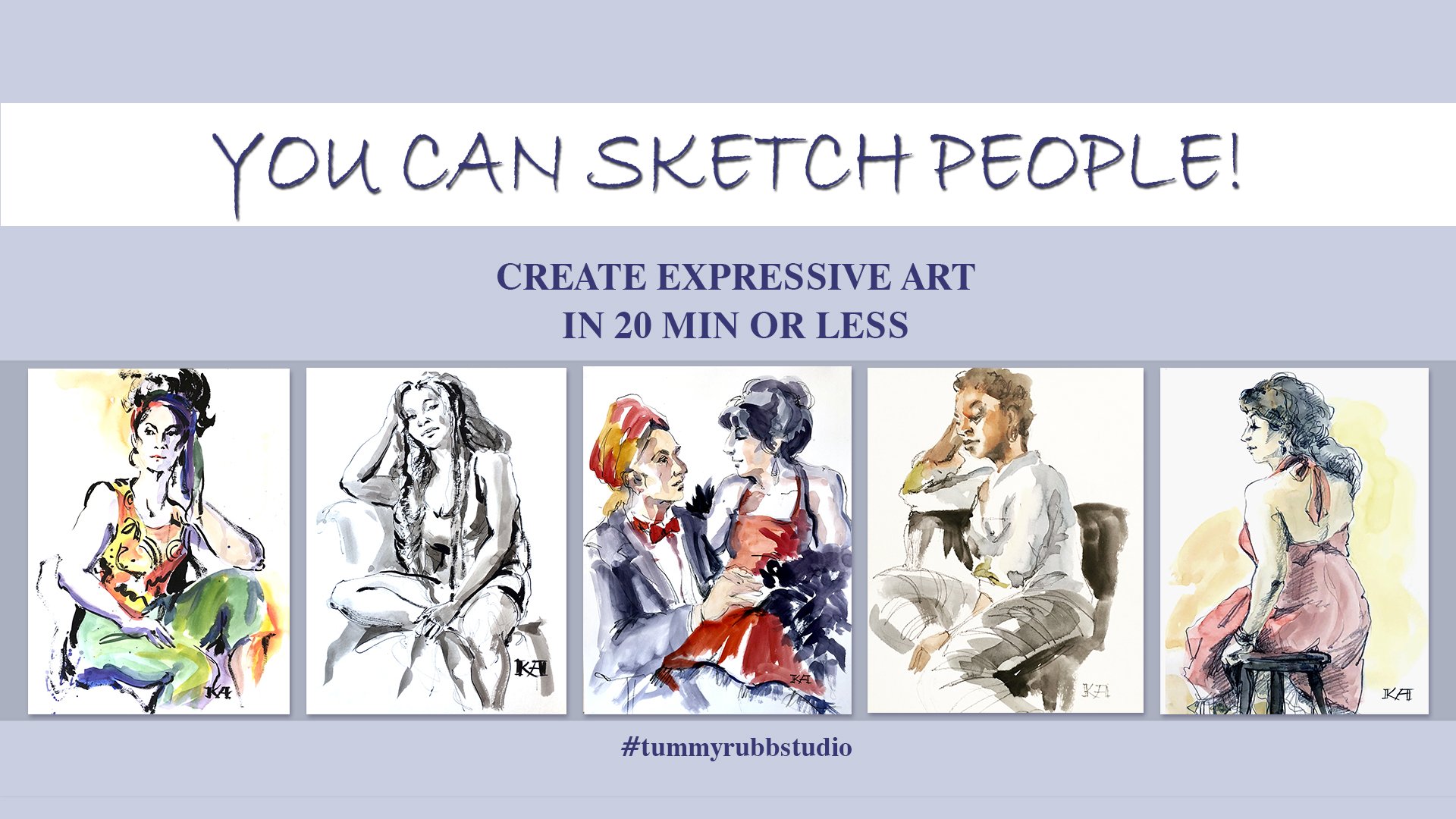
1. Class introduction: welcome to the class. You can sketch people understanding for proportion and color. My name is Sonya, Honest on the artists for 10 Arab studio human beings are one of the most fun and popular subjects in art, but left artist struggle when working on faces. Our faces are a collection of complex forms and capture in the correct proportions, and relationships of those forms can make or break the drawing. It's especially important since when looking at our human eye is first drawn to the base, and then we kind of scan the rest of the artwork. In this class, we will look closely faces and learn the techniques for quickly and correctly capturing them. I will be using mostly watercolor with some Marber's well cost sales and water soluble pencils. But you don't have to start. You can just use a regular pencil and sketch paper on this case. The principles explained in this class on my checklist for working on past sketches, but they also applicable for longer pieces like I will also reveal several secrets that will make a sketch is more expressive, dynamic and more student of yours. Let's get started
2. Positioning the features: welcome to the class. You can sketch faces, understanding, form, proportion and color to draw faces quickly and correctly. When you to understand the following typical position, you know of the features. Of course, everyone looked different, but there are some guiding principles that will be applicable to almost any face planes of the face. The face is not flat. It's made up of multiple surfaces at various angles to each other, and this will be much easier to see and draw. One would look at light and shadow relationships on the face. We will also look at how to quickly add some color to ours, catches to represent the skin tone and hair column, and I say represent because I will show you that mixing your realistic skin tone is not critical for a successful Skitch. Let's take a look at this. Diagrams off the human face in its features. The overall shape for adults will be novel or close to it. Some people have more rounded faces, some a longer but usually Children's faces of every round. And as we grow up or face a one gains, the features will be mirrored on the central line and set on horizontal lines that divide the face into roughly three equal parts, which again will differ from person to person now is the model starts to lift her head. The upper 2/3 off the head starts to get shorter, so we get for shortening and the gym comes forward. If the model looks down, all the central lines of the futures will shift down, the forehead will become larger, the upper third and the lower thirds will become shorter for shortened. So this was our starting point for an fast or looking at the face straight on. Now, if the head turns and we have, ah, 3/4 turn off the face, the center line will acquire a curve because faces are not flat, this likely curve and one side of the face will start to get shorter and disappear from view. But the horizontal center lines of the futures will remain in the same position, and if they had a stilted and 3/4 view, the same principles will apply. As we saw with a straight on view. If the model looks up, the central lines of the features will all move up and the forehead will become for a shortened. And if the model looks down, the forehead will become larger longer and the center lines of the features will come closer together. And also note the position of the ears how it changes with each position off the head. Sometimes you can see the models ears, but if you can, it will definitely help you with correctly depicting the tilt of the head. And, of course, the model can be turned all the way to one side, so we will see the profile. I usually try to avoid the post like that, because if the model looks directly into the light, there is no light and shadow on the face. And if the model is turned away from the light than the whole face will be in shadow. So it's just not very advantageous position in which to draw the model. After this very quick overview, let's look at each position of the head in more detail Here. I have outlined what we talked about the oval off the face with center line and with the center lines of all the features. Normally, I would use my pencil to draw in the features and all the details, but so that you can see it better. I'm going to use my Sharpie. I usually start with the eyebrows and just go down and I will draw in the eyes and the nose and the mouth. And then I would work on the outline of the face, looking at my model and giving a little more precision to the general oval shape that I initially sketched in. And I will show the jet bones and the chin and ears a very important for correct position, Year of the head. And then I will just very quickly sketching the here. Here is usually not critical. Just want to give a general idea off what it looked like on the model. And this is our straight on view of the model. If the model looks up, all the lines of the features will start to bend a little more downward. We will see the underside of the nose, the nostrils. Miles will have a downward band. The chin will come forward, the years will be lower on the head and the forehead will be fore shortened, so it won't be 1/3 of the face anymore. It will be slightly shorter, depending how far back of the head of stilted. So this is the straight on view with a model looking up. And if the model looks down and we're looking straight at her, all the lines of the features will start the bend upward, the line of the face. And in this case, the lower third of the face will become for shortens the general become shorter can we will see more of the forehead and we will see the top of the head. Yeah, And now let's look at this 3/4 view model turned her head to the side. So her right side or left side for us, the viewers will become for shortened. It will partial to disappear, and the nose will cover some of the I when I will be smaller than the other. Was shorter than the other should say in one side of the mouth will be shorter than the unsigned, and that reflects the turn of the face. But particularly proportions will remain the same as in the straight on view as an unforced and in 3/4 of you will also see more off the skull. So we need toe show that appropriately for the single 3/4 view. Would they had tilted up? Is very similar. There's the features will acquire more of a band. The lines of the features the central lines of the futures in the forehead will be slightly foreshortened, but not as much as in the straight on view. They're important to draw the here in the correct application and to draw enough off the skull because we will see more of it with a head turns. - And if the model looks down with 3/4 view, the trickiest part is Teoh. Draw the ice correctly. The eyes are the away from us, will be almost completely covered by the nose, depending on the angle, of course, and the lines of the futures will start bending upward and also observe how her chin almost completely covers the neck on that side of the figure. And the last few we're going to study is the profile, so basically just need to draw correctly the outline off. The features catch all the angles and proportions, and on the most important thing is the distance at which the ear is located from my reference plant. In this case, I'm looking at the I and to draw enough off the skull because we will see basically the whole skull, and I'm even drying out of room for the ponytail, and that's the profile, you know.
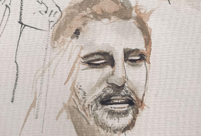
3. More about features: in this video. Let's talk about each future individually, and I'll mention a few mistakes that can happen when we draw a human face first, we'll look at the eyes. They're not flat. There are little balls set into eye sockets. So if these air our lids, there will be a bit of a shadow on both sides. And then there is the iris and the pupil with the highlight. And when the person's hands start to turn, we look at it, and 3/4 this side or this side will become for shortened. It will start to disappear. So this Carvel change and you will still have a bit of a shadow. May be on the white of the eyes, and I'm going to be your wife. And then in profile, it will. One side will completely disappear, so it will look like something like this, and you will see the the curve of the eyeball and have your virus Smears were here, and then the lashes will stick out. So don't draw. The eye is a flat object and the eyes that also set inside the ice Alkins. So if we draw the eyebrows and the eyes, there will always be if the light is coming from the top from the upper left or from even from the street top, that this will be said back related to this surface. So there will be a shadow somewhere here may be close to the nose as well. So it's very rare that there is no shadow on the the eyebrow because Isa set back inside the sock ins. And if we look at it in 3/4 of you traveled in this way Hi, bro. Some sort of a line of the nose and the other eyebrow. And the eyes are not gonna be right here because they're set back. There will be an angle here, and there will be inside the socket so there will be offset. Relate in relationship to the eyebrow. And this I because it's back, it will be partially hidden by the nose. And it looks like this you might see with white off the I kind of connecting with water view and the wrong way to do it would be Sometimes I see when people draw and drink water and they draw this side kind off, begin to android kind of like out here. So they make this distance too large and this I starts toe pop out of head. And this is this is not correct, So I will always be a set him. So this one, you will have this curve here, curve of the eye socket. People tend to dry it flat, so that's not correct. Position off the ice. Themselves on the face is very important as well. Make sure you don't draw them too high. We briefly talked about the fact that the adults their faces are roughly divided into three equal parts. So the line off the eyebrows is 1/3. Yeah, and bottom of the nose is 1/3 and 1/3 is the tip of the chin, and the mouth is located somewhere here and the eyes are located somewhere on leave eyebrows. And even on this schematic, this is the top of the head, not accounting for hair. So if a person has kind of pokey here, there will be even more volume on top. And what sometimes happens is it's in. It's kind of a now our nature. There was even scientific study proving that people tend to do this independent on off being an artist or not, we tend to draw the eyes too high on the face, and I know I do that very often when I start and then you end up with something like this, which is obviously not the correct proportion. So it's no big deal because we start with the light outline. It's very easy to correct. So when you draw your face or scheduled in, likely, you can always go back in and they have the forehead and then you will dan the hair, and if it runs off the page, it's no big deal. But keep in mind that would tend to draw the eyes way too high on the forehead and just check your proportions. So it's approximately three equal thirds if we simplify. The human knows it has a friend, two sides and the bottom, and that's what the nostrils are located. If we look at a human knows, it's a pretty complex form, and it has four surfaces. If it has the front, it has the bottom surface and has two sides. So if I draw in the nose into this diagram, I will say something like this. No, the tip of the nose and the nostrils will be here, and the people from it overhang a little more. And then the openings on the nostrils will be here. And so this will be where the eyes are going to be connected to the nose, and this will be this will be connected to the eyebrows. So if we look at it in 3/4 you one side will become for shortened. But we will still see the front. We'll see the bottom, and we will see this side. If I draw in features into this diagram, I was something like this. And then there will be the bottom portion off the tip of the nose. That might be some nostril visible. That will be the opening of the nostril. Did this nostril? Then this will be the eyebrow, the edge of the eye socket, and the eyes will be sent back some way here. So that's knows and take water. You okay? Um and we can do the profile so it will just see the one side of the nose. But we will still have this side, and we might see some off the bottom surface. Knows my much. See this just slightly into this knows the nostrils will be located on the bottom surface and sold this nostril and this row. So a lot of times I see that people drove something like this. You will never see the nostrils as circles unless the person is standing right above you. And not even then the nostrils are located on the bottom surface. So they will always be for short. And you need to also account for the tip of the nose. It will most likely overhang. So you might even see. Just may start over right here. Um, you might not even see the openings off the nostrils. So knows will look something like this. There will be just the hint off the nostrils. And because this is the tip of the nose protrudes usually quite a bit, you know, depending on the person's features, the nose. If the light is coming from upper left or even from straight up anywhere, the tip of the nose will cast a shadow. So this bottom surface, first of all, it will have the core shadow, and then it will cast a shadow under the nose, depending on where the light is coming from, So this situation will never curve. This will be always in shadow, and on 3/4 view, this will be in court shadow. And then it will cast a shadow, depending on the shape of the cheek and direction of the light and in profile, with bottom pulled in shadow. And there will be some sort of a cast shadow from the nose. So don't draw the pig's snout. The humans nostrils don't look like that lips of volume, some more than others, which means we need to treat them as a geometric object with light and shadow. They kind of look flat when we look at them straight on and fuss. So when we draw this, first of all, keep in mind that most likely this will be setbacks. So there will be small shadows here, and the upper lip might cast a small shadow on the bottom lip, and most likely, this will be protruding, so double the cast shadow here. But also, if you look at lips in 3/4 view or oven in profile, the side will start foreshortened. Something like this. So this shape, it's not a flat shape. It has a curve to it and then profile. The one side will completely disappear, but this is not a vertical surface, so it will go in, and this bottom left will most likely protrude forward. So that's where that cast shadow is coming from because the bottom left cast this shadow and the upper lip is most likely turned away from the life. So it will be in your shadow to some extent and depending how much it protrudes. It might cast a small shadow on the bottom left, and very often people draw lips, and they either just color them all in you quickly, which looks like a person is wearing lipstick for the lips. I just glued onto the face or they don't show any shadow it all than it looks flat as well . But this is not correct, because this is a protruding shape, so it will be darker than the bottom usually, and there will be some casts shadows, because it's this surfaces that turned at a certain angle to the light, so don't draw flip flips here is a very important than helpful in positioning the features . Don't forget to draw them. The last thing I wanted to mention is the position of off the year. If you can see the models here it list, you can guess at their location. You can see the air low with something. It always helps to draw the ears. And that will help you with the correct size of the hand and with correct position of the features because he can relate. Positioning of the features to the here and what we need to keep in mind is that, um, human skull located So we have. This is where the face is red. We have that knows somewhere the mouth on the chin. And this is where the brain is red and they job would always come to the ear lobe. And that's immediately helps you with the size of the head and with this distance as well. And even if you look a 3/4 view, we'll do it this way. So if we draw the head just when we started the outline, doing this the jaw and drawing the ear that immediately gives us the basis to work with because we know that neck will be set somewhere in the cereal, we can draw the neck and then we know the face will be a little bit central line and we can divide this into ther's. And even if we didn't have time to draw the face, this gives a sufficient basis to work on it. Even if the model moved a walked away or something and we can draw in the teachers and we know the nose is going to be some way here and the miles will be somewhere in this third and we're already took me with three seconds to draw the face. If I started with the light right outline and I drew the jaw and I'd really here, so here's a very important
4. Planes of the face: make the face more realistic and describe it as a complex, three dimensional object. We would use light and shadow. Since our paper is white, we will leave light areas alone, and we will add some kind of shading to darker areas. As always, we will go from large forms to smaller ones, and we will carefully observe our model. If you're drawing on toned paper, the paper will be your middle tone, and you will add shadows and highlights. Let's go over each position that we initially sketch with just line work and try to add some tone and shadowed areas. I will be using ink washes just because it's faster, but you can use pencil shading, charcoal, black watercolor. Whatever you have, hand him for reference photos. I positioned the light as it is typically positioned in a figure lab on the left and slightly above the model. If you're working outside or in unstaged environment. The light, of course, will be different, but most likely will be coming from above unless it model is holding a flashlight under the chin. Then you'll just have to reverse a light and shadow areas for rich view off the face I will start by defining overall light and shadow areas with my wash. So we'll do the whole shadowed side of the face or the figure if you're drawing the figure , and that, plus the land port might be not for finish sketch. But in this demonstration I will move on to smaller forms, and I usually do that only if I have time. With light falling from the side, the shadows on the face will follow the same pattern. Each time I so appreciated by eyebrow ridges, there will be a highlight. Don't make them the same in both eyes. That makes them look cartoony. One side of the nose will be in shadow, and it will cast, most likely wanna to shadow and Chin will cast a deep shadow on the neck. A bullet will be more shaded. Lower lip will cast a shadow. And let's do exact same thing for other positions of the face. And I'll speed up the video just the bed so we don't spend too much time on it. In this 3/4 view, the lights will be a little different because the model is basically looking at the light. The difference will be that eyebrow ridges are not cast in the deep shared that we usually seem above the eyes, the bread inside off the face and the nose will be in shadow. So we need to look at the model in make adjustments and our tunnels kitsch and the same will be true for 3/4 view, with a model looking up eyebrow ridges and the chin will not cast a shadow because the light will penetrate this areas and also noticed that I'm not darkening, that we live because the light hits it as well. - And with the profile viewers, I said, that will be very few shadows. There will be a little bit of shadow on the side of the face where it's turned away from the light and the back side of the head will be in shadow. And here are all the views of the face describing the planes of the face in tunnel relationships. You might have noticed that when artists do public demos, they usually like to pick. Older man is their models. It's because their features, much more defined and deep folds and wrinkles, will create hard edged shadows that are easy to capture. faces that have softer features, which women usually do, will have less defined shadows and will be harder to draw in pain. That's why it's so hard to faint. Children and babies. Their faces are very smooth, and they have very few shadows. I painted this demo to show you how I will age this model by hating more and more hard shadows to her face. The great soft edges and watercolor. We need to either apply color to them paper into previous wash, or we need to soften the edges with wet, clean brush. If your shading with a pencil, you'll probably want to smudge the ages with 30 on. So here she is, with all the ages smoothed and softens. Looking young in the aging part of this video, I add brushstrokes onto dry paper, and I don't soften them, which grades hard edges and shadows. So if you're drawing a weathered old sailor, wrinkles are appropriate. However, if you're doing the commission portrait of a lady and you want to be paid, wrinkles should probably be minimized and just soften as much as possible.
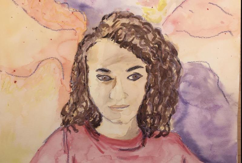
5. Working with color: Now let's talk about color to show that an object has volume and human faces. A complex geometric option were used ability off warm colors like red, orange and yellow to appear closer to the viewer in cool colors like blue, green and purple to recede. So if we use warm colors on light areas of the face and cool colors on shaded areas, we should give the desired three dimensional effect. Keep in mind that setting off warm colors against cool colors is quite sufficient to realistically describe a face, even if none of them represent a realistic skin tone. In this video, we will look at a couple of ways to quickly add color color's catches. In this first sketch, I'm going to basically do a tonal sketch with Derventa. Intense pencil. I'm using indigo, my favorite color, and then I will bad, a little bit of water color, and you will see how the sketch will come to life with minimum addition off color. I'm starting with a very light outline. I know it's hard for you to see, but bear with me for just the second. All will be revealed in the moment. Okay, I think everything looks okay. Now I can go over the whole face one more time, making slightly heavier marks. This time I'm looking at the features that they location in relationship to each other and also in relationship to the overall shape of the face. And I'm trying to visually measure distances and angles to make sure my sketch looks like the model and looks realistic. - Waken start 18 tone because I used water soluble pencil. Well, I need to do is pick up a brush wedded with clean water and just much The pencil in that way very quickly can give my sketch additional shape and three dimensionality. I'm covering with that blue tone, the whole right inside of the face on my right because it's in shadow and also can darken here. And I can add some smaller shadows around the nose. And on that I that's closer to the light weight sketches looking good. But I think what I'm going to do is go over it one more time with the pencil. Just a dark, um, in some areas, like the eyes, the area where the here meets the face and maybe deep on some shadows on the nose on the mouth and on the neck. Okay. If we wanted to stick with black and white or I should say blue and white monochrome sketch , we can stop at this stage. I think this looks like a finished piece of art, but I want to add more life to this kind of snow queen effect. So I'm gonna mix some water color and add a little bit of color to her skin and her hair. You will see that I spend exactly three seconds on mixing the skin tone amusing permanent orange with in addition of magenta, it might not seem like an ideal match, but you will see the final result. And I think it portrays her skin tone there. Realistically, if you squint and look at the reference photo, you will see that she has much lighter areas on the face where the light hits it and these areas. I'm leaving this paper. I'm not putting tone on there. And if accidentally put some on those areas, I can always watch my brush wipe with clean water and even maybe dot with paper towel if I need to. And for hair, I'm using my favorite make sure off Red, brown with mineral violet. And again, I'm not going for the exact town off her hair that I see in the photo elected color. It has depths, and it gives hair great volume, and it works for darker shades of hair. And again, hair has highlights. So I'm not covering the whole surface. I'm leaving either my pencil wash or just white paper in some spots where the light hits it . And actually, I think this kind of her whole right hand side of the face on my right disappears in the shadows. So I'm actually going to run the same mixture of mineral violet and red brown. But I'm going to keep it as a light wash much lighter than here. And I'm gonna touch up her lips with some magenta and note that I don't run the lip color all the way to the left hand side with the light hits it. And there is a highlight in the middle of the living. And now, to give her even more life, I'm going to add some permanent light orange to the most prominent parts of her cheeks to give her a little blush. And that really brings her face the life. The sketch actually look pretty good at the previous stage, but I want to show you a secret for making your sketches even more attractive and even more expressive. After I'm done with my drawing and watercolor washes What I do, I go over the eyes and the mouth with a darker color, a very often used mineral violet for that because it looks like a natural shadow on the face and accentuate the eyes and I deep in the shadows in the corners of the mouth, in the middle of the mouth. That gives your model a very pleasant, kind of likely smiling expression. And we're always more attracted to people who smile at us. And I also add a few dark accents to the hair just around the face, and that brings out the face and attracts attention to the eyes. And your sketch looks more appealing and your model looks more appealing, which usually makes models very happy when they see here is another example of working with color. You don't have to start with a tonal sketch or tunnel on the painting. You can start directly with the skin tone and as you will see in this demo, aval just gradually increased situation off my color and it will still give me the three dimensional effect. Then I will add some shadows with the same skin tone mixture, but neutralized, which means I will add complementary colors. In this case, blues and purples. Blues will be complementary toe orange to make the color cooler in shaded in darker areas. So I start with painting the whole face, including hair with light orange mixture. It's pretty watered down, so it's a light shade and then a mixing light orange with Crimson lake, which is more reddish orange, and I can start deepening the shadows. This will be my mid tone going over the shadowed part of the face, and I'm applying this more saturated mixture and it will go on Hera's well because then we will neutralize it with our blues and purples, and you have to look at the model really carefully. This implication is not random. I'm following what I see on the model's face. Now I need to let this dry, and we will move on to our third layer after this. Okay, the pain dried. So now I'm using even more intense. Make sure have more Crimson Lake in this, and I'm blind, 1/3 layer all over the shaded areas. Now this is going to be the basis for my shadows. I'm looking at the model, and I'm following the outline of the shadows on the face. It's already begins to look more like a face, and I want to soften the edges to a certain extent that lift in too much pain, hopefully, and I'm going to let this terribly dry, and now we can work with cold tones. I'm using ultra marine blue, and I'm just applying it on top of my orange under wash again. Looking at the model and following the shadows on the face and the hair and effect I'm getting is pretty realistic of. And though I didn't mix natural skin tone and I didn't use any black or brown still achieving realistic effect because tell him how light or dark the painters is much more important than the actual shade of the pain, the color itself. So if darks are dark enough and lights a light enough, it doesn't matter what color they are really in the next video will be just a short demo of me painting a face with random colors and still getting a realistic effect. After this school layer is dry, all I need to do is deepen my darks. I'm mixing ultramarine violet with the orange, which gives me a warm a shade more towards brown. And now the paint is very saturated are there to have any water in it and my brushes almost drive. So I'm just gonna deep on the shadows, around the mouth, around the nose and, of course, the eyes. And again, this is an expressive sketch. I'm not going for a realistic portrait, even though the wrist, um, resemblance to my models. I'm using the phone tomorrow for inspiration and for actual photographic resemblance, and we're done. Here is the final result in the short demo. I wanted to give you some pointers on painting Humanize. First of all, keep in mind that it's very rare that the whites off the I a very wide eyes around objects and also shaded by eyelids and eyebrows. And most likely, the whites will be in shadow and we can show that shadow either with skin tone, which works really well just a light wash or with a little bit of cool tone like blue purple that will push the ice back and make them look natural and not bulging out of the head. And second thing that works really well is adding a bit of Fred in the corner of the eye. And on the inner island. We have a lot of blood capillaries in the eyes, so they're not going to be only in gold color. They will have some warmth to them, and it seems aiding red will make them bloodshot, but it actually brings them to life and makes them look more realistic. In the same thing works for nostrils a swell everybody's blood in there, so using red in the nostrils makes the face more lifelike.
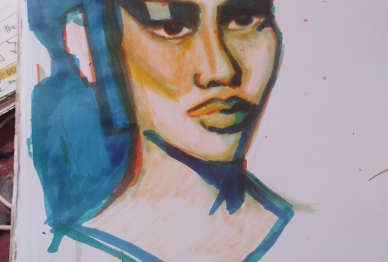
6. Importance of Tonal Relationships: In the previous video, we talked about depicting skin and hair with more or less realistic colors, and in this video, I would like to show you that color itself is not. Nearly as important is correct tonal relationship, which means having the full range of tones from light to dark. I'm going to use column gold, Scarlet Lake that will be my warm color. And for the cool colors, let's use some greens and blues. And as you see a converted my reference photo toe the gray scale because I don't need to see the color, it will confuse me. I need to see the tonal relationship. So as I did before, I'm going to cover the face with a warm tone. In this case, it's scarlet leg or injury. And then I'm going to drop in some cascade green on the shadow side and let's said slightly more intense, warm tone to her hair and her shirt now will continue working on the shadows with a little more saturated mixture of cascade green and blue. And since the shapes are smaller, musing a small a brush, I'm squinting slightly when I'm looking at my reference photo and I'm applying more saturated wash in the darker area. And if my doctor Kahlil runs into lighter areas by accident, I can always lift it off with a clean brush or even debit with paper towel. Way to darken the hair just for variety. Let's throw in some fallow blue. It's a nice, cool color. It will help us to describe the dark shape. Wait for the sketch to dry, or I'm going to pick up excess water with paper towels. So now our sketch has the range between lights and me tones. So all I need to do is at the door. I'm going to use a very saturated mixture of both green and blue, - and then any bit of warm color to the person's eyes always brings him to life. So let's drop a bit of red orange in the eyes on. I'm also going to darken my shadows on the neck. That shed was pretty dark. It's almost his darkest hair. I'm going to correct her mouth a bit to give her a nice, pleasant expression, and I feel the shadow side needs to be darkened a little more and unified at the same time , having too many details on the shadow side makes an image kind of fracture. Do you want everything to be nice and unified? And also we can see now that the hair is way too light when you to darken it. I'm going to use Saleh blue and maybe I'll darken the shirt as well, unless literally in a bit of background, just to make this Ketchmark finished, I'm using permanent orange. It's very light orange color, and that's it. Here is the final result, face painted with random colors without mixing the realistic skin tone.
7. More on sketching hair: in this video, I would like to talk some more about sketching. Hair hair is not flat. It will have light and shadow, which, when you to show, to convey that the Harris three dimensional. Let's look at this first example. A lot of times I see people doing either this all this neither off, which is exactly correct. First thing we need to do is show overall, light and shadow, so it will look something like that. And after the overall volume is defined, we can go into detail and show their core shadows and the shadows that they cast. And even if you don't want to show overall shading, you're working with just lines by their ring, your pressure and line density. You can show that hair has overall volume. It's not flat. And here's another example. Our model has long hair, but the same principle will apply. We will show overall volume, look at big shapes first, and then after that's done, we can go into detail and define it curl and smaller shadows that they cast and one was catch here in color. I think most important thing is to show warm vs cool areas which will make the hair three dimensional as well. I'm usually not that much concerned with depicting realistic hair color, as you will see from this examples. In the previous video, you saw me use combination of purples, blues and reds browns to pain dark hair. Now let's look at the blonde model. I'm starting with lemon yellow full highlights, and then my mid tone will be medium yellow tone. I'm using cadmium yellow and shadows on blonde hair will be warm as well. I'm moving on Teoh light orange. It's and I can also around the same mixture on the face for skin tone, and I'm going to deepen the skin tone with Scarlett like to give it warms. You know she's very fair skin, so she will have like a slide blush, which Scarlet Lake represents very well waken start applying cool shadows. I'm using ultra marine blue, and I'm dropping into my yellow when it's still wept. And if those two colors mix and become green, that's good as well, and I don't want no the shadows to be the same song, mixing in some magenta into my blue. I'm not using mineral violet because that color granulated is, and I don't want any granule ation on the face, so I'm mixing my purple, and if you look at her hair, it's cool shade on top. It's almost like neutral green color, so we're going to drop that in a mixture of ultra marine blue and light orange. You will see that I'm running the same colors on the hair and on the face, and I think that if you limit your color palette and you also use the same colors throughout your painting, if you can, it really unifies it in a congratulate. Add color to her hair, and the important thing with blond hair is, of course, the preserve of the highlights. If you apply too much tone and you will leave no highlights, it will just look flat and a natural, and a gradually keep deepening the shadows on the hair and around the face. My painting is still well, it would probably need to show something around the face. I'm gonna just indicate her shirt, throw in a few cool purple and blue shadows on the shirt, and I really like that purple background. I think that's is a complementary color to yellow, which I used for the hair and sets off the model really well, but not to make it all the same. I'm gonna throw in some ultra marine blue as well, and I'm always tempted to go very dark on the background. But I just need to restrain myself and working layers and gradually build the dams. Otherwise the color will become dull. And my team and I don't want the hair to have a heart age, some running some background through the hair on the ages as well. And I'm going to let my watercolor dry, and I'm going to add some details with water soluble markers and similar to when we work with pain to working with markers. You don't want to just have the same shade everywhere. So I'm using a whole bunch of them, as you will see at some shadows and some details to my painting. So I try not to think about Shadows is, let's say, gray or black. I think about the Miss Color. I'm going to use blue and purple and green markers too deep in the shadows and to have details and also in the face. If you like orange and red markers around the nose and the eyes for fair skin. It really makes the difference, and it brings to face toe life. And those brush pants are really good for showing separate strands of hair. They're much easier to use than brush and take a lot less time. So that's what I'm going to do. Just detail the hair a little bit, hair cast shadows and you object. And there will be some cast shadows that I'm going to show with cool tone. Of course, I'm constantly looking at the photo trying to see if the tone that I have not color, but the value I have on paper is what I have in the photo. And it can always go back toe, watercolor and just deepened and soft in some things here and there like I'm doing now and we're done. I'm gonna sign and let's look at the final result
8. Overall Composition and Development: in this video, I would like to talk about steps we can take to turn our puts kids into fully developed work of art. First, we need to think about the composition of our peace will choose a focal point. It could be the face or the whole Ciger. We will have some movement, some elements that will guide the I'll be fewer around the peace. We will let some design elements some background that will help us to feel the page, but at the same time to keep the attention on the focal point. And, of course, we want our darks and lights to be first of all present, and they are for and also distributed, not all bunched together on one side, but somehow thought out and arranged on the page. So let's say I'm sketching my model with oil pastels and only have a minute or two. This is a dynamic foes, so it probably won't last very long. Let's say this is all I have to start with. I have a photo and I want to develop its very quick skates and to finish so far to illustrate my thought process, I'm going to do small thumbnail sketch just to explain what I'm talking about. So let's say here is our finger and she's on a rectangular sheet of paper. Her hair is going to be dark, so maybe what I can do is connect the dark shape of her fear with the right hand side of my sheet. On balance, it that might be something dark under her left arm left on my side. And maybe even we will extend this dark shape towers the left side of the peace but not make it as dark as the right side. And the bottom left corner can have some texture or something like that in Midtown range and the upper portion. I'm goingto leave life, and there will be some shadows on the finger. So if we look at it against the upper portion is live, then we will have mid tone on the left hand side, some mid tone and texture on the bottom. The model itself will be very like she's light skinned, and there will be some light on the arm there and the sections of her hair, and the design is going to be dark. Now let's transfer the design That composition they came up with all the elements that complete the figure. Let's transfer them on our sheet of water called paper can again. I'm working with oil pastels, and now that I have timeto work, I'm going to switch between different colors, use a few different ones purples and some purple, some yellow. So that's my initial idea. Another thing I'm going to do that I really like to do with oil pastels. I'm going to pick up white and applied to light areas to preserve them white. I'm not using masking, so I need something to help me save what they burgs. I'm going to use white oil pastel, and now we're ready to pay if we want to add color it for our sketch. If you have time and inclination to do so, we need to think about the following. We need to choose a color palette. Our color palette needs to help us to maintain the tunnel relationships that we came up with during the initial idea stage. We want to create interest with various shapes and maybe at some interesting textures, and we need to do something to unify all the elements and tie them all together into the finished piece of art. I'm going to start with a light wash off permanent original. The skin here is to show the skin tone way can drop a bit of scarlet lee on shaded areas. Intensify the color. A good rule of Hamas once you drop the color somewhere on your painting, you probably wanted in a few of the places because that will make a painting more balanced . I'm going to run this permanent orange left inside. You can actually added to her hair. It will be good basis for our highlights. Waken pain The hair with cobbled violet E It's going to mix to a certain extent with orange and give us a nice brown color. And even if it doesn't, it looks good by itself. And let's also put it on the left hand side. So I'm already establishing the dark street that goes kind of diagonally through my painting and creates movement and creates interest, as was my initial idea. And I want to use my favorite color walker, a ping from her shirt. I know it's not that on the model, but I invented all the other colors, so why not the color of her shirt. So let's put it here and also on top, right waken to some splattering to achieve the texture that I was starting about and on the bottom left. I want to keep things like so maybe a little lemon yellow. Maybe the whole bottom portion can be lemon yellow. And let's add a bit of a permanent orange. You some splattering again. Give us nice texture. Here's my Scarlet Lake again. I'm intensifying some things in the painting to restate that movement diagonal movement that I want on this first layer. Let's let it dry and continue working way have our figure drawn we have our color was loosely distributed on paper, but everything is about the same tone value. So what we need to do is deepen some areas to have more of a tonal range. So I'm going to do that. I'm going to mix more pigment. I'm mixing French ultra marine with the cobalt violet deep in a made in scarlet lake as a complementary color to achieve when neutral mixture. So it's not too purple, and I'm going to darken her hair live in the highlights alone. You probably want some variety in this shaded portions as well, so I'm using a little more blue in the mixture. Just toe have some variety in my colors, and I'm going to run the same tone into the dark upper left corner area that I planned during my initial sketch stage, and I wanted to have a dark area under her left arm. My left, and we will deepen the shadows on the figure a little bit. Even though I'm imagining the background inventing all this colors, I still want the figure. Look more or less realistic. I'm going to forgive the face a little more definition, the faces, my focal point so it can't be blurry. - The hair is still a little too light, so that's deep in that as well. That's my main idea. That's flowing hair. I wanted to draw the view's attention, so I'm looking at the painting and then making all these decisions. What does it need to convey my idea and to achieve my goal? And I want to lead to my focal point, which is the face of the models. So I'm going toe. Add more Scarlet Lake around the face on the bottom left area lost its structure so you can use a little more pigment as well. Maybe a little, most flattering is praying from the bottle. Okay, Now I think all our tonal relationship are in place. So all we have left to do is add some finishing touches. I've decided that the unifying element and my painting is going to be the line work with oil pastels. I'm going to add some more design elements that will, first of all, full the whole painting together. And there will also add even more movement and picture and interest for the viewer. I'm using several colors amusing purple and orange and brown. I don't want it to be able to say what will be rather boring. Okay, I think that's enough texture. And another thing I'm going to Dio is since the faces my focal point. I want to have it the most contrast in my painting. So I'm going to darken her eyes and the shadows on the face. I'm using pains, great to do this, and I think I can even darken the hair around her face. That will also help to bring attention to the face way, turn a really quick sketch into a finished piece of art, using our imagination and developing the composition, selecting the color palette and stick into the color palette and keeping the viewer interested with a range of tonal relationships with texture with design, but at the same time in pain in harmony and unity in the painting.
9. Final words and class project: I hope you enjoyed this class. Discussions have painted in. The demos were pretty well developed, but they don't have to be. You can use on the pencil or in ink pan pastels, markers, whatever materials you have handy and create unique, expressive art. It all depends how much time you have to spend on each piece. Unfortunately, or fortunately, with art, it's not enough to know the rules and watch the tutorial. It's extremely important to practice as much as possible. Try to find time to sketch people in their faces. Always have a schedule candy to draw friends or family members. If you can go to model session at the local art organization or school, quipping, great masters is an excellent exercise as well. Nowadays you can find a lot off their work on mind. You don't even have to go to museum. Please share your sketches in the project section, even though the Justice Kribel they're great inspiration for the students and I will review and feedback on each one. Please review this glass. It helps other students to find it. You can find my art projects and information about other classes on my website time. Arab dot com. Let's connect on Social Media. I regularly post art photos and videos. Camera studios. YouTube channel is a good place to find free tutorials, materials review and live streams They care and have a creating.
 Ksenia Annis, Figurative artist