Transcripts
1. About the Class: Hello, everyone and welcome to my watercolor class where we will be painting this interesting lady in a lavender field. We're going to paint her using simple but liberating flowing techniques. We'll explore the art of splashing, splattering, and the unique effect of salt in watercolor. If you're wanting to learn to paint loose human figures, then this class is for you. Don't worry about sketching as I provided a drawing template and the reference photo in the resource section so you can go ahead and enjoy painting with me. But if you'd like to learn good life hacks, that will make sketching easier, I encourage you to take a look at my previous human figure Class 2. In this class, you'll learn to paint as your heart leads. You'll overcome your fear of playing with water and pigment. You'll enjoy the beauty of creating spontaneous splashes to bring out the essence of your painting. I'll be sharing detailed instructions, painting principles, tips and tricks that will help you as you create your own watercolor work. I'm Bianca Rayala. I'm a watercolor artist and a silver brush educator from the Philippines. I love watercolors and I'm so passionate about sharing my love for art. My goal has always been to inspire people to pursue their creative passion and purpose. Come and join me, let's take this beautiful journey together.
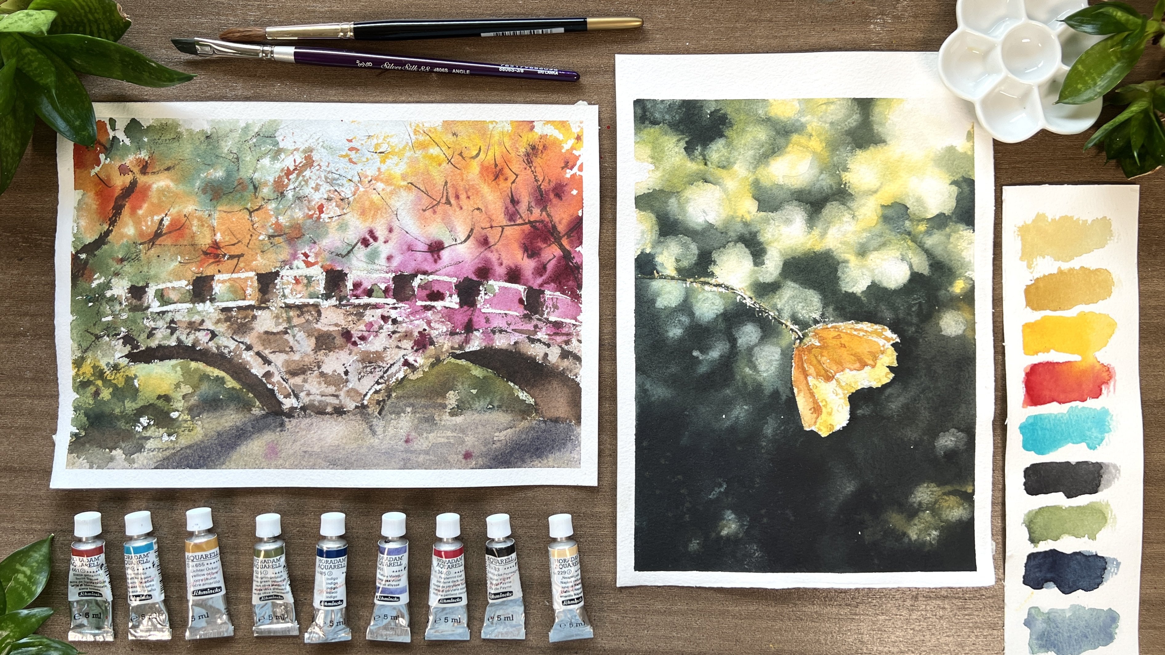
2. Materials: Thank you for taking this class. Here are the materials that we'll be needing today. I'll start with the paper. I'm using 100 percent cotton watercolor paper. It's cold-pressed and 300 gsm. This one is a sketchbook from Baohong. I love drawing people on this sketchbook because it's like journaling special memories. For the paints, these are the colors in my watercolor palette: yellow ocher, burnt sienna, Indian red, perylene violet, quinacridone rose, neutral tint, amethyst genuine, horizon blue, cobalt turquoise light, lavender, compose violet, veins green, indigo, olive green, and lunar blue. My essential colors for skin tone is yellow ocher, burnt sienna, perylene violet, and amethyst genuine. But you don't need to get the exact colors that I have if you don't have them. Just find something very similar from your facet and you're good to go. The basic brushes that I use in this project are, number 1, a natural hair round brush for creating washes and spatters, second, a synthetic round brush for details in fine strokes, and a flat brush for watercolor splashes to create this beautiful effect. All the brushes that I use are from Silver Brush. We will be needing salt to create this beautiful effect. I used pink Himalayan salt for this work. But if you don't have one, a regular sold will do. It is also interesting to experiment, as different types of salt create different watercolor effects. Prepare two cups of water, a small water sprayer, some tissue paper, pencil, and eraser.
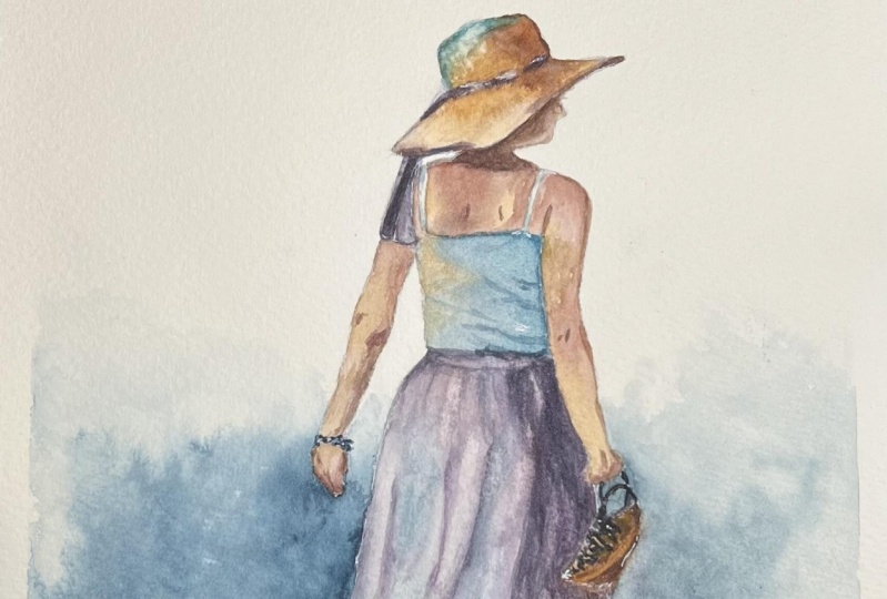
3. Project #1 Walking Lady- Pencil Sketch: For our exercise, I'll be drawing on this sheet of paper which is made of 100 percent cotton in portrait format. I placed the figure off-center because I plan to paint a soft background to show contrast on where the light is coming from. Then I will also add a cast shadow here on the right. Let's review some basic concepts on sketching. First, we start with planning how big the drawing should be. What I do is to use the height of her hat as the unit of measurement and count how many of it is the whole size of the lady from top to bottom. Knowing that there are six parts of it, I can safely estimate the correct size to be drawn on my paper. To know more about the basics of sketching people, I suggest that you watch my previous human figure class here at Skillshare. I started drawing the outline lightly from head to toe. I also pay attention on the angle of the arms and feet so I could imitate her movement. When it comes to details, try to avoid drawing all the lines that you see, but just the main and dominant ones only. In this case, draw only the strong lines or folds that you see on her skirt. I've provided a copy of the pencil sketch and reference photo at the Resource section, which you can use as your guide when drawing or as a template for tracing.
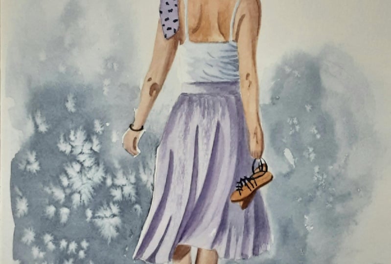
4. Painting the First Wash: To give you an overview of the painting process, I will paint the lady from head to toe in one layer. After the first wash, I will enhance the picture by adding shadows and contrast including a soft misty background. Lastly, we finalize the painting by adding some small details and highlights. Let's start with the first wash. Here, I want to portray the reflected light from the sky to the hat, so I mix turquoise and [inaudible] genuine. I paint it on the top ward portion and the area lighted by the sun. Then I continue painting it with yellow ocher, blending both colors softly to eliminate any hard edges. To paint the dark tones of the hat, I simply add brown churner on my mix. Just play with the mixing of colors as you can create different tones depending on the ratio of your mix. For example, more brown churner and less ocher will give you a dark saturated tone. During this step, I also try to set up the tonal values by making the shadowed areas dark enough and the lighted areas light in tone. Our aim is to paint this in one layer, so we need to show volume and dimension on our base wash. For the face which is in shadow, I mix brown churner, a bit of horizon blue and [inaudible] genuine for dark tone. I've painted the inner part of the face with the creamy mix of paint, and then softly spread the paint on her face. I accidentally stained my paper with my brush, so I will try to lift the color using a wet brush and a clean tissue. Now, let's move on to painting her back. If you will look closely at her back, you will see a different skin tone because some parts are lighted while some parts are in shadow. To make it simpler to understand, the base color that I used for our skin tone is brown churner added with a bit of horizon blue. If I want the tone to be lighter, I add a bit of yellow ocher. In contrary, if I want it to be darker, I add [inaudible] genuine and perylene violet. I paint our back portion by portion so I can incorporate the appropriate skin tone. One important thing that we should be careful in painting people is making sure that there is consistency in the color of skin. I notice that a common mistake on beginners is that the base skin tone differs all throughout the body. It is like having a fair skin on the arms then a yellowish tone on the legs. The key is either having an enough pool of color mix before starting or constantly swatching your mixes before applying to your work. It is very helpful if you have a copy of your reference photo beside you so you can imitate correctly the tone on each body part. Now, as I paint the hands, take note that the fingers usually are reddish in tone, so you use more perylene violet on this area. As we paint her white top, I will use a bluish mix of horizon blue and amethysts genuine. I will also add a bit of lavender and make the mixture very diluted. For the one portion of the shirt, I paint a thin mix of ocher and then blend it with the blue shade. I make the right side darker for contrast. Also, I will gently soften the edge between the skin and the top using my synthetic brush. Now, I will go back painting the left side of the picture starting from the ribbon on her hat down to her arm. I simply use perylene violet and diluted it with a bit of horizon blue. Then using a creamy mix, I painted the ribbon. Same color principle will be applied in painting her left arm. When I paint a dark tone, I soften the stroke with a clean brush so it will smoothly transition to a lighter tone. Don't forget also to add those dark spots on the elbow as this small mark will help give your picture a dimension. For her hand, I still did the same thing of making it reddish using perylene violet. Then I'll gently soften the tone as it reaches the wrist.
5. Painting the Skirt and Background: Now let's paint the skirt. I'll create a soft pink-purple mix using amethyst genuine, ferritin violet, and horizon blue. I will make my mixture flowy yet saturated. I start here at the waistline. Then for the lighted parts of this skirt, I will use the same mix but with more horizon blue in it. Here in the waist area, I started with the small purplish mix then transitions to a bluish mix to show the lightened portion of the skirt. The same principle applies to painting the other parts of the skirt. Try squinting your eye to clearly see the light tones and dark tones. If it is quite a struggle for you, you can create a greyscale copy of the reference for tone so you can better see which areas should be light, dark and a mid tone. Now I'm using a softer brush so I can easily spread soft tones of colors. Notice also that I softly connect the colors from the purple hues to the bluish hues, so I can create the soft transition of colors. Notice also that I paint the dark part of the skirt on the right, with a strong purple mix, and I paint the lighted parts with self-blue mix. Now, while the area is still damp, I will make some thin strokes to portray the pleats or the folds of her skirt. I try not to draw each and every pleat I see on the reference but just carefully select the dominant ones. After all, I'm not aiming for a realistic painting. It is not necessary to draw everything similarly. The important thing in painting impressionist work is to capture the tones and the movement of the object. Using a flat brush, I pre-wet the area around the lady to create a misty background. I avoid wetting the lady, but instead, I wet a large area so when I apply the paint there would not be hard edges around. Then I mix indigo and lunar blue. I just use lunar blue because it has a beautiful granulation. My paper turned dry quickly, that's why the paint didn't flow much. I try to make it flow a bit by wetting the area even more. When doing this step, be careful not to overdo it as you might be carried away and paint the entire background. Paint just a portion to create an atmospheric feeling. One more thing, since the light is coming from the left, I will darken this left side to create contrast to the lighted part of the skirt. I continue painting the lower area with an even softer tone. I soften the edge between the background and the skirt, that's why I'm using a clean brush to remove those hard edges in between. Now, as I paint the right side, I will make it a bit lighter and I will try to show continuity of color from left to right. When the background gets a bit moist and dry, I can proceed painting the legs and feet. I will make the feet a bit reddish by using perylene violet and then blending it with berenjena. I painted the shadow using berenjena, Amethyst Genuine, and perylene violet. As I paint the slippers in berenjena, I will add the strap and details later on when it is completely dry.
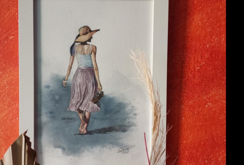
6. Painting Shadows and Final Details: As we do the final stage of the painting, make sure your first layer is completely dry. On this step, I will be adding shadows and details that will enhance the picture. I will start with a cast shadow on the ground. I'm mixing cool dark blue color using indigo, Amethyst Genuine, a bit of burnt sienna and horizon blue for the shadow. I start from the tip of the toes, then paint towards the right direction making the rightmost part faded and soft. Now were done. I will be painting details starting from the hat. I will add some accents on the ribbon using a thick and buttery mix of paint. Next, I will paint the cast shadow on her back using burnt sienna and Amethyst Genuine. This is the same color that I will be using for tiny details on her shoulder blades, underarm, and elbow. When doing these final details, your brush should have very minimal amount of water. This is necessary so you can control the stroke and you can have this nice, thin layer. We don't need to define the hands too much. Some suggestive lines would be enough to show what it is. I darkened the face a little bit since the color faded too much. Basically, I'm just checking the spots that needed to be darkened on this stage. I also keep an eye to my reference photo so I won't miss any important detail. Now I will enhance the shadow on her legs by darkening it a bit more. I will be adding little details on her feet too, and don't forget to soften the edges so the colors will blend together. Using a thick amateurs genuine paint, I paint the strap of her slippers. Now, I go back to the skirt and paint some dots and lines on the pits. I also dead my finger on my strokes so that it would not be too strong, and would blend on my initial layer. But be careful not to overdo again this stage because it will be distracting to see too many dark lines and strokes. I enhance the shadow here on her skirt, and also underneath the slippers. Lastly, I'll add some shadows of folds here on her shirt too, using muted bluish gray color. Our painting is done. See you in the next portion of this class, which is painting the lady in lavender field using even more exciting techniques such as splashing, splattering, and salt sprinkling. See you there.
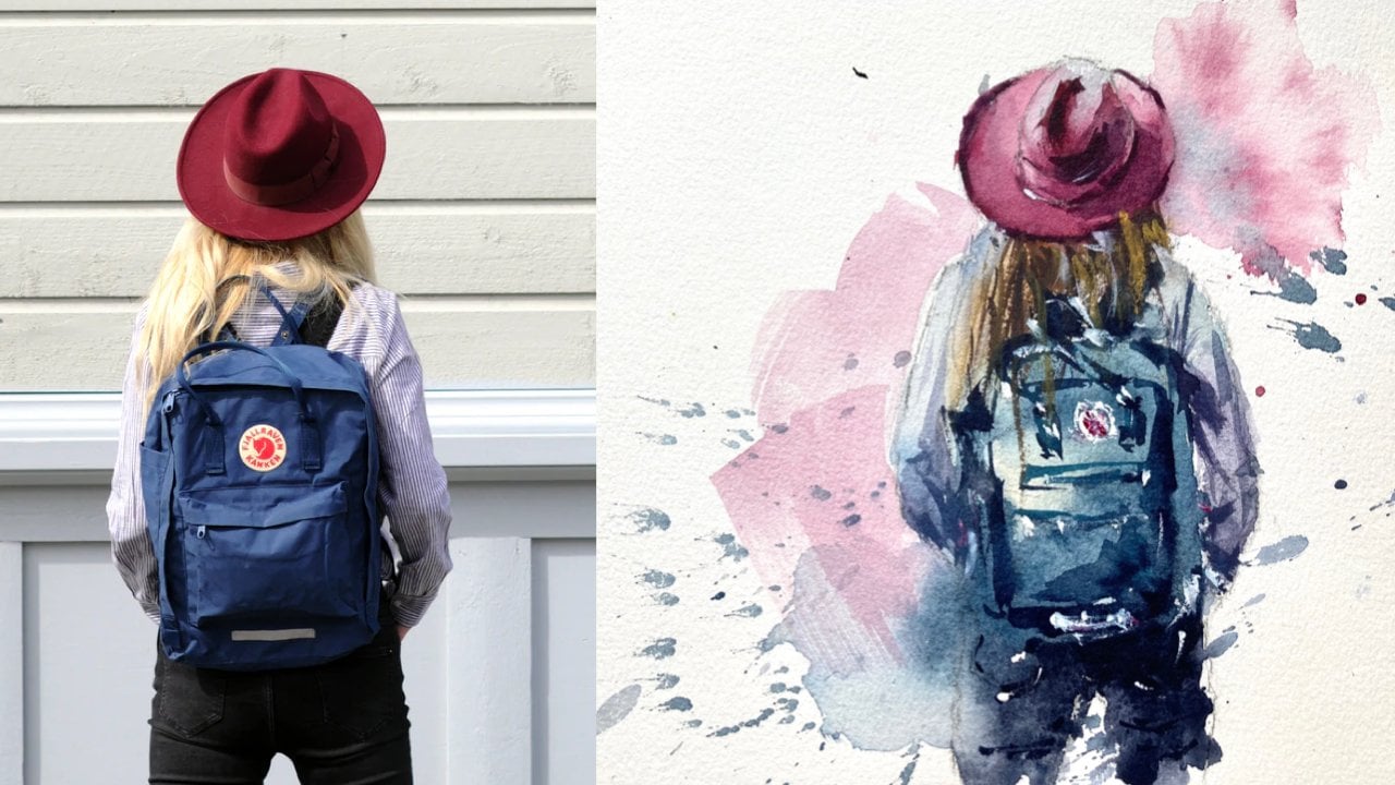
7. Project #2 Lady in Lavender Field- Pencil Sketch: I prepared the template of the pencil sketch for your guide to save much of your time. You can find it in the reference section of this class. If you would like to draw on your own using the reference photo that I also provided, feel free to visit the fundamentals part of my previous human figure class to get a good refresher on drawing human figures. Just to share some tips as you prepare your drawing, it's essential to position the lady in the right-side part of the paper because we want to create a splashing effect from right to left. Decide how big the image should be and keep an eye on the proportion so you can create a balanced composition on your paper. There is no need to draw the lavender field as we will let the salt and watercolor to create the impression of the field. Lastly, don't forget to lighten the pencil marks before starting painting. Let's get started.
8. Painting the Hat and the Hair: [MUSIC] Let's begin painting from top to bottom. I mix horizon blue with a bit of amethyst genuine to paint the reflected light from the sky to her hat. I'm using my silver silk 88 synthetic brush so it will be possible to create controlled strokes and my brush won't contain too much water in it. [MUSIC] Next, I create the color mix for the hat using yellow ocher, a bit of burnt sienna, and horizon blue. I added a hint of horizon blue because I want to make the color more saturated. I carefully blend the colors together, so there will be a hard edge between the transition of colors. [MUSIC] I darken this board a little bit, since I always refer to the tonal value on the reference photo and this part is slightly darker in tone. [MUSIC] Then now, we can also add a little bit of amethyst genuine on the same mix, we'll have an even darker color. [MUSIC] Using a thicker mix of burnt sienna and ocher with amethyst genuine, I darken the tone on some parts of the hat to bring dimension. For the dark ribbon on her hat, I just use a creamy mix of Payne's gray and remove the excess water from my brush before I create the stroke. [MUSIC] One important thing I want to share in painting human figures is to maintain color connection between all elements. When we say color connection, it is basically maintaining continuity of colors all throughout the subject. We're building a smooth transition in colors and tones. It is like painting the subject as a whole, rather than painting it portion by portion. Thus, leaving hard edges between colors. [MUSIC] Now, I continue painting the hat and I do keep my reference photo beside me so I can follow the correct tonal values. Tonal value is the lightness or darkness of a color that allows us to see the image with depth and dimension. Without applying correct tonal values, the image will be flat. To create the dark tones in the hat, I simply add amethyst genuine to my basic mix. The more amethyst genuine you add, the darker the value it will be. It is good if you test the color mix first on a separate paper to see the swatch of your mix before applying it to your drawing. [MUSIC] As you observed, I still use horizon blue with a little bit of amethyst genuine to paint the lighter portion of the hat, and then paint the main hat using yellow ocher, burnt sienna, and a little bit of amethyst genuine. [MUSIC] Here, I'm trying to darken some parts of the hat by adding amethyst genuine on my brown mix. We want to show the dimension by making the dark tones dark and lifting colors to create light tones on our wash. I painted with yellow ocher, this part of the hat underneath. [MUSIC] Then painted a hint of blue near the face. There's a tiny portion of the lady's chin that is visible in the picture. For this skin tone, I use burnt sienna with a bit of yellow ocher and also paring in violet, and amethyst genuine and adjust the color mix depending on how light or how dark I want the skin tone to be. Again, it is normal if mixing colors take some time, just so you can get the desired shade. Now let's go into the fun part, the hair. It might look challenging at first, but the secret to create a wet on wet wash on the hair is knowing the right timing to apply the pigment on a moist paper. I suggest you observe how I do it first before you try on your own because timing is really important. Here, I use a flat brush with clean water and pre wet the portion of the hair. Better if you use a very clean water and then using a mix of yellow ocher, burnt sienna, and again amethyst genuine I create a creamy mix for the hair. Since I'm going to paint over a wet surface, the mix should be saturated as water color tends to fade when it dries. Notice that the hair color is darker than the hat, even though I used the same three colors because their proportions is different. [MUSIC] Again, the timing is really important and you should have done the entire hair fragment while the sheet is still wet. Using my natural hairbrush, I paint from the edge of the hat going down and let the pigment flow on the moist surface. I also darken the upper part of the hair even more to emphasize contrast. If you can notice I also tilt my paper a little bit so that the paint would flow naturally downwards instead of trying to do so many strokes with the hair using my brush. On the other right part of the hair, you can see that I painted a lighter brown mix of color to show volume. Using my synthetic brush, I will create some wavy strokes to portray the flow of her hair too. [MUSIC] This part may seem to be addicting to do, and sometimes it's hard to stop. Don't forget to step back and pick a pause so you can avoid overdoing this step. Always keep in mind the two things, maintain color connection and check tonal values and you are done. [MUSIC]
9. Painting the Field: Splashes and Splatters: Now, we will continue painting the lady's shirt. At this point, the hair fragment is semi-dry. When I try to touch it, it's a bit cold too. So I mix my base wash for her shirt using indigo and horizon blue and then I start painting with a milky wash the outer part of her shirt, then gradually darken the tone as I move to the sleeve. Since the hair fragment is semi dry, notice that I didn't create a hard edge between the blue shirt and the dark hair. The hair fragment is also not moist to make the blue pigment flow and bleed towards the brown color. I also carefully paint the edge on her sleeve, trying not to paint over her arm. Now, I did a dark purplish blue color to paint the shadow part of her shirt. I maintain the thick mixture then blend it with a light blue color I initially painted. This is the fun and exciting part, the slashing of color using the flat brush to create the lavender field effect. I use my black velvet flat brush and I mix a watery but saturated mixture of amethysts genuine, and my leftover paint from my palette. I fill the brush with lots of pigment so I can do a quick upward stroke starting from the lady's back, going left. I do another swift strokes on the right part of the paper and also another upward stroke going to the left as I imagine this would make the composition complete. Afterwards, I use a water sprayer to soften the edges and create a soft and loose impression of a lavender field through my splashes. You can also filter paper to let the paint flow freely. Now since this fragment is still so wet, and you can visibly see that there's a puddle of water, I let the paper absorb the pigment first before adding splatters. We can proceed first on painting the arm. I still use burnt sienna, a bit of yellow ocher and I'm just [inaudible] to create her skin tone. For the wrist, I will add a bit of perylene violet to make the mixture reddish in shade. Don't worry in case the brown color of the arm slightly bleeds on the purple shirt underneath, like what happened on mine. I actually like it because it shows color connection in my work. Now going back on painting her arm and folded leg, I will slightly lift the purple color that covered a portion of her leg so I could paint a brown shade. I use my natural hair brush to sip this excess puddle of water on my paper, and when the paper has already absorbed the water and pigment, I can begin splattering paint to portray lavenders. The paper is still moist, that's why does splatter softly blends at the purple background. I add a hint of [inaudible] rose on my purple mix so my spatters would be pinkish in tone. I also will splatter some olive green mixed with a bit of indigo for the impression of leaves. Just enjoy the process of splattering, but be careful not to cover the lady with too much splatters. You can cover her first with a dry tissue just to make sure she won't be filled with too many paint splatters. A quick tip, when you splatter using your natural hair brush, the brush will be filled with lots of water and pigment.
10. Painting the Details: Part 1: Now that the paper has absorbed the paint, I'll sprinkle some salt to create beautiful blooms. Just wait patiently for the salt to take effect and try not to dab or do anything with the area. The blooms will slowly appear as the paper dries completely. Now let's enhance the tone and details of her hat. I take a darker mix of brown to add some tiny details here and there. Let's paint the shadowed part a bit darker to create more contrast. Try squinting your eye as you look at your reference photo so you can see the light and dark tones. When I add another layer, I make sure that I use another clean brush to smoothly blend the colors between two layers. I'm still darkening this part a little bit just to emphasize the curve of the hat. For the inner part of the hat, I just do a subtle dry strokes to create those tiny textures. I will also darken the ribbon part with a creamy mix using my synthetic brush. Lastly, I outline a bit the edge of the hat to define the shape, but notice that I'm just doing some suggestive lines.
11. Painting the Details: Part 2: Now that we are done with the hat, I will create a dark purplish mix to enhance the shadowed area of her hair right under her head. I will also paint some strokes to show the movement of her hair. I notice also that the tonal value of the lady's top is the same with the tonal value of the purple field. Since I want the lady to stand out, I need to darken the tonal value of her shirt. So I look for the dark tones and start painting her sleeve. I skipped the areas that should be light-toned. Using indigo with a bit of purple or amethyst genuine and horizon blue, I have here my dark mix. Next, I paint the shadow behind her sleeve and the folds on her back. I add some Payne's gray on my amethyst genuine to create this dark purple color. I blur the paint as I reach the edge since the edge of her back is light. I will put contrast later on by darkening the background here on the right. I soften the edge using my water sprayer so colors would just blend in together. Now, let's enhance her arm by building the shadow portion. I paint just a small area here below and then later on, I will soften it with a clean brush. Doing this step also separates her arm from her leg behind. Next, I paint the shadowed part of her leg using a darker mix. Then for the fingers, I will do a negative painting by putting dark lines or dark strokes in between fingers to separate them. You don't have to outline the entire finger and suggestive lines would be enough to make it look like a finger. I add some dots of purple near her hand as I want to show that she's holding a lavender stem and maybe I could paint a stroke of a stem or two also. I add some more splatters around the area. Look how beautiful the blooms in the salt has created. When I do splatters, I intentionally avoid splattering too much on these blooms because I don't want to erase or to cover those effects that the salt has brought. Most of my splatters are placed on the white part of the paper. Now, I'm just adding a few more details and highlights on her shirt. The last step, I use white paint to add final accents here on her sleeve, even on her shirt and her hat. So this is our final painting. I'll see you on our next video for the recap of the important lessons of painting human figures.
12. Class Summary and Project: Thank you so much for sticking with me until the end. I'm excited to see you step out of your comfort zone and explore the beauty of watercolor as you do your fearless strokes. Always remember that painting in this style requires building color connection. It is thinking of it as painting the picture as one instead of painting it portion by portion. Always capture the tonal values by squinting your eye as you look at your reference photo. Lastly, the most important thing is not to be afraid. Release every stroke without hesitation. Paint from your heart, and simply enjoy what you're doing. I'm sure it will come out very well when you have confidence in yourself. For your class project, please do share your work to me by uploading it to the project section so I can take a look and share my thoughts about them. Seeing your projects is a big encouragement to me every time I create watercolor classes. I hope you had a great learning time with me, and I'll see you again on my other class. Bye bye.
 Bianca Rayala, Top Teacher | Watercolor Artist