Transcripts
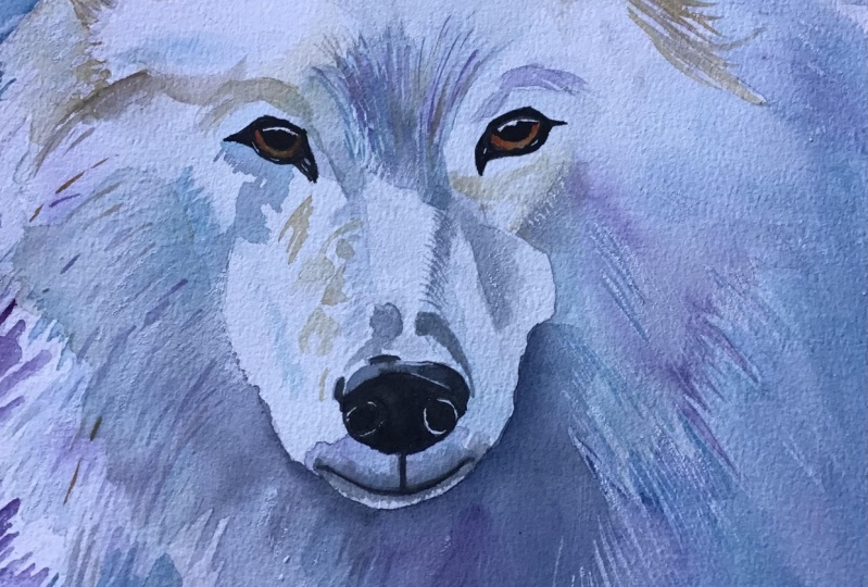
1. Welcome To The Class!: Hello, everyone. My
name is Will Elson, and welcome to this watercolor class where we are going to capture the fierce beauty and powerful presence
of a white wolf. In this class,
we're going to use the expressive qualities
and transparency of watercolor to express the wolves vivid features and its ethereal, almost ghost like essence
that evokes its wild nature. I've been a professional
artist for many years, exploring lots of different
subjects from wildlife and portraits to cityscapes
and countryside scenes. I've always been entranced by the possibilities of watercolor. But when I started, I had no idea where to begin
or how to improve. I didn't know what
supplies I needed, how to create the
effects I wanted, or which colors to mix. Now I've taken part in many
worldwide exhibitions, been featured in magazines, and been lucky enough
to win awards from well respected
organizations such as the International
Watercolor Society, the Masters of
Watercolor Alliance, Windsor and Newton, and the SAA. Watercolor can be overwhelming
for those starting out, which is why my goal
is to help you feel relaxed and enjoy this medium
in a step by step manner. Today, I'll be guiding you
through a complete painting, demonstrating a
variety of techniques, and explaining how I use all
my supplies and materials. Whether you're just starting out or already have some experience, you'll be able to
follow along at your own pace and improve
your watercolor skills. If this class is too challenging
or too easy for you, I have a variety of classes available at different
skill levels. I like to start off with a free expressive
approach with no fear of making mistakes as we create exciting textures
for the underlayer. As the painting progresses, we'll add more details to bring it to life and
make it stand out. I strive to simplify
complex subjects into easier shapes that
encourage playfulness. Throughout this class, I'll be sharing plenty of
tips and tricks. I'll show you how to turn
mistakes into opportunities, taking the stress out of
painting in order to have fun. I'll also provide you with
my watercolor mixing charts, which are an invaluable tool when it comes to choosing
and mixing colors. If you have any questions, you can post them in the
discussion thread down below. I'll be sure to read and
respond to everything you post. Don't forget to follow
me on Skillshare by clicking the Follow
button at the top. This means you'll be the
first to know when I launch a new class
or post giveaways. You can also follow me on Instagram at Will Elliston
to see my latest works. I'm thrilled to
guide you through the entire process from the
sketch to the fine details. So let's grab our paints
and let's get on.
2. Your Project: Thank you so much for joining
me in this class today. We're going to have
a lot of fun because this portrait not only
incorporates fine details, but it also lets us express the watercolor in
a very liberating way. And that contrast
makes it so exciting. We're going to be
looking at details that capture the texture of fur, the depth of the eyes, and the dynamic
forms of the face. We'll play with color gradients, splashes to give our work a spontaneous and
atmospheric backdrop. By the end of our
session, you'll have learned not just how
to paint a wolf, but how to imbue your watercolor animals
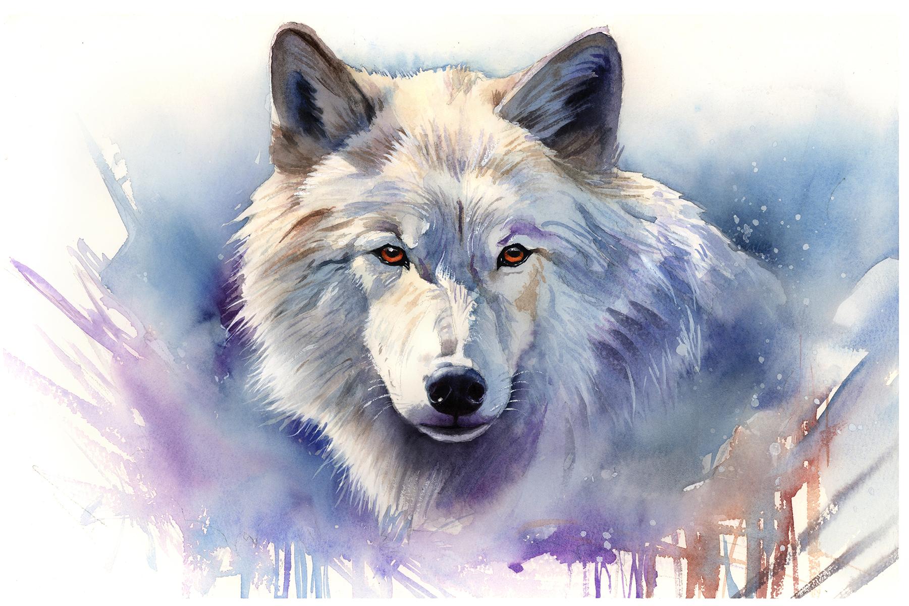
with emotion and life. In the resource section, I've added a high
resolution image of my finished painting
to help guide you. You're welcome to
follow my painting exactly or experiment with
your own composition. As we're going to be focusing on the painting aspect
of watercolor, I've provided templates
you can use to help transfer or trace the
sketch before you paint. It's fine to trace when using it as a guide for
learning how to paint. It's important to
have the underdrawing correct so that you can relax and have fun learning the
watercolor medium itself. Whichever direction
you take this class, it would be great
to see your results and the paintings you
create through it. I love giving my
students feedback, so please take a photo
afterwards and share it in the student project
gallery under the Project and resource tab. I'm always intrigued to
see how many students have different approaches and how they progress with each class. I'd love to hear
about your process and what you learned
along the way, or if you had any difficulties. I strongly recommend
that you take a look at each other's work in the
student Project Gallery. It's so inspiring to see
each other's work and extremely comforting to get the support of your
fellow students. So don't forget to like and
comment on each other's work.
3. Materials & Supplies: So before we start the painting, let's go over all the materials and supplies you'll
need to paint along. Having the right materials can greatly impact the
outcome of your artwork. So I'll go over all the supplies I use for
this class and beyond. They're very useful to have at your disposal and will make it easier for you
to follow along. Let's start with the
paints themselves. And like most of the materials
we'll be using today, it's a lot to do
with preference. I have 12 stable colours in my palette that I
fill up from tubes. They are cadmium
yellow, yellow ochre, burnt sienna, cadmium
red, Alizarin crimson, Opramarne blue, cobalt blue,
serlean blue, lavender, purple, viridian, black, and
at the end of the painting, I often use white gouache
for tiny highlights. I don't use any
particular brand, these colors you can
get from any brand, although I personally
use Daniel Smith, Windsor and Newton
or Holbein paints. So let's move on to brushes. The brush I use the most is
a synthetic round brush like this Escoda Purl brush
or this Van Gogh brush. They're very versatile because
not only can you use them for detailed work
with their fine tip, but as they can hold
a lot of water, they are good for
washers as well. They're also quite affordable, so I have quite a few
in different sizes. Next are the mop brushes. Mop brushes are good for
broad brush strokes, filling in large areas and creating smooth
transitions or washes. They also have a nice tip that can be used for smaller details. But for really small details, highlights or anything
that needs more precision, I use a synthetic
size zero brush. All brands have them,
and they're super cheap. Another useful brush to have is a Chinese calligraphy brush. They tend to have long bristles
and a very pointy tip. They're perfect
for adding texture or creating dynamic
lines in your paintings. You can even fan them
out like this to achieve fur or feather
textures as well. And that's it for
brushes. Onto paper. The better quality
of your paper, the easier it will be to paint. Cheap paper cuinkles easily
and is very unforgiving, not allowing you to
rework mistakes. It's harder to create
appealing effects and apply useful techniques
like rubbing away pigment. Good quality paper, however, such as cotton based paper, not only allows you to rework
mistakes multiple times, but because the pigment
reacts much better on it, the chances of
mistakes are a lot lower and you'll be more likely to create
better paintings. I use archers paper because that's what's available
in my local art shop. A water spray is
absolutely essential. By using this, it
gives you more time to paint the areas you
want before it dries. It also allows you to
reactivate the paint if you want to add a smooth
line or remove some paint. I also have an old rag or t shirt which I use
to clean my brush. Cleaning off the paint
before dipping it in the water will make the
water last a lot longer. It's always useful to
have a tissue at hand whilst painting to
lift off excess paint. Also, you never know when an unwanted splash or drip might occur that needs
wiping away quickly. I also have a water dropper
to keep the paints wet. When you paint, it's
important to have them a similar consistency to what
they're like in the tubes. This way, it's easier to
pick up sufficient pigment. A hair dryer is useful
to have for speeding up the drying time and controlling the
dampness of the paper. And lastly, masking tape. And this, of course, is just to hold the paper down still onto the surface to stop it sliding
around whilst painting. Also, if you plan on
painting to the edge, we'll allow you to create a
very crisp, clean border. And that's everything
you need to paint along. I encourage you, as always, to experiment and explore with whatever paints or materials
you want to try out. Now let's get on and
start the sketch.
4. How to Sketch It Out: Now, when faced with an
intricate drawing like this, we always have to break it down into as simple a
shape as possible. So I'm starting with
a big broad circle right in the center
of my piece of paper, and then adding these
little curvy triangles that will obviously turn into
the ears eventually. And I just work around
that main circle. Of course, this drawing
is quite intricate. So I do recommend using
the template if you want to ensure a good outcome
for your painting. However, if you're confident in your drawing
skills and want to practice them anyway,
that's perfectly fine. You can use this lesson
however you want, and whatever you feel you want to take from it
is perfectly fine. Essentially, by tackling
the intricate details, we like to start off with
simple broad shapes. So that's what we've been
doing and I placed a line in the middle of the face here just to try and keep
things symmetrical. So I'm trying to
match it pretty much equally each side and a little
circle there for the nose. And what's great
about this subject is that it is
basically symmetrical. The patterns are the
same on either side, and we can observe
how the eyes match, the jaw line matches. So we want to replicate
this on both sides, limiting the detail
to begin with. If you find yourself going into details before you've
mapped everything out, then mistakes will
happen because you need the full context of
the forms, the shapes. Now I'm adding a
line of the shadow, the shadow line of the face. So I'm starting to
refine the outline now. I'm changing from my soft
pencil that I always start off with and going with
a finer pencil now, going through the
outline, basically, yeah, working from one
side, moving across, making sure the edges are as
correct as I can make them. Of course, at this stage, I'm constantly adjusting the angles and
observing distances. I'm keeping my pencil
lines still a bit soft, so that I can correct the
mistakes if I need to, especially when it comes to
painting with watercolor. I don't particularly want
heavy markings on the paper. So I'm keeping my pencil
lines quite soft. And it's completely normal
to make adjustments. Don't expect to do the
right lines straight away. I'm going to just record the basic outline
with my pencil here. But it's I'm going to have to go back and
forth with the rubber to get it really refined because I want to make it
perfect for the template. I'm going to be scanning
it in and turning it into the tracing
template for you. So I want there to be lots of clear
lines for you to follow. So you can see that I've basically mapped out
the broad shapes, and I think we're in a good
spot now to stop the video, and I'll arrase the
preliminary lines gradually and clean
it up for the scan, and we can get on with
the painting stage next.
5. Light To Dark: So to start off the painting, I'm going to pre wet
some of this area over the brush just to
make the paper alive. I don't want to go direct on
the white of the paper with pure wet pigment because
that's quite intimidating, even for me, just as a
matter of principle, I like to pre wet the paper, especially with these
foundational layers. Just easing the pressure
is much better. And then I give it a
few minutes or seconds, even just to really
soak in before I mix this yellow ochre. Mixing the yellow ochre
with a bit of burnt sienna. And I can experiment wherever I want a bit more yellow ochre or a bit more burnt sienna as we explore and have your own
personal preference really. We're laying down
the foundational layers of the painting, and as you can see,
we're starting off with light subtle strokes. We're not even really
suggesting any fur at this stage, technically,
or necessarily. We're just adding
a bit of the glow. Because I don't want
there to be a pure white. So when we're adding
the darks later on, this will just be a
subtle little bit of color in the light bits
that we'll then paint over. And we can take our time or we can at least be
relaxed about it. We don't need to rush ourselves. We can add a bit of
tone as we move along. Building up color
through layers, and it'll give us
the flexibility to enhance depth and detail progressively
rather than jumping straight into it all in one go. So you can see I'm mixing this burnt sienna
and yellow ochre, a bit of black to take the
vibrancy away from this. You can see also that as it
dries, it dries even lighter, so it's really not very noticeable at this
stage what I've painted, but it's still wet. So you can see these little
brush strokes that I'm applying now have quite
a soft edge to them, but they still hold their form. So I'm trying to imply a
bit of the fur texture now. But because the paper is damp, like I said, they're
soft brush marks. They don't have much texture. We'll come back later on
with some harsher texture. And that'll make it a
bit more dynamic having soft fur and then
textured fur on top, making the most out of
the whole of the medium. Notice also that
I'm only just right now starting to apply a bit
of blue and cool colors. So far, most of the painting
has been warm colors. But I'm adding blue because blue is the complimentary
color to orange or brown. So they complement each other. And as these pigments
mix about on the wet of the paper, they
look nice together. They work well together. And
I've just cleaned my brush, and I've got a tissue in my hand always to soften any hard edges. I don't want any hard
edges at the moment. Except for at the
ears at the top, you can see I've got hard edges where I've purposely
mark that area out. But I don't want to
create hard edges in areas that I don't
want or intend to. Some accidental hard edges
are not what I'm looking for. Now, I'm mixing another blue. This is with a bit of purple in. You can make your own purple by mixing blue and
alizarin crimson. And basically, the reason
I've added that purple in there is because that
complements the yellow ochre. So we've got the purple and
the yellow ochre working well together and the blue and the burnt sienna
working well together. And mixing these four colors
in different quantities, having fun with that
will just create a lovely unique
interplay of colors.
6. Wet On Wet: So now we've started to
introduce additional colors like blue and purple into
these browny yellows, and this is where wet and wet
technique comes into play. By applying these colors
while the paper is still wet, they naturally bleed
into each other and create organic
fluid transitions. And the interaction between the yellow ochre and these
cooler colors can also produce subtle grays and neutral tones that add
complexity to their palette. But complexity in organic way. We don't have to
think about this. The beauty of watercolor is that it can create its effects and color expression without us actually having
to do it manually. We just lay out the opportunity
for it to do it itself. I also recommend using
a water spray, likely, you can miss your painting or
the paper to keep it alive, to prolong the drying time because this will allow you more flexibility to work with
the wet of the paper. It's a technique that can seem quite intimidating at first, but it offers the advantage
of extended working time. It means you don't have to
rush if you don't want to, because I want you
to take your time of this and go slowly and introduce pigments
gradually at this stage. Because this is a white
wolf we're painting, and we're going to be using negative painting to
paint the background, and the main wolf will emerge from the use of
painting the background, rather than directly
painting the white itself. So we don't want to be too
heavy on the pigment here because it won't then
be a white fox anymore. Of course, there's different ways you can
approach a painting. You can paint the background
directly first and then come back to the main fur area and paint these details
and painting now. And you can experiment
with that if you want to find your own
personal way of painting. But today, I've
chosen to do it this way because as a
general rule with watercolor painting
light and then to dark is more secure process, a safer route sometimes
watercolor can be overwhelming. So this controlled approach prevents the colors from
getting out of control, and it keeps the painting
feeling light and airy. We're focusing a bit more on textures now as
we're getting a bit darker as we're building up the layers and
the general tones. We're still not getting
caught up in details, but starting to
think a bit more of the direction of the
fur and you can use your brush to mimic
the direction of the fur or the length of the fur and this can enhance the realism that we're
trying to convey. Even though we're
not detailing yet, each stroke contributes to the overall texture of the fur. Starting to work
on the ears now. And remember the
beauty of watercolor, opposed to other
mediums, of course, it's relevant in other
mediums to some extent. But specifically, watercolor is the layering capabilities. Each layer we add can bring more life and dimension
to the painting. And this is still technically
the first layer because we haven't waited for it
to completely dry yet. So as we continue,
keep in mind that patience and the
gradual buildup of color is one of the keys to achieving that
depth and that vibrancy.
7. Starting The Ears: I like mixing this yellow
ochre with browns and blues, because the cool tones give
it a serene kind of feeling, and the warm tones bring it
a lively, vibrant feeling. We don't want to go too
dark at this stage, since it's a white wolf again. I want most of my edges
to be soft, as well. Although there is still
a bit of texture there, I'm trying to limit the
really hard edges or the high contrast of a dark stroke next to the white of the
paper, for example. For any hard edges that
appear to be drying, just take a damp brush, which is completely full of clean water and gently
soften those edges. Now I'm using pure blue
against this brown, and I'm going to
kind of cross over my brush marks between
the blue and the brown to mix them in together. And you'll find that blue and
brown, when mixed together, make a kind of gray because as I said before
they're complimentary colors, so they neutralize each other. So Now we're going to start moving into
painting the shadows, and I think we'll
begin with the ears. It's important at this
stage to focus on the overall form rather than getting caught up
with smaller details. These finer points will come
later once we've created a solid context established by the broader shapes and tones. And for those of us who are
right handed, like myself, we can work from
left to right to avoid disturbing the wet paint with our hands as we progress. And if you're left handed,
I suggest working in the opposite
direction to achieve the same ease and efficiency. So as we begin
with the left ear, I first wet the paper, the area thoroughly to prepare for a smooth
application of paint. And this technique
helps in laying down a gentle wash that
we can build upon. So I'm using a brown
tone at the moment, and you can see it's kind of transitioned into
that blue down below. This initial wash sets the
stage for depth and dimension. Now I'm dropping
in some blue onto that brown to make it
even more dynamic. A few touches of that blue. And now I'm working
on the right ear. I'm doing it the
other way around now. I'm starting with
this blue wash, and then I'll add a bit of
brown pigment later on. And this mix helps create
a more natural shade in the fur because it reflects how light interacts with
the wolf's coat. With the brown, you can see
that I've muted it using black because I don't want
it to be too vibrant. I don't want it to be
orange, orange brown. I want it to be a muted brown. But when using black or any
other very dark pigment, you have to be quite mindful because they're
very potent and can easily overpower the
more subtle shades we're planning to lay down. So instead of applying
black directly, I always gradually mix it in
my palette to begin with. To allow us more
control and to ensure that we enhance rather than overwhelm what we're
trying to achieve.
8. Adding Some Shadows: So now we've established
the main shadow area or at least the underlayer of
the shadows on the ears. We're going to address
the facial shading. Using similar colors, I'm
going to use a bit of blue and purple and
a bit of brown. But I'm sticking to the cooler side because it is the shadow. Maybe I can indicate a bit of the body whilst we're using this cool tone
of purple and blue. So this part in
between the nose and the eyebrows is quite
crucial because it helps define the facial
structure of the wolf, and it contributes a
significant amount to the expression that
we're trying to portray. Now, it's quite a light tone, so I didn't pre
wet it with water, and I want to keep
the edge hard. As you can see in
between the eyes and where it meets the
bridge of the nose. I've actually kept
a hard edge there. And now we've finished that, I'm going to pre wet the area above the head because we're going to start to
paint the background. And by adding water
to begin with, the pigment will flow freely, so it'll be quicker to
apply all this paint. The wash will be a lot smoother because we're
allowing the pigment to blend and spread out itself rather than using
individual brushstrokes. I'm using the point of my brush to mimic the edge of the fur, the spiky kind of feeling. And then I can connect
it all as we move above And when it comes to painting this yourself, you've got to consider what
kind of blue you want to use. Do you want to skew it
a bit towards purple, have a warm blue,
or you want to have a green influence and
make it even cooler blue? Or you can just keep it neutral. You can have a pure blue, like I'm using cerlan
blue right here. Cerllian blue with a touch of that brownish black to
make it not as vibrant. I'm not using heavy pigment. I'm using a light to midtone
pigment at the moment, and I'm using the
side of my brush to soften that edge and a
tissue to help control it. It's very subtle,
but as you can see, even though it is subtle, the outline of the wolf
is starting to appear. The whole form of the wolf
is going to emerge more distinctly from the paper as we start building on this
tone of the background. And since we're covering
a broader area, it might be wiser to actually
switch to a larger brush. As long as it still
has a fine point. At the moment, this brush I'm
using is fine because I'm just painting a
small little area as the background meets the fur. But as we fill it out later, I'm going to switch
to a larger brush. Notice how I use pure water to create a nice transition from the pigment to the
white of the paper. And now I have changed to
a larger brush because I'm filling in quite a
large area on this side. It's only for efficiency.
9. Starting The Background: While a smaller brush offers more control
for detailed work, a larger brush will speed up the process for
filling in the background. So I'm starting to
mix a cool blue, purple shade, and it's perfect for the backdrop
that I'm envisioning. There's no need to rush
this area as well. We can take our time.
It's all part of the fun. Painting should be
enjoyable and a chance to relax and experiment with
your strokes and blends. But also, if you
prefer a faster pace, that's completely fine, too. So I'm pre wetting this area, like I did at the top, and I've pre mixed all the paint
that I plan to use. And I've gone back to
that small brush now, just for the fur line. I'm trying to be mindful
of the outer edges. This is where the
precision will make a significant impact on
the overall composition. We can come back later. We have white gouache
at the end just to refine these white
furs that stick out. This negative painting
technique requires a balance between what is painted and
what is left unpainted, because we're using the white of the paper to bring out
the form of the wolf. Dropping in pigment and
letting it bleed out itself. And this will create a
smooth transition of color. I've created a little hard edge on the right hand side there, and you can see I
don't know why. I felt like it's one of
those things where I felt like it needed
it rather than any particular reason
I can explain. There's a lot of soft transitions going on
in the background, so I felt like an
arbitrary hard line somewhere might just help. And of course, we're going to add some expressive
lines later on. So I'm going to help interact
that into the background. This background isn't
just a backdrop. It's actually an
integral part of the painting because it
interacts with the subject, and the expressive
marks that we're going to add later create a kind of cohesive and striking
element to the painting. So moving on from
the background now, we'll come back to that later. And we can start
developing the fur and the shading that goes on to bring out the facial structure
of the wolf a bit more. Notice how with
this second layer, we're starting to
intensify the colors. They're being a
bit more vibrant. They're a bit more darker in tone as well. A,
10. Building Up The Layers: And because we've already added
that previous underlayer, we're involving or integrating different techniques such as wet on dry as well
as wet on wet now. And this will help us control the intensity
of the pigment. We're trying to enhance a bit
more of the contrast now, and we're beginning
to hint at some of the finer details that will eventually lead the viewer's eye
across the painting. Of course, the main
striking details of the painting are the eyes, primarily, and then the
nose and the mouth. But we're not going to
paint those quite yet. We're just trying
to think of the fur and the direction of that fur. Using very directional
brushstrokes that mimic that
natural flow of fur. Almost you can feel the wind blowing against that fur
and the cool breeze. So with this second layer, we're not only thinking
about adding texture, but without even realizing this kind of building up
helps make it a bit more dynamic and adds a
realistic essence to what we're trying to achieve. By deepening the colors around the eyes below the jaw
line along the snout, it enhances the
expression of the wolf, and it captures a kind
of wildness and a focus. It adds to the depth and gives it a free
dimensiality to it. As this process unfolds, it's important to take a
step back occasionally and assess the overall balance and harmony of the painting. Each additional brushstroke at this point, is quite deliberate. We're aiming to start
bringing things together, all elements into a cohesive
and striking representation. So at this point, the color scheme
is pretty defined. We wouldn't necessarily
want to add a bright green or a
pink at this stage. Ir. Keep in mind that the beauty of watercolor is its ability to
layer transparency and create that depth
that is both visually captivating and because
it's visually captivating, makes it emotionally resonant. And as we progress,
we will continue to refine these details to make sure that every stroke contributes to it
rather than takes away. But it also respects the kind of natural characteristics
of the wolf.
11. Mid Tones: But we don't have to overthink the emotional impact because that usually comes by itself as long as we have everything
else in order if we observe the tones and the colors and make sure those
fundamentals are correct, then the emotional quality and the capturing of the essence
will look after itself. The most emotional
part, I think, probably with the painting, will be the gaze, like the eyes. Eyes are always one of
the most powerful tools we can have as artists to convey emotion and presence because it makes them the focal
point of our subject. And that will be later
in the painting. So we'll put most of our attention into getting the eyes right because as
long as the eyes are right, then we can be quite expressive with the
rest of the painting. You can see that most of
the colors we've used now are cool colors. On the right hand
side, at least, they're all cool colors, and a bit on the left, we've
got a bit of warmth coming through where the
light is on the fur. But the majority of
the colors are cool, and I've emphasized this because later on when
we paint the eyes, we're going to use
a warm orange, and this will make them stand
out as the central point. And so beyond the eyes, the capturing of the essence of the wolf involves the way we handle the texture and
the form and the edges. You can notice how the
fur is not so rigid. We're not overly
defining the strokes. We're trying to get them to
be fluid and expressive. Suggesting a bit of
movement and depth. You can see on the
right hand side, at the moment, there's
a lot more tone. It's darker. It's
adding to that form. And here on the snout, it takes quite a
lot of observation to see how to create that form
to get the lighting right. So we've done the first
underlayer, the light tones, and now we're coming towards the mid tones being complete, and now I'm starting to mix
some of the darker tones. On my palette, you
can see I've mixed some Burnsiano with black
to create a dark brown, but I'm going to incorporate that with some
dark blue as well. I'm using these lines
quite sparingly. Refining that shadow
underneath the snout now. I want it to be
quite dark, indeed. See, I'm mixing my own red here, mixing green in there
to neutralize it, and a bit of blue
to make it purple. Now, I'm following that line of the snout to create a nice
contrast within the shadows. And I do a few dabs of
this dark pigment around the painting just to help my mind assess
the tonal values. And what I mean by that is I look at my reference
or references, and I assess or observe
what's a similar value, a similar darkness or lightness. And I use that brushstroke, that pigment to just dab around the painting where that color is so that it's all balanced. And it's in the right context.
12. Deeper Shadows: Let me talk a bit more about
getting tonal values right. Because when it comes to getting tonal values correct
and by tonal values, I mean, the lightness or darkness of a color
regardless of its hue. The accuracy in tonal values
is key to creating depth, form, and a sense of
realism in the painting. And it's not just about
choosing the right color, it's about making
sure the value of that color is correct within
the overall composition. And the process I use to check my tonal values is
simple but effective. First, I observe my reference or subject and identify
a specific tone, whether it be a mid
tone, a shadow, a highlight, or even in
between those three. But I don't just look at
that tone in isolation. I compare it with the
surrounding values within the whole of the
reference or subject. How dark is it compared
to the deepest shadows? How light is it relative to
the brightest highlights? And then understanding
these relationships is what makes tonal values
work in a painting. Then once I've identified
the tone in my reference, I then look at my
painting and ask, does my version of that tone match the way it
sits in my subject? Then I apply a few dabs of that tone in the
relevant areas of my painting to see if it holds up within the
context of my piece. Then if it doesn't match, that tells me something is off. Either I've gone too
dark or too light, or the surrounding
tones need adjusting. And from there, I can work
out how to correct it either by deepening the shadows or lightening the highlights, scrubbing away some of
the pigment, for example, or modifying adjacent areas
to match or maintain balance. A good habit is to constantly step back and assess the
painting as a whole, because values are relative, meaning that a tone that
looks correct in one part of the painting might
appear too light or too dark once more
elements are added. That's why
continuously comparing values within the context of the entire painting is so important and why you can
see when I'm painting here, for example, I've applied dabs of this tone to
the side of the snout, underneath the snout and a
bit on the left on the fur, just because I can see that
those are matching tones, even if they're not
directly linked. This approach helps create a natural and cohesive
balance of light and shadow, and it makes the subject feel
believable and dimensional. And mastering tones is one of the most crucial
skills in painting, more so than color,
because color works itself out as long
as the tones are correct. And the more we practice
this observing, comparing and adjusting, the
more intuitive it becomes. So it's one of the most
important aspects, but also it happens to be one of the biggest
challenges in painting, getting the tonal values right. A common mistake is
focusing too much on individual colors rather than how light or dark
they actually are. This is why it helps to
occasionally squint at your subject or your reference, because when you do
this, you filter out unnecessary detail and only
see the major value shapes. And this allows you
to identify whether your darks are dark enough or your lights are light enough.
13. Mouth & Nose Underlayer: Another great way to check
your values is to mentally compare them against a known reference point
in your painting. For example, if
you ask yourself, is this shadow as dark as the
deepest shadow in my piece? Is this midtone actually reading as a midtone
or is it too light? And these constant
comparisons help ensure that every value is placed correctly in relation
to the others. Sometimes you might feel
like a painting looks off, but you can't quite
pinpoint why. More often than not, it's
because the value is balanced. Maybe your highlights aren't quite bright enough or
maybe your shadows aren't deep enough to provide the contrast needed
to create that depth. Testing small areas first before committing to a
large wash can help. Laying down a small dab of a particular value allows
you to see if it works in context before fully applying it across
a larger section. It's also important
to remember that values shift as
watercolor dries. A wash that looks
perfect when wet made dry lighter and
sometimes white gouache dries darker than when
it's wet and light. Sometimes a second layer is needed to restore
the correct depth. This is where layering
and glazing techniques come into play by
gradually building up values to avoid over
darkening too quickly and to maintain control
over the final effect. Also one final tip about values if you're struggling
with assessing them, try viewing your painting
in black and white. This removes the
distraction of color and lets you access
whether the lights, midtones, and darks
are in harmony. You can also use this method on your reference image to help identify the
value relationships. You can take a photo
of your painting, turn it into black and
white on your phone, and turn it to black and
white on your device. You can do that on
your computer settings or your phone settings. You can make the screen turn black and white just for a bit. So you can identify the value relationships
in your painting. I'm just setting up
the underlayer for the nose here because
in the next section, we'll be painting the nose, so I'm just doing
the underlayer. We're going to paint
the nose quite dark, as well as the
mouth and the eyes, and that will create
a strong contrast. And contrast is a very
powerful element, but you have to use it wisely. High contrast in specific
areas like around the eyes, nose and mouth, it grounds the subject and
makes it feel solid. However, contrast isn't just
about dark against light. It's also about
choosing where to sharpen edges and where
to let them blur. Too many hard edges can
make a painting feel stiff. Whilst too few can make
it feel unfocused. So I tend to keep the
strongest contrast and the sharpest edges
in the focal area, and it allows the rest of the subject to gradually
soften in the background. And I end up doing
that in this painting. You could see some of this fur outside of the snout and eyes
is actually quite sharp. It's not that soft, so I'm
going to apply some water later to just soften them
out again to blend them. And that's what I'm doing
now. I'm blending them a bit. Scrubbing it because
it's taking away from the focus of the central
part of the wolf's head. Bit like a camera.
If you take a photo, you can focus in on
different parts, and sometimes the foregrounds blurry and you're focusing
on the background or the background's blurry whilst you're focusing
on the foreground. So that's what I'm
trying to achieve here.
14. Simplifying Details: When painting from a photo, it can be quite overwhelming. Or even in real life, it's even more overwhelming, in fact, because there's
just unlimited detail. Sometimes a photo
without any detail or if it's pixelated or blurred is actually
easier to paint from. Because there's a
tendency to look at your reference or subject and
paint every single detail. It's difficult to
simplify it all. But the key is to
simplify the details. You don't have to paint
every single strand of hair. Not every texture
needs to be painted. Like I said at the beginning, think in terms of form
first, details second. The fur, for example,
is painted in layers, and we start off with, like, wet on wet, big, broad kind of strokes. Even with a small brush, we're using the wetness
of the paper to soften the edges and make them
very broad and loose. And then we refine
them a bit more later on with smaller strokes. We let the watercolor do
the work for us and we allow colours to blend naturally to create
soft transitions, rather than forcing everything
into place ourselves, this creates a sense of
movement and natural flow, which, of course, is key to making the
subject feel alive. Even if the watercolor doesn't flow exactly
where we want it to, even if it's anatomically wrong, because it has this
elusive energy to it, it'll still have emotional
value and be captivating. Uh, Even though this is an animal and not a human
portrait we're painting, we've got to think
about the language, almost the body language of the wolf to suggest
feeling and emotion, even if we're painting
a vase of flowers, we could still arrange
the composition in a way that has character
and personality, even though it's
inanimate object. We can suggest movement in an object that doesn't actually have movement through brushwork. In this painting, I'm allowing the background to bleed
into the fur slightly to reinforce the idea that
the wolf is part of its environment
rather than cut and paste on top or cut out from
the environment at all. And the way we're
applying paint in this loose expressive way around the edges versus a
kind of tighter, more refined brush
style in the face. It subtly communicates whether the subject is resting in motion or observing
its surroundings. I mean, to be frank, so much of this is
discovered at the end. Like, I try and fill my mind up with the emotion that I'm trying to express and I
hope it comes through, but I never know what kind of mood it'll
actually result in, whether it does
convey these things. I'm not consciously
thinking of them. I'm or at least I'm not consciously
trying to plan them out. I'm trying to inject
myself with that mood that I want to convey and hope that somehow
it comes through.
15. Painting The Nose: When it comes to selecting a reference image or
preparing for a class, my process often
involves combining elements from multiple different
sketches and references. I do a lot of practice sketches to figure out composition, and I might look online for a certain reference that's
in a similar position, and then I combine that
with a different one, as well as doing
preliminary work. So there isn't generally a
single reference picture that I work from or that even
represents the final artwork. But when it comes to
searching for an image, I usually look for about
five or ten of them. All of them were
basically obviously a white wolf with a lot of blue for the snow
and the shading. There wasn't any purple
in them or even brown. I've used my own creative or my own personal choices to add purple and
brown into this. And color choices
play a big role in conveying that essence
that you want to convey. Using cooler blues
and purples in the shadow gives the
wolf an air of mystery, while warmth in the eyes
that we'll add later provides a contrast to that warmth and it
draws the viewer in. And the balance between the warm and the cool tones creates harmony while also enhancing the emotional feeling
of the painting. So I've just painted the mouth, and you can notice how I use darker tones to define the
shape and the texture. I used a bit of deep purple and blue as the underlayer before
I applied that dark black to ensure that the shades
are not just strong but also subtly blended into the surrounding fur so that it's not completely disconnected from the
rest of the face, especially the upper lip and along the sides
of the mouth. And as I'm painting
the nose here, you can see that of course, I'm using very dark black. But I'm also going to
keep a few highlights, and I might even come back
with a white guash just to really make those
white highlights punch. But these small highlights are very pivotal
in adding realism. I want to imply light naturally hitting the
nose because it's a wet nose. And so that makes it quite
a reflective surface. And you just need a few
touches of this light to trick or create the
illusion of that wet surface. The sharp edges around the nostrils make it
seem very reflective. And it's that deep
contrast between the darks and the lights that
give it that glossy look. A,
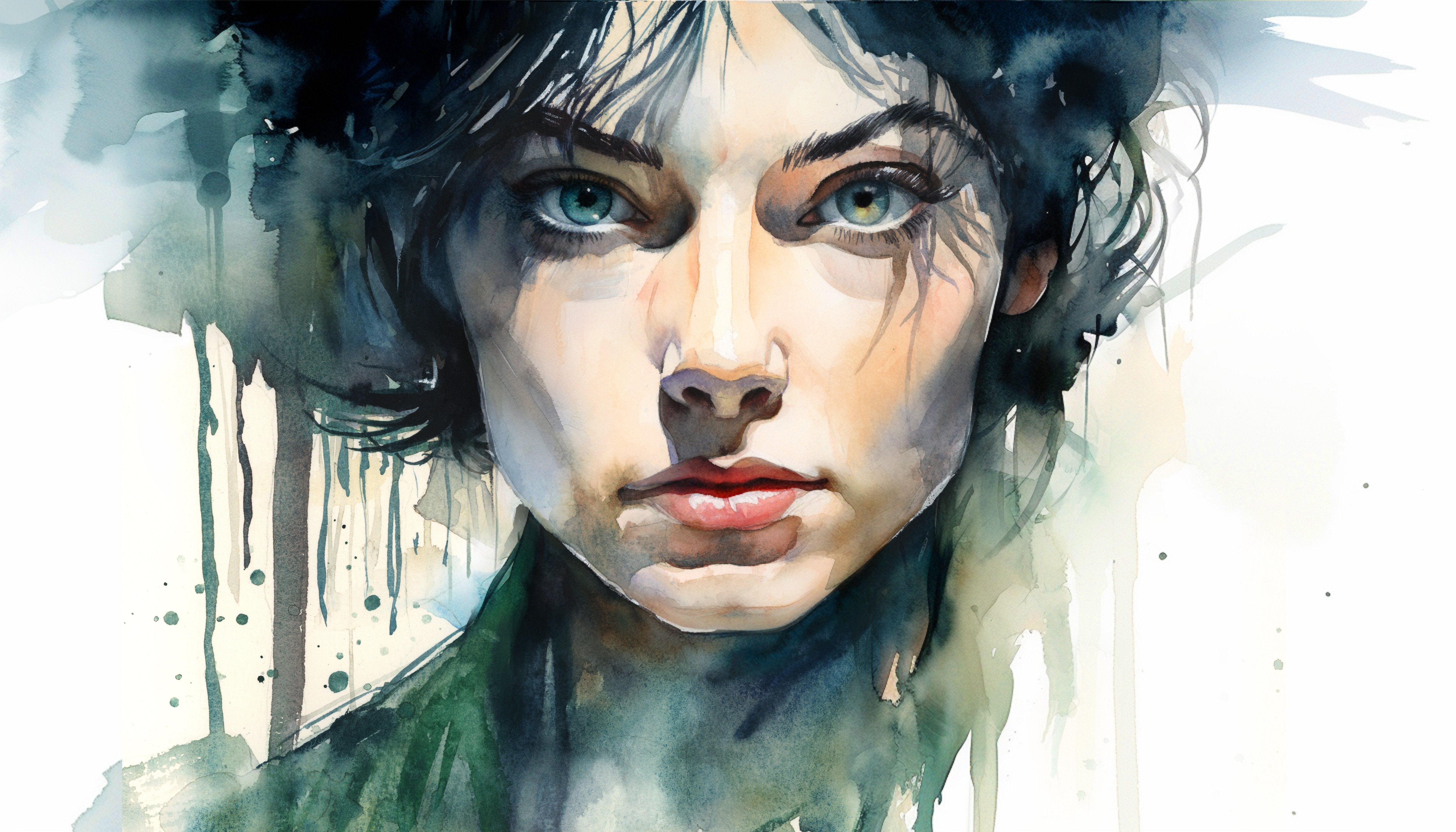
16. Eyes Underlayer: And now we're going to start the most important
part of the painting, arguably, and that's the eyes. But we're going to do it step by step so that
it's nice and easy. I'm mixing a little bit of yellow ochre and red to
make this nice warm orange. And I'm just painting
the pupil, the iris. And that's all we're going
to do at this stage, just filling out that area. And we'll come back to it
later once it's dried. But now we've got that warm glow to contrast all those blues
that are in the painting. This glow, this
strong underlayer sets the stage for the intricate details
that we will paint later. Because again, it's that gaze of the wharf that really
draws the viewer in. So while that eye color dries, we'll start painting the
shading on the neck, and this helps anchor the head. And I'm mixing cool colors here. I can specifically tell you
what they are ultramarine, bit of cobalt, a bit of
purple I have there. But I advise you to explore your own direction because as long as they're cool,
it doesn't matter. Any cool color will work well and harmonize with
the other warm colors. You can see I apply quite
a bold brush mark there. Now I'm using a pure
wet brush to soften their edges and the water will
flow out nice and freely. I'm trying to be
mindful of the way the shadows conform to
the contours of the neck. Adding a bit more
purple into there. And as it reaches the bottom, I'm adding a few strokes
to imply the fur. And once that pigment has fully mixed in and
sunken into the paper, I'm just going to
clean my brush, take some water out of it, and just suck out some strokes. So I'm creating or I'm pulling out some
of the pigment to create some directional lines. And if there's a buildup of
paint that you don't like, you can just use a
tissue to dab it out. Or even if there's some
areas that have dried, you can scrub away at it with
a clean brush and then use the tissue to wipe away
scrub out that pigment.
17. The Eyes: Returning to the eyes now, now that the base layer
is settled and dried, we can start adding a
bit of depth to them. So to begin with, I'm painting the outline with a nice
thin stroke of black. And then bit by bit, using
the tip of my brush, I'm going to fill in the rest of the space where on a human, it would be the
whites of the eyes. I'm actually going
to paint black. To really make the
orange glow, contrast. And because black is
such a strong pigment, really take your time and use all the fnease you have to make sure you don't
go past that line. We want these orange
circles to be perfect. We want the irises and the pupil to be perfectly circular. Of course, the eyelid on the top cuts off the
top of the circle. And now, when I add
the pupil here, see how I'm leaving
a little bit of a gap between the top eyelid. There's a little
bit of a reflective highlight that I'm
leaving there. Of course, if you're
not comfortable, you can just paint it
black and then come back with white
gouache at the end. Same thing on the
right hand side. Although I decided to
paint the pupil first. I really like this brush
because it has a very fine tip. I don't need to swap over to a tiny little brush because this one's
already got a fine tip, so there's absolutely
no need to. And in fact, it'd actually
be harder to paint this with a smaller brush
because it would keep on running out
of pigment or water. This brush holds a lot
of pigment and water, and it still retains the tip. The sharp highlights
there obviously convey where the
light naturally hits. And this small detail can make the eyes appear
very moist and reflective. And it's vital for
capturing that essence. It's the most important part
of the painting, really. Trying to enhance
the richness of the iris by deepening
the orange around, ensuring that they're
vivid and striking. The darkest tones towards the outer rim of
the iris and around the pupil create kind
of natural gradation. I'm slightly softening the iris. Then refining the outline of the eyes with the very
fine tip brush of pigment. This, you can use pure black or a very dark blue or purple. You can see the
ultramarine in my palette. It's so dark, it may as
well be black, really. It's only when it's diluted,
you see the color in. And this darkness of the eyes contrasts with the
white around it, and it really makes it pop. It gives that wolf
a piercing gaze. And I've actually painted
over the highlights there. So I will come back at the
end with white gouache. But I have to make sure it's completely dry before
I get to that stage. 'cause I still want to create that high contrast of the
highlights to make it sparkle.
18. Eye Highlights: So getting the hair dryer out to make sure that it
is completely dry. And as I was saying before, as pigment dries, sometimes it dries a bit lighter
than you'd like it to. So I'm just having to go back there to emphasize
the dark darks. Now using the pure white. Just to add that
lifelike sparkle, a tiny speck of light on the
upper part of the iris over the darkened area to simulate that effect of
light catching the eye, enhancing the free dimensiality and the reflective aspect, trying to be cautious with
the size and the placement of these highlights because
it should be subtle. And this subtleness is
actually very effective. If you make it too big, then it actually doesn't become effective because it's
not realistic anymore. Now I'm just assessing any more details
that I might want to put before applying the
rest of the background. Just using a palette
knife to scratch away some of the highlights. You can use a card or maybe you don't need to
use one at all. I just felt like
it at that stage. So yeah, thinking
what final changes I can add to the ear. I need to do something
there. It's a bit too undefined at the moment. But even now, it's not necessarily
detailed I'm painting. I just have to make it
look a bit more natural. I'm not aiming for perfection, though, and huntiva really. Because the most
compelling paintings aren't necessarily
the most detailed, but they're the ones that
make us feel something. And sometimes that aim for perfection actually gets
rid of the feeling. So don't be afraid to let areas remain unfinished or suggestive. What you don't paint is just
as powerful as what you do.
19. Left Background: So now as we bring our
wolf to completion, let's focus on finishing
the background and using the negative
painting techniques to further define the
silhouette of the wolf. And we can also introduce some abstract elements that enhance the artwork's
expressive quality. So I'm starting by mixing
the colors that I want, and I'm going to be quite
vibrant to begin with. I'm going to use this serlean
blue and a bit of purple. But then I'm going to bring
it down with a bit of black. Once I've got the
color that I want, then I need to think
about the vibrancy of it. And if it's too vibrant,
it just won't work. So now that I have
the colored mixed, I'm prewtting the area
that I want to work on, and I'm pre wetting it
further than I plan to paint because I want it
to transition to white. The white of the paper. And to allow that transition to
happen, I have to go further. So using this larger brush that still has a
nice fine point, I'm just dabbing in there, and you can see it
just flowing out. I might encourage it a bit. Of course, I chose blue
because it complements the tone that we've
used inside the wolf, but it does stand out enough
to create a contrast. I have to use controlled
brush strokes when defining the fur, but I'm trying to use broad fluid strokes to fill in the space outside
in the background. And I'm trying to maintain a balance between control
and spontaneity, really. I'm allowing the colors to
blend naturally on the paper, this purple and the blue. I'm just going to try and allow that to do what it wants now. I can splat a bit
of water on there to help a bit of chaos. A few arbitrary and abstract
brushstrokes going on now. Trying to create that
atmospheric effect by giving the impression the
wolf is emerging from a misty, undefined space. I'm personally not
trying to define it. I want it to be ambiguous. Particularly where this
wash meets the fur, it has to be a strong contrast. Now I'm introducing some
abstract brush work. You can apply some slats
as well if you want, but I'm doing a lot
of dry brush marks to create that
textured stroke look. You could experiment with salt, even though I'm not
doing that today, or you can even dab
it with a sponge a bit because these
expressive touches should complement the
overall composition and it'll make it unique to you because these abstract
or expressive strokes are impossible to replicate. So when you do them yourself, you're going to create
an original artwork. A,
20. Right Background: You can see the direction of those abstract marks do point inward as they curve around and go to the
bottom, they point inward. They draw attention to the head. So continue building up these
layers until you achieve a desired intensity and texture. Adding a bit of
brown because that complements the blue
on the other side. I think I have to be a
bit stronger up here. The contrast doesn't
really match, so I'm going to have
to boost it a bit. Each addition now should
enhance the visual narrative, so we can try suggesting
elements of the wild environment or simply adding a few
dynamic brushstrokes. I'm adding a few dry brush
marks because there's not many dry brush marks in the
actual painting itself. So to make the most of the
whole medium of watercolor, I'm going to start
adding some there. Because it's all
very controlled. The wolf itself is
very controlled. So adding this
expressive side of it gives it a nice bit
of balance and contrast. Again, contrast is not
just about color or tone. Contrast can be
abstract and defined. Using an old rough brush to soften some of
the edges there. And because it's all wet, I can just dab in
this pigment and it'll blend out
nice and smoothly. I'm squinting my eyes a lot, actually, just to see if
the tones are balanced. Now, if you remembered when we first painted the background, I left that hard line
at the top there. Now I'm going to create
a few more strokes that are parallel to that. And it's almost a bit
symmetrical with the other side. On the other side, we've got strokes facing down,
coming down from the left, and now we've got strokes
coming down from the right, it creates a kind a V shape
with the wolf in the middle.
21. Finishing Touches: Now I've dried everything off completely with a hair dryer, and I'm just going to go
in with pure white paint to further refine the
fur the outlines. We can also enhance
any highlights we want to add and maybe introduce a few splatters because these small yet
powerful additions help bring the wolf to life. And they add a bit
more contrast, texture, and a bit
more refinement. Because some of these strokes
we just couldn't pick out with the blue paint
for the background. So just adding a few
more lines like this, add a bit more depth. A few highlights on
the ears, the outline. Maybe along the
bridge of the nose, the edges of the eyes, up at the top here,
highlights that catch the light and ultimately enhance the realism
of the painting. They make the fur look more
dimensional and luminous. But it's important to keep
these highlights subtle. We don't want to overdo it. A little goes a long way in creating these final
touches of brightness. It's easy to be
over enthusiastic, and it's difficult
to go back because this white paint it's
hard to scrub off. What feels right now might look a bit overdone
if you leave it a few days. What might be a good idea is to save this part in
a few days time, maybe do another project
and then come back to this. But as long as use
your judgment wisely and be conscious of the
fact you might overdo it, then you probably
won't overdo it. Now, adding some whiskers there. Again, very subtle. I only need to add
one or two each side. And not even complete whiskers, implying a few whiskers. I'm trying to achieve
a dry brush mark. So sometimes the
pigment might not even fall off my brush because it's too dry, but that's okay. It's better than having
an overly wet brush and losing that texture. This last date is about
bringing everything together to ensure the wolf
doesn't just sit on a page, but actually feels
like a living, breathing presence
within its environment. Maybe a few more lines
just to help the flow, the direction of the fur. I don't want I'm trying
my best, at least, I try my best to make sure that wherever you
look at the fur, it follows a kind of flow. There's not a lost
strand somewhere. It's always going with
the flow, so to speak. And lastly, I'm going to wet my brush, get some
pigment on there. So it's not a dry white anymore. It's a very wet white, and I can just flick it off into the dark areas to
create more contrast. Again, being very sparing
with this. That should be it. I don't want to overdo
it with any more spatters, a subtle touch, just to add that lively feel.
22. Final Thoughts: Well, welcome back,
and congratulations on completing this class
on painting a white wolf. I hope you found
the experience as exciting and
enlightening as I did. In this class, we
covered many things, everything from rendering
realistic fur to adding abstract elements that amplify the mystical qualities
of our subject. We also embraced the
fluid spontaneity of watercolor to enhance the
atmospheric backdrop. Remember, watercolor painting is not just about technical skills, but also about expressing your creativity and
personal style. I encourage you to continue
exploring, experimenting, and pushing your
boundaries to create your own unique
watercolor masterpieces. As we come to the
end of this class, I hope you feel
more confident and comfortable with your
watercolor painting abilities. Practice is key when it comes
to improving your skills, so keep on painting
and experimenting. I want to express my gratitude for each and every one of you. Your passion for watercolor
painting is so inspiring, and I'm honored to
be your teacher. If you would like feedback on your painting, I'd
love to give it. So please share your painting in the student projects
gallery down below, and I'll be sure to respond. If you prefer, you can
share it on Instagram, tagging me at Will Elliston, as I would love to see it. Skill Share also loves
seeing my students work, so tag them as well
at Skillshare. After putting so
much effort into it, why not share your creation? If you have any questions
or comments about today's class or want any specific advice
related to watercolor, please reach out to me in
the discussion section. You can also let me know about any subject wildlife or scene you'd like me
to do a class on. If you found this class useful, I'd really appreciate
getting your feedback on it. Reading your reviews
fills my heart with joy and helps me create the best
experience for my students. Lastly, please click
the follow button Utop so you can follow
me on skill share. This means that you'll be
the first to know when I launch a new class
or post giveaways. I'm so eager to see
how you're gonna use these techniques to create
your own beautiful wolves. As always, explore
and experiment with whatever you feel
you want to try out until next
time, bye for now.
 Will Elliston, Award-Winning Watercolour Artist