Transcripts
1. Introduction: Winter is a magical season
where we get whisked away to Wonderland
filled with ice, snow, sledges, soft
sunlight of the morning, and of course, snowmelt. If you are someone
who absolutely adores winter and wants to make
it even more special, I have got the perfect thing for you a fun painting glass. Hi, guys. I am Rigor on
ath an artist instructor, mother, skill share teacher, and brand donor of
vibe and parcels where we manufacture
handmade sketchbook, Artist Great Paints,
and much more. If you are new to watercolors
and haven't heard about me, you can follow me
on Instagram by the name watercolor dot
Illustration dot letter, and I give out
videos every week, even on YouTube,
by the same name. In this class, we dive into seven different
painting projects that take anywhere 15-14
minutes each. We kick things off by going
over all the essentials, the type of paper to use, watercolor techniques, and the paints I
love. Don't worry. I will also share some budget friendly option
alongside pricier choices. Next up, we will cover
the basic of sketching, think horizon line,
and vanishing points. Plus, we will explore fundamental watercolor
concepts like values and color mixing. After that, it's time to roll up our sleeves and get creative
with individual projects. Most of the projects use
a limited color palette which allows us to worry
less about color choices. This way, we can
concentrate more on grasping the step by step
approach to learning, ultimately enhancing our
understanding of watercolors. Each project is designed
to be completed real time so that you exactly know how
long it takes to finish. Hey, feel free to
work alongside me. I'm here to encourage you
every step of the way, and let's make this winter
unforgettable throughout.
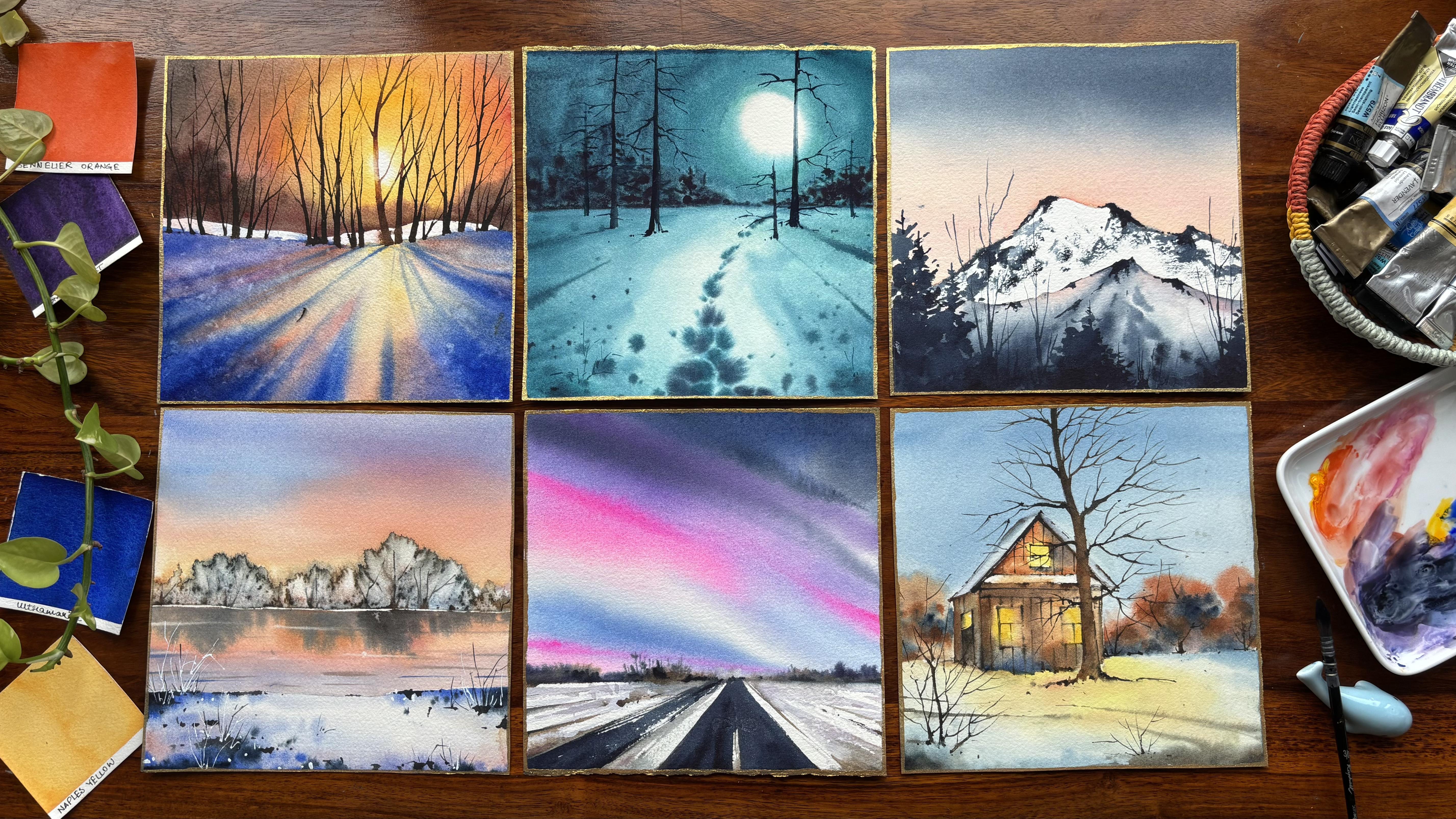
2. Materials Required: First, let's have a look at everything we need
for our painting, two jars of water, which is one for fresh supply and one for washing
your brushes. The next is about the brushes. What are the most
important brushes? The first is the one which has got a very
nice and thin tip. This is from the brand is
called our optimal brush. You can have any brush
that's available with you. This is a blending brush as well as I use it for
applying my colors. The third one is a broad brush. Now this is three by four, approximately a bit
lesser than 1 ". That is 0.75 inch and I use it for applying the water
on both sides of the paper. These brushes are good to have, and this is the 00
silver ruby satin brush. This is the Vince size
four brush Casaneo. This is again, the
Vince size three brush. You can have this
brush or you may also avoid the brush if you want to go ahead
with this painting. I would leave that decision
absolutely up to you. The pencil is very important
along with an eraser. The pencil and eraser will
help you to draw the house or any of the other paintings where there is some amount
of sketching in board. I will use the tissue. You can either use your
tissue or you can go ahead with any of
your cotton cloth, et cetera that you can use, and it is pretty much
environment friendly. Now, these are kitchen
tissues that can be used. I will go ahead with arches, 300 GSM, 100% cotton paper. This is 20 by 20
centimeter paper. Most of the papers
that I have used is around 18 into 18 centimeter, except the last size, which is a bit longer and that is going to come up
in the bonus lesson. The board. Now, the
board is very important. Either you can go for
a board like this, I can help you to measure
also what is the inch, What is how much the square one, if you want to measure with
this and then cut it out, it can be seven into seven inch, this way or this way, whatever you want to
place your paper on. As well as it is good if
you are cutting your paper on top of it or else you want to apply water and then
again place it. These mats go very well further. If you don't have a mat, this kind of acrylic
boat can also help. I have this acrylic board
available with me for long, and I have been using it
for pretty long time now. Colors is something
that I must tell you. Colors is all about various
brands that I have. You will see Senalia, you will see Migello
Mission Gold, you are going to see then Prima, you are also going to see
Daniel Smith, the many others. That I have Windca Newton, you will see, all of these
are pretty much mixed. Whatever colors I wanted, I have bought those
colors white knight. All of these brands are good. A bit cheaper one
is white knights. They are absolutely
professional grade and gives you great results. If you are someone
who wants to have good colors in the
initial days only, I will suggest you buying
pike knights or Cenlo. That's all we have from all
the materials perspective, let's go ahead and understand
a bit about the sketching, all we need for completing
these projects.
3. Sketching Basics : I would like you guys
to know a few basics of sketching before you go ahead
with the final painting. Why is it very important
to know some basics? Because that can
really help you to ace through your watercolor
journey pretty quickly? This I have learned
over my own experience, as I was never good with
my sketching basics. Slowly, I have started learning
it, and over the years, I can tell you that
it has helped me a lot to age through
this medium altogether. Going ahead with
the first basic, that is your horizon line. Your horizon line basically
separates your sky, water, or the sky and land area. Now, this is how I look at it. You should always know where you want to place
your horizon line. The next would be
your vanishing point. Also, some people call
this as invisible point. Now, why do we call it
as vanishing point? Because all the
lines will move to one single point beyond
your horizon line. Till the length, you can see the particular area or till the length you
can see your grounds, that is your horizon. And beyond that, these lines
do meet to one single point, and that is my
vanishing point or as I say Audio, the
invisible point. This is a very, very important
concept, and believe me, we have multiple
vanishing points, whether you are
doing a landscape or you are doing an
architectural building. I will be telling you a bit about the
architectural building. Supposedly, you have a building, and there are two
different vanishing points which you need to allocate. More of architectural
buildings when you come to, there can be multiple
vanishing points rather than only having one
single vanishing point. And you have to allocate
your buildings, windows, doors, et
cetera, accordingly. Let me draw it for you, and then you can see how
you can go ahead with it. You can see here two
vanishing point. One vanishing point is
on the horizon line and another vanishing point is
just above the horizon line. Now, the second vanishing
point is for the left side and the first vanishing point is for the right side
of the building. Though sometimes the
multiple vanishing point may work or may not work, it all depends upon the composition that
you are attempting. Let's go ahead with
the next video where we are learning
about the values.
4. Value Study: We are going to start out by understanding the
values in watercolor. Now, what do we mean by value
or value means that we are starting with the
lightest value and then moving to the
darkest value. This can be used
for any photograph which you want to paint. Just convert your photograph
into black and white, identify the major shapes that you have in that
particular image, assign a value to
each shape 1-5, just the way exactly we
are starting over here, paint the shapes and values and add the minimum
details that's needed to practically show how this complete photo
is going to turn out. Now, this not only simplifies the whole photograph
for painting, but it also gives
you more opportunity to work or break down
the composition easily. Avoid painting every detail
that we have in a painting. That's something
which is not needed. And you can actually connect
with the shapes and sizes to unify the painting and make it very unique of
your own choice. Choosing light and shadows is very important in this case, because the better is
your lighter values, then the better would be the contrasting features of
that particular painting. The contrasting things
will help you to elevate your style of painting as well as it will also show the maturity that you
have as an artist. Let's go ahead and
continue the process. What I usually do is I
pour in a lot of water for my first wash and it's
usually majorly water, what I go ahead with for my first wash. You will
see it's very, very light. Then I go ahead with a
bit more darker color and go with the second layer. That is going with one step
darker for my layer two. Then for my layer three, I would go really dark. I will have about 50% of
paints and 50% of water, whereas my fourth
would be about 60, 70% of paints and waste water. Now, the last one would be 90% of paints and less of water. I just feel that my third layer went a little bit darker
than I was expecting, and hence I made it
a bit more lighter. This is all to just assign the scale in which
we want to paint. That is 125. You can
also have one, two, ten. I would leave that decision up to you what you
want to really go ahead with for this painting or for any of your paintings, but it's always good to
simplify and keep it to 125. As well, I am someone
who really appreciates the loose and free flowing
watercolors because of which we have done this value study
most importantly today. Okay, I will see you
now in the next lesson. We are going to start
with our first project.
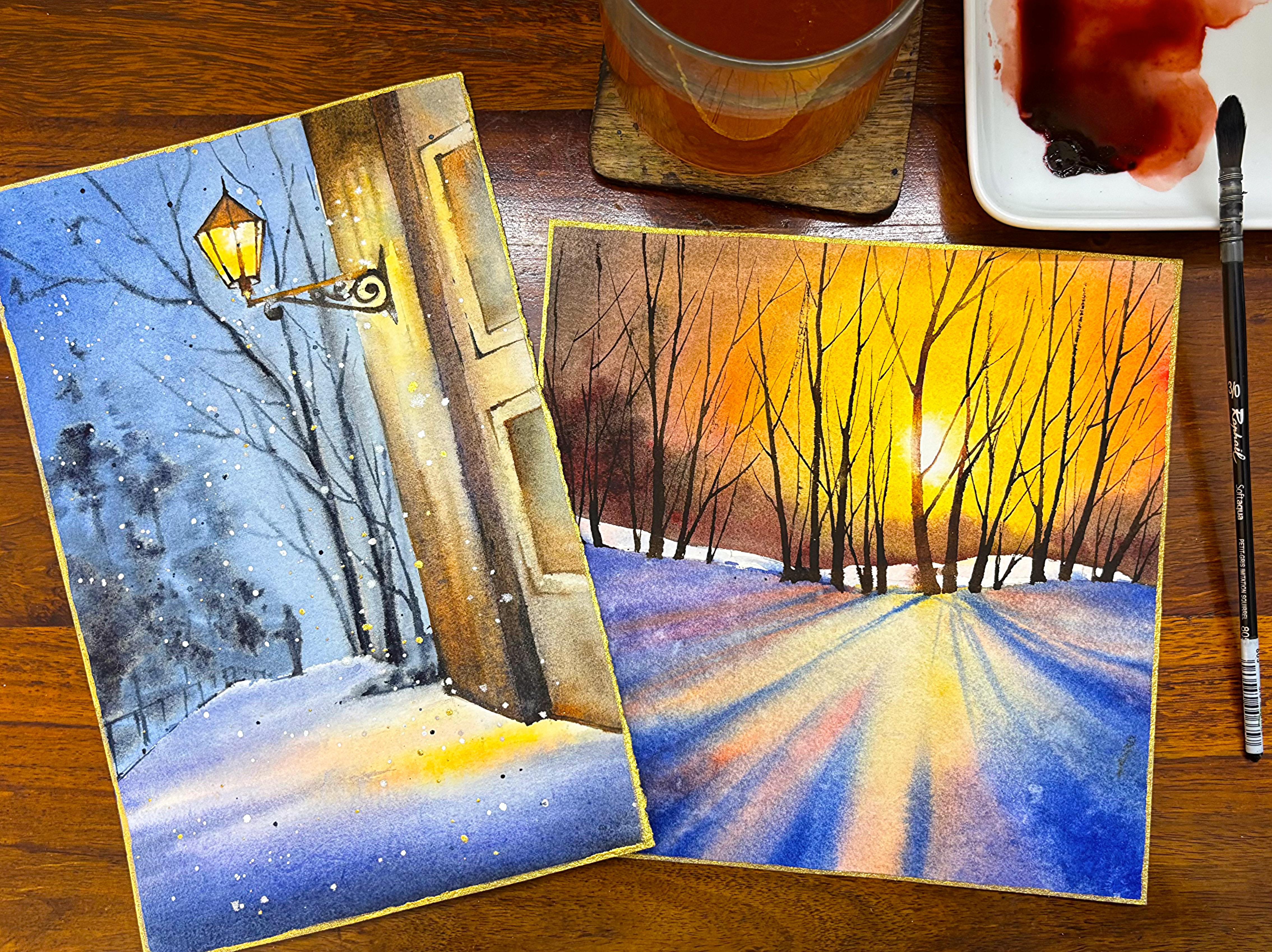
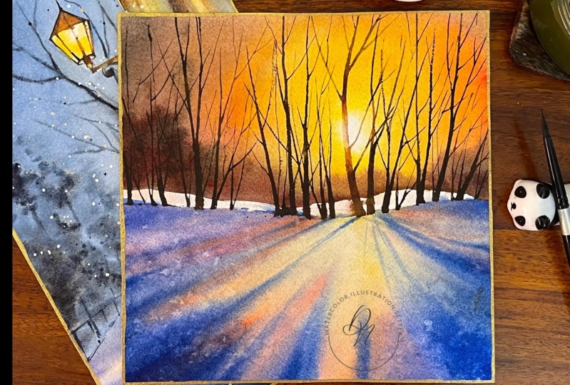
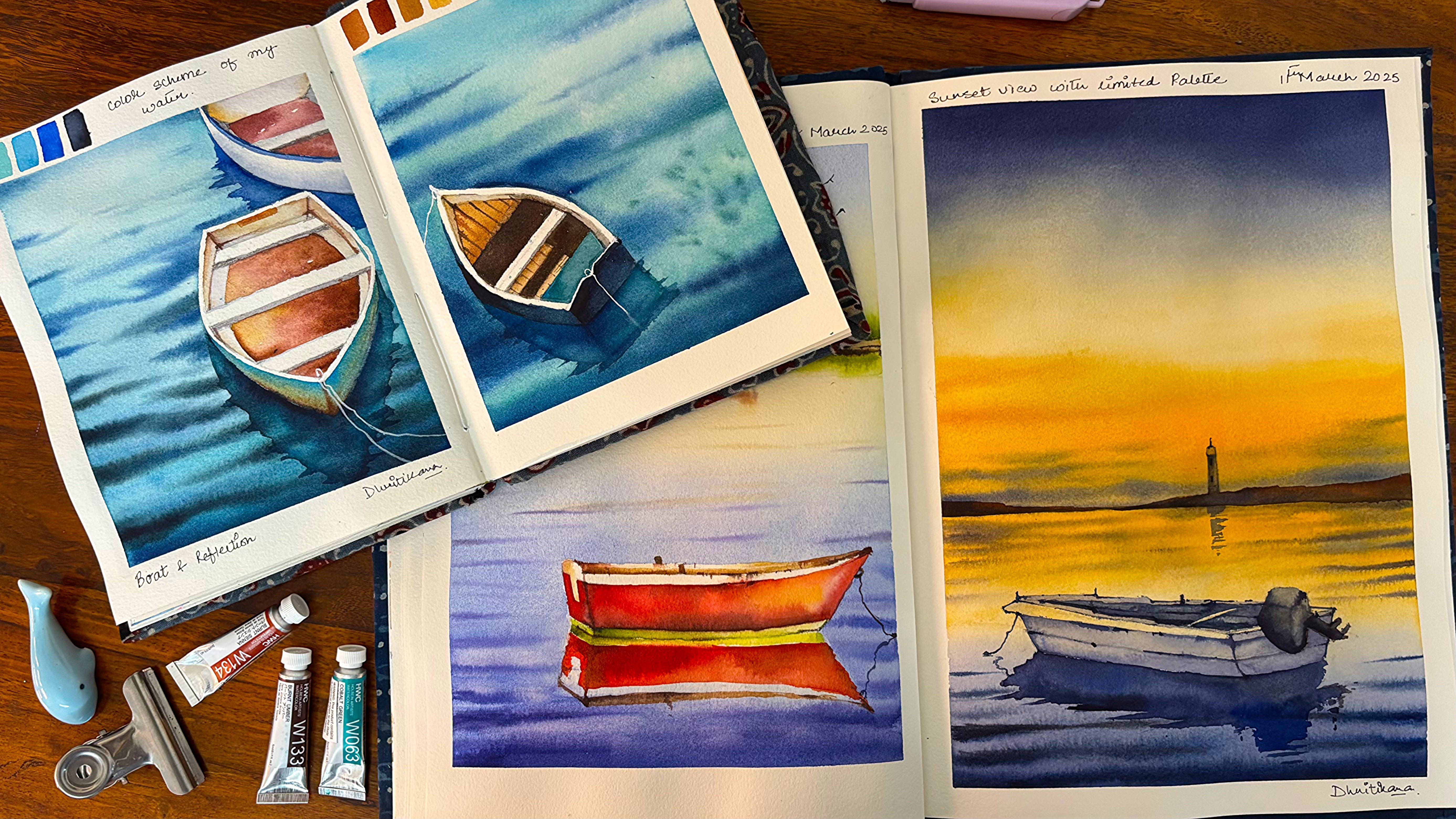
5. Project 1 Walking Down the Road: Hi, guys. Let's have a look at all the colors which we need
for completing the painting. Today, I'm going to
do an h2h painting, which means that we are going to start from the top and
go till the bottom. We are not going to
tape down any part of the paper or not even leave any part of
the paper in white, except the snow parts
which are usually denoted in white as I want to
use the white of the paper. Usually take white
watercolor paper, but there are many of
the other watercolor paper entoned colors
that are also available. Though I am not a person who is in love with those
kind of papers. You can choose your paper
a bit intelligently as we are going to go ahead and
use the white for hours. No. I have added water on
the backside of the paper, and now I'm adding water on
the top part of the paper. The top part has
majorly the sky area, and I have chosen the top part way larger
than my bottom area. The sky is the major
part where I'm concentrating the whole
focus in this painting, though it is a winter painting, but still the sky plays
a key role in it. I'm going ahead
and adding water. As I tell you, I usually do
cross patches so that there is no way that we are leaving
any of the parts in white. I will go ahead and even wet the bottom part well
because I can see that my bottom part is not sticking to the acrylic
board which I have taken. These kind of small
things do happen, and this is a pretty
old paper of arches, though I see that it has not
lost any kind of sizing. This might be around at
least three to 4-years-old. But, yeah, it was kept
in a closed space, and I usually use silica gel to store my papers so that
no humidity can get in. That way, you can really keep your paper safe for a
longer period of time. Going with the lightest
value of this painting, and that is majorly your opera, Opera is one of my
favorite colors, as you have seen already, and I have used that color
in many of my paintings. Going with the royal blue, this is from the brand
sanelia and I'm adding it towards the bottom area first and then going
with the top area. I would go ahead and use
generous amount of royal blue, even on the top parts. There is a lot of space
that can be used, and the blend should
be absolutely natural. That way, I can ensure that the colors are
moving into each other. That way, I can ensure that all the colors
move into each other. In a very easy and simple way. As well as the blend
is absolutely natural. No way I am trying
to get any hardages. Softness is the key
for this painting, though you can have hardages, but since all of these
paintings are edge to edge, that's one of the reasons
keeping in soft would be way more better for
all of our paintings. I will continue adding
more of royal blue. And any of the other colors, you can see that if you mix some amount of
royal blue and opera, you will get a
purple like shade. Though having a purple is
always great by your side. So if you don't have purple, you can make some amount of pink and blue to
get that purple. Going with my paints gray, paints gray is one
of my favorite. If you don't have
this paints gray, you can also go
ahead with indigo. The indigo that's there
with me is basically from the brand QOR
and it moves a lot because of which
I try to avoid using indigo for all
these kind of paintings. When I'm using more of Layer two or any of my layer three, then I would like to use the indigo which I have
with me as of now. You would observe that I
will keep moving my board here and there so that the
colors move into each other, and I have to do way
less job compared to the water that's doing
all the job for me. I just like to add the
colors and then just move my board so that all the colors can move into
each other very easily. Whole of the painting is
done in easy and simple way. So do not be stressed
for this painting. I can tell you you are going to nail this painting for sure. There is hardly anything which is difficult
in this painting. It's only some of
the parts where I'm going to tell you how
you have to move around. Easy going painting, you can have painting sessions
with your nephews, nieces, even with
your children during the holiday season to
enjoy this painting. Anyone can do it, and each one of you is going
to love it completely. You can also make
holiday cards out of it and gift it to your
near and dear one. Watercolor is a lot
about enjoyment. You continue to enjoy
with watercolors, it's going to
reward you so much. I am trying to take off all the extra paints that
I have on the paper, and then I have
my tissue always, always handy by my
side to take off all the extra colours
from my table, though I have to go ahead and again rinse the
table completely, which is absolutely okay. These are part and
parcels which do come up when we are working
in watercolors. I always get smitten
by the ultramarine, and this ultramarine
is from the Rembrandt. It is one of my favorite
ultramarines for now, and I love to
introduce it in many of the places wherever I
think it can be included. So I've introduced a bit of it towards the top
right hand corner, and then, again, I would go ahead and work on my
skies wherever necessary. Know that the whole painting is coming together very quickly. That's one of the
reasons you may not want to work upon each and every
area in a lot detail. And secondly, there
is less to be done. Less is always more. Know this. And this particular provo serves very well for at least
watercolor paintings. I think less is more for watercolor
paintings helps you to determine that you are not going to overwork
on any of the areas. Overwork kills a painting
and for watercolors, I can say for sure overwork is going to kill your
painting completely. Adding some of my paints gray again towards
the bottom area. If you don't have this color, just mix some amount of Prussian blue with black
to get a similar shade. Of course, black is not a shade that I usually use in
any of my paintings. And if I don't have a neutral
tint available by my side, then only I would like to
use any of the black colors that's there in my palette or
available with me in tube. All I can say is usually
this particular palette, which I have been using
for many years now, doesn't have any kind
of black, but, yes, there are many of you
who are in love with the color black and you
might like to use it. So I'm pretty open if you
are someone like that, who can make some
amount of blue and then get a shade that
looks similar to this one. Great. I guess I'm very happy
with how it has turned out, and do we need to work
more on it or less on it? Is something that time
is going to tell us. Last 10 minutes of the painting. Yeah, we're almost done
with a lot of it for now. I'm introducing some
lines, as you can see, there were a few lines that
we did draw initially, and those were the
lines which is going to define basically the road that's going into
the horizon line. Of course, the
vanishing point is not on top of the horizon line. It is somewhere towards the
backside or what you can see is these all lines will join to one single point somewhere
in the sky area. So these kind of
things you do keep in mind when you are working with watercolors.
These are the basics. Vanishing point is one of
the basics of drawing, and I have taught this in
many of my other classes. If you are new to
watercolors or drawing, I would say these are some of the basic concepts that you
can go ahead and check out. I love to go ahead with
very diluted light washes, as you can see on my right. This is a very light, dirty purple kind of color
and just extended towards the bottom part of this road
that we will be painting. Of course, it's a road. You will see how I
come up with it. I usually like to use the whites of the
paper, as I always say, use the whites of the
paper for drawing the snow or use it in your painting wherever
you think it can be used. This is something
that I've learned, use whatever resources
are available with you, whether it be even your paper. You can either take a Sepia or else mix some amount of blue into your burn Sena and get a darker value as
you see over here. Use a size three, size two, whatever brush
is available with you. No need to have
any fancy brushes. These are easy paintings
which we are going to do. Though the first one
is way more easier, I would say I've
kept it that way. As we progress, of course, the difficulty level
is not going to increase to a huge extent, but yes, maybe the last
two or three paintings, you might find that there is a good amount of
drawing, sketching, and then you will figure
out the painting, how we go ahead and apply the colors, which is watercolor. H2h painting has got
a lot of positives. You don't need to worry about where the colors are flowing. You don't need to
think about how I'm getting that great edge or not and how my
movement of colors is, like, is it going
out of the tape or did I did I not get
that clear edge, which I've been
looking out for all of these tensions are not there. And in watercolor,
all I've understood is that you have to
go very free mind. Or I can say that
your mind should be absolutely clear when
you are working with it. You don't need to think much
and just go with the flow, enjoy the flow, and fall
in love with this medium. Loving this medium, of course, can help you a lot in getting great
outcomes for yourself. I'm now going ahead, adding
some dots, adding some lines, and wherever it is necessary, just go from the edge and then take it to
the middle part. That way, you know, what you
usually do for your surface, keep some space for your
own self pure painting. I think I'm not happy with how the middle part is looking, and there are times
where I just do decide that this part
is not looking great. I might have to go ahead
and paint over it. Sometimes, adding the roads, et cetera, is not easy
going with the floor. We do change a lot of things. So the road was not decided when I started out
with this painting, but as I progressed, I just felt that the road is a necessary thing
is this painting. And hence, I went ahead
and added the road. Though after adding lots and
lots of lines, et cetera, I was truly not satisfied with
how the final outcome was. Few of the areas I will pick
up the colors and blend it, as you can see with the
help of my blending brush. This is any more brush
that's available with you is good to go
for this painting. I'm not looking forward
to any one single brush. You can go ahead with whatever
brushes are available with you and create this
painting, the colors. Anything all I'm
always interested in is 100% cotton paper. Go ahead with arches, fabriano or any kind of
100% cotton like Bahng, et cetera, which are mold. Rather than it being handmade. Though if you don't
have a choice, yes, it's good to go
ahead with handmade 100% cotton 440 GSM paper. In those cases, I usually
prefer 440 GSM over 300 GS. I will add few more dots
with the darker value. This can be your darkest
of the value that can be neutral tint or any
kind of darkest blue, paints gray, et cetera, to create this smaller dot, which basically shows
the different values that you have in
any faraway trees, et cetera, which you observe. I will be adding some roads now. You can go ahead with
any blue of your choice. For me, the blue can
be ultramarine mixed with some of the darkest
of the neutral tins, et cetera, or just go
ahead with Pains gray. You can also go with indigo
if that's available with you. I have also added a sideway
pathway kind of line, which mostly shows
the sideway road. I again, wanted to just add it, so I added it. It's
perfectly fine. You want to show it.
You can show it. If you don't want
to show it, that's also absolutely okay. Finally, I'm done
with the roads part. I want to add some
gold on the sides. This is my personal
choice to add the gold. If you want to gift these kind of small token of small cards, or you can say paintings
to your new and dear ones. That's also good
to go ahead with. Just keep in mind that whenever
you are adding the gold, your paper should
be absolutely dry. If anyone is wondering, what is this gold from? This is from my own
company, vibrant parcels. If you are looking for any set like this, you can
reach out to me.
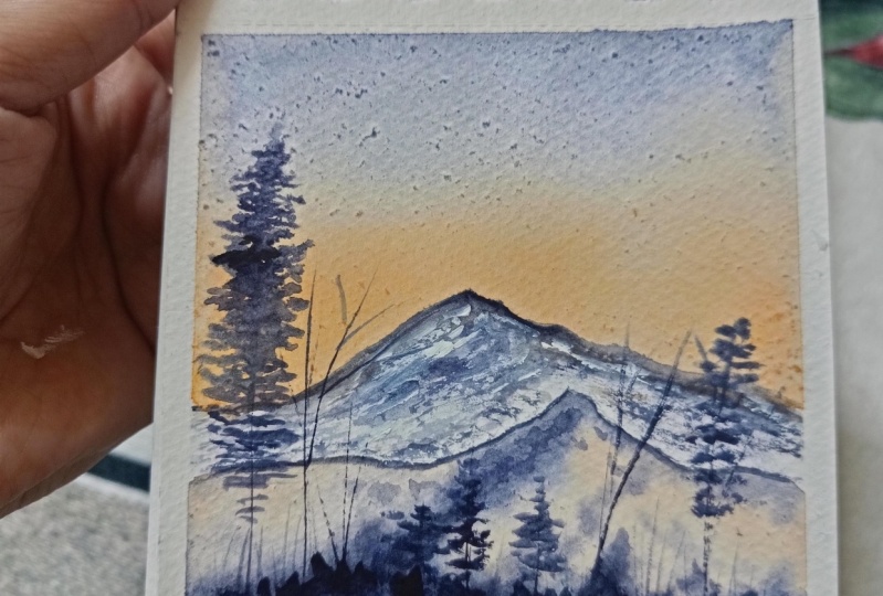
6. Project 2 Majestic Mountains: Let us understand all the colors which we need for
completing the painting. Going to first at these
two small mountains. You can see about one third
of the paper is my sky and almost two thirds
of the paper is my whole of this mountain area, though, of course, mountains
are done in separate way. Or you can say that is my land, and the sky is basically the area where I'm going to experiment a bit with my colors. Though these colors are simple, and I think you will easily get it anywhere
in your palan. If you don't have
it, I will give you simple solutions of how you
can make it for yourself. So just pick up your brush. It's an easy painting. Pick up your pencil, start sketching along with me. These are just the
two simple mountains which we are going to draw, and then I will
tell you in a step wise manner how you can go ahead and start adding your colors in a very easy and
simple manner. The bottom part of my painting, I'm going to add some
of my dry trees. That's one of the reasons
I'm trying to add these few lines to have idea that where I want to go
ahead and add some trees, there will be a few pine
trees and a few dry trees. That's all in terms
of the sketching. You should be happy
that it is simple, easy, and very quick. In terms of adding the colors, also, it would be quick. So just go ahead. And either you can take
a color like the peach, which you see on my palette, or else you can also create the color by mixing some amount of your opera into the naples yellow that
you already have. Now, this kind of a color, you also get it in one of the brands called
as white Knights. So I have given you input about how you
can create the color, as well as how you can already have the
color on the palette. But I guess creating
colors is not bad. Go ahead, mix your
colors, have the outcome, experiment with it, see if it is closer to the one that
I'm applying over here. If it is not closer to the one that I'm
applying over here, go ahead and again try to make some of your colors and see
if you can come up with this. If in case you are
someone who is not or who is just starting
out with watercolors, then of course, you can go
ahead with the exact colors. But I feel that color
theory is a very, very important part
of watercolors. Even if you are a big no, please go ahead with color
theory and understand how you can create your own colors in case you do not
have any guide, go ahead and check out my class hundred and one
watercolor techniques. There, I have added a portion, which is all about color theory. I'm going ahead and
adding some paints gray towards the top
part of the sky, as you can see over here. I have taken my brush that is from the brand fire
or aquaton you can see, and I'm using that
particular brush to apply all my colors. Let's go ahead and continue
to add colors into the sky. For a seamless wash, you have to always go ahead
and move your board a bit so that the colors
can move on its own. You can see that my
paper has started to dry off because when
I recorded the class, it was long back. It was not the winter season. Of course that's the
reason it was drying up, but I got a chance
to release it now, but I'm really happy
that I can still show you how easily you
can do few paintings. And these are not
very small paintings, at least 18 to 19
centimeter papers, which you can take
for actually going ahead and working on all
your square size paintings. That's a real good size
to start out with. If you are someone who
is thinking about, can we go big can we really
paint or all those questions? Stop working on a simple
A six or five size paper or if five size, I will not say still bad. You can start by using a square paper if you're trying
to migrate from a small, like A six size paper
to a bigger paper, and then move on to A
four and A three sizes. It took me a few years to also start painting on a
really big paper, but I can now say that I enjoy more
working on bigger paper, as it gives me a lot
more opportunities to experiment compared to
what I was doing earlier. I think it's time to
apply some colors. As you see over here, I'm starting from the bottom
and going towards the top, adding these colors in a
very simple and easy manner. You just apply some water and see how your colors are
moving, believe me, I have done this earlier
also if there has been some kind of a mistake
or even not a mistake. Just on my own, I have added these colors to make
the blend seamless. Now, why I say that blend is not seamless or I'm not
getting the exact look and feel of the colors like the way I as I have seen that
getting the perfect mix, getting the perfect
colors is kind of a myth. To be frank, you have
to experiment with it. You have to allow your water to start dancing on your people. You have to allow your colors to go ahead and
blend on its own, let them work for you. All of these doesn't
come on its own. It takes us some time to
understand how we are going ahead and applying the colors so that all this
magic can happen. Right now you can
see I am picking up some opera and applying it on
the lower part of the sky. Along with it, I have also
added some of my paints gray. If you're someone who
doesn't have pains gray, you can also go
ahead with indigo, but make sure the yellow
that you are mixing for this kind of a
color that we have added towards the
bottom part of the sky. It doesn't react with the
indigo to give any green. I'm done with this part, and it's time for cleaning. You can see, I love to
clean my place a bit, at least before I start
out with my second part. So just going ahead and cleaning this part
of my table a bit. Now let's start out with our
lower part of the mountains. Why I say lower part because the top part is still wet and I don't want to touch it as is. I'm going ahead with
the same color mix that you have seen for my
sky on the right side. You can see that now I have
shifted to a bigger brush. It helps me to apply my
colors very quickly. I'm not going to complicate
this painting at all. It is a very, very
simple painting, and anyone can do it. Now I need to shift out
to a smaller brush, and this brush is
basically my size ford brush from the
brand, the Vince. I have been using this
brush for a few years. Now, I guess I got it
somewhere in 2023, and it's been great while I continue to use
this brush over many, many, many paintings of mine. Going ahead and adding a bit
of darker value, as you see, I'm approaching the colors from the left side or from
the right corner side, that allows me some time
to to gain my confidence and then go ahead with the larger strokes or the smaller strokes
of the mountains. Small dots and strokes is all you need for completing
this painting. I will go ahead and
mix my colors towards the bottom area and
add a few drops of this practically darker value of paints gray and
add these dots, as you see, these dots are not going to complicate
your painting at all. Of course, it's going to ease out your painting to
a greater extent. And that's what I
guess is important. Understand that slowly you
build upon a painting. On the first go, you never
apply your darker colours. Always go ahead with
simpler shades, simple colors or lighter
value colors and then build upon any portion
of the painting that you need to add on your
colours or add on more variations or
work with your values. That's most important. Values is something that I
always say is very, very, very important
in any painting. If you understand how you
can work with your values, you can nail any
of your paintings. I'm done with the bottom
part of the painting, and I should allow it to dry off before I go ahead and
touch the top part, though I don't think that
I did allow a lot of time. But still, it is almost
right from the top side, and I'm good to just start
applying smaller lines and smaller dots here and there for my this particular
area of the mountains. As you can see, that
mountain area is something that I have always always focused on in case we are doing any snow
related paintings. Either it has been Northern lights or it
has been mountains. But both of these kind of paintings or these paintings
give me a lot of joy. Without them, I don't think
a winter season is complete. Of course, you will have more paintings or you will like more different
kind of paintings. And there are various paintings, which I have also done in the
past for the winter season, but this practically remains
one of my favorites. Okay, going ahead with my
dry brush technique and applying some of the colors
in few of the areas, as you can see over here. I believe on this idea that if you can keep some
of the areas in white, it can really work as snow, and I try to use the white of the paper for these kind
of experimentation. Why I say that use the
white of your paper, it gives you with a lot
of opportunity to not add any colors or avoid dirty mixes, which you can get if you are adding some kind
of white on top of your paper always or I avoid adding the whites
as much as possible. Opaque, non opaque, any kind of white colour is
something that I try to avoid in all my paintings. Okay, adding some more
dry brush technique towards the bottom
part of this mountain, and then we will go ahead and start adding some of our trees. Trees is a very, very important component of this painting, and hence, adding the trees will also bring a lot more joy. You can see that
I'm just trying to add in a simple way these trees. And these are practically
the pine trees, of course, you may have a different
way of painting, but you can see that
the top part is easy, and then I start extending
in the bottom part. Only the top part is what
we are going to detail. The bottom part,
go ahead and add colors exactly the way
I'm adding over here. No thinking much about any portions how it should
be or what it should be. Now I've realized
that, of course, this one looks really small, and hence I need to just go
ahead and broaden it a bit. These are over once I start applying the
colors on my painting, I get to understand and then
I get to do these changes. Every time I am not fixated
on any particular way, I should paint my pine trees
on any particular way, I should add my subjects. I just continue to add and see how the
painting is turning out. Yes, there are a
lot of times I have failed but I'm here to help you out with stepwise process of
how I create any paintings, but important part always realizes that even
an artist can fail. Whatever they think of, it's not always that they are absolutely correct in analyzing or in creating all these
paintings on their own. And hence, it is important
for us to always go ahead and just work in the process of creating the painting and see
what works best for you. I always start in
a particular way, and then once I continue
to add the colors or once I continue to add these kind
of lines to my paintings, I create my own. It takes some time, of course, but you will love the
process of this creativity. I'm starting out with
the dry longer trees. Yes, for this, I have picked
up my zero, zero size brush. You can go ahead
with any thin brush that gives you more confidence. If you are going
ahead with very, very, I would say a brush, which has got a nice tip, but still you're not confident about it or you are
not sure about it, that is really going
to harm your painting. Go ahead with the brushes that you are more
comfortable with for this part of the
paintings as you are creating smaller lines. I like to break it up
towards the top area, though during the drier season, you will not see that there is a a lot and lot of branches
moving here and there, and that's one of the
reasons I've kept it in a way that they are just
approaching towards the top. Anyways, the leaves
are not there. And hence just keeping
somewhat lines smaller, picker, always mix
up your lines. This is nature and
nature is random, so you really don't know
how they're going to appear in front of you or how
they are going to come up. If you are adding them, some of the places would
be more uh I mean, there will be more
trees, some of the places will have less. That's all I have seen
in my experience. I hope you also
experience the same and understand to create nature
in a beautiful manner. Over here, we are going to
repeat the process of these dry trees and
just starting the um, I mean, all of these pine trees. So, follow me how I'm
doing it, and that's it. You have to go ahead with your darker value colours to do this. Some more fine details
for the sky area, and then for the borders, once this paper is
dried out completely, I will go ahead and
add a golden border. Now, this golden water color
is from vibrant parcels, and this is a particular
sheet that is my favorite. I have a calligraphy set, which is a must for
all calligraphers, or even if you are someone who is creating
paintings, it has silver, golden, and various other
colors that can serve as your holiday greeting card thing that you always sent out to
your friends, et cetera. So, of course, have a
look at it if you get a chance on my page of
vibrant parcels in Instagram. Okay, continue to
add some more of these lines towards
the bottom area and let them dry off,
as I always say. I can see a few dots
on the top of my sky. So either I have to
add a longer line and create my trees or else if I'm not adding
some longer line, maybe I have to add birds. I don't know what I would
be going to add or leave it as it's something
that is ongoing, and I only do once I understand where I'm
reaching with this painting. I think I will just
leave it as is and add this golden shade, as you can see, Oh, my God, this is real hot, and I am so so happy
once I'm adding it, it doesn't come
off at all if you even put your fingers on top of it once your paper is dried off. So yes, this is a
great color to always, always have for yourself, even if you are a
watercolor artist, it is heifer to have a few nice colors for
yourself that can always, always uplift your painting. Let's go ahead and move on
to the next painting now.
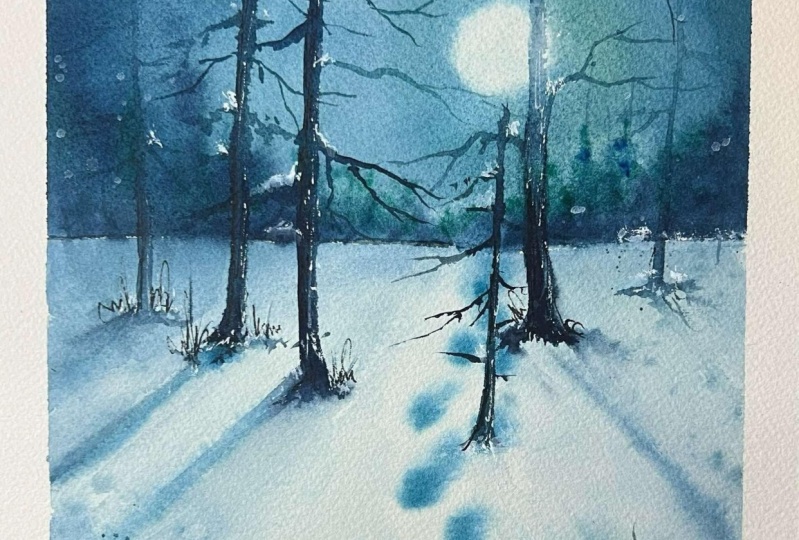
7. Project 3 Journey through the Night: Go ahead and first
have a look at all the colors which we
need for this painting. I am going ahead
and adding a line. This is basically
my horizon line. It's going to separate the bottom part of the
painting from the top part. Bottom is basically
your grounds, and the top part is your sky. I have two beautiful
colors with me that I would be using for
creating this night sky. This is my teal green, as well as another color
that is cobalt green. Though you can also use any of the other shades if you
have with yourself, but these two are good enough to start out
with this painting. Another good part
of this painting is that it has very less, I would say, it has very less in terms of work that you need
to do for your sketching. Some of you don't
like sketching and are just exploring
watercolors for fun. And this is a painting that you should always, always
go ahead with. This is also one of my
favorite paintings, and I hope you also fall in love with a
painting like this. Okay, another thing
that I must tell you, although nights guys
will not have a lot of stars or may have stars,
may not have stars. Don't be really obsessed
with the stars. First, apply water on both sides of the paper and then try to add this kind of a moon where you will get all the light.
It's a soft moon. I have applied water on
both sides very well. And hence, all I can say is now I'm going ahead
and applying my colors. I've mixed some
amount of my cobalt green into the mix
of my te green. Of course, the painting
came out so well. I don't know why the
video is moving a bit. But if you can avoid that part, most of the areas
when I'm applying the colors is absolutely stable and you do
not need to worry. Sometimes what
happens is you have painted something and
you try to paint again, but it doesn't come out exactly the way you have
painted the first time. That's the reason I
did not want to change this video at all and wanted
to bring it to you guys. I hope I hope you can
understand my feelings completely and look through it and paint this along with me. I am super, super excited. Believe me or not, this is my favorite painting
from this series, the night sky part, at least, how beautifully you can
actually paint a nightsky without even having lots and
lots of colors by your side, have three, two, four colors. And another color that
we must have is paints gray to add the darker
values. That's it. We are going to work with
them and come out with the best things for this holiday season or
the winter season part. Yes, it was supposed to be
holiday season earlier, but now it's Windows
that is only. If you are also
painting along with me, even in sometime
later of this year and want to present to you
and your and dear ones, I would always always ask you guys to create this painting, give the painting or make it
a holiday card for yourself, whatever you want
to go ahead with. This is the perfect choice of the painting you
must go ahead with. Colors are not moving a
lot. I don't know why. I have used Migo Mission gold, cobardGreen or I don't know. I sometimes feel that some of the colors don't move a lot, even if you have
added the waters, and the water is
also drying up very quickly compared to what
it should have been. It's okay. Don't think much. Go ahead with the
flow, as I say, you just need a seamless blend, and if you are getting
that, that's absolutely. Good to go ahead with. And now, some of the places
have snow and it's freezing. Choose that perfect
cozy corner of yours and go ahead
with this painting. Believe me, this is going
to add so much love, and I have practically loved creating the painting so much that I can't tell you. I've also added some of the
water in the bottom part, leaving a very fine
line in between the top of this area that is basically the
sky and the bottom part. You will not see it over here, but you will see once I start
creating my bottom or part or start adding the
colors to my bottom part, you can see the top part is not moving into
bottom part at all, and that's how I differentiate. I start adding
some darker values towards the horizon line. Though the horizon line
is not visible very well, but yes, around
the horizon line, start adding these smaller, smaller dots, smaller,
smaller lines, and you can see the
colors are moving at I am in love with it. These small dots
are becoming blooms and they really,
really make my day. Without pine trees, I feel that none of the window paintings
can be complete, yes, to a great extent,
but dry trees, pine trees, then adding
some footmarks on the snow. This is basic. And
I'm going to do that. Even in this painting, it brings me lots of joy. And hopefully you also enjoy
painting this along with me. I always say that the enjoyment really comes when all
of us are painting together when all of us are exploring our side
of creativity. Great. Let's just add some
more of our bar green, as you can see over here, and then blend it
from the bottom. Adding some of the turquoise. Or some people also have turquoise in case you
don't have te green, turquoise can also work. Now, all these are experimental and you might have to go ahead and experiment with your colors that is there in your palette. If you don't have this color, you can also create blue shades like Prussian blue or indigo, and then go ahead with any
of your other blue shades, like one of the lighter values that you can take in this combination
would be ultramarine. Anyways, the whole of
the painting is dark. It's not very, very, I would say light colors
that I have added. Now I'm going ahead and adding some water in the middle part of this area where I want
to make a pathway, and there actually,
the humans have moved. You can see some of their
footmarks. That's the idea. That's the reason also to go ahead and apply
the water so that those areas don't have a lot of colors and it becomes
easily see I mean, these footmarks can
be easily seen. Okay, adding some darker
values and keeping my corners absolutely
boring, as I always do. Corner should be boring. If
your corners are not boring, then how do I go ahead and concentrate in the middle
part of the painting, which is basically the
heart of this painting? Once I have blended the
colors of the snow, I will go ahead and start
applying small dots. Now, this particular
brush of mine is also very old and it
has got a very nice tip. The tip is still
doing very good. That's one of the reasons I just go ahead with this brush
in most of my paintings. I have taken all
the extra colour on the right side towel,
which you can see. This is a cotton towel
that I keep by myself. Earlier, I was
always using papers, and I just feel it's a small way to be cautious
about your environment. I use the screen towel nowadays
for many of my paintings. It's not that I've
completely stopped using paper altogether
or tissues, but some of the places
where I can avoid, I just try to avoid
as much as possible. Some smaller lines,
as you can see, these are basically
the reflection of the dry trees that we are
going to add in this painting. The paper is wet. That's one of the reasons I'm adding these lines right now. This kind of things I do when the paper is not
having a lot of water, which means that
there are no puddles. There is hardly any
sheen to on the paper. You have to wait for five
to 6 minutes or 7 minutes before you do the process. But every paper is
different and you might have to look at
how your paper reacts to water and how much
time it does allow you work on various
parts of the painting. Some splattering, as that
is my favorite always, as you see, slattering
is something that I have fallen in love
with, always, always, always. And yes, now going ahead and adding some
flattering for this part. Okay. So lines over
here, as you see, for the pine trees, the paper is wet and I
cannot touch the surface. If you cannot touch the surface, just wait for a while. Or else you can be careful
just the way I am not to touch any part of this painting and apply the lines
or dots in a way. That they appear soft. My background needs to
be absolutely soft, as I always say, but it's
tough to do this way. So either you can go ahead
and do this initially, I'm using my paint
scray to work this out. As of now, you can see how
these lines are turning out. And yes, I'm pretty happy with how this
painting is altogether. I am super excited, super happy, and hope you are also falling in love with
a painting like this. Something that I always, always love to create.
It's not in green. Green sometimes
really look a bit of or artificial, but yes, these are the colors that you can always use for your water, for your snow, for any kind
of future paintings, too. Let the paper dry off
and then start adding your dry trees as
you see over here, a simple line from the bottom
and take it to the top. Once you have
reached the top part or the end of your paper, then you have to just go ahead and start branching out
this particular tree. Though there will
not be a lot of branches that I'm
looking forward to, I am just adding a few
branches or dry branches, as you always see in any
kind of dry tree painting. A few of them is good to go, use the darkest
value that you have, but I can see that my background has turned
out a bit more darker, though it should not interfere
much with this painting, and I guess we can
still continue to add the branches
towards the top area. The lower part, I
would like to avoid not have lots and lots of them. As I will not be
in a position to see them to a greater extent. That's the reason we should
focus on the top part. You can see that I start
branching out towards the end. So I take a straight kind of a line which is originating
from the middle part. That is basically the
middle line which we have created and then branch it out towards the end
with another line. And that's how I continue to create more and more
branches over here. I see that, yes, the tree looks
nice and complete. I might have to go ahead
and add a few more or just leave it that I will
decide as I progress. Sometimes having less is good. So yeah, you continue to decide or you continue
to paint and decide. I think this really looks
nice as a dry tree for me, I will move on to the next one. There are a few
more, and this would be more of an iterative process. Believe me, there is nothing much that we can
do in terms of creativity. I would say the one that
you have already created, you have to focus on it and continue to add more
and more trees in your background area or you can say on top of the snow
area that you have marked. There you just need to
keep one thing in mind. Some of these trees
would be smaller, some of these trees
would be taller, and the reflection
is already seen. How I have created
this reflection is something that
I must tell you. All the lines will move to one single point on
the horizon line, and that is known as
the vanishing point. Now, this vanishing point
understanding is very important for anyone who is
working with watercolors. That is the basic
of any kind of, I would say,
sketching, et cetera, and it can lead you to very, very good paintings even in your future if you are working with any kind of architecture
paintings, et cetera. M Now I'm going to create the smallest tree
because the top part or you can say that the middle
part of this tree is broken. Few of the trees, you
will also get broken. Yes, it's not that every time everything would
be standing tall, and this is one of the
ways of representing that. Going ahead with another one, as you see over here, from the top, I will start
adding the darker values too. In the middle, I will
keep it a bit light. As the light of the
moon is not very, very I would say it doesn't
have so much of glaze or it doesn't bleed through
any of your trees, but still keeping
it a bit lighter, I think will be a good
choice at this moment. We'll see if you want to
add more darker colors as we go in the process
or as we progress. I will add few more lines as
my small and small branches. Over here, I'm branching
this out more. I have got more confidence. The branches that I created
last time were very different than the ones that
I'm creating over here. Always, always gain
your confidence from not the main tree
that you are creating, but from the trees on the sides. Yes, this is one of my main
trees that you see over here, I have to add some more of my darker values as I progress because the
tree has become very, very, I mean, thin compared
to the bottom area. And yes, that's the
reason we have to add some more of our values. Or you can see I have to add some more strokes with
my brushes. Great. I guess now it's time
to go ahead and add one or two dry grass kind of
lines for this bottom area. I'm not going to extend it a lot of you here and
there, and that's it. Once this part is done, let your paper dry off and
start adding the golden color. That's the highlight of this
painting. I can't tell you. They are like this adding
of golden colour makes this painting look so
unconventional and so beautiful. I am so much in love
with all of it. Okay, great. I guess I'm
adding one more tree. Trees are never enough
for me, believe me, I love creating trees to the
maximum possible extent, and I continue to create them as I progress in watercolors. I first started creating trees. So when I started out with
W watercolors only usually, we don't start out with
trees at the first go. We just start experimenting and then we progress
through the trees, but I just started
out with that. Now going ahead and
adding my golden color, as you see over here, once done, just see that the whole of the
painting has come together. I'm trying to go ahead and
had some amount of cobaldwin. I don't know why,
but I guess just for the seamless blend that
I always always target. Okay, guys, meet you
again in the next lesson.
8. Project 4 Gentle Radiance of the Dawn: This painting is going to be
very interesting as we are going to use a sort technique for the whole of the painting. I will go ahead and mark an area which is a bit below
the half of the paper, and then we even mark an area which actually separates
my water from the land. Now, the land has
to be in snow and hence only the water area I would be painting
as well as the sky. There will be less
of the paints that I would be applying
in the snow area. If you see I go ahead with my scale initially to
mark the horizon line, though I know that many of you might not be wanting
to use a scale, but it's absolutely fine when you are starting out
with watercolors, you can use as much
help as needed. I have applied water on the back side of the
paper as well as on the top part of the paper where I'm going to apply my sky. I'm going ahead
with a color which looks more like naples yellow, but the only naples yellow
did not have any peach in it. This is mixed with a
bit of peach color, you can say, and it is
more opaque in nature, though I'm not sure that
it will do the job or not, but I was just going ahead and experimenting with
my color palette. Believe me, just your artistry
colors are most important. Like, now I'm mixing some amount of the coral color that I have, which is quin atrodon coral
from the brand Daniel Smith, then mixing with the
yellow kind of sheet that we had and extending it
towards the top area. Always, always
remember that you do not need to go ahead
and paint very quickly. Slowly, you can add and continue to add more
and more details, as I always Everything can wait and everything
can take your time. As I know, taking time is good. Go with the lighter
values initially and then go ahead with
the darker values. Never rush in the process of
painting with watercolors. Watercolors is a medium that's
going to reward you when you are going with the flow
and just allowing your own, I would say, creativity
to flow on its own, rather than just relying on any photograph or any
painting that you have seen. Take the inspiration
from the photographs or paintings which you might
see other people doing it. Just use your own colour,
sheets, et cetera, and use your own values, choose something very different
from what they have used. And here you go. You have something absolutely
stunning for yourself. I'm going ahead and
mixing some amount of brown into the
paints gray which I have and then
extending it from the horizon line
towards the top area. Once an extension
of this burn Siena, as well as Pains gray is done, we will go ahead and use
some of the table salt. You will see that table salt is very common in each
of our houses, and I will use it for just applying it on top
of this place, which is still wet. And then this beautiful
outcome will happen. We have to wait for that
outcome so till then we are going to work on the
bottom part of the painting. Most of my paintings in this particular series is from top to down and edge to edge, which means that you do not
need to tape down your paper. All you need is a board and
start with your painting. Since my middle round cannot be done as the top part is wet, I need to go ahead with
some of my snow area. I will just wet the
paper first and then start applying some amount
of blue on top of it. The blues are very beautiful, which I'm going to apply. This is somewhat like one of my favorite.
That is royal blue. You can go ahead
with royal blue and ultramarine Oel also use some amount of any
other shades like sereium blue or other blues
that are available with you. I am not concerned
with the fact that you are using any particular
different kind of blue. The only thing that you
should keep in mind is the paper should
be wet enough so that your colors
move on its own, we need to do less work, and it is just the
water that helps you dance or helps your colors
dance on top of the paper. I'm also going to add the same colors that
you usually see in the sky and that gets
reflected onto the snow area. I like to use it that way, but you can also go
ahead and only use blue. Though most of the areas, wherever there is white snow, there is some reflection of the sky that is on top of it and hence all of these shades will add a new flavor
to your painting, and it is going to
really act as a way to showcase how beautifully you have mastered the skill
set of watercolors. I will go ahead with
the darkest value of ultramarine and just start dropping these smaller dots and lines over here and there, not marking all the areas, keeping it towards the sights
or towards the borders, as I always like to
keep the borders not so interesting and going
with the darker values just makes it a bit boring as the idea of working with
watercolors over here is to understand the
salt effect where you see that wherever we
have applied the salt, the colors will move from that particular space to a
different place altogether, and you will get an effect
which looks like white. Along with some colors, that makes it very
interesting for anyone who is also exploring this
medium for the first time. You all can see that my sky has some white dots, which
I really don't like. That's one of the reasons I'm going ahead with the colors that I Audi applied for my sky
and just trying to blend it. The sky is still wet. It's not absolutely dry. That's one of the
reasons I can do it with another layer of colors. If you have seen
that the sky has completely dried up and nothing
can be done, leave it as. And it's not important
that you will also have this kind of white
drops here and there. That's because
mostly of the salt, I guess, or maybe when I
was applying the colors, it had, like, one time, my brush had water in it because of which
I got that color. Blending is the key,
as I always say, and if I can't blend
well, of course, this painting is not
going to come together. That's one of the reasons I have to continue blending it
with a bigger brush. Bigger flat brush are always good for any
kind of blending that gives you an edge towards
getting a good blend, as well as it helps
you to understand that always working
with a flat brush, which is of bigger
size can make it easier for you to work through
this watercolor medium. Watercolor is a fast paced
medium, but along with it, you have to also keep
in mind that there is less way to get back
to this medium that is all I can say is there
are less chances of mistake as this mistake
had to be also fixed, and it took me a lot of
effort to get this fixed. And just try to not
get any mistakes, but we all are humans and
humans to make some mistakes. That's one of the reasons. If you have a mistake like
this, you can go over it, though it can make your
painting a bit more darker, which you may want to
avoid, but that's okay. In few times, we don't
have much choice. I'm going with the
same color of the sky. That is a mirror kind of a reflection which
you get over here, and then when it is
touching the snow, I will make it more
in the blue shade. H. Whatever you do above water, if the water is almost still, there has to be some
kind of reflection, and here I'm going to
create that reflection. I would be using
some darker values, though the reflection, I'm not going to add
the salt effect as there is little bit movement
which I want to create. And if we add too many elements, in any place, you know, the whole of the
effect goes for toss. And that's one of the reasons, whatever it be when your
paper is wet at this place, go ahead and apply
the darker values. Once I've applied the darker values, I will just use a flat
brush to draw some lines. This is basically to pick up the colors from that
particular space, wash your brush, then again, just take off all
the extra colors on your tissue or the
water on your tissue. Go ahead with some more lines. As you see over here, continue this process
till you are satisfied. Not a lot of them we need, but yes, a few for sure we
will need in this painting. Once this is done,
we will just close the edges in few of the
places as you see over here. This is basically
my paints gray. I'm dropping in some dots
and lines here and there, even on the lightest value of the snow that
you see over here. This is to basically
show the drier parts, or you can also add
one or two lines which will showcase that
there are dry plants. I'm also going to add it. So be around. This is going to be a very
interesting painting. There is less work to be done, though it takes a bit
more time as there are three components that
we are attempting the sky, the snow, and the water. The lifting out technique
did not work the first time, and I think that's one of the reasons for,
again, attempting it. Let's go with the
second attempt. I think now it would be better. I do have a moist brush with me, and the paper is still wet. Wet in a way, I would
say that it's not wet, not dry somewhere in between, that is going to really help us to pick up the
colors very quickly. I will try to use
two to three times the same brush
stroke at one place so that the lifting
out becomes easier. A few dry plants. I'm going to add just here
and there to make it look like snowy and these plants don't have any kind
of leaves on it. It's time to repeat
the same process with the white gouache. Now, why use a gouache? This is a very not
transparent medium, which means that it's
an opaque medium. And hence, it's easy to
draw with this color. You will see that it goes above the color that you
have applied in watercolors, and you can see this white very well when you apply
it on the dark spots. Yes, all the spots, if
you have kept in white, it becomes difficult
for you to also see it. But yes, of course, we will
drop in a here and there so that it is not even
yet it exists. We are going to repeat
this process of dry plants on the other
sides with the black, as well as with the whites. Now, this is not exactly black. It is paints gray and mixed with the colours that were
available on the palette, so it looks more like black. I usually don't have any
black in my palette, and I am being very true to
you that I never use black. I prepare my own gray black
shades and then use it. Sometimes, yes, I do
use a neutral tint, but that, too, is
not exactly black. It has various shades
also coming up in it in few of the paints you
will get on neutral tint, which has two shades. So be very aware when you are actually buying
any kind of shade. Whether it is granulating or not is something
that you should always always check or it is
having a dual tone or not. Sometimes the dual
tone may not be very likely and a good outcome for
any watercolor paintings. Though it's a great
outcome if you are going ahead with any of your
calligraphy, et cetera. M Time to draw some loose branches of the tree. I'm not extending it
everywhere and not I'm drawing it everywhere in
just a few of the places. Some places are still wet. That's one of the
reasons you will see that the colors are moving a lot because of which I have to use my flat brush to pick up the
colours in various places. I would be repeating this
exercise time and again, so just continue to follow me and just paint along with me. There is less to
explain at this stage, hence just going with the flow is important to
complete the painting. Once the painting is done, let it try apply some gold
colour on the borders, and you can see a
beautiful painting that has come up for you, and it marks the winter season. It's easy going painting. I hope you have liked it. We are going ahead with
the next painting now.
9. Project 5 Illumination Spilling from the Barn: Hello, guys. Let's talk about the colors first to
understand what all we need, and then we are going to
start with our sketching. The sketching part
is not difficult. It's just that we are
going to make a house. I'm going to place this
house on the left side. I never place my subject in
the middle of the painting. The top part is basically
one you can say part one, and then the bottom part
is divided into two parts. So the total house size
is three equal parts. The left side will be one part, and the right side,
again, would be one part. That's how we go about it. I usually see this hole with the help of a pencil mark
with the help of my nails, a bit of area and see the left side is equivalent
to the right side. We are going to do
two slanting lines, one on the left, another
one on the right. It is a bit extended than
the point which I have made. So, yes, it's going to
be a left and right. This one seems to be a bit
smaller. I don't know why. This one seems to be smaller. We can always erase
and again get back to it as we have done
on the left side. I will go ahead and make
another line at this stage. The whole of the video
is real time so that you exactly get to
know how much time I have taken for the sketching, as well as for the
final painting. I'm very sure of this fact always to keep my paintings real time that really helps you to understand the
flow of the process, how we start, and how we end. There are a lot of confusions, even as an artist, as a very, very experienced artist myself, how to go about or how
to approach a painting. All I always go ahead with
is my wit and confidence. If you have confidence, you can nail any painting and never try to overdo watercolors. Stop at a particular time
where you think it's enough. We are not going to
work any further. That's the trick that
has helped me to actually nail many of my
paintings in watercolor. Again, every day is not a
great day for watercolors. Hence, take it with
a pinch of salt. If there are happy
accidents, be happy. If there are not
so good accidents, just accept it and move on. We are going to
go ahead and make a small window on the
top side of the house, as well as we are going to make some doors and windows
on the left side. You can see that I
am making two lines. Now, these two
lines are basically going to meet at
one single point, and that particular single point is called as the
vanishing point. As I have explained earlier, in the videos where
we were practicing. If you are not aware
of vanishing point, I would say it's a very,
very important concept. And just to go through it or just to have a
basic understanding, go through my video
of sketching. It helps you to understand this particular painting in
a much, much better way. We adding some dry trees even on the bottom
part of this painting, as well as there is a main tree which is going to come up. The whole of the
painting is supposed to be based on these two
important subject, that is the tree and this house. It's a evening time
or you can say it is a dark time where there are a lot of lights that
are there in the house. Lights in the
winters are common, and when that whole reflection of the light falls on the snow, it makes it even
more interesting. I am someone who looks out for these kind of small
details in any painting, and these small details really make or break
your painting. The tree that I
have drawn is also somewhere trying to cover up a bit of my house
that I have added. Along with it, I would
be adding two of these windows that will
also show a lot of light. Light is something that I've always loved to add
in my paintings, and this is one
opportunity that I did not want to get away with. So yes, you will
be seeing lights, reflections of the lights
on the snow and much more. This painting actually
has lots and lots of learnings that we have done earlier in the last
four paintings. That's one of the reasons
that this painting is bit more not so complex, of course, but, yes, it has more steps
in it compared to the other paintings. No. I will start
branching out my tree and add the darker
details in few of the areas where
I think I would be adding the darkest
value of my colors. Why it is so important? If you already have a
dark value over there, you exactly know
in your mind that you're going to apply
a dark value there, and the areas which
are in light, you could be adding
the lighter values. This way, you can define
your painting pretty easily and quickly compared to leaving it for
the last moment. Why doing a detailed
sketch is important. Ifever you get a chance
to do a detailed sketch, I will always ask
you to go for it. Detail sketch helps you to understand not only the colors, et cetera easily, but
it also helps you to move very quickly during
the painting stages. And when you are starting
out with watercolors or you are starting out with any
new medium like watercolors, acrylics, et cetera, this is a great add on for
your skill set. It will help you to hone
your skills in a much, much better way and easier way. I have spent a lot of time
on the sketching part, as you can see over here. It will take about ten to 12
minutes for the sketching and then only we can go ahead
with our final painting. The whole of this
painting is real time, which gives you a lot of
opportunity to just go along and sketch with me as
well as paint along with me. The best way to go
about a painting is just to first understand
how the flow is. So you can watch this video at a two X speed,
understand the colors, how I am sketching, et cetera, and then just rewatch it once more at one X speed and
follow along with me. This is a wooden house, and that's one of the reasons you will see that I am adding some of the darkest values
for those wooden areas. Further some more lines you have seen that I have
added to showcase those wooden area
towards the front side or where there exactly is
the window, et cetera. We are going to
draw a small, um, I would say door on the
left side of this house. You will see how I do it. I continue to add
some more lines. You can also do it
or do it later on, but I would say it's good
to have a detailed sketch. As I mentioned earlier, hence, going with this sketch will always always add on
to your painting. For or final sketch, I like to darken out a
few areas with my pencil, as you observe me
doing it over here. I continue to do this process
in many of my paintings, and this particular painting, I do it on purpose
so that I know exactly where all my darker
values are going to reside. After my first wash, usually, what happens is
all these sketches go waybard lighter as
there is a lot of water and sometimes the
graphite does dissolve and I do not get the exact
lines where I've marked. That's another reason
for which I do try to go over these sketches once more and make it
a bit more darker. A small apology that I might
ask you at this moment is my particular phone
ran out of space because of which I could
not record the sky area. Though I will explain
you the sky area is in any of the darker
values like an indigo, or you can go ahead
with pains gray. Once you have added this, go ahead with burn Sienna and your Pains gray or indigo to create the bushes
of the background, as we have done even audio in
one of our last paintings. The sky is an
absolute flat wash, as you see over here and
even this bottom part, you can see that I've
applied some burn sienna, and now I'm going over in the bottom part with some indigo to create
the darker values. This is how you are going to progress on the left, as
well as on the right. There is less to
explain at this moment, only the fact that I
would go ahead and apply more of burn Siena
in few of the places. So continue to watch it
and don it from there. There is nothing
much to explain. It's just a bit of blending
till your paper is dry. Secondly, you can
drew this process only when your paper is wet. You cannot do this process
once your paper is dry. That is something you
should keep in mind. You can see that the top
area is the blue area, and when my blue
area was still wet, I did apply all these colors. It became blue. And because of that bloom, I can see the background bushes. Even after applying water on the backside of the painting, I need to apply some
water. On this no area. Now, this no area will have a beautiful outcome once I
start adding the yellow. Now, the yellow
that I'm adding is, I guess, somewhere aoline. Now, if you don't
have this aleine, whatever yellow is available
with you, go ahead with it. I will also apply some of
my ultramarine or blue, but it should not turn green. That's something
you must always see that the yellow color
doesn't turn green. Take a very, very light
wash of your blue for not allowing the
yellow color become green. You can see that the
wash of blue is very, very light, and the colors are moving from the Olean
to the bottom area. You can also take
naples yellow if you don't have this particular
color by your side. So these are the other options that always can be exercised. I tried to add some orange, but I was really not happy
while I was adding it. Now again, I have blended it with the yellow
on the right side, again, applying
it on the people. Some more of the
darker values of blue, applying it from the
left and on the right, I always like to apply
the darker values later. Ifever I want to
go ahead with it, that gives me more confidence. Applying it later
makes more sense. Or else going back to the
painting becomes very tough after you have applied the darker values in the
initial stages itself. So purple for the
thatched roof so that I can see the
thatched roof well, and then I will go
ahead with my browns, yellows, et cetera,
for the house. But before we work on the house, I am really not happy with how the background
bushes have turned out. There are some dry patches, and I might like to blend
it a bit with my brush, which has some water on it, and it might create some clear blends compared
to what appears over here. Though imperfections
are always good, but sometimes there is, uh a thing that I want
to make it more perfect, though you can leave it
at this stage it is, or you can also go ahead and repeat the process
as I am doing. If your paper was wet enough, you will get a clear blending, as well as there will be
no hardages I of course, paper is not wet enough, though I have been
using Arches paper for almost entirely
creating all my paintings, but there are times where
even I have to give up on any particular painting as the paper was getting
dry very quickly. So sometimes it's okay to
leave it at that stage, again, go with another layer of water and then start
with your painting. I did pre wet the area where
I want to add the light, and now I have just
taken some colour on my brush going ahead with the yellow areas where I
want to paint my light. This light is getting reflected on the snow as you
can see over here. The colours will flow on
its own and on the sides, I'm going to add
some burn sienna. Burn Siena is going to
play a lot of trick. The colours will move around, not that only a particular
area will stay in yellow, but the whole painting will
bloom and give the darker, lighter values, whatever we want for this part of my house. Values play a very specific
role in any painting. If you are someone who
is new to watercolors, you may not be willing to mix up the colours as much as
I do right now as I have years of experience and
mixing up the colors like Bern Sienna paints gray really elevates my
style of painting. But if you are new, you can go ahead with your
burn Siena and then add some darker value of blue on the palette to get the darker
value of this burned Siena, which can be CPR or any
of the darkest value that you get by mixing the blue
and then add it on the house. But painting on your
paper directly, which is mixing your
colors directly on the paper gives
you a lot more shades and values compared to if you are mixing right
now on the palette. That's something
which I have realized with my experience
into watercolors. If you are mixing the
colors on the palette, it gives a lot more
interesting colors, as well as the blues
can also be seen. Then the word Siena
can also be seen. The yellow is also
merging into the browns. So overall, it's a very
interesting outcome, whereas if you are
mixing on the palette, these all colors may not be
seen together on the paper. We will continue to paint. As you see over here, I take a blending brush
of mine and start blending the areas where
I think it's necessary. I don't want the yellow to get
faded away with the brown. That's one of the reasons I
am also picking up the colors from the windows
wherever I think that the darker value
has taken over. Go ahead with the area
that has the door and start even adding the
darkest value over there. There is less to
explain at this stage. Continue to paint and continue to mix your colors
on the palette. It's going to reward you
in every way possible. If you are tired at this
moment, do not stop. I'm telling you because
we can take a break once our house is done and we can
focus on the tree later on. That way, you can always divide your work rather than
doing the work together. I am a person who
loves to take breaks, smaller break, water break, or any of the other kinds of break which you
can think about. These breaks help me to get a better perspective not
only of the painting, but also helps me
to understand how and the way I want to
progress in this painting, it helps me to rethink about my decision to work on this
painting or even think about how I can actually
add value to it by introducing some
different kind of gradient washes or different
kind of textures into it. All of this I can understand and then
again, get back to it. It's a good idea
to take a break, so never think about
not taking a break. Yes, exactly where you need to take a break is something
that you need to learn. Once you are done with the
grounds and the skies, as well as the
bushes, you can take a break and then come
back to this house. Once you're done with the house, you can again take a small
break and get back to the whole of the tree once
this part is completely dry. I'm just trying to add
some lines over here, as you can see, and
trying to paint the door. In the darker values, rest of the areas
are kept lighter. The paper is still wet. Adding some of the lines
will make them a bit blur, and it would create
an interest for all the people who are watching this final
painting by you. For the darkest of the value, I will create a CPR like color. We will mix some amount of burn senna into the blue that we have and then start adding some lines as you see over here. Once these lines are done, we will move on to the tree
as I did tell you earlier. Now, these lines or smaller dots are basically here to give you an understanding that there is a separation of the land
from the snow area. These smaller dots is basically a detailing part that you may like to add or you
may not like to add. But for me, I always
go ahead with them. Some of the places I add and
some of the places I live, even for my windows, I do the same effect. Some of the places I add
and some of the places are thinner or some of the
places there is no line, some of the places,
yes, there is more darker line,
more broader line. That way, there is a lot of I would say interests that I create
in each of these space. Even in some smaller parts, I try to keep that interest. Larger parts, of course, everyone will be more
interested in doing it. As it is always easier to work through the larger area
with a larger brush, if you are someone
who is, I mean, who wants to work on
a larger painting, please go ahead with
an AFO sized paper or else some bigger square size paper where
you can paint this. It will turn out really well. Continuing with some
more detailing, as you see, I use
the tip of my brush. There is no extra color
on the top or on the tip, and I continue to add some
lines as you see here. Adding some blues to show
the right side of the roof, which is there in which
is basically snow laden. So that's what I'm
trying to create. I'm not sure how good
I am at this stage. There is at least
some close to ten, 12 minutes more left
in this painting, and we would really like to
add more interest and love, as well as lots and lots of, um, I would say areas that
are more difficult for any new or any beginner to start out with because if you're starting
out as a beginner, we are not really
sure of the colors, then various kinds of other things that we
use in a painting, but here you already know here you have done already
four paintings. And this is basically going a bit above what you have done. Believe me, the next
bonus lesson that I'm going to give is
going to be easy, but there we are trying
to create light. And when you create light, I will teach you
how you can make your painting look
or glow, absolutely. So those are things we are also going to learn in
our bonus lesson. Well, then let's
continue to branch out a few of the areas in
the background bushes. I'm not going to
add a lot of lines, only a few here and there. Time for my trees, I will start with
the lightest value, which is my brown or burn siena and then move on
to the darker value. You can do this with the
help of CPA or else mix your blue with the
burn siena as I have done in various places
in this painting. You can see that we are not using a lot of
colours over here. It's mostly the yellow, burn siena and blue
that usually is going to decide the whole
fate of this painting. Believe me, you do not need a lot of paints for
doing all the paintings. Most of the paintings in the
series is limited palette that gives you a lot more
opportunity to mix on the paper rather than doing on the palette and create
various values that many people wouldn't
have even thought about creating if they would be
sticking to only the colors. Initially, when I also
started out with watercolors, I wanted to have all
the colors by my side, and I was someone who
was blindly purchasing various different kind of sets for doing or
completing paintings. I have Michelo Mission
Gold, full set, then I have Shimanke two or three different
varieties of full set, then I have SneliasFull set. I have PWC's full set. I have Winsor Newton, professional grade full set. I have whole bean full set, but believe me, over the years, I have realized this
is not what you need. What you actually need is only a few shades to create
an expressive paintings. These are just to have a good idea that you
have invested a lot, or maybe you have invested a good amount in your
hobby or something that you really like as a side hustle or even as
your main profession. So you should be actually
dedicating good amount of time for your
passion altogether. And that's what it did to me as I was purchasing
so many sheets. I wanted to try out
a lot of colors, and it really helped me to
ease through my paintings. But the real change in my paintings came when
I started experimenting with the colors and
how the color mixing happens on the palette
and on the paper. If initially I went ahead
with color mixing on the Palette. The next I went ahead with color
mixing on the paper. And that's how you gradually
move together and you gradually go up in the way of
painting with watercolors. I see some of the bottom
area is still wet, and what I usually do is go with the same colors
that I did use for my area of this tree into the painting part and just create a few
shadows here and there. If your paper is not wet, don't try to add a lot of lines. This is something we don't want. We are leaving the corners
as is not so interesting. After all, I always say
leave your corners as is. Don't try to add
a lot and lot of um I would say lines
or et cetera into it, continue to paint the area which you have thought is
important in your painting. I continue to branch
out my tree over here, and once the branching
out of the tree is done, we will go ahead and focus on the other part of the
painting that is still left. The bottom left side, we initially thought we would
be adding a few bushes, which we will be
doing even in future. So we are going to focus on it. Then just meditate. Just try to branch out
as much as possible. Every branching out really helps me to gain some more patience, to be more patient with watercolors and to enjoy
this medium altogether. You cannot have a final outcome without enjoying this medium. This medium is something
that's going to reward you once you start
partnering with it. I will go ahead and
wet one of the part of my house so that I can
add some colors over there as it appears a bit out or compared to the house it
looks really, really like. That's why I wanted to add a bit of a darker value
touch here and there. I have added a darker value
on the corners and tried to blend the color
with the background using a blending brush. Once that is done, you will
go ahead and start adding our dry branches or dry
plants, as you see. Some of them, not
that I'm going to occupy the whole of the
space with that, but yes, start from the bottom and take it to the top that
would help you to actually gain a lot more confidence with
your brush strokes. Always always try
your brush strokes on a rough paper rather than just going with the flow and starting out on
the paper directly. This also helps you to understand where
your strokes are going. Are you comfortable
with the brush or not? And if you are experienced
with watercolor, go with the best
brush that you think can create best of the branches. I usually pick up this
brush which is from Escoda, and you have seen
me using it very often in many of my
older paintings, too. It really helps me to have that confidence to
go about creating branches in any
place that I want because of the nice
tip that it still has. I think I have bought it some four to five years ago
and still it is doing well. That's another thing which I must tell you if you are someone who is into watercolors and
want to do watercolors well, then go for good brushes. It might cost you higher
in the initial purchase, but as you progress
with watercolors, you will understand that's
going to pay off in long run. So more detailing. And once
the detailing is done, we will just allow the paper
to dry off completely. Now, the paper drying off
is very important as we want to add the detail of
the gold on the borders. Golden border is
something that I have always always loved
in any holiday card, holiday painting, or creating various different kinds of
paintings of my choice. So yes, this is another
one that I like. I will continue to
add some more of these dry plants on
the right side too. As you can see, there is some darker value over
there also which is existing and I'm going to
add it to make it look like, yes, the snow is there and there's some mud
also along with it. Now, these branches are
coming out from there. Dry leaves, dry rushes, dry. Everything is dry, right,
during the winter season. Even our skin is so dry. Anyway, I guess I'm happy
with how it has turned out, one or two dots here and there, as you always see,
I love to add, just to make it look
more organic, as I say. Some of the areas which
I did not create well, and I want to just go ahead and make it a
bit more perfect. I use my flatbush to remove any extra colors or
just sweeten it a bit more that's all I do in this part or in this
particular space. Once this is done,
we are going to move on to our bonus lesson. I'm very, very excited to
teach you the bonus lesson. That is your light. The light which falls from any particular lantern
in the evening, that is one, and another one is the soft light of the
morning dawn time. So that is also something which I really, really love always. Continue to add some gold on the sides and make it
look more even, nice. And then let's have a fine
look at this painting. Oh
10. Bonus Lesson 1: Let's have a look
at all our colors for this particular painting. We are back on a bonus lesson, and this lesson is all
about light and shadows. Now, why I have
included this lesson, we have already done
quite a number of paintings in this
winter magic class. I wanted you guys to
understand a bit more about the light concept and how
usually the shadows move. We have learned about
an invisible point, and how all of these shadows
actually move according to that invisible point
is something we should learn and we are going to learn in this
particular project. Let's go ahead and
make a rough outline. And once you have
made this outline, go over it with another two
outline as you see over here. Then we are going to do
absolutely rough sketch of the trees that we are going
to make in this painting. Painting is really easy. It's all about painting trees then having the glow of the sun, as well as the shadows of these
trees onto the snow area. I could have done this a bit more lighter and
value, I would say, but then I feel the whole intent of this
painting came out only when we started exploring it in
a bit more darker value of blue compared to audio one which I was
initially thinking. So all the paintings when I do, I usually try out one
small painting or maybe a same size
painting and then go ahead with the second painting as I am doing it over here. Once our rough sketch is done, we will go and load our
brush with a lot of water, apply that water on the
back side of my paper, as well as on the front
side of the paper. I will shift through
a round brush and load my brush with yellow, and once I have loaded
my brush with yellow, I will start with these round
movements on the paper. I will try to add the yellow only towards the top
part of the paper. Once this is done, let's start adding some
naples yellow from the top and try to take
it evenly onto the paper. We really don't want to go ahead and have a bad
blending because of which, I always love to keep
adding some water to on it. You will see how we keep this
blend absolutely seamless, and I just touch the water. And then again, go
back onto the paper. You see that how I keep
blending the colors. Take a lot of colors, mixers. I don't know why I do that, but, yes, I do it. I
took some orange. I took some yellow as well as I did take some amount
of my coral color. Though you can go ahead
with only orange, you can see that this is
somewhat like a bright orange. You can go with Cadbm orange or any of the orange that's
available with you. It's time to take some
neutral tint and start adding from the left side and take
it towards the bottom part. You can see that
the neutral tint, which I'm adding
is blending very slowly with the coral
color that I'm adding now. And then, again, I would
be adding this neutral. Since this neutral
tint is very dark, we have to keep
adding some amount of the water into it
so that it becomes lighter in values
and it doesn't show off within the shades
that you see over here. No. The neutral tint that was more like a black
color is now becoming brown as we have mixed good
amount of shades into it, which is majorly your coral, then your orange, as well
as some amount of red. I will go ahead with my
bunsena and the shade of neutral tint to give this sheade of the color
that you see over here. One thing that I
must say is that the blend is not very
important in this painting, though the blending part is always very, very
important aspect, but still you can I think
do great even without having the perfect blend
as there are going to be lots and lots of
trees in the front. And because of the trees that are there in
the foregrounds, your background will get
covered up to a great extent. You may just go with a normal blend and that
should work for you. I will go ahead and add some colors even
on the left side. As you see over here, that is the same shades
which we have added on. It's only a bit of a blend with the coral and with the browns, as well as with
the neutral tint. Once this part is done, we will go ahead with
some clear water and just blend it with the background as I
am doing right now. I'm pretty happy
with my background, and now let's go ahead and apply some colors for
the foreground snow. The foreground snow
is quite dark that I have actually added
into this painting, though you may also go
ahead with lighter colors, but since it is I wanted to show that there
is a good amount of shadows of these trees
that are falling on the snow and hence those
particular shadows, I did apply some amount
of blue as well as this yellow and the coral that we have added
into the painting. I have just taken the
yellow in my biggest brush, that is the size 0.75 flat brush and added it just below the place
where there is the sun. I'm trying to extend
it a bit on the right, as well as on the left. Once that is done,
we are going to apply the coral as well
as the ultramarine. Ultramarine is one of my favorite shades or
colors that I usually go ahead with whenever I am doing any watercolor painting
that has no in it. I don't know, but this
is one of my favorites. It will remain my
favorites, I think, for maybe a few more
years till I figure out the other color which I
like to add into my painting. Going ahead with some more
coral color in the background, you may hear some
birds chirping. I don't know, but, yes, there are a lot more
birds in Bangalk compared to other places
that I have been. And yes, therefore, you
can hear the birds. It's good to be close
to nature, I guess, and going with some more of
the coral and the yellow, as you see, I keep the corners absolutely
boring as always. So corners would be more of
the blue and the coral color. We will do add all the
colors one after another. I go from the lightest
value to the darkest value. That way, what happens is, I can have more control over this painting
rather than going with the darkest value and then coming back to the
lighter value. That way, my control is way more lesser compared to
what I have over here. You will see that the painting looks more patchy
at this moment, but as we move, you will see that
the painting will become more and more I mean, it will start shaping up. Continue to blend
your exactly in the similar way we
have done on the left. I will apply the same
way for the right. I did drop some amount of my blue shade onto
this yellow area, and I have to go ahead and either lift it or blend it with the background as we have done even before in many of
our other paintings. If you have watched
my glasses, you know, that I too actually
comemt lot of mistakes, but I then tend to cover up either by doing these
kind of smaller tricks or painting bits or sometimes adding some branches,
trees, et cetera. No. This process of adding the shadows is
quite time taking, I would say, I have
seen that in the past, and I am seeing it even now because of the simple fact
that not only takes time, the blending has to be
absolutely seamless. The colors have to
move into each other, and there are some splatters that I also use
to show the snow. Overall, it is time taking, as well as in the first wow, you may not get
the perfect blend. I have done it in the past. I have failed a lot of times, and then I have come up with
easier method like this, going from lighter
value to darker value, then blending it with clear brush with only
water, then splattering. These are step by
step processes that I have also done in the past, and I'm continuously
doing to improve the process of
painting or improve my process of actually having a seamless soft shadow that I want in a
painting like this one. I'm going with some blue and
then starting from the left, absolutely, blending it
towards the middle part. You will see the
glow of the yellow that is there for my background
has to remain the same. I don't want to touch
that glow or I don't want the glow to
decrease by any chance, because of which I might have
to go ahead and then again, go with the colors
of blue, et cetera, if the blending has
become very, um light, I would say at this moment, as there is less of blue which can be seen because of the
blending, et cetera. I have to continuously still add some more
colors still blend. This is a process which
is more of a trial and error till you get
the best of the outcome. You may have to even
pick up some colors in few places where you think
it is not necessary. Frankly, there is no best
way to go about or I can't guide you through the best way that you
can take to nail it. In the first go itself,
it takes a while. It takes one or two attempts. It's okay. We all are learning. We all do it that way. As a teacher, if I
can't suggest you something that's
absolutely seamless, then I watercolor is
quite unpredictable. And even if you can only suggest the best way
or the best approach, but you really can't have a formula driven
approach that will give you an outcome which
looks exactly the similar is all I have
learned through my painting. You can see that I picked
up some of the colors, and I'm again adding some lighter values from the
right and taking it inwards. These are the things
that I continue to do every time I don't
get the best blend, as I did tell you even earlier
and I want to repeat it that do not do not beat yourself up for having
the best outcome. It takes time and
it will take time. No one can actually
tell you how much time, how much work, how much labor you have to do to get it there. Start enjoying the process, start enjoying the journey. If you enjoy the journey, the final outcome
will be one of the best that you have
ever expected. I continue to add
some more blue lines with one of my thinner brushes. You can go ahead with
this kind of a size of a brush that is
size your brush, or you may also leave it as
is that you get initially. The lines are
originating almost from one single point and then
moving to all directions. This is all I told you about the invisible point when we were learning in
the sketching part. Now, why the sketching
part became important and this is there
is simple sketch, but everything has
an importance, and everything that
I'm teaching over here can be used even in
your future paintings. The rule remains same for everyone and
for every painting. The rule can never
change. These are basics. And if you can have
your basics right, all I can tell you is any subject that you want
to attempt will be the best of your ability and the best of your outcome that
you can ever think of. Finally, I guess I
have a good blend. It's time to add some more of the orange in few
of the places where I think it is
necessary and it has become really blue
at this moment. Again, blend it in few of the places where it is necessary.
It's a trial and error. Believe me, I'm trying
it every bit to have that perfect clo perfect blend and everyone that you see
is painting snow perfectly. Yes, has gone through a
lot of trial and errors. We have to, um, always take that as a very, very important
aspect or as a very, very important point and then only work through the
whole of the painting. In the first row, you may have lots and lots of changes
that you would like to do. And slowly steadily, you will just avoid doing those
kind of changes. Like right now, once I've applied the blue
on the left side, the lines were not great. And hence I did blend
the color again. I'm doing the same even
on the right side, I will go ahead and again apply the color as
you see over here. Yes, so many times I go ahead and keep
applying the colors, again, pick it up and
again, apply the colors. I don't know why
it is like this, but it's been like this, and this is only the
best way that I know to work through
these soft shadows. Soft shadows are to
create, believe me. It's one of the difficult things that I have done to date. And when something
is so difficult, you can't expect it
to be done in one go. I to start with our splatter, we will go ahead and just
pick up some clear water on our brush and then start
splattering on the paper. Once we are done with
these splatters, we will go ahead and again, splatter, even some
colors of blue, as we see over here on the
right and on the left side. These platters remain constant, which means that if you
don't have these platters, you will not have
the kind of snow like effect that we usually
want in a painting. The colors have turned out lighter than what we
have applied initially, and hence now going ahead.
With my background. These colors are again, more lighter in value, and I would like to keep
the background hell more lighter compared to what we have done for
our foregrounds. In some of the
places, of course, we need to add
some darker value. That's it, what we are going to add and rest of the places, we will keep ***. Some blue blue is my favorite, as I did tell you already. I would love to go
ahead with some of the blue for sure in few of the places and continue to
go very slow at this stage. You are mostly done with the whole of the painting that is setting up
your background. And your foregrounds
of the snow. It's only the particular trees
that are left right now. We are adding some amount of our coral and creating
a color that looks more purplish going over
in the lightest of the value of the evening sun, then going with some yellow, and then picking it up, again, picking it
up from the bottom, not applying any of the
darker values at this stage, working with some of
the lightest color, adding some of my burn
Sienna at this stage, going with the top
area with some CCR. There are multiple shades that I have used in this painting. You can go ahead with any shade that's
available with you. You really do not
need to go ahead with the same shades that you see on my palette as I always say. And mostly, I do suggest a few options like I
suggest for the coral, you can go ahead
with the orange. I told you that you can use cadmium orange rather than mixing so many colors
for the background. And hence, even
whatever is closest to you or the closest color that is available with
you, use that shade. Never think about the shades. Don't get into the process
of only buying sheets. Believe me, I have been
there, I have done it. And that's why I say never get confused with the watercolor
sheets that you are using. Slowly, Stagi you will
see that nowadays, I only use about 17 to
18 colors in my palette, though that is also higher. I would say, as I become more and more mature
with watercolor, as I go ahead and
with my colors, maybe I will even get down to somewhere around
15 or 14. That's it. We don't need more than that. And I've seen in my own
experience that we don't need it. It's good to have a lot of
colors because then you can experiment to understand
what colors you need, what colors you don't need, which colors you
would love to use, which colors you
would want to uh, actually make it available
for yourself on the palette. So those are the
things, of course, you can always think
about, but rest, you may not even think
about the other shades, et cetera that you
have to include or what you need to buy. It's always good to go ahead
with whatever is available. Painting the trees is pretty
much an iterative process. What I usually do, I will tell you step by step. I will make the main first, and then I will
branch it out slowly, as you have seen in my first particular
tree that I did make. I'm not going to branch it out into lots and lots of numbers. I will branch it out to
two, three, four, maximum, and then leave as
I'm going to paint lots and lots of trees for
this particular painting. If I'm branching out lot, maybe I will go with
lesser number of trees. If I'm branching out lesser, I will go with more
number of trees. That's how I usually do it, and that's usually my approach. But you may or may not have
this kind of approach. You may love to have
some other approaches. Every artist has a different way of playing with their colors, playing with the kind of
subject that they want to add because you are practically actually seeing this
subject from my eyes. When you start seeing your
subject from your eyes, it might actually turn up very different all I understand
from every painting that you are doing
with me is you are trying to understand
the whole process of painting and how step by I go ahead creating
various textures, et cetera, in my painting, how I create my shadows, how I create my light. All of these are very,
very interesting concepts that you must learn in any
process of watercolor. And s you can play with
your own subjects, you can play with your own
inspiration and get to an outcome that you think
works best for you. Another trick that I would
tell you was near the sun, everything will be lighter in value and far away from
the sun as you go, everything would be
darker and value. If this simple trick
you can keep in mind, I think you can nail
all your paintings. Painting trees is more
of an iterative process, as I've told you earlier, the process remains same. I don't need to explain
much over here. Wherever I think
it is necessary, I would go ahead and tell you. Right now, I'm using my
size four brush to add all the thicker tree trunks. And then as we progress, I might have to go ahead and
switch to a thinner brush. So this is the only
thing which I am doing. Going away from the sun and hence I am using my CPR color. You can see that I've
switched my brushes. That's the only
important difference or that's the only important thing
that I need to tell you. Rest, everything remains same. When you add any
of the branches, either it from the
bottom or from the top, just don't make lots and
lots of branches in it. A few of them here and there, as you progress towards the top, they will become more
and more thinner. That's it. I guess this is it. What I want to tell you,
keep it more original, keep it more normal, as is. And then let's have a look at the final outcome,
how it turns out. One thing that I
must tell you is throughout this whole
of the painting, you must keep in mind
that you cannot draw these trees until and unless your snow has dried
off completely. Do not try to overpower
at any point in time. Give it the time it
needs for making it go lighter or making
it go absolutely drier. Yeah, once the paper is dry, then only start with your trees. Do not shorten that tine up. I like to keep the trees or you can say
the branches, et cetera. Once my paper is
absolutely dry, yes, there will be some water on
the back side of the paper, it would not be an
absolute dry one. But still, the colors will
not move into each other. That is the stage which I
really want for you guys. And the colors should not
move onto your hands. Some of the people
also use a glove. I too have bought a glove very recently. I'm yet to use it. I will review it
and let you know, is it a game changer or is it a real one which can help me to not smudge any of the places, but till then try to have
a dry surface before going over it on any of the top places with any
of your darker values. Right side of this part is already done. I will go ahead and
move to the left side. I will go ahead, branch
it out more and more. As you see, I love to
branch out my trees, and that's why I keep
branching them out wherever I think it is necessary and whenever
it is necessary, that is something you must keep in mind when you are
branching out your trees. Continue to do this process, continue to add some more lines as you just see over here. Painting trees have been
very meditative for me. There is less to be done, and you can just
continue to follow as you go just go over the lines that you
have already added. In the initial part, you can go with some
darker lines, too, because this is a
very, very dark line or value that we
are using at this stage. You can see, yes,
there is some amount of smudging. I also do this. So yeah, we all tend
to make our mistakes, but till the time, we can
actually get away with it. It is good because watercolor is less forgiving compared to
any of the other medians. Once we are done,
it's time to add our golden border on this now. When you are adding
your golden border, your paper needs
to be really dry. So make sure your paper is dry and then have a fun
look at this painting. I would say this is one of your favorite paintings if you are in love with
light and shadows.
11. Bonus Lesson 2: Let's have a look at
all the colors and the size of the paper
which we are going to use for this bonus
lesson. Hello, guys. This is the last bonus lesson
in the winter magic class, and I'm going ahead with
the sketching first. Once I'm done with
the sketching, we will go with
the painting part. You will see that
I'm going with very light sketch with the
help of my scale. You can also go ahead with your scale. There is no problem. The size of the paper
absolutely has changed. I have already
mentioned the size of the paper in the initial
part where we have discussed about the
color so that it is easier for you to understand what is the size you can take. It's a bit smaller
than E four size is all you can expect
and then started. We are going with
lantern lines as of now, and I would be
drawing a lantern. Now, a lantern last two
particular painting that we are doing in this winter magic class is all about painting lights. And when it is about
painting lights, one was in nature, how you paint the light
when there is a sun. And the next one is when
there is of course, we have also built up
a human as humans, we have built up a lot of the
monuments and then roads, buildings, et cetera,
how light falls on it, and how it glows on the snow, as well as the whole of the painting has a lot
of perspective in it, which we did study in the initial section
of our sketching. So all of it put together, I have added in this
particular painting. Super excited for actually discussing this particular
painting with you guys. Just go with simple sketching
as I'm doing over here, and then we will go ahead
with the soft approach. Soft approach means more of wet on wet approach for
the entire painting. There would be less of wet on
dry and more of wet on wet. We will first make
a straight line and then add a slanting
line as we go below, there would be a circle, too. As you see over here, once I have added the circle, I will go ahead and erase it. Why do we erase sometimes Because we just
don't know the scale and the style in which
we have to paint whether it has come down
or whether it has gone up. So all of it we do
keep in our minds, and that's the reason we
have a pencil and eraser. Most of my paintings
that I do is particularly final or I have
seen with some artists, they do a very rough
sketch and then again, come back to it with
a final sketch, which takes a lot more time. Though that is not my style, I usually go ahead with a final sketch in
the first go itself. If I need to balance or add any checks and
balances later on, this is how I do it with it. Maybe if absolutely the
sketch has gone wrong, then only I will go ahead another final sketch
after removing the colors from the entire paper or you can see the graphite
marks from the entire paper. Colors means, of course, it has to be the graphite marks, right? Great. Okay, let's continue
with this sketching. There is about 8 minutes that we would need
for this sketching. It's not a very easy sketch, just a horizon line or
something like that. Yes, there is lantern, and we have to also
draw the lantern. There's a bit of perspective because there's a bridge
on the left side, as well as there
are a lot of trees that we are going to add
on the right hand side, but mostly in snow
and even in snow, I have added various
kind of shades like a golden and silver and white. So all of it put together
has come out really well. You can see I have made
a basic lantern first, and then I'm now extending
it on the right, as well as on the left. Now, this lantern is easy to make and is easy
to go ahead with. There is not much of
complexity which I have added, or I do not need to also show you a lot in terms
of the sketching, how to actually finalize
the sketch or how to initially sketch and
then finalize simple, easy, good to go ahead with. If you are someone
who is in love with painting any buildings or you are someone who
loves urban sketching, I think this is one of the
paintings that you can always always look forward to and
have in your urban sketching, book as together
as the sketchbook which you own. No. I'm broadening up
the bottom part of this particular lantern, and then I will just also push it down as
you see over here. Slowly, steadily, I'm
building up on this lantern. I'm not in a hurry
to build up on it at the initial go itself. Slow and steady always Bins
the race is what I feel. You should not ever hurry
up any of your paintings. Just try to go slow, try to add as much
as I would say, lines or particular darkness
that you want to use with your graphite marks for your final painting that can
come out absolutely amazing. We are about to end
the sketch almost. This is the major
part of the sketch that is drawing the
lantern, as you all know. Rest, there will be
some background trees, either you can make it
now or you can also do it once you are done with
your first layer of colors. This would be mostly
wet on wet as you have already in last or in
the previous paintings. There will be more classes where you can do more of wet on wet. I feel that is one of the areas which is not
being touched much. And I really think that if we can consider doing in a way that helps you all to
learn how to make soft paintings rather than
having a lot of hard edges. This basically is
a road which is connected to the
bridge like structure, and there will be a man, which I'm going to
add in the middle. You will see that it's a very, very small person
in the distance, as you all know a bit about perspective and the
vanishing point, whosoever appears in towards the horizon line or towards
the place like this, you will see the structure
to be really small. I'm trying to make a very no
frill kind of a human being, which means that I am not
going to add a lot of detail. There will be a body and legs. So it would be basically
your torso and legs, some bit of a hand path that you would see,
and that's it. We are anyways going
to paint it in a dark blue gray shade
or a neutrt shade, as I usually don't have
any black in my painting. Though I'm not saying that you cannot use, please go ahead. Try using black in
your paintings. I know many of you love
black and white paintings, and that's something I
also like, but yeah, I try to avoid black in my paintings as whenever
you introduce black, what happens is that your
painting might turn very dark. And that's the reason
when you are a big no or starting
out with watercolor, it might be very difficult
to go with a black part. Time to just go ahead
with some of the yellow, and this is the yellow that I'm going to add for this
particular wall. Now, this wall is where the illumination of
the light is falling, as well as on the bottom part. This is how I am imagining. Of course, you know,
when there is a lamp, the reflection will appear
on the wall that's there, as well as on the ground where the complete light is falling. A particular work
of a light is to eliminate the area where
you actually switch it on. And that's what I'm also
going to depict over here. Once you have added the yellow, it's time to add the blue. You can go ahead with
Prussian blue or else you can go ahead with any of
the blue of your choice, but on the darker
side, it can be also an indigo indontrine blue. These are the blues where
you have a lot of option. You can also go ahead
with ultramarine, but you might have to
mix it with a color like I say don trine or Prussian blue to make it
darker as we progress. You can also try to have
lighter values initially and then go ahead with
the darker value as I always do the same. I'm not going to mix the colors, though the paper is still wet, as I've applied water on both sides of the paper
on the back side, as well as on the front side. I have taken some
amount of coral color. This is quinacridone coral
from the brand Daniel Smith. Though you can go ahead with any of the colors that's
available with you. There is no hard and fast
rule of going ahead with the shades that
exactly matches to the one which I
have or I'm using. Only one thing
always keep in mind, an artist's great paint can
help you to have a color or a look and feel as you see over here in my
particular classes. Whenever I'm painting, you can see those kind of shades and colors like I am
doing or I am using. Or else what happens is your
color becomes really dull as all the student ray
paints are made out of binder and pillow, whereas an artist's
gray paint is made out of binder and pigment. So here or there are
three components for student red that is binder,
pillow, and pigment, whereas the binder pigment is a great combination to have better paintings or a
better painting outcome. Since you guys are putting
in so much of effort, it's always good to go ahead with an
artist's great paint. Ifever you want to invest during the Christmas season or give yourself something or
even on your birthday, I would say, this is one of
the great things to always, always go ahead
and gift yourself. I've mixed a bit of the
coral and the blue, and you can see the colours
that I'm applying now is with the help of my size four
brush from the brand DaVinci. Time to add the trees for
the background. I'm using the tip of my brush, and I have this neutral tint from the brand,
Windsor and Newton. I really love this colour
to a great extent. I have been using it for many of my paintings,
but lately, I have been observing
that even you can go ahead with other
neutral tints of Snelia, et cetera, but senala
does move a lot more than the nutrtent which you
get from Windsa Newton. And if you want colors
to even move less, you can go ahead with
Michello Mission gold. Micello Mission Gold is a
paint where I have seen that the colors don't move at all in the whole
of the painting. It is a perfect combination when you are using water and pigment, the ratio goes so well that
the blending is also perfect, as well as they
don't move so much that they occupy
the entire area. I will switch to
my thinner brush and make a few more branches. You can do it now or else you can also go ahead
and do it later on. I would leave that
decision up to you, but this painting looks
very bright and vibrant, which gives me lots and lots of, I would say hope
and the beauty that it needs to have
a great outcome. Always the outcomes
are not very good, and it's just the
initial feeling. There are so many paintings which initially I did not like, and once I completed it, they were one of the best or the masterpieces
which I created. So you really can't say
that this is the best of your work or this is not the great work that
you have done. It all depends as you
progress with your painting. You can see that I am occupying various parts with the help of my blue for the background. Now, this is basically
leaving the area that I have for my building
part on the right, Leaving that area, I
will go ahead with either dontrine or you can
go ahead with the color, which is Prussian blue. I would leave that
decision up to you. You can also make some
ultramarine like me, which I always always
do or some T blue. These are the colors
which are my go to shades for most
of my paintings, you will see these
colors coming up. Tal blue, I usually don't
use nowadays if I'm using yellow because it creates the green which I don't
want for my paintings. As you can see that my paper is still wet for the top part, and I will go ahead with
some tree like structures. These are pine trees that
I want to add on the left. I'm using the same blue
and neutral tint mix, which I did prepare
initially and going ahead with these marks with
the help of my Escoda brush. Now, this escota brush is
also known as Escoda optimo and it's like a pretty old brush around five to six years back. I did purchase it when I was just starting out
with watercolors. All I want to say is, if you are going ahead
with good brushes, they do last you long
hence you do not need to always or continuously go ahead and purchase
more and more brushes. Oh I will again go ahead and draw
the dry trees with the help of the tip
of my brush and add some more fuel lines as the other parts of the trees
have really gone very, very blur after I have added the blue on the top
side of this painting, as you would see because I
had to get these effects, and that was not possible
without adding some more blue. Blue that I added initially was way more lighter than
what I really want. And hence, I had to go ahead with some more of
this beautiful shade of blue that I don't know how it gets created with the
help of so many colors, the mixes, et cetera,
which I have. You can also use a mix of your iridium blue and
Prussian blue to get a shade that looks similar to the one what you usually
see on my paper. Growing trees and branches are always meditative and
it takes a lot of time. Hence, do try to enjoy
this process or else it might be very
difficult for you to continue with the background. As the whole of the painting
takes quite a bit of time. It's not going to be very easy. You start and you finish
something like that. And hence, as it takes time, you need to also
enjoy the process. I will go ahead and just paint the man who is sunning
over there on the bridge. And then we will also add some more of these
lines on the left, and on the right, I don't know why this whole of the pot on the left has
started granulating, but granulating is always good. I do enjoy when my
colors do granulate. So overall, for me, I think this is a great
thing that has happened, but if you do not like granulation, never
use ultramarine. Ultramarine has a
granulating effect. Hence, you might get an outcome
that has good amount of granulation in adding some
lines for this bridge area. And once we are done with it, we will go ahead
and add some more of the lines in the
bottom area just to make it a bit more darker
and there should be a good implication
of the colors, and there should be
highlights in few places. There should be lighter
values in some places. So overall, this
painting has to turn out in a way that appears really, really, I would say eye catching to anyone
who observes it. My paper is still wet, and hence I can go ahead
with the tree part again. Now, you can only work
on the trees in case your paper is wet or else
you will not get the exact, I would say, exactly the lines or the tree effect
that you really need. My colors are still moving to quite an extent,
but that's okay. We can overall go ahead with some more of our
dots here and there. I'm going ahead with
some of the dots even on the top part of these dry
branches of the trees. I would leave that
decision up to you you really want to add or
you don't want to add. Now it's time to paint our building. This
is my favorite part. I go ahead with a really dark brown or CPR color
at this moment, and then when I go below, I will blend it
with my burn Siena, as well as ultramarine. You will see how
we go ahead with our colors at various places
and how the blend happens. I usually like to blend two
or three colors when I'm painting any buildings as all the buildings
have wear and tear, and you may not always
find the same color in all the places where when it was painted like
earlier, whatsoever, even if be made of stones, there will be a wear and tear on the stones because of the heat, then the wind, then
you have rains, all the weather
condition put together. I cannot be same
at all the places. You have to keep
that thing in mind when you are painting
any kind of buildings. Right now, I'm just
trying to add the window. You might not be in a
position to see it currently, but you can see it very well once I have added
the colors on it. We will be highlighting
a few areas and some of the areas we
will not be highlighting. We are just going
to go ahead with simple lighter and darker
values to make some of the areas darker and some
of the areas lighter rather than highlighting
all the places where we would like
to every time. So this is how it is. The
more option you have, you would like to always keep exploring it as
much as possible. So this is a kind
of a yellow colour. This is more like a gamboge yellow gamboge kind of a shade. But you can go ahead with any color that's there
on your palette. As I always say, you do
not need the same shades, same colors which I have. You can also go ahead
with yellow ochre. I would say that at this moment, I have less role
to play as we are just playing with the
shades and the colors. You have already added some
amount of your paint screen, which is blue in shade or
you have gone ahead with some blue and neutral
tint together to get a colour that looks really
dark towards the bottom, mixing it with
some burnt sienna, as you see over here. So this is all I do
mixing on the paper. Now, what's the
difference between mixing on the paper and
mixing on the palette? When you mix on the palette, you get a single shade, and then you apply that
shade on the paper. Whereas if you are
mixing on the paper, what happens is you
get multiple shades, and those multiple shades can really actually show the wear
and tear of your buildings. It basically imitates and it shows any kind of
wear and tear that usually happens in
any kind of building that is there for
longer periods of time. Usually all these
buildings are from your early 60s or 70s. The towns are from 80s, and then you can see
that I mean, to say 16, 17, 18th century kind of
places or maybe 19th century. And those usually are
made out of stones or pretty bigger stones or
maybe some walls, et cetera. So whatever is
being constructed, it has got a lot of wear and
tear is all I want to say. And that wear and tear, I can show very easily when I'm mixing the
colors on the paper. Now I will start adding
Gernsiena from the top, though the yellow
is not wet anymore. It has already dried up, but let's blend it with the help of some water
and the darker value, which is already
there on the palette. Now it's time to work on
the lifting technique. What do I exactly mean
by lifting technique? I have this flat brush from
the brand, silver velvet, and I go ahead by lifting off the colors from a few of the areas where I
think it is necessary. The paper is still wet, but it doesn't have
a lot of water. So this is the correct time to practically lift
off your colors. If you have a lot of water, then the colors will
move into each other, still or into the places where you have
removed the sheade as your paper is made
out of cotton and the colors to move on top of
a cotton paper very well. Hence water control
becomes a very, very important aspect
in this kind of place. I will go ahead and add some
more of my darker value, as you see over here and blend
it with the burnt sienna. Just to make it look
beautiful, pretty, nice. And whatever you say that
this actually stands out, it highlights a few places, whereas highlighting
all the places. I'm lifting out technique is something that I always
always love to use, and many of my paintings I have used even recently for
other paintings, too. Hence, all I can say is these are something that I am
completely in love with. As I did tell you, just lifting at one time might not be enough. We are also adding colors, and hence the water is
also getting added, so you might have to
lift it once more, or the process might take two to three times before
you get the final outcome. Once lifting out technique is done, we will go ahead and apply some clean water on
the bottom part of this road area and then go ahead with some more
of our darker values, as you can see, I am using
some of my ultramarine and some of my coral to get a shade that looks
a bit more purplish, of course, adding it. It's not highly purple, but it's somewhere in between, I would say, the blue, more of blue and really less of purple. I continue to add this shade. Always mix and
match your colors. Do not go with any
shade that I say. Just try to use mix the colors, see if the color is
turning out or you need to add some more of your coral into it
or pinks into it. Coral can be easily replaced by carmine or any of the
other shade that you have available in pink with
you and mix a bit of red into it to get a shade that looks similar to the
one that I'm using. So every shade that we use
also has an implication. It's not that all the shades are good or all the shades
look good on paper. I am again using some amount of darker values towards
the bottom area. You can use any color of
your choice for the same. The paper has again dried
off and I would be using my flat brush to add some clear water
towards the top area, we have to also add some more of these darker values
and going ahead with the purple that we
have already prepared and adding the colors on
this bridge area. Once the bridge area is done, we have to go back to the area where our building is
and then add some of the darker and lighter values to show that this is
the brown or this is where we have to add some more of our darker values to
highlight some of the areas. I'm not saying each and every area I'm
going to highlight, but yes, some of the areas do need a highlight
at this moment. It's with the soft edge. So your colors do move a bit rather than staying
absolutely in hard edge. And this particular thing I really love for
all my paintings. I love to paint soft, and the soft effect comes out so well in any
painting that you do. Let's get to the last part now. This is basically
all about detailing and then painting this
particular lantern. I'm starting with a
brown shade and then taking it towards
the bottom part, as you can see for
this building, I will continue to add some of the other details
wherever it is necessary, just the way I'm adding from
the bottom these lines, taking it towards the top. I will also add some amount of blue mix it so that it looks darker in value in
few of the places where the brown
doesn't work well. I usually add a bit of ultramarine into it
to make it darker. I usually don't have any black in my palette, as
I've already told, and hence, I use
these shades of blue, et cetera, to make it darker. I pick up the colors
from wherever it is necessary with the
help of my flat brush. You know that I love
lifting the colors. This is what I'm
doing even over here. Let's go ahead and continue
to add some more lines, as you see over
here with the help of my thinnest tip brush. Now, this just has a thin tip. It doesn't have a
very thin bottom. So always know that
there's a difference. I think I'm almost done with
all the other detailing. It's time to start with our best part that is
painting this lantern. I will go ahead with
some of my burn siena, take some time, and then
start out with this. I don't want you
to hurry into it. It will take the time
that it is needed. As you see that there's almost 10 minutes which I have kept only for pinking this part. I start with my brown, then I will go ahead
with some amount of the other deeper
values of brown, which can be mixing it with
some amount of blue or it can be even with some
amount of white, dark brown that is CPR. So I would leave
that decision up to you how you want to
pick up your colors, choose it, and then
start adding onto it. Some of the areas
where I don't want the colors and I
have just added it, I will go ahead and
pick it up with the help of my clean um, I would say flat brush
that you see over here. I will use the top of this particular part of the lantern and
then add the lines. Once I've added these lines, I have to also color this part. It's just that I'm
taking it very slow. I do not want to
commit any mistake. This is the last part that
we have to paint hence, getting into any
mistakes at this moment, of course, will not
be a very good idea. Going slow is always a
good way to just have your energies conserved and
not to try to see that. Okay, I have to just end it. Okay, let's go fast, fast fast, but, you know, fast will never help in any
watercolor painting of yours. All I can say is, if
you have the patience, you can nail any watercolor
composition of your choice. Let's go with some more of these lines in
a few of the areas. The area that is white,
I would leave it as is. I do not want to
touch everything. I will just go with
some clean water to touch upon a few of it. Rest of the areas, of course, I will use my burn Siena, and then we have to also make these handles that is actually holding this
particular lamp. All of that needs to
be done. So be around. There will be some music. You can listen to it, just
concentrate and keep painting. I hope you are enjoying
this bonus lesson, too. If you have liked anything
about this painting, please go ahead and leave me
a feedback as it is not only a great source of motivation
for all my future classes, but also I get to
know what I can improve upon or whatever you
have liked in the class. A constructive
feedback is something that I always always
look forward to. Mm. The illumination of this lamp will fall even on the handle, and hence I'm making it lighter. As I go a bit more
towards the right, I will make it
darker and darker. This is how I usually
work through the light. I don't know, like, there
can be different approaches, but this is my
particular approach. I have painted lights
now for many years. I paint lights, sun, et cetera, and there have been many paintings which
I have come up with, but this remains one
of my favorites, and I hope that you also
find a lot of peace, enjoyment and laugh when you
are doing this painting. You know, all the
creations or the whole of the part of creativity is based on the fact that
you enjoy your time. If you enjoy your journey, I can tell you you are going
to nail your paintings. Even if it be not
nailing your paintings, we do learn something, and that learning makes a lot of difference in
everything that we do. And hence, I guess, I always, always say this to everyone
who is into watercolors, to try to get like, you do not need to al always get into each
and every painting. Just try to work through the
basics and you are done. We are not perfect, and hence everything cannot be perfect. You can also go ahead with some splatters if your
paper is wet enough. If not, then just
leave those platters. I would leave that
decision up to you. This creates the
way the snow is, so all of it put
together, it looks nice. So I can tell you what I
usually do for my paintings. I have added some water or
a clear layer of water in the area where I
think that I need to add some more of
my darker values. I'm almost done. Then we need to add the golden
on the borders. You know, that adding
the golden makes this painting
completely stand out, so we need to use that for the entire part
of the borders. You can go ahead with
something which is like silver or copper or any
of the other colors. I love the golden. That's
why I added the golden, but these all colours also
look great in any painting. Mm. I wanted to experiment. Hence, I went ahead with
some of my golden splatter. You can do this or you
may not also do this. I would leave that
decision up to you. You can see how I'm adding
these golden splatters on top of the bottom
area and the top area. This looks very nice and very
pretty as far as I feel, and then I will go ahead
with white splatter. You can also go
ahead with silver exactly the way I'm
using splattered. These are handmade paints from my own brand, vibrant parcels. They look great, amazing. It doesn't come out, and that's one of a great
quality that we have. When we manufacture
these paints, these are all handmade and hence you do not have any
kind of chemicals in it. It is usually the
binder that is made out of gum Arabic
and the pink pens.
 Dhritikana Nath, Watercolor Artist and Instructor