Transcripts
1. Welcome to the Class!: In this enchanting season, we find inspiration in
the twinkling lights, the aroma of the holiday treats, and the joy of sharing special moments with our loved ones. Hello everyone. I'm tu, a self taught watercolor artist, silver brush educator ambassador to white knights ans that. I'm stationers in India and
a skill share top teacher. I have been teaching online for more than three years now. Have also conducted several
in person workshops. I go by the name
Colorful Mystique on old social media channels, especially Instagram,
where I share a lot of my process videos and snippets
from my studio practice. I have been creating Christmas themed classes for the
past two years now in Ski share and I
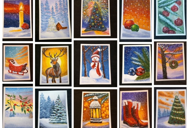
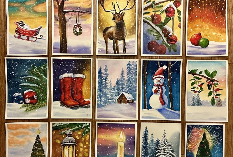
welcome you all to my third Christmas themed class, where we'll paint 15 magical
paintings with walkals. Welcome to a new
creative adventure, where we'll bring the magic of Christmas to life on paper. During our artistic journey
through this class, we'll uncover the
secrets behind capturing iconic Christmas symbols from the charm of cozy winter scenes, whimsy of festive ornaments. Each brush stroke will transport us to a
winter wonderland where the tens of
holiday traditions comes alive on the canvas. All the 15 class projects
will be focused on painting magical
Christmas themed objects with water colors. This class is suitable for both beginners and
intermediate artists alike. Because I have
explained each part of the painting process step
by step so that anyone with any level of skill
can follow right from the materials used to the different brushstrokes
in the painting process. You'll learn it all. I've designed this class such that each and every
one of you can feel the joy of painting magical winter themed
Christmas paintings. If you're ready, let's get
straight into the class.
2. Class Overview: He, he, he, thank you so
much for joining this class. Now I want to give you a brief overview about the
structure of this class. So there are 15 class
projects in which you will be painting
magical winter themes, Christmas paintings
with water colors. Obviously, right before
these 15 class projects, I have included another
lesson called Art Supplies, where you'll find
all of the materials that I have used in this class. Each of the individual
colors that I have used in the 15 class projects are mentioned right before the
painting process starts. It's included in the class
project video itself. When you watch it
first, you'll find the colors first and then
the painting process starts. You can use these paintings in a variety of ways, such as, for example, you can
create cards out of it if you take a
four sheet instead. Because all of these
paintings are in a five size and you fold it in half and you paint
over the top half, then it becomes like
a card which you can use and share it with
someone you love. Another way that you can use these paintings would be to paint on a slightly
smaller size, such as maybe an six. Then you could then attach a little twine at the end and hang it on
your Christmas tree. So I'm just thinking
of various ways in which you can use
these paintings, but I'm pretty sure that
you might have lots of ideas in your head as to how
you can use these paintings. You can also use it to
decorate your house because it is the Christmas season
and obviously it des, alves a lot of
Christmas paintings. Right. Also, don't forget to upload your class projects to the project section
here in Skillshare so that I and other artists
can see your paintings. Don't hesitate to ask me if at all you have
any questions. Just leave a discussion in the discussion
section and I'll be happy to help you now that you know the entire
structural class, let's go ahead and
have a look at all the art supplies that
I have used in this class.
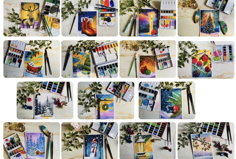
3. Art Supplies: Let us have a look at
all the art supplies that you will need
for this class. First of all, you need paper. This is the paper that I
have used for this class which is basically from
Saunders Waterford. As you can see, it's co pressed white 300 GSM and
100% cotton paper. This is the four size pad
that I have and I have basically cut it into half
to get the five size. As you can see,
I've cut the paper like this into half
to get this size. Any medium sized paper, roughly ten by 7 " or
something lesser than that, would be ideal for this class. I would highly recommend
that you use a paper that is compressed and
100% cotton paper, so that your paper stays
wet for a long duration of time while you're working
on your paintings. Next, you will need brushes. Of course, I have basically used a large pointed down
brush such as this one, which is a size eight
and sometimes size six. And smaller size brush
for the detailing work, such as a size four or
this one size four. This is the silver black
velvet size four brush. I would also recommend
having a flat brush, which is highly useful
to apply water on the paper because it would
cover a larger surface area. But you can also
apply the water using this larger size brush
that you have as well. I would also recommend
having a line of brush. Basically, the main
thing that you would need are a large flat brush, pointed round brush of
a considerable size, such as a size eight
or a size ten. Then a smaller round size brush, such as a size four
or a size two. I'm using a size four here
and it comes to good point, so it is enough for the details. But if yours doesn't
come to a point and you can shift to either a
size zero or a size one, anything that suits your
style of paintings. Next, you'll need
watercolor paints. Of course, I have
used watercolors from various different
brands and have filled it into my usual palette. This here is my usual palette, and as you can see,
I've filled it up with the colors
that I mostly use. It is a 36 color palette. But you don't need all
of these 36 colors. Each of the colors
that I have used in the class projects are mentioned
right before you start. So you can prepare your
colors beforehand. And also a PDF of this
palette is attached in the resources section so you can understand and know the colors that I have used
in my paintings. I would also recommend
two jars of water. This is because there
are high chances that one of them would get muddy as you wash your brush
and you dirty pigments in, and it would turn like
a very muddy color. And the other one
would be to pick up fresh paint and also to apply fresh water
onto your paper. Because if this water
turns muddy and you start picking up fresh paint
from this one using this, after dipping your
brush into this one, you'll understand how muddy
your paint is going to be because you're
picking up your dirty pigment colors from
this one as well. So it's better to have
two jars of water. If you're very comfortable in working with a
single jar of water, then that starts
litty fine as well. Then you'll need a board of some sort to tape
your paper on too. So this is a wooden plywood pour that I mostly use
for my paintings. If you've followed along
several of my classes before, then you visallyk this port. So you can use any kind
of ports that you have. You can even use newspaper
or even a card boat. I would refrain from using a magazine or a newspaper because while you're
tearing your paper, it's going to tear
both that paper and your paper as well. There
are high chances of that. So it's best to use a
surface which won't come out or peel off as you
eel the tape off, obviously. So that is why I'm using a
wooden boat like this one. And having said that,
you definitely need a masking tape to tape
your paper onto the boat. So this is a masking
tape that I'm using. It's basically new brand, something that I
got of Amazon UK. But notice that I go and buy this again and again
because I love it, not because of the tape, because it's cheap and
it works with my paper. I have noticed many times that if your paper is being
town by the masking tape, it's not because of
the masking tape, but because of the paper. If the paper is good enough, then the masking tape
will be able to hold it. One another brand that I have heard is
relaterally amazing for watercolor paintings to
tape on is empty washi tape. If you want, you can go
and find that as well. You may also need a
pencil eraser and a roller to create the
first initial sketches. I mostly use the roller to tape down my paper and
stick it firmly on. You can refer to the
taping the paper lesson. Understand what I mean by that. You also need white quash paint. White quash is ideal for when you want to create
back the highlights, or for the snow,
or for the stars. It's literally useful because watercolor paint is not as
opaque as the guash one. Using guash makes your paintings
really pop when you have the stars or even the snow
painted with the white quash. This is the reason why I
use this white quash and I squeeze it onto this
little palette over here, which I mostly use for a
whole of my paintings. It's just dedicated for my white paint just because
it gets easier that way. The white quash that I
use is from Windsor and Newton designer squash,
permanent white color. Other colors that
you can use are titanium white and zinc white
which are also really good. Titanium white is
my recommendation because zinc white is kind
of like a cool color. And I would recommend going
for the warmer version, which is the titanium
white or this one, which is the permanent white. Lastly, you will also need some paper towels or a clothes that you
can use so that you can remove excess water from
your brush or excess water from your paper and use for
the lifting method as well. So basically any kind
of paper tissues or paper towels or you can even use a cotton cloth
for this purpose. Now that you know
all the art supplies that we need for this class, let us move on to
the next lesson.
4. Taping the Paper: All right, so first let me
show you how I take my paper. So I've got this five
sheet of paper here, So I've got this from a large four sheet and I'm
going to be using this tape. So this is just a normal
masking tape that I use for most of my paintings.
It's still the same. I always just go back to Abazon and buy the same brand because I know that it works for me, even though I'm pretty sure that it's got nothing
to do with it. But I still love this one. It's pretty cheap. So that's
why I go back to this one. I've got the masking tape and this is saunders
water foot paper which I've already shown you in the art supply section here. I'm just going to tape
all the four corners. I'll probably take like
around two centimeter. That is around 0.5 centimeters. Just tape my paper down there. See that then? All the
four sides the same way. Okay. All right. So once you've taped
all the four sides, the next thing you
need to make sure is that it's fixed
very, very firmly. You need to make sure that this step is done before you
approach your paintings, because you do not
want your paintings to bleed into the outside edges. Even then, it might
bleed because you know, you've literally got strokes that you're going to do
and it might still bleed. But I still like to
take care and make sure that it really firm on my paper. What I usually do is you
can use any ruler and I just run it over
the edge like that. Okay. Just to make
sure that it's stuck firmly so that if at all
there's any air gaps, all of it would go away. So I can already say there
was a lot of air gaps. Because see how the paper
is slightly bent there, which means there were air gaps and I've taken it
away right now. All right, there.
That's how you'll be taping the paper for all of the 15 class
projects. All right.
5. Day 01 - Twilight Candle: Welcome to day one of
this Christmas class. And this is the painting that we're going
to be doing today. It's a candle like light. And let's start this with
a very positive note. Okay? The colors that I have used for this painting
are Quinacrodone gold. Don't worry if you don't
have Quinacrodone gold, because you can easily mix up using a transparent
yellow lycaon crimson. And you can also
use a transparent yellow and an
orange to mix that. So quenacrodone gold orange, Alizarin crimson paints, gray violet, indigo,
and lavender. And last but not least, you will also need
some white quash paint for the splatters, of course, the snow splatters. And basically that's
all the colors. If you're ready, let's go ahead and paint this gorgeous thing. All right, let us start because this is day one of this class. We're going to start
with a simple candle. Candle. It's like a
source of energy. It's like a source of light. So I just want to
start this class with a very positive note. All right. So that's
why I'm going for this candle theme today. And it's going to be
completely mystical and misty, but kind of, you know,
magical actually. And the painting is also
not going to completely make any sense because you've already seen the painting
and you know how it is. Obviously, you must be thinking how the candle is still
lighting in that snow, but that's what the magical
part of it is all about. Okay. So first of all, we need that candle. So I'm using this thicker tape here to mask out the candle. I don't want to use masking tape because I know that many
of you may not have it. And I want to try this one. I can't remember if
I've used this before. Right now, my memory
is really bad. So what we are going
to do is we need such a thick tape for the
candle, but don't worry. If you don't have a thick tape, you can use a smaller one. And then you can stick
it multiple times stacking together to make
up the distance for that. All right. Look and see how much is the length of
my candle going to be. So I want my candle to
be somewhere like here, towards the right side, one by three of the paper for the better composition,
of course. Okay. Somewhere there
is where I want. I'm not going to stick it
completely because I have some cutting to do here. I think my candle can come up until there where the base is. And then you know
what I'm going to do. I'm going to cut our
tape in a zigzag, slightly bend manner towards
the bottom because that will act as the unevenness
of the snow. Okay. See that? That's even look,
my tape is turned. Let me stick it
firmly again and in the correct position. Okay. I guess that looks good to me. Along the top as well, we need to cut it such that it forms the tapered or the
bend top of the candle. So, in order to get
that correctly, you can use your pencil and
make a sketch. You see? This is what I make. Okay. Sketch of the top part. Now, let me show
that to you closely. Okay, See, that's
what I've done. Now, we'll cut that out. Okay. The top part of that is what we're
going to cut out. Be careful as to
not spoil the gum or the sticky part of the
tape too much because then it will be no point because it'll start
bleeding inside. Okay. Just a little bit extra careful that you
don't spoil your tape. We just need to be
roughly correct Okay. There. I think I've got
that correctly now. Now there's one
more thing to do. The burning part of the candle. This candle is supposed
to be burning. We need to capture
that. Here's my tape again and I'm going to
cut a section out of it. And just going to quickly tape it somewhere on my
board or paper. Okay? And then what
we're going to do is we're going
to sketch out okay, the burning part of the candle. Okay? It's like a drop. Let see that. Okay. Okay. I think that's too thick. Let's make it a bit thinner. That's what drawing in on top of the tape is
helpful because then you can just keep refining it because the other areas
are just going to be cut. Even if it's not cut, it's
just all over the tape and not on your P. Now what we've got to
do is like cut it off. Okay? I like this technique. It's just really
simple, isn't it? Makes things easier for those who don't have
a masking tape. Did I say masking tape? I meant masking fluid. I've got it cut out. Okay, now we're going to
place this over the top. Leave some gap,
because that's where the wick of that
candle is going to be. And make sure that you place
it straight up. All right. Now you've got to make sure that these two are
stuck firmly such that there are no air gaps or anything where things can bleed. All right. Let's just
carefully do that. All right? I think that's good enough. Now, the next thing that we're
going to do is I'm going to add a Christmas bubble
in front of the candle. Wait, first, this is going
to be the foreground. Okay. Then that Christmas bubble is going to be like right in
the front of that candle. I know that some part of it
is not not being sketched. We've already put
the tape on it, but that's absolutely fine. When you remove the tape, you can complete the
sketch and finish it off, just the round Christmas bubble. Then again, make
the base such that it's like a baby shape
so that you have that base for the whether
it's resting on the snow. Now, actually we can go
and paint this freely. I'm just running
it over once more and making sure
that it's really, really firm and there's
no air gaps or anything. Okay, now I'm pretty confident. Now we can easily
paint this here. I've got my large size
ten brush. Let's start. I can easily go apply water all over without
worrying about, oh, I have to skip this
region or skip that region, that initial part or the trouble that you go
through to cut it into shape and get the exact shape of that burning part
and everything, that's all the
trouble after that. It's completely easy. Okay. But here because
it's a round shape, if you want, you
can go ahead and mask that as well using a tape. Okay. But I thought it's just at the bottom and I
will go around it. Okay. I'm just going to
go around if you want. Trust me, it would be easier if you actually mask
that region. Okay. If you want, you can
go ahead and do that. All right there up
until that point. Then here I'm
applying the water. I'm going to make sure that
all the water on my paper is even and make sure that there are no large
pools of water, which is very important
in this case. Okay? So what you
can do is you can actually lift your boat
where your paper is stuck and then give it an
angle that will make sure that all the water flow we're
not applying at the base. Okay. I forgot to mention
that actually don't apply your water below the line where you've marked the edge
of the background. Okay. Because that area is going to be the
foreground snow. Just skip that region
and apply your water. And now you can
see all that water accumulated on my
paper at the top. Just just grab a cloth
and wipe it off. Okay. There now I've got like a very beautiful even tone
of water on my paper. And let's start, I'm going to start with a quince gold shade. Okay? Quin gold, because
I want the area around this region where
the burning part is surrounding that to be a
little bit of golden color. Okay? Because it's like a glow
surrounding it. All right. Then maybe a little
bit gold into the sky. After which we'll start
adding more other colors. I started with that
Quinacrodone gold, then I'm going to go with
a bit of my Alizarin. Okay, here, adding my Alizarin and a bit of Alizarin here on
the left side asper you can see where it's joining. Then I think I'll go
with a bit of my violet. Okay, here is my violet shade. I'll take it on top of the
Alizarin, my violet shade. Okay, I'm not taking it
closer to the yellow. Remember, you want your
violet to be further off from the yellow because it can turn
into a brown shade. Also observe, I'm
just lifting my paper slightly so that if
there's any extra water, it can flow off. Okay, see that again here. And here towards the
bottom again. All right. Let me go back with
my violet over there. See, I'm applying violet again. This is why I said
you can go over your tape region and be
completely free with it. See how I'm applying. Okay. Oh, I think you can see a lot of glare
from the light, isn't it? I'm shooting this at
night and there's a C I apologize if it's really disturbing for you. I hope not. Okay. I guess I want this
Alizarin to be a bit on the right side as
well. Keep adjusting. But this is the beauty of it because you can
now keep adjusting and keep moving your
pigments because the whole thing
is just wet here. I'm going to pick up
a little bit more of my Queen Gold and apply it around burning candle area. See, that's the burning area and I want to apply around it. Now, here towards
the right side, I will actually
take my violet and I'm going to apply
it a teeny tiny bit. Okay? But this time I'll be very careful that I don't touch my yellow region and make my violet mix with
it being very careful. Okay. And mindful there
have to be quick. The bottom part of my paper
is now starting to dry. Then as I go towards the bottom, I'm going to be
picking up Indigo. And then I'm going to mix
it up with a little bit of violet. See how that go? Just shade, it becomes, this is like some background
effect that's there, like maybe a background
mountain or something. You want to add it in this
manner with a bit of violet, which makes it creamy
and beautiful. But be careful, color
is prone to bleeding, but if it bleeds, then I'll just resort to using my
cadmium pigments. Okay, Here, going
back with my indigo and adding now
around the bauble, you want to be careful. And going around
the shape, remember that was the foreground. Now, did I say foreground? Oh, I don't know. Is my brain
working these days here? Just adding a little bit more
of my violet and blending. Okay, That is the
background but this is like further off mountains or something that was there
in the further off region. Okay, now we've added that. Going to take my
yellow a little bit more at some strokes there. Just reinforcing my strokes that I made earlier because
as you may know, watercolor dries
on shade lighter. When this dries up, all this vibrancy
that you see right now is going to be
completely gone, trust me. It's going to turn way lighter and you're
all going to be like, oh no, this is not
what I painted. In order to avoid that, it's better if you can place one shade darker than what
you actually want. Just here taking a bit more
of my Alizarin adding to those places because I know that it'll get lighter anyways. All right. There.
I've given that a nice just color and I
just hope nothing bleeds. I'm just taking everything
from on top of the tape. I know that it's not
going to bleed through, but I'm still afraid. I just just being extra cautious and extra
careful. That's it. All right. I guess I like
the way that's turned out. Now what I would like to do is wait for this thing
to completely dry out so that we can remove that masking tape and start adding and
painting our candle. All right. There you go. It's completely dried up now and you can see what
I was talking about. Right. I mean, look how light
it is after it's dried up. Now, I'm going to peel off that masking tape in order
to peel off the tape, because you've
stuck it so firmly, try peeling it off at
an angle like that. In that way your paper
will be protected. Because if you
peel off straight, then there's high chances that it's going to
tear off the paper. But you don't want it to
tear the paper, right? Just try to peel it off
at an angle like that. I'm peeling it off towards the right side.
Can you see that? Like slowly peel it
off to the right side. Can you see so perfect? Oh my god. Okay. Then that teeny
tiny bit at the top, That's because we
stuck it so firmly. And look at that, and look
at that glow over the top. I mean, over that
weak area, isn't it? Just so cool guys. Okay, so now let's get to
painting this Christmas bauble. And I'm going to be painting, that's with Alison Crimson. Okay, so let's paint that. But before you start, I think it's like wet that Oh, and I just realized we
need to complete that, Bobo, We said we'd
do that, right? Just draw a sketch. Or if you're so confident
directly with the brush, then you can do that as well. Doesn't matter. All right, there I've
completed the sketch, and I'm just going to quickly apply some water onto
that whole region. I've applied some water, then I'm going to start
with my Alizarin. Okay, here, taking my nice,
beautiful Alizarin paint. I'm going to start okay here. And I'm going to
start. And then we need to leave some
highlight here. I'm just going to make a
large white hatch stare, which I'm not going
to be painting. Okay. So I just made a circle and made a large white patch. I know that some of
the paint is going to like spread inside
but that's okay. Okay. So I'm not going to be
bothered about how that is. I'm going to paint the
rest of the region. Okay. So that area is
supposed to be the highlight. The highlight is here on the
left side because do you see that light source that's
coming from left side here? There's something that's casting the light from that side, which is why we have that highlight on
the left side here. Okay, so it's coming towards
the right, from the left. So we have the
highlight of all of our objects on the left side. All right, that's the thing, but now we need to add
Taco shadows here. I'm picking up a little
bit of paints gray. Okay, I'm going to add
that for the shadows. This here at the bottom, what we're going to add
is the form shadow. That is the shadow
of the form itself. Okay. A little bit there. Then we have more shadow
on the right side here. I'm just adding that over the
top of my Alizarin itself. Okay. You can draw some shape. I've washed my brush. Going to pick up
more of my Alizarin, and I'm just going to
mix these around. Okay. So that that right side is in the shadow and everything is
just mixed in. Oh, there. You see now that
looks like a bauble. Right. Okay. Let me just
grab a little bit of my Quina done gold and I'm just going to put it right
here over the top. Okay. So you can see it's got a slightly golden
shade right now. And the reason I've
put that gold is, you know, this
candle light there, that's reflecting
some of the gold into that buble as well.
That's basically it. Now let's go ahead and
paint a foreground. So this is the
foreground region. I'm applying water, but
as I'm applying water, I'll be careful not
to touch my bauble. You could actually wait for
it to completely dry out, but just to do it, you can see I touched a little, teeny tiny part over
there and that's spread, but I'm not too bothered. Okay. Then I'll start with
violet towards the base. I've actually touched a little
part of my bauble and see. But that's done, it's like
created a bloom over there. So I'm just going to adjust
it there. That's it. Then back to my violet paint now going to add some deeper shades into
some of the regions. Okay, mostly towards the base. Then I'm going to take a
little bit of my quin gold again and I'm going to
apply it here at the base. Okay. That's because I want it. The candle wick that we have
here is not reflecting. It's cast some light onto the snow region
which is why we see that. Now we're almost, the
only thing left is to paint R candle. Let's do that then. The candle, it's going to be quite easy to paint
or Do you see that? Do you see that
bleed over there? I've got to really
adjust it to adjust it. Make sure to take off all the excess
water because this actually happened because
there was water right now. If you take just paint
and add over it, it should be fine just showing you the
different methods as to how you can
adjust these things. Okay. Now, for painting that
candle, let's do it. I'm just going to go directly with the wet on dry method here, but I'm going to use a
smaller size brush here. I'm going to be using
my Is seven rush. Let's start with
that golden shade. Here's my golden shade. What basically I'm
going to be doing is just adding that candle
reflection again, that light of the
candle is going to reflect onto the candle. But why? Somewhere
towards the middle. And why not towards the top? Because the top area is so that you don't see
the reflection of it. You only see it as a
very lighter tone. What you're going to do is this yellow that you just out light. Go ahead and spread it out. Okay, spread it towards the top, such that it's very light
towards the top. Can you see? It's so light towards
the base as well. Try and spread it
out if you want. You can grab more yellow and
place it at that region. Then I think towards the right side we can start
adding some other shades. Here I'm picking my
yellow ocher and I'm adding that yellow occur. And I'll add that
towards the right side. Okay. To make it easier
and comfortable for me, I'm just going to
turn my paper here. Adding it like that, have my
hands comfortable like that, to draw a straight line. That's why I've
turned my paper here. I'm applying that
yellow occur in a line. Then once you've applied all
the way towards the center, go ahead and blend it. Okay, Soften it out because the left side
is supposed to be lit. There's more of the
highlights there. You only need that
lighter tone over there. Okay, now maybe we can
turn our paper this side that I get that
lightest tone over there. See all that color is supposed to be towards
the right side, but I guess in order to
capture the round shape, I'm taking a little
bit of yellow ocher, a bit of my orange,
and mixing into that. And then I'm going to
apply that towards the center of the
cylindrical shape. If you think of the
shape of a cylinder, this area here is going to
have the most shadow, okay? Then the right side is going
to be a little bit lighter and the left side is going to be the most of the highlights. That's what this is. Okay. Right side is lighter because it's got the reflected light. The left side is completely
all the highlights there. The candle is almost
looking good. The only thing left
to do is to add a little part of the wick here. Just take a little bit
of the quin gold and add something there at the
base of our little thing. Then once that is dry, we can go ahead and add
in the little wick. First what we'll do is
we'll wait for this to completely dry or you can try it up with
whatever you're using. Then we have the snow to
add in as well. All right. Here my paint is dry. I'm picking up a
little bit of paint. Scra all right, I'm just
going to add that wick. You start right
there at the center, and then you draw like
a line work there. But wait, we're not done. There's some tiny, tiny
thing that you need to do. If you have a little
bit of cadmium orange, then take that up. It's good if you can mix it up with a little bit of cadmium yellow so that you get
a yellow orange color. Then you need that
for the very tip, because that area is you
need it to be orange. We're almost done. We can just go ahead and
add all our snow here. I've got my white paint. This is the white paint
that I normally use. It's the permanent
white designers quash from Windsor and Newton. You can see it's the
permanent white shade. All right, I've got it in this little tiny ceramic
bowel over here. That's what I normally
use for all my whites. You can see it's dedicated
for my white paint and we're going to take it in
a nice, creamy consistency. You also need a lot of water. We're going to be adding
some nice snowdropsa here. Pick it up in a nice,
watery consistency. As watery as you can make
it, then start dropping. Oh, look at that heavy, heavy bits of snow. Just go ahead and
add it everywhere. That's it. That's really it. I'm using a larger brush
because I really want it to be having larger
drops as well. So don't use a teeny tiny brush because the larger
brush can give you the larger droplets
as well as smaller ones. Okay. That's the reason
why I use a larger one. Let me warn you right
now for this class, you're going to get
your hands dirty with all the white paint when
you do the splattering. For those of you who don't
know how to splatter, I mostly my one hand
for splattering. I prefer that it's just I
hold my brush like that. Okay. With these three
fingers like that. And then I have this
finger like hanging and I tap it onto my brush and
that releases the pigment. I think this has a
more controlled way of applying because then I can just move my hand around and I would know
where it's applying. For example, I want some of
my splatters to be here. Of course, it'll spread
to the other areas, but this is more better. I feel see I've
got the splatters over there and I can
just move around. The other method of
splattering is the easiest. For those of you where
this method doesn't work, you can try the other
one to basically hold your one rush like that and
the other rush in one hand, and just tap it on
the top like that, which releases all the white Pt. But this method is actually the dirtiest
because it's going to ruin everything in front of
you if you're watching me with your device
in front of you. Make sure to keep
it further away or to hide it because it's just going to get white paint all over it and you
don't want that. Now we've added the
splatters and there's one penny tiny last step
that we're going to do. Remember this snow
that you applied? Yes, it's snow. But did you know that
if you look at snow, if you were to capture
it in your painting, when you look at it, there's
going to be levels of snow. This one all feels like
in the same level. But if you want something
to go further backward, then you need to paint
it in like a shadow. What would you paint the
shadow of the snow to be like? This background is violet. It's better if you
can use like a color that's mixing violet
and white together. For me, that is lavender. If you have lavender, go ahead and pick it up. And then add some splatters
with lavender as well. Okay, just a few. And you will literally see the difference in
your paintings because it looks so good when you have that varying levels and
depth in your snow. All right, And there you go. We have our painting completed. Isn't that Coaches? Oh my God. Look at that perfection
in that candle. I really love the way it's turned out with
that tape method. I love it. So I'm going
to peel off the tape. Okay? Notice how I'm peeling
off the tape at an angle there. I've got clean,
nice borders here. I love the way it stands out. I hope your painting is
as beautiful as this one. Trust me, it is. Just look at it with
different eyes and do not ever compare
to anybody else's. And then you'll see the
beauty in your painting. Here you go. I'll see you next day and thank you
for joining me today.
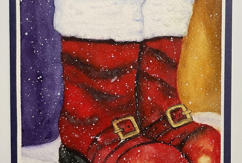
6. Day 02 - Santa's Boots: Hello, Hello, hello. Welcome to day two. This is the painting that
we're going to be doing today. Can you see? It's sanders
boots resting in the snow. It's a magical
background and I've created a lot of color
variations as well as created some good
color combination by using the
complimentary colors. All right, first now let's have a look at the colors that I have used
for this painting. It's quacdone gold. I've already explained
how we can mix up quinacrodone gold in day one lesson, you
can refer to that. And then a little bit of orange, transparent brown or band
umber violet paints, gray lavender, cadmium red, cadmium yellow, and
obviously some white quash. If you've got your colors ready, then let's go ahead and start
painting Sanders boots. All right, let us start. So let's get to sketching
the boots first. Okay, so the boots are going to be around starting from
one by three of the paper, okay, for better composition. And also, don't try to make
it towards the center, try to move it towards
the left side a bit. And also we'll
adjust the height. Okay? First of all, if you want for making
things easier to sketch, I'll show you some simple steps. The first thing is mark out one by third positions of your paper. That's one by third. Then from the top on
the horizontal line, that's again one by third, okay? If you make it like a grit or think in your
head like a grid, you want your
things to be there. Let's say this line
there is going to be where the boots are going to be aligned but not
towards the bottom. Let's have the part of
the boot right there. That'll be our first boot. Okay, our first boot is going to be somewhat shape like that, going to come down like that. And that was the one by
third position, right? If you take it up to there, then it goes and has
a bend like that. Then towards the front, we want it going like that. That I know that the sketching roses might
be somewhat difficult, but if you power
through it and you try to sketch out in somewhat
as close as possible, then you'll be able to do it. Okay. Trust me. All
right, that's not bad. Then towards this side, we have the height
of the boot again, something like that goes around. Then here is where the
height of the boot is there. You see that boot? Then here we'll have some furry stuff and
another furry stuff here. Now, for the next boot, it's going to be somewhat, again, going towards the side. The thing is you don't have
to align them together. It can be such that the
boot is kept like that. That's why don't bother too much about having things
aligned perfectly. And also, don't try to make your shoes right at the border. It's okay if it's like
going out of the picture. In fact, it's much better
for the composition if there are things
that are going out of the picture, okay? In this case here, one of the boot is going
out of the picture. See that? Okay, I need to make that bit
go up a little bit. Cellmate that it needs
to be like that. There's the snow over. It's going to be the. Okay, so there's the boot. I know you might
be thinking that it's possibly quite
difficult to sketch, but if you would never
try it, then it's hard. Easy thing to do would
be to possibly look for pictures of boots
and try that out. You know, it might really work. And it'll be easy for you. Perhaps you just go ahead
and try it out here. I've got two boots
resting in the snow. It's the snowy background
there at the back. Okay, now this is what
we need to capture. I'll show you the
picture closely. You can pause right here and sketch it out if you
find it difficult. Here you go. That's
the close up. Okay, now you can
see the whole paper. And there you go. That is the boots that you
need to sketch out. Okay, Once you have
done your sketch, now let's get to painting this. We'll start with the
background first, Okay? So it's easier when we have
something in the background. Obviously, I'm going to go
with the wet on wet technique. I am applying water all. Okay. It's going to be pretty rocket signs
or anything here. We'll just make it
as easy as possible. All right. Here,
just applying water, we'll make sure that we go around the boots.
Okay, see that? Just going around the boots, I think maybe it's Santa's. You know, it's obviously
Santa's books, considering it's all
red in color, isn't it? So you've already
seen the picture and you know what's coming up. So there you go. Keep adding O. That is like the background. We can lift it up now
because as you can see, it's a hole at the
back towards the top. Anything that has formed the pole in your paper
can go all the way towards the top and reduce any extra poles that
are formed on your paper. If you look at your
paper underneath light, then you would be able to see the water that you have applied. In fact, you can actually
see here on my paper, see where I have applied the
water as moving it around. That's because I've got
studio lights here. It's easy for you to see
that as well, isn't it? Now, let's paint the
coaches background for today's background. I thought of making it again, somewhat magical
and dreamy looking. I'm going to start
with a little bit of quinactone yellow here. Okay? That quacrotone yellow, we're going to apply it here towards the right
side. All right. You can easily mix it up, as we've already discussed when I've explained the colors used. You can just easily mix it
up on the right side here, a bit of the quin gold. And then I think I
will transition to a little bit of orange here. I'm picking up my orange. Okay, I'm transitioning
to that color. This is why the wetness of your paper really,
really helps. Because you're just blending
it as you're applying. So you see all
that yellow is now blended into the orange
on the right side. But I guess we can add in a
little bit more darker color. I'm taking my
favorite combination, which is to use a little bit of burnt umber or
transparent brown. And you can put that along
with that orange there so that your transition is more of a darker themed
color towards that side. Now let's get to the top, the brown tone
that you see here. It's got another advantage
of using that brown, because when you mix
violet to that brown, it gets into an even
darker color here. Now the next color I'm going to pick up is a little
bit of violet. Okay, when you add
violet to your brown, see how it's turned a
little bit more darker. It's just gorgeous and beautiful when you
add in that row. But remember what I
said about water colors where your colors dry,
one shade lighter. If you actually want
it to look like this, you might want to
add in a little bit more on the top, all right? And make sure that
it's vibrant enough. I love working with
vibrant watercolors. I love making things
vibrant here. Now, the next color I am picking up is I've
taken a bit of violet. Okay. What's the left
side? It's violet. Do you see what I'm
trying to do here? We've got yellow on the right side and
violet on the left. Why do you think that
is important here? Let's because it's
the composition. Yellow is the
complement of violet, or in fact, violet is the
complement of violet. When you add it together, it really looks so
amazing and pretty. It's really good for
the composition. That's why for the
color composition. Oh, I'm not saying the
terms right today. I wonder what happened. Okay, I'm just worried that
my son will wake up anytime. And then while I'm blending, I have to go anyways, that's what it's very
attractive in your painting. When you have complement
colors together, it's like balances out everything
in your painting here. Now I've applied a
very vibrant violet. I know that it'll stay vibrant even when it dries because I'm
really applying a lot. Now you can see I'm taking over that violet over to the
right side, over my brown. But I'll stop somewhere there because I want to take
my brown and mix it up. Because you don't want
to bring the violet all over to the yellow region. Right. So we'll go back
to our brown paint. Okay, that's my brown paint now. That's what I'll apply and I'll blend it along
with the violet. Okay, so here towards the top, I'll blend my brown paint. And every time it
mixes together, I'll wash my brush because
we don't want that the violet to be coming all the way towards
our yellow region. Okay. Rather we just
want it to be the brown. But we just have that subtle, beautiful yellow
tone over there. All right there. So I've captured the brown, but now you see there's like a clear transition of the yellow. So I'm just going
to even that out by picking up a little
bit more of my quin gold. And you know, like kind of
mixing it all together. So long as you keep
your paper wet, as in, use your strokes to
keep your paper wet, then it's going to turn
out beautiful, trust me. So remember that all that
orange that we applied is gone. So you can just pick up a
little bit more orange. Now I kind of like blend
that it's created. So now, before we finish
off the background, let's do something that will make this painting
really beautiful. So remember the white
splatters that we used to add. Let's add some wet
on wet splatters. The good thing about
that is that it's going to give more
depth to your painting. The first lesson
that is in day one, we kind of learned
how to give depth with a different
color of the snow. But today now we're
going to do it with the wet on wet splatters, which is even more beautiful because it kind of gives like mixty levels in a
different depth level. How do I even explain this? But you get the point right. Remember to use a smaller
brush this time because we want those snow to be
like tiny, teeny tiny. Here, I've got my
white quash paint. Okay. Load up my brush
really nice and creamy. Do not add a lot of
water to your brush. That's important. Okay? Yesterday, that is on day one, when we
were doing this, we said that you
can add in a lot of water so that you get those
big, big beak splatters. But today we don't
want to do that. We actually want the
fresh, nice, creamy paint. Do not add a lot of water. Okay? You just want
it to be creamy. That's it. Then go ahead and
splatter it in to the paint. As you splatter,
you'll notice how it's spreading out a bit and
creating those beautiful, gorgeous better on platters. Yes. Obviously, it's
going to fall on your boots a bit,
but that's okay. That's completely okay. Okay. There we're down
with the background. And then we can move on
to the foreground slowly. I guess we can actually paint
the snowy foreground here. What I'll do is okay, you see that harsh
line that we ended? So I'm just going to soften it. Okay? Softening it at the but do not bring
down your paint. Just run your brush
over like that. So that that area
gets softened and the hard line that's been
formed there goes away. Okay, see how I've softened that. We'll do the same towards
the left side here. Just run your brush. Okay, And soften it. And remember to wash
your brush each time and then using a clothes or a tissue wipe off the Xs water. Okay. Just so you
don't introduce. Too much water there. And do
not bring your paint down. That is important. Okay? The left side is even. All right, but then do not bring your paint down
for the other side. All right, so now let's get
to painting the background. For painting the
background here again, we'll apply some water. Okay. Towards the base and all underneath the shoe,
the boot, of course, now for the snowy region, we'll try to give it a
somewhat similar background. Let's pick up a lavender tone, and that's what we'll apply. Okay. Picking up lavender and try to apply it
in various levels, but you don't have to
completely apply everywhere. Okay. Here, just let it be. It's all right to keep it white, but there's something
else that we need to do, which is to mark the
shadow of the boots. That is very important.
So here I'm going to make the shadow by using a mixture of lavender
and paints gray. I already have paint
spray here on my palette. Let me grab some more. I'm mixing that and see how you get like a creamy gray color. And using that
creamy gray color, I'm applying right here
underneath the boot. Okay. And then we'll create
a shape there. This is the shadow underneath. Picking up a little
bit more paints, gray and all that dark depth should be like right underneath. And as you go further away
from the underneath ocean, it needs to get lighter. All right? Okay. Now we've
captured everything. All the shadowy
bits of the boot. Oh wait, There's
this little portion that's going upward. All right. Now all we have to do is to wait for this thing to
completely dry out, then we can paint the boots. Okay? All right, so our
painting is now completely dry, and let's go ahead
and paint the boots. Okay, I just want to first quickly mark out the
areas where it's going to be the white fur
part of Santa's boots. This area is going to be
like having a fur region, then that is going to
be a fury region there. Then there is another extra
bit of F region there. This is the far region. Here is part of the
boot that goes inside. Here is the far region, and this is the furry region. All of the firt I don't know
if I'm saying this correct, for it's like the inside part of the boot which has got a
really nice thickness inside. So that needs to be white. Okay, we'll definitely add
some shadows to that part, but that really
needs to be white. All right, so let's
just go ahead and stop. So I'm going to start with a
very nice, creamy red color. You go ahead and use
any cadmium red, okay, Or a nice red shade. And that's what we will add. So see how I'm adding that nice, gorgeous cadmium red shade. Okay? Don't bother if it's got like some bits
of white here. You see there's areas of
white that's left behind. But that's okay because when you're adding the
snow over the top, all of these are not going
to be evident at all. So it's going to
be perfectly fine. Okay, So follow along
the shape of the boot and try and make the
go Js boot shape. Okay? So we're doing this one first and then
we'll do the other one. Okay? The reason
for that is there is a lot of shadows and highlights that we
need to capture. And this one, okay? See, as I said, we're leaving that area which is supposed
to be white As white. Okay? Inside part of the shoe having some
nice fury region. The whole thing, there is
no highlight over here. The highlight is
over at the bottom. When we reach the
bottom, we need to make sure that we get the
highlight correctly. Okay, up until this portion, there is no highlight. Now, the highlight over here, again the highlight
that I want to add. Let me show you,
I'll create a red. Around it. That's where I want my highlight
of the boot to be. We haven't add the shadow yet, but we'll add the high
light over there. Okay. Picking up some nice red shade, adding it onto the top. Can you see how I'm using
a very watery paint, such that any of my
previous strokes, I'd not let it be dry. I keep it wet. I keep my
paper wet as much as I can. I run my brush over and keep it. Which means almost like painting it with
wet on wet itself. Because it is wet on dry
but I don't let it dry. All right, that's controlled
wet on wet technique, where you're controlling
the way your paint flows. All right, now the reds added but the highlight is not
going to be completely white. Okay, we're going to
make it lighter as we're going to add in a
lighter tune over there, we're going to be
using cadmium yellow. And using cadmium yellow,
we'll blend it in. Okay, we'll see, obviously the paint is going to flow and get rid
of the high light, but we'll just use more cadmium
yellow and we'll add it, and then we can add
white over the top, at the center as well. But first let's just
use cadmium yellow and make sure that we
create a nice high light. Okay, See how it's blended. To create that go just shade, but you can just pick up more cadmum yellow and
make sure that you get the nice stone. Okay. The area that you do
not want it to be yellow, you can market as red. All right, now that's done. Now we need to get to quickly
adding the shadow here. I'm going to go with my paints
gray over the cadmium red. All right. Paints gray. Let's start right
underneath that region. Let's take it towards
the right side. Always to the right side. Okay, now if we pick up a little bit more red
and try and blend that in, don't let it be
completely in pain spray. Just blend your shadow bits. Now you've got like a
nice shadow bit there. Let's pick up some more pain. We're going to add a nice bit of shadow towards the center, which will give the
boot its shape. Okay, that's taking Pinsclay, and I'm adding it over the
camm that we just added. But can you see how makes
the boot really in shape? And gives it a nice
bit of shadow. Okay. All right, then here I'm just going to add
some lines like that which makes it have
that at the point where it isn't that gorgeous. Then some bits here at the base. Let me wash my brush, pick up a little
bit more red and blend that region right there, because I only want it at that grease point,
at that base point. And then right
here at the front. Okay, now you can see
here for example, I'm just going to show you what happens if your paper is dry. This region of my paper, while I was trying to
keep it wet, has dried. That's okay. I've just applied a little
bit of pain screen. I'm just going to pick up
a little bit more red, Blend it over the pain
screen and see it's dried, but it's okay, it's gone. Whatever is dried doesn't matter because I'm
just blending it. Now. We've cut that boot
really amazing, isn't it? I just realized I do not like the shadow bit over
the top over here. I'm just applying some more red and getting
rid of that shadow. All right, so now what
we'll do is we'll paint the bottom
bit of this boot. Okay, so for painting
that bottom bit, I'm going to first start with a little bit yellow ochre and a bit of dark brown mixture, and that's what we'll paint for the thing
that goes around. Okay. So I know
that you're red and that area is still wet and it might bleed but that's
completely all right. It's okay if it bleeds. The one thing you need to
note is that all of this is kind of resting in the
snow and it's a wintry day. So your shoes
doesn't need to have that much clarity because when
you add stars on the top, it's just going to be fine. Okay, so do not stress too much about getting
everything perfect. Strive to get the overall
shape and the highlights and the shadow bits correct and then everything will fall
into place. All right. See, I've added that
part and now we'll go and shade in the dark bits. But rather than using
just paint spray, I think I'll mix in a little bit of prown to my paint spray, which makes it even
better, black. Okay. If you have
black or a lamb, black or ivory black or
something like that, I think you can use
that, which is, you know, much better. All right there. See, I've made the boot,
and now you can also see the shadow underneath and how the snow is and all of that. See how it falls into place. I did this first and
while I was doing, I'm pretty sure
the right side of my boot is now completely dry. This area is dry, but let's just make sure and dry it up so that
we're absolutely safe. All right. All right. So I've just dried it up
and that area is dry. I'm pretty sure it's
going to quickly dry out. Please do not worry
about it. All right. Now, we'll go ahead
and paint at this time when you're painting
this area because it's like behind the other boot needs to have a lot of shadow
in order to capture that. Go ahead and pick up a
little bit of paints gray at first and
add that paints gray over there because otherwise once you've
added the red, you might not be
able to see where the distinct line of
red your shoe was. And then it might be difficult for you to in fact
add in the shadow. Okay. This is the
reason why go ahead and add it first with
paints gray. All right. See added with paints gray. Then let's pick up
red and blend it up. Okay. That way you
know where the line is and then we can add in any further shadows as required. All right. Here,
getting the line there. Looks it was
supposed to be here. I don't need that. I think
I'll cover it up with white. Okay, let's cover up the boot. Second boot. Okay, applying a nice
amount of the red paint. This is cadmium red
that I'm using. Any opaque red would
be this vibrant. So you can go ahead and use any opaque red that
you have. Okay? I know that many of you may not have opaque red like this, but it's absolutely fine. You can even use a
crimson as you come here. This is where your highlight is, Let's just get that
there up until there. Then a little bit
over the top here, the high light is going to
be something like that. The rest of the areas
is going to be red. Let me get my high light, taking my cadmium yellow. There's too much
water in my brush, which is what's leading
it to blend like that. But if you take it with a
lesser amount of water, the blend, you take it with
a lesser amount of water, then it actually
blends much better. I think it needs to be a bit
fat on this side. All right. That the highlights
of that shoes, We'll add in proper highlights, but this is like the
beginning stage. Okay, I'm just adding a
bit more red paint to the areas where I want
to add the shadows. Okay, now we'll go
back to our paints gray and going to add
in the proper shadows. Okay, now we already
have the red. While you add in
the paints gray, it's just going to blend in to the red that
you have there. See how it blends in? We need to capture like nice dark shadow over that region. Also to the bottom, because the other shoe is
like blocking the light. Then you can pick up your red
and just lend that region. Then taking a little bit
of more paints gray. This side is also the separation within the
shoe, the boot region. We'll add that as
well for the shadow. Taking a bit more
of my red paint and trying to blend that part. We'll just see how it's glowing
and how it's turned up. We have the bottom side to paint now we'll go
with the same combo, which was brown and a little bit of yellow
ocher mixed together. Then back to the brown
and black mixture base part of the shoe as well. It's like the shoe is like. Lifted and you're
seeing the underside of the shoe that should be somewhat lighter than what you've already
added for the top. So I'm just mixing a little
bit of lavender to it. Okay. So that it
becomes lighter, but it's still
going to be darker. Boots is complete, but obviously we just have a few
more shadow to add. Can you guess what that is? It's basically just going
to pick up a little bit of cobalt blue or you think it's even better to add lavender just like we did for the snow. You see these furry regions that we added those need shadow, Just add in a little bit of water so that your
shadow can spread. Okay. I need to wipe that out. Right. Taking a bit of lavender. And add any tiny
bit of lavender. Okay, I need to clean
up the lavender. It's mixed with
paints, gray there. Taking a bit of lavender. I've added some there like that. Then you can even use the softening technique if you do not want to like wet it here. I've added the lavender now all I'll do is now go
ahead and soften it, but always be careful
that you do not touch any of your red
regions which are still wet because you
don't want your red to be spreading out of that
region right here. A bit of lavender pain there, a bit lavender onto that
is just captures the snow. Sorry, did I say snow? I
mean captures the fur. And a bit over the top here. Okay, it's only to
the denser regions that we are applying here. As it joins the boot, it's got dense, that's why. Now see already it
looks like there is a I mentioned to this boot right now we're done with
adding all of the shadows. We only have to add white. Now, let's wait for
this to completely dry. Okay? All right. Here, I've
completely dried it out. Now all I'm going to do
is like first correct that area where I had
accidentally put a bit of red. Just taking my white paint right here is where I
had made a mistake. In fact, I know that
it would not be much visible when you add
the snow on the top. But I am have that OCD in my
head that if I don't apply, then it'll be like,
oh, oh no, there's, there's there which is why I
applied and got rid of that. Now, there is one
thing that you could do If you want to make
it look like fur. I'll just show you. But
I don't think I'll do it for all of the areas because
it's just time consuming. But if you want your painting
to look really beautiful, then you can do that here
taking a bit of white paint. Okay? And then add the
criss cross stuff. Okay. It's using the
tip of my brush. I'm adding these little, teeny tiny criss cross
lines towards the outside. You see it looks like
a furry structure. I love the way it turned out. It's like it's making me
want to do it all around. Maybe I'll just quickly spend 2 minutes and do
that. I'm really sorry. This is what's taking so
long and so many people are put off when there
is like a painting that takes 45 minutes or 1 hour. Because this just feel that, oh, I don't have that much time. I think you staying away from a good painting,
that's all I can say. Oh, I love the way
it's turned out. See how that fury structure
is looking? So cool. I think these teeny tiny
things are actually what makes your painting
unique and stand out, really, because there are
lots of people who paint. But when you try to put
those teeny tiny details in, you know that's what makes
your painting really unique. Almost done, if you're waiting
for me to finish this, all right? All
right, there you go. So done that, oops, why did I put the
white paint away? We need to add the snow. Let's get ahead
and add the snow. Here's my brush. Loading it up with
nice white paint, which is already
there in my palette. Okay, here, loading
it up, load it up. I think I need a
little bit more water. Now, you can use watery paint, but when you're doing the
wet on wet splatters, they don't use watery paint. Okay. There now just apply
and splattered everywhere. It's already looking. So Coateus, my God. Look at that, you guys, and see how you can see
the depth underneath. I think maybe we should
have added a lot more of those snow drops
that were underneath. I initially thought
that I wanted to add some white
highlights over there, but then I thought that I really loved the way that
yellow was popping out. So that's why I skipped it because I love the way that
highlights turned out. And I'm going to just
use this tapping method because I really don't want
to get my table dirty. So I think I'll stick with this there. It's snowing and the boots are sitting
there in the snow. I think Sandra's
left in the snow. Our painting is
literally complete. I'm just going to try
it because there are some splatters which kind of sits right in between the tape. Like for example, this one. So if I peel it off,
then it's going to spread out, or
it's going to spread. I just don't want
to take that risk. So I am going to dry this up. Okay? All right.
So there you go. Let's remove the tape. I really, really love the way this has turned
out. My goodness. There you go, guys. And here's today's painting. You know what I love about this, it's actually these highlights. And thank you for
joining me today. I'll see you all tomorrow. It is in the next painting.
7. Day 03 - The Reindeer: Hey, hey, Hey,
welcome to day three. And here you go. This is the painting that we're
going to be doing today. First of all, don't panic, I know that we've never
painted animals before. If you were like someone who's joining my class
from long before, Occasionally, one or two maybe. But this is new to me as well. But I'm sure that you can
do it if you just give yourself the time
and dedication. It's not that difficult. I've explained all
the methods as to how you can sketch this and how
we're going to paint this. It's really easy, trust me, so don't worry about it. Okay, so let's have a look at all the colors that we
need for this painting. First of all, we need a transparent yellow
Quinacridone gold, which we've been using for the past two days now in this class. Then transparent orange,
transparent brown paints gray, and lastly violet
for the snow bits. And of course, I forgot
to mention white quash, which is very important for
these paintings, isn't it? Because we've got a
lot of snow on this. So here we go, and
let's get started. All right. Let us start. So let us quickly make the
pencil sketch of our reindeer. So you misleading
know that reindeer is kind of like a
Christmas E thing. I don't know the whole
story behind it, but I've seen many
photographs of reindeers. So I thought that that's
something that I haven't tried before. And let's do it. So I know that you may be intimidated by
seeing this subject, and it's quite
difficult to sketch. But trust me, I'm
going to show you some easy steps as to how you can sketch this
out. All right? So the first thing would
be to assume everything to be in easy shapes that
you know, for example, if you assume the head to be
kind of in an oval shape, so there something like that and then you can make up from there, it's something like that
and then goes like that. Okay, that's where
its mouth starts. Our reindeer is slightly
turned at an angle, that's why we're
sketching like that. Then here at the base, we have its body, the head part going okay, down. Then we have its eyes over here. All right, there. Then we'll sketch out a
year over this side. Okay. Then now for the body, obviously after
making the sketch, if I find that something is off or something is missing or, you know, it needs some
kind of adjustment, then we can always
do it later on. Okay, But first let's
just go ahead and sketch, and then you'll be able
to figure out how and what is missing or how
anything is gone wrong. Like I already saw that
that ear was messy here. If I put in the other ear there, yeah, I think that's okay. Now, for the body, again, we assume that it's like
another oval shape there. Try and mimic the shape first, and then try and sketch it out. Okay, If I bring that and then use that shape to trace
out your neck shape. Okay? See then at
the base again, is another I oval, but that is probably
not an entire oval, but it's like a circle. You trace out a
circle, see a circle. Then the body part which
is like stretching outside is again another circle because this is like the belly. So it's obviously like
a huge circle. Okay? But that circle is supposed
to extend a bit downward. And then we've got
the back side, which is again, supposed
to be like a huge circle. You can first make
up the circle, so that will be like the back
portion of our reindeer. You can again, trace it like a circle and then
comes down the legs. And then the legs join there. Try and always assume things to be easy shape that you know of, which will make it eventually
easy for you to sketch out. Then observe where the legs are. The legs are going to be like attached to the
front portion here, which is this part of the body. There goes the leg. Some of it is gone
way off the canvas. You actually don't have
to worry about it. Then remember this
circle that we did, this was supposed to
come and join here. Let me come and make that. Join. See that was
like the dummy part. And the legs are in front of it, there is the leg and then
we have the slight bend. Then here is the next leg
that's attached here. We are missing one limb, of course, and that would
be the one at the back. Just trace out that again. Now we've got a reindeer. I'm really okay with this. I think it's all okay, isn't it? I've made the sketch properly. I've marked out the eyes, and we have like
the bags behind. We have the things
inside, the years. Yeah. I guess I'm really happy with
the way the syst out then. Now, obviously, the fun part, the best part that makes
the reindeer be a reindeer, is obviously it's
horns, isn't it? Let's get that out. Okay. Now, this horse, you don't have to make it
exactly like what I'm doing. Every reindeer has a unique one. I think I've heard
somewhere that it's actually like
the humans DNA, where all of those
horns are different. So no two reindeer will
have the same one. I don't know. It's just
something that I read somewhere. I don't know if this is true. Okay. It's really
exciting, isn't it? That's one. But I guess I want to add another
prawche for this. Yeah, that looks good now for the other one that acts like my main one. And then I'll have
another huge branch going out to it from there. Okay. Maybe this one we'll have now we have our huge reindeer. If you want to make it smaller, you can about composition. As I always say, nothing should
be always in the center. It should be towards the side. But if you have your objects which is touching one
corner of your paper, then it's absolutely fine. But still don't make your
reindeer stand right there. Okay, chop it off a bit. That makes your composition
much better and attractive. But if you were to draw the entire legs of the
reindeer and put it inside, then do not make
it in the center. Try to move it slightly towards the left and
towards the bottom, so that it meets the
composition rules. That is the rule of thirds. Okay, now that we have
everything in place, let's go ahead and paint this. Before that, let me
just mark out the snow. This is like the
background snow for me. Okay. We'll have
multiple levels of snow. I think the snow can end. Okay. That's like the background Okay. Of our reindeer. Now, let's get to painting this. What we'll do is we'll apply water to the whole of the paper. Oh, I missed my large brush. I kept it somewhere
and I can't find it. And I thought, let
me just try out this whole thing using
a smaller brush. Actually, the real reason is I'm just lazy to go look for it. Okay. So here I'm
applying water today. It's okay that even if you apply water on top
of your reindeer, it's absolutely fine Just go ahead and apply to the
whole of your paper. Okay. Nothing to worry just
to the whole of your paper, but make sure that
everything is even now. As you can see, I'm
rubbing my brush all over and making sure that I have an even consistency
of water on my paper. Applying an even consistency, you can even bend your
board to get an even tone and have the water flow so that there is no large pools of water that is
formed on your paper. Okay? So you'll see that
all the water accumulates there at the top and
that's perfectly fine. Okay. Now let me just absorb all that extra water there
at the top because I don't want it to flow back to my paper and ruin my painting. Because if there are back runs, then there is high
chance that it'll cause blooms on your paper. Blooms are when there
is extra water on a painted surface and your
water spreads the pigment. That's what is known as blooms. So I can still see some
extra bits of water. But if you go and soften it with your brush and absorb
any excess water, then it'll work out okay. And then if you've taken too
much off from your paper, you can always reapply back, but make sure to apply
the water multiple times because it really helps
your paper to stay wet. Okay? If you're like living in a very dry climate and you find that your paper
is kind drying very fast, I have a very good
trick for you, which is to apply your
water onto the paper. Then wait for it
to dry out a bit. Not completely, but wait
for the paper to soak in the water right after
that reapply again. This time, The second time your paper will take
longer for it to try. That is because the
underlying fibers, the paper has thickness, right? The underlying fibers of the paper is going to
have a bit of water which will make the top layer of water that you just applied
to take longer to try. That's one method that you can use to make your paper stay wet. Okay, so now that we
have our paper wet, let's go ahead and start. I'm going to be starting with a nice transparent yellow today. And this transparent yellow
we're going to be applying. I don't mind that
the center portion or the reindeer is all going to be in
color at this point. Okay. Here we apply the yellow, and as you can see, I've applied it like a circle in the center. And then I'm just
going to slightly blend it towards the inside. The inside part is going to be like a lighter bit of tone. Okay, then we'll pick up a
little bit of quin gold. You must have understood by now how much I love the
quin gold color, Right? Then this quin gold color will start to apply
by going around. Okay, Around the yellow
that you just applied. But we need it to
be more contrast. Start adding a bit more. Okay, bring it out. Start bringing it outward. See that? Okay.
Out more outward. Keep an eye out on the area
where you have applied. I marked the foreground that
there is the snow, isn't it? I think a lift of some paint because I don't want lots of paint
at the bottom. Okay. Some bits of
yellow is good because this kind of light is bound to reflect something
onto the surface. Okay, here I'm picking
my Quinton Yellow again. I'm going to apply
towards the edges. Okay, later on we'll
add a darker color. But before that, let's just give that undertone
because I really love that undertone even when I'm adding like a brown
or some color tone. Okay, and then slowly blending towards the inside and leaving that light towards the middle. So see, it's a very lighter
area towards the middle. All right, now that
you've applied that, let's go ahead and start
with the talker tone. So that would be transparent
brown in my case. So I've got a lot
of questions about which transparent
brown I usually use. The best one I found, which is like darker enough, is the one from Seneliar
which is transparent. It's amazing. The best part like about it
is that it is transparent. It really makes it a good thing
with water colors because then you can like layer over
the top and you see that inacton gold shining through
and it's still dark. I mean if you take
this in a very dark consistency,
it's dark enough. That's what I love about
this transparent brown. It's dark enough and
it's also light enough. It's like serves for
both the purposes, if you know what I mean. Okay. Here I added that dark brown. Okay. Subtle dark brown
towards the outside. Now I'm going to start adding a bit more darker tone here. I'm picking up my darker, darker brown and I'll put
it over the very edge. Okay, here there added the
darker brown towards the edge. Let me wash off my brown. And I'm going to go back with my quin gold and start
to blend things inward. Now because you see when
I added that brown, there was like a distinct line between the brown and the gold, which I didn't want on my paper. But if you now
take up your paint again and blend inwards, then you can get rid
of that separation. You see now the
separation between the yellow and the
brown is gone. But obviously, we have
the separation between the Indian yellow or
the transferring yellow that we applied initially. But we can get that off by again going round and blending. But this time as you can see, I'm not picking up any more of my, um, transparent yellow. The main reason being that this quin gold that I'm
applying has yellow in it. And see what just happened, I dropped a little bit of water. I think there was some
water here on my brush that's caused blooms
here right away. You see what a bloom is, but get rid of it by quickly
applying paint over it. See, know how to correct stuff that is very important in water
color painting. If you know how to
correct the blooms, you're saved then and
there isn't it here. Okay, Let me go back
to my quin gold. All right. So now you can see that glow in the middle and all
the colors there. I think now we can go ahead and apply towards
the bottom as well. But you see my bottom had
actually started to dry. And if I reapply the water, then there is high chance
that my water will flow up. What I'm doing is I'm giving
an angle to my paper, that my paper bends
downward. See that? Okay. So the gravity is going to assist in my water to flow
down rather than going up. If it goes up, then
it's going to be harder for the water I mean, for it to form
blooms, right? Okay. Just adjusting more
areas because I can see that it's not a perfect
circle there at the top. And it's kind of like
bothering me here just you don't need it to be a perfect
circle, by the way. It's just I just want to mash things towards the
left and the right side. And I'm trying my
hardest to do that. Okay. But if your
paper has like, kind of started to
dry and you feel that it's going to be tough
for you to achieve that, then don't worry, Don't
touch it too much. Okay? But you see the
more brown I add, the more separation
or the line I get, which means the more I would be needing to add my
green gold over it. Okay. But know how to adjust things,
that's most important. So know the amount of
water on your paper. You can see that on my paper, the top part has now
slowly started to dry out, which means I would need
to use more pigment than water if I'm to be
doing these nice washes. Okay. Can you see
how my paints like then flown down as I
applied the water? But there is always a beautiful lifting technique which can lift the paint off. See, I'm lifting the
paint off and then I'm using my cloth, which is outside the frame
here on the left side, dabbing my brush so that it gets rid of that excess
water and the excess paint. Now towards the bottom, let's go ahead and
add complements here. If there is this much
light in the sky, then the shadows on the snow are going to be the
opposite color of that, which is obviously
going to be violet. I'm going to use this,
it that's there here in my palette because I do not
want a very vibrant color. I just needed to be a very
subtle, lighter tone. This much violet is actually
enough on my paper. Okay. I'm going to apply again. Do not bother about
how the color is going on top of the
reindeer. Let it flow. Okay. Here, take up some more of your violet and start adding. Okay. I applied a darker tone in some of the areas that
is more than enough. I think now we can actually
wait for it to dry, but before it dry is out, I would like to do
the thing that we did yesterday where we add those snow drops
in the background. That would be
taking my brush and taking some coaches yellow Gh and doing wet
on wet splatters. That's because my paper
is actually still wet. But if your paper is not wet and you find that it
started to dry out, the skip this step because
it's so not worth it to disturb your paintings
too much with a lot of watery paint. Okay. Having said that, if your paper is still wet, go ahead and add those
beautiful splatters, but just try to keep it
away from the reindeer, which is why either use your hand or something
to like cover it up. Okay. Cover the reindeer. Some of it is still going
to fall on to the reindeer. We can't help it,
but it's okay when we add the fresh paint on
top of it and it'll be fine. Okay. All right there. I love the way that stand
out and you can see how it's like gone way into
the background already, the fading off into
the background, which is what we want right now. Let's go ahead and quickly dry this up and then we
can paint the reindeer. All right. Here, My paper
is now completely dry. Let's go ahead and paint
that beautiful reindeer. We'll add in a bunch
of colors on the top. Okay. First, I'll start with
my quin Akon gold shade, and we're just going to
add it over on the top. Okay. Just go ahead and
freely add in over the top. We do need a lot of
white for this painting, because we need to add
in the white areas of the reindeer and so many
other things. Okay. But let's just go ahead
and fill up this. I don't know if it's a
little one or an adult, but let's call it a little one. Just follow along this
sketch that you've made. This is why a nice
pencil sketch, or a good pencil
sketch is going to come handy at this point. Because you'll be
able to really just use your brush and fill it up, take your time and
do this process. But if you have a
good pencil sketch, then it's going to be really
quick and easy for you. So obviously as it
comes down to the legs, if you've got too
much pilot on it, then it's going to
look slightly brown. But that's okay,
because we'll be adding brown on
top of it anyways, so do not panic. Okay, there you go. Painting is complete. Just okay, let's just go ahead back into our painting and
add the darker details. For the darker details,
here I am picking up my transparent brown again
and we're going to start, I'll start with the legs. I'll put in some darker
tones for the legs. I will add in the darker
tones to the left side here. Okay. Some nice
darker tones there. This leg is in, uh, mostly in
darker tones. Okay. We will add the separation
between both of them, but then we'll use
white paint for that. For now, just go ahead
and add in the tones. It's absolutely fine. This leg, again, I think
this is not shadow. Okay, this is actually
the color of its legs. It's got a white
towards the inside of its body parts and darker color towards the
outside of its body parts. The white part are actually reflecting a bit
of a yellow tone, which is what you see here. Okay, there, that's
the inside part. And then again, the
outside part of its body is having
that brownish tone. Then we have some
nice brownish tone again here, adding brown. There's some brownish
tones here underneath. Then the belly part
of the underside, belly part of it is dark brown. This region here is actually brown when you're
adding this brown here. Okay, Try and do the
downward stroke, so it kind of looks like the furry shape on
its body. Okay. Make it as downward
stroke as possible. Don't worry too much about this because we're going to be
covering this up in snow. It will look good in
the end eventually. Okay, here, added that. Then obviously we need some
level of softening here. I'm going back
with my green gold and then I'm just
going to pick it up and push my pigment upward
and blend that region. Okay, see I'll blend it over that region with
the green gold so that my brown doesn't look as
though it's like in midair. If you know what I
mean, I don't like to see like a clear
cut line anywhere. Now, we'll add in
the darkest parts. For that, I am going to
be using paints gray, but I'll mix it
up with my brown. Okay. Because paints gray
has like a blue undertone, but if you mix it
up with your brown, then it becomes warmer. That is, it becomes
a good color to use along with your queen goat. Okay, here, adding
a bit dark there. There are some dark areas here. This leg, like I said, is supposed to be nice and dark. Then I guess this part is
again dark, some areas here. Then the belly part and not entirety of here
but a little area here. Okay, Where else? Here. Only this middle
part here is dark, the rest is not that dark. Okay, once you've captured that, let's go ahead and
mix in another color, which is basically using my transparent brown and
my transparent orange. Okay, I really love the mixture of orange and
round together because it creates like a golden shade similar to the Indian
gold. But it's not. Gold. Okay. I mean, it's not that best
as Indian gold, but it's still like a
golden brown color. Now, we'll use that
golden brown color to create the other highlights. Okay. It's like if you blend that in. Okay. Ah, you can already see how
that's already shaping up, because when we're adding all of these highlights and everything, it's shaping up, isn't it? This region should be
like a brown shade, but we also need a
white highlight there, which I will add. But let me just add in
the brown that goes over a little bit of brown, but the brown over the
ears is going around. But I think we can use
paints gray for that. Just using a bit of
paints gray going around. And then around the ears, the center part is going to be in that yellowish
stone itself. Okay, Then let's go back, brown and orange mixture. I want you all to be bold
enough to try this out. Take that daring step, and trust me, it's going to
turn out beautiful, okay? Because we all have
that fear in our head, like what if this doesn't
turn right? But who cares? It's just a painting
and if it does, then it's just going to
be literally amazing. That's what you need to aim for. That's what, that's
what I do in my mind. You should be able to, people always ask me how
do I have the time? It's because I dare, I dare to do it, even if I just get
like 5 minutes, I dare to come and come to
my studio and just paint. So that's what you
need to do as well. And trust me, you will do it. Whatever you were there for. It's always the inertia to start that's actually
stopping us. Okay. So a bit of yellow, I missed out this year, so I'm just adding it up now. Okay. Lending the edge of that year taking
up my white paint. Okay. Not too much. Just a nice amount and we'll start adding
the white to areas. Okay. Some areas, this region
is supposed to be wide. We have some region use
the end of your brush. And like I said, try and
make the downward stroke. Okay? These downward
strokes are going to be helpful in
creating like the fury, Fury structure of the
reindeer. See that? Okay. I remember that
line that we used. This is why I use
transparent paints because then you can still see the
pencil sketch that you made. I can clearly see the pencil sketch that I made over here. That's what I'm going to
be using to get my shapes. Okay, then we have the
belly part, which we did. Again, that part is going to be just using
downward strokes. Always try and use the strokes according to
the shape of the body. Okay, here, see the body goes downward like that
in the belly part. I'm using that, My God, I just love the way this
is starting out more here. This area is like a
little bit light. Then as I said, if you add bit over here, that will create the
separation between the two limbs and see create
downward strokes, okay? Because you've got
paint underneath is going to come on top of that. And it won't be like pure white, which is exactly what we want. We just want it to be slightly lighter than what
there already is. Okay, here, take that
white paint and I'm adding over there. Okay. Make that downward stroke
follow the shape always here. That's the shape that
creates the furry shape. Now, let me take
a bit more of my white following around then. Like I said, the center
portion of the years. Okay, it's starting
to shape up now. I will take very little paint. As you can see, I'm getting
rid of all of the Xs paint. I just want to do like
some fury shapes. I'm just using the brush. Can you see how the hairs of my brush are if it
doesn't go like that? Try it out on a paper
and like flatten it out. You can also use a smaller
flat brush if you have. This brush is actually really
good for this purpose. That's why I'm using
this one here, okay? Using that, just making these downward strokes and getting that white paint. Okay? Acting like the fury shape. And you see that it goes
over the colors that we've already applied and works
out to be perfect, isn't it? Some areas can be lighter and
some areas can be darker. Just let it form on its own and don't worry too much
about how it's forming out. Okay, I think that's enough, and I love the way that looks. Now we have some details, ultimate highlights,
to add in the end, but we can do that later. But for now, let's go
ahead and add the horns. Okay, I'm just going to
shift to my small size brush because I'll make it quick
for adding the horns. Okay. What I will do is I'll
mix up that same color, the orange and brown
mixture that we had. Okay. I'm just taking a lot
of color at this moment. And then I'll mix in brown to it so that it
becomes more brownish. We want it to be more
brownish rather than orange. Okay, just mixing up
enough of my color. But I'm pretty sure
that even then, I'll have to mix up
more in the end. All right, there you
go. So now let's go ahead and paint the horns. Okay, Starting there, just go ahead and add
in the horns, okay? All right. Just one more horn. Just concentrating
and doing this, I want to finish this quickly. Trust me, we're almost done. There isn't much more to do. Like I said, see, I'm having
to mix more of my colors. I was so sure of that
it's going to run out. All right. Just one more here and we're absolutely done When we're done
with that tiny bit, although I kind of feel like
this is a bit empty here, so I'm just going to
add another horn. Okay. I didn't like the way it was previously,
so just improvising. Okay. Yeah, that looks
much better to me. It makes much more
sense now. All right. We've added that now. We need to create some shadow areas. Okay. Giving depth,
taking darker brown, see how dense that
transparent brown is. This is what I was
talking about. That transparent brown is really good if you want to make
a dark color as well. And for lighter tool as well. Here I'm just taking that transparent brown and I'm adding it in certain places, especially here at the
pace where it's joining. We want it to be darker,
the same along this side. I want it to be darker, maybe along some of the side. I think I'll go for the
bottom edge on this one. Okay. But if you're not getting dark enough
with your brown, go ahead and add in a little bit of paints gray to your mixture, which will make it darker. Okay, here, I'm just going to
grab a bit of paints gray. And I've added
that and add that, can you really see that
dwell tone over there? So that's what we
want to achieve. Okay, I think
that's good enough. Now, let me see if this
is dry. Yes, it's dry. So you can actually go
ahead and draw the eyes. I'm using paints, gray
and the brown mixture. We just want it to be dark
here. I'm just using that. I'm marking out the eyes. I chose this shape because it's quite easy to draw a single eye than to draw two eyes and have difficulty in
matching it up. I wanted to make
this easy for E, that's why I chose this picture. Okay, now taking a little
bit of dark down and we'll add in like a
bag around the eyes. We also need to add white there, but we'll wait for it
to dry out completely. As you can see, see
the white that I added is gone now, completely. It's all almost dried up. Now, I'm going to give
it another layer. I'm just picking up a
little bit more of my white and I'm going
to add it on our top. In some of the areas now, these areas will
be like a globe. But remember to use
that flattened shape of your brush when you're
trying to do this. Okay? Because we
want it to be nice and creating or mimicking
the shape of the fury areas. Okay. See now that's
a bit more lighter. Over the top of what
we had done earlier, I did squeeze out a little
bit of my fresh white that'll be a bit
more vibrant than the dried out ones that were there in my palette
from yesterday. Okay, I forgot a little bit
of highlights here earlier. I'm just going to add that then I want a little bit
of here to be lighter. Let's just think of where are the areas that you
want to be lighter? The light is coming from behind. Okay, so I guess this area is because of the light and this is
because of its body. Okay, so this area
is light because it's got highlights
coming from behind. You need to capture
both in here the white of its body part as
well as the light that's shining off on its body because of all those
light from behind it. Okay, two things here that
you need to be careful about. Just going to blend. Blend the white towards
the bottom there. See how all that
light is glowing, capturing the white of its body. This is the white of its body because this area is actually away from the light
source, yet it's shining. It's the white of its body. We've got some white
of its body here. Then like I said, let's start painting
certain areas, like the area under its
eyes and above its size, that needs to be white. Okay. There some
parts in the center, then here, these are white parts
on its body itself. Okay. Now, let's create
separation here. I'm just adding
some marks because that's so it's snowing and the poor thing standing
there in the snow, so it's got some
snow over its head. Okay. That's what's happening there. I think that bit will be, anyways, covered up when
we add in the snow, but I just wanted
to put in some snow drops over there Anyway, let's not add too much here. A bit of white spot. Okay. Yeah. Now that's our reindeer. It looks cool, isn't it? But now we've got to put snow on areas where the snow
can actually settle down. Okay? So quickly, go ahead and add the snow over
the top of its horn. There's a little bit
of snow settled. So look for surfaces that
are like horizontal. Okay? This area was horizontal. But then it's not
going to be any snow there because it's vertical, so the snow will just fall off. But if you look here, there is a chance that the snow can settle over there. Okay. That's what Look for,
areas where the snow can actually settle down
here, obviously. Like I said, then,
yes, here as well, isn't it? Don't add too much. Just a teeny tiny bit
would be more than enough. Now, if you look at this one, this horn here is going in
a bit of horizontal manner. Okay? But don't draw
a straight line. Try and make some extra shapes. It looks like as though the
snow has settled there. Oh God, poor thing. I don't know how long he's
been standing in the snow. Please don't hate me for making him stand
outside in the snow. But it's a reindeer. I suppose it's their
life, isn't it? They're supposed to be there
living in cold climate. If I'm not wrong, I really
don't know much about them. Okay. All right. I guess we've added some fair amount of
snow on the reindeer. Maybe you can add
some more here. I know it's not vertical, but it can still have some bits and pieces
here and there. Okay. Yeah. Now all that's left to do is go ahead and add some
nice amount of snow. Let me just make sure
that I've covered up everything and
exactly as I want. We've drawn the eyes, we've drawn all the areas.
We've added the F. Yes, I think the
painting is complete. We can just go ahead and
add in our gorgeous, beautiful splatters
and finish off. So this is what poor thing
is, standing in the snow. I put in a lot of
splatters there, but I guess it's okay. All right. I've added the snow, so I'm just going to
slightly more interesting. Okay. Like we've done before, I want to give a slightly
different colored snow, but not too much. I'm picking up a little
bit of orange. Okay. I will add that. Okay.
Just in some random areas. Okay. I think that's
it. Not too much. Do not add too much. Okay. As much as
you've added the snow, do not add that much. Okay. Because then it'll
be very, very difficult. All right. There you go. If we've completed
the painting now, we'll wait for
this to completely dry out and then we
can peel off the tape. There is completely dried out. I'm going to peel off the tape. Remember to peel out your
tape towards the side. That will save the
paper from tearing off, if at all. It is going to tear. Okay. So remember
to do that always. There you go. Our
painting is complete. I hope you enjoyed painting
this one I really did because this is a subject that I actually have never
tried out before myself. This is I didn't even
do a practice painting. This is like straight
onto the paper. I just did the sketch and I just thought, okay, I'm
just going to do it. And if it doesn't turn out,
then I won't add this lesson. It's as simple as that,
but see how it turned out. So I'm pretty sure that
you can do it as well. All you need to just
try it. That's it. Thank you for joining me today
and I'll see you tomorrow.
8. Day 04 - Christmas Baubles: Hello? Hello, Hello.
Welcome to day four. And this is what we're
going to be painting today. You can see it's a bunch of baubles hanging out in the snow. We've got some softer ones and we've got some
harsh edge ones. I'll be showing you
the entire process of how we're going to
be painting this one. Before that, let's get to know the colors that we
need for this painting. I've used gold, which we've been using
for the past few days. The cadmium red,
alizarin, crimson, lo blue sap green, dark green, lavender, violet, transparent brown paints gray. And of course, lastly, some white quash
paint. There you go. If you're ready
with your colors, let's go ahead and paint
this gorgeous thing. All right, let us start. So let's go ahead and make the pencil sketch of
our Christmas bubbles. The first one, I'm
going to place it around one by
three of my paper, which is going to be this point. Here is the intersection
of the one by third of both the horizontal and
the vertical lights. Okay, so there's my first Babu. If it's difficult for you to
draw like a perfect circle, then go ahead and draw it using
any object that you have. I don't aim it to be perfect. I like the unevenness
of my paintings. That is why, okay, there, that's one round shape. And then now we need to add the top portion of where it's
going to be hanging there. And then a bunch of snow over
the top and then ribbon. Okay, going upwards, that would be the main one
along with a few others. But let's also add like
a leaf in between. This is like, I think
hanging on a tree. Okay. Some leaves there and
then another leaf there. But then we'll have another
one of our Christmas bauble. We'll add the ribbon
of that there. Okay. So it's going to be
attached to that. The attachment is not seen because it's like
masked in the snow. But here we'll have the hook
on which it is attached. All right there. And then the Christmas bubble, another Christmas bubble there. Don't worry, all of these doesn't have to be the
same size as well. But if you're using another
object or a compass, then you can
definitely sketch it out using the same size. But I am not bothered. I'm just going to go
with a rough estimate and you can see how I
trace out the circles. I just go round and round until I get the perfect
shape. That's it. We've got one over there. Then I'm just going to
add like leaf over there. The empty space between
that space is gone. Okay? Because I don't like
to have those empty spaces. Then now we need to sketch out the ones in the background, but ones in the background, make sure that they're very light. Okay. You can even go ahead
without any pencil sketch, but I believe that for you, if a pencil sketch is easier than go ahead
and do it because it shows where your
stroke is going to be when you're trying to
do the wet on wet washes. Okay. We have another one there. I'll have another bauble there which is going to be
what's in the background. And then another one there which again goes
in the background. And then I know that it's going to be covered
in snow as well. Then we've got like tree
branches that go behind. Okay, but that tree branches
are covered in snow. Another tree branch
going over there. And then let's say we'll have a tree branch
coming from behind, but it's again in the snow. Okay, some leaves. We don't need to
capture that in detail, but let's put some
other bubble there. Okay? Another one over there
and a half one over there, okay, and some leaves. Okay, there you go. That's my pencil sketch
you don't need to do and make it perfect, but just some random
bubbles here and there, along with some snow covered
areas and some leaves. So let me show this image closer so that you can trace it
out or sketch it out. Okay, so there you go. This a depends on sketch
that I have made. Now, if you're ready, let's go ahead and
paint this one. Okay, so today I'm
going to be using this large flat brush
for applying the water. I just thoughted
that it's easier, you know, if there's
a flat brush. But like I said, if
you don't have it, you can also do it with the other process that
I've been using, like the pointed round one. So you necessarily
don't need a flat rush. Okay. So I just found it today and I
thought that it's easier. That's it, But you can go with any kind of
rush that you have. There you go. Just
applying water. So don't worry about the background or the
fok ground right now. Just apply water to
the whole thing. Okay, we'll draw it out perfectly and then we'll
refine the fok ground. Now I've put in a pool
of water on my paper. And then I'll go and soften the whole thing up and make sure that there
is no large pools. I will absorb extra
bits of water and carefully apply an even
coat of water on my paper. Okay. And also any excess
water that comes out, I will absorb that. Okay. And remember the trick
that I mentioned yesterday which is to apply your
water multiple times. If your paper is
prone to drying very quickly or if you're not
using 100% cotton paper, make sure that the
water is even. You can lift your board at an angle so that
excess water will flow and will make that whole water surface
even on your paper. Okay. Okay. I think that's good. I've
applied enough coat of water. You saw how many times
I applied the water. That's how you can get that
perfect, perfect blend. Okay, so here now
I'm going to use my size eight. All right? Obviously I kind of love this green gold color
and I'm not sure yet, but maybe this is the
theme of this class, you know, like having
this green gold color. But I know many of you
may not have this color. But there are so many
ways to mix this color, so you don't have to worry. This, this color is actually just a mix of Alizarin
and transparent yellow. Y 150 is the transparent yellow or
Indian yellow that I'm using. And Alizarin crimson is R 83. So if you have
those two pigments, you can actually mix
this green gold color. Okay, Try it out, starting with a beautiful green gold
shade over to the top. Okay. So like I said, don't bother about the
fo ground elements that you have added right now. Just go ahead and
add in the paint, even on top of the bubbles, but obviously, try
to stay a bit away. Don't go and deliberately
paint over it, but just you see how I'm doing. I've just applied around
it and not inside it. Okay, I think a bit
of gold over here, and then I'd like a bit more of my gold over here on this one. Try and apply a little bit
of gold deliberately now. Okay, I guess that's it then. Picking up a little bit
more of my golden shade and I'm going to go over
the top side there. Okay. Yes, I think that's
enough for that one. A little pool of water there. So I'm just going
to tilt my board so you see the
water flowing down. That's because there was a
little pool of water there. If I tilt my board, then that pool of
water will be gone. Okay. Now I need to add in a darker color
from the bottom. I'm going to be mixing
like a bluish color, but with a little
bit of violet in it. If I mix my tal blue
and my violet together, see that dark blue that I get? Okay. My violet and my
tal blue together. I think I'll mix in a little
bit of indigo as well, because I want it to be
slightly on the darker side. In fact, you could mix, it paints green instead. Oh, that's a lot of pigments
that I just That's okay. Oops. And see, my paper
is starting to dry out. Let's quickly go ahead and
add in that darker shade. On the darker, the
extreme darker shade should be towards the left side. Okay. The other areas, try and make it
slightly lighter. Leave the bauble area. Do not put blue over there. It's okay if your
blue and yellow mixes together to form any
greens because we're actually going to add in
some greens right now. Leave some gaps
wherever you want. Okay, now we've done with
some kind of background now. Now let's go ahead and put in more green tones for the background leaves
and everything. But let's add in the
branch at first. Okay, for the branch here, I'm picking up my
transparent brown. So now we're going to be doing
wet on wet stroke itself. But make sure that
the paint that you're using is in a
very prem, consistency. Do not use too much water. Because if you use
too much water then it's just going
to spread out. It's not going to form the shape of what you're
trying to achieve. Okay? There's a branch
that goes like that. See how I got that shape, and it's not spreading
out too much. But it'll still be
softer because we're doing this in the wet
on wet technique. Okay. Then another branch that we sketched out which
goes like that. Okay? Go over multiple
times if you want, then remember we had
another branch that was coming out like that. Okay. That's done, the branch area. Then now I'll go ahead and start adding
some leaves again. I'm picking up my sap
green color this time. Okay? Using my sap green, we will try and
make some leaves. Okay, Here I'm using the
whole length of my brush. I'll show you the
stroke. You touch down using the tip
of your brush. And then you press your brush
and create the shape of it. It's not evident on there, but I'll show it to you now again on paper and
then you can see it. Okay? You don't need
to complete it out. And try doing this in different formats like
try and bend your brush. Try different directions
and unique combos. It's absolutely fine
that it doesn't form the exact shape that
you're expecting it to be. Okay, we'll do the same
towards the top as well, some nice shapes. Okay, let's do
another one there, then another one there. But this one like I
made it overlap on that branch that we just
did, another one there. All right, so keep
adding some nice ones. Now that you've added the green, let's go ahead and add in some darker greens over the top. Because you don't want it
to be like a single color. You always want to add in
depth to your paintings. Right? If you pick
up the dark green, just try add it somewhere. In fact, you could also even add leaf with the darker green. See, I'll put some darker
green over there, maybe. Okay. Maybe I'll draw a branch or leaf with
the darker green. See another leaf there. Then we'll add more later. But now we need to add
in the snow over this. Okay? The snow over
this is going to be tricky because
you want to add, but you want those
white to be soft. Let's go with the white
quash here, okay? But I'm going to mix in a tiny, tiny amount of lavender
into my white paint. This is because it will become
like a violet undertone. You don't want it to
be perfectly white. Okay, here I'm taking my
white quash and we'll start, but try and apply
it over the branch. Okay? That's where the snow is resting there over the
branch that you just added, the same over on the other side. Okay. It's wet on wet. So make sure that
your paper is wet. It's very important that our paper stays wet
for this purpose. Okay. See another
one over there. We're going to mark
in a lot of snow, let's add many of the
leaves is like in snow. If you pick up a lot of
green for me, your paper, wash your brush off
so that you get rid of that green that you
picked up back. Okay. Then pick up the white again and go and add in
any shapes that you want. Okay. I think I want a bit
more green on my paper. Some there and there. And then back to adding the white things there. It's, it's been
snowing for a while. Almost everything is covered in a lot of snow, if you
know what I mean? Okay, here, it's a
lot of snowy region. Then we have this ranch. Now, let's paint the
bubbles in the background. I know this is quite tricky because your paper might
have started to dry out, But if it started to dry out, then paint those
bubbles in wet on. Right. It's absolutely fine. Okay, remember we had
like a bauble over there. The color that I'm using
here is now cadmium red. Cadmium red is opaque and it'll appear right on top of
any color that you have. Because this is the background, it's absolutely
fine that you don't have a clear cut version
of the cadmium red. And it also serves as a good purpose that our
paper has started to dry out because then your
paint won't spread too much when you're trying to
apply these bubbles. Okay. Apply paint for these bubbles. And then another one over here, which was kind of overlapped by the other one
is here, isn't it? Okay, so there we've painted
the bubbles over there. Then there were two
more bubbles, right? So there was a bubble here, but it's kind of like
masked by the snow. So these branches are kind of like in front of
it. Okay, that's fine. I've painted that bubble in wet. I love the way that turned out. I can't remember if I
had any more bubble. So these two are
foreground. I know that. Oh, this one is supposed to
be in the background as well, so let's add that, Okay, So you can see I'm leaving all the foreground
elements that we made, which is kind of that
snowy bit there, which is supposed to
be in the foreground. Okay, So the rest is like in the background. So
let me paint that. Now, before you let
this thing dry out, you need to add in
the shadows as well. So I'm just adding another
bauble here. Okay. I just loved this process of adding a lot of baubles.
I think. So here. Now I'm going to pick
up that paints gray, and let's mix it up
with a little bit of that red and paints
gray for the shadows. Okay, I think
somewhere over there. Then here along the edge here, I want the shadows
for this one as well. Something over the
left side is where the shadow is going to
be, towards the middle. Then on here as well, don't let it hang out there. You can go ahead and pick up more red paint and just
blend your shadow here. This one feels like
it's literally hanging out in the middle. And I want to get rid
of that too much feel. So I just took my red
paint and I planted it. See now it looks better. And you see how it's got
that softness around. If yours is not that soft and you feel that you need
to soften that touch, there is an easy
method to do that. Pick up another brush. This is a size six
brush and it's different from the one
that I was just using. Go ahead, Pick that
up and then go around your bauble that will absorb all those tiny
hairs that are formed. Okay, Do not press too
much because you don't also not want to lift
up the yellow paint. You just want to create a shape. Okay, see I pressed
a little bit too much and then I lifted
off some of the red. But that's okay because it's going to be
in the background. And also we will be
applying snow over it, so I think it will
not be visible here. Again, I'll do the same, just go around
with another brush which makes the
edge more smoother. Okay, see that? Okay, that's how you
achieve the softness. And then once you
wash your brush, make you right, nice again. Okay? You can easily get rid of large
number of hairs this way. All right? I think
that's pretty good. I love the way it's turned out. Now that's the background
done now let's wait for this whole thing to
dry out and then we can paint the
foreground and we're done. All right, here I have
completely dried up everything and you see how
the white has faded so much. This is why I always say
you should apply like really multiple codes or take heavy pigment when
you're doing the background. Because if you want your
paintings to be vibrant, then you need to put
one shade darker than what you actually need because see how it's
actually faded. I should have put more here, but there's nothing
I can do now. And I think maybe
the foreground and the snow will make this
painting pop. That's my hole. Okay, so here, picking up my brush and we start with
this bubble right there. So let's go ahead and pick
up some nice cadmium bread. And now when you're
doing this bauble, it'll be with the wet on dry and it'll be over the top and
have like harsh edges, not so soft edges, which will make this
part that is which will make this bauble
be the foreground. Okay. All right. Added that bubble. Now obviously the
next thing is to add in the shadow because
while that is wet, it is good to add in the shadow. And because we painted this
in the wet on dry method, it's going to dry out quickly. So we better add in the
shadow right now. Okay. I just picked up my paints
gray and I'm going to go around like that Then I guess I'll add
some in the center, maybe a little bit over here, because that area is going to be covered in snow at the top. It'll have some shadow
onto this bubble. Okay, then I'm just
picking up a bit more of my cadmium red so that we can blend this
thing that we just added. Okay, don't want
it to be too much. Okay, added that, now we need a little bit
of white highlight. Clear up my white first. Say it's covered in a
little bit of green because I was applying a lot
of it on top of the green. That's like picked up
the green. That's good. Now let me take my white, make sure that it's very
nice and creamy white. Okay. Taking that
nice creamy white, I'll drop in a little
high light over there. Okay. I picked up some red back. Let me wash my brush,
dry it up quickly. Take a little bit
more of my white, then I'll apply it over the top. Okay. If you do that
multiple times, then you should be able to
get a nice highlight. Okay. I think that's good enough because we're applying this
in like a opaque color. The cadmium red that
we're using is opaque, so it's very hard to actually get the
highlights over the top. Ideally, if you're using
like a transparent color, then you could leave
the white space and paint around it and all, but we just didn't do that. That's Now let's paint this one. Oops, I picked up the wrong red. Let's paint this bubble. Before we paint that buble, there's something
I'd like to do, which is to basically
create like a light source
there on that side. Because you see this bauble
is actually like over the surface where it's got
some light reflecting onto it. Whereas this one, we're seeing it inside the
light source itself. So it's that same color, but this one I want some of that glow from the golden area to be reflecting on top of it. Here, I've applied
a little bit of the golden color along the edge, so that will be the
golden shade reflecting. Then I'll pick up my red and
add the rest of the bauble. Okay, see now it's got
like a golden area. We need to blend that. I can see that it's not
blended properly. I'll pick up my gold again
and I'll blend it into that. We just have to be careful
because the red is very much overpowering than
the yellow, golden shade. Okay. Just have to
be really careful. Pick up golden shade
and add it there. I believe I'm just going to lift up some part from
this right side here. You could also do is drop in a little bit of water which
actually creates a bloom. But this case it's going to be good because it spreads
out the pigment. And in fact, it makes
it turn lighter. Okay. See how that
area is like turning up lighter but
still has an edge? Okay. All right. Now,
time for the shadow. The shadow is on this side and somewhat
going towards the middle. Blending that. Yeah, I
think that's good enough. Blended everything. And the highlight
here, in this case, I guess you actually need a white spot where it's
actually reflecting the light. Okay, that side.
But you also need a separate highlight which is actually the original highlight. This is just the light
reflecting of it. I'll place my highlight. That's just going to be
somewhat in a lighter stage. We've added two bubbles, but now we need to add that
top part of the bubble. But I guess I will
make that into a slightly golden color here. I know that we have
the quin gold. But what I'll do is I'll add
in a little bit of yellow. See that a little
bit of yellow occur. Then go with a bit of the qua, pick up a little bit of the
quin gold and add over here, add to the top. But now, because we're painting it like
in a golden color, you need to show as though it's having shadow which
will make it look real. Picking up a little
bit of brown. And then I'm going to add like a little line in the middle. Okay, then we'll also use brown to add in the
ribbon and the hook. But now let's paint
in the leaves first. Here I'm picking up
my nice green shade. Okay, I'm just looking for a
spot to mix on my palette. It's still got so
many colors there which I haven't gotten rid of, but that's okay there. Here, that's my first leaf. Can you see how I
did that shape? And then go ahead
and spread it up. I'll pick up a little bit
of my darker green so that I can join it
right here at the end. Okay, that is a leaf then I guess I'll pick
up a little bit of my darker green now for
the leaf adjacent to it. Okay, here. Just picked up a
little darker green or the leaf that was
adjacent, then spread it. Now as I'm reaching
closer to the bauble, I have to be really
careful that I don't paint over the bauble and destroy it, just the line of the
leaf in the middle. Then more green, this was in
the foreground right here. We had another one there
which goes in the foreground. But now you can paint over the one that you've
already done. Here is the snow part, and I guess we have
another one over there. I guess that's enough.
You don't need to do much be cause when
we add in the snow, this is going to look pretty. I already love the way
this picture looks. I guess I'm going
to stop at that. I'm going to pick up a
smaller size brush so that we can add in the teeny
tiny details. Okay. Here, picking up my
smaller brush and I'm taking my darker green. Okay. And we'll start
adding details like this, and we have the lines
of the the leaves. You can add it in fact
with brown as well, but I think I love the greenish shade,
that term applying. It's just a line in the
middle for the leaf. Okay. You don't need
for the other ones. Now let's go back
with the brown. I'm just picking up the brown that's already there
in my palette, plus a little bit more. Let's add in the hook there. That was the hook for this one. The hook is not
visible because it's under the snow,
which we will add. Let's go ahead and put
in the ribbon for that. The ribbon for that, I guess I'm going to put
it in a red color, but this time, Ali,
is are in rather than the cadmium red. Okay. Here goes the ribbon. And the other side ribbon. Okay. Just a ty, tiny
amount attached. Okay. And the same
goes for this. It comes over the top. We've got the two ribbon, you can add a little bit of shadow to one side just using
a little bit of paints, gray like I've just added. We're done adding those details. The only thing left with
is now all of the snow, the foreground, as well
as the background ones. Okay, let's go ahead
and apply the snow. I've taken some fresh
white quash onto my palette here and I'm
going to apply the snow. Okay, so I'm going to
start with this area here which we had marked
out as having snow. Okay, So it's like
going in front of on top of this
leaf here as well, and then goes over
there onto the red. We need to capture
some shadows as well, which I'll show you in a moment. Just observe I'm not
painting the area where it's touching the
bauble yet. Okay. I've painted all of
the top regions, now we need to
capture the shadow. Okay, so for that I'll wash off the gosh paint and then I'm going to use a little
bit of lavender. Lavender is really
good for capturing the shadow of snowy bits. If you pick up some
lavender and then like try and blend it
along with the white. Okay, You'll see that it gets that like a dwell tone color. And it also serves as the sea, a shadow bit of the snow. It's just when I'm
trying to focus, I think my mind goes blank and
then I'm talking nonsense. You can only see the snow bit. Pop, isn't it? I
just love it Here. You can add in more white. Just make sure that
it's not too much. If you want, you can add in a teeny tiny bit over
the top of this one. I like it, I think I
will just add it then. A little bit of my violet. Did I say violet? I meant lavender. Oh, you
know that, right? I hope this doesn't look
like a caterpillar, but maybe it'll make
sense when you've added the splatters
of it. There you go. The painting is complete as you could leave
it at this stage, but I love the snow
and the spatters. I'm just going to go ahead and splatter of white
paint over this. Okay. We've been over
this past three days in a row where we're painting these magical winter landscapes. It's all snowy and we just
need to capture that. Right. Taking nice,
creamy amount of guashdrop all over
our paintings. Okay, I can see that some of the areas are
still were in spreads. But it actually looks
good because then it'll go like in the background. I should have waited
for this to try and I actually forgot
about drying this. Even when I tap using a second or my hand
even, it spreads everywhere. I really don't like when
it spreads everywhere. I have no control. But this is hurting as well. It hurts my fingers
when I do this method. The good thing about
this tapping method is that it creates those
teeny tiny ones as well. Because when you do it
with your one hand, there's not enough force for the teeny tiny ones
to come around. That's one disadvantage
of the one hand method, But if you've got a very watery, creamy paint in your brush, then you will get enough. But then those smaller splatters
will be tough to make. But there you go, I've
got nice splatters, something going on over
on top of this area here, which is where the
white spread out, but it actually looks
like a snowflake to me, and I love the way
it's turned out. I'm going to leave this one
over there and just going to blend the other one using
a little bit of red, that this one looks
like a snowflake. Oh, this one. See this one? It really looks
like a snowflake. So I'm just going to leave
that one because I love the way it has that
snowflake effect on there. But I know obviously that you're not going to see
such a large snowflake. But as I said, this is
just a magical painting. So I'm just going
to leave it there. Okay, there you go. We're done with another
day's painting. I'm just going to quickly dry this up before we
can remove the tape. All right. Everything
is now dry. Let me go ahead and
start removing the tape. You go. I've removed the tape. And can you see how good
has this one turned out? I really love when we
add splatters and I love the background soft ones
that we've captured there. See those bobbles
in the background? I hope you enjoyed
painting this one. Thank you for joining me today. I'll see you tomorrow
for the next painting.
9. Day 05 - Baubles in the Snow: Hey, hey, Hey, welcome. Today, five. This here is the painting that we're
going to be doing today. From all the sky backgrounds
that we've been doing and the random branch
and everything today, it's like a bouquet
light effect. If you look at the image, we have some background
bouquet lights. We have Bokground
bouquet lights. And then I couldn't help it, I added a snow as well. Initially, when I
started this painting, I thought that there
wouldn't be any snow. And we'll just leave it
as the bouquet lights. If you like the
part where it looks after the Boca lights have
been painted without the snow, then you can stop right there
and not add in the snow. It's totally up to you.
I just couldn't help it. And I want to add it on the top. So that's why I did
it. Now let's go ahead and have a look at the colors that we need
for this painting. We start with Quenacrodone, gold, Alizarin, crimson,
and transparent brown. Then for the folk ground, we have cobalt blue and violet. For the baubles we
have cadmium yellow, cadmium red, sac green, dark green, and paints gray. Then for the Bochelts, we have cadmium yellow, cadmium orange, and
obviously white quash. These are all the colors that I have used
for this painting. If you're ready, let's
go ahead and paint this. Go is painting. All
right, let us start. We'll add in the Christmas
bubbles at first. First of all, let's mark end
of snow, which is again, going to be towards the bottom, because that's the best for
a composition, isn't it? Sketch it out lightly,
because we actually need to add the baubbles in front
of the background snow. But then there, that's the level where
my snow is going to be. Don't make it
completely straight. Add some curvy lines
like I've just done. Then we'll have a large bauble. Okay, here, that's one
of the large baubles. Make it resting in the snow. You can use any object to
make the circle if you want, or a compass,
whichever you prefer. I prefer to do it freehand. So that's why I have
done it like that. Here again, it's
resting in the snow, but I'll have another
bubble in the front of it. Okay. So what I'm
going to be doing is I'm going to be erasing
some part of here. But actually, let's just draw the bubble and
then we'll erase it. Okay, This one is going to be
slightly smaller in shape. Okay? Slightly smaller
circle here, there. That's in snow as well. Okay, now we'll erase off the extra bits that's
inside of this buble there. That's our simple simple
reference picture. All right, let me
show that closely. Here you go. It's
as simple as that. You can actually refine your background
sketch a bit more. Okay, we'll paint
the background. We're going to be doing it
slightly different today. Let's see how we do that. Okay, so here I'm going to
add water onto my paper. Slightly different as
in it's not going to be snowy but rather bouquet effect. I mean, you've already
seen the paint thing. I don't even know why I say all these as if
it's like a surprise. But it's because I haven't seen the final output yet
while I'm doing this. But you, because of
the way I edit these, have already seen the outcome that it's really
funny, isn't it? Okay, so here I'm
applying the water and I'm going to skip
the area of the baubles. That's what's important. Okay? So we carefully avoid that region of the baubles Okay. Of the circles that we've added, also along the edge of our snow. Okay. And the rest of
it is just background. This is still a
magical painting, if you've already seen it. But it's just slightly
different. That's it. Okay, so here I'm
applying the water. You can lift up your board
towards the other side now because you have this edge which is completely
filled with water, which means you can
allow it to flow and remove any excess water or puddles of water that's
foaming on your paper. I'll just lift it off my board and getting rid of
all of those bits of water. Okay, now we'll get to
the painting process. We're going to start
with quin gold. Of course, you guessed it right. Okay. Here, I'm going to
add in the quin gold, but I'll add it
towards the base. We're going to paint
from bottom to top. I said wrong at first, but here we'll apply it
around our buble careful. Okay. Because we don't
want paint to go inside. We want it to be nice
and beautiful, right? Picking up my golden
shade and adding. Just carefully adding. That's why you can see
how I'm doing that, using the edge of my brush. And then as you move up to
slowly move up your pigment. But we do need it to be
slightly concentrated amount. Okay, In this case, if you're actually mixing up your golden shade
and mixing it up using more brown
and orange version so that you get it to
be more golden color. Okay, there, I think
that's good enough. Now, we'll start from
the top to bottom. But in fact, what I think now, I think it would
be more vibrant if you were to add multiple
layers of paint. Let's actually do
that. What I'll do is this just clicked in my
mind as I was doing it. Let's just put the
Quinacdon gold all over. Okay? Like towards the
whole of our painting. And then when you add
in multiple layers, it'll make it more
attractive and vibrant. Remember I said that it's always best if you can add that, because otherwise if you're adding the Alizarin
over the top, then there's high chance
that the Alizarin, because it's transparent, will reveal much of the
transparency of the paper. But now when you apply the
Alizarin over the top, it's not going to reveal
the underlying color, which is underlying
white of the paper, but rather we'll reveal
the golden hue underneath. And we'll give it
a beautiful glue. So you can either go with
Quinacrodone Rose shade or Alizarin Crimson as well. This one is PV 19, which is Quinacdone Violet Rose. Okay. Any of those
colors would do and see how vibrant and go just
that's coming out on the top. And I'll show you Alizarin
here on this side. It's actually just
the same because you're applying over
the golden shade. Okay. Bringing down
my color here. You won the golden shade underneath the red
up around there. Okay. We'll blend it. We actually need
to work quickly. We're going to build
this up in layers now. We'll apply the red all
over, up to the top region. Okay, up to the top. Pick up your paint as
quickly as possible. It helps when you know where the paint is in your palette. If you work slow
and you're like, where's my paint Then your
paper is going to dry out. With practice, you will quickly learn where things
are on your painting, on your palette, and how you
can quickly grab colors, how you can quickly mix them. It all comes with practice. And I'm sure that you
are all rose by now. Here I'm picking up
a little bit more of my golden shade and
we're going to, again, mix it into the red. Okay. Because we want to blend that red and not have
like a clear separation. Then I've washed my brush
and then I'm just going to use water to blend
it again. Okay. Going around, it doesn't
have a clear separation. The red, I mean. Okay. In
case you pull down more red, go pick up a little bit more of your golden shade and
just blend it there. You'll see what happens then. Now we'll add the next color, darkest on the top, which is going to be
transparent brown, or Ban Tumber or Vandyke brown, any kind of dark
brown that you have. That's basically what you're
going to use and then we'll apply that
on top of the red. Now you see that area has got three layers now on the top, but on the same layer itself. On the same wear on
wet, but you've got like three layers which
will give it more depth. If you were to just apply
the brown at first, it would be really
difficult for it to show through and have this
gorgeous colors underneath. That's why I instantly thought that this
is the best idea. If I want to capture that
depth in my painting first, I, I picked up paint screen. I don't want paint scray today, not for the background here, brown Again, I'm quickly just laying down the
colors at first. Okay. And then I will get
to the blending part. Just need to be
quick about this. Okay, here I think
towards the right, I want it to come all
the way up until here. And I wanted it more
darker towards the top. But I think I won't apply
paint scray because I like the way it has some gold shining through
underneath there. I've laid down the paint, but now we need to go
ahead and blend here. I'll pick up my Alisa
and blend that in again. Okay, blend. Just move
your brush around in circles such that you don't see a clear distinction between
where the brown is ending. That's our intention. Okay, so see, I cannot clearly distinguish between
where the brown is ending. If you picked up a lot of
brown from the top region. You can go ahead
and wash your brush and use your Alizarin again,
like I'm doing right now. Okay, stop there. But now you can see a clear distinction between
the Alizarin. So we go back with our cold
and blend that in. Okay? So long as you do that, you'll be able to not have a clear separating line
between any of these colors. Look as though you see how
it's not having clear blend. Another thing that you can
do now is our paper is wet. Let us like tilt
your paper towards one side so that your paint
will flow and mix by itself. You won't see it
happening like in real if there's not
a lot of water. But trust me, your
paint is moving. I can see alien
seeping down here. And then it creates
those go go us shades. Okay. You can add in a bit more darker color
if you want here. I'm picking up my brown and
I'll add it to the tip there, maybe some around here. But because you
have your paper at an angle and you're
applying just the top, I believe it's okay. But if you find that
there are some areas with too much water and
you want to blend it, you can pick up your red shade and blend it into the brown. Okay. See how I've
blended that region. And see how we've
created that glue. It looks like it's burning
in the background, isn't it? But we're done with that part. And now we're going to add
in some bookie lite effects, but like in the background ones. Okay? Today, because
we're not using the snow, what we're going to be using is some different colors, okay? First of all, cadmium lu pick up a nice amount
of cadmium low. Okay? But we want it to be
watery because we're going to do splatters and that too
wet on wet splatters, Trust me, it's going
to look great. Pick up some wet on wet paint, which is nice and drippy. And then you might want to
use another paper just so you mask off her
two little baubles. And then go ahead and splatter
those beautiful colors in. You'll see it spreading
straight away. Okay, in that wet paint. And you really
want it to spread. Okay, that's the background
what we're doing then. You can wash off the yellow. And let's go ahead and pick
up some cadmium orange now. Okay, So this is
going to be some lighter because cadmium orange, it won't be that
visible as the yellow over the already existing
dark background that we have. But then it is still
going to be there. So that's the reason
why I'm adding it. If you do want some larger ones, what you can actually do is you can pick up your
color and you can go, physically go and add. It doesn't usually work because it's not that good
as the splatter itself. Because see that
one, it's so light, you can use it to your advantage to get those lighter ones. This is quite different from the orange and the yellow
ones that we've applied. In order to get
different effect, you could actually use
it to your advantage. It's not like the
perfect bouquet. Light effect, you
could actually just go and sit and make each bouquet. But if you don't
want to do that, then this is the easiest step. Maybe I'll add some of them nice because I like
the way it's turned out. After it's like expanded, I'll pick up my color, add it. I think that's good enough. That's our background done now. We'll wait for this
whole thing to try out so that we can add
in the foreground. Okay. All right. It is completely dried off Now, can you see piques?
I used a heater. Some of it actually spread
out and got really blurred. There was some amount
of water here. I mean, the paper was wet. So when I was using the heater, itreread then it
turned out a lighter. A whole lot lighter than I
expected over this area. But it's fine. I like
the beautiful effects of that subtle
bouquet lights here. Now we opened the
foreground and the bubbles. For painting the foreground, I'm going to just quickly apply water to the
foreground region. Skip the bubbles for now. And again, just only
apply to the foreground. Just a quick load of water. You don't need to
apply like a whole lot because it's a smaller area and you can do
this really quick. Okay? Violet, of course, just applying a
teeny tiny bunch, you can use a mix of colors. I think I'll use a little
bit of cobalt blue as well. Okay, here, a bit of
cobalt blue at the base. Then I think we can go with a bit more violet
in some places. Whoops, I picked up a whole lot of violet
and see what's happened. I think I'll just absorb
that extra bit there. Turn it lighter.
That's our snow done. Now, let's go ahead
and paint that bubble. The first bubble, I will make
it with red shade, I guess. Okay, dark red. So this is a cadmium red
that I'm picking up. We've done this bubbles for
so many times now, isn't it? I can't remember if
it so many times, but yesterday's painting
actually had a lot of bubbles. So that's why I feel like
I've done this so many times. Yeah, that's good enough for us, isn't it, to paint
those bubbles. Here. I come down. As you
come down, be careful. Do not touch much of your snow because then it could
spread underneath. It's actually going
the other way round. It's not spreading underneath, but rather it spread the color from the bottom is
spreading inward. I know why that is,
because I'm flying wet on dry on this one and the
other one was wet on wet. There is more water on the other side that is
on the snowy region, it's flowing to the area
where there is less water. See how it's flown inside. I like that effect, so I'm just going to
leave that there. All right. Add to that. Now for a tiny, tiny bit of highlighting, what I'll do is, first of all, I'll just use my
brush and try and lift off some amount of paint. It's a very dark red, it's not going to happen. But then I will lift off. Just use your brush
multiple times. Run it over, then wash as
you've picked up the pigment. Then try your brush and to do
that multiple times. Okay? And then what I'll do
is I'll take cadmium yellow and I will add over
the top and blend it. Okay? See, this is opposite to the way that
we've added yesterday. Yesterday what we did was we applied a little bit of cadmium yellow and then blended
the red along with it. Today, we are doing
it like a blend. Okay? I mean, by using
the lifting method, I just wanted to show
you different methods as to how you can approach this. But now, obviously shadows
pick up your face gray here. I'll apply that to the bottom. But need to blend that, picking up more red,
Blending that into the red. Okay, We just need
it to be darker. That's why we applied the
paint screen at first. And then once you
apply the pain scray, pick up more red and
just apply over the top, which will make it
blend beautifully. All right, see how
that stand up. I love the way it's looking
from that highlight. Let's add a little bit of
white highlight as well. So let's go ahead and pick up some white paint and we'll
add it over the yellow. Okay, this is white quash and then you add it
right in the center. It's like nice glowy highlight. Although now it's looking
like an apple, isn't it? But it's okay. I think there are ways to make
this look like a pop. What we'll do is just pick up a little bit of
color, red color. I know that we haven't
made a sketch, but then I guess if
you do that and add a little shape at the
top, that should work. But you need shadow here, picking up a little bit of
brown and adding that there. And also to the side
here, over the top. If you add, then picking
up a bit more of the red, mix it up nicely. Okay. Such that it looks good. Yeah. See now it's much better. It looks like a bauble. All right then I think
this end is not much dry, but I'm still going to
go at them to paint it. I'll start with a
nice sap green. This one is going to be like
a very vibrant green color. Just pick up the
green, go ahead and apply over the whole area
of that next bubble. Okay, there. Now let's do
some nice highlight lifting. So there I lift off some
paint okay, like that. And then I'll pick up my yellow, add it over there, try and mix it up with green
towards the background. Then for the depth, I'll
take my dark green, maybe a little bit
of paint gray. Add it towards the bottom. This time we're not
going to add in the detail of the bab part. This Bob sticking
inside the face of it, is going down green
and blend it nicely. Just took a little bit of yellow again and added some
nice highlight. If you want, you can drop in a bit of white
towards the center. We're basically done
with that region, but I feel like the
foreground has gone too soft. What I'll do is I'll reapply
water to the foreground. Snowy region also,
not everywhere because I just want
to give it like different levels of snow here. If I apply the water just
to the base part and pick up a little bit more of the violet and then add there. Okay. You could also even apply the
same cobalt glue that you did that should elevate
the foreground a bit. Yes, that's much better looking
than what it was before. Since we're done
with that part now, let's go ahead and
paint the background. Okay. The background as
in the details in the background for that going to pick up the same color that we take the splatters with, but right now we're not
going to do splatters but rather we're going to
draw those Brochelites. Okay, This is the part where it gets slightly time consuming, but just go ahead, pick up your yellow and add
in as many circles, small, tiny, tiny
circles as you can. Okay? Because that's
the Boca Lites. Try to skip the
areas that there's already the Boca Lites
from your splattering. That will also be visible
because you actually don't want to get it off right. You want it to be there, right? But if there are some
splatters which you don't like or hasn't turned out
well or hasn't blended well, then you can go ahead and apply over the top and Masket
at this stage. Okay. That's how you can salvage, I mean your painting,
tiny circles. Take your time. Okay.
If you have that's it. Okay. I've added a whole
lot with my yellow. So now we'll go ahead and add some with our cadmium
orange as well. So it's one of the
colors that we use for the
background, isn't it? Here? Using my cadmium orange, it's best to add the cadmium
orange to the brown regions, mostly because it'll be visible. As you come down to the yellow, it won't be visible
much because it's lighter and the orange is
also somewhat lighter. So it's best to keep
it to the top areas. Anything darker than
the cadmium orange, it itself, then it'll
be clearly visible. Okay, I love that now. Lastly, just add some more with white
paint and that's it, picking up a white paint now. And we'll do the same
and add some. Okay? The white is good for us to apply towards
the yellow region, but that doesn't mean
that you go ahead and add all of the white
to that region. Okay? Just like in random
order in some places. Just forgot to mention, if you don't actually have the cadmium yellow or
the cadmium orange, which is opaque, you can
also use guash instead. If you have like white quash
or even acrylic paint, that is the yellow or
orange acrylic paint, you can even use that. Okay. It will come nicely
on the paper and you'll be able to see it
pop over the water colors. Okay. Then obviously it'll be
like a mixed media art. That's okay. Right? See how
beautiful it has turned out? I like some of the
background lights and some of these foreground
ones. All right. Our painting is now complete, although I'm so itching to add snow on top of this,
what do you think? I should we try it
out like all of these paintings have been so much with the snow, isn't it? What Maybe I'll just add
in a teeny tiny amount, because I'm literally so inclined to add it
over the top of this. Maybe just a teeny tiny amount, but I know that
it messes up with the background bouquet
that we had added. But then still, who cares, because it's just gorgeous and beautiful when
you add in the snow, especially those
smaller splatters. Right. See how the teeny tiny platters are
looking so good? Oh, actually, this is now
looking so pretty because of how those background lights are there along with
the snow, isn't it? Yes. Now we're finally
complete with our painting, and let's go ahead
and remove the tape. All right. There you go. And that's our
completed painting. I hope you like it and thank
you for joining me today.
10. Day 06 - Christmas Tree String Lights: Hello, hello, hello.
Welcome to day six. And this here is the painting that we're
going to be doing today. So as you can see, it's a nice Christmas tree with some gorgeous
string lights going round and round like a spiral. And then we've got
a beautiful sky with some complimentary colors. So we'll go ahead and see the colors that we
need for this painting. I have basically used cadmium
yellow, quencrodone gold. Of course, then if you want, you can use a bit
of cadmium orange, but I'm telling you
alternatives as well. Then there's cadmium red, transparent orange,
indigo, cobalt blue, sap green or dark
green, olive green, some violet, transparent
brown, and paints gray. And obviously there
is white quash. But I guess I don't need to tell you that
every day, isn't it? So there you go. Those are the colors that I
have used for this painting. If you're ready, let's go
ahead and paint this one. All right, let's start. We'll first mark in the
Fokround snow region from there where we can deduct where the tree is going to be. Okay, I'll have my found snowy part
somewhere around there. And it'll go up like
an angle over there. And then here is where
my tree is going to be, so I have my tree over here. And then it's going to
extend up until here. And from there you
can slightly just mark out the conical
triangle shape, okay, Which is going
to be our tree. It's not going to be
entirely over the paper. Don't ever try and put
edges around edges. It's called tangent edges. If you like, literally
make your tree sticking out along the edge
here. It doesn't look nice. It's always best to
chop out some parts of your painting towards the
right or towards the left. It just makes it
attractive because it's got no tangent edges. Tangent edges are basically
when two edges are like sticking together or
like touching each other, it doesn't really
look good there. We've got some part of our
tree chopped off there. Here at the top, we have like a star. You can just add a
star over there. Okay, there I've
added like a star. I think I will add like some more extra legs for the star. Okay. I've added a
star at the top. And this is basically tree, I think my stars like
slightly bend that side. Okay. Let me make
that star proper. This is where the
tree is pointing. Okay? My star needs to go
straight up, isn't it? You can actually make a
simple star if you want. The simple star is
to draw a triangle. Then add an upside down
triangle over the top of it, and you'll get the
simplest star. It can't get better than this. This is the simplest
star that you can try. Okay? But then after that, you can maybe like add in some extra sparkly
areas. And there you go. That's the pencil sketch. We don't need to
sketch anything else. We'll go straight ahead and
paint everything else now. Okay, so we'll start by applying an even coat of
water onto our paper. Okay, so only towards
the foreground region. We'll start by applying water. Here I am taking my water and using my flat
brush and applying the water. Okay, so you can see
here I am trying to avoid the tree but also you don't want to avoid it entirely. You can go somewhat
inside the triangle, but don't fill it up entirely
inside the triangle. Okay, that's the catch here. So here I am applying my water slightly inside the triangle region,
but not entirely. Okay. So apply an
even coat of water. Lift your board in case
you want to get rid of all the large pools of
water that's forming. Okay. All right. I think I'm happy now that
I've applied the water, let me absorb excess water
that may have flown out. I see that this area has a
little bit lesser water, so I'm just going to
reapply it some more. I think that's a good amount. Now, I'm going to go
again with my size eight round brush and we're
going to paint the sky. Okay. For painting the sky, I'm going to go with like a little amount of orange shade. I'm starting with
my orange shade. Okay? And then what I'm
basically doing is I'm going to add in the shape of
tiny, tiny clouds. Okay? Use the full
length of your brush. Don't do that. And do
the pointed once. Okay? Use the full length of
your brush and then apply. Like that. Okay, That
makes it more attractive. Okay, see using the whole length of my brush and
the parallel side. And then putting down my paint. We're putting it down in
different directions. Okay, having some paint there. Then I think some bits there. We'll have some bit
that's continuing over. Then maybe another bit. I see that there's a
pool of water there. See that? It's probably
because I applied some extra. Remember, this is
what I'm saying. But it's always easy
to absorb extra water. I'm absorbing all that extra
bits of water from my paper. Just using my brush
and my cloth. Okay, just absorb it and
then it'll all be fine. Then here I take
my orange again. I've applied some more. See, now we've applied
some nice orange strokes. Now I'm going to go with
a little bit more orange, but this time I'm
going to make it a little bit more darker. Here I pick up my orange. Okay, And I'll use the teeny
tiny pot on my palette. And then I'll take in a
little bit of brown as well. I'm mixing that into my
orange so that it turns into a slightly
golden brown color. Okay, see that using that, I'm going to go over the top
and add in some shadows. Okay, Here, that's my brown
and my orange together. Using that, just adding
some nice shadow elements. Okay. If you feel that your orange has started
like dry out or something, go ahead and pick
up more orange. Add it over the top. Okay? See how I am reinforcing
the orange on my paper. Okay. But make sure that your
other areas are not dry. You need to be working
quickly for this part. Okay. Then the next color we're going to take a
basically cobalt blue. And we'll add that to
the rest of the areas. So this is tricky I know, because it can really
get in the way of the orange and make muddy
colors on your palette. But trust me, it's
going to be all right. Okay, Even if it kind of mixes, it's not going to
form any green, but rather it'll form like
a slightly grayish tone or a dark bluish tone
because that's the advantage of
using cobalt blue. But if you are using
some other kind of blue, then there is a
high chance that it will make a very muddy mixture. Okay, so that's why
try and stick with cobalt blue over
to the right here. Apply it to the
areas in between. Okay. Can you see how the sky is turned up? Now, let's go ahead and slightly blend it up as in you're just
going to use your brush. Okay. And make sure that
it slightly blends up. It's just going to form grays. It's absolutely fine. Okay. It's not a muddy color. Gray, orange and brown actually go and
create a gray color. And why is that? Because orange is the complementary
color of blue. It's not going to form greens, but rather it's going to form and beautiful grays
in our skies. Okay, You can see how
that's turned up. You can just pick up
a little bit more and I'm trying to fill in the gaps. See that? All right. Then as we now approach
towards the bottom, we'll pick up some violet. And I'm going to add that. Okay, over the area. Okay, a bit of violet. Blend that violet into
your cobalt blue. Okay. Don't have a
clear distinction between the violet
and the cobalt blue. Taking that violet over to the bottom and picking
up some more and adding. And then I'll stop where
my foreground area is. Okay, There no clear distinction between my
blue and my violet. It's very subtle and it's a very lighter color
that we're trying to add. Now we'll add in some
background trees. How do we add those
background trees? We're going to do that
with a very darker color. You can pick up a smaller
brush if you want because I think it'll help with getting
the shapes correctly. I'm switching to a size
two brush at the moment, and then I'm going
to use indigo. Okay? Indigo is like a
nice dark blue color. Okay? If you don't have indigo, you can mix your thalo blue with pain spray and you'll
get this gorgeous color. Okay? Blue with paints. Gray would be an ideal
color for using indigo. Okay? You can add in
some wet on wet trees. Okay? Draw the stem first
and then some tiny, tiny marks, see and make
your pine trees. Okay? You can do the same and have your pine trees in
different heights. It doesn't always have to
be in the same height. Some of them can be taller, some of them shorter.
But it's in wet. On wet because it's
the background trees. Okay. This is the one that's
going to be in four crump. We'll make that in detail. The rest of it, I want it
to be slightly bloody. That's why I'm
adding it this way. Hi, love this part of the sky. It's like a glowy fury, oranges and it Do you think so? Too much water and see what's happening.
It's spreading out. I'm just absorb extra water from my brush and
then draw the line. It's okay that if it happens
with your point tree, just make it a bit
taller and then come down because that sent of heart is going to be not
visible anyways later on. See okay, another tree. One more tree there there. Okay, I've added the tree. Rest of it is going
to be the foreground, But I also want
to add something. We want to be
adding a little bit of snow onto those trees. So what I'm going to be
doing is I'm going to pick up a little
bit of white paint. Okay? So some gorgeous, nice white paint, a very
creamy consistency. So this is my white quash paint. Okay? Which I've been using
for all of these lessons. We're going to take that and we're going to drop
it over the top. Okay? In some random areas as if like snow is accumulated
on top of it. See how is that turned out? Okay. The same for
all of the trees. Pick up your paint each time. Okay. It's not going to be
evident once it dries up because it's really on
top of a darker color. So it's going to turn up very, very light in the
end, but that's okay. We just want to capture
some word lightness. And it's a very, very
much in the background, so you don't need to capture
much of it in detail. But let me tell you something else in order to make this
painting more realistic. Or not exactly realistic, but something that will make the person that's
looking at it go, wow. Is to add something else. You remember you just added these white onto
those pine trees, but there's something
else that you can add which will elevate
those pine trees. It's basically picking
up your white paint. Okay, I'm going to
mix my white paint here in my palette nicely. Just cleaning my brush because I don't want to ruin my palette. And then pick up a
little bit of orange, you remember the
orange from the sky. And then mix it up
with that white paint. Okay? Then add that tiny, tiny bits of orange, okay, on to those white areas. Not all the areas, but in some of the areas, it's only going to
be visible when somebody looks to your
painting up close. But let me tell you, these are the little things that
makes your painting pop. What is this orange color? It's the light being
reflected from the sky. Because the sky, this
bright orange color, there is no way that your
snow is just going to be pure white and
that's in a cold color. You need to have
some light strokes, which is why we're adding the golden orange
shades in between. There is another way
that you could do this, which is to basically
like pick up a little bit of cadmium orange and you add in some
random areas as well. Okay, any of these
methods you can do, you can either mix
your orange with your white and add
that over the top. Or you can pick up cadmium orange and add
that over the top. So now that we're
done with that, let's go ahead and
paint the foreground. I believe this part
here is almost dry, so I'll just go ahead
and paint and I'm going to take nice violet color. Okay, that's where I'm
going to start with here. I'm going to apply
that violet color onto the base right there. I know that it's going to create some white gaps,
but that's okay. I think it'll serve as
the snow on my paper. Okay. Then I'll go ahead and soften the bottom
part immediately. And also towards the right because we don't want any
harsh edges right here. I have softened the part and then I think I'll apply
a little bit more water. I wanted that violet to be nice and in a very
good consistency, which is why I applied it
with a ton dry stroke. Going to go a bit
more over the top. Okay, I want it somewhat darker but then I also want it softer
towards the bottom. I'll soften out the
bottom part of my violet. See, then I guess I will
apply a bit of violet, but I need it to be more color than the one that to be
applied for the background. Okay, that's the
basic rule here. I want more color on this side. And more depth on that side. Okay, Then comes our
color, the quin gold. And that's basically
what's going to be going underneath the tree area. Okay? Because there's
a lot of lights on the tree which is
being reflected down onto our snow, and
that's basically it. Okay? Apply that and
let that soften out. Okay? Which is why I
applied the water. But you don't want
that gold to be mixing with the let shade. Okay? Just apply that
teeny tiny amount of golden shade to right
below the tree area. Okay? See just below the tree. And then soften it out. So now we've captured
the light there. The next thing is obviously
for us to paint the tree, but I guess we'll wait
for this whole thing to dry out before we attempt
to paint the tree. Okay. All right, there you go. Everything is now
completely dry, and our tree here
is not as simple. It's going to be quite tricky, and I'll show you the trick. Okay, So we're going
to do something really gorgeous with this tree. Okay, What we're going to do is, first of all, we're
going to paint it with our go the quin gold color. Yes. Trust me, don't worry, it's going to be all right. Okay. Just within the triangle. Don't go outside. Just
within the triangle first, I'll paint it with
this beautiful, gorgeous golden color. Okay? Yes, towards the edge, you see some softened
out area, which is okay. Use that proper yellow paint, the quin gold color. We'll paint the
whole area inside. Okay. Now, that's looking
very weird, isn't it? But that's okay. Don't worry. Now, what we're going to
do is we're going to start painting the leaves
of the tree, okay? The Christmas tree
branches or leaves. Okay. For that, I think
it's best if we can switch to a
smaller size brush. I'm going to take my size
brush for this purpose. This is my size brush and this is my silver plaque
velvet brush. All right, I think I've already shown this in the
art supply section. A brush and we're
going to start, basically I'm going to start
with olive green here. Olive green because that kind of reflects brownish
or orangish stones. So if you mix your sap green
with a little bit of orange, then it turns into olive green. So that is the reason
why we're using olive green because
the sky is orange. So the tree, which is kind
of like green or sap green, is going to get those
orange hues in. When you add those orange
hues to the sap green, it looks like an
olive green shade. So it's just directly
paint with olive green. Okay, so if you don't
have olive green, mix your green with
a little bit of orange or a little bit of brown and you'll get
olive green shade. Okay. And that's basically what
we're going to start with, Nice consistency of olive green. And then you can start
and start adding, you see like the branches or the leaves of the pine trees. Before you go ahead and
do for the whole thing, we're going to leave
some slight gaps at random places when
we do this, okay? And those gaps will
have those yellow or the squin gold seen
underneath that is because those will be the
lights on the Christmas tree. Okay, so let's have a light
somewhere right here. I'll just add the outside
bit of that tree there. There's a light there. The lights on this tree is
going to be like in a spiral, going around like
that at an angle. Okay? I've put my
first light here, then my next light is
going to be here again. I have my tree part
going out there. And then I have all
of this area here, which is going to be with
only the Queen Gold. Just that area. I've left a large cap there. Then we'll go around again. Okay. But you can have some
light somewhere in between. Maybe I think I'll have
another light over there. I've left like a little, teeny tiny gap here. See that? Picking up
my olive green again. Then we'll add until we reach the point where
we want the next spiral. I think the next spiral is
going to be somewhere there. Until then, I'll keep adding, We definitely need to add
shadows and everything, but let's just go
with this one first. I think I've reached
the point where it's going to be the
next spiral Here, I'll leave a huge gap. That is my next spiral. Slightly slanted. I should
have made it slanted. Oh, but that's okay.
Whoever's draped the tree didn't do it properly. I think it's easier if
you can mark the position where the next line could
be somewhere there. Okay. Over the top of
it, all of the areas, you could actually fill it up and add the details on the tree. Okay. You could leave
some areas blank, but it helps when there is that underlying color on your
tree, don't you? Think so. And make sure that
you get rid of the edge of the triangle that
you painted with a yellow. Okay. That's why when you add
this green on the top top, then that yellow is not going
to be visible. Okay, here. Now this is the thing that we said is going to be the tree. The next area, Okay, Don't make it like
a straight line, but rather do some criss
cross zigzag areas like that. And see now that's
the line where the next layer of the
lights are going through. Then I think I'll have my
next lights somewhere there. Okay. And it's going down
like that at an angle. So until there, let's fill
in with a color game. Now, as I said, we do want to add in
some shadows, right? So it's better to add
the shadows while your strokes are still
and some of it can plan. So I know that all of
the areas at the top has properly tried out maybe, but you can still
add on the top and some areas will be still wet and that's
what we want here. I'm picking my sap green and I'm going to mix it
up with my brown. If you are a person who've actually mixed up
your olive green, then go ahead and mix
more brown to it, and that will make it more dark. You can also mix in a little bit of paint spray if you want. Okay, here, picking
up my paint spray, my brown and my sap green. And I've turned it into a very, very darker color by taking C, just giving to our tree, which is very important, but don't cover up
the areas that you've actually tried to keep. Remember the area of the lights. Okay. This region
here is my light. The other areas I can
go ahead and apply. I have a huge area here
which is basically more dark because there is
no light in that region. Okay. Are we can go back with the olive
green and fill up. Don't try to cover the whole
thing up like by painting. Just still try to mimic the shape and the leaves
of the pine tree. Because it's good
when that teeny tiny amount of golden color is being reflected underneath. Okay, it looks really
nice that way. The added that then coming back and now we have our
next layer of light. Again, that is going to
be like with the gap. Okay, that is the
next layer of light, then I guess next layer light will be somewhere over there. Then I think I'll go back with the darker green that we
mixed up and try to fail in, in some of the areas. Again, I know the light reflecting a lot of the
strokes that I'm doing. Right. Sorry about that,
shooting this at night. So you can imagine, but I'm glad that you can
still see the paintings. Just need any bit more to do, which is towards the basic end. So that's where we said that next layer of light was
going to be, right? So that's the area of the light. You still want to
cover up the ends. Okay, we only want
the lights to be like there next layer
of lights. Okay. This is what I'm doing. I'm
just using my brush and then the outward strokes. I know you're not seeing that. Okay, Let me try to see some out strokes.
Okay? Like that. Yes. If I hold my paper
at this, you can see it. I actually haven't set up the side for this class that was mainly that side was reflecting a lot of light that's coming from
my studio light. I thought it's not worth it to show you just a
lot of reflections. It's winter now,
I can't help it. There's no way I can paint
using the daylight light. Literally, there isn't
any daylight light because the sun
goes down by around 3345 and it's always
dark because it's like literally gloomy and
it's the winter climate, I have to use Sem studio
lights and shoot at night coming down all
the way to the bottom. Now at the bottom,
we definitely want more depth in darker colors. You can use your dark
green this time. That is because that area, like away from all of the light and is going to be like
really dark right here. You can pick up the dark, dark shade, try and get it like the branches
of your pine tree. Okay. In fact, you can
even make it more darker by mixing a little
bit of paints gray and adding over the top. I think I'm adding
that paints gray to the extreme bottom
because I want it to be even darker than the
green that I will add it. All right, Now we've got
that part of the tree. Now I'm just going to look at my painting and fill out the
areas where I feel that I can still see that golden line
of my triangle underneath. So I can see some areas
here just covering that up. Now, we'll quickly go ahead and add in some
Christmas baubles. Okay, for that, taking up my cadmium red because we
had some nice red baubles. Okay, Try and put it up in areas where it's
got some gaps. Not on the areas of the lights
Here, I see a large gap. I'll put a nice red
bauble over there. All right, Then I see
a large gap there. Maybe I'll put a nice
red bubble there. Maybe one over there. Okay, another one over here. We also don't want too much, we'll just add like a few. I think that's
pretty much enough. But remember, shadows
always taking my paints. Gray. Oops. There was a lot of water on my brush and I
just stuffed that water. Okay, I've absorbed
that extra bit of water taking paintsray. Add the shadowy bit to one end. Okay. Of your Christmas bubble. Then when we add in, the highlight will
look much better. Okay, I've added
the dark details, now let's go ahead and
paint the star on the top. For that, what we're going to be using is a little
bit of white paint. We'll use a bit of
white quash paint. Okay, there you go. Mixing up white quash paint. We'll add in a teeny tiny
amount of cadmium yellow. Cadmium yellow, because
it is also opaque. It'll just help with getting
the overall opacity. Okay, I guess I need more white. Okay, just going to pick up
a little bit more white. See that creamy white
that I'm picking up? And then I'll add it
to my cadmium yellow. See this light color? I think it's like
naples yellow in color. Maybe if you have naples yellow, you can use that in guash. Okay. That's basically
what we want. We add it to the top, then we add the star as well. Okay? You can just draw the outline of
the star and let the inside part of the
star be transparent. Or you can paint
the inside of it as well and make it
like a solid star. It's totally up to you
the way you want it. I'm just trying out
first how this looks. Added the star, but it
can't be in a single color. You need to give it some
dimension for that. Now, you will go ahead and
use a little bit of cadmium yellow and add to just
some areas of the star. Okay? Which will give it
like a dual tone appearance. Can you see how I've
added that Now? Once that is done, let us go ahead and
finish off with the lights that we said
are going to be there. Okay, For those lights, we'll use white paint. The best part is now what
you're going to see, how that's going
to turn up. Okay. Remember we said that, okay, in those gaps there's
a white light there. Then the light was going to
be like in a spiral manner. I've added three lights there, then there was an
individual light there, then more lights going
in the form of a spiral. Okay. Let's add, add those lights closer clustered together in the spiral area. Can you see how it already
looks as though that Christmas tree is draped in those lights and it's glowing? We're not done yet
because there's literally some
more things to do. I'm inclined trying to
add snow over this, but I guess I won't, because this time if
you add the snow, then these lights that we added, the beauty of those
lights will be lost. I don't want that to happen. I want those lights
to be gluing there, just like we picture it to be. I won't add snow today, sadly. All right. See now
we've added that, but can you see? There's like a lots of gap there which we need to
fill, so let's do that. But for that, I want it to be gluing because there
is light there, so the area around it
would be really gluing. I'll pick up my olive green, the same color that we
added for the tree, and then mix up a little bit
of the queen gold with it. Can you see the color
that I've made? It's like a very more lighter
version of the olive green. Okay. There, and then
we'll start adding that. In fact, I think if you
actually do it with your golden shade as
well, it might work. But I think I'm just
going to mix it up. But I see that when
I'm doing this, my white is spreading. Like this one spread.
We probably have to wait for that white to dry
out before we can add these. Okay, let's just wait for it to completely dry out. All
right, there you go. I've tried it up then now
I'll pick up my golden shade and try and fill in
some of the gaps. You don't want to go all the
areas but just in some of the areas and try
add that. Okay. But when you try to add
it over the dry paint, it'll look odd because
there's literally no connection between this color that you're adding
and the olive green. We'll sort that just a bit. Let me just fill it up and then I'll show you how we're going to sort that. All right. I've added more paint
at several places now. In order to make
that connection, what we'll do is pick
up a little bit of the olive green and start adding some amount over the top
of this light yellow, olive green color
that we just applied. Don't let it simply
be sitting there, but let the golden color
be showing through, but along with some olive
green on top of it, that will make it totally linked together and not as though
it's like sticking out. And can you see now each
of those lights are like, glowing and nice. Okay. We're almost done. We'll finish off by adding
some teeny tiny lights. So these were larger lights
that we added to the tree. I guess there these
are probably the big, huge round bulb lights. We're going to have some
string lights as well, which are like teeny tiny ones. What you can do is just
use the tip of your brush. Tip of your brush and
start adding these drops. Okay? See another easy way or method to do it would be to add splatters onto the tree. Okay, You can do
that if you want. I'm masking out the rest of
the areas and then adding splatters if you really want. You can also go ahead and add in snow over the top of this. I didn't want to ruin that and take the
attention of my lights. That's why I'm not
adding that today. But see how it's turned
out After adding those teeny tiny
lights onto the tree, it's like our tree is
literally glowing, isn't it? There's one last thing to do, which is to add the high light onto our Christmas bubbles. Each of them go ahead and put a teeny tiny
dot over the top. I'm putting in mostly
to the right side. Okay, which will
capture the highlight. And now I can see
the bulb is glowing. Okay. But I think I want to add in a
little bit more glow. There is always that one
extra bit with me, isn't it? So I'm taking a little bit of cadmium yellow and
I'm just going around that white region
that we just applied. Because I feel that
I want it to be slightly more, you
know, highlighting. Because of all of this light, there's bound to
be some reflection onto the baubles, right? Yeah. Now I'm happy. Now I'll stop. Okay. And you might
be thinking there. She said she's going to stop, but then she's still
picking up paint. I just spotted something and then I really wanted to do that. I'm taking up my brown. I'm just going to give
like a little bit of edge to my star. Okay, that was too much. I'll pick up probably
the same color and try to blend off that edge. Yes, that's correct,
that's perfect. Now, just blending a little bit of the edge, creating an edge. So what I did was I applied
a little bit of brown and then I applied the same color over it because it gives
like an edge to that stars, it's not a flattened thing, but will make it like a
three dimensional object. Okay, that's what I wanted just only
applying to one side. And yeah, I think that's enough. This side was too much, so let me just get rid of it. I don't know, I really
want to add the snow. I really just can't help it. Maybe what I'll do
is I'll mask out this area and then add some
small amounts of snow. Okay. Now, for those of you've been wondering
why there is snow, when she's been talking about, I'm not going to add
snow, I'm not going to add snow is because of this decision that I took at
the end to add in the snow. Because I just couldn't help myself and wanted to add snow. So here I'm covering up
the rest of the areas. This is like teeny tiny
snow now, can you see? It's just a little. And I'm using the smaller
brush this time to add in my snow and not
the larger brush. And I've covered up my tree using a different
sheet of paper. Okay. I think that's much better. Slightly snowing, not heavily snowing. That helps, isn't it? Okay. It's just because
I couldn't help it guys. It was so like literally killing
me that I was not adding the snow to this
painting. There you go. So our painting is complete. I believe all the edges are dry. So like we're free to go
ahead and remove the tape. And here you go. Here's our final painting. I hope you liked it and thank
you for joining me today.
11. Day 07 - Sleigh Ride: Hello, welcome to day seven. And this here is the painting that we're
going to be doing today. It's a Christmas sleigh, a gorgeous Christmas
sleigh, a magical scene. You can see it's
quite magical because the sky is kind of like
a turquise blue color, which is like really
impossible, right? So let's go ahead
and paint this one. Before we proceed, I'll let you know the colors that I have
used for this painting. It's basically cadmium yellow, quin gold, of course. Admium red, transparent orange. Hello, blue, Hello,
green, yellow, ochre, lavender, transparent
brown, and paints gray. So there you go. Those are all the colors that I have
used for this paint thing. I mention aqua green
from Windsor and Newton. But you can actually mix the turquise blue shade
that I have created here, the Turquise green, using
hello blue and hello green. In fact, I do use that
in the end because I did not end up liking
the acho green mixture. So it's pretty
easy, won't worry. Oops. And I forgot to
mention cobalt blue as well. So I'm using cobalt
blue as well. All right, so let's go
ahead and paint this. Alright, let's start. So let us first catch out little object in
the front at first. Okay, before we start
with that object, we'll just roughly mark out the position where the four
ground snow is going to be. It's going to be
roughly like that. Again, one by third or
below that of the paper. Do not make it in the
halfway position. Mark our object, which
is basically the sleigh. Don't worry too much about getting the shape
perfectly okay, just go try to roughly
get the shape here. I'll show you how I do it. You need a curve
like that at first. And then let's have an angled
line towards the bottom. Then follow that angle line
and try and curve it upwards. Okay? Such that it follows the same parallel
line and stops there. Now we've created like a
slightly angled up shape. Okay, Then taking
that at the top, okay, we'll have
another curve there. It doesn't need to be
the same on both sides. Okay? This side, the curve
that we're going to be adding, needs to be, also I forgot, it shouldn't be that
pointed on this side here. What you're going
to do is you're going to take that
curve and then slightly angle
upwards like that, and add something like that. See that's a shape. And then bring this downward. Okay, And slowly take it and join to that right
side where we've added that. Okay, Now we'll mark
the right edge. Okay? Okay, Not from the edge. Okay, slightly from the inside. Mark. Make a slight angle
and then follow it upward. Okay. No pointed edges here. Then again, as a parallel, parallel to this line would
be something like that, which means we stop there. Then this edge
would be the curve. Okay? The curve would
be something like that. See how we're
creating things here. Then it would bend down and
it comes and joins the. See everything is in a parel manner and we'll
add another line there. Now we need to trace out the
other side, the inside part. Again, it would be parallel
to this line here. What you can actually
do is if you want, you can use like a ruler or something and look for
the parallel lines. We sketched out this line
or this line at the base, and it's all going to
be slightly parallel. Okay? There is a
perspective distortion, but we'll see it when
it comes to that, okay? If I take that line
upwards, okay? It's supposed to be that. But because of
perspective distortion, let's try to angle it
down a little bit, a tiny, tiny bit, okay? Which is why if you even
not get the perfect shape, it's going to be absolutely fine because of the effect
of distortion in place. Okay? There I've made in like a two parel lines and then from the edge of it
we'll add the next one. Okay, bring that down
and let that go. And join there, but you
don't need to join. That is covered on
top of this is snow. Okay. This thing is
entirely covered in snow. This is covered in snow. This edge here is
also covered in snow, just marking out the areas of where my snow is going to be. You will paint over it
and then we'll be adding white later on. It's okay. There's an inside
parallel space stair. But Again snow. And now that's the
body of the sleigh. Now we'll mark in the legs. Okay. Like I said, it's okay even if it's like
a little bit wonky shape. Because this object is actually, has a little bit of wonky
shape, I guess, okay? And it has a lot of
folds and bends. You only need to think of
some lines as parallel. For example, now
the base base part, You need to make it
parallel to this line. If you add another line, okay, where it's resting, see that line needs to
be parallel to this. But then after that
it's going to bend. Have an inward bend like
that comes down there. And then you don't
need to complete the bottom part of it because
it's resting in the snow. Okay, Again, this
side and slide bend. Okay, Comes in. Now we need to mark the inner
areas and the surfaces. The next plane that we see, here's another plane of this
side that we're seeing. Since we're seeing this side, like we're seeing
this side, right, so we see this side of the leg. Then we'll be seeing the
inward side of this one. Okay. There, that's what we see. The base of its
resting in the snow. You don't need to mark
it. Now, the other leg. The other leg is again not
going to be visible entirely. You just draw another
parallel line right there, and that's where that leg is. Then as you can see, this one will extend further outward
because this is here, right? The base part actually needs to go all the way up until here before it will start to bend
and come over there, okay? I know this looks a bit tough. And you might think that, oh, this is really not worth it. But try it out, it will turn beautiful. Rusty. Okay. All right there. This here that you see is actually the area that's
resting in the snow. See? Okay, That's the
snow bit. There you go. That's our sleigh.
Done. You don't need to do and focus on too much. Okay, there you go. That's the shape
we're doing now. The rest of everything
is background and snow. You've already seen the picture. So you know what's coming up. I don't even know why I
keep things when I talk. And when I'm recording this, it looks as though it's like a complete surprise, isn't it? But the funny thing
is where I edit, I put it at first and it's
just really funny, isn't it? Now, let's paint the
whole thing, okay? First of all, we're going
to start by applying water. And here I'm using
my large flat brush. When you're applying water, you can not worry about sleigh. Go ahead and apply water, especially to the
whole of the paper. Okay, today we're going for
the whole of the paper and really do not bother
about any thing. The sleigh is going
to be like in a very opaque color so we
can make it over the top. The snow over the sleigh is also going to be
in an opaque color, so it's absolutely fine. Okay, so just keep adding the water and make sure that it is in an even consistency. Okay, Nice and even consistency. You can tilt your board so that your paper doesn't
have any large pools of water anywhere. Okay. Pools of water
are very risky. You saw what happened
on the last day, right? I had a pool of water
and somehow it was not blending properly
and I had to adjust a bit and absorb
the extra water. If you remember. Okay. That's
why I always recommend, like if you paint, when
you're applying water, if you can just like create
an angle on your paper, then all that extra water would flow down
and nothing would stay in a flat area because gravity is going
to help it to float down. Okay. Now I'll absorb the
extra bits from the bottom. I've taken the extra bits up and we'll start with
the sky region, okay? Yes, you. It's like
a magical sky. I'm going to go for like a
turquoise color for the sky. It's very surprising, isn't it? Turquis, but this is magical. Don't even put lots
of thoughts into it. This color is actually Aco
green from Windsor and Newton, but you don't need to
use the same color. You can mix it up.
The best mix I would suggest is Taloblue
and Tallo Green together. What I'm going to do is I need this to be slightly bluish. I pick up my Turquis
Green or Acco Green. Then I'm going to
take slight bit of my The blue and mix that up, and now I get the gorgeous
shade because I like, actually the shade that I should mix is probably
these two together. But I just wanted to be a little bit vibrant and that's
why I'm using this. Okay. And we go with this
gorgeous Acco green and hello blue mixture. Okay, I'll tell you
again, Hello blue. In fact, this is my halo green.
Maybe I should mix that. Yeah, it's actually much
better than the Acco green. There you go guys. I was
wrong about the other color. Anyway, here, just
going to mix that up. Then I will take
it up words. Okay. Then what I'm going to do
is just going to slightly soften out the base
of my a green color, the turquoise green color
that I've just applied. Because what we're
now going to do is we're going to apply
some orange into the sky, just like we did
the previous day. Okay. It's okay if your orange slightly mixes up with the green today, it's
absolutely fine. It's just going to
mix and form browns. And that is a color that we're okay with in the sky for today. Okay, here, picking some
nice amount of orange. Okay, we're applying that
in an angle from the top, bottom, top to bottom. Okay. Here, picking the orange, adding some nice shades. Look at how pretty is that. Right Then we'll take
some more orange. Okay, I'm going to
apply over here. How can we not use our
signature color of this series? Right? The Queen Gold here. I take my Queen Gold. Now I'm going to
apply the queen gold. Notice where I've applied
the queen gold is towards, like the bottom and not where all my orange or the
acogreen color is. The Turquis green color is. We're staying away
from all those colors. Okay. We only want the golden shades towards
the bottom there. Okay. Now we'll go ahead and quickly do the rest
of the sky. Hello, blue. Tallo green mixed together gives the gorgeous Acho green or
the Turquis green shade. Now we'll add this go
goos green shade. Okay. We're going to add it
like areas in between. Okay. See, bill it up
in areas in between. Let it be. That's okay. There is a little
bit of yellow there. I actually didn't notice while I was just going on applying. But how I can rectify it, pick up a little
bit of orange and immediately go over that region, see that's a little
bit of orange, and see how that turned up. I'm just adding a little
bit more orange and making things vibrant
at random places. Okay, I've applied some more orange and I'm just softening
things up at the moment. Okay, then here's my quiz. Shade there more
blue, more green. I want this to soften up. Now what I'm going to do is I'm going to like slightly tilt my board and let all
those things blend in. Okay? You can see that
when you tilt your board, you get like these hairs. As soon as you see the hairs, go ahead and slightly
soften them up. Let me tell you a
tip while softening, make sure that your brush
doesn't have water in it. Use a cloth or a tissue and then wipe off all
the excess water. And then go ahead and do
these softening process. Each time you do
that, you're picking up water and paint
from your brush. Wash it off, and
dry brush again. Okay. And repeat that process and you
should be good to go. Okay. You'll see there
are some areas that it's going to be like slightly greenish or slightly
brownish in our case. And it's absolutely fine here. Okay. But now I
just want to add in a teeny tiny amount of shadow to the clouds because it's
like one shade right now. So we'll pick up transparent brown and transparent orange. Or burn timber and orange. Okay. And create
that gogous shade. Gogous golden shade. And add it on top of the orange. Make sure you add it
to the orange area. Okay? You can add
mostly to the base. Okay, See that now, once this dries up, it's going to look
absolutely gorgeous. The sky is also not the
focus in our painting. The focus is towards
this thing here, right? The sleigh. We don't need to actually make everything
perfect in the sky. Moreover, a lot of
it is going to be covered by snow. I mean,
you saw it, right? It's all covered in snow. I can't help it. I
just love adding snow. Christmas class is literally my favorite because you get
to add a lot of snow. I go nuts with it. And I just add lots and
lots of snow. I see that. Bottom part has now
started to dry, so I'm just going
to quickly apply paint to the bottom and
add the snow as well. Okay. The shadows on the snow. So that's basically my cobalt
blue here I'm using today. Okay. Yes, it started to try. So I'm just going to quickly
soften out areas where I see that it's started
to try and observe. Here, I still have held
my paper at an angle. Okay, I'm using my hand here. The easiest method to use is to put something underneath your
board that you're using. For example, like this stave. In fact, you know what, I'll take the stave and I'll place it under there and they'll
give me the nice angle. Observe closely my paper is
under an angle right now. Okay. Here, adding a
bit of cobalt blue, I'll take a little
bit of violet. Tiny, tiny amount of violet. Okay? Because there
are lots of yellows in the sky in order to capture
the complimentary color, that is the shadows. Which means we need to be
adding some violets as well. Okay? And that's the reason
why we're adding this. I will take more cobalt blue. Place it under there. Okay. Because this is the
underside of the sley, it needs to be under
the shadow. Okay. This region is under the shadow, so let me pick up
that more shadow. Let me show you. This leg here casts a shadow
onto this side. Okay? And this leg here, onto this side like that. Okay. Some shadow there, paint the underside Okay. Nicely. You can stuff a little that any amounts of violet
in there, I guess. Okay. Yeah, like that. And what else? Little lighter blue. Okay. Towards the top. It's
going to be like literally lots of lighter blue. That's it. Okay. So
the blue that I'm applying towards the top
is very, very light. And you know that water color
is dry, one shade lighter, so it's going to be
really light when this dries out. There you go. I guess that's it
with the background and the foreground which
are all going to be, which was in the wet on wet. Now, observe closely, if
you look at my paper, parts of it has dried. So if you observe that there are any areas which are
started to dry, do not paint over
it because that is the number one rule with watercolors when
painting wet on wet. So if you see an area and you apply paint with a
lot of water over it, it's going to spread out and create harsh edges and blooms. Stop working when you see that your paper has started to dry. And what you can
do is you can add another layer over the
top and work on it again. But do not do it
while it is wet. Okay, Let it dry
completely then. If you want slowly
reapply the water again, that's the easiest thing
to do with water colors. So let me go ahead and quickly dry this up,
and then we'll paint. Oh my goodness, Can you see how lighter
this is turned up? This is what I say. If you want like really vibrant colors, you have to paint it one
shade darker, isn't it? Now, let's go ahead
and paint the slate. Okay? So we're going to be
painting this side first, and then we'll move on
to the other side. Okay? This side basically, go ahead with some nice
camium red shade. Okay? This is why I
said it doesn't matter, even if your colors
go over the slate, because the red that you're
going to be using is opaque. Go ahead and pick up any
nice opaque red shade. The one I'm using
here is cadmium red. If you do not have
this opaque shade, I think it's best to use like guash red paint
if you have that. But if you're someone who's been following my classes
for so long, then I bet you definitely have cadmium red,
cadmium orange. And cadmium yellow
is in your palette. Because you know how I
use that to my advantage and paint opaque over
transparent colors. That's why I really use that. Sometimes it's like using such colors to your advantage and knowing the
properties really helps. Cadmium colors are opaque. You can apply over the top
of even a darker color, even if you've got
really dark paints, gray in the sky or any object. In fact, you could paint over it just with cadmium reds
and cadmium yellows. It really works over the
top because it's opaque. Okay, that is the
property of it. Okay, I've added that. Now I'm going to add in a
little bit of shadow here. I'm picking up my paints gray. I put my shadow on
this area here. But what you can do is pick up a little bit
more cadmium red. Make sure it's nice
and even, and blended. Okay, You only need the shadow
of that region over there. Then now we need
this region again, that is also going to
be in complete shadow. Okay? Because it's
facing this side, which is away from the light. The light is at the
back side, right? This side here is actually
away and not facing the light. It's going to be
completely undershadow, okay, in order to
distinguish it, in fact, what the
best method would be to actually pick up
a little bit of like. Your pains? Gray. And add that. See the mistake I did is like not waiting
for this side to dry. So that can you see
how it's bleeding in. But I'm okay with it
because I know that it's cadmium red and I can adjust it again once it's dried up. Okay. Even though I'm impatient, knowing such teeny tiny things helps when you're
trying to paint. See how much it's spreading, but then I got the
darker shade there. Okay. I'll just go ahead and
paint in more shadow areas. This is going to be with paint gray and cadmium red
mixture area here and a tiny, tiny line over the top, which vanishes there
because it bends upward. But then that shadowy area
resurfaces back on this side. Okay? For here, this leg
is almost in shadow. Okay? Because it's
over the other side. I shouldn't go
over to that side. Right, because
it's going to like smudge inward. Be careful. The top line, you need to
be like making straight. But at the bottom line, you can have some bends or curves because that is where
it is resting in the snow. I forgot to add the
edge of this one, but I'll add that
with the brush. Okay, that's edge. This is the other
plane of that one. Let's go ahead and
paint the other side. Okay. Like this one
again, it's in shadow. It's facing this side and away, totally away from
the light source. Okay. Plus I think it could also be the color of the sleigh, like that darker color
towards the inside, and, you know, a nice red
shade on the other side. I think that's good.
We've added that then. Yeah, this side I've added I guess all I've got to do is
like wait for things to try. Yeah, but I have this
red area to add here. I can go ahead and add that. That is fine there. That's cadmium red. And we'll add that, which is the plane
adjacent to it. Okay, making that
as a straight line. And here it joins here. Okay. Then at the base, because it's resting in snow, you don't need to have
like a straight line. Okay. Then what else? Yes, the legs that's attached, that's in red shade. Okay. So that side that we added first was the
other plane of it. Now this is the main side that's visible. Okay, there you go. All right. Here. My sledge
is now completely dried out. I'm just going to
adjust that area which pled because of my patients. Okay. So here taking my red like that, you can either wait for
that part to dry out and then paint a little
bit more shadow over this side, which we will. But meanwhile, let's go
ahead and add in the snow. For adding in the snow here, I'm grabbing my white paint. Okay, picking up that nice, nice quantity of
red quash paint. I'm doing so much
because this is from yesterday and
it's dried up. G is better when it's fresh. It's so much better
because this is dried up. I have to run over it
multiple times thing first, starting right over there, adding over the top, make sure that you add it in a nice line towards the bottom. Okay. The top region can
have some slight variations, but this here is like the
surface of the sley's body. I mean, the bottom
edge of it. Okay. That has to be proper there. Added the snow, we have the other side actually forgot to paint some parts
inside of the sley's body. Okay. We'll do that after
I add in the snow. Okay. This side in which the
snow is accumulated here is an area that the snow has accumulated here inside. So I think the sleigh is like, has been sitting in that for so long that everything
is covered in snow. And you see that now it's just a bunch of
white paint, isn't it? Should not be like that.
What could make this better? Why does it look like a
bunch of white shade? Why do you think it's
because it lacks shadow? Okay. The moment you
add shadows to this, this is going to
look amazing, okay? Even though it's snow,
it needs shadows. Shadows to separate the
different surfaces. Shadows to distinguish it
from edges and corners. And once you add that, this is going to look amazing. What shadow can you add? Simple, the same color that
we've used before. Lavender. If you pick up some
little bit amount of lavender and start adding it on top of that white
and blend it along. Okay. Then just picking
up a little bit of white blending that I've got a little bit of
lavender shadow there. Then where the now inside part, because it's inside, it's bound to have a lot
of shadow right here. I've added a tiny, tiny amount of lavender there. Going to pick up white and
blend that in the inside. See, as soon as
you've added that, you can actually
see the separation between the two
areas of the snow. Right? We need to be doing
this on all the areas here. I've got, I think, a
little bit of snow there, and then I've got a shadowy bit. This edge here needs
to be in shadow. Wherever you add the shadow, just go ahead and pick
up a little bit more white and just blend
that shadow region. Okay? I think a tiny, tiny amount of violet here. Okay. See, as soon as I've
added a shadow, this is looking really
much better, isn't it? Okay. So the inside part is where we need to add
in the shadows really, really nicely, so that it looks like the inside part.
Do you know what I mean? Okay. Because it really now
looks like the inside, right? Because you've got the
separation between the two and it's acting as though
it's going inward. The only thing I forgot to add, which is the paints gray
and the red mixture, is to add another line of
body part for the sleigh. I didn't add it with
a pencil as well, so I missed that. Okay. It's a line parallel to this one and
it's the edge of it. Okay. It doesn't have any surface. It's like a surface
that's like going down. That's why it doesn't have
any snow accumulated on it. Okay. Any surface that's
horizontal has now accumulated. This area doesn't there. We're almost done. Just going to take in a little
bit more paint scray now, add in shadow areas
more over this side. Okay. Remember I said that I was going to wait
for that to dry out. I guess this area down
here is more dark. Okay. Blending into that region. Then I can pick up a
little bit more red blend, The whole thing, wherever
you feel that we need to be adding to blend. Okay. There, I guess that's much more better now that
I've added that. Next thing that I'm going to be adding is actually if you want, you can add it
using gold paint in case if you have the
shimmery paints, then you can use that or just go ahead and do what I'm
trying to do right here. Okay? I'm trying to
create that golden shade, but if you have shimmery paints,
you can really use that. That looks much more
amazing than this method. Okay. What I'm going to be doing is I'm going to be
picking up cadmium yellow, which is opaque, of course. Okay. I'm not using
shimmery paints, honestly. I have it and I'm just
lazy to pick it up. But if you have, you can use that also. As you know, I always
try to refrain to using this palette
in my classes so that anyone who's
joining in doesn't feel overwhelmed by all of
these additional supplies. Right? Picking up
some yellow occur. Okay, that's yellow occur. Yellow occur is one
such color which has a really large activation time. Really takes a lot
of time to activate that I'm mixing with
cadmium yellow. Okay, You can see I've mixed my yellow occur
with my cadmium yellow. All right. Mix it up nicely. Now we're going to be using to paint the edges and
some nice shapes. Okay? So if I'm
going to go inside, then I'm going to create like a slight spiral shape there. Okay? And then follow
the edge of my sleigh, but in the inside. Okay, see something like that. And then continue over to this side and make
the same thing. Okay. Then I guess going to follow along this side and again make
something like that, it's just a magical
Christmas sley. See that? That's basically it. Then if you want, you can go ahead and
do more designs, any kind of design
that you want. I'm going for
something like this. It's actually really
difficult to sketch out and do the exact same
thing, like in a mirror. But I did it. I've added
some design over there. And we'll try to do
the same on this side. Okay, in this edge, remember perspective, it will be more closer towards the edge. Don't have it the same
space as this side. I think I like it now. It's really looking
good, isn't it? You can give, maybe this edge, do some nice golden touch. Yeah. Why not? Okay, there you
go. We're done with that. We've added so many
shadows and everything. I think the only
step now is to add in a lot of snow and we're
done with this painting. Let's go ahead and
do that, okay? So snow, snow, beautiful snow. Okay. Here, picking up onto the paper and everywhere. Careful if you're using
the to brush method, because then you can have your paint all over your
table and everywhere. This method actually hurts. This finger hurts
from doing that. Today, I guess I'm going to add some lavender chops
as well. Okay. Just giving a shadow to my snow. Okay. So here, lavender
and without that, in some of the areas. Okay. Yeah, I think that's
enough. Not too much. You also don't want, like too many of
those lavender ones, but there you go. That's our painting for today. Let's remove the tape. Here you go, guys. Here's the final painting. I hope you liked it and thank
you for joining me today.
12. Day 08 - Fancy Christmas Baubles: Hello, hello, hello.
Welcome to day eight. And this is the painting that we're going
to be doing today. It's just some
gorgeous two baubles. You might think it's
similar, I know, but it's literally got some other things
in the background. Let's have a look at the colors that we need for this painting. This is one painting where I
have not used the quin gold. Can you imagine the colors you basically need
are cadmium yellow, cadmium orange, cadmium red. Hello, blue, indigo.
Or paints gray, A dark green, olive
green, lavender. And obviously I've already
mentioned paints gray. And lastly, of
course, white quash. Don't forget that. So
these other colors that we need for this painting. And now let's go ahead
and paint this beauty. All right, let's start. First of all, we'll
mark the foreground and the little baubles
sitting there in the snow. I know that this looks quite similar to the ones
that we did before, but as you've already seen, the background is
quite different. So let's do that right now. So here I have my
foreground snow, and you can kind of like
sketch out the whole thing, and then we'll add two baubles, the hair sitting in the snow. Okay. So it's like a circular
shape, obviously. Another one, probably
slightly bigger. I think for the
other one as well, it was slightly bigger. Right? Yeah, but that's okay. I guess we'll just
make it slightly bigger and then
have the thing on the top that makes it look like the pop and maybe like a hook. And for everything
in the background, we don't want to
sketch that out, but maybe the folk
ground pine leaves, you've got a pine leaf like that sitting there
closer to the snow. Then another one goes like that, another one there, and
another one, that side. Okay. That's basically our
pencil sketch. There you go. Let me show that to you closely. Okay. This is basically the pencil sketch that
we want to be doing. Once you've got your
pencil sketch ready, let's go ahead and paint Now, we're going to be
painting the background. Let's apply water
to the background. We need to be skipping these
two little bubbles there. I would say the background
is quite tricky, but I'm sure that you, after all the paintings, after the reindeer
one especially, you roll really good at it. Here I'm skipping all
of those areas of the baubles and applying
water onto my paper. As you can see, I'm using
a large flat brush. I've applied water over the hook area because I
think I might be able to recapture that with opaque color in the end if I
apply paint over it. So I'm just going to
skip that and just go over, there you go, like before you can
lift your board so that any excess water
that is forming into large puddles or pools or
your paper can flow out. Okay. And then it will
accumulate the bottom, which then you can
wipe off easily. Then I'll wipe off
excess water out. Today, I'm using a tissue
because I can't find my cloth, making sure that everything
is even on the paper. Once you're confident that everything looks good,
you can proceed. Now, I'm shifting to my
large size eight brush. Okay. And we'll start
with the background. For the background, I'm
going to go with a color. I need it to be like a
cool, nice background. What I'm going to be
doing is I'm picking up my lo blue and I'm going to
be mixing it up with indigo. I'm mixing it here in my palette because there was
already indigo there. I know that fine, because that's the color
that I want to mix with. Okay, that's bright blue
indigo. Mix together. If you don't have indigo, another color that
you can actually mix together is paints gray. Maybe you can do that as well. It gives you that
dark, vibrant color. That's what basically we're going to be applying
onto the paper. Can you see that? Goes color turning up
that's bright blue. And let's do paints gray
because actually my indigo on my palette is finished and
I haven't filled it up. Okay. Start from the left
side and be careful about it. Okay? Because on the right
side we have our tree to do. Remember the pencil sketch
of the lines that we did? Stay away from there
Okay. For the time being. And then I'll tell you how
we're going to do with that approach on that area. Okay, here paints gray
and hello blue mixture. Come down, right to the
point where the snow is. And obviously go around our bubbles that
we've sketched out. Okay, around that thing. Like I said, this is
a dark background, but we'll bring out
those hooks later on. Paints gray and bright
blue. Coming back here, Let's add some more over the top because I can see that
it's like getting lighter. And obviously I keep telling
you water colors dry. One shade lighter. Okay. What am I mixing? I picked up the wrong
color. It was fine. It was an Indian, three blue, but I don't want
you to be confused. Okay. Paint gray, bright
blue over the top. There you go. Keep adding. Come over to the right
side as well there. Keep adding bright blue
and gray together. Come a bit down there. Up until that point. Now what we'll do is
we'll do the tree, okay, We'll do some background trees and then we'll go with the
four round ones, Okay? This here is supposed to
be background tree here. I'm picking up my dark green, but I want it to be cooler because it's in the background. What you do in order to
make something cooler, pick up a cool color here. I'm going to pick up Telo blue, which is actually very cool, and I'm going to mix
it up with my green. You see it's turned into
like a telo green color but not tello green because
tello green is more light. I'm picking up
this color which I mixed with my dark
green and my blue. Okay? My bright blue tell blue. And then you can use that to trace out the shape
of those pine trees. See some things random. Okay? Dark green and
low blue together. And you put that there
in the background. The one that comes here, we'll put that in the foreground. Let's not paint that, okay? In fact, if you pick
up a nice darker green and add it over the top of the blue
that you just applied, because it's a lu blue, it's going to be
absolutely fine. Okay, I've got some
nice bluish background. Now we'll get back to
painting our background. We've got some gap stars
here picking up my paints, gray. The paints gray. Back to my Hello
Blue. Need more? Hello Blue. Just going to go over the top and
fill up the gaps. Honestly speaking,
you don't need to fill the complete gaps because there's snow everywhere. It could be like it's
covered in snow. Moreover, we do need to
add the snow right now. Okay, here I'm just
adding more shade. Because I know that this
is going to literally get lighter as soon
as my paper is dry. I want it to be vibrant. That's why I'm picking up more colors and adding on the top, mixing it up, spicing
it up together. And that's the background
part of it done, which I just saw that I hadn't filled up this left
side of my bubble. Okay, that's the
background part done. Now, if you want to give
some lighter colors, you can give that, but
it's completely okay. But let's now try and add in some of the
snow on the trees, on the pine tree leaves, okay? So here I have squeezed out white paint because
for this purpose, it's better if you have
fresh white paint. Otherwise, it's going
to be so watery and so light that you won't be able to make it
appear on the background, which is why I have
picked up fresh paint. And you can see how
creamy that is on my paint brush, See that? Okay. And that's what we're
going to be using, that you can use that and then
try and make those shapes. But as you see, I've
picked up a lot of those colors from my paper pack. Wipe that off or
clean your brush. Then take fresh white paint. Keep repeating that process. I know probably you might waste a little bit of white
paint in that process, but it's still so
much worth it to get that nice snowy
effect on the top. Okay, here, let
me wash that off, picking up some more
fresh paint now on. This side. Okay. Washing
that off because I've picked up a lot of those colors
picking up again. And here it's just going
to be like in some areas. Okay. Because this tree
is like vertically, almost towards the top. So it's going to rest in
the areas in between. So that's why I
added in between. Okay. Here, same. It's going to be
just in some areas, it's not the tree, it's
actually the leaves. Forgive me for saying it wrong. Okay. Then there's another
thing that we need to add, which is like the twig
that goes in between. But we need to be
capturing that with a nice opaque color here. I'm going to be using
my cadmium orange. Okay, let me pick up my cadmium orange and observe closely what
I'm going to be doing. I'm going to mix
my cadmium orange with paints gray or dark brown. Because I need it
to be dark. But I also need it to be opaque. Paints gray and transparent
brown or burn tumper are all either semi transparent
or transparent, which doesn't make it opaque, which is why I mix it
with cadmium orange, which I know that is
definitely opaque. Okay, and then you use that
to draw your center line, and you see it come
on the top, see that? That's how you get your
center line there. The same for this. Now we've
got the center line in, we've got the thing in. Maybe remember those background stars
that we used to apply. Maybe you could do some of that. It'll just be more attractive because you've got those
fading out stars in the sky. It's sky, but yeah, feeding out stars
in the background. I think that should be enough. I'm not going to add anymore. And then now what I'll do is I'll wait for this
whole thing to dry out. Okay? All right, there you go. It's completely dried up. Now, let's go ahead and
paint our two bubbles. Okay, I'm going to
start with the one on the left and I'm going to be
using my lo blue for that. Make sure that the blue that you have in
your background is dark indigo or paint, scrape halo blue because you can see that I'm applying my lo
blue here and how it's like, so vibrant in front of it. Okay, let's make
our light source. I'm going to have my
huge highlight there. I've left a gap. Then I'll paint the rest
of my bauble with this. Hello blue color. Okay, And then just follow along the circle and also
paint the top part. This is quite easy,
it's like coloring in, but obviously we need to
add in shadows later. Don't forget that. But let's just do this process quickly. Okay, there you go. Here I've got the Hello Blue. Now I'm just going
to make sure and soften out the edges
of my highlight area. That's going to be like
my high light to be in a circular region just softening towards the inside. And then we'll put
in darker areas. Okay, the shadow region here, I'm picking up my paints. Gray, this edge here. Then I guess it can
go like that towards the center and a nice
dark chunk over there. And this is not a shadow
area because it's a bauble that actually reflects a
lot of objects around. That's why it looks weirdly this way when you're painting the
shadow on these bubbles. Okay. So don't confuse much. Just try and add your black
spots at random places. Okay? It really has no point. That's where you're trying to apply or like to look
after this theory of the light and
shadow thing. Okay. So I'm picking up a little
bit more paint screen because I need to apply on this one as well to make
it look like the top edge. Okay, so we've got
that covered now. Let's get to the red boble, basically going with
my cadmium red. But I guess I need to actually wait for this to dry
out, So let's do that. Okay, let me quickly try this up or you can wait
for it to dry out. It doesn't take much long. It's going to be really quick to dry out. All right.
There you go. I know that the tip
part here is dry, so I'm just going
to continue Okay. There using the red paint mark in the highlights
of this one again. Okay, Over the top the highlight is going to
be like somewhere there. Just draw a circle and
then I'll paint around it. Okay, so there you go. Now, softening the inside of that ye light, just like before. If you kind of start losing the white area that you had
left for the highlight, then you can always
use some white paint and bring back your highlight. Okay. Just make sure to soften out the white as well because you don't
want it to be like, you know, like sitting
there as one harsh edge. I like softer edges, but if you'd rather prefer to have harsh edge
in your painting, it's absolutely fine, you
don't have to worry about it. Okay, so here now I'm going
to pick up my dark paint, gray color and apply the
shadow on it as well. It makes more sense when you add such random shapes
over Christmas bubbles, rather than painting it like perfect circles and getting
the shadows perfectly. I just don't know
why, but I've seen lots of pictures of
these Christmas bubbles, and that's how they look like. Just go ahead and soften it
up and join those lights. And you can pick up
dark paint, gray, and then add to the top as well, a little bit more red
to just spread it out. Okay, there you go. Now I've got the two bubbles before we paint the foreground. I guess we can go ahead
and paint some of those leaves in the
background now. Not the background, actually the foreground ones for that. Basically what we're going to do is we're going to pick up a little bit of the
cadmium orange and like you can mark out the center line,
another one over there. Now you can have some
more in the front. Okay, just tiny, tiny ones. Now is the case. I'm going to be using
olive green here because my olive
green is opaque. But if you don't have a
green that is opaque, I have an easy way out for you. Mix your cadmium yellow with yellow blue or any
blue that you have, that'll make it opaque because
cadmum yellow is opaque. Mixing any opaque color with any other color is going
to make it opaque. Obviously, if you mix it with
a pure transparent color, then it's going to be somewhat
opaque and semi opaque, but it still be opaque and
will still come over the top. Okay. This is why you can
freely go and create the ease, see how I'm creating
these leaves. You just need to do
your hand like that and get the trees in the
brine tree shapes in. Or you can sit there and
draw the separate branches. But I'd rather do this because this is the easiest
method, okay? When you're painting,
always look for the easy way out to
get your shapes, okay? Here, this swift movement. If you actually hold
your brush further away, it's going to be even
easier to do that. Oh, that's much
easier to see that. Don't try to control the
shape that you're doing. Keep your brush further away
and try and get the shape. Okay. See how I'm doing that? In fact, because
there was a lot of white space there which I
didn't put the background in, you can go ahead and add in
a lot more of those leaves. Okay, now we'll
add here as well, but while you're adding here, we need to be adding shadows and some darker lines as well. Okay, here, I know that in this angle
you probably can't see much. I'm just waiting for
that region to try out. I think I'll just let
it dry before I'll move on and add to the top.
All right, there you go. It's up. So I'll go ahead and add and you can see
how it comes even on top of that paints
gray color that we added over the cadmium red. Can you see how it's
appearing on top of that? You can easily mix
your green color by using just a yellow
and blue sheet. Okay? So don't worry about
getting your colors. Okay, Then now I'll go for a
little bit of the shadows. For this one I'm taking my
dark green and I'll put it in some random places
in between there. Because this area has got
a lighter background, which means you've got
to put in the shadows. Okay. You can see how I'm adding the shadows in the
exact same manner that we put in the strokes. As soon the shadow, Can you see how real
that's looking? I don't know what's
the word realistic? That's actually the
word. I said it right the first time anyways. Okay. See, keep adding. In fact, even though this is
the dark background, but you can still
add in the shadows. And it'll be fine mainly because the background that you've
added is like in wet, wet. It'll have dried out, but you need to add
more highlights that can be achieved with
more color like that. But what I'm going
to be doing is I'm going to be mixing
my olive green. Okay, there's my olive green. And I'm going to take
it here in my palette. And then I'm going to mix
it up with cadmium yellow. So those of you who are mixing this yellow by
mixing this green, by using your cadmu melo, add more cadmium yellow
into the mixture, then it'll have more lightness. Okay? And more effect for
adding the highlights. Okay. See once this dry out, it wouldn't be so bright, but it'll look much better. Okay. There I can see
how that's looking. That is the little Christmas
pine leaves that adding. Okay. You can get
rid of empty spaces and some lighter lines there. I see a lot of white in
the background over there. So I'm just going to fill
it up with more leaf parts. Okay. There, like onto
this poble as well. Maybe we'll add another
branch over there. It's absolutely fine to do so picking up that
lighter shade, adding that in between, that actually gets rid
of the white space. White dead space. There's no more
white dead space. I know there might be a little, but when we add snow over
the top, that would be gone. Now the last thing to do, there are three
more things to do, which is first to basically, obviously paint the foreground. Here I'm applying water, and then you can apply
water all the way up. Paint the snow. Snow,
obviously in the usual color, which is the lavender shade. Okay, here I'm picking up a few lavender color
and adding that up. And then I've softened it. Okay. Remember there's one
thing that you need to capture which would
be the literal snow, the shadow under the tree. If the leaf area that
you just did is wet, make sure to try it up while you do it,
because can you see? Some of it is spreading. But
I like the spreading look. Okay. Here you're going to apply water in between the
strands of the leaves. I know it's tricky. And can you see that some of
it is spreading? It won't spread too much unless your stroke was too wet. Okay. Once that is done, you're going to pick
up your lavender. You're going to add
that in between into those areas that
you applied the water. Okay. This area needs to have more shadow because it's
resting in the snow. It's not going to be
as light as this. Okay. It's need to
capture more shadow. You pick up your lavender and try and go in
between the leaves. Add it. Can you see how that dark shadow has already
transformed The picture? Needs to have that shadow there because it's resting in
the snow. And that's good. It looks so good. Get rid of the white spaces
and add in the shadow. Now, that was the one
thing, foreground. The next thing left
to do is to add. Let's add some design. Because we've been painting
empty bubbles for a while. I just feel that it's
good to add in a design. Okay, that's with
the white quash you can add with a different
color if you want. Liked yellow, but I prefer the. A white on it. Okay, That's basically
going to be any kind of design, let's draw snowflakes. Okay, snowflakes are
basically going to be, you're going to be
drawing an x shape, then another x over it, and then mark out the ends and add little inverted arrows. Also, I think if I add
in larger snowflakes, it might be more effective. Okay, let me try that. I'm
going to try that one. Quite a larger one then. Like I said, inverted arrow, larger one was much, much better, isn't it? I tried to do a smaller one
and that didn't work out. Then if you've got space, you can add more in the inside,
another inverted arrow. Yeah, that's looking good. And so much like a
design, isn't it? Let's add another one here. While you're adding, be
wary of the fact that you design is going to
fade under the tree. So do not complete it when
you touch the tree area. Okay. Leave it up to where the tree is
and you can even like, go over the under the branches. Okay. Okay. It's like how it's
faded behind the tree. Maybe because of the smaller
one that I did there. I need to match some
more next to it. So I'm just going to
add another one right here and make it smaller one, it matches this one. Maybe here is got to two, but lots of bigger ones
On smaller snowflakes, I think I will add snowflakes
on this one as well. That's pretty easy, isn't it? And I'm going to do only
bigger ones on this one there. You know what, I just realized? I'm going to add one such that it's like fading
into the snow. Okay? So this part here
is gone over to the snow. It's gone into the snow. And if you want, you can
add one over there as well. And assume that it's like little part of it
being seen. See that? Okay. Just a little
part of it being seen. Okay. I think we're good to go. The only thing to capture
the snow over the top, there's going to be a lot of
snow resting over the top. What I'm going to be
taking is I'm taking my dense spite paint, okay? And I'm going to be stuffing it right over the top because
it's got a surface. You would think that,
how can it be there? But it's a ball and this
Hooker is like in the middle. It's still got the top area
for the snow to rest on. There will be snow. Okay?
The same goes for this one. Snow resting over the top. Always never forget the shadow. Okay? Taking a little bit
of my lavender paint, stuffing it at the bottom. Okay? You don't need a lot. Just a tiny, tiny amount. And then just go ahead and
blend it with your white. Okay. Now we can finish this
painting with a lot of snow. I did say that. We tried to add the end. Maybe we can do that. Just pick up a little bit of Gadmium orange and try
and add in the hook. But it's absolutely
not necessary. I didn't even complete the hook. I think I'm just going to add in the stars which are my favorite. And you
know that, right? Go ahead. Fill up
the whole thing with enough later stars. There you go. We've completed the painting. I hope you enjoyed this one. So let's remove the tape. Okay. There you go. And that's the
finished painting. I hope you like it and thank
you for joining me today.
13. DAY 09 - Hanging Christmas Wreath : Welcome to day nine and this is the painting that
we're going to be doing today. I hope you like it. And let's have a look at the colors that I have
used in this painting. The colors that I have
used are cadmium, yellow, green, gold, of course. Cadmium red, Alizarin,
crimson, sap green, dark green, olive green, violet, transparent
brown, and paints gray. So basically these
are all the colors. I mean, you don't actually
need all of these colors, but I've just used
a lot of these. For example, on
this wreath here, you can mix just green and a little bit of a lighter
color, or cadmium orange. I've actually used
cadmium orange, and I forgot to mention
that cadmium orange and mix that up to get kind
of like a sunset color. And then in the sky is where
I've used a quin gold, Alizarin crimson and the violet. And for the tree here, it's just a quin gold and
the transparent brown. So you could just two with
a little bit of colors and some of them you can mix yourself as well.
So there you go. Let's go ahead and paint this. All right, let's start today. Obviously you've seen
it. It's quite simple. It doesn't have much
things going on. It's just basically going to be a tree branch and wreath on it. Okay, let's just sketch
out of the tree first. Then first of all, somewhere around there is
going to be the background. Then we have the lone tree. Okay, You can
sketch out the tree and let it have branches
going outward from wherever, then more branches
towards the top. Then our main branch is going
to be something like this, which goes thinner
towards the right side. Okay. I guess then
the tree trunk maybe. Let's make it a little
bit more thicker if it's got to have this long branch. Okay. This thick. Yeah, that actually makes sense. Then we'll have it much
better. See, okay. And then it goes thinner and thinner towards
the right side, and then you can
have more branches. You can have like thin
branches sticking out. I guess we can do all of that
with just our brush itself. The main thing here is this
thing that's tied around. Okay. So taking the rope. Okay, Going the other
side there. Okay. So this painting, I'm totally imagining
it out of my head, but I guess we can do it right, and then we've got to
have like a round shape. Okay, That's where the
wreath is going to be there. And then I guess it's tied like somewhere over there which masks away inside of all the leaves
and decorations on it. Okay. The thing is you don't actually need to
have it like a perfect circle because let's have it actually
in a slight oval shape indicating that
it's slightly bent because it's hanging
on a branch. Then definitely it's
going to revolve around right then when it revolves it's going to look
like an ellipse. I guess that's more attractive
as a picture than to make it completely symmetrical,
if you know what I mean. There also, another thing that I forgot is you need to give it surface. It's turned this way,
so you're going to see more of this side. This side is going to be like
slightly thinner and then, but then you start
seeing the inside of it. You see, imagine it like a tire. At first you'll be filling in. Also, just do it as a wreath
if that's difficult for you. And then you just want to add the snow and everything
on top of it. You're more than welcome
to go ahead and do that as well. Now let's paint. First of all, we'll start by applying water onto our paper. Basically, it's just simple. Let's just go ahead
and apply water to the whole thing because we'll
paint the background first. Here I'm taking water and then I'm just going
to apply water to the whole of the
background, okay? Just make sure that the
water that you apply is even and does not
have any large pools formed on your paper
above the snow line. That's where we want it to be. Don't mind the tree as of now. In fact, if you want to get
like a softer snow line, you can even apply water
all the way to the bottom. It's going to be absolutely
fine. All right there. Now I've applied the water and I'm just going to add my colors. I'll start with quin
gold for this one, because it's just so
beautiful, isn't it? So here I'm just going to apply. The Queen Gold. Okay, What we're going
to be doing is we're going to be creating
some nice ships. Okay? This is going to be like the extreme background where
the sky is being seen. Okay? It's like a wintery scene, but it's like a
nice sunset scene. Okay? You know what I mean?
There's no point adding anything on top of
the tree because it's going to be
masked out anyway. If you need to put
any strokes there, make sure that it's
not on the tree. We will be covering
up the tree later on. So then if you add any of those strokes right
now over there, it's going to be
absolutely useless. Okay, Then pick up more darker colors and
somehow add to the bottom, which will create like
the depth on the clouds. Okay? Maybe I'll add
like some portion there and then I know that anything over to the
tree is pointless. Okay. Then as I come
towards the bottom, I'm like decreasing the colors. Okay. Is meet for darker
colors over there. Then for the rest of the sky, we are going to go
for a magical color. We'll try to create
like a magical theme. And I'm going to be
starting with my ilet. Okay? We have to do this quickly because your paper
might start to dry out. Grabbing a nice amount of violet and go ahead
and apply it. Remember to leave gaps
and do not touch any of your yellow areas
because then it might turn to like muddy color. But so long as you stay away
from those colors and area, you'll be absolutely fine. You can see that I'm applying in the areas that's
like in between. Okay. And just
applying my colors. Okay. You might want darker
colors to be over at the top. Nice darker colors
over at the top. Then let's pick up a
little bit of Alizarin. Okay? And you can drop it
into the areas where there's like the joining between
the violet and the yellow. Okay. That would make it
not form any muddy colors. It would just slightly turn like a brown shade wherever
there is a mixture. But then it's going to be
still gorgeous because it's just a brown shade and
not a muddy color. Can you see how I'm gradually
mixing in my Alizarin? And also make sure that as
you come towards the bottom, you reduce the amount of
pigment in your brush there. I'm reducing the amount
of pigment in my brush. As you can see, it's
completely reduced. Okay. You're going to go
with a very lighter shade towards the bottom then I
think towards the background, if we add something there, it's probably going
to look weird because of the fact that the
wreath ends there. What I'll do is I'll probably pick up a little bit more red and create a lighter tone
of background over there. I think that's much easier getting rid of excess
water from my paper. And this will give it
a soft touch as well, if anywhere I see that. It's like trying to bleed
out or not blended. I'm picking up my colors again and trying to
blend it slowly. Can you see? It's bled out here. And it's mixed with a violet, but it didn't create
a muddy color. I'm just going to
leave it right there. Okay. That's a point
where if you look at it, it's completely okay and you're okay to
leave it like that. Okay. Just picking up a bit more violet because I want to make it darker
towards the top. I always make it
darker towards the top because that's where
perspective kicks in. All perspective, things
that are further away needs to be lighter and things that are closer to us needs to be darker. The sky there is actually
the closest part to us, that is why we make it darker. And also the bottom part, towards the center, is
the furthest point. And as you go towards the end of your paper is the nearest
point towards you. Okay? All right, that's done. So I'm just going to wait
for this to completely dry out so that we can paint in
the tree and the wreath. Okay? All right. It's
completely dried up. Let's paint the snowy
background face because once we've
painted the tree, it would be really
hard for us to go and paint the background. Okay. That is why
applying water, you don't need to
apply all the way, just slightly where
the Alizarin ends. As you know, the Alizarin has seeped down to the bottom because you've applied
a lot of water. I mean, you applied water to the whole of the
paper and that's absolutely fine now
for the bottom. And to get nice vibrancy, pick up some violet
and then start to blend it and create shapes. Okay, that would be
like the foreground, but I guess you can
mix in a little bit of cobalt blue to it, okay? Gives the snow a better
dimension, I would say. And do leave some gaps,
it's absolutely fine. So I'm just going to
leave it at that. And that is going to
be my foreground. Now let's quickly try this up because for the
tree to be painted, this area has to be dry. Although you can always
start from the top, and by the time you
reach the bottom, it's going to be dry. But I just want to
do this quickly. So that's why I'm
going to dry this up. Okay, there you go. It's completely dried up. Now, let's go ahead
and paint the tree. Okay, It's going to be actually
simple to paint the tree, but we'll use like a dwell town color so that it looks a bit
more attractive. So you know that
there's a lot of light over this side and there's a lot of
light over the side. Which side do we choose as for the light? Difficult, isn't it? But I think I'm going to go
for the left side because, because the wreath is
over here and I just want to make it like
in a much better way. It's only going to
be light up until here and then maybe
some light over there. Okay, see this area is lit just a little
part on the left side. I've used quin gold there. Then I'm going to pick
up my brown shade of mix in with the quin gold over to
the right side. Okay. We had the separation, the tree there okay, where it was separating out air and another branch
going over like that. I'll show you another way to have this light
enough as well. Okay? That's basically
after you've painted the whole tree because you can always use opaque colors
to your advantage. Okay? This is now just
my transparent brown. Okay. I've got a
lot of questions from where the tans
print brown is. I don't know if I've already
mentioned in this class, but it's from siniliar
and I absolutely love it because it's just so gorgeous
and it's just so dense. You can see and it's
also transparent. So if you want it to be opaque, you just apply it in a
very dark consistency. If you want it to be lighter, you just apply a lot of
water and it will be transparent along and filling
in the tree as you can see. Now you've got that
lighter spot over there, then this is where
we add in the branch right then it's going to be like just like
you've added the sketch. And then it can go thinner and thinner towards
the right side. Like I said, you can add
more branches to anywhere on the tree where you think is more useful and
makes sense to add. I think that would be like
I'm just going to add another small branch
that goes like that, maybe another branch there. I'm just using the
tip of my brush. And that's very important
that you use the tip of your brush to get
these smaller branches. In fact, you can
switch to a smaller size brush if that helps. But see, I've got a nice
branch over there, maybe. Why not? Like another
smaller branch. Okay, that looks much better and I don't want any
branch this side. But I think I'll branch
out on this one. It's winter so everything's
like dried up. Okay. We've got enough
branches over there, and then the tree just goes up and there's
more branches there. In fact, if you want, you can branch out on
the top of this one. This is endless. You can just go on
and on forever. But we don't want to
do that right now. So now let's get
back to our wreath. And what I'm basically
going to do is I'm just going to fill it up with
one color at first. This is just so that there is some kind of
background when you're adding in your elements on
the tree, on the wreath. Okay? It's just
basically the quin gold, so it'll have a golden
hue underneath. Okay. It doesn't
need to be perfect. Just apply some color and I guess I won't even
wait for it to dry out, but I'm going to pick up
my sac green at first. Observe here my sap green. And then we're just going
to do ease outward strokes. Okay? Make it outward
such that it is coming from the external part. But before we do that, we could actually add in some Christmas bubbles in order to add the
Christmas bubble. Let's just pick up a
little bit of Alizarin. Okay, I'm taking dense. All is add in right
now. And I'm just going to add in some decor. See just some round
shapes. Okay. It doesn't need to be perfect round shapes at random places. Remember, this is like the
inside part of the wreath, which we need to paint
it in a different way. There gave some nice baubles. Also, the baubles also need not be in a perfect round
shape because again, the wreath is turned that way. You've got to be
careful with that. Now, you can go ahead
and add in these tiny, tiny leaves all over. Okay. And again,
before I forget, I want to do
something which is to paint the background or the
inside part of the wreath. The wreath is like composed
of, it's got a thickness, but it's something like a
haystack or I don't know, like a wooden set or something. And then over it is where all of these leaves are weaved in. Okay. It's like the
branches inside. Okay. And then it's
weaved in there. Okay. That's the inside part. And then you use the same
color and go over it in different places using the tip
and creating nice strokes. See that? Okay. Then you can also go for darker shades. So I'm kind of picking up a darker shade right
now and adding just using the tip
of my brush and then trying and mimicking
these random shapes. But do you see that even
though when there are gaps inside the sky that's
seeing through? That's why I applied the golden shade because I don't want the sky to be
seeing through there, but rather it's the golden
shade that sees through, which is absolutely fine
because it looks like it's the inside part or the
structure of the wreath. All right there.
Now you can see, now let me put
some darker colors in at random places there, picking up one of my
dark green shade, the other was sap green there, lots of nice dark shades now. But we're not done yet because this is like a sunset scene. So you need to put up some
sunset colors, right? I mean, that rate
needs to reflect the sunset colors right here. I'm just picking up a little
bit of my olive green, although that's not working because I actually
need to dry it up. Maybe what we'll do is we'll paint the string on it perhaps. Okay, I'm switching to my smaller size foe
brush for that purpose. And I'm going to pick up a
little bit of paints gray. Okay? And then
using paints gray, I'll mark in whichever
side you use, you use to go around, this is the side I'm using and as you can see,
I'm going around. Then the other side over the
branch it goes behind. Okay. And then come
underneath the branch and complete that here. There are no shadows
in play because obviously it's like hanging in the air and
there's no shadow. It's just a magical painting. Then now what I'm going to do is I think I'd like to
add in a ribbon. I'm just going to
pick up a little bit of cadmium red there. You can just add in
a nice ribbon shape. Okay, there I've added a ribbon at the top. I didn't need to add
any too many shadows because this part where it is already a lot of dark green and red and green
mixture makes brown. You don't need to add in a
lot of shadows to your red. The cadmium red automatically
mixes with a sap green to create some highlights
and some dark areas, which gives it like the shadow that you're expecting it to see. I guess those areas are dry now. Now I'll pick up some olive green and add
it in random places. You can see that the olive
green actually comes on top of the dark brown there. And in fact, in order to
get even lighter strokes, the best method is to use cadmium yellow and
mix it with olive green. This here is actually a mixture of my cadmium yellow
and olive green. So I'm going to use that olive
green and cadmium yellow. Then using that, if you
add some nice ones, the best method to make
it sunset is admi, yellow is still very light. What do you do? Guess you've got to make it
slightly brownish. If you pick up a little bit of orange and add to that mixture, orange and green, were isn't it? Now? That's slightly orangish. Okay. And use that and that would depict the
sunset colors. Okay. Then you can also create some darker shadows
by using paint. Scraykay. Just some of
the areas. Go ahead. Like here for example, there's
the ribbon underneath. It's going to be somewhat darker then maybe
closer to the bubbles, it's going to be darker. That's basically it.
Okay, we're actually done with our main
elements in our painting. Now the only thing left is to
obviously add in the snow. Here, I've got my white paint
and let's add in the snow. First of all, I'm
going to add in those areas where it's
bound to settle on my tree. Obviously, this is a
horizontal branch, there is high chance that my snow is going to like
settle over on the top. Let me see how this whole
thing is covered in snow. Then as you come
towards the right, it make it thinner. It won't accumulate this much because the branch
is actually thin, so it doesn't have
a surface area to form thick snowy bits. Okay. Go with the
branch and make sure that you put it
in a right manner. Okay? And then there's
this vertical here, then maybe it can
accumulate in this revise, okay, in this area in between the things
where snow can accumulate. Okay, here again, here. And then on top of the ribbon. See that on top of the ribbon, obviously it's like fallen on to the wreath and gone in between some of those
structure of the leaf. Go ahead and add in some snow it can
accumulate over there. Okay. Today I'm not going
to add any shadow because I like the bright highlight
white of the snow. Especially because this area
has got like a sunset scene. That white of the snow
is going to stand out. Okay, then let's go
ahead and finish off with the snow fall, actually. Okay, so here I'm loading
my brush and then a app, a drop all over the painting. That is the most
fun part, isn't it? Don't you think? I seriously enjoy this bit of the process? I dropped a large piece there. Now I can't touch it, so I'm just going
to leave it there. All right. Right, there you go. Before I peel off the tape, there is something
that I actually forgot which I said I'd show you so in order to get lighter
strokes on these trees. So I completely
forgot about that. But let me tell you, just add in a little bit of
yellow ocher over on the top of your bena or bunt
umber or transparent brown, Whichever brown you are using. And you'll get lighter strokes. I'm really sorry I
forgot about that, but I remember right
after adding the snow. But there's no point I
can't add on it right now. Okay. But that's the
way you can do it. So let's go ahead
and remove the tape. There you go. So here is
the finished painting. I hope you enjoyed painting with me and thank you for
joining me today.
14. Day 10 - Snowy Christmas Tree: Welcome to day ten. This here is the painting that we're going
to be doing today. So let us have a look at the colors that we
need for this one. So it's basically cadmium yellow and cadmium
red for the baubles. Then for the background, we've used paint
Sray and indigo. And then in the foreground
we have this tree where I have used a dark green quin, gold of a bit of paintcray
and lastly, some white quash. So those are all the colors that we need for this painting. If you're ready, let's go
ahead and paint this one. All right, let's start. So today we're going to
start like with a very, very simple pencil
sketch because a lot of it is going
to be the background. And just a foreground tree, I mean, you've already
seen the picture, right? So around one by
third of the paper, you can have the background. Okay, So that would be
where the snow ends and basically the rest of the area is going to
be the background. And then we have our
tree in the front here, which I'm not going to
sketch out much because it's really unnecessary
to sketch that out. Okay, so let's go ahead
and paint our picture. It's going to be pretty simple at first because we're going to be painting the
background and we're going to be doing
that in layers. So I'll apply water
to the top portion. That is just the background area and not the foreground area. All through the background area, you want to apply the water
and skip the bottom part. The bottom part is where
your snow is going to be and why your foe grout us
today. It's not a sunset. Send, don't worry, we're
not going to be using like a violet paint to paint with
the paint, the snow area. Okay. So here I'm
painting the background. I mean applying water onto
the background region. Okay. In fact, you
could skip and not apply paint the water as well because we're just
going to be doing a simple wash at first. Since we're doing
this in layers, I think that will work best. Okay. First of all, I'm going to be picking up
paint scray to see that color. I'm applying the paint scray, I want it towards the bottom. I'm using my flat brush itself
to apply the paint scray. Okay, here I'm applying the paint scray
towards the bottom. Let me tell you, let's
lift up our board towards the top such that
our main starts to flow in that direction. Okay, I'm going to
take this slightly upward and create a
mountain effect or Okay, so that would be like there's a foggy mountain in the
background, see that? Okay. You can pick up a little bit more paint and start adding because
like I always say, when this dries up, it's going to be really dry. Okay? We don't want that. We really want the
mountain to be seen. Right? So you can
go ahead and apply, but don't apply too
much darker color. Okay. This is somewhat the
color that we want to apply as we want to add another
layer of background on it. Okay, I've got my paint and my board tilted upward so that everything is
flowing towards the top. It's like in a soft effect
and you can slightly soften up the top just
so that it doesn't have too many hairs
forming at the edge. Okay, let me clear that I don't want my mountain to
go all the way up, so it's going to be like
around somewhere there. So that we have a clear line of distinction where the
mountain is ending. So you don't want it to go
all the way to the top. Okay, now that that's done, we can completely dry this up because this is
our background layer. So what we're going
to be doing is to apply another layer of water
over the top of this one. But let me warn you
now, straightaway, you're going to apply
the water only when your paper that is this
layer is completely dry. Okay? Make sure that
it's completely dry. To know that, just touch
the paper mostly with the back of your hand and you'll be able to see if
it's cold or not. If it's cold, then it means
it's not completely dry. Okay. So you need to absolutely
wait for this to dry up. Otherwise, your paint spray that you applied is
going to smudge. Even now when I'm
applying the water, it's going to smudge slightly. But what I'm going to
do is I'm just going to quickly rub my brush
along and apply water. And observe how I'm picking
up water each time, and I'm not like bringing the water that's already
there towards the top. Do not go back and forth a lot of times because
that's very, very risky and can move
your existing pigment, which we do not want to happen. Okay. So you can
see there's already some paint spray that's,
like moved around. Now what I'll do is I'll
just use my angle on the board to move any
excess water Okay. Out. And I can see the
pigment moving out. Can you see? This is
not just the water, but that's the
pigment moving out. This is why I said
you have to be like extremely careful
when we do this. Towards the top, you can
apply the water freely. It's absolutely fine. Now, the next thing
that we'll do is we'll go ahead and paint
that background, okay? Because we did not
apply a lot of water. The high chance
that this area is going to dry out quickly, we need to be working
very, very quick. I am going to be starting
with my indigo color. Okay, Picking up a nice indigo. Going to add in some pine trees. Okay? Make sure it's a nice
creamy mixture of paint. Okay? Because you do not want
it to have a lot of water. If you add in a lot of water, then it's going to spread out, but you only want it to be like, to wet in a nice,
creamy mixture type. Okay? Here, first of all, I'll start with the center
line of the pine tree. You can see as you come
towards the bottom, make sure that your strokes are towards the downside, okay? Only towards the top. You need to make it towards the top. And everything
towards the bottom needs to be facing downward. This is because as the snow settles on the top
of these pine trees, they like stoop downwards. That is the leaves. They stoop downwards and they literally
cannot stand upright. And also, I think in winter, they actually stoop downwards. You can see I've added one
layer of pine tree leaves, the pine trees there. Then I will go for another
one, but slightly smaller. Okay. Again, the top one
can be like facing upward, but then as you start coming over to somewhere
in the middle, you've got to push
it downward. Okay. Again, like I said,
this is the background, so that's why we're
working on it like that. Okay, then the next tree that we're going to be
adding is slightly trickier. Wait, I need to add some more. See, this is what happens
if there's a lot of water, but you can still
somewhat match it up. Maybe I'll make this
a little bit taller. And if it does start to spread out and you've
got like a lot of water, you can always absorb
bits and see how I absorbed a little bit from the top and made it
somewhat better. It's the background,
so it's okay for it to be like in a messy stage. Okay. Now we'll go with
the third pine tree, and this is where it
gets tricky here, again, picking up my paint. And this is slightly
less taller there. The top bots are fine, but as I come towards
this middle portion, I'm going to slightly change
the color tone of it. And the reason is we have
a Christmas tree right here and on the Christmas
tree are some lights. When there is light, the color of the pine trees are not actually blue right there. The dark green color, when there is light, you see them as more of their
original color. The rest of the area is like a night scene
or darker scene. You see it as dark,
bluish color. Okay. That is why
now you have to add in a slightly green tone
to your dark blue color. The indigo that you just added, add in some nice dark green to it and start adding
that. There you go. Just adding dark green,
stooping downwards. Okay. First in the green. Okay. Then you can pretty much add some indigo
strokes in between. Okay. It's like in
a greenish stone. I think I want to
refine these a bit more because it's a little
bit more messy. Yeah, I think
that's much better. Now, we need to add
in some snow as well. For that, I'm going to be
picking up my white paint. Picking up some quantity
of white paint. Make sure it's nice and
because you do not want it to completely use dried paint because it won't
come over the top. Okay? And then you're going to add some nice strokes, okay? On to these trees, which is basically the
snow over it. Okay? You can wash your
brush if it starts to pick up from the painting. See some nice strokes added. It'll be completely
fine when we add in the tree and everything
over the top. Okay, Now just go with the flow and keep adding some
nice snow areas, some over this tree as well. Washing my brush, as
soon as I see that it's picked up the color on my paper. Add some nice strokes. I think that's enough
for the background. Now, we'll completely
dry this up, okay? All right, there you go.
It's completely dried up. Some of the white paint
has smudged over here, but I guess it'll be
all right when we add in the snow over the top. So now I'm going to be
painting the foreground. So let's apply water to
the whole of the paper. I don't know why I keep
saying hole of the paper. It's just coming out
of my mouth anyways. So let's apply water to
the foreground area. Okay? Where the snow
is supposed to be, and then we'll add
in our colors. Okay? So here I'm shifting
to my size eight brush. Okay? My medium size brush. And we'll paint in
the foreground today. The foreground colors
are going to be, it's kind of like a night scene, so it's more darker colors. Okay. So here I'm picking up
a little bit of paint gray, and I'm adding that to the base. That's what the color
of the snowy region is. You can have darker colors
towards the bottom as you go towards the
top, lighten them up. Okay. Now, I'll have a little bit
of my green gold of course. Okay. Just at the base where
the tree is going to be, because this is
because the light from the tree is being
reflected off onto the base. That's it. So it's a tiny, tiny amount of the
yellow. That's it. Okay. Now, we'll
add in our tree, the tree that we're
going to be adding, because it's a night
scene, we have to do it in a darker color. I'm going to be picking
up my dark, dark green. For that purpose, our tree is going to start
like somewhere there. The center point of
you've done just right of where you've made
the other tree. Okay. It's exactly not
in the center but also not too much
towards the right. I'll make the center
branch. Okay. I know that this is going
to slightly smudge, but if I go up back, it wouldn't, if you go and stop there and put a drop there, then it's
going to spread out. But if you keep going backward, then it wouldn't
spread that much. Okay. See that. Now, while
I ain't the top portion, the bottom part should get dry. It's almost like an empty tree. Okay. But some branches
here and there. So I guess towards the top it's more empty. Okay. But as it comes
towards the bottom, we'll have more
pine tree branches. You'll have as you start
coming towards the middle. Okay. There. As you start
coming towards the middle, it has more and more
branches and leaves. Okay? The leaves have only fallen off towards
the other side. This side is more visible. I'm leaving some
gaps here and there for adding my white paint. But you don't need to add that. The reason being, you can always add pit on the top and it still would be beautiful here. As I'm coming
towards the bottom, I need my tree to
start getting denser, and denser and bigger as well. Okay, that's a
branch that's big, but then there's also
other branches in between. We start adding the proper leaf structure
of our pine tree. Okay. Now towards the middle, I'm just going to make it dense, just like the way
I usually paint. Okay. Just make it more because you don't want
to see what's through it. Here it was, but I guess you can make
slightly more effective. Yeah, that's better. Then let me come all
the way down just so that I have a surface
that I'm working on a done up until there. Well, that's not the
tree. Don't worry. We're going to have to
extend the tree lots more. Okay. Seeing through that area, this is going to be greenish. That's why we only need to
apply like a teeny tiny bit of that green and it's just
seen through the tree. But also mainly because we've got some
lights on our tree, which we will add anyway. Let's get the tree done. Concentrate more on adding the leaves that are
stooping downwards. Okay, over the top is where
we'll be adding the snow. Towards the downward ones, it's completely al
right if you actually don't add any towards
the top. Okay? For example, if I
show you if you draw in a branch and then you just add in the leaves that are like coming downwards, it's absolutely fine because
the top portion is anyway, is going to be
covered in the snow. We have more to be added. We said this is going to
be the base, isn't it? Dark green and adding to
the base right there. I guess this is where
one of the branch is. Okay. We might need to add something more to the foreground
under the tree because I didn't add the shadow and we definitely need that
right there's the tree done. Then we'll get on
with the white paint before we add in any
Christmas bubbles. Okay? Because I want to put
in the nice snowy bits. So here I'm taking a
nice amount of white, and then let's actually fit in the snow in some areas where
it could actually settle up. Okay, like in
between the branches and then we start to make it. Okay. Let's see, This is a place that it
can get settled on. Then as we start coming down, we have to start creating
the shape of the snow. Okay. And I'll show you how exactly
it's going to be done. Let's say this is the one that
we're going to start with. Start with the horizontal one, create like a
bubbly shape there, and then start to add in some creepiness
towards the bottom. How do I explain
the word creepy? Is actually creepy, isn't it? There? Let me show that
to you again here. A larger bit like that, but then start to add in some form extending on to
the one towards the bottom. Okay. Don't do it left,
right, left, right. Bring it towards
the middle as well, like for example, this
one I'm going to do it, it's in the middle one. Then here I guess I'll take
this towards the right side. Okay, I'm starting to
pick up the green. I'm going to wash my brush, dry it off, and then pick
up the white paint again. I don't know if you can
hear like a T voice, but it's really
windy here today. There's a window right
here and there's the Christmas lights
hanging outside and it's actually banging
onto my windows. I can hear it very loudly, but I don't know
how the editing, if it's going to go out or not. If it doesn't, if you hear like sound in the
background, then that's it. I really hope that
with the music and with the background
editing, it goes off. Just warning you guys, it's really disturbing me while
I'm painting because that Christmas lights
is like literally banging onto the window there. If you don't hear it well, if you do, I apologize. Okay. So, just going on, adding the snowy bits. Okay. Here, I guess I will
add it to the center. Picked up some green,
washing that off, I might have to add
another layer of white, I guess in order to get rid of the greenish hues that I've turned up on my
paper like there. But before we do that, let's add in some Christmas
bubbles and Christmas lights. Okay, basically what
we're going to be doing is if we can pick up a little bit of
the green gold. Okay. Just a teeny tiny amount. And we're going to add
it in some places. You can add some lights
there, and then if you want, you can go ahead and like soften out the outer edge of it. Okay. That would work much better. Or you could not soften out. You can just add
some light areas. Okay, onto the left side. It is not going to work
because quin gold is like an transparent color softening out the area that I
apply my quin gold. But over to the left, what you can do is
you can pick up your nice cadmium yellow and add over the top some nice Christmas bubbles
hanging on the tree. I don't know who's put
it on such a tree, literally standing
outside in the snow. Then you can add
those cadmium yellows in middle part of your coin. Gold. That's not a lot I know, but it still is something. Then we'll pick up
a little bit of red and we'll add some red
red bubbles as well, just in some random places. I'm using cadmium red here,
that's really opaque. Okay, that'll help in getting a nice opaque Christmas bubbles. I guess that should be enough, because when we add more snow over the top, it'll be fine. But before that, let's go ahead and paint in the underside Okay. Of our tree. I'm spreading out the
green a bit, but Okay. I've carefully avoided that. Now I'm just wetting the
bottom part of my tree. Okay. I know we've put some
quin gold over there, but it's absolutely fine. But we needed to be
slightly more Taka, it's the underside
of the tree and that definitely needs
to have a shadow here. I'm picking up my
paints gray and I'm adding it to the
area underneath. Okay. Wherever there are any gaps and filling
that up. Okay. But even if you don't fill out the gaps, it's absolutely fine. Mainly because it could
just be the snow. Okay. Here, just adding
some tiny, tiny amount. I think that looks much
better because you've added in like the shadow and make sure that you
soften out any extra bits. You don't want it
to be too right. And now you also have like tiny, tiny amount of light lit area. Okay. Yeah, I like that. It's got a shadow, it's got a lot of confusing
stuff down there, which makes it even
more attractive. Okay. Now what I'll do
is I know that this white and all of this
here is still wet. So I'd like to dry it up
so that we can add in the proper snow and more
of our snow over the top. All right. It is
completely dry now, but I just noticed how the
pain spray that I applied towards the bottom is
completely faded out. So I'm just applying a
little bit more water so that I can take a bit more of my pain spray
and start applying. Because I would like it to have that paints gray color like
that at the bottom. See that? Now, that makes it move better. Right. But when you're
doing this process, make sure not to touch the tree because you just dried it up. And you want your tree
to be dried. Right. Okay. Now I will go back to
my dense white paint. I need to make sure
it's nice and dense on my brush and then I'm going
to go over the top. Okay. The darker, darker green that has come reflecting
through the white, because my green was slightly wet when I was adding these
white paint over the top. Okay. But I think it
gives like a oh my God. It's actually looking
like a bit of a shadow, but although the shadow color should have been
a different one, anyways, that's going
to be all right. Now we can add the
snow over the top. Let's add the snow over the top. For that, I'm going to be taking some nice thin
quantity of the paint, the white paint, and then
splash splatter over the top. Keep adding, so if there is
any area that you don't like, for example here, a lot of my
paint had like spread out. So I'm just going to add ins and cover up that where the
paint didn't actually spread. Well, that should help. Then over to my tree. Over the top then the bottom. It's just a snowy day
with a lot of snow. All right. There you go. I
think that's much better. Now, I feel good about this because you can't see much of the
background. It's a blur. But then you still
see that there's like a tree over there,
some background trees. And then you've
got the foreground Christmas tree and everything. Let's go ahead and peel
off the masking tape. I guess I should wait for
it to dry because I can see some areas that are
still wet over here. Maybe I'll really wait for
this to completely dry out. All right. There
you go. Now I'll peel off the masking tape. And there you go. We've finished the painting. I hope you like it and thank
you for joining me today.
15. Day 11 - Winter Berries: Welcome to Day 11. And this here is the painting that we're going
to be doing today. So, isn't that gorgeous? So first, let's have a look at the colors that we're going to be using
for this painting. So I have basically used
quin gold, of course. Then Alice on crimson, lavender. Hello, blue or bright
blue from white knights in cadmium red
paint, gray, green, dark green, and transparent
bro obviously I don't need to mention white quash for these beautiful
snow drops, right? Snowfall. Those are all the colors that I have
used for this painting. If you're ready, let's
go ahead and paint this. All right, let's start. We'll first catch out the branch where the berries
are like hanging on. Okay, the branch has somewhat thickness and then it's as if it's been
shot off at that place. So that's where it's
got like an edge there and not a pointed one
towards the bottom. Okay. Then we'll
obviously add in the other branches where the leaves are and where
the berries are hanging. Let's say there are
some berries over here. You just draw like
pretty circles. Okay? And then have adjacent
circles to it where the edges of it are
being chopped off because it's in the back side. Okay, That's how we're
going to add these berries. Let's say we have
four of them here. And then we have another
branch that comes over down, another set of berries there. Okay, let's maybe have three
here, three berries there. Then let's have a
large branch here. We'll have another
set over here. You can add as many as you want. This is even the sketching
part is really pleasing. If you want to spend a lot of time doing it, you
can do that as well. Okay, then I would
add some over here, that's over here, here. And another one that
goes like behind it. I guess I'll add one last one, last set over here
and be done with it. Okay, 23 combo. So I think I'll make
this one a combo. Four. Okay, there you go. And for this one, I guess the branch
could be that way. And then we'll add the
leaves in between. Okay. So that is basically
a pencil sketch. Let me show that to you closely. There you go. That's
the pencil sketch. All right, so we'll be painting the background first and all of these cherry and all these leaves and
everything are over the top. For painting the background, you just apply water to
the whole of the paper. We don't have to worry
about the pencil sketch, we'll be adding darker
colors over the top. So it's absolutely fine. Just go ahead and add water
to the whole of your paper. Okay. At the moment. First, I pick up a whole lot of water
and then I just add it. And then I might give an angle for my pool either towards
the top or the bottom, whichever you prefer, and let all the water flow remove any unevenness or large pools
of water from your paper. Okay? That's what
we're basically doing, as you can see this batter here accumulating at the bottom. That's because all the excess
water is flowing down. Okay? Any excess water, we obviously absorb it off
and that should do the trick. Okay. There, I've absorbed
all the excess water, I believe now the water on
my paper is somewhat even. You can always look under light and see how
much water is there on your paper if it's too much
and then if it's too much, you can just use
your brush to sweep over and absorb any extra water. So you can see I'm
sweeping down because I found that there
was a little bit of extra water at the bottom again. So I'm just absorbing
all of that. Okay, here, see
more water there. Once you've done that, we can go ahead and
paint the background. You can guess already, the first color is going to be the quin gold
for the background. Okay, I want the quin
gold to be like in a nice golden color
somewhere over here. Okay, up until this point. Then let's extend that
towards the top there. More golden color here.
Towards the right side. Pick up more darker golden color towards this right
side and add it. Okay. It's like an
orangeish color. If you're actually
mixing up the quin gold, then go ahead and mix
it up with orange more. Okay. Or add orange itself. And that should help picking
up a teeny tiny amount of Alizarin because that's what we're going to be using
for the transition. Okay. Alizarin, then
adding that. Okay. A little bit. As you can see, I've only applied
until the middle part. And then I'm just going to
spread it so that it's a very, very lighter tone towards
that side. Somehow we only Lighter tone. Okay.
Then I'm going to blend that Alizarin
over to the top. And then wash my brush, make sure it doesn't
have the pigment. Then blend that over
to the bottom as well. Okay. So can you see It's
like a nice golden color over there and then lesser
color toward the bottom. Any extra color
towards the bottom, you can kind of
like soften it out. Then we'll add some nice tones
in the background. Okay. Some trees, or
shrubs, or bushes. So for that I'm picking
up my lavender. Okay. We'll kind of
drop in that lavender. It's going to be
kind of like a bush. Okay. It's okay when the
lavender mixes in with that color there at the
background and it's going to be turning
like a grayish tone. It's absolutely fine. Okay. No tension. Don't parry if it forms like a muddy gray color because it's kind of
like the background. And we're trying to depict
some bushes where it's got a covered in snow
kind of effects. We can see some tones
that I'm getting here. It's kind of like a
gray, greenish gray. Okay. And that's
absolutely fine. Okay. That's one
set of background, but before the paper
at the top dries, we have to add in
color over there. For that, I'm going to
be using my bright blue. Okay, let's add some
nice blue tones. But we want it to be
in a lighter tone, so do not add like a heavy
tone of the Hello blue. Bright blue is the
same as Hello blue. I hope you already know
that I tend to keep saying it bright blue even though I'm using telo blue from Schmitt. Now, earlier I used
to do the bright blue from white knights and then
it just stuck in my head, so I just keep using that
word when I'm speaking. Okay. So as you can see,
I've put down the blue, but then I did not
bring it all the way down because now you're
going to like blend it along with the Alizarin slowly such that there
is no clear transition. Okay? You don't see clear
transitioning line. In fact, if you want
see a beautiful, slight Alizarin cloud over there that's formed.
Maybe I should do that. You know, like pick up I like
the way that turned out, so I'm doing it on purpose now. Okay. Like picking
up a little bit of Alizarin and trying to
add that in between. So you can kind of do that and see how
the blue start out. So that's all in the background. We don't want to do
anything else then. Now for the bottom part, we want to add in some
more snow effect. So I picked up a little bit of lavender and then I'm going
to kind of blend it out. Okay. We only need it to
be not the paper white, so that's why I'm
applying the lavender. This is not the bushy color, but just getting rid of the
white of the paper and adding some shadow levels to
the snow at the bottom. Okay. And that's why
we're adding that. Plus it's good to have
some paint over there and not leave it white because when you
peel off the tape, otherwise it's going to
be like paper white. And it will be bad because there'll be no edges for your
paper towards the bottom. So I kind of want to avoid that, and that's why
I've added that. Now we'll go ahead and add some pine trees
in the background. Okay. So I'm making
sure that my brush is absolutely dry. Okay. Because when I'm picking
up my paint spray, I want it to be nice
and dense so you can dip like the
pointed tip in water, just so that it picks up a
little bit of the water, and you get like a very
creamy consistency. So see, that's a very,
very creamy consistency. Make sure that brush is literally
doesn't have any water, because if it has, the
paint that you're going to apply right now is going to spread and you do not
want that to happen. Okay, So let's say I've got
like a pine tree there. See it doesn't spread much because it does not
have a lot of water. Okay. And you can kind of
like add in some background. I still think that's like
a really too deep color. So what I'll do is
I'm just going to run my brush over top and absorb some extra color
so that it turns out to be a lighter
version. Ah, I like that. Maybe we should do that.
I'm seriously inventing techniques as I'm painting here, then pigment, you, apply
that onto the paper. Create your pine
tree. That's like a nice and dark
pains gray color, but oh, it's too much. I've washed my brush, removed the paints gray, and then running my
brush slightly over the top and absorbing
the extra dark color. See some background pine trees. As we move on to
this right side, I wanted to slightly depict some brown tones because
there's a lot of yellow here. Remember we added a dark
yellow to the side. The pine trees are in a slightly more yellow,
golden brown color. That's why I'm using
my transparent brown and I'm repeating
the same process, like adding some
pine tree shapes. Okay? It's a bit darker. I'm absorbing extra bits. Okay? Because I don't want
it to be that dark here. I absorb it using the tip
of my brush, the extra bit. And there that's now light.
I guess that's enough. I don't want to add
too many pine trees, but what you can do at this
stage is maybe we can add some background white strokes
that would be amazing, don't you Think so here I'm loading my brush with a
nice white quash beans. Okay, then let's just drop
it into the background. So these are going to be like
the wet on wet splatters. Will turn out to be the
further snowy effect. Okay. So these are
further off things. So now that's a background done, so I just noticed
that a little bit of my pine tree is kind of
like spreading there. So I'm absorbing that. It wouldn't matter too much
once this is all goes in the background and the focus comes onto the rest
of the painting. But still, I just want
to make it right here. I've absorbed a
little bit of extra. Maybe if I pick up a little
bit more of my paint spray and start to
add, make more sense. Then now our thing is complete. Let's go ahead and dry this
background, okay? All right. Here my paper is completely dry. And you can see those white
drops, they're really faded. The reason actually for that is because the
quash paint that I used was a Rita paint which
I reactivated with water. But if you had used like
fresh squash paint, then it would be a
bit more vibrant. Just telling you that
that's one mistake I did. So it's kind of really faded,
but I think it's okay. You can still see those
white drops, right? It kind of looks like blooms at this point because
it's all spread out. Okay, first I think
we'll paint the berries. So I'm going to load it
up with my cadmium red. Okay, that's the color we're
going to use, cadmium red. Just go ahead and paint
the whole thing now. Then we'll add in the shadows. Okay, shadows, highlights, all of that will come
in its own time. Let's just add in
all the berries. Just use the tip of your brush or the
whole of your brush, whichever way you
prefer to paint. Okay. And add in the berries. As you can see,
you've completely lost the shape that you've made. I guess we can fix it up. Okay. I'll show you the
way how we can paint that negatively and get the
best effect. All right. So I think this was a 21, right? Yes, berries in one. This is three berries
in one place. I guess it's best
to just remember your sketch that way you
know what you're doing. This is why we're using like a vibrant color and
this is wet on dry. So when you paint
over the background, it'll be clearly visible
and would have no problems. Okay, there you go. That was the last set added. Now what we do is we'll
add in the leaves. Okay, For that I am going
to pick up my sap green. Okay, here I've got a little bit of the sap
green left on my palate, which I'm going to be using. First of all, I guess I will add the leaf
towards this side, okay? I want like a leaf, nice leaf towards this side. As you can see, I'm
using the whole of my brush and then lifting it off and creating the
shape of the leaf. Okay? You don't have to
in the same method, but it makes it like a satisfying process when you create the leaves like that, see using the whole
length of your brush. And it also gives like variety in the way that you
add your leaves. Okay, I guess I
will have a leaf, maybe a smaller leaf over there. Then here comes a branch
that's definitely a larger leaf that goes
towards the bottom. That as you reach
towards the tip, you can use the tip
of your brush to shape it up a bit and
get any nice shapes. Okay, here another leaf. I got to be careful because
my green can spread. Okay, I guess I
can add more here, but I really want to wait
for the Aries to dry out, because otherwise it
would spread too much. So you can go ahead and paint your leaves in
other places here. I've got another
leaf over there, maybe one that's facing
towards the top. These different shapes
that you're adding, make sure it's almost all
of them the same shape. All you need to look at is
getting the same shape. Some of them can be thinner,
some of them can be thicker. That doesn't matter. Okay.
Mainly they're leaves, so they'll be like bend in different ways and as you
see them when they're bent, kind of like distort the shape. Okay. So all you need
to do is like to get some shapes
correctly, that's enough. With that color,
with the sap green, maybe we can add few darker one that is using my
darker green there. I'm picking up my dark green and I guess I'll add
a few with that, but I'm still scared of adding there because
it's still wet. Okay. This is dry, so maybe I'll do it there. It almost goes like in a
circular shape, isn't it? Oh, we shouldn't be
doing that anyways. Then now I'm picking up my brown paint and we'll
try to add in the branches. Okay. So it's okay where your branches are slightly like blending
intowards the tree. That's because they're anyway is going to be like it's
a watercolor painting. And I guess you shouldn't be too bothered about things mixing up, because when things
are mixed up, it looks really,
really good, trust me. Okay, so here comes and that's where your branch kind of
really ends, isn't it? We'll add more
things on the top, but then then comes your tree. We've attached several things
right now, but don't worry. When we add in the
shadows and the leaves, then everything will make sense. Okay. I'm just looking
to see if it's dried up. If it's dried, we
can go ahead and add in more leaves here. I've got my dark green
paint and I'm going to add another leaf over here. Okay. And I guess I'm trying to fill in the gaps
which I shouldn't. I should just probably
go and you know like add in branches and leaves
in the front, right? Okay, so here I go,
I take the leap and I added a leaf in
the front over there, then another leaf like
coming from behind. Then I've added enough
over to that side, and I guess I can add
some over to the side, so maybe some here. Okay. Next to the berries, they shouldn't always be coming up from one side, isn't it? That was do dark in color, so I'll probably absorb
in a little bit of the green from it and
then you get like an extra dwell colored leaf. Okay, see if you like pick up because that's dark
green that I'm using. It's take some of the green from it and that's what happens. Okay? Maybe a little
bit of olive green. And what you can do is
just some of the leaves, go ahead and add in
some lighter tones. Okay? Because you need to have some color differences
in your leaves as well. So maybe you can use it to
draw the stem in the middle, or you can use cadmium
yellow for that as well. So it's just totally trying to get in different
shades into your tree. So like intoor leaves, so you can see I've
added some ice, olive green shade and see how the easy leaves have
got like a dual tune, all of those areas that are try actually if you
look at my painting, let me try and show
this to you up close. You can see like the sketch
has actually come back and you can see where the berry is or the shape of the berry is. So it's actually very easy
to do the shadow right now. So let's get ahead
and do the shadows. Taking up a bit of paint, gray. Okay, And I'll start
with this one. And I'm going to be adding
it to the bottom of this. It's like adding to this
one, which was the bottom. So this is like one whole berry adding to the bottom
part of that. Then once you've added it, go ahead and immediately
soften out that berry. Okay. Around now you've got
one shape of the berry. That one is behind, this
one is in the front, and this one is again behind. In order to depict
that behind, you, go ahead and paint the
inside part of that berry. If you want to soften, you can pick up a
little bit more of a cadmium red and soften it up. Okay, now you see you've got like a different
shape of the beery. This one was over the
top as well. That one. Let's put the shadow
in another place, extremely away from
the other areas. It's not exactly the shadow, it's just like to create the
roundness of the berries. Okay. You don't have to
add too much as well here. This one is the one
that's behind adding a little bit of paints gray and then spreading it outward. Okay. We do the same process
for all of it. Okay. Here, this perry and we have sperry
which is outside. And this berry, all three of them are behind the
one that's in the front. Just softening it out and
blending it with my brush. Now you can clearly
see that there are like four
berries over there. Do you see that? And you can see that
this is two berries. You can see that this
is four berries. See how you've made it visible in front of each
one? Okay, that's three. Now what's left to do is I
guess we can add more leaves. I'm just going to pick up
my sap green a bit more. I feel I've got way two
less leaves right now. I'm just going to put some
smaller ones as well. Okay. And then when we cover
this up with the snow, it's not going to be matter. Okay, so here another
leaf over here, it's overlapping the other one. So I'm just going to
pick up a little bit of darker color and make sure
that the overlap is visible. Now let's go ahead
and add in the snow. Before we add in the snow
on the areas over the top, what I'm going to do
is I'm going to put in a teeny tiny amount of lavender. So that when I put the white, it's going to blend
in with the lavender and create some shadow effects. Okay? This is like
taking some lavender. Add it to the top of
the branch. Okay? Only over the branch where there's no
leaves sticking out. So you can see it goes behind the leaf a little
bit over there, then continuing over to
this side behind the leaf. Before I move on to my white, I just noticed
something that there's this leaf here which
is like in the air. Just grab that, adjust it, and maybe you can use your brown itself or any other color to draw a line in the middle for these trees. For these leaves. I don't know why I keep saying trees, not for all of them. If you don't want to, some
of them is best left blank. Okay. Now we'll go
with the white paint. So I've squeezed out fresh white quash paint
onto my pallet, so it's kind of like in a very dense consistency
right now. And then what I'm going to
be doing is I'm going to be applying this over
the violet, okay? In a nice dense consistency. And because the violet is there, the bottom part of it is
going to be like somewhat, in a slight tucker
tone to see that. Which gives in the automatic
effect of the shadow. So this is another method that you can use
to apply the snow. Okay, see I've applied
snow up until that point. Now we have a lot of other places where you
need to add in the snow, but those are like teeny
tiny areas, so it's okay if, if you don't add
in the lavender, it can accumulate here. This is almost vertical. It's not possible,
There's a horizontal one, slight horizontal over there. Then the next point is it almost can settle over the
top of the berries. It's highly possible, of course, the berries add little drops of snow over the top like that. See, oh my god, we're not going to be
seeing the other ones there. Not on all of them. Obviously, you don't need
to add for all of them, just the ones that are literally where you can see the
ones over the top. So you can see the
top one of this, a little top part of that one. This one has got the oh, I didn't add the shadow for
that one, I just saw that. Okay. We'll have that there a bit over the
top for that one. And you see how it's
already looking really amazing because it's the snow
settled over the top. Okay. Then you can also
have like the snow somewhat attaching to
past parts of the leaves. Like for example, this leaf is almost in a vertical plane, so you can add a bit
of snow over there. Before I proceed, let
me just add in a tiny, tiny amount of shadow to this one where I
completely forgot. Okay. So there's this one, There's this side, softening it out so that it
completely forms there. Then now I need to, I guess
this one is the one behind. Okay. I added to
that side as well. I guess I put in a little bit
too much of my paints gray. But if I blend it,
it should be fine. If not, I can always pick
up more cadmium red. And there you go, we have three separate berries
over that side. So now that part is completed, you can see how this
whole thing looks better. And see how the
lavender has popped out of the tin *****
paint that I painted. And that's where you have the beautiful under
shadow there. So the shadow where the snow is resting on that branch
and it's still there. So we can finish off. So this is like literally my favorite part of the
Christmas paintings because you can just like literally add in a
lot of snowdrops. Okay, so I'm using
a larger brush, so you can see some of
my drops are like large. And then I keep adding, which makes them
eventually smaller. So I get like a combo of
large and small snowdrops. See that? Okay, and
that's what I want. It's always best if we can
get like combo of small, large, and medium sized ones
and not the same sizes. As well as don't
try to make it like a small, teeny tiny stars. Because I feel like snow
should have different sizes. When it's too small,
then it can literally look like the stars in the sky, which we do not want it to be. But you can also try
in different ways, but there are some
people who actually prefer it to have smaller stars. It's totally up to you and it's absolutely fine whichever
way you prefer. I prefer mixed sizes,
so that's why I do it. Okay. Okay. I guess that's enough. I'm happy with the way
this has turned out. We can see the berries,
we can see the snow, We can see the background. Although this pine tree, the leaf has the color is showing through
because the sap green that I used is transparent. But I guess I'm not going
to be too bothered about that and not focus
on that little part. If everything is dry, there are some snow
drops here which are going over the tape as well. So I'll just wait for this
to completely dry out and I'll remove the tape. All right. So let's remove the
tape now. There you go. Our painting is now complete. And look how gorgeous it is with all the background colors and the foreground berries
hanging from the tree. So I hope you like
today's painting and thank you for
joining me today.
16. Day 12 - The Night Lamp: Welcome to day 12. And this is the painting that we're going
to be doing today. Isn't that goes, so let's have a look at the colors that
we need for this one. It's basically cadmium yellow, transparent yellow,
queen, acrodone gold, elis and crimson,
transparent orange, green, dark green, lavender, transparent brown, paints gray. And of course, e, if you're ready, let's go
ahead and paint this beauty. All right, let us start. So let us sketch out
the lamp at first. But before we do that, we'll have to mark where the
foreground is going to be. This is where the snow is, and somewhere towards
the right side as well. I just left a gap here because I want that area to be where
the lamp is going to be. Okay. Somewhat there. You can make the lamp as big as you want and as
small as you want. I guess the lamp is going to
be somewhat at this height. Okay. Then let's see
how it's going to be. So it's going to have
like a slight slanting like that and then
it goes straight. And then again another slanting, I guess it's slightly slanted
now towards that side. Okay. Then it comes
towards the bottom, so does the other side. Okay, I think I want to make this have a
little bit more height. Otherwise it would be
like a very fat lamp. Let's actually do that. A
bit more height, that's it. And then also not start
from the real bottom part. Okay. That height would be enough then maybe make it a
little bit thinner, I guess. Okay. Not until there. Yeah, I think that's good. Then taking my lines down and that's where the lamp area ends and then it
goes up like that. The angle here is too
much adjusting that, make sure it's like in the
same angle because we're following the perspective
on the same horizon line. That's very important. Okay, I guess this side is a bit wonky. I can feel that. Let me
get the line straight. That's where it
should be joining, then everything should be fine. Then the bottom part of the lamp is going to be
along these lines. Then something at the, like a curve there again
comes up to that point, and then that's where it curves. Then at the bottom
part of the curve, that's where it's
sitting in the snow. Do you see that? Okay, the
bottom part of the curve. Now we've done this part. Let's also just add in where
the things of the lamb go. The edges of the lamb. Okay, there's one there. Now, if I make this into half, then everything else should
be sitting in there and the heights should be
the same. That's there. It's got like a
curved shape towards the top, that's what we're doing there. And the same
line across here. This one will be thinner because we're seeing
the side of it. Okay, Now for the
top portion, again, let's have a little bit, make sure that there
is a little part of it coming outside the
area of the lamp. Okay? Observe these teeny tiny things in the
sketch that I'm doing. Okay. I guess that's where it comes and join. Another one over there. Can have another one joining there, there, and the last
one towards this edge. Okay. Something wrong
with the shape there, which means I need to adjust
it again towards the T. It's a different kind of lamp. There now, that's where the hook is going to be joining in. Which can go outside
of the picture. Okay. Don't make it like hanging right from the
top but make it go outside. That's good. We've
got everything now. We want some pine tree
branches coming out like that. Okay? Just a few
teeny tiny ones. Maybe a large one here. Okay. There. That is
basically our pencil sketch. Let me show this to
you very closely. There you go. This is the
sketch that you have to make. Okay. One more thing
that I want to add. Remember I said that
this was the foreground. That's the foreground
where the snow is sitting, but let's have a little bit of snow towards the
back of it as well. Okay? So that line is going to be there,
somewhat like that. Okay? Just that now we can apply water to our background
and start painting. Okay? When you're applying
water to the background, don't worry about
the lamp or anything because the colors in the lamp are anyways
going to be darker. So you can just ignore
that and apply Okay, there as you now reach
towards the foreground where you've now created
that extra line for the separation of the snow, that's where we want to stop. Okay. You don't want to apply water to the whole of the paper, but just along the
background, that's it. So here I've applied some
nice amount of water, just make sure that it's not forming any large
pools of water. And it's just a sheet
of water on the paper, which is very important
at this stage, okay? Because we want to create
some nice bouquet lights. And that's not achievable if there are large pools
of water on the paper. Okay. So as you can see, I'm holding my board at the
angle towards the top so that any extra water would flow out of the paper
onto the top region. Okay. All right. I can see that it's now
a nice sheet of water on the paper and now that's
what I'll used to paint. Okay. So I'm going to be starting with my
medium size brush, which is my size six. And of course, we are going to start with
a nice lighter tone. It's transparent yellow today. Okay. That's the first color. And what we're going
to do is we're going to make such circles. Okay? Nice circles without
transparent yellow. We have to work quickly, because you have to add
all these bouquet lights before anything dries out there. Circles. I think one over
there should be enough. Okay? We've added the first
layer of the circles, now the next is using quin gold. Okay? The golden shade. And we'll start to go around the ones that we've
already added. Okay, See going around the light transparent
yellow shades, we start to go around. Okay, Not too much. We only need to add
in a little bit. Start to go around,
don't worry if your paint is spreading
onto the lantern. It's absolutely fine. Now the rest of the areas, we're going to paint
with a darker color. But that darker color
is going to be a mix of transparent orange
and transparent brown. Here I'm picking up
my transparent brown. You can either use
burnt umber or bank brown or any doc
brown for this purpose. And then mix it up with a
transparent orange shade, picking up a nice amount
of transparent orange. Mixing it up with the brown, you get like a
golden brown shade. That's what you're
going to be adding. Okay? Now start going around
those lights again and make the round shapes such
that now you can see that they are surrounded
by these darker colors. Okay, Now the other areas, I'm going to fill this up. Okay, I'm not going to fill it up towards the inside
of my lantern, but just right up to the
outside of my lantern. Dark brown, transparent orange. I've got for this
one, this side as well, haven't I there? I'm adding for that side. But as you can see, I'm not going to completely
complete that. And then the rest of the areas, you can go ahead and apply the transparent brown and
transparent orange mixture. Okay? Or the brown
and orange mixture, whichever brown
that you're using. As I reach here, I'm going to slightly decrease and try to go around also in the middle of these lines where I've actually added the lines
for my pine trees. Okay, let me show you how I'm going to
be working that one. Meanwhile, you can pick
up a little bit more yellow and try and
create that round shape. Again, what you would
do is you would go around with your
brush like that, like in a lifting purpose. But that creates
the circles, okay. If at all they've con, blended, make sure you clean your brush and then repeat that process. Because it's yellow over
there, it should come out. Okay. See over here, if I do that process,
it should come out. I can see that this
one's gone again. So I'll do that one more time. See, that's come back. We've got one more over here. Just rotating my brush. Oh, I see, you can't see that. Probably I should hold my
brush in a different angle. Let me show you for
this one. But it's difficult to have
to do it like this. Okay. There if you do that with your brush.
Okay, Rotating it. It's best to hold it like
in a vertical angle. I didn't realize that you were not seeing it, but
I just saw it. And of course, so they are
another bouquet lights there. So now you can see they are like beautiful bouquet lights
reflected, isn't it? Let's just fill up the areas where you've got
the lights, okay? And then here again, in between now we've got to
fill in the pine tree leaves. What I'm doing is I'm
picking up my sap green. Okay. And then I'm just
going to add there on to the paper like in the wet on wet
itself and adding that. This is like the initial stroke, so don't worry about it. Okay, remember the
point leaves has to go increase as they go towards the top and start decreasing
as they come down. This is a lesser area and it goes and
increases at the back. This one again. Okay? Now we'll pick up darker green. Okay? Because we need to
be adding darker colors. It's never going to be this vibrant green in winter, okay? Because plants turn dark as summer approaches
and the leaves are almost, really, really, always. Make sure that you have these
darker tones on it, okay? It's okay even if
there are some gaps of white because when
you add snow in the end, it's just going to
make sense in the end. Okay. Not to stress about
the fact that, oh no, you've left a lot
of white and that your paper is like starting
to dry out or anything. It's absolutely fine.
Don't bother too much. Okay. I've added enough
paint over there. But now what I'm going to do
is let's continue the area where we were adding the brown
and orange mixture here. There's some more here. But now when you're adding, make sure that the other areas that you already
added are still wet. And try to blend it along. See how I'm blending it
towards the inside and there. Okay. There's a tiny, tiny space at the
top, isn't there? The blended And add
it there as well. Okay. And then what I noticed is this area and this
poke light was gone. So I'm just going to
add it once more. Okay, I've got enough
bouquet lights there, but we still need to add
in the light inside here. I've picked up a little
bit of my Indian yellow. Okay, My transparent yellow. I'm just going to
add it in there. We're going to leave that large
area over there as white. Okay, added that
yellow going for the quin gold shade applying to the rest
of the areas. Okay. So there applying the quin gold to the rest of the areas
inside the lantern, it's absolutely fine
that your other areas of the lantern are not painted
because we're going to be painting there with
the darker color anyway. Leave that center portion white. Okay. That's what we need. All right, there you go. I think we've got like a
nice mixture now. And I did apply some
paint over here, so I feel that my
water might spread and create some dark
bouquet lights. But I think even if it forms
like a harsh edge there, I can adjust it
later with my brush, so I'm not going to be too fast. I mean, adjust it later with my snow so it's
completely al right. What I'm going to
be doing right now, I'm going to be picking up
a little bit of my paints. Gray because I want some more and darkness
to these trees. Okay? So it'll have
varying levels of on it when you
add such colors. Okay? So it'll have like dark
colors, some medium tone, and it'll look amazing using
the pointer tip of my brush. As you can see, I'm
adding the paints gray. Okay. We'll do the
same for this one. That's some nice leaves
added in the background. Okay. But I also want to kind of add a little bit of snow
over the top of it. So I guess I'll add
some white paint, but then make sure that
the white paint that you add is nice and creamy. Otherwise it'll spread
and smudge here. I've picked up some
nice white paint. Picking up this is white
quash paint as you can see. Okay, I'm using that, we'll add that onto the tree. This is like a horizontal one. Let's add to the
top of that one. Okay. Going to pick up more as I add because you
can see as I add, it's picking up the
green from the paper and this brush has now
some green edges. I'm going to wipe that off. Okay. All right. We can't wait for
it to completely dry out and do that
process because then it would look odd that one is in the background and then the snow would
be in the foreground, which doesn't make any sense. Go ahead and add some
dense white paint. And you should be al right here. You don't need to add
in all the places. Just randomly. I guess that's good to go. We've now captured everything
in the background. This part here at
the bottom is as, as the other areas. Let's go ahead and paint
that bottom part now. Okay, For painting that, we're going to have to apply
water around the lamp. Okay? This time we're not applying water onto
the lamp area, but we'll have to apply
water around the lamp. But you know what I just
realized, actually, because the lamp
is darker color, maybe you can just go
ahead and freely apply. Yeah, you should be. Water
color is fun that way. Lighter colors first. Darker colors over the
lighter colors and it works. Yeah. Maybe just go freely apply the water all
up to the edges. Okay. I think it's
fine that you go over the lamp completely
fine. Okay, let's do it. Okay, there you go. I've
applied some nice stones. Now what we're going to do
is we're going to pick up some nice quin gold shade and we're going to drop it
onto the paper at first. Okay? Some of these areas
needs to be nicely lit. Okay? Because there's the lamp, which is like casting
the light onto the snowy region somewhere
along here. Somewhere there. Then we'll start to cover
up with the darker tones. Here, I'm picking up lavender and then
adding to the base. Okay. That's where the lavender
tones go here as well. As we approach
towards the yellow, we stop okay, here again, going right next to the yellow, but then stop right there. Same way on all of the areas. Start adding your tone, but then you stop when it's
starting to reach the yellow. Okay. In order to create that nice separation
between the two areas, you can add in a bit of yellow or this green gold towards
the right side there. Now we need to create a
mixture that blends those two. I'm picking a lavender and
I'm going to mix it up with a small amount of Alizarin here already in my
palette, which I'm taking. Okay, and we're going
to be using that to blend in a little
amount of the mixture of lavender and Alizarin together towards where
the golden shade is. Okay? Make sure that
it's not too dense. It needs to be very subtle. But you can see the mixture, how it appears like a
good transition and okay, don't make it like a
straight line, Keep going. And having some variations
here as well here. Okay, Now that'll give
an eye separation. Now we've got to
add some more over here and some more over there. Okay, so now we've
got that part ready. We'll refine this more
after we've added the lamb. For now, let's
just wait for this to completely dry out so
that we can paint the lamb. And then add the snow. And refine the
snow area as well. But I guess some thing that
you can do is probably add in a darker shade for the bottom because that area can
be a bit more darker. So I've picked up and
added a little bit of my paints gray
and then now adding more darker tones by
mixing that paints gray with my lavender again. Okay, so that bottom
part is now like Dark, Can you see that? Okay. And just blended that
region of okay, there you go. It's nice and dark at towards the bottom and lighter
towards the top. Let's now dry this
up. All right. There you go. Everything
is now completely dry. And let's go ahead
and paint that lamp. Okay, so we're going to
start with a nice dark, transparent brown color or burn temper or whichever
brown the two using. Okay, And that's what
we're going to be using. You can start right at the top. Okay, I know there's
more towards the top, but I'm just starting with
this little dome over here. And there's no color
change on this dome. So just go ahead and paint the whole thing and
that's in the foreground. We'll be doing it in
the wet on dry method. Then more as you come down, just blend the whole
thing doesn't matter. I know that all of
those sketch lines that you've added are probably
not going to be seen. That's okay, we can refine them. Add them up later. Here again, coming over to this edge and
making the dome shape. Same for the inside
and all of the areas, we want to be adding
the dark brown color, whichever you're using to
the whole of that area. Okay, it's coming up
until this point. And then the straight
line over there, don't worry, we'll make
this much better and it'll look much better when
we add in more details. Okay, then painting this side. For painting that side, all you've got to do
is add in the line as you come towards this side is where it
starts to get tricky. Okay, so you're going to add
like your brown over there. And then you've got
to blend it with a somewhat lighter tone
because it needs to reflect the colors
of the light inside. Okay, washed that off. I'm just going to pick
up a little bit of my orange and blend
that into the brown. You see it's a nice
orangish color. Is my paper bend? Because I can see
that this is like slightly d. What's wrong? I think there's like a
bump in my paper there. So it's like slightly
at an angle. Okay. Nothing to do
about it at this point. Anywaypes, I made a mistake
with my dome shape, so I've got to go and adjust
the others now because it has to be in the
matching height, right? So this is how you
can adjust stuff. If you do make mistakes, all of my dome is now going
to be slightly less holler. Okay, this edge you're free to add. Then comes this edge
which is also again, free to add as you please. This is where it gets tricky as it comes all
the way down here. And for this one, as you
come up to that point. Okay, then let's go
fill that up with the transparent
orange shade there. Taking the nice
transparent orange, adding that to the edge here. Again, it'll be the
orange lending in here. As it comes to
that white region, you can even make
it even lighter by adding some quin gold or the golden color and
getting it even lighter because that's the center part And it's glowing, isn't it? You create that glow over there. Okay. And then go
back to your browns. Can you just see as
I made that line, some of my yellow just flowed
down there and blended and created that nice glow
in that center portion. So I'm just going to
leave it right there and not add more
brown part onto it. Okay, there you go. That's Added. Now it's just a matter
of adding the base again. This is why I said
that any colors onto your lamp is absolutely fine because you're
anyway is going to be applying some taco
colors over the top. I don't know why I paint in
sections when I know that. I'm just going to be adding more towards the base anyways, I like to paint it in sections
because then in my mind the fact that that's the line where the divisions
go, gets captured. Now I know like there's a curve there because I've
painted it as a curve. It gets into my memory, that's why I do it and not
paint the whole thing. Just little things that
helps me in my process. I'm pretty sure that you
might have other things that helps you in your process
and you can find that out. Okay, there you go. We've captured at the
bottom, but as you can see, it's weird and it doesn't look like it's perfectly sitting
there in the snow. Right. So we'll
get that straight, but first, let's sort this out. I think all of the areas
there is dry. Oh yes. We have the top portion
of our lamp to add. Let's just add that as well. I guess the hook on
this side can actually like vanish behind this branch. Maybe it's hanging
on this branch, although it's impossible
because it's very thin there. Maybe it's almost on
the verge of falling. Okay. That part is done. Now we can paint actually
the bottom so that we'll get more time while the
top portion of it dries up. Okay. For painting
that bottom part, what I'm going to be
doing is I'm going to be picking up a little
bit more of my gold. Okay. Make sure it's nice
and golden shade and I'm just going to apply
some more like that. Okay, can you see right
below the brown that we just added and
creating that line? It's a better on wet stroke. And then what you've got
to do is you've got to go and pick up some water and immediately blend it towards the bottom so that
there's no harsh edge, but then the stroke is
like, nice and dark. And then you can
pick up a little bit more of your Alizarin and lavender mixture as in a lavender mixture and
try to add some more. Okay, some variation.
As you can see, I'm just putting
down the paint at first and then what
I'll do is I'll go and soften up the whole
thing so that it blends. And then it'll be in a non uniform blend,
which is what I want. Okay, I've blended that. Maybe picking up a
little bit more, add in some random areas, apply water onto the top. This is like a different
technique, isn't it? Where you apply some
wet on dry strokes, and then you blend
it away there. Now, picking up a little
bit more lavender, adding that region and finishing off the blend all
the way towards the bottom. Okay, Now you can have
some high and low points. It's like the wavy nature of the snowy area
in that region, in this area is just
unevenness of the snow. Now, you can actually clearly
see the separation between the two areas right now, what we need to do is make sure that everything on
the lamp is captured. Let's quickly try
this whole thing up. Okay? This whole thing
is now completely dry. But there's another technique that I'd like to
show in this class, which is to soften an
edge that is hardened up. As you can see, this
edge is really hard. I would like to soften
it up because you can see it's like a
really harsh line. I'm using my brush and then I'm running over my
brush like that, in somewhat round, round, round direction, such that the paint over there
gets slightly absorbed. It's almost the same as lifting, but you're trying to lift it from an area that's
actually dried up. You can also use your tissue to absorb the paint that
you've just lifted. See, when you're running
around with your brush, this time for the lifting, you're making sure
that your brush has water and then you do
that and scratch it. Not entirely scratch
but like rubbing. You see now that area is softened and I'll show you
the same with this left area. Okay? So this is just
another technique. Okay, go ahead and
scratch, scratch it. But going round and
round like that, then you can use your tissue to absorb okay, the paint and Lend it out, sina we've got like a softer edge rather than the harsh edge that had
actually formed over there. So we've got the candle
light and everything is, so let's go ahead
and actually add in a white paint and the shadow, the shadow will make
the lantern more alive. Okay. And I'll show you how. So here I'm loading my
brush with my white paint. So this is a top
surface area, isn't it? So that area is going to be, get accumulated with some
nice amount of snow. Then where else? This is again like a horizontal
surface. It's the dome. The top part of the dome
is going to have like a lot of the snow accumulated. Okay? But this is a
vertical area and it's inside that area won't have any snow there. I've applied the snow, and then you can see as I
come towards the bottom, I'm decreasing the amount of paint that I
have on my brush, and it's in a creamy
consistency that starts to create like
a dry brush technique. It's a controlled
wet on wet to dry brush technique
where it starts to get dry towards the bottom. Okay, now that area is dry and we've achieved
up until that point. Now we need to again create the distinction
where it was a line. Okay? That line is like an extended outward surface where again the snow can settle, it settles over there. Then we have the
pace here again, where the snow can actually settle in another part
of the base here, again, where the snow
can actually settle. This is why I said I know where the separation
is in my head. It helps me. We've marked the places where
all the snow has settled, but we need to add shadows. Right here, I'm picking
up a little bit of lavender and what I'm
going to do is too much. I've just added a
teeny tiny amount, and then I'm trying
to spread in with the lavender and add it
in some random places. You can take more white paint as well and blend over the top. I guess that's cool enough. When we add more
snow over the top, then this will be amazing. But before we add the snow, I'd like to add in
more poke lights. But these are a little bit more foreground than the ones
that we already have here. I'm picking up my Academe lo
and I'm going to just make some nice round circles
at random places, but make sure that
it's away from the bochetlts that
you've already added. Okay? Can you see it
at different places? But some of them can overlap but don't make
too much as well. You could actually mix up a color with your
cadmium yellow, which is quite
lighter and not as the color of the
snow itself here. That's a cadmium yellow
and white mixture. And I think I'll do that because then it's a different
kind of color. The cadmium yellow
and not the white. And also different from
the snow, isn't it? I think I've added
some nice lights now. All I need to do is like to
wait for these lights to dry out and then I can add
the snow over the top. Oh, wait, there's
one other thing that I actually completely forgot, which was to basically add in the other side
of our lantern. So you can basically do
is use the mixture of the transparent brown
and the orange shade. And we only needed to be like in a very, very lighter shade. Okay. And add like an inside layer for the
lamp. Okay, there you go. I'll show you. We'll do
that with our brush itself. So it's like an
inside layer there, Another inside layer over there. Okay. And this side can
have the line of the lamp. I've sketched out the line of the lamp up until that point. Okay. And then what
I'm going to do is I've washed my brush, and then I'm going
to use my brush to pull down the
paint like that. Okay? And then like it gets vanishing behind
that light area. See what I did there? Okay, Just a trick. So let's do that for
this side as well. Don't do it like in the center of our angle of our opening. Just a teeny tiny
bit up until there. And then let it just
vanishing behind. Just keep adding
the straight line with your brush as
you spread it out. See how we've got the
inside part of it's not, the inside is the other side
of the lantern as well. And that little thing made the lantern look
more real, I would say. Don't you agree?
Okay. Okay. So now let's quickly dry
this up and then we can finish off
with more snow. Okay? All right, there you go. It's completely dried up and we can now add in
the beautiful snow. Okay, so here I'm loading up my brush and then
it's the easy thing. Isn't it splatter all around? I said before, I
love big splatters. I'm just going to add in
some big splatters as well. Let it have splatters
towards the bottom. All right. Now that we've added some white
splatters today, we're going to add in some
lavender splatters as well, because can you see, the snow is literally
that color. You need to add in few
lavender splatters as well. Not a lot. But see, I think that's enough. Some lavender splatters. I think the edges are safe. Today, I don't see any
overlapping splatters. So let's remove the tape as soon as you add in
the white paint. This thing is completely
gorgeous, isn't it? And it's like transforms the
picture up until that point. It looks like it's
not looking good. But then as soon as you
add in the splatters, I feel it transforms everything. There you go. There's
the finished painting. I hope you like it and thank
you for joining me today.
17. Day 13 - The Snowman: Welcome to Day 13. And this here is the painting that we're
going to be doing today. It's a beautiful snowman, and let's have a
look at the colors that we need for
today's painting. So it's basically no yellows. It's a surprise, is it? So we're going to be using
are transparent brown, cobalt blue, halo blue, indigo paint gray, transparent
orange for the nose, and cadmium red for all
of these red colors. And you can also use an additional
ultramarine blue for some of the extra shadows
here at the bottom. So those are four blues, basically cobalt blue, lo blue, ultramarine blue, and indigo plus the cadmium red paints gray and the
transparent brown. And also the transparent orange
for the nose. That's it. Okay, so there you go. Let's go ahead and paint
this beautiful thing. All right, let us
start. So fest. We'll start with sketching the line of the snow,
of course, okay? And somewhere around
there we will stop, because that's where the
snowman is going to start. So we'll start with a
nice large ball shape. Okay? So don't complete the
ball towards the bottom, but go ahead and complete
it towards the top region. Okay, And also, it needn't
be a perfect ball, because think of it this way. The snowman is some kind of thing that somebody
has built up, right? So maybe they couldn't
do like a perfect ball. So don't stress about
getting a perfect circle. Okay, there you go. We've got one nice circle. Then the next part is going to sit over the
top of this, okay? And it's going to be a
slightly smaller ball. There you go, making a circle. Don't use any objects to trace out the
circle for this one. Do it freehand
because that's much, much easier. Okay?
Trust me on this. Then, another smaller
ball on the top, which is going to
be even smaller than the one that we've already
made for the second one. Okay. Then here, you don't
need to add any thing. You can just go ahead and
add like a what do you say? So, I can't remember the
name of this right now, but yeah, a scarf, isn't it? There? You can add like a
scarf around our snowman. The scarf is lying there, so we don't need this line towards the inside.
So we can erase that. Erase that. Oops, I think
I erase the wrong one. I want the top circle
to be on the top. Remove the line of
the bottom circle. See? Okay. Yeah, that's how it should be. Buttons and everything
else we can add later on. The top hat, that's
important, right? So the hat of the
snowman, we start there, then it's going to go outside of its head and curve around. You can make that curve come outside and then go like that. See that? Let's make
another layer like that. It's got a very nice, fancy hat, then I think it's got like
a sand tap of hat again. Somebody has given
it a sandap hat. And then this area is wide,
this regions are there. Then obviously next thing
is adding the eyes, the button eyes and the
carrot for the nose. Okay, I'll make it
somewhat angle like that, then I think that's okay. Then obviously a twig
for the mouth and we'll have some twigs
over here for the hand. Okay. Another, let's have this twig bend. Okay? So that's
basically the snowman, but let's add some background
objects as in I'm going to place in background
tree trunk over there. Okay, Something like that there. Very thin trunk. That's it. Maybe it'll have like a lone branch that's cut
out, something like that. Then maybe you can have
another tree branch, but then it's like disappearing behind the snowman. See that? Maybe we can add another one over here on this side as well. I'll add one more, and this time it's
coming really close. I don't want any objects to be touching different objects. I'm placing that a little
bit towards the right side. Okay, that's much better because it's not like
a tangent edge then. Here. Let's continue that
line of the foreground there. Okay. And taking that
tree and going upward. Okay, add some random branches. Okay, I think that's
good. Now, let me just refine the hand of this snowman be cause it's kind of like in front
of that tree, isn't it? So I don't want the additional
branch to be over there. Okay. So that's basically it. So now if you're ready, let's go ahead and paint this. Okay? We're going to start with the tree over there at
the background first. Okay? For that, I am going
to grab my brown paint. Okay. Going directly with
the wet on dry this time. Just directly, go ahead
and apply the paint. Okay? Don't worry about
like wetting the paper or anything because we'd have
to paint the background. But then we'll do it in continuous manner by
using this method. Another alternative
method that you can use is you can
actually mask out the trees by using masking fluid or even using the tape method like
we did on day one. But I'm just going for a
different method today where we are actually painting
the tree at first. Okay, try and get in
some nice shades. We've got another tree
over here, right? So here I'm adding that, but only up until
the hat, Remember, because it vanishes behind a snowman and another
one over here. Just do those quickly. Okay, and paint. Now, I need to get the shape and the branches and
everything correctly. We've got it nice and added the branches and the
tree trunks right now. Okay, So this is
the first layer. Okay. So now the next
thing what we can do is we can wait for this
whole thing to dry out. Okay? All right. Since the first layer that we applied is now
completely dry, we're going to paint
the next things. Now, we're going to be painting this in sections today. Okay. So that's quite different from what we usually
do, isn't it? So here I'm going to
start with a nice halo, blue color and this is what we're going to be applying
in the background. So we'll start with
the first section, which is kind of the left
side of the tree. See that? We'll take our Hello Blue. I'm going to turn my paper
because it's easier for me to cover edges and straight
lines this way. Okay, so here I've
applied my Theloblue. Somewhere when I reach towards the head point of our snowman, I'll start to put
in a darker color. Okay, I will start to take
in indigo at this point, which is nice and dark. And then I'll start
from the top. Okay, go over towards the bottom and start
to blend it up. Okay, blend it towards the
blue that we just add it. Okay. So there shouldn't be like any clear distinction
between both those colors. Like any line or anything, just randomly blend it
up. Can you see that? Okay. Then we'll go
for the next section, which is going to be this
area that is between this tree branch here and the
left side of the snowman. Okay, so we'll do the
same process as in Nola this way because
that's easier for me to do. Like to cover right up to the edge of the
tree. Can you see? And I'm not going
to bother about that tree branch right
now because it's fine. I'll just go up until
somewhere there, isn't it? Then I'm going to pick up my
lo blue, it's wet on dry. But make sure that none
of your strokes that you apply dries, okay? So it's going to be like
a continuous wet on dry, which makes it looks
like an even blend. Okay, that's what we're
going to be doing here around the snowman. But you can clearly
see how there is no clear distinction
between any of my strokes. It's perfectly
blended. See that. Okay, so we're going
to be doing that. Forget about the extra hand
part of the snowman for now. That's absolutely fine. You don't need to
paint it right now. We'll do that later on
going around the snowman and adding I'm taking a lot of paint and pigment.
That is why this happens. But if you take in a nice dry pigment that is
going to leave a harsh line. So make sure that you don't
get any harsh lines by going over as
quickly as possible. If at all you get
any harsh line, just quickly run
your brush over. And that should get rid of that harsh line and
you should be able to add in the next stroke
of color. Okay, here. I'll stop somewhere there. And this time I won't
start from the top, because then it
would be hard for us to blend it with the indigo. Okay, here I take
my indigo paint. I am going to blend it into
my blue. Okay, see that. Coming over here. Now, along
this direction of the tree, I need it to be
nice and blended. Okay. Wait here. There's this edge part of the
tree going towards the top. Okay. All of this, you have to repaint quickly
because you need to blend it. Okay? As you can see here, I'm picking up some nice
dense indico paint. And I'm blending it into
the area of paint that I've already applied such that it doesn't have a
clear distinction. But here as you may see, there is some kind distinction, I think slightly extended
up until there, isn't it? Now you can see a
clear distinction, but as soon as you pick up some more color and
blend that region. Okay, like I picked up
a little bit more of my tallo blue and then I
blended it towards the bottom. See that? Now there's
no clear distinction between the tallo blue
and the indigo color. Right? There you go. Now I'm just picking
up a bit more of my dense indigo because you can see it's a lighter
tone over there and I want a darker tone
towards the top. You can even use paint spray if your indigo is like
turning out to be lighter paint scray will give the nice depth towards the top. Now we've layered that part, but now as you can think of, well if you want, you can start with indigo
for the next section, because it's the top part. That area is anyways going to be indigo right there. It's indigo. And then around the hat of
the snowman, going around, making a nice circular shape, somewhere up until its face, right up until there. It's indigo. After that, you can blend with
your telo blue. So I need to turn my board again because that's
comfortable for me. You do the same as well. Whichever is
comfortable for you. For me, drawing lines that
way is very comfortable. So that's why I do it there. Up until that point, I've got my indigo and I'll start adding thalo
blue to that section. Now here I'm picking up my thalo blue and I've
added to that region. Okay, let me fill in the
thalo blue all the way on this side then. I guess I can
freely go ahead and paint around the
snowman right now. Okay. And ignoring the
branch of its hands, that's absolutely fine for now. We don't need it right now. We can add that later on. Okay, there it goes. Some nice background, isn't it? Okay, and just use your brush
to kind of like blend in. Again, there is no clear
distinction between the indigo and the tello blue. Now again, back to the
indigo for the top, or you can start with the
tello blue at the bottom. Whichever way you do it, just make sure that
you do not have like a clear distinction line
between the two colors. Okay. And there, adding indigo towards the top again,
some more indigo. These branches, we've already
add them as branches. Then we need to make sure
that it's covering the top. It's absolutely fine even if you have some white
gaps in between. Like for example here,
there's a white gap there, but it's a place where
the snow can rest on. I'm absolutely not
stressed that I've got white area over there.
Okay, do you get me? It's absolutely fine. And here I bring down my indigo. And moreover, we
will be covering a lot of these with snow again, I mean, the final painting, you know how it's
going to turn out. It's just a technique
that matters. Isn't it? Painting in different sections? I'm pretty sure I've never done something like this before. It's really an exciting
technique for me. Add the indigo. Now I will take the
theloblue and blend it. Because I'm taking theloblue and it's a somewhat darker color, I am able to pull down
my indigo like that. Okay, here, the indigo blue there. Then once it's
completely dried out, we can start to paint the
rest of the painting, which is basically the snowman
and the foreground snow. Okay, We can start
right from the top, and I am going to be
using my cobalt blue. Okay, So what we're going to be doing is
we're going to be adding the cobalt blue to
the face of the snowman. And then blend it so that it looks as though
it's under shadow. And like the different forms of the shadow as in to
create that ball structure, that's what we're
trying to do here. Okay, so here I've applied some paint and then I'm
just going to soften out. Edge quickly. I'll show
you in different ways. For the smaller one,
what I did was to I applied some copalte blue over to the right side and then I just
like softened it. Okay. Then you can also pick up some copalt blue and paint
it right underneath the hat. Okay? Because that area is
going to be darker anyways because obviously it's the
shadow cast by the hat. And then we have it
on the right side, the nice shadow towards
the right side. But we also need to add in a dense shadow for
another object, which is basically the
carrot nose that it has. That would be
something like that. Okay, over this side, that's the dense
shadow of the carinos. Then a little under the eyes. Okay. So use the tip of your
brush and do like that. And the same over this side, a little under the ice. We will add the eyes later
on, but this is for now. Okay. Now let me show you another method to
paint the snowman. So that would be
basically to apply water to the whole body part. Ignore the scarf for now, because that's going to
be like in cadmium red, which is obviously opaque. So you don't have to
worry about, you know, applying around
the scarf for now. Okay, so here I've
applied water, but skip that region of the
scarf because literally there's no point
applying there when you don't have to go
around any object. Okay, again, taking
my cobalt blue, you can see that I think this is much easier blending
process than the other one. But I just wanted to show
you the different ways as, as to which, how you
can apply the shadows. Okay, here, applying
the cobalt blue onto the wet surface,
Blending it that way. Okay, see I've blended it. That's how on that side is. But here we have some
more shadows to capture, basically the shadow
of the scarf. Okay, onto the side, all the shadows are
towards this side. Okay, here a little bit
of the dense cobalt blue. Then we have the shadow of the, underneath part of
the scarf to capture. Okay, so as you can see, it's spreading a bit, but I can soften that out. Now that's done,
then we go ahead and paint the next layer
of our snowman. Okay, for that I'm
applying the water, but what I'll do is I'll make sure that I don't
touch too much of the edge here because then all that cobalt blue
would flow down. Can you see that
part over there? Then taking the
cobalt blue again, starting from this side and
going at an angle like that. Okay, more dense colors
towards this region. I believe you can make this
region a bit more denser. I've applied a little
bit more cobalt blue. The cobalt blue, it's two
different blues today, as I've already
mentioned in the colors. But it's helpful
to know, isn't it? Okay, there you go. Then we have the
end of the scarf, which is right here, sir. Cobalt blue to that region. You can like soften
out this little bit. Okay, teeny, tiny bit. And make sure that
there isn't too much of water there and not too
much of the paint either. Okay? All the dense cobalt blue can be over to the top. Okay? Nothing underneath that
gives it a nice ball shape. Then let's soften out towards the bottom part as well as
where the snow is resting. I mean, the snow is resting. So you can go ahead and apply water Foreground region as well. Okay, that's the foreground.
The whole region. Today we're going to be using
cobalt blue for the snow. Okay, there. And since the shadow is all towards the right
side, there you go. The shadow of the snowman, and everything is going
to be touching. Right. Bottom side. It's
actually this side, right? It should be
something like that. Following almost the same
angle as that of our carrot, but in slightly in perspective. Okay, there, that's the shadow, but denser shadow
right underneath. Okay. I was wondering where
I was picking up the green. So my brush is accidentally
going over to this side, That's where I was
picking up green. Another thing that
you can do to get in denser blue color is to mix in a slight amount
of ultramarine blue, and that would make
it slightly denser. But then remember,
ultramarine blue is more of granulating than
your cobalt blue. Okay, that could prove tricky, but it's okay there. I've added a little bit of my ultramarine blue
then. Now I'll go back. More of micropulse blue. Okay. And then I'll mix it
with my ultramarine blue. Just need this part here to be having a nice
amount of shadow. I guess there is this
tiny area behind the snowman that's somewhat lighter because the
shadow is like that. You see that? Okay. If
you lift off some paint, this is the area that goes
behind the snowman. Okay. It's not the side
of the snowman. Yeah, I think
that's much better. Now, you can clearly see
the shadow of the snowman. See how that's
reflecting the shadow? Maybe picking up a little
bit more ultramarine blue. Yeah. Oh, now I can
clearly see the edge. It's looking amazing, isn't it? Maybe you can create the
edge part of the snowman, but then blend it. Okay. Because we don't
want any distinct line. I love the way it's turned out, but I want to, like I said, create that bottom line of the snowman where it's ending.
I think that should do. And then slowly making sure that the whole
thing is a blend. Now we've got a
bottom edge to it. I think I picked up some
color from somewhere. See now we have the
gogo, gorgeous snowman. You can keep lifting some
more of your colors if you feel that It's like starting
to lighten up here. I'm lightening up that part. Just lifting off some colors, because that area is the area that goes
behind the snowman. There we go, we've added that. I think we can go
and add in that hat. Now let's do that, okay? Cadmium red, beautiful
cadmium red over to the top. This region here is supposed
to be white, right? So we'll leave that. It's a nice,
beautiful, dense red. As you can see. You can
also use like Pyl red, which is also like
a very dense red. Now that's red, we
again need to capture shadow paint spray, of course. Okay. You always don't have
to like use paint spray. You can also use a
complimentary color and you'll get a better
shadow, I guess. But I love using paint
spray for my shadows. Okay. So that's why I use it. We use the same shape that we tried for the body
of the snowman, and add in the grays over top. But then obviously
you've got to blend it. You pick up a little bit more of your cadmium red, blend it. See, now that side is
a little bit darker. I guess there's another area. I have the red, This
edge here is a red as in this round thing
is a red over the top, which is a white, like a fancy sand as hat. Okay, added that. But again, even
that area needs to have some bit of shadow here. I'm picking up my paint spray and what we're going to
do is towards the base, we'll add in around like that. Okay. Here, going with
my paint spray and around like that and
obviously to the red, to make sure that
it kind of blends in and does not create
any harsh edge anywhere. Now, we've got like a nice
beautiful thing there. So I'm not sure if this is dry. No, this is actually still wet. So now, because there is
nothing else to paint, you have to kind of
wait for it to dry up. So I'm going to
quickly dry this up. Okay. All right, there you go. I've dried it up completely, so now we'll go ahead
and paint that scarf. Okay, so the scarf around
the snowman there, it goes picking up nice
dense red color there. Then we have the scarf
that goes like that. Okay, and the longer edge, this is why I said that
you don't have to worry about like applying
cobalt blue around. Because the cadmium red, if you have it, is so, so opaque that you can literally paint
over the top of it. Now, down with the cadmium red, but shadows of getting the
shadow at the bottom there, at the bottom part
of the scarf there. Then I guess a bit
over to this side, a bit over on the top
of the one. Okay. Then I guess the end where the scarf is attaching
to the cloth. Okay. There. I
guess that's good. So I'm just going to make
sure that everything is now. Okay. So taking my
red paint lending things because we don't want it to look much into
the eyes right there. Just lending out things. I can see the distinct
line of the scarf, It'll make more
sense when we add in the snow over
the top as well, that part of the scarf is done. There's one thing that
you can do if you want, like I've picked up a
little bit of my red again and then I'm
just going to add in some lines like that. So it'll be like, you
know, those threads coming out of the scarf. I mean, if you own
a scarf like that, then you will
probably understand. So doing the same thing
or the other end of the scarf see
something like that. So can you see like it's
got the tooth at the end, basically it's just
the thread area of the scarf or I like that. Now that we're done
with that part, I guess and the body of
the snowman is now dry, we can paint the two hands. One of the hand was supposed
to be on this side, right? Both sides there,
Taking the hand. And then there is the branch. You can literally add
in like a branch shape. Then we'll do the same
for the other side. I'll be somewhere there
going over like that, having a branch there. That's the branch of
the snowman added. Now I guess we can
put in the I's and the buttons paints
gray for that. Remember when you
put in the eyes, like not cover up the blue that you added for
the shadow bit. Okay, Like a teeny tiny
amount for the eyes but having the cobalt
blue underneath it. So that'll make
the eyes pop out. Act like some buttons. Okay, then we have the twig. I should have added that
twin, but that's okay. I'll add in the buttons, then some nice buttons. Again, body, I don't know
who put the buttons slanted, Didn't, didn't put the buttons. Just kidding. A little bit of transparent
orange for the nose. Okay. You know what the best
part about the nose is? Because there's some
cobalt blue underneath, it's going to have some
shadow areas reflected. The complementary color
of orange is blue. That bottom part is already
going to have some shadow because you already
have some blue on the surface of your snowman. Isn't that amazing? When you mix two
complimentary colors, they actually create
like a brown shade. If you were to do that
with blue and orange, then you would get
a brown shade. You actually don't
need to create any shadow over the
top of this carrot, because it's basically already there through the
blue underneath, then just using the brown
to mark the twig mouth. Okay, Oh, this snowman is already looking absolutely
gorgeous, isn't it? I love the way it turned out. You could actually
end the painting here if you're actually
happy with it. But I am not happy without snow. I'm going to add snow. But before that, I
thought that you could make things
pop a little bit more basically by adding
some more shadow here. I am taking a little bit of
micro balls blue and I'm going to add it
right below the hat. Reaching. Okay, see
that just below the hat because it's now wet on dry and you're
applying right below. Then use your brush to smudge
the end and soften it up. See now that hat
pops out as well. That's one tricky
thing that you can do. You can do the same
for the scarf as well. Taking a bit of the blue
going around and adding, maybe add some more over there can always make
your things pop. Then here I'm softening out
the edge of the cobalt blue. Okay. Make sure that
you don't touch that buttons, that you add it. Okay. Oh, I love the
way it turned out. See, see how it's looking. Amazing and with
all the shadows. And there's another
thing that we forgot. I didn't add shadow
for these buttons. Right. So you can
pick up a little bit of the cobalt blue and add it around the edge of
the buttons as well. Okay. And you can add in a
shadow for the hand, but remember the
direction of the shadows. This one doesn't need to have, but this one it's
probably need to have. But then don't make it
too evident like that. Just make it Okay. Subtle line that goes like that. Okay. It's also not there. Something like that
then I think now we're good to go ahead and
add in the white paint. Okay, first of all, we'll add the white paint onto the areas where
it's bound to settle. So much so that would
be over this twig. So much of it is going to
settle on the twig and we have this edge of the tree
branch sticking out. Now about the head part, you can either cover it up in the same white or you can just leave
it paper white. It's absolutely fine. Okay. But then if you add
like some edge to it, just like the fury
texture that we gave in one of the
class projects, then it'll be good
because then it represents the furry texture. Okay? The same for this one. If you can give it a
slight fur texture, just so that it's not perfect but has like a fury
texture to it. Then here you can mark in the areas where some
snow can settle in. Okay, let's not do
that too much then. I guess on these trees here, there are some snow
areas, okay, sticking in. I think it's been snowing for a long while now
that the snow has really creep in and settling
on onto the tree as well. Okay. See that some
of it onto the trees, I guess you can add to the top as well.
Okay. That you do. We don't want to add
too much. I love the way this stand out. Now, another thing that
you can do is you can add in some dry brush
strokes as well. For adding the dry
brush strokes, I'm picking up the white, then I'm making
sure that my brush is like really, really dry. And then using that, that is what you
can actually use over the top of the scarf. Okay? Because it's bound to get dry snow over the
top of it. Okay? And even maybe on the
top of the hat as well. This is actually facing
towards the right side. Right, then that means there is a literal possibility
that it's going to accumulate in a
lot of the snow. Okay, I'm just going to add in some nice dry brush strokes. Okay? Because it can literally
accumulate a lot of snow. Oh, I love the way
that turned out. Then I guess it can also
accumulate over the top of the scarf where it's bend. Then here it can
accumulate over the top, anywhere that it has a surface, you can see that this is
a horizontal surface. It's definitely going to
attract a lot of snow. Okay, I guess that's enough. And we can finish off by
adding white splatters. Okay, there you go. Picking up my brush and adding the white
splatters over the top. This is always the fun, fun part where we finish
off with the snow. I love when we add the
snow over the top, and I think I've mentioned
it 100 times before that. I love the large
drops that we get, and then I also love the mixture of the large and
the smaller ones. I guess I'm going to shift to a smaller size brush because I'd like to have some
smaller drops now. Okay. Not all of them
should be very large. I'm shifting to my
size brush right now. We'll get some
nice smaller ones. See, those will give a smaller. Okay. So smaller brush gives the smallest platter and bigger brush gives
a biggest platter. But then you can also
get a smaller platter with a bigger brush by just keep on splattering even when the paint
on it is finished, then it'll only have smallest
platters at the end, the white paint over this
tree a bit more because I can see that it's
lightened up a lot. It shouldn't lighten up, that's because it's
over such a dark color, the paper tends to absorb
the white color a lot. We don't want that to happen. Right, Even for this
fury region here. Okay. I think
that's good enough. And I love the snowman
the way it's turned out. So now we can go
ahead and remove the tape. So here you go. Here's our final painting.
Hope you like it. Oh, I love the snowman, especially the shadow here
is absolutely my favorite. Here you go. And thank you so
much for joining me today.
18. Day 14 - Christmas at the Cabin: Hey, hey. Hey,
welcome to Day 14. And this here is the painting that we're going
to be doing today. As you can see, it's a
beautiful Christmas tree in front of us, more heart, and the Christmas tree
even has some lights on it and with a lot of snow
and some amazing background. So first let's have a look at the colors that we need
for this painting. Okay, so we start with a nice background
of violet and rose. The rose that I
specifically use, Pb 19 or Quinacridone
Violet rose, which is from white
nights. Okay? And then over the top we have these background
trees which are basically a mix of
lavender and indigo. Or you can use
lavender and paints gray as well with some
white on the top. White quash is absolutely necessary in this painting
where you've got to add all of these snow drops and a lot of snow
over the top as well. Then we move on to the house
to paint all the details, which is basically
quin gold inside, then some burns,
transparent brown. And we finish the house up with the same lavender
and the white. Then over to the tree is
a mixture of transparent brown and dark green with some cadmium yellow
lights on the top. And the shadow is basically, again, lavender and white. That's our painting for today. Let's go ahead and
paint this one. All right, let us start. So we'll start by
quickly sketching out the little hut and the four
ground Christmas tree. Okay, somewhere along, that will be the line
of the foeround. Okay, then we have
the little hut over here that could be first
sketch out like a V shape. Okay? Inverted V
shape, of course. And then maybe
something like that. And perspective, this
is going to come way down because of the
effect of perspective. And then the roof
goes like that. Okay. But it's not exactly like that because there is
snow over the top. Let's just mark
the inside line of the hut and then we'll mark
out the snow over the top. Okay, there, that is an
additional layer of snow. Okay, And that is basically covering and gives
an edge like that, so let me just erase that. And then here as well, you're going to have the top
of that covered in snow. Okay, If I erase that
line, let me show you. Just making things
easier for you. So that is our line of snow. Okay, Here also
there's going to be a line of snow, basically. This is the thickness
of the snow. Okay? This part here is the thickness of
the snow. This here. Then we have the house that
can just basically go inside. And you don't need to clearly
mark the bottom part be, cause that's like masked
away and here as well. Then we have the door
over here, okay? And maybe a tiny, tiny little window over
here. That's basically it. And of course we need to add
in like a small chimney, because houses like these always tend to have like
a chimney there. Okay? So add in a chimney. Then again, the top
part of the chimney go in perspective again, that will be covered
with snow as well. Okay? You don't need to
like mark that too much, We just need to do a
teeny tiny bit and I'll show you that stroke when we're doing with our brushes. Then the next is we're
going to have like a large Christmas tree
alongside the tree. Right? That is basically the
most important thing. It's just a pine tree
outside their house, which I think they have
decorated for Christmas. Okay. There's the center
stem of the Christmas tree. We don't need
clearly marked that, but it gives you a perspective when you're trying
to add in the shape. You can see just adding in the place or the lines as to how
the snow is covering. Tree snow usually like
covers in sections. And now as you come
over to this side, it's okay to come in
front of the hut as well. Well, that is clearly
the intention, right? Like it's really okay for it
to be in front of the house. Once I've done that, I'll show
you my sketch in closely. Okay, there you go. That's the sketch that
you want to make. You see here, It's just
basically some random shapes and almost like going towards the middle and then
going outside like that. Maybe like a flower,
half flower shape. If you were to make this
on the other side as well, you'll get like a flower. Okay. But don't make it like too perfect like
a flower as well. All right, so we can get
started with our painting. What we're not
basically going to do is the white of the
roof and everything. I think it's better if we can paint it with the
white paint itself. So let's do bother about
the house right now and we'll paint it.
Paint the whole thing. Okay, there you go. I'm applying water, but I'll only apply up to the foreground. But again, do not apply it at
the line of the fok ground. I'm going to go further down. In fact, if you want, you can go ahead
and apply water to the whole of your paper as well because it doesn't matter. You just have to
prevent it from going towards this foreground
region here. The paint. Okay. That's all you have
to be careful of here. I'm going to apply my water. I just dropped in some water because it makes
me easier it makes it easier for me to
like, apply the water. And then I think I will
tilt my board so that all the excess water that I applied will flow
towards the top. Once you have applied the water, we can start basically, the first color that
we're going to be taking is a little
bit of violet. So we want it to be in a
very, very lighter tone, pick up a very watery
consistency of the violet paint. We only want it to
be literally subtle. Okay? It's just going to
be a subtle background, but all the things
in the foreground that is going to be vibrant, I mean, you already
saw that right then. A little bit of pink shade. Okay. Again, we'll
add that most of these pink shades are not
going to be seen because we have the tree in the
front and you've already seen that anyways. But I'm just telling you I'm just picking up a
little bit more of my violet then back
to more of my pink. But we always want these tones here to
be very, very subtle. Okay, they're going on
adding the pink shade. The pink shade is going to come all the way towards the bottom, but as you come
towards the bottom, make sure it's very, very light. A more colors towards the top and towards the bottom
is literally nothing, almost very, very light. Okay, so that's our background as in the first layer
of our background. And we'll do it on
top of this itself. We don't need to
wait for this to dry and reapply the
water because I just think that it's
going to just blend the whole thing up and we
don't want that to happen. Now, we'll paint our
trees over the top. Okay. For that, make
sure your brush is really nice and
just damp dry. Okay. And we're going
to pick up lavender. Picking up a nice, dense amount of lavender. Okay? So you can use your brush to pick up
dense amount of lavender. But your watered brush, okay. I mean, wet brush,
what am I saying? Anyways, wet brush, you
can see how wet that is. But ultimately,
when you're putting the paint onto your paper,
you need it to be dry. Okay. I mean, damn not
with a lot of water here. I'm just going to use my
lavender a bit more. Okay. And mix it up here on my palette. On this
right side here. Let me pick up more.
I need it a lot more. We have a lot of
trees to add, right? What we're going to basically
do is we're going to start adding a little bit
more darker color onto it. So you can either add
paints gray or you can add in a little bit
of your indigo. Can you see as soon as
you've touched that indigo, it's turned into a
nice creamy color, plus it less transparent. Your indigo is transparent. Paint is transparent, but lavender is not a
transparent pigment. It becomes like an opaque shade. And then make sure
that you get rid of all the Xs water from your
brush by touching it on a dam tissue or the cloth that you're using so
that all you have left is like the damp brush
but with pigment on it. And then now we're
going to make the tree. I'll start from the
left side here, mainly because I can see that there's still
a lot of water here. If I started there, then all of that paints that I apply will
like spread too much. But here there is lesser water. Observe and look at your paper and see where there
is lesser water. If you see that
it's in the center, go ahead and make the trees
that are in the center. And if it's more
water everywhere, then just wait for
a bit to settle down so that we want
these to be very subtle. Wet on wet, you don't want
it to spread too much. We want this to be actually dry on wet because your
brush that you add, it is dry and the paper is wet. Okay. That's what is cold as dry on wet. And
then let's start. I think the first
one will add there, can you see as soon as you
add that it's not too wet, you get not too spreading stroke and this
is the background, Okay? Then we'll obviously again make the shape of the pine tree. Remember to have all the Leaves stooping downward, like the way I'm
doing right now. Okay. Pick up some darker
strokes in between or you can even just go ahead and
keep adding your lavender. And then at the end, you can add some darker
strokes in between. You can also add some white in it before this
whole thing dries out. I'm observing that as I come
towards this bottom here, my paper is a little
bit more wet, but I guess it's okay here. Remember we didn't apply
water up to the line, but we let the water
go down a bit. And that's absolutely fine, because you want that water to not create a perfect
board line there. Then I guess this one can
be a bit more taller. I've picked up the indigo
mixture right now, and I'm making that okay there. And it's basically making
these round edged shapes, okay, all the way
towards the bottom. And then you can leave caps as well because it's
winter come on. So many of the leaves have
like fallen out and Okay, as I come towards here,
I'll keep adding, but I'm trying mostly
to avoid the area where I have added my
tree in the foreground. Okay. Then here I pick up again, picking up a little
bit more indigo. Oops, this is a bit denser.
Okay, let's see that. What I'm going to do is
I'm just going to add a nice dense line in the middle. You need to see the stem of the tree, isn't
it? Pine tree. Then I guess I'll make the
next one a bit more smaller. Can you see It's
still a lot wet. Careful about that. When
you're adding your pine trees, you don't want it to be
spreading out too much. On the paper, this is on wet, especially it doesn't
have to be too wet. Remember that point. This
one a bit different. Taller Also, let's make this
a little bit more dry, okay? Don't want too much of
the leaves on it, okay? This pine tree is a bit
dry towards the top, but towards the bottom. Let's add a little bit
more that's slanted, but that's completely
okay because pine trees, they're not always
perfectly straight. They can be slightly slanted. And this one I'm going to
make it like go outside of my paper because
it's going outside. It's a fairly, really tall
one right behind the house. Compared to that, this is a really small
pine tree, isn't it? The one they have for Christmas? And obviously it
has to be small. If it was a larger tree,
I don't think anybody could climb over the
top to decorate it. Right. You know what? In fact, I have not me, but the house in
front of my home here has a pine tree exactly
similar to this one, like just a small height. And I wondered why they
haven't decorated it though. Okay. And I guess maybe towards the right we'll have
more of the taller ones. Okay. That sounds good. I'll have it there. And
that's another one. Okay. Taller pine trees. I'm just adding them together. Okay. Because I know they're
anyway is going to be so you see all that pink
shapes that you added. It's just literally
in the background. So you're not going to
be seeing much Okay. Part of the house then. This is part of the
pine tree there. Okay, It's towards that side. Now you can create more
ness to some of them. Region, not the stem but
the trunk of the pine tree. By picking up your indigo and
adding towards a stem part, but leave some gaps in between. Do not go perfectly over the
way down and create a line. Okay? Because there
are areas where the snow or some of the branch is covering
the center line. You don't want it to be
like completely visible, which would mean as if
the pine tree is like growing on both the sides
and not towards this side. I love the way
this is stand out. Now if you want, you can
add like some more shapes. And remember I said we can add some darker death at places. You can pick up your indigo and add some darker
strokes at some places. Then in order to make it more, you can also add
lighter strokes at some places as you can use your white paint
to create lighter areas, even lighter areas
than the lavender. So this is dried up
white wash paint, which is definitely
going to take a long time for
it to reactivate. So let me just
reactivate it quick. Fresh wash paint is
always much, much, much better, but I don't want
to waste all of this paint, so that's why I'm
reusing it and it would need like a lot of swirling around and
make sure that it's dry and not have a lot of water. Okay. I guess that's okay. Then going to add over the top. Okay. You don't need to add in all of the
places, but just, you know, some random
areas we'll give. And again, obviously
because it's such a darker color
towards the bottom, it'll spread and
then it won't be this light white that you
see here on the paper. Okay. And that's exactly what
we want because we don't want it to be like
perfectly this white. Right? So the strokes that I have added are like Strill still wet. Some of it may not be
still wet as well. And you get some dry strokes, but that's absolutely fine
so long as you manage to create some nice strokes. Mix of the dry and mix of
the wet strokes in between. Okay, Don't stress
too much or that, oh, my paper is like dried up. Now what do I do? It's fine. Just go ahead and add the white. It's absolutely fine. Okay, The more wet it is, it does give depth, but it's absolutely fine if
it's not as well. So do not stress
about that point. Also, if you think
that like you've added too much of
white at any point, you can always go and re, add any of your lavender or the colors that you've basically used and add over the top, which will again add
beauty to the strokes. Okay, I guess on the right side, some of the white is
like literally dominant. So I'm just going to add a
bit more of my lavender. Remember initially we added
lavender plus indigo. And this is just lavender. The mix of it is going to
create like a beautiful blend. Because now you have lavender, you have mix of
indigo and lavender. Then you have just indigo
and then you have white. Okay, Then all of this
is going to be like a very good palette of
colors for that background. Pine trees, so I know that it's a lot of work for
just a background. But then it literally adds
beauty to the painting. You can see I'm taking fresh, fresh lavender
paint as I do this because I also want my
paint to be like dry. So you can see I'm not
tipping my brush in water or anything
because I do not want it to be too wet and then distort the already
existing painting. Okay, so now we've got some nice background
pine trees there. Let's quickly add in the
foreground snow here. Just apply the water again, but make sure that
the water that you add did not go towards the top because that can
ruin your pine tree. Okay. Once you've added that, go back to that violet paint and put that on
the snowy region. Okay? I've added some
nice violet paint to this left side, but the most big chunk of it is going to be towards the
right side of this house. Because you need to to pick
the shadow of the house right there picking
up my violet. Do not worry that your paint is like flowing towards the top. It's absolutely fine because your house is going
to be in a Takahd. Okay? No shadow directly
from underneath it, but we'll have like a shadow
just at the side there. This tree there is kind of
like in a dip in the snow. So the shadow is not directly starting from where
this is. Okay. Oops, a little bit dark paint. Let me sort that out. You can see nice
shadow captured. Okay. And now that is
the background layer. Now we'll work on the foreground once this is
completely dried up. Okay. All right, there you go. The painting is now
completely dried. Can you see how gorgeous those pine trees look
in the background? I mean, it's the absolute
background and it's just like not that in focus and that's
exactly what we wanted. Okay. So now we'll go ahead and paint that house for that. Of course, I'm going to start with a little bit
of my Queen Gold. Okay, And we're going to
add that for the door area. Okay, here. I put it into the door. Now look for the area
where you had marked for. Your snow. Okay, so there, that's the region I had
marked for the snow. Now we're going to
paint the house. For painting the house, we obviously need to, again, look for the area where we have marked
for the snow. So I see my line going
there, somehow like that. Okay. And the rest of the region we'll
cover with our paint. Oops, I actually forgot that. We need a little bit of win
gold for the windows as well, so it's like literally
glowing inside there. Okay, we've marked in
the window as well. Now the problem is obviously
we have to dry these two up if we want to
paint around the house, I mean, all the other
areas of the house. So let's just quickly do
that. Okay, there you go. I've completely dried it up. Then we're going to pick up
some nice brown shade. Okay. And we're going to
paint the house. Okay. So this is why I said that it's going to be
in a darker color. So do not absolutely
worry about, you know, like making
any other shades. But I think it's actually better to get
some more details on the. We'll pick up a lot of
burn sienna at first. I know that we have
applied a little bit of transparent brown over there. You know that little
extra line that we added. Go ahead and add in some
burn sienna to that region. And also, in fact, you can paint the whole of your house with
burnt sienna there. Let me show that to you
once more one more time. I know that this
looks a bit crazy. And I started it in
a different tone and then I like
quickly changed it, but let me show you why. Okay, so when you're
adding your burnt sienna, make sure to go around
the tree somehow. Okay. And it's okay that even if you can't possibly
go around all of the areas of the tree and you accidentally go into
some place of the tree, it's absolutely fine again. Okay. Now again, make the shape of
the snow towards the bottom, some slightly
curved shape. Okay. Then here I pick up
my Pan CNN again, that's the basis in it
and it's supposed to go like that there. Okay. So I don't need that extra line
towards the outside. That's the line of the house. Okay? Then let's paint
the whole thing. It will make much more sense
when we complete this. Just trust me and just do it. Okay? Then over to the
right side as well, Again, covering up
the inside part. Okay, Up until where we have made the
sketch of the house. Okay, so now we've got
some nice shades in, now we're going to put
in more taco shades. Here, I'm picking up my
transparent round and remember the place where
we started to add. Go ahead and blend
in some nice colors. Okay, over to that side. This side is basically
in a lot of shadow. Okay, Remember all the shadow
was towards this side. This side is in
shadow because of the snow hanging
from the roof. Okay. Then this side is
where there is light. You just add in just
the line to depict how this roof is like
overflowing on that side. Okay. Then obviously
this right side does not have any light. Okay. There's no
light on this side. Light is from this
side basically. That's why this side
is like in shadow, especially from
the tree as well. Go ahead, pick up the brown, go over the burn sienna over to the right
side of the house. Okay, that's what
we're adding there. You can see towards
that right side, we add in nice
depth colors. Okay. There. Then I think we
can also add a line in between for how the window is. I've added that. Now you can see that
it clearly defics how the light is reflecting
through the window. And picking up a
little bit more burned Siena line that we
did, we sketched out. Okay. Just like the
roof part here, I accidentally painted over
this one with the dark brown, but I guess it's all right. Okay. Now we've got
some nice colors in. Okay. Blend that with the burns. We've got the lighter colors, but now we need to
add in like the door. Okay, let's see. Let's have the door
towards this side so that we can paint the
door as dark like this. Okay, I'll attach the door. It's like it's halfway open towards the inside
and you don't see it. Again, only up to the bottom
where the snow is there. See, it's like house door
is like slightly open. Okay. Then once it's dry, maybe we can add in some
wooden lines or something. Okay. Now, over to the top where we want
to depict the snow. Right. First we'll obviously mark in some nice
snowy elements. Okay, the shadow of the
snow using lavender. Okay? So go ahead and apply lavender all the way up
until the edge of the house. There it goes. Then
as you approach here, let's see, It's going
to come down like that. Okay? This part of the house
is definitely in shadow. Again, like I said,
it's this side away from all the light. This region here is more of
the light reaching on it. But then we need the
bottom part of it to have shadow again. This part, the bottom
part has to have shadow. We just added the lavender, but now we need to complete that with a nice bit of white. Observe closely what
I'm going to be doing. I'm picking up my white paint. Okay. And we're going to
first add it to this side. Let's mark the area where
it's like more white. The light areas first there. That's nice and light isn't
it blended with the lavender? So that at the base, it will have a mix of
the lavender and white. Okay, keep adding. It'll mix automatically with
that lavender underneath. You can go for multiple
layers because obviously we have so much color underneath that you might
have to add multiple times. And also then over to the
right side, like I said. Okay. Adding the lavender bits
and the white bits. Okay. On top of the lavender bit, try and add it like
in a streak of line following along
the length of the roof. Okay. Like that, make it streaky towards the
bottom. That okay. A lot of the white is
captured and most of the light color dark shadow
bits is towards the bottom. Okay? Okay. You see we've got some nice lavender bits
and then we've got some white paint as well. As you come towards the bottom, make sure to make it vertically, slanted like that,
because this is downward. Okay. Make sure to follow
the teeny tiny things. And then also to blend it, I think I would like
to add a bit more lavender to that
area because it's like literally in
the snow there. Can you see how it's
looking already? Like how it should be
with all the snow? I think that extra
line of lavender will actually make it look like
it's the slanted slide. Okay. Side of that roof
rig. All right there. I think that's much better. I think the area of the
house has actually dried up. Here I am picking
up a little bit of my transparent brown and I'm just going
to add some lines. You don't have to do this with your larger size brush,
It's absolutely fine. You can just shift to a smaller size brush and try it out. Okay. I have a very pointed tip for my larger size brush,
that's why I'm doing it. Okay. Just some lines just to show that it's like
made of food and plank. Oh my god, I'm already
loving this and I know that this is like
taking a long time. So let's quickly
quickly wrap it up. So it's basically
the next step is to go ahead and paint that
four ground pine tree. And what we're going to do is we're going to pick
up lavender again. Go ahead and paint along the shapes that we
have created. Okay? Remember those shapes that we sketched out
in the beginning? We're going to like paint inside those shapes
right now. Okay? Create those random
chai, shapes. Okay? I'm just using my brush and I'm going inside
and I'm painting them. Okay? Remember where it came
overlapping into your house? Continue along those lines. Okay. And the last bit at the bottom. At the bottom, make
sure that you go along the length of the snow
and completely add it up. Okay. When we add lighter tones, it'll make much more sense. We've covered like a tree, but it doesn't look
like a tree at all. Right, now let's make
it look like a tree. Okay, here I'm going to take in a little bit of
my transparent round and then I'm going to add in the
center line of the tree. Okay, follow along. The pencil sketch that you've
already made goes there, it goes there, somewhere
there, somewhere there. As I go towards the bottom, it's not going to be visible,
the part of the tree. Then I'll start adding
details on there. Okay, I'm taking my dark green and I'm going to be
mixing it up with my transparent brown so that
I get like a darker color. You can also in fact throw in a little bit of paint
spray in there as well, because we want it to be
like dark, dark green. Where the color green is
not actually visible, but it looks like something
that's dark but not black. Okay, then again, what
we're going to do is towards the underside of the strokes that
you've just added, add in some tiny lines. Okay? Branches, it's
actually the leaves sticking out and these are the leaves on which the
snow is covered up. Can you that? Okay. So that's why you don't
need to add a lot just in some random places
and all the places where there is like
white gaps in between. Okay. That is a place where
as the snow is covered up, it's on these leaves that
the snow is resting on. Okay. There added
some pine trees. Now as you can see,
it's all just shadows. So we need to add light
on top of this, right? I mean, the lightness of
the shadow on top of this, we come back to our
white paint and this is the last step of this
where we add the white, and then we can just basically
add the stars on the top. Unless if you want, you can go ahead and add in some Christmas bubbles
and everything. Maybe we should add Christmas
Boggles, do you think so? Adding some white over the top. Let the bottom part of it
remain with the lavender. Okay. And that should make it appear as though it's got both shadow and the top
areas are like the light. Okay. On all of the region. The top areas are the white region and shadow
is always at the bottom. Okay. Oh, I'm loving the way it turned out. Let's do the last
bit where we add. I'm just adding it
like in small drops, complete lines as you
come towards the bottom, make sure you only add complete lines towards
the top regions. Okay. White at the top. Oh, I love the way
that trees turned out. Now we need to make
this Christmas, so let me pick up a
little bit of my yellow and maybe what we can
do is actually maybe add in like a star over the top. I'm not sure. Okay.
No, I don't think so. Maybe lights, Christmas lights, that's what will
make this better. So I've just picked
up my cadmium yellow. Okay. And you can just add that cadmium yellow
at like various places. So it'll be like somebody has just put in string
lines onto the tree. Okay. You see it's like wrapped up and these are the
teeny tiny details that you only see when somebody looks at your
painting closely. But then they're going
to be like, oh, wow. It's a lot of
details like small, teeny tiny details
at several places. There you go, I've added a
teeny tiny string lights, and let me actually show
that to you up close Okay. So that you can
actually see it there. See that those are the
teeny tiny string lights. And now the painting is
now basically complete, and we can just go ahead and add in a lot of snow over the
top, But you know what, There's a lot of place on
my tree that's still wet, so I'm just going to
quickly dry it up. Okay. All right. There you go.
It's completely dry. And I'm picking up
some white paint and we're going to splatter. Okay. So today I'm going
to splatter smaller drops. Okay? Not bigger ones. And let me explain
the reason for that. All of these other days we were painting objects that are literally small, but
in a closer view. For example, baubles
thrusting in the snow. In this painting, for example, if you were to place
a bauble in the snow, it would be like right there
as a teeny tiny thing. And then you're looking
at the bauble up close, that's why you have
a bauble that, that's big, then the snow drops would be very bigger as well, and you see all
those bigger drops. But today you're painting, you're looking at pine trees
and you're looking at, not houses, but
you're looking at this hut that's like
literally far away. Then your snow bits has
to be smaller as well. Sorry. But while I was talking, I just realized that we missed out this teeny tiny chimney. My little transparent brown. Okay. Adding over the top. And I add it like in a
slight slanted angle. Let's just add in a little
bit of snow over the top. Okay, I think that's it. Okay, then getting back
to adding my snow. Remember smaller
drops this time? Okay. That's why I'm
loading my brush, but I'm not using too
much water to load it. Okay. Because if I
use too much water then they're going
to be larger drops. If you feel that you're afraid that you might
create larger drops, go ahead and use a smaller
brush if you want. Okay. Then it'll be fine, just making sure that I
don't have too much water. And then I don't create
large, large snow drops. We only need very lighter, smaller ones today. Okay. So there you go. Our painting is complete and we
can remove the tape. Hey, hey, hey, and here's
the final painting. If you look close, you can even see the Christmas
light. See that. I hope you like this and thank you so much for
joining me today.
19. Day 15 - Christmas Fireworks: Welcome to day 15. And this here is the paint that we're
going to be doing today. So it's like a
congratulations on reaching up to
this point and for painting up to here as well. Because fireworks, these
fireworks are for you all because you've taken the bold step to come
and watch until, I mean, until this
lesson in this class. And thank you so much for that. So let's have a
look at the colors that I have used
for this painting. In the background, I have
used Crodone Gold, of course. Alizarin Crimson. Hello, blue, indico. And paint spray. Then for the fireworks, I have used cadmium yellow, cadmium orange, cadmium red, and some white quash. Then for the tree over
there in the foreground, I have basically used my dark green paint
spray and quin gold. And then for these lights here on the tree,
it's basically again, some white quash cadmium
red, cadmium yellow, and also cerulean
blue, which is opaque. But if you do not
have cerulean blue, that's absolutely
fine because you can go ahead and just use blue quash or you can
just totally skip those blue lights because it's
not actually that visible. If you ask me, there's 1234, uh, blue lights
that I have added. But if you've got quash paint, then you can use blue lights. Green lights, any amount of lights using the technique that I've shared in this lesson. There you go. So, let's go
ahead and paint this one. All right, let's start. So we'll first just sketch out the layout where the Christmas
tree is going to be. That's it. Okay, That is the only pencil sketch that
we have for today's painting. So maybe even if you want, you can just sketch
out the center part. I know that I always say that you don't place
objects in the center, exit, tra, et cetera, that you should go for the
best composition. But I kind of like where the Christmas tree
is right there in the center and the fireworks is kind of like shining
through behind. Okay, So that's why
we're going to do this. Okay? Let me see. This line here that I'm going to add up until here is where my Christmas tree is going to be and that there is my foreground. Then I'll have another
layer of the snow there, and then we have some background mountains and
things at the back. Okay. So it's like three
lines at the bottom. I know I'm drawing it
very, very lightly, and here that is the
stem of the tree, and on the top of it is going to be the tree
in a triangular shape. If it makes it easier for you, you can sketch out, okay, how the tree is going
to be just with your pencil. Okay. I guess there that should do it would always be outside of
this that your tree is going, the pencil sketch will
not be same. That's fine. So make sure that you make it
such that you don't make it too big and then your tree
becomes even bigger than that. Okay. If you intend to paint
your tree up until here, then mark your triangle somewhere a little bit
inside. Okay, there. That's our pencil sketch. Let me show this to you
closely so that you can see those lines that
I made at the bottom, even though it's
very, very feeble. But do you see that? So that's
what we need at the base. Okay. Now that you've done that, let's go ahead and paint
in the background. So today we're going to do it something very, very
different. Okay? We will apply the water to
the background in different as in the way we paint the
background and the objects. That's how it's going
to be different. Okay. Oops, that line, there is again the
foggy background. Mountain or the trees I guess up until there
is the background. The second line that you may, that's where you want
the background to be, then go ahead and apply
water to your paper. Okay? The whole of your paper, you need it nice and wet, but make sure that
it doesn't have any large blobs or pools
of water as always. Okay? So I can see that there is some large pools of water. That is why I'm trying to
tilt my board to remove the excess water and all of that water will accumulate at the bottom where I
can absorb that. All right. Make sure that
I applied multiple times, which gives me enough time for me to paint my
background. Okay. I guess that's good enough. And then I can go
ahead and absorb all that excess water if
at all there's any more. My brush will make sure
that I flatten it out. See if I'm absorbing
some extra water. I make sure to go
and rub it along my issue so that I
remove the water. I think that's good
enough. Now, let's go ahead and add in the colors. Okay, we'll start with the
beautiful green, gold color. Of course, we're going
to basically add it to the part where there
is the tree right here. Because there is going to
be like a nice firework there that's very vibrant. That's the center
of part of that. Then I'm going to pick up a
little bit of my Alizarin. I'm going to add it to where there is this region case,
the rest of the regions. I want to add it to blue paint. Okay, now I'm going
to add blue paint. But what I'll do is I'm going to start with a nice amount
of the thalo blue. I want to add taco shades, but I will first
start with halo blue. Okay? Because the
undertone of thalo blue will make it nice
and dark enough. So there you go,
applying the hello blue. And then observe here
as I come closer, I'm going to stay away
from that quin gold, don't go too much next
to the quin gold. Okay? Make sure that you try and
stay as much as a way, but don't apply your stroke
right next to the quin gold. Just keep it closer. Okay? Now, let me bring that down. I guess I want that quin gold
to be slightly along here. Okay? Just a teeny tiny amount. Actually, it should be outside. On the outside part of the tree. Okay. There's the tree and teeny tiny amount
of the quin gold. Then back to my blue. Okay. Somewhere there.
Then here again, going with my blue. I'll come all the way up to where we have applied the base. You don't need to fill in the
center part of the tree at all so you can
leave it completely flying. That's absolutely fine. Okay. And don't worry about
the tree shapes right now, just go ahead and
apply the colors. Okay, there we've added
one layer of color. Now we need to quickly make
sure that we blend many of these things here in this
region, like towards the red. Okay, I'm going to
slightly blend it up. So you can see the
Alizarin and thalo blue is a very verse color
to mix together because it's going to
form some muddy shades. But that's absolutely
fine because when we add the other colors on the top, it's going to make
much better. Okay? But don't blend these. Okay? The yellow, Don't blend
it, it's absolutely fine. Then we need to add some nice trees in the
background over there. So what I'm going
to be doing is I'm going to pick up a nice
amount of my violet. Okay? And using that violet, we're going to create
the background. But the thing is when you add the why led to
your yellow blue, it turns into a bluish color. See that? And that's
exactly what we want here. Using that bluish color. I'm just creating that
background there. Okay. This is like the
background mountain, I guess. It's like a bushy pine tree
structure over there. Okay. We want it to be slightly
reflected underneath. We might cover that
up later along with our strokes as well,
but we don't know that. Just just add, here's
where the tree ends again and make sure you try to add it in
different height levels. It's like some pine
tree shape over there. Okay, there. That's that part. But now we need to go ahead and cover up and make
darker strokes. Okay, I'm taking my indigo right now and I'm applying
over my bright blue. Okay, Onto the top regions. We need to make it
as dark as possible. So that is why I am picking
up my indigo and adding, I will add it over here. Okay. All of the edgy areas. The reason why I added
the thalo blue at first, this indigo when added over, the bright blue makes
it more vibrant. Else on the white paper, it wouldn't be this vibrant. You obviously know
that the undertone of indigo is kind of like
a bluish shade, right? So if you have more
blue underneath, then it's going to
be more vibrant. Rather, if you just directly
apply to the paper, then you wouldn't
have it this vibrant. Okay. Now we need to go
ahead and blend things. So as you can see,
I've just applied a lot of random colors.
Now we need to blend it. So I'm picking up my
bright blue again here, I'll just blend that. Okay. Using my bright blue, you can go over to
that Alizarin region. That's absolutely fine. Here I pick up my blue again
and I'm blending that. Don't bother about the
quin gold right now. It's fine. Okay. Just just create the blend such that
the top region looks darker. Okay, I think that
blend is nice. Now, it looks like a door
or something, right? Like a pathway in the center. Let's get rid of that. Picking up my Alizarin, just going to add in a
teeny tiny amount here, Blend that color in. Okay. Adding some
Alizarin over there. Then back to my quin
gold towards the center. Wherever you think
that it's created like a distinct border, you can go ahead and
like blend it up. Okay, see, as soon
as I blend it up, that part is much better then
I know that there's this, oops, had blue shade in my
brush and I picked it up, but it's okay because I think the tree is
going to be there, so it won't be that visible. Then next over to
the right side here. I know that in
order to blend it, I can't take more yellow
or blue to blend it. So I'm just going to use
water and then wash my brush. Each time as I blend, it's going to have
slightly greenish shades, which obviously we cannot avoid. This is like the ugly stage of the painting
where it looks like what is going on on
the paper right here. Just picking up a little
bit more of the blue. Lending that up if you want, you can pick up more
indigo for the edges if you feel that
that's gone away here. I feel it needs a
little bit more indigo. As you work, the best
thing is to keep working on your paper and observe the areas that
are starting to dry. Never let your paper dry, okay. If it dries, then you wouldn't be able to achieve this effects. Drop a little bit of water
there, let your paper dry. Observe closely, and
the areas where you can blend and create a nice effect. Okay. So here I've
created the blend. Now it doesn't look like
as though much of it is separated when we add in the
fireworks and everything. I think this will
make much more sense. Okay. Now what we're going to do is we're going to drop
in some splatters, okay? This could be the
snow or this could be like the part of the
fireworks itself. Okay? So here I've got fresh wash paint and I'm picking up fresh wash
paint. Remember that? Because I don't want
it to be too watery, so I'm using fresh wash
paint at this point. Okay. Then I'm going to
splatter and make sure you splatter it towards the darker areas because
there's no point adding it to the center where we're anyway is going to cover
it up with a tree. Okay, so that's some
splatters there. Then now I'm going to shift
to my smaller size brush, which is my size four brush. And then we're going to
do some other things, some things in the background. Okay, so here I'm going to
pick up some cadmium yellow, making sure that I pick up
a nice creamy consistency. You want to make
sure it's creamy. So I think this is
cadmiumyellow plus white. But if I add more
cadmium yellow, it's going to be fine there like a nice creamy consistency of the cadmium yellow.
Not too much water. If there's any water rid of it, make sure your brush is like just damp and creamy
consistency of the paint. That's what we want, then we're going to put
it into the sky. But I'm sure that if
your paper is wet, you might have to do
it multiple times in order to get something
there on the paper. See, that was not much visible. And I picked up a lot of
indico from the paper. Have to do it again and again. Repeat until you get
the color on the paper. But while your paper is stat, you don't want it to dry out. And you don't want it to
get a hard edge stroke, which is why we're
doing this process. Okay, I've got
something over there, but I have to wash my
brush again because I've picked up a lot of color. Then let's see, we
want to keep adding. I think what I'm going to do
now is I'm going to pick up a little bit of my
cadmium orange again. We need it to be vibrant. So make sure that your brush
has a load of pigment. And then what we're going
to do is we're going to like add it to the sky. Okay. In curve marks like that. Okay? It's kind of where
the firework is spreading, but that firework is
in the background and we'll have other firework
in the foreground. That's why this. Okay. See, I've picked
up a lot of color. Look at my brush, see that? Okay. It's got a orange and some other
color over the top. I want to get rid of that. If you wipe your tissue,
that should be fine. And picking color,
I'm going to do that. Okay. I know that the light is very bad and
you can't see it. Well, let me see if I can
show it in a different angle. Oh, see, that is what I
just did on my paper. Okay. Just a lot of
background strokes. That's it. Then I guess,
let's do some more. I'm going to pick up
a nice yellow shade and then I'm going
to try on this side. Okay, We're going to it
at some random spaces. And then you can do
some lines coming out. Okay, Like that, some lines
coming out like that. And see the blue and the yellow mixed up on my brush and
which has turned it to green. Okay, Maybe we can add some
yellow splatters as well. That should look good. This is cadmium yellow. Okay? Don't use any transparent yellow because it
will be no good. I've put some nice drops there. That was basically
the background. I guess while that tries, you can go ahead and
paint the background. So here I'm applying water. I'll make sure not to go and touch bottom part of my
snow and disturb it. Okay. Even if it touches. I guess it's okay a little because we
want to paint violet. And the color that's
already there is violet that plays in our favor. Okay. Because you'll anyways, be just pulling down
some violet paint, which is absolutely fine. I guess so. Okay. Here,
going ahead and adding some nice water because I
want to add it with water. Okay. I've picked up a little
bit of violet and then I'm just going to soften that up and add it to the background. Now you can see, clearly
see the difference between the violet and the violet that we added to
was a top right. That violet is bluish. While the violet here at the other area is
a violet, right? This is a very subtle
shade that we want. You can see even though
I apply a darker shade, I try to make sure
to lighten it up. That's what I'm doing here. I'm only painting towards the
top region as you can see. Then the next layer, I wanted to pick some light. I'm taking a bit of quin gold. Okay, then I'll add it there. Then lines along there, Quin gold is a little
bit too bright, so let me lighten that up, then I'm going to pick
up her violet again. Oops, too vibrant. But always, if you use a little
bit of water, you'll be able to
soften out anything. But I guess towards this side, I want a teeny tiny
amount of Alizarin here. I've picked up a little
bit of Alizarin, and I'm going to add that
into the areas in between. This is not a reflection of
what's there in the sky, but rather what's
there on the tree, the lights on the tree, that's what's being reflected here. Do not think of these strokes as the reflection of
there in the sky, okay? And also the violet. Here are the snow areas. That's the snow and the
shadow areas on the snow. But the other colors are
the lights being reflected. I can see some mess
going on there, but I think when I add in the
foreground, we'll be fine. I guess that's the
background for now. Now, we'll go ahead
and try this thing completely so that we can add in more details to
the foreground. Okay? All right, there you go. My paper is now completely dry and we can go ahead
and add in the foreground. Okay, So what I'm going to
be doing right now is I, I'm going to pick up
some nice white paint. So remember I said
fresh quash white paint in a nice creamy consistency. And I'm going to mix it up with that cadmium yellow that's
already there in my palette. Okay, so I need more making
sure that I get rid of all the yellow before I put it into my white
quash palette. Even actually, it's better. If you have like naples
yellow quash paint, then you can use that. You can use a lot of quash
paint at this point. If you do not have
cadmium colors, okay, that's cadmium yellow
plus white mixed here. And you can see it's
like in a very, very lighter tone right now. Okay, that lighter tone
is what we actually need. I'm going to start right here. Now, remember that sketch
that you have on your paper? I can see my triangular
sketch right there. This is why we
needed that sketch. Okay? Because we're
going to mark out the nice
fireworks in the sky. And this is what
makes this painting different because we're painting the fireworks first
rather than adding it last. Okay. I'm just putting some random strokes in
the center at first. Okay. Just a few strokes and then now we'll
paint the fireworks. The fireworks basically from that center point
that you marked. Go ahead and add lines
towards the outside. Okay. Like that. Then
some extra lines. Keep adding lines from there, towards the outside.
Okay. Like that. See? And it's okay for
those lines to overlap. This is why you need
them to be quash because you need to be
painting over a dark surface. But this time it'll
be okay because you've already
dried at the base. It will be fine over the top. You just need it to be
creamy consistency. Make sure there's
not too much water when you're mixing
up this paint. That's very, very important
if you need to get it okay. At the end, also add
like these tiny, tiny, small marks. Okay? This is like a huge firework. Okay? And let it go on
top of the tree as well. You don't need to bother
about the tree right now. We'll do that at the end when we're trying to paint
the tree itself. Okay. So this is like a nice firework towards the edge of the tree. Okay. I've added many
and I guess should be. Okay. Adding these extra lines at the end is also
really helpful. Okay. Now that you've done that with
the lighter yellow color, we want to do some with white. Okay? So that'll give like an extra dimension
to your firework. Okay, so here I'm loading up my, now you understand why there's
all that yellow color. Because it's from
the firework which is like radiating
that vibrant color. Okay? It's making the sky in
that region be yellowish. Okay. That's basically
what's happening. Go ahead, pick up some
of that nice colors. In fact, if you want, you can skip that center
part of the tree because we'll be covering
it up with darker objects. Again, that is painting the tree again with
a darker shade. You can avoid the tree, but it's a safer
bet to just keep going and adding your strokes and worrying about
the tree later. Okay, that center part, make it nice and white and make sure that all of the strokes
are like coming from there. Okay, see, added that nice bit. Now as you can see, the yellow becomes the extra
background part, isn't it? So that's a nice firework added. Now, I guess we can
make one more in the background because I want to get rid of that greenish touch. Maybe I'll make it like
orange plus green look okay. What I'm going to do is
I am going to pick up a nice amount of my cadmium orange and I'm
going to put it there. Okay? A small firework over there with my cadmium
orange first. Okay, we'll make this like, maybe like a yellow firework. The center point where with the cadmium yellow will
be the center for this one. Add some nice ones. You can even go ahead
and add it over to the top of the cadmium yellow
ones that you had depicted. Okay, So that the
cadmium yellow ones kind of pick me in
the background. Okay, some nice ones. Okay, There's a firework there, but don't make it like
in a single color. Now, go ahead and
pick up your cadmium yellow and add it
over the orange one. This here is the lightest
part of this firework, okay? Then you will have cadmium
yellow coming out of the top. You can even add another layer of white bright light on it, because when it's lit, the light part will
have so much lights. So you can like pick
up a little bit of white as well to do that. Okay. See, just add in
light shade as well. That would be okay. I guess let's not do too
much and ruin this then. There's already lots of
things in the background, some light light colors, and some random things. There's a random
firework there as well. This one here that's there
is our main firework. If you feel like, you
can go ahead and add in like lots more for
that firework. Okay. Because that
is the main one. Let me try and put in a lot
more of my white paint. Try and create some more
gorgeous strokes. Okay? I'll put some splatters
over there as well. This is not going to
be the snow, okay? This is going to be
like the splatters of the firework region.
Okay? Not the snow. So don't go over to the bottom, just stay there at the top. So we've got some nice platters
and nice work over there. That's it. So this is,
as I said, not snow. So I guess maybe this is the only painting where
there's no snow, is it? Okay. So now what we have to do is all these squash paint
that you just applied, let's wait for it to
completely dry out. Okay? All right, there you go. All of it is now completely dry. And now is the point
where we're going to paint the tree over
the top so that the firework goes behind but it's still a very vibrant
and go just fireworks. So here I'm picking up
my dark green and then I'm going to pick up paints gray because I want it to
be very, very dark. We don't want the
green to be seen, we actually just want a
greenish hue to the color, teeny tiny hint of
the green. That's it. So I'm going to pick up a nice, creamy amount of paints gray
and add it to my green. So if you have Perlin Green, you can actually
use that as well. So Perlin Green is
actually not green, it's a black pigment. It's PPK 31, which
is actually black, but that's a very good color
that you can apply directly. Okay. Then now
look for the tree. There's the pencil
sketch that goes up, so that's where my
tree starts, I know. Okay. So if you
want, if it helps, you can just go ahead and
mark out that center line again with your paint
that you just picked up, which will be helpful for you. And then because this
is a darker color, it's easy to paint or a
lighter background, isn't it? Okay. But make sure it's a
very creamy consistency. And don't rush too
much onto the stroke that you just applied
for the fiber. Remove the underlying paint, and that white is going
to mix with this black. And then it's going to
create like a gray shade, which obviously we
do not want, right? Start with the edge
of the pine tree, so think of it like a small
triangular shape, right? So start edge, edge, and start inging outward slowly. I'm using the pointed tip
of my brush as I do this. Okay? Now there is something that we
need to take care of. So let me go ahead and paint
the left side first, okay? And then I'll show
you what I mean. Here's my triangle that
goes up until here. Okay? So like I said, always make sure that your tree strokes are towards the left side
of the triangle. More left, okay,
towards the triangle. That region is very
white, very vibrant. So that whiteness is going
to show through the tree. The tree is not
going to be black, so we need to depict that. So it'll be somewhat
lighter color. What color do you
think it will be? So let's start mixing
that color with a little amount of olive
green and queen Gold. So this mixture here is already a mixture of olive
green and Queen Gold. So that's why I mixed it there. Okay, queen gold
and olive green. See it's the same mixture. I guess you can put in a bit more olive green green when shown through the light. That's what this is right. There you go, picking that up. And then that's what
you'll paint to this side. On some edges and some level. You can actually go ahead and put in some golden shade itself. Okay, golden color
to that region. First, we'll start
with the golden color. Was it a little too much water? There are so many things in the theory that we
need to understand. Okay, we painted that. Now we can get back to that
mixture of the black green, I mean the paints
gray and the green. Okay. Almost somewhere
around there. You can start to stoop down your pine tree
towards the right. Add in some of the darker shades because it's not
going to be entirely light. That's because the tree is so dense as it comes to the center that no light
passes through it. Okay. Only towards the edges is where you're going to
see the light come through. As you come towards the
outside, where's my triangle? Let me just put in some drops to mark the
position of my triangle. Okay, that's my triangle. That'll really help
me while I'm trying to put in my pine tree strokes. We've got some nice
light shades over there. The pencil sketch
on this, right, That I can somehow
see very nicely. So I don't need to put any dots. I only put dots and not line, because these dots will
be easily covered up when we add in the
pine tree leaves. Okay, Towards the center. Okay. Literally
dense in the center. Go ahead and do that. It's fine. No light is going
to pass through that center point
until where we marked towards the outside is
where we're going to go with our brush and create
like the tree shapes. Again, don't think of getting the perfect stroke, perfect shape for your
pine tree as well. Just go ahead and create
some random stuff. As you can see. I'm just
filling up with my brush. Okay. Only towards the edge. I try to create
some shapes around. Okay. The shapes this is why I said that
even if you paint, make your triangle
up until there, your tree is going to extend
way over to the bottom. Now, for the bottom
branch of the tree, make sure to create
like the strokes of the pine tree
leaves coming outward. When we add in some of the snowy shadows,
this will make sense. Okay? I know that this
is the last lesson. It's probably taking
a little bit longer, but it's so much worth
it, guys, trust me, this part of the painting, I love the way that firework is shining
through underneath. Don't you think so? We can
adjust that in the end. Let me just go down all the way through and then I'll
see if we need to adjust things for the ease of it. I'm just going to pick
up my Perlin Green. It's right here. It's
exactly the same. So just go ahead and mix up
the pens gray and the green. Let me see the tree. So
the tree comes here and this side is thinner because this is the
center stalk, isn't it? I need to extend it a
bit more up until here. And bring that, all of
them up until that point. Okay, let's do that. That is how you can keep
adjusting the tree. Like you look at your paper
and you observe like where, like I just said, this is
the center line of my tree. And this is the distance
where on the left side, on the right side, you
need the same distance. If you make that the
distance of the bottom part, then it needs to follow the
triangle all the way through, which means I need to add
a few more centimeters, centimeters, like
millimeters towards the right side for my branch. Okay. Yeah, that looks much better, I guess. Remember at the base, to add in the leaves nicely. We've only added the
pine tree right now. Now, next thing we need to go ahead and add in the shadows. Okay, for that, just wait for your
paper to dry out again, because this is the darkest
things that we've added. Right? So let it dry out. Okay, Once it's dried, let's paint that
bottom stem part. There's the stem part and it's
resting on the other side. So that's why there
is a separation of the sand dune sand
the snow area. Okay, I've added that. Now we'll paint the
shadow of the snow. You already guessed
it. That's going to be with nice lavender shade. Okay. And that lavender shade, you're going to apply over the top of some of
the leafy areas. You don't need to like
apply everywhere. Okay? Just in some areas, wherever you apply, imagine the pine tree leaves,
like coming outward. Anywhere. Outward on the top. If you apply, then
it'll imply a shadow. Okay? Off the snow,
obviously. Okay? So here I'm adding, and you can see
what's happening. So this is like
dense, dense paint. Make sure you pick
up dense paint while you're adding this. Okay. You only need to
like add in random. But can you already
see how the way I've addited this is looking
like a pine tree. Okay. Here at the base. I have some nice snow settled, then I guess some parts
here in the center. Then maybe like that snow
can settle like that. Not a lot, but a
tiny, tiny amount. Oh, I really love the way already how
the stray stand out. So, you know, while
that lavender dries out, we can do something. Okay. Which is to refine
that foreground a bit. So what I'm doing is I want
to make a distinct line, so I'll pick up my
Queen Gold again. And I'm just going to go over, so when you do this
with wet on dry method, you will have a distinct line. Okay? So see I've
just done that. And then I'm going to
soften out the base. Okay? As soon as you soften it out, the base will not have
any distinct line, but the top portion will
have a distinct line. Okay? So here is
Alizarin, isn't it? If I pick up a little bit
of my Alizarin and Add, then I'll have a distinct line. Okay, this area now already looks in
the foreground and the tree is like in the
background of that. Now it's only the
last, last step, I promise, just adding some Christmas
bubbles to the tree. I'm going to start
with a little bit of my cadmium yellow and
I'm going to put in some nice round shapes
at random places. Okay, you don't need
to put it everywhere. Just random places, maybe not actually Christmas
bubbles, I guess. I want to make them as
lights on the tree, like colorful
lights on the tree. I put some nice yellow lights, but now I want to create
like a shining light. Okay? So what you would do is pick up and then using
the tip of your brush, try to create a
star shape, Okay? Can you see it? Looks
as though it's shining. Not yet. Okay. But
try and do that. It's just basically always make sure that you do it
outward from the center. Because if you do it
from the outside, towards the inside, you
will have a harsh edge. The harsh edge but a
thicker edge there. Yes, thicker is the word. You don't want a thicker
edge but rather you want it to be okay, thin. That's why outward
from the center. That's how you want to do it. Okay. Here you can see how I've added from the center
towards the outside. Okay. Then I guess I'll do it with a little
bit of red as well. Well, coaches on the tree, I feel I'm just doing it on
areas where there is no snow. Okay? Going to put in a
drop of red at some places. Don't make them too close
to the yellows as well. Okay, Then I guess I will use that and do the same thing
I did with my yellow. And have those outward strokes which will look as though
the light is shining. You've already seen the
final picture, right? So you know how it stands out. Some red lights done. I'm so tempted to add blue
as well, but guess what? I know that many people
don't have blue. If you have, gosh,
you can use that. Maybe I'll just show you that. Okay? This here is ceulium
blue and it is opaque. Okay? So erulium blue. Or you can use a
gach blue color. Okay? There, I'll
just put some blue. Okay? At some point,
maybe that's it. Then obviously again
the outward strokes. Then once you've done that, go pick up your
white paint again. And this here is the last
step of the process, okay? You're going to put it at the center of those light areas, but I guess you need the
paint to be dry, otherwise, you're just going to
swirl it around and it's just going to mix
up when you brush. Okay, there you go.
I've tried it up, and then I'm just going to
add in the center light. Oops, I had some
water in my hand now. Can you see it like bright
and shining already? All of the lights. Go ahead and add in a
nice center, white. Okay, so we'll feel as
though it's like shining. See, that's basically, it's looking like
shining, isn't it? Your white paint over the top
of some of those strokes, like for example the red ones. I feel if you add your
white also coming out, then it'll look really pretty. That is like having an
undertone of the red. The yellow ones are fine
because it's like very light. So it's absolutely fine. But if you add it
to the red ones, I guess it'll make
it look much better. It'll have that undertone of red for all of
the lights. Okay. So you know what I know. I said that I won't
add any snow. But again, like always, I am so so inclined
to adding the snow, and I feel so bad that this
one doesn't add any snow. So if you're wondering why
the final painting has snow, when I mentioned that this
one doesn't, then this is, I could not resist
and I just added it, but I'm going to make
sure that it's very less, it's not too much larger
drops, but smaller drops. Okay. Today, not larger
drops again because it's a larger tree that we're seeing and not a small
Christmas bubble. So yes, we'll have some snow. I can't resist. I really can't. I
always think that, no, I won't add any snow. But then I end up adding because when I look
at my painting, I feel that, oh, no,
there is no snow. And then I just go ahead
and add it, you know? So I guess that's it. So let's remove the tape now. All right, here you go. Here's the final painting, and I am absolutely
in love with this. I think this is my
favorite of all really. So there you go, and thank
you for joining me today.
20. Thank You!: One final thank you for
joining me on this class. So here are the 15 paintings
that we did in this class. So I just want to say
a big thank you to everyone who joined me and
painted along with me. Christmas class is like one
of my favorite classes, and I always, always
enjoy painting each one. And you know what, I really had a struggle this time
because I was really out of reference pictures to paint
and I didn't know what to do because I had like lots
of reference images saved. And I've already
done all of those in my previous Christmas classes.
So, you know what, I, all the images in this class
are like invented by me. Literally invented. So I thought of objects that could go along with
the Christmas theme, and then I like invented them. I invented the pack grounds, and then I kind of made a
rough sketch and drew it out. But I invented them as in
I found out references. For example, if
you take the lamb, I just found the
reference of a lamp. And then I put all of
these elements around it such that I put just
a pine tree branch, I put some bouquet lights. And then I made it
sit in the snow. It's kind of like that. All of these invented so
you can clearly see, and this one of all
is my favorite. I had another fireworks for
one of the Christmas classes, but I guess this one is
my absolute favorite. A little bit of time. So if you joined the last days lesson, then you knew that it was a bit lengthy, but so much worth it. Because I really love the
way this is stand out. So here are all the 15
paintings of this class. And I hope you really enjoyed
painting all of these, and I hope you learned a
lot of new techniques. I sure did invent a lot of techniques and learned it
myself as I was painting. So I really enjoyed creating
this class and I want to thank each and every one
of you who made your way to this class and joined
me up until this day. Thank you so much
and I'll see you all in my next class. Bye bye.
 Geethu Chandramohan, Colourfulmystique - Top Teacher, Artist