Transcripts
1. Introduction: What? That's fine.
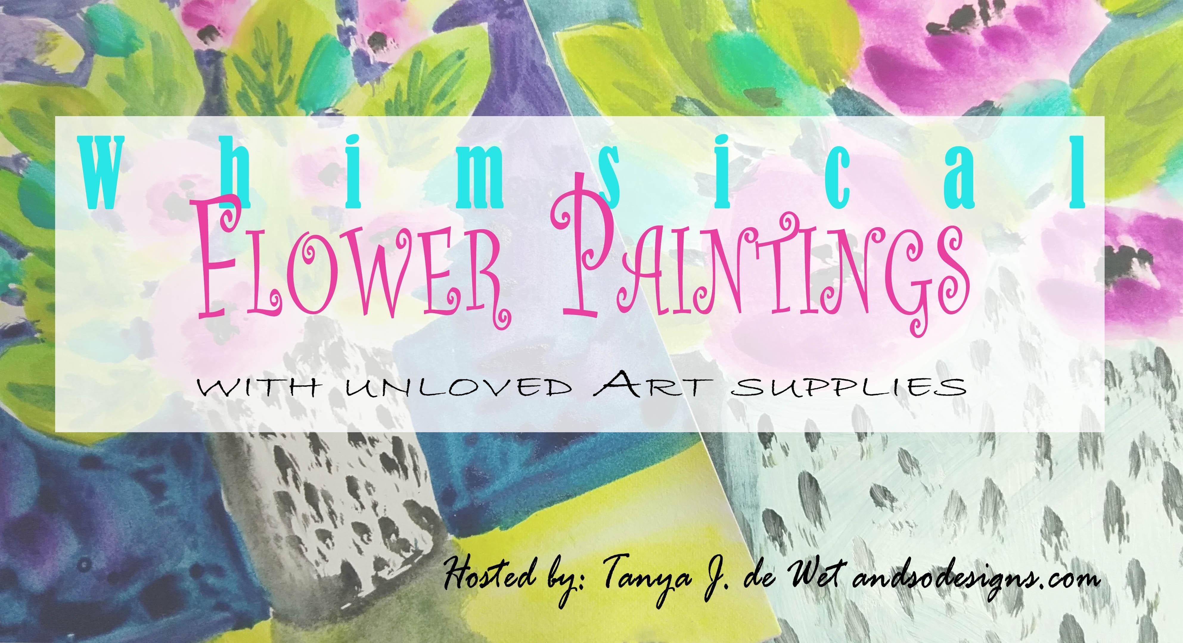
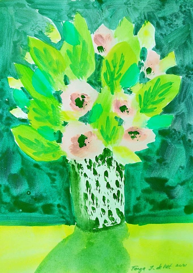
2. Draw the flowers: Well, welcome, except that you could join me for this class today. I discovered some unloved art supplies. Sound really large brushes, some awful sketch books that are bought online during the year now Watts and a whole folder. Guage, acrylic paint, watercolour paint. All student grade, of course. And I don't want to get rid of them. So I'll show you how to make something pretty. We're gonna paint whimsical flowers. And I even have a second book. And this is what it looks like. It has the same thing, C. And you can use this same glut or you can use any other one you like. The idea is to use up those unloved art supplies and you have loads of fat. So they see way this will take us first things first, we need to see what we have. So go out and get really bad sketchbooks that you've been holding. And too afraid to try. I can promise you. After doing this, your sketch book will fill up really quickly. I'm providing a template if you'd like to use mine. It's nothing elaborate. You can redraw and move some of the items, reshape your vars. Vars doesn't have to be square. It can be an oval around. It can even be a short w1 depends on what you like, but arrange your shapes in a pleasing way and then have a look at your art supplies, see what you've got available. And then last but not least, do a few tests to see what colors you like. When we look at our Carlo window, we can distinguish between our warm and cool colors and try and have a balance. There are so many tutorials out there on the usage of color. And I would immediately just suggest that you get the colours together that you like the most. If you're going to give these two frames, which I highly suggest we wouldn't be selling any of these ones because it is on very unloved paper. And that would be a pretty gift to a friend. Specially those frames who don't have the finances right now to pay you anything. But I can have something pretty on their wall. And it's a perfect gift if you put it in a very simple frame. So get your things and we'll meet each other in the studio on a blank page. For starters, we are going to imagine a table worth I flower part. And then in the flower pot, five to six randomly spaced flowers, then a suggestion of some leaves, maybe an extra flour if you like, tucked in behind. It depends on how adventurous you feel today. Now these are just outlined and you can even reduce the size by squeezing it in tighter towards the same time. It doesn't have to fit the whole page if you don't want it to. In this next example, I'm lifting table up slightly higher, creating a smaller volumes. And then having bold flowers in a. Just be careful that your vars doesn't topple over from the weight it's carrying. But you can really adjust and play around with your flowers. Have these pretty little bunch y1's. I'm no flower decorator. But I know what appeals to me and what my eye likes to see. So play around and remember, you can always add larger and smaller elements according to your liking. Next up, we're going to take a look at our color combination.
3. Colour combinations: Right? So to do that.
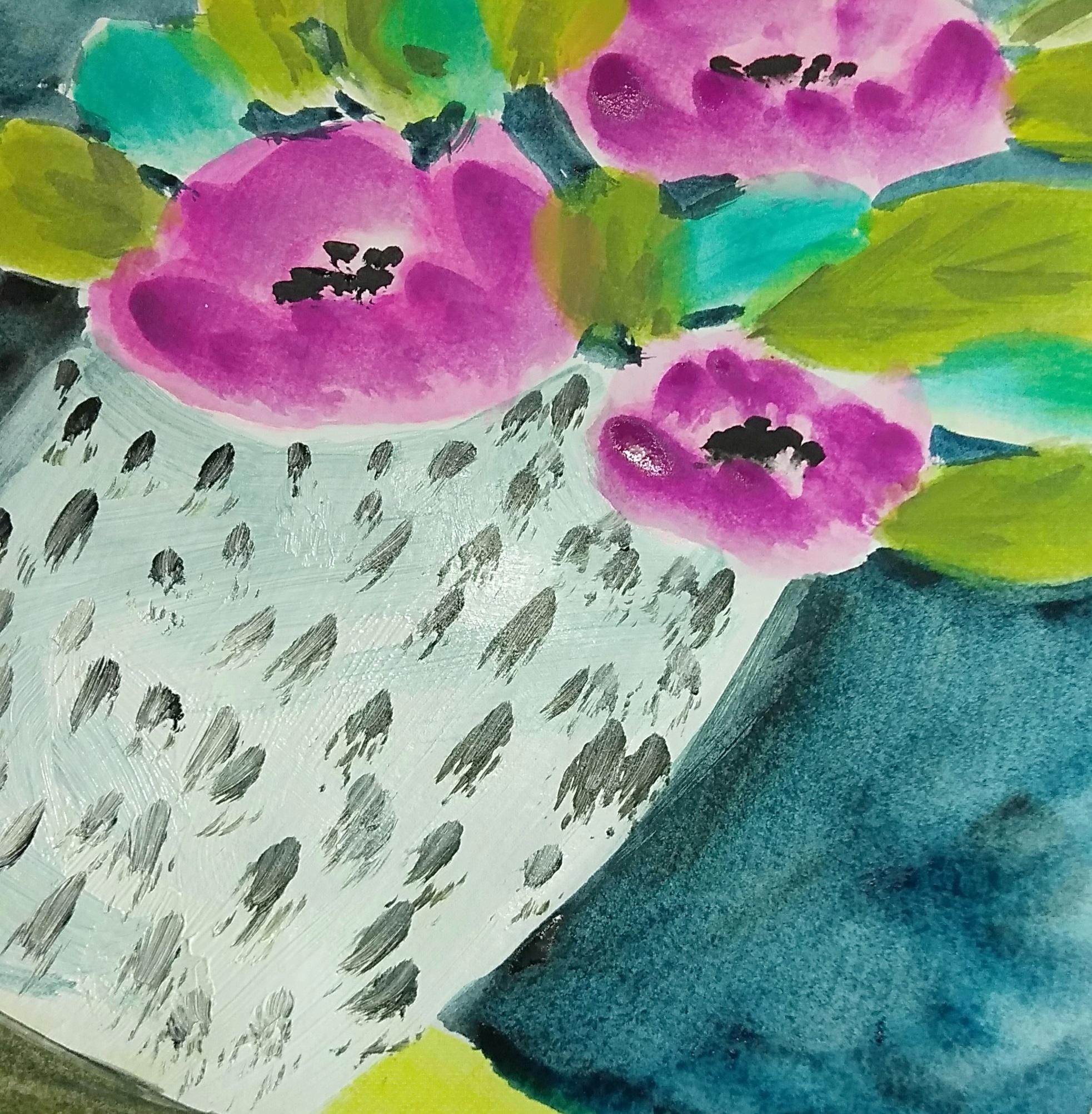
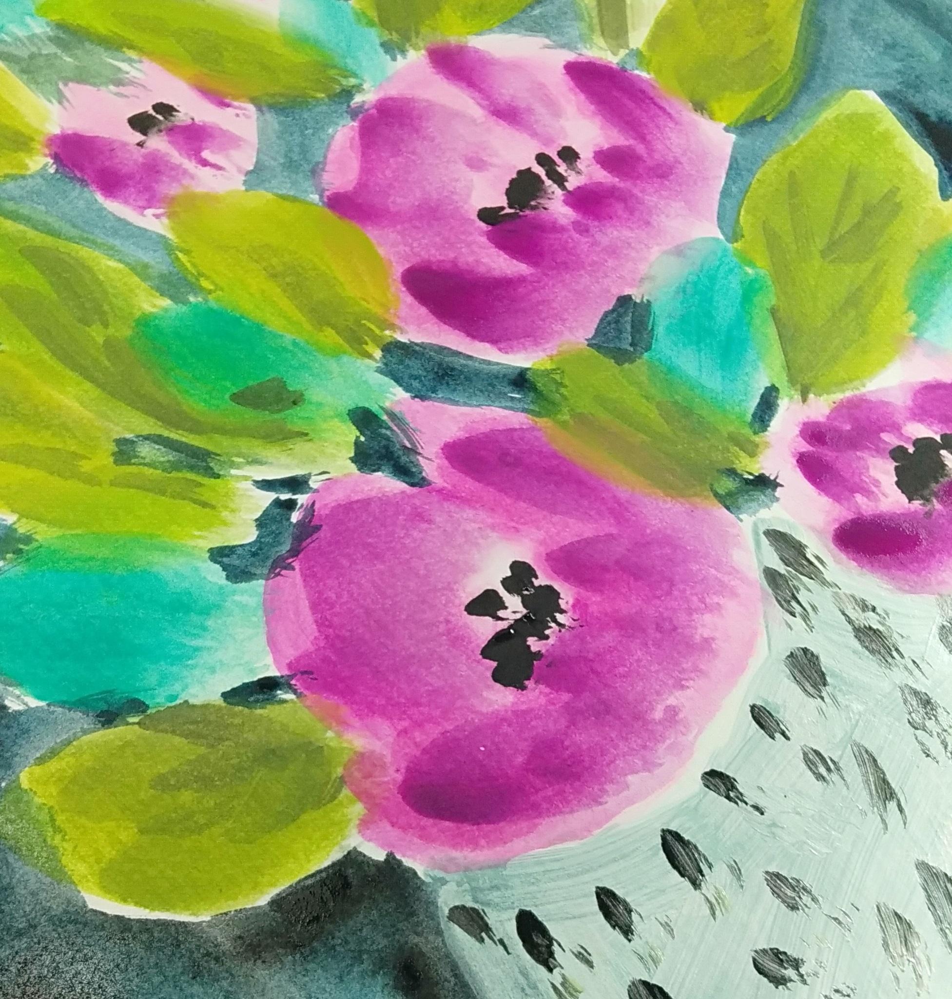
4. Fill in the Shapes: In this video, we're going to take a quick overview of the steps we're going to take to get to our little whimsical paintings. So first off, or mix up a little watering mix of that first Pink and just fall in the flowers. You will notice that we've also dark and some of the front petals of those flowers shapes and just pop in some details here and there. Don't overdo it there. Make it interesting and play around a little bit of creativity and use those unloved planes. That's what we're here for. After all. The table, I just popped in a nice yellow, bright and vibrant to stand off next to the white of the pot. As you can see, we've skipped ahead and some of the leaves are already made with varying mixes of the Greens. Just press that very large brush into the page. Make stamping movement to get your leaves organized, scatter them around your flowers. When we start with the background colors, we will mix up about two shades. One will be a darker blue for the bottom area near the table. And the second mix will have some of the lighter green in it as we moving upwards towards the light. Now make sure you tuck those colors all around the flower and leaf shapes. And also in the background between the leaves and the flowers. This will make sure that your images are surrounded by, by those dark colors. Also vary the direction of your brush and simply fill it in with random strokes. You will see that it happens quite quickly. And the only thing you need to be wary of is changing the colors gradually. I mean, not go from one to the next, just gradually. Okay. Okay. They do. While I have that color on the brush, I'm gonna dip the brush into the wind and make a pale grayish mix to give some accent and a shadow side to the flowerpot. Now, it's not that important. I like a little shadow here and there, just to show that that part has a shape and the shadow easily defines that shape. May be giving it a curvy look. When you look from afar, you'll notice that we've also dark and some of the front patrons of those flowers shapes and just pop in some details here and there. By adding some darker tones to those leaves, you're also creating some interest around that. And since I'm using guage, I can interchange light over dark, dark over light, and play with the colors. If these were just watercolors, it would be somewhat more difficult. And process works easily with guage and acrylics. So I'm just taking a little bit of the black on the tip of this very huge brush and making marks on the flower pot that will resemble the reference I've been looking at on the left-hand side. Any way? I think I can call this one. Does
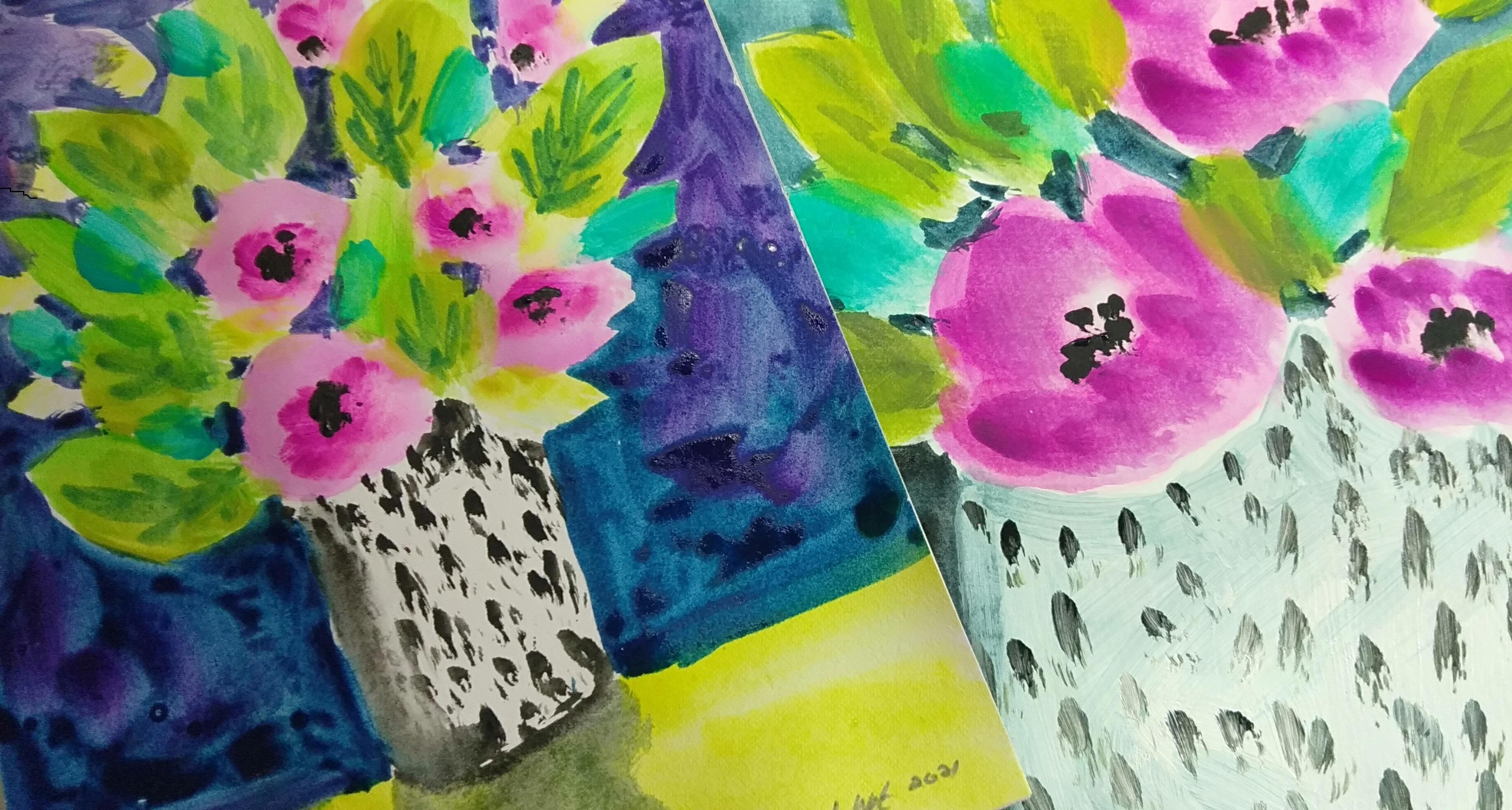
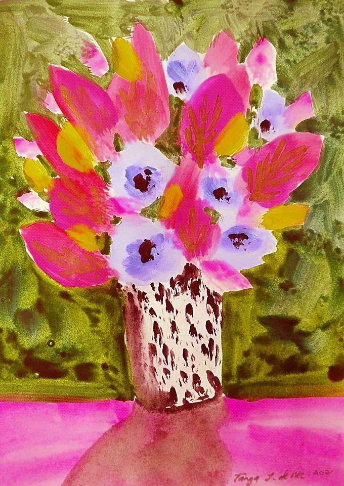
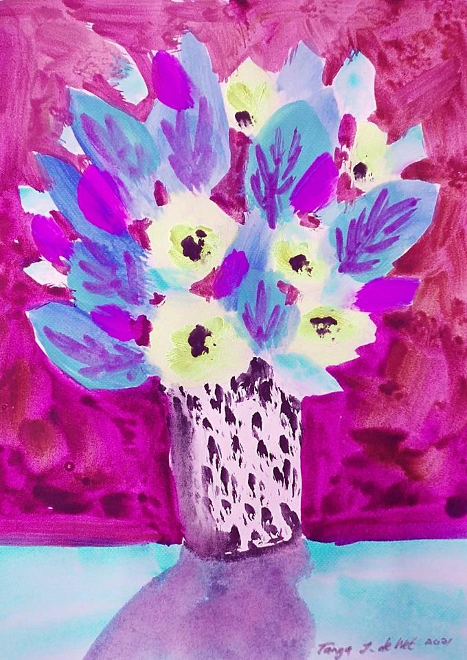
5. Alternative Colour Palette: I don't want this one to be exactly the same as the ones we've already created. So let's use something a little more natural to squeeze out some yellow ochre. Will see with this one takes us, but still wanted to not being nice and bright. Maybe a Orange. We are painting whimsical flowers after all. And how to unlock. And nice dark green. And I think we've got green, We've got yellow and orange. So maybe something blue or violet. This one. And last but not least, I'm going to get a little bit of white and have a to one side. And of course, nothing is set in stone. So we can continue to change these color schemes. For now. I am putting in a lightly colored background for the table and painting in some dog tongues of that color. You can actually start any way you want. Create some, use painterly moocs. And don't worry about the end result or the outcome. We are playing and having fun with our unloved art supplies. Remember, turn that flower arrangement upside down by dumping in some of those colors. And because this is just the first layer, you can play around and experiment seaway that will take you. If it doesn't work out. You can always paint over it. Really liking that. Let me show you what I did in the other video. As you can see. So much options available that will never be stuck on ideas. I thought of mixing a little bit of green into that purple doesn't match if we getting mad or if things don't turn out the way you're like. These are unloved supplies and you can take the pages out at any time. Creating these lovely dark leaves will really set off that orange. And if you call your paintings whimsical, nobody can tell you that that was around. Well, this was right. You should have done it that way. And besides, it's fun. Don't forget that you have some white and use it in any way you like. I'm going to create a lovely striking background data. In a way I wish that I took a little bit of glue. So maybe just revisiting my panic and waking the tip of my brush in a little bit of blue. Let's see what we get. Omega that's cooler already. For help if you could see right? Just like that. And I'm going to roughly fall in the back. Follows a negative shape behind your flowers and leaves and start to shape that background. I've gone back to the purple now. And it's exactly what I wanted. I wanted top area to look purple and the bottom next to the table to be slightly bluer. This is a perfect time to experiment if you want. I still don't like these pains, but the painting is starting to come together. We can sometimes surprise ourselves in the most interesting ways. Just when you thought you'd never learned something new. Along comes a little project like this. And in a matter of minutes, you've created something that's fun and creative. And even if you make a mistake, it's not the angles a world. If your colors will allow it, you can always cover that up again. And if it doesn't want to cover up, just pretend that it's part of your paint.
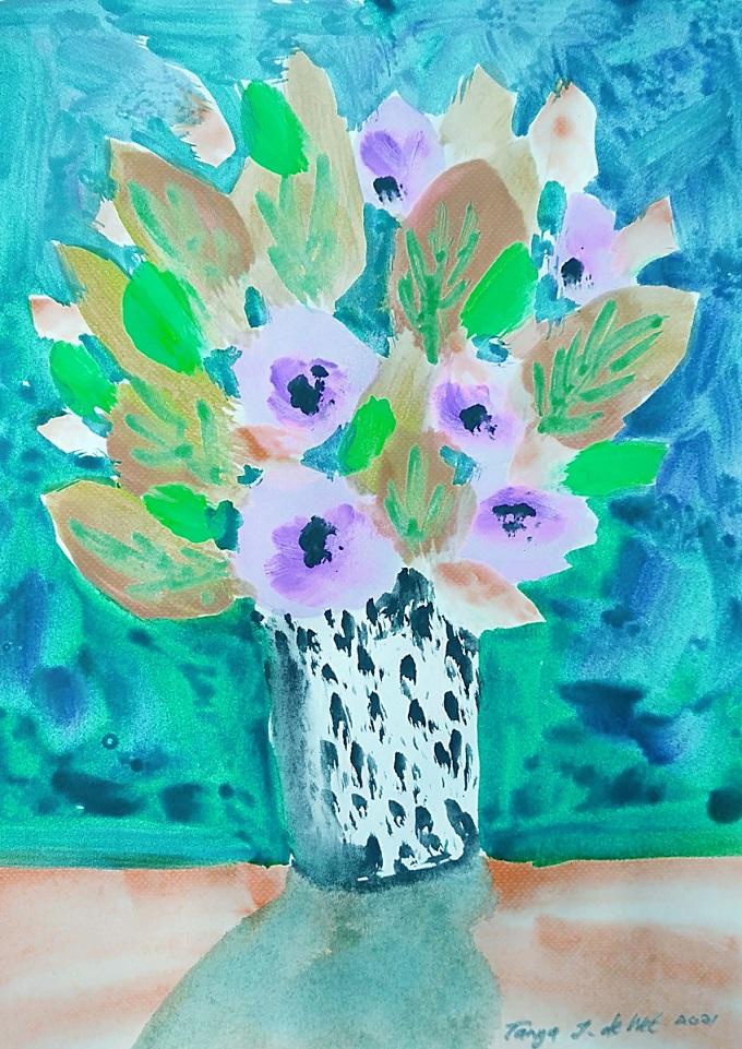
6. More Layers: Those first layers have dried. And I'm just going in with the darkest version of each of the colors. Applying nice and thick to get those really textural effects. And creating and reshaping the flowers as I go. You can, of course, completely leads him as they were. But I like to work at them a little bit and redefine their shape. So when you get to an area like that part there and you don't like the roundness of the shape. You can always use a little bit of negative painting on the leaf area to carve out a different shape. Well, too, create an age for those flowers. It's also a good idea to add some texture onto your leaves as well. And you can vary the color variations can tip in some of that kind of variations in the planet and create some areas of interest. Don't overdo it though. If you initially didn't add enough leaves, you can add more leaves if you like. Island, Guam to do that. And of course we need the shadows, so I'll grab some of the violet and green mix and put a dash of orange in there so we get a nice gray transition and will give our flower pot a shadow. Everything needs a shutter if it's got light casting on, it. Assumed to have a bird problem today. You hear them in the background. And if you want to be a bit daring, why not throw in some of your brightest color for that? Shatter? Thanks to now, I can't guarantee that every single one of these attempts will be successful or that you'd even like them. But at least you're not throwing paint away. That could be used for practice. Right now. I'm just taking a little bit of that white and heading some elements to my little orange flowers. You see where they might go. Also adjusting the green. Third, I can add some details and I'm still busy with a fairly large brush. I didn't switch to smaller brushes when I started the details. I'm still using that big wild brush. This would be a good time to practice brushstrokes if you haven't done so yet or just to play around. All right. I'm starting to think that I've done come like that. Purple background with the yellow tables. Let's see phi, like the purple table beta. We can always change the shadow, will leave it as is. So let's see. Almost looks worse. Not afraid. They choose the white MCU strokes nicely visible. That's already looking a little bit. Maybe I just wasn't feeling or white or maybe you're just wasn't feeling a yellow table today. Sink will make a new Gray for my shadow so that I can cover that up as well. I'm going to let these layers dry quickly, handling, get back to that. That's better.
7. Last touches & Class Project: Now just look at the difference that color change made. You can play with every single color you have. I'm looking forward to seeing what you've created and share it posted on the Resources section. And let's all appreciate and love each other's work. Thank you so much for taking this class. I'll play out with some more footage. You see.
 Tanya J. De Wet, A Creative Mindful Life