Transcripts
1. Welcome To The Class!: Hey you guys is demonstrated
here. Welcome back. And today we're
gonna learn about impasto and then learn to paint impasto waves in pastor is such an easy
technique to paint, but you wouldn't know
it until you try it. In pastor is a
painting technique. Wet paint is laid on a surface, typically using a knife
or a brush to make an object appear raised from
the surface of the canvas. The easiest way to
tell if a painting has an impasse to or
not is to look at the painting from
the side and see if any paint is
sticking out of it. Now you can do texturing using just take body
acrylic paints, which is what I like to do. Or you can use an
acrylic Jim medium to take any old paint as well. In this class, I will show you
my gloss heavy gel medium, how to mix it with
acrylic paints. What are the benefits
and the results you get? I will also teach you the
different techniques of impasto and how to decide what technique
to use in a painting. I will show you the
different materials that you can use to
create impasto FX. And finally, in
just three steps, I will teach you to
paint in Bath. Two ways. You can create this painting on a canvas and add to
your home decor is such an easy painting and it has such a beach
vibe to your room. So in under 30 minutes you are going to
become a problem in impasto and be able to create
amazing imbecile paintings. Okay, let's get
inside the class now.
2. Supplies: In this video, I'm
going to tell you all the art supplies that
you'll need for today's class. You can use whatever palette
knife you have at home. So these are the
ones that I have and this is the one
that I've linked to use in this class. If you don't have a
pallet knife like mine, you can grab a plastic or a knife or even a
popsicle stick. Or you can use a
paintbrush as well. You can also use the
back of your knife or backup your spoon. Like you just need something long sticking out that you can use to put paint on your Canvas. You can literally
use anything study and out to create
textures on Canvas. You can even use the age of your credit card
to paint impasto. The colors I'll be using in this class are just four colors. I'm using these two
fluid acrylics, Prussian blue and green. I'm using fluid acrylics
because these two colors, shades, I don't
have intake body. That's why. And then I'm using this aqua green color
and a white paint. These two other
thing, body acrylics. So I painted the entire painting using only paints
without this gel medium. But you can use the gel medium if you
want to in this class, I haven't, but in future
classes I'm definitely going to try using this
and create a painting. For this class. I have
used a canvas close. So this is the Canvas globe. So now the surface to paint on his very important why
you're painting impasto. I have done this one on a paper and you can see the
paper is pretty much folding. So I just don't feel that paper is a good medium to paint impasto on because
this is so thick. So that's why I use the
Canvas cloth in this one, but I would absolutely recommend
using canvas board for it because then you have a strong base to support
the thick impasto paint. And then I'm going to use
this disposable paper ballot. Um, I actually like anything flat surface to mix paint on because when
you're using a knife, you need a flat surface where you can mix all the paint on. If I use a plate like this, it's very much of a
struggle for me to pick up the paint from this plate. You can see that even
after struggling so much, I haven't been able to
pick up all the paint. Whereas if I squeezed the paint out from the palette,
from this palette, I will be able to take
out the entire paint of display because it's a flat
surface. That's all guys. So that's all you need to create this impasse of painting. And of course, grab a
lot of tissue papers. You're going to need it.
3. 2 Types Of Impasto Techniques: Here in my journal, let me demonstrate to you two different kinds of
impasto techniques. Curious my knife. The first one is wet
on wet technique, and the second one is
wet on dry technique. So when we're blending
two colors and investor, you can do so in either of these ways depending
on the effect you want. So let me first paint the
first layer of paint, which is Prussian blue. And now I'm going to do the exact same thing for demonstrating the second
technique as well. So I have added a Prussian blue, both on top and bottom. And now I am going to add
some white on the top one, which is right now wet paint immediately
a second layer on top of the first layer, it is wet and wet
and both the colors mixed together depending
on the pressure you apply. I'm just adding a little
bit more operation do before adding
the white to it. I generally like to use
this technique because I liked the impasse to
effect you get this way. So I'm picking up wide and slowly adding
on top of the blue. In this technique, you see
the two colors mix and blend and create a shade depending
on the pressure you use. Okay, the different kinds of textures that you
can also create by mixing weight and weight using two or three colors
as many unit to use. You can do this technique, especially if you are working only with cool colors
and warm colors. So I think it is
wise to stick to only set same color family because when the game together, they produce a muddy effect in comparison to mixing
warm and cool colors. I'm just picking up some
more off of Prussia view and just blending
it with the white. So here I have a lot
of blue on my knives. I'm just wiping it off and
adding some more dark blue. I'll shade different little bit. And this is what we get. Look at how the two colors
with on weight have blended and created such
a beautiful effect. Here is an example of wet on wet technique using
the cool color. Here I'm mixing three
colors, blue, green, and white, on top of each
other while they are weight. And you can see the beautiful
effects that I'm getting. Here is another
demonstration of wet on wet technique on the one color. So here I am mixing
three colors, crimson, red, orange, and
yellow on the canvas. And they are creating
such beautiful effects. All the pins are weight
and I'm applying them on top of each
other at the same time. But they mix and
blend and create a different shade other
than these three colors. Which is, I think it's an amazing effect to
achieve with impasto. Now, in the second
one you see I have added that Prussian
blue earlier, but now I'm just going to
dry it off a little bit so that I can show you
the second technique of weight on dry. So the first layer is dried now. And now I'm going to
apply a second layer of white on top of it and
it won't mix at all, unlike the one that
happened on the top. And it will give you a
very different effect. And as you can see,
the colors are visible separately because they weren't blending much like
the first one. You can apply the color gently omit pressure to get
different results. So you can experiment with this technique and
see what kind of things you get once you edit it with Fisher and
with less pressure. If you press too hard, you overwrite the bottom
layer color completely. Or you can go, go slowly
like I'm doing here and add just a touch of paint with your knife and get a
different outcome. This method is
effective when you are using both warm
and cool colors painting and in one
of the first layer to dry completely before you
add the second layer, because you do want
the colors to mix, the warm colors and
cool colors to mix. So I'm just adding little bit
more color wherever I can. And just to get the final
outcome that I want. This is all experimenting, so just play around with it and see what effect you are getting. You see the top
one is still wet. So when I'm adding
this aqua blue to it, it's all blending with
the bottom layer. And I believe that it even more, whereas in the bottom
layer you can see it is like absolutely seperate. Colors can see all the
colors differently. Here's an example of
weight on dry technique, where I have first painted the sky using blue
and let it dry. And then I've added all the warm colors on top of it to create the sunset sky. And you see the colors doesn't blend too much into
each other because the first layer
was dried before I added the second layer of
the warm colors on top. But now when I'm adding the
block on top of the red, it is the wet-on-wet
and the colors are blending into each
other a little bit. So that's it for the
impasto techniques. I hope you understood these two major different
types of impasto techniques. So give it a try experiment
and see what you like.
4. Acrylic Gel Mediums - Whether To Use Them?: Okay, here is my new gel medium. There are tons of
varieties of mediums, jails and modelling paste
out there in the market. And they're basically
all different types of acrylic binder. They come in different
forms like gloss and Matt. I think gloss medium intensifies
the color that you're adding it to and adding Matt mediums mutes
down the color. And I definitely don't want
to mute down my colors, so I prefer gloss
mediums over Matt. Matt also has its
very specific use. Say for example, if you want to mute only a sudden part of a finished painting without
adding any more pink to it, you can just apply some matte
medium and it will push the area bad by muting
the colors of that area. I hope that makes sense. It may sound a little confusing, but let's not get into all
those details and let's focus on creating some
impacts to textures. Now by mixing the medium width, two different types of pains. So I'm going to first mix
it with my fluid acrylic, and then I'm going to do the exact same thing
with my tape body acrylic and we're going to see the difference
that it makes. So I'm starting with a fluid acrylic and I've taken
out the dark green color. So according to me, the main benefit of this
acrylic gel mediums or to thicken the fluid body
actually is because that heavy body acrylics
are already picked. So even if we don't
add matte medium or gel gloss medium to them,
gel mediums basically, it's totally fine, but it can
take in the fluid acrylics, then that's a game changer. So let's find that out. So right now what I'm doing is I'm just adding a little bit of
fluid body acrylic, the green directly on my paper. So that is just a thin layer
of the fluid acrylics. And now I am mixing this
gel medium with the green, so I'm just taking my time
to mix this entire thing, squishing it all around. It's actually such
a fun feeling. Unless you do it, you
won't understand. This tape medium is actually
like, it's so creamy. I'm loving this mixing pot. So I've mixed it very well
with my fluid acrylic. So the green color was
really, really thin. And now, oh my God, this is a huge extra. I mean, I am in love with it. Look at that lows. It's like just absolutely like
a pig body acrylics. So if you have no body acrylic and you use only fluid acrylics. This is a game changer guys. So you can just buy a gel medium and can mix all
your fluid acrylics with it. And you can get the effects
of fatigue body acrylics. So all the colors that I don't have intake
body so I don't have, I mean fatigue body
I buy really like selective pains that actually like to use directly
on my canvas. Like this dark green
color, the Prussian blue. These are the colors
that I don't have, the exact shade that I have
in fluid acrylics and I can't use them in my
impasse to paintings. Now, I have an option of mixing them with
this matte medium, and I think I'm totally
going to do that in future. I absolutely love it. So this is mixing
the gel medium. I don't know why I keep
calling it matte medium, but this is like a
gloss gel medium. So I loved mixing the gel medium with
fluid fluid acrylics. Now let's see what
happens when we mix it with the acrylics. So for the thick body acrylics, I have taken out
this green color. I think it's a light olive
green from Liquitex basics. And now I'm just
adding a layer of the thick body acrylic
directly on the paper. As you know, I don't
use I've never used met me 12 gel mediums before, ever in my life. This is the first time you
saw me opening the new jar. And I have always used just pick body acrylics for doing
all my paintings, all ambassador paintings
and any other painting. So I really want to try and see if there is any difference. That is that if I mixed some gel medium with
a tip body acrylics, the only difference that
I feel after mixing this is not so much in texture. I think it's a little thicker, little slight thicker, like
with the fluid acrylic. It was a huge difference. But with the thing
will decrease, there is a little
difference because it's a bit thicker than
the original hello. But it's not that
take but, but, but, but what I want to tell you
is I absolutely love the the, you know, the thick creamy
texture of this gel medium. I think it's amazing. I think I'm falling in love
with this medium and I have, I am going to use it in my future paintings.
I totally love it. Okay, now I have little bit of gel medium left on my palette. So what I'm going to do is just add this directly on my paper. It has just a little
bit of green in it. One important thing that
I want to tell you this, even though it looks
white, it dries clear. Okay. So when you my light green, it looks like the
light olive green it looks like as if
it has lightened. Hello little bit, but once
it dries, it's going to dry. Absolutely the same color that I'm telling you
only from my knowledge. So once this dries, I'm going to show
you what happens. Alright. So here are all the
textures that we did, and this was a really fun
exercise for me to do. You can also try eat out, or you can just gain your
knowledge from my video. Okay, now the colors had tried. The reason that I got
is just mind-blowing. Look at this, the
ones that are with the gel medium or so
glossy even after joining. Whereas the original
to paint is so mad. Look at this difference,
clear difference. The original paint is Matt and when it is
with a gel medium, it is so glossy. I mean, I actually missed this. Like, you know, when
I used to paint impasto and apologize,
it becomes Matt. It becomes, it goes little down. And this Jinping is amazing. Oh my God, I am in love with it. I think you guys should
totally check it out.
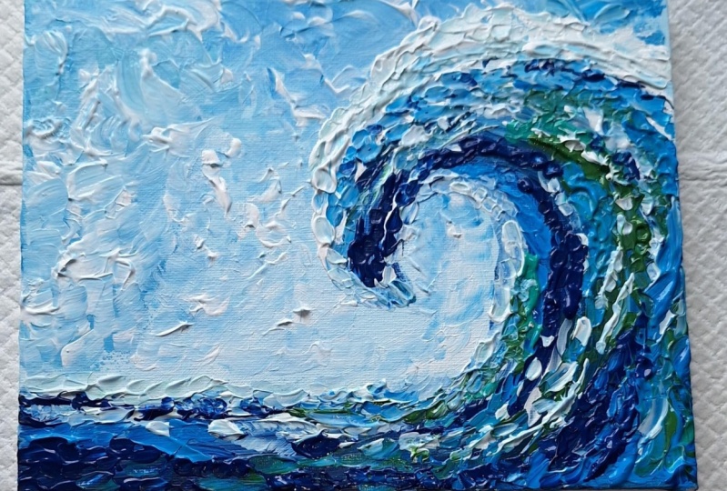
5. Step 1 - Paint The Background Ocean Water Using Brush: Okay, before we start painting, here is my reference image. I have saved quite a few in my Pinterest board
or nature in school, you can go there and browse
more reference images if you want to choose something different than what I am doing, I will link it in the
description below. So you can choose your
favorite image and you can make it slightly different
than what I'm doing here. But you can use the same techniques that you're going to learn in this class. I'm using a brush and a knife for this
impacts to painting. And I will start with the brush to create
the background first. So the first step of
creating your impulse to waves is to paint the
background ocean water. I am using a lots of white with a tiny dots of Prussian blue
to create the background. But you can use any
color you like. Remember this is the
background and most of it is not going to be visible after the waves
come on top of it. You can use multiple
shades of blue to give whatever blue shade
that you like. You can use. Ultramarine, cobalt blue,
whatever is your favorite. Go in random directions,
play around. This is the most fun stave. Just go in whatever
direction you want to, using your brush and
try to create lots of nice brushstrokes that will be visible at the
end of the painting.
6. Step 2 - Paint The Crashing Wave Using Brush: Once you've finished
painting the background, now it's time to
paint the big wave. I am using Prussian blue to
create the shape of the wave. Tried to hold your brush
from the back and give it one big sweep to create
the shape of the wave. Then go over it with multiple colors of your choice
to give some dimension. Here I'm using some dark green and aqua green along with white. Here, I'm adding a thick layer of white paint strategically on the upper layer of the waves
where the sunlight is the brightest and more
light is reflected. In this step, I'm also
adding some thick layers of my heavy body acrylic paint with the brush to
create some textures. Most of it anyways, is going to get added
in the next step. But in this tape I'm just adding a tiny touch as
I'm painting this. I'm keeping the bottom
layers dark by using more of the dark Prussian
blue and the green. Remember the Common
Rule of dimension, you give one side
dark on one side, light by adding darker
shade of the color on one side and
the lightest shade of the other on the other side. And that way you
can convert a 2D, 2D looking object into
our 3D looking objects. So that is what we are
trying to do here. So the wave looks like
almost 3D effect.
7. Step 3 - Add Thick Impasto textures on the Wave Using Knife: Now comes the final step and the most interesting
part of this painting, adding a layer of impasto paint, which is basically just adding a thick layer of your
heavy body acrylics. I am using the paint directly
as it comes from the tube. But if you want to
save your paints, you can also mix the paint with acrylic heavy gel mediums. I just don't feel like
taking so much of troubles, so I just use the
paints directly. I'm wiping off in
life sometimes with the tissue paper because
when I'm adding the white, sometimes it is picking up a little bit of blue
from the bottom layer because the previous
layer is not dried and painting
immediately after the, after the state to or
not to have too much of blues shown on
the top and just wiping off the excess paint. And then taking up again a fresh layer of white
to paint on the top. Okay, Now back to layering. Hold your knife in the
direction you are trying to create and move it
in that direction. And you can't
achieve this effect if you don't use a lot of paint. So as you see here,
I'm picking up a huge quantity of
acrylic paints on the back of my knife and letting
it gently on the canvas. You don't want to put a lot
of pressure while painting in pastor because that may
ruin your bottom leg. Impasto is all about layering thick paint on top
of each other. So be very, very gentle when
you're painting in investor. So at the beginning
of this tape, I was using more of white
to create the white waves. And now I am just
going over step two, but with a knife and
using dark colors and creating another layer of
texture using the knife. Now you see I'm also creating a different
kind of texture. By dabbing the knife
on the canvas. You can do so many
different kinds of textures using knife
and thick paint. It's really unbelievable. Let me know if you want me
to create a tutorial on different knife
textures and that'll be very excited to do so. I think this dabbing technique of white on top of the waves, we are also creating the
fraud of the waves that is almost like coming
out from the away. So you can do this
by spraying also. But I feel using naive and the faster technique
you can create such amazing frauds
coming out of the waves.
8. Final Touch Ups: Our painting is almost done. You can endure, but for me, impasto is very
difficult to finish. I just always feel like adding some extra touches at the end and I can
just keep on doing. But for the sake of this class, I will stop basin. But all I'm doing here is
just adding another leg, a little thicker layer of paint. Wherever I feel like just to add those extra touches to
the entire painting. Since quite a heavy amount of paint has already been
added to this painting. Rather than adding more paint, what I'm doing is with
the edge of the knife, I'm just tweaking
the paint around and giving the final
texture that I like. So all I'm doing is doing
here is tweaking the paint here and there and adding
some light textures. I'm not really adding a lot
of paint in this final step, but just tweaking the paint
around with my knife. And that's it. That brings us to the end
of this painting tutorial. I had so much fun painting it and you should
totally give it a try. The final look of my painting, I hope you like it. I can't wait to see
what you come up with. Share your work, take a picture of your
finished painting. I would love to see them. And especially if you use a
different reference image, that's gonna be even awesome
if you liked this class, I appreciate you writing
a review for this class and ask me any questions
in the discussion below. I really hope you got a lot from this class and that
you enjoyed it. And if you did, make sure to
follow me on Facebook and Instagram because
I have a ton of new courses coming
up into pipeline. Do share your artwork that you've created out
of this class. If you're sharing on
Instagram, use this hashtag. They will street art projects so that I can see
all your artworks also invite you to explore all the different classes
that have created for you. If you want to up level your painting scales and create
some amazing landscapes, you can get the complete
list on my website. Make sure to take
out my art blogs. I share helpful step-by-step
instructions for beginners on how to create
easy acrylic paintings. Along with a lot
of valuable tips. I appreciate all the
loving-kindness from you guys in terms of
review and reading. Thank you so much
for being here. Thank you once again
for joining me in this class and happy painting.
 Debasree Dey, Acrylic Artist & Educator