Transcripts
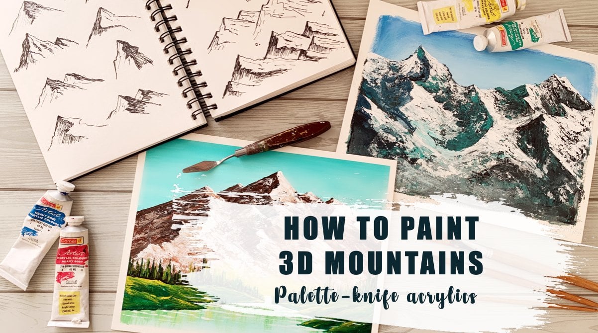
1. Introduction: We all love the beauty of nature and love
Indian landscapes. But what if we learn to paint in a new and exciting way instead of painting the same
way as we always do. In this class, we
will learn to paint a mountain landscape
in an oval shape. No, we won't paint
on an oval Canvas, but paint and overall landscape in our regular
rectangular Canvas. In case you are
new here, welcome. My name is taboo story. I am an artist and
educator from India who has been teaching art professionally for
eight years now. Learn more about me on my
website and I would love for you to visit my humble
studio on the Internet. In this class, you will learn various art supplies,
acrylic techniques, color theory, and
I will be sharing with you lots of tips and
tricks along the way. If you've followed
my other classes, you would know how much
a focus on techniques which you can use to create
any other paintings. In this class also,
I will tell you about every detail
of working with acrylics and creating
these amazing masterpiece. I have divided this painting
into eight distinct steps, starting with the
sky and the clouds. Then we will learn to paint the snow-covered mountain peaks. Then some gorgeous green trees, along with some pine trees. And finally, we
will learn to paint a big tree coming out
of the oval frame. So I hope you are excited by
now to dive into this class. If you want to
learn these things, go ahead and enroll in my class and I love to
see you inside the class.
2. Art Supplies: Hey guys, Welcome
inside the class. So in this video, I'm going to tell you
all the art supplies that you're going to
need in today's class. So starting with the surface. So I have painted on
our canvas paper, which is a little different from the acrylic papers
that I usually use. So I just wanted to show
you that paper quality. This I did not buy online. So I can give you a link
because this is a paper that I bought from a local
art store in pony. And this is how the back of the paper is called
oil paper. Okay. It's not called
the acrylic paper, but it works just like
an acrylic paper. The differences I can
show you compare it with the equity paper and show you that this
is a little yellowish. So this is the brush TO, or acrylic paper that I bought, which is this one basically
is actually a 3400 GSM. Honestly, it doesn't
matter that much though, the feeling of painting
on this and this is very similar kind
of like canvas, paper, acrylic paper
type of thing. But this class I have
painted on an A3 size paper. As you can see, it's
a pretty big one. Little bit smaller than
a three, I would say. The reason being we are going to create
an oval shape inside. So the overall size of
the painting reduces. It's not as big as they ate, treats a little smaller. And also another reason I walked on our bigger surplus for
this painting is because working with a knife on the mountain becomes very difficult if it is
like this small. Here is a knife that I
used for this painting. As you can see, it's a little
beak size and I feel I have a little bit more surface to paint in the mountains
because if it is too small, I have a small knife to
use on a smaller surface, but I just feel when
I'm painting on a bigger cell surface
for especially when I'm painting snow big mountains, it's a little easier to
paint on a big surface. By the way, I have
a class on days where I have taught
in detail how to paint a snow-covered
mountain peaks that you can always go to and learn if you want to
gain more confidence in painting and this
snow-covered peaks. Because I think this is such a beautiful technique to learn, which you're going to
learn inside this class. But it's going to be in just a while painting
this mountain. But in that class, I have explained
it in much detail. That will give you, make your basics much more
stronger if you do that. Alright, so coming back to
our acrylic art supplies. So this is the paper
that I have worked on. You can work on the reason I'm showing it to
you so that you understand whether
you want to paint as big as E3 or you
want to print A4, or you want to paint
a five choices yards. So this is the size
I have walked down. The most important thing
is the painting surface. And the second most
important thing for this class is this. This is a paper which means there is
a sticker side to it. So you get this very
easily on Amazon. I will try and link it below. Yes. See when you
open it like this. So this side is the
sticky side and this is the backside
which is on this, this sticker paper is the most important
thing for this class. To be able to create
this oval shape, which I'm going to
tell you in detail in a later video how to cut out and how to create this oval shape and how you
can use it in your intake. But for the supplies list, this is the most important
thing for this class. We are done with two things. One is the canvas paper
or acrylic paper, then the sticker paper. Then of course,
you need a knife, you need a couple of brushes. I have done the whole painting
using just two brushes, one flat brush and
One round brush. The flat brush using the plant-based Scalia than
the entire background, including the trees
and everything. And just for creating
the branches, the tree trunks and the branches, I've
used a small brush. You can use even essays, Marlowe for doing
all that thin lines. Okay? So that's for the
painting materials to brushes and one knife. I mean, the size of a
knife obviously will depend on the size of the
canvas that you're working on. And then comes the colors. Okay, so now let's get to
the colors. The tunnels.
3. Color Theory: So now I have taken
out all the colors that I just talked
about on my plate. Prussian blue, teal blue, cadmium yellow, sap green. This is not exactly sap green. So I'm going to tell you
based on what it is, a dark green and brown, white, and black and purple. So these are all the colors that you would see me
using in this class. In this, let us look at all
these colors individually, see how they react
with each other, how they mix with each other, and the colors they produce. And also, if you don't
have some of the colors, how you can recreate
some of these colors. Okay, so just grab any
rough sketch book that you have or any rough
paper is totally fine. This is my sketchbook
where I kind of that these all the colors and see how the colors mix and what colors they mix
with whatever happens. So this is fine. Sketchbook to paint, to create colors, study, and meetings. Right? So let's find out the colors. So the first thing that I wanted to tell you
that I have heard from many of my students is that they don't get
this teal blue color. This teal color comes directly
from the brand that I buy. But I think you'll get
these in other brands also with different names. So let's say e.g. this one. So these are very close
to this teal blue color, a little bit different. Cobalt Teal or torque
quiz green. I think. I'm doing a color study. That's why I bought all
these colors to find out how they react with each other, how different they
are from each other. And I think this one
talk with green. Then there is this aqua green. These are all very
similar colors. Now, you don't have to buy all these colors to
create this color. I'm going to tell you how, if you don't have this
color, how to create it. The main panel that you probably would have
is dark green, which is basically
viridian hue color that probably everyone would
have, the Prussian blue. These are the two basic
colors that we all have. So now if you have
these two colors, you can create this
color. Very easy. So before doing that, let's see how Prussian blue is on its own, however, agent who
is on its own, and then we will see
how to mix them. Here is little bit
of my Prussian blue. Now, I take in other brands, this color would be
called Halo blue. Okay, So I'm just
telling you because every brand has like little
difference in the colors. So I have done little bit of
study to understand this. Let me take a little bit
of white so that you, because it's so dark, if you mix it with white, you will understand how
the color is exactly. Okay, So this is our Prussian blue or kilohm Lu,
whatever you have. And next is the radiant view
or the dark green color. This is how it is. Like I was telling in
the previous video, in the supplies video, it's very important to see your colors swatch up little
bit on your sketchbook, even though it looks
like a wastage of color, It's very important
that you kind of make these marks that
I'm doing with my brush on the skateboard
because it will help you understand your
colors so much more. See the moment I added little
bit of white with this, we'll again consider
color changed so much. This you wouldn't know if
you don't do this exercise. So that's why I feel it's really important
when you do this. Now, once you know this, that this happens when
you mix white with your viridian view where
you have this knowledge, then when you see this color anywhere in your painting or you have to
create this color. You don't have to think so much. You know that just by
adding white to your color, you can create such a
beautiful light green. See already, this feels so
much lighter, teal blue color. You see that? This is
Prussian blue, viridian hue. Let me write it down so that
I don't forget it later. I think this is like from
my practice I can tell you this is a good practice
to write down your colors. So whenever you do them, because I've seen
later I forget. I mean, not with just
one color like Man, I miss one or two colors. I can do forget
what I have mixed. So it's, it's a good practice to write as and when
you are practicing. Alright, so now that we know, just by doing this to exercise, I can see that it is
so close to teal blue. So let me add the
teal blue first directly from the
tube as it comes. This is how the color is, right. And let's add little bit of why tweets is already
a very light value color. So I don't have to add too
much white to lighten it. Just a little bit is
going to be good. You get this pretty
mean dish color that it creates when
you add white to this. Okay? So this is the blue plus y. Okay, Now let's create this
teal blue color on our own. Okay, So if you don't
have this color, this is what you do. You take very less
of this dark blue, pale blue, and then add
some of the viridian hue. Now, you almost can't
see what color it is. What you want to do is mix
a little bit of white to this and you will see that
what color it is coming due. As you can see that this
is more of a bluish. So continue to add green in small increments until
you reach this color. So to reach this color, I am going to add more white. As I can see, this color
is much lighter value, this is much more darker, more white to this. I think we have reached the
very close to this color. Just need to add
more white to this. This looks a little bit
more greenish to me, so I'm just going to add
some more green to this. We got all, most the same color. So let's try it out. A little bit more dark. So I'm just going to add
some more white to this. And let's come here. So this is, I feel it's
still a little bit more bluish so that you
understand the concept. Now, let me just wipe off
my brush and let's just add small increments of green to achieve
this color exact. Okay. I think, yeah, yeah. Now we are very, very close. Okay. So now lets
light in this color. So you see you don't need to buy so many colors to
create these colors. If you just know a
little bit of color, mixing recipes, you can just create these
colors on your own. Okay, I think this is the exact same color
that I have done up. And all I'm going to do
now is make some white and just lighten the color white. Okay, Isn't this fun to find
out what your colors can do? So here I'm going to write down. Okay, so now you can create this color on your own if you need just a
little bit in your painting. If you feel like you need this color a lot more than
you can by the whole tube. Okay. So that's the blue part. Okay. Now, coming to the
blue, the green. Okay. Let's just before moving
on to the green leases, swatch over a little
bit of the purple. Find out about this
color a little bit. This is the color
right out of the tube. Now, if you don't
have this color, you, all you need to do is mix a
little bit of red and blue, but which they then
reach blue because based on which rate and which
blew you are using, the particle is going to be muddy or it's going
to be vibrant, purple like this, the
one I'm swatching out. Which means you need to know if your blue is warm or cool. And so we don't read. Okay, So this is a prison
violet that I am using. Now, let me give you the
purple color recipes. I'm not gonna do it
and this time now. But you can take a
screenshot of this or you can just understand just
by looking at this chart, which colors will
create muddy purple? Which colors will
create bright purple? So if you don't understand the concept
of warm and cool colors, let me quickly tell you that
blues can be warm or cool, and read can be warm or cool. So what is a warm blue? This is a warm blue which is ultramarine blue because this
is more pleasant rate side, so red is the warmer side, blue is the cooler side. This is one blue. Let's talk. Only this is one blue because
this is more reddish. This is cool blue because
this is more bluish. This is the Prussian blue. This is more towards
the green side. If you compare how to compare, how to understand it,
color is cool or warm. Look at them side-by-side. If you look at these two blues, you can clearly see that
this is more reddish, this is more greenish. More reddish is one more. Greenish is cool. Now let's look at the rates. So this is one red, this is cool red as
I've written here. So what is warm red? This is the cadmium red and cool
red is the crimson radar, quinacridone red,
permanent rose. All those are on the poolside. Again, compare
them side-by-side. You see this is
on a color wheel. What are the colors next
to array on one side do have orange on one side
you have poeple. Though. That is more towards
the orange side, is the warm red. Because red warm. And then rate the rate
that is more towards the purple side because the
orange side is the warm side. The purple side is the cool side because that's
how it leads to blue. So the more bluish the radius
compared only the two reds. One which is more orange-ish
is the warm read, the one which is more
purplish is the cool. Okay, So that is, that is understanding
our warm red, warm and cool colors
in both blue and red. Now coming to the purple mixing, what I've written in the
brackets here is that warm blue has red in it and warm
rate has yellow in it. Okay. Let me let me break
that down for you. This is blue. So we are supposed
to mix purple, which means we're
supposed to blue, mix only blue and red, but some of the colors. So what are the three
primary colors? Blue, red, and yellow. So some of the primary colors, little touch of yellow in it. So say e.g. warm blue has
this little red in it. One blue has little reading it because it's on the red side. So there is no problem
because we want to get proper and having red, blue in the mixture
is totally fine. But if there is a touch
of yellow in the mixture, then there is a problem. Right? Now, as you can see, cool
blue has little yellow in it. Why? Because cool blue is
towards the green side. And similarly cool blue, cool Rein has little blue
in it because it is on the blue side by a warm rain has little yellow in it
because it is on the orange side having y in
the mixture in any of them. Okay. Guess what happened? I was talking in the
camera and I was filming and I found out just now that my phone was out
of storage area and nothing got recorded after
like what I was just saying. I just stop the video and
I'm re-shooting it again. I just went ahead. So I'm just going to explain it and then accidents happen. And that's part of life. I first taught that
I'm going to cancel this whole video and
reshoot it again. But I am learning to accept that accidents happen and you need to accept
it and move on. And that is what I want
to share with you. Also, I noticed the
last thing that I recorded was I was sharing that I'm having a little
bit of a mix of y in the mixture is not going
to give you a light bulb. That is why I'll just say
everything what I just said, sometime bad, but
it wasn't recorded. So one blue and one
red has white in it. So that is why it is
so muddy, even cool, blue and a warm red has both
of them has white in it, so it is almost black. This one has only one yellow, so it's not bad, but this is the only mixture
that has no yellow in it. So one blue, which is
the ultramarine blue. If you want to create
accidentally bright purple. What all you need
to know is you need to use a warm blue which has, which is on the blue,
on the red side, which is ultramarine blue. And you need to use a
cool red, which is here. I have used crimson red, which is on the blue side. So if you use this
to red and blue, you are going to get
a very bright purple. But if you use cadmium red or Prussian blue or tailor blue, or any blue on the green side, then you're going to
get muddy violence. I hope that is clear. This just a little bit of color theory knowledge
for you to understand why some color scheme
muddy mixes and why some colors
give bright colors. So just having this much of
information is going to be really helpful for you
to create any painting. Now, coming back to what I just found that that you missed, first thing what I did is C, this is the color
that I took out a directly from the tube,
from this bottle. And this is the color
that you will see me using inside this class. But this is a color
that I prepared my mixing sap green
with cadmium yellow. What I did is I brought the sap green and
I, in this bottle, I poured sap green and yellow and close this and start it. And that's how I got this color. This color comes
directly in this tube. It's called light olive
green in liquidous basics. But now, if you don't
want to buy this, I am going to show you how you can mix this
tolerate yourself, and that is exactly
what I have done here. So this is a sap green color
and this I have tinted down. And I feel this exercise, like I was telling before, also is very
important for you to understand how this
sap green color, we need mixes with white and the colors
that it can produce. Because when you do this, your cell and you see
the colors changing, it really helps you
understand how your sap green will react in your painting when you are mixing
it with white. But if you have not done this exercise and do it
directly in the painting, you will be confused and you will not know how
it is going to be. So I just wanted
to tell you again, that is a very good
practice to do it. And then this is cadmium yellow. Cadmium yellow is
orangeish yellow, which is like just from the
study that we understood. Cadmium yellow is the
orangeish yellow, so it is the warm
yellow and lemon yellow is the bluish yellow, which is the cool yellow. So this is cadmium yellow. And again, I have tinted
it by mixing white. And then I mix the
two colors here. That is the part
that you missed. So I'm going to show
it to you once again. So I took out a little
bit of sap green from this tube that
I have because I don't do not have
that sap green in the fluid acrylics
because I already used data and created
this color and detail. So I'm going to show you
that how you can create it, which I already did here. But since we missed
that footage, I am going to do it once again because you need
to see it yourself, how this magic happens. And the recipe that I figured is kind of
like 60 per cent, 70% yellow, and 30% sampling. Now, if you mix these together, you get this beautiful color. Okay, and that is
the color that I've added here and tinted in town. And that is exactly
when I found out I was on the last part
I was it's tinting it. So as we continue doing that, and that's when I found out that the video has stopped recording because my phone is out
of the out of storage. Okay. I probably
do with this here. Probably this makes sure
that I just did has a little bit more yellow than
the one I did earlier, but that's okay a little
bit here and that is fine. As long you get the recipe
and you can change, create your own color. It's going to look at this
beautiful tint of this color. It's so good. I'm going to create one
more layer of the tint. Okay? So let me write down the colors. So this is okay. So I hope you understand
how these colors are so beautiful that you're
mixing with each other and creating
these beautiful colors. So now as you understand from just this much study
that you need to, you need not have
all the colors. You can just have cadmium
yellow Sap Green, Prussian blue, viridian hue. And you will be able to create
the colors and the violet. I'm not going to do that. Take out the rate
and do that mixing. You can do that yourself. Alright, now that we do
some more mixing and show you what these colors can do when you
mix them together. And before doing that, I want to show you one
more beautiful mixing that you can use
in your painting. And that is a mixing creating another way of this
light, olive green. For that, I think I need a
little bit more of yellow. Okay, So let's take
a lot of yellow. The recipe, Let's see how
much we need and then probably we will
find out the recipe. This is the yellow and just
a tiny touch of black. And let's mix this up. This is also a little
different than this color, but this is also a very
beautiful shade of olive green. Now, of course, as
you can understand, you can increase the quantity of black to change the color
of the olive green. Now, if I make some
more yellow to this, this is the color I get. If I add more black to this, I get just a little
darker version of this. So I'm just going to
quickly swatch out just a little bit of
this green over here. And let me create
all three of them. And more yellowish one. Again, I just want
to repeat it again. Doing this exercise is not a wastage of
color because you get a lot of color
confidence by doing this exercise that you can
take to your art practice. So it's a very good
practice to do this. Okay, This is more yellowish. Now, if I mixed a
little bit of white to this, you look at the colors. There are so many variety of colors that you can create
just by mixing all of this. And let me show you a
fun thing that I have done these days are becoming a little
bit of like a color. Now, I want to show you all. What little bit I'm trying
to show you here is, is the thing that I have
already created in this chart. So by mixing cadmium
yellow with black, I have created all these shifts. So these are the different. So what I was trying
to create here, tiny bit of yellow
to the bladder. This is the color
you get and then gradually increasing the
proportion of the yellow. This is a wide variety
of colors you get, and then I'll just tinted them down by adding white
as I've gone down. So look at these beautiful
colors in the center. So this is just for
you to understand. You can create this
if you want to do. And another one that
I want to show you is by adding ultramarine blue, that by adding ultramarine
blue with cadmium yellow also, you get to create all
these beautiful shades. I might be having this color mixing charts
on my YouTube channel. You can check them out. About this. Tell us now, coming
to the colors that we're going to
use in the painting. Most of the colors
that you will see me mixing are like
in the bush area. Here, in the bushes. You will see there's a lot of color combination
that is happening. The colors that are mostly
mixing in all the green area is this dark green viridian
hue, this sap green. Now that we know the
color recipe where I'm going to call it live
light on if cream, cadmium yellow, and these brown. Okay, I haven't
switched off the brown, so let me quickly do that
and then I'm going to do, so this is the colors, okay, which is all here. These are the colors in
different proportions. While painting that
you will learn, while you're learning the
painting of this one. And you will see that how so many beautiful shades come out by mixing these colors. So let's quickly try
out some of them here. I am going to just
swatch out this brown. This brown is a little different than the bonds CNR that you get. But I feel if you mix bonds and also it's going to
be kind of similar. It's not going to be
very, very different. Okay, So this is the color. That's why I'm adding
the white team to it so that you understand
how this color is. This is a bit yellowish
and I feel bonds sienna as a little
bit more orange-ish. Okay? So these are
all the colors. So these are the four
colors that we're going to mix now to see what colors we get so that when we painted in the painting, we will know what
is happening is, let's say a little bit of virgin hue with a
light olive green. I'm going to do vary randomly, not the way we will
do in the painting. So that you understand. And now for this distinct ones, you can see I have added
a lot of white to this. So in the distinct one, I haven't used the viridian
hue because it is very dark. So for that, I have
used mostly this and this and a lot of light. I feel I have a
little bit of eight, Daniel, so it's better
that I wash it off. Okay, let's do this once again. Light olive green. Next week. Cadmium yellow. It can get even lighter. And along with that, we will add some white. Okay. And if we add
chest, olive, green. Oops, I think I picked
up a little bit of blue. That's okay. See this can happen while
painting also because you will be having some teal blue
color from the white. And so this can happen
in the painting. This can happen. And so when you do
this exercise and find out what happens
when that happens. And you see it's a beautiful. And nothing to worry about. So these are the distinct
colors that I have done now while we
in the foregrounds. So here in the foreground, It's a little dark. For the dark areas. What I've done is mixed, but he didn't you with
blackberries or black. So when you use
makes that look at the color and then some
viridian hue with this color. So some of the
black gets mixed up with cadmium yellow also creates little bit of this
beautiful olive shade. So every, all of
these color mixing is going to happen when you paint. Okay, So these are
all the dark shades that we want to use
in the foreground. And we are going to meet, introduce little bit of
brown in the mixture and see what happens when we mix brown to all of these
beautiful colors. Okay? So mostly I like
mixing little brown to this light olive green color. And I see you look at the color, it creates beautiful array. And we can use little
yellow with the brown. This is the color you get. And a little bit of viridian
hue with the brown. See any color that you
mix the brown width, what it does is it's
kind of mute the color. What is Mu? So if this is the bright red, Where is our radians? So this is the bright
viridian hue, right? The moment you add a little
bit of brown or bonds here. And after we looked
at the color, the color gets muted,
little desaturated. And this is a very
good color to use in your landscape because the
color of nature is not bright, saturated colors straight
out of the tube. They are little muted. So it's a very good practice
if you use a little bit of this brown or burnt
sienna in neon colors. So I hope you understand
what I am trying to get at. So let me do a little
bit more of this mixing and show you this is the light olive green plus
beautiful color, right? And next, let me do the same thing with
cadmium yellow once again. And say Look at the
color, beautiful codon. I'm not using sap green, so there is no
point in doing it. But since we had when
the color study, It's good to see the color. So look at the sap green original and the
Sapling Plus brown. Such a pretty color, right? These are all the colors that I will be using mostly
in this painting. So now that you see the different kinds
of the dark shade, the lighter shades, you have wide variety of greens
to use in this painting. There's gonna be a
little bit, okay, since we're doing this new thing is the color of practice. Might as well just
do a little bit with the teal blue
and see what happens. Okay, so a lot of
water in my brush. Let you just trade-off. Here is the T-loop. My plate is almost out of space, but I still managed
to do a little bit. Okay, here is the tilde. That's brown. Oh,
look at this color. This is kind of like greenish. And the beautiful color on
the Green family, right? See how beautifully
muted this color is. This is the bright teal blue, and this is the muted teal blue. It's such a pretty color. And this color, if you're wondering where we
are using all these colors. So look at the painting displays where the teal blue and
the green is mixing. This is where this
color is coming up. The lighter shades are here. All these lighter
shades are here, and all this dark
shades are here. And all these mid tones
are like these ones. So there are three
different ranges of colors we're using. Lighter tone,
mid-tone, dark tone. So that's how we create depth in a
painting, in a landscape. So the Fordist one light tone, mid layer is the midtone and the absolute front
layer is the dark tone. So all these darker
layers you see it's, it's kind of like mix of
brown with all these colors. So now that you understand
all of these colors, how you can create them, I think you will be
able to create painting much better than if
you hadn't done it. So I highly encourage that. Do this color study
little bit takeout, just a tiny bit of
paint on your plate and trying out all
these exercises, see how your colors
mix with each other and the colors
that you create. Because your colors,
depending on the brand, can be a little different
from my colors. So it's very important that
you know how your colors are. I hope you enjoyed
this video and understood and learned a
lot about color theory. If you have any question, if there is something because I know I've talked about
a lot of things. It is something that
you don't understand. If you have any question, feel free to ask me by
asking me any questions.
4. Brush Techniques - Trees: Now, while my other
sketch book is trying the color study
that we just did, I have taken my
other sketch book where also I do a lot of practices and studies of different things in life and
some color studies also, I'm going to show
you a little bit of techniques of able to paint the beautiful trees that you
have in this, in this class. So I think I'm gonna do it here. And I'm using a flat brush, just a size smaller because this space is smaller when
you're in the painting, you will see me using
this flat brush. The bigger one, because the
painting surface is people. Okay, so now since we
already have the colors, everything mixed up, the
technique is you only do. So if you see in the paint in the class, inside the class, I'm using a kind
of a rough brush, which means that the
tip is kind of rough. So something like this. I don't think I have that brush now it's so bad that
I've thrown it away. But it's kind of like this. Okay? And this is
fairly a new brush. So this is also
one of the things, questions that I get from my students that I don't
have a rough brush. How can I do this? I'm going to show you
the technique with both the brushes and tell you how you can see the pictures are both beautiful
input the brushes, but it's just a
little different. So all you need to do is print
out the brush a little bit more that you already
are kind of spread out. So I will show it with a new brush first so
that you understand. So to do the technique, what you're going to
do is let's say I'm mixing black and
vague and he'll cure. And all you need to
do is it like this? So they can say,
all you're doing is going 90 degree on
top of your canvas. And you're going to create
some strokes like this. The moment you go
on your surface and you catch your
brush like this, you see this beautiful textures
are going to come out. I hope my hand is not
blocking the view here. This is how it is. So couple of things
to understand why I'm doing this is see, look at this with
a new brush also. And if you feel it's
not coming good, just press your brush
against the plate so that it opens up the bristles and then
you can come and touch it. One of the things that
you need to remember is not picking up too much
of pain. So say e.g. I. Am picking up
this light olive green or whatever color
you're picking up, just pick up less. And if you do that,
you are going to get amazing textures like this. You see how I'm
changing the colors. I'm moving from dark to
midtone to light tone. So I started with
a dark over here. This is what happens when
you pick up a lot of paint. I picked up a lot of paint. I dipped it into the puddle over your and I picked up a lot. So if that happens, just take your tissue paper, dab it off, and then come here and you will see again you're getting this beautiful textures. So now you need to blend the colors inside
your painting, right? So we're starting with
the dark ones here. Then gradually we are
moving to the mid tones. And we can mix a little bit
of brown, also, sap green. And we're getting this
beautiful colors. See again, what is happening
is the bristles are joining up together and it's gone giving
me good textures. So again, what you do is just
press it down on the plate. Why didn't the mouth? And then come here and
create your pictures. So depending on the
brush you're using, depending on the
pressure you are using, depending on how much
you're whitening, whitening up your
bristles on the plate. Every body, all of us are going to get different textures. Okay, Let's add a little bit of yellow and a little bit
dark brown to the mix. You can just dab a little
bit on the tissue paper. And if we want to lighten it, now let's say we add a
little white to this. And we go on like this and you can see the texture
that is forming. Every texture is different. But still it will give you
very realistic leaves. If you follow this texture, depending on the brass, every brush will give you
very different texture. Okay, One important
thing to understand in this technique is you don't want to fill up all the
space. You've seen. A little bit of background
is showing through. And that is the most important
part of understanding this technique that you don't want to fill up all the places. So again, you can go on top of this and
you can add another color. But no matter what you're doing, you are leaving some
space in between. Okay, now, I will keep this brush aside and show
you with this rough brush. Look at the pictures.
Need nothing is good on, nothing is bad. It's just different. Look at the texture
I'm getting with this. It's different from the one I got in with the
previous brush. I hope you're understanding
the technique where I am taking less pain. Couple of things to remember
to do this technique, right? Have less paint on your
brush and do very light, gentle strokes on your canvas. And you blend just
the way you would blend while painting
with a flat brush, we move from one
color to another. Depending on where
you are painting, what color you're painting with. Change colors. And who do this kind of
dab, dab, dab technique. Okay, so I hope you understood
technique of the bulges. One more technique that I
would do teach you is I loved. So I was holding it
like this, right. So it's a little
uncomfortable if I'm pulling my sketch book
like this and doing it. But if my sketchbook or my
big focus is on the table, I can go on top of this and
I can just do it really fast and cover up a lot
of area in a less time. Okay. And I love doing this. I can just continue doing this for hours and hours and hours because I just love
this technique so much. And you will love it
too once you understand the technique and able
to do it in a right way, because you will see
that you're creating such realistic leaf textures in your paintings that didn't fall in love with
this technique. I hope you've got
the techniques. So there are few more techniques that we're going to
use in this painting. So I just wash it off. I am going to show you. So you understood this technique
for the cloud thickness. I'm going to show you the
cloud picnic little bit, but I have a class on
clouds separately. You can have a look at that. I have dark color
blending and creating clouds in a very easy way for
any beginner to understand. So that is one
technique that we need. The first thing that is the
one that I'm going to show you in a very easy way, how you can create clouds. But if you want to
learn in detail, that is the class
that you go to. The mountain class. I already told you there is a mountain class
how to create does snow-covered peaks that is alternative closet
candidate for two. Then I have another
new class that I have recently published
which is on the stoic. These are not snowing by
infinity that just by interests, but the technique
is just the same. We'll see here in this class. I am going to create this paired these pine trees
with a flat brush. In that class, I have shown
techniques with plaid, brush, pen brush, filbert
brush and round brush. If not all the techniques, you can just look at the
black brush technique because then you
will be able to do these binaries very confidently
inside the painting. So if you just practice it once on your sketchbook,
you will get it. And this technique. So there are total of four techniques that
you need to learn. Cloud, snow-covered
mountains, pine trees, and this bush technique.
5. Brush Techniques - Clouds: Here is my clean water
and my clean brush. And let me show you
very quickly some of the cloud techniques that
weekly to do in this painting. This is a very, very basic technique that I'm teaching you. If you want to learn in detail, the Cloud classes, what
you could do. Okay? So all we're going to
use these three colors, white, blue. So first, what you do is add that teal blue and
the white, the background. So we start with
the background and we add in a very
loose abstract way. Okay? So now that the blue
and the white is added, we can start to give it some
shape with more white in it. Okay. We're forming some clouds in a very loose way
with a flat brush. Again, have VD less
paint, otherwise, it's kind of
difficult to do this. So I'm taking white on top
of this light area and going and creating a cloud shape that we learn to create
in kindergarten. Okay? Now, kind of done
with this corner. And now we come on
top of this and add darker layer of
clouds like this. I would also recommend if
you have a filbert brush, you can do this with
flipper brush also, but any brush is fine for me. But because in the filbert brush you have a rounded teeth. So the clouds already
form, kind of bright. So you see, I'm going
to layer after layer, so little lighter layer
in the background, little mid-tone layer
in the foreground. And then I'll add a
little dark layer, which is by mixing teal blue
and this Prussian blue. So you see it's a
little bit dark, dark layer and creating some shadows in the
Cloud like this. Okay, we need to
fill up this place. Also. I didn't go into the background. And so just by
varying your lighter, so now that you
understand the colors, you will see that it's
so easy for you to understand what I
am showing here. Because all you're doing
is changing colors. You're not creating clouds, you're creating
changing color values to create the beautiful clouds. So here I am going to
add some of the tibial. And then here I'm going to
add some lighter color. Here, I'm going to add some. You see, this is
so much of a play, you're not focused on creating absolutely
realistic clouds, which is what I have taught in this 15 days of
summer sky class. If you will see that class, that is where you
will see how to create a beautiful
realistic club. But we are not doing that here. We are having a plea with
our brush and Canvas, changing the values and
creating some loose abstract. See that value. Then on top of it,
I'm going with lighter value and creating. I feel this is really
easy for beginners To do. Play around with
and feel very easy. You don't have to
think too much. You don't have to feel confused what to
do, what not to do. You just having fun
and in the process, you're creating some
beautiful cloud extras. You see how quickly and
how easy I did this. I'm just adding some. I think I've picked
up some green from this list, but that's okay. Having a little stroke
of green in the Cloud. I don't mind. More lights. Okay, So that is all Do you see how quickly and how easily we created such a beautiful cloud and sky in a very loose way, yet it looks so good. So you can continue doing
this as you go down. Same technique. Alternately, you just make good mixing lighter
shades and Doppler shifts. That's it. And you can use this
technique in any of your paintings and
it looks so good. So that's it. So this is, look at this
up close how it looks. Now you can blend
it a little bit more to make it more mixed up. I have the layers a
little bit more separate. If you think, if you look at
this painting here, here, I have mixed it a little bit
more in the clouds you see, you don't see the
layers so prominent, separate from each other, but it is pretty much the same technique that
I've used here also. But as you understand
from the technique that every time you do it
is going to be different. It's never going to be same, but it's a very loose
way of painting clouds. I hope you understood
these two techniques that I tried to
talk to you here. And I already gave you a reference to all
the other techniques. How you can learn them before
you get to this painting. But if you don't
want to do all that, just start off with
this class, have fun. Then if you feel you
are having difficulty, then you go back and learn
some of the techniques. If you want to solve
for the pine trees, referred to the snowy
pine trees class for the mountain peaks, there is a separate
class on mountains and far sky and clouds. There is also a separate class. Check out my other classes if you want to learn in detail. And now let's get inside this
class and created spending.
6. Prepare the oval sticker paper: **** the patient, take
sticker paper like this. So this is a sticker paper. You will be able to
open it up like this. One sided, sticky, this
side, this ticket. Okay. So this is A3 paper. Next wash out to do is
take any other paper. I had a black paper, so I took a black one and
create an oval shape. How to create an oval shape? What you can do is take another pin paper
folded into two, then make one of the sides. Then you can open it, cut it up, open it up, and then, you know, measure it up so that all the four
quadrants are equal. So that is how you draw the
sketch on a chart paper. Slightly thicker paper
would be better. Alright? So this is, this is pretty
much a thick paper, so blackjack paper, okay. So after joining, so that is
I just easy way I told you, but you feel can
draw it freehand, you could do that as well. So after drawing it, what you have to do is
just cut it off so that you can lift me
a site team like this. Once you have cut it down, what you have to do it, take your sticker paper, place it on top of that, market out and cut it out. Cut it in a way that
this side, this is, this is the place that we want to place on
our Canvas, okay? So catch it in a way that
this doesn't get cut. Now, depending on
your canvas size, you can make a bigger
oval shaped like this, or a smaller one like this. Or I've done two depending on the canvas size
that I've painting on. If you're using this size. So it's the same process. You just placed it. Sticker paper, make a pencil
sketch, and then cut it off. Your sticker paper,
which would be ready with a hole in the center. Alright, so now
it's almost done. Take your canvas. So if
this is my canvas paper, you place it on top of this. So this is already cut
out and stick it as just take off the attached
paper to the sticker. Take it off and stick it on. On your canvas paper. You will have a circle
in the center to paint. And later on, you
can just peel it off and you will
get the overture. I hope that was helpful.
Let's get started.
7. How to trace oval free hand: Now to create the oval shape, all you need is a plane
of printer paper. This is a plain printer paper, white paper that I've got. And here I have a black
chart paper onto V2. I'm going to trace it
and carried out so that I get oval shape like this. Okay. So let me show you
how I have cut it out. So this is my A4 size and obviously I'm creating a oval-shaped that
will be of this size. Now if you want to do
even smaller of FSAs, you can do a site like this. So it's totally up to you. So I kind of did it free hand and I'll show
you a little trick. You can do it as well. So simple. Just make a few mock
test to get kind of like oval-shaped kind of eyeballing and movie the people. Okay, So it kinda
got a good oval. Okay, Now here is the trick. What I will do is folded, folded in half again. So I've got this
quadruple the size, and look at which one I have
where I have a good mark. So I think this one
is fairly good. So what I'm doing is just my
kid out once again nicely. Okay? And now I'm going
to just cut this much. Okay, Now, let's open and
see how we got, what we got. So now I'm just going to
round it off over here where it is a little bit pointy. I don't like that. Yes. This side. The smallest sizes. Absolutely fine. Only the longest side I'm
just going to trim off the point onto my
shape is ready. Now, all I'm going to do is this size is a little
bit smaller than this. As you can see,
with this method, you can create whatever
size you want. Now, all I'm going
to do is my kid out. Because this is a
little TikTok that but you cannot fold
it and cut it. That's why I did it on like a regular printer
paper because it's easy to follow it and got now a multi-day out and
I'm just going to cut it off. Okay, so here is
my black cutouts, which is ready now, all I'm going to do is put it on the sticker paper market. I would once again
with the pencil just like the way I did. So this becomes my template, basically ready for future use. In future, whenever I have
to create an oval landscape, I will not have to go
through this process. This is done, I've
gotta throw it up. This is what you need
to preserve for future. So anytime you want to
paint, just cut it out, mark it out on your
sticker paper, then cut it off and then paste this tick of
paper on your canvas. And you are good to go.
8. Step 1 - Sky and Clouds: I'm starting with the teal
blue and white alternating to create the sky. And I'm using my flat brush, you can find links to
all the colors and add supplies that I'm using in
the description box below. I am mixing the teal blue
and white alternating. So you can see that I can use, I'm adding little bit of Prussian blue here
just a little bit. If you're using fluid acrylics, my only request would be not to use too much water and paint, use very tiny amount, otherwise you will
not be able to blend the way I'm blending. If you think that you are
having difficulty in blending, it would be because you
have too much of paint, but if you're using
heavy body acrylics, then mostly you will
not have this problem. So I am alternatingly it mixing blue and white to
create the sky. Now with the same brush
without washing it, I just created the water
lines of the leg here.
9. Step 2 - Mountain: Now with the same brush
without washing it, I just dipped it in
violet and black. And since I already had a
little bit of blue and white, you can see that color is
little lighter than the dark. So I'm using the same
brush to just go over it and add the chest
playing Black Mountain. So do not worry
about the shades of the color shades that you are getting here,
doesn't matter. Just use a violet and black and just create
the mountain shape. And then I picked
up a little bit of white just to blend it a little lighter towards the
bottom where it is approaching the horizon. Now comes the knife. So I am using fluid
acrylics here, but that is very bold of me. I would recommend using a thick body acrylics if you
have it to do this step. So very gently, you should not put too much pressure on
your canvas with a knife. So two things. First of all, pick up very, very less paint on
your knife and then gradually brush it on your canvas with a
very feather touch. Like pressure should not put too much pressure because if you put too much of pressure, it will look blob like. To create mountain textures. What you need to
do is add white on one side and a
little darker shade on the other side. So sure. I'm adding white, mostly on the left side and
on the right side, I'm mixing a little
bit of the violet and black and creating
little darker shades. So it shouldn't be very dark like the background
mountain color, but little shade of a shade darker than the whites
so that there's a differentiation between the
white and the darker shade that you're creating on the
other side of the mountain. So once you create
these two shades and put it on two sides
of the mountains, the mountains that will
start to look really nice. 3ds, 3D textured. And after adding the
textures on both the sides, whatever area is remaining, you can add a very
slight textures of white using the ninth very
gently on the Canvas. Don't try to cover
it up too much. Let the background of the
mountain show a little bit. But yeah, whichever place. So just go with your intuition
and see whatever you like. If you don't, if you can put very less amount
of white also, that also makes the snow peaks
looks at really gorgeous. Here I'm adding little
black on top of the white. This is called color correction. So if you have added too much of white and you
want a little bit of black to show through so you can just go over it
and added little bit. That's why I said
like if you just add little less amount of
white to begin with, then you don't have to do this. But just in case if
you make some mistake, you can always go with the darker color and
add it on top of it. That's the beauty of painting
with acrylics, right?
10. Step 3 - Distant Trees: Now with a flat brush, I picked up a little bit of sap, green and yellow mix and
adding the bottom of the mountain and blending it very nicely with
the background. Here I'm creating the
distant trees as well. By giving vertical
strokes upwards. In the first layer, I created really lighter
color so that I can create the dark layers
in front of it. Here I'm intuitively
drawing out the land. So if you find it difficult, you can just watch this
much but a joint out with the benzyl and then come and collaborate
on top of it. Or you can go along with me. Just buy with the brush, drawing the line of the land. And also I'm
increasing the color of the green as I'm doing this, and adding another layer of vertical strokes on
the distant trees. Now with the dabbing technique, I'm adding little
creating kind of like Bush or like structure with
the sap green and the yellow. So make sure when you're
doing this not to put too much pressure
on the, on your Canvas. Do it very gently. And then you'll
be able to create a very gorgeous
textures of the leaves. No, I picked up a little
bit of brown and blending it with the color of
the yellow and green. Now this brown color, it's particularly
from the acrylic alphabetically laterally
brand that I use. But if you don't
have it, you can use raw sienna or burnt sienna, mix it and you will get a
color very close to it. It won't be exactly the same, but it will also give you
a very beautiful color. I mixed a tiny bit of black
along with the brown. So by increasing the
darkness of the colors, we are coming more
to the foreground. Also remember to take very
less amount of black men. You take the paint. If you
take too much of black, it won't look nice. It will not look like it's
going with the background. So just take valence
amount of black so that gradually we are moving
from light to dark, right? So with a mix of
black and brown, I'm not adding the
color everywhere, but just in some
places between the green that I've added
in the previous slide. Now here I'm going to introduce a little bit of dark greens. So as you can say, it's a mix of all these beautiful colors, sap green, yellow, green, brown, black, but mixed in the right proportion
in less quantity. That's how you get this beautiful blend of all the different
colors of nature. So I generally don't like using our color
directly from the tube. And I like to mix up all the
colors together because, you know, that's how
I feel nature is. So that's it with
all flat brush. Now I'm going to switch
to my round brush. And at the line of the water just below the
land we just created. So even if it picks up a little bit of
green from the land, it's totally fine and
we will just blend, blend it with the lake color
that we created earlier. Now to show the reflection
of the land on the water, I'm going to add just a tiny
bit of green on the white.
11. Step 4 - Pine Trees: Now let the background dry a little bit before
doing this step. Otherwise, your black
color might mix up with the background if
it is not tried enough. So I'm using black just
to create the land. And then directly again, a mix of all the greens and the yellows to create the land. And I'm going mostly on top of my sticker paper
edge because this is where the land is going to be and create the
edge of the painting. Okay, Now I love
creating the pine trees, the width of my flat brush. With a flat brush, I can see I can I'm twisting my brush to as the narrow side to do the
top edge of the pine tree. But if you find it difficult, you can start with the top
with a small round brush. And then as you come down, you can use the flat brush. Make sure to have really
less amount of paint. And now I'm adding
one more layer of green on top of
the bladder that I just added with
little lighter color of green only on one side, not on both the sides. So this is how, this is the exact same step
that I'm going to to beat and create
the other pine tree. First layer is dark color. And for the second layer, I'm going to use a little bit of lighter color and
only on one side, not on both sides. No fancy new creating
the leaf textures from the edge of our border paper, which will create our painting with a craze around the edge. Now, exactly with the
similar technique, I'm going to create the
land on the left side. I'm creating the broad land
part with my flat brush, mixing little bit of
dark green and brown. And now I started creating
the pine trees on the left. This time, I started with a lighter brush
to create the outline. So similar thing you can do
on the right side as well. And then with the lead with
that, with my flat brush, I'm just creating the pine
tree is going in a zigzag way. So watch these ones. It's very easy once you
understand the techniques. So watch it a couple of
times if you need to. And then you can
create it on your own.
12. Step 5 - Trees on oval edge: Once again with the same colors, mix up all the greens and black. I'll start creating
the textures on the edge of the
sticker paper and will start going up to create the beautiful edge
of the painting. I absolutely loved
this dabbing technique with my flat brush by mixing all the different
types of colors. If you feel you are having
difficulty doing this step, I would just
recommend try it out on your notebook
couple of times. And this time the amount of
pressure that is required to create beautiful
textures of the leaves. Also remember the
different brushes give different textures. So depending on the
brush that you're using, you will get different texture. So if I use a different brush, I always get different extras. So find out which brush is working good with you and
giving you the nice texture. And then all you have to do
is just change the colors. In some places I'm
using blues and places, sorry, not blue. I'm using green in some places, I'm using brown, some
place I'm using debris. So just by varying the
colors in different areas and creating a beautiful
line of bushes.
13. Step 6 - Tree reflections in lake: So I have a lot of dark
paint in my brush, so I'll just wash it off and
then pickup little bit of light shades to create
the reflections from the land down on the leg. Make sure your brush
is completely dry. Dry it off on a tissue paper. Take absolutely less
amount of paint and create some vertical strokes down the land to create
the reflections.
14. Step 7 - Unmask & extend the painting on the oval edge: Alright, now we're done with almost most of the
painting and it's time to take off the sticker paper and see what we just created. I absolutely love
this crisp edge of the painting that it creates. So be very gentle, slowly take it off and reveal the
beautiful painting that you created inside it. Okay, Now in the same way how we created all the
beautiful trees inside, we will just continue little bit on the outside of the edge. I increase it outside
the oval shape and create the beauty of
this landscape painting, which is protruding
out of the oval shape.
15. Step 8 - Big tree coming out of the frame: Now I'm creating a branch, a huge tree trunk that is
almost as if like coming out from the frame
of the oval frame of the painting and
coming outside. So to do that, I'm using brown, little bit of black on one side and little bit of
white on one side. So that's how you create
the highlight and a shadow and create the dimensions of the
objects in the landscape. I absolutely love this part of the painting creating tiny
branches here and there. So take your time and to
these branches really slowly, I paint really fast. So if required, you can
slow down the speed or you can just pause it and
paint your own branches. I'm creating little
bit inside the land also, but very less. It's not gonna be too much pay less protruding from
here and there. And in the oval wreath
of the trees as well. Now I started filling
up the trees, the leaves of the tree, the main tree in the
front of the painting, by mixing the colors
brown, black, and yellow. So the technique
is just the same, exactly the technique that we use to create the pine tree. But this time we are creating
in a different shape to give a create a
different kind of tree.
16. Final Touch ups: So when I create the textures, this leaf textures
with my flat brush, sometimes if there are
places that I don't like the pictures that
they have come up because many are
using a flat brush. It just spreads
out of huge area. So I like to use my
small brush and add little bit more texture in a more controlled
way on top of that. So you can do this in the entire part of the painting wherever you feel you don't like the texture
formed because with a small brush you can
do it very nicely. And then with white
and the liner brush, I am creating the water lines. This is, this I
find very soothing, very relaxing to do this part. It looks so beautiful
ones you just add a little white line. It just creates the water
lines so beautifully and gives such a beautiful
day in the landscape. So with white, I'm creating some little channels
in the trees. Make sure not to create a
continuous line and make them broken because they
are kind of invisible. Not too much visible
because of the greens. And now with white, I'm
creating the border very crisp. So wherever little bit
of paint has gone out, use the paint white
and create the line, the oval shape, very nicely. So like if we all pay does
not go out, That's excellent. You don't have to
do this, but if you think you want to correct the
shape some, in some places, this is the time you can
just do a little bit and create a very
beautiful shape. That brings us to the end
of this painting tutorial. I had so much fun painting it. You should totally
give it a try. I can't wait to see
what you come up with. And I'm so excited for you
to create this painting. I really hope you got a lot from this class and that
you enjoyed it. And if you did, make sure to follow me on Facebook
and Instagram because I have a ton of new courses coming
up in the pipeline. Do share your artwork that you've created out
of this class. If you're sharing on
Instagram, use this hashtag. They were street art
projects so that I can see all your artworks
if you like this class. I appreciate you writing
a review for this class. I also invite you to explore all the different classes
that have created for you. If you want to up level your painting skills and create
some amazing landscapes, you can get the complete
list on my website. Make sure to take
out my art blogs. I share helpful step-by-step
instructions for beginners on how to create
easy acrylic paintings. Along with a lot
of valuable tips. I appreciate all the
love and kindness from you guys in terms of
review and reading. Thank you so much
for being here. Thank you once again
for joining me in this class and happy painting.
 Debasree Dey, Acrylic Artist & Educator