Transcripts
1. Introduction: Hey, my name Jeremy and I'm a Brand Designer from Sydney, Australia and I've been designing websites for over eight years now. I've used everything from Wix, Squarespace, and even WordPress but now I've tapped into the power of Webflow. I've been designing in Webflow for around three years now and I want to share with you all my knowledge I've learned on how to build websites for myself, but also for clients, and give you all the practical tools and tips that I've learned to help you build your website. If you want to learn how to craft amazing designs especially when it comes to typography, layout, and UI, I'm going to share some website design tips. I'm going to give you some websites where I find my personal inspiration. I'm going to show you the workflow and prices of using the building blocks, using the box model, and creating a simple website that's functional, that also has some interactions as well. I'm going to show you a bit of the animation, I'm also going to break down how you can import some code in there. I'm going to show you all the settings and all the basics on how to use Webflow, how everything works, and honestly give you my personal experience on how to use it. For your class project, you're going to be creating and designing your own website from scratch, whether you're a designer, an artist, or maybe a photographer, and you want to build your portfolio, then this class probably will be great for you because you can challenge yourself to build a website from scratch and the cool thing is you don't need to know any code for Webflow, it's a no-code Visual Builder. If you want to learn to be a powerful web designer or maybe just learn how to build websites as a hobby then definitely check out this class, it's great for beginners, graphic designers, or people who just want to learn a new hobby. Enroll today and I'll see you in the class and hope to see you make amazing websites.
2. What is webflow : What is Webflow? Webflow is a no code visual website build up. Now, I've used everything from Squarespace, Wix, WordPress, and even Shopify, and I can tell you that out of all of those, Webflow is the best because it's easy, it's functional, it's got so many features, and it's just overall amazing. It's really cool because you can actually build full functioning websites, all the way from blogs to e-commerce, so just simple normal sites, even if it's for your portfolio. That's why I loved the versatility of Webflow, and that's what it is. It's all about crafting and designing a website the way you want it without having to know all these code and all these other jargon, you can really make websites pretty easily. It's simple, and it's all visual, makes it a lot easier to build all the blocks together. Now, what are some of the benefits or the pros to Webflow? Some of them are, it's an all in one solution, it's easy for clients to actually update it and edit it when you finally hand over our client website, you don't need any plug-ins as well, it's also got a lot of features like HTML embed, you can also export code, which is cool if you're a developer, and I want to go more deeper with the code. It's all hosted in one place, so I don't need to go figure it out and hire Bluehost or some other hosting service, it's all integrated. It also includes a CDN, which is a Cloud network that allows your site to be a lot faster because it utilizes servers all around the world, and on top of that, it's got the Academy X, which is full of tutorials on showing you how to learn Webflow and the great community as well, heaps of support in the forums, and people are just willing to help, and to give you advice. Those are the benefits and the pros of it. The cons, I can only think of three. The main one is the cost that, because you're going to pay for the account and the hosting, it can be a little bit expensive, but you only have to pay after you use two or more sites, so it's free under that, so it's a pretty decent deal. Then lastly is the learning curve. It's a lot higher because you've got to understand how things work. You got to understand a little bit of HTML and CSS, but you don't really need any coding experience. You just got to understand the tools, and you're going to learn that it's not as easy as drag and drop. You're going to figure that out.
3. Box model: [MUSIC] Now I want to mention the box model. This is based off CSS. It's all about the building blocks and the core functions on how a website works when you're building it. There's four key building blocks. Number 1 is the content. Number 2 is the padding. Number 3 is margin, and number 4 is border. These are the four building blocks that we do need to understand before we start interchanging the sizing and the layout and all that stuff. I'm going to show an image here real quick. You can see here that it's all about having boxes. I don't know if you know about a Russian doll, how you open it and it's got a little one and a little one and you keep opening it. It's got all these blocks inside of it. Think of containers within containers or boxes within boxes. That's what it's all about. When you have a block that you're using to throw images or text inside of it, you start off with the main content. Then you've got the padding on the outside. Then you have the border which is the outline or the outside of the padding. Then you've got the margin which is the very edge and outside of the box. Sometimes if you want to adjust the spacing between two objects, all you have to do is adjust the padding. Maybe you want to add an outline to your box. Then you would adjust the border and add a stroke to that. That's basically what the CSS box model is. Trying to keep it very simple, but it's good to have the understanding so when you're building the blocks, you remember, okay, these are all parts and building blocks together.
4. Inspiration and tools: [MUSIC] I'm going to show you some amazing websites where I find inspiration and some tools you can actually use for your websites. Number 1 will be Dribble, I always go on here for UI design inspiration so if I type UI design, you can see you get a whole bunch of designs and websites, and everything is just visually beautiful. Just remember one thing that not all of these websites are functional, or are designed and actually built in a Webflow or in a website, they can look beautiful but it's not always practical, make sure that you think about it, but it's got an amazing designs here and I think it's a really great website. Next up we've got Behance, another great site especially if you're a designer. They have amazing websites, they've got branding, the whole shebang on here. You can scroll through here and look at all these interesting websites here entirely got a lot of content on here. Next up is actually Webflow's showcase. If you go to the Webflow website and click on "Showcase" at the top corner, you can see that it's going to show you all these websites that are built with Webflow. I can see a whole bunch of new ones here, they are looking really cool and the cool thing about Webflow is that you can actually clone some of these websites, I'll show you how to do it in another module but they have so many cool designs like even if I click on this one. This looks beautiful, look at these got some interactions in it and yeah I think that's awesome. I can click "Open" in Webflow, if I want to quickly see how it's built and you can see here, I can see all the elements and it's just amazing how we can do this. I can see all black boxes really cool. That's Webflow's showcase. Next up is some templates, it's called flowbase.com. Now if you go this website you can actually download some free templates but they also have purchasable templates. Maybe you're building a membership site or you need a specific type of layout or design or component, you can actually get it from these sites, for example, you can see they actually just have normal website templates, but they've also got just basic components that you can get. This 150 bucks you can get a temporary for construction so maybe it's for a client you can save time and just download a template and then design it the way you want it with the colors and the brand etc, and the fonts. This is a really cool website, I love going to templates. If I go to templates and click "Free templates" in the menu there, these are all downloadable and you'll literally just copy and paste it into a website project. Makes it super easy and it will save you a bunch of time. Next up is Awwwards with three W's, don't ask me why they did that. But they usually do competitions where multiple designers each year will submit their website and they get ranked for just basic inspiration, actually really good too. They are more creative, they're more outside the box instead of standard client-based website sometimes it's just more for abstracting and win. You can check out these. They got a menu here so you can check out the collections or the winners, for example, in collections they've got e-commerce, they've got hovers and cursors, a whole bunch of stuff. Maybe I want to look at image galleries and slideshows, I'll click that, and it'll pop up and show me a whole bunch of examples of a gallery, for example, I'll click on this one and this looks pretty cool. I might get inspired to do it, no idea about that or something like that. I think it's awesome. Next up is, land-book.com. This is an amazing site, I've been on this for a while. If I just scroll up you can see it's basically website inspiration. You've got landings portfolios, so up the top left you can see maybe I want to filter by portfolios and see some examples of that, and look at all these amazing sights for inspiration, super amazing. Maybe I just wanted to click on one of them and for example, let's click of this one here. You can see on the right-hand side it'll actually show me the website so I can click on that and go check it out. I can scroll through and see that main design here, really liked the color scheme here just simple black and the grayish color. Got some interaction that's pretty dope. This is a great site for getting inspiration and check it out. Now, mobbin.design is another one, Mobbin or Mobbin, I don't know. Basically, they get a whole library full of different tech startups and actual real businesses and they look at the screen so mainly it's for mobile UI designs. You can see you've got a whole bunch for example, Klarna is a payment app like Zip Pay. You can see all the screens, you can even download it, which is insane and copy design or get inspired, so you can see all the screens of the actual app itself and this will save you a tone of time, especially if you're building a website that needs to be mobile responsive this would be the site to check out. If you're someone that loves illustrations, you can check out a bunch of sites one is called blush.design you can check out that. You can now combine different images and make some illustrations yourself. They've also got different collections, if I go Beep Beep collection, you can see you can download all these assets, which is really cool. They do have some for free, but they also have different plans as well, you can check it out. They've got the free plan and they've got $12 one, it's a cool site for some illustrations there's plenty of other sites like Envato Elements which I use but I'm just showing you a few specifically for illustrations. You've also black illustrations as well, maybe you want some African-style images, these are really great. As you can see, some of the packs are paid, I think most of them are but there is the few free packs but this is really nice site if you want to add some different illustrations here as well. Maybe I want some like business you can check out, they've got like this cool pack and that would be really great. Now, if you want some 3D Icons, 3dicons.co, this is a free pack designed by one of my mates, his name is Vijay. You can download them all as PNGs or even Figma. If you're designing Figma, you can actually get all those files and you can see a whole bunch of icons here, which I think is really cool, really [inaudible] If you're into that 3D style, definitely think about getting some of these I think it's really awesome. Now, if you want more 3D icons, illustrations, a whole bunch of stuff, you can check out iconscout.com. They do have some pricing plans. It's pretty affordable, its only what? 12-13 bucks, you get all access and you can get a whole bunch of images. Maybe I want even animations for web player, I can go to Lottie animation and you can see there's a whole different bunch of them that I can use for a website as you can see, super dope so that's another great site I recommend. If you specifically want just icons, flaticon.com is really great, they have really cheap plans, they also have a free plan as well, whole bunch of different icons, so definitely check out Flaticon. Its pretty straightforward, they've got just different packs and stuff like that. The next one would be thenounproject.com as well. They have over three million icons, let's type in a pyramid or something , we'll see what pops up. You can see all these icons pop up a whole bunch of different styles some are thin strokes, some are thick, but you can literally download these and use them for your projects. You can say get this icon and obviously you need a free account to get those icons. Where can you get some Google fonts? Just go to fonts.google.com and you can actually download a whole bunch of these fonts, they are free for commercial use. I use Envato elements to get my fonts and I use other websites as well. Lastly, we've just got a Facebook group. This key is called Webflow designers global. It's basically a group where a whole bunch of workflow designers from around the world help each other say, if you want to ask questions or you need help with something, this is a great group to be and people post inspiration and a whole bunch of different stuff. So it's a free group, 20K members, just join it. I don't have any affiliation with it, so check it out. We have just a few YouTube channels that I love, they focus specifically on Webflow. One is called Timothy Ricks. He has awesome tutorials, really amazing, and you just saw there are design and stuff. That's really great for Webflow and then another guy as well, Caler Edwards, he's got some cool designs specifically in Webflow as well, check out those channels and hopefully all these resources and tools help you out. I know it might seem like a lot, but they really will help you get that head start on designing your website.
5. Website design principles: I want to give you five website design tips that have really helped me and I believe that you need to implement when you're designing your website. Number one is hero images. When it comes to hero images, they need to be bold, stunning, and beautiful because you need to grab someone's attention. When someone jumps onto that website, you literally have five seconds to impress them and that's why you see all these tech startups and these big companies, they have amazing looking mock-ups and designs on the front page, on the very hero image, which is the main hero image at the top on the homepage. That's what it's all about; grabbing attention, being visual, being bold, being creative, but making it to stand out and being functional as well. When you think of hero images, think of using illustrations, bold images, think of color, think of how you can make it interesting. My second tip is simplicity. When it comes to designing a website, is it simple? Is it easy to understand? This is a button, this is the heading, this is an image. Is it easy to scan through the website and understand how it works? Because we need to make our core message clear. Is our core message and our marketing and our titles all make sense? Is it easy to read? These are the things that are part of simplicity that I want to make sure that I implement in my website. Make sure it's simple, make sure it's clear, and make sure it's also functional that someone can actually use it without getting frustrated. The third tip is the CTA, which stands for call to action. Do you have a simple bold call to action? Think of a button. Is it have a high contrast? Does it have color? Is it easier to click on? Does it have a hover state on top of it? Because you need to make sure that a button is consistent throughout the whole website so someone knows, if I put my mouse here, it's going to be a button that leads to a link or a page or something like that. Always make the call to action clear on the button. Sometimes you can have like scheduled call or book now or contact now or quote today. Whatever it is, think of a bold, clear headline when it comes to a call to action because you want someone to act, to take action, to take the next steps. Whether it's booking you for an email or a call, if you're a client, or whatever it is. Make sure that your call to actions really stand out. I always use color and typically that's what I did to make it stand out. I use a high contrast color that's the opposite of the background really, and that's how I usually do my call to actions. Tip number 4 is structure; the way you structure your site matters. As I mentioned before, we have the hero image at the top of the page. Then you've got to think about, okay, what comes next? A lot of the time, social proof is really good, showing past client logos or brands you've worked with, that boosts reputation and trust. You can think about, I need to put work or projects or services. I need to add testimonials or reviews if it's a product side, I need to have a footer at the bottom. Maybe I need to have a blog somewhere there or do I have an email marketing embed that I need at the top so I can get more opt-ins for that. Think about the structure of the site and the layout. It's very important that you build beforehand and design it so that when you go to create the website, you have a clear structure that's easy to navigate. Plan your site, think logically, and think of hierarchy. What's the most important information that a customer or a client needs to see? Put that at the top. The things at the bottom should be the least important but keep everything else clear. My last tip is navigation. When it comes to navigation, the user experience is everything. Everything needs to be easy to follow, and everything needs to make sense. Do the page names make sense? Do the buttons make sense? Because if it's bad navigation, someone's going to get frustrated and jump off the site. Think about how the buttons interact, think about if someone's on a mobile phone, does the hamburger menu react very fast as they click? Or is it too far on the right or whatever? Think of the navigation, how everything flows together. Think of, what's the next page from the first page? What button goes to what page? Think about the logical steps that someone wants to take or the steps you want them to take by guiding them through the design of the website. Those are my five tips when it comes to website design. There's plenty more, but hopefully, those will give you some inspiration.
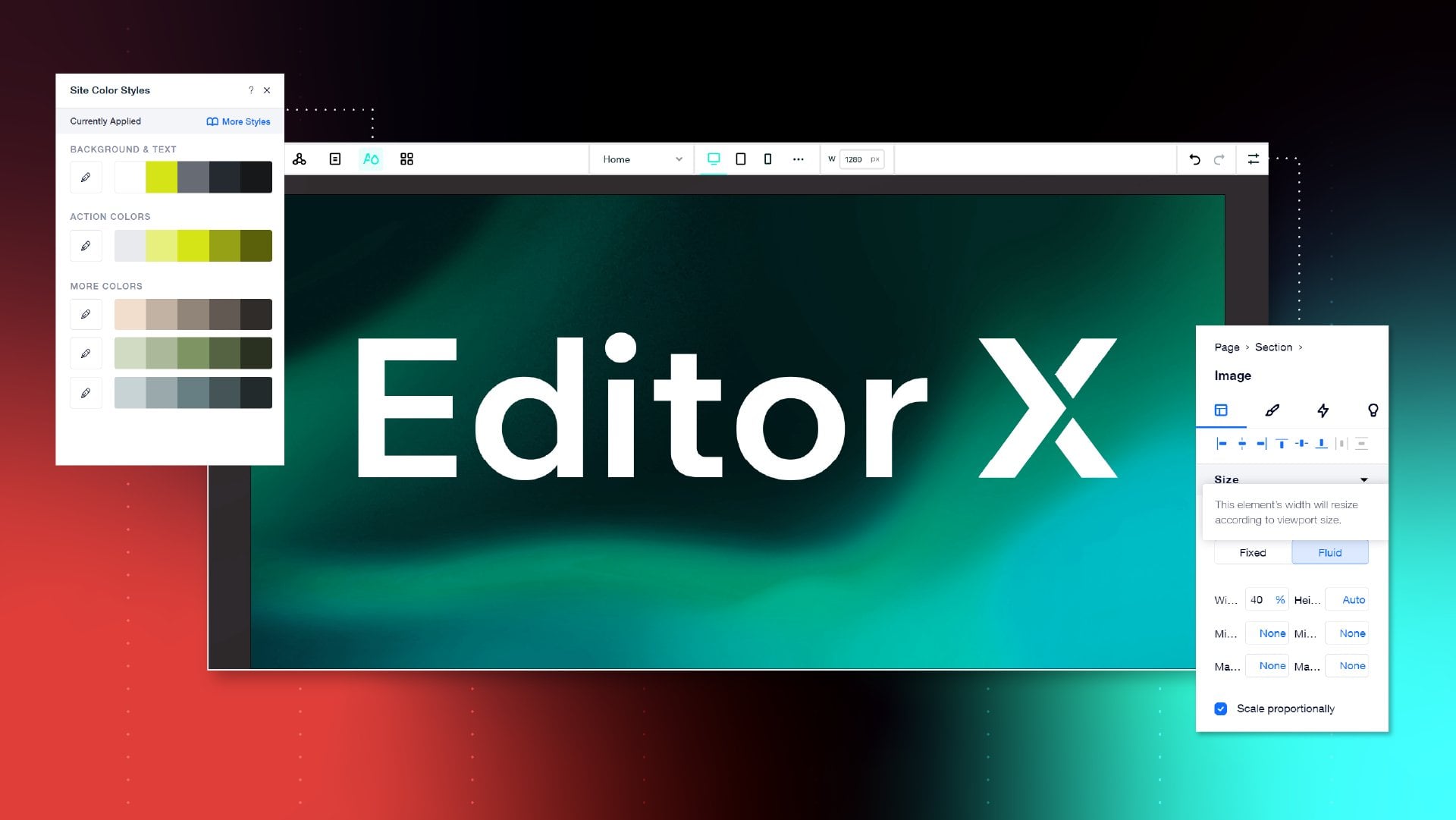
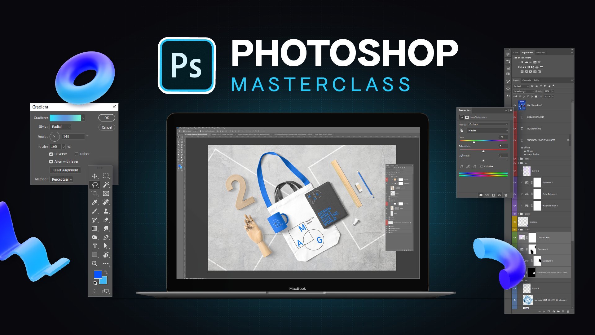
6. Webflow interface basics: Now we're going to get to the fun part. We're going to build this design in Webflow. In Adobe XD, I've just gone and built two pages here as you can see. It's a 1920 pixels by 1080, and you can see just made a really simple, added a bit of work there, some services, testimonial section, key button with a headline. Then we've got a page for a portfolio piece or an artwork. Maybe you're a photographer, maybe you're a logo designer, whatever you are, it can work for you. As part of your class project build up, you're going to need to build up your website, and you can follow along or you can try and do your own thing. You can see here I've gone ahead and exported some of the assets already. If I go to my assets here, I've got the star, the arrow, and then just the other shapes as well. I can import that into Webflow. I'm going to go to Webflow. I'm going to go to the top right corner and click "New Project", and this is in your dashboard, so you can start a new project. I'm going to select the first one where it says Blank, as you can see there. I'm going to click "Select", then I'm going to say Skillshare Class Project , click "Create site". You can name it whatever you'd like, probably put your first name. Now we're in Webflow. Before we start designing, I want to go through the basics of the Webflow interface. At the top you will see this bar, and these are called the breakpoints. Right now you can see I've got this automatic breakpoint, which is the desktop breakpoint. If I move my mouse over it, you can see Base breakpoint, which is the desktop, and you should always start designing on desktop. That reason is, is because when you design from desktop, every change you make following into the iPad view and then the mobile, the designs cascade downwards, so it's like a waterfall. If you make changes on the desktop, it should affect the other ones. But if you design from mobile, the changes you make won't affect the desktop version. Just keep that in mind. What I can actually do is I can click here. I can change the width to 1080. You've also got some other options here, but I'm going to press "Enter". Now you can see it's changed, and this is our breakpoint. I can click the other breakpoint to go to the tablet view, which is iPad view. You've got mobile landscape, I rarely design for this because people don't watch videos like that, unless they're on a train or something. Then you've got the mobile breakpoint as well. The cool thing is you can actually drag this tab. If you know you're designing for a specific phone or mobile, you can drag it, and if you pay attention to the bottom as I'm dragging, it's showing up on the different phone sizes, so 360 pixels is a Galaxy S8, S9, etc. You can see the iPhone 12 is a bit wider. I'm going to click back to the breakpoints. You can see at the breakpoints, it should save the pixels. You can see if I go back, it's not saving the 1080 that I set it to and that's because we need to make a new breakpoint. On the left you see these three dots, I can click that, and you can see I can add a specific breakpoint. Maybe I want the 1920 one, I'll click that and click "Create". Now you can see it's got this breakpoint, 60 percent there, and this breakpoint is at 100 percent there, which is cool. Basically, that's how you use the breakpoints, very simple, very easy. Now we're going to go to the navigator. On the left-hand side we've got our navigator. You can press "Z" to turn that off and on, and it brings that out. This is where we have all our elements and our layer. Think of it like Photoshop layers, that's where all our boxes are, all our layers, and all the things that we're using to stack everything. Your sections, your boxes, your Nav, etc. Top-left, to the plus button, you can add elements. You can also add layouts. If I click "Layouts" I can drag a pre-made layout, maybe I want a Nav bar, Sticky Nav, I can drag that and it's going to add that Nav bar there at the top, super easy. In my navigator, you'll see it'll pop-up, now I've got the Sticky Nav there, I've got a Container. Within that, I've got the Nav Grid, and the List Items, etc. You've got plenty of options here, play around with them, have fun with it, experiment. We've got sections, containers, and grids which we'll most definitely use. The Div Block is the basic block that we build, and we'll always use that. You've got typography, headers, paragraphs, quotes, etc. You got the CMS items. You can add YouTube videos, Lottie animations, forms, components. If you want to add HTML code, you can add and embed, so I can drop an embed code there, drop the code and then it should add the code there, obviously we don't have it right now. The next one is symbols. A symbol is basically like in Photoshop or in Illustrator, when you save a symbol, it's basically when you create a button, you can save it as an object or a symbol, and it'll create an instance so you can reuse it all through the site, and it'll have the same functionality. Super useful, saves time. The third one is your navigator there. Then we've got Pages in the fourth tab. We've got Utility pages, you've got E-commerce and CMS, these only pop up if they're activated, obviously. With Pages, you can see I can click the clog, I can rename the page name, I can set other pages as the home page. You've also got your SEO settings in here, which we can discuss a bit later on. If you want to add a page, you can go to the top left and click "Add Page". I'm going to go and add the pages that I want. I'll make my About page, I'll go Contact page, then we'll go back and go to Work, or you can do portfolio, whatever you want. You've got these pages, so I can drag these, and you can see the reshuffling, super easy to do. The fifth tab you can see is CMS Collections, we're not going to be using that. You've also got the card section, you need to pay for e-commerce, so we're not going to use that. Then you've got your asset manager, this is where we drop in our assets. I'm going to go back to my assets here, drag and drop those files. Before you upload files, what you want to do is go to TinyPNG and compress the files, because you want the site to load faster. The bigger the files, then they need to be compressed, so TinyPNG compresses the images. For example, this file is too big, I can drag it here, it's going to compress the PNG and actually you can see it reduced it by 60 percent, I can download that. That's another quick tip you needed to remember as well. Hopefully, the assets should have been uploaded there. Usually, you're able to drag the button, but in this case I'm just going to click the "Upload" there. I'm going to go locate the assets and click "Open". Now it's uploading them so you can press that button to upload files. You can also add folders as well. You can see I've got all the images there, really cool. Then we've got this little cog here to save your backups, super-easy. Then down the bottom, you've got other little things like video tutorials. If you get stuck, you can always click that and literally watch a tutorial right then and there. If I don't teach something, you can always go back and learn that. That's the whole left side panel. On the right side we've got our styling panel. When we have an object, we can actually style things. At the top right corner, we've got classes. A class is like a style in Illustrator, Photoshop, InDesign, when you create a graphic style, it's like that, that's how I try and think of it. But a class basically sets a specific style for a specific object. If it's for a container, or a specific header, etc. We've also got layout, so you've got your static, your Flexbox, your grid, etc here. You've got Spacing, so we can adjust our margins, and we can adjust padding as well, which we'll go through. You've got sizing, so anything, the width, the height. You've got the overflow, so if image is outside the bounds of a div box or a container, then you can adjust that. You've got position as well, which we'll go through that. You've also got typography, so we've got all the fonts here, super-useful. You've got weight, size, color, align, style, very similar tools if you're a designer and you've used things like that before. You've got backgrounds as well, so we can add images, we can add backgrounds, gradients, we can add clipping, like a clipping mask, which is interesting as well. We've also got border, so we can add a border to an object. We can add a dash as well. Then you've got effects on the bottom here. We've got opacity, shadows, transitions, filters, etc. At the top-right corner, you've got settings. Sometimes when we have a menu, for example, if I'm going to do a Nav, I'll just put a Nav here. You can see the settings, it says header, and then we've got ID, and you get some things there. If I click on the button, you can see it's got the link settings. I can choose this to go to a page for example, choose a page, you can go to a web page or whatever. Next thing is the style manager. This is where all your styles are. If you create classes or styles that you're not using, basically, it will tell you, and you click "Clean Up", and it'll delete all the unused ones. Sometimes you might have an element and then maybe you style it, but then you decided to make a new button on a different page, and if you don't want, you don't need it anymore, you delete the style. Then the last option is the Interactions menu with a little thunderbolt, which is a cool icon, and here is the way you can add triggers and animations, etc. Basically, this is the basic interface of Webflow. Then we're going get stuck in, we're going to start designing. One last thing is on the top-left, you can click the Webflow button and click "Dashboard" or the "Project Settings". It will take you back. You can see if you need to upload fonts, you just go straight to the fonts. If you want to get back, you click the "Designer" button with a little paint brush, and it will take you back to the Webflow designer.
7. Account settings: [MUSIC] I'm going to show you how to use the basic account settings in Webflow. Once you're in the dashboard, you can see I've got a whole bunch of websites here, these are my current websites and things I have archived as well. Now to access the account settings, what you have to do is go to the top right corner, click, "Account. " Click, "Account settings." Now once you're in here, you're going to get all these tabs up the top left corner, so you can see all these tabs. I'm going to just quickly go through them and show you what they're about. First you've got profile. You don't need to worry about this tab, it's basically just your basic account information. That's basically not necessary. You can also upload a picture. I recommend uploading a little picture so you can see if your account does help for visuals. Click on, "Plans." I'm going to explain the account plans. There's a difference between account plans and hosting plans. Hosting is where you actually host a specific website with all the hosting features and then account is an actual account to create websites with Webflow. I recommend starting with the free account because it's free. You get two websites. You're also able to do client billing and free staging. Now free staging is when you're able to preview website live, not on your own domain though it will be webflow.io. I'm currently on the Lite plan. That's what I recommend, unless you're a crazy full-time web designer and you want to do he's of client projects, then go the Pro plan. I think the Lite plan planet is enough. You can have up to 10 websites. They call them projects. You can see it says 10 projects here. We've also got client billing, enhanced staging and also code export. I don't use the code export because I don't necessarily develop outside of Webflow. These are the account plans. You can filter by annual on the right corner or click, "Monthly" and you can see the price would change to $24 a month. You can click on the next tab of the top where there is billing, you have your number you have your card, and you can always change or move your credit card as you can see there. You can also see the subscription amount that I'm paying per year and then obviously all the site plan that I have basic hosting. You can see I've got two sites with basic hosting, $15 a month. The invoices and you've got any changes in past invoices there as well. Next is the integrations. Integrations are if you want to put a API key. Maybe you got a third party template that you need. I'm pretty sure you can actually use Zapier with Webflow and some other tools which allow connections aren't currently having integrations, so I didn't bother with that. Next one is the billing tools. This is when you want to bill your client through Webflow. Maybe you want to have a maintenance plan where you update the website on a monthly basis. This is where client billing is really cool. You can set it up, you get started here and you can set up how that billing will work. Most likely it works through Stripe or PayPal. The next one is Purchase Template. If you do Purchase Template through Webflow, it will pop up through here. They've also a ThemeForest here as well. If I Right-Click on Browse Templates, you can see they do have a lot of templates which are like whole bunch of stuff and you can see they're always updating with fresh templates. Here's someone that doesn't want to bill from scratch, want to save time then invest in a template. It will show up in this second here in the Purchase Template section. The next thing is the email settings. If you do put a stand at Webflow form on your website, this is the email that the formal send the emails to. You need to make sure that this is the main email that you're using. Then you can select the email notifications. That's pretty straightforward. You can choose what you want to fill in the newsletter, etc. That's the email settings. You've also got security. Here you can enable two-factor authentication for more security and you can change your password and basically that's it. It will show you the login details, the activity if there is a suspicious activity but I don't anyone would be hacking your Webflow account anytime soon. One last thing, if I go to the top right corner, you can see it says go to public profile. In Webflow, what happens is that you actually have a public profile where you can share your actual websites. You can share this with the community. You can see I've got 90 views on this which is pretty cool and someone can view my site and check all that out. You can also edit. You can also turn it off as well if you don't want it to be seen. That's basically how you use the account settings in Webflow.
8. Site settings + change fonts: I'm going to quickly show you the project settings when you want to see the backend of one of your websites. I'm going to use my example of my current website, jeremymura.com. Once you select a website, you can left-click on it and it'll say Open Designer, that will take into the design part where you can start building a website. But instead of clicking that, I'm going to click the three dots here then and click on Settings. You can see you've got other settings like duplicate the website, you can move to a folder, you can share the link and you can also go to the editor, which is the client side of the editing. Now, I'm going to click on Settings and I'm actually going to show you this section because it actually is important in terms of building the websites. In the general settings, you can see you have your name of your website and then you've got the sub-domain. When I'm staging the website and to preview it, it's going to use this domain there. Now, in terms of the Favicon, you want to pay attention to this Favicon, it says upload size is 32 by 32 pixels. When you do an icon in Illustrator or Photoshop, make sure you do save for web and you save it as a PNG or JPEG in that sizing and make sure that it's all nice. You can basically click Upload and then drop the image in there. Then you have a nice little icon at the top of your browser, when in the tab, that's a Favicon. Now the web clip, this is only for iPhones. Basically, I don't need that but I put my logo there anyway. Same thing, you just save for web and save it as a PNG or JPEG to upload it. You've got localizations at the time zones and you can also put a website passwords so you can click that on and put a password. In case you want no one to access it by accident or a hacker or something like that, you can turn that on. I don't typically use it because my other tools that protect my browser. Now showcase, as I've mentioned in the previous module, what you can say is if you want your website to be showcased on public and people can view it on the Webflow showcase, on landing page, then you can turn that on, but you can always turn it off so you just get your public profile. You've also got the option to leave the Webflow branding on. If you want to like a little badge at the bottom of your website, you can tick that on. You can see, obviously, I've turned it off because I just don't want it, but I leave workflow in the HTML, so if someone wants to check the website. So if you press F12 on a website, you can see Webflow will pop up somewhere in here. I could go search, I could type Webflow and it will pop up here in the HTML code. I'm going to just click save there, and then it just always has side activity at the bottom. Cool. Next thing is hosting, so if you want to host a website, then you need to select the right plan. Now for my basic websites, if I'm building just a portfolio for myself or it's a small business that doesn't need crazy things, then you just select the Basic. I'll give you all the options here. You can read that into your own time. You got the domain SSL included so I was protected, you got a CDN, bandwidth, 100 pages is plenty, and you got 100 form submissions, which is cool. Now, if you do want CMS, CMS is a Content Management System. If you can have a site that has a big blog or has multiple projects or planning pages within it, then probably CMS is the best to go. You can see the pricing there. Now, if you want to do like a bigger business, then I would select business. If you want to do E-commerce store, you just click E-commerce and the prices will go up significantly, so that will double, but you do get features like Stripe and PayPal integrations. You got customers who checkouts, CMS, tax, shipping, etc. I had a client that did use the standard one for this and it worked really well. Then obviously if you select annual, the price will go down. That's for hosting. So when you're ready to host your website, all you got to do is just select Basic and then pay and you're good to go. You only have to host when you want to, because the account gives you two free websites, you can design as much as you want, which is pretty cool. Now, the editor is the editor setting. So when you want to add a collaborator, you can invite someone. Here, you can see that my email, I can edit and publish. To do more collaborators, you need to add a CMS or business site plan, so you need to go up at here. Also, to get white labeling, you need to upgrade as well, and this will give you access to this. This is great if you want to have co-workers managed design or multiple clients or people in the client's team manages their site, so this is a good feature. You've also got billing here. Once again, I can see the exact billing for this specific site and then client billing, similar to the other settings I showed you in the other module. Then we've got SEO, so Search Engine Optimization as we most of us know. You've got indexing, so I don't want my webflow.io to be indexed in the search engine so I'll make sure you want to turn that off so it's disabled. You've got Robots.txt. If you need to upload that text, you can do that. You want to auto-generate sitemap, I had that on so tick yes for that. It just saves you time, so Webflow does it automatically for you. You can also put your Google site verification. If you're using Google Analytics, this is where you put your key and connect up with that, makes it really, really easy. Then this thing, I don't know what that is obviously that. Onto forms. A form is when you're just using the basic Webflow form, you're not embedding one from say Mail or ConvertKit, you're just purely using the form within Webflow. This is the details in the filling here. The name, the email that I was sent to, so I want to change this to my hello email. Subject line that can be new submission, and then reply just would be either. If someone puts it through your form, even though in this website I don't particularly have a form, but if you do, I will send that to my email. You can also put the email template as well that will send a little thing to the person replying. You've also got recapture validation, I don't use that, and then you've got integrations. You can also hide form submissions if you want. Restrict uploaded access, I just had that on and just leave it like that. Now, one of the important ones is fonts. If you do want to upload your own fonts for a website design, you need to come here and do it here. It's super-easy, it's super simple. Obviously, I can choose fonts from this list here. They've got actually a lot, they've actually added a few more than one then the last checked, so you've got to hit the Google Fonts then. But you want to come down to custom fonts. Now, you can see my Installed Fonts. I've already uploaded these custom fonts, which is my Montreux font. You can see the style, so normal, Italic, bold, etc. Then obviously, it's a W-O-F-F file, that's the file you should upload as. You can see, I can go to the right-hand side and delete the fonts I don't want. If I have one I don't like, I just delete it. You can see that it's got just backup fonts there. It's super-easy, you can put Adobe Fonts as well, API, but just better off just leave it, just download the font. If I click upload, for example, I will go to my font section. You can see obviously uploading font. It's going to import it into this window like this. You can see the name so I can just take them off 400. Make sure you select the right weight. Whatever the weight is in your programs in InDesign or Illustrator, just double-check. Normal, and then you can see, I can swap it, I can turn the order, etc. Then I'll click Upload File and it'll upload into here. Right now, I don't want to do that, so I'll just leave that, but it's so easy and fast. Next, we've got backups. Backups are straightforward. The website automatically saves a backup for you, so you don't have to worry about that. Super-easy. You can preview or you can restore. Maybe the design, it didn't like it, you can just go back. Super-easy. Next up is integrations. Now, here for this specific side, I have my Google Analytics because it's tracking this specific site on my other sites. You can see my Universal Analytics Tracking, this is my code. Now, if I log into Google Analytics, it's all going to be connected. You've also got Facebook pixel. Here's what I'm doing. Ads, it's connected to this pixel here, and you can get a code for that. Then the last final one is adding custom HTML and CSS. You can see here, in the head code, I've got this code here. Now this code is from Flodesk, my email provider. If I go to Flodesk, I'm basically using an API from inside my account. This is what I use for my emails. Basically it's telling Webflow to pick up the forms that I've created in my Flodesk. Then there's all the tabs in the party settings. You've got some other things up here, like transverse, if you click this button, you can transfer a site to your client. I can break that down in a similar video. You also have the share button. You've got the designer button, the edit button, and the publish, and these are all available in the designer.
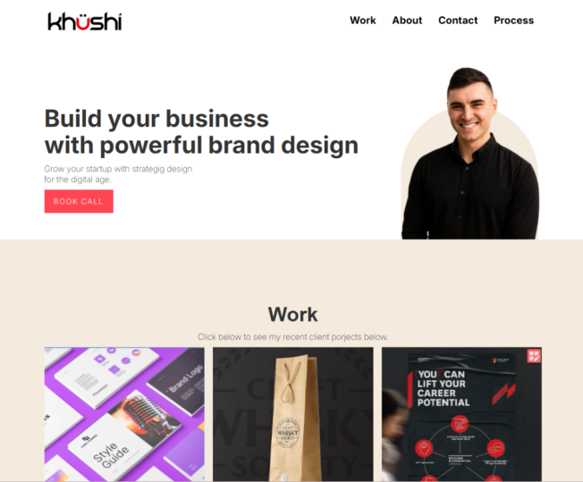
9. Nav + Hero: First, we're going to work on the Nav, so I'm going to go to Webflow. I'm going to go to the left-hand side and I'm going to go to layout and usually, I just stick with the Sticky Nav here, just simple and easy. Right-click. I'm going to double-click on the "Nav logo" and left click and click the code there, choose image and I'm going to select my logo that I've already uploaded in the images. Cool, so the logo is in, now I'm going to go to the right-hand side and go to the sizing so I can change the pixel of it. I'm going to go down and do like 150 pixels. Beautiful. That should look good. Now, I'm going to go to the Nav and on the right-hand side you can see inside this box we've got a container and inside we've got the grid which holds these lists of these other names. We've got a list item and then between that is just the link and these links go to another page. I need to go and upload the font, so I'm going to go to project settings. I'm going to click on "fonts" and I'm going to go and click "upload" and I'm going to locate my fonts inter, and I'm going to need bold, regular, and this one, extra light italic so bold, regular, extra light italic click "open" and you can see there in there, and then I'm just going to click, "upload," upload, and upload and now I've got those fonts beautiful. Now, I'm going to go first change to the website. I've got to work about process and contact. You've got work about. Now, I can also press "control C", "control V," and it should duplicate it. If I do it from the left-hand side, you can see, select the list item and duplicate that like that, as you can see in the navigator menu. I've got work, about, process, and contact. Now, I can leave this button here if I want, I'm just going to delete it and make sure you delete the button in the list item so we can see there. All right, so I've got my menu here and what I'm going to do is I'm going to style it. For this menu, you can see I double-click it, it's 29 bold in top. I'm going to go down to topography, I'm going to find my font, which I'm using inter for this, I'm going to go and select the style, the weight, which is also the style. Click "bold " and I'm going to make it 29, which is obviously too big at this size, but at this 1,920 doesn't look that bad so I'm just going to adjust it and let's go 19. That looks good and the color, I'm going to just make it like a black for now, and then please click "plus," and you can see here, create. Now, if I go back to XD, you can see I've got the colors here, different colors, so I can go ahead and add that in. I'm going to double-click, select this and then I can paste the hex code in here, and left-click off it and then click "plus" and you can see it adds it and I can name it whatever I want. I can change it, just make it gray, press "create." I'm going to quickly do that for these other colors as well. What you want to do is if you're on the topography, click the "color" and we can go in here and we can add these in. Now, you can see this one, the contrast says fail that's for accessibility reasons. It's really good how Webflow makes that happen, but obviously, we can still use the college doesn't matter if it says triple A that's really good. It's just for contrast reasons, but in this case, should be fun. I'm just going to delete that color, paste that, and click "plus" and create. Beautiful. All right, so we've got all our colors are really cool. I'm just going to make sure I've set the black color, and for the background as well, I'm going to go down on the right-hand side of my sterling pound go to backgrounds and click the color and I'm going to make it just fully white as you can see and now we've got our Navbar. You can see that it's fully responsive if I go to the mobile view. Beautiful. That's the great thing about Webflow. It's just automatically responsive because we've used those layout templates. Amazing. Now, we're going to start to build out the rest of this. You've got Sticky Nav here and now a cool trick or shortcut is you press "control K" and I can type in anything. If I can type in div, I can type in section, I can type in container, whatever it is. I'm just going to type in section, and you can see I'm just going to drag this out. I'm going to drag the Nav inside that section, and then I'm going to control K and press "Container." All right, you can also go to the top-left and do it from here and just drag and drop a container like this inside the box, that's fine as well. We've got the Sticky Nav, we've got the Container, but you can see it's inside the Sticky Nav, so I'm going to drag that out like this and drag it below. You can see the layers matter. Make sure you drag at the right location. I'm going to press "Control K" and then select a div block. A div block is basically just like a normal block. I was talking about four issues to build a building block, like a logo block or a container, a box. What we want to do is, we want to give it a class, or a tag. For this one, we'll call it wrapper and we can make the width a certain pixel, so it's at 940. I can make it 1,080 if I want. It's going to extend past that. I can make it 500 pixels if I want, as you can see there, so it's really up to you what you want to do that. I can lay it like ideas, but let's just say you do 600 pixels, you can go to the spacing button, and click this little square, and it's going to center the box. Now for example, if I go in drop an image inside that wrapper, you can see it's fully centered and it's only 500 pixels. Now if I click the "wrapper" and make it 1,000, it's going to expand that as you can see like that. It's pretty simple. I'm just going to go back. I'm just going to leave it at 940, because it's set that. Now what I wanted to do is add some elements, so I'm going to go here, I'm going to add a header. Make sure you left-click and drag inside the wrapper. I'm going to press "paragraph" as well and then we're going to need the two images as well. I'm just going to copy and paste. I'll copy and paste this into there, and then we've got a button as well, so I'll go plus, locate the button and then drag that down like this, so you've got a button there. Cool, I'll just leave the images out for now. Cool. Now, what I'm going to do is I wanted to style these. This is a inter-bold 85 points. I'll go down to topography, type 85. It might look big, because I was designing for this size here basically. I'm just going to make it 45. That's cool. We'll go Inter, Bold. Excellent. This one's Inter, Regular, or Normal. Sometimes it doesn't show the names properly which is fine. I'll go 16 pixels. Usually, 16 pixels is good. For the button, I'll go down to backgrounds, on the right side, and then I'll just left-click the color I already had there. Button, I have the color. Now for the text, I'm going to go to type, and I'm going to click the "menu" where it says more type options. Now, it's going to give me the ability to capitalize, so that I can capitalize my button, as you can see there. I can double-click this, paste that in, and I'm going to adjust the kerning a little bit, also known as the spacing between the letters. I can see letter spacing if I type five, you can see it's going to space it out. That's just too much. I want to do maybe two. Oh, yeah, I might just do two, and then I'm going to change the font as well, and that can be on normal, as you can see there. It looks pretty similar to that. Beautiful. Now what I can also do is add extra padding. You can see we've got padding here. I can hold Alt and if I hold Alt, It's going to scale up both sides, so I can hold Alt and drag it out. Maybe I want to add a bit more space, and maybe I want to make 12 pixels. On the side maybe I want to get a bit bigger like that. Okay, cool, That's a pretty solid button. We've got our wrapper, we've got the heading and paragraph, and button. Now I can give this a star. It says heading, so I can do heading and type H1. Now I've added a combo class. I can remove that class and just rename this one to H1 heading like that and press "Enter." Now, this is class H1 heading, this is just paragraph, and then this is just button. You can always rename it. Just remember whatever other objects in the Website you give that class too, it's going to add the same style to it. Okay, cool. We've got that. For this wrapper, I'm going to add a combo class, I'm going to call it hero. We've got wrapper, hero, and then what I wanted to do now is I'm going to add some padding to it, and maybe many pixels, give some space, give some breathing room. Cool. We've got this section as well. Now to this section, I'm going to add my images. Instead of adding the images into the wrapper, I'm going to add it to the background. On the bottom right you can see it says backgrounds, images, and gradients. I'm going to click this. I'm going to go the right side. You can see choose image and I'm going to select my little guy here. I'm going to click "contain" and I'm going to adjust this. I'm going to take tiling off. We don't want to tile this guy here and let's go 90 percent. We can go custom. Maybe I just wanted to set in pixels. I can do maybe 400 pixels. The width and the height. Cool, awesome. We've got this guy, now we're going to add a bit more padding to it. The section, cool. I can add another image as well and I'm going to add that rectangle, turn the tiling off, and then I'm going to bring it to the same position roughly. It's too big, so we'll go to 50. There we go, and I'm just going to drag this to the bottom so you can see, I'm dragging it under Jeremy and you can see now I've got that guy there, which is me. I'm going to go to my section and I'm actually going to add some padding. If I move the padding, you can see it moves the bottom part, if I add margin, you can see it adds space outside remember, but we want to just remove the padding so you can see the Nav is wide, so that's why the head's getting chopped off, so we want to bring this down. Let's just say a 100 pixels, and we can bring this wrapper down as well. I'm going to add some more Padding there, and I can bring this up like this and click on the "back section" and if I want to go ahead and maybe fix this, maybe 250, make it smaller, I can adjust this and you just got to play around with these settings and then if you play around you can see that. I'll just control Z to go back. I can turn the 2X off, but that's off. You can also add gradients and stuff like that and as you can see, well, I'm just going to control Z and get [inaudible].
10. Work + Services: Cool. Once we're done with that, let's start to build the next section. I'm going to click the ''Plus'', add a section, drag and drop it in. As you can see, beautiful, now I've got the section. I'm going to start to build at this. Now, I'm sure they might have a layout here. You can see they've got a card section. I'm going to literally drag that and drop that. You can see sometimes it adds the section automatically, so we could just delete this section. I'm just going to start to copy this text here. Now, to make this text the same as this one, all I got to do is select the heading and type h1, and I can see existing classes. Now, all I got to do is left-click and it's going to add that same style on class. It's going to extract the same font and the same font and bonus style. It's super easy to do that. Resume in here, copy the text that I already had, that I already wrote, delete this paragraph. Then now I've got these cards, which is really cool. Now I can go and choose an image. I double-click on this image, click ''Choose Image'', and then I go and add that like this. I've got this one, beautiful. I'm just going to quickly do this. It's making the process very simple. The paragraph style, make sure that these have the style of this one. I'm going to go type paragraph, add the class. Even though it has the name of the paragraph, but you got to add the class to it. Styling on the side, and it should take the font. Beautiful. Now what I'm going to do is click on the Cards Section. You can see I'm on the Cards Section area. Go down to background again, but this time we're going to click on ''Color''. I'm going to select this and select the nice cream color. You can see what it's looking like. What I'm going to do now as well, I'm going to go to the grid container because it automatically added a grid. If I want to edit the grid, I can click just on the card behind it and click on the little red square there. I can adjust the sizing. If I want no spacing, I can just make it like this. I can shorten one side if I want, it's really up to you, and I can left-click on ''Done'' to get out of there. Now what I want to do is inside of this card, we've got the image mask and then we have a div block as well. The div block, I'm going to make the background white for that. I'm going to go white, click ''Plus'', which is awesome. I can type, I'll call it card block. Now, for the other ones, I'm going to give it the same style. Once again, type card, go to the existing class, and then apply it. In the card block, you can see the text too far to the left. I can click on the card block and add a bit of padding. But you can see it's going to change the images. As you can see there, it's adding padding all around everything. But what we want to do is add just padding to the header and the paragraph. We can add a div and put these inside of that div or block. What I can do, I'm going to go div. On the left-hand side, I'm going to drag the header and the paragraph inside of that box. I'm going to call that card text. Then on the left-hand side, I'm going to adjust some paddings. Now you can see the paddings there. I'm going to do about 20 pixels. That looks right. I can hold out and figure it out [inaudible]. I'm just going to eyeball it. I don't want to take too long. Then we sweep. Then now all I got to do is do the same for these other ones here. Go to the Selector at the top and tap card text, and there we have it. Boom, sweet. Now we've got these cards looking just like I would design them. We can add a little bit of a shadow if we want, but I'm just going to leave it for now. It's in a centered container there and the card's great. I'm just going to add a bit of padding on top. Let's go 40 pixels just to give some space breathing room there. Beautiful. Now what I'm going to do, is I'm going to add another section. I'm just going to drag it here. I'm going to drag it on the bottom, make sure it's blue, not red, as you can see. Sections have to be separate, they can't be inside another box, etc. This section, I'm going to make it the same color as before. I'm going to add a div block and I'm going to name it the wrapper. You've got the wrapper there and we just need to add a container as well. I'll go to get a container. Remember, you can always make a class for the containers if you wanted a certain width, but I'm just going to do it like this. I'm also going to change the color of this text, this isn't meant to be black. These headings should be h2 header. Make it black. I'm just going to add another section. Control K. Sometimes it doesn't work as you wanted. I'm just going to add another section just so I can see the container and the wrapper I have. What I'm going to do is add a div. I could also add a grid if I wanted to and put one in each. I could also add a column. I could click ''Plus'', get columns, and then drag it. Drag that inside the wrapper that we have here. I'm going to press "Control K" and type image. Drag that here. Then I'm going to press "Control K", type header, and then drag this like that. I can also go here and, once again, drag the paragraph. I'm going to copy, paste, copy all these texts as well. Obviously, I can make a list and do it that way, but I think this is just a faster [LAUGHTER] way of doing it. Once again, just adding the styles as I'm going. Now, you click on this image. I'm going to choose image and then I need to upload the one that I wanted. I got this image of Unsplash, looks good. Awesome. I can press shift enter here to do a breakpoint, you can see the end, just so you make the text more tight. That is looking good. I can add padding if I want, so 20 pixels to align it more to the text. That's totally fine. But I think it looks fine. It's just nice to name. You can also name your sections. Obviously, it says Section 2, I can name this section services. I can even do a dash, sometimes it's nice to add dash, section dash services. This one's card. You can always go back and add the sections. Just remember, it may alter other parts of your site with the same style. So make sure you do name things from the start as best as you can. I'm going to go container and then div block, style that wrapper. Then within that we are going to have a header. You can see. You can also choose the different headings as well. If you add a global tag, so if I left-click, you can see it says HTML tag and if it's pink that means if you do that all the tags with these settings like H1, H2, H3 each one has its own style. It's similar to like adding a class width but this adds it to all of like a default global tag. I just like doing a class, it's just easier to keep track as you can see here. We've got testimonials Now we need to have this sentence, and for this one, what I'm going to do is I'm going to make it a combo class and just call it center. Now I'm going to go to Typography and click the Center. There. Now it should center that text as you can see there. Really easily. Now for this section, I need to add a bit of padding there just to get it away from the other section there so we get some space. Now I'm going to get a paragraph. Sorry, not paragraph. We need to go and add a grid here. Let's see layout, see if they have any thing similar. They don't have testimonials. I could probably do a card section again. But for this one, I'm going to add a grid. I'm going to drag a grid here inside the wrapper. On the right-hand side, I'm going to add another column. What you want to do is click the little plus button here and you can also do it on here as well. The rows, I'm going to delete the row and have three columns like this. Now what I'm going to do is go paragraph and then we've got like a little text there so I could do paragraph again, but I'm going to go header. We can go H5, so all H5 headings. I'm going to click in the selector at the top right. All H5 settings, we're going to give them Inter and we're going to go extra light just like this. Then I can go ahead and copy the name like this and just make sure I drag it inside, make sure it's in the right grid. I'm just going to make a div block so I can drag the things inside of there. I'm going to do in this circle. Sometimes it doesn't work properly. I'm going to drag inside there and drag the paragraph inside there. Now we've got a div block. Now it's always best to create one thing first. I'm going to add 100 padding on the bottom. It's always good to create one block first and then you can copy and paste so it's a lot faster. I'm just going to quickly change the font there to the normal. This is going to be paragraph. Make sure it has the right naming convention. Cool. I'm going to paste it in there and because this is centered, I'm going to make a combo class so you can see two classes there. I'm going to go to typography and center that like this. I'm also going to heading 5 and center that like that, boom. Just like that, we've got a nice element. Now what I can do here is I can press a div block as well. For this one, I'm going to add image and I'm going to add the stars. It will be better if I just had the five-stars by itself as one image, but for this I could just control C and paste it in. But it is better if you just had one image. But now I've got a div block with five images of the stars as you can see there. Now this I can just call it star as a class and then add a bit of padding, as you can see there. Maybe six pixels. I'm just going to delete these other ones and copy paste it again, so it has the padding there. There we go, and there's this block, I'm going to call it star review, and then I'm going to center this. I'm going to go to my flexbox display. In Layout, I am going to click Flexbox and then we want to click on the center here. It should align that to the center. Now we've got our testimonials. It is looking pretty good. Now I'm going to add a bit of padding here. I'm going to get the div block, I could call it card-testimony. Then I'm going to copy and paste that same thing. Literally we just duplicate it like that, really easily. Now I'm just going to copy all this text here. I've got my client names which I renamed. I didn't want to put their real name. There we have the testimonial section. There we go. Beautiful. Looking pretty [inaudible] . Now almost done. Just one little section with the button and the footer there. I can go to the Navigator. If I want to press this, it will pin it so it's always there, but I like to have an unpinned so I have more space to work with. You can see, yeah, that's how I like it. I'm going to go add another section, and drag it to the bottom. I'm going to do section-CTA, change the color. Then what I can do is copy this header and just paste it in here. First, let me get the container and then div block. Then I'll paste it inside of this, so it's in the wrapper. It's always good to make sure that remember that the boxes that we're stacking everything in keeping it neat and tidy as much as possible. For this text, this should be a H1 center. There you go. Then all I want to do is I can go ahead and copy this button if I want. Now if I want to make a symbol out of this button, all I got to do is go click "Create symbol." I can also right-click. It would ask me to create symbol here as you can see. Then I can call it main button. Create. Now it becomes green. Now this button, I can give it settings, etc. But it's actually really useful. Now I want to go to settings, I can always use the same instance. I can drag and drop the button instance and you can see it says main button. I can always right-click and I can click unlink instance. This is going to make sure that this button is not the main edit. Because if I edit this button, it's going to effect this button and so I want to unlink it basically. I want to add another div block and just chuck the header in this as well because you want these things centered. Then this, I'm going to go click on the Flex, click on Vertical, and then Center. Now it's wrapping and putting that object in the center. It's aligning it and justifying it to that div block that we just made. We made it actually did block inside the wrapper. Let's call it center align for now. Make your brand stand out. Press "Enter." Now I might adjust the letting here. It's a bit tight. The heights, let's go 50. There we go. The letter height, okay, that'll be better. Section CTA, I'm going to add a bit of padding, so I'm going to hold Alt, drag out. There we have it. We've already built our page up. Now for the button, I can click the cog, click a page and let's just say it's going to go to Contact page, and click new tab. Now if I click the top left, you'll see preview. Now I can look at how my site would look like. There's a bit of an issue here with image. I might have to fix that. It could be because my PNG is a bit off, but anyway, it doesn't matter. For example, click on the button now. I can left-click it and I'll go to the other page. Obviously there is nothing on that page. In literally like 20, 30 minutes, we've built this site. I'm going to get back to my homepage and we can make little adjustments. For example, this button, and what I can do is do a hover state. I'm going to go to the selector at the top, click the drop-down menu, click on Hover. Now, what I want to do here is go to the color and I can make it go black or like a dark red. So maybe I just want to go like dark red or something like this. Now if I click on a None, so I'm changing the states from hover. So this is the hover state, and then I go back, click "None". Now if I click "Preview" put my mouse, you can see now it has a hover state, which is awesome. It feel so good when you do that. Now, you can do is press states, you can do focused, etc., but I'm trying to keep it simple and leave it as that. Amazing. We've done our page now, I want to build the portfolio page.
11. Footer: I'm going to quickly finish off the footer out and then we can move on to the next page. I'm just going to go back here and copy these links. We can see here. Copy these. You can see the texts are in each separate list. You can see it's a list and then within the list is a list item. Each text is basically a different link. We might need to just type home, about, and contact. Then we're going to delete the other list items, so we're going to navigate to the left and just leave those, and then resources. I can just type tools and freebies. I'm just giving you guys some ideas on some things you can have in the footer. Usually, it's just extra links to help people find or contact you if they are lost. Then you've got socials. Well, it's called Meta now, so we'll just call it Meta. Instagram, Twitter. Then you've got this text here. Now we can double change the image of this. Usually, I like to just chuck in the logo, which is really cool. Maybe you can add that in. Then the footer heading. I need to change this to inter, and we're going to go bold. That's fine. Then this footer link. Same thing, just going to go inter, normal. Then pump it up to 16. I think that's really cool. The bottom page. I can copy this text, copy and paste, like that. We want to make sure that it's going to look similar to how we designed it. I'm in the footer here, and I've got different div blocks. If I copy and paste one more div block, you can see other links. I'm going to drag the text blocks inside of them and just delete the list items, and the header can get deleted. You can see that, and I'm just going to press Enter on this, and it should make it like this. Then on this div block, I'll just call it a copyright as a class, add a bit of padding on top to bring it down if I want, like this. You can see it's sort of aligning there. I'm just using my eye to roughly make it exact. I think 40 pixels will do. Then just change the font, 60 normal. There we go. I can link the logo if we want, but obviously, it will change the size and everything. But I think that looks fine. Basically the same thing. There we have our main page, is looking great. Now, a few things I want to do. I want to select the footer, and I want to right-click and make it a symbol. So I'll create a symbol, and I'll call it a footer. Now when we use it on the next page, It's going to be the same. Then I'll do this sticky nav as well. Create symbol, and I'll just call it nav. Now we're good to go. What I'm going to do is I can go ahead and duplicate this page for the work page, or I can just go to the work page.
12. Project Page: Let's start to build that out. I'm going to go to my tab on the left, and you can see I've got one new symbols, the Nav. Then also I can drag the footer there as well. With the footer and the Nav, then what I'm going to do is press "Control K", Find section, and just bring that section there like this and I'm going to start to build out the secondary page, which should be pretty easy. We're going to add a container here and then within that a div block. Then we name the div block, the wrapper. Then within that we're going to add a heading, which is going to be a H1. Make that black. Make it like this. I'm going to call this wrapper and then add another class called work. I'm going to add some padding on the top there and the bottom, it's got 100 pixels. I'm just going to add another section as well. Below that for the next part, I'm going to just change the color of that next section. For this one and then we've got the text as well. What I can do for this one, I can add a grid. I'm just going to add a grid and we don't need any row so I'm going to go click the little bin. I'm going to use this, I'm going to drag it to do 1.75. I'm going to click down and drag the heading inside of that box on the left. Now on the other box I can go on paragraph and it's now inside of that grid. We've got basically two columns in this grid and the cool thing about a grid is it makes it responsive. We just need to make sure that it's vertical and it will stack on top of each other. But it's basically uses Flexbox, which is great. Then I can just like come in here, copy and paste the text. I'm going to have to select this type and you can select it. You can see you've got some options here, so I can insert links. I can actually wrap with the span. If I need to make a custom class within this paragraph, I can do that. If I click this and then I call it is it H3, H2 header, it should work. I'm just going to add header, we can go H4 header. I'm just going to drag it inside of that. I'm just going to make it a div so we can throw the things in that box. Now all these things in its own box and then I can type role, so I can delete it here. Just typing dashes. I can copy paste the header, I drag it below. We add a paragraph and then just paste that in like that. Then the year, same thing, copy paste, drag it underneath. We've got year and put a paragraph, put 2020 like this. Just need to style this with the paragraph class. Paragraph. Just like that. Then boom, we have a thing like that. We'll just go to template design, excellent. Now we have our page here and looking good. It doesn't have to be exact. We can always just make things easy like this. Cool, so now what I'm going to do, I'm going to add the images. I can actually add another grid if I wanted to, just keep it really simple, I'll get rid of the rows and get rid of the column. Now I've got one column. I'm just going make sure that grid is within the container. We make sure that it's centered. I could put it in the wrapper but the container already centers it. Then all I have to do, I can call this Grid 3 and we can just go call it work. Now, I'm going to go and select an image in the media section and I'm going to drop that in. Choose the image and now basically I can start to paste this in. What we want to do, you can see how this section overlaps it. I'm just going to adjust the padding of this grid like this first and the top section, I can bring up the margin. I can also adjust the padding as well. First, I'm just going to copy and paste the images and then I can just go through, it's just duplicating the image block and then I can just go through and change the images. I'm double-clicking, replace, replace and now you can see that we've got these images just like that, which is what we wanted. To overlap the sections, all we have to do is go to the grid and I could do it on the container. But if you do that, it's going to change all the containers with that thing. But I'm going to go to the grid and I'm going to change the padding and drag it downwards. I'm just left clicking and dragging to make it minus. Let's go minus 135. I'm going to add some more padding to the top section. Let's go 100 pixels and then we'll go back to the grid and get minus like 150, as you can see down on the right side. Now you can see we've got these overlapping effect. Now if we go to mobile, you can see that it's still overlapping, which is cool. Beautiful, too easy. Now, we're just going to add the last final touch. I'm going to add a div at the bottom here and then I'm going to add a header for the next project. I'm just going to name it once again, wrapper. Next project, this can be a H1 heading and then what I'm going to do is I'm going to call this wrapper next, just call it wrapper next. I think it's inside the grid, so I just need to drag it outside the grid for a sec. I'm just going to make another container and then put the wrapper inside that container. Make sure I'll drag it out of there, drop it in here, and just make sure that it's inside the section. You can see the lines, it tells you where it's located, so I just want to drag it on top of that. I usually just drag under like that. Now it's inside that section. I'm going to add some padding to this section. Let's go 135 pixels and in this wrapper next, I've got this and then I need an image. I'm going to chose the image, I'm going to select the arrow. Now to get the arrow next to that, I'm going to go to the wrapper, I'm going to go to Layout click the Flexbox and you can see now it's switched to horizontal. Now on this image I can give it a class of arrow and then add some padding like this. The arrow is a bit too big, so I'm going to make it smaller. What I'm going to do is I'm going to go to the high and just change the percentage. You can see if you click the little button here, you can change the pixels. PX is pixels, you've got percentage, you've got EM, you've got CH, which you got VW, which is view width, VH which is view height, and then you've got auto. I typically just use percentage, pixels and sometimes I use the view height as well. But for this I'm going to use percentage. It's inside this wrapper, this wrapper goes all the way across. It's basically, at the moment the width is 39 percent of the total size or width of the actual wrapper. Going to press Control Z, I'm going to just change this to 20 percent for the width, we'll go 25 percent. Then I'm going to add some padding just to bring that through. I'll drop the padding of this as well and there we have it, we've got the arrow there looking at bit more like the size from here, which is really cool, beautiful. Now that this page is working, now I'm just going to go back to my pages, go on the homepage. Now what we want to do is we want to make this card linked to the other page. What we have to do is we've got this card block and we've got the card image mask. What we need to do is you need to add a link block. I'm going to press the Plus button and go down to link block. Now this is basically just a box with a link attached to it so we can make sure that the card that we click on it's going to be linked. I'm just going to bring the link block into the card block. I'm going to bring the card image mask into the link block there. I'm going to make sure that the width is at 100 percent so you can see that. Now we've got the card block, we've got a link block, and within the link block we've got the card image mask, with the images. I'm going to left-click on the link block and you can click the little cog here, or you can go on the right cog on the right. As you can see, I like to do on the right side, so I'm going to click on the Cog, click the Page, and I'm going to go down to the work section. If I want to go to a new tab, I can click this button, but if not, I'm going to leave it. I'm going to go to the top-left corner and toggle preview. Now, when I go over my mouse, I'm going to left-click and it's going to take me to the web page, which is the one we just created, as you can see there. Now, what if we wanted to add a hover over the image? I'm going to go to the link block here, I'm going to scroll all the way down. Now what we're going to do is we want to change the opacity. I'm going to click the upper top right, the selector, click on the Hover button and what I'm going to do is I can drop the opacity down, or I can add a color on top of it. Let's add a filter. I can go saturation, for example. If I wanted to go like black or white, drop the saturation to zero percent. Now when I hover over this, it's going to go black and white as you can see. For example, I'll click "Preview", pull my mouse over it, and now you can see the mouse changes. I click on it, boom, just like that. You can make it change to a different color. You can make it scale if you want it. You can add any of these effects or colors, etc. It's going to literally change the way it looks. If I go to hover, if I go to pressed as well, I can delete that. For the sake of it, let's just change the scale. Now let's go back. Now if I go to Preview and I pull my mouse and I left-click, you can see that it's scaling. See that? If I let go, it's going to go. Pretty cool, you can do like little interactions and little things, but we've done our website and now I'm going to show you how to do a bit of SEO in some last minute things for the website.
13. Make it responsive: Now what I'm going to do is show you how to make the website responsive. We're just going to use the homepage for now. What I want to do is go to the top break point and click on the tablet. As you can see, we're starting to see some things that are not working. Remember, whatever change we make on the desktop will affect the lower ones. But whatever change you make on the mobile will not affect the desktop or the iPad. It cascades down. If I make changes in the iPad, it should affect the lower ones, and it won't affect the desktop. If I make changes here, the desktop view will not be affected. I'm going to click on this. What I can actually do is I can make the text smaller, or I can make the background image go invisible to make it fit. For example, I'm going to click on "Section" and then I'm going to go down to Backgrounds, and I'm going to turn the eyeball off. Now, you can see it turns it off. If I go back to desktop, you can see that my image of myself is there, and it's totally fine. Now, go back here. It's off. If I go to the desktop, we can see that the image is gone as well, which is super easy. I can leave the text there. It's readable. It's working. Everything fits in here because this is like a nice card here that works. In order for us to move this, instead of moving the padding and margin because it's set in a certain box there in a column, what I can actually do is go down and we want to go to our positioning. It's on the static right now. What I want to do is click "Relative". Relative makes it work based on the section that it's in. What I can actually do is I can play around with the width here. I can drag the positioning and it's going to pull it to the left there, which is cool. For the desktop, you can see nothing's happening. If I get down to mobile and scroll, you can see that obviously, it's really big. I might need to make that smaller. You can see, I can bring it back like that eventually. I'm going to go back to the iPad view. Relative positioning allows us to control that image and break it outside of a box and bring it based on the section. We can look at testimonials. You can see that the last one is cut off. What I want to do is I'm going to select the grid. Now what we want to do is we want to change the grid to two rows. I'm going to click "Edit grid". Now I'm going to go on the right-hand side, go to this little red dot plus, and click "Plus". Now I'm going to just delete this row now so I can right-click and click "Delete column". Then I can right-click here and delete this column here, as you can see. I'm just going to scale that down using this little toolbox. I'm going to press "Done". Now the testimonials are right in the center. This testimonial here needs to be centered as well. I'm going to adjust the padding here and pump it like that right in the center. I'm just going to eyeball it. Cool, easy. That is looking good. Then the button here, we've got the text and the button that seems to be all vertical. I'm just going to get the button, and then I'm just going to adjust the margins there to fix that. Beautiful. The photo is not too bad. I think it's all right. I might just drop the size of the text here, which is great. Now on desktop, the text size is still the same as it was originally designed. The iPad view it's going to be a bit smaller. Beautiful. That looks good. That looks great. I think I actually need to add a bit more padding to this section, like that. Beautiful. This is landscape mode. I don't usually touch this because obviously, people don't watch videos like that unless they're certain type of person. But I usually just skip that and just go straight to mobile. Mobile is this view. Now you can see we've got the menu. It's already activated. You can obviously customize this menu here. I can change colors. I can change the links. I can change the phone, etc. But because we already had that, for example, if I have a hover, I'm going to change the color, and we'll go like this red color. Now when I hover my mouse over it, you can see there's a red selection. Obviously, when someone's on their phone, their thumb clicks and scrolls, so they won't be able to see that. But if they're somehow on the browser and it's small size, then it will look like that. I think that's good. Now what I'm going to do for this is, go down to my typography and I'm going to drop the size significantly. I'm going to change the height, which is the [inaudible] or the spacing between lines. Will go like 30 maybe. Change this to 25. I'll break that up as well like this. Now I'm going to go to the wrapper and I'm going to go to the padding on the left and just bring that in like this. I'm going to press "Shift-Enter" here to make a page break. What I can actually do is decrease this as well if I wanted to, the padding on the bottom. The work was already in a nice little card group. That's all responsive already. This here, I'm going to bring the padding. What I can actually do is I can increase or decrease the font size. I just want to press "Enter" and we'll see what happens there. I think that looks good for this image. I think that is fine. I'm just going to change it to static. It should be fixed. Let's see here. Then the mobile view. Easy. I think that's fine. The padding. The images. I don't know what's going on with it, it keeps going bigger. Now we've got these as well, the testimonials. [NOISE] It's in a grid. I'm just going to make sure that everything is centered as well. Grab the card, and then pull that padding like this. Now you've got padding on the sides, which is making it fit. The testimonial, just adjust the padding there, fits like that. Beautiful. Too easy. Just going to adjust the padding of the div block that it's in, as you can see there. The footer is already good and ready to go. That's basically how you make your website responsive. Now, if I click "Preview" and I just make my browser smaller. You can see that if I make my browser smaller now, it starts to go responsive. There we go. Obviously, this is a certain size. Sometimes your website won't look perfect in every single size, but most sizes, it will look good. You can see there. So someone's going [inaudible] see how it looks. That's why it's great to use grids and flexboxes because it's easy to stack things, and it's easy to make it responsive.
14. Basic SEO: [MUSIC] I'm just going to show you how to do some basic SEO. Once you have finalized your website and you've adjusted everything that you needed, all you go to do is go to the page section on top-left. Go to the main pages that have the content on there and click the little call button. It's going to take you to the homepage settings here. Once you add a site plan, you can make a specific learning page password protected. Maybe you have a private client or an audience that you want to send them a certain thing, then we'll need a password there. But that's that. Then we go down and we got the SEO settings. This is a preview of how it's going to look like on Google Search. For example, if I go to Google and I type in my website, you can see Jeremy Mura- Home. This is what it says here and that's the title that I have there. When you have different websites, you can see Google, it has the subsites that it shows. What we need to do is add the title tag. Whenever you do this, you want to make sure that you use key words that are related to your niche, to your location, and things that are relevant. Basically I can say Brand Identity Designer in Western Sydney-Jeremy Mura. I'm using Sydney, Western Sydney specific. I'm using Brand Identity Designer or I could say logo designer, that could work. Try and figure out your keywords that people actually search for. Then we've got the Meta description. This Meta description is just basically the extra text. You can see the text here on the bottom. You can say, Jeremy helps small business create a strategic brand to grow their business online. That's just one line. Typically you want to try and have two lines, but it can be pretty short. Create a strategic brand to grow their business online and build an audience that loves their products. Cool. I put small businesses in there but strategic. Probably be good if I say strategic brand identity to grow their business online and build an audience that loves their products. Cool. You can see the preview there, what it's popping up as; that's pretty cool. Awesome. Now, you've got the Open Graph settings. Typically I don't really do this because I don't share things on my website to Twitter. If I'm on Instagram or YouTube, I just share directly to my other social pages. If you have blogs and stuff, then this is useful. But once again, Open Graph. It tells you whatever you're sharing to Facebook, Pinterest, Google from your website. You can adjust the title, the description as well. You can have a URL here. You can do that. But I typically leave that out. You can see Google here has account and go to Google Classroom and also continue to Google Drive. If you don't want certain websites to show, you can just click "Exclude this page from site search results". That basically means it will hide it from the search bots scanning through that page basically. But if you want it on, then you can see that what it's going to show up as your title tag, I can turn it off or on, same as the description as well. Then you can have an image as well, but that's totally fine. Then you've also got custom code. I typically leave that, I don't touch that. Basically that's how you add the SEO. You have to do that for each individual website. One last thing when it comes to SEO as well, obviously using CLI, titles with relevant keywords and stuff like that. But you can also go to your images as well. I'm just going to save changes. I'm going to my images. For example, I'm going to go to this image here. Click on the call. You can see at the bottom there is Alt Text. Alt Text is HTML texts that pops up while the website is loading. If the website cannot load the image for whatever reason, slow internet, etc, then you need to be descriptive here. I'll say image person walking by posture design. I'm being descriptive, explaining what the website is. Put a full stop. You can also use decorative as well, don't convey meaning and don't require Alt Text. If it's just an image like an illustration, you click "Decorative" or an icon. But if it has a bit of description, then you can add it back. Obviously I went back and it's gone now. But that's Alt Text when it comes to SEO. The website will usually tell you if you need to adjust it. Typically if you come here, it will tell you things to adjust for the website. Apart from that, the only other thing is to sign up for Google Analytics. If I go check my account, I'm just going to quickly login here. You can see here that I'm looking at some details on my website. Two hundred users, 230 sessions, bounce rate is 66 percent. Session duration. How long someone's on my site? Is for one minute. I can find out what's direct, what's coming from social, etc. Which is is pretty cool. Referrals, different websites, YouTube, Webflow. That's awesome. I can look by country, which is great as well. It just gives me a whole bunch of details so I can see what parts of my website are doing the best. The homepage has the most views, the shop has the second most views. Then my free design Guide is next, and then the Mura Academy is next. I can see, can I improve my website? Can I improve the conversion, etc? It's also good to pay attention to desktop and mobile. A lot of people are watching from desktop, like 75 percent. Mobile is at 23 percent right now, which is cool. Set up Google Analytics and it's really going to help you manage the website and improve the SEO. One last thing is Google My Business and you will get a website that pops up, you want to click that. This is how you get a page on Google. You can sign up. I've already got one so I can click "Manage now". Let's see if it loads up my page. Beautiful. This is another good thing for SEO. You do pop up when people are searching on the search engine. My home, I can see the views here which is called the performance. I can update my hours. I can look at my reviews. If I click "Manage reviews", you can see all my reviews like this. Now if I go to Google real quick and I type in Jeremy Mura designs, you can see, boom, it just pops out right on Google. You can see it's certified. It tells me how many views, I've got my reviews as well on the right side and it's got all the details as well. I recommend doing this for SEO purposes as well. It's going to boost that. Obviously, you can manage things from here, but once you update everything and put your website, then it's going to make people easier to search for you and find you. Those are my basic SEO tips.
15. Embedding calendly and email form: [MUSIC] Now, I'm going to show you how to put HTML embed. Maybe you have a Mailchimp form that you want to put in there, or maybe you want to put your appointment schedule or calendars, something like that. I'm going to show you how to use that. I've got my simple layout. I've just got the container, a wrapper, and then a div box, and I called it Calendly. What I'm going to do is go to the plus button, scroll down, and go to embed. I'm going to drag and drop that into the box. It's going to ask you for custom code. What I'm going to do is go to my Calendly, whatever site you're using. I'm going to click the "Cog" and click "Add to Website". What I can actually do is make it a popup text or an inline embed. For this situation, I'm going to use the inline embed, and I'm going to click "Continue". What's going to happen, it's going to produce this code here, as you can see, which is basically HTML. What we're going to do is ''Control C'' or we can click the little button "Copy Code". I'm going to paste it within this box, and then press "Save and Close". Whenever you do a HTML embed, it's not going to show live. Even when you preview it, it won't show up. It will only show up when you actually publish the site. I'm going to the top corner, and then I'm going to publish. Obviously, I haven't set up a domain for this because it's just a build that we're doing for the class now, but I can publish to the webflow.io. I'm going to click "Publish". Once that done, it will say published. Great. Successful. Now, I can left-click on this little arrow, just like that, and it's going to take me to the actual website, with the webflow.io website. I can scroll down, and it's actually got my embedded Calendly form where people can come in and book some course. They come in here, maybe they want to book a consult, they can click here, and it'll take them to the calendar just like that. What if I wanted to add a email form? I'm going to my emails, and I'm going to click one of my forms, so you can see I've got my brand identity guide. I can click this three dots, and what I can actually do is go embed. It should give me a code, so I can see the header line code. What I actually going to do is put this in the header code, and then this is the inline code for the embed. I'm going to copy this. I'm going to double-click, and I'm going to paste it inside here and click, ''Save'' and close. We're still in the Calendly section, but I'm going to swap it out. Then for this code here, I'm going to press ''Copy''. Basically, it needs to send a message to the server of flodesk, so it can draw the information from there. What I can actually do, go and click the "Contact" page, scroll all the way down, and you can see, I can put inside the head code. This will just work for this certain page, but if you put it in the head code in the actual back-end settings, then it'll work for every page. I'm going to put it there. I'm going to click ''Save'', then I'm going to click ''Publish'', and we'll see what happens. Hopefully, it should have my little form there. But basically, that's how you do it when you're putting an email form. Just like that, you can see, we've got our form. I can go in here and type my name and my email address, and it will send an email, and I'll get that, and then I can click ''Download'' as you can see there. Obviously, it has a black background because that's the design I've designed on this form. If I want to edit the format, I'll have to go back and change it here. Whatever brand colors you use in your website, make sure it's the same background color so it looks like it blends.
16. Simple interactions: Now I'm going show you how to do some spicy interactions. I'm going to keep it very simple. I might go more advanced, maybe later down the track when I update the course. But for this one, I'm thinking very basic. Now I'm going to select the header or the object or the bottom, whatever it is, the thing that I want animated first. I'm going to select the ''H1 Header''. It's got the style of H1 heading, which is great. I'm going to go to the top right corner, click the little thunderbolt. It's going to take me to the interactions. What I want to do is instead of doing an element trigger, I want to do a page trigger. When the page loads up, I want the text to come and fading. I'm going to click the little plus button here, and I'm going to set when I want the interaction to activate. Do I want it to activate on page load or page scroll? I'm going to do page load. What I'm going do is go to the Action, and I'm going to select ''Start an animation''. It's telling me when page starts loading, this is the action it will take. I'm going to start animation. I'm going to press the ''Plus'' button here, and now, it take me to the Action menu. What I need to do is press the "Plus" button again. For this, what I want to do is I want to do opacity. What I'm going to do is the opacity will make it go to zero. This is the starting phase. I'm going to bring that down to zero. You can see, the H1 Heading is gone. What I wanted to do is I want to plus the end of the animation, and I want to put the opacity back up. For this one, I'm going to bring the opacity at 100 percent. If I press ''Play'', you can see what happens here. It starts off at zero, and it goes to 100 percent really easily. If I select on one of these things, I need to select the first one and click "Set as initial state", so it starts off at zero percent opacity. Make sure I got the elements selected. Now you can see here that it is going to affect the H1 selected element. You can see, it's a H1 Heading. You can also make it on the class. That means it's going to affect every single title or headline with the H1 Heading on it. I prefer to do that, so it affects everything on the page. If I press ''Play'', you can preview it how it's going to go down. What I can also do is I'm going to select the last bit. You can see, I can start it After Previous Actions, so it's going to start after the first section. I can do an ease in, so an ease basically makes it more smooth. I can do ease in. That's really cool. What I want to do is I wanted to add a delay maybe of, let's say, two seconds, so we can see what it looks like. The ease in can be the first 0.5 seconds. That was fine, and I think that is fine. I'm going to click ''Save''. I can also rename that. Just before I'm going to save it, I'm going to say fade in. Then I'm going to click the "Save" button. In this part, you can see it's got the fade in. If I click it, it will take me back to it, and I can edit it. I can delete the things and change anything I want in there. What I can do, I can click "Preview", and you can see the fade just like that. Obviously, the two seconds is a bit long, so I'm going to go back, change the delay, and make it one second. Click "Save". I'm going to click "Preview" again. You can see there, it fades in really, really nicely. Awesome. That's when the page starts loading. I can also add a separate animation when the play finishes loading, but I don't need to do that. If I go ahead and click "Preview", you can see the animation is working. We'll go again. Look at the text, it's fading in nicely and easily. What if we wanted to add some texts flying in or the button flying in? I'm going to click on my "Paragraph" text. I'm going to click "Page trigger". On page load, we want to make another action. Instead of selecting the "Fade in" thing here, we want to make a new one. For this one, I'm going to do move. I'm going to click "Set initial state". What we want to do is move the x axis of the page like this, coming in from the left. I'm going to plus and do move again. For this one, I'm going to make sure it's at zero. We want to select it and select the "Class". Instead of that only element, we want to make it the whole class. The delay, I'll just make it one second as well. I'm going to click "Save". I'm going to hit "Preview" and just pay attention to the paragraph texts. It should fly in. It happens very fast. We need to make it a bit slower. I'm going to go back here. We've got this, and we've got the ease in. We need to actually ease in. We can do any of these custom ones. It's really cool. We will do In Quart. I'm going to do delay two seconds, easy in, or make that one second. The movie is going to be at zero pixels, so it starts back in that position. I think that it's going to be fine. I'm going to go back. I should rename it and call it move. Save, and let's click "Preview". Let's see what happens. You get the fade and the text flying in just like that. Beautiful. Then now, we can select different animation. If you want to see the fade in, You can see that it works for that class, and it's really easy to do that. Basically, that's how you add interactions. What if I wanted to add an element trigger? I I go book on the main button. I can make an element trigger. I'm just going to click on this. I'm going to click the "Element trigger". What happens if we hover over the mouse? We can add a whole bunch of stuff. We can do a grow or a shrink, a spin, a fly, whatever we want to do because it will bounce even, but we can do a whole bunch of stuff. What I can do is let's do a pop and see what happens there. I'm going to make the delay maybe one second. On hover out, we might just do pop again, and then we're going to click "Preview". You can see now, if I put my mouse over the button, look what it does. It pops. When I let go it, it pops again. Super awesome. Let me just edit that. I can make sure that you're doing it on the Main button there, like inside the button instance. I'm going to click back on the hover here, and maybe we want to do something else. Maybe we want to do a spine or something. We can do spin. Clockwise delay, we'll do maybe 0.5 seconds, 0.05. On this one, we'll do the spin outs, 0.5 seconds. We'll click "Preview" as you can see this. If I go click the "Preview" button, look at that. That's pretty cool. Do we want it to spin in? Let's go counterclockwise. Delay would just be zero. It's on hover. Cool. I can put it on the class. Down here, it says element. I can change the class. Let's test that out now. The button if I put the mouse over it, you can see that, and it spins away. That's pretty cool. If you put invisible elements and because I changed it to class, it's going to work on this button here as well. [NOISE] That's pretty dope. That's how you make a page trigger and an element trigger, two very simple ways of just making things. You can play around with it, like you can do a mouse on top or hover our mouse over. Maybe you've got buttons or you've got illustrations or icons and you want them to move, you can do that. If you want more of a simple page trigger where you're scrolling, you can make things move as well. That's another way to do it. Hopefully, I've helped you understand how to use basic interactions.
17. Simple Design system: What is a design system? Basically, a design system is combining all the styles, the elements, and components of a brand for a website. It's like when you design a brand identity and the brand uses print like business cards and has a logo and all those other features. It's basically a style guide, but for digital, for web basically. It's literally a system where you, as a designer, or if you have a team of designers, or the business when you hand over the project, has a system to make sure that they use all of these elements together as part of the whole site, so they have global features. Now, I'm going to show you some examples of some design systems here on Dribbble. For example, you can see here, if I click on one of these ones, you can see here's a simple design system. It's got the colors, the brand colors, the typography system, the headers, the paragraph styles, any quotes. You've also got some UI components as well. If I go down, you'll find some more ones here. For example, this one has a whole bunch of buttons, UI, modules, cards, whole bunch of different stuff, even inputs for forms and things. It can get very complex if you have a big website, but if it's a simple client website or for yourself, you don't need anything crazy. It could just be a simple style guide or design system. Now, you can go on Dribbble and type in styleguide at the top and you will get a whole bunch of stuff. You can also type design system in here, and if I press "Enter", you'll get a whole bunch of different things here, different components, different elements. This one, you can see it's got the colors, the typography once again, the tab bars, buttons, avatars, icons, textfields. Basically, if you updated one of these styles, it's going to change the whole style over everything on the website. It's a global change. That's why it's good to have one of these because everything with the same class on Webflow or the website, it's actually going to affect a change on everything, and that's why it's smart to design like this. Now, you can go to Webflow. If you go to Showcase, you want to go into the bar and you can type in style guide. You can also type in design system and we can actually find a project and clone it. There's a few here. I'm going to type in design system because I found one before that was really useful. I found this one, this one was pretty cool. It's got 400 clones already, that's really cool. You can click "View Project". What happens here is that you're able to view the actual page design in Webflow. I can click "Open in Webflow", and it's going to open that up. You can see this example. I'm going to look at the page. It's just one page. I can click "Preview", and you can see if I click on these tabs, it's going to basically scroll down to those areas. The header is here. It's got typography, paragraphs. It's got rich text things, colors, buttons, whole bunch of different things. If I go to the top right corner, you can see it says read mode. What I want to do is click "Clone Project". Now, once you do that, I'll go to this one because I've already cloned it, I can see all the wrappers, the dibs, all the content here. The thing is I can actually edit this. For example, this header maybe I don't want Inter font, I can change it to Merriweather font, and now it's going to be changed every way. Now, if I build a website, I do the normal pages, it's going to affect everything, as long as the classes are the same. This is a heading H1. This is really cool. It's got a whole bunch of stuff here. I do recommend using a basic design system for your website, it's going to help you out. Grids as well. As you can see here, spaces. It will save you time, but it would take a bit of a learning curve just to get used to using it and stuff like that. But overall, I feel like it's a really great practice to get into. But if you're putting your first couple of websites, don't stress too much, just play around and use it. But if you want to get into this, just clone a design system so you don't have to do it from scratch, and I'm sure it's going to help you out a ton.
18. Adding Lottie Files: Now, I'm going to show an amazing tool that allows you to integrate animations with Webflow seamlessly. It's called LottieFiles. You can just go to lottiefiles.com, and you can download free animations. This is what the website looks like. It's supported by amazing companies, and it's just really cool. You can see LottieFiles. One of the benefits are that these are smaller than PNGs and GIFs, and they load faster than MP4s as well, so you can see here an example of that. It's a lot more compressed, and you can see people are always uploading new LottieFiles, animators, etc. You can also download the plug-in for After Effects, so you can check that out. They have the download files here. Just go to the Design at the top, and click "Create with After Effects". You can also use the Editor, which allows you to edit online if you're not an animator. You can just download these tools from Adobe Cloud or the plug-in there. You can see you can export it directly from After Effects into a LottieFile. That's LottieFiles. It's really useful. What you want to do is you're going to go to Discover and click "Free Animations" at the top-left corner, and it's going to take you to this section here, where I can literally download any animation, and you can use filters at the top by, by Popular. What they do have now is actually called Categories, so I can search specific ones I want. If I scroll down, you can see they've got a whole bunch of different stuffs: motion graphics, UI, a whole different stuff, even beer animations, which is cool. Let's click that. Feel free to download whichever one you want, whatever floats your boat. This one looks pretty cool, New Year Party, but there's just so many different animations. I've gone ahead and downloaded a few. If you want to download an animation, for example, if you want this one here, I'm just going to click on it. You want to go to the top, and click "Download", and what you want to download is a Lottie JSON file. You can download the GIFs and MP4, but this is the one we want, so click that, and it should download to your computer. What I'm going to do is jump to Webflow. Now I've gone ahead. I've already downloaded a couple before, and what we want to do is add that in, so I'm just going to scroll down, and I want to add it to this section. I've got a little chat one. What I'm going to do is click on the left-hand side, on the Assets, and you can see I dragged that one in already, but I'm just going to drag in these other two just like this as you normally would as a normal image. Now you can see we've got these JSON files, which are the animation. I can put my mouse over it, and it will show me that as you can see there. Now what I'm going to do is I'm just going to click and drag it inside my container here. I've got this. I can change the sizing of it. Maybe I just want to put the pixels down, maybe 300 pixels, like that. Now if I click "Preview", you can see the animation automatically runs. Super easy. I didn't really have to do anything because it's integrated automatic. You can see how the animation actually stopped. What if you wanted to actually loop it? I can go back out of Preview mode. I'm going to double-click, if I go down, you can see that it says "Loop". I want to take that on. I can also play in reverse as well, and I can also change the in-built duration if I'm not looping. I'm just going to go click on "Preview" again, and now it should automatically be looping over and over again without stopping. There we have it. So simple, so easy. Now I'm going to show you a way of creating an animation with the LottieFile. I've gone ahead and gone to my other page, and you can see here, I've got all my process page. I've got three steps on how I work. What I'm going to do is go to step 2. I'm going to show you how to make a scroll animation using the LottieFile, so I'm going to click on the asset. I'm going to drag in these graphic design one, and just drag it under the paragraph section here. You can see this nice, big icon. Now what I can do is I can change the pixels of it. Let's go 600. Once we have our animation, we want to make sure that we select it, so I'm going to click on it, and you can see that it's selected in the navigator. I'm going to go to the top right corner, and make sure that my interactions is selected here. Go to Element trigger, and click the "Plus" button. Now what I want to do is go down to "While scrolling in view". This is going to allow us to, as we're scrolling down, that the animation will stop playing. Now I'm going to click that. I'm going to click "Select an action", and click "Play scroll animation". You do have a few settings here on the animation boundaries. You can play around with that, but I'm just going to leave that for now, and you can see you've got a scroll animation, and it's called New Scroll Animation. I'm going to click on this, and click the "Cog". You can see on the right-hand side, you can see you've got an exclamation yellow label, so obviously, it's not working, so I'm just going to make sure that we select our Lottie animation. I'm going to click "Plus", and I'm going to click "Lottie". You can see integration should be popping up, and you can click "Lottie" there. Make sure that it's selected and plus, and then we're going to have the Lottie there, as you can see. Cool. As you can see, when it's at zero percent, the animation will be at zero frames, so it'll be at the stop, and when we're at a hundred percent, we want to move the animation forward. You can see the animation is previewing. We want it to be at a hundred percent, then what I'm going to do is add a keyframe ease in. I'm going to put this on ease in, and then the 100 percent one at ease out, so you have a smooth animation there. I'm going to click "Save". As I'm scrolling down, you can see the animation play. You can see that. It might look a little bit jaggy because I'm recording the screen, but you can see how it's moving, which is really cool. We can do it with any other animation. Let's try the beer one over here. I'm going to drag that down. I'm just going to take the Preview on. We've got the house one, sorry. We've got the house one, that's cool. I can go back and add the element trigger "While scrolling blue view". I can click the scroll as well, and that should work as well. I'm going to go back up. Scrolling through, you can see it's animating, and as I'm scrolling down, you can see it's coming through like that. You can always go back, and we can go, and edit the scroll animation. We can change the easing if you don't want the easing live preview on. You can take live preview on on the bottom right, and you can see what it's going look like. That looks pretty cool. That's how you add a scroll animation.
19. Connecting Domain: Now once you're happy with your website, I'm going to show you how to connect your domain. Now, all you have to do is go to the top right corner. When you click on "Publish" and you want to publish it to a custom domain, you will see there's a button here that says "Click here." Now I'm going to click on that and it's going to take me to the account settings in the back end of the project. You'll see it will straight away take you to the billing section and that's because you do need to pay for an account to host the website. Once you do that, then you can connect your domain. If you don't connect the domain, then you have to have Jeremymura.webflow.ai or whatever your name is. Once you've done that, what you can do is scroll down and you'll get to the custom domain section. Now, you'll have an option here to connect the domain because I'm on the site I don't have it, I'm going to go to the other side in a second. But you can click on this button here and it'll show you actually how to connect your domain. Now, I personally use GoDaddy for this. I think GoDaddy is a great website for buying domains. It's cheap, it's affordable, and it's really easy to use. They've got really clean UI. Now I'm just going to go back to one of my other sites that I have. Now once you're in the custom domain settings, you can see here that mine has been published, everything is green, it's all connected. Now, you can also add custom domain, so you can see you can put a domain there or you can buy a new one through GoDaddy or Google. You can see if you click "GoDaddy" it will take you there. Now, what you need to do to connect it, is you need to connect to the DNS. I'm going to go to my products and you need to add the domain number of Webflow into your domain. I'm going to click on the domain, click the three dots, and click on "Manage DNS" which stands for domain name system. I'm going to scroll down. Right now you can see I've got a CNAME record and the proxy-ssl.webflow.com. It's pretty easy to add this. You can edit it. You can basically click "Add" at the top right corner. You can click CNAME and then you type in WWW, and in this one, you just copy it from the website, paste that in, and this can be half-hour or whatever it is. Then you add the record and then basically just wait, sometimes it takes 30 minutes, an hour, whatever. Then once you save it, it should automatically go green and then you're good to go.
20. Thank You: I was going to say thank you for joining this class. Hopefully, you learned all the tools and techniques that you need to build amazing no-code of websites. Remember to participate and actually do the class project. I will be checking every project and giving feedback where I can and just to make sure that you improve and get better and better. Now if you can do one thing and just click the "Follow" button on my account to get updates on new classes because I got a whole bunch of new classes coming in 2022. You don't want to miss out on that. If you do have any questions or need support, please just post a discussion in the discussion board down below, and I'll answer your questions as fast as I can. In the future, I will be updating little extra bits in part of the course. If you do have other suggestions or things that you want to learn and you feel like I missed, definitely put that as a suggestion in an e-mail or just a suggestion in the box below. Thank you so much. We look forward to making new classes, and I'll see you in the next one.
 Jeremy Mura, Brand and Web Designer