Transcripts
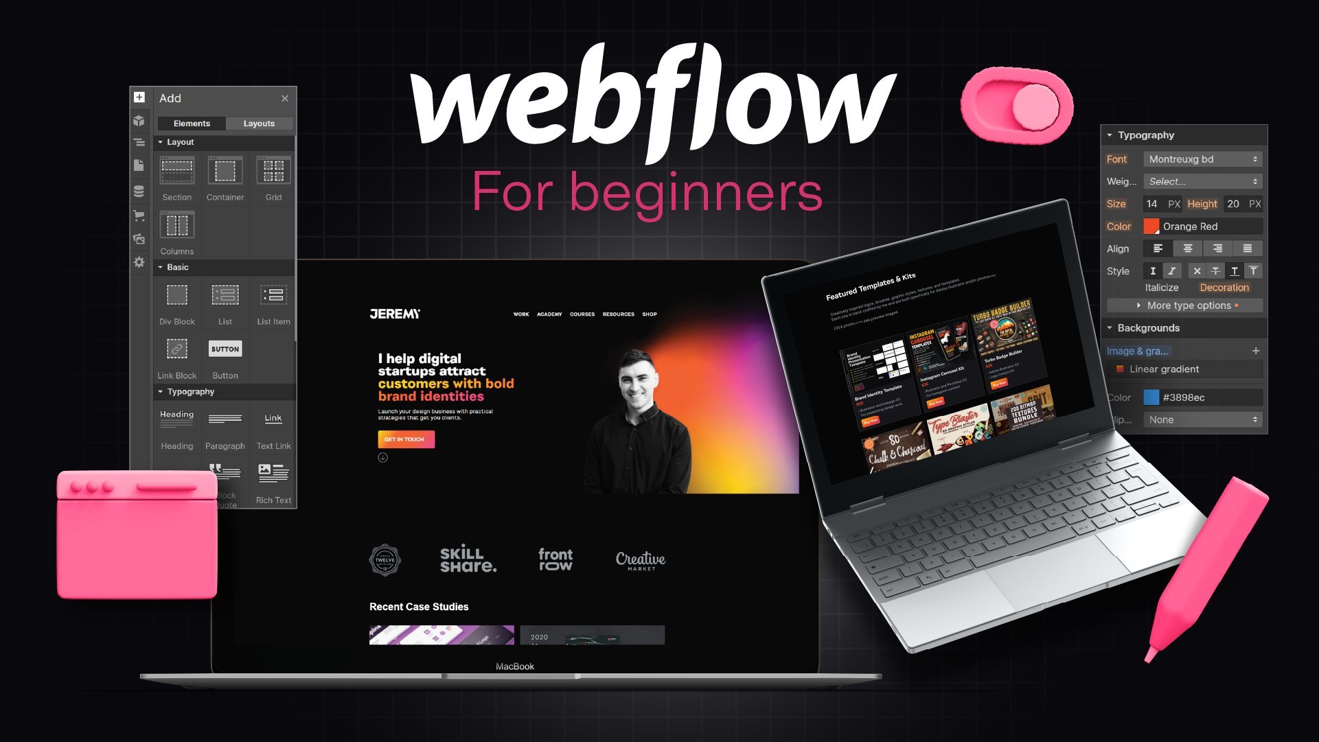
1. Class Trailer: [MUSIC] Hey, my name is Jeremy, a Brand Designer from
Sydney, Australia. In today's class I'm going
to show you how to create websites in Editor X. I'm going to show you the basics of
the platform on how to create really cool websites whether you're an agency owner, a freelancer, or
someone who wants to shift into web design. Editor X is a great web
creation tool that allows you to create websites to
how you want them, customize them in the way you want without even knowing code. It is a no-code tool, and it's a really cool tool on crafting amazing
experiences on the web. We'll talk a little
bit about grids and flexbox in the layout
of tools in Editor X, and we're going to have a
blast creating cool websites. [NOISE] Now for
the class project, all you have to do is
create one website based on a real client or
a concept project. It could be for a tech company, it could be for the local
coffee shop, whatever it is. Just create one simple
website and let's put all the tips and tricks into practice and take
action on that. Enroll into the course today
and I'll see you in there, and let's create amazing
websites together [MUSIC].
2. What is Editor X + features : [MUSIC] What is Editor X and
what features do they have? Editor X is a no code web
creation tool that allows you to build websites
with just dragging and dropping elements
onto a page. You've got a lot
of functionality. You can also customize the
CSS if you want as well. But overall, it's an easy
tool to build websites, and they've got a lot
of different things. But some of the pros
and the cons from my personal view is
that the pros are, you have nice
editable templates. You've got templates and also
wire frames to build off. They've got a whole
bunch in this store and you can actually
use them for free, and they're just
super easy to edit, add your logos, add your colors, typography, all that
stuff really easily. I think that's one
of the key pros. The second one is they have
an academy full of tutorial, so they're easy to follow along. They break it down in short, 2-5 minute tutorials, and
it's an nice academy. They break down all
of their tools, so if you ever get
stuck and need help, then you can
actually jump on the academy and learn something about the web's
creation process. Number three, as I mentioned
before, it's drag and drop, so I can just drag
elements, texts, sections, and layouts
and a whole bunch of stuff and compositions
on the page. Really easy and I can just
click around and move it around and I like that
flexibility with it. Then lastly, you also
got the app market, which includes integration, so you can integrate
different things. You can install a store, or if it's a certain
form that you need or a payment processor, you can put that on your
website and it's all part and integrated
of inside Editor X. Now, the few cons that I think
of is that there's a bit of a learning curve because
it's not like normal weeks. Editor X it's different, it's more for creators,
designers, freelancers, and agencies, so
there's a bit of a learning curve to get used to it and building the website out. That's one of the cons. But then the second con is
that it has some limitations. It doesn't have any
crazy features in terms of crazy animations, you can do basic
animations, which is good. But I think it's missing
some other things as well. But overall it's got the
basic tools that you need. But those are the
pros and the cons. You can see I'm
just on a website, if you go to features/design, you can see here you've got the main thing which
is custom breakpoints. You can work from desktop straight down to
iPad and phone view, so I think that is
really, really cute. You've also got CSS grid, so you can create grids that adjust based on min-max
or the content. So if you want
columns, two columns, three columns, four rows, whatever it is, you can adapt that and it will be responsive. You've also got the
repeater as well, so if you have a
blog or you've got certain content portfolio
pieces that need to repeat, it automatically
does it for you, and it works directly
into the CMS. You've also got the
layout tool as well, so you can create
flexible layouts that are basically
responsive boxes. You can customize blank
wire frames and move them around and it'll shift for you when you scale it up or down. You've also got docking as well. You can dock images or
elements or icons or text, whatever it is to parent containers or the different boxes that you're designing in. We've also got layers as well, so like Photoshop, It's always clean to have layers so
you can manage that. You've also got text scale
as well, so text scale, you can set the minimum
size and the maximum size, whether the website is scale
it up or it's on mobile, it's going to scale to
those sizes that you set. Those are the main features. You've also got other
ones like master, pages, custom menus, stack,
all these stuff. You can check it out
yourself, but I just wanted to mention those main features. Now the other main features when it comes to
interactions and effects, so you can check that out
on the website as well, is they have hover interactions. You can create hover
states as well. When you put your
mouse over an element, it's going to do something, whatever you set it to do. I think that's really key
when it comes to web design. You've also got move, you've got rotation, and it's pretty
straightforward, but it does. You've got opacity,
so you can do masks. You can also do time sequences, so if you set it to a certain goal at a
certain trigger point. You've also got opacity, color change, and you've also got moves so you
can move text around. Those are the main
interaction features. They've got sticky positioning
as well as you can see, you can create these
cool scroll effects and a bunch of other stuff. Those are the main features
when it comes to Editor X, so you can see it's
very, very bust, it's versatile and
it's great if you are a freelance designer creating
websites for your clients.
3. Using the dashboard: [MUSIC] Now I want to
show you the back end of Editor X as you start to sign into your
account and what you can do. This is the dashboard of your account so you can see
I've got other websites here. Now the cool thing with this is that you can create folders, so the top right corner you can see I can create new folder. Maybe I want to call
it Clients 2022. I can create that
and then what I can actually do is drag
different sites in this and maybe I want to drag this side then I
can right-click on the arrow there and
you can say Move to folder and I can click
that and click move here. It's very structured in
terms of that really easy to do that and plan
out your content if you've got a whole bunch
of different clients. You've also got the
top-right corner, you've got account settings, domain, your business e-mail, vouchers, subscriptions,
payment methods, all that stuff is in
the corner there, that's really easy to use. The top left you've got
your Partner dashboard. If you click on My
site as well you can select your sites from here. You've also got the resources which takes you
to the Academy x, inspiration design
features which I showed you a couple before. Then you've got Help, so you can click on Help and it'll take you to FAQs or issues
that you're having. If you do want to edit the finer details and
settings of the website like renaming it then you can put
your mouse over it and click Select site and will take you to your other main dashboard
for that specific website. You can see here if I need to connect my domain
or compare plans, I can do everything within here. I can go to the right-hand side and click on the Site actions, I can click Rename site so if I want to click
that rename it, I can rename that and click "Save" and it's going to
update that really simply. You can also get
feedback, view live site, transfer the site
to someone else if it's a team member
or the client, you can invite people if
you do have collaborators. You can also move the trust duplicate assign or
create a new site there. It also gives you
analytics which is really cool so you
can see reports, so if you click See All reports, it will show you that. I can see how many
visitors I have. They also give you some prompts to guide you on
building your site, so publish it connect a domain, and get found on Google
and it'll help you connect to Google Analytics. You can also customize
your dashboard If I click left-click, you can see I can add invoices, I can add e-mail campaigns, upcoming tasks, etc, so you can manage
the whole project of a client website all
within this dashboard. You can scroll down
and you'll also get some suggestions here as well and some other things
you can add to the website. On the top corner you
can see your inbox or messages and notifications
and new releases, so anything new
that Editor X has released you can see
that there at the top. Then on the left
you've got all these other options like contacts, communications,
automations, marketing, SEO, reports, finances, etc. and you can manage
everything from back end. If you do want to edit the
website you just got to click Edit Site and it
will take you to the designer and the workspace. What we're going to
do is we're going to create a new site, it's going to ask you what
platform you want to click Editor X and once
that happens it will ask you a few prompts
on what type of website is, is a store, a design, an event, etc. For this, I'm just
going to click on Business and it's going to give you some suggestions
on some templates here. So you can see here we've
got some templates. I can click down the bottom See all templates if I want and I'll show you some
of those so you can see they've got extra ones here. I just scroll through, so you don't have to create
from scratch you can literally just create
using [NOISE] that. You can also click on Wireframes at the top right you
see this little button. If I click that
it'll just show me wireframe so without
any images or anything. It shows you the bare bones of it and you can create
based on that as well. For what we want to do,
I'm just going to click Blank Canvas because we're
going to build from scratch.
4. Editor X Interface basics: [MUSIC] So now we're in the
main workspace of Editor X. Now I'm going to show you
the basics and I'm going to start with certain parts of it, and then we're going to
eventually build the website. But first let's just
cover some of the basics. The first thing I
want you to notice is up the top of the middle. You can see you've
got your breakpoints. I can also click here
and I can see my pages. I can click Manage Pages, I can create more pages. I'll show you how to
do that in a minute. But we want to pay to
use the breakpoints. This first breakpoint you can see we can edit from
1,000 pixels and up. You can see the
width of the website is currently at 1,935. The middle button here on the breakpoint is a
lower breakpoint, and it's basically for
an iPad or a tablet. If I click on the lower one, you can see it has
a mobile view, and you can see that as well. If I click on the desktop,
I have that there. I can click on the
buttons and also add a custom breakpoints. What I want to do is add 1,440, and I'm going
to click "Done". Now, we can see we've
got a custom breakpoint that's 1440 and up. We can click that as
you can see there. We can bring in here as well. It's going to adjust
to your breakpoint. You see the gray area, it will snap to that breakpoint, which is really cool. I drag it out. We'll go
to the next breakpoint. Then, if I drag out, I'll
go to that next breakpoint there on the gray dashed line. Beautiful. When
you're designing for a specific size or
resolution for your client, it's going to make
it easy to design. For this website, we're
going to be working in 1,440 because that's how I designed the current website
we're going to work on. Then this is 1,930 or 20,
basically if you round it off. Now, on the right-hand side, you've also got the Inspector. If I click on this
little mixer icon here, you can see it says, "Inspector," this
will allow you to design certain
elements of the page, so you add in your colors,
for example, the background. But you want to make this background black
for now, or whatever, green or pink, whatever, it doesn't really matter, I
can make it black for now. But it basically allows you
to customize your elements. If I click on the header, you can see I can
adjust the sizing, I can adjust the positioning. I can click on this little icon with a little paintbrush, and I can add the fill of the background there as
well. I can change it there. Maybe the header, we want a green or we want a
blue, whatever it is. Then, we've got a
hover interaction. The lining ball is a
hover interaction, I can click "Add
Interaction," then I can go ahead and start to
play around with that. But we'll do that a little bit later. That is the Inspector. You've also got your comments
right next to that icon. If you have a team, you
can add comments here, say, "Hey, design the page." If you have a team, they'll see that comment wherever you've added that, which
is really cool. We've also got
notifications here as well, so if you get site
visitors, et cetera. On the top right, you've got your Publish
button, you've got Invites. If you want to invite your team to collaborate, then
you can do that. You just type in the email
and add them into that. Super easy to do, and great if you're
working in an agency. You've also got Previous,
so if I click that, anytime I can view
my website live. I can obviously bring
this down as well, and I can scale it in once
again to those breakpoints, and I can see what
it looks like live. Obviously, there's no
content on there right now, but it's really handy. Then, you just go back and click "Edit Site"
to go back to that. If you go to the left-hand side, we've got our Menu bars here, and then we have
our Add Elements. I'm going to left-click on that. Click "Elements". This is where we can
add our content. The meat of the website. We can add buttons, titles,
paragraphs, containers, layouter, repeaters, menus, shapes, lines, et cetera. We can save assets as
well in this space. We can already use
pre-made compositions. I can literally click
on these and add that straight into the website
without having to do much. If I left-click on this, you can see boom, it adds that just like that into our website. I'm going to go back.
You've got Layout tools. Once again, before, I mentioned we have grids,
so I can add a grid. I can add the layouter. There's
pre-made sections here. We've got the repeater as
well, and also a light box. That's great for a gallery
image or a pop-up. You've got custom pre-made
buttons. I like this. I don't have to make one, I just click on that or
drag it, drop it in there, and I can go ahead and
open up the inspector, and start to play around, and change the
colors and shadows, and all that cool stuff. We've got Texts, Menu, Search. We've got menu bars and navbars, a whole bunch of
different stuff here. It's good to go in your own
time and see what you've got. You've got contact
forms as well. Then, you've got other
things like, you can add a blog to your site. You can add a store, you can add a booking, events, membership, a content manager, which is CMS, and a multilingual site as
well, which is in Beta. You've got a whole bunch
of elements to use. The second part is the Layer. If I click on this icon
here to get our layer, so I've only got one page,
which is the Homepage. You can see in green, this is one of our components, which is a reusable
symbol basically, and you can see that
will be in green. I can toggle the little arrow, and it's going to show
me all the elements inside that navbar. Then, you go to Sections. I can see the layers. We can go to Section here, et cetera. Pretty straightforward
how to use layers. The next thing is site masters. We can create master
sections of multiple pages. For example, the header and
a footer, this is a master, which means on every
single page it's going to have that same thing. It will have the footer and
the master on every page. You can set it as default. You can actually duplicate it, and make something else. If you want to edit
something, I would edit the header using this because
that's why it's green, and then it's going to
apply it to every page. The next part is Pages. I can left click
on "Add New Page". You can see it's a dynamic
page, design once, generate unlimited pages or it's just a standard blank page, so you can choose
whatever you want. If I just add a page,
I can click that, and now go to Page, and I can
call this team, et cetera. Now, we've got different pages, I can click on them,
and you can see that. The one or the little home icon, that's your Home page. Just remember that.
If you want to change settings, you can
click the three dots. You've got Settings, SEO. You can rename the layer,
you can duplicate it, and you can edit the page or
add a comment for your team. We've also got Site Styles. You want to click the A
with a little droplet. We've got typography. You can actually have
control over the fonts. You've got H1 to H6
and then you've got a Paragraph 1 to Paragraph 3, so you can customize
all of those. If you click on it, you can see what it's
going to show you. You can change the
size, the boldness, italicize it, or add a color, whatever you want to do, really. If I click "Apply"
it's going to apply that. You've also got colors. I'm going to left-click
that. We can edit our global colors here, so our color palette,
I can change that. Also, you've got
page transitions. If you just want to set
general transitions for pages when you change pages, you can set that to an
out in, which is cool. Here is the app market. You click on the little
squares, looking through here, and I'd say probably don't install too many
because you don't want to bog down your website, but you can play around and
look at the most popular. If you click on
"Popular This Month", you can see what's popular
or the Team Picks. You can see Team Picks here. Heaps of plugins that you
can use for your website. Then lastly, you've got
the Content Manager on the left here, you can see. If you have a blog or a big portfolio or a
big marketing website, you're going to be using that. For our design today, we are going to be
keeping it simple, so we're not going to
need to use the CMS. Then lastly, we have some
menu options at the top. We've got our Slide, so
I can click on that. You've got your options here. You can invite,
you can duplicate, transfer site, upgrade
to a paid version. You've got dashboard, roles, and permissions for your team, so if you want to
change that, and you can go and manage your
site here as well. You can also click
"View" as well. You can zoom in and zoom out. I typically use the shortcuts, which is right here,
Control plus and minus. You've also got Tools here. If you want to click
on the Media Manager, which is another
key thing you need. I'm going to click
that, and this is where we can
upload our assets. I'm going to be uploading
my images here. If I click "Upload", upload from the computer or I want
to drag some things, I can now come through here
and start to drag my images, so I'm going to drag this in. I'm going to click
on "Site Files". You've also got
Unsplash as well. You can see you can get free images right within
that, so it's all integrated. My slide files are
going to pop up here. I'm going to drag
and drop some of the images there
that I'll be using. It's super easy to add images. You can also crop them, edit them, and adjust
them if need be. If I click on this,
I can actually click on "Enhance" if I
want to adjust things, I can auto enhance. I can adjust the
brightness, et cetera. It's like Photoshop.
You've got filters, you can cut out things, add filters if you want,
it's pretty useful. I'm going to go back and
just click off that. Then, you've also got Dev Mode. If you're someone
who wants to add custom code to your website, maybe you're working
on a creative website, you can click "Dev Mode"
and you can connect APIs, you can add custom code CSS, and do all that stuff.
5. Flexible Layout Tools: [MUSIC] I want to show
you the core layout tools in Editor X that
I think are very useful and they're
pretty easy to use. I just got another page
here, just a basic page. I've got a couple of sections, as you can see here. Now, I'm going to go
to my Plus elements and you want to go
down to Layout Tools. Now, you've got five tools here. You've got empty boxes, which are also known
as containers. You've got grids, you've
got the layouter tool, you've got the repeater, and you've also got lightboxes. Now I'm going to show you the
basics of how to use these. An empty box is just
an average box. You can see you've got
some variations here. For example, I can
just drag and drop this gray box inside
this section. You can see here, if I go
to the top-left corner, you can see it says container. If I go to my layers, it
also calls it a container. A box is known as a container that should just call a
container in my opinion, but for now that's
what it's called. You can also stretch it. If I click the little icon on
the top right corner, it will make the container fill the whole size of the actual section here,
as you can see that. I can go ahead and change the
background color if I want. I can do whatever
I want in there. Within this container, I
can start to add objects, images, icons, whatever it is. For example, if I
want to add a shape, I can drop a shape into there. If I go to my layers
now you can see that within this container
is a basic shape. I can move this shape
around, I can scale it. I can change the color of it. I can basically do whatever I want with it
as you can see there. Now I can go ahead
and delete the shape. I can delete the
container as well. Now it's always good
to build containers because you don't want
to stuff up any design. If you're designing or changing something
in the background, you can change the container
instead of changing the individual boxes
of the object. That's how you use
the basic container. Now the other one is grids. Grids are really useful
if you want to have a section that's cut off into different boxes or columns
or rows, it's up to you. For example, I can use
this two-by-two grid. I can stretch it, I can make it bigger as
you can see there. Just by using my mouse, I
can use the align tools to align it into the direct
center of that section. I can actually change
the grid layout. If I left-click on the
top, it says change grid. I can do a one-by-four. I can do a four-by-one. I can actually go
to advanced mode and actually start to
customize the sizing. If you've got these
two little lines, I can drag it and I can have different sizes, as
you can see there. I can also increase
the size, the height. I can click the
little Plus button, it's going to add a column. You have so much control
over what you can do. I can also add gaps, maybe I want 20 pixel gap. You can see that will add
a nice little gap there. It will give you
some guidelines. I can click "Done", and
then we have this grid. I can always go back and change advanced mode
and delete parts. You click on the text and
click "Delete Column." Maybe I just want a two grid
like that, that's fine. I can also delete the
grid background on the bottom and clicking
"Delete Grid". I'm going to delete that
container from before. It's pretty easy
to use the grids. It's great if you have
portfolio pieces. Now, the next tool is
called the layouter tool. You can see here I'm in
the section and it's got pre-made sections here. At layouter, you can create more of a responsive section. I'm going to scale this up. I'm going to click on
the "Layouter" here, make it a bit wider
and a bit longer. If I click on the "Options", you can see I've got mosaic. I can do bricks, I can do rows, and I can also do
columns and a slider. Now the cool thing with this
is that it makes everything responsive and you can
customize everything. I can select this and I
can plus or minus it. If I want to take
up more of a space, I can change that. You can see if I
wanted to do multiple, maybe I want to make this a
bit longer, you can do that. Then what I can actually do is I can just drag and drop
images into here, drag it in, and then I'm
going to stretch it. Then I can change the image. Maybe we have a team member, I can double-click to
readjust if I need to, and I can drop out of the
images in here as well. I can drop the text if I want. You can see if I get
down to mobile view, it makes it responsive. That's the cool thing
about the layouter. It makes it responsive
and you get more of a custom look and feel with
these grids that you have. I can add images. Maybe you want to
add a little bit of text in here or something, and change the
background to black. There you go. You can see
this is the layouter tool, and once again you can see
it makes it responsive. Obviously, the texts
would have to go smaller, but that's the layouter tool. Now, I'm just going to go
in this other section here. I'm going to show
you the repeater. Now repeater is
really great if you have repeating objects
of the same kind, for a blog post or
a portfolio, etc. You can see you've all
these really nice tools. I want to drag and drop this one into it and it
says replace section, so it's going to
replace that section. Beautiful. I'm just going to
make sure that it's scaled. I'm going to click
on it. I'm going to change the background color. We can make it
green if you want. You don't want to
get the gray color. I can change the image. If I double-click in
there, I can select, for example, let's
select our team here. You can see that every
lad is the same. I'm just going to make sure
that it stays like that. Cool. Now you can
see here the text, I can come in here
and recall it. You can see, to customize takes full items that already
exist, click "Edit Text". If I customize it, you can see it's going
to change the effect for all the texts because
it's basically repeating the same style and
design across every element. If we add it or minus an
element or a team member, it's going to make
those changes. For example, I can get paragraph 3 and make it green like this. You can see how it's in
a stack so it's grouped. I can double-click
and edit the title. Heading maybe I want to
do like a heading 3, that will change that. Maybe I want to change
the text to a script. You can see it's going to change all the other titles there. Just keep that in mind.
A repeater is really great when you use it properly. You can change the
container as well. I want to make that green. The text in here, I can also
be able to edit a text. That one will go
paragraph, there we go. It's super easy, repeater is great. Make sure you use it. Now I can also click
"Manage Item." You can see I can
duplicate an item. If I click "Duplicate",
it's going to duplicate and start
adding more team members. Maybe we have a team of six, you can see that it's
just repeating it. Makes it super easy to add that. I can click "Change
Grid Layout", and you can see I can
change that as well. As usual, also if
you want to add an individual grid
in there then I can. Use repeater, it's
really useful. Now the last one is
called a lightbox. Now, these are
basically pop-ups. Maybe you want to have
a cookies pop up or you have like a promo
or whatever it is, then we can totally have that. I'm going to click on this, and that's going to add
this cookies light box. I'm going to click on
that and I can actually change the color. Let's go with black. You can say these are
the cookies policy paragraph, that's really cool. I can click on "Set Up Overlay." You can see clicking
closes lightbox, so I can turn that off and on. I'm going to close that for now. I can set a trigger
point as well. You can see its cookies policy, automatically display
lightbox on pages. I can say "Yes." I can show on which page is
it going to show it on. It's going to do the delay and you can see it's in X button instead
of the Close button. You have some choices, you can customize on that. That's our pop-up there. You've only got a
few styling options, so just fill color for now. I'm going to click "Preview"
and we'll see what happens. Cool. Once I'm happy with the lightbox, I'm going
to click on "Preview." Let's scale the slide down to the right size and let's go to the Team page and
there we have it. We've got the cookies pop-up, the two seconds of light in the bottom there and I
can click the little "X." Basically, that's what we do. We've set it to the Team page. You can customize
it and set it to any page you actually want. That's super cool to be useful. Basically, those
are the five tools you can use, the layout tools, they're really
useful, really great, and use them in your designs.
6. Brand Library + Building Nav Bar: [MUSIC] The website
we're going to build is this one I built in Adobe XD. It's a crypto wallet
where you can store assets and tokens and
NFTs inside your wallet. I'll just quickly whipped up this simple landing page and then you can see the
mobile version there as well. We're going to build
this, keeping it simple. We might do a few other pages, see how long the
class goes forward, but this is what we're going
to create and we'll show you how to do that.
We're in Editor X. Now, I'm going to
left-click on my header. The first thing I want
to do is go to my inspect on the right-hand side, click on the paintbrush
and change the background. But you can see here, I actually don't have my colors. I can add custom color C, or I can go to the
top left and click on my brand site colors and I'm going to change
my main colors here. For my background,
I'm going to go to XD and you can see I can just copy the HEX codes that
I've already created. You can see here, click on that. Paste in my HEX
code. There we go. Click "Apply" and apply and it should change
that right there. I'm going to do the same
for the grays as well. There we have our colors for the background and text
and then our action colors, which is basically
that call to actions. Our bottoms and stuff is
going to be the green stuff. For the text as well, I'm going to need the
green here as well. Some of the texts
actually to be green. Beautiful. Once we've done
that and then we can go back. I'm going to click
on the header, click on the design
on the right side. Then you can see
now what colors I actually added into here. See our theme colors. I can go ahead and
drop those in. I'm actually going to
use the black color. I'm going to do the same
for the body as well. The same for the
footer. There we go. Now I'm going to go
to my header and double-click on
image of the logo. I'm going to click
"Change vector art". I'm going to click my site files on the left
and I'm going to select the logo design,
which I've created. Boom, it's very fast. It just loads in just like that. I'm going to delete
that menu there. I'm going to go to
the plus button. I'm going to add a menu. I'm going to go down
to menu and search. Now what I want to do is add a simple menu and we're
going to customize it later. Just this header
here, basic one. I'm going to bring it. I'm going to copy. Make sure I click on the header, then paste it inside the
header using Control V. Now you can see I've
got my pages here. Now I need to add my
other page as well. If I go to pages, make sure I add a page. I'm going to call
this one is support, team blog and support. I'm going to click on the
menu and click "Manage menu". Now you can see he up, any one of them is showing up, so I need to add
the other pages. I'm going to click "Site Pages". I'm going to click on all pages. We check that and click "Apply". Then they should pop up here. Then probably I'm going
to click "Manage menu". If I need to move things around, you can drag and drop them
just like that really easily. I'm going to go
to the Inspector, go down to the text and
change the color to white. That's why it wasn't popping up. We can see the page that's selected is going to
be this green color. I can probably change that. If I go fill color
and the hover, you can see it's got this green, but maybe I want to make
it gray or whatever it is, you can change those things. I'm actually going to
go ahead and change my fonts as well. I'm going to click on
the Site color styles. I'm going to go
to my typography. Now, I'm going to
basically change. I've got all these
character styles over here saved in our XD. Now what I'm going
to do, the font I'm using is Space Grotesk. I'm going to click the
little pencil here. Click on the Search bar
and type Space Grotesk. They have that which
is really great. For this one, it should be bold, which is really cool. Then we've got our
paragraphs as well. Also got our H2, which is 42 pixels
for the first H1, this is going to be 56. I'll click "Apply". This one is 40. Now it'll Space
Grotesk. It'll be bold. Click "Apply". That's going to be the green color as well. H3 is 24, bold color green. This is going to save
us so much time later, so I don't have to
do it manually. It's going to save all our
headings and our paragraphs. I've got paragraphs
Space Grotesk as well, that's going to be 16. That should be regular,
which is great. We've got paragraph
2 which will be a white Space Grotesk
16 and apply. We've got a black version
and a white version. Then also we're going to have
a green version as well. Sixteen, type in Space
Grotesk, click "Apply". Now we have all our character
style saved in here. If we need to add something
manually like the text, for example, I will
go to the Inspector, I click the design,
click on the text. You can see, obviously, you can go down and choose
the font from here. If I type Space Grotesk, usually I can change on there. If I click on the theme, it's going to have all our
saved character styles that I just did before
in the library. Now I can select any of these. If I go heading 3 or heading 6, whatever it is or
the paragraph 1, it's going to change
it to the ones, the styles I set
it as you can see. Now if I want to resize, all I'm going to do is
just drag the box so I can make it really wide or
bring it in closer. I'm going to go
down to elements. We're going to go to Quick Add. What I'm going to
do is add my title. I'm going to click and drop
that in just like that. Super easy. I'm also going to go add
a paragraph and also add a button as well. The cool thing is our guides
you can see I've turned on, so everything will snap where
we set it. Really cool. I'm just going to
extend this section. I'm going to place
another section, make it a blank one. What I can do is just drag
this down to bring the height. I'm going to Shift click
and click on all these. What you can do is actually
select stack or group. If you stack it, it's
going to put it within basically a stack which makes it responsive when you adjust it. As you can see there,
which is really cool. I love that responsiveness
is really cool. This text, I'm
going to change it, this will be a H1. There we go. When you click
inside of the stack, you just want to
click again inside. You click in the right
objects. Bring that up. Beautiful, this is looking good. I'm going to bring
that down like that. Double-click on the text. Paste that in just like that. Let's double-click into here. You can see we've
got our button. I'm going to design this button. I'm going to change that. We're going to go
to the Inspector on the right-hand side and
also change the color. Texts actually
needs to be black. That's looking good. Now, button. I want to actually
change the corners. In the inspector,
you want to go to the third option,
it says corners. I can round off everything. Instead of rounding it up,
I'm going to put it on zero. But if I put 100 pixels, you can see it makes it
into a rounded shape. I'm going to put 0 because I
want a flat rectangle there. You can add a shadow
which is cool. We can add a shadow like
this for the button. Another way we can do it
is just add a border. I'm just going to add a
basic rectangle shape. I'm going to change
the color of it. A shortcut if I want to
bring it to the back, I can press Control
and down. She's great. I'm going to make the
border, the green color. In the Inspector I'm going
to click board on the shape. I'm going to put the opacity
of the fill to zero percent. I'm just going to use
my arrow keys here. I'm going to make
it a bit smaller. To get that effect as you can see how we've got
this little outline. It's basically a
rectangle with a border, as you can see there, which
I think is really cool. I Just want to make sure
that I press Control G, holding Shift and
selecting these two, we now have this
button as a group. I'm going to double-click onto the button inside the group
and right-click the button. Now what you want to do, we want to turn
it into an asset. I'm going to go down
at the bottom, it says Save as asset. I'm
going to click that. I'm going to call
it main button. Then we can add it
to say that's it. I can also create a
new library as well. I'm just going to click "Add". Now, if I go to the plus
button and click Assets, it should be inside of here. What I'm going to do now is
I'm going to add an image. I'm going to drag and
drop an image right here. I'm going to click
"Change Image". It's going to load
up my media library. I'm going to click on my hero image here and click "Update". Beautiful. Now I'm just
going to drag that so it's big and it snaps right to the
end of this section there. You can see that it
automatically scaled it, which makes my life
so much easier. Now I'm going to add
my second image, which is going to go behind it. A little icon element here. I'm going to press Control
Down and bring that up. You can also click these
little stretch button in the right corner
and it should stretch it to the full width
of the actual section. If I don't want that,
I can just turn it off and just scale it how I want to. I'm just going to
bring it behind here. I can use my Shift and I'm tapping the keys there
just to keep that effect. Beautiful. I think that's
looking really cool. Also it's starting to look
like our design here.
7. Building the Home Page: Now I'm going to
click "Add Element." I'm going to drop a title here, and also we want to
drop paragraph text. This section is just pretty straightforward
but for this one, we need to actually change the text orientation
to center it. I'm going to click "Edit
Text" and another text tools that you've got the
paragraph alignment. You can adjust line spacing,
also character spacing. You can do dot points
and numbered lists, and you've also got to change
the direction of the type. You've got the
heading tag as well, and you got a whole
bunch of options there. For this one, this
is going to be a H2. I'm just going to go
ahead and start to copy this text like this. I do need to align this text to the center, just like that. Beautiful. Now, the paragraph
text is to go here. There we go. Excellent.
Add two for some reason. I'm going to click
"Edit Text" and make sure that we're set
to the white one. Sometimes you have to click
off it and then you have to click onto the paragraph. Beautiful, just like that. I'm going to click off it and
then just scale like this. Beautiful. Now I want
to add an element here, so we got three
little sections here. Now, what I can do for that, I can just bring this
section like that. I'm going to add
another section. Beautiful. Now for this one, I'm going to click the
repeater and you can see they've got the three here. I'm going to click that
and we can see we've got these three little cards. I'm going to drag that. You can see they call them
cards you can do a list, you can do a slider as well, you can do a grid cell,
which is pretty cool. I'm going to keep
it just on cards. Just Control Z that and I just want to make
sure that the layout is actually centered, beautiful. Now for these cards, I just want the background
just to be nothing. I'm going to turn that off. Now I have to add
our title in here. I'm going to put the title. You can see as I'm attaching it, it's repeating it,
which is really useful. I'm going to drag in
here and you'll see the little blue box says Attach like that. I'm just going to
click the "Edit Text" real quick, paragraph. Beautiful. Now we're going to add our
icons into the Repeater. What I'm going to
do is go to plus, I'm going to go down to shape. Instead of doing image,
we're actually going to upload an SVG. I'm going
to click on Shape. I'm going to drag into here
and I'm going to attach it, I'm going to scale it
down a little bit. Then I'm going to click
"Change Basic Shape." I'll go to my site files, and you can see I've
got the PNG versions, but we want to use
the SVG versions. I'm going to double-click. Then I'm just going
to click and change the other ones as
well. Just like that. I'm going to get
back to my design. Just make sure that
it's all correct. I think this was the
other way around. I'm going to go ahead
and copy and paste my text from the design. Cool. Now that is looking good. If we need to extend
the repeater, we can actually make
it wider and bigger. As you can see, we can extend it and the text
is going to adjust. Obviously, the shapes
are actually changing, so we'll probably have
to scale that down. Just be mindful of
that if you're playing with the scale or everything. Moving on to the next section, I'm going to click ''Plus
Add new sanction'', and this one is going
to be a blank section. Now for this one, I'm going
to do a repeater again. We're going to go to Quick Add and I'm going to
click ''Repeater''. I'm going to make
sure that it's in the middle when I
add a title as well. For this one, I need
to make sure that it is centered, the text, I'll center that
and this should be, I think a H1 as well. It's a H1 or H2. Then we are going to create
this section here like that. Beautiful. I'm going to click on the item so you can see you've got
the different items. I'm going to open up my layers. I'm going to rename
these sections so I can go testimony,
features, intro, just double-click to
edit layers here. I know what's happening. Once I have my Repeater, what I'm going to do is
go to the Inspector, click on the design, fill the background and
make it this nice gray, dark gray color we have there, and then just click off of it. Now what I'm going
to do is to get this look that I have here
is I need to have an image, some text, and we have to put that little
tick icon as well. I'm going to start
off and I'm going to put an image here, drag and drop it,
and we should see attach. We've got that. Then what I'm going to
do is change the image. I'm going to select
the person there. Then I'll play around with this one as well,
change this one. Now, what if I wanted
to round this off? I should be able
to go to image in the expected click
on the corners and let's maybe do 20 pixels, see what happens. That's great. Let's do 100 pixels. You can see it sort it a bit round but what I want to do
is I want to bring that in. It looks more like a circle. We'll make it a bit bigger. I think we'll go
500 pixels and that should completely round
that off those as well. Now I'm going to
add some text in. I'm going to bring paragraph
text writing here, just going to make sure
that it's scaled properly. Now I'm going to
select Paragraph 2 when I add some
more text as well. Litte text box. This one, I'm going to
put it to Paragraph 3. I finally set the
image size there. The text is docked to the right. If you see on the right-hand
side the positioning, I dock that to the top, and then the margins
here is 120 pixels. If I need to adjust
that, I can adjust that as far as
spacing is all right. Then I got these verified buyer, I just need to get an icon so I'm going to get
the plus button. What we can do is
click on "Shape". Obviously we can
import our own shapes, but I'm just going to
change the basic shape. You can filter out
certain shapes. If I click that, I
can do vector art. You can do categories as well. I'm going to search by icons. Then I'm going to
change the category and you get a whole bunch
of really cool icons. You can see it's really amazing. I'm just going to
type in check-mark. Let's see what pops up. Cool. We've got this. I'm going to
double-click on that, should add that to the page. I'm going to scale this down. I'm just going to go
to my fill color and change that to our
green color over here. I'm going to drag this. I'm going to hold Control
Alt just so I touch it, and I'm going to scale it
down. Zoom in a little bit. You can see that my guides
snap it into place. I'm just going to move
the Verified Buyer a little bit to the right. Not too much. Boom,
there we have it. You can see here this
one was a field check, but that will work as well.
I'm going to click on it. I can see if I
wanted to adjust it, but I think I'll just
leave it like that. Beautiful. Now we're going to move on to our next section. But first I just want to
quickly add the border. You can see in this photo we've got a light little strike. We've got border size of one, and is gray color here. I'm going to click on the
"Repeater". I click the "Design" and we want
to click on "Border". Now what I'm going to
do is go to the Border, click the gray button, and make the pixel, one pixel. You can see it did it around the actual whole repeater
box. You can see that. But I want to do it over the actual squares there, the cards. I'm going to click
on the "Item", and then I'm going to
change the item gray color and one pixel. Make sure that's 100 percent. You can see that
now it has that. If I click on "Repeater", I'll go back to Border
and just turn that off, put it on zero,
and check it out. Now we've got our borderline
one pixel on that. Super easy to add, nice borders. It just makes it pop
a little bit more. Beautiful. What I'm
going to do is I'm going to add another section. We'll keep at a blank one. What I can do is I can just copy this whole section
or copy this text. If I go down here and
then press "Paste", you can see it just
copies the whole section. That's one way to
just speed things up. If I want to get rid
of this section, I can right-click and just click "Delete", and it
should get rid of it. Now what we're going
to do is we're just going to go to xt here. I'm going to copy
and paste my text. This text will be a
H1, and copy that. I'm going to dock it to the top. Change the docking. There we go. Now we're going to
have these four icons. Then Download button. For this, what I'm going to do, we go to the plus
button and we are going to select the "Layouter". I'm just going to put
columns like this. We've got four columns. Bring that like this. I'm going to scale this up, this section. Zoom in a bit. I'm going to drag this down. Hold Control and Alt to
attach it to the section. I don't know what
happened to that. It should be like that. I'm going to bring that
up. Cool. I'm going to click "Add Item". I need to go add the
objects to this now. What I'm going to do,
I'm looking at plus and then I'm going to go add shape, drag it and drop it
into the box there, and I'm going to go
change basic shape. I'm going to go to "Site Files" and then
I'm going to click the SVG that we have
here of the Chrome. Click "Add To Page". I'm just going to
scale it up here. Just like that. I'm going to do the same for the
other boxes as well. Beautiful. Now I'm just going to click on
the "Layouter", I'll go to the right side. Then we're going to
change the background color or just turn it off. You can see that. Just
going to turn it off. I'm going to open my
layers, so I'll just make sure that I
selected the item. I'm just going to drag.
I'm going to leave it on the design there. Drag that as well. Boom, and there we go.
As you can see there. It's roughly the sizing, it just needs to be
fixed, so the columns. Let's go to Spacing, let's go to Item. We can adjust the padding. If we need to add more padding, you can type something
like that on the item. I'm going to paste
the button in here. As you can see I'm
going to scroll down. I'm just going to adjust. I didn't know what
happened to this. I'll just adjust
that real quick. We've got our page done. Now let's add the footer. I'm going to go to COMPOSITIONS and go down to NAVIGATION
and click on "Footers". You can see we've
got a few here. For me, I think I want to go with this one because it's similar to what we want. I'm going to click on that. Now if I zoom out a bit, I'm just going to make sure that the footer
is at the bottom, so I'm going to double-click, rename the footer and
drag it to the bottom. What I can actually do is I can set as a master and
set as a footer, but this footer is
already down the bottom. I'm going to click on this and I'm going to click "Delete". Let's select this footer
and try and do it again, Set as Master and
click "Footer". We had to delete the old footer to make this one a footer. Now you can see that we
have our footer here, and I'm going to go ahead
and use the text here. This is going to be paragraph 2 and what I can actually
do is just go in, copy, double-click
into the header I clicked the Vector
Art of the logo. I'm going to paste it down here. There we go. We have
the logo pop-up. I'm going to drop
it into this stack. I'm going to move the
text up just like that, keeping it real simple.
I'll move that up. I'm going to go to the
plus, then I'm going to go down to contact. You see there they've
got subscribed, they've got contact forms. What I can actually
do is click on this. It's going to drop that list in. I can bring this into here. I've got the stack
key. What I'm going to do is I'm going to bring
it into the stack. I'm going to click
on the inspector. I'm going to edit the
design of this field. I'm going to make
it that gray color, I'm going to turn the
border off the text. I'm going to make it white. Could also make it green. I want to make that
white as well, paragraph 2 font size. I'm going to make it like you can change the input colors. You can change all
these settings really. I'm just going to
just bring scale that down inside this
fits inside the box. This is the success message. If I want to preview it, we've got our success
message there. Now that will pop out once
you click that Join button. I don't know if you
can actually add the text as I've done here. For now, we're just going
to leave it like that. I'm going to delete
the title field title, so we don't need that and I want to take the
required button off. What you going to do is
click the little cog and you can edit those settings. You can add conditional
rules if you want. I want to add a rule
for the Wix form, now we can put some message. I can turn that off. I can turn it to a link to
an external URL if I want. You can even add a
download as well, but you need to
upgrade for that, etc. You've got a whole bunch
of different stuff here. Anyway, let's move on
to the stack over here. I'm going to drag it over here. I'm going to add the pages. We've got download, this is going to be paragraph 2. I'm going to add
some of the margins. I'm going to make sure
you select the text, and we've got 15 pixels. I'm going to go Control C, Control V. I'm going to go to my layers panel.
I'm going to right-click. I'm going to go duplicate. You can also press
Control D as well, and it should add the
text inside of there. Make sure you dock it to
the left and the top. Once again, 15 pixels. Select layer Control
D and up to the left. Then I'm going to edit. We got a blog and support. Then I have this stack. I'm
going to press Control C, Control V and paste it, and then I'm going to
snap it like that. Very good and I'm just going
to delete the other ones. Sweet, there we have it. This needs to be a
bit more like that. I'm going to change out, leave that on there
and we're going to have Instagram,
Facebook, and Twitter. I'm going to go to the plus
button on the elements. We can actually
use social media. I'm going to go down
to find the right one. You want to go down
to embed and socials, and you're going to
find social bonds. You can see it like this. You can pick whatever
style you want. I'm going to click this style. I'm just going to
move it over here. We want to stack it into
that bar just like that. Now I can set the social links. What you want to
do is click on it, click Set Social Links. I can add icons if I want. But I'm just going
to delete TikTok. I just think these are
Instagram, Facebook, Twitter. Instagram, Facebook,
Twitter that's fine. I'm going to delete these. I can click on the cog as well. You can change these items this is for Twitter and I
can click on the link here, and then I can put it to
my Instagram account. Now I've gone ahead
and downloaded the social icons that I want. As you can see here. Now what I can do is I can change these icons. I'm
going to click Add. Got to my site files. I'm going to add all
these to the gallery. I've gone ahead and
added those icons in. I can delete these ones here. Twitter click Done, and it should add these icons and if needed to
change the layout. You can click the layer and
click horizontal or vertical. I want to do a
photo for this one, I can drop the icon size down
as well maybe 25 spacing. I think 10 pixels
should be fine. I'm just going to keep it
easy, and I'm going to delete that text and just keep
the icons instead, just keeping easy and then if
I need to change the links, I can click Social Links and I can paste the
links inside there. Beautiful, it's looking good. I'm pretty happy with it. I'm
going to click on Preview.
8. Building Team Page: Now, we're going to
create the teen page I've designed over here. You can see I'm in
XD and I've created these nice just avatar
images of the team. Obviously these images I
got off Unsplash and I created a gradient in Photoshop. You can see in Photoshop I took the images and then added
that gradient and some exposure and the black and
white filter on top to make those images just
look nice and pop. But we just basically make
them on brand really simply, and we've got like a
little jobs section here, we're going to make some
of those cards and then also like the benefits as well. I'm going to show you
how to design that. Let's jump into Editor X. He is the team page so far, I basically just
created a new page and I've already got the text
from the homepage here. I'm just going to
build from that. I'm going to refer back
to my editor exe file, so I can just copy
and paste the text. I'm going to do that right away. I'm just going to copy
and paste the text here. That's why it's always
good to pre-designed your site so you can
just copy and paste, makes it super easy. I'm just going to scale
the size of the section. Just need to make sure
that this is docked. I'm going to go to my inspector
and dock this to the top, not the bottom, and then I want to scale the bottom like this. Great, super cool.
Now for this one, I'm going to use
the repeater again, which is one of my
favorite tools. We can use the pre-made
ones if we like. But for this we're going
to make a custom one, so I'm going to drag and
drop the repeater in there. I'm going to go to
my inspector tool and I'm going to put the
width on 80 percent. I'm going to drag that and
make sure that it pops, add lines to my
texts on the left, which is looking really good. Now, what I'm going to do
is I need to add my images. I have to go plus quick add and then
I'm going to go to image and drag that into there, I'm going to scale that up,
it's stretch the image, I'm going to click change Image, and then I'm going to
drag my images into this. Select them, drop them in there. I'm going to select my
main image and I just want to make sure the first one, I'm going to click
that click update, and then it should update there. Beautiful. I'm going
to change this image, and I want to actually extend the repeater now because
we need a sixth grade. Let's go into the settings. I'm going to click
on the repeater, I'm going to go to my layers and make sure that clicking
on the repeater here. You can see it says cards. What I want to do is
click manage items. What you can actually
do is duplicate. I can duplicate item 3, and then I'll do that
a couple more times, and it should
automatically create the same style and
design just like that. Now, for some reason,
I just got to extend the height of
that because it was bumping into the text T. I'm just going to
bring this down. Just like that. Super easy. Beautiful. Now, all
I'm going to do is just double-click or you click change image and then select those
other images now, and the last one there,
boom, excellent. Looking super amazing. Now, what I'm going to do
is add some text. I'm going to go title, and I need to hold control, and also it actually
attaches it to inside the actual
repeater there. I want to do about 18
pixels from the bottom. I think that will work. I'm going to click edit text, and then what I'm
going to do is I need to do the white text. I need to leave it on
H2 and I'm going to just change it to
white, like that. I think that works. Beautiful. Now, I'm
just going to go and copy and paste the names
of the team members. Now, all the text is there. Now, if I drop it
down to mobile view, we can see everything is there, we're just going to
have to fix it up later on and change it to
make it responsive, but for now it's
looking pretty cool. I'm just going to adjust
the sizing on these blocks because it is actually going
to be around 450 pixels. I'm going to go to
my inspector tool, and I need to go to the height. Let me see this. I'm going to change it to 450. So there we can have
a better view of it. Now, I'm just going
to click preview really quick change to the right size that
we've been using, and cool, so that the
image is looking good, I just got to make sure that
sizing is not doing that. I'm going to click the repeater
and I want to make sure that it's docked to
the top as well, not to the bottom. I turn that off. I'm just going to
drag this down, snap it into place, make sure you leave
a bit of space between the title there. I think that's looking better. Cool. Excellent.
DNS looking great. I'm happy with that.
Now, I'm going to move onto my next section. We've got some texts
here. I'm going to add a title again. I'm going to drop that in there, drag until I add
to that section, and we should make it the H1. I think that will work. I'm just going to change
the width as well, I'll go 50 percent. There we go. Beautiful. Drag it up at
50 pixels from the top, send to that, I'm
also going to drag the bottom of that section
there to expand it. Beautiful. Now, we
got some boxes, so this is going
to be a repeater again. Good all repeater. Layout tools, repeater, and we're just going to drag and drop this
one just like this, and I'm going to make
the width 80 percent. For this one, the height of
that is about 300 pixels. I'm going to make sure
I select the item, and I'm going to just go with 300 pixels to make
that more of a square, and I'm going to go click
the design and make the background the dark gray
color that we have here, and also see if we can
add a border there. Cool. We've got
the border going. We have a nice set of
border that we've created. Now, what I'm going to
do is add some text. I'm going to drop a
title into there, we're going to drop
a paragraph as well, and we're probably going to need a couple more
paragraphs as well. I'm going to click edit text, and I'm going to select
the white version. There we go, I'm just
going to zoom in again, and I'm just going to
copy the text from here, I'm going to drag that out, this one we'll go H2 and
we'll make it white, and just got to scale
out the width there. We're not chopping off the text. We've got the visual designer, we've got this text here, and we're also going to make
it the green paragraph. We're going to drag it up, I'm also going to drag this
a little bit to the side, 25 pixels from the edges. Now, I'm going to add
another paragraph here. I'm just going to paste that, and then we're going to go
select the white paragraph. Make sure it snaps
into place, beautiful. Now we've got some
nice gray ticks over here for the salary. I could just copy this
text here like this. Now this one, I didn't think I have the right color for it. I'm just going to select the black version and then
do that light gray color. I'll bring that up.
Beautiful. I'm going to scale this down. Then we're going to add a button to the corner here, cool. I'm going to click, Change text, Apply Now. We're going to go to the
Design button change the background to
zero percent opacity. We're going to add a border. That border is going to be,
let's just say two pixels and it's going to be
green, beautiful. Now I don't really
want it rounded, so I'm going to turn the
roundness off and then boom, we have our almost
exact same design that we've created here
as you can see there. That button, I can
shift it to the left. The text also needs
to be green actually. I'll go to the design,
click the text, change the color, left-click
on our theme color. Boom, we have our bottom there. Beautiful. Now what we do
is just replace the text of the other ones with
what I've done here and then we're done for this
little section as well. Beautiful. Now onto
the next section. I'm going to press
the plus again, I'm going to choose
blank section. I'm going to go to
my layers and just name this section Benefits. This is Jobs, and this is, I'm just going
to call that Team shots. I like having the sections
named neat, beautiful. Now I'm going to go down. Once again, we'll
change the color as usual to the black color. I'm going to duplicate this text and put it into
this section here. Make sure you press Control
C and then Control V just to copy-paste,
that should work. Let me go snap it into
place, fixed pixels. I'm just going to scale
the height as well. We've got some text here. I can copy this text, paste it here, it
should be fine. I just wanted to
change the text. I just want to center
that texts like that. There we go, beautiful. Now this one has a repeater
similar to this one. I'm going to copy this repeater.
I'm going to paste it. The cool thing is
actually going to duplicate that whole thing, which makes this super easy. For this one, we're actually
going to have no background. I'm going to drag the opacity
off and it's just going to have one point pixel border,
as you can see there. Now what are we going to do? I'm going to delete the main text and make
sure you do it from the first box then
it deletes it from all the other boxes
because it's a repeater. I'm going to delete that, he's got these icons, the H3 or H2, and then the paragraph text. I can delete this, I can also delete the button and I think
we're good to go. For this one, I'm
going to go edit text. I'll go H3. It's a bit bold, but I'm going to turn
the boldness off. Excellent. I'm going to scale the width of
the container there. I'm going to drag that to
the side, which is cool. Probably around 40
pixel or 50 pixels. I'm just going to copy and
paste this text in here. Then now I'm just going to
look at how big these boxes. The height is around 210. I'm going to change that. Click on the Item, and I'm going to go 210 pixels. Drag the text, and then I'm just going to
center everything. If you hold Shift
and select by them, I can just tap my hold Shift and the arrow keys and I'm
going to tap it like that. Beautiful. I'll fix
the other boxes down. I just want to add my icon here. What I can do is go to plus. I'm going to click Shape. I'm going to hold Control Alt, make sure it clicks and
snaps in just like that. I'm going to click
Change Basic Shape. I've already gone ahead
and upload them as SVGs and PNGs, just in case. Now I have to just quickly
add them into the manager. It's going to be sort by date. You can see it's going
to upload as SVGs. It's going to actually show them in the manager,
they're beautiful. I want to click on this one. Then because I've
already done in XD, all I have to do is
export it and it just really easy to do that. Now, to keep it really simple, I can just hold Control
Alt and address, duplicate it, and paste it. It actually starts to paste
it in all of the boxes there. Now it's inside the repeater. We've also got to
click Manage Items. Now what I'm going to do is, I'll click the three dots and duplicate them just
like I did last time. Now I've got six
boxes just like that. What I'm going to
do now is just make sure that I'm selecting
the right item. Click on the vector art. I think there's a
duplicate there. I'm going to change
the vector art. The next one is the health one. Then we're done. I can click Preview
really quickly. Then we can see how it
looks like the team page, it's got the animation
from the original thing. I think we should add a bit of animations to make
it look better. The button has got
the hover effect that looks really awesome. The texts somehow
went to the left, but you've got these
cool boxes and maybe I could add a
hover thing there. What I'm going to
do, is on Edit. I'm just going to
check these texts, make sure that it's
docked to the top. You can see that I'm
turning off the docking and make sure it's
docked to the top. I'm going to click
on the cards here, and the items, and let's see if we can add a hover interaction. Now what I want to do is, let's do a grow effect. I will make it 0.5 seconds. Ease in and ease out,
that's beautiful. You can see that's
what it looks like when you put your mouse over it. I'm going to click preview
and see what it looks like. You can see if you put
your mouse over it and now all those items will have
the little animation effect, I think that's pretty neat. Looks pretty cool, I love that. We've got a bit of a
hover effect there. Now for this one, I can click on the repeater. I've got the repeater selected. I'm going to make sure
I click the right one, repeater, and then
click on the item because we can't add an
animation to repeater, we can only do it
to the actual item. I'm going to click on
the item at Hover. Now for this one, we
can add something else. Let's go with float. I'll do the same thing,
we'll do like 0.5 seconds. Ease in and out. As you can
see, that's what it will do. If I click Preview, now you can see what it's doing. It's doing that,
that's pretty neat. Let me just fix that. Awesome, I like that. Adds a little bit
of an effect, cool. All these interactions, just add more details
on the website and just make it look
10 times better. Then lastly, we'll add an
animation to these items. I just go to the
Layers, click the Item, so it's going to
apply to all of them. Click the lightning bolt again. I'm going to go to add
hover interaction. Now this one, let's
do something else. Let's try forward. Let's see what this one does. Ease in and out. I think I'm going to go,
let's try a sink. Play that and it goes
down, that's not too bad. We can also do rotate. I think we'll stick with rotate. For this one, we will
leave it on 0.3 seconds. We'll do ease in and out. I'm going to click Preview. Click on the desktop view, just scale that out so it's on the right size of
the design for, and then now it does a
little bit of a rotate. That's pretty neat. I like
that, really awesome. Beautiful. That's how
Team page is done. I can always go
back and add little touches and finishes on it, but I think it's
looking really good.
9. Making it responsive: [MUSIC] Once you are
happy with your website, your page, whatever it is, then we want to go to the other breakpoint and
start to make it responsive. I'm going to click on
the iPad breakpoint, so we can see some
things out of place. You got to fix that and
also on the mobile as well. Every time you make a change on an upper breakpoint on
the higher resolution, it should make the change
on the low ones as well. If you are working on the iPad, it should update
it on the mobile. I'm going to click on here,
then I bring that up. We just want to make sure that everything fits pretty well. I have to scale things to make it fit
then that's totally cool. If I make a change there,
you can see that on the desktop view it
shouldn't stuff it up. On this view, I'm actually
going to add a hamburger menu. For this, what I
can actually do is I can hide the layers. I want to right-click on
menu and I can click on "Don't display," and
it should hide that. If I go to desktop view, you
can see it's still there. If you want to hide
something, you just right-click on the layer
and click "Don't Display". If you want to display it again, you just click on "Display"
and it should show like that. But if we go back
to the other view, it shouldn't reveal it. In a mobile, it shouldn't
show it either. Then what we can actually do is I have a hamburger
menu already here and I'm just going to
change the color to white. You can make it
green if you want. That works. I'm
going to scale it up a little bit, so 40 pixels. What we can do with
this hamburger menu is we can obviously use that. I'm going to click "Open Menu". When someone clicks
on it, this is what it's going to look like. It's in a container. I can change the
background so if I want to make green or black,
whatever it is. I think I'm just going to
make it a greenish color. That's our main green. Then I'm going to click
off that and the text, it can be black,
that's totally fine. I can make the text a
bit bigger if I want, maybe like 24 pixels. I think that's fine. If I just click out
of that you can see, if I just click "Preview" and if I click on the hamburger menu
you can see how it works. It's already inbuilt, makes
it super easy to use that. What I'm going to do
here is I'm going to adjust the sizing. We've got the text T.
We can edit a text. We can drop the size, or what I can actually do is
bring this out like this. I'm also going to check
the desktop view. I'm going to see it's not
causing any problems there. We've got this image. This one I can scale it up. This one, I don't know
why it was there, so I'm going to
bring that there. I'm going to go to my layout. Now I'm going to just
change the height. As you can see, I'm going
to put 300 pixels there. Beautiful. Now this text and
this bottom should be below. I'm just going to bring
that. Remove this. I'm going to draw the
box out, so 360 pixels. I'm going to drag that and
then the Download button. It's looking good. Now this one, I'm just going to make the
text wider, the box there. Same goes for these
in the Repeater. I'm going to go into the layers. Make sure I select the text. I can actually increase
the size of the Repeater, so if I want to drag it out, it should fix the issues there. I want to click on the text and I can play
around with the margins. Let's go 250, and you can see that it
adds a bit more space. Beautiful. This one as well, I'm going to add some
pixels on the margins. I don't think that's working. Let's click the Repeater. Drag this out to the edge. I'm going to add
some padding on top. 50 pixels, that works. Then I'm going to make this
into a one line thing, so I'm just going to
drag that out and drag it down a bit
like around 28 pixels. Beautiful. Looks a lot better. Now we can see here this
text is a bit stuffed up, so I'm going to scale that. Drag it down. There we go. That fixed that. It's got a bit too much sizing so I'm going
to adjust the size, margins on top or make
it like 90 pixels. There you go. Beautiful.
Then this one, we can play around the width. I want to put it on 70 percent. I'm just going to check
the desktop view. Beautiful. It's not
making any changes there. Now I'm going to click
on the mobile breakpoint so we could see that. You can see the maximum. If we scale it up,
it's going to be 720 and then the lowest is
320 as we can see that. The mobile will be very small. Now, you can see we're going to have to
make some adjustments again as well. Let's edit the text and
change the size to 40. [MUSIC] Now once you've done all that, everything should
fit the sizing. That's the iPad view and then
also the PhoneView as well. Just adjusting the sizing. Basically you just
go to the size, adjust the fluid and then adjust the width
for a lot of the stuff. If it's a Repeater or
a card or a layout, you just change the
layout to a vertical one. Usually when you right-click
they have settings, for example, the
cards had a ListView. But it's basically all
about fitting the text right and making it look
nice. Then that's that. Now once you're happy with it and you can always
click "Preview", but if you want to
publish you just click the "Publish" button. It's going to give
you an Editor X link. You can see here I've
already set a link for that and I can
click "View Site".
10. Adding animations: I'm going to show you how to add interactions in animations. What you want to do is you
want to select a section. I'm going to select
my Hero section here. As you can see, it's selected. I'm going to go to the
right side of the Specter, and click the thunderbolt, and I'm going to click
"Add Hover Interaction." Now, what I can actually do is add a custom interaction, so I'm going to click
that button there. Now it will give you some prompts to set
up interaction timing, start making layout
and design changes. You can set the
hover state when you hover on the initial
load of the website. I can turn the timing off. For example, if I move
this maybe up like that, and maybe we move
this off the screen. I'm going to click "Done." Now, you can see if I go back to the Hover Interaction, it's
got the seconds there. So I can click on that and
I can change the seconds. Maybe you want it to 0.6 and we want to ease in
or ease in and out. That's fine. We can change that. This one I'll make
it 0.6 as well. Now, you can see now if I click "Play," that location
where I put it, it's going to use that
movement and bring it down. So you can see they're
basically slot into place really easily. I'm
going to click "Done." Now if I click "Preview," and I'm going to
change the view, you can see that, how it works. It's so easy. When you
hover, it's doing that. If I go back to Edit, I actually don't want the
hover to be on the text, I want it to be
an initial state, so it should be on that. I'm going to click "Done." Beautiful. Now I'm going
to click on the button. I'm going to add a
custom interaction. For the button, I'm going
to make that a hover state. I'm going to make
the background, we can make it darker. We want to make it dark green. That's going to be ease in. I'll just leave on 0.3 actually. I'm going to click "Play." I'm going to click "Done." Then I'm going to
click "Preview" just to make sure
the view is right. Now, you can see
how I hover on that , it's taking effect. Just simply doing these
little interactions, it makes a lot of difference. It makes your website
a lot more fun. You can also add stuff too. Let's go to the repeater. I'm going to click on the
Vector Art right by itself, and I can actually make an animation just
on the art itself. So just double-click inside, make sure you're in the
layers inside the object, and you want to
click "Animation." Now, I can just add simple animations like this instead of adding it
to the whole section. I can do float in, I can do turn in,
whatever you want to do. There's so many
things you can do: spin, reveal, slide in. I like the glide-in, so I'm going to
click 'Glide-in". I can click "Customize." So I can change the direction, the distance as well, I can change that, the duration, the delay, and only animate
for the first time. Then I click "Play,"
you can see that. If I want to increase
the distance, let's just do it like
150 pixels duration, let's go 1.7 duration. Then we can play that. It's a little bit too
slow. There we go. Now we've got a
custom animation. When you select it, you can see that it's blue, so you can see it's animated. Now we can do the same. You can see because
it's a repeater, it's applying the
same animation. So if I just refresh, you can see that that's
how it hovers in. You can add animations to texts, icons, any of the layers, and that's how you add those cool little hover
effects and animations.
11. Installing Apps from the market: [MUSIC] We're going
at the top left and click on the App Market icon. You can see it's
going to take you to the app market at
home for the pages. You'll get recommendations, you'll get what's trending now, you'll get some
business solutions there, some paid solution, some things are free some
things are trials as well. You've got made by Wix. If you want to add a gallery, you can add Wix forum groups, stores, even bookings, that's extra comments, etc. You can filter by team
picks, newest apps, there are 70 different
things you can actually add. If you want to add, maybe
go to collect leads. We can see, we can
add Forms or popups. What I'm going to do
is I'm going to add a Wix chat. I'm going
to click on that. I can see what it
looks like it's a little chat bot that comes up. If someone lands on my website, they can chat to
customer support. I'm going to see it's a free plan available,
which is great. I can look at the
views, the reviews. I'm going to click
Add to site Wix. Now I'm just going to
move that, inspect that. Now we can see that the app automatically plug straight
into your website. I can click on the Settings, it's going to open
the Wix chat here. I can engage with this
and change things up. Engage visited capital
A's customize it. I can click Manage chat. I can see the chat hours. You'd have to upgrade for that, but you can edit the hours. I can choose the form
fields, online form. You have so much control over what you can
actually do with it. I can look at the display. This is what it looks like.
That looks pretty cool. It's using my fonts used and already set that I've
set for the design as well. I'm going to add
the logo in there You can see it adds the logo. I can change the color of the chats and maybe
I want to make it like the blue color, so slight interfering with the green there. That's really cool. Texts and icon, that's fine. I can turn the icon on and off. I can change it as well. I can put the logo if I want. I'm going to go or you for that rounded one, I
think that's fine. I can look at the text as well. Send a message far within a few hours to help. I can add the email
is remio1@gmail, that's pretty cool.
I can change that. I can do an animation. You go all these control. Once again, if I
look at the display, this is what it will look like. I can click Open inbox
and it will connect to my integrated inbuilt
inbox inside my website. If I go to inbox, you can see this is what it will look like if
someone sends a message, I'll get the messages
here and I can reply. Hey Dan, here to help or whatever and
I can send the email. You can see, just like that,
I get contact details. I can edit the
settings here as well. It's really easy to use and
that's basically how you use apps and it's really cool. If I click Preview, and if someone clicks
on it, you can see this is what it looks like. You guys need help with app
or something, whatever it is. You've got little emojis
that's pretty lit. That's a really neat tool to add when you're adding apps
into your website. [MUSIC]
12. Basic SEO: I'm going to show you
how to do some basic SEO on your pages on your website. You want to go to
the top left corner, click on Pages, then
navigate to the Homepage. You can obviously edit
every single page. I'm just going to
show you how to do the main page for now. What you want to do is click these three little dots here. You want to go down
to SEO Basics. Once I click that, you'll get a whole bunch of options to manage
at the top corner. I can go to page Info. I can obviously rename the page. I can call that Home if I want. It'll tell me that
this is the Homepage. I can click Advanced Settings. I can manually control
the caching as well. I can go to Permissions, and at the moment it's
actually open to everyone, but maybe it's a members
only page or a login page, or maybe it's a private page. Then you can put it on password holders and
you can set a password. You can also click
members only as well. If this is just the members or paying customers, then
you can select that. I'm going to go back
and click everyone so anyone can view this page. I'm going to go to
SEO Basics now, and this will allow us to
edit the title and also the paragraph texts
when it comes to the meta-description in
Google or any search engine. So at the top you can see
it just says home spectrum. But what I'm going to do is
I'm going to change that. Now what I can actually
do is edit the title tag. Instead of just having Home
Specter you want to make it more specific with keywords. I'm going to paste in some text. Specter, a safe
ethereum wallet built for Tokens, and NFTs. Now I can obviously
change the text if I want to edit that. Then what we've got here
is the meta description. You can see there is
no description there. I'm going to paste
some texts in there. Now you can see it pops up. On Google when someone
looks up Specter, then that's the text
they're going to see on the first result. Then I can click Go to URL. It's going to open up or preview and obviously just
show me the page there. Then down the bottom, you
want to make sure that let's search engines index this page, so then it actually
pops up in Google. If this is off, then the bots in the search engines are not
going to actually scan through the pages and
all the backlinks. You can also go to
social share as well. If someone shares
your website on Facebook or Instagram or
one of those platforms, then you usually get a pop-up which gives a
preview of the site. What you want to do
is upload an image. It's just a simple add here. You can see that so
instead of having anything blank or just randomly, the searching is selecting a logo or something
from the website, any image, it's
going to pop up with this image here and
obviously it's going to copy the title that I did in the SEO Basics and the
meta description here. You can see here this is what it looks like the
preview on social. I can obviously adjust
the image and move it, but this image was
1,080 by 600 pixels, and you can see that's
what it looks like. Then you can scroll down and they've got
Twitter settings here. Twitter looks a bit different
as you can see there. I can change it to
be small or large. That's really cool as well, and I can edit the metadata
for Twitter there. That's another cool
thing as well. You've got advanced SEO. I don't usually play
around with this. You can call it structured data markup so you can
add a new markup. You've got Robots Meta Tags. So if you don't want bots to follow or index
anything like that, you can change that, and then you've got
additional tags as well but I typically leave
that for SEO experts. You can also hire an SEO partner with Wix and they're
going to help you out. That's the SEO Basics. I would go along with
every page that you've designed and do the same thing, and it's just going to create
better results for you.
13. Embed Widget: [MUSIC] I'm going to show
you how you can embed a widget onto your site. I'm in Calendly and I'm
going to go click on the cog and I'm going to
click Add to Website. Calendly is my calendar
booking system, and I use it for my clients. I'm going to select the
option embed in line, and what you're going
to do is just click Copy Code and it will copy this HTML and JavaScript
here, which is fine. I can change the colors, obviously but I'm just
going to copy that, go back to Editor x. Now what you want to do
is click Add Elements, and you want to go down
to Embed and Social. Now you can see you
can embed widget, you can embed a site, and you can embed a custom element. Now what I want to do is
going to click Embed Widget, it's going to put a box here. Now I'm going to just
stretch the box open. I'm going to click
on the menu there click Enter Code
and I'm going to click Control V to paste it in. Now I want to click Update. Then you can see already we have our embedded Calendly
system right there. You can see it's embedded there. I can go ahead and
click Preview. I'm just going to
change my desktop to the right size here. You can see, I can
scroll through and it's got a
little scroll bar. I'll have to adjust the
margins on that section. Then I can click on it and I can book a Calendly just like that. Super easy to do
and really easy. If I got a mobile, we'll see
how it looks like on mobile. See it's pretty responsive. Obviously, it's got
the scroll bar, so I would probably
have to make it longer. Let's get back to edit site. I'm just going to
go desktop view. I'm going to click the section. Make sure that I select
the section here. Then I'm just going
to adjust the height. We'll make the height 1,200. That's a bit too much.
We'll go 800 pixels. It just opens it up a little
bit more so we can see that. Then obviously we can
get rid of some of these other parts in Calendly, so we can turn off and hide some of
these and just have one or two it will
look a bit better. That's how you embed a widget. You can embed a whole
bunch of stuff.
14. Making a blog: [MUSIC] We're going to work
on the blog page as well. We're going to build
that out. For this part, I'm actually going
to add a blog. I'm going to go
down the bottom on the 11th menu and click
on "Blog" and you can see there will be a
button that says Add To Site. I'm going to click ''Add
to Site'' and Editor X is going to do its thing. Now, you can select a
whole bunch of stuff. You can do blog with
the writing team, blog with the members
there, or just a normal blog which
is what we want. I'm going to click
''Get started''. Once you add the blog, and this is what
it will look like, you'll get a search bar
at the top which I can customize the design
and click ''Settings''. You can type in find blog or find parse
or whatever it is. You can toggle that
off and on as well. You can also click the design, so I can change the fill
color or the opacity. I make the background this light gray and I will drop
the opacity down. Now change the text color
to this lighter gray, place all the text
to lighter gray as well as you can see there. People, if they want
to find blog posts. We've also got these
blog posts as well. Keep in mind on the Inspector, it just gives you the docking size and
positioning tools, so you have to change
the design of it. It's got a white background. I have to click
"Settings" here for the blog because it's
an embedded widget, I have to change
the design here. For the design, I'm
going to click that. You can see we've
got the labels, buttons, margins,
posts, and blog menu. I can click "Blog Menu"
as you can see there. I can go back, posts and I can bring the
posts background down. If I want to change it, maybe
I want to do the green. I thought it looks better
with the gray there. Then with the text, I
might just go change it to white just like that. You can see it's updating
the changes there, which is looking really good. I'm going to go back,
Buttons and Margins, Background Color, that's
just area background. We're going to bring
it to zero percent. You can see the
background there, because I didn't want
that white stuff. Text color is fine. That
little outline is good. You've got Video
settings on hover, but I'm not going
to have any videos, which is totally fine. You've also got the layout.
I can keep on editorial. I can do side by side and it
should change it like this. You can do tiled if you want. I like how it gives you
pre-detailed information. You can have full post. I like it. It's really good. I'm going to click
"Side By Side". I think I really like that. It shows the images
really nicely. You can display certain things. If I want to get rid
of the reading time, I can get rid of that,
the publish date. If I want to get
rid of the badge, I can get rid of that as well. You can customize it to how you want the
blog to look really. Views counter and comments, I'll get rid of that,
and the likes counter, just keep it really simple. Then what you can do is
actually go to Create A Post or I can click "Manage
"Posts". You can see here. I'm going to click "Manage" and it's
going to take me into my back-end dashboard where
the blog posts are stored. On the left-hand side,
you can see Blog, and I've got my
Overview, my Published, my Drafts, Scheduled, and Trash. You can see that sampled
posts that it's given me. I want to edit that, so
I'm going to click "Edit". I'm going to type 10 startup. I can edit the text here. You can see I can write
text, I can press "Plus", I can add a video, images, gifts, files, dividers. You can do so many
things with this. I can click on this. I'm going to click on the image, double-click it and it
should take me to this, I'm going to go to Unsplash. I'm going to type creative. Let's see what pops up. There are lots of cool stuff, I like that photo actually. I'm going to click
"Add To Page", and it's going to
add that blog image, and then I'm going to click
"Delete" on that image there. Then you've got some other text. You can play around
with so many things. You can add tags,
categories, SEO, settings, there's a whole bunch
of different stuff. If I want to change
this image as well, I've got to click "Update". I'm going to go back to
that same image as well. Let's go here. It's going to change my
display cover image, not just the images in the blog but my display image there. The published date, you can see 23, the author, which is me. If you have your team member, you can change the
author to that person. You've got so many tools.
Once I'm happy with that, I can click "Save" and
then click "Publish". Now you can see my
blog post is there. Now let's go back to the page and everything
should be changed. Boom. You can see
there my new image and the text there as well.
Looks super good. You can always go back
and click "Manage Posts" to fix that
and adjust that. There's a lot of functionality when it comes to
building a blog. You've got some tips here,
you've got templates. It's a really good tool
in terms of Editor X.
 Jeremy Mura, Brand and Web Designer