Transcripts
1. Introduction: In this class, I'll be teaching you the fundamentals of web accessibility. What it is, why it's important, and how to implement the various best practices into your web projects. Website should always be developed so they can be accessed and interacted with by everyone, no matter the user's ability. Where accessibility is a fundamental aspect of web development that every developer needs to be aware of. And I'll be showing you how to make all inclusive website beaches. You'll then use this newly equality acknowledged Cray, your own single-page website utilizing various accessibility techniques that will enhance user experience for all. Hey, I'm David and I'm a front-end web developer from Northridge in England. I have many years experience of creating digital applications for a variety of international clients. I enjoy helping failure well developers like yourself to improve their skills, which will help them further bacteria and ultimately help them become the best wool ran developer that they can be. This class is aimed at students who have some basic knowledge of HTML and CSS, but would like to learn about the importance web accessibility and how to implement these features across common HTML elements will in each create your class project is your favorite IDE. Vs code will be my code editor of choice, and I'll be using this throughout the class. But any others that you are familiar with and comfortable using are absolutely fine. You'll be hosting your website project on GitHub Pages. And don't worry if that's completely new to you. I'll show you how easy it is to do. And it's all completely free. With the skills that you'll gain from this class, you'll be able to offer so much more as a web developer, whether you're a freelancer or if you work for a company. You'll be able to not only explain the importance of web accessibility, but also we had to demonstrate how to implement accessible features to any website build. Another way to apply our new fine accessibility knowledge is way before the project development begins. So you'd be able to impart your knowledge at the planning stage or a project and advise the project creatives or UX designers on the best approach and creating an all inclusive website. So by the end of this class, you'll be confident that all feature web. So I projects you'll be building will be accessible to all. So without further ado, let's get started.
2. The Class Project: The project that you'll be putting together will be a single-page website, which will feature at least a navigation in image, some text, a form, and a footer. Now the important thing here is these elements will be created with accessibility features in place. So I'd like you to make a single-page website with some fun information about a personal hero, whether that be a musical hero and actor or an actress you admire, or someone important to you. So, I mean, you could even make it a page about your favorite pet. Again, the accessible components you'll be building will be the most important thing. So don't spend too much time overthinking your content. So this project is a perfect way for you to apply your new found accessibility skills to a real-world website with actual comparators that could benefit from some inclusive features for a successful project and receive five gold stars at the end of this class, you should include concepts that are covered in the lessons. When it's finished, you'll need to test it to make sure it passes any audit tests in light hires, ensuring it is fully accessible. Of course, I will show you how to use Lighthouse and how best to test your work and how to make any necessary fixes. Students should be using their favorite IDE to build their class project. I'll be using VS code, but any ID or code editors will work just as well. And I will encourage you to share your work on Skillshare. And to do this, I recommend deploying your final project to get hub pages. So GitHub account is required to do this. But don't worry, I'll show you how easy it is to set up and push your work to a live web page for all to see. But first, let's learn about what accessibility actually is, why it's important, and the core fundamentals of how to implement it into your website.
3. What is web accessibility?: The power of the web is in its universality. Access by everyone regardless of disability is an essential aspect. That's a quote from TBL, the inventor and godfather of the World Wide Web and our Lord and Savior of course. Neither are over 1 billion people with varying disability. And this is from the World Health Organization. So that's 15 to 20 percent of the population. So with this in mind, it is our responsibility as developers to produce websites that can be accessed by everyone. It is a basic human right that everyone gets treated the same way and peak with any disability can access the web equally. And that is basically what the practice of web accessibility is all about. Ensuring that your websites are usable by as many people as possible. To help make this possible, there are certain rules and regulations in place which you can follow. The most notable is the WCAG, which is the Web Content Accessibility Guidelines. Now, this isn't exactly a short read by any means, and I'm sadly not asking you to read it word for word, but it is useful to understand the main concepts outlined in this document. There are different levels to this too, which measure the success criteria. So that's a double a and the most strict is aaah. Now you should always be aiming to conform to at least the single a level also is useful to know about your country may have its own set of laws governing web accessibility. You owe your company could get in legal trouble if anyone were to complain about your website not being accessible. Companies have been sued in a past for ignoring these measures. Now this isn't something for you to worry about it. Because if you follow along with me in this course and make accessibility a part of your future web development process. You'll be fine. Maybe considered the adding accessibility features into your web project will be time exhaustive. This may be slightly true if you're trying to add accessibility features into an already built project. But I'm wanting to teach you various techniques that you can implement as you're planning and building a website. And this way, when it becomes the norm for you to do this, it will just be part of your development process without taking up a great deal of extra time. And to be honest, because it is an essential part of web development, it shouldn't be considered extra time at all anyway. And because I know that you're an awesome human being, you of course want to do what's right and you care about all humans equally. So there's no discrimination here, right?
4. What to Consider: So what kind of disability do you need to consider when building your next web project? Let's first talk about visual disabilities. So this could be someone with low vision with complete blindness or colorblindness. So users with low or complete blindness would use something called a screen reader to navigate through a website to screen read is basically software that reads digital text out loud. And there are some paid options. And the most famous jewels and dolphin, there are also free options. So the Apple Mac has voiceover built in. And you can also download ChromeVox from the Google Chrome extension store. So these people with low or complete blindness word rely on a keyboard to navigate around the website so they wouldn't be able to see the mouse pointer, for example, press control space. Okay, so here's an example of using VoiceOver on the Mac. So you can see a little dialog box here. And also are you, hey, as I tab along to the navigation, what happens and how it reads out. Link about list three items. You are coupling gallery. You are currently on a link to click this link, press Control, auction, space. Link, blog. You are currently on a link. Link. Read more names2 required invalid data menu popup, edit text with autofill menu entered a chrome has new window. Token be autofill menu, press the up arrow, down arrow D, then press the return due to enter it into the form. You are currently on a text field to enter text in this field time. So it can be auto. They'll have you press the up arrow down arrow D, then press the return key to enter it into the form. So bear in mind, you wouldn't, actually, if you are blind, you will be seen any of this. It's literally just the audio description that is being read by the voice-over. So that's, this is why it's so important to make sure all your HTML and markup is properly semantic, written correctly so it can be described and read out as intended. Now, typography is really important as well to be with low visibility would be affected by certain font families that are used and also the size of the font as well. And this can also affect the older users. See as you get older, your vision can deteriorate. So topography is also an important thing to consider for the older website users. Now when it comes to color blindness, contrast is really important. So this is the use of color, of text. And backgrounds. So if the color of the text is similar to that of a background, then some people will not be able to read the text at all. Also, another thing to consider is how you use color for different state changes. For example, on a hover state, if you just change the color. This also may not be seen by certain users. Contrast is also important for screen glare. So it's worth considering that someone may be looking at your website on a mobile phone or a tablet outside or on the box, or somewhere where there would be some screen grabs. So you may not be the person that actually designs the website, but you might still have some influence on how the website is designed. So these are some things that are worth knowing. So you can get involved in these conversations early on in the development process. Some people or some users may have auditive disability. So this has to do with deafness. And things to consider. Here would be any videos or music that are on your website where captions would be really useful in these situations. And also, if there are any actions that happen on your website are indicated by sound only of see these people would not be able to recognize these actions. Some users may have cognitive or neurological disabilities. And this is like learning disabilities or ADHD or MS, or seizure disorders such as epilepsy. So things you need, consider the use of animations. So you don't want to be too over the top with your animations that can be distracting and cause issues for certain users. It's also worth noting that these users can reduce the motion on websites. So I can go into the settings and then click on reduce motion. And as long as the developer has taken us into consideration, then this should reduce or completely remove any animations from websites. And I'll show you how to do this in a future lesson. So physical disability, this could be something like muscular dystrophy or someone with reduced dexterity. And again, these people who may not be able to use the mouse, so they're reliant on the keyboard to navigate. It's possible that the users may be holding something in their mouth to push the keys, and this is hired, I would navigate around a website. A 100 percent accessibility is something that's really tough to achieve, especially on large projects. So don't beat yourself up by not being able to achieve this every time. Often that will be edge cases. So just do the best you can. I would advise there if someone doesn't notify you that your site does have an accessibility problem, start a dialogue with them, be empathetic, of course, and just take reasonable steps in trying to fix the problem.
5. How to Test: So how can you test a website for good accessibility? Well, I'll show you the process that I go through when I'm doing such a thing. So first when we come to website, I tried to navigate throughout the website just using my keyboard alone. So mostly using the Tab key to tab along to see if I can access all anchors and buttons and inputs. Now, it's good to know that any off-screen content should not be tappable. So imagine a menu which is opened by clicking on a menu anchor or a burger icon. And you wouldn't see the navigation items until you click on this open and close button. So with that in mind, when you tab across, you should not be tabbing or you should not be able to tap into that hidden menu. You can only tap into those items or onto those items when the menu is active and open. So that's worth checking. And you should be able to tab all the way down to the bottom of the page, including the footer. Now, an example of bad accessibility is on a, let's say a blog listing page Lists, loads of different blog posts. And it's got an infinite scroll, which means you, when you would use your mouse, you will scroll down and more posts would load, and you scroll further down and some more posts would load. Now, that might be a cool looking feature for me, a new book for someone who is blind and needs to tab down that never be able to reach the footer until all posts are loaded. And this is really confusing for them. So make sure you can tab all the way down to the footer and don't use infinite scrolling. And I focus rings should be present on anchors, button inputs, anything that's selected. Now I have worked with creatives in the past who have said they didn't like the look of the blue outline and it should be removed. But it should never be removed and it shouldn't be made subtler either. So the focus ring can be restyled. But just make sure it doesn't get removed because it is important for people to see what is currently in Focus on the page. So I would say it's your responsibility as a developer to maybe educate the creative or the UX desire as to why it's important to keep in these focus rings. When it comes to hover states on an anchor or a button or anything that's clickable. This should, the hover state itself should not be indicated by color alone. Because someone that has color blindness or partial blindness, we're not be able to see the difference. So you can change the color on hover, but also includes something physical, maybe like an underline or a border. Now I went to notice an animation on a page is worth checking to see if it can be removed when you select reduce motion. So in your settings for your MacBook or your PC or whatever computer you're using. That should be an option inside your accessibility settings to switch on reduced motion. And then when you go back to the website, you can see if the developer has included this to either lesson or completely remove any animations that are in the website. As mentioned earlier, distracting animations can be an issue for anyone, has got any cognitive issues. Now, those are some handy tips to test accessibility on the front end. Let's take a look at some useful tools which we'll dig deeper into the code itself.
6. Useful Testing Tools: Let's look at a couple of useful tools which will help you when testing for good accessibility. So the first one I want show you is in Google Chrome. So if we just inspect the page which opens up our DevTools, on the right here. There should be a drop-down with a little light tires included here. Now if you don't see this, just double-check first. And then if it's not there, go to the Google Chrome extension store, download it because you can't add it to various other browsers if you download it as an extension. So just click on lighthouse. Okay, and we have some options here, including performance best practices, SEO, and what we're interested in is accessibility. You can also test for mobile and desktop to see how this performs on smaller devices. So I'll leave a few of these selected and I'll just click on Generate Report. Now after a few seconds, depending on how quick your computer and connection is, this should give us a handy report and some schools are at the top. Ok, and we'll get here actually three of these green and the school is out of a 100, which is kind of what we're aiming for. Accessibility here is an amber, so 87. So ideally, you would be wanting this to be green. So I would say aim for 90 to 100. Sometimes is very difficult to get accessibility to 100, but try to get it 90 or above if you can. So we're going to ignore performance best practices, and SEO, they're all looking good. But accessibility, it looks like there may be some things that we can improve hair. So if we scroll down, we can see accessibility here. And then it gives us some issues that we should look at right now. So the first one is contrast. Now it says here, the description here for lighthouse are very useful so it's worth reading. So it says contrast. These are opportunities to improve the legibility of your content. So as spotted here, that background and foreground colors do not have a sufficient contrast ratio. So if we just open this up, you can see there's three failing elements. And if I hover over them, you'll see the nav bar at the top is being highlighted. So it says here, low contrast texts, difficult or impossible for many users to read. Now, we know that it is the nav items at the top here that need to be changed. So let me just move up my code here. We can see that. Now let's look at our navigation, which is here. So I'll make these and sort of gray. Let's make them all a solid black, like so, and they're updated. Okay. Next on the list says, okay, navigation heading elements are not in a sequential descending order. So failing element is h4. So we can only use H4, the page if H1, H2, and H3 precedes this on the page, but there is only one header here. So let's just check what this is. So you can see here is an H1, which means this must be an H2 because it's the next header in line. Remember the head and number does not indicate the size of it, but it indicates the importance and they must be in sequential order. So where it says Five more, there should not be an H4, they should in fact be. And H2. So, so fat. Okay, let's go back to the light house. Was next, form elements do not have associated labels. So it's open this up. It's telling me that the input name and email do not have labels. So hit, they have placeholders, but that is not enough. These inputs must have labels. So let's add them in. Okay, this is our name. Let's add a label. Label for is the id of name and name and an asterix because it is required. And then we'll do the same for email, for ID of e-mail. And then we'll write email here. Okay? And you can see the labels appearing there. Now, that has all the things that have been flagged for accessibility. So I'm not going to do is this clear lighthouse and then is generate a report a second time. And hopefully we should be in the green. There we go. Accessibility is 100 and in the green, perfect. The next tool that I like to show you is cooled site improve accessibility checker. And it is by the company site improve. And you can download this from the Chrome Web Store right here. Okay, and this delves deeper than light hire stars. So it's really useful if you really needing to make sure your website is accessible to double or even triple a standards. Service is a really in-depth accessibility tool. Now, first, I just like to show you the filters here. So you can just check for the different levels, a debate for plane. Let's check for all of them. You can also specify what your job is. So we are developers, so let's keep it at that. Others would apply to content providers, for example. So it'd be useful for them. But we just want to check the code. And at the moment I've just got errors selected for just close the filters. There aren't any areas, so that's really good. But how about if we just add some mornings and reviews just to make sure that we've got everything covered. I'm also going to select all job titles, just two, just so we can check everything. So we know we don't have any errors, but there are some things that are worth checking. So we open this up in for interrelationships, is the small tag correctly used? It says here, Let's click on that. You'll see that the tool automatically scrolls down to the instance of that and highlights in red which is down here. So all this is telling me is to double-check that I am using the small tag correctly. Do not use the small tag to alter text size. That's fine. I'm not using it all to the size. I'm just using it for the copyright statement down here in the footer. Okay, sure we check. Another one. Images of text. Is the image free of text. Now this has to do with the logo here, which is highlighted largely on the side here. And I basically it's telling me that you shouldn't use images that have text inside. However, if images of text can't be avoided as if it was in a company logo, for example, then the alt tag should contain the same text as the image. So text alternative says it here, doesn't contain the same text. So we're all good. So there are a couple of useful tools for you to use. I would recommend that if you're going to code along with me when we start on the project that you use Lighthouse to test as you go because it will flag useful issues that you can amend. If you really want to delve further than Siteimprove really does go into much more accessibility depth. So two options there.
7. Semantic Markup: Now let's look into semantic mockup and why is important for accessibility. So here we can see a typical website layout and notice the different elements and the different HTML tags used. Sir, We've got a NAB that's inside the header. We have a footer at the bottom, we have an aside. And then in the center where the main content is, is a main tag with the section. And that section has a header 1 tag. And then within the section is an article. So this is just an example of the various layout tags I wanted to show you. And I wanted to also point out that you can't see single div. So what I'm trying to get across here is don't use a div or less. There is literally no other tags that you can use for that situation. So here are some divs, and this is for a navigation component or navigation menu. And then just there's diff containers and within the devs, individual divs for each menu item. This is a poor way of doing it. So as mentioned on the previous slide, don't use divs and as you have to. So a better example is using a nav tag for the container. And then we have an unordered list. Within the unordered list, our individual list items. So again, just try to use the tanks that it's much clearer for screen readers to indicate what part of the website that on, if you do use semantic tags is easy to distinguish between different types of data. And also really good for search engines such as Google to navigate through your page. So semantic HTML is all about using the correct tags for each element. So what does this mean for screen readers? Let's take a look at how a screen reader would read these two examples. Let's first take a look at how the screen reader reads this navigation on the page, whilst we've coded it with just using divs. So not in the best semantic way. You are currently on a new window. You are currently on a link. You are currently on a link. To click this link, grass control, auction space. Music. Okay, So it reads out as link and it reads out the name of the link. But this could be more descriptive. There's no way of knowing. This is a navigation menu. Just sounds like it's a selection or random links, which could be anywhere on the page. Now let's check out how the screen reader reads this navigation out when we're using the correct navigation HTML elements. Okay, Now these three items are in a correct list in the HTML. Let's see how the screen reader reads it out as a tab across to the about page item. List items has new window. Okay. So it's actually said that there is a list of three items because it knows that these items are in a list of, well three items and then not in some random div tags. So just that little bit extra information tells the user that is a list of three items. So slightly that is going to be a menu of some description. Now let's take a look at some HTML tags that you might not be aware of. So these aren't necessarily that common. And quite often, instead of using these correct tags, divs may be used or paragraph tags may be used when actually there's so many that you can choose from. So here's a good example of using a time tag to represent this day of 20th of May here. And how about the description list? So you may have heard of an ordered list or an unordered list. Well, this description list contains description term and then the description detail. And that detail is for the term above. So it's kind of a summary of the point above. So this is different kind of list worth knowing. How about the address tag. So within the address tags, you can contain a physical address, contain a phone number, and email, even map points or longitude and latitude. You can even include Twitter handles and other social media URLs. How about the small tag? This is often used for copyright I sharing in this example. So really will help with accessibility if you do use the correct semantic tags and layer your websites in the best way that you can using all the tags available to you. Now is take a close look at some more common HTML elements and how they can be used in the correct accessible way.
8. HTML Elements: Let's take an in-depth look at some more common HTML elements and how best to use them for optimal accessibility. So with common headers, you're likely to see H1, H2, H3, and so on into, until we get to H6. And I've seen a lot of developers use them in this way to alter the size of the heading and this is wrong. They represent the level of importance, not the size. So that's an important thing to remember when it comes to using these header tags correctly. Now they must follow a sequential order on the page. So you can't just drop in and H4. If, for example, there isn't an H1, H2, H3 proceeding it on the page. And it's useful to know some screen readers can skip between headers. Sir, Anything that provide some kind of importance that may come before the header may be missed. Now let me give you an example of what I mean by this, excuse the very bland styling here. But you may see various blog post or small articles laid out this way with a date of when it was published and the title Anson text. Now the problem here is, as mentioned, some screen readers can skip between headers to navigate around the page. Easier. But then that does mean once you skip to this header right here, going to completely miss anything above it in this container. So this date will not be retired. So please don't lay out your posts like this. The best way would be to swap them around and keep all your important information below the header. Images should always include a descriptive alt tag. And the only time that you would leave the old tags blank if the image is purely presentational. When it comes to using images that contain words, for example, logos often have words in them. The old tag should include the exact words used. Now let's quickly look at some image examples. So when it comes to images, when you add an alt tag to your image tag, please make sure it is descriptive and describes what is in the image. Now that isn't obvious thing to state BBs price as the higher minimal, some old tanks are live scene. So with this image, this beautiful image of this cat, the alt tag is a gray cat wearing a crown. So yeah, describes exactly what is in the picture. So I mentioned presentational images. The only times when you leave the old tag empty. So this could include like a divider like this is. So it doesn't really add any information to the screen, if you like, is purely just for presentation. So in this example, the alt tag is empty. And to help screen readers further, I've added a role equals presentation here to the image tag. Now when it comes to logos like this one that I've been using throughout the course. It does have text within the logo. Generally you want to avoid using any text inside an image, but of course, some company logos do have text. So in this example, the old tag should say exactly what the words are, and it does here. Now when it comes to anchors and buttons, make sure that they all have a hover state and also a focus outline. Now it might be tempting to remove the focus outline if you think it looks ugly, but don't remove it, you can restyle it. But just don't remove it completely is important that a Fergus outline remains for accessibility purposes. When it comes to external links, they should indicate some way that they are actually external and they will open a new tab or a new window. So you can do this with some text that accompanies it, says opens in a new window. Or you can include an icon which represents that opens in a new window. Make sure that your anchor and button text descriptive. So buttons that may have something like read more or click here by themselves just aren't enough. So to include more information without actually adding it to the text, you can use aria attributes, where you can include some offscreen text. Let's take a look at some examples of this. So as mentioned, please make sure that your clickable anchors or buttons, do you have a hover state and a focus state? So if I tab to this first button, you'll see the blue outline. If I hover over it with the mouse, has a harvest date with the shadow. And when it comes to harvest dates, please don't just change the color of the text because people with low visibility or colorblindness would not be able to see the difference. So make sure something physically changes. And with external links, please indicate that it is an external link. So either with an icon or even better have some descriptive text that literally states that it will open in a new window. And please be descriptive. So you'll often use buttons or ion kids that just say read more or click here or something along those lines. But to someone with low visibility, you, you can't get the whole context of the page or the content. We need more information. So what are they reading? Mohr buret. So that's just inspect this Read More button. And you'll see that I've added an aria label with a description of read more about being descriptive. So at least when a screen reader comes to this, but have more information about the context of this button. I would like to point out that RA dash label. The words inside it is not a 100 percent translatable. So that does mean that there's not 100% accessible. A better solution would be here. And to include some descriptive text which is not visibly seen but will be picked up by screen readers. So in a span, I have included this text here. We'd more by being descriptive. I've added a class of SR or link, which is screen reader dash early. And then if we can see the styles here, now I do not add display none to this because then this will be missing and the screen reader will not read it out. So instead, you can add the styles, removing borders, giving a height and width of only one pixel. Positioning absolute, and then give it a margin of minus 1 overflow hidden and padding of 0 basically completely removes it from the screen. So it's not visible to you. And I buy a will be visible to screen readers. And with form inputs similar to buttons and anchors, they should always have a focus outline. So you can see what field is in Focus. Form fields should also have labels. Please do not remove them and place holders on their own are not enough. So you should include a label. Screen readers will read out the associate level even when the field is in focus. So that's good to know. And you can also add focus to the input just by clicking on the label so the hit area is larger. And this also applies to touchscreen devices such as mobile phones. Hopefully you found these tips useful and you'll be able to start implementing them as soon as you start following along with the class project coming up soon.
9. ARIA Attributes: Let's now look at aria attributes and how they can help with accessibility. So are they useful MDM docs state where Accessible, Rich Internet Applications, which is what R is stands for, is a set of attributes that finds ways to make web content and web applications, especially throughout with JavaScript, more accessible to people with disabilities. So they can add accessibility semantics to custom components where they normally would only exist on native elements. In the previous couple of lessons, I've explained hire many native HTML elements already have accessible features for you to utilize. But there may be situations and occasions where you need to create something more custom. So let's take a look at how we can help with this. Now here is a common situation where the anchor icons, so you might find this in a social icon list or a compact navigation special and mobile phone where you might not get any text at all, but you just have icons to represent a clickable item. The problem being is because there's no text associated with these icons. Screen reader comes to them. They don't know what they represent. They can't see the style of this icon, so they would have no idea of it being Instagram and Twitter, let alone where this would click to. So in our code there is a way that we can fix this. So on our anchor just inside Chrome DevTools here, I'm just going to add an attribute. And this is going to be aria, dash label. And then within this label, we can write some descriptive text. So we can say opens the Instagram account of me. And then the brackets opens in a new window. Right? And then when a screen reader comes to this, there'll be able to read this aria label, which describes exactly what this clickable icon will take you to what opens and what it represents. Let's do the same for Twitter as an attribute, aria, label. And that's why I open the switch. Current. Me again in brackets, opens in a new window. So when there is no texts to read, an aria label makes good use of this. And I would say this is like the most basic example of an aria attribute case. I want to show you two examples of a set of checkboxes and how the screen reader reads them out. First we'll look at the native checkboxes. So using the normal input HTML checkbox tags. And then below is a set of custom checkboxes that I made myself just using spans and labels, but not using the native input checkbox tags. So let's switch on the voiceover screen reader and see how retype the native checkboxes. Checkboxes, Google Chrome window, The Godfather tick box has keyboard focus. You are currently on a tick box to select or deselect this tick box, press Control option space. All right, Let's tap down ellipse now, I'm saying tick box. You are currently on a tick box, the wild one tick box. You are currently the wild one tick box. Okay. So that's pretty clear. It recognized that they were checkboxes, recognized they were in a group of checkboxes and also recognized when they were ticked and untagged. So pretty useful. However, what happens if you want to style some custom checkboxes of z? This design is terrible. I'm not gonna get any marks for good design here, but this is not the point of this lesson. I just want to show you that what happens if we create designs and custom checkboxes where we can't use the HTML equivalent. How the screen reader will read these out, and what we need to do to use aria to make sure these are accessible. So let me switch on VoiceOver and we'll see how it currently reads this list of checkboxes out. Voiceover on Chrome aria checkboxes, Google Chrome window. You are currently on a text element inside web content to exit this wet area press control group. You are currently on a text element inside web content group. You are currently on a text element inside web content to exit this wet area press Control option. You are currently on a text up VoiceOver off. Okay, so not very useful at all. It thinks that it's just the text element. It doesn't know it's a checkbox, doesn't know if it's tick or untick. It's basically very blank and not useful for anyone who is using a screen reader. So how can we change this? So on the span, which is the checkbox itself, I've already added a tab index of 0 across all of them so I can at least tab to them. Otherwise I wouldn't even be able to use a keyboard to select them. So for these four, we need to tell screen readers that the actual role of these custom checkboxes are indeed checkboxes. So a role equals checkbox. So that's the first step. Next, we need to state if this, these are checked or unchecked. So we can use an aria label of aria dash checked. And we'll set the godfather to true. And then for these three below, we'll add an aria, checked equals false. Okay, save that. Okay, and I've already styled, so the check one has a little cross in it. This is also not enough. So these labels need to be linked to these custom checkboxes. Now, similar to the native input type of checkbox is where there is a label below which says four. And then the value inside the full links to the ID of the input. We need to replicate this with our custom checkboxes. So to do that, we can use a nother aria label called aria dash, labeled by. And this needs to equal the ID of the label. So this here. And I'll just quickly add the same aria labeled by for the following checkboxes. With these aria roles and attributes added to our custom checkboxes. Let's see how the screen reader reads them. Act now. Voiceover on Chrome, aria checkboxes, Google Chrome window. The Godfather tick tick box has keyboard focus. You are currently on a tick box inside when content to select or deselect this tick box, Apocalypse. Now I'm Jake to tick box. You are currently unchecked. Tick box. You are on the waterfront to tick box. You are currently on a tick box inside when CMS ain't VoiceOver off. Okay, that's great. So with the use of aria, we've managed to make sure our custom checkboxes have got accessible semantic details which will help with screen readers. Now please bear in mind that again, the MDS doc states that the first rule of aria is if a native HTML element or attribute has the semantics and behavior that you require, use it instead of repurposing an element and adding an aria role state or property to make it accessible, only use aria roles when there is no HTML element equivalent to achieve the same thing. Many HTML elements already have so many great accessibility features already built in. So it should only be a unique situation where you have to create something unique. And if you need to keep accessible, which of course you should do, then this is when aria comes into play.
10. Class Project - Setup: Now is the part of the course where I'm going to build a mini-project, just a single pager, which has various accessibility elements to it. So I really urge you to follow along with me and build yourself a single-page website similar as well. I'm gonna be showing you in the next couple of lessons and try to include as many accessibility features that you've been taught throughout this course. So I'm going to be using VS Code here. And if you want to follow along and copy my course project, well, you will need is an index.html for your mockup, a style.css for your styles. Then what I would like you to do is to think of your favorite actor or musician, or someone who is a hero to you and maybe write a page about them. And then we using Marlon Brando because I think he's a great actor or is there any walls? So we're using a portrait of him. And I've also created this logo which we'll be using in the header. So create this myself. We didn't have access to something to create yourself a logo. Just find a suitable image online. And really the best way to learn is to put your new found knowledge into practice. So let's continue to host your project on a page for everyone to see. And I and others can give you feedback. I'll show you how to host your project on GitHub Pages is completely free and it's easy to do. If you don't already have a GitHub account, please go to github.com and sign up. I already have an account, so I won't go through the whole process, but just follow the onscreen instructions and you'll be set. The simplest way to push your work up to GitHub is to download and use GitHub desktop. You can download this desktop dot github.com. And then at the end, we'll have all your work ready to host on GitHub Pages. Now when you've downloaded GitHub Desktop is going to look something similar to this. Now, we won't need to push up any work until you've finished your project is fully tested and you're ready to host it. So I'll show you this process at the end of the project lesson. But when you do you have GitHub desktop, just make sure that you are signed in to GitHub. And you can do that by going to the main menu, clicking on preferences. I can see I'm signed into GitHub right here. As I say, don't worry about pushing up any work until the end.
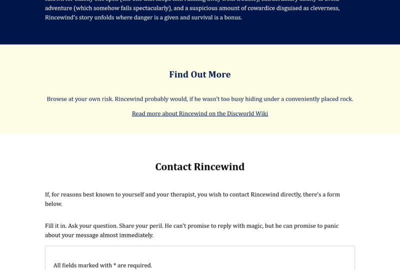
11. Class Project - HTML Part 1: Let's take a look at a mini-project, shall we? So I'm going to be building a single-page website all about my acting here, I, Marlon Brando. Now, it would be cool if you can follow along with me. So go ahead and open your code editor. Now, why didn't you make a page about your personal hero, whether that be an actor or an actress, or a musician, or awesome family member, or even a pet. The important thing here is don't spend too much time worrying about the content itself, because the focus on this mini-project is by making accessible components. So please follow along with me. Perfect parent is points. Maybe look at using some accessible HTML tags are not shown you in previous lessons. And also you don't have to copy the exact order of my components may be swapped yours around a bit. So try to experiment if you can, but if we don't feel comfortable, you can of course, just follow along with what I'm doing. And I will explain the accessible features as our encoding. So I hope that's clear. So let's get started. Well, I'm gonna be showing you in this lesson is the HTML mockup. So all you will need at the moment is an index.html file. So I'm going to using extension called emmet, which allows me to use code snippets like this, exclamation mark tab graphs. And it's made an HTML template, okay? And if you don't have Emmett, you can look in extensions and search for it. In the end, you should find Emmett in the list of extensions that I do believe it comes bundled with VS code out of the box. Okay. Stop building accessible features. So first I'm going to adjust the title, which can cause Marlon Brando info page. First inside the body, I'm going to make a header. And inside the header I'll make a rap. And when we start looking at the styles, I'm going to adjust the ramp to be a maximum width. So all our contents is nicely in the center. Inside the header, I want to include an image tag. I'm going to give it a class of header logo. Now I'm going to be using this logo right here. Now, I've created this myself inside a graphics package. So if you can't do the same, brilliant. If you don't have access to something like that, you can't just use any logo you find on the Internet for now. But even if you don't want to use a, an image for your logo, you can't just use a header like an H1 up in the top of your head, a line which can represent the title of your page. But whatever you do, just make sure it's accessible. Sir. I will be using this logo, which is here. And our first important part of the accessibility is adding an old tag, sorry, because it is. A logo with text in it is important to write out the words are inside the image. Sorry, is literally Marlon Brando. Now let's take a look at building a navigation list. Sorry, I'll be using some semantic tags S or don't use devs, tried to use what is available to you, sir nav. And then an unordered list. Inside will be three list items which contain anchors. Now this won't be a functioning nav. So these weren't actually link anywhere. But let's say there may be an a page, say maybe gallery. And let's say a blog page. Okay, as our header. Now let's look at the main body of work. So the main tag is used to contain all the visible elements inside the main body of your page. Sorry, not including the header, not including the footer, but the content in between. So inside the main, I will make use of the section tag. I'll give it a class of intro, as this will be our introduction. Okay, and then we'll use the rap class for div guarantee. You use another cool class called rap column. And I'm going to send to my work. So I'm going to create another class called rap center. So these classes will all become clear in the next lesson when we look at the CSS, the actual styles themselves. And then this section will have its own header. And inside the header will be an H1. Now this title is important. This will be the very fast and the main title of the page. And I must only ever be one H1 a page and per section. So I'm going to say welcome to the brand info page. K outside of the header. Less include an image tag with a class inter image. I will be using this portrait of the man himself. And then let's take a quick look at this picture so we know what to include for the ol tag was black art picture of him in his younger days. So the alt tag should be something along the lines of a portrait of a young Marlon Brando. And actually that's put a black and white portrait of a young Marlon Brando. Okay, That's cool. Let me just close this side palette ions so there's more room. Okay, then, and then let's have a little paragraph with some introductory text. So I'm going to add a class of inter text. And let's write something about Marlon Brando. Mono, brand is considered one of the best actors of all. Time, he has won two Oscars. And his esteemed Korea for the waterfront. And what year did he win that? Let me try and remember things. 1954. And you should be 4 and 4, The Godfather. Okay? So if you're following along with me and you've created your own page, maybe think of some nice inter-text about your personal here and write it there. Just don't spend too much time worrying too much about the content. Just make sure it is accessible using the correct HTML tags as we're doing here. Okay, Then next section. Let's give this a class of find out Mu. Now this should have a header. Now we've already used an H1, so there shouldn't be a second one on the page, so it should be H2. Find out more. Let's have some text to read more about Marlin Breuer and on his IMDB page, please click on the below link. And I will add a link as well. So this ANCA, I'll give it a class of text anchor so I can style it. So the H ref, I'm going to direct people to his profile on IMDB. Let me just put these attributes on their own line so it's easier to read. Now have a target. I want a certain person Nin in a new window or new tabs or target should be underscore blank, which we'll do that. And then the inner text or text to the anchor. Read more. Now to make this accessible. And then I write opens in a new window. So it's very clear that that's what will happen. And then to make this even more descriptive because read more is not really enough, I'm going to add an aria label here, which says, read more about Marlon Brando on his IMDB page. Because, or he says opens in a new window, I weren't write it in the aria label. That should be enough descriptive words there for the NCA. Let's move this up so you can see that a little bit clearer. Now the next section going to add a contact form. So I'm going to add my rap and I'm going to add rap column as well. So the items inside will stack when we get to the styling in the next lesson. So the next header has to be an H3. We've already used H1 and H2. Now you can have multiple h twos on a page, usually like two or three and no more than that. So this could be an H2, but it can't be an H1. We've already used up their economy and H4 because we've used H1 and H2. So our options here, H2 or H3, H3 because that's sequential. And I'm going to skip the former title of contact me. K, and then in a paragraph. Alright, if you'd like to chat to me directly by Marlon Brando, please fill in the below form. Save this. And there we go. There is our initial mockup haven't finished with contact for me. I just wanted to see how this is laid out.
12. Class Project - HTML Part 2: Okay, Then now let's look at our form inside a form tag. Now this won't actually be a working form. It's not going to be clicking anywhere by we'd like to use some form fields as an example of how best to use them in an accessible way. Okay, so I'm going to have some required fields. It will prevent the user from submitting the form without filling in the required fields. So to make this clear for everyone inside a paragraph tag, I'll write all fields marked with asterix are required, so that is clear to everyone. Okay? And I'm going to group the fields in a div cooled form group like this. Now let's put an input, a text input. And the ID should be name, and we'll give it a place holder of Enter name. Let's save this. You can see down the bottom here enter name and it says it right there. However, just having a place holder, this hit Enter name is not enough. There should be a label. So let's include label. The label for is for this ID right here, which is name and label of name. And this is going to be a required field. So let's put an asterix right there and we can see the asterix down the bottom here. Now are to also help with screen readers making sure that they know this is a required field. I'm going to add an attribute on the field of acquired. And I'd just like to point out that using Emmet in VS code, it gives us some very useful IntelliSense recommendations, Hey, when you start typing, so required are required. So this does help with including accessibility attributes like this. Very handy. Okay, That is looking good, has all the correct accessible labels, including information about it being required. So we're looking good. Okay, Our next form group can spell it correctly. Let's include an input for an email address. So making sure you use the correct HTML tags available to you, I'll be using input type of email. Say the ID should be email. Let's not forget the label for email. And make sure it says email and this won't be required. So I'm not going to be including an asterix or a required tag. So what's next for our form, we can add another div. Form-group. And what we'll be using here is maybe some checkboxes. So have a think about the form that you're going to include in your project and what field you can include. It doesn't matter if you don't copy exactly what I do. As I said, just make sure what you're doing is fully accessible. And we will test this at the end of this lesson and right at the end of the project. Okay? So because there's gonna be a few checkboxes, but they're all going to being part of the same group. We can group them using a field set. And this will keep them together. And a field set should have a legend, which is basically the header of the field set. And this section is going to be nature of inquiry. Okay, great. So there are check boxes inside a div, each we can do input type checkbox. So make sure you're using the correct HTML tags. And then the name is going to be inquiry. And then let's take a look at the label which I'm going to put underneath. And this label is an inquiry about his films, let say. So give the input an ID of his films and the label for needs to match this. Right there. That's copy and paste this the next checkbox. So her information about his life say it's changed the RD and the 4. Now notice how we're keeping the same name here of inquiry. That's because the checkboxes are part of the same question. So we're going to do one more per any other information. So the ID should be other, label for, should be other, and the name will stay is inquiry because it matches the same question. And this is all very important for screen readers because this is the kind of information that will get read out to the user. Save that K Saqqara checkboxes are working perfectly good stuff. Okay, next, let's have a, maybe a text field like a free form text field where you can write anything they want. Since I did div form-group, I'm going to use a text area. And let us give her a row of say eight. Don't worry about the columns. Give it an ID of message. And then the label must have full of message. And we'll just write message for the label k. And then we need some way of submitting the form as if it was a working phone. It's not. But we'll build the marker and the styles as if it was a working form. So we need to submit button, so we'll do button Submit. Okay, So type of submit, good stuff, and then we'll write submit. Here. There's a button down the bottom there. So that's it for our main section and the header above. So all we need now is a footer. The footer tag. Put it inside my rap class. And then I'm going to use a copyright statement here. So to use the copyright symbol, do an ampersand copy semicolon, and look how the VS Code IntelliSense recognizes that good stuff. All right, copyright and my name and the year. And what would be better to make this even more semantic and more accessible is to use the right tag for this copyright. So I'm going to be using small. Or small is very useful for things like, Well, terms and conditions or copyright statement. We hover over that. The MDM reference above says the small element represents side comments such as small print. And this is small print. Don't use the small tag just to my texts mole. That's the wrong way to use it. Use it for, well, for something like a copyright, so make sure it is semantic. Okay, and that is pretty much the HTML lab I'm going to be using. So as I've said, you can copy exactly what I'm doing, but you will get bonus points for Moving your competitors around. So maybe don't have them in the same order that I'm doing them or use different components altogether. Maybe thinking about different form fields you can use. That just makes sure that it is accessible. What we can do is maybe test this inside light hires so there aren't any styles just yet and we certainly haven't finished with the work yet. But as the mockup is done, let's click on Light hives and see what score it gives us. So accessibility is check the, generate the report and see what score we get. Accessibility 100. So that's very, very good. If we scroll down, there's nothing to work on here. It gives us reasons to why it passed. And buttons have an accessible name. That's good. We've included the title element. The page contains a heading. Our IDs are unique. Form elements have labels. Okay, that's good. Maybe when we start working with the styles, this may throw up some suggestions to us, but we'll see when we get to that section, which is coming up next.
13. Class Project - CSS Part 1: Now your mockup is in place. Let's have a think about styling the page. And when you do stall your page. Maybe done copy exactly the styles and colors that I'll be sharing you maybe think of something your own. But as I'll keep saying, think about accessibility. Are the colors that you're going to choose, going to be seen by everyone. Is the contrast good? The text readable or the animations too distracting? These are just some of the things you need to think about in this lesson. The first thing I'm going to do is I'm going to add some custom font styles. So I'm just going to go to Google Fonts. So maybe choose from the list on Google fonts and choose something, a font style that you caught like the alotta. So you can see this is quite readable. That's very clear to read. So that's going to be fine for me. But how about if I show you an example of maybe something that's not so easy to read. So this ballet fonts just click on this. Let's make this bigger. I don't know about you, but this is difficult for me to read and I've got very good vision. Think about someone with low vision reading this, if this is the font family Youth rag of sight, is going to be very difficult for that person to read the content on your page. The maybe unique scenarios where this is applicable. But if you're trying to get information across on your webpage, font, families like this are just not going to be suitable for everyone. So I'm going to stick with my choice of a lotta. And when you find the font that you'd like to use, we can select the style and then it will give you a link that you can put in the header of your page. Now, I've already got this link ready from Google Fonts, and we can just paste this above our title on our index.html page so that font is ready to use. So the styles next begin. And he is an asterix to select everything and he's box-sizing border-box. So all our dimensions are in place and working as expected. Now, let's add the custom font. So on the body, I'm going to add a font family of aerial actually. So what I'm gonna do is the loss of fun. The argues from Google fonts I'll use just for the head is the main text is going to be Arial. Second was going to be Helvetica and then sans serif. Okay, and then some more reset styles on the body, on the UL and the Allies. Just going to remove all the margin and padding and margin 0, padding, 0 headers. I'm using an H1, H2, H3, and on our ankles as well. I want to use my a lot of font, refreshes page and the styles on working because of course, don't forget to link your style sheet. So above the title. There we go. Links to style.css. And your style sheet needs to be in the same folder as your HTML. Just save that. And then we can see our font changing there. So I've made a rap class for all our components. So let's flex them, display flex. And then I'd like to align items center. Let's justify the content, the space between. Let's make sure they're in the center. So margin auto is give the rep, max width of, say, one, fires and pixels. Skip the rapid padding of 0, top and bottom, 25 left and right. And we'll make sure the width is 100%. Okay, see how our wrap is looking. Okay. Looking good so far, but there's more we need to add. Sir, I also included a class of wrap column on some components. No, I need to do is do a flex direction of column so they sit above each other. And then we'll align the items to be at the beginning. So flex dash dot, great, so you can see up changing there. And then I also made a class of wrap center. And I'm going to align the items center, the rigor. So for a class of header, which I should have included on the main header, which I haven't. So add it here. Class of header. So this is our header that contains the nav and the logo at the top. Let's display flex. The items. Must align the items to be center. Justify content to be space between. And let's give it some padding of 10 pixels, top and bottom, 25 pixels, left and right. K getting closer. Okay, as you can see, the header logo is massive. So skewer header logo of Height can be automatic or alter, and width will make it a 100 pixels. That's more readable, okay, Water by this nav. So let's target the nav and then we'll target the UL, which is the direct child of nav. And then we'll target the allies, which are all the children of the URL. So as we remove the bullet points, list-style-type, none, and all give them all the margin left of 20 pixels. Actually, we want them to be in a worrier. So what I'm gonna do is tell you the nav and then the UL. Sure, the display flex. So in a row. Like that, good stuff and then justify content space between. Now it's looking more like a normal header. Now let's look at the anchors themselves. So we'll remove the blue, maybe a different color. So nav UL, LI and then anchors will give a color of black. And what we're gonna do is remove the underlined text decoration, none. Now how about the hovers for these nav items? Now I'm just going to copy this line here and then add hover here. So what we could do on hover is maybe add a nice gold color. Afb 61, ie. If we hover over that. Now, it looks pretty good to me knew, but I would say anyone that has color blindness might not be able to see this gold on the white background and also any color changes. Well, they would be able to see anyway. So really what I need to do is also changed something physically on these anchors as you hover. So I'm going to add text decoration of underlying. So the underline. Now I'm still not sure about the contrast. So maybe when we deal with Lighthouse test at the end, we'll see if this color gets flagged. And if it does, then we can change it. It's going to add some basic styles to all the sections. Just some padding, padding top and bottom of 50 pixels. So they're spread EIR and a little more readable. Whitespace on your webpage will make things more readable. Our H1, then you make this font size of three rems. Okay, much bigger. So good. To maybe I'll leave as is for now. The H3 Darren here. Let's make a bigger h3 font size of two rems. Okay, notice how the H3 is now bigger than the H2 and that's fine to do. If you're looking for different sized head is. As I've mentioned in the past, don't use H1 and H2 and so on, just to change the size of the header, that's not what they're used for. They indicate the importance of each section. So just because this is bigger than this header up here, doesn't mean they should be H2 and H3. That's not how you semantically use these headers. So is the level of importance. So we'll keep the H3 being slightly bigger than the H2 has. Absolutely fine to do. Now let's think about our intro section. I'm gonna make sure this is the display flex. And let's align the arguments to be center k. Actually let's make them into columns of flex direction will be column. Yet that's fine. Going to make the text a gold color. Do hex value of c 6, a 105 be. Okay, you can see it changed here. Now. Rsa, the contrast is pretty pool there. So I will add a background color of black. That's much more readable, That's good. K The image is quite big in your image. Let's give it a width for maybe 200 pixels. Looks good. Let's just make sure the height is water, so it is responsive. Now the intro text, let's make sure text align is in the center. Does that look good? Let's do a margin top of 25 pixels and a max width of 500 pixels. Spaced out nicely. Just noticed that I've ran, he has won two ofs God's think that is an award for anyone. So let us quickly change the typos. And it also spell esteemed incorrectly. He's Philistine. Yeah, let's go with that. Hopefully is correct. Okay, back to the styles. Let's go to our find out more section. Fine art, more background color. I'm going to give it this gold color logging using yellow looks cool. For now. I'll leave the color as it is. I will run a lighthouse test to see if that's acceptable, if the contrast is good, when might return to that. But I need to add a hover state. That's important. Everyone needs to know that that's clickable. So the text I'm co-host. That's just remove the text decoration to text decoration. None. Great. Okay.
14. Class Project - CSS Part 2: Okay, let's take a look at our form now. So the form, I'm going to give us a border, solid one pixel and then Hex of j, k. Let's make it slightly rounded. So border-radius of five pixels, min-width. Let's give this 500 pixels. And let's make sure there's some padding inside of 25 pixels. Okay, shaping up nicely. Okay? And then I've used lows of divs inside for form dash group, the class of form dashed group. And for all of these items, I will display flex. And I'll make sure that the flex direction as columns so they stack on top of each other. Like that. Let's make sure there was a padding bottom or 25 pixels, so they're spread. I was looking readable. And then for all of our labels, make sure there is some space between them. And the form fields below some margin, bottom. Ten pixels. Yeah, that's enough space that be fine. How about the fields themselves? So input and also the text area. I'll add some padding of 10 pixels, top and bottom, 25 pixels left and right, okay, and spread. I actually think that's too much padding. 15 pixels. Yeah, okay, that's looking good. Just realize the email is missing noise place holder. So I'll just add that in to here. Placeholder equals enter e-mail. Much better. I'm going to do the same actually for the text area. Placeholder message here. Okay, Great. Back to the styles. Now, this form submit button could look a bit better. So as the form direct child button. Okay, how are we going to style this background color? Let's make here zeros, 0000, some black. Let's give it a border, solid one pixel. And then that's used gold color I've been using. Is that looking k, we need to change the color then again, we use the same gold. Yep. Okay. Karina make this slightly rounded. Say let's do border-radius of five pixels. Let's make sure that cancer is a pointer. We know it's clickable like that. Good stuff. Padding. Ten pixels, top and bottom, 20 pixels left and right. And that's looking pretty good. Now I just want to check is how the focus outline is looking for this form. So yeah, for name as good email, checkboxes, message, and then it does go to the submit button. But because I'm pattern is black, can't really see the airline bat. Well, sorry, I'm going to add a bit of space between the button and the outline. So you can do that by using eye line, dash, offset. Add five pixels here. Tab across again. Okay, that's looking good. You can see the outline quite clearly now. Now how about a hover state for the button? So it because I'm lazy, I'm just going to copy that. And then I'm going to add colon hover. Okay, what would I like to change? It's changed the background color to be gold. We change the text color to be black. So I'm basically reversing the colors. How does this look at the moment? Yep, good, or will change orders. Well, actually, to be the reverse, so border solid one pixel, black. Good. Because I'm fancy, I'm going to increase the size to transform scale to be worn 0.25 K. And then I'm going to make sure that the animation is nice and smooth. So transition property, we're changing the background color. We're changing the border. I read changing the transform. Now I have a transition duration. Let's do this over 0.2 seconds. And then see the transition timing function to be 0s in arms. Okay, looking nice and smooth. As I've mentioned in a previous lesson, animations like this could be distracting for people with neurological or cognitive issues. So what you want to make sure is, if you pay does contain animations that change quite dramatically. Say this button. You need to give the user the option to be able to turn these off or at least reduce the motion on the page. Now how do you do that? What you need to do is I'm going to put this at the top of the page because this is going to apply to all animations, is you add a media query code at media. Then in brackets. For fors, dash reduced, dash, motion, colon reduce. Okay. And everything in here. Will contain styles that will apply to someone who has set this on their machine. So what can we do? I'm going to select everything. I'm going to select the pseudo element with before and the same for after. So was it I'm actually selecting there. Well, it's pretty much everything that exists on the page. This is what this asterix does. And then it means I can set animation duration to basically be 0.0012. So I will set this to important, so it overrides everything. So the animations will be instantaneous. I will do the same for transition duration. Transition duration 0.0012. This is also going to be important. Now, these will change the or remove the motion in between the two states of animation. So watch high. So that's still looks the same. And this is because I haven't changed my reduced motion settings on my machine. So someone with any cognitive issues may go to their preferences like this. There we go to accessibility. And we'll go to Display. And they would click on, would use motion. And this will trigger any information that's inside this media query. So what does that mean for our button? You can see there's no transition, is the animation happens immediately. But this large scale increase could still be distracting. So I'm also going to do specify that scaling transition. So Form button hover transform. I'm going to reset the scale to just be one. I'm gonna make sure this is set to important. Now let's test this. So owning changes the color so there's no more distracting animations. So that is how you test your would use motion animations. And I'm just going to remove that. Says check yet the animation is back. Okay, more is left to do. Well, it's any our footer right down the bottom there if you can see it. So footer. Let's add a background color of black. 000, 000. We add a color of maybe gray for the text. Display. Flex the items. Let's align our items to be. Center. Justify the content to be space between padding, 10 pixels top and bottom, and 25 pixels left and right. Okay, and that is copyright. So as a page pretty much done, let me just check. I haven't missed any classes. From our mock-up. I can see that I have a case in these everything inside finite more, make sure is in our wrap. And also have RAP column added to that. Let's have a look at our styles now. Okay, that's looking good. Hopefully you have followed along with me and maybe change the colors, may be changed the layout to match your hero page. But we're not quite finished yet. I can see some things here that would failed any accessibility checks. So how a barrier? We just double-check and Lighthouse light hairs inside Google Chrome it. Okay. Accessibility is checked as Generate Report. See what it gives us. Okay, accessibility 1907 were in the green, so that's good and that's what you should be aiming for. But let's see if it gives us any recommendations. Okay, accessibility, background and for ground colors did not have a sufficient color ratio. Failing elements that are to see if I hover over this one, It's pointing to read more right here. Okay, that's fine. So let's fix this. So this is inside our text ANCA. So I'm kinda make sure the text Anchor is clear. Let's make the color black. So 000, 000. Okay, it's not black. And then another failing element is small, which is the copyright. And as you can see, I hope you can see that right at the bottom, that gray isn't very readable on the black is a. So let's update the footer. Let's make sure changes grey to be, how about this gold color that I've been using? And that is more readable. Okay. And the past audits are all green, so these will be accessible features we've used that are working well. So please run Lighthouse on your page and if this flags up any issues or warnings, please work through them. And then that is your page done with fully working, accessible features. Well done.
15. Class Project - Sharing is Caring: Now to share your work on Skillshare. So myself and other students can see your great work. Just open GitHub Desktop, which I've done here. Just make sure that you're signed in or going on Preferences and I am signed in. And then the drop-down here, we're going to create a new repository. Okay? And I'm just going to navigate to the folder. Let's make sure you do the same to the root folder of your work and give your repower name and call accessibility Skillshare. That's fine. And then click on Create Repository. K should be open. And just make sure you see some files here on the left, which I don't. That's probably because it has created a repo folder for me inside my directory. So I'm going to do is just copy my files into that folder. Like so. And then we can see our changes here. Are k there ready to push up to GitHub? So in the summary failed, I'm just going to write a note. Feature, single page, accessibility, website, something along those lines, and then commit to main, which is the name of the branch. And then on the right hand on the top I'm going to publish to the repository. So just to confirm that value up to GitHub. And after a few seconds, once it's pushed up all your work, we can check the repo on GitHub, which we'll do in our and go to github.com, make sure you're signed in. And on the left should be a list of your repositories. I just searched for Skillshare to narrow down to the repair. So just click on that and it'll open up. Okay, and to make sure this is made public, so you can push it to GitHub Pages, just go to Settings here. And then all the way down the bottom. You need to change the visibility of the repo from private to public. And under GitHub pages you can see it says upgrade or make this repository public to enable pages. So change visibility here. It's currently set to private. Click on make public. And then I'll say, Please type the name of your repo to confirm. So I'll just copy this. So this is for security reasons. There we go. I understand change repository visibility as narrow public. And then in GitHub Pages, you'll see there are now some options for you to choose. So make sure you choose the main branch, which is where you've just committed your work. Let's click on that. We want the root directory, I will click on Save. And then once this loads, this should give us a URL to our website, which will be public folder. See here is so when your URL is ready, I encourage you to share it as it will be a link to your published how page, website. I maybe by a, by the accessibility features that you've added. By adding this all to the your project section of the class. Because this will allow me to offer you any feedback and suggestions. I also encourage you to interact with other students so you can offer each other support. Of course, if you do have any questions or need more tips, then please let me know. I'm happy to help.
16. Summary: Well done. You've done an awesome job of getting all the way through this course and creating your own all inclusive single-page website with accessibility features. You've learned so much in these lessons all about the fundamentals of web accessibility. The different levels found in the accessibility guidelines, the various disabilities that you must consider when you work on your next web project. And how to implement the correct HTML and CSS accessibility features to create websites that are all inclusive and usable for everyone. Now I've been a developer and having web accessibility knowledge, such an important and necessary skill to have no matter what level you're at, whether that be a junior, mid level, or senior, it's absolutely fundamental that you make accessibility part of your web development process. Not just on a legal level, but also in print. Any discrimination and the products that you make, I encourage you to take your new found knowledge. And if you work in a big a development team or creative team, impart your accessibility knowledge at the planning stage of your next project and explain how and why it's important to include these features. Finally, I just wanted to say a massive thank you for not only signing up to the schools, but also for completing it. Without your support, teachers like myself would not be able to create content like this. So really thank you so much. If he did enjoy this course and I really hope that you did, it would mean so much to me if you could take the time to leave a review, I read every bit of feedback that I get and take on board any comments that you may leave. So I can keep on improving our lessons and keep making the goals is that you find useful. So with that being said, thanks again so much, you're awesome. Now go forth. Incurred.
 David Sealey, Web Developer