Transcripts
1. Intro for Skillshare videos: Hello, and welcome.
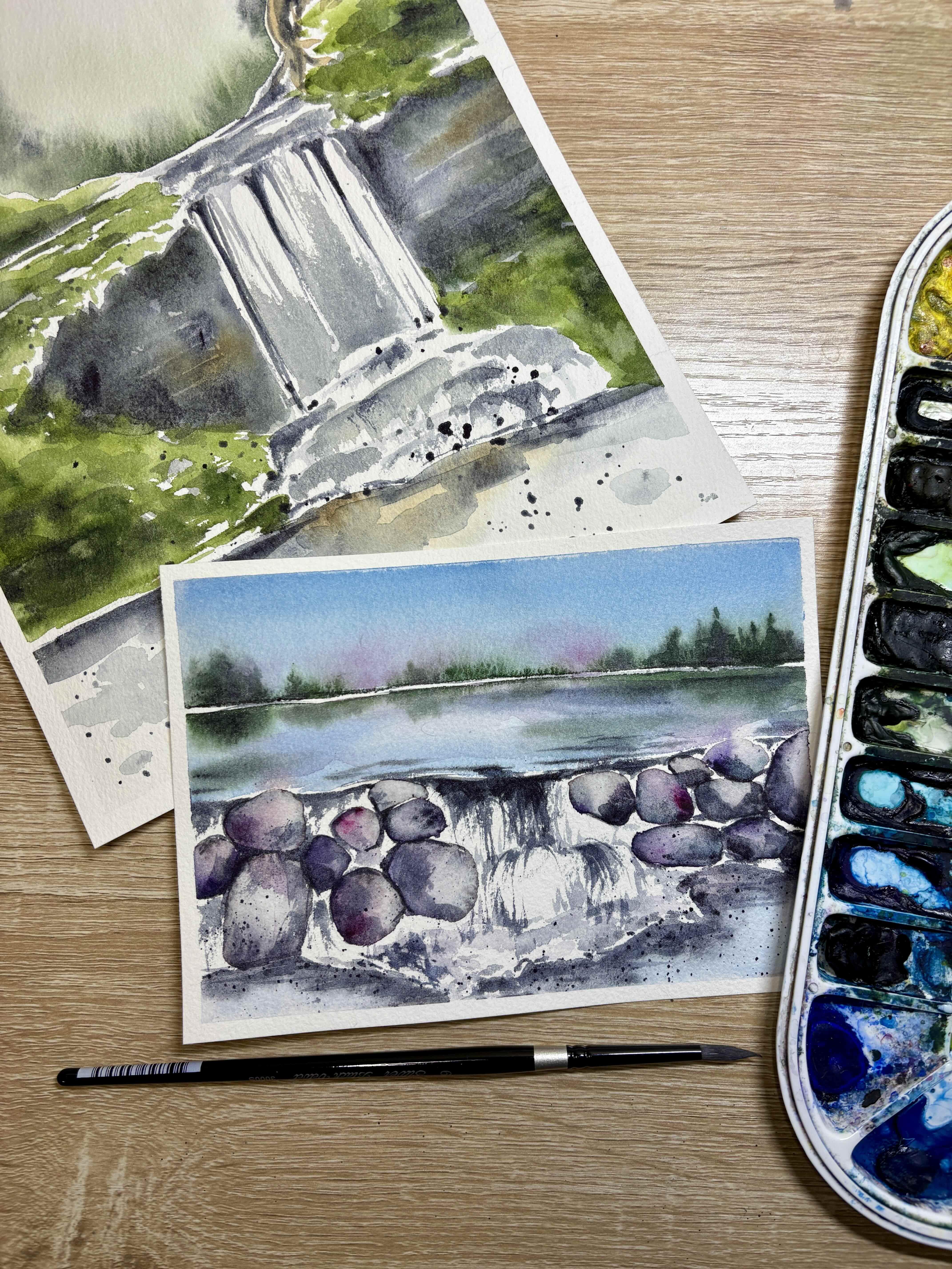
My name is Emily, and I'm an artist and instructor based in Madison, Wisconsin. In this Skillshare tutorial, we'll learn about the basics of painting a waterfall
in watercolors. We'll learn to paint
a soft skyline, as well as some rocks. And then we'll follow it up
by introducing how to paint a very basic waterfall using
a dry brush technique. You'll have access to a tracing template
included in this tutorial, as well as some color
reference photos and printout instructions that will teach this
tutorial step by step. So grab your supplies, and let's get ready to paint.
2. Supplies: Alright, let's talk quick about supplies needed
for this tutorial. So first of all, we're
going to talk paper size. So this tutorial,
you can do either with an eight by
ten inch sheet of paper or a five by seven inch
piece of watercolor paper. The video is showing this tutorial with a
five by seven inch. However, there's also a
template for eight by ten. It just depends on how
you prefer to paint. And if you want to work a
little bit smaller or larger, just know that you might
need to work just slightly quicker for the sky
and the reflection, just to keep it wet as you're
dropping in your colors. Now, both sheets of paper
that I'm using is arches, 140 pound cold pressed paper. That's our paper that
has texture to it. You are going to want a cold pressed paper for this tutorial, as we are painting
the whole paper, and we want to keep sections of it wet so that we can
drop in our tree line. You'll also notice
that I'm taping my watercolor paper to a
plastic corrugated board, and with some watercolor tape, you can find a link to all of the supplies that I'm using, of course, in that supply guide. There's a link to finding the exact types that I'm
using in the video tutorial. For brushes, you will need a larger capacity brush for
wetting the sky and the lake. You'll notice in the tutorial, I am using a quill brush. It's from silver Limited. You can also use a flat brush
just know that you won't get the section quite as wet as you might
with a quill brush. Really any large size
capacity brush, a mop brush, anything that you can use to wet the whole area quickly to give you a little bit more time
to drop in your colors. The brush that you'll see me
using for the majority of the rest of the painting is
gonna be a black velvet, silver limited, round
size four brush. I use this brush for
the dry brushing, for dropping in the trees, for painting the rocks, for doing the splatter,
basically for everything else other than
wetting the large surfaces. However, if you have
a round size zero or one detail brush that
you'd like to use for the rocks or
the trees instead, because you prefer using
a smaller brush for that, that is completely up to you. Watercolor paints, you can see the exact paints
and the colors that I use in the tutorial
in the supplies guy, those colors are
circled for you. I'm using Daniel Smith colors. If you do not have
Daniel Smith colors, we want a blue for the sky. I'm using a gray for gray for the rocks and indigo for
the rocks and the water. You will want some accent
colors, potentially. I'm using a magenta
and a purple. And then we're using green, a deep green and an
Indigo for our tree line. You can see the exact colors that I use in the supply guy. You'll also need
your cup of water and a paper towel or a rag, and we're all set
to get started.
3. Painting the Sky and Tree line: Alright, so we are going to
start by painting the sky and the tree line both
in the same steps. So I'm starting with
my large quill brush. You can also use a mop brush if you would like for this step. We're going to wet our horizon line up to where our trees are. So well, basically, up
until the water is. We want to include the
tree line in the sky. So after I wet that
small section, I'm going back and
grabbing some thalo blue. This step has to happen quickly
because we need to drop in our tree line now while
the sky is still wet. So I added that blue fairly quickly. I
didn't overthink it. I switched to a size
four brush, round brush, and then with a slightly wet
but not overly wet brush, I grabbed some deep sap green. You'll notice I'm dropping in that concentrated deep sap green along the base of
the tree line there, and I'm allowing that sap green to slowly
seep into the sky. I'll come back with
more sap green, concentrated deep sap
green on my brush, and actually paint a line
along that horizon line. Now, a few things that you might notice happening
to your own piece. If you're noticing that the
green is spreading too much, you might have too much
water on your brush. Every time I go back
to grab more water, it's really just a drop or two of water on
the tip of my brush. As I go to Grad More Water, I'm switching to indigo now. You see how this
moves very quickly. I switched indigo to just add a little bit
of darker color. I'm still sticking at the base, but then I decided
that I'm going to add some more pine tree shapes. And so now I'm starting at the tip top of where those
pine trees would be. I'm keeping those kind of taller pine trees towards
the edge of my painting, and I'm keeping the tree line in the very middle of my painting to be really nice and loose. So all of this needs to happen while the
sky is still wet. If I notice my sky
is starting to dry, that is an indicator to me
that I need to stop working. Now, you also want to think about not overworking this area. So now that I'm adding these little tiny dots
along the right hand side, I'm noticing it's
starting to dry. My paper is drying
slightly because those little burbed dots
aren't spreading quite as far. And so this is my sign that
I need to be done soon. So I'm just adding some really
tiny little lines here. I just want them to be
little tiny shadows. I don't want to add any individual branches
or things like that. These are meant to be in the
distant and quite blurry. Make sure that you are
not trying to touch up or correct any part of
the sky at this point, using a wet brush, you will ruin the sky if you reintroduce too much water to this skyline. So let those little
tiny imperfections go.
4. Painting the Rocks: Alright, so we are going to let the sky dry just a little bit, and while we let the sky dry, we're gonna start
painting our rocks. So right now, I am mixing up a transparent shadow violet that I'm going to use for
the first layer of my rocks. So this is kind of a
medium transparency. What I'm going to do is I'm
going to paint each rock individually using this
base coat of shadow violet. Then once I've finished
painting with shadow violet, I'm gonna drop in some water in little droplets in
the center of my rock. This will push the pigment
to the edge of the space, and it's also going to kind
of rewet the area so that I can drop in darker
pigment along the edges. I'm going to go in and drop
darker pigment using indigo. This indigo is
from Daniel Smith, so it's a little bit
more of a gray indigo, and it's not quite as blue. If you're finding
that your indigo that you're using is a
little bit too blue, you can feel free to drop in concentrated pains gray or any other sort of dark gray that you have around the edges. So I'm dropping in and
dotting this indigo, this concentrated indigo
along the outer edge. I might also concentrate
some more of that indigo along the
base of my rocks. All I'm wanting is I'm
wanting to give it texture, and I'm wanting
to give it shape. So once again, I'll
paint rock by rock with this base layer of shadow violet or pains gray, whichever
gray you have. Then I'll take and drop some water on purpose in
the center of my rock. And then I'll add my darker
colors around the edge. Now, in addition to your indigo, you can also add accent
colors to your rocks. So you'll notice that I grabbed just the slightest
amount of purple, and I'm adding just a
little bit of that purple. I might mix a little
water in with it so it's not too
bright and vibrant, but I just want to give a
little bit of a shade of purple or a shade of magenta
to some of my rocks. I'm still using that indigo, so I'm still creating a really
dark edge around my rock, but that accent color
is just gonna give a little bit more depth and
a little bit more color, obviously, to my paintings. So I'm going to go
ahead and I'm going to keep doing this with
all of my rocks. I'm going to continue
to add water, and I'm really not worried about these rocks
being too watery. Really, the more water
that you do drop in the center and the more pigment that it pushes to the exterior, the more of these
little almost, like, spider like veins that
you'll see from the pigment, kind of trying to creep
back into the center, and that gives it some
really cool fun texture. So play around with
how much water you add and how much color
you add to your rocks. Another note for painting our rocks is that
we want to try to keep from painting two rocks that are immediately
next to each other. It's not a huge deal if you have a little bit of color bleeding
from one rock to the next, but we definitely want
to make sure that we keep the definition
of each rock. So we're going to try
to avoid painting the long edge of
two rocks that are smushed next to each other so that we can have
some clear definition. As I'm painting, you'll
notice I'm adding in some a little bit of that
violet, that purple color. I'm also adding in a
little bit of magenta. That's a quinacridone magenta. You can change up your
colors that you add. You can add oranges. You can add greens, tans, browns to your rocks. Whatever sort of accent
color that you do add, think about where else
in your painting, you might want to add
that accent color, too. So I chose this
purple and magenta, and I'm going to add that
purple and magenta later on in my painting in the sky and in
the reflection of the lake. So when we're adding our colors, we just want to make sure
we're not adding colors in one spot without adding them
in other spots as well. Alright, so I've gotten
to a point where I need to pause on my rocks
because they're too wet and I don't want to ruin each rock and paint the
one that's next to it. So I'm going to start working on the little section of the lake
that's in the foreground. So this section of the lake, I'm going to start with my
quill brush and wet that area. Now, wherever the
waterfall is hitting, that's going to be nice
and bright and white. So this section that
I'm painting right now is this section
of the lake after all that white foam and all of the spray back
from the waterfall. So I'm kind of making, like, a little yew shape around
the base of the waterfall, and I'm making this not even. I'm making that line,
not an even line. I'm adding a little bit
of the little blue to the base there just so
that it looks like water. And now I'm going
in to that edge that's closest to the waterfall
and dropping in indigo. So I want that edge
to be nice and dark because right after
that foamy foamy spray back, you're going to have that
intense reflection of the lake. Now, as I'm adding this, I'm making sure that
that line that I created that kind
of zigzag line, I don't want that to be too
apparent that it's a line. I don't want it to
be a hard line. So I'm going to go back
with the edge of my brush, and I'm going to add
some little blobs of color along that edge. It's not going to be as dark, so I'm adding a little bit
more water to my brush. Whatever color was left on my brush is the color
of this little, like, foamy spray
there at the base. And these little blobs, I just want to make
sure that I'm not going further that I'm not going higher than my rocks because that's where the base of the waterfall is gonna fall. Okay? So the
baseline of my rocks there is going to be
where these blobs stop. I'll leave some white of
the paper to shine through. But like I said, I'm just
trying to mess up that line, that edge because
I just don't want that edge to dry so hard. Alright, so now that I gave a little time
for these rocks to dry, I'm going to go back
in and finish up the rest of the rocks
using the same technique, this light gray as a first
layer, dropping in water, dropping in my accent color, and then a dark indigo or a dark gray along the
edge of my rocks. And just as a friendly reminder, don't be afraid of using too much water on
your rocks here. You'll really notice how
much water I do use. And, of course, it's
enough that if I were to pick up my painting when
I'm painting my rocks, it would probably dribble down. So also do not worry if you have two rocks that the colors start to bleed together.
That's not a huge deal. We're also not worrying if that creates a hard edge
at this point. We will be painting
a second layer on our rocks to add a little bit
more shadow and definition. This first layer is wet on wet, getting down those colors and getting the
shape and texture.
5. Painting the lake and upper Falls: Alright, so transitioning
to painting the lake, we're going to go back
to our quill brush, and we're going to
wet the lake section. This is the section
above our rocks. Now we're going to take
great care to leave a tiny sliver of white paper along the
base of that tree line. I don't want my lake to go up to the edge
of the tree line. I want there to be a
little white sliver to differentiate the wet on wet from the top and the
wet on wet from the bottom. Now, I also am going to only
wet up to the rock line. I'm not going to wet where
the waterfall will be. You might notice there's a
little line on your template. You can try to
follow that as well. I'll start the same
way as I did with my sky using that thalo blue. I want to keep it really
nice and light in color. So I'm adding that
thalo blue first, but I'm working fairly quickly because just
as with the sky, I'm going to want to drop in
green from the tree line. I'm making sure to
not once again, I'm not going all the
way up to the tree line. I'm not touching the tree
line with my paint brush. If I accidentally touch some
of these rocks, that's okay. You'll get a little bit of color that kind of blends
into the water. It's not a huge deal. I actually kind of like how that looks. Alright, then we're going
to add a little bit of perhaps darker blue reflections on the left and the right
side, if you'd like. And now before it dries, we're going to look at
our tree line reflection. So using whatever liquid
is still on my brush, I'm not adding more liquid
at this stage. I lied. I'm adding a little
tiny itty bit on my brush because when I
touch it to the paper, I didn't get any of
that green coming off, which means my
brush was too dry. So I added a little drop of water on the
edge of my brush, I grabbed a little bit
of that deep sap green. And now I'm going in, and I'm painting
along that top edge. So I'm leaving that
sliver of paper so that there's a clear
definition between the trees and the reflection, and now I'm going to allow that water to pull
the pigment down. I can add a little bit
more of that green pigment under the sections that
have taller trees. We don't want these shadows
to be an exact reflection. So we don't need to worry about making sure
that you can see two little trees in the reflection or three little
trees in the reflection. We just want to look
at it as like clumps. I'm also taking some of
that deep sap green, and I'm adding a
little extra shadow in certain spots in the lake. What this does is
it just mimics that there's probably trees around the edge of the lake
that we can't see. It just gives a little
bit more dimension. Just be careful of
not adding too much of that green in the center. We don't want our
lake to turn green. Alright, so I washed my
brush off and I used a dry brush to just soften
up that edge a little bit. And now I am ready for
my waterfall. All right. So if this is your
first time painting a waterfall or using a
dry brush technique, I highly suggest that
you practice this on a scratch sheet of paper before trying it on your final piece, just because dry brushing is one of those techniques
that once you do it, it either works or it doesn't, and it's hard to lift off
after you've done it. So right now, I'm mixing
an indigo with some water. It's a medium transparency, so it's fairly dark, but I could always go darker. Now, my lake is still wet, so I'm using caution
on painting a line along the center or the top center of where
the waterfall is. In certain spots, it's okay if that indigo touches the lake. I can get a little bit of
bleeding into the lake, but I don't want a lot of
bleeding into the lake. After I've painted
that line of indigo, now I'm using the edge
of my brush to dry brush some sections
coming down from the top. I'm going to continue that in certain sections of the
mid line of the waterfall, where I add that line
of color and then using the edge of my brush to very
quickly dry brush downward. Now, this does take a
little bit of practice, and you might want to test out this dry brush technique with a few different
sizes of brushes. You might find that a smaller brush will work better for you. Before this dries, I can go back and add a little
bit more depth to that top of the waterfall because that's where
it's going to be the darkest is right where it's
flowing over the edge. So I'm adding a little bit
darker of that indigo. And since I've let that
lake dry a little bit, I'm also going to add a few little water
reflection lines with that indigo just
above that line. These water reflection
lines above the waterfall aren't going to necessarily connect
with each other, so I'm adding about four
different lines there. And I'm going to continue the same waterfall and dry
brush technique of painting that long line and then using
the edge of my brush to quickly wisp some of those
dry brush marks downward. Now, for this second
level of waterfall, that little tiny
waterfall in the center, you'll notice that
my dry brushing, I'm keeping it to
the outer edges. So I've got this almost shape of that second
level of waterfall. I'm going to keep the darkest of my dry brushing on
the outer edges. So I'm thinking about these waterfalls as
like little umbrellas. And I want to keep that
little umbrella shape, and all of the linework that I add is going to add to
this umbrella shape. And of course, in those little tiny sections in
between the rocks, we can also try our best to add a little bit of dry brush. If you're having a hard
time with your dry brush, really try to adjust the amount of liquid you have
on your brush when you when you do these
quick strokes downward. If your brush is
too wet, of course, you can't get this
dry brush effect. If your brush is too dry, you also can't get
the dry brush effect. So it has to be this perfect, just slightly damp consistency to really get the dry
brush technique to work.
6. Defining the Rocks and Painting the lower section of the Falls: Alright, so now that we've
got that first layer of water of dry brush
on the waterfall, we're going to go with
this indigo and go around some of our rocks to define our rocks a
little bit more. Now, when we grab this indigo, we're using still indigo
mixed with water, but it's going to be a
lot darker of an indigo, more of a dark transparency than a very light transparency. We also want to avoid completely circling our rocks
with this dark indigo. We completely circle it, these rocks are going
to stick out too much. So I tend to add extra definition where rocks are touching each other or
just along the base. You'll also notice
that I'm going in and adding a little bit of dry brush texture to the rocks themselves using
the same indigo. Now, it's a similar
dry brush technique to the waterfall where I'm using
the edge of my brush and I'm wisping kind
of sweeping with the edge of my brush to just add a little bit of
texture to the rocks. I'm trying to keep
this texture along, like the base of the rocks or
just one side of the rocks. I don't want to
completely darken them and add a whole complete layer. I'm just adding a little bit of shade and shadow
to these rocks. And, of course, don't
forget that you can correct any sort of
mistakes that you make. These shadows were a
little too dark for me, so I came in with
a little bit of water to lighten them
up a little bit. I also can use my paper
towel and blot off if some of these
rocks got too dark or some of the shadows got
too dark on the rocks. I want to add texture anyway, so blotting off
with a paper towel is just going to
add extra texture. And of course, as I was
painting the rocks, I decided that I wanted to add a second layer to the lake side. So I'm using that same indigo, and I'm painting horizontal reflection lines
in that lake area. It just looked a little
too perfect to me. So I'm keeping a very, very, very light hand on
my brush and adding just some horizontal lines along that base
area of the lake. And sometimes my brain wanders, and so I decided to add a little bit of
that magenta water down to the foamy area and
the base of the watercolor, just to add a
little extra color. You can do this at this time. You can do it at the very end. My brain, that's
just where it was. So I decided to do it then. So we've pulled all of our brush strokes from the top downward for our waterfall. Now we're going to
look at pulling brush strokes bottom up. So right now, you'll
notice I've got indigo on my brush,
that same indigo, and I'm pulling some brush
strokes starting from the base of the little
sections of waterfall, and I'm pulling upward. These are kind of
individual lines that are clumped together, but they're also clumped in
the edges of my waterfall. So I'm trying to keep this same umbrella
shape of the waterfall. And so I'm not going to put a really dark patch of lines in the center
of my umbrella. It's gonna be on the outer edges of my umbrella, if
that makes sense. Alright, so with
my final details and my color corrections stage, first, I'm going to
start with that indigo, and I'm going to go
along my tree line and just add a little darker
of a tree line here. I just want to make sure that
this tree line stands out. Depending on how dark you were able to
get your tree line, you might not need to do this. I wanted a little
bit more definition. So I added just a
little very quick edge of indigo along that
base of the tree line. Now I'm gonna look back
at my rocks and see if I need to add any more
shadows or definition. Maybe I don't have enough
color in my rocks. Maybe I want to add
some light washes of that accent color. Right now, I'm just
looking at the base of my rocks to kind of add a little bit of darker shadow along the bases of my rocks. Once I'm done with
that, I can take a peek at any of my reflections. Do I need to add
extra reflections? Because remember,
those reflection lines in the water we
did what on what? Maybe they dispersed a
little bit too much, and so maybe I want
to go back and kind of correct some of
those edges a little bit. The next thing I want to do
is I want to add splatter. So I am adding splatter to
the base of my waterfall, and as you can see, I started adding some splatter and realized that I was
getting splatter all over. So instead of
getting it all over, I don't want it on my lake. I'm going to use a
paper or, in this case, a plastic board to protect
my lake and trees. Now, for splatter, I
am using that indigo, that dark indigo
for my splatter. I want dark splatter along the base of my waterfall so
that it gives it more motion. I have my loaded brush loaded full of indigo
in my left hand, and I'm hitting it with
another brush on top. So, I like to add a lot of
splatter here because I do think that it helps to connect
the water with the rocks, and it gives it a lot
more motion, as well. And I do like to have a
dark splatter for this and not a light blue, not a magenta. I like to have that dark indigo because it really gives
this sense of motion. So this step is optional. You can always choose to add a little accent color to your sky or to darken
your sky color up. I decided that my sky
wasn't dark enough, so I'm mixing up a little
bit of thalo blue, and I'm adding one line of slightly darker
thalo blue to the sky. And then I'll just add water
the rest of the skyline. I'm going over the trees, and I'm going up to the
sky up to the lake. I'm still leaving that little
white sliver of paper, but I do need to paint
on top of my tree line, or otherwise, you're
going to end up with a hard edge that you won't like. Now that I've added
that slightly darker blue along the top, and the base of the sky is wet, I can add my accent color. So here I was using my
magenta for my rocks. And so I'm adding
just a little bit a little hint of magenta with quite a bit of water
along the skyline there. I decided to bring a little
bit into the water, as well. This is a technique
that's more referred to as glazing where
you've got very, very water down color, and you add it on top of a
dry section of your painting, just to give it a
little bit more color. The reason I'm doing
this is I wanted to bring that magenta from the rocks into other
sections of the painting. So if you had chose if you chose orange for your rocks or green
for your maybe not green, but if you chose orange or
another nice sunset color, I would add that color
instead to your skyline. And it'll just kind of help to connect your painting
a little bit. Alright. And even though I said I was done
with my painting, sometimes I also
like to futz around with it probably
longer than I should. And so here, I had
decided that I wanted to make the waterfall
a little bit darker. It was looking a little
too light for me. And so I mixed up a
little bit more indigo, and now I'm adding
an extra layer of accent marks to my waterfall. So I'm making these
outside the umbrella and the bottom up line
work from my waterfalls, I'm just making it a
little bit darker. This is definitely
not a necessary step. You should look at
your own painting and decide whether or not you think you need to
darken it up at all. Sometimes we run the risk of darkening up a section and
then immediately hating it. If that happens, you
can always lift with a little bit of water
and your paper towel. But for me, I decided
that I wanted to add just a little bit more
dimension there with some darker line work.
 Emily Marie Watercolors, Watercolor Artist and Dog Lover