Transcripts
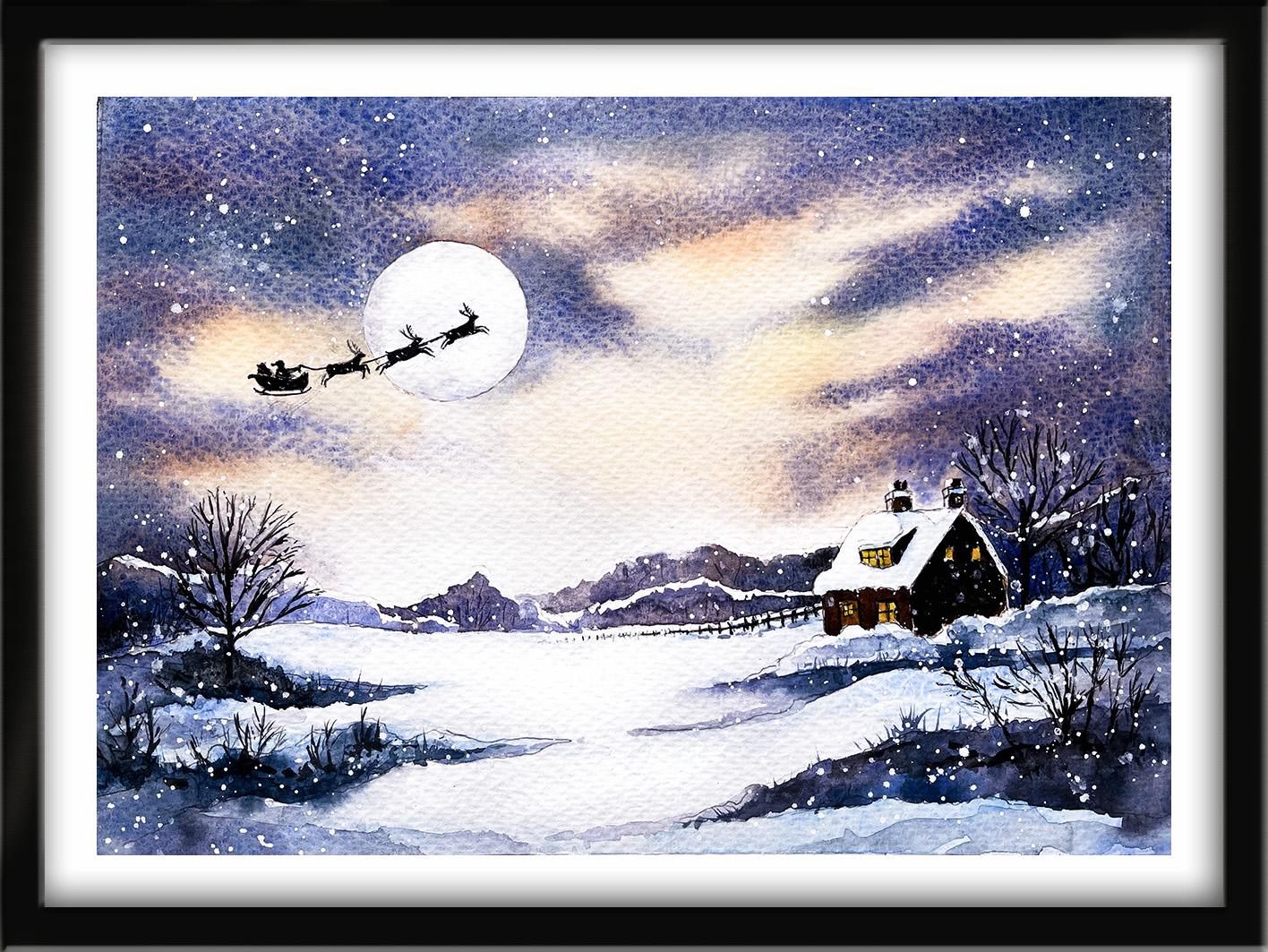
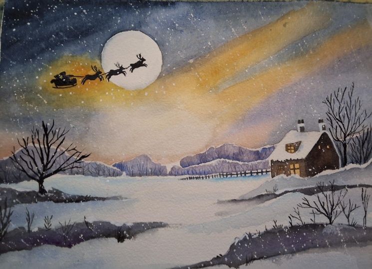
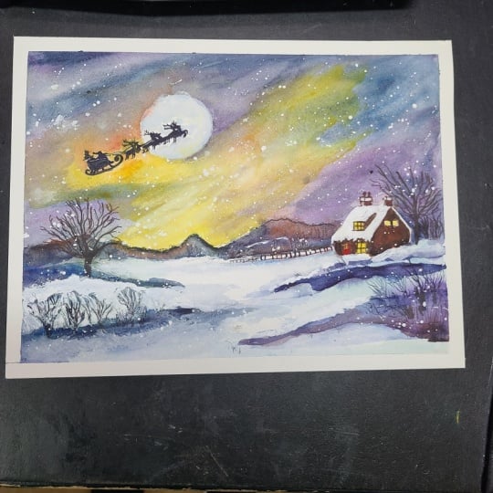
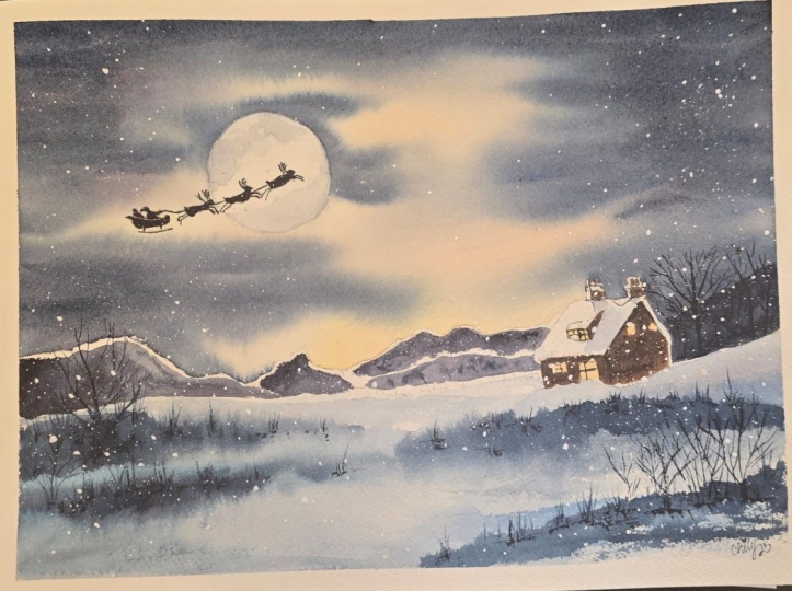
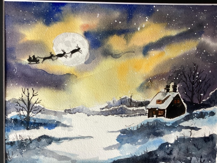
1. INTRODUCTION: Hello, and welcome. In this festive
watercolor class, we're going to paint a
magical winter night scene filled with glow atmosphere
and seasonal charm. We'll begin by creating a
luminous night sky using wet and wet techniques before building the
landscape in layers. You'll learn how to paint
distant trees and snowy hills, add warm window lights, and use tonal values to
create depth and contrast. The class finishes with
Santa's silhouette crossing a softly shaded
moon and spattered snowflakes to bring
the painting to life. It's suitable for all levels, including beginners because I'm going to be guiding you
every step of the way. And I'll be sharing all
the techniques, tips, and tricks that I use in
my own professional work. I've included a copy
of the drawing in the project resources section so that you can download
it and trace it, and then not worry
about the drawing because this is a
painting class. I am a professional artist, author, and tutor,
and over the years, I've sold a lot of work
across the world and helped hundreds of people to
learn more about watercolor. You can see examples of
my work on my website. My style leans towards
impressionistic and contemporary rather
than photorealistic. I like to explore loose approaches that
bring out the color, light, and essence
of my subjects. I've tried to
replicate this across all the many other videos
that I have on Skillshare. I'd love to see your
own finished painting, which you can upload through the project and resources tab. I'll give you some
personal feedback on it, and you'll be able to
see the artwork of other students and
get their support. At the end of the class, you'll have your own beautiful artwork to be very proud of. So let's swizzle our brushes and get on with the painting.
2. Paint a glowing night sky: wet-in-wet technique. Let colours to mingle naturally on the paper: For this class, these are the colours and materials
that I'm using, but do feel free to use
any that you already have. For information on brushes
and paper, et cetera, do check out the basic
materials document that I've added to the
project resources section. Now you can see that I've
kept the drawing very simple, minimal details so
that we get a nice, loose free flow painting. And I've included a
copy of the drawing in the project resources section so that you can download
it and trace it, and then not worry
about the drawing because this is a
painting class. And we're going to
put a little bit of Christmas magic in it by painting Santa and his reindeers making their
Christmas snow ride. In my palate, I got a watery
mix of quinacadon gold, about the consistency of
tea, also some orange, and a thicker mix of
a plum color which is made up of light red
ultramarine and indigo, and then some ultramarine and
indigo just on their own. I'm starting off with the
wetting wet technique, so wet paint onto wet paper. First of all, I'm pre
wetting the whole of the sky area with a large hate brush
and some clean water. Just going carefully around those distant trees and
hills in the background. Now, you do want it
to be nice and wet, so I am putting plenty
of water on here. Also just going round the
circular moon shape as well. It doesn't matter
if I go over Santa because that's going
to be black later, but do need to keep that silvery moon nice
and clear of any color. The reason that I'm
using the wet on wet technique is because it
avoids getting hard edges, which is perfect for
achieving a nice soft sky. When I do add some colors
onto this pre wet paper, they will blend and
mingle into each other, as I said, without creating
hard edges between them. So I'll get some nice soft, gentle transitions of color. To some extent, you've
got to let the paint do its own thing and not try to control it too much,
although, of course, you are always in control, but it's a much
more abstract way of applying the
paint to the paper. So don't worry at all
if the appearance of your sky doesn't look
exactly like mine, it would be impossible
for that to happen. The other aspect
of this technique is that because
the paper is wet, you will get more
dilution of color than you would if you applied
the paint to dry paper. Now, as you can see, I've
added a little touch of orange just above
those distant hills, very pale, hardly there. And now I'm stroking in some streaks of the
quinacadon gold. I'm leaving plenty
of paper in between those streaks because due to
the wetness of the paper, those colors will
naturally travel in the water and blend
into each other. And while that yellow
paint is still wet, I'm stroking in a few
streaks of the orange color. Now, I'm letting
those two colors mix and blend on the paper. I don't want there to be as much orange as there is yellow, so just a few little touches, and you can see already how that blending
is taking place. If you're using an orange
straight out of the tube, do make sure it's a
transparent color and not an opaque color. I've mixed my orange
with permanent rose and the quinacridone gold because both of those colors
are transparent, so I'll still get the glow of the paper coming through
from underneath. So far, I've spent about
3 minutes on this sky, and I'm aiming to get it completely finished
in less than ten. That's because as soon as the paint and the
paper start to dry, if I keep adding more paint, I will start to get hard edges. And the sky will start to
look overworked and muddy. It's really important
when painting a sky using the wet and
wet technique to get it finished as quickly as
possible and leave it alone so that you don't meddle and fiddle
and overwork it. I've moved on to the plum color, adding some streaks of that over the top of my yellow
and orange colors, but leaving some of those lighter colours showing through in between the streaks. Now, the color that
I'm putting on, although it looked
right in the palette, it's actually a bit too
much on the gray side. I want a nice warm
glow in the sky. So I'm going to add
a little bit more of my light red color to it. What I really like
about this plum color is that the ultramarine
and the light red tend to get a bit augmentative
with each other as the paint dries and the colors
separate out a little bit, so you get much more
of a light red, plummy kind of warm appearance. I also want to try and create
a sort of vignette effect. So I'm making the color
darker at the top, right, and top left and along
the top edge of the sky. And to do that,
I'm just adding in a few extra strokes of
ultramarine just on its own. That is, of course, blending in nicely to that plum color
because as I keep saying, everything is still
nice and wet. A lot depends on the
temperature of your room, as well as to how
wet the paper stays. If in fact the paint was
starting to dry and I was beginning to get hard edges instead of this nice
soft appearance, what I would have to
do would be to leave the painting completely
dry, bone dry, and then pre wet it
again gently with some clean water before adding this extra layer of dark
paint over the top. Now it is drying a little bit, not too much that I'm
worried about it, but because of that, I'm lifting my board up and
shaking it from side to side to give those colors some encouragement to run
and blend into each other. As I said earlier, you do get
some dilution of color with the wet on wet technique because of all the water
that you've put on earlier. So I do want to create some
darker tones in the sky, not everywhere,
just a few places. And to do that, I'm using
my indigo and placing just a few thinner streaks in and amongst those
plum colored ones. Using these dark
tonal values against the light ones is the secret
to getting this illuminated, glowing appearance in the sky. If you think about
it for a moment, it's just like when
you put faro lights on or a table lamp
in a very dark room. You do get this lovely
illuminated glow appearance. If you put the faro lights on the table lamp on in
a very sunlit room, you would get that sort
of more washed out look. So it's important to consider your tonal values at this
stage in the painting. I'm also considering where the light of the moon
above might fall. Now, I know that the distant
trees and hills that I'm going to be painting
later will be dark. So it's that central area
of the painting just above the trees and hills and below the moon that I want
to keep the lightest. And again, I'm giving my board a really good shake to encourage those final colours to blend and mingle into each other
without any hard edges. But it's been about 8 minutes now since I started this sky, and I know that if I
keep fiddling with it, I will just overwork it, so I'm going to lay it
down flat and let it dry.
3. Paint distant trees & hills. Add shadows in snow. Paint glowing window lights in house.: I've got a couple of cut
up pieces of credit card. If you don't have
those, you could use a cocktail stick or some
other pointed tool. I'm using my plum color to paint the distant
trees and hills, but I've added a little bit of water to it because I don't want the color to be quite
as dark as it is in the sky. Importantly, I'm not going
right up to the pencil mark. I'm leaving a little thin sliver of unpainted paper
along the top of these hills and trees
because I want it to look like there's been a
fall of snow on top of them. I'm adding a little bit
darker color at the base of the shape because it will get darker as it moves further
away from the light, and carefully taking that color around the snow topped roof. As you can see, I'm using the wet-on-dry
technique this time. The wet-on-dry
technique is simply painting wet paint
onto dry paper. It allows for more control, stronger color, and crisp hard edges
where the paint ends. The paint will only go
where the brush takes it. In addition to the plum color, I'm adding little bits
of ultramarine here and there just to add
variety to the color, and also because these
shapes are in the distance, and anything that is farther
away appears more blue. Again, I'm not painting
right up to the pencil line. I'm leaving that ridge of
unpainted white paper as snow. I'm also using a
clean damp brush to just lift a little bit of the color off here and there, again, to create some variety of tone and make them look a
little bit more snow laden. This central area of trees and hills is immediately
below the moonlight, so they are going to be
lighter in tone than when I come on to paint them
in the far left and right, where they're more in shadow. A Before the paint dries, I'm using the point of my
cut up credit card to just scratch in a few tree trunk
shapes into that wet paint. The paint will flood
back into the scratches, and it will make them look darker than the
surrounding areas. So you'll get this impression of trees without actually
painting them. You can actually get two
different appearances with this little technique. If you scratch into the
paint while it is still wet, you will get a
darker indentation. If you scrape into it
whilst it's almost dry, the scratching
tool will actually push the paint away and you'll
get a lighter indentation. So either way,
you're going to get some nice tree trunk shapes. And I've just got
this right hand side now to finish with
my darker color. And then I think probably all my distant trees and
hills are pretty much done. I think you can see
now how getting this darker color
of hills and trees running along the horizon helps to illuminate the
sky even further. We're getting that really
lovely glow now below the moon. I'm turning my attention
now to the little house. I'm painting the windows
with quinacon gold, and I'm also going to
drop in a little bit of that orange color that we
put in the sky earlier on. I want it to look
warm and inviting, even though it's
in such isolation, and one might imagine there's a log fire crackling
away inside. I'm only going to paint the windows at this point
because I need them to dry before I paint the dark
walls of the house itself. To paint the shadows and
the dips in the snow, I'm using some cerulean blue. It's quite watery, again, about the consistency
of tea or milk. Thinking about where the
moonlight is shining almost in just off center
really of the composition, the left and right
sides of the scene are going to be in more shadow
than the area in the middle. So I want my shadow color
to be darker at the far left here and getting lighter as it moves
towards the center. And we've got some
little dips in the snow where the trees and
bushes are emerging, so they are going to be a
little bit darker still. To add a little bit of
variety to this blue color, I'm going to also drop in some little touches of
cobalt blue here and there. That'll just liven these shadows and dips in the snow
up a little bit. Now, I'm starting off using
the wet-on-dry technique, so wet paint on dry paper. But then, of course, when I add the cobalt blue on
top of the cerulean, that changes over to the
wet-on-wet technique, and we get some nice blends and mingling of those two colors. In order to continue the vignette effect that
I started with the sky, I'm sweeping a little bit of that cerulean blue across the
bottom of the foreground. I'm going to repeat exactly the same process over on the right hand
side of the scene. And finally, I'll
add a little bit of blue colour to the shadow
on the snow on the roof. As when I painted with the plum color on the
distant hills and trees, I'm also on this hedge that's running in
front of the house, not painting right up to the pencil line,
but leaving, again, that little sliver of white unpainted paper to resemble snow
nestling on the top. This is just the first
layer of color on the snow. I'm going to build it up in another layer later
on, but for now, this is just going to be quite simple layering of this
first initial color wash. So for now, keep it
nice and light in tune, and we'll deal with the darks
in the next layer later on. Whilst you're
watching it, adding these colors to the snow, it might be useful if I
give you a little bit of background theory
about painting it. Simple and crisp, white is
actually a colorless color. Mixing red and green
and blue light together is what gives
you white light. Now, because it is white, snow can appear a
difficult subject to paint with watercolor. It isn't really a color, but some consider
it to be so because white light comprises all hues on the visible light spectrum. Therefore, as it comprises all other colors in the rainbow, you can effectively paint snow with a palette of
all these other colours. Because snow reflects the sky, it can often incorporate
a lot of blue, particularly where
the shadows fall. However, especially
when the sun sets, the sky can radiate a variety of other colors that
you can add for depth and visual interest
to the composition. For instance, it can be useful
to add a touch of yellow to areas where the shadows transition into the
brighter areas. It may seem counter intuitive. Snow isn't meant to be
blue or yellow or pink, but it will all work beautifully
together in the end. Another point to note
that when painting white, it's all about tonality. So don't be afraid to use some
medium and very dark tones because this will
bring impact and emphasize your
lighter whiter areas. I hope you found that
background knowledge on painting snow useful, and you can carry it forward to any further paintings that
you do of snow scenes. This painting now,
I'm just finishing off adding a little bit
of the cerulean and cobalt to the
shadow area of snow that's on this right hand side of the roof and the chimneys. And then we can move on
to the next section.
4. Paint house walls. Deepen tonal values in snow. Paint foreground trees & bushes.: I've got some burnt tumber
mixed in my palette, and I've got another brown, which is much darker by mixing the burnt umber with some indigo and a
little bit of black. I'm starting off with
just the burnt umber, painting carefully around
these two little windows and also around the edge of the bushes here that
are covered in snow. Having covered this gable
end in the burnt umber, I'm now going to use my
very dark brown to add some shadow color underneath the roof edges at the top
on the right and left, and also just above
the hedgline where the hedges will be casting
a shadow against the house. Because the burnt umber
that I put on first is still wet, the brown black, the dark brown color
that I'm putting on now will blend gently into
that brown underwash. And so I'll get sort
of a graduated effect. The center of this
gabling will remain a little bit lighter than where it's underneath
the roof gutters. And I'm also using this dark brown color for the
far side of the chimneys, the sides that are furthest
away from the moonlight, because they also
will be in shadow. There's a triangular shape at the right side of
the bedroom window, and this too is facing
away from the moonlight. So I'm going to paint that
also in this dark brown color. The front of the house is positioned towards
the moonlight. So I'm going back to the burnt
umber color to paint this. I'm going quite
carefully with the point of my brush in between
the door and the window, just filling in this
front facing shape in this dark brown color. There is quite a large
snowdrift that's piled up at the bottom
edge of the roof, and that will be casting a
shadow over the front wall. So I've gone back to my
very dark brown color, and I'm just painting in that shadow below
the snow drift. I've decided to use a
watercolour pencil to draw in the window panes because
they're such small items. And you can, of course,
use a small brush with a good point if you don't
have a watercolour pencil. If you do use a pencil, make sure it's sharpened
to a very fine point. You don't want big thick
lines going on here. Yeah. And I'm going to use the pencil to
just add a little bit of shadow underneath the snow
on the chimney pots as well, where that also will be cast in a little bit of
a shadow below. And I'm just filling
in an area that I've missed for painting
the door itself. I now need to add
some more layers of color to these dips and
furrows in the snow. I'm still using the cerulean and the cobalt blue that
I used earlier, but in slightly stronger mixes, so the tone is a
little bit darker. And I've also got some indigo mixed with a tiny
little bit of black, not much, just to give me a
really intense dark tone. H. As you can see, I'm concentrating, first of all, on laying down the mid tones. And then whilst
they're still wet, I'm going to drop in my
very dark indigo color. But I'll add this dark
indigo color quite sparingly because it's a strong
color and it will flood, but I don't want it to overtake
the mid color completely. So I should end up with a mixture of light
tones that we put on in the previous section
and the midtones that I've just put on
now and then some of these very dark tones. If you do get too
much dark color on, of course, you can always lift it off with
a thirsty brush. By that, I mean, a brush
that you've dipped in some clean water and dried
on a piece of paper towel, or you can dab it with a piece
of paper towel to lift it. Similarly to when
we painted the sky, because we're using the
wet-on-wet technique, putting wet paint on
top of wet paint, we're going to be getting a
kind of abstract appearance. So yet again, don't worry if yours doesn't look
exactly like mine, the watercolor will run
and do its own thing. I'll let you watch me painting these darker tones on the left and right
side of the painting, and I'll hop back on in a few minutes when I'm
ready to paint the bushes. I'm using some very
dark blue black color, that's the indigo with
a touch of black to add some little bushes and twigs
in these darker toned areas. Do need a brush with a very, very fine point for this. I'm actually using
a Chinese brush because I find that
unlike a rigger, they hold a little
bit more paint in the body of the hair, but they've got this
very fine point, so you don't keep having to put your brush in
the paint as much. Now, the important
thing here is to keep the little twig and bush
shapes very varied. Change the direction
of the little twigs, have a little clumps
of them together. What you don't want is a
row of soldiers stood in a line at equal distances
apart and equal heights. We're not copying this
little photograph that I popped up in the top
right hand corner, but I just thought it
might be useful to have a quick look at how random
nature is with these things. And how thin and spiky these
little bushes and twigs are. So just remember, as I
said a little moment ago, you need a brush with
a very fine point. For the fence in the
very far distance, I'll switch back to using my black watercolour pencil that's also got a
very fine point. With such tiny
little fence posts, it would be really
quite difficult to get those in with a brush. I'm adding a very thin
streak of cerulean blue just below the fence post because as they
dip into the snow, they will cause a
little bit of shadow. I'm adding a little bit more of that very dark brown color that I used before because
looking at the gable end, it has actually
dried a little bit lighter than I wanted it to. So I'm just adding another
layer of that dark tone to give a bit more definition and structure to
the little house. I'm using the same,
very dark brown black color now to paint the trees
and the bigger bushes. Again, I'm being mindful to
keep the branches and twigs relatively thin using
my small pointy brush to get this fine detail in. And although I've reverted
to using a brush now, there's no reason why
you shouldn't use a watercolour pencil if
you find that easier. M No.
5. Paint the Santa silhouette. Shade moon for rounded 3D effect. Spatter technique for snowflakes.: For this small silhouette
of Santa and his reindeers, I'm using black straight
out of the tube. But of course, you
could continue to use the black
that you've already mixed with your burned tumber
and indigo ultramarine. I'm also switching
between two very, very small brushes because these are extremely
small shapes. The one that I'm using with
the lavender violet handle, that's a micro mini
size 20 stroke note. The one with the yellow
handle is actually a nail beauty brush used for painting very intricate
designs on people's nails. And this nail brush or beauty
brush, as it's called, is actually one of the finest tipped brushes I've come across. It's not really met for art, but it is very cheap, much cheaper than a
normal art brush, and does the job
wonderfully well. Although I usually advise people to work as quickly as you
can with watercolour, when painting these very small, intricate and very dark shapes, this is where I would suggest
that you do take your time. Because we're working with
this very dark black color, it would be more difficult
to correct mistakes later. But it would be possible
to do that to some extent, whereas if you used a
black waterproof pen, which you might feel more
comfortable in using, but do remember that
because it is waterproof, you wouldn't be able
to correct that at all if you made any
accidental marks. This little area will
be the main focus of the painting because it's where we've got the strongest
tonal contrast. We've got the blackest black
in Santa and the reindeers, and we've got the lightest
light in the white, silvery moon behind them. So this little area
of extreme contrast will immediately draw the
viewer's eye straight to it. And for those of you who are very happy with
your snow scene so far and don't really like the option of putting Santa
and the reindeers in, you could miss that
out altogether and just stick with the lovely scene that you've already got. You could, of course, add
a few little birds in the sky if you wanted to add
a bit more interest there. End of the day, it
is your painting. So do feel free to make these
choices as you go along. But if you do decide to put
some birds instead of Santa, make sure they're very small. Look at the size
of the reindeer, how big they are and
adjust accordingly. What you don't want is any big flying albatrosses
coming across. I've reverted back to my small
pointed watercolour brush, and I need to add a
little bit of shading to the silvery moon because
it's a rounded shape, and we need to again recreate
a three D appearance. I'm using the same colors that I've used in the sky
except they are very, very watered down, so quite
pale and light in tone. In the main, we want
to keep the moon as white as possible
while doing this. We don't want it to
become a sun or a planet. It is a big white, silvery moon, and that's helping to create some of the
magical atmosphere. Several options for
painting the snowflakes. You could use some cheap
white acrylic paint. Windsor and Newton
designer gouache or doctor PH Martin's
bleed proof white. Personally, after a lot
of trial and error, I've found that the
bleedproof white is actually the whitest
white that I've come across. And so this is what
I'm using now. And I've covered my
little black silhouette because I don't
want to have done all that hard work and then have it obliterated with
white spatter. Spattering is a technique where paint or masking
fluid is flicked onto the painting surface to produce some interesting
textural effects. Load your brush with some paint, and then you can either
shake the brush with a wrist licking action
to force the paint onto the paper or tap the brush with your forefinger or with a second brush that you're
holding in the opposite hand. You can use a toothbrush
for very fine spatters and just rub your finger
over the bristles to spray the paint
onto the paper. This spatter technique gives you a much more natural and
random appearance than if you were to try to paint all of these little dots in individually with the
point of a brush. If you get any spatters
that are too big or in a place you didn't want them or even a bit too
strong in color, just dab it off with
some paper towel. If you use a big brush, you'll get big spatters. If you use a small brush, you'll get small ones
like I'm doing here. Mix your paint or ink
with too much water, you'll end up with
big watery spatters rather than nice neat
little white ones. So it might be a good idea
to maybe try it on a bit of spare paper so that
you get used to this technique before you actually apply it
to your painting. Now, it's unlikely that
Santa wouldn't get a few flakes of snow as he's
traveling through the sky. So I'm going to remove the
paper mask that I've put on. But instead of spattering
around that area, I'm going to go back to my
little beauty nail brush, that really tiny pointed one, and I'm just going to add a few little snowflakes with that. Again, I don't want to
undo all my hard work with my black silhouette by
accidentally splashing on some big splodgs As always, there comes a time when you
know you really need to stop fiddling because you're in danger of overworking
the painting. So I think it's time to call Santa's Christmas
Snow ride finished. I do hope you've enjoyed this painting and that
you've learned some tips and techniques along the
way that you can incorporate into
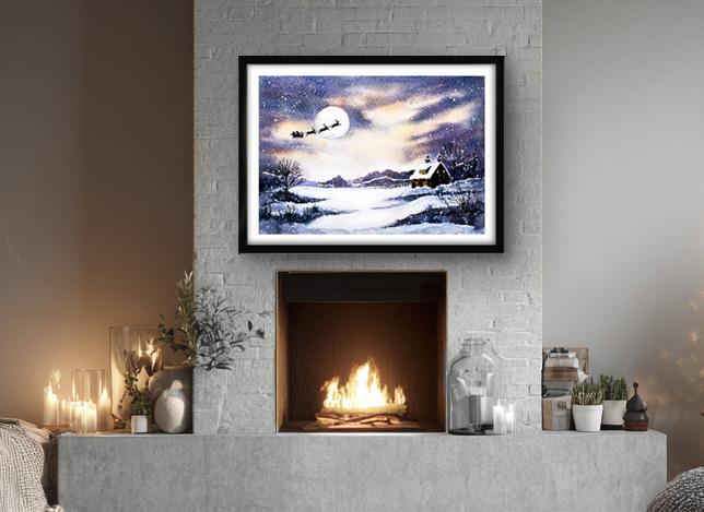
your own paintings. And why not pop it into
a mount and a frame, and you'll be amazed how good
it looks when you do that? If you've enjoyed this class, it might encourage you to look at some of my other videos. I've got lots of lovely
subjects loaded with more tips and techniques to help you with your own
exciting art journey. I'd really love to see your
own finished painting, which you can upload to
the your project section. And if you could
just take a moment to leave me a short review, that also would be really great. In the meantime, thank
you for joining me, and I look forward to seeing you next time Happy painting.
6. FINAL THOUGHTS: Well done on completing the painting of Santa's
Christmas snow ride. We've covered quite a
few different techniques as you've been following
alongside of me. We use the wet on dry technique, putting wet paint on dry paper. Then we used the wet
on wet technique, putting wet paint on wet paper. We looked at how
to add shadows and depth to the snow while
still keeping it looking white and a simple technique for adding all those
tiny little snowflakes. And we discovered an
unusual tool for painting that very tiny detail in
Santa's black silhouette. I do hope you've enjoyed painting our
enchanting snow scene. And what you've
learned along the way will help you in your
own art journey. Now, don't forget to upload your own painting through the
project and resources tab. After all your hard work,
I'd really love to see it, and I'll be sure to give
you some personal feedback. And if you've
enjoyed this video, do have a look at my other
classes on Skillshare, which are packed
with more tips and techniques to help you
on your own art journey. If you click the follow button, you'll be able to follow me, and then you'll be the first
to know when you upload a new video or any
exciting updates. And if you could
just take a moment to leave me a short review, that also would be really great. In the meantime, thank
you for joining me, and I look forward to seeing you next time Happy painting.
 Carrie McKenzie, creating painted visions