Transcripts
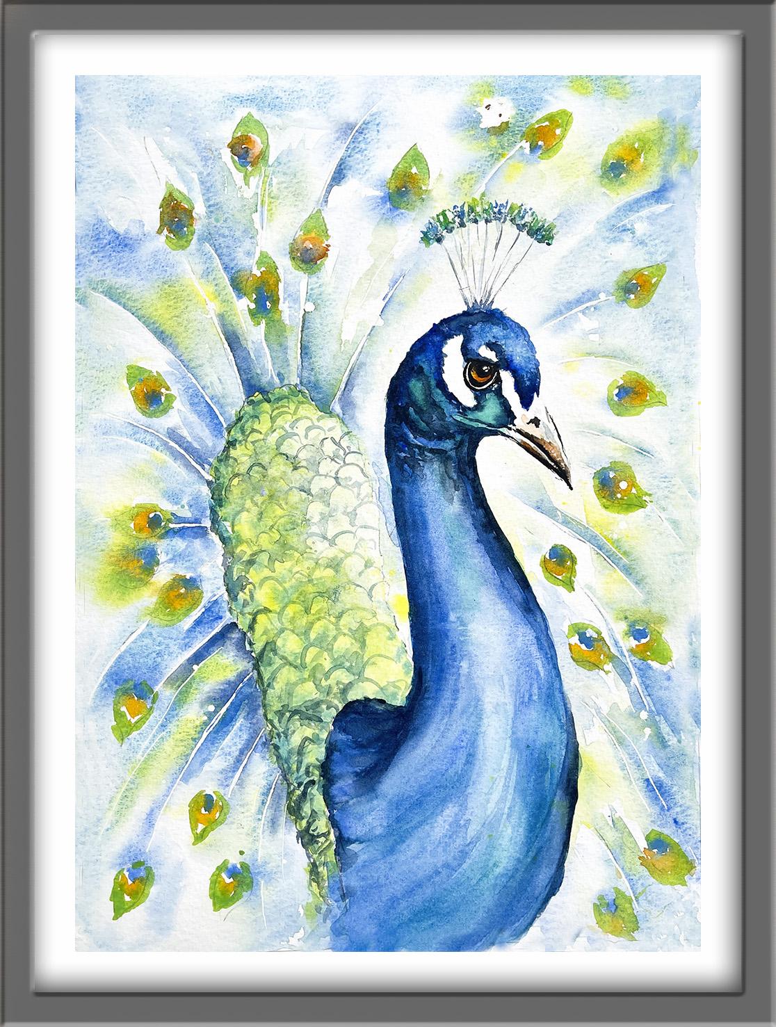
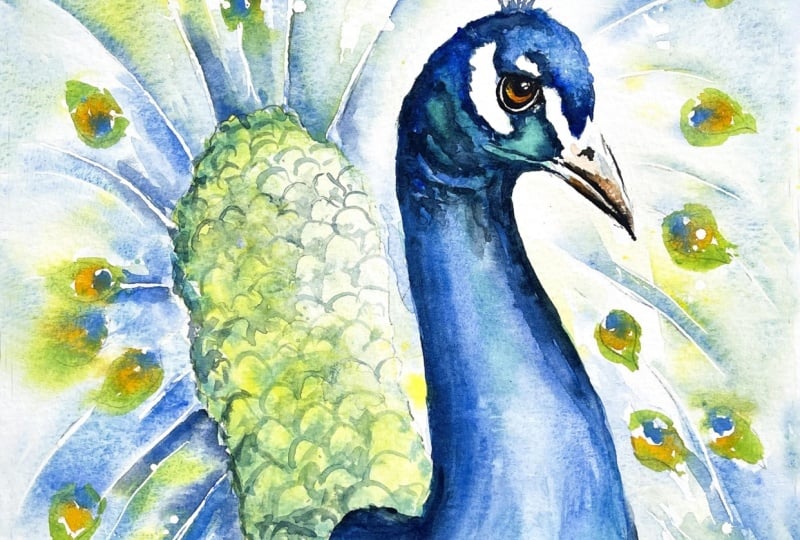
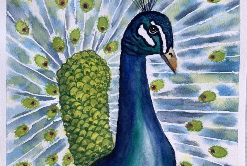
1. INTRODUCTION: Hello, and welcome. We're going to paint this
striking and elegant peacock, exploring the beauty
of flowing color, delicate feather textures,
and graceful form. It's a wonderful opportunity to develop your confidence
with color blending, layering, and creating
soft luminous effects. You'll learn how to paint expressive feather textures
without overworking. We'll build the
peacock together from loose expressive washers through to the more refined details, all the while keeping that fresh, spontaneous
watercolor feel. It's suitable for all levels, including beginners because I'm going to be guiding you
every step of the way. And I'll be sharing all
the techniques, tips, and tricks that I use in
my own professional work. I've included a copy
of the drawing in the project resources section so that you can download
it and trace it, and then not worry
about the drawing because this is a
painting class. I am a professional artist, author, and tutor,
and over the years, I've sold a lot of work
across the world and helped hundreds of people to
learn more about watercolor. You can see examples of
my work on my website. My style leans towards
impressionistic and contemporary rather
than photorealistic. I like to explore loose approaches that
bring out the color, light, and essence
of my subjects. I've tried to
replicate this across all the many other videos
that I have on Skillshare. Now, don't forget to upload your own painting through the
project and resources tab. After all your hard work,
I'd really love to see it, and I'll be sure to give
you some personal feedback, and you'll be able to
see the artwork of other students and
get their support. At the end of the class, you'll have your own
beautiful artwork to be very proud of. So let's swizzle our brushes and get on with the painting.
2. Materials & Composition. Preserve feather spines and eye highlights with masking: This class, these are the colors and materials
that I'm using, but do feel free to use
any that you already have. For information on brushes
and paper, et cetera, do check out the basic
materials document that I've added to the
project resources section. As you can see, I've taken a few liberties with the
reference photograph, and that's the great
thing about creating art. You paint with your
memories, senses, and imagination, as well as
what your eyes literally see. Now you can see that I've
kept the drawing very simple, minimal details so
that we get a nice, loose free flow painting. And I've included a
copy of the drawing in the project resources section so that you can download
it and trace it, and then not worry
about the drawing because this is a
painting class. We're going to make a
start by preserving the white of the paper
with some masking fluid. You can apply the liquid gum with all sorts of
different tools. You can use a glass
pen, a ruling pen, a rubber tipped applicator, even an unwound paper clip
for very fine details. You can use an old brush, but don't use one of
your good ones because once that gum gardens on
the haze of the brush, it's impossible to remove. But of course, you could always use the pointed handle
of your brush instead. Now, as you can see,
I'm using a glass pin. I really like using
this form masking fluid because it's so easy to
wash it off afterwards. I can also vary the
thickness of the line or the shape just by adding
more or less pressure. As I said, if you don't
have a glass pin, you could use an
unwound paper clip that also has a very fine
point for fine detail. The only drawback with
that is it doesn't hold as much liquid gum on it, so you do have to keep dipping
it in and out of the pot. I've added a tiny dot of the masking fluid into the pupil of the eye
for the highlight. Also added a rim of masking fluid around the
outer edge of the iris. And now I'm going around
the tail feathers, adding the masking fluid in sweeping strokes where we've got the spines in between
the feathers. Now, these do need to be
quite fine, not too thick. You don't want them to look like thick trunks or
branches in between. And I am slightly
varying the thickness of the line and also using some
broken ones here and there. Putting on the masking
fluid and preserving some white paper like
this will help us to get some light back into this wonderful display of tail feathers when we
put the paint on later. Don't have to paint every single spine,
every single feather. We're trying to
create an illusion of this fantastic display. My style does lean more towards impressionistic
than hyper realistic. But if you do want to add one or two more spines than
a showing on the drawing, as I'm doing here, then
by all means, go for it. Just don't go overboard with it. Which I'm probably doing myself, so stopping now doing
the lines and instead, I'm spattering on some of the masking fluid around
that tail feather area. Dipping my pen into the masking fluid and with
a wrist flicking action, spattering it onto the paper. When we rub off the
masking fluid later, we'll reveal little dots of dappled light shining
through the feathers. We do have to leave all
that masking fluid to dry completely before we can
start to paint over it.
3. Rear Body, Eye & Beak: let colours blend naturally, light & mid-tones to create rounded form: I'm starting off using
the wet-on-dry technique. That's applying wet
paint onto dry paper. I'm using my light yellow
and just kind of blobbing it on really rather than stroking
it on in long strokes, just adding little
blobs of paint and letting all those
little blobs join up. The two reasons why I'm using
that kind of brush stroke. One is because the feathers at this particular area are
very small and tight, and the other is by adding
the little blobs of color, I'll get some variation in the lightness or the
darkness of the tone. I've switched to the
wet-on-wet technique, so I'm adding wet
paint to wet paper. And that gives you a much more diffused effect with soft edges. And when several different
colours are used in this way, they'll intermix and blend
with each other on the paper. The light green
color that again, I'm kind of just blobbing
in here and there is mixing really nicely with
that underwah of yellow, but not completely
obliterating it. Got this lovely variegated
soft effect going on now with a variation of
both color and tone. And to emphasize that, I'm adding in a little
bit darker green now, particularly over on
this left hand side. So I'm imagining
that there might be more light coming
in from the right, and this will also
help to create a more rounded effect of
this particular body area. I'm not sure that blobbing in paint is a very
definite art term, but it's the best I can think of to describe what I'm doing. I'm just using the point, the very tip of my brush to add this darker
color and letting the wet wash underneath kind of soak up this darker
color from the tip. You don't want to be
kind of stabbing at it, very little soft
dib dab blob blob, getting that darker
color in here and there, but still letting
the yellow that we put on first and
then the light green. We still want those colors to show through and
not be obliterated. Now, I need to
leave that section dry before I can
do any more to it. So I'm turning my attention
to the peacock's eye. And I'm just adding some light yellow around the irish shape. Now, it's a very
small area to paint, so I'm using a very small
brush with a very tiny point. It's actually a beauty brush. It's used to apply patterns
on people's nails. It was as cheap as chips and one of the best little
tools I've come across. I've added a tiny
touch of orange on the lower iris and even tinier touch of burnt
umber right at the top of it. And now I'm just
stroking on some very watery orange around
the beak area. I'm adding some very
watery orange to the lower beak area and a
little touch of cerulean blue, again, very watery just to join into that orange color and
give it a little bit of shade. Now I need to leave
all of that to dry completely before moving
on to the next section.
4. Tail Feathers: Paint large tail area with wet washes and soft luminous colour transitions : I we use the wet-on-wet technique
in the last lesson. But in this one, of course, we've got a much
bigger area to wet. And the important thing with wet-on-wet is that that
paper has to remain wet while you're
adding the color to get the soft diffused
effect that we want. Once the paper starts to dry, we'll no longer get that effect. So it's important to
work quickly in order to get the paint on before
the paper does dry, and I'm using a much
bigger brush and a lot more water this time
in order to achieve that. Now, if you are a slower worker, instead of doing all of this background tail
feather area in one go, you could do one half
at a time instead, or even split it up into
thirds, left, top and right. And although I'm dashing around, adding all this wetness
with my big brush, I am going quite carefully around the peacock's
head and beak. Because I don't want the
colors that I'm going to put on to spread into those areas. Now, having put all
that wetness on, I very quickly want
to take some of it off where the actual
feathers are. I've scrunched up
a small piece of paper towel into a point, and I'm using that tiny
point to go in and dab the feather shape those
small feather shapes to lift the wetness
up and dry them. And now, for the exciting bit, this is why you need to be
a butterfly in big boots, brave and fearless, but
with a light touch. I'm starting off with my cerulean blue and just drizzling that into
this wet wash, letting the wetness of the paper soak up the paint from
the tip of my brush. So I'm not having to
drag the brush down or press it into
the paper too hard, very light strokes
and as I said, just kind of drizzling
this color in. And importantly,
notice that I am leaving gaps in between
where I place the paint. Because the paper is so wet, the cerulean blue will start to blend into those unpainted
areas that are wet. And I'll get some nice
soft dilution of color. Remember, we're not painting
a hyperrealistic image here. We're trying to
give an impression of these glorious feathers which are splayed out in array
behind the peacock's body. And because they
are splayed out, you will get some
light coming through. So we're trying to
create a bit of a light and airy feel now. I'm stroking the paint alongside those spines that we masked
with masking fluid earlier. As this is where we want most of the color and
the contrast to be, when we remove the
masking fluid later on, of course, we'll have white
lines where those spines are. So we need the color to be next to them in order
for them to stand out. The other reason that I want these background feathers
to be quite light and airy is because
when we come on to paint the peacock's
head and body, that area will be quite dense, quite solid and
very, very colorful. So we need a backdrop that
doesn't compete with it. So I'm particularly leaving the area immediately
around the peacock's head and the front of
his neck actually quite pale and very little
paint going on there. And then to vary the color
and tone a little bit, I'm now going in with
some cobalt blue, putting that over the
top of the cerulean, but not everywhere,
just here and there. Now the feathers will be denser immediately around the back
area of the peacock's body, the sort of yellow
and green area that we painted earlier. So a little bit more paint
around that than far out. Again, I'm adding the
slightly darker cobalt blue, immediately around the
green and yellow area that we just painted, where the spines and
feathers will be more dense. But over here on the
right hand side, I'm keeping the color a little bit further away from the
peacock's head and body. H. But overall, we're starting to
get this lovely overall clockwork
effect of color. And then whilst all this
blue paint is still wet, I am going to spatter on
some of my yellow color. It's quite watery,
consistency of tea, so that will blend in
nicely into the blue and create some green
colours in and amongst. Adding these little
tiny areas of green just helps to
harmonize the painting. So we've got some colour in the tail feathers that we've just applied
on that rear body. Oh. Because I don't want that spatter to have the effect of lots
of little dots, I've given my painting a
really good has shake to encourage those colors to blend in a little
and mingle more. I've also got a dark bloom
mixed in my palette, which I've made with ultramarine and a little touch of indigo. I'm using this dark colour to add more emphasis to the spines. So stroking it along
those math lines, and because everything
is still very wet and no paint has dried, that's blending in nicely, too. And this is why I
said you need to be a butterfly in big boots
because I'm absolutely dancing around these
feathers now and just landing here and there
with my strokes very lightly. And I'm working quite quickly because once the
paper starts to dry, once the paint starts to dry, I won't get this
soft blended effect. These wonderful
tail feathers are actually found on
the male peacock. They are known as a train, and they're actually log
gated back feathers, not tail feathers at all. They can reach five to
six feet in length, which is about over 60% of
their whole body length. During courtship, males will
shake their tail feathers. That's a process called
train rattling to produce a very low frequency
infrasonic sound that we humans can barely hear, but that attracts the females. And the vibrant blues and greens are not actually
caused by pigment. Instead, the feathers
have microscopic, crystal like structures that
reflect and refract light, creating a sort of
iridescent color. I'm now starting to paint those little tear
shaped feathers that we dried with paper
towel earlier on, and I'm adding a little dot of cobalt blue at the
start of each feather. Because we dried these
little shapes earlier on, that blue will pretty much
stay in place and not run too much into all
that other color that we've been splashing about. Now, these eyes are
actually quite strategic. An adult male typically has
around 170 eye feathers. The number and symmetry of
these eyespots are believed to be used by females to measure
a male's genetic fitness. The male peacock will
shake its feathers at approximately 25
times per second. And this specific
train rattling motion creates a sort of
optical illusion. The iridescent
eyespots appear to be hovering steadily against
a shimmering background. And then all these wonderful, colorful high feathers are shed every year after the
breeding season finishes. The males don't develop their full colour
plumage until they're about 3-years-old and
the train reaches maximum brilliance at
around six years of age. And despite the massive
size and weight, the trade doesn't prevent
the peacock from flying. They can still fly
short distances to escape predators or fly
up into trees to roost, although actually, they do
prefer to stay on the ground. The next color I want to add to the eye
feathers is orange. But if I have that
now next to the blue, it'll just run in and
create a muddy brown. So I'm going to break
off for a bit and add a little bit more dark
color to the eye and beak and then come back
to these feathers.
5. Eye & Beak: Deepen eye & beak tones, add contrast & definition to face.: I've mixed a black
with some burnt umber, my darkest brown, and some
indigo, my darkest blue. You will get a more lively
black by mixing it with these sort of colors than if you use it straight
out of the tube. However, the areas
that we're going to be painting are very tiny. So if you do want to
use it straight out of the tube, that's
absolutely fine. I'm using my small
nail brush again, with the tiny point to add
some black to the pupil. You can go over the masking
fluid because it's dry now, so it will resist the paint. There's a dark shape
just over the top of the eye and also coming around
the right hand side of it. And then I need to add
a much thinner line of black around the outer
rim of the iris. And then another
thin black line just below the masking fluid that
we put on below the iris. Now, these areas are tiny, so it can be a bit tricky
to paint precisely. If you do struggle with the brush to paint
such small areas, you could use a black
waterproof pen. But importantly, do
remember that once black waterproof ink is
on, it's on for good. You can't remove it, whereas if you paint on with the brush, if you do make a mistake, it is possible to
remove the paint. I'm using the black to define the lower edge of the
upper and lower beaks. And then, while that
paint is still wet, I'm using a damp brush, a clean damp brush
to just soften and blend that black color into
the underlying colors. So I don't get too hard edge. I'd get a more gentle
transition from the black to those lighter
orange and blue colors that we put on earlier. Wouldn't be appropriate to use the black waterproof pen
here because you wouldn't be able to blend and soften the color from it as
you can with the paint. I'm also going to use the black. To paint is little nostril. It's a funny little shape. It's kind of an upside
down comma shape. I've lost most of
the orange color that I put on the beak earlier, so I'm just adding
a little touch back in to liven this
beak area up a bit.
6. “Eye” Feathers: Add colour variation & interest to “eye” feathers; keep marks loose yet expressive.: These small blue
circles that I put on the eye feathers earlier have
had time to dry a bit now. They're not completely dry, but they're dry
enough for the color not to run in and
spoil the orange. I'm simply painting a kind of horseshoe shape of orange
around each blue circle. I have added some yellow to my orange paint because I don't want the orange
to be as strong as, say, an orange fruit. I want it to be more
golden sort of color. And if you don't have orange
to hand, then of course, you could always
mix it with some yellow plus a little
touch of pink or red. Whichever method you use, you do want a more subdued
sort of golden orange color. You don't want the orange to overshadow the brightness of
color in the peacock itself. I'm going to be
working my way around these eye feathers and adding
this splash of orange, this horseshoe shaped splash of orange, as the middle color. Need to leave a little
bit of space on the eye feather for the green that I'll
be putting on last. I'm continuing to work
quite loose and fresh, so not a lot of precision
or detail here. Because these tail feathers are further away from
the body and head, you won't see as
much detail in them. We want the main focus to
be on the peacock's head. The train or these tail
feathers that we're painting now remain a
glorious but subtle backdrop. O. I've got my mid green color. It's quite a limey
kind of green. And I'm using that color to
paint the last little bit of each eye feather at the
tip and around the sides. Now, the orange paint that I
just put on has stayed put. It's not running too
much into the green. But if yours is doing that, if it is running in
and blending too much, so you're not getting
the distinction between the green and
the orange and the blue, then just leave the orange paint just dry a little longer. We're very fortunate
that we can see peacocks in zoos, parks, and gardens pretty much
all over the world, but they actually
originated in India. And in 1963, the Blue
or Indian peacock was designated as
India's national bird. You'll find the peacock
depicted many times in Indian art and also its
Hindu religious culture. It's associated with gods and goddesses, as well as royalty. And for example, people
believe the Hindu god, Lord Krishna, wears a peacock
feather in his crown. And even in Christianity, early mosaics and paintings
often depicted peacocks, as people thought their eyes on the tail feathers represented the all seeing good
or the church. And in ancient Persia, people associated peacocks
with the tree of life, which is still a very
popular emblem now. And many cultures
consider the peacock feather to be a symbol
of purity or good luck. Because the color is structural
rather than chemical, peacock feathers don't fade or lose their
vibrancy over time. Anyway, I hope you've enjoyed learning a little bit
more about the peacock if you didn't already
know it whilst I've been painting all these
repetitive strokes. I'm just checking my painting
now to see if there are any colors that need a little bit more
color adding to them. Watercolor tends
to dry about 20 to 30% lighter than when
you first put it on. So you can't always tell immediately if you've got
exactly the right color. But as the paper
does start to dry, you'll be able to see whether the color is fading
a little bit or not, and then just pop it
back in where needed. I think it's time to let
it all dry completely now before going on
to the next step. Oh
7. Head, Neck & Body: Build depth & form with tonal values; lift highlights, paint crest feathers: I'm starting off with my cerulean blue color and just dabbing that
onto the top of the peacock's head
and also adding a few little feathers to the
crest in this same colour. I want to fill in all the
feathers on the crest because we'll be putting some different colours in there later on. Now, the feathers
on top of the head are actually quite
tight and bobbly. I can't think of another word
to use for them, really, but I'm using little dabbing
actions with my brush, little dabbing strokes
to try and create this bobbly effect on this area. My paint is quite watery
about the consistency of tea, because this is going
to be the very pale underwash the lightest tone
on the peacock's head. So I don't want it to be
too strong at this point. I'm working my way around
the peacock's head, using these little
dabbing strokes and keeping it all light and loose. And now I'm switching
my color to viridian. It's sort of an emerald color. And I'm bringing the viridian around the front of the face. I am being careful to avoid those white shapes completely. Although we could use
some white gouache or white acrylic later
on to paint them in, nothing is as white as
the white of the paper. So do paint carefully
around those areas. And I've just brought
that watery viridian down into the neck area. It's important to have
all your colors ready mixed because although
we're painting wet-on-dry, wet paint on dry
paper at the moment, I do want to start using
the wet-on-wet technique, and we want these colors to
blend in together nicely, just like when we did
the tail feathers. And that's exactly
what's happening now as I dab in little dots of cobalt blue into the cerulean
that we placed earlier. I'm trying not to obliterate
the cerulean completely, but you can see
that the cobalt is now adding this darker, stronger tone of blue
and still creating this bobbly effect by keeping these little
dabbing strokes. And then bringing
the cobalt blue around the back of
the head, again, avoiding the white shapes
and adding little sort of lines of dots now
because we've got some creases going on around
the back of the neck. And while all that paint
is still nice and wet, I'm now dropping in
some ultramarine, again, using these
little dabbing actions. So we've gone from the
light cerulean blue to the mid colour cobot blue, and now we've got a darker
tone with the ultramarine. Using these different
tones of colour, we're already starting to get a more rounded three D appearance
in the peacock's head. Adding a few little touches of ultramarine just underneath the eye and at the outer side of the white
shape on the far right. Adding a few little
touches of very watery ultramarine over
the viridian shape. And then I'm going to add
some more viridian into this area at the front of the face just to strengthen
that vidian color. Don't want to lose that. And now I'm bringing the ultramarine and the Vidion down
into the neck area. You can see from the reference photograph how these colors, these different blues and
the Varidion are blending together to give us this shape and lovely
colorful contrast. Although I've altered
the shape and outline drawing for my peacock
from the reference photo, I am still using it as a guide
for the color reference. I've swept a bit of
the viridian color to the lower part of
the peacock's neck, and I am now just
hopping about a bit. I've decided to put some
of the viridian into the crest feathers whilst I've got that color on my brush. And now I've switched
back to the ultramarine to add some more color
down the back of his neck. I want to get that color
on this area so that it blends nicely with the aridian before the veridian
starts to dry. I'm also stroking
the ultramarine down the right hand
side of his neck. And again, that's
starting to give us this three D rounded
effect on the body shapes. I'll leave those
colors on the neck to blend a little
and keep my eye on them whilst I go down to the bottom of the neck as
it goes into the body, again with some watery
ultramarine at the moment, just to get the
base layer going. And I'm continuing with these
more sweeping strokes now, not the little dabbing strokes
that we use on the head, but longer strokes following the contour of the
peacock's body. I'm also stroking in
some turquoise here. Now, that colors optional. You can just carry on using the Varidian ultramarine
and cobalt blue. But if you do want to
add a little splash, the turquoise is a good choice. I'm adding a bit
more ultramarine to either side of the neck because
as it's starting to dry, I can see it fading. Watercolor does tend to
dry, as I said earlier, about 20 to 30% lighter than
when you first put it on. So you can start to see this color change as the
paint does start to dry. And as long as it's
still wet or damp, you can go back in and
touch it up a bit. Going back now to the
peacocks head with some indigo and ultramne mixed
together, so got a very, very dark blue now, and I'm using that to go in between the white shapes
and the top of the head. Again, not obliterating
the colors that I've previously put on, but just giving some depth
where it needs to be. I might feel like I'm
hopping about a bit crazily, but the reason for that is because I want to get
this dark color on before the colors
that I've previously put on on this head area
are completely dry. I still want to get
some nice soft blends, and whilst the paint is still
damp, I'm able to do that. And particularly using
this dark blue to indicate the creases under the chin and around
the neck area. Because the paper is actually
damp rather than wet, you can see that this
dark blue color, it's blending in slightly, but not flooding in. So I am able to get
more definition. And I'm increasing that strength of contrast in definition by taking the dark
blue down the back of the neck towards
the rear body. Now, this paint here, of course, is a little bit wetter
than the head area, so I am getting still some nice blended colors
mingling together, but it's not flooding, so I'm getting the
light colors still in the center of the
long neck and body. If I were to go all over the light colors
with this dark blue, then we'd end up with
one single color tone, so it would all
look very flat and uninteresting and certainly
not a rounded shape. So do be mindful to keep the light areas in the
center of the neck and body, these light colours
and just add in the darker color to
emphasize the roundedness. If you do put too
much dark color on somewhere and you
need to lift it off, then just rinse your brush
in some clean water, make sure your brush is
nice and clean but damp, and then use that to
lift the color off. So it's called a thirsty
brush technique where you use a damp brush to just
lift off the paint, and you can even dab it with some paper towel if you need to. I sometimes think
it's as much about taking paint off as it
is about putting it on, but it's a combination of these two techniques really that will give you
the rounded form. The other technique that I'm using as I'm working
my way around the peacock's head and neck is the blending and
softening technique. Again, you use a
clean damp brush, but instead of
pressing the brush into the paint to lift it off, you use a much more gentle
stroking action to soften any hard edges that
are occurring so that the color blends and mingles
into the underlying color. And if you haven't already
used this technique, I do suggest you
try it on a bit of spare paper because it sounds
a very simple technique, but it is quite difficult
to master completely. So all you would
need to do is paint a thin rectangle at the left
side of some dry paper. And then, while the
paint is still wet, take a clean damp brush
and gently stroke the right side of the shape to soften and draw
the color away. And just repeat that several times until the color blends and disappears into
the background. I think I'm almost there now with the peacocks
head, neck, and body. I've got a nice mix of light, medium, and dark tones. So I've got a good rounded
three D appearance, and I've also got some
nice soft blends of color. I've used the blending
and softening technique to make sure I do get some
nice soft blends of color, and I've used the lifting paint off technique with
a thirsty brush to make sure I've retained
some lights and highlights in the crucial areas. To finish this section off now, I'm using my different
colours that I've used in the head, neck, and body to add some little touches of color
to the crest feathers. Interestingly, these
little crest feathers are actually specialized
sensory antennas, and they vibrate at the exact same frequency as the males train
rattling tail feathers. So these also help to send
signals to the female pe hen, alerting her to the
male courtship display. So there's quite a lot of
science and technology underpinning this
rather splendid and flamboyant hanky panky.
8. Finishing Touches: Remove masking; refine head & eye; add final feather details.: I've rubbed all of
the masking fluid off with a clean dry finger, and as is often the case, when you do this, there's a little bit of
tidying up to do. I've had to add a little
bit more black paint to the pupil of his eye. The masking fluid
that I used for the highlight was
actually a bit too much, so it looked more like a
hole than a highlight. And I'm adding a little bit more black color to the rim around the iris and also the rim around the white shape
underneath the iris. But this is where
you need to assess your own work because it might be that you
don't need to do this, that yours looks
perfectly fine as it is. I'm also adding a little bit of darker color just to
the top of the iris, where it's seen a shade
from the brow above. I do want the eye to have
a glassy, intense look, but it can look a little
bit too much if you don't just add that bit of shading
at the top of the iris. I'm also adding
just a touch more black in between the
upper and lower beak, just strengthening that line. Also, I'm aware that now
the paint has dried, the creases just
below his head and onto the beginning of his neck have just
faded a little bit. So I'm also just going
to strengthen those with some dark ultramarine
color and using the blending and
softening technique to soften them in to
the underlying wash. I am mindful that there's a
very fine line between adding a little bit more
detail and fiddling too much and ending up
overworking the painting. I don't want to lose all
the lovely freshness and looseness that
we've achieved so far, and I certainly don't
want to muddy the colors. So I'm going to leave
this area alone now, and I'm going to move on to add a little bit more detail
to the rear body. I've added a little bit of ultramarine to my
viridian color, and I'm going to
use this to define the feathers on this
rear body area. Now, the feathers
here are not as small as those on
the top of the head, but they're not as big as
those in the tail feathers. So somewhere in between. And you can see from the
reference photograph that they're actually
little dome shapes. In keeping with the
rest of the painting, we're not creating a
botanical representation. So I'm just painting
these little dome shapes quite loosely going along
from left to right. I'm painting wet-on-dry, so
wet paint onto dry paper. But because these feathers are all overlapping each other, there will, of course, be
some shadow in between them. So I'm just kind of scumbling the paint into the little
dips between the domes. I'm using a slightly
watered down version of the color that I've just painted the lines of domes with. And then I'll touch
in to the bottom of each shaded area with a
little bit of stronger paint. Because even in this area, we're trying to create some depth and tonal
variation to achieve that. I've got about a third
of this area done, so I'll move on and repeat
this process further down. And as I said, don't
worry about getting these little dome
shapes too perfect. We are going for an
impressionistic look. That is my style. And also, importantly,
if we were to make this area too
detailed, too precise, it would actually draw the
viewer's eye into this part of the painting instead
of the peacock's head, which I want to be
the focal point. As we move further down to where the rear body joins the neck, it will be a little bit more
in shade from the neck, so don't be afraid to add a little bit extra shadow
down at the bottom here. I am trying to keep the overall appearance
a little bit darker on the left hand side and lighter at the top
and on the right. I think I'll add a
little bit more shading to this bottom area
and towards the left. H and don't forget you can use a clean damp brush to
kind of soften and blend some of those lines
and those shading areas in. We're definitely on
the home straight now. The only thing that is left to do is to maybe add
a little bit of darker color very near to the rear body just
along the spines, if I want to make some of them stand out a
little bit more. Now, as I said earlier,
assess your homework, only do this if you feel it's necessary for
your painting. As they say, less is more. So I am going to stop now, and the only thing that
I am doing is I'm using an artist's scalpel
to just scratch out some of the paint
in the crest feathers. Mine are a little bit too dense. There's not enough
light in between. So I'm just scratching
the color away, revealing a little
bit of white paper in between to give it
a more airy look. So there we are. Our
peacock is finished, and he's looking very
proud and handsome, if I say so myself. I do hope you're just as
proud of your painting, and why not pop it
into a mountain frame, and you'll be amazed
how good it looks. I do hope you've enjoyed this painting and that
you've learned some tips and techniques along the
way that you can incorporate into
your own paintings. Now, don't forget to upload your own painting through the
project and resources tab. After all your hard work,
I'd really love to see it, and I'll be sure to give
you some personal feedback. You can follow me on Skillshare to get to hear
about new classes. And if you could leave
me a short review, that would be really great. If you've enjoyed this class, it might encourage you to look at some of my other videos. I've got lots of lovely
subjects loaded with more tips and techniques to help you with your own
exciting art journey. In the meantime, thank
you for joining me, and I look forward to seeing you next time Happy Painting.
9. FINAL THOUGHTS: Well done on completing
the painting. We've covered quite a
few different techniques as you've been following
alongside of me. Instead of just slavishly following the
reference photograph, we've looked at how
we can adapt it to make a more attractive
composition. We use masking fluid to
preserve the white of the paper for the spines in the tail feathers and the
light showing through them. And we took advantage of the
wetting wet technique to paint those tail feathers in a very loose and expressive way. And we defined the head
and neck area using tonal values to convey that
rounded three D appearance. And we added some final
details to achieve that really intense glassy
eyed stare and the sharp beak. Now, don't forget to upload your own painting through the
project and resources tab. After all your hard work, I'd really love to see it, and I'll be sure to give
you some personal feedback. And if you've
enjoyed this video, do have a look at my other
classes on Skillshare, which are packed
with more tips and techniques to help you
on your own art journey. If you click the follow button, you'll be able to follow me, and then you'll be the first
to know when you upload a new video or any
exciting updates. And if you could
just take a moment to leave me a short review, that also would be really great. In the meantime, thank
you for joining me, and I look forward to seeing you next time Happy Painting.
 Carrie McKenzie, creating painted visions