Transcripts
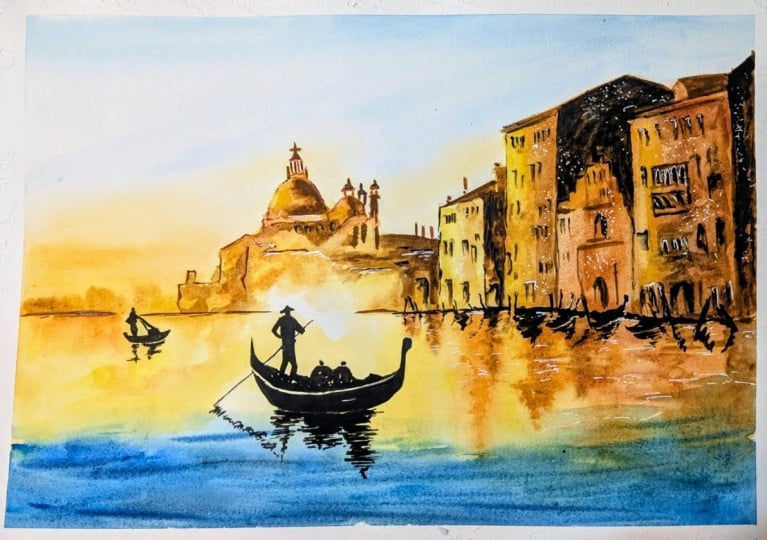
1. INTRO Venice: Hello, and welcome.
In this class, you'll learn how to paint a luminous Venetian
scene in watercolor, focusing on light reflection
and expressive mark making. We'll begin with
a loose sky wash and gradually build
up the buildings, reflections and water
using layered techniques. You'll learn how to
use tonal values to create depth and distance, how to soften edges for
an atmospheric effect, and how complimentary colors can bring energy and
movement to water. And of course, it wouldn't
be Venice without a gondola and some
mooring pools. And we'll also explore
ways to introduce texture using watercolor
pencil and sandpaper. Venice and watercolor. What a perfect marriage. It's going to be a lot of fun. It's suitable for all levels, including beginners because I'm going to be guiding you
every step of the way. And I'll be sharing all
the techniques, tips, and tricks that I use in
my own professional work. I've included a copy
of the drawing in the project resources section so that you can download
it and trace it, and then not worry
about the drawing because this is a
painting class. I am a professional artist, author, and tutor,
and over the years, I've sold a lot of work
across the world and helped hundreds of people to
learn more about watercolor. You can see examples of
my work on my website. My style leans towards
impressionistic and contemporary rather
than photorealistic. I like to explore loose approaches that
bring out the color, light, and essence
of my subjects. I've tried to
replicate this across all the many other videos
that I have on Skillshare. I'd love to see your
own finished painting, which you can upload through the project and resources tab. I'll give you some
personal feedback on it, and you'll be able to
see the artwork of other students and
get their support. At the end of the class, you'll have your own beautiful artwork to be very proud of. So let's swizzle our brushes and get on with the painting.
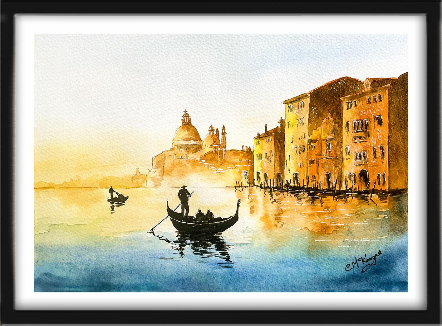
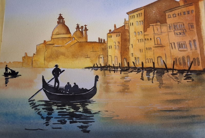
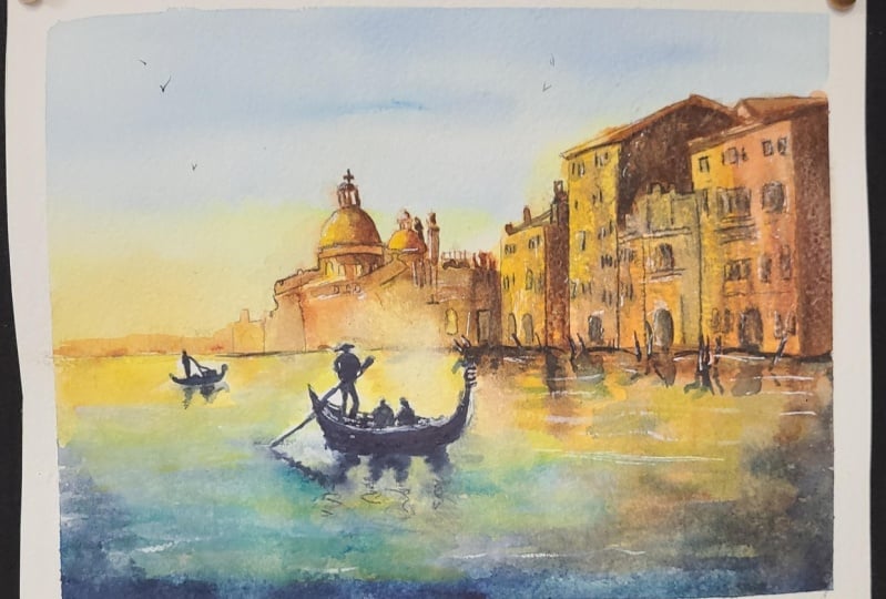
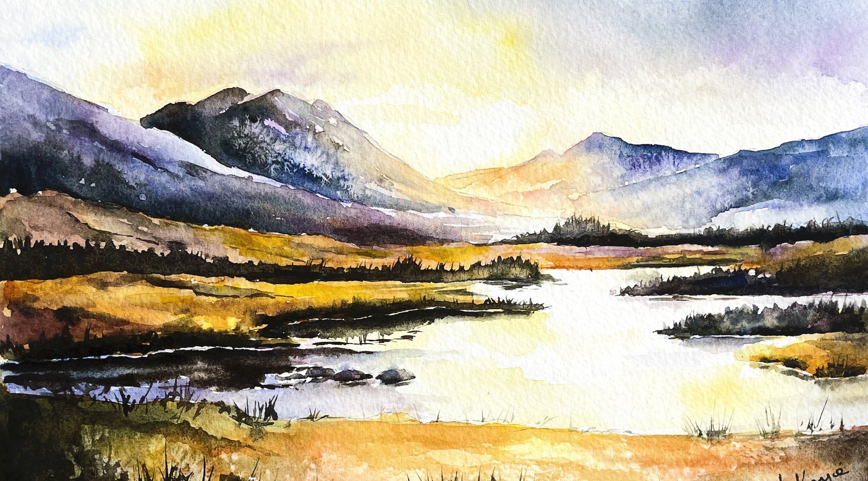
2. Materials & Composition. Paint the Sky using wet-on-wet technique: For this class, these are the colors and materials
that I'm using, but do feel free to use
any that you already have. For lots more, useful
information about brushes, paper, and other art materials. Take a look at the
document that I've added to the project
and resources section. You'll find that really helpful. There's an enormous amount of detail in the
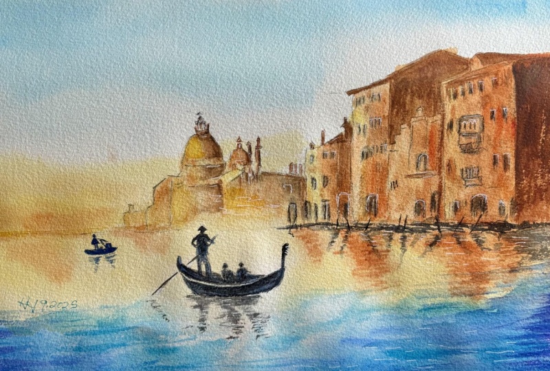
reference photograph, but the beauty of
artistic license is that we don't have
to follow it slavishly. Now you can see that I've
kept the drawing very simple, minimal detail so
that we get a nice, loose free flow painting. And I've included a
copy of the drawing in the project resources section so that you can download
it and trace it, and then not worry
about the drawing because this is a
painting class. I've cropped quite a lot
of the detail out and tried to create a painting
based more on the essence, mood and glamour of this
amazing golden city. I'm going to start
by painting the sky, and I'm going to use the
wet on wet technique. The wet on wet
technique is simply putting wet paint onto wet paper or paint that is still wet and let it spread
into the wet wash. This results in a lovely
diffused effect with soft edges. Because the paint mixes into
the wetness of the paper, the color is diluted
and the tone is paler. So as you can see, I've pre wet the paper
with clean water, and then using a large brush
while the paper is still wet and brushing on a little
bit of cerulean blue. Consistency of my
paint is about, like, tea or milk. There's going to
be a lot of color in the buildings
and in the water. So in order to balance the composition and not
overpower it too much, I don't want the sky
to be very colorful. I'm going to keep it quite pale. Viewer's eye always
need somewhere to rest. So by keeping the sky very
pale and insignificant, the focus will remain on the buildings and the
water where it should be. I've just added a little bit of cobalt blue into that
cerulean blue sky. Not a lot, just a few little
touches to vary the color. And I've used the blue in about two thirds
of the sky area. And now I've switched
over to some pale yellow. I'm using Daniel Smith's
handsome yellow light, and also a little bit of Windsor Newton rinocodonGld
to warm it up a bit. And I'm keeping this
yellow golden color a little bit darker
along the horizon and paler as it goes
towards the blue because what I don't really
want is for those two colors, the blue and the yellow to mix. Otherwise, I'm going
to get a green. So I've almost gone to white now in that top
third of the paper. Also keeping the area around the right side of the
basilica very pale, almost white, really,
because I want the light contrast there with the darker tones of
the basilica itself. It doesn't matter if you go over some of
the buildings with this pale yellow color because they're going
to be darker later on. Makes a tiny bit of burnt sienna in with
my transparent orange, and I'm just stroking this
on above the horizon as I want to warm up this
particular area and give it more of a glow. And in fact, I've just added a little bit more quin gold to the mix to warm it up even more. My paper is still quite wet, so I am still getting these soft blends of color going into the
underlying wash. It's extremely important to paint the sky as
quickly as you can. If you carry on adding color or water to it when the
paper starts to dry, it will get overworked
and you may get unwanted cauliflowers
appearing in it, too. To encourage the colours
to blend a bit more, just give it a good horse
shake as I am doing here and then set it down
and leave it to dry.
3. Buildings & Reflections: first layer. Tonal values to suggest distance and atmosphere.: In the buildings, I'm using three colors, my light yellow, my quin gold, and some transparent orange mixed with a little bit
of birth sienna. I'm pre wetting
with clean water, the whole of the building shape, but I'm not wetting it as
much as I did the sky, so it's sort of a
damp wet, really. And that's because although I do want some definition in between
the different buildings, I also don't want
it to look like a children's coloring book that we've just filled in
each individual one. And I'm not too fussed about
wetting every single shape, so the domes at the top of the basilica or any chimney
pots have left those dry. I have, however, wet the basilica buildings
a little bit more than those nearest to us because when we
get to that area, I want the color to dilute. I want it to be paler because they are receding
in the distance. And the tonal values of all
objects that are further away are always much
weaker and less visible. I've started at the right
hand side of the buildings, and I'm using my darkest color. That's the transparent orange mixed with some burnt sienna. Now, unlike the sky, which we wanted a fairly
smooth and soft appearance, these are crumbling
old buildings, and so it doesn't matter
if you get bits of color that are a bit darker
in one place than another, that will actually help to
convey the old texture. And don't worry about trying to paint the parts of the
buildings that are in shadow because we'll be
doing that at a later stage. Watercolor paintings are often created by painting in
a number of layers. Once this layer has dried, we'll go back into it and
then we'll do these shadows. But for now, I've switched
my paint to the quin gold, this lovely light,
glowing gold color. And I'm running that into the Bertsienna mix
that I've just made. So you get a nice transition
from one to the other. The paper is still
quite damp and so I'm not getting too many hard
edges at this point. I'm also stroking a
little bit of the light yellow down the front edges of these buildings
in the middle. Still with touches of the
Bertsienna mix here and there to keep them in keeping with the rest
of the buildings. Even though I've used the light yellow for these
middle buildings, I think the tone is still
a little bit strong, so I've twisted a piece of
paper towel into a point, and I'm just stroking that down the left hand
side of each of these buildings just to lighten the tone as they are moving
more into the distance. I can do this because
the paper is still damp, so it's easy to lift that
color from the surface. It's a bit like
sculpting, really. Sometimes I think it's
just as important to know when to lift paint off as
it is to put paint on. To paint the basilica buildings which are furthest
in the distance, I'm using my lightest
tones for most of the area with touches of
burnt sienna here and there. I'm just dabbing a little
bit of the color off that's around the Gondelia's
head because I want that to really stand
out I want his head to really stand out when I
come to paint him later on. And in order for that to happen, the area at the paper around his head needs
to be much, much paler. I've also added a
little bit more water to my Burtsiena mix. And as you know,
watercolor always dries about 20 to 30% lighter than
when you first put it on. So these colors that I'm
putting on now will be paler, much lighter when
they eventually dry. Now, whilst I've been
painting the basilica, the paper obviously is
starting to dry more, and these buildings on
the right hand side are still a little bit
damp but not much so. So I am going to add a
little bit of colour, the same colours that
I've been using over the top in some of the areas
where they are in shadow. You don't always have to
use a darker color to paint the shadows or
the darker tones. If you paint over
with the same color, if you glaze many layers
of the same color, that shape that you're
painting will get darker and darker
with each layer. And as I said before, I will be waiting until
all of this completely dries before I add the really
dark shadows later on. I've switched to a
smaller brush with a really good point
to paint the domes, the smaller shapes with the crosses and other
effigies on them. I want the tone to
be a bit darker on the right hand side of each dome because they are
facing away from the light, and then obviously lighter
on the left hand side, where they are
towards the light. And right at the
top of each dome, there are some very
small windows. So I'm going to try and
leave those unpainted, allowing the sky that we painted
earlier to show through. But don't worry if
you paint over them because we can always
add a little bit of white paint later on before the painting is
completely finished. And to make it easier to paint
these really tiny shapes, I've turned my painting upside down so that I can more
easily get to them. Well, that was all a
little bit fiddly, but I'm the right
way up again now, and I'm just going to finish
off these buildings by painting some very abstract
shapes along the horizon. I don't want to be
anything too definite. And I'm using my
mostly queen gold and a little bit of the Bertsiena
mix along the bottom. Whilst we've got all these lovely colors still
in our palette, we're now going to paint the reflections of the
buildings in the water. There are many different ways that you can paint reflections in water because it may vary
from a fast rushing stream, a calm lake, a raging storm
or just a shallow puddle. In addition to the
objects surrounding it, water will also reflect
the sky color above it, clouds or sunsets and
any objects below it, minerals, silt up, pebbles and microscopic life
on the water bed. Unlike a shadow,
a reflection will always appear directly
beneath what is above it. Reflections are not actually in the water, but on its surface. So the reflection wiggles following the movement
of the water. In general, you first pre wit the water surface with horizontal strokes to
create a smooth base. And then using colors that are softened and a little
bit more diluted, dulled than what is in
the reflected object, paint vertical and
horizontal brush strokes to mirror the shapes
in the water. For added realism,
leave small gaps or use a dry brush to
create shimmer effects or subtle highlights
and then gently lay horizontal strokes of
lighter or darker shades, where you need to
represent ripples or movement and light on
the water's surface. And as you can see, I've
pre wet the whole of the water area and begun to drop in using
horizontal strokes, the colors that are above
the water in the buildings. Started with the lightest
color, the light yellow, and now I'm starting to drop in some quin gold and
my Bertsiena mix. I should mention that
I've also placed a small metal tin underneath the top of my painting board. It's about half an inch deep, and that's to slightly
tilt the paper downwards, and that will encourage the paint also to flow
downwards as I'm painting. I'm using all the same colors that we use for the buildings and trying to place them in a mirror image
of what is above. If the water was
absolutely still, we would get almost
an identical image in the water as
to what is above. But in our case, the
water is moving. We've got gondolas going up and down and maybe
a slight breeze, so we don't need to put them
in as an exact replica, just an indication of
the colors there that are above in those buildings
in the right place below. So I'll let you watch the
video along now as I paint in the rest of these reflections before we go on to
the next stage.
4. Buildings: Second Layer & Structure. Wet-on-Dry technique; blend and soften hard edges: I've added a touch of
burnt umber and a touch of ultramarine to my
burt sienna and orange mix that I used to
paint the first layer. And I'm using this
darker tone to shade the right hand side of
the basilica buildings. As well as denoting where the light is coming from,
which is from the left, this shading will also help to convey a more three
D rounded effect, particularly on the domes. Unlike the previous sections, I'm now working wet on dry, but haven't pre wet
the paper beforehand. The wet on dry
technique is simply painting wet paint
onto dry paper. It allows for more control, stronger color, and crisp hard edges
where the paint ends. The paint will only go
where the brush takes it. Although this technique
does produce hard edges, you can use what's called the blending technique to
soften them where needed. To blend and soften a hard edge, you need to use a clean
damp brush to pull the paint away from the hard
edge and blend it softly until the colour disappears into the white of the paper or the underlying wash.
You may need to clean and dry your
brush and repeat the process several
times in order to get that gradual gradation of color until it disappears
into nothingness. It may sound like quite
a simple technique, but in fact, it is quite a
difficult one to master. So do practice it
because it will make a massive difference
to all your paintings. As you can see,
I'm continuing to work wet paint on dry
paper and kind of smudging and scumbling
the brush around to create this old texture
crumbling facade. It's a really great exercise in loosening up a little bit
and not being too neat. I'm working my way across all the buildings
from left to right, adding that darker
shading where needed. The side of this middle building here is well away
from the light, and so it does need to have this much darker
shading applied to it. I've actually thickened
it up a little bit from when I painted the
shading on the basilica. So I've added a little
bit more paint to darken the intensity because as we come nearer to the front
of the painting, those dark shadows will
become darker and intensify. And just as when we
painted the first layer, you can drop in little bits of extra color here and there in the areas that
you're painting so that it doesn't all look
the same in one area, and you've got that
textural difference. Just a gentle reminder, we're not painting a
brand new housing estate. These buildings have been
around for centuries. So a few scruffy or smudgy marks are only going to
add to their charm. I'll let you watch
the video along now, while I paint the rest
of these shaded areas, and then I'll hop back
in when it's time to add the darks to
the reflections. M m In order to add
the reflections in the water of these darker
areas that I've just painted, I do, first of all, need to pre wet the water area where
I'm going to place them. We need to do this
very gently with a soft brush so that you don't disturb the
underlying color. And then load your brush with the dark shadow color
and using wiggly lines, wiggly strokes, drop it
into the water below. And just as when we painted the first layer of
reflections in the water, it may help to tilt
your paper slightly downwards to encourage that
paint to also flow down. And just another
gentle reminder that reflections are stronger when they are nearest the source, and they get weaker as
they move away from it. I'm not adding too
much shading in this particular area because
in the next section, I'm going to be
adding quite a lot of dark more in pools
and other shapes.
5. Water: Colour & Contrast. Paint the blue-turquoise water; use complementary colours: I we've got a lot of yellow and orange color
in our painting so far. So for the next section, I'm going to take advantage
of complimentary colors. You can see from the
color wheel that the complimentary color or the opposite color of
yellow and orange is blue. By placing complimentary
colors near to each other, they have a powerful effect, each making the other
more intense and vivid. So I'm going to use a few strong blues now
to create contrast, vibrancy and energy
in the painting. I'm re wetting the whole
of the water area, again, very gently
with a soft brush so I don't disturb
that underlying color. I'm stroking in, first of
all, the cerulean blue. This is the lightest of my
blue colors, and again, using horizontal strokes to depict those ripples
in the water. Remember, when we
painted the sky, we left a small area to
the right of the basilica, almost unpainted, very pale. And that pale sky will be reflected in the water below
just around the gondola. When we paint the gondola
in the next section, which will be very,
very dark, indeed, we'll have some real
impact in that area, which will draw the viewer's eye to the center of interest. So notice that
although I'm taking some of that blue
cerulean color up into the orange and yellow areas of the water and a little bit
into that white section, I am leaving most
of it well alone. Then to add more depth and
blue color to the water, I'm stroking in
some cobalt blue. Just as before, I'm using horizontal strokes to indicate
the ripples in the water. And I'm being careful
to leave some of the cerulean blue showing in
between the cobalt strokes. And to give this section of
the water even more impact, I'm stroking in now
some turquoise. The turquoise paint
that I'm using by the SAA is a very strong, rich, vibrant color, so you don't need much of
it to make an impact. If you do want to blend the
colors a little bit more, instead of shaking
the paper all about like we did for the sky
to get a very soft, even transition, you can just shake your paper
from left to right, from side to side, and
that'll help the paint to flow from one side of the
painting to the other. And then the final color
that I'm going to add here to create even more
depth is some indigo. This is a very strong
blue black color. So again, you don't
need much of it, a few little touches
here and there, particularly along the
bottom of the painting. A. From left to right, and then let it dry. But
6. Gondola: Mix a rich black. Details with Watercolour Pencil. Distress Buildings with Sandpaper: To bring out some of the
detail on the buildings, I'm using a black
watercolor pencil. Mine is made by Derwent. It's the ink tense range. You can use any
watercolor pencil really, but the ink tense range are
very intense in pigment. You don't have a watercolor
pencil, you could, of course, use some black paint with
a very fine tipped brush. But these are such small shapes, it would be quite tricky, so it's a lot quicker for
me to use this method. You can use the pencil dry as I am doing here,
and then later on, you can just wet the little
touches of black with a damp brush to smudge
that color a little bit, make it look a bit more natural, and that's what I'm going to do. Or you can dip the
pencil into some water, in which case, you will get more intense color
straightaway on the painting. I'm not being too particular or precise with these strokes. As I said before,
we don't want it to look like a children's
coloring book. And if you haven't used
this technique before, it might be a good
idea to try it out on a piece of scrap paper, and then you can test
out the intensity of the color in the
pencil that you have. Well as going over the windows, doors and under the roof tiles. I'm also adding a
few little dots and dashes here and there. There might be cracks in the building or
other such marks. Having said that, you don't
want to overdo it either, because these buildings are further away from our gondola, which we have yet to paint, so we don't want the detail
to stand out too starkly. M I'm switching to a small brush that's
got a very fine point, and I can go in now
and just dampen some of these shapes
with the end of it. I'm not actually repainting
the entire shape. I'm just touching it so that some of that color
runs a bit further. It also darkens with the
paint, as you can see. And I'm not wetting
every single shape. So we're getting a little
bit more tonal variety. So we've got some
quite black areas in these little shapes and some medium and light
gray tones as well. To paint the little
boat in the distance, I've mixed a strong black
using burnt tumber and ultramarine and a
little touch of black straight out of the tube
just to darken it further. I wouldn't use just black
on its own straight out of the tube because it does tend to dry rather dull and flat. So by mixing it with your strongest brown and
your strongest blue, you will get a much
more lively black. The reason that we've got
this little dark shape in the distance is because we want to keep the viewer's
eye inside the painting. And if you look at
the gondola itself, that is sailing away
out of the picture. And so by putting this dark shape further
in the distance, it kind of acts as a
stopping point and takes the viewer's eye
back into the main focus. I'm painting a few little
horizontal lines into the water as the
reflections from the man who's driving the
boat and the boat itself. Remember again to keep those reflections
soft at the bottom. Now using the same black mix, I'm painting the gondola and the figures
that are inside it. This is the area of highest interesting contrast in the painting because you've got this really strong
dark black color set against the lightest
light in the painting. So the viewer's eye will
naturally be drawn to it. And there are some tricky
little shapes to paint here. So do take your time. Don't rush this bit. If you get any black blobs
or smudges anywhere, it's quite hard to lift off that really dark
paint once it's on. So take your time and get these little shapes in place
with a small pointed brush. If you do find it
a bit too tricky, painting these small
shapes with the brush, you could, of course,
revert back to using your black watercolor pencil. If you dip it in water first, you'll get a much stronger
black colour with it. And that might be a really
useful technique to use for painting the mooring pole that the gondolier is holding. It's important to make the heads of the people
quite small, really. It can actually ruin a painting if the heads are overly large. And as you're working
around the gondola, don't be afraid to leave a
few little white spaces, white shapes here and
there that might be where the light is just catching on some objects inside the boat. I'm also going to try and leave a very thin sliver of unpainted paper along
the rim of the gondola. And once again, we're back to painting the reflections
in the water. So coming down from the boat itself using horizontal
brushstrokes, as we have before, wiggly zigzag movements to replicate the ripples in the water as the boat
moved through it. I've just realized I've
forgotten to paint the mooring pole that the
gondolier is holding. So I'll just very
quickly pop that in so I can do the reflections
from that object, as well. I've watered down my black, so it's more of a pale gray, and I'm now adding some
reflections just below some of those black markings
that we made earlier with the
watercolor pencil, particularly getting
the edges of the buildings where they are darker coming down
into the water. And then going back to
my strong black mix, I'm adding some mooring
pols that are scattered around the edges of the
water next to the buildings. You don't want to make
these like a row of match ***** or soldiers on duty. So vary the size,
vary the direction. Some might be a bit
slanted, some straight up, and group maybe one or two
together and then have a gap. Also, as you get further away, make them a little bit smaller, so they are receding
in the distance. And then, of course,
we need to add their little wiggly
reflections in the water. And just a little point to
remember about the reflection. If the pole is slanted one way, the reflection needs to go in the opposite way when
it's coming down. I'm adding some dark
shapes along the bottom of the building and where the
mooring pols are based. Now, again, you don't need
to be too precise in this. Just some rough black shapes
really at the background, indicating there
might be some people, there might be some more
gondolas mowed there. But whatever shape you are
painting, don't forget it, we'll also need to
have some reflection in the water below it. A a a nice little technique that you can use to
enhance the texture on all buildings is to rub a little bit of coarse
sandpaper over the surface. The sandpaper will just catch the little dimples that are raised on the watercolor paper, so you'll get this
scattered light effect. As with most of these
little tricky techniques, it's probably best
not to overuse them, or it can look too gimmicky. Finally, I'm using a
white gel pin to just add some markings around the windows and doors and on
some of the walls. Again, I'm not outlining
any of these shapes, adding little touches
here and there to bring some white highlights
into the structure. As always, whenever we've got any color or shape
above the water, we need to add some reflection
in the water itself. So I'm adding a few horizontal white highlights in the water, which serve as reflections from the white marks that I've just put on and also small white ripples in the water that
are catching the light. I'm also adding a
few white highlights on the GondezPole where
it's catching the light. And I'll add a tiny
highlight to the end of the gondolier just where it also stands proud
catching the light. And now it's time
to stop fiddling, sign your name, and call
the painting finished. I do hope you've enjoyed this painting and that
you've learned some tips and techniques along the
way that you can incorporate into
your own paintings. And why not pop it into
a mount and a frame, and you'll be amazed how good
it looks when you do that? If you've enjoyed this class, it might encourage you to look at some of my other videos. I've got lots of lovely
subjects loaded with more tips and techniques to help you with your own
exciting art journey. I'd really love to see your
own finished painting, which you can upload to
the your project section. And if you could
just take a moment to leave me a short review, that also would be really great. In the meantime, thank
you for joining me, and I look forward to
seeing you next time, happy painting. Oh
7. FINAL THOUGHTS: Well done on completing our beautiful painting of
Venice in the golden sunlight. We've covered quite a few
different techniques, as you've been following
alongside of me. Instead of just copying
the reference photos, we've used them in a more
loose and imaginative way. Use the wet on wet technique, putting wet paint on wet paper. We used the wet
on dry technique, putting wet paint on dry paper. And we looked at how to
paint reflections in the water that mirrored
the subjects above it. Power of complimentary colors, which we used when we placed the strong yellow and
orange colors against the blues gave us lots of
energy and dynamic contrast. And we took advantage of other tools like the
watercolor pencil, white gelpin and even a bit of sandpaper to add
those extra details. Now, don't forget to upload your own painting through the
project and resources tab. After all your hard work, I'd really love to see it, and I'll be sure to give
you some personal feedback. And if you've
enjoyed this video, do have a look at my other
classes on Skillshare, which are packed
with more tips and techniques to help you
on your own art journey. If you click the follow button, you'll be able to follow me, and then you'll be the first
to know when you upload a new video or any
exciting updates. And if you could
just take a moment to leave me a short review, that also would be really great. In the meantime, thank
you for joining me, and I look forward to seeing you next time. Happy painting.
 Carrie McKenzie, creating painted visions