Transcripts
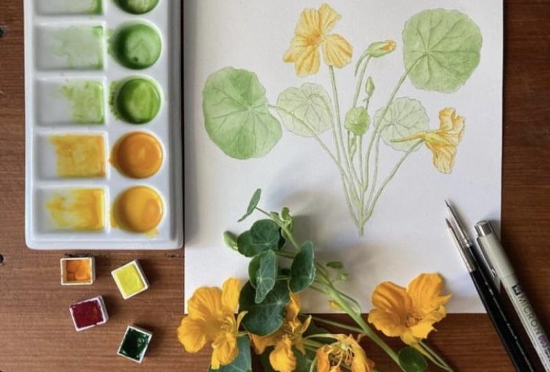
1. Introduction: Watercolor and Inc is
a technique I love. I remember being fascinated by the paintings by
Patrick Spotter. I've been practicing this
technique for a while, and now I want to share
my knowledge with you. In this class, I'm
going to show you, first of all, how to
set up your study page, how to really study the flowers and the leaves
in the different parts of the plant so that you have a thorough understanding of your subject before you
start your final painting. Then I will show
you quickly how I do some thumbnails study, and this will be
just quick sketches, nothing to be worried about. Oh. Then I'll show you how I transfer the drawing into
a good watercolor paper. After that, we will start
with the color mix. I will show you exactly which colors I use
and how I mix them. There will also be
a little tip for you to remember which paint, which mix is in which well
in your color palette. Then we start inking
the design and first we will do the outline
and then the details inside. Then we will start
applying the washes and I will show you
step by step how I apply each wash. Then we
will review the painting, and finally, we will
add the final details. By the end of the
class, you will have a completed nsturtiu
painting and also a deeper understanding of the painting process all the way from sketchbook to
the final painting. This class is perfect
for beginners who would like to try the joys
of watercolor painting. Intermediate artists
who would like to advance and
refine the skills, so maybe learn a new skill like the ink and
watercolor painting. And anyone who craves a creative outlet and
sense of accomplishment. I have included some
class downloads for you, which you can find by clicking
the link below the video, you will find the tracing, the ink drawing, a picture
of the finished painting, reference images, color mixes, and also a pigment
comparison chart. In case you are using different paints
from the ones I use. I am excited that you're here. If you're ready,
let's get started.
2. Class Project: The project for this class is, of course to create an
Astortium painting. You can start from a
sketchbook page like I did and do your
thumbnail sketches and then move on to
the final composition. You can also use some of the reference pictures maybe
that I provided you with. Or you can use the line
drawing I have given you, so you can just use that drawing and you don't need to worry about
anything else. You can just follow
along using that. Once you complete your painting, don't forget to post pictures
in the project section, so I can give you my
feedback if you like. If you have any questions, don't hesitate to ask.
I'm always here for you.
3. The Study Page: In this lesson, I will show
you how I sketch the flowers. At this moment, I'm drawing
a side view of the flower. It's important to draw
different views of the flowers, front side and also
different stages. For example, when
there's a flower bud, or a fully opened
flower and so on. And in this case, I will show with
a side view that this flower has a really
particular peculiar shape. So at the back, for example, the top petals extend to form
a so called spare SPU R, which is where the neectar is. And the f the petals of the
anastrotium, are different. There are five, which
is which means is a zygomorphic flower because it's got different
number of petals, an uneven number of petals. They are different.
The top two petals are different from the
bottom three petals. The bottom three They have a thickened bases and they
have peripheral outgrows, which are not in the top petals. Here, as you can see, I'm drawing the flowers
seeing from the front. Again, I start with measurement
and I do a rough circle. And then inside
the circular start during the petals and
everything that I can see. In this case, because the
petal are not fused together, you can see the sepals as well between some of the petals. Then you can see the reproductive apparatus
of the flower as well. Always try to be
realistic and take measurements It's very important to draw the different
views of the flowers, but also the different parts because when you're drawing a flower as complicated
as this one, because let's face it, it's not one of the
simplest flowers to draw. It's a really good
idea to study it in all its parts
because then you will know the structure when you go and paint or draw
your final composition. Even if you don't see some of these parts when you draw
your final composition, it's important to know where everything goes,
where everything is. It will help you to make
the drawing more realistic. As you can see, I'm really
studying the flower and I'm looking at it from different sides and try to get a feel for all of
the parts of this flower. Then what I do is because
the petals are different, I will draw the
single Petos as well. I always like to draw petals
anyway like a single petal. But in this case is even more important
because then you have a record of the difference
of the two petals. This one is the one with the. Then later on, I will
draw the other one, which is just the
simple smooth petal. And always write out the
measurement as well. This is the sepals structure, which looks like a little star. Again, I take some measurement
and do a circle first. Then inside the circle, I will start drawing the sepals. And these flowers have another interesting feature which I didn't know about until
I started studying it. The statements are different. I mean, they are
different sizes. You have bigger, medium, and smaller statements, and
I've never seen this before. I'm not sure if there
are other flowers that have this characteristic. But while I was doing it, I realized that some of the statements were
bigger than others. Um, so I will sketch the statements as well
in a few minutes. But it's quite
interesting to find out, really, things like that. Here I'm just sketching
the the pedal. As you can see, it's
very different well, very, but quite different
from the other one. It doesn't have the outgrowth
and it's quite smooth. Here, I'm just taking
another flower apart. I don't really like to do
that to the poor flowers, but it's important if you want to study the
flower in depth. Here, I will just open the two petals that
are fused in that spare, and then just separate the reproductive parts of the flower basically to study
them a bit more in detail. This is when I noticed the statements were
of different sizes, and I draw the the smaller
one and the bigger one. But I normally draw
them enlarged. This time is twice the sides and I usually write
times two next to it, just to remember that
this is actually twice the sides of
real life statements. I just take a note here that I found that the statements
are of different sizes. In this particular flower, I had found two bigger ones, three medium and
three smaller ones. Then here I just take some quick cool studies just to have a record
of this as well. The petals are quite wrinkly. I take pictures just
to make sure that I have reference images for when
I paint the final project. But I also do a very
quick cool study. This is not You know, it's very different
from the final work that I normally do. But just to have a rough idea of what the petals look like. Sometimes I like to do these cool studies with
color pencils as well. So it's up to you
as your sketchbook. You can do where you like. You want to try and usually
I do some pencil studies, just graphite, which
I think I will do in this page
as well later on. But at the moment, I'm just jotting down this color study. I use my two brushes method, one brush to lay
down the paint and the other brush to
soften the edges. That's it. That's
the study page. I will continue to work
on this page, as I said, maybe just adding some
graphite studies. But more or less, this is my study
page done and then I can carry on with a final composition
and a final painting.
4. Thumbnails: When it comes to doing
the val composition, I always like to do
some some sketches. So I made this visual
journal for botanical artist because I like to keep all my
sche findings in one place. So take a new page. And That's right. I'll write natrotium here. And then I normally
leave this space for my notes and for the findings, things that I like to jot down and keep for
future reference. And in here, I do some
thumbnail sketches. So I do some really
rough type of sketches, nothing too complicated. Maybe one landscape. And let's see. I could need something simple. I could do something like
that for the leaves, and maybe some flower beds here. Bigger flower. I feel is a bit a bit complicated this one. Let's try something like this. The flower here. Maybe here. As you can see, I don't do
any detail at this stage. Maybe something like that. This type of composition, maybe like this,
the flower here. So maybe I'm not sure this would work. Let's try a different one. Something simple, maybe. I leave on this side.
Flower on this side. Another leaf may be
seen from the back on this side and
little flower bed, maybe another leaf at the
back somewhere there. This way looks more simple and not bad, I
think the composition. So, I think I quite like this. What I'll do is I will
develop this a bit more, and then we carry on
with the project.
5. Transferring The Drawing: To fix the p. In here, I'm using
a low ta tape. So when you take
it off the page, it won't tell the paper. So try to not to lose. To use a low tape at this tape. In this part, I changed
the leaf ale bit. I made it a little bit because
this part of the flower of the sp was the margin of the. I'm not sure if I
can show you here. It's almost touching
and I don't like it as a compositional
arrangement here. I made the leaf a little
bit bigger just slightly, it doesn't really matter if
it's only slightly bigger, but it's important for the
composition that you don't have the kissing lines.
That's what they called. If you notice things like that, then you can adjust it. If you want to know more about position for your paintings. I have a specifically
on composition, which is called composition
for floral painting. You can have a look there. I think this is done. I'll show you. I use a little bit of a
stronger pencil line so that you can see it on camera because otherwise it will be very difficult for you to see. But generally try to keep light and now that we have this, on to the next stage,
which is the inking.
6. Colour Mixing: I have now erased the pencil
lines from the drawing, and I have scanned this, so I have a copy of the drawing
just with the ink lines. And now I will proceed
to mix the colors. So I click the palettes and
I'm going to mix the colors again by using the color study that I did in my sketchbook. I'm going to use
the recipes here, and I start with a yellow. So it's cardium yellow deep. Will make quite a
bit of color because it's a good idea to have
enough a list for each layer, but it would be
nice to have enough for the whole painting. You don't have to remix
it and it will be always the same color because
every time you remix it, inevitably, you will get a
slightly different color, it's not the end of the word. You can have a little
tiny difference, but if you struggle with
making the same color, then it's good to have a good amount of
mix to start with. This is one. Then here, I will add a
little bit of Qa qu magenta, which is this one here. These are from Oda. A too little. Always add a little
bit at the time. I'm going to taste this color. I get some paper. This is going to be
my lighter orange. Then I'm going to do another
we with a darker one. I've added more red to this mix, we have a darker orange
for the darker areas, and then I'm going
to mix the green. For the green, I'm going to
use this one for the buds and the stems and this
one for the leaves. We have per green, lemon yellow, and quinoa. I'm just going to
add some water here. To loosen it up a little bit. That's the lemon yellow
from Daniel S Meat, but you can use a green
yellow from Winter in Newton like a lemon yellow
from Winter in Newton is fine. Now we need to add
the Queen Qdromagena to tone it down and make
it a bit more realistic. This is the Queen Quiromagena
from Windsor Newton. Always add the red a
little bit at the time or you get brown. I think this is okay, actually. It's always looking more
like when it's in the well, so keep checking on your paper. And now making the
one for the leaves. We have t and lemon yellow, and a little bit of
windsor blue, red shade. Now I will do the color
for the front of the leaf, which is this one here, which is permanent green. The lemon yellow, qua magenta and a little bit
of windsor blue red shade. It's basically G. I put G
Windsor blue red shade. I needs a little
bit more wind blue. But always add in very small amounts because
this is a very potent blue. Okay. I think this is okay. I'll be my colors, and then I will use
the other whales to dilute it and maybe
change it a little bit.
7. A Tip For You: If you like me, I have problems remembering
which mix is which. I use this little trick. I use transparent magic tape, and what I do is, I have my mixed color
and codes in there. I put the tape here,
and then I For example, this is the first one
is mix A. I write A, and then we have This one is mixed A. I'm
already forgetting. This is mix C which
is more yellow. That's A, and then this one
is for the buds and stems. That's G. Then we have that's the
top of the leaves. That's a mix H. And then we are for
the back of the leaf, which is the abaxial and is mix, which is g p the winds
of blue red shade. That way, even if
you leave your work, and then you come back at a later stage and you
don't remember which one was the green because
the greens in the palette they
look alike in a way, sometimes which one is which. In this way, which is
your green for the stem, which is your green for
the top of the leaves, which is a green for
the back of the leaves, and also the oranges. This is just the way I use. You might have a different
way to remember your colors. But I just wanted
to tell you just in case you like to
adopt this method. And now we can proceed to
paint the first layer. I'll see you in the next lesson.
8. Inking Test: Now that I have done all
this work on the study page. But there's one more thing I want to do because I would like to make a little painting
from this study. And I want to do this painting
as an ink and watercolor. So if you have watched the
other classes that I've done, that I like this technique too. I'm going to use the
pens, the micron pens. I'm going to start with a 003
and see what it looks like. The I like to try usually on
my sketchbook before I go on to work on the final project because this way I can
test out the technique. I even if it's something
that I normally do like the normal watercolor or
this that I've done before, it's always nice to
have a test run. I take it as a warm basically. Athletes do a different
type of warmup. I do this. I'm just going to try this. I'm going to do the
contour of the petals. I normally like to do
something like a little bit of a broken line because I don't
like a continuous line. It looks too much
like a cut out. And it's okay to
make mistakes here because this is just to taste really to try and see
what you like to do. Sometimes I try color pencil in here as well and sometimes
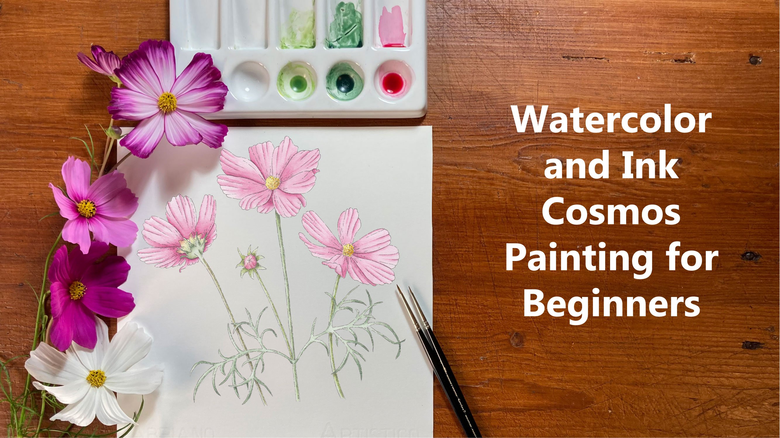
I just the watercolor. This technique, I explain
it in some detail in my other class about ink and watercolor where
I paint some cosmos. But it's basically
a matter of lifting your pen and making this
broken line to start with. I'm going to move the camera a little bit so you can
see better what I'm doing. You have a more direct view and just finishing the petals. As you can see, I just lift
and make some small dots. These flowers are the
petals are all wrinkly. It's nice to have this
texture like this. The pets, let me see
if I can show you. They have all these ridges. They make all the
light and shade. In here, I can do
something like that, just to convey all the
folds that the Petos are. This also will give a sense
of direction of the Petos If you find working
within a little scary, it's just a matter of practice. Take your sketchbook
and just give it a go. This type of technique. A bit. I'm using this
sketchbook because I made it myself with HS paper. When I do my tests in here, I note that the final result in my final project will be more or less the same because
the paper is the same. If you use a different
type of paper, then you might see some
differences when you actually work in your final
project with your best paper. I know it's a bit of an
expensive practice to do. But I really like the fact
that I know I can use this and then I know the
result that I will get in my final project rather
than being a surprise. In here, we have some of the outgrow of the petal. Okay. Then I can start giving it a little
wash with water color.
9. Inking the Outline: Now we're ready for
the aching part. I'm going to use my
micron pain 003. I think this is
better than this 01. But I'll try it and
see how it goes. I'm going to start
since I'm right handed, I'm going to start
from the left side and I'm just going
to put this here. I put my hand on
the page too much. I'm going to do like I
did in my sketchbook. Broken lines. That is not continuous and it doesn't
look like it's cut out. It's all a matter
of just lifting and maybe doing some small dots. Lifting the pain,
doing little dots, breaking the line
every now and then. I like this thickness. Okay. So do the veins in the same way. And feel free to move the paper. It doesn't have to stay
always in the same direction. Maybe I'm going to
add just one more. This is more or less the
structure of the veins. If you feel like it is
completing the design, you can always add another one. I usually try to keep
it as close as possible to the real structure
that I can observe. But this is, as I was saying before, a scientific
illustration. If you want to add
a couple of things that are not there, it's okay. Just to the ten. It's important to rest your hand the forearm completely on the table and
then just move your hand. Depends on the movement
that you need to do, but you need to try not to do it with your
hand lifted like this. You have a good f. I'm going to do the
rest of the outlines. I usually do the
outlines first and then do some shedding inside. I changed the angle
of the camera here just to hopefully show
you a bit better. As you can see
every now and then, I lift the pain and just to some little dots or
very small dashes. If you have a paper
that is a bit rough, it will be even easier
to do this type of work. All right. We done the outline and I have corrected certain
things in some places. And sometimes like in here, for example, let me
see if I can put it. If you can see, but
the incline doesn't follow the line. But
that doesn't matter. It doesn't have to be completely exactly the same as it
was with the pencil. You can change it a
little bit or if the pen goes a few millimeters
one way or the other. It's not going to be
the end of the world. That's why we keep the
pencil lines light, so we can erase them afterwards. The next step is to put some shading and some
inking on the inside, and we're going to do
that in the next video.
10. Inking the Inside: Now that I have
completed the outline, I'm going to do a little bit
of inking on the inside. I'm not going to do too
much on the leaves, I think because I don't like when it is too heavy on the ink. But I'm just going
to add some lines more or less the same
technique as before. I just do some des. This was the vein. A bit of a little bit
of ink here and there, just to give the idea
of some darker areas. Maybe a bit here. And I work on the diction of the leaf in the in the veins. Something like that.
Maybe a little bit here. Then this is the
leaf at the back. I'm not going to
do too much here. I think I'm going to
leave it a bit lighter, just to give an idea
of that is far away. Just a little bit
in here like this. This area is a bit
in shade as well. Maybe a bit here. In the flower, we
can do a bit more here because there
are some folds and always try to go in the
direction of the growth. With the petals, you can do quite a bit because
they're quite. They have lots of folds. So just do a few lines here
with the side of the bed. Yes. Then in here, we
have all the folds and things because
the flowers are not opened, something like that. Then here again in the d side, and a little bit on this side. And this little leaf,
a little bit here. There's a tiny little
flower band here. Then this leave has
got a little bit of shadow in this area. Just two dashes. You can practice sc paper
or in your sketchbook. Just to get a feel for what
the lines should be like. If you want to have another
class on ink and watercolor, you can watch that as well
to see with another flower, what it looks like
to do the inking.
11. Inking the Inside Part 2: This leaf there's not much shadow in here because
it's hit by the light, but maybe something underneath. Here, the flower. But I'm not going to do
too much in here. Just a few dots in
here, not too much. Then here, there is a
little bit of a shadow. I just realize I missed
a little bit there. So because the p is folding
where we can see that part. As you can see, this can happen, but you can just as. And I get just a few dots to show that the petal is folding. Then inside the stems, I'm not going to do too much. They're quite thin. What I do is just a
little bit of a line of small dashes here and there on the side where
there is more shadow. In my case is the right side. All right, so I think
we are ready for the next stage where we're going to add the watercolor washes. But first, what I do
is I wait for it to. Then I'll erase all
the pencil lines that can still be seen. Then I will actually scan
this as it is just with the inclines because you never know how you
might want to use it. It's nice to have a version of your ding with the inclines. Then when you do that, you can carry on with the
watercolor washes, and we do that in
the next videos.
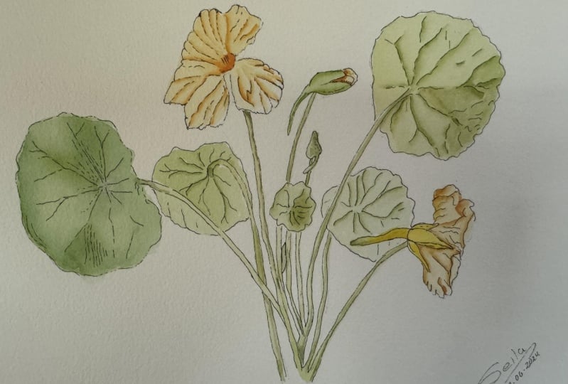
12. First Wash Leaves: We are finally ready to
start with the first layer, what I'll do is I try different sizes because they are smaller and bigger spaces. I have here my Winter
Newton brushes, one, two, and three, and then
we'll see which one is best. The leaf, these
leaves are quite big. I'll try with three
f and I'll get some clean water and I will
dilute this color first. I'll start with a lighter color even on the flowers
because there are lighter places here where the light hits the
petals, it's quite light. You can always make it darker. With the flowers,
I start with this, then I'll try the
diluted vasion as well. Always try because you can never tell how strong it is in there. That's light enough. Then for the top of the leaf, we add this color. C I put at drop here water
and dilute some of these. Might not be enough. So I
will add a little bit more. Let me see. Going to
start with this leaf. If you prefer to do
a painting where the color comes out of the incline, you can
do that as well. It's up to you. I'm
going to do this where I stay inside the
lines, so to speak. The first layer is going to
be just a flat layer or a I'm not going to worry too much about shadows and
anything like that. I normally do my
paintings like this. Sometimes I start
with a wet on wet. But when it's like this, the first layer is going to be just a light wash
on the dry paper. Now, this leaf is
seen from the front, but it's quite small, so it's st lighter
than the other leaf. I'm going to use lighter g
that I mixed for the stem. For this one. I'm still using my
number three brush. I just have to be careful
on the edges here. Will use this green for this small but
that is not open yet. And also for the sepals here. No Then for the back of the leaves that we
use last mix here. Again, I diluted quite a bit, and these are leaves
seen from the back. I actually I'm going to use. More water here. I just
picked up a little bit of water with my brush
because I'm going to leave a bit
lighter just to give the idea of the depth
that these are the back. The same here. Diluted wash for this. Then this is also
seen from the back, but it is a bit closer. I'm going to do a less
diluted wash for this one. S
13. First Wash Flowers and Stems: So I'm going to do this flower, the sty wash with
a light yellow. Look at the wash on the
flower bed as well. Just make sure that
the other color is before applying the
other one next to it. I've added a bit more lemon
yellow to my lighter mix in here because the sepals
become yellowish color, orange, almost like the
flower, you see here. It depends on the age
of the flower as well. I'm going to use this
color here for the sepals. They also have some
tiny green parts. What I do is I use
a little bit of this green for the stems and mix it here in the at the tip of the spare
and let the two colors mix. Then maybe add little tiny
s of green here and there. T since it's still, it will mix and
give that effect. That is yellow greenish. Then for the ser, we just use the color green. I might just change my
brush to a smaller one. Let's try number one. I've done the first wash now. What I'll do is I
wait for it to dry. Then I'll check my pictures because I took some pictures
of the leaves and flowers, and I check where the
lights and darks are, and I'll do another layer just to emphasize a little bit
with the light in the dark. Then after that, we can
proceed with the details.
14. Second Wash Leaves: The first layer is
now completely dry. I'm going to apply a little
bit of a second layer just to basically show
some darkened lights. What I do is I use my number
one Winter Newton brush, and then I'll the mix for
the top of the leaves, the mix and it's still diluted
but not as much as before, a bit less diluted. And I use my two
brush system where I apply the paint
with one brush and then use the other one to
smooth the transition. So I'll put a little bit of a shadow here because
the leaf is folding. I'm using a reference
photo for this. I basically smoothing the edges of the paint with the wet brush. I just wet my brush and
dry it a little bit. Then here there is a bit shadow. Put the paint down
and then smooth the edges with a
damp brush, not wet. Then if you can see that it
still is pushing the color, you rinse it again until it's clean because it will
pick up the green pigment. I can see I'm if I can show
you this picture here. Two pictures of all the
parts of the flower because this particular part of
the flower is now dead. Basically I have
some different ones, but it wouldn't be the same. I always take some pictures for reference for the
lights and darks. Although I mix the colors
using the fresh material. There's a bit of shadow here as well. Maybe a little bit here. So always rinse the brush when once he's picking
up the pigment. Make sure it's always
clean and just dump. Then if you think these
areas are too light, we can always add was, again, a light wash to
bring it all together. This here is the lighter leaf, so it's seen from the
front, but it's lighter, so I'm going to use
the mix for the stems. Maybe add a little
tiny mix from the H. That's the mix from the stem, and I add a little bit of
this is to bring it together. This has a little bit
of a shadow here. You just smoothing
edges of the paint. Really make it nice transition. Maybe there is a little
bit of shadow there. Since this is now damp, you can just drop a little
bit of the color as well to make it a bit. Here is quite light, so it. These are okay. Now we can do the leaves the
scene at the back. Actually, I'm going
to leave these at the moment. I'll do this one. Then I will compare
how light compared with the rest of the painting because I want to
leave this lighter. I'm going to do this one here. In here there is a darker
area around this side. For me, the light is
always coming from the left, being right handed. There is ale bit of a ridge
here because at the back, the veins are a
little bit raised. There's a little bit of
shadow next to the veins. Here is very light in this area. There is a little bit
of a shadow here. Okay. So let's that for now.
15. Second Wash Buds: And I'm going to
do the flower bud. So here is quite light. We have a bit of shadow down
here where it is curving. I bring a little bit here. And on this side of the spare on the right side of the spare, which is in the flower
body is still green. You can still lift
the color as well. If you think it's
a bit too dark, with a damp brush, press it on the color and
it will lift it. Then for the little bad here, we do the same, we do
the shadow on the right. Keep your brush if you
use this technique. Then there's a little
tiny one here. I do the same thing.
16. Second Wash Front Facing Flower: Okay, so we can do the fold
here in the flower now. So in here this
petal is closer to the center of the flower. Okay. Realized here there is
a little bit of cara, maybe it was in my finger. I didn't wait probably
long enough for it to dry. What I do if this happens, I have this brush from the
Billy show collection, which is called the deradictor. But you can use any stiff
synthetic bristle brush and just gently go over the
paint and remove it. We remove it. Just be careful because some pigments stain
and they won't come off. But this one was okay to remove. I should have done it earlier,
but I'm going to put this here now and just carry on. Under this pedal, there
is a bit of a shadow. Here the pit of is caving. So again, there is a little
bit of a shadow in there. It's in the center of the petal, then it becomes lighter as the petal goes
towards the light. I usually go over
the whole petal because it makes it more and it darkens it
a little bit as well because you're pulling
a little bit of the pigment. And again here. It's a bit. There is a fold here. Basically, just
where the folds are, you use the color and then you just make the
transition with the brush. It's quite dark in the center. Then on this side, the petal is in the
shadow as well. Again, I go over the
whole petal just to make it easier to make
the smooth transition. Then there's a little
bit of a fold here. You can use your ink marks to guide you the folds
in the shadows are. And always look at your
reference photo or if you're painting
from a live flower. Just keep looking at your
reference and keep adjusting. All right. I think I leave the flower now this
flower and then move on to the next next one.
17. Second Wash Side Flower: I'm going to do this one, the flower seeing from the side. There's a darker area here
with the petal folds. And then in here as well. So this area here
is quite light, so I'll leave it lighter. There are some here or this bit. We have some shadow. And then in this. Yeah. Yeah. And the flower bud is quite that came here. Let's go this little
folds as well. All right. Now we can
proceed with the stems.
18. Second Wash Stems and Sepals: All right. The stems
are quite thin, so there's not a lot we can do. We just have to work
very carefully. And I use the same
technique as before. Place the color where the
shadow is and then use the other brush for the transition to smooth
out the transition. I'm still using my
number one brush here because the tip is quite small. But in the final
details, I might ah. There is a little bit
of a shadow here. Under the petal. You don't have to do the whole se the
same time the whole length. You can do it ale
bit at the time. Then again, here,
there is a little bit of a shadow from the leaf. We can make this da afterwards. If we don't think this is,
that can be corrected. I don't do too many details on these two leaves and then here. We do the same thing
as the others. Then I add a little bit
more detail in here. We got a little bit
of shadow here. In here, we have a little
bit of green as well, so I'm going to get some of the green for the stem
and just add it here. I think we're done
for this layer. I it and then come back
and have a look at it and see if I need any
more details anywhere. A
19. Reviewing the Painting: Now that I have finished
the second layer. I can see that these leaves
are a bit too light. Also, I think I
would like to add a bit more color to
the other two leaves. What I do is I do
a wash and I will use the color for the for
the front and for the back. I'll dilute it a little bit. Then I will just do a
wash on top of this. Just a flat wash. I think I'm going to use a bigger brush. I'm going to use a number four, and just do a flat wash. Because I think it's just
too light the color. I'm going to leave just the part without doing the wash
because that's lighter. Okay. You know, just
reinforce the d here. All right. And then this one is the back. They'll do a light wash
on these leaves as well. Then here, I just reinforce
a little bit. The shadow. The brush is not too wet, it's almost like a dry
brush technique this one. Then in here, we have
the little stamens. The color dri ale bit. I think what I do is
e a smaller brush. I'll use a numero. Just do the statements.
20. Details: With the number zero brush. I just do a little
details here in there. In here, I will reinforce the shadow to show this
petal is on top of this one. I still use the same technique. And do the same in here. Add a little bit of
the darker color just reinforcing the shadows,
make it a little bit. D. Okay. When the brush is almost dry, you can add a little bit of color in the place if it's
where it's too light. It's almost like coloring with a colored pencil because it looks like there's
nothing on the brush, but there a little bit on this pencil as well. Basically just going
checking all areas that need a little bit of
contrast and shadow. The contrast really is
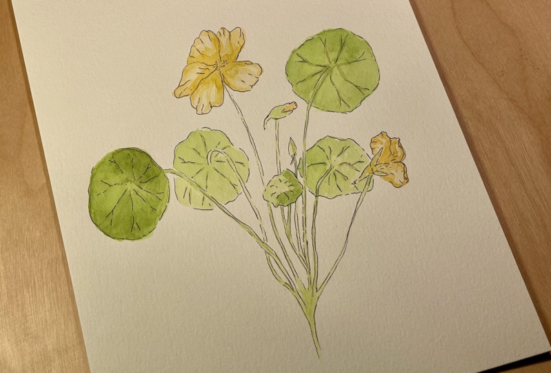
what gives you the effect. I think we finished with this. You can leave it
one or two days, just to look at it with
fresh eyes afterwards. See if there's anything
else you'd like to add any more details. But I think it's fine like this. Then you done. You can scan it if you
want a digital copy of it, or you can just hang it in
your wall and admire it. I hope you have enjoyed this class and see
you in the next one. S.
21. Final Thoughts: Congratulations on
completing the class. I hope you have enjoyed it, and I hope you have learned
new skills that will be useful for your
future projects. Don't forget to post pictures of your paintings in
the project section, so I can give you my
feedback if you like. If you have any questions, don't hesitate to reach out. I will try to answer
as soon as I can. If you have enjoyed the class
and if you have liked it, please leave a good review because that would
be really helpful. Also, don't forget to
hit the follow button. You will be notified as
soon as I post a new class. I hope you had fun and I will see you in
the next class. By
 Katia Galante, Botanical Artist and Illustrator