Transcripts
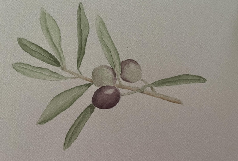
1. Class Introduction: Hi there, and welcome to my class How to paint
an olive branch. My name is Katya, and
I'm a botanical artist, and I'm passionate
about capturing the beauty of nature
in every brush stroke. In this class, I'll
guide you step by step through my
tried and through method to create a stunning botanical
watercolor painting. Together, we will paint
this delicate olive branch, learning techniques to
achieve vibrant greens, rich browns, and
those subtle details that make your work
truly stand out. We start with color
mixing and we will be exploring how to create
the perfect greens, deepen your shade
with darkening mixes and mix tetons for the
olives and the branches. Then we will move on
to the first wash, layering and adding details that bring life
to your painting. I will even show you how to give your work the final polish with one more wash and then all those important
finishing touches. This class is perfect for advanced beginners or
intermediate artists looking to refine their skills and explore the art of
botanical watercolor. I've included everything
you need to get started. There is a materials list, a tracing of the branch, a reference image, and a picture of the final
painting to guide you. By the end of the
class, you'll have your very own beautiful
olive branch painting and a new set of skills to use
in your watercolor journey. If you're ready, grab your
brushes and let's get started.
2. Class Project: For your project in this class, you'll be creating your very own watercolor painting
of an olive branch. Using the step by step
process I've shared, you'll mix the colors, layer washes, and add the fine details to bring this beautiful botanical
subject to life. I've included
everything you need to make the process
smooth and enjoyable, and you find a detailed
materials list. And also, I've included
the tracing for you and also a picture of
the finished painting, so you can have as a reference
and a reference image. So take your time as you
move through the lessons. Don't worry if things
are imperfect at first. The beauty of watercolor lies in its fluidity and how it
captures the essence of nature. Once you've completed
your painting, I love for you to share it in the project section
of this class. It's always so
inspiring to see how each artist adds the unique
touch to the same subject. And remember, practice
makes progress. So whether this is your
first botanical painting or one of many, each piece brings you closer to mastering the
art of watercolor. So I can't wait to see your
beautiful olive branch, and let's get painting.
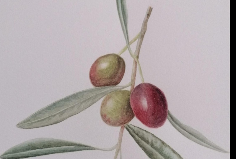
3. About the Reference Picture: I just wanted to show
you a quick note about the reference image. You will see that you can see my fingers there and also one of the leaves it looks like it has been attached from
another picture, which is exactly what happened because when you do
botanical painting, it's very rare that you find the perfect branch with
the perfect composition. And that's true for
anything for flowers, branches, and all
sorts of plants. So what we normally do
as botanical artist, we take different parts. You can work from
life and so turn the plant around if you
have your plant there, or if you work from pictures, like I had to do for this class, you can take bits and pieces
from different pictures. The important thing is to keep in mind where
the light comes from. So don't mix pictures where the light is from left
and then it is from right. So just make sure
that the light is always coming from
the same direction. And he will be right. By doing this, everyone does it. So you will see that the picture
is a little bit strange, but it makes sense. And at the end of the day, you have my reference of the
finish painting as well. So you can always refer to that if something doesn't
make exactly sense. Okay? So that's all I wanted to say about
the reference picture.
4. Color Mix Darkening Mix: As usual, we start
with the color mixing, and I have here
my darkening mix. For this painting, I'm going to use the red darkening mix
and the green darkening mix. The red one is made
with Winsor blue, red shade, quincuo magenta,
and transparent yellow, and for the green, I'm using blue green shade, quincuo magenta,
and lemon yellow. So I'm going to mix these now. So mix ok to get violet, and we might have to adjust
this but start with this. And then we'll add the
transparent yellow. So this is the red
darkening mix. And as you can see, you get a gray black for your darkening mix,
and that's perfect. And what I'll do
is I'll just right here red darkening mix so
we don't get confused. Now I'm going to mix the
green darkening mix. Again, magenta to get
again a violet colour. I think this is
quite good as well. It's kind of gray. And I'm going to
do the same thing. I right here Oops
green darkening mix. And now I will mix
the other colors, and I will use my color study
from my botanical diary to mix the colors because I've I've done the studies,
I've taken pictures. But unfortunately, the
olives and the leaves are not not really I can't
really use them anymore.
5. Color Mix - Leaves: Okay, so for the leaves, I'm going to mix Iden tren blue, which is quite a dark blue. And the leaves are quite dark. So we need to start with
something already pretty dark. I'm going to try and mix
a good quantity of it. Because it's always good. I mean, you can mix more color, but it's always nice to have enough to do your
whole painting, especially when it's
a small painting. Okay. And then to this, I will add transparent yellow. Blue is a blue with
a tendency to red, and transparent yellow is a yellow with a
tendency to orange. So when I mix these two colors, their color bias is
going away from green, so you don't have
a brilliant green, but you will have a sort
of dark muted green. So this maybe I need to add
a little bit more blue. So it's important when you mix your colors that you have
an idea of the bias of the color because otherwise you won't get the
result you expect. The first time you mix, you have to keep trying and trying. Okay, so that's a bit darker. Now to darken it a
bit more and make it more natural looking, I'm going to add permanent
alza and remson. I'm going to add a red and always add the red a
little at the time. Don't add a big quantity. Otherwise, you
might get a brown. Let's have a look. I'm still quite light,
so I'll add a bit more. I might take a little while, but it's better to
approach it this way rather than add too much. I put a little bit more. It's quite a lot of paint here, so that's why I need
to add a bit more. Okay. I think we're
getting there. And then to this, we can add the darkening mix to make it
even darker, to the green. In fact, what I'm going to
do is take a little bit of this and add some of
the darkening mix. Maybe a little bit more. And we can always
adjust this as we go. And then I will mix the
colour for the olives.
6. Color Mix - Olives: So for the olives, I
have perilin in my room, winter blue green shade. And okay, we do this one first. Again, I'm going to try and mix a good quantity of this color. Also because I'm
taking part of it, and I'm going to take
part of it and add quincudomgenta to it to make it a little
bit more reddish. Okay, so we have
the perilinimroon, and we're going to add the
blue Winter blue green shade. Try not to add too much. I may have. Let me see. These blue, the winds are blue, the green and red shade,
they are quite strong. No, I think this is
perfect, actually. And if you don't get the colors exactly
like mine because of, you know, the screen
color is different. Don't worry too much about it. As long as it's similar,
you'll be okay. And then I'm going to
take some of these. I'm going to add the
quinaquidron magenta because some parts of the olives have a reddish sort of bias. So that one is fine. And then so now I'm going to mix the green for those
areas of the olive green. And for that, I mix win to blue, red shade, lemon
yellow, and to that, I add unequid magenta to make it tone it down,
make it more realistic. So win to blue red shade. Still quite dark. I possibly added a bit too
much blue because I was saying they're
quite strong these blues. Well, that's okay. It doesn't matter if I have a bit more color because
with watercolor, you can keep it and you
can reactivate it anytime. And I like to do a
big painting of this. So that would be right.
Okay, we're nearly there. I'm going to add the
quinacutu magenta now. Again, a little bit at the time. Start a bit more. Okay. And now we just need the
colour for the branch. And
7. Color Mix - Browns: So the branch has this
sort of golden color, and I'm not sure you can
really tell from the video, but it's sort of
underneath this top area, which is almost
like a gray color. There is this,
golden green color. So I'm going to use different blues and
yellows to mix this. So for the first color is cobalt blue and
cadim yellow pale. I usually try to use
the same paints to mix the different colors
for the painting, but in this case, I wasn't getting the
right shade, really. The right color. So I
tried a different angle, and I think this one
I quite like it. As I was saying, when
you add red to green, you get a brown. So to this, I'm going
to add Quinequidn red. I might need to add
a bit more yellow. So when you're mixing colors is really all a matter
of adjusting and tweaking and keep checking
so we are nearly there. So don't get frustrated if you can't get the color you want straightaway because it does take a little bit of time. Sometimes you might get
the color straight away, but sometimes it
just takes time. This one is close enough. And then to make it darker, I add more cobalt blue
and more quinquigon red. And then if you add
more cobot blue, it goes to that sort of
gray color that I mentioned before that is sort of
just at the very surface, which I will use, I think, as a dry brush for this
texture, basically. So I will mix these
colors as well, and then we're ready to go.
8. First Wash: And The first thing we need to do is to remove the excess pencil lines so
they make them lighter. And this is very important
with watercolor, of course, because otherwise, if the
paint is not dark enough, they might show
through your painting. So I still leave them a little bit darker
here so that you can see, and the leaves are
quite dark anyway, so that shouldn't be a problem. But just be mindful
that the pencil will show through if
the paint is light. Now I'm just taking some of the mix for the leaves
and I'm going to dilute it quite a bit because I'm going to
apply the first wash, which normally I do almost as a flat wash. You
can see it's quite diluted and remember that we can always add more paint
and make it darker, but it's going to be very
difficult to make it lighter. So I'm going to apply it wet
on dry this time because, I mean, you can do wet
on wet if you want. But the area here
is quite small, so you don't need really
to have the paper wet. Again, as I mentioned,
you can do it that way if it's your
preferred method. I don't want to
tell you that you have to do this,
the way I do it. I just want to show
you the way I do it in case you like
working this way. So I apply, as I was saying, the paint almost as a flat wash. And because it's
so dark the leaf, you don't need to
leave an area for the vein because when you
apply the rest of the layers, it will show and you leave a little bit of an area
without the paint, it will show light anyway. So you do this for
all of the leaves. And I sped up the video
here just a little bit because it's all
the same technique. So you just carefully apply your diluted paint
on the leaf area. So I'm using my number one
brush from Winter and Newton. You can use different brush, of course, different type. I know these are
quite expensive, and if you're trying watercolor for the
first time and you don't want to spend too
much money on supplies, you can use a different brush. But I tried other
types of brushes. I've tried synthetic ones, and I can't work with
the synthetic ones. I don't know, it's just
my way of working, but they don't work for me. All right. So I'm going to
use the lighter paint, again, diluted for the leaves that
you see from the back, which is called a back seal. There's a couple of
leaves here that are turned and you
can see the back. And if you are interested
in botanical painting, this is something that is
actually very important. If you want to do an
illustration for botanical work, which is at the moment,
we're not doing this. Is botanical painting,
but it's not, you know, a scientific illustration or something that is
going to be on a show, for example, or a competition. But if you want to do
something like that, it's very important that you show different
parts of the plant. So you need to show
the top of the leaves, the baxil, you need to
show the back of the leaf. You need to show the flower from two or three
different points of view. So from the front, from the side and from the back
would be the minimum. And extra points if you like, if you show the root
systems as well when it's like a bulb or
different type of plant. In this case, is a tree, so you don't need to do that. But it's a really
nice composition for botanical work when you have the roots
and when you have, for example, the flower
and the seeds as well. In here, for example, to make it a botanical
illustration, for a competition, for example, I will need to add a
little bit more than this, and I will need to add
an example of the flour, and then maybe a section of
the olive and also I mean, you can see also the
inside, you know, the pip, the olive and what else? So the flower I said, yeah, I think that's
that would make it more interesting and more
botanically accurate. But for this type
of illustration, you don't need that, of course, and we want to have fun here. So don't stress about
all the different parts. But just so you know, in
case you are interested in pursuing botanical
illustration at a higher level as well. And at the moment,
I'm just applying the first wash on
the olives as well. And there are a couple
that show some more green. And here actually, I had
forgotten to add a little bit of because you can
see a little bit of the top of the leaf in there. So I added the darker color. And I was saying
two of the olives, you can see more green. And then the third
olive, as you can see, I'm diluting the darker color because this one you can't
really see the green. This olive is more ripe, so the green is gone, and you can see the
darker color because they become quite dark, almost black. But this is kind of in
the middle of the stage. But it's gone this maroon color, which is really lovely. So I'm doing the fist
watch for that and also for the little
stokes, as well. And then we're going to apply the first wash for
the branch too. So the first wash will
be completed after this. And for the branch,
I'm going to use asma brush because
it's quite thin. But again, it's the
same type of work, just a flat wash
with a base color, which I call the local color. The branch is this brownish
color up to one point, and then the very tip becomes green because it's
quite a young branch. So I apply the green
at the bottom and let the two colors mix as
well at one point. But the very tip is this
lighter color, this green. That's it. After this, we
are ready for the next step.
9. Second Layer - Adaxial: Now that the first wash is dry, we can proceed with
the second wash. And what I do is, again, I take some paint and dilute it, but I will dilute it
a bit less this time. So it's a little bit thicker. Of course, you know, try not to go too dark too soon because the way
to proceed is to add different layers and make your painting darker
a little at the time. So again, I will use here
the wet on dry technique. So I start with a
leaf on the left. And what I do is I use
my two brush technique. So I'll apply the paint with my brush with
my number one brush, and then to make the
smooth transition, I will use another brush, in this case, is a number
two miniature brush. Which is just basically a damp
brush to as I was saying, make that smooth
transition and avoid, you know, that line
that might form. So this way, I
don't have to pick up constantly new paint, and I don't know I quite
like this technique. So as you can see, I
carefully apply the paint, and I usually start applying the paint where I see
the darkest area. And then I will smooth the
transition with the brush. So you will have this
sort of darker area. And I proceed like this
for all of the leaves, and generally, this is my
technique for everything. So have a look at where
the darkest area is, apply your paint, and then
transition it put it down. With the damp brush. Make sure you always
rinse your damp brush, and also make sure that you
tap it on some paper or a towel because
you don't want to drop too much water
on your painting. Otherwise, it will create
this sort of stains. You know, it will
push the paint and the pigment in a way
that you can control. So you rinse your
brush and tap it on your paper towel and then do that transition work that
I was telling you about. So in here, there is
that little tiny part of the top of the leaf
that you can see. So I'm applying the
paint there as well. And this way, you will give also the impression of the mid rib, that main vein because I'm
not unless only for one leaf, the one on the right hand side. But for the other
leaves, you can't really see that vein very much, but you need to give the
impression of the vein and where that mid rib is the
leaf sort of dips. So you need to convey this
with your darker light. And and on the side, normally the olive leaves, they also curl towards
the back of the leaf. So you need to convey that
again with a darker light. If you look at the leaf,
you will see that where it starts curling
downwards, it's darker. And this is the leaf I was telling you about
where I will leave a little tiny space,
which is lighter, just to convey that vein because this leaf is really turning
towards the viewer so you can see the midrib but here I show you
exactly my technique. So you can see that
I'm applying the paint and then smoothing it
down with a damp brush. And you can do that
with the same brush, but you need to rinse it,
you know, to do this. So apply the paint, rinse it, and then do the same work as
I do with the other brush. But I find that you use a
lot of paint like this, and it's so much easier to
just have a second brush. So here, as you can see, I'm carefully leaving
that little bit of space just to convey the
idea of the mid rib. And that colour
that was underneath the face layer now with a darker color
looks really light. So we probably have
to put a wash on top of the lighter area so that it doesn't really
stand out too much. So this is how I proceed
for the second layer, and I proceed like this
for all of the elements. And I find that this
technique really gives me a lot of
control on where I put the paint rather than applying wet and wet where the paint sort of rush whereever it likes because
sometimes the pigments have a mind of their own. So I prefer to do it like this because I
control it much better. Of course, there are
very talented painters that use the wetting wit. I'm not saying it's wrong, so it's just a matter
of preference. And it's important
to experiment a lot, to paint a lot
because in that way, you will find your
own technique, which is maybe the wet and wet, maybe like mine, the wet and
dry, or maybe it's a mix. You know, it's a matter of experimenting and see
what you like to do. So don't worry. It's not wasted time and it's
not wasted paper. It's a way to improve and to find your
technique and your style. And that's the
only way to do it. There's no other way. So I'm doing the same thing here. So I applying the paint where the darker area is and
then smoothing it down. All right, so that's
the second layer done, and we're ready to move
on to the other leaves, the abaxial leaves. Oh
10. Second Layer - Abaxial: We can move on now to
the abaxial leaves, and I'm going to apply a very diluted layer of the same color as
we've been using so far. So but very, very diluted
because I like to give it this sort of color shining
through the next layer. So what I'll do is I just
start defining the shadows, but with that color,
and then I will apply the lighter color on top. So it's because watercolor
is transparent. When you add these colors, even though it looks like you're adding
something else on top, the previous layer will
still show through. So it's a good idea. It's something that I like to do sometimes this type of work. So applying a different color. And in here, you have to remember that the
mid rib is raised, so it's more visible and it's casting a shadow on
the surface of the leaf. So at the moment, I'm defining the shadow to show that the
mid rib is actually raised. So hopefully, you will
see this and it's conveying this three D shape because to give the
appearance of three D, we need to use the
shadow and the light. So I'm just darkening a little bit where I was telling you before
the leaves curl. So this leaf is curling. And again, this is casting a shadow on the
surface of the leaf, this part of the leaf
that is curling. And the same happens with
this next leaf as well. And again, here you can
clearly see the mid rib. So you need to make
sure that you apply the paint in a way that looks like the shadow that is
cast by the raised vein. So I have a look at
the reference photo in the picture of the
finish painting that I enclosed in the class, so you can see
exactly what I mean. In the final leaf that
is seen from the back, you can't really see very
well that raised vein. You can see it a little bit, but not like the other leaves, but you still have to give the the impression
of a shadow. So you still need to do
the central area darker so that it shows that there is the leaf that is
casting the shadow. And also the side the left side of this leaf
is also darker because it's not receiving
any light or batch light because the leaf is curling again, so
that would be darker. And now what I'm doing is
I'm mixing the light paint, lighter green with a little
bit of darkening mix, the green darkening
mix to make it a bit darker so that I can
reinforce the darker areas. And this is something
that I normally do when I need to make a paint darker, as I explained in the past, I like to add the darkening mix, so it makes it darker, but it doesn't change
the hue so much. I'm going to use it on the leaves that you
can see from the back. And basically now, what
I'm going to do is just to strengthen the areas
where you see the shadow, so the darker areas. And I will make the video a bit faster because it's
the same process anyway. So I will speed up
things a little bit. H So as you can see, I'm just going back to the
area just next to the mid rib, just to make it a little
bit darker just to, you know, lift the
mid rib, so to speak. So when you apply the
darker color next to it, it looks like the mid rib is actually coming
up from the page. So don't worry about
getting too dark. Just keep applying the paint as long as you
don't go, you know, in with thick paint really dark all at once,
you would be fine. And then after this, we
can move on to the olives. So we can start to give
the three D effect on the olives as well. Y
11. Second Layer - Olives: Alright, now we can proceed with the second
layer on the olives. And I'm going to dilute a little bit the color
mix for the olives, which is the lighter green
and also the maroon color. So I have two maroon
colors for the olives. One is more with a
tendency to the red, which is for certain
areas of the olives. So I'm preparing
all three colors a little bit diluted,
as you can see. And two of the olives
are more green. So I'm going to
start with those. A So I'm just going to use to start with
a green olive on the left. Well, this olive
is actually green, but it's also the maroon color. But I will start by applying the green because we can
apply the other color. Since it's darker, we
can apply it on the top. And just be mindful of
the area of highlight. So as you can see, I'm
working around it. And I'm just using my damp brush to soften the edges and
make the smooth transition. But try to leave the
area light in color. It's not completely
white, but it is light. So be careful when you
work around this area. I don't like to
use muskin fluid. Normally, I try not
to because it's it leaves a very sharp
sort of edge in the color. So I try not to
use muskin fluid. But if you are finding it difficult to apply the
paint to leave the area, then try with the muskin fluid. But I would advise you
not to use it if you can. And what I did here was I mixed some of the
maroon color with the green color to make this
sort of dark type of green, which is sort of you
can see this green in the transition between
the dark color and the green color,
the lighter green. So this is something I
also do quite often. I use the mixes that I have on my palette to make
another color that I can see without mixing basically a fresh new color completely, because with those two colors, you can achieve exactly
the hue you need. So hopefully this
is making sense. And then what I do is
I also start to apply the maroon color as
well because you can see an area on the
bottom of the olive and on the two sides that it's
becoming to sort of ripen. Again, try to leave the lighter area when you apply this darker
color as well. And as you can see, I'm using small strokes to apply the paint And I'm going to use reddish, more reddish paint on this side of the
olive because I can see that this olive has got this light more
reddish color in it. So always I will look
at your reference photo and check for all the different
colors that you can see. And I always use my second
brush to smooth down the paint and sort of push a little bit of the pigment towards
that area of highlight, because it's not
completely white, shiny, but it's much lighter. So in this way, you get
a little bit of colour but not too much. So it will give this idea of the olive
being a little bit shiny. So I proceed like this
for all of the olives. So this one, the second
layer is almost done. And then once the
second layer is done, we can add details. Always work carefully when you're working next to the leaf. I'm now diluting that color a little bit because
I want to apply it underneath the darker colour
in the olive on the right, the one that is more
ripe because again, it will give it a different glow if you apply that colour. And again, be careful to leave the lighter area
of the highlight. I always try to leave
a little bit of a larger area so you can work towards
making it smaller. But if you leave a
small area, too small, then you won't really be able to take the color away and
make it bigger again. So if you want to
because, I mean, certain colors you
can lift them, but then you might
damage the paper. And these colors, especially
are very difficult to lift. The reddish shade colors are
usually difficult to lift. So it's better if you
leave a larger area, and then you can
make smaller rather than apply too much
paint, you know, make the eyelight too small and then trying to regain
the highlight back. So I'm working in the same manner for all
of the olives as well. And I'm going to spit
up the video a little bit because it's
the same technique that I'm using for
the last olive. So this one's got a
little bit more green, but it's the same
thing as I did before. Again, I'm applying
the darker color on top of the green because this gives the particular kind of shine from the green as well, and the darker color can
be applied on top of the lighter green is actually
creating a great effect. And here I can just
show you that I mix the maroon color with the green as I was
explaining before, to darken the green and get
this new mix, basically.
12. Second Layer - Branch: We can now move on to apply the second layer to
the little branch as well. And again, I'm diluting
the color for the branch, which is the color that
you can see underneath that texture that is typical
of the olive branches. And so I will apply this
first as I have before. And then once this is
dry with the dry brush, I will apply my darker color, the grayish color to mimic
the texture of the branch. I start from the top and I
use this golden brown color. Then when I get to
the bottom part, which is the thinner part, it becomes more and more green. So I will switch to
the green color. And I'll make the
video a bit faster again because it's as
usual, the same technique. So always using my damp brush to make a smooth transition. And I apply a little
bit more color just underneath
the olive because there will be the shadow
cast from the olive. And then in here, in the last part of the branch, I applied the green color. And then after this, we will be ready to start
working on the details.
13. Details - Adaxial: Now that the painting
is again dry, we can start working
on the details. So for this stage of the work, I will use again dry brush, but even more dry
brush than before. So I'm picking up a very
small amount of paint. So I give it a little
mix and then try to get rid of part of that
paint of the excess paint. And what I do is I always
have a scrap piece of paper, and I sort of do a few lines in there to get rid of the excess paint that
is on the brush. And then I start working
on the leaf in this case, as if it was basically as
if I was using a pencil. You can imagine a color pencil
or a graphite pencil that you use to darken your areas. So if you ever used
pencils for coloring, this is more or less
what I'm in a way, how I can explain my technique. So I start always from where
the color is more intense, whereas darker, where
I can see the shadows. Uh, always be very
light with your touch. And if you feel like
you saw me before that you have too much
paint on your brush, just again, do a few lines
on a scrap bit of paper. Or sometimes I even
use a kitchen towel and tap my brush on
the kitchen towel. Then basically just draw with your brush and add
the color slowly. Because it might
look like you're not depositing much color, but you actually are. You are putting down
quite a bit of color. And if you want to test this, do the same thing in a white
piece of paper, you know, away from your painting, and you will see how much
paint actually is deposited. But you can see even here the the leaf is becoming darker. So this way, you have a lot of control where you
put your color, you have a lot of control
how dark you're going to do your painting and also you
can build the color slowly. So if you're not happy with how darkens, you
can go back again. You can add a little bit of the darkening
mix to your green, for example, and go
back again with that. The important thing
here is to not to load your brush too much because if it's too full of paint, then you will deposit a lot of paint as soon as
you touch the paper. So if you again, if you're not sure, just do
a few lines on the side. I do that very often
because I don't want to just put a big blob
of paint on my page, not after, you know, all the work has been done. So if it does happen, that you put a bit more
paint that you want, you need to keep a paper towel
handy and you just dab it, you know, put the
paper towel on top. Don't rub it. You know,
don't wrap it down. Just put the paper
towel down and lift it up and you will see that it
will absorb the excess paint. But try not to do it
in the first place. You know, accident happens, it is not something that
is not likely to happen. So in case you can do that, you can just dab it
with the kitchen towel. And as you can see, is a bit of a slow work. This is actually work, normal speed, as you say. So it's not a fast way
of doing watercolor, but the result is also very different from when you
do the fast watercolor. So I'm not saying this
is better, of course, but when you do a faster
watercolor is an effect, which is more
loose, for example, which is lovely as well. But if you want to achieve
that botanical look, then this is a
great way to do it. And it's kind of
meditative as well. When I do this type of work, I just zone out and I don't really think
about anything else. It's kind of a
therapy if you wish. So I advise you to try
and see if you like it. And if you like to color with pencils or to do graphite work, then this is something
that is in a way, similar as a technique. So you will enjoy it, too. So as you can see here, I just slowly build up the
color in that fold where the main vein is and the
central vein, and that's it. I just keep building the color. So the next couple of videos, I will do them I
will show them at a faster speed because basically
it's the same technique, but I wanted to show you anyway. So you can skip
them if you want, if you want to just
see the next steps. But if you want to
have a look, you can just check them
out and see how I apply the paint. A
14. Details - Adaxial Sped up: Uh In this video, as I mentioned before,
I'm showing you the same process to apply the
details as I used before. So basically, it's sped up quite a bit because
it's the same thing. But just in case you want to
have a look at how I did it, you can watch the video. Otherwise, you can just
move on to the next videos. So in here, I will complete
the adaxio leaves, which are the leaves seen from the top. Or the darker ones. And it's all basically
this process of drawing with a brush. So if you keep watching, enjoy the video, and I'll
see you in the next videos.
15. Details Sped up Second Part: In this video, I'm finishing up the details for the leaves. So I'm finishing the
top of the leaves, and then I'm just going
to work a little bit on the abaxio so the
back of the leaves. And it's the same as before. The video has been sped up because it's always
the same technique. And if you don't
want to watch this, you can always skip it
and go to the next one.
16. One More Wash: I'm now going to apply a wash, because sometimes
after the dry brush, I like to apply a light wash all over
the area where I worked, just to bring
everything together. Sometimes I apply the wash to change slightly the
hue if I feel like, I need to give that little bit of a different
color to the painting. But normally, I like
to apply the wash just to bring the brush
strokes together. And what I do is I dilute the
color quite a lot and apply this diluted wash.
You need to apply it gently because you don't want to disturb the
layers underneath. And I use the same sort of technique that I used
before with my two brushes, but try to be careful and use a gentle touch and don't
rub your brush too much. Just apply the wash
in a gentle way. And in this way, you will
see that it sort of brings all the little brush strokes
together in a cohesive way. And I will do that for
all of the leaves. So they all have the
same sort of treatment. And when you apply this
wash it won't make a difference on the color
that you have applied before, as in you won't lose your darkened lights
because the wash is light. So your dark areas will still be darker than the light areas. And, of course, you can
try to avoid a little bit, you know, the lighter areas by using the two brush method. So you apply more wash
on the dark area and then transition it
with the damp brush. So you basically apply just a little bit of water
on the lighter areas.
17. Details - Branch: I will now proceed with the
details for the branch. So I'm still using the
brown golden color, and I do my little lines
on the scrap paper, and I will apply the color here the same way
as I've done with the leaves. So I'm going to use small
strokes and work as if I was, um, working with my pencil, so little strokes
and apply more color on the right side of the
branch because when I work, I'm right handed, so
usually the light comes from the left for me. So the branch is in
shadow on the right side. So as you can see, I feel like there was too
much paint on the brush. So I've dubbed on a
piece of kitchen towel. So I will so this
takes basically the excess paint of the brush because these
brushes hold a lot of paint, so it was a little
bit too much for me, and it would apply
too much color. So I just proceed
like this slowly. I work my way down the branch, and it's the same as
before, basically. If you feel your
brush is too big, if you're using the
same brush as me, the number one, but you feel it's too big for
you to work with. You can always go down sides. You can use zero or even
00. So this is up to you. I find that these brushes
have a really good point. So even in this small space, I can still use the same
brush the number one. As you can see, I don't
pick up the paint very often because
as I was saying, even if I dubbed the
brush on the paper, it still has a lot of paint. So you don't need to pick up the paint very often
with these brushes. Then, of course, at this point, the color changes
into the green. So I'm picking up a
little bit of green. And just tap it on
your paper towel and proceed as before. And then in the next video, we can start working with the details on the
olives as well.
18. Details - Olives: We can now start to apply
the details on the olives. So I'm just picking up
some of the pigment, the one with more reddish hue, and I'm going to work in the same way as I
worked for the leaves. So I'm getting rid of the excess paint in
some paper towel. And then just using
the small strokes as if I was drawing just
work on the olives. And I start with the
one on the left, which has this reddish pigment, and it's good to add
the two pigments. I'm picking up the other one now because when you
look at the olive, you can see these
two different hues sort of combining
and shining through. And with the darker one,
I'm going to apply it, of course, in the area
where it's more in shadow, and the reddish
one is in the area where it's more towards
the light because the light sort of brings up this reddish hue that you
can see in the olive. And then when it comes to
work towards the green area, I will apply the paint
in short strokes, almost like a little
stippling action. And I make my strokes
a bit further apart. So I'm just adding a little bit more of the green
darkening sorry, the red darkening mix in
here to make it a bit darker because in the side where is more shadow,
it needs to be darker. So I'm adding more
darkening mix. You can do this a little
at the time so you can see exactly how
dark it becomes. And I do the same thing in
the other olive as well. So make the mix a
little bit darker and start applying the
painting there as well. And So I'm going to speed up the video
just a little bit. So it's a little bit
faster than real life. But this is basically
all you have to do, color a bit more with
your paint and make sure you have the darker area
as dark as you there, really, because I know
that it's easy to think, I'm going to make it too
dark, so I leave it. But don't worry. It's
the darker light that makes the three D effect. And as you can see,
I'm turning the page, so don't be afraid of turning the page around if it's easier
for you to work. And then after this olive, we can work a little bit more
on the olive in the center. So we're going to do
that in the next step.
19. Details - Green Olive: Alright, so I'm going to move
on to the green olive now, the one that has got more green, but it does have a little bit of that reddish areas as well. So I'm continuing
with that first. So I just add a little bit of that color in the shadow
area to make it darker. Again, I use small strokes and when it comes to the area where it starts to become green, I use smaller strokes and a little stippling action and
the strokes further apart. So you can create the digression from the
dark into the green color. It's all a matter
of practice really and always remember to leave
the area of the highlight, so don't go there too much. But just try to leave
it quite light. It's not completely
white because it's not that shiny so much, you know, it's not
like a cherry, the shine and the olives, but still there's
still the highlight. It's still a little bit shiny. So this is what I was telling you about when you go
onto the green area, do those little dots here and
there so that you can make the transition from the maroon
color to the green color. And then I'm just going to pick up a little
bit of the green and add the maroon color to make the green a little
bit, you know, darker. And this combination I
find works really well to recreate the color of the olive because if
you think about it, it's almost, you know, it's getting its ripening, basically, and that green
is becoming that maroon. So when I start
working, I start from the edge between the two colors and then move towards the green. And I work around the
eyelight as well. Keep checking your reference
photo as well for, you know, dark areas
and light areas. And when it comes to
the eyelight I do do strokes as well in there because I can see that it's not completely so it's
not completely round, but there are some sort of shadows that break up the elight And then I'm going
to add a little bit more of that green to
the top olive as well, because I actually didn't do it, I think earler on. So I add a little bit of
that to that olive too. And then after this, we can move on to the branch
and the little stokes, and we're almost there
nearly finished. I hope you are enjoying doing this painting with me. I
20. Details on Stalk and Branch: Alright, so we can
apply the details on the little stalks of the olives and also
on the leaf petiole. So the little bit where the leaf is attached to the branch. And I'm still using
my number one brush. But if you find it difficult
to use that brush, you know, don't hesitate
to use a smaller one. And when you apply the paint
on the patios of the leaves, also try to convey the
part that is in shadow. So there is one side, which for me is always sort of the side
on the right hand side, that is a little bit darker. So I know it's difficult to
do on such a smaller surface, but try to apply the paint a little bit darker
where you see the shadow. And I'm trying to do that on
the little strokes as well. So as you can see,
I'm just applying the paint on one side of the patio just to convey the fact that is
in shadow on that side. Then I'm using a darker
green also to that effect. So just working on the
side that is in shadow. And the secret here
is always to have little paint on the brush
and not too much water, just a little bit of paint to
use it as a pencil almost. And then for the final
details of the branch, I'm going to use
the darkening mix, the red darkening mix, and I'm going to dilute it. And I will use
that to just paint some small lines to mimic the texture that you
can see on the branch. So just get rid of the
excess paint and just lightly paint some small
lines on top of your branch. At the same time, you
can use this paint to apply a shadow as well where
the branches in shadow. So near the olives, underneath the olives
and on the right side. Again, I've sped up the
video a little bit, but this is the same
process that I'm doing. Just keep picking
up a little bit of paint and applying it
with short strokes. I use short vertical strokes. And I've mixed some of
the darkening mix with the brown because there are some little sort of darkened
marks on the little branch. So I'm just doing
that at the moment. And in the next step, we're going to have a look at the painting and basically
apply the very final details, and that's it, we will be done. So we will do that
in the next step. A
21. Final Details: All right, so we
are finally going to apply the very final details. So at this point, you need
to check your painting, see if there is
anything missing. If there are details
that needs adding, maybe some areas need
a bit more shadow, needs to be a little bit darker. So check your reference photo
and check your painting, see where you want to
add a little bit more. And this is what I'm
doing at the moment. I'm reinforcing certain areas where I can see more
shadow, for example. And I'm still using the
dry brush technique. So very little paint
on my brush and just applying the paint
with small strokes. And that's it. You just need to have a
general check of the painting. And at this stage, you should check all the parts
of the painting. So the olives and the branch
and the leaves and all that. And then once you've done this, it's always a good idea to
actually leave it for a while. A few days, doesn't have to be a long time, two or three days, and then have a look at it again because when you look at your painting
with fresh eyes, you can see things that
maybe you don't see anymore since you've been working on it for
such a long time. So that's a good idea. Or you could show it to someone
else, see what they think. And also, you could take a picture because sometimes
from the picture, you see things that well, at least this is
what happens to me. Sometimes I see
things that I didn't notice while looking
at the painting. I'm not sure what that is, but when you take the
pictures, you know, they just show you things
in a different way. So that's also a good idea. Also, if you take a picture, you can as well, turn it into black
and white to make sure that you have enough
contrasting tones. So you need to have dark tones, really dark, really light, and anything in the middle. But you need the contrast in the painting to
make it interesting. If it's kind of middle tone, then it won't be that interesting that
even if it's in color, somehow we will register that something there is
something wrong with it. So make sure that you
have very dark areas, very light areas, and all that. So as you can see, I'm just going from one
leaf to the other, enhancing the darker areas, making sure that the shadow
areas are dark enough. And I like to do this
just to move from one part to the
other so you don't get too accustomed to that
particular part of the plant. And you can just look at
it with let's say with fresh eyes in a way because you just going from one
side to another. I so I'm just going to apply a little
bit of a wash on the mid trip because I think
it's standing out too much. So I just apply that
live on the mid trip. And that's it. We have finished. So I really hope you
have enjoyed painting this olive branch
with me because that really is the most
important thing when you are painting,
just enjoy yourself. So I will see you
in the next class. Bye. Oh
22. Final Thoughts: Congratulations on completing your beautiful olive
branch painting. I hope you're feeling proud
of what you've achieved and inspired by the progress you made in your
watercolor journey. In this class, you practice color mixing, layering washes, adding intricate details, and finishing with those all
important final touches. Each of these steps is a
valuable skill you can carry forward to your future
botanical art projects. Now that you've
completed this piece, I encourage you to
keep experimenting, perhaps try a different
type of branch or botanical subject
using the techniques that we've explored here. So challenge yourself with colors, textures
or compositions. And this is really a great
way to grow as an artist. If you enjoyed this class, I love for you to
leave a review. Your feedback not only
helps me to improve, but also helps other students
to discover the class. It means so much and it
makes a big difference. And while you're here, make
sure to follow me to stay updated on future classes,
tutorials, projects. I've got so many exciting
things planned and I love for you to join me
in this creative journey. Connect with me on social
media, where I share tips, behind the scenes, glimpses and more watercolor inspiration. If you share your
finished painting online, make sure to tag me as well, because I love to celebrate
your work with you. Thank you so much for
painting with me today. Keep creating, keep exploring and I can't wait to see
what you make next. So until next time,
happy painting. Bye.
 Katia Galante, Botanical Artist and Illustrator