Transcripts
1. Intro: What You’ll Learn & How to Approach the Painting: Hello, and welcome.
In this class, you'll learn how
to paint beautiful expressive helibos
in watercolour, using a loose yet
controlled approach. We'll begin by using
masking fluid to preserve areas of white
paper where the stamens are. And from there, we'll build
the painting in layers, starting with leaves and stems, and then focusing on the petals. We'll use tonal values and different textures to create a sense of light,
depth, and form. You'll learn how to lay a
color for richness and add fine details such as
petal veins and stamens, all without overworking
the painting. It's suitable for
beginners and all levels because I'm going to be guiding you every step of the way. I've included a copy
of the drawing in the project resources section so that you can download
it and trace it, and then not worry
about the drawing because this is a
painting class. I am a professional artist, author, and tutor,
and over the years, I've sold a lot of work
across the world and helped hundreds of people to learn more about watercolour. You can see examples of
my work on my website. My style leans towards
impressionistic and contemporary rather
than photorealistic. I like to explore loose approaches that
bring out the color, light, and essence
of my subjects. I've tried to
replicate this across all the many other videos
that I have on Skillshare. I'd love to see your
own finished painting, which you can upload through the project and resources tab. I'll give you some
personal feedback on it, and you'll be able to
see the artwork of other students and
get their support. At the end of the class, you'll have your own beautiful artwork to be very proud of. So let's swizzle our brushes and get on with the painting.
2. Materials, composition and drawing. Use masking fluid to preserve white paper: I've provided a document in the project resources section, giving you in depth information about the different art
materials that you can use, colors, brushes,
paper, et cetera. And you can read that
at your own leisure. For this class, these are the colors and materials
that I'm using, but do feel free to use
any that you already have. The photos have been
used as a reference, but I've created my
own composition and colors to give the painting
a little bit more zinc. And I've included a
copy of the drawing in the project resources section so that you can download
it and trace it, and then not worry
about the drawing because this is a
painting class. I'm starting off by painting
with masking fluid, and I've got a few
different tools here that I can
use to paint with. I've got an unwound
paper clip, a glass pen, a rubber tipped applicator, and some old brushes. You can apply masking fluid to the shapes where you want to reserve the white of the paper, either for highlights or to
paint over by hand later on. Now, you do need to
wait for the fluid to dry fully before applying
paint over the top of it. When it is properly dry, you can just rub
off the hard gum either with a clean finger
or with a putty rubber, and you'll see that it leaves behind crisp defined
white shapes. If the white shapes
are a bit too stark, you can soften them
with a damp brush, or you can even paint over it. Now, don't use your
good brushes for this because the gum
will spoil them. So use an old brush or even
the handle of the brush. I also use rubber tipped applicators because the gum is very easy to clean off them. You can get a ruling pen, which varies the
thickness of the line, but I tend to use an unwound paper clip for
very fine lines and dots. Or alternatively, as
you can see here, I'm using a glass pen, and this has a very fine nib. And because it has
an indented end, it holds more fluid
in the tip of the pen so you don't have to keep
dipping it in and out of the masking fluid just as much. You can also use the glass pen
for ink or paint later on, and it does clean
beautifully easily in water. I'm working my way
around each flower, painting the masking
fluid over the very thin, fine stamens, and they've got little
dots at the end of them, which contain the pollen. It's important to notice the direction that
these grow in. They grow out from the center of the flower in a clockwise
sort of direction. And some of them are a
bit longer than others. So maybe a little bit thicker. It's just important to
paint them in this sort of random natural way and not like a uniform
regiment of soldiers. As I said earlier, it's
important to leave the masking fluids completely dry before going on
to the next step. How long that will be depends on the room temperature,
weather conditions outside. It must be dry to the touch. Anything from 15 minutes or
so to a couple of hours.
3. Leaves & Stems: First Layer Paint leaves and stems using wet-on-wet and wet-on-dry techniques: I'm using two colors to paint the first
layer on the leaves. I've got handsome yellow
light by Daniel Smith, but you can use
any light yellow. I've also got green appetite
genuine from Daniel Smith. Now, you can use any green. The reason that I use this
particular colour and pigment is because it's one of the few greens that granulates. So you get that lovely mottled appearance that
you get in nature. And to be honest, that does
a lot of the work for me. It's a mid green, so I can add yellow to it if I want to
make it a lighter green, or I can add blue if I want
to make it a darker green. So it's quite a
versatile colour. And although it is
a little bit on the more expensive side than some of the student
quality pigments, I haven't come across any
other manufacturer that does a pigment quite
as well as this one, and it does last a long time because the pigment
is very intense, so you don't actually
need very much of it. So if you paint a lot
of foliage or flowers, and you can afford to splash out on one professional
tube of color, that is the one I
would recommend. Now, as you can see, I've gone over each leaf with
my pale yellow color, and then I'm just dropping in while that yellow
is still wet, I'm dropping in some
of the green in the places where we'll get
the darker shadow color. So where a leaf is emerging from behind a petal
or where it's lower down in the
arrangement and so won't be catching quite
as much of the light. When I painted the leaves
with the yellow color, which was the
consistency of tea, that was wet paint on dry paper. So that's the
wet-on-dry technique, and the paint will only go
where the brush takes it. When I'm dropping in some
of this green color, of course, the paint underneath that yellow
paint is still wet. So this is wet paint on wet paint, the
wet-on-wet technique. And with the
wet-on-wet technique, you don't have as much
control over the result, but you do get a lovely
diffuse color with soft edges. And the second
application of paint will just mix in with
that underlying wash and you'll get some
lovely blends. But I don't want the green to completely obliterate
the yellow. So as you can see, I'm just putting in little
touches of it with the tip of my brush
and letting that green spread just a small way, not completely over each leaf. It's very common
when painting with watercolour to painting layers. So not try and get
the whole result, the finished result
in just one go. By using layers and letting the painting dry
in between those layers, you actually build up more
depth and richness of color. So it's a little bit like when
you are painting at home, decorating the walls,
and you'll put on an undercoat of paint before
putting on the final layer. When it comes to painting
the stems of the Hellebores, can you see from this
reference photograph that actually the stems
are not really green. In fact, most of these stem is colored in a sort of
a pinky beige color. So I've added a little
touch of magenta to my mid green colour and
added quite a bit of water. So it's very, very
watery and pale. That's the color that I'm using now to paint
the stems with. You can add little touches of green here and there
if you want to. Just let those colors
blend in a little bit. But in the main, they are this
sort of pinky beige color, quite a neutral color. As always, I'm thinking about the tonal values
of these shapes. Even though they're
quite small shapes, there will still be
areas where they are a bit darker areas where
they're a bit lighter. So where the stem
is behind a leaf, there'll be a bit of a
cast shadow from there. So I'm adding a little bit of darker color just
underneath that area. Where it's coming
in front of a leaf, that's going to
be a bit lighter, so might dab a little bit of the paint off there
with some paper towel. And then the last little bit of greenery to add before moving on to the petals is to add
a little bit of the green, the mid green colour, quite light around the
center of the stamen. Obviously, that's
just going to be on the flower at the top and
the flower on the right, because the flower
on the left has a petal folded over
the actual center. And then we can leave
all of that to dry again before moving
on to the next step.
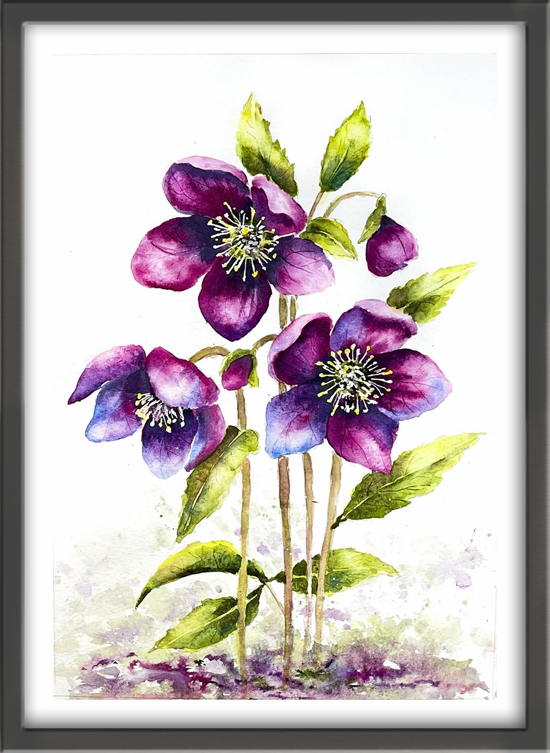
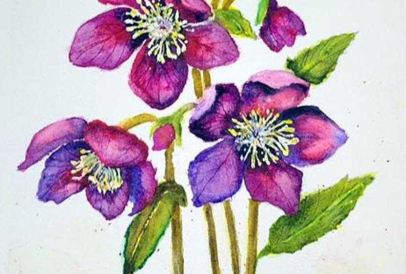
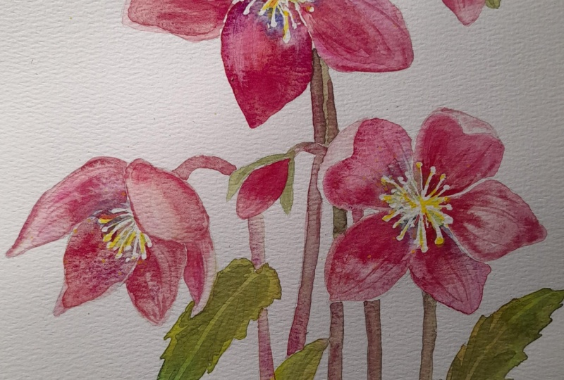
4. Paint petals using light, medium and dark tonal values to show form and shadow. Score veins gently: And before painting the petals, I've mixed some
different colours in separate wells of my palette. I've got some quinacodm pink. You could use permanent rose
if you don't have that. I've got some magenta, and you could use
a zarin crimson if you have that
as an alternative. I've also got some indigo, which is a very dark blue black, and a mauve purple
and a cobalt blue. And I've also used some
of those colors to mix up a plummy pink or a
deep raspberry color. And they're all about
the consistency of milk. I'll be working alternate
petals and even flowers to avoid the colors running across all the petals if I paint
those next to each other. I started by painting this
petal at the top with my palest pink and then dropped in some of
the darker plumy pink, raspberry and mauve colors
where the petal is in shade. For example, where
a petal is curled over or where one petal
is behind another. I've also touched
in a little bit of indigo at the base of the petal and just underneath the lip of the petal
that's curling over. And I'm using an
unwound paper clip to score just a few very light
veins into the petal. And it's important when
you're doing this to consider the direction of the petal
and don't overdo it. You just need one or two of
those little light veins. When you score the paper with an unwound paper clip or you can use a pointed
cocktail stick, the wet paint goes back into that indented line and
makes it look darker. I've moved on to
an alternate petal at the bottom of this flower. I've started off with some
darker paint than I did for the last petal because it is a little bit in shade being
at the bottom of the flower, and there is a petal
overhanging it from the top. I'm adding some of my
mauve purply color around the tip of
the bottom edge, just to add a little bit
of variety to this color, so it's not all flat and
one tone or one color. Again, I've added
a little touch of indigo at the base of the petal, where it leaves the center, and I'm also adding
some indigo just in the center itself in between
the cluster of stamens. Then quite gently with
my unwound paper clip, not want to score too hard want it to look like big
thick tram lines. So just some nice
faint vein lines coming down that bottom petal. And again, I'm following
the direction of the petal itself when
placing those veins. I think you can see from the reference
photograph just how subtle those veins are and the direction
in which they go. I'm moving over to
the little bud now, I can't paint any more petals on the top flower until the ones that I've just
painted are dryer. So again, starting off with my palest pink and then
building up the tons, the dark tons,
where the bud is in shadow and keeping it light where the bud
emerges into the light. Can't emphasize enough how
important tonal values are in a painting. Along with shape
and composition, tonal value is one of the most important parts of any painting
that you'll make. So I've attached a document, the one that's just flashed up to the project
resources section. And if you haven't
already had a look at it, I do suggest you pause the video maybe for a couple of minutes and just have a read through because getting tonal
values right and getting that contrast into your painting will really make
all the difference. We've looked a lot at how to darken the tone on these petals, but I'm not mentioned about
how we might lighten them. So if we've actually got
too much dark color on, what you can do is use a thirsty brush to lift
some of the color. And what I mean by a thirsty
brush is you just rinse it into some clean water so the
brush is nice and clean, semi dry it on a
piece of paper towel, and then just stroke
the brush into the wet paint and
it'll lift it off. You might need to do this
several times as I am doing here just to regain
a highlight or two. I'm going to use
this same process to paint all of the petals
on the three flowers. So I'm going to let you
watch the video along now, and I'll hop back on if
there's anything that I need to explain or introduce. Mmm.
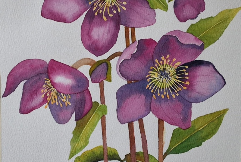
5. Add a second layer to leaves and stems for depth. Paint stamens and an abstract foreground. : I have a mid green and a dark
green mixed in my palate. The mid green is the same one that I told you about earlier, the green appetite genuine,
which granulates beautifully. And I've added a little
bit of ultramarine to that to darken it
for my dark green. If you don't have that color, then you could do
exactly the same thing with a color like sap green. Use that for your
mid green and add some ultramarine or
indigo to darken it. I'm starting with the
leaf right at the top, and as I'm adding my mid green, which I'm putting on wet-on-dry, by the way, so wet
paint on dry paper. I haven't pre wet it
first. Notice that I'm leaving a very
thin sliver of the yellow color
unpainted running down the center of the leaf
for the central vein. I'm using quite a small brush, and I'm using the
points of my brush to push out the paint around
the edges of the leaf. Now, you don't want it to
look like a holly leaf. It's not all spiky, but you do want a kind of a serrated edge going around it. There'll be some reflected color from the petal in
front of this leaf. So add a little touch
of the plum color that you mixed earlier for the
petals just at the base of it. I'm adding little
tiny touches of my dark green mix just
to either side of that central vein and
also at the bottom of the leaf to just emphasize the shadow where it's
behind the petal. I'm repeating exactly
the same process for the second leaf, putting the mid green colour either side of the central vein, leaving that unpainted,
and then pushing that mid green colour
along the edges of the leaf to create
that serrated edge. Just to repeat about that edge, it's only very lightly serrated, not like a bread knife, but the leaf around the edge, as you can see from
the reference photo, it's not exactly smooth. And then just as I did before, I'm adding my dark
green color on either side of the central vein and at the base of the leaf. And then before the paint
on these two leaves dry, I'm using my unwound
paper clip to add a few veins on either
side of the central vein, just like we did
with the petals. Now, we're not trying
to create a botanical, hyperalistic
painting, so there's no need to put in all the veins that are shown on the
reference photograph. If you look at that, there's dozens and
dozens of little veins. But we just need to put a few in just to indicate the
existence of them. Also, we want the flowers
to be the star of our show. So if we put too much
detail into the leaves, it will start to
overpower our main focus. I'm moving on now to
the third leaf and just a reminder not to cover up all the underlying
light tons on the leaf. You can always use your
paper towel to dab some paint off if you're getting too much of the
green colour on them. Or use that thirsty brush
technique that we used before. I'll let you watch the
video play along now as I complete the rest of these
leaves in the composition. Remember to keep
the leaves lighter, where there is light
coming on them, darker, where there is shadow from another leaf or a petal
in front of them, and a little bit of the
plum color where there is some reflected color
from a nearby petal. But I'll hop back on
if there's anything new or different that
I need to explain. Mm. I've removed all of
the masking fluid with a clean dry finger. As you can see, I'm using a very tiny brush to add in some light yellow
to these stamens. The brush that I'm using
is called a micro mini, and it is a really
good little brush with an excellent point for painting these sort
of small details. But you could use the point
of any brush as long as it's a really fine one
that will let you get in to these intricate areas. A very budget
friendly alternative is to use a nail brush, the sort of beauty brush
that nail technicians use to add tiny patterns when they're doing
people's nails. As you can see, I'm
dancing about with my little brush and adding the light yellow
to these stamens, but it doesn't matter if I
don't cover all of them. I might leave little slivers
of white here and there, and that will help
to put a bit of sparkle into the centers. If by any chance,
you haven't actually managed to mask enough
of these little stamens, if you've got some missing, you could mix some white gouache with a little bit of yellow so that you've got a
very pale opaque color, and you could just
paint them in. Or if you happen to
have lemon yellow, which is an opaque color, a light yellow opaque color, you could use that as well. Although I tend to use
transparent colors in the main, there are some instances
where it is useful to have some opaque colors if you want to
cover something up. So any colours white of gouache or white gouache
or lemon yellow, for instance, they're really quite handy for
this sort of thing. I'm also using my
little tiny brush to add in any little touches
of very dark color, which I've mixed with some purple and black
into those centers. We're at a point now
where you need to just stand back and
assess your own work. Have a look if
there are any areas that need strengthening. I use some extra color, extra shading, which is what I'm doing now
with these stems. Although they
looked okay before, because I've now got all this extra greenery on
with the leaves, they're looking a
little bit insipid. So I'm just strengthening
some of my stems. It might be that yours
are perfectly okay, and in that case, just
leave well alone. But, um, it is really
good practice to reassess your work when you're
getting towards the end like this and just
do what needs doing. You don't need to go over every
single thing you've done. Looking at my painting, I do feel it's lacking some of that shine that you get
on petals and leaves. Although you can use a brush and some water to lift off paint, I want to introduce you to
magic sponge eraser because this little tool works miraculously to remove
unwanted paint. You can use it to lighten
an area that is too dark, or even strip the
colour right back to white paper depending on which colour you've used because some colors do stain the
paper more than others. Just tear a small
piece of the sponge, dip it in some clean water, then squeeze it to
just damp and rub over the unwanted paint until
the color is removed. Use a paper towel in between to blot and get the last
bit of paint off, and keep rinsing your sponge
out during to keep it clean or even throw it away
and use a fresh piece. If you accidentally get a
blob of unwanted paint in the middle of your painting or you just want to lighten
the tone of an area, give it some highlights, this little piece of sponge
will become your best friend. Because it's normally sold as an abrasive
household cleaner, it does tend to rough up
the paper a little bit. So take extra care
if you're painting over the area that you've
sponged with another color. There's always a danger
when you discover a little trick like this that you carry on and
on and overdo it. So I don't want to strip out too much color and then have
to paint it all back in. So I think I need to listen
to my own advice now really and sit on my hands and have a look
what else needs to be done. In fact, at this point, you could call the
painting completely done and leave it just as it is. And that is your choice, also. And that is exactly what I
planned to do at this stage. However, when I looked
at it a few hours later, I thought it would
maybe benefit from a little bit more color in the foreground to
kind of bed it in. I didn't want to use
browns and blacks for the soil colors
because I didn't think they would sit well with
the rest of the painting. So I've decided to use
artistic license and use the same colours that I've
used in my leaves and flowers for this
foreground area. So I've just dabbed on some
of my mid green color, my plum and pink and purply
colors and let those colors merge and run into
each other across the foreground in
quite an abstract way. Because I then got a
little bit too much of a solid appearance
across the foreground, I then spattered a little bit
of white paint across it. And then finally
to add some depth and contrast to the foreground, I've gone in with some slightly
stronger paint, again, using my plum color
and my purply colours and just added
a few linear marks, abstract shapes in the
foreground to finish it off. I do think that adding
a foreground has helped to kind of bed the flowers into
something more solid. And by using the same colours that we've used for the
leaves and the petals, we've managed to
retain some synergy between all the different
elements of the composition. You could, of course,
continue using these colors across the
whole of the background. The danger in doing this is that the painting can become too busy and fussy and overshadow the impact of the
flowers themselves. So I'm going to leave you to make your own choice on that. But for me, I think I'm going to call my painting finished. I do hope you've enjoyed this painting and that
you've learned some tips and techniques along the
way that you can incorporate into
your own paintings. And why not pop it into
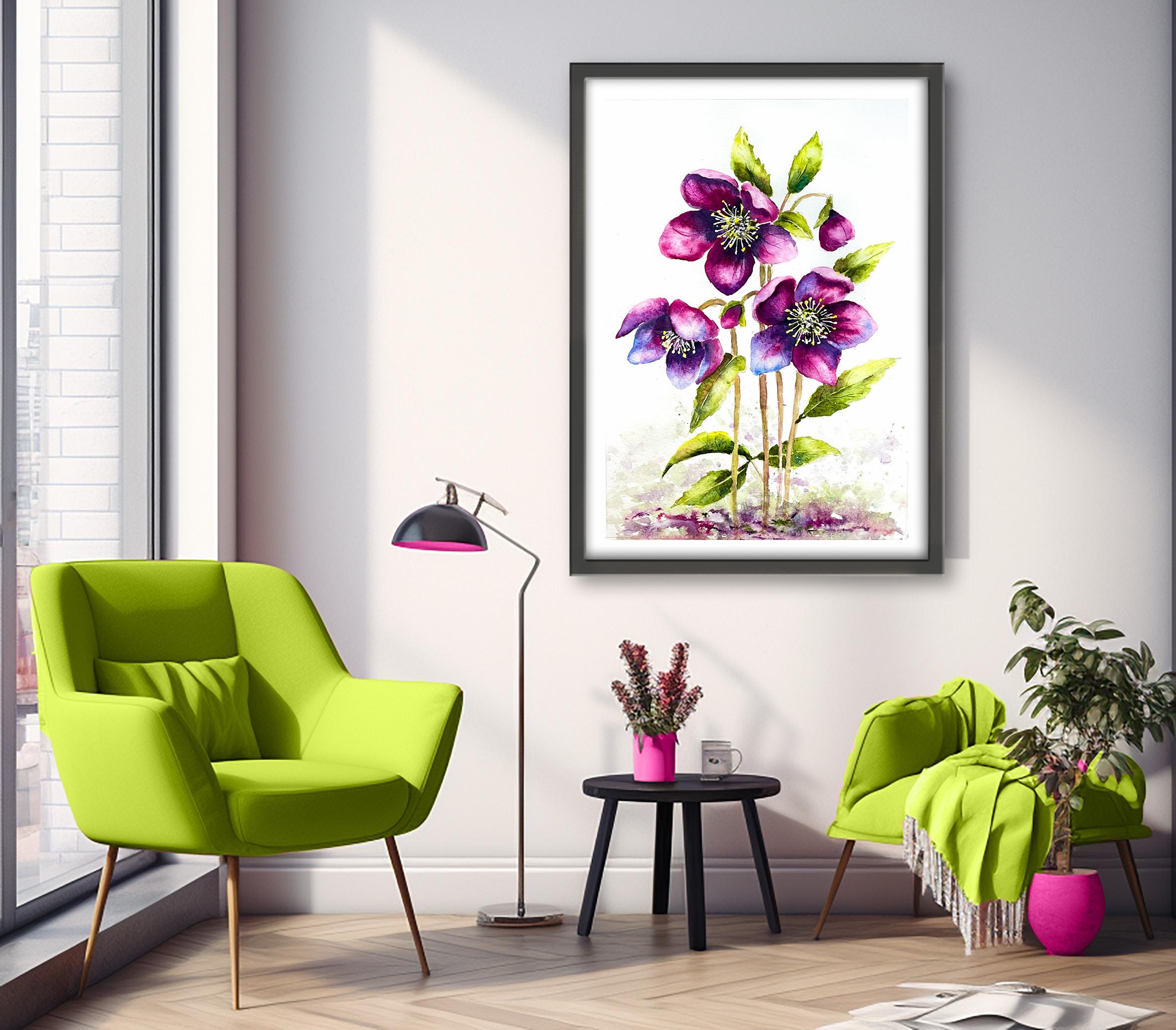
a mount and a frame, and you'll be amazed how good
it looks when you do that? If you've enjoyed this class, it might encourage you to look at some of my other videos. I've got lots of lovely
subjects loaded with more tips and techniques to help you with your own
exciting art journey. I'd really love to see your
own finished painting, which you can upload to
the your project section. And if you could
just take a moment to leave me a short review, that also would be really great. In the meantime, thank
you for joining me, and I look forward to seeing you next time Happy painting. And
6. FINAL THOUGHTS: A huge, well done and
completing the painting. Why not pop it into
a mountain or frame, and you'll be amazed
how good it looks? We've covered quite a
few different techniques as you've been following
alongside of me. We use the wet-on-dry technique, putting wet paint on dry paper. Use the wet-on-wet technique, putting wet paint on wet paper. We use layers of color to
add richness and depth, and we lifted color where
we needed to lighten or add a high light
with a thirsty brush. And we discovered a quick way
of adding a few veins into both the leaves and the petals with an
unwound paper clip. And we painted a very simple
abstract foreground in harmonious colors that would tie in with the rest
of the composition. Now, don't forget to upload your own painting through the
project and resources tab. After all your hard work, I'd really love to see it, and I'll be sure to give
you some personal feedback. And if you've
enjoyed this video, do have a look at my other
classes on Skillshare, which are packed
with more tips and techniques to help you
on your own art journey. If you enjoy painting flowers, have a look at my
peony sunflower or spring blossom videos, or maybe try
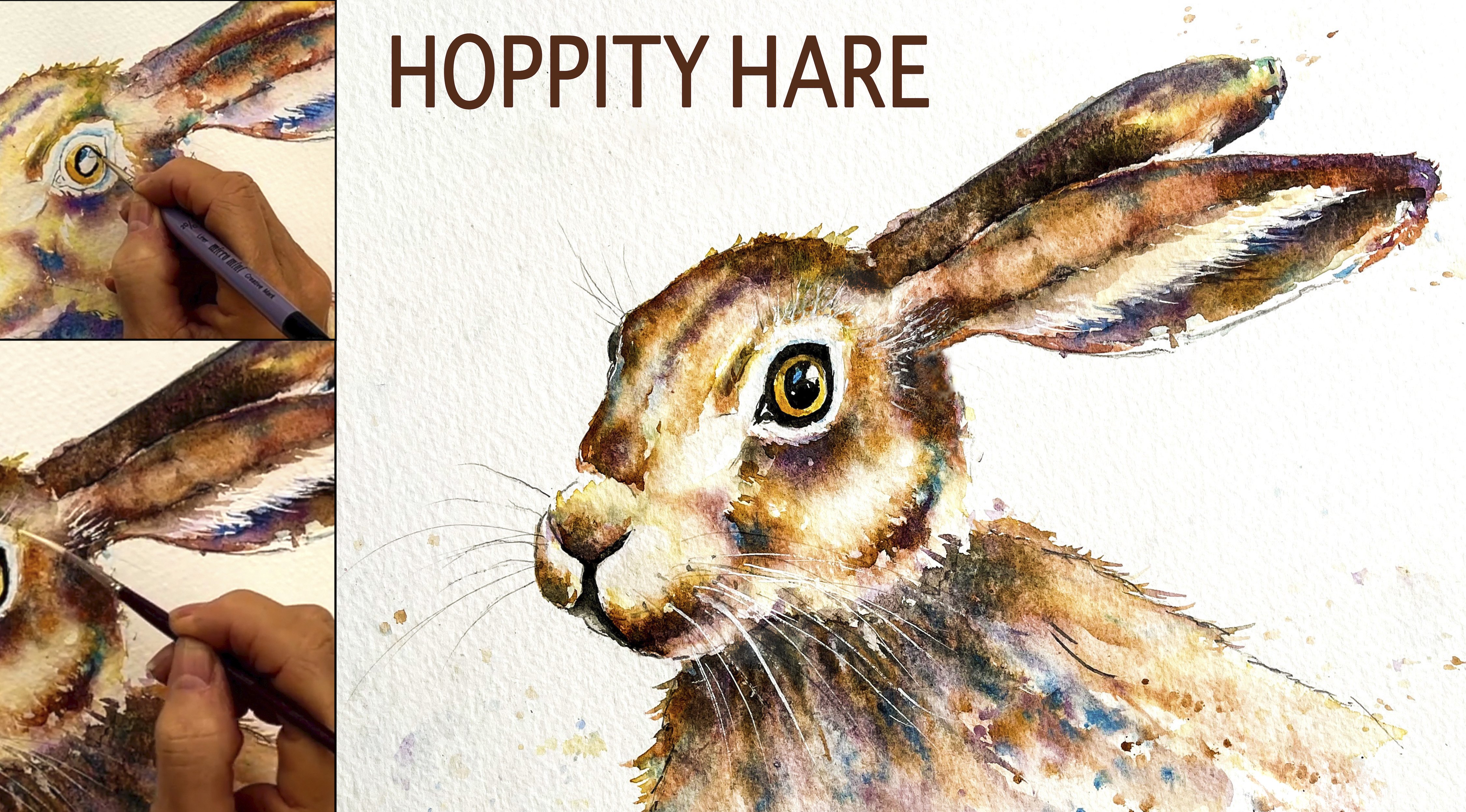
something completely different like
lovely hopety hair. If you click the follow button, you'll be able to follow me, and then you'll be the first
to know when you upload a new video or any
exciting updates. And if you could
just take a moment to leave me a short review, that also would be really great. In the meantime, thank
you for joining me, and I look forward to seeing you next time Happy painting.
 Carrie McKenzie, creating painted visions