Transcripts
1. Welcome to Geode Inspired Abstract Watercolor Painting: Have you ever been inspired by the beautiful lines and texture of G. Oates? I definitely have. And so I created this class so we can paint abstract paintings inspired by Geode or AG it slices. Hello, my grand friends, Jessica Sanders here, welcome to my chin in this class for any level, we will create geode inspired abstract art with watercolor. We'll be covering three key elements to create lovely paintings, along with textures you can create with watercolor and get some special effect. Once we've covered, the basics will go on to do some practice painting and create a very simple practice things . Then we'll move on a little bit more complex and create within a shape. And from there we move on to creating a larger painting. So I hope you'll join me in this class. Let's get started by talking about the supplies
2. Supplies: So let's talk a little bit about supplies for this class. Now you'll need your typical watercolor supplies, including your watercolor paints, a variety of sizes of brushes. You don't have to have asthma. Nias. I do. If you have a couple of different sizes, then that would work, too. You will need also watercolor paper. I'll be working in my watercolor journals. I haven't Artie's, a journal here and be creative watercolor journal. And the main thing is that you were using cold press paper and that it is heavyweight £140 or more. 300 GSM is the other way. Measuring. Okay, so watercolor paper watercolor paints you. It's nice toe haven't Alex. It's not absolutely required, but it is really nice. Especially for these geode and ag. It's slices, which would normally have a little sparkle in real life, so keep that in mind off. Now I may be adding some whitewash in. I haven't decided that yet. I'm going to just play and see what happens, but I think this could have some really cool texture effects. If I added it into, I will be using salt as a way to create texture. This is kosher salt. You can use kitchen salt, or you can use special salt for watercolor. Any of those salts will work. Then you also need some sort of clean rats. Clean film. You won't need a lot just a little bit. Just grab some from your kitchen if you have it. And this is going toe also creates a lovely texture. Don't forget. You'll need a couple of jars of water. You will need a cloth for drawing your brush, and you'll need a fun and exploratory attitude. All right, let's get started.
3. Key Elements: So in learning about Geos and aggad slice inspired abstracts, I believe there three key elements to think about as we paint now. These air Not difficult concepts, but it's just something to keep in mind. And to just guide you're painting a little bit, so the first element is lined. G EDS. Have an AG It slices have lots of lines in them, right, and they have a variety of lines, so pick any color doesn't matter. Was picked the color here and think about just lines. They can be skinny lines. They can be thick lines. They can be wider lines, right? That could be a variety of lines in our geo painting, and we want there to be a variety of lines. We don't want it to be boring, right? So consider also, you might have lines that go from the end of thick as you go and back and forth so the lines will very. And that's an important thing to consider when you're painting your abstract, geode inspired watercolor painting right? The second element that I have found is important when painting geode inspired abstracts is the flow of the lines, so we have lined variation really here and we have lined flow here, and the thing about it is they all flow together so all of our lines will flow together. So if this line curves that way, then our next line will be similar, although it may change in with it may change in texture or anything like that. But we will have some type of flow to our lines so that they work together. So it's a very organic, very see what's the word? It's their very organic shapes, right? They're not very angular. The lines are not very angular. Although some of the textures can be angular, the lines definitely have flow. And so, as we're creating our overall peace, we want to think about the flow of the lines and how it all works together. So that's what I mean by flow. Now the other thing is texture. Texture is probably the key element for creating these. We can fudge a little bit on the lines and maybe a little bit on the flow. But if you don't have texture, your your painting is just not going to be inspired by G OD or an AG it slice. You really need texture for that, and so I have actually an entire section of textures with watercolor. But when we think about texture, you can also consider something like dry brush texture. So my brushes quite dry and creates very interesting lines. I need more paint. Let me. We pick up more color, but still I want to dry brush effects, so I'll get some texture with my lines on the edges of my brush. So that's one type of texture, and then we have three more water color textures to explore.
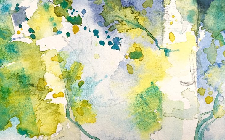
4. Textures: Now let's talk about our three mawr, actually, four watercolor textures to explore. We'll talk about water, salt, cling wrap and our bonus, which is wash so they are all going to have a little bit different effect on texture. And you can use some or all of these to help you create your geode inspired abstract painting. So first, let's talk about water. When we're talking about texture water gives. It's just going to give sort of a star light, star like effect. It can be blooms. It could be big enough to be a bloom, or it could be small enough that it just creates an interesting texture. So this isn't even wash of water color, and it's not a puddle. So that's important because if you have a puddle, the water effects won't work. So, too, do the water effects. All you do should dip your brush in the water, and then you tap off excess because you don't want too much, and then you just touch your brush to an area on the paper. Now, if you get a big spot of water, it's going to create a bloom, which is perfect. It's a great texture But if you get a tiny spot, it'll just create a little story shape. So we'll let that dry and then we'll see the results. Results. Okay, next, let's talk about salt. Salt also has an effect on your order. Color again. You can't have too much water, and it can't be too dry. So it has to be a nice wet wash. But again, not a puddle, because if it's a puddle, it's not going to work very well. And all you do is Sprinkle your salt in. I'm sure it's you've seen this before. Many, many people You salt technique in their painting, but we'll just see the different effects we get from each one here. So now we need to let this dry completely. And then we can brush off the sultan, See what it looks like. Next is cling wrap. Now, the witness doesn't matter very much when it comes to the cling wrap, but it does affect your drying time. So I don't one of too much water because I don't want to take too long or too dry here while we're waiting. Um, I don't see that Maybe a little bit more. You can even put a variety of color and kind of doing this sort of pretty even colored washes, but a little bit more water to that. There we go. So this has a little bit more water than either of these two. And I've cut a very small piece of clean film, and when you put it on your paper, you're going to just bunch it up and put it down and let it create some angular shapes. Now these will be the most angular shapes. If you use this technique, this will be the most angular shapes you will have in your painting. So keep that in mind. It creates a nice, really crystal and type of shapes. So something to think about their and then let's try wash Now I and not 100% sure what this will look like. So I just want to try it and see the effect it has. I think it could have a really cool effect as far as like creating little like white ish or light or area kind of blooms kind of Lawson. Some circular shapes. Maybe So what I'm going to do is a little water there while my brushes clean. Okay, now I'm going to lay down a wash of color, just like we've been doing this whole time and all these orange this time for variation. And then he's gonna pick up the squash, get it nice and juicy and drop it and drops in there and just see what effect it has now. If it's thicker, it's not going to move as much, right? Also, how much water you have in your paint here does matter. So I think you could get some really cool effects. And maybe, like I'm having fun dotting it around is going to flow into that paint color and affected a little bit. And the more drops you put in, the more the lighter as faras, like the creamy, lighter color you were. Paint will become still going to look orange over the color you put it into, but will be lighter and brighter in that area. So let's let these textures dry, and then we'll talk about them a little bit more, and then we'll move straight into our first
5. Texture Results: So let's chat about the results of our watercolor textures experiment. So let's talk a little bit about water so, as I mentioned you gets or these story shaped and if you use a lot of water, you'll get a big bloom shaped like this. But it can create some really interesting effects now. Different paper for all of these textures and all of our techniques your paper, your paints, etcetera will make a difference. And so it's important that you experiment with your supplies. You don't have to have my supplies. You just have to learn your own supply, so that's sort of important when it comes to watercolor. So for salt, it also gives a starry effect. But it draws the color into itself so you'll see these little dark areas. That's where the salt was actually laying. So to be like a little dark area. And and there was like a little light area in the middle. Eso While water will push the color away completely, the salt absorbs the water so it pulls the color into it. So that's the difference between the texture of water and salt. Now, clean rap is going to where it touches the paper. It will usually have a darker area and where it has a wrinkle, like this area here with this area over here, it will have a lighter color so it will create sort of angular shapes. Or it could be rounded depending on how you press the cling wrap or clean film down onto your watercolor paper. It does take a long time for the cling wrap to dry longer than water or salt because it's covered, and then our bonus texture, which was quashed. Now I think you can see it has a similar effect of water, but it will create more of a Grady int color and more of a creamy color. So in the water, what you're seeing shining through is the color of the paper. But with quash, you're going to get a mixing of the color of the paint, plus the white of the quash. So this is not light reflecting from the paper like it is here, and half a little different quality, and you may not be able to tell on camera, but it is a little bit different, and it this creates sort of a soft color wash. I've seen a lot of artists you squash for creating clouds so you would paint maybe a blue sky and put wash cloud shapes. And it will make nice, wispy soft clouds. So just some textures to be aware of. You can use any of these. You can use all of them in one. If you want to, you can combine them. So, for example, first putting down salt and then putting down cling wrap may give you a little bit of different interesting effect, and that could be fun to try. So just like let your creativity flow and enjoy the process of painting. And let's get started now with our very first Praxis project.
6. Painting 1 - part 1: I am working in my Ortiz, a sketchbook. I've taped off a square with some washi tape, and I've trusted down nice and tight. Be sure and use a low tack tape if you're going to do this. Adjusted that as sort of a personal choice for this particular paint. I want to start with, like a purple color and I'm using my mission. Goldwater colors and I want to start with sort of a strong color, I think, and I'm going to sort of work in a diagonal flow this way across my page. I'm keeping in mind my key elements of line flow and texture, so I'll be working on those along the way, and I'm just going to create my first line. I've decided not to draw. It's really it's okay if you want to do that, but it's really not necessary. And I'll start here at the top and just create a line that's a pretty heavy line, and now I just even made at whiter. But it's still it's also pretty smooth, and I have a little dry brush effect there on the edge, which is kind of perfect, and I'm going to go ahead and add some salt along that edge there no reason not to. I'm just going to brush it off of where I haven't painted yet. Now that's a pretty dry stroke and that salt may not have much effect, but maybe it will have a little. So now I'm going to move toward the blues toward the Reds, Rather and I'm taking the next red violet and I want to create another line this time overlap a little and went all the way death. Now this is a thinner line. It does touch in some areas, but I curved it, so I left some little space just to maybe do something interesting there. So remember line variation, color changes and choices, and if they flow into each other, that would be great. In this sketchbook, it doesn't have a lot of flow. The paper really matters for that, and in this sketchbook it doesn't have a lot of flow, so I may not get many flowing effects here, so I'll just continue moving around my palate in the color spectrum and creating some nice lines, and I'm keeping my hand it on the paper trying to be more studies and It's okay if I leave different size gaps. It's also okay if I go back and add in more color and wetness to that long. I like that one a lot, but I do want them to have texture. So I'm an Ansel to that one too. Now, Right now, I'm just playing and having fun, practicing in my sketchbook. Of course, I believe you should always be having fun when you're creating right. But I just want you to know that I'm not putting pressure on myself to make something really perfect. Okay, so I have a bigger line. Couple of smaller lines. Let me go for more, A little bit wider, but not too much. So I'm just changing the angle of my brush against the paper and notice I can go back and work on it more to and I'm still following that curve. This line is not is why is my 1st 1 or maybe it is? I don't know, but it's still working. Still working, continuing the same idea. This time I want to do really skinny line. And if I mess up, well, then I'll just make it a little bit whiter. And that will be OK and I'm leaving mostly a little white space in between and notice. I'm actually going quite slow to create this line still flowing. It does slow in there together a little bit. I like that a lot now in thinking about it for this broad stripes. I think I want to add some water drops, maybe create some bloom effects in there. I don't know how strong they'll show up, but it's fun to do. Maybe a little more creative bigger to actually adding some kind of big water drops here. We'll just see what happens. Let's experiment and play and have fun, OK, this color I love this is when my favorites were here. And so I think I want to start at the bottom and create a different shape that's still going to flow. But I want to add interest to my paintings, so let's created different flowing shape. Now I have this big gap in here and I will probably add more color there later. But for the moment I'm going to leave. It s so far, I like this flow in and out and overall in this abstract painting, think it's really pretty I don't yet know what color I'll put here, if any at all. White space is very valuable and art, right? So that's something to consider when you're painting. OK, next color. I'm just going to keep on going. Guys keep on chucking here and this one's a little bit more orangey. And I think I'm just going to maybe do the opposite and press down as I go to make a wider line. That's a nice melon color that could be this perfect color for a watermelon. I wanted to be skinny at the top and wider at the bottom. I don't know. I think I think we've got that right here. Even that out a little bit like I messed up. Is that Is that a problem? Not really. Because I could just go back and fix that line with a nice, smooth stroke of my paintbrush, Right? So don't worry again. We want to do no pressure painting this this for fun enjoyment. If it turns out wonderfully great, that's kind of a bonus, right? Because what we want is to enjoy the process more than we want to worry about the outcome. Okay, next color is a more orangey, a more orangey red right there. I'm loving seeing this progression. I think this progression is really nice, and I think I will create another shape, another not a line, but a circular shape. So here, because I think it's really interesting to do that. Do I want texture? That's the question. I think that I do. I think I'll go for some salt in there, just dropping a little bit. Can these air not very wet, So that may not have much effect with the salt right now, especially on this particular paper. All right, nice. I'm having fun. I hope that you're having fun, too. Meets of nice flowing lines here and honestly, if you really wanted to, you could stop right here. This is a nice composition. It's interesting, it has lying and flow, and I feel like it's a really I feel like it's a really nice abstract composition with lots of white open space. But for the sake of our class, I will continue. But you could stop at this point. It's It would be really nice painting, and you could frame it and put it on your wall.
7. Painting 1 - Part 2: Okay, Next color is brighter orange less read now more yellowy, and we'll go ahead and go in here. I'm always trying to leave these little white lines in between the colors. Maybe touch a tiny bit, but most part keeping them separate. Next, sort of a hungy yellow. I'm also using a brush that doesn't hold a lot of water. I'll do skinning line Really thin line there like that, keeping on going, switching these colors now. You could just create a progression of one color and now be cool, too. It's a warm yellow and I want to keep going with these yellow. So I think I want to make this also pretty small. Pick up this lemon yellow. This is probably the last yellow color I'll use, and I'm going to Philly in this little circle. So I made a progression from this purple all the way through this yellow. So really, I started here with bright, clear violet than red violet. Bright opera. Crimson Lake Rose Matter. Permanent rose permanent red for 1,000,000 orange, yellow, orange permit melody, Permanent yellow light. These are a lot of paint colors, right, but you don't need this many paint colors. This is just what I chose to do for fun. These different colors. I could just do three colors or two colors or one color in different values. So their lot a lot of options with this So I can see that this is beginning to dry and it's got some nice little blooms of their very subtle, and I think I'm okay with that. I do want to bring in the more blue, but I think I'll put some blew over in this area again, using Mission Gold, a civilian blues. What it's called. It's a really bright, clear blue, and I'll do you like it. Then line and my thin line got thicker at the top. Okay, with that, it got thicker, all all the way around. Okay, so that's nice. And now I want to do actually let me work this a little bit more, make it a little curved there, so I want to go down and curve out. So completely changed what I was doing with this line. That's fine. This is a sketchbook, right? So that now has an outward curve, this sort of inward curve as well. And then I can just go to the next blue and I just use my finger to study my hand. Create a little tiny line there In looking over this entire painting, I feel like I need to balance out this circular shape with another semi circular shape over here. E. I don't know this way I feel about it and looking at, I guess with my artist's eye in your eye may be different. The mine and that's okay. I do feel I need this corner filled in for a bit of balance there, and I'll just continue around my spectrum of color. Right? And now I'm got the Peacock Leo, one of my favorites, and I'll do like a little circular shape. Now I'm still using the same brush, right? I've used it for all the different size strokes. That's the lovely thing about a round brush. You can get white and thin and everything in between, and it's great. So let me see. I wanted to. I kind of wanted Teoh like up Alu. Now that's very tongue. Me, huh? And I realize that, but it still provides balance to this area, and then I can put a little circle or semi circle in that area next to it, and I'll continue around the palate. So that means ultra marine blue is next, which is a more purple e being really careful just to not touch. I don't want these to touch. Do you want them to be close? So that's pretty small. I realized that. But I still feel like it adds balance here and now. Let me show you because I used all these colors of the rainbow. Basically, I didn't use green, right? It didn't get agree. But I used the blues, the purples, the oranges, the yellows, the pinks, the reds. And because I did that, let me show you my watercolor. Are you ready? It is gray, right? That's why I have two jars of water. That way I have one that's more clean. It doesn't contaminate my colors of my pain. Now we could go on to put a second layer on this. We could add metallic. We could use cling wrap and do different things with texture. But I think for the purpose of simplicity of this first painting that will lead it this way
8. Painting 2 - Part 1: So now we've had a practice painting. Let's try painting on a little bit different paper just to see if it has a different effect and let's make it a little bit more complex. Let's try painting within the shape so I may use any of these size brushes and I have my pencil to draw shape. So what I want to do is just raw shape. It can be a circle, a square in abstract shape, but I kind of want to go for something organic, and I think I'll try and oats. I'm just holding my pencil loosely and I'm warming up on, uh, and over there we go. It has multiple lines. It's a line show and I'm finished. I don't mind. But of course, you can always taken a racer a race lightly so they won't show up this much. But I want to focus on being lose, expressive, going with the flow, emphasizing different lines, doing the things that we need for G odes, right and not worry so much about being perfect. So let's just play down. I have some beautiful turquoise paint here. It's cobalt teal. The colors don't matter as much except you want something that's going to work well together, I will start here and I'm going to make a stroke that will sort of define the flow of this painting, and we'll start at the top. Could make a stroke that goes all the way down to the bottom edge. Now I'm not worried about perfect being perfectly lined up on the edges or anything like that. But if you want to be that way, you always can. You can use masking fluid or tape to light on the edges, but I'm just going to go with it here the way it is now. Look at that stroke. I love that lovely stroke light pressure at the top. Heavier pressure, the bottom and a nice flow to to start creating this shape within this shape. Actually. Now, let's see. Let's go for some cream. This has a little bit of whitewash it. I can tell because it's opaque. I don't mind that at all, but I think I want to make it more earthy. Add a little bit of that sap green in there. Is that what I want? Some slimy coat? I'm just gonna pick all of it up so there's a mix of greens in here. I'm dipping my brush in and then tapping it off to get some excess. And then I will create another shape here, circular shape at the top and this one. I want to fill it so I follow along this line with the tip of my brush. It's all nice and wet. It's not going to dry, so make sure if you're doing that. If you're outlining the shape you do, keep it nice and wet or otherwise, it will have a line within it, so that looks pretty. Can. That is a perfect place for salt. It's got a nice, juicy color and I will just drop in salt, and that could be dry while I'm working on the rest of the painting. Now I think I want some darker blue, so there's maybe a bit of indigo would be nice really dark blue. So it's a gray blue here, but I want it to be not too heavy. Salt water it down a little more water there, so it'll be the lighter. And actually, I think I'll also be experiencing the peacock blue with that, which is the blue green still using my mission gold palette. Except I did bring in this call until you can get this color by mixing Meridian and Peacock . So here's a nice grey blue with a touch of green because of the peacock, and I make a nice thin line flowing down here and I will turn my book because I needed to. And this may touch here because thes air really close together. So just want to be really light touch, using the very to my brush but still create a flowing stroke. It goes to the edge, So I'm using this outside edge that I drew. I will add to that there. So I'm continuing toe. Let one line sort of informed the other. I think these would actually join up here That would be really nice, some continuing to let the shape of one line inform the shape of the other to create that flow that we talked about between the lines and it really creates a nice, cohesive painting and adding in a little bit more paint here, and that's making this line a little bit wider than I originally planned. But that's OK. I wanted to be nice and smooth and connected here with this area at the bottom. There we go. That's a nice, smooth flowing and it's bleeding into the other. So it's giving me that nice watercolor effects that I love. E. I think I'll do a similar, maybe make it a little bit darker. So a little bit more into go and this time make the line smaller and go around this edge, but sort of connects to the shape. Really like pressure. There you go. It's not dark, so I wanted to be, so I'm going to be dropping more. And if I just drop in a little bits of color, it's going to creates some effects there because some of it better have been other parts, and I'm okay with that. I think that's actually a special thing about watercolor. Okay, now what shall we do? Let's repeat this color. It's gorgeous, and we'll just add another line. See, Let's could continue this this area a little bit heavier, lying and so a little bit more pressure on your brush. I think I want solved in that little line to, so I'll just be careful, careful to just put it in that area. now remember, even though I'm being careful about my lines, I'm still focused on being loose, expressive and embracing watercolor effects like blooms. And I love when it has some uneven color in there. It just creates some interest. It's a lot of fun, and so just keep that in mind. It's OK if you have little things in there that are really what make watercolor special. These are things that you really don't get with other mediums, so just keep that in mind and be gentle with yourself. And and don't worry, it's going to be fine. Just focus on the process and enjoying the process. I'm adding some of the peacock blue wake up, and it's flowing into that. But it's darker in the COBOL, and I think it will look really nice right here. So, as I said before continuing to allow the lines to flow together, one line sort of dictates the next life, and it gives the painting what it needs. Okay, I want to work on this side a little bit, and I think I want to mimic this shape. But I'm not men ready for that. I loaded my brush with Peacock, but I don't think I want to do the peacock. I think I actually do want to mimic the shape on the opposite side here. So I'll go back with the green and see, I've lost my mixture of color and I want to make sure color. So let me. I want to be a little different, but still be green. I'm gonna add a little bit of radiant here to see that blue green, blue green, and then I'll pick up all that. So have both colors, all the colors there. So I will use this line and thinking of this shape to create a shape here. And I'm going to start. Actually, I don't see I usually start where have the smallest point because it's easier for me to have less pressure. And so next to this line, I need a little bit more control of my brush. I'll start here, but then I will continue over like this way. So now look at this nice shape. It's pointed on both ends, but it doesn't matter. I mean, I could do that, but I want to do circular shapes. Then I'll just fill it in. It doesn't have as much of that yellow green. I'm just going to drop that in. I want more of that. It's a little darker than this. That's actually kind of perfect, because it will sort of ground or shape. And I am going to add salt to the Syria. Very nice, a little bit here on the edge. I don't want to go closer. Just that Well, it's nice. Okay, so now I have sort of a reflecting shape. And so in that way again, we have a flow to our piece, right? So let's go back to our dark and it's almost like a reflection. But it's not quite the same shape, more pressure as I go connecting those lines near the top. And I'll just smooth that light. Really pretty, fairly dry brush here, too. Finished that edge? I would like it. Okay, so let's sort of mimic these shapes here again. I'll use my dark and make a small line starting here. Not too much pressure. I want to be thin that stopped there on the bench. So you see how you could just change your line up a little bit As you paint you start with a certain line but you can adjust it. It doesn't have to be like perfect the first time, but it's nice if it's a smooth stroke. This is a great way to practice brush control, but at the same time, give yourself the freedom to just be creative free. And don't don't sweat the small stuff, so I will add this peacock into this green and create a sort of softer, bluer green. It's p coughing. Call teal into this green, so let's do some of that. Let's but here kind of sauces go this way, dropping in some more color and a big help, actually, also dropping a bit of water to create some blooms and dots here, some water color effects Nice. And then let's do that on the other side or something some for. So if you need to, you can always turn your paper and go for that. A similar shape over here so but wider. So a lot of my lines go from thin to thick, and I think that's a really nice effect and creates a lot of flow. But you can have lines that are basically all one size that goes throughout, and that works nicely too. So let me go ahead and and this drop in water just like I did. This one has more wet than this one. It's OK. You also may notice I skipped this space. I didn't really intend to do that when I made this line, but I just going with it. So if my brush goes a little different direction than I expect, it's okay. Just let it bread, then trying to correct it, Don't worry about it. And then bits of color here also.
9. Painting 2 - part 2: So while this is not symmetrical, it's almost right. It creates a pleasing composition. I think I want to also add in some metallic. I haven't done that yet. I think I could add it in these green areas while there's still wet. So let me do that. Cool, quick. I've already pre wetness metallics. I was just dropped some in and will create some nice sparkly goodness. They're sparkly, very pretty. Love, love, Love ends Percle. I want to fill in. Use little spaces here now And I want to do that with the, um with a light color. So I brought her down some of this till, and I will fill in the spaces so gently, gently with the brush, Go slow if you need to and fill in that space and I'll do the same over here. So following my lines, leaving the white spaces, put some salt, have quite a puddle of water there and then I, on top of the salt, will drop in the gold. There is a lot of water, so I don't know exactly what happened, but I'll just drop it in around there, and we'll go with how it looks at the end would be just perfectly fine. Are really pretty. No, I have this open space in this open space, and I still have this open space and I'm trying. I'm just considering what I want to do there. And also I want to enhance this color. So what I'm going to do is I'm going to go along the edge with the same color, and then I'll soften that line. So I'm gonna make a line tickles down inside this shape inside this line, and then I'm going to soften it so clean my brush dried off pretty well and just push along the edge of this line and create a nice soft edge there, and that will add some depth to this line. It would look a flat because we're adding that extra layer of color. Cand I love that. And I think I'll do similar thing for this line, but not the entire line. Right starting here. So take a look at your lines, see if they need some at a depth and you can always add that to one side. Just soften that up with a lightly damp brush, Mostly dry. Go along that edge and your erase that line as long as you do. But while it's wet now, that won't work. If it's already dry. Okay, so I've created sort of lighting here. By doing that, that's really pretty. I think that's really pretty. I'll do the same with this shape, but I'm gonna do it on this outside edge because I want. That's where I wanted to be darker. Look, softening. Have to be careful because this is a better line. I just want to go along there and pick up that line. I think I will even enhance it a little bit more by adding a little bit more pain. Not much. A little bit more pain here at the bottom really defined it nice and soft. Now this little light of peacock blue, I'll reflect that line. I'm calling it reflect because it feels like a little bit of a reflection. Not really. It's really just similar right, but it really blew. It's nice, so this is wet. So if I touch, it's going to bleed together trying not to touch it. But I might not succeed again. I'll do light pressure, heavy pressure if you don't want to touch it, then wait till I mean, if you're worried about touching it, brother, wait until it's dry before you do this little line. If you have a line like that, you wanted to be close there. All right. Now, if you noticed, this goes really outside the line and it's pretty dark. So I'm going to do sort of a similar thing where I get thirsty, brush nice and dry and just pick that up a little bit. I don't mind if it's there, but I don't want to be dark. So picking up the paint on that outside edge. Here we go. No, I think that the Peacock blue will look nice here and here, and maybe I'll add a little go to that as well. So it's because that color and gently let's do this side first. That way it's easier, more pressure, less pressure. And they touch okay with that. So it's a similar lying and let's do the same here. Go back here such a dry stroke. So following those lines, letting those lines inform one another. Go back over this with screen nice, and now I'll add the gold that that's flowing, and that's what I want. You can make discreet marks, but in this case flowing, and I'll do the same here. So I'm talking you through my thoughts as I paint, because hopefully that's helpful to you to know what's going on in my head while I'm picking. And if you notice them not focusing on Oh, this has to be a perfect line or anything like that. I'm just relaxing, painting and going with the flow, letting the lines dictate to me what they need. And I think that's a really lovely way to paint. Can it so fun and relaxing? So I really want to encourage you to think that way. Now this kind like the way this shape looks, but I want to enhance it even more. I know God never it once already, and it's fairly dry, and I'm just going to do it again. But this time going to you. I'm going to use that teal, but I want this end in this end to be darker, so what I'll do is I'll go over this area to a certain extent right there and in this area , feeling that in and then I'll soften those edges, which was going to sort of create this time, don't us. Instead of going into it, I'm pulling it out a little bit, so that's creating a bit of a radiant in the color. So this area in the middle will be lighter, and it'll give some depth and dimension to my abstract geo painting here. All right, I am calling this.
10. Painting 3 - part 1: Now that we've done a couple of practice paintings, I want to demonstrate for you a larger painting, a little bit larger scale, not in a sketchbook. This one I'm not going to talk through. I'm just going to paint and go with the flow, and we'll just see how it turns out. This the part where you've done your practice paintings. You followed along with me and you can still copy and do what I do and use the colors that I use. But I also encourage you to explore your own lines, the lines that you like and the flow that you like when you're creating these abstract pieces and this is going to be something that maybe is frame herbal. And if it turns out bad, well, that happens and I'll try again. Okay, so let's get started with that and I'll see you at the end
11. Painting 3 - part 2: So this big painting is now dry or mostly dry. Saul. Remove the plastic grab. It comes off really easy, you know, and leave some interesting texture. I also still have salt. So have that offside. Brush it off now. This is the point which I decide. Do I want to add more layers of paint? At this point? This is just one layer Now. The only thing I would advise when I put down my plastic wrap I wasn't very careful. So we have these little areas that are overlapping here. I'm OK with that because it's sort of reflected down here a little bit. And that works. And then this. I didn't get it all the way to the edge. So there's this little edge, but there's nothing wrong with that. That's pretty interesting, too. I mean, I'm going for an interesting painting, abstract with flow and line variation and texture. Right, and I have all of those things and I'm looking over this painting, and I do feel like I would probably go back and add a little bit more painting here a little bit more in this textured area. Feel like they look a little bit of finishing could use another layer. I do enjoy this salt effects in this flu. You can see like this right here. That looks really cool within that, that lighter blue area. I like these dots. This was sort of a happy accident. I accidentally splattered some paint there and I just decided I'm just going with it. And I made it into a dot section and I continued it over here on the other side to reflect that there somewhere. Salt effects. Really nice notice. I added. Little dots here in their little dots of the metallic, has a nice metallic sheen. They think in the interest of completing this painting, I'll go ahead and do that second layer, and then I'll come back and talk to you about it a little bit more. We could always add more than two layers, right? I just have to decide when you want to stop, and I just feel like this area in these areas look a little bit unfinished. Me and I want to change them up a little bit, so I'll get started with that. And then I'll come back and shot with you a little bit more and we'll take off the tape. Wouldn't we're finished. I'm going to dio for those sections I'm going to add in his cobalt teal and going to as salt to those areas. I think that would look really nice and I kind of want to make it this rough edge and I'm going right over the texture that we created and it's still going to show. But it may not show as defined and may not be as obvious that I use the plastic Brown changed my mind and sudden to smooth it all the way up to that gold. And now, at salt this I'm just going to add assault. I think in the edge create a nice texture, Ray around this rings which I feel is where it needs it. And I'm adding quite a bit. You can see that And then I think I also metallics now. Right now I'm doing this and no holds barred. This is just me. I'm fun and seeing how things will work out and, you know, possibly completed painting
12. Paintng 3 - part 3: Okay, so this is dry. I did use a heat tool, though I do not recommend that you do that because you might not get the effects you're looking for. So I caution you. If you want to use a heat tool that if you're using salt and things like that, you may wanna let things dry naturally. But in the interest of completing this class, I decided toe up for my heat tool. Right. Okay. But I just wanted to disclose that teeth cut. It's kind of like a Yeah, I know. I just wanted to let you know you should get a little different results. I'm getting all the salt off. I'm rubbing gently. Also, my papers a bit work because of the tape and because of the heat tool. But it will be just fine. I can flatten it out very easily. I love the sound of the paper. Okay. It's enough playing with that hurry. Let's take off the tape. I'm not adding any more layers. I feel like this is a nice composition. I could turn it in different ways and have different effects. And, you know, that's pretty cool. That's that's something interesting. You could do with abstracts. You can't do with necessarily other types of paintings. Let me just on tape start up healing off now. I'm trying to go carefully. You don't want to tear my paper some good slow, but it is still warm from the heat tool and that is a benefit of using it. Oops. Jordan tape and not my paper, which is the best option, right? Okay. Whenever I tear the tape, I just go back to the other end and grab it. Quick tip. There last Etch love seeing that clean edge. One of the main reasons why I used the tailor. You go. This is my abstract painting inspired by geode or ag. It's sliced. Now. I do see some at some places where I might do something a little different, but I kind of like the loose feel that it has these little jagged edges. Give it I don't know. I just feel, gives it some character and overlap there and sort of connects the spaces as well. I don't know how I would turn this if I were to frame it. I mean, if I turn it this way, it's sort of like the landscape, the sun. If I done it this way, this dark, this anchors this area, and it's still very landscape ish if I turn it horizontally. But if I go back to Vertical, it still has that lovely flow of lines. And, yeah, it's really it's really nice. I really like it, he says. If I were to frame it, which I very well could do, I'm not sure which way I would turn it. And in fact, if I were to sell it, I would leave that completely up to the buyer, and they could put it the way they enjoyed it most. Right, so there we go, so you can see where I went back over this textures not as dominant as it was before, And I have these nice shapes within the metallic from the salts like Little Starburst, and because I had the metallic after end of the salt. It's not under where the salt was laying on the paper. It's just around it, and it really creates an interesting effect. So play around with your supplies, relax, have fun and enjoy the process. And in doing so, you'll learn so much and you actually have better paintings than you might expect
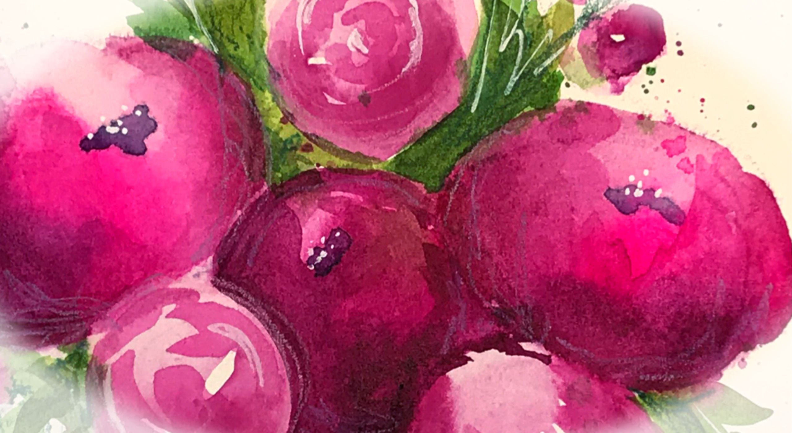
13. Project and Thank You!: for your project in this class, I would love to see first, do some warm ups, practice those key elements and learn how your water color and watercolor paper and brushes all work together. You can try out the different textures made with water, salt, cling, wrap or even washed. You can pick the ones that you really love to include in your paintings, and then you can pick your project. If you're a beginner or you feel a little unsure, try the warm. A project, the practice one in our sketchbook. Then you can try painting within a shape. It is a little more challenging, but I am sure you can do it. Be sure and play around with line variation with texture, with the flow of the painting and the composition. And if you're really feeling excited and want to dive into more, you can try to do a bigger project that maybe you can even frame. You can copy mine and use my color palette, or you can really bid Ventress and explore and try your own colors in your own lines and shapes. So you are a couple more examples of other paintings that I did that are geo inspired. And I hope that this class has inspired you. Thank you so much for joining me. I'll see you very soon.
 Jessica Sanders, Artist | Designer