Transcripts
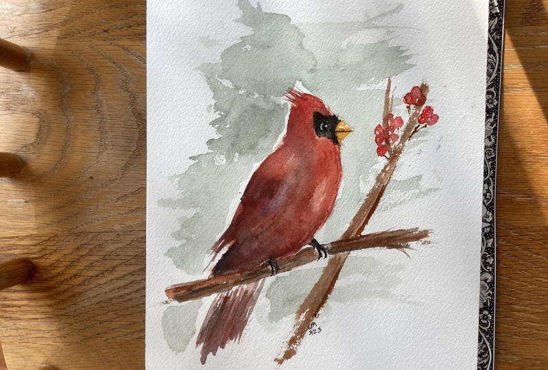
1. Introduction: Hello, and welcome to my watercolor winter
cardinal class. In this class, I will be
demonstrating how I painted this cardinal using some
exciting watercolor techniques. Wet into wet is the first technique I'll
be talking about. And as we move
through the painting, we'll be letting
our various layers dry and we'll be adding
some detail on top. I'll show you how I painted
this background and how I mixed up my colors so
that it looks cohesive. For the class project, you'll be painting your
very own cardinal painting, and I absolutely love
to see your work, please share it with the
class when you're done, if you used a variation
of these colors, I would love to see that too.
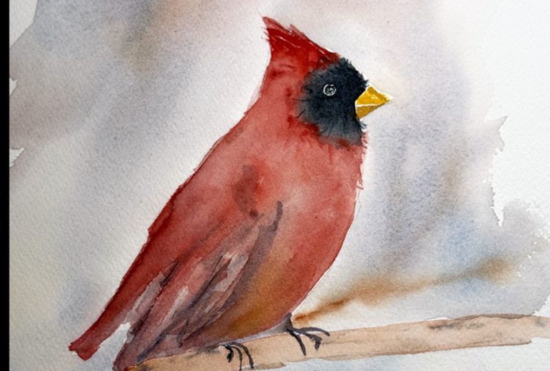
2. Supplies: So let's talk about the supplies I used for this
watercolor cardinal. I also want to share
with you that I did attempt to paint
it the first time, and I didn't like my result. So here is just a reminder that it's okay if your painting doesn't work out the
way you want it to. You can see here there were just some things I didn't
really like about it, and I'm sure I could fix them or maybe fix this hard edge
that's starting to form. But I thought I want to start over and work on another one, and so that's what
I did over here. I've been painting
for years and years, and I still have paintings that just aren't
working out the way I planned. And so I do start over. Sometimes I work on the
other side of my paper. I do use arches,
cold pressed paper. That's my go to
watercolor paper. For finished paintings. However, when I'm practicing, I definitely use cheaper
paper because I'm frugal. So I have some recommendations
if you're looking for some more inexpensive
paper to practice on. I use Canson and whatever I can find at the
craft or art store. So as far as brushes go, I'll be using a handful of
different round brushes. I do have a number
12 that I think is helpful for doing larger areas
of wet into wet painting. So you'll see me use this
number 12 by Princeton. I really like these
neptune brushes, but any sort of large
round will work. It's just to pre wet
the bird's body, and then you'll see
me drop in color. I also use it for
the background, and that way I can quickly add color without
it drying too fast. That's why I like using a
bigger brush for larger areas. And then I use a handful
of smaller brushes. I do have a number six. I do like these
silver black velvet. They are expensive, but I find myself using
them quite a bit. The reason why I
like them is they have ultra fine point
when they're wet, so you can get
super fine details. Although I did use an even smaller brush for some of these feathering details. I have a number four round that also comes to a nice point. And several other
synthetic brushes that I don't have
here at the moment, but they were just cheap
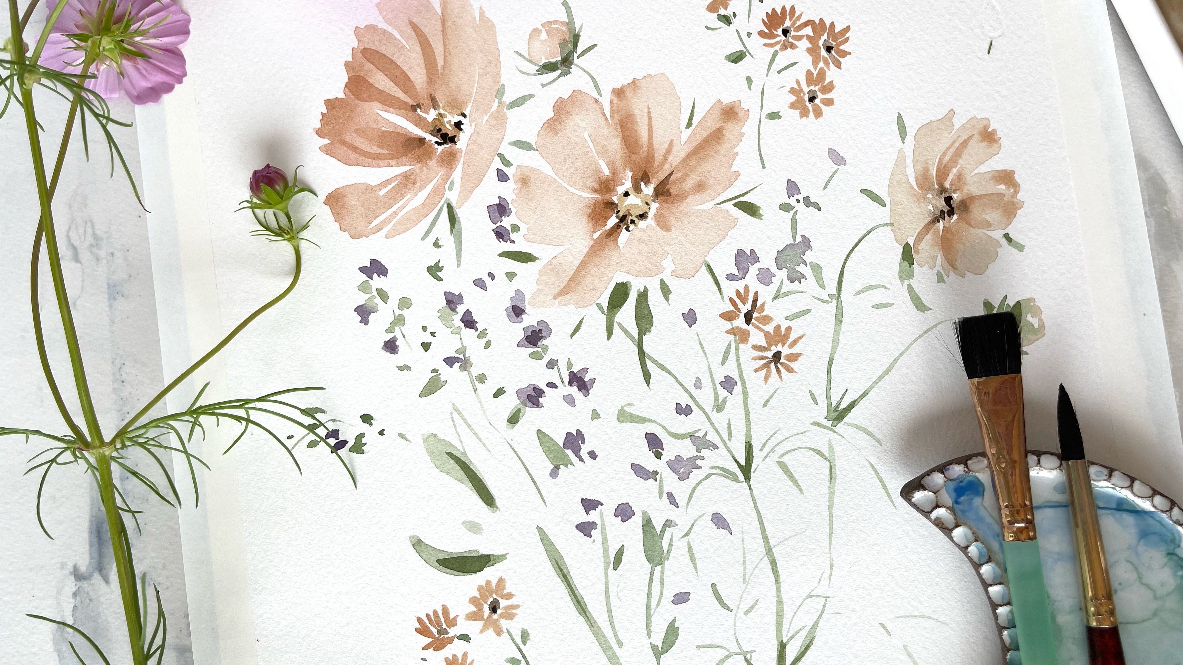
inexpensive brushes that I got from the craft store. As far as colors go, I tried to keep a
limited palette, and you'll see throughout
a lot of my paintings, I don't like to work
with tons of colors, so you'll never see
me working with, like, ten colors at a time. Although never say
never, maybe I will. I tend to mix all my colors, so I rarely paint
straight from the tube. For my red, I used Windsor red, and I don't have
the tube available, but a similar red you could
use would be a cadmium red, although it's very bright. So I did tone it down a bit
with some naples yellow, which is a warm yellow, or you could also
use yellow ochre. That would be a
nice warm yellow. It just brings it down a notch. It makes it a little bit
more of an earthy color. As far as my blues, you'll see in the bird, I've got some of these plum
colors in the shadowing, and that's because I mixed up. My winds are red with some cobalt blue and a
little touch of my yellow. So when you use red,
yellow, and blue, in general, when you
mix them all together, you'll get a very neutral gray. And if you mix them all
in a saturated mixture, you'll get a pretty dark
gray or even almost black. I also used ultramarine
blue and burnt sienna. And I use those two
mix together to get a pretty dark color that I used in the eye and some of the darker detailing in
the wings and the branch. And if you don't
have burnt sienna, you can use burnt umber, raw umber will work, too, or Vandyke brown, any sort of a medium to
dark brown will work. And ultramarine blue is
a good blue that mixes into a nice deep gray when you mix it with burnt
sienna or burnt umber. And so that's pretty
much what I used. I did use some of that
burnt sienna in the branch, and my background is that
kind of purply grayish color, which is just a mixture
of cobalt blue. My winds are red, and I do have a touch
of my yellow in there just to create
that kind of soft gray. Let's see what else? I did talk about paper. Arches paper is
what I recommend. I think the important thing is, if you don't have arches, there's other great
brands out there, too, like fabriano get something
that is 100% cotton. That's important
because some papers are made with a cotton
and wood pulp mixture, and it just doesn't
result in even washes. At least that's what I've found. And so try and find
something that's 100% cotton and 140 pounds. That'll help your
papers stay flat. I also used a pencil, and you'll see that I do have a traceable outline of the
cardinal if that helps you because I'll be focusing on watercolor techniques rather
than anatomy of a bird. I could do a whole
other class on that. But for this particular class, I just wanted to get
right to painting. So if you like, I have
a traceable outline that you can use and a reference
painting available, too. So as you work
through this class, I have a video that talks
about water control. And it's important because
we'll be using wet into wet painting techniques when we do the
body and the wing. And so it's just helpful
to have an idea of what your brush might look
like when you're using these different
watercolor techniques. So hopefully you
find that helpful, and let's get to painting.
3. How wet should your brush be for wet into wet?: Of the trickiest things about watercolor is learning
water control. What do I mean by this? The unique thing
about watercolor is its fluid nature compared
to acrylic or oil painting. We use water to dilute the paint to make lighter
colors and values, and use less water
to make the paint more concentrated
and richer in value. So one of the questions I
get from my students quite a bit is when you're working in
the wet into wet technique, how do you know how much water
should be on your brush? By controlling the amount
of water on our brush, we can then control
how far the paint spreads while using the
wet into wet technique. How I make a puddle of
paint on my palette. I like to make the
puddle not too light. A medium consistency or
darker value will work best. I take a look at my brush. If there's enough
paint on my brush, it will hold its shape
and be somewhat full. I can then drop in color into a pre wet area on my paper
and watch how it spreads. If my brush is too saturated
and full of water and paint, it will push out
the existing paint on the paper, creating a bloom. Sometimes this is
intentional and it can produce some really
wonderful effects. But sometimes it's not intentional and you can
remove the excess water by dabbing your brush on your paper towel or letting a drop slide down
your water container. Keep in mind that time is
also a factor in watercolor. As the paint starts to dry on your paper and you try
to drop in more color, it will create some
hard edges and blooms. The paint you drop
in will push out the pigments on your paper
that aren't quite dry yet. Also, if there is a section
of your painting that is still wet and you accidentally
touch it with your brush, the paint will bleed
into the area also. I do this intentionally in
many of my floral paintings to create some
fantastic soft blends of color on my paper. And then to really pack a punch, I drop in some very
concentrated dark paint into the centers of my flowers. I use a smaller brush to
drop in the color since a larger brush might add too much water and make the
dark paint spread too far. Now, if there isn't enough paint and water on your brush,
it will look like this. You might be able to bend
the body of the brush, and it won't hold
its shape as well. When you try to
drop in color into a pre wet area, it
won't work as well. Instead, your brush
may actually soak up the wet paint that's
already on the paper. I like to call
this type of brush a thirsty brush because
it acts like a sponge, it's slightly damp
but not saturated. And the watercolor
molecules on the paper adhere to the brush and get
soaked up into its fibers. It's a great way to
soften hard edges, soak up excess water or paint, create rays of light or
highlights within your painting. You'll get the hang of water
control the more you paint. It's a skill that
develops through muscle memory and
continued practice.
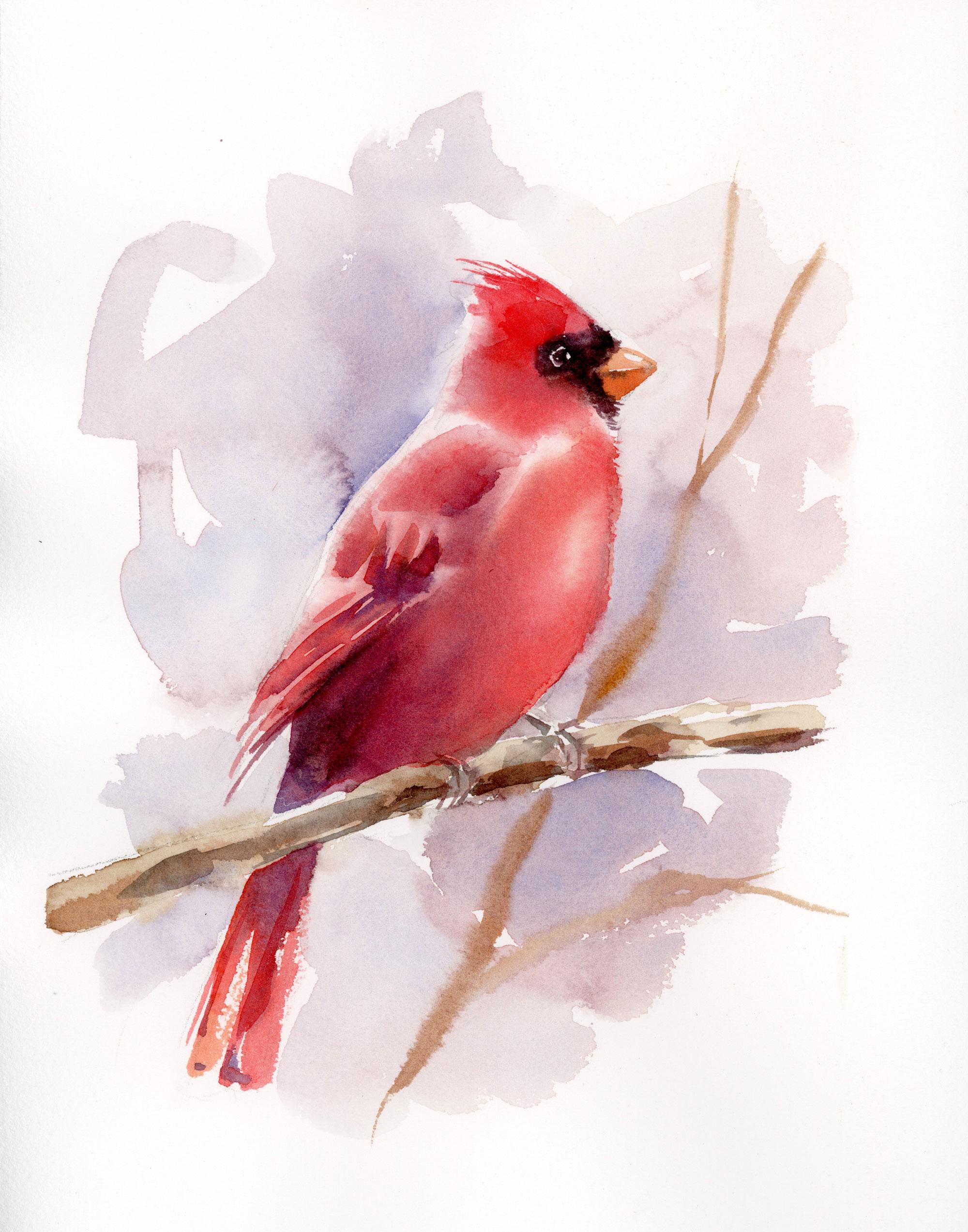
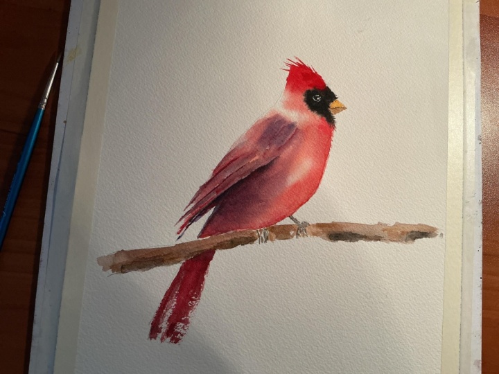
4. First Layer, Wet into wet: Watercolor artists
in this tutorial, I will show you how I
painted this cardinal. At first, I started using a wet into wet technique
to paint the first layer. I'll show you how I mixed up these different colors and how I painted a
gorgeous background. The entire video is just
over 20 minutes long, and I'll show you the supplies
and the colors I used, as well as some alternatives in the notes section
of this tutorial. Also, if you like, I do
have a downloadable, traceable outline
of this cardinal, which I think helps
a lot of students because we want to get right
to painting right away. So I just recommend lightly tracing the outline
of the bird and the branch onto some cold pressed
watercolor paper, and then we can begin. To begin, I'm just going to pre wet part of the
cardinal's body, and you'll see that I'm going to leave the area right around the eye dry and you'll see
why in just a minute here. I'm just using some
clear water and a soft brush and just
lightly covering the wing, the belly, and part of the head. The key here is just to make sure you don't have
water pooling. You want it to just make
the paper slightly damp, and this way, you can drop in color and you'll get
a nice soft effect. So I'm just going to soak up any areas that look like
there's too much water, and now I'm going to start
painting in my bird. I've got a mixture of Windsor
red and some naples yellow, which is a nice, warm, sort of an orangy yellow, and I'm just going to lightly apply it to the
belly sliding down. And I'm thinking about where
my highlights will be. Where are the areas that I want to be a
little bit lighter. And in those spots, I'm just going to leave
it white. You'll see me. Sometimes I touch up edges or soften edges with
a thirsty brush, and I'll also be pulling out some tiny little feathers with
my smaller pointed round. Now, going back in
with my number 12, I'm going to create a darker, richer area here and I'm lightly adding some
texture to the wings. I'm going around that eye Keep in mind that
this first layer is not going to be
super detailed. It's just to give an overall soft base
layer to the cardinal. Now I'm going to mix up a more purply red using cobalt
blue and Windsor red. It gives it more
of a maroon violet look for the shadowing. I'm just going to
drop it in here under the wing just to give
it a bit of a shadow. It's important not to dip your brush back in your
water at this stage. You do not want to have a
brush that's super wet. Otherwise, it'll just push the paint that's already
on the paper away, and you'll get these
uneven blooms. I'll add this color a
little bit into the wing, and on the sides of the head, you'll see I just softly make suggestions of
feathers in the wing. And then with that one stroke, I'll be defining that
shadow beneath the wing. And you can see with the wing, when you look at
a cardinal's wing or even any bird's wing, you'll have layers of feathers. So you'll have some feathers
that move in one direction, then you'll have
another row of feathers that might overlap in
the opposite direction. So I'm just making
that suggestion here with my paint brush. Now, in order to mix up
this really dark color, since cardinals
have that dark mask around the eye and
the beak area, I've got a mixture of
my three primaries, so I have my Windsor red, touch of that naples yellow, and then cobalt blue, or you can use an
ultramarine blue, which I do use later to give
a bit of a darker color. And that gives you a nice black, but it's not black
from the tube. It's a black that you create by mixing these three primaries. And if you add more water, you'll get a lighter gray. Now, you can see it's
pretty saturated here. Now, I'm using that same
mixture with my smaller brush, and I'm just giving the wing some definition
and some feathers, some more definition
here, some shadow. Now, most of the bird's
body is still damp, so I'm able to just lightly put in color and
it'll softly fade. But I have to be careful not to add too much water at this time, because otherwise, I will
get hard edges and blooms.
5. Adding Depth and Shadow: Now, part of the bird's head
is already beginning to dry, so you can see how I can layer on some of that
darker red paint, and now I have to fade it into that background with
a thirsty brush. So I'm taking a very
fine thin brush here and just creating these little short strokes to suggest the crown on the
top of the Cardinal's head. My red mixture is
more saturated, so that just means
I have less water, more paint ratio,
and I'm using that to create more intense color
on the top of the head. Now, I'm going to stop
right here before I keep painting because the rest of the bird's body is still drying, so I want to make sure
it dries completely. Now I'm going to add
in that eyeball, and this is why I left
the eye area white, and this is so that I can get some nice crisp detail between the eye and
the outer edges. At this stage of the painting, the bird's body is still
damp and I want it to dry completely before
I add that second layer. So what I'm going to do next is just paint in the tail
beneath the branch. And I apologize
that I don't have it in the full frame of video, but you can kind of get
the idea that the tail is just a few brushstrokes
that go up into the body. This time I'm not pre wedding. You can see how I take some wet paint and I
drag it across the paper, and I have a few areas
where you can see that texture of the cold
pressed paper coming through. That's a take on the
dry brush technique. It's where you take
your brush and instead of painting
more vertically, you hold it on an angle and
you drag it across the paper, and it skips over
some of that texture leaving a beautiful
textured appearance. So I've got a mixture of my
Windsor red and cobalt blue, giving a nice, deep, purply red. You can also use ultramarine. I did use that in
this video as well. It gives it a deeper,
darker appearance. And I'm just touching in
some areas behind that. Now the branch is white, but soon I will be
painting it in. I'm just creating a
bit of shadowing. So now that our first
layer is completely dry, we can add in that beak
and our background. So again, I'm using naples yellow with just
a touch of my red, and it gives it a nice darker
bottom half of the beak. And then I'm going to
paint in the top half with just a more dilute version
of that same mixture. And you'll see that I left
a little bit of a space of white dry paper where the
bottom of the beak is. And then I'm touching in some of my darker shadow mixture just beneath that
crisp white area. And that just gives it the look of a shadow, of an overlap. It really helps to use a small pointed
brush at this stage, like a number six
or a number four. I'm going back in
with my number four, and I'm just adding some teeny, tiny little feather, some texture detail right
under the beak. You'll also notice that I left a highlight in
the beak on the top. That's just dry white paper.
6. Painting the Background: I'm going to start painting
in this branch now, and I'm using a mixture
of burnt sienna and a lot of water to
give it sort of a fluid textured appearance, and I will be
dropping in some of my mixture of cobalt
blue with Windsor red, sort of that purply
gray mixture. That will help give
it some shadow, and it will help tie in with my cardinal since the
colors are similar. I skipped over
where the feet are, and this is just
because I I have room to make decisions on
how I want my feet to look. And you can see I'm just
dropping in a bit more brown in some areas to give the branch more
of that natural look. Now here we've got that sort of gray mixture with cobalt
blue and Windsor red, popping that in into a few areas might start adding some
of the detail in the feet just to help it tie in a little
bit with the branch. And I'm just making
sure that I add more shadowing to the
bottom of the branch. So always keep in mind where your light
source is coming from. And if you don't like something, you can always fade
it out a little bit. I'm at the point now
where I think I'm going to start putting
in my background, and the background is
really quite simple. It's just cobalt blue, a very watery mixture
of cobalt blue, a bit of that Windsor red, and a touch of that yellow. It can be yellow ochre
or naples yellow, just to give a nice,
gray, hazy blue color. And it helps to use
a bigger brush here. I'm using a number 12. Keep in mind my bird is
dry, so that really helps. And you can use this mixture to define areas of your bird. So the top of my bird's
wing is a highlight, and so I'm using my background, a darker background to really make that highlight stand out. Then I'm using a thirsty brush, which is just a brush that
has all the paint removed, and it's just a damp brush. And this just helps you fade
any areas that are too hard. As you can see that's
what I'm doing here. I'm lifting color, I'm softening some of
those hard edges. We can add a bit of that
background over here, too. I do leave some areas
of white paper. It's just my personal taste, but I think it helps give a nice kind of atmospheric look. So now that the
background is still damp, it would be a good time
to add in a branch. So I've got a brown
mixture here, and I'm just going to put in a branch right behind that one that the
bird is sitting on. And you can see where
the paint is still damp, you get these nice soft edges and where it's slightly dry, you've got more of
those harder edges. Now, I'm thinking,
should I add more? And I think I'm gonna
leave it as is. I might add one
more on the bottom, but I don't want to overdo it. I think I'll touch
in some shadowing on the stick on the branch that
the Cardinal's sitting on. Okay, I think this is funny. I didn't realize I do this, but I sort of act out what
I'm gonna do before I paint, so you can see me here kind of imagining where my branches will go and what they'll
look like in my head. And every time I go, no, no. Well, let's put one right here. There, call it done. Alright, I'm gonna stop there. I don't want to overwork this painting. I
think it's good.
7. Final Details: Now, watercolor
always dries lighter, so I thought the bird needed just a little bit more detail. So I'm going to mix
up some puddles. I've got a mix of my Windsor
red with touches of that yellow and then some more of a plum shadowing with that
cobalt blue and Windsor red. Then I'm going to add
my burnt sienna and ultramarine into a really dark puddle over
on the bottom right. And I'm just going to
add a bit more detail, some richer color into the wings using a
smaller brush here, a number six, I just add some feathers moving diagonally and then touching in some
of that shadow color. I'm going to make sure
that the bottom of the wing is fairly dark. This will show a
shadow even better. Then I'm going to
use a thirsty brush and soften that edge. And then add that
mixture of black that I made. Thirsty brush. So a thirsty brush is
just a damp brush, and you use it like a sponge
to sort of soften areas. Then I'll define these
other feathers up here. Now, they look a bit harsh.
Those are hard edges. So I will soften them. I will blend them together
with those other feathers. Here's my thirsty
brush where I just soften some of those hard edges. And here, I've decided to merge those two feather
areas together. I think it will
just look better. So I'm adding in a bit of that darker maroon color
to join them together. Then I'm going to add
just a bit more my red to the upper part of the wing, softening that upper edge
with the thirsty brush. Now, I tend to soften areas where the light hits
that gives it more of a lighter reflective
look like a highlight. Then I add just a touch of that darker color
near the bottom edge. Now, since I added more color, some richer value into the wing, I need to do the same
thing into the head. So I'm going to grab
that bright red. Again, it's mixed with
just a touch of that. You can either use yellow
ochre or naples yellow, just a warm natural yellow. And I will be softening
this. You can see here. Again, I just want
to repeat because some people might not be
familiar with thirsty brush. It's a brush that doesn't
have any color on it. It's just damp with water, and you use it just to soften
any sort of hard lines. Adding that deeper
red around the eye, and then a little bit here
and there into the wing. You can also use that
thirsty brush to soak up or pick up any blobs of paint that you don't
want on your paper. I'm just going to add
two quick brush strokes into the tail here
with that deeper red, that rich bold red color and
a bit of that shadow color. Now, I decided that the
belly of the bird needed to have a bit more color,
some deeper values. So I'm pre wedding the
belly, just the belly. And now I can drop in
some of my dark shadows, some more saturated
red the reason why I pre wet this area is because I wanted to
have sort of a nice, soft blending of the colors, so they merge together,
nice and smooth. So I've got that red. I
did leave a little bit of a white highlight in the
center of the belly there, and now I'm adding in
that shadow color, that plum color just
beneath the wing. See how it softly
fades into that red. That's what's nice about using this wet into wet technique. Then I'm going to
clean up the edges around the bird with
a thirsty brush. That's just a damp brush, going around the outside
of the belly here, just sort of lightly
tickling it, soaking up any sort of paint or hard lines
that might be forming. There we go. And as always, it brings me so much joy to see your
watercolor paintings. So if you feel like it, please share them with me on Instagram or email or
wherever you like.
8. Closing Thoughts: Well, now that we've wrapped up our watercolor cardinal class, I really hope you've
enjoyed this lesson, and please upload a photo of your finished painting into the project section
of this class. And if you have any
questions or thoughts, don't hesitate to reach
out or leave a review. I love hearing feedback from you and I love helping
you learn watercolor.
 Katrina Pete, Watercolor Artist