Transcripts
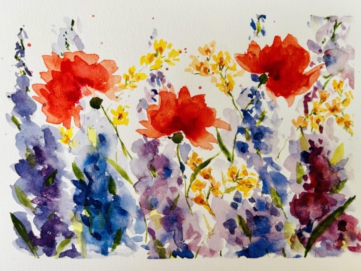
1. Class Introduction: Hello and welcome to my Rainbow
Meadow watercolor class. I'm your instructor,
Katrina Pete, and today we will be using several watercolor techniques to paint this loose and
vibrant floral meadow. We will explore the arts of
loose floral painting and focus on the impression of a meadow rather than
a realistic painting. I'll show you how to create
the feeling of movement through directional brush marks within the foliage
and green leaves. We will move from light to
darker values with layers of watercolor giving our
paintings depth and vibrancy. At the end of the class, you'll have a little rainbow
meadow to pop into a frame. I encourage you to share a photo of your
finished painting in the project section of this
class. Let's get started.
2. Supplies: So let's talk supplies
for this class. To get started, I'm using
a few different brushes. I think it's helpful to have a larger round and
a smaller round, a more detailed brush that
comes to a fine point. I'm using a number 12
round by Princeton, the Neptune series of brushes. And these are really
nice brushes. I really like them because
they are fully synthetic, yet they behave and act like natural haired brushes and that they hold quite
a bit of water. They can last longer
when you're doing washes and dropping in
color for wet into wet. They're wonderful brushes. I also really like my
silver black velvet, and although these
contain a mixture of synthetic and natural hairs, they do come to a
really fine point and they're great for detail. So this is a number six. Then you'll also
see me pulling out some other random brushes like this number six,
this is a Filbert. Filbert brushes are just
basically flattened brushes that come to a rounded
edge like this. The nice thing about
filberts is that you can get these beautiful
rounded petal shapes, yet you can use the sides of
them to get thinner lines. They're great for flowers. I just like to mix up my floral shapes by
using a combination of filbert and round brushes so that they don't
all look the same. I am using a smaller filbert for these tiny little asters. As for paint colors, for the blue and
purple delphiniums, I used a mix of cobalt
blue and Windsor violet. If you don't have cobalt blue, you can use another
shade of blue. Ultramarine would be great. You can even mix it
with red so that it produces a nice purple hue. You can use Prussian blue. I would just recommend using
whatever blue and red, or blue and purple
combo that you have. Because delphiniums come in a wide range from blues
to purples to pinks. Those are just the
colors that I had on hand For my coral
colored poppies, I used a mix of Naples yellow, which is a really nice
warm golden yellow. I mixed that with
my Windsor red, which is a really
bright, bold red. But you can also use
a lizard and crimson. You can also even
use rose matter. That's more of a pinkish red. For the yellow flowers, I used naples yellow. And then I also added
touches of that red, just so that it would tie
in with these poppies. As for my greens, I used a mix of pearline green, which is a really dark
rich forest green. And I used a bit of yellow ochre to make it
more of an olive color. For paper, I used arches 140 pound cold
press cotton paper. I use this paper for any
paintings that are going to be a finished work of art. However, I am very frugal and I know that this
paper is expensive, especially when you are starting out and you're
learning water color. What I do is I use the back of failed paintings for
practicing. I use both sides. And then it's like I get two
papers for the price of one. I also have a stack of inexpensive canson paper
that I use for mark making. Practicing different
brush strokes, shapes, all sorts of things. But you will find
that you'll get very reliable
results when you use a paper that is 100% cotton. I also use paper towels. You'll see, especially when
I'm blotting my brush, when I'm using a thirsty brush, it's nice to have something
to absorb excess water because water color is
all about water control. We need something to sop
up that water so you can either use a towel or
paper towels for my palettes. I am using ceramic and I prefer ceramic because it's just easier to see the
puddles that I mix up. I find that plastic
or most plastic palettes the colors
and the paint. It tends to bed up too much. And it's really hard for
me to see the consistency, which is crucial
for water color. You want to see how
dilute your pigment is, because the more water
you add to paint, the lighter the value you get. It's just easier for me
to see it on ceramic. This is a plastic palette. The reason I don't
really like it for water color is because you'll notice when I'm
mixing up my puddle, the water it just
sucks in like that. And it's so hard to see what you're going
to end up with on your paper when everything
just closes in on itself. I don't really like using these plastic palettes
because of that reason. However, they come in
handy for things like guash and they're pretty cheap. But if you can, these ceramic
palettes are from Amazon. I have them listed in the
supplies on my website. Go and check them
out. I also have a spray bottle that I use
to awaken my palette. I use this ultra
fine mist sprayer, but you can use any sort of
spray bottle that'll work. That's pretty much it.
Let's get started.
3. Leaf Practice: When it comes to painting
florals and botanicals, I think it's really
important to become familiar with your
brushes and to explore the variety of shapes and different line markings that you can create using just one brush. In this example here, I'm using my number eight
round by Princeton, Neptune. Now I've got a
puddle of green on my palette and my brush is
loaded up and ready to go. I'm starting with the
very tip of the brush and pulling my paint
across the paper. And as I move across, I'm pushing the body
of the brush to the paper to create a
wider part of the leaf. Then I'm going to practice some arm control
movements by just putting the tip of the
brush on the paper and dragging it across to
create thin stems. Then I'm also going to push
the brush into the paper and pull up on the end to
create a tip of a leaf. As you're doing these movements, you can practice by creating different
swirls, different shapes. And even just pushing your
brush into the paper to create little raindrop
like sized leaves. These little markings
become areas of movement within a
botanical painting. You can create some really
interesting directional flow by just learning and practicing how to arrange your brush and how to create those dainty little leaf shapes. Now, leaves are never
perfectly flat and straight, so we want to mimic
what we see in nature. I want you to use your arm as a way to create a curvature
within your leaf. And drag your brush
across the paper while you push down on the
belly of the brush, and then lift up at the very end to create
a tip of a leaf. I often use these shorter
little leaf markings to show movement and to create areas
where I can fill in the gaps between my
flowers and my stems. Although we will be painting this beautiful
wildflower bouquet, I just want to break away and show you other ways that you can use brushes to practice
stems and leaf movement. In this example, I'm using
my number six pointed round. It's the silver
black velvet series. And I use it for more of these
finer lines and details. Because it comes to a
super crisp fine point, I am able to mimic those dainty little skinny little leaves
that are on the Cosmo flower. And these long
gangale stems that make these flowers so
striking and whimsical. Because the belly of
this particular brush isn't that wide, it's
relatively narrow. I don't have to
worry too much about the stems getting too
wide and throwing off the look here is yet another brush that I think is important to have
in your arsenal, or at least to be aware
of what it can do. It's called a liner
or a rigger brush. It has a very long
skinny body and it's used to make these really
expressive skinny lines. It's great for painting grass, but it's also great for painting these skinny little leaves that are found on
the Cosmo flower. I tend to hold this brush in the middle and toward
the end of the handle. Remember, the farther
away you hold your brush, the more of an organic movement you will achieve in
your brush work. If you hold it very
close to the tip, it's great for tiny detail work, but you won't get as much of that free feeling that you can achieve by holding it looser
at the end of the handle. That goes for really
any brush that you use. I'm using my number
six again and I'm holding it closer
to the brush portion, which allows me more control. There's always that
balance between control and expressive brushwork,
but in this case, I want to be
controlled enough so I can guide my stem and bring it all the way down
to where I want it to be. Another key to expressive
and floral brushwork to create gaps
between your leaves. If you notice my leaves are not all connecting
to my stem, I'm creating these little
spaces in between them. Your eye can still tell
that it is a leaf, but you don't have to
connect all the dots. I think by allowing some
breathing room in your florals, you'll get more of an
airy look to your work. Now let's take a look at one more brush that I
think can be helpful, although not as common, it's called a cat's tongue. It's an oval shape with
more of a triangular tip. You can achieve
these super skinny stems with a really
fat body of a leaf. Now, a very similar brush to this one is called a filbert, which is just a rounded
brush that's flattened. You essentially can
start by making a skinny line and then turn your brush to create a
flat, broad shaped leaf. Then slowly turn it back and lift up again to create the tip. This is not a common brush, and I don't use it in any of these paintings that
we will be working on, but I just wanted you to
be aware of what it is. If you have something
similar like a filbert, that's definitely
something you can incorporate into your florals
and botanicals as well. In my series of paintings, we will be using
mostly round brushes and occasionally a skinny
rigger or a liner brush. But you can be comfortable
using mostly round. A variety of sizes would work for this class just for fun. While your leaves are still wet, I think it's nice to drop in a different color and watch
it slowly fade because this is a great way to show contrast and harmony
within your paintings.
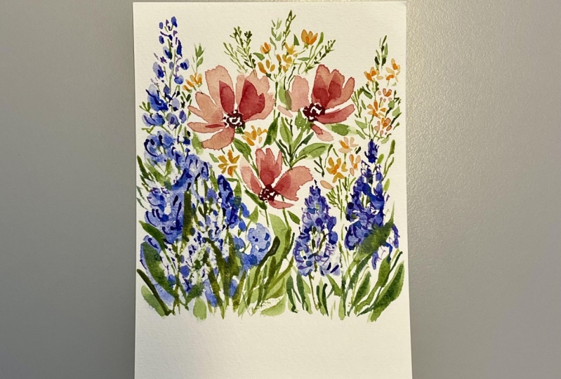
4. Establishing Our First Layer: What I like to do first is
establish my color palette. I'm imagining these poppies
that are this coral color, that's a mix between red and
yellow with a hint of pink. My rose matter mixed with my naples yellow which
is a really warm yellow. It's a fairly light value, it's not a dark value. I'm just going to maybe
put the flowers now. You'll see that I
rinsed off my brush. I want this mixture
to be very light, so I'm adding more water, making it a very pale mix. These flowers are very
loose in fluttery. I'm just going to use my brush. I'm using a number, 12, and I'm pointing the tip up. And as I'm putting in my petals, you'll see me turn my hand, creating a cup shaped flower and maybe add a couple petals that are just jutting off there. Rinse my brush, grab
some more of that color. Let's put a third
one right here. Now they're going in
different directions because it's a wild
flower meadow. I'm imagining a flower that's pointing this way
and one going this way. And I might have another
one just up here. The key here is to put your flowers in
different positions so it doesn't look too symmetrical. I've got one here,
one in the middle, and one slightly higher up. It's okay if the edges of your petals are slightly jagged, because poppies look
a little bit jagged. Now, rinse your brush and grab a bit of that darker value, which is your red
mixed with your yellow and maybe some
more of that rose matter. Then what you want to do next is just drop it into a few areas. It's already starting to dry
here, so it won't spread. But I can drop it in right here. That color will just softly
fade and give a nice effect. You can even drag it
along some of the petals. I don't put it everywhere, just in a few areas
of the flowers. Sometimes toward the
center where it's usually darker, but
it's up to you. I've got my three main
feature flowers here. You can rinse your brush
and it's a good idea to grab some clean water at this point because we're
going to be using our blues. What I like to do next is start painting in my delphiniums, which are these
beautiful spired flowers in shades of blue and purple. I'm using this number 12 brush because it holds
quite a bit of water. It's by Princeton,
the Neptune series. I'm taking a fairly light
mixture of my blue and purple. It's very watered down. And I do this for a reason because when I paint
in these delphiniums, I start from light and then
I work into a darker color. I also drop in darker values
while they're still wet. I'm going to put one here and maybe one here and
one over here. I start at the bottom
and I make these loose, circular shapes because
delphiniums are just clusters of flowers inside the center. They have darker flowers. As you get to the top, they
have these little buds, that's why I just made
tiny little marks. While this is still wet, you can rinse off your brush or remove some of
that excess paint. Now, we're going to
make a darker value. I'm using my cobalt blue, with my Windsor violet,
it's fairly dark. And then I'm going to drop it in maybe a paint,
in a few petals. When you add those
darker values and you let them blend into
the lighter values, it creates this
really nice effect. Now, I'm going to
rinse my brush. I want to add another
one right here. Let's do it more
in a blue color. I'm going to grab
that cobalt blue. And while this
edge is still wet, it's going to fade. See that the purple and blue
are touching each other. There's no hard
edge right there. I'm rinsing my brush
because what I want to do next is pull this color up. As I pull it up, it's going to fade that color out
into a lighter value. See that I'll even do
it on the side here, because I really want
to fade that color. That's one of the reasons why I like working with water color is because you can get some
really nice faded effects. Let's grab some of
that darker blue mixed with our violet and let's
drop it into a few areas. You can even paint in these circular shapes
with delphiniums. They're darker toward the
center of the flowers. That's why dropping in
this dark color will just fade out and it'll
look really nice.
5. Painting Delphiniums and Asters: Before we paint the
rest of our flowers, I think I'll add another
delphinium here. But I want to add a third
flower, a smaller one. And I'm thinking of
something yellow. I'm going to use
a smaller brush, now I'm thinking
daisies or asters. The brush I'm using is smaller, number four, it's a filbert. I might even number eight, it's not that much bigger. I just want to add some
nice yellow flowers, like dainty little
clusters of asters around. I want to do that over here. Before I move to this
side of the painting, just make some marks. These are tiny, tiny,
tiny little flowers. It's okay if you overlap other flowers on your
paper, that's okay. Water color, these are meant to be lose more
like an impression. They come together, but these
asters come together in clusters and you can have them lean a little
bit peachy if you want. I just love that color,
that coral color. I'm turning my brush as I go, it's not all in the
same direction. And there's some tiny little flowers that aren't even open, they're just little buds. Those will just look
like tiny little marks. But think of making
three areas of clusters. I like to use odd numbers
for when I paint. Maybe pop them in
here between those. Delphinium probably have
some fading up this way too. They're not all the
same shade of yellow. Some have a bit of that
orange color in there. It ties in with those poppies. These aren't perfect. If
you look at asters up, you've got some that
are in full bloom, some that are just
opening up like this. It's a very natural look. Okay, we'll let that dry. Let's put another
delphinium here, maybe one here and here. Then we'll leave some
space in between two. This time I'm going to, again, I'll start with
a really light mixture. That blue, I will
put one right here. They don't always
stick straight up. Sometimes they go in
different directions, slightly off center,
some don't go as high. Again, think watery. This is very loose. It's okay if some of them
touch your other flowers. See how that yellow is
bleeding in. That's okay. That's part of the fun of
loose watercolor painting, is letting the paint do what it wants to do,
rather than forcing it. We can add another one here. We'll make it a little bit
bigger, some of that water. Again, I'm making these. I am skipping over some of
those yellow flowers just to let's put some in there
and we'll carry on over here. Again, fuller at the base, smaller at the top. While it's still wet. That's where you can drop in your very dark value paint
in some darker petals. If it's not spreading that far, you might have too much water
on the paper. That's okay. You can just paint
it in like this. Just work with what you have
going on in your paper. Don't try and force anything. Don't fuss in one area too much. No, we're at a point where we can start adding
in our green stems.
6. Framing the Flowers with Foliage: My delphiniums aren't
completely dry. But that's okay, because
what I plan on doing next is skipping over
some of the flowers, you'll see that here I've
got some pearline green. I like to mix it
with yellow ochre. It's more of an olive color, it's a medium mixture, it's not too dark and it can start over
here where it's dry. Delphiniums, they have these little leaves
that stick out. So you can see with my brush, I'm just pushing it down,
creating little marks. They have almost like grass like leaf shapes in some areas. But in between the flowers
you can tiny stems. You can use the tip
of a small brush, like a number six, to paint
in these dainty stems. As you get to the top, I'm dabbing little green marks. These are the
leaves on the buds. You can also take
your brush and hold your pinky to your paper
to ground your hand, and then pull up and
create small lines. I find making quick brush
marks works really well. To get that looseness, I'm going to do the same
to this blue delphinium. See, I skipped over and I
added a green mark there. As you go to the
top, it branches off into little dainty flowers. And I'm just going to work my way over from left to right. Now, these poppies, they
have these whimsical looking stems that I'm going to
give it breathing room. But they also have this nice
solid base of their flower, and they might have
a bigger leaf. That's where I take my brush and I push it down
and I pull up, take my brush, I push
it down and I pull up. It's okay if you cross
over another flower, that's all right.
This is a meadow. These flowers are wild. Sometimes grass goes
in this direction, sometimes it goes up like this. Let's paint in the little
base there, one right here. Notice how I left a gap
between that and the flower. I like to give things. Breathing room looks
more fresh and airy. Now, these little
day dainty flowers, I'm going to use the
very tip of my brush, and they have these
tiny little leaves. They're made in clusters. I'm using this brush to show these tiny little leaves
and stems leaving space, leaving gaps, painting in
the little green leaves, it adds texture to the piece. Flowers are overlapping. Once everything is dry, we're going to be adding
darker values into these flowers here so that
they pop more off the paper. But for now we're working
with light and medium values. Nothing too dark
except for some of the centers and some
of these details. And that's fine, Just
work on making marks. I like to use the set it and forget it
mentality where I put down a mark and if I
didn't like it too bad, I have to live with it. Don't let it get to you, because the art of loose floral painting is all about looking at the
impression of what you see. The impression of this meadow is one of dancing
flowers in the light, different textures,
very fine lines and thick blobbier flowers. It's just that merriment of different
textures and values. Again, these delphiniums going to make sure I have some leaves poking out and some are hidden, some are behind the
flower, some are in front. Just as you'd see in nature. I find the little quick marks. If you start at the
tip of your brush and you make a mark like
and you pull it down, you can get a leaf at
different directions. Turn your brush in different
directions so your leaves are facing different
ways. One there. Now we're at a good
stopping point, we can let this dry. And then we'll add
one more layer to really give it some depth.
7. Adding More Definition: Now that everything
is completely dry, we are going to add
some darker values and layer on this water
color so that you get some more definition
in these flowers. I'm just going to
awaken my palette. The wonderful thing about water color is because
it's transparent, we can still see
the colors beneath, even through the layers. I'm starting with my poppies here and I'm going to
amplify that color. Make it a bit of a darker value. So I've got a bit
of that yellow. And my red, it's
leaning a bit to fiery. I'm going to tone it down with this pinkish red called
a lizard and crimson. I really like this
red for florals. You can mix it with cobalt
blue to make a lavender color, yellow to make more of
a pinky coral color. I like the way that looks. Only going to put
it in a few spots. You'll see I might
have one right here. This just gives the petals
a bit of definition. You can see I'm just
putting down a few strokes, Not everywhere, just
in a few areas. In some of the spots. I want to soften
that color a bit. I'm taking a brush which
is a thirsty brush. A thirsty brush is
just a brush that has a little bit of water removed. It's acting like a sponge. Then I'm just going to pick a few areas like right here and I'm just going
to soften an edge. I just like to fade
out some of the areas, not every maybe
that's all I'll do. Okay. I'm just adjusting my light so that you don't see
so much of a glare. Now, let's focus on some of
the other little flowers, These little yellow ones. We're going to do
the same thing. I'm taking my smaller, you can use a that's fine. I'm using a number four.
This is a Filbert. I'm just going to grab some of that yellow color and
just dab in a few petals, not everywhere, but like I said, just giving it some definition, some added texture,
a nice layered look. And then for these delphiniums, I'm going to take a round brush. This is a number eight
by silver, black velvet. And I'm going to define
some of those areas. I've just got some light purple and blue
mixture on my brush. Right now it's fairly light. I'm going to carve out some
of the flower details. What I mean by that
is I'm looking for an area where I can
add some definitions. Right here, you see
there's a rounded curve. I'm going to create a shadow behind it so
that it looks like this flowers coming forward. We can do the same
thing right here. I'm going to rinse my brush and then soften the edge there. Soften over there.
Then I'm going to grab some more of
that darker blue, darker purple mixture
and just drop it into that wet area with
these delphiniums. You want to get a bit of
a darker value going? I got that cobalt blue mixed
with my Windsor violet. I'm going to use another
brush for my water. This brush has just clear water. This one is loaded up
with my dark color. I sometimes paint
with both hands. It helps me when I'm dropping in color, clear, plane water. I'm just going to make some loose little
circles in a few areas. Then with this brush,
I'm going to drop in that dark color,
see how it spreads. Now, if you can't quite see
where your clear water is, you can hold your
paper up to the light. I can't do it now because I've got all these palettes on top. But if it's taped
down to a board, you can lift it and see
where that clear water is. Let's put one right here. I could use some definition
there. Again, clear. Circles, then take
your brush loaded with that darker color and just
drop it in a few areas. Okay? Clear water
on this painting. In just a couple more
sections, not everywhere. Maybe right up in here. This drop it in dark
purple, dark blue. You can even use indigo. I got my clear water over
here, drop in my dark. With this brush, once
you get the hang of it, it's fun to work like that. You can work a little bit quicker Then your
other brush that has, that's loaded up
with that color, you can carve out these little flowers and
then add different centers. Then just have a glance
at the overall painting. And if you need to add any dark values in the
balance out any other areas. Now I think I will, I might add some
darker green foliage just in a couple areas. It's pretty dark already, but I want to do it just to
give it an additional layer. I've got a mixture of
my pearline green. You can also mix indigo and sap green or sap green
mixed with a dark brown. Just a dark color. I'm just painting in definition
into not every leaf, but some of the leaves. Some of the lines
in the leaves gives it an additional layer,
which is what I love. All right, I think we're
at a good stopping point. This is a loose water color. If you want, you can darken
the centers of these poppies, which I might do, I
haven't decided yet. I think that might
look good if I put some darker centers in. I'm going to take that sap green and I'm not going to
cover all the white. Let me think. Actually, I'm going
to take my green. I'm just going to make a
quick mark in the center. Make one here and one here. I'm leaving some space,
some white space. But I just made quick
little marks just to give the impression
of that darker center. Now, with the loose
watercolor florals, it's all about giving
the impression of what.
8. Closing Thoughts: Rather than painting
realistic flowers, I like to give the
impression of movement and light by the use
of varied brush marks, layers of watercolor and
directional foliage, where the darker green leaves help frame the light
and airy flowers. As always, I absolutely
love to see your paintings. Please upload a photo of your painting to the project
section of this class. I absolutely love
to see your work. And if you'd like
to follow me on Instagram and see what
I'm up to in my studio, I'm at Katrina Pete
Watercolor. Happy Painting.
 Katrina Pete, Watercolor Artist