Transcripts
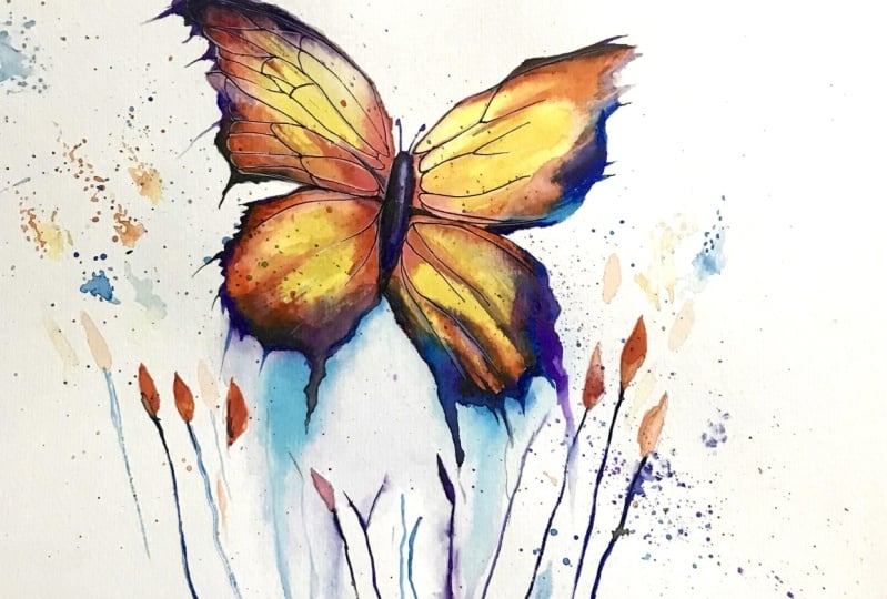
1. Welcome To The Class!: Hello everyone. My name is Will Elliston and in this
class we're going to learn how to paint a simple
but captivating butterfly. It's the perfect subject for
learning watercolor because not only does it
give you the freedom to be loose and expressive, but it also allows us to explore the three most
important elements in creating a
successful watercolor painting and that is, to have a full range of
tones from light to dark, having an appealing variety of textures from smooth washes, to dry brush or splatter
effects and lastly, of course, is having a
beautiful harmony of colors. I've been a professional
artist for many years, exploring lots of
different subjects, from wildlife and portraits, to cityscapes and
countryside scenes. I've always been entranced by the possibilities of watercolor, but when I started,
I had no idea where to begin, or
how to improve. I didn't know what
supplies I needed, how to create the effects I wanted,or which colors to mix. Now, I've taken part in
many worldwide exhibitions, been featured in magazines
and been lucky enough to win awards from well
respected organizations, such as the International
Watercolor Society, the Masters of
Watercolor Alliance, Winsor & Newton and the SAA. Watercolor can be overwhelming
for those starting out, which is why my goal
is to help you feel relaxed and enjoy this medium
in a step by step manner. Today, I'll be guiding you
through a complete painting, demonstrating a variety
of techniques and explaining how I use all
my supplies and materials. Whether you're just starting out or already have some experience, you'll be able to
follow along at your own pace and
improve your watercolor skills.If this class is too challenging or
too easy for you, I have a variety of classes available at different
skill levels. I like to start off with a free expressive
approach with no fear of making mistakes as we create exciting textures
for the underlayer. As the painting progresses, we'll add more details to bring it to life and
make it stand out. I strive to simplify
complex subjects into easier shapes that
encourage playfulness. Throughout this class, I'll be sharing plenty of
tips and tricks. I'll show you how to turn
mistakes into opportunities, taking the stress out of
painting in order to have fun. I'll also provide you with
my watercolor mixing charts, which are an invaluable tool when it comes to choosing
and mixing colors. If you have any questions, you can post them in the
discussion thread down below. I'll be sure to read and
respond to everything you post. Don't forget to follow
me on Skillshare by clicking the "Follow"
button at the top. This means you'll be the
first to know when I launch a new class
or post giveaways. You can also follow me on Instagram @willelliston
to see my latest works. Let's get started
with learning fun and exciting watercolor
techniques and how you can use them to paint your
own beautiful butterfly.
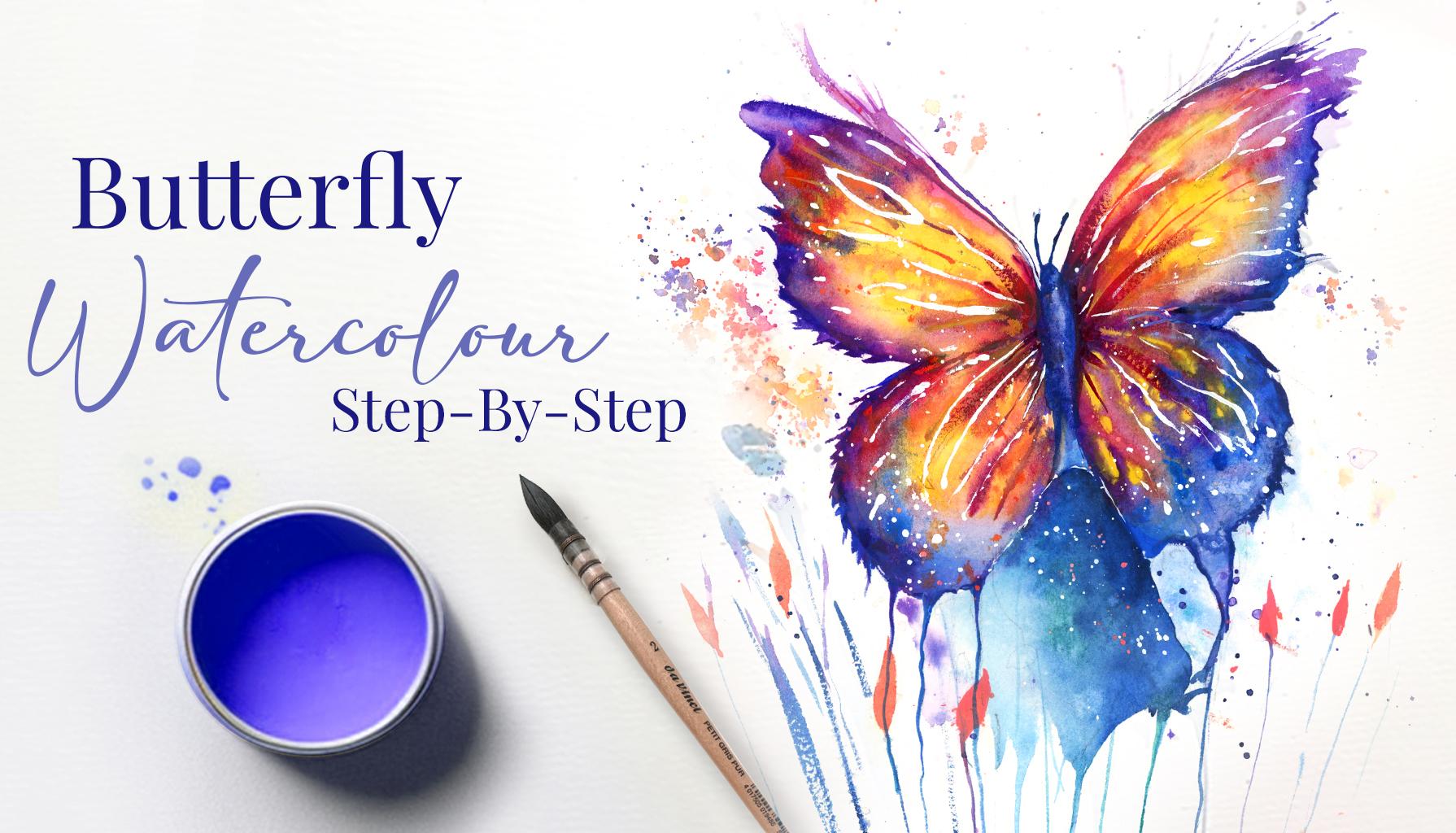
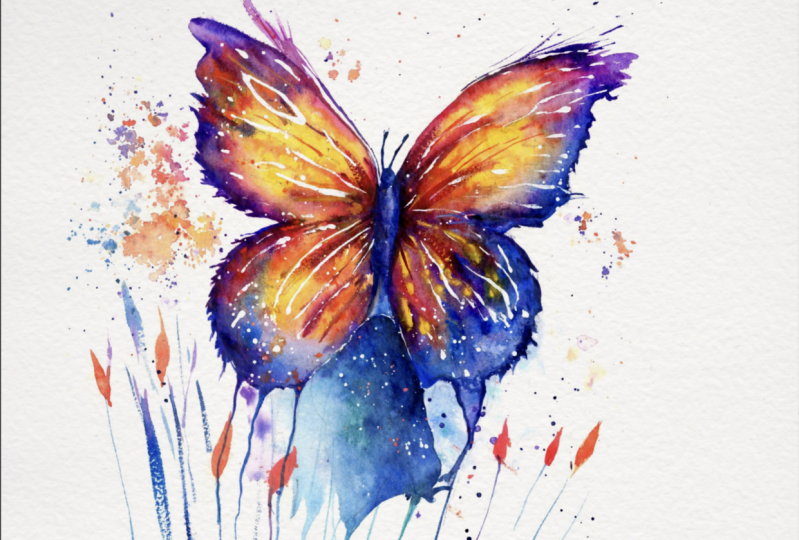
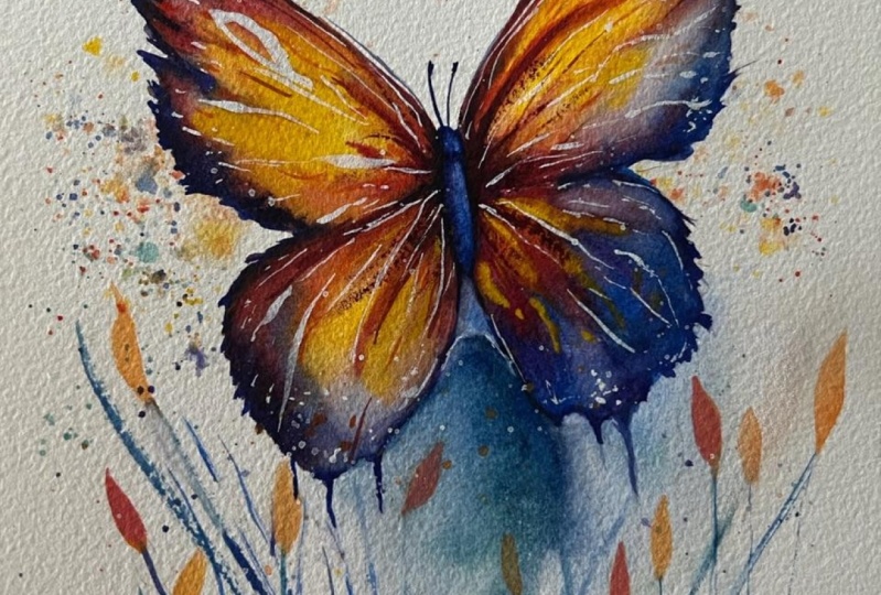
2. Your Project: First of all, thank you so much for joining
this class today. I'm really happy
that you're here. Today we're going
to learn to paint an expressive butterfly. What I like about
this is that they can be taken in so many
different directions. You can really follow
your own creative path and use it to have fun
exploring watercolor. I've planned out a simple
step-by-step approach that you can follow along with, but if you're feeling
brave enough, you can add your own
individuality to it. Maybe you want to choose
different colors, or maybe you'd prefer softer, more delicate brushstrokes, there's literally no right
or wrong way to go about it. In the resource section, I've added a high
resolution image of my finished painting
to help guide you. You're welcome to
follow my painting exactly or experiment with
your own composition. As we are going
to be focusing on the painting aspect
of watercolor, I've provided templates
you can use to help transfer or trace the
sketch before you paint. It's fine to trace when using it as a guide for
learning how to paint. It's important to have the under drawing correct so that you can relax and have fun learning the watercolor
medium itself. Whichever direction
you take this class, it would be great
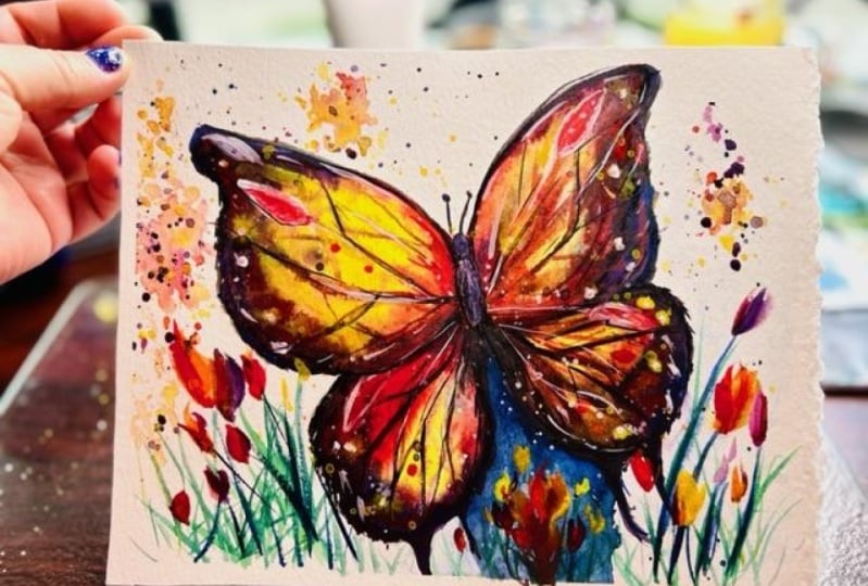
to see your results and the paintings you
create through it. I love giving my
students feedback. So please take a photo
afterwards and share it in the student project gallery under the project
and resources tab. I'm always intrigued to
see how many students have different approaches
and how they progress with each class. I'd love to hear about
your process and what you learned along the way or if
you had any difficulties. I strongly recommend
that you take a look at each other's work in the
student project gallery. It's so inspiring to see each
other's work and extremely comforting to get the support
of your fellow students, so don't forget to like and
comment on each other's work.
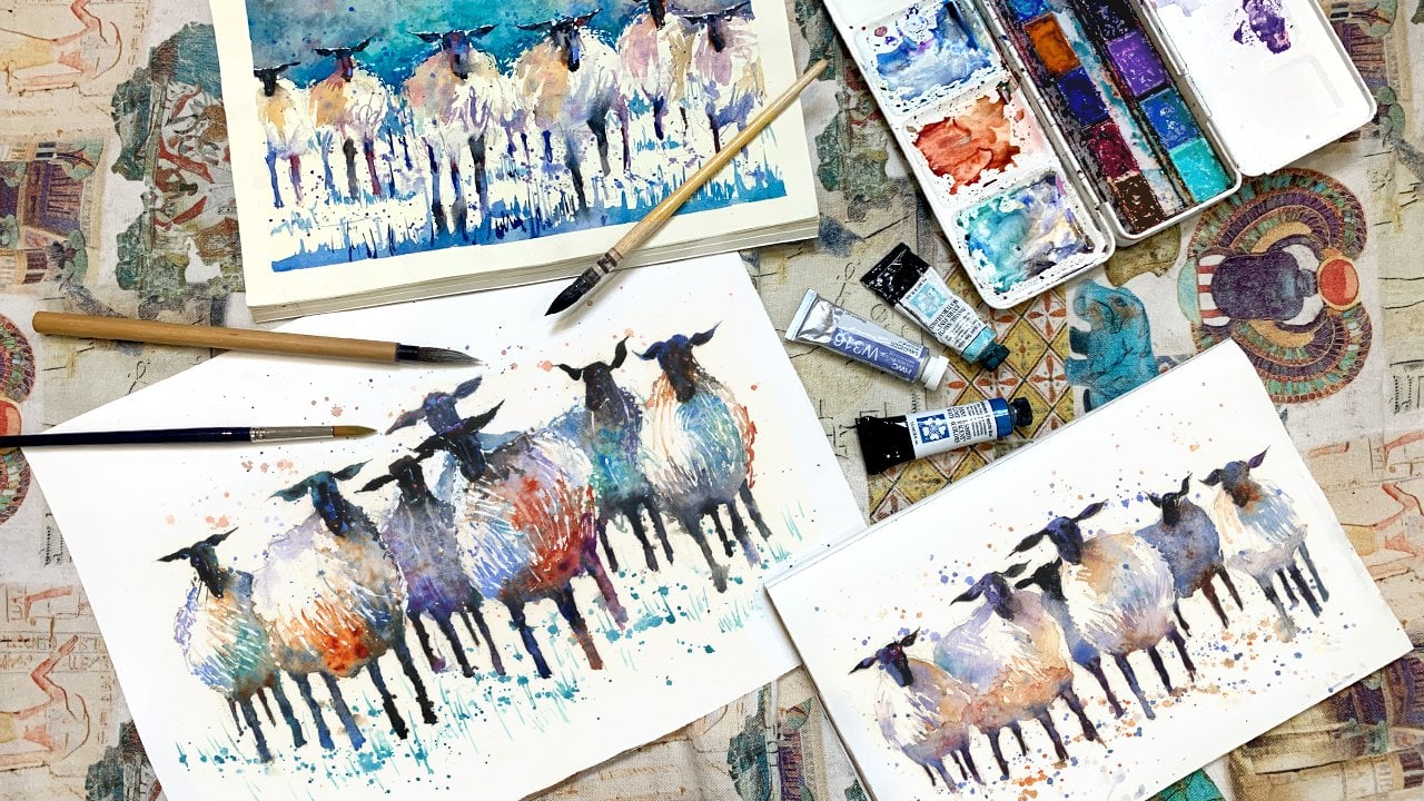
3. Materials & Supplies: Before we start the painting, let's go over the materials
and supplies I use. Having the right materials can greatly impact the
outcome of your artwork, so I'll go over all the supplies I use for this class and beyond. They're very useful to have at your disposal and will make it easier for you
to follow along. Let's start with the
paints themselves. Unlike most of the materials
we'll be using today, it's a lot to do
with preference. I have 12 staple colors in my palette that I
fill up from tubes. They are cadmium
yellow, yellow ocher, burnt sienna, cadmium
red, alizarin crimson, ultramarine blue, cobalt blue, cerulean blue, lavender, purple, viridian, black, and at
the end of the painting, I often use white gouache
for tiny highlights. I don't use any
particular brand. These colors you can
get from any brand, although I personally
use Daniel Smith, Winsor & Newton,
or Holbein paints. Let's move on to brushes. The brush I use the most is
a synthetic round brush like this Escoda Perla brush
or this Van Gogh brush. They're very versatile because
not only can you use them for detailed work
with their fine tip, but as they can hold
a lot of water, they are good for
washes as well. They're also quite affordable, so I have quite a few
in different sizes. Next are the mop brushes. Mop brushes are good
for broad brushstrokes, filling in large areas, and creating smooth
transitions or washes. They also have a
nice tip that can be used for smaller details. But for really small
details, highlights, or anything that
needs more precision, I use a synthetic Size 0 brush. All brands have them and
they're super cheap. Another useful brush to have is a Chinese calligraphy brush. They tend to have long bristles
and a very pointy tip. They're perfect for
adding texture or creating dynamic lines
in your paintings. You can even fan them
out like this to achieve fur or feather
textures as well. That's it for
brushes. Onto paper. The better quality
of your paper, the easier it will be to paint. Cheap paper crinkles easily
and is very unforgiving, not allowing you to
rework mistakes. It's harder to create
appealing effects and apply useful techniques like
rubbing away pigment. Good quality paper, however, such as cotton base paper, not only allows you to rework
mistakes multiple times, but because the pigment
reacts much better on it, the chances of
mistakes are a lot lower and you'll be more likely to create
better paintings. I use Arches paper because that's what's available
in my local art shop. A water spray is
absolutely essential. By using this, it
gives you more time to paint the areas you
want before it dries. It also allows you to
reactivate the paint if you want to add a smooth line
or remove some paint. I also have an old rag or t-shirt which I use
to clean my brush. Cleaning of the paint
before dipping it in the water will make the
water last a lot longer. It's always useful to
have a tissue at hand whilst painting to
lift off excess paint. Also, you never know
when an unwanted splash or drip might occur that
needs wiping away quickly. I also have a water dropper
to keep the paints wet. When you paint, it's
important to have them a similar consistency to what
they're like in the tubes. This way, it's easier to
pick up sufficient pigment. A hairdryer is useful to have, speeding up the drying time and controlling the
dampness of the paper. Lastly, masking tape. This, of course, is just to hold the paper down still onto the surface to stop it sliding
around whilst painting. Also, if you plan on
painting to the edge, it will allow you to create
a very crisp, clean border. That's everything you
need to paint along. I encourage you to experiment and find out what
works best for you. Now let's get ready
to start painting.
4. Sketching It Out: Let's start the drawing and I'll try and break it
down and keep it as simple as possible for
you to follow along and even adapt it to your
own composition. First of all, as a butterfly,
it's symmetrical basically. It's almost like a
mirror, so I'm just going to put a line in the direction where I want the
butterfly basically to be. [NOISE] Then we can draw symmetrically
on each side and then start off from one side. Go back around to the other. Starting of light, of course, and then building on the
darker lines later on. Like an S-shape comes around and you copy on
the other side too. Of course, there's many
different types of butterflies. The good thing is that they're
all symmetrical so you can adapt it to your own. It's your choice. I'm not following any
scientific anatomy. Just whatever feels right
looks good for a composition. Of course, we will
wrap these lines out at the end to
make it look clean, but we can go over
them, correcting them, making sure they're all correct. You can also paint horizontally rather than
vertically if you want. I'm just doing that this way. Give space for the camera
for you to see my palette. Then let's have a few blades of grass or some petals
of some kind, vines, or whatever those things that you see around
lakes and ponds. Now, I'm going to
change my grip to a more controlled
grip like this. I'm going to go and
darken the line a bit. Spend your time making sure that the drawing is just
as you like it. Few more lines to follow
the rhythm of it. They have quite intricate edges, which is a nice
thing to play with. You don't need to do
exactly as you see it. Just anything that mimics that irregular pattern,
like zigzaggy pattern. I'm using a 2B pencil. Any pencil is fine,
whichever you prefer. I like 3B because it's softer. Allows you to have
a darker line, which is useful because
you want to be able to see that line when
you paint on top of it. You want it to
disappear so easily. Just going to merge the
end of this butterfly into the vines that
we just painted or the blades of grass. Make sure it's mirrored,
so it's symmetrical. It's a good drawing
exercise, this action. That doesn't need to
be super accurate. Don't inhibit your
expression and individuality by worrying
about it being too detailed. Allow yourself to relax
and have fun with it. The body here, middle, poke a little head out there, and maybe the antennae if
that's what they're called. A bit uneven there,
but that's okay. It's a good example showing
you how things can change. How you can make corrections, adapt with it, and not mistakes. It's just the nature of
painting and drawing. Adapting to problems,
problem-solving. That's about right. Let me have a few things
coming up there too. I want that a bit
bigger. Then I'm going to add a few patterns, very simple patterns,
like circles, lines following the
direction outwards. Now, you could put masking fluid on there if you
know how to use that. I'm not going to do that today
because I don't think it's necessary for my style. I'm going to add white gouache at the end for these
white highlights. But if you know
how to use masking tape and you enjoy using it, masking fluid rather, you can go ahead and
experiment with that. It's all about experimenting and taking your painting
techniques to the next level, so whatever suits your style. That's just about
coming on for me. I think more grass blades. Blades of grass rather. That's the drawing done. Well, I was drawing this. I was also thinking about
what colors I'll be using, and the different tones.
5. Deciding What Colours To Use: Let me show you my color charts. Every color here is what I
have on my palette here and every page is dedicated
to one of those colors, and it is mixed with every
other color in the palette. That's Cerulean
Blue, Burnt Sienna. For example, I'm just looking
around to get an idea. A color like orange there, which is obviously cadmium red
mixed with cadmium yellow. I like that because it's
a very vivid color. Maybe I'll stick
with that and I'm thinking what's the
complementary color to orange? That is blue. One of these blues. A color like purple. Purple is complimentary
of yellow. Those two already, we have four complimentary
colors and I think that's what I'm going
to have as my base. I'm going to have a
yellow, orange, purple, and blue look and we can
involve other colors, but that's the four
colors we need. You can follow along or you can look and see what
other colors inspire you. I have these color charts in the project resource section. Let's get on with the painting.
6. Starting With A Simple Background: I'm going to try and do it with just these
two small brushes. This is an Eskoda Perla
size 8 and a size 1, but we'll start
off with a size 8. These are just synthetic
round brushes. It doesn't need to be an Eskoda, just anything that's
synthetic and round. I'm not trying to overthink it. I'm just going to wet the
paper just starting off from the background to begin with. Like I said, we're going
to do a bit of blue so I think mix some blue
straight away. I want to keep some
vivid areas here, so I'm just going
to paint close to the edge and hopefully that will create
a subtle effect. I always like to make it a bit more interesting
than just a plain color, so just a few dabs over any
random color I'm using. Green just to add
a bit of interest. It's very subtle. You
won't notice that. It'll just be a subconscious
thing that's just there. It's not really essential. Now, I'm going to paint these
blades of grass actually. Let's mix some more blue. I'm going to do a
dry brush effect. Three elements, we've
talked about color already. Now we've got to think
about tone and texture. I'm going to do some textures here with the blades of grass. I'm going to make sure
the paint is quite thick. I'm just picking
up various blues. I've got cerulean blue here, cobalt blue, and
ultramarine blue, and just mixing it until I
find a color that's right, mainly ultramarine blue, and just that's as easy as that for the
time being, just one. That's three. It might be easy to overdo it. You don't need to. That's what I'm going
to do for this stage. It looks simple. It looks too
simple to be worth doing. But it will come to
something, don't worry. It'll play its part in
the final composition. Even without context,
it looks a bit strange. I'm mixing a bit
of green in here. Even though we are
all going to stick with the blue and the
purple for the main colors, I like to dab other colors
just for subtle parts. It's not going to take
over the main color. We've had a bit
of texture there, a thicker line there. This side here too. Try not to overdo it. Maybe get a tiny bit
of purple involved. Now as most of these blades
grass I have painted blue, I'm going to mix some orange, which is red, different side
of the palette and yellow. Cadmium red and cadmium yellow. Mix that in nicely, add a bit more water so it's
quite a wet consistency. I'm just going to plant
them on the top of these blades because the blue and the orange will
go well together. Maybe one over there. I like to keep them odd numbers, so you have three
there, one there. It keeps the composition
a bit more interesting. I'm going to use my tissue
to dab off the excess water here and clean my brush. I'm going to splat pure
water just up here. That's a clean brush,
so if it dries, nothing will make a difference. I'm going to grab this orange again and just dab
it into those parts. Few more splats. Really fill up your brush. Adds a bit of atmosphere. You can connect the
splatters a bit. Don't overwork it
too much if you want it to look organic. Then we can grab a
bit more yellow, few dabs of yellow
in some of them, then a bit more red, make it a few of
them red emphasized. I feel like one big splat there. It's going to let it
drop just like that. Then I could just
do the same again with the complimentary,
which is purple/blue. You can mix them to
whatever you desire. I'm going to keep
it fairly blue. Actually, I need to
add a little bit of blue rather, keep it purple. Do the same thing, just load up your brush so it's just
about to drip by itself, hold it very close and then tap like pollen or
something like that. Go back to the blue and add one or two more
lines here just like that. I just want these splats
to be a bit bigger. I can do a blue-green
splat there. Now I'm going to
use the hairdryer and dry this off a bit.
7. Adding More To The Background: I'm just going to wet this area because I think I'm going to add a
bit more of a background. Cerulean blue, can I get off some ultramarine blue and paste it on
there very thick. Maybe even tap it of black. Then cerulean blue. Direct from the palette or tube, straight onto the paper. Very thick pigment, more cerulean blue, maybe even mix bit
of green in there. Take it up and make it interact. I've got my water gun here. I'm just going to make
sure it stays wet whilst I do this. The brush need more
water in there. Formula around. I'm going to wet it and
then go alone watercolor now to do its
magic, just wet it. Let it flow into each other. Put more green maybe there. Got my paper on the slight tilt. I'm going to connect this blade of grass,
remove this section. Something like that. I'm just having
fun experimenting, and you can too, just
whatever you feel like, let your mind relax and just play around
without any limitations. Now once again, I'm going
to dry that off completely.
8. Painting The Outline: Now, going on to very
thick pigment back with a purple and cobalt
blue this time, for me, but you can
choose any color. It's going to go
around the outline, the outskirts of the butterfly because we can blend this
in from the inside out. At the moment, I haven't really
needed this small brush. Let's see if we can do
the whole painting with this small eight-size brush. Not that it matters it's
fine to switch brushes, but it makes it feel a bit easier if you can do it with as little
materials as possible. I had a bit more water into that Panathenaic because
it's starting to dry out and I like to keep
my pigments very moist. You don't have to
buy your purple, you can mix ultramarine
blue and Alizarin crimson, and that creates its own purple. That's of course more
of a reddish purple. The more red you put in, the more red
obviously it will be, and vice versa with the blue. I swirl the brush around
to create a nice tip. Remember, we'll be
coming back over this at the end with
white gouache just to make sure the
outline is nice. Don't worry about making
it perfect at this stage. Up to this corner up here, add a few thick lines there. I'm moving all around because I want to vary
the color everywhere, I don't want to have the
same color in every spot. I fill up a brush with a color, move around, then fill back
up with a different color, and then go around again. With it being so dark, it's difficult to see what
colors they actually are but as soon as you
dilute it with water, later on, you'll see the
magic of watercolor. Let's continue going around. You don't have to
be so delicate, you can just create a
nice organic textures, you can hold the
brush at the tip, and just randomly
zigzag it around applying some blobs of color
directly into the middle. Every time I feel like
I'm getting a bit slow, I do something a bit extreme
and crazy like that, just adding pure
blobs of pigment. You're a setting scene, for it to all explode
as soon as we start adding diluted water. I was about to say wetted water and because it has more pigment, there's not much water in here. As soon as we start
adding more water that's when the
exciting stuff happens. Alizarin crimson now, cadmium red, just a
few red dots there. Always setting up takes
a bit of a while. Can take a bit of a
while if you want to take your time and do it
slowly and get it right. But when we start
adding the water, it moves very quickly which
is what you'll see right now. First, I'll just clean
up my palette a bit. I want to leave some of
my purple over there. Use a tissue just to
clean that area up.
9. Painting The Left Side: Now we're working with complimentary colors
like blue and orange, and yellow and purple. When they're mixed together, they neutralize each other, so they'll turn into a gray,
which is not what we want. We want to keep
everything vibrant. [NOISE] So when we talk
about mixing them, we're actually keeping
them next to each other, we're not actually mixing them, we're blending them smoothly. You'll see what happens
when we do it on the paper. [NOISE] So I can take my brighter vivid yellow here, let's put directly on the paper without any
contact for the time being. Just spreading out the area. Then I'm going to
take a bit of cadmium red and have some
ready here mixed. [NOISE] So the main part is going to be yellow and the
edge is going to be red and we'll mix it all in together, you just have to
go with the flow. [NOISE] So I'm going to
start wetting it out, drawing it into these areas now. Using my brush in a
circular motion just to agitate the pigment. [NOISE] Then, rather than the yellow mixing with the purple and
making it a dirty color, we add a bit of red in between, which helps clean it up a bit. [NOISE] Put more red in here this section. [NOISE] Female plops
of yellow to make it really vivid [NOISE] and some Alizarin Crimson, red. [NOISE] You don't need to fiddle with it too much, allow the water color
to do its own thing. [NOISE] I'm going to try and practice
what I preach to that because I end up doing to. To pour in a bit. [NOISE] So that red, pour out, [NOISE] connect with the blue here, [NOISE] and wash down and
create its own purple. [NOISE] Have to be careful when it mixes with
the yellow here so going to make it slightly orange so that we
don't get a muddy color. [NOISE] Red paste on thick pigment and
watch it melt into it. [NOISE] Slightly burnt sienna. Burnt sienna is an orange, which is dark and down,
towards burnt sienna. A pure sienna is
actually orange. [NOISE] Cleaning my brush. I want that purple to be a bit line so I
take this lavender, bring it up a bit so
you can see a bit more because purple is
quite a dark color and I want it a bit more visual, so I want to be able to
see the purple a bit. [NOISE] You need to try all your utmost
attention and don't allow the blue to mix with the yellow there
otherwise it will make green. [NOISE] May not be
the end of the world, though we might add a
nice, interesting texture? Yeah [NOISE] It's not too bad at to
actually, doing that. [NOISE] Add few more drops of purple into the middle
and watch it bleed out. Following the rhythm. That's one side, virtually done to this stage. Just allow it, do its magic. It can be quite abstract, we'll come back in later with some whites just to
add some definition, but it's only subtle definition. Let's do a similar thing
on the other side. Let's quickly paint
a bit of blue there , and now that's dry.
10. Painting The Right Side: Similar thing on the other side. Start off with the
yellow or not, maybe I can show you a
different way to do it. Let's start off with the purple. Going the outside this time. We can go to the inside like
we did on the other side. Whichever you feel more
comfortable with, you can try. I'm just demonstrating
different ways to go about the same
thing basically. I'll paint the
other side one way, this side a different way, and whichever side you like best when it comes to
your turn to paint. That's the direction you
can choose to follow. Once you do many different paintings
and different styles, you can do a lot of same
things in different ways. Now go in with the yellow. Trick of yellow is to
make sure it's pure. You don't want to
contaminate it on your palette on
the paper really. You just want to blur
the edges so it bleeds, and that's it or leave it alone. Otherwise you lose that vivid, bright nature of yellow. I mixed the purple with yellow, then it's already lost some of its vivid colors because I need satellites to
add more red and then it sorts that out a bit. I'm going to take the yellow
to the edge of this blue, making sure they don't mix, so again, make green, and then add a bit of red. This where it connects
just like that. Few splits just to get the pigment and water moving
a bit more on the paper. Some purple again. Lots of water, that's fine. Very blue here, like player. Connected with that dark edge. Very thick pigment
while it's still wet. Just adding whatever you want, whatever color you think
goes by all of it. In this case, I think for
me, purple and yellow, you could do red and green as they're
complimentary colors, but I wouldn't advise
that because, well, unless you want a Christmas
looking butterfly, because red and
green, of course, associated with Christmas. But they're complimentary
colors nonetheless. Well, I missed out the
yellow in here. That's fine. I'm going to show you how
to add some yellow there. Let's just create another
interesting effect. That's what we're talking about, a range of different textures. Really load up my pigment
with very thick wet pigment, literally drop it in. Similar than this a little bit, and it makes it really muddy, create some nice
taste is exotic. Because this butterfly, no way. Well, let's say no way. But I doubt a butterfly looks like this in real
life these colors. But that's not the point, it's about creating what
you want to create, expressing the feeling that you feel when you look
at different colors. That's the fun with watercolor. To finish around a bit
that the water move down. You can really control
where the water flows. You can already see
different textures there. Almost doesn't look
like watercolor. It looks like acrylic, and that's what I find
interesting about watercolor. That's how I like to
use it in any bold way, not having it all pale
or not necessarily pale. I like to use my
pigments strong, thick, rather than subtle. Now there's always a
desire to keep on going. But I've painted all
four sections now, and I'm just going to let it go, and I can do any edits later on, but I don't want to overdo it. Just for a few minutes. I'm just going to
allow it to dry. Maybe not completely,
but just allow a mind to rest on it without interfering, just to gather my thoughts.
11. Painting The Body: Upon thinking for a bit, I think it can make
use of some of these sections going onto this. Actually I want to
use a small brush. I haven't needed to use
it so far, necessarily. I'm just going to color in using this preference
just to demonstrate it. Because this brush still
has a very fine point, which is very useful. I'm going to dry it off
with the hairdryer. I like these little bits
that are coming off it, so I'm going to do a similar
thing to the other side. I don't know whether
butterflies actually have that on them. Now, let's paint the
body and the antenna. The antenna can be a
dark blue or purple. Can be so dark, it doesn't really matter what color it is, but it just has to be very thin. There we go. Then print the body. A little bit of a highlight on top
display, pulling away illusion of 3D. Make it a bit darker. I need some dark red
mixed with some purple, make it very dark. It's dark in the middle and it gradually gets lighter
as it comes out. I need some fast strikes
for dry brush effects. [NOISE] Add a couple more of these yellow,
orange knocks. I'm going to put one on
top of that actually, so I'm going to mix a bit of
white gouache just a bit, and I actually put it. Well, I [inaudible] Maybe two small ones there. [NOISE] Make that blade a bit more defined. There we go. Use the hairdryer again.
12. Finishing Touches: Of course, if you are
painting smaller then you would have to use
a smaller brush. Now I'm going to
go straight from the tube on this white gouache. Start adding some
white patterns. By patterns, they're
not very intricate, just little curvy, circles, dots, lines. Moving
my brush quite fast when I do this so it keeps
a bit of texture, but very lightly touching not
barely touching the paper. These little white lines just really pull the
painting together, and add another level to it. Like I said at the beginning,
you could have put white, or you could have put
masking fluid on here, and it would have just
done the same thing. It would have reserved the
whites with the paper. You can just look at the patterns on
a photo reference. [NOISE] You have to make sure this pigment is thick
enough because otherwise, when it dries, it will
become a bit transparent, and will ruin the effect a bit. I'm going to take a bit more wet. Add a bit of water on it. Actually I do have some
white in my palette. Fill up the brush
with some white. Just a few white
splats on there. The same again with the orange. [NOISE] One last thing for me is to add a reed
to that, and that is it. I'll take the tape off,
have a look at it, see if there's anything
else that is needed. There's one more
thing [NOISE] that's important that I nearly always
forget about straightaway. The pencil markings. Let me just draw it
off, and rub it off.
13. Final Thoughts: Welcome back and congratulations
on completing the class. I hope you had fun watching, and if you haven't already
given this painting a go, now is the time to put what
you've learned into action. When we set out to
paint this butterfly, we wanted to create
something that was both simple and captivating, and I believe that we've
accomplished just that. But what's even more exciting
is that every one of you has the opportunity to take this painting in
your own direction. You can use different colors,
different brushstrokes, and even different
techniques to create a painting that is
uniquely yours. Throughout this
class, we've explored the three most
important elements of creating a successful
watercolor painting ; tones, textures, and
colors, and I hope that you now have a better
understanding of how to use these elements to create a
painting that has not only visually appealing
but also expressive. Remember, watercolor painting is not just about technical skills, but also about expressing your creativity and
personal style. I encourage you to continue
exploring, experimenting, and pushing your
boundaries to create your own unique
watercolor masterpieces. As we come to the
end of this class, I hope you feel
more confident and comfortable with your
watercolor painting abilities. Practice is key when it comes
to improving your skills, so keep on painting
and experimenting. I want to express my gratitude for each and every one of you. Your passion for watercolor
painting is so inspiring, and I'm honored to
be your teacher. If you would like feedback
on your painting, I'd love to give it, so please share your painting in the student projects
gallery down below, and I'll be sure to respond. If you prefer, you can
share it on Instagram, tagging me @willelliston, as I would love to see it. Skillshare also loves
seeing my student's work, so tag them as well @skillshare. After putting so
much effort into it, why not share your creation? If you have any questions
or comments about today's class or want any specific advice
related to watercolor, please reach out to me in
the discussion section. You can also let me
know about any subject, Wildlife, will see me
lightly to do a class on. If you found this class useful, I'd really appreciate
getting your feedback on it. Reading your reviews
fills my heart with joy, and helps me create the best
experience for my students. Lastly, please click
the follow button up top so you can follow
me on Skillshare. This means that you'll be
the first to know when I launch a new class
or post giveaways. Well, I hope you learned a lot, are inspired to paint more
on this beautiful medium. I look forward to seeing you
all again in future classes. Until then, happy painting.
 Will Elliston, Award-Winning Watercolour Artist