Transcripts
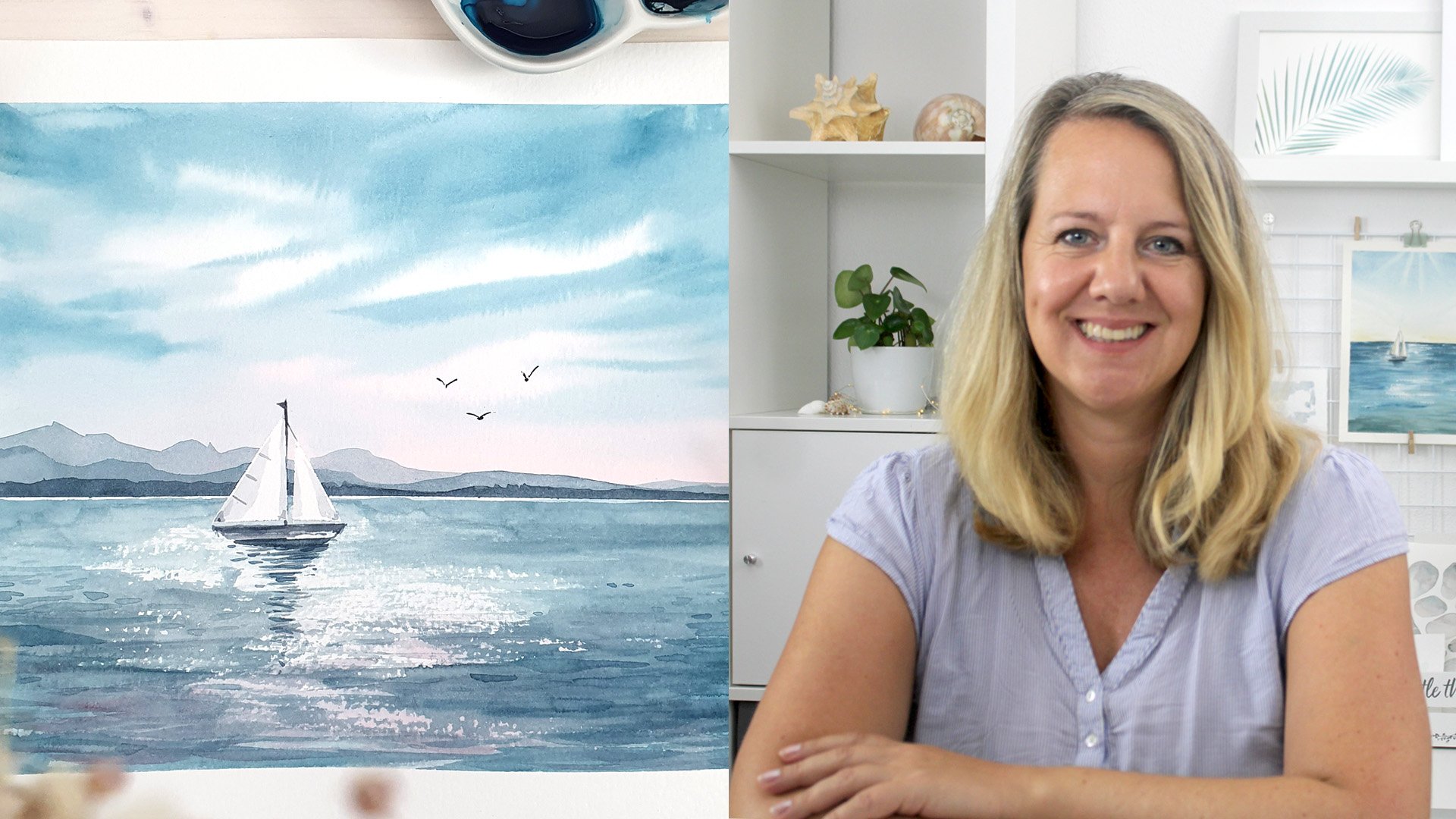
1. Intro: Are you ready for a vacation in the some? That is just not possible at the moment, then bring that summer feeling into your home to their own paintings. Hi, my name is Katrin Graff and I'm a designer from Germany. Being creative and drawing was always a part of my life. But when I started working, I lost that. About five years ago, I really felt that urge that I needed some creative balance to my day job at the computer. I started taking drawing classes after work. What I learned in these classes is that every artist has its own style of painting. In this class, I will give you an insight of my unique approach to paint with watercolors. We will be covering everything from basic brushstrokes to mixing colors and painting beautiful background gradient. As well, we will be exploring different types of shapes of palm trees, and in the end of this class, we'll combine them in a modern composition with an inspirational summer quote. Whether you are a beginner or an advanced artist looking to expand your painting techniques, this class is for you. Let's get started.
2. Class Project: Your class project will be creating a piece of art or a postcard to send some summer vibes. Choose two or three different elements from this class and combine them to one artwork. We will be drawing a beach scene with at least one palm tree. I encourage you to use your own reference photo or sketch. In a couple of many exercises, we'll cover every step so that in the final project lesson you're ready to make a choice and combine it all. You can combine it with a quote to make it inspirational, I will add a PDF to the bonus section. I'll see you in the next lesson where I'll talk a bit about materials.
3. Materials: Before we start, let's talk about materials. You need some brushes, watercolors, and paper. Good quality paper is really essential when you want to draw with watercolors. It can be rough and cold pressed, which has a structure in it, or really smooth like the hot pressed paper which can be great for hand lettering. Hahnemühle has a broad range of really good watercolor papers. For sketches, I mostly use the Canson Aquarelle paper where you can drip off easily the single pages. Whatever paper you choose, it should have at least 300 grams per square meter. For this project, I will use the Montval by Canson, which is cold pressed. I've been drawing for a while now and I rearranged my watercolor box with colors from different brands. When you first start out, your watercolors might look like this. Colors absolutely can make a difference. There should be from the discounter. But to begin with, you don't have to buy the most expensive colors. Especially if you paint larger scale images, it can be pretty useful if you buy your colors in tubes. I mostly only use these two in my favorite colors. When it comes to brushes, I really have far more than I actually use. I have two with the French binding that hold water really well and like to I use them for background washes, as well the flat brushes are pretty good for gradients. For most of my illustrations, I use round brushes with synthetic hair. They don't have to be very expensive. Just make sure that the hair flips back in the pointy tip. Besides paper colors and brushes, you need some paper towel or cotton cloth and some water and you're good to go. In the next lesson, I'll talk a bit about mixing colors and creating a color palette.
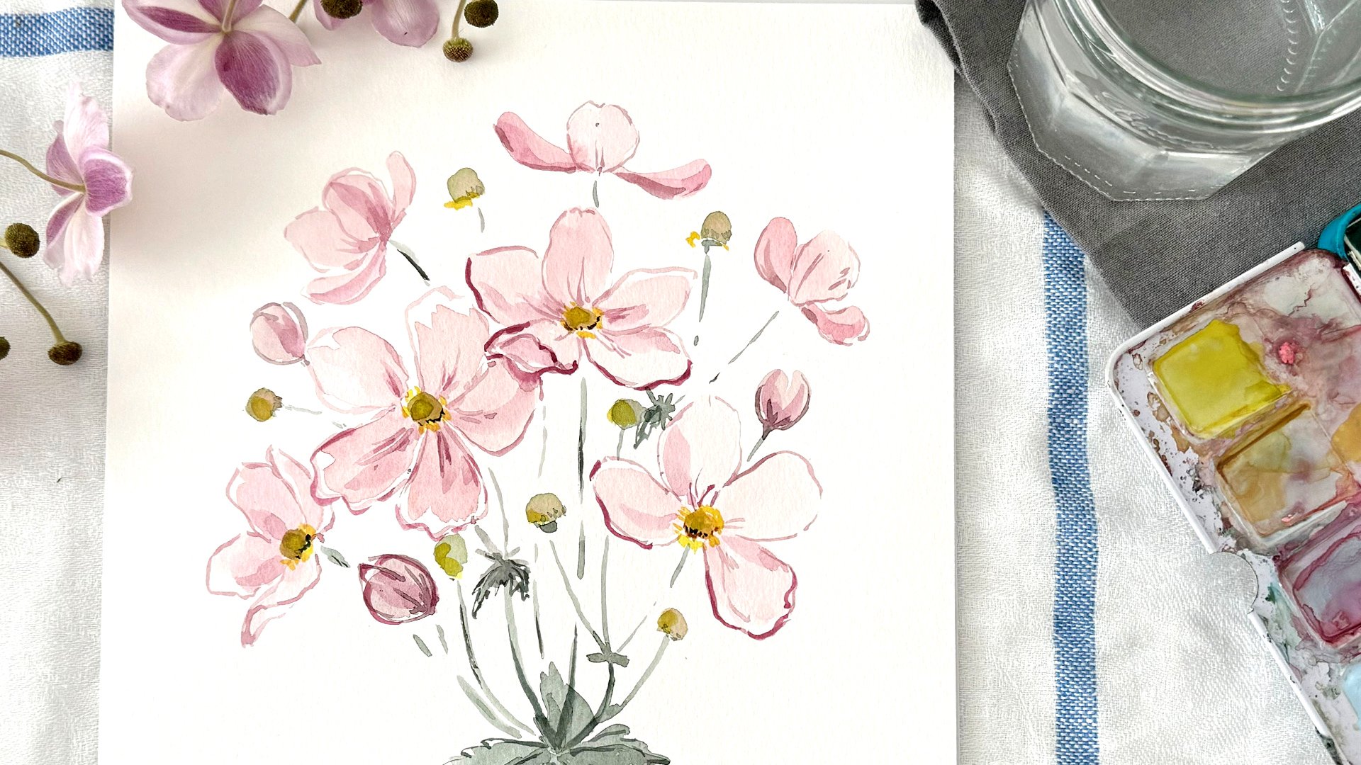
4. Mixing Colors: To create your personal color palette, you first have to get to know your own colors. Draw down each color on that little sheet of paper to see the vibrancy and intensity of the pigments. Then make your own color wheel, starting with the primary colors, and mixing the secondary colors. This is the watercolor box I am using. You won't find any real red on it because I don't really like it. I found it useful to have a Pinterest board to realize what colors you really like. By pinning images, the colors and motifs just come naturally. Now let's try a little color palette of greens and blues. Start with the pure colors, right off your watercolor box, and in the next step, we will add some different colors. Even though it might not look like the obvious choice, start with painting a little bit of red. The color gets more desaturated, and will have more natural look to it. Then try it with the light core, and see how the green is getting fresher, which is good for young leaves. Keep on mixing the colors, and you will see what a wide range of blues and greens you will get. Then test your colors on some leaf shapes. Try to create a color palette based on some desaturated pastel colors, and add just two to three vibrant colors. This is an example of how my personal color palette for the final project could look like. In the next lesson, we'll do some warm-up exercises with our brush.
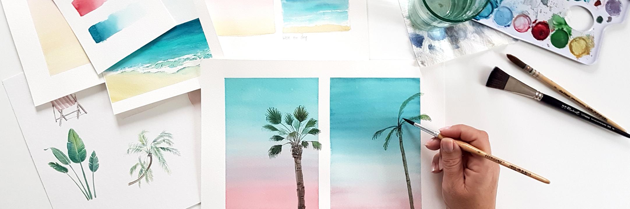
5. Brush Control: Before we start with the actual drawing, let's do some exercises. First we begin with a straight line. Draw the brush across the paper using your whole hand, not only the wrist. Here Here use a brush number 10 to show you the difference between a thin line and a full precious stroke. It has really fine tip, so you can vary your stroke. If you don't have a brush that goes this thin, just use a smaller brush for the very fine lines. Let's vary the strokes from very lightly to a full pressure stroke. Repeat this a couple of times until you've got a whole page of lines and variations. This pressure variation is needed when we draw a palm leaf. First, I start with the stem with just a single stroke ending in a final tip. Then we'll draw the leaflets. Again, we start lightly applying a bit more pressure in the middle part and end lightly. Keep practicing like that, I will speed up the video a little bit. I like to keep a leaf in a green tone, but vary the shades by adding some yellow, blue or red to make it more interesting. Sometimes your brush might not be loaded enough with water, so just pick up some more water and pigment and go over the leaf again. If you use too much water, your paper might warp and the pigment spread to the edges of the wet area. Now, let's try a wet-on-wet technique. First, apply some water to the leaflet, then pick up some color with fairly few water and draw over the wet area. Here's two different colors that I can now blend together, which makes it look really lively. On this leaf I just try the same effect with two other colors. Experiment with some different colors and you'll see that sometimes the pigments react differently. The next exercise is on wet-on-wet technique. Apply some water so that the paper has a nice shine, and then use a fairly dry brush with a lot of pigment and add to the paper. When I drew my line the paper was already too dry, so I had to apply some more water. We can see pretty good how the pigment spreads out into the wet area. Like with the lines in the beginning, try this exercise a couple of times with lines, and dots, and wavy curves on a wet area. As well, try this with different colors and see how the different pigments react. Get creative and play around with this technique. On the leaflets of the palm tree we need some final lines as well, so let's exercise them. I love when pigments blip into a wet area and colors blend together. In the next lesson about background gradients, you'll do so many exercises where you'll learn more about blending colors.
6. Background Gradients: In this chapter with background gradient, we'll explore some color combinations. Draw some rectangles on your watercolor paper, and we get started with watering down the rectangle and then adding color on top of it. While you go down, keep adding water, so the color would go lighter. For the small thumbnails, you can use whatever brush you like to. Here, I use a brush with a French binding that holds a lot of water, so I don't have to go into the water all the time. But for larger scales, I recommend a flat brush. Try your thumbnails with different shades of blue to see what effect it will have. If you like the appearance of clouds, take a dry paper towel or a cotton cloth and just take off some color. This is a really easy way to get some clouds. Let's try some different color combinations. Do a little research like on Unsplash. I added a little image here to see the gradient from turquoise to yellow and purple to pink. Start with the first color on top, and then add the second color on the bottom and go up sliding from left to right. If you have too much water in one area of your image, take a dry brush, and lift off the additional water. But since these thumbnails are more for trying and experiencing how the different color variations work, it doesn't really matter if there's too much water in one corner or too much color. For a smooth gradient, make sure you draw your brush across the page from left to right and back as well, up and down, to get a really nice gradient. If you don't only want the sky in the background, but you want mountains or a sandy beach, then the area has to be dry. Either you draw the sky, the gradient of the sky, and then wait till it dried, or you stop at a really light color and dry area, and then you can add a second color. It doesn't blend into each other, but gives the appearance of a sandy beach with a sharp edge dividing the sky and the sand. In this last thumbnail, we will try the wet on dry technique. Here, you don't apply any water to the paper, upfront, but just use your brush and color as you're used to. As you go further down, you realize that the water gets less and there is some white paper coming through. We want this effect for waves. It's like the white foam on the tip of the waves. I would love to see your thumbnail gradients in the project area. Now that we've got some nice background washes, let's move on to the next lesson. In the next lesson, you'll paint a beach scene where we will apply what we just learned.
7. Beach Scene: In the previous lesson about background gradient, we explored different color combinations especially for skies. Now that I have a larger area for the gradient, I use a flat brush. Now let's add a little beach scene. You can mark the horizon by a masking tape like I did or you just take a ruler and a pencil. For the form tapes of the waves, I use a white wax crayon. This is the easiest and fastest way, but you can as well use a masking fluid. Just be sure to let it dry or just leave some white spots while drawing with a fairly dry brush. For the water, we basically need two shades of blue, one darker blue, a tone of indigo for the deep water in the background, and one lighter brighter blue, a bit of turquoise for the shallow-water and the foreground. As we practiced in the lesson about gradients, I drag my brush back and forth and up and down to get a nice gradient. Where I drew the lines with a white wax crayon, the paper one pick up any watercolor. Now, that I draw over it with a light blue color, it already looks a bit like foam on a waves. To keep the water more depth, I go with the second layer and some details. For the water and the sand, I use my mop brush with the french binding that holds a lot of water. Later when everything dried, I will use a small round brush for the details. For the color of the sand, I use a mix of yellow ocher and some gray, so that the beach don't look too bright. For a nice gradient between the beach and the water, even paint over the water pit. When everything dried, you can add some more details. Make the horizon even a bit darker, add some structures of waves to make it look more interesting and lively. In the end, apply some depth by drawing some darker blue shadows along the white form tips. I'm looking forward to see your result in the project gallery. In the next lesson, we'll draw some palm trees.
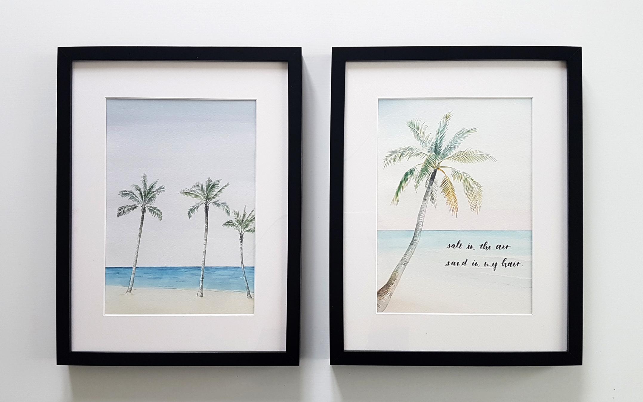
8. Palm Trees: Let's look at some different type of palm trees. Look at your own images of palm trees, or do research in your favorite research machine, or on websites like Unsplash where you can find a wide range of images. There are more than 2,500 species of palm trees called the Arecaceae family. They can grow as climbers, shrubs, tree-like or stemless plants. Not all palm trees are trees, and not every plant that is called palm is actually a palm tree like the Yucca palm. I still think it gives you this summer vibe feeling of a palm tree, so I'll show you a first version of how I draw a Yucca palm tree. Like I will do with all the following palm trees, I start with the stem, add some details before I come to the leaves. The leaves are basically just a straight line with a pointy tip. I use different shades of green that are put in different areas, so the tree looks more lively. Putting in some darker contrast helps to make the tree look more dimensional. Begin with one color and put it here and there. For the leaves in the back I use some more pigment, so they are darker and add a little bit of blue and brown. At the end apply some more details, and in the background some more shading. To sketch your image, your palm trees and landscape in advance is good to see if the composition works and if you want to add more or less. But when you start coloring with watercolors you should erase most of the lines, because once you draw all of it, it's really hard to get rid of the pencil lines. If you like the look of the pencil lines, that's fine too. But I would recommend to merely erase everything just so that you can't see really fine lines, and then you can start drawing. On this palm tree that looks like a pineapple. I applied the wet-on-wet technique that we already practiced in the brush control lesson. For the leaves, I'll use a lot of fine lines that I will show you later in the final project. Next, I'll show you a fern palm tree with palmate leaves that look like an arm with a hand and a lot of fingers on it. Again, I start with the trunk of the palm tree, put in some lowlights to the left and some highlights to the right. While the color is still wet, I put in some details with dark color to give the stem bit more structure. For the leaves I start with the long petiole or leaf stem, and then at the hand-shaped forearm or the circular forearm. In the end, I draw the little leaflets. In the middle of the leaf let us stay together and separate in the end, in multiple pointy leaflets. The ends are fairly dry, so I draw them in a brown-greenish color at the end. At last we have the typical palm tree. The coconut palm tree is one example here. It has a long trunk, and the leaves are very long and look pretty much like feathers. Instead of drawing every little leaflet, you can draw a more abstract shape of a leaf at some different shades of green to make it more interesting. In the end, add some darker details to give a bit more dimension to the leaf. On this leaf, I leave out the petiole or leaf spine in the middle because the little leaflets are thinner at the end and in the beginning. So it looks like as if there's no spine if you look from afar on the leaf. As always, I add some darker details on the trunk, especially where the old leaf scars are. Now we have a range of palm tree shapes to choose from. Choose the one you like. I will take the coconut palm tree for the final project. I'll see you in the next lesson where we combine the background gradient beach scene and country to one composition.
9. Final Project: Now, you will be creating your final drawing of this class. I want to encourage you to pick a palm tree you want to draw and follow along with me. Have your background gradient and beach scene from the previous lessons ready or paint a new one. While watching this class, work alongside with me. I will remind you of some tips along the way. You'll find my reference photo in the project resource area, just in case you don't want to use your own pictures. For the final class project, I repeat all the elements that we learned in the previous lessons. To prepare my image, I taped the masking tape all around. This is especially useful if you're working on a loose sheet of watercolor paper. You can stick it to your table or a drawing board. I just like the clean edges you will get when using the masking tape. As well, you can have a smaller area where you draw your image. For the background sky, I used a really light blue wash in the upper corners and some light pink for the horizon over the water. It's hard to see now, but you'll see it once I rip off the masking tape. I keep my background; the sky, water, and beach in pastel colors so that the palm tree, as my focal point, becomes even clearer. As a reference, I used a photo that I found on Unsplash. All images on this website are free to use for inspiration. I altered the original photo so that I got rid of all the elements I didn't want; like people, boat, and branches of other trees. While the color of the background is still wet, I can lift off some color with a paper towel. Like this, the trunk of my tree won't blue too blue and doesn't have a hard edge where the horizon is. After using a flat brush for the sky and a mop brush for the ocean, I now use my round brush size 8, but a size 6 should work as well. As in the previous lesson, I start with the trunk of the palm tree, drawing an irregular shadow on the left side. It might be different on your reference photo, so keep your image at hand and make changes as you like it. To keep the trunk some more structure, I add two little lines to give the impression of old leaves scars. I add as well some fine lines to the right of the trunk to define the shape. As highlight, I just leave some blank spots. I started with a light gray and add now a second layer with some color to make it a bit more realistic and interesting. In the last lesson I showed you, on the first leaf of the coconut tree, how to abstract a leaf by drawing a loose leaf shape and dragging out just some leaflets. On this tree, I want to keep this fine, crisp look, so I'll draw more individual strokes as leaflets. To choose the colors for the crown of the palm tree, I look again at my reference image. There are some dry leaves hanging close to the trunk, so I use a yellow for the first layer and then add some brown for the details. I keep drawing with the same yellow tone in different areas of the crown so that it gets a cohesive look in the end. Practice to observe and try to abstract what you draw. Don't draw everything you think is there. Take this leaf, for example. From the distance, you can hardly see the spine of the leaf because the style of the leaflets is pointy close to the spine and in the end, and broaden the middle part. You can now draw a very fine and interrupted line for a spine or just leave it out, and it would still look like a palm leaf. When the first layer of the leaf is dry, add some darker details. For our natural look, it is important that the strokes are too irregular. As I mentioned before, try to repeat the same color in different areas of your drawing. Drawing every leaf with many little strokes can take up a lot of time, but it also can be very relaxing. Since water color tends to look washed out once it dried, I now turn back to the trunk of the tree and add some last darker details. Ripping off the masking tape is always such a nice feeling when I see these crisp edges and the white framing. Coming up next is adding a quote. I'll see you in the next lesson.
10. Quote & Composition: Now that we have our background gradients, palm trees, and beach scenes, let's spice it up a bit with an inspirational summer quote. I'll provide a range of quotes in the project owner's area. For the first example, I choose a quote with only three small words; sea, sun surf. I will make these words the main focus of this image. We'll draw the words pretty large. While palm tree, only place the second row. If you haven't drawn the landscape, or palm trees yet, you can make little placeholders and arrange them. I use a transparent paper for sketching. It is easier to make a composition there than drawing on the actual background. Because if you erase the lines of your pencil, the watercolor paper would go rough and gets destroyed. If you like, draw down the words first on a separate sheet of watercolor paper, to see how much space they've taken. Because there are only three words and they are fairly short, I draw them all pretty much the same size. If you are choosing a longer quote write down the words, and see what's the main focus. Then give it a number, one. Then look for the second most important word, give it a two, and so on. Like this, you can find out which words to write larger, and which ones will be filler words. In my second example, salt in the air, sand in my hair. The words salt and sand could be priority one, and air and hair could be priority two. The filler words in the, and in my, would get the priority three, so they could be really small. To compose a quote, could fill a whole class by itself. Here, I'll just keep it simple, and write the words all in the same size. As I did before, I write the quote on the transparent paper and arrange it on the paper until I like how it looks. I always try to keep it away from the border, so that, if I frame the image, it doesn't get in my way. As well have in mind the white space, the space in between objects. If I have the position I like, I transfer it right onto my drawing. I'm so excited to see your final results, so please upload them to the project gallery, and if you like, leave a comment. I'm really looking forward to some summer vibes. In the next and last lesson, let's wrap up what we learned in this class.
11. Final Thoughts: You learned how to paint great background washes that you can apply in a broad range of landscape drawings. We as well explored some different kind of palm trees and how to draw them. In the end, you learned something about composition. Thank you so much on joining me on my first Skillshare class. I hope you had fun and I'll see you in the future. Don't forget to upload your class project to the gallery. If you like, share your work on Instagram so that I can feature you in a story.
 Katrin Kamides Studio, Watercolor Illustrations