Transcripts
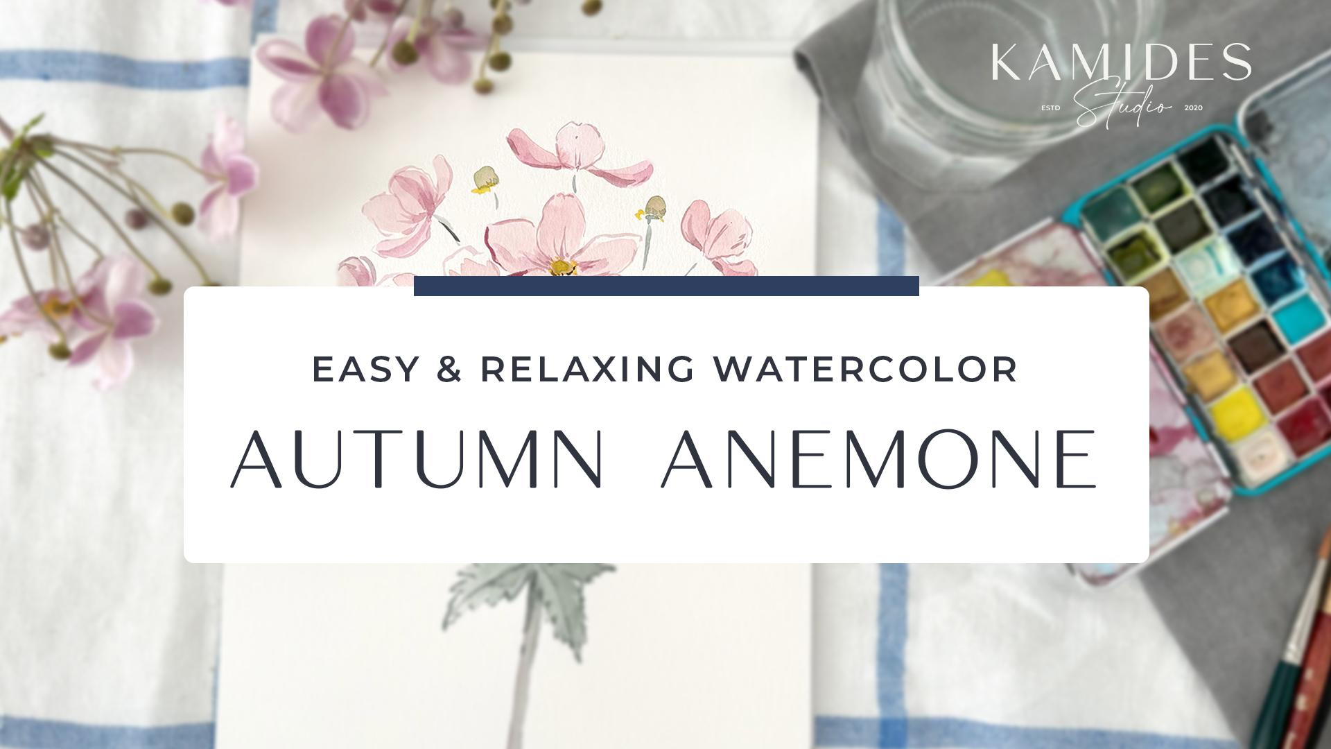
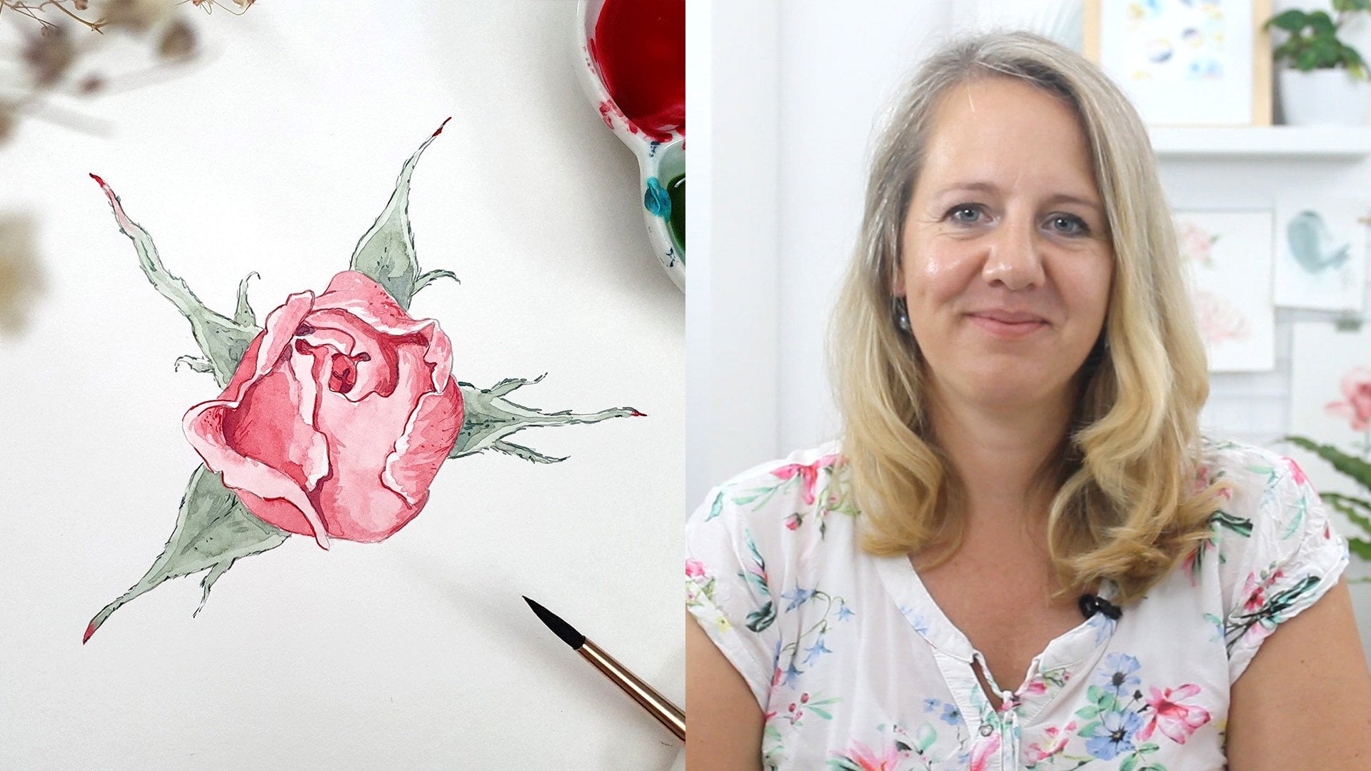
1. About This Class: Hey, there, if you don't know
me yet, I'm Karine Graff. I'm a watercolor artist and
surface pattern designer, and I live here in
Southern Bavaria with my family in a
beautiful country side. It's close to a
lake and mountains, and we have a nice
little garden. So for two years now, I was looking forward to that
class because each summer, these beautiful autumn
anemonies grow in our garden, and they get just hue. And so I want to paint them and make a little
class about it. I'm really excited about that. So I hope you'll join
me in this class. We will be doing some
practicing strokes before. And then I have like
three layers of first sh. Second player with some detail. And then really fine
details at the end. We have a nice little a bouquet of these autumn animalies, that you can gift or hang
on your wall or just have a practice,
whatever you want. It's a nice relaxing class. I'll hope you see in
class. Let's get started.
2. Material We Need: Before we begin painting, let's make sure we have
all our materials, starting with the water c paper. So I recommend cold pressed
and 300 grams/square meter. Which brand doesn't
really matter. I like anime, but that's because it's really
accessible in Germany, and it's a nice brand. This one is glued
in all four edges. Then I got a jar of water, my colors, I'd like to use this travel case
with a half pens. For me, it's like
a perfect size. I can bring it everywhere, and for me it's enough of color. So I got some brushes, a round size 12, round size eight, and
then a small one Also, I got a t to filbert brush. This one is size eight, but they also might
vary about the brands, and you don't
necessarily need this. You're pretty fine with three different sizes
of round brushes. Then grab some paper towel or
some old cloth to wipe off some excess if you make some plochs or
something like that, you can wipe it away. It. Then of course, we need our subject. I got my flowers here. You don't need the
actual flower. I will provide you
with the image. If you haven't
downloaded it yet, go to the project and
resources area and you should find an image there. This is a small example
from the very edge. But this also gives us the main characteristics
of the flower. It has a long stem here and
then has this pointed leaves, and from there, there are a
couple of stems separating. Then he can see it also has some flowers there and sometimes it will
separate here as well. I'll show you a
larger one because this is the one that
I'm dragging around. This is the one that
I have in the base. Let's get that out of it. You can see here as well. It has this really thick stated, then there's these pointy
leaves and then it'll separate. This one actually comes
from one above here. He can see it separates again. And this is dense on top here. But also, I want to give
you another example. Just to really get the
characteristics of this flower, so the really thick stem here, then the pointy leaves, and then it separates in a little bit of
curve and straight and then here are the top
parts like this one here. I think this is really
specific to this flower. And if we get these
details right like that, it already looks like
an autumn anemony. Let's get practicing
some strokes. Let's warm up with our brushes.
3. Warm Up Exercises: To warm up, I use the
largest brush first, grab a bit of water and mix a light pink color. I load it with a lot of water because petals
are really light. I have a small one here. This is nice to
see the shape is. Actually, let me grab a
little bit more pigment. For you to see, you
don't have to make it dark to see how our
form could look like. It's a little bit
of a hard shape, and you don't have
to do it right now. I will show you
later how we can add these details with
the small brush. Now just get the shapes. We can try different direction. I also want to try
filbert brush or tang. So let's get some more pig wind. Then we can get into
the more side view. So see what shapes you come up with your brush. Let's try whole blossom. And one other one, Let's mix our green. Let's try these little stems, they come down here
and the pointy leaves. You don't have to
make an exact shape. Triival form to get that right
and a little curved step. Also, I want to mix the greenish yellow
part to the middle. Let's get that right here. If they're like the
younger blossoms, they're quite yellow
in the center, and they get, the more
brownish they get. At this stage, you
can mix and match your colors and greens and pink. You can even use totally
different colors. Ad really up to you. It's nice to have the colors up front so that you can just paint and you're h with the
result later on because I think color makes a
lot of difference. I think for practicing, that's pretty much for now, just have my
smallest brush left, and this is for details, and I think this will be a
fun part because when we get to to add the shapes
that we really want. Even if we haven't
painted everything, maybe We can add it with
these details in the end. These are the brushes and
the colors I'll be using, and then I'll see you
in the next lesson.
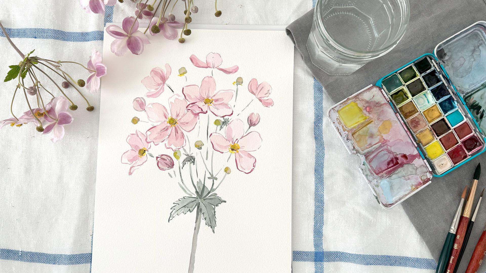
4. First Loose Layer: Now I turned my paper into
portrait mode for motif, and before you start, you can think a little bit
about your composition, where the, the main blossoms
go and where the stem is, and the pointy leaves, and maybe how many flowers
you want and a mix of medium sized
and smaller ones, and maybe some from the back, some from the side, so that it's not all
facing and boring, but it looks ale bit diverse. I'm mixing my color again. For the blossoms, first, I start with a
really light wash. Let's get some water. Really loosely. I want to just draw some petals. Think this could use
some more water. It's a bit hard to tell but they will lighter than it looks here. I switching to my just
to see how that works. Grab some of the violet
because I want to paint the back of
the flowers here, and they are a bit darker, as you can see here. They have these
three dark leaves. When they're still
closed, they look darker. Here, another one
in the back here. And then one large
and facing here, which is very specific is
that they have five petals. But if one of one petal, you can just leave it like that. Have maybe three or four, which looks interesting as well. Either you follow a
really nice image and just copy that or if you have a little
bit of experience, I think you can go really intuitively into it to painting, and it's important part
is that you have fun. Doing it. Maybe there's one missing, and then we fill it
up with little butts and this old stems. Okay. All right. For my blossoms, I
think that's enough and I will pick up the color
here. To make it lighter. Then I'll grab a little
bit of green and mix it to my pink, and with that, I'm
painting some closed puts. Still closed. So T and with some more green. So yellowish green. I can then paint the old blossoms where the
petals already fell off. This could even be a bit
more brownish than I did. Maybe I'll go over
just a bit of browned That's that. You can already see the bouquet on top
where all the flowers go and now can add the centers
of the flowers petals. Which has this first that the green center and
then the yellow around it. I can see here, it's
really quite nice. I think the pink and pink and yellow this
really n summer ipe to it. Now I grab my smaller
brush and get the stems. Now I have to decide where I
want them to come together. Maybe this one here. B. B. B. Then with a little bit of my purple. Make this dem at the bottom. Maybe. Here's something.
Some leaf missing. So some more. Now our leave. The large leaves. So this is our first part. I will let it now.
5. Second Layer: Now to the second layer. Because at the moment, it looks a little bit
flat and a bit dull. I want to add some shadows
and some dark parts. I mix a wash of a little
bit more pigment. It's than right now, and I'll do it to the
blossoms and the leaves. Let's start with the
leaves because they're fewer just on the center
and maybe one side, have a look at your leaves
where a natural shadow might be or just be expressive wherever you
want the shadows to be. It's really up to you. It's just to have a
bit more diversity in the range of light and darkness. I think here missing. Make another just like that. My blossoms. As I said before, I want the
back of these blossoms here. I can see it's sometimes
really like a streak. It's only half of the blossom, half of the petal, is dark. I these three, you can really
see how they were together, the outside is dark. This one here, and
then when it's open, the lighter ones inside,
the sunburn something. B. B. B. B. Then we can have a
look where we want some shadows within
the blossoms, maybe, where they might overlap or just where
the sun falls in. To give it a bit more dimension. Sometimes it's hard
to decide how much is too much and how much
more you want to add. You always can come back. I've finished that stage. What I can do now is adding
the details around here. I don't know how you
say that the sees around the center of
the blossom and I think we'll add some more
details in the next lesson.
6. Finishing With Fine Details: In our last part,
we add the details. For this, I'm taking my very small brush and
mix a highly satratd, pigment loaded wash
first with a pink purple and see it not that bright. Maybe some green
as well. Et's see. Okay. So, the upcoming
births blossomed, a little bit of shape to it. And then around my blossoms and like in the practicing part, you can now add the
shapes that you want. If something is more wobbly, or if you know the color before when
somewhere you didn't want it, you can now adjust it and make
the real the form that you intended to be and this part, you can really take your
time and draw the details. It's really more drawing,
actually than painting. Less loose painting rather than more detailed drawing
work at that stage. I try to give you as many of
my thoughts while drawing, of course, usually don't
talk that much while I draw. I hope that you can
follow along and Well, if you have any suggestions, just go to the discussion
area and or find me online. You can always t to me and maybe I can
make it better next time if you have questions about the brushes paper or colors. What I can say now is maybe you want to know
what color I use exactly, but I really couldn't
tell you since it's a wild mix match of colors. And I tend to just
put them on paper, see how they look and then, mix them so that I
just like the results, I would never know
what the name is and hardly know the brand is because I do use a
different couple of brands. What I sometimes
do is in for fall, I use different colors
and for summer maybe. For example, my turquoise, I just bought a new one, which is really nice in summer, but it doesn't give not
necessary autumn vibes. In winter, you can use it
for snow for this bright, y winter days maybe. And also for brushes. I have a couple of
different brushes. I use Princeton and
Da Vinci brushes, but it's hard to recommend something because in
different parts of the world, you get different brands were
living in Germany, we get That the Princeton brush
is a birthday gift. This one here it's a
natural hair brush. But I don't really think that it's if you're
really professional, maybe it does make a difference, but nowadays there are so
many good synthetic brushes. It's hard to tell. It's not only the brushes
are better or not, but also if you use, animal hair might not
be the most sustainable and it idea came. I got my details, but I feel like there should
be some more darker parts, just to make it a bit
more interesting. I have this flower petal
that's in front of the other, so I make this darker. I forgot I just put in
some water here. Anyways. That's water color. Let's make this d, it comes out more
front I'm here. Think it looks more interesting. Now what I haven't got so far is the yeller circles
around my centers. Now I will switch to yellow, and a little bit brown, and my circles here. I'll like how that
gives a pop of color. B. B Now, you can take a step
back and see if there's anything more
you want to add. If it feels like there's
something missing somewhere. What I see now, for example, I totally forgot the
details of my leaves. Of course, I will add them now. With the petals,
you can now make the outlines more detailed. Maybe some mod dots
here and there to give a little bit more structure
or texture rather texture and just a tiny bit more in
the centers of my blossoms. T colors. B. B. B. I probably could play around
with it a little bit more. But I think for now, that's it. And maybe I'll try and
have a look at it later. I think it looks good, and I'll leave it like that.
7. Thank You: So we reached the
end of our class. I'm really happy that you joined me painting
this beautiful flower, and I hope you like the result and you
enjoyed the process. If you like a snap a picture and upload it to the
project resources area. Also, if you like, you can up to social media, just tag me and let me know and I will share your
image there as well. I hope to see you in
another class five hour.
 Katrin Kamides Studio, Watercolor Illustrations