Transcripts
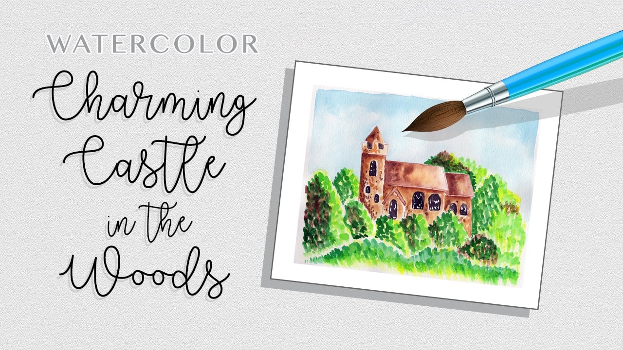
1. Class Intro: Hello. I'm Daniella Melon and author and artist here on Skill Share. In today's class will paint a watercolor stone chapel surrounded by trees and flowers. This intermediate watercolor project is created in steps to achieve a colorful and CompuServe painting. We'll build up layers of color using wet on wet technique and then and subsequent layers with lots of details. We'll use basic painting supplies like £140 watercolor paper and water color pigments. I've included a template of a lion art landscape, which you can download and print onto a piece of standard copy paper. Use this as a template to make your pencil sketch. Then start painting, enjoying the process of creating shapes and colors in your piece. For your class project, create your own stone chapel using the step show, take a photo of your work and posted in the project section. Be sure to follow me here on skill share to get notified of future classes and please consider leaving a review. Thanks for watching. Now let's get started painting
2. Class Supplies: The supplies for today's watercolor stone chapel class include the template, which you can find in the project section you can download that fit that on a piece of copy paper. I'm using a nine by 12 piece of watercolor paper, but an eight by 10 would work just as well. We'll have some water color pigments, which will include a list in the class, supplies some paintbrushes. I have four here, size 10 64 and one pencil and eraser, a jug for water. And then I used paper towels to pick up water and paint. In the next chapter, we'll go over using the template.
3. Using the Template: to use the template. I just take my light source and here I'm using a light pad. But you could use a window. A glass table with a light underneath it, or even a picture frame propped up with a light bulb underneath would work as well. You could also cut out the template and trace around. It is a stencil. I like using the light pad for a little more complicated designs. So what you do is you put your template that you've printed out onto your light source, whatever that might be. Turn on the light, and then you can put your paper right on top of it. And from there you get a faint vision underneath and then you'll trace where you want it. And this is where you can decide where you want your image in relation to your paper. So here I'll go just like this, and then I'll trace around the lines that I want using a very light hand, and I'll speed this up now from here. Your template. You could modify it because this is a chapel. If there is something that you want to put up top, um, say you want to put a cross on the top of the chapel. This is your opportunity. And likewise in the background. I'm gonna have some trees. So I'm just gonna cry to create an outline off where I want the trees to be the foliage. And then I'm just gonna sketch very lightly just around the edge and would have a little border here. And this is just a guide for me to know where I'm going to stop painting. So from here, our next stage will start painting.
4. Step #1 :Background Trees: for a first layer. We're gonna make a very light background, so just take some clear water. And this is our number 10 brush. And I'm just painting water in the background around the chapel. I'm just trying to saturate the paper. And so all this foliage will be wet and we'll start our preliminary layer. We'll go in, just create that outline. I'm leaving the walkway, Um, a new wet, so dried. But I'm just going in with the background right over here. So now that our papers quite wet, just gonna make some extremely light colors. So I'm just gonna take some of the stark green is deep green, and I'll mix in some yellow green with that and then with my brush and just gonna drop it in some spots where I want trees to be. And again, I'm just looking for a light color. I'm not saturating the paper with pigment, just giving some color, leaving white spots and then down here with this foliage of doing the same thing in the grass again. I'm just creating some white spots. So our base of paper is not completely white for our background is my goal here when I have that done, gonna take a little of this Van Dyke Brown and I'm gonna drop in some spots of that. So these are nice earth tones. And again, I'm just looking to add a little bit of background variation in color. Do it the bottom here of all my little sketches of my shrubbery. Then I'll put it on the walkway, rinse out my brush and just try and get a very light pigment down there. Gonna go around the edge of my painting with a wet brush just so that it fades lately and we'll let this cut layer completely dry.
5. Step #2: Background Chapel: so far our next layer, we want to paint the chapel, and we're gonna do this in a very subtle color. We're gonna do it with some grays in just a little bit of warm from brown. So I'll just wet the chapel, leaving the door dry, and then we'll just drop in a little bit of pigment. So I'm going to switch to a smaller brush my number six brush, and I'm gonna mix a little bit of this Mars black and a little bit of water. I want just a very subtle color and I'm gonna take this and I'm just gonna drop it along the edge and let it bleed into the rest of the chapel. We're trying to create stonework, and so to do that, we'll have a lot of layers, very subtle color and just a hint of what looks like the stone. I'll go in there what my brush with more water blended out just so I get a very light color and I'll leave that door untouched. For now, there are two layers here on this chapel, the first vestibule and then the actual chapel. But for this layer, we're just creating a little hint of color again. So we're not dealing with a white background. And then I'm gonna take some of this Van Dyke brown that we already next for the background lightened that up just a little bit. And I'll drop in some of that as well. Gonna go right over the bell area here, which is some of that Van Dyke brown for the background. And we just want little areas variation in color, considerably lighter than what we have for the background, and we'll let this layer completely dry.
6. Step #3: Background Door: now I gotta work on the first layer of the door. I want the door to be very vibrant. So I'm gonna take my number six brush, which has a little point to it. And I'm just gonna paint Clearwater on the door here. And unlike the earth tones and the subtle colors we used on the background and the chapel itself, we're gonna makes a nice, vibrant red. I'm gonna take Crimson Lake and mix it with some water. It's a nice, rich color, and then I'm gonna make some of this orange. It's actually over 1,000,000 Hugh, and that is a nice color again, this is just the first layer, but I'm going to start with the perimeter of the door and create that shape that we like. I'll get my brush in some water, get those colors blending. So there are no harsh lines. And then I'm gonna go in with just some pure color of that Crimson lake, and I'm going to stick that right on the edge right up against the building. And they'll do the same thing with some vermillion. Hugh, get some of that rich color and I'm just gonna drop that in the center of the door. Well, this is drying. Gonna switch brushes to my number one brush, and I'm gonna take a little that Mars black. Not a lot, but just enough to color my brush and still have control over it. I'm gonna just drop in some of that black right on the edge of the door. It'll create a nice shadow, and then it'll blend together. If I've added too much of this Mars black, I can go in there with the colors that we already did on the door and add more of that in. But for now, I like the way that looks, so I'm gonna let this layer completely dry.
7. Step #4: Adding Shadows #1: So now that our first layer of all our background was dry, we're going to start work on the chapel with my brush. I'm gonna take my number one brush and a sharp point, and I'm gonna mix some of this van dyke brown with just a little water and I want a sharp pigment, um, not so loose on the brush that it either spatters or is uncontrollable. And I'm just gonna outline the chapel here. So right on those marks that I made very light hand, I'm gonna go down on my pencil marks and outline the chapel because it's not a rich pigment , It should not dry too terribly dark. And it just gives us a border. And I lined the inside chapel is well, - with this color, I'm gonna water it down a little bit further, and I'm just gonna paint over my little corner stones that I have throughout the chapel architecture here. And this is a very pale color. It will just be a shade darker, maybe two shades darker than the chapel that we've made. And I'm gonna outline the Bellas well, the same manner I'll come down here. I'll do the same thing with light fixtures in the corner. Stones here is Well, could I just wet my brush? I haven't even lighter color of brown. And I'm gonna go in here in this little door frame again. I'm looking for a very subtle color and I'll let this layer completely dry.
8. Step #5: Adding Shadows #2: now I want to start work on shading deep shadows in my background. So I'm gonna use my number six brush with a sharp point and I'm gonna mix my color first. So I'm just gonna put a few dabs of water on my palette and I'm gonna make some of the sepia with some mars black Still wanted to look brown. But I wanna have a richness to that brown. Then I'll rinse my brush, and I'm gonna look at the areas that I want on my painting to have that nice shadow and I'm gonna work at them individually. So I'm gonna start here, and I kind of did a sketch of a treetop. So I'm gonna go underneath that tree top and again, I'm not gonna have a straight edge. I'm gonna have a very jagged edge. So with my point of my brush, I'm just gonna wet some areas over here. And I'm gonna be very careful to line the chapel with wet paint so that I have a nice, sharp edge to create the shadow behind the chapel. Do this right here, and I'm gonna go right down to this bush up against the chapel we're gonna create just some brush strokes of just water. So it's kind of hard to see, but I know that I'm creating an unnatural shape or a, uh, just a jagged shape here. Gonna switch to my number one brush and pick up that color we made. Move this to the side and I'm gonna very carefully drop that color right along the edge. Very wet the page because a nice bleed through, I'll go back in and just drop more pigment each time I'll start all the way to the top here , and I'll just add some flicks of shape of a brush for that shadow. I'll continue down side of the chapel here, right to that bush that we made. And then I'm gonna pull color, go back in and with my brush, I'm gonna push off again. Just trying to create some money shadow the next to the color remade. I'm gonna makes a little more of that black and I'm gonna create the darkest shadow up against the chapel, create a nice, sharp edge and then I'll just go in and drop some black and some spots. So it's mostly brown. We'll come back in middles, push outs and shapes. Then I'll go back in here, and I like these sharp edges. Just pull that out with some clear water here. I'm just gonna take the Clearwater on my brush, pull out some shapes. Now come back in with that brown and drop it in the wet area that we made on the paint on the paper. And there we have one spot of the background.
9. Step #6: Adding Shadow #3: So for the second area of dark shadow, I want to do it here, kind of from the tip of the chapel all the way right up to approximately here again, I'm gonna have an organic shape coming out from the edge here. And my lines are just gonna be little sharp spots that look like when we add another layer will look like leaves. The reason I'm doing this in sections instead of all at once is because I want to make sure that I have control over the dark color and I don't want it to sneer or blend. If you're very careful, you could do it all at once. Um, I don't like to take that risk at this point, so I'm just gonna go in with my wet brush and I'm gonna create that boundary where I want the shadow to be. And then I'm gonna create my shape but the point of my brush, Then I'll go in and I'll just wet that. So I know that the paper is nice and wet to take the color, gonna switch to my smaller brush my number one brush and I'll make some of the sepia and as well, Then I'm gonna go. I'm just gonna drop in the color and watch where it bleeds. Then I'll push that color up, create that nice, sharp edge of the chapel, and I'll let these colors do their thing over here. I'll just push some shapes out and I'll come back in and straighten this line. Make it nice and neat because I don't want it to end exactly right here. I'm gonna take it down just a little further. So I'm gonna rinse my brush and then with water, I'm just gonna go down a little and pull out my shape. We'll come back in, drop my color and pull it out here. I could go back in with some of that Mars black and just nearest to the chapel. I'll drop in some pigment. I'll let this layer dry, and we'll work on our last area of darkest shadow. Next
10. Step #7: Adding Shadows #4: for our last shadow in the foliage behind the chapel. Gonna wet my brush I'm gonna create a shape that approximately goes from the top of the chapel here on the left hand side just up a little bit into the treetops. It's gonna hug the side of the chapel, go down a little bit and then it's gonna come out here will be a bigger patch over here where disappears into the treetops. Gonna go in with my sepia dropping the pigment and again creating the outline of the chapel is well, there any spots that are too straight. I'll go in there and it will come on. This side seems that is dried on the paper So outlined my chapel Pull some color and then, with a clear brush, I'll go in. Just pull that color around the treetops, come down a little. Here is well And then with my Seppi, I'll drop that in again. I want to create a shape that looks like leaves the shadows of leaves and very thick, lush forest. Makes a little more of that brown and they will go in there with a little that black again closest to the chapel and then in just some spots here to give a nice variation, go back in there with my sepia and in the next chapter will do the shadowing for the foliage on the ground.
11. Step #8: Foliage Shadows: these 1st 2 flower beds are gonna have very little area of shadow, and then they'll be have bright little blooms on top of them. The next layer will have just a little bit of shadow on the bottom, followed by the last layer. I'm going to start with the layer in the background here, and I'm just gonna take a little clear water on my brush and just pull a little edge. This will help. Give me It will help ground the image as well as give me the border between the different layers of foliage we have, the layer in the background will be have a least detail and as we move forward, will get sharper and crisper. I'm gonna move. That sepia I'm gonna create is dropping that color in a very organic shape. Just like this. I could go back in, drop in a little more color, as I see, And then I will continue this on the next layer as well, leaving a little gap of completely dry paper between the different layers. Again. Go back in this one. I'll put some sections up top as well. So it's not just on the bottom layer and I'm gonna fill it in with blooms. Go back in here, drop in some pigment, maybe spray some pigment just like that. And then with a very sharp brush will just go in. Just like that. We'll do the same thing on this side. I clean my brush, go back in with sepia, drop in our pigment in our shape, closest to the bottom and then just a few little sections here and there in between the blooms that will make Go back here, pull up pigment. Start with water layer. I will go in and dropping that pigment. Come back down here, get it nice and darkest at the bottom to the simple sides. And then lastly, I'll go over this last bush in the background. What's unclear? Water. Don't take that sepia and drop it in again. I'll take the Clearwater, pull it up a little and let this layer completely dry.
12. Step #9: The Walkway: for this layer. I want out later Walkway. And then I want to create just a hint of trees trunks in the background here. So I'm gonna use my number six brush with some clear water. I'm gonna create a nice, thick layer on that walkway right up against the door as well, fulfilling the whole walkway and then with my smallest brush, my number one brush. Gonna take that sepia and mix it with that Mars black that we have that we used and very carefully and with a very light touch. And just get outline the walkway here, a good decree of jagged edge and let that color bleed in. We'll make another pick up some more pigment on my brush into the same thing right on the edge, all rooms, my brush. But I still have some pigment on it. It's just much lighter. And I'm gonna go in and just pull some color just like that, that I'm gonna going with a little bit of this yellow Oakar and that's just toe warm, that color up a little. So here I have the yellow Oakar and I'll mix it with that color. We already mixed that light brown. I'm just gonna pull some color there as well. Looking for a nice blend with a clear brush will just go in and see if there's any spots with harsh edges. And if not, I'll just leave it just like this. I also want to work on the background of the bell here, and I'll need my sharp small point for that. I'm gonna take some of that sepia that we have and because it's it will be the shadow behind the bell here of more trees just gonna create unusual shape behind it. I'll go in there as well. We're kind of work on the outline of the bell on the right hand side again. The only edge that's gonna be straight is going to be the one of the architecture of the building. But because I want to give the image of the leaves from the trees behind it and light peeking through, I'm gonna leave the left hand side. I'm free of any pigment at this point. Now I want to go in very quickly. Just add a little faint layer of tree trunks. So with my number six brush in a very sharp point I'm just gonna use some water and create the shape. So I'm going to start the top here. I have a kind of an outline sketch where the leaves will conglomerate, and I'm just gonna create the tree chunk so it's gonna be thicker at the base than it is at the top. And here I have a split tree on this side and on this side, I'm just gonna make two trees. Could be the slight angle and again, thicker at the base. It will make a small one right back here. My number one brush. I'm gonna go in there with some of that yellow Oakar and sepia mixture and drop color in just on the perimeter. I'm not worrying about filling it in, and I'll go over here is well, going there with a wet brush. Blend the color out in the center. They'll come back and pick more pigment up and make that small trunk while it's damp on the paper. I'm gonna go in with some of that sepia mixture in a very sharp point and just gonna outline the edge. I'll do the same over here. What? My brush and blend out that line that we need. I'll go back in there with that sepia and just pull some shape, making a little shadow here and there and let that layer completely dry.
13. Step #10: Adding Trees: So now we're gonna mix are three greens that we're going to use for our foliage. Once again, we're gonna work on not filling in the entire area with color. Gonna start with my number six brush. I'll make three little puddles of water on my palette, and I'm going to start with my darkest screen here, my deep green. And I'll mix that over here, and then I'll take my Veridian Hugh on the next one and my deep green again over here to achieve my darkest screen, I'm gonna mix a little of this crimson lake, and that gives me almost a black. I'll play around with adding a little more green to that again the deep green. And I get a nice, rich, deep green color for this one. With the deep green I'm gonna add of a radiant hue to that which lightens it up considerably. And then I'm gonna add a little of this yellow green. And that kind of gives us a very, um, bright, healthy, earthy green for this last meridian green meridian. Hugh, I'm gonna mix in Prussian blue and then some cerulean blue. So we're gonna get a blue green when we're done mixing in this one. So actually makes him deep green. And with that, there we go. So we have our three greens and we can play around with diluting them with water to get additional colors. Let's start with my deepest green, and I'm gonna start over here on this side with a wet brush. I'll just drop a little the water out of it, pick up my pigment. And I'm just gonna create some brushstrokes that start where our shadows are and move up in this kind of a pocket that we wanted to make of this tree. And again, I'm trying not to fill in the area, but to give the effect of leads. We'll come right up here up against my chapel. I like to do that in a straight line and then just pull my shape out from there, okay? And that will also be where the most richest pigment is. Overlap a little in the shadow here and just continue with my leafs. My leaves over here picking up more pigment each time have a few clusters thrown in. We want to get to the edge of here. I like to just push that leaf in all different directions. Make sure I have enough pigment on my brush Still leaving some of the paper exposed that we painted behind it, which gives a nice rich look because of the layers we've built. And then I'm gonna come over here and just slowly move down a tree trunk a little bit, do the same thing over here, but I'm gonna go on the smaller bush, and I'm gonna do about 2/3 of it starting at the base. And I'm just gonna pull my color straight up, make long strokes come over here on the side of the chapel. And then lastly, I'll do the same thing. Make a nice, sharp point, and I'm gonna go over here on my middle. Bush not continue my strokes from the shadow area again. I'm avoiding straight lines, Just kind of pressing them up, and we'll let this layer dry
14. Step #11: Adding Trees #2: next. I'm gonna go in with my blue green here that I mixed. So I have my wet brush pull some of the water off of it, and then I'll absorb the pigment with my brush number six, brushing the points. And I'm gonna do a similar thing. Gonna create shaping these leaves. But I'm gonna make little sections that I connect to each other. I want to go in there, make sure I have a lot of pigment, and I'm still leaving some space is well again. There's no straight lines. There's just these lines to indicate, like leaves on the tree. Take this color as well. I'm gonna move continuing the strokes that I made on this side of the bush. I'm just gonna create straight strokes here. And then it could do the same thing on this bush in the background Here, press down, create lots of points, pick up more pigment and continue this throughout this entire bush, looking for lots of texture and naturally where the point is, will create a little bit of a darker color. Got a rinse my brush and we take some of that really bright natural green we made and I'm gonna just blend it on the top layer here on certain sections of this tree that we just did with the blue green and layering the greens. Given nice effect, we still have some of the background showing through, which is also a nice look Could take the screen. I'm gonna create the strokes we did over here on these trees and a little bit in the shadows as well. Create a little appear nice little canopy of greenery. Go back in and I'll go right over that dark color remade for the shadow. And lastly, I'm gonna go in the second bush here, and I'm gonna create a shape, and we'll let this layer completely dry.
15. Step #12: More Work on the Trees: Now that our three greens have dried, I can see that I'm not really fond of this shape here. It's a little too square. So I'm gonna do is going to try and make some more of that color. So this is never six brush. I'm taking my deep green and mixing it, and I'll mix it with some Crimson Lake, get a nice dark color and now just gonna create some shape. Same thing on the side. Here, put a few little dark patches right on top of that shadow and some underneath here is Well , bring it up. I like the way that looks a lot better. We're going here and just add a few more individual leaves and just a few on this side as well. It'll tie it in and bring it all close. My sharp point. I'll just take a few little thin strokes and I'll do a few little get enough pigment on my brush. A few little dots back here. Well, let this layer dry
16. Step #13: The Blooms: So now I want to work here in this bottom flowerbed of creating blooms. So gonna go in here with some of this brilliant pink, which is just a light pink gonna mix it with some water, get a nice color, and then with my number one white brush, I'm gonna create just some shapes here where I'm gonna put pink. So I wet the paper. I'll go back in, pick up the pigment, and I'll create some nice, brilliant pink over here, the top of the area that I just wet on the paper following a very organic shape that I'm gonna go and take a little the Crimson lake when I have a lot of the color that I like down and mix it with that brilliant pink. And then I'm gonna go closest to the shadow. I'm just gonna drop in some of those little spots of color. So there we have some bloom, and then we have the two colors combining do the same thing over here little sections and let that layer dry
17. Step #14: Chapel Stone #1: now to work in our church. Take my large brush my number 10 and I'm gonna wet the church. And we do the just the background piece for now. So I'll leave that that entrance vestibule dry. So I'm just gonna re wet that paper. If I'm concerned about going to close to the foliage, I'll just leave that dry and going with a small brush toe, work the finer points. So now I'm gonna go in with my number one brush and take the water that we painted. I'm gonna paid right up to the edge of where I want the entire back of the chapel to be. This will help spread out the water evenly so that we can control in the next step. Go back in on in the areas that weren't what, sufficiently see if you tilt the paper where it's wet and where it's dry, it may not show up in the camera, but for your own knowledge, that's how you could do that to get a better view. So now I'm gonna go in there, and I'm gonna take some of this van dyke brown and mix it with a little bit of this Mars black, so I don't get terribly warm color. But I do get a little brown color and with a sharp point, I'm going to make horizontal little segments just throughout the chapel here. So it'll look like stone again. It will dry a little bit lighter than we put down, got a rinse off my brush And then we take some of this cerulean blue, make a little puddle of it and makes a little bit with the Van Dyke Brown. So we get a blue hue toe are brown and then I'm just gonna go in and add some little bricks of the blue as well and I'll just scatter these throughout and then lastly, I'm gonna take a little bit of puddle of water. They don't want to blend in with that. Pinks will take a little bit of the water and some gray. So I mixed some Mars black with some water, and I'm just gonna pull in some grey bricks as well. Just a few here and there gives it a little depth that was a little too thick. So pull that up once again, and I'll let this layer completely dry.
18. Step #15: Chapel Stone #2: so that I'm gonna repeat the procedure in a little front here at the vestibule. I'm gonna go in my chapel with just some clear water And what those areas. And then I'm gonna go in with my small brush blended out to make sure you have the proper boundary. And then I'm gonna add the bricks so I'll take some of this sepia water it down. It's very subtle. And just make some bricks. Then I'll go in with some cerulean blue in some of that sepia and pulse, um, blue bricks as well, and lastly, all going with some gray. So I take the Mars black in some water and I just pull in some grey well, at this layer completely dry.
19. Step #16: The Door & The Lights: So now I would like to work on the door using my number six brush. Gonna go in there. And you know what? That door down one more time. Gonna take a little of this. Crimmins and Lake create that outline again, letting it bleed into the center. This will give us a nice vibrancy. Pull it right down the center here where the door opens. I'll go in there with some of that birdie. And I'm sorry with some of the vermillion, Hugh, And add that as well. Could move on to a number one brush. And I'm gonna take some of this Mars black and mix it with this sepia. Get a nice dark color and I'm gonna outline these little lights here. So the vory light hand because create the shape of these little lights that we have on the church. But I'll dip my brush in water and let that color bleed. Do the same thing on the other side. I love that color bleed. Gonna go back to that door and with some of that Mars black that we mixed for the lights, Gonna put it on my brush and what's gonna go around the edge creates a shadow in the doorway, and it helps to make that color nice and rich with a very sharp point. I'm going in a very light hand. I'm just gonna create the door and then right up top here where the bend starts, gonna create a very fine line going right across, create two door handles, and we'll let this layer dry before we start adding the detail work.
20. Step #17: Details on the Chapel: now to start our detailed work. So I'm gonna take my eraser, and I'm gonna erase just that little pencil outline I had as a guide of how big I wanted my painting to be. Now, from here, I'm gonna take my number 10 brush. And I want to create a little wash of color in my palette. So I'm gonna take a little of this Van Dyke brown. It's kind of a warm brown without being too yellow and just a teeny bit of sepia. I'll add to that because it's a nice stone color, a little bit more water. And I'm just gonna go over my entire chapel with that color over the vestibular as well. I'm just gonna avoid the door and the lights that we had done. I'm avoiding the stonework, the bell here, just going over the stonework of the chapel itself, not the decorative elements. Yet while the paper is still damp. I'm gonna go in there with my, um, the number six brush, and I'm gonna take a little bit of this Mars black that we have put it on my brush very carefully. I'm gonna outline the vestibule. I want the color fought for on the outside of the vestibule. So I'm gonna go in there. Any spots that come on the best of the oldest dabbed with my paper towel. Come down here on the side as well. Go in there, get my brush. Nice and damp. Then blend the color out a little bit. So there are no harsh lines, just a little bit of shadow. Then I'll let this layer dry.
21. Step #18: Details on the Trees: gonna start at the bottom of the page here. Just wet some of that area where there is kind of, like a little bit of a lawn it will carry out in front of the walkway here. And then I'm gonna go in here with my, um, Floridian Hugh and a little dig deep green and also just a little of this yellow green and I'm gonna just drop in in long spots of it. Point, I'll rinse my brush with a damp brush. Just gonna pull that color out, make a nice, soft blending edge. Gotta switch brushes now to my number six brush, would it take that yellow green and mix it right in with that color that we mix just for that lawn. And with this color, I'm just gonna go over some of these areas on these trees. The tall trees. I will create a little bit of variation and that's what we want here. We can also change the shape slightly of the trees by doing this, come back in here, nix those colors again. It gets a little more shadow to the colors we applied, as well as adding another layer of warmth and I'm gonna take this my brush here. I'm gonna just create those strokes right over here on this foliage and right over here. And because we're building on different color layers, it looks a little different. And yet it it's very cohesive. It ties everything together, and I'll let this layer dry.
22. Step #19: Border Details: I want to spend just a little more time on my greenery in my background. So I'm taking my number six brush and some of that green that we mix the yellow green with the variety in Hue. And I just want to go in there with a little bit of water and create the background here, just adding it in, go right on top of the trees. And then I'm gonna go in there with a wet brush and just blend out that line. So it's not such a harsh edge on this side. I could go right over the Trias. Well, well, let this layer dry.
23. Step #20: Details on Door & Bell: to work in her door. Just put the final details on the door. We're gonna make some hardware. So I'm gonna take my number one brush in a little bit of this Mars black and once again will makes it a little sepia so that it's not pure black. It's got a little bit of warmth to it. And with a very sharp point, I'm gonna create the edges here of my hardware on the door. So just below this little line that we have here gonna create two little kind of like arrows creating a line here, do the same thing on this side create felt. And just from that and then down here, I'll do the same thing on the hardware, pull it out, creating little lines and then creating little minds over here with an extremely sharp point. Very barely touched the door. See if I can't get this point Nice and sharp. Just kind of create what looks like little boards of the door. Barely touching. I'll go back in with just a little bit of water on my brush. Can make these little handles a little bit bigger. Now to work on the bell. Use that same color and will create the outline of the bell, adding a little more sepia to it. So I have a lot of pigment create the outline of bell. Pull that color up from the bottom right over here. Now reads off my brush. Take a little of this Van Dyke brown. It'll blend all these together with some water. Gonna go in here with a little the deep green, a little background, and look this layer completely dry.
24. Step #21: More Details on the Chapel: now to get a nice effect on the chapel. Gonna take me number one brush. I'm gonna wet it over here on the palate, and I'm gonna take some of the sepia and some of this Mars black What? A little more water to that. A little more sepia. And I'm gonna have a very sharp point of my brush. And I'm gonna be very carefully outline the exterior of chapel again. I don't do this very slowly. This is the only edges that we want to be nice and sharp or on the chapel. A little. Flip this over and I'll do the other side here. This helps clean up any pigment that ran. So there we have the outline of the chapel, and now we're gonna work on the vestibule. We already did a little bit layer of shadow behind the vestibule and now outlined in the doorway as well as the bell. Will it? This layer dry and we'll come back with a few more details.
25. Step #22: Final Details: so I want to add a little bit of a archway here on the door. So I'm gonna take that same brown that we outlined the painting with and starting the center point is gonna bring two lines down just like that, with a very sharp point of my brush. And then again, straight down here, they don't have to be perfect. And then I want to do the same thing on the top of the bell to tie that in. We're gonna get a nice sharp point with my brush. I pull that together, gonna take some of this pigment, wet it down and just pull some shadow out from the side. Here. This vestibule don't go in with a wet brush and just blend that edge out even further. And I'll do that on the other side as well. Then I'm gonna take some of this color, water it down just a little bit, and I'm gonna add a few more bricks here and there throughout my chapel could go over existing bricks and I'll do the same thing on the best of you'll. And now, instead of going with a deep blue like we did before, I'm gonna mix more of the gray with just a teeny hint of blue and I'll make some gray bricks as well that will blend nicely and create a nice layer over the existing layers of bricks that we have. It will also add some or interest to our chapel and for our last detail. I'm gonna take some of that gray, that blue grey, mix it with a teeny bit more water. And I just want to create a little shadow on these cornerstones here on both the bell area and the doorway. Just gonna create a little shadow again. Soft edges, but just a little discoloration. So it's not completely perfect. And there we have our chapel.
26. Class Wrap Up: here we have our watercolor stone chapel that we finished. We use lots of layers short little timeframe spent on each layer, but lots of layers to build up the color. In the chapel alone, we have a number of layers with a number of layers of brick, and because we have so many layers of brick and so many layers of color, it creates a nice rich image. We have the same thing with the foliage in the background. If you think about it, we didn't use a number of shades of green. I think we only had about four, but because we layered them and because we added them in steps, it produces a really rich image, I hope. Youll try your hand at one of these stone chapels, and if you'd like to vary it, please feel free. You could change the color door, the color brick or even the foliage. Here's one that I did. The foliage is a little vibrant. A little more yellow is placed in it, but it's the same template, and I also incorporated that yellow into the stonework. Here I created a much thicker outline and a much darker image up against the chapel with more greenery for shadow instead of the brown. I hope youll try your hand at one of these and post your work in the project section of the class. Please be sure to follow me here on skill share to get notified of future classes. And please consider leaving your review. Thanks for watching.
 Daniela Mellen, Artist & Author