Transcripts
1. Intro: Still lives are one of the
most accessible categories for paintings because we can literally turn anything
around us into art. Hey, there. I'm Tanja. I'm an artist based in Denmark, and the main focus of my
work are still lives, usually centered around food. In this class, we'll
be painting one of my favorite types of
subjects, a metallic surface. In this case, in the
form of a spoon, we'll go at the entire
process, including the sketch, picking out colors, a
few additional tips, as well as how to paint
the spoon step by step. So if that sounds interesting to you, let's get right into it.
2. Supplies: Let's have a look
at the supplies. You're going to need a
pencil for sketching. I'm going to be using a
0.2 mechanical pencil, and in order to
achieve darker values, I'm going to be using
a six B as well. You're going to need an eraser. I'm using an mal eraser as
well as a needed eraser. We're going to need some paper. Of course, we're going to
need some watercolor paper. I'm going to be using Ash, 300 SM cotton paper. You'll also need some paper
for sketching and a study. I'm going to be using a
sketchbook for this study, as well as a loose sheet to more easily transfer my sketch
onto my watercolor paper. Going to need tape to tape down your watercol paper,
masking fluid. And with this, I'm also
going to be using a dip pen. But if you don't have
a dip pen, you can also use your preferred tool. We're going to need some water, a cloth or something
to wipe out brushes, as well as some tissue
to help get rid of excess water
and to lift paint. For brushes, I'm going to
be using two main brushes, a size 12 and a size six. You may also want a lighter
brush for the background. I'm going to be using a size 16, as well as a 1 " flat brush. But one brush will do. Last couple of brushes,
I'm going to be using an old one brush, a scraper or flat
brush for lifting. A Mel means bunch
on magic eraser, also for lifting and a separate
brush for mixing paint, so we don't wear down our
good brushes too quickly. And of course, we're going
to need some watercolor. We'll go with the exact
colors in the class. So get out your palette
and let's get started.
3. Understanding Our Subject: Okay, we're going
to do some time traveling, so stay with me. We're gonna travel back
in time all the way back to a year where they
couldn't afford color, and the world was
black and white. And we know that was the case because we've got old
movies to prove it. So, now that we're there, please ignore my
terrible sense of humor. But are you able to tell which one of these is the metal spoon? Hopefully, we all pointed to
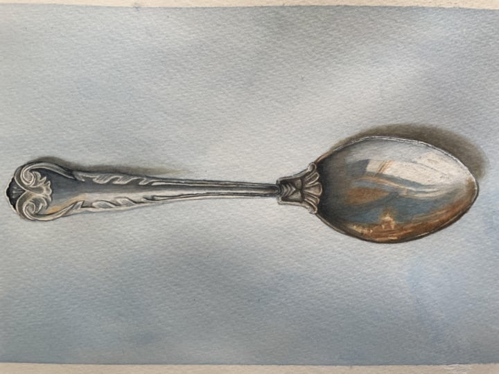
this one. And why is that? Most likely, it's because of the way it reflects the
light and the surroundings. We know and understand that
that is how metal behaves, whereas the plastic
spoon doesn't reflect the surroundings
the same way, and it doesn't bounce off the
light the same way either. It's important to note that not all metal objects are go to reflect the
surroundings the same way. Surfaces that are very
smooth and polished are going to reflect things
almost like a mirror. Think of something like chrome. Lots of hard edges and crisp
detail where something like brushed steel or aged metal
tend to have much softer, almost blurry
looking reflections. So when painting something,
in this case, metal, not only will understanding our subject increase
our chance of success, but it can also provide
us with more freedom in terms of what we want
our paintings to look like. We're going to do a
study to go a few of the key points that can help when painting realistic metal. So get out your sketchbook
and let's get started.
4. Shape & Structure: We're going to begin by
creating an outline. It does not have to
be perfect and it doesn't have to match
the reference exactly. Any generic spoon
shape is perfect. We're going to start with
an upside down egg shape, something like this. And then depending on
where we make the cut, this egg shape or
the base is going to be about one third
of the total length. So the handle is going to be about two times the
height of the egg. So let's add in the handle. Approximately like this. You don't need to make a tent. We just need the rough shape. Gonna finish off the shape and maybe make a couple of adjustments to at
least even it out. Okay, great. The first step is understanding the form.
And what does this mean? It means we need or at
least it helps if we have a basic understanding of
our subject and the shape. Because if we were
to draw, paint this, having absolutely
no understanding of the underlying structure, we may have a hard time
creating a convincing replica. Of course, if you
have a reference, we could just copy it exactly, not worrying about any of this, but understanding the Y can help us so much
in our art practice, and we can transfer
the knowledge onto different subjects. It doesn't have to
be just spoons. So just like we
know that a box on this case a square
has even flat sides, and we know that a sphere
is rounded like this. Going all the way around, which means that any shading or highlights are going
to follow this shape. And so for the
spoon in this case, the most rounded or I guess concave point is
right around here. That doesn't necessarily apply to all spoons around the world, but it's fairly standard. And so the shading
will have to follow a grid that looks
something like this. Maybe not 100%, but
something along these lines. It's just an approximation. So let's go back to our spoon. Now in the reference photo, the light is coming from a
window from this direction. Hitting the handle
right here and then casting light onto the base
of the spoon, as well. Reflecting the window itself, where we have that
super bright highlight. So if we add some basic shading, we're going to keep
it lighter right here at the start of the handle. And then as we move
closer to the base, what we're seeing
is a reflection of both the wall
and the ceiling. So we're going to gradually
make that dagger closest to the base where the
handle is the most narrow is also where the
handle starts to curve. And so naturally
because the side or plane of the spoon is
facing away from the light, we want this to be dagger. Following the form
of our subject, and then move on to
the base as well, adding shading
around this shape. And then when looking
at our reference, we can see that the darkest
points or sides within this area are the ones that are facing away from
that light source. So we want to make
sure that our values here are deeper or darker. It's worth noting that
what we're seeing here may not look like this
in every situation. So if we as an example, had multiple light sources coming from different
directions, we would maybe not be able
to see as much of this kind of natural looking shading that follows the shape
of the subject. But what we can be sure
of is that what we see on the surface of the metal is going to be a reflection
of the surroundings. So if we were to paint this boon within
as the life scene, we can take some creative liberties and make some changes. We do need to make sure that any changes we make
to the shading or the reflections
need to make sense according to the scene or
setting the spoon is in. So if we, as an example, put the spoon in a
really moody scene in a dark room only lit
by a single candle, we're not going to have a ton of insanely bright reflections
bouncing off left and right. And likewise, if we
put the spoon on a picnic table at the
height of summer midday, it probably wouldn't
make sense to paint the spoon with no reflections
of light whatsoever. Once we've got this, we can
move on and take a look at the next key point when
painting metallic objects.
5. The Importance of Value: Okay, we've got a spoon, but it doesn't necessarily
look metallic. And even if it was made
from a different material, it still doesn't have a lot of depth to really drive
home the point, let's ad in the background. The next key point is the
importance of lights and docks. This is one of the
most common problems across all mediums, no matter the subject, the lack of contrast or not
having the correct values. And if the values off, it's going to look
less realistic. Let's do an experiment. Let's add in all the shading
and all the details, all the reflections we
see in the reference, but keep it purposefully
very light. I'm going to begin by marking off the reflection
of the window. I'm not going to worry about the fact that I have some
shading within the shape. I'm just going to say
that's completely fine. And then move on to the
rest of the shapes I see. We've got the dc over here forming almost like a
triangular shape in the center. We still don't have to
worry about perfection. It doesn't have to look neat or polished. It's just a study. We've got a curve right
here near the handle. And then some deep
values up here as well. Gonna go in with some more
shading here. Done. Okay. This looks better
than it did before, but it doesn't exactly
pop off the page and it doesn't look
all that realistic. It's kind of flat. Maybe if we add in the shadow
right here, right? If anything, that made
it worse because it made this boon melt into the background and
stand out even less, and we've got no real
sense of light and shadow. So let's make sure we work those values to the same level we see in our reference photo. We want to have both
the brightest brights and the darkest darks. Don't be afraid of having
intense contrast and areas that are sub dark almost
completely pitch black. I know that especially with
medium like water color, people tend to paint too light. And a part of that comes
from the fear of not being able to paint oid with
an opaque lighter color. But in order to really breathe
light into our paintings, we need to utilize
all the values. At least if our reference
or model calls for it. There are always going to
be exceptions to the rule, but this is not one
of those cases. We do see those super dark darks and the super bright
brights in our reference. And by doing a study like this, we don't have to
try to imagine what something will do to our
sketch, drawing or painting. We get to see firsthand what
a difference it can make. And you can even do a
couple or a few studies, each of them being slightly different so you can see
which one you prefer. It doesn't have to be
anything big or advanced. It can be small
thumbnail sketches, something like this, but
on an even smaller scale, where we get to do a value
study because it'll give you a chance to play around with
softer or harder light. More or less dramatic
looking shadows. Play around with
the composition, see if you prefer a
different crop or test out different color
palettes or color schemes. You could make the argument that this type of prep work takes too much time and it's much more fun to get started
with the actual painting, which may hold some truth, but is it better to end up with a painting you're
less happy with or work your way through a painting only to find that
you're not happy with the composition or
the colors are not working or any number of things? And in the end, you
end up starting over and you wasted all that
time on the first painting. Well, wasted is a hsh word. I don't think time has
ever wasted creating. Any failed painting is
an opportunity to learn, and it's still
experience gained. But hopefully, you see my point. At the very least,
if you're someone who struggles with your
paintings being too light, do a simple value study before you get started
with the actual painting. I think it's worth trading in
a few minutes of your time in order to potentially save
a lot more time in the end. If you're someone who
tends to paint too light, there are a few things
you can do to kind of manage that fear or
to help improve. I already touched on this, but the first one is to do
a study just like this. It doesn't have to be the
same medium that you're going to be working with
on your actual painting. So in this case, we're using
graphite for the study. But if it's something
you struggle with and you're going to be doing a painting in watercolor, you may want to do the study
in watercolor as well. A study is a great way to test different
techniques or colors. It's a great way to
problem solve beforehand, so you've got everything
figured out before sitting down to do
the actual painting. Another tip would be to use
a color of value isolator. We used one of these in one of my recent
portrait classes, so I'm going to link that
in the discussions below. But what you want to do is
take a piece of scrap paper. I recommend using the same type of paper that you're
going to be working on, especially if using watercolor. It doesn't have to be a large
piece no more than the size of a credit card and cut
a square in the center. You can then use
this to hold it or your reference and isolate
one color or value at a time, enabling you to directly
compare that color or value. To your paper. And then if you hold it up over
your painting, you'll be able to see how
close or how far off you are. Still painting too light, what I'd recommend is find the point on your painting that is going to be the darkest, so the darkest point
in your reference, and go in with that color first because then everything else
has to measure up to that. And we can see from this study how much of a
difference it makes. It's the same spoon, the same drawing,
different values. So the second point
on our checklist is going to be value. Let's move on and take a
look at the third key point.
6. Understanding the Reflections: Third and final point
on our checklist is kind of a two pattern,
understanding the reflections. And this is also one of the
many advantages of taking your own reference pictures because if you're
using a stock image, you don't necessarily have
access to this information. And granted, it's not an absolute necessity in order to be able to paint
something, but it can help. And so what I'm referring to is the fact that metal
or in this case, silver or steel is
very rarely just gray. So if we remove the
black and white filter, we can see how it reacts to all the surroundings
around that object, which also ties into
the second part, understanding the
reflections themselves. So we've got the light coming in from a window up
here and going down, giving it a cool,
almost blue tone. And that blue can also be found on the base of the spoon
around the center. On the opposite side, we're starting off with
some cool gray, which is from the
walls and ceiling. We've got some
beautiful purples, which is due to a
pink kitchen towel, some more saturated glues, which was from a bottle
of dishwashing liquid. And finally, we
have some yellow, peach and green tones
coming off from the tap and the
way the tap reacts with the surroundings as well. Let's have a look at the
reference we're gonna be painting. Same thing. We got the light
coming from up here, but this is a different window. This is in my studio. So up here, we have the
reflection from the sky, and we can see that same blue reflecting onto the
base down here as well. But then up here, we
have some yellow, which doesn't quite make sense, considering the sky is blue. This is a house across
from my window. But because the surface I was taking the picture
on was tilted, it managed to get
into the photo, and the reflection from
the window is being cast diagonally down to
the base right here. Over here, we've got some
gold tones coming in, and this is because I put a reflective screen
next to the spoon. And this is another advantage
to taking your own photos. We can manipulate
the surroundings in any which way we want. And in this case, I wanted
something more going on other than that one highlight we
see from my ceiling lamp. Something else to note is that, due to the positioning
of the gold screen, it didn't necessarily cast a reflection onto
the entire spoon. So when painting this spoon, that's something we can
choose to adjust to make that golden tone go further down along this
line. Or up here. And that screen also
affected the shadow from the base of the
spoon because the gold is shining up onto the
underside of the spoon and the underside of
the spoon is then casting that color
back onto the table. When looking at the reflections themselves, other
than the window, we see the corner of
the room around here, and then we have my
arms and my camera. Though this may be a very
straightforward example, this could be one
of the reasons for why it's good to
understand the reflections we're seeing because we can
choose to edit things in or out as we're painting or make adjustments to
some of the reflections, but still having
them make sense. So as an example, you
may not want to move a portion of the
corner of the room to one side without moving the
rest of that reflection because that's going
to create some weird cut off warped situation. But we could choose to
surgically remove my arms. And then if that space
feels too empty, we can put in a different
object instead, which is exactly what
we're going to be doing. So if you're ready, let's move on and get
started on the sketch.
7. Sketch: Going to provide my sketch
for you to use if you want. You can also trace a reference or if you want to
create your own, I'm going to go
through how I approach sketching something like
this for a painting. So going back to the egg shape, I do find this is
the easiest place to start with something like this because this in
itself is a fairly basic shape. So we want to try and get it as close to the shape we're
seeing in the reference. Then from here, just like
with the other spoon, the base is about one
third of the total length. So the handle is going to be about two times the
length of the base. Next, we can mark of a
center line for the handle. No need to use a rule of this. It doesn't have to be perfect. But having this makes it, in my opinion, at least, easier to see if both the right and left side looks
about the same. Even if you don't
manage to get it to look exactly like
in the reference, you do still want both sides on your spoon to be symmetrical, because really the
most important thing here is to make a spoon
that makes sense. It's far less important if you can tell exactly
what spoon it is. Once the handle is in place, we can add the, I guess, connective joint down here. Not sure if that type of
embellishment has a name. And then once we've
got the rough shape, we can move on to
the second pass. We're going to do
three passes in total. For the second pass, we
want to refine the shape. So starting down with the egg, we want to just correct
the shape if needed. So we want to really try and copy the shape we see
in the reference, make it taller, shorter, wider, narrower, et cetera. And we also want to
try and even out the shape if it isn't as
symmetrical as we need it to be. Simplify it as much as
you can in your mind. Try and break it down into
familiar looking shapes. If something looks like a
triangle or a figure of eight, use that as your starting point. Start by getting down the most basic measurements
or dimensions. Then build onto that using larger shapes and work your way to smaller
and smaller details. I'm going to draw what
I see in the reference, but the great thing
about drawing or painting something
like this is that it doesn't have to look like the reference
photo at all. If we wanted to, we could
make up our own spoon design. It doesn't matter. So if you want to
change the shape or the length of the handle or you want to
change the design, this filigree
embellishment type stuff, no one else is going to know. I mean, maybe unless we have some insane spoon collector out there who knows that that
design doesn't exist, but I doubt that's
going to happen. And even if it did, who cares, we're allowed to
design our own spoons. So don't feel discouraged if your version is off from
the reference picture. The most important thing is
to create a spoon that has a fairly straight
looking handle and a spoon that is fairly
symmetrical on both sides. Once again, just like with the reflections and the
colors and everything else, as long as things make sense, we can do whatever we want. You merely need to fulfill the criteria for
it being a spoon. So you need the base
and you need a handle. While refining the
shape for the handle, we also want to start plotting
in some of the details, at least in the sense that
we can start breaking this larger shape into
smaller sections. That's the main goal for
each pass we're doing. Each time we want to break a larger section into smaller and smaller more
manageable portions. Because things are starting
to look a bit messy, I'm going to use a
needed eraser to get rid of some of
the pencil lines. We're not looking to erase them. We want to be able to see
them for that third pass, but we also want to be able to see what we're doing and having this many lines is just going to end up looking
super confusing. The third and final pass is the one that's going
to take the longest. This is where you want to
go over everything again. Make those final adjustments. So if the shapes are slightly uneven, we want to correct that. And then we want to add in some of the final
details as well. And you can add in as many or as few details as you'd like. You want enough
guidelines to feel comfortable moving on to
the painting process. For me personally, I would typically keep a
sketch like this, so for something like a spoon, more simple than what
I'm doing in this class. And I'm going to be honest, part of that is due
to me being lazy. I mean, we all know the painting
process is the fun part. But I also know I have the technical skill needed
to go in with my brush and paint and finish up those details without having
an underlying sketch. It all comes down to
your comfort level with different techniques, but also just
personal preference. Every artist has their
own way of doing things. And no matter what approach
you decide to take, I think we can all agree that the most important
thing is that we're sitting down to create
something because honestly, what could be better than that? But also, while on the topic, I am a big advocate for
practicing the fundamentals, one of which is drawing because having the ability
to draw is going to give you so much freedom in
return when it comes to making small changes
or adjustments, combining different
references without the use of photoshop. Even making things
up on your own with very limited or no
use of references. It's always worth investing some time in building
a strong foundation. You want to keep looking back and forth between the sketch and the reference and follow each shape you see as
closely as you can. Although I'm sketching
out most of the design, I am going to add in
the final details after I've transferred
the sketch onto the watercolor paper
because that way I'm able to give you the most clean
looking version I can. So if you want to use my sketch, you can find it in the
projects and resources tab. And if you don't want to
use nomine or your sketch, you of course more than free to trace the
reference as well. Finally, we're going to
go back to the base of the spoon and add in
some of the reflections. I want to say the accuracy
here is less important than for the remaining portion of the spoon because we don't
have to worry about symmetry, and any reflection
we're seeing is already a warped
version of reality. The most important
thing in this area is to have reflections follow the planes of the spoon or those curves we saw in the
grid when doing the study. Once you happy with your sketch, you want to transfer it
to your watercolor paper, and then we're going
to move on and pick some colours. Okay.
8. Color Palette: Let's have a look at the calls
we're going to be using. We don't see as many calls
in this photo compared to the other spoon
because this one was shot in a much more
controlled environment. I'm going to show you
the calls I've chosen, and then we're going to have a fun little chat about paint. So you can decide which
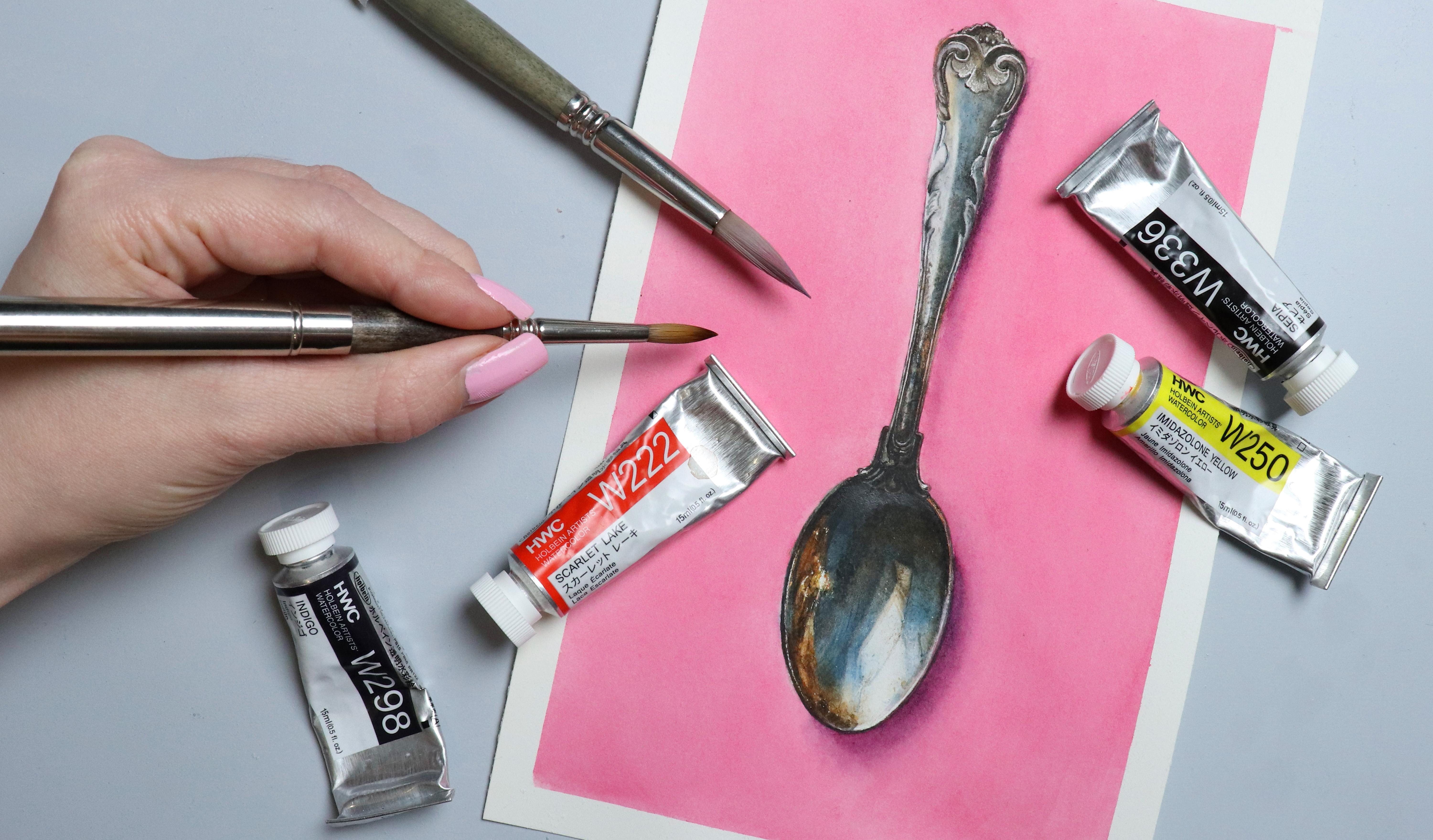
ones you want to use. So the calls I've picked Scarlet Lake Im das lo yellow. Indigo. And Sepia. You can also pick a colour of your choice for the
background if you want, but we're going to
go over that later. Spoiler, I'm going to use pink. I say this quite a
lot in my classes, but color is not that important. If you have the same colors that I have here, that's great. And if you don't, feel free
to pick any colors that are similar or ones that you feel would give a
similar result. But I want to show
you something. So different brands sometimes call their paints
different names. So the same pigment may be sold under different names
from different brands or different color names like Indigo may be sold using
different pigment mixes. As an example, we've got
three quinacidon reds, one by Daniel Smith, one by Holbein. And
one by Migello. The first two use
the same pigment, but they don't look
the same ones watched. The one by Daniel Smith
is more red toned, and the one by
Holbein is more pink. This is also the one I'm going to be using for the background. The one by Michello uses a different pigment.
Oh, here's a fun one. One of my favorite
colors opal turquoise, which is also one I have the most versions of
in my main palette. So I have six
different ones here. A four of them, three of
which use the same pigment. But they also don't look
the same when watched. So we've got Schmune, Holbein, white
Knights, and Rosa. This one may be more difficult to get to come across
on camera because opal turquoise is one
of those colors that cameras just don't want to
show the true colors of. Shminge and white knights
are the most similar with Shminge being slightly
brighter and nicer looking, in my opinion, then
Rosa is more green leaning and hobine
is much more blue. Other pigments tend
to be more similar. Something like qui
aquomagenta tends to look more similar
across different brands, although some brands look more dull and some
are more vibrant, even though it's the same
pigment across the board. The reason why I'm showing
you this is not for you to stress about not having the
same colors as someone else. It's to show you that if
you shop colors by name, if you buy a different
brand to someone else, it may be using a
different pigment, and so the color is
going to look different. Or if you shop the
colors by pigment, the color may still
look different across different brands. Even if they're using
the same pigment. In this case, we've got
the indigo and the sepia. And so here are three different brands
and their versions. We've got Roman Schmal,
Schmine and Holbein. All of them look
slightly different, but all of them will work. The main differences
that the ones by Schmine tend to be
more muted in color. The Roman Schmal and Holbein both have very nice
vibrant indigos, but this one is
leaning more warm, and this one is more cool toned. All of them are going to
work for this painting. Use whatever you have. If you don't have any of these, you can also mix
your own colors. If I grab the portrait palette we put together in one
of my other classes, I'm going to link that in
the discussions below. We've got completely
different paints in here, but I'm sure we can mix
something that is very similar. If we use helio turquoise, add in some Pyl red, maybe a touch of quinacru gold. And if we use a warm blue, so thalo blue, red
shade by Holbein, add in the Pyl red. We've got colors that are
really quite similar to the indigosRd quinacn gold, and a touch of blue. Oh And we've got a really good CPA. The reason why I'm choosing to use Indigo and CPI
for this class is because they're very close to the colors that I want
on the final painting. So it's mostly a
matter of convenience. The red and yellow are
mostly there to help get more green or
orange toned mixes. So get out your palette
and have a play to see which colors you want
to use for this class. And let's move on and have a
look at some color mixing.
9. Color Mixing; Head: The first part of the
spoon we're going to be painting is the
base or the head. So let's go over some
col mixing for that. I'm going to do a rough outline of the spoon in my sketchbook. You can go ahead and follow along if you want,
but this is optional. I'm going to use it to show which area the different
columxes are for. You could consider this a type of color study. So
let's have a look. We're definitely going to need some black for
this area up here, and we're also going
to need some gray. So if we use the indigo and
CPA and mix those together, we basically have our
grays and blacks. With something like watercolor, there is no way
for me to give you an exact ratio for the different colours
you're going to need, so you're going to
have to eyeball it. But don't stress about
the color mixes. Look at your reference
and try to recreate the colors you're seeing.
Closely as you can. And if you find it difficult to isolate the different colors, you can use a color
viewer or color isolator, or if you have your
reference on your phone, you can use the color Pippad
or color drop tool to pick up colors from
your reference to see exactly which colors
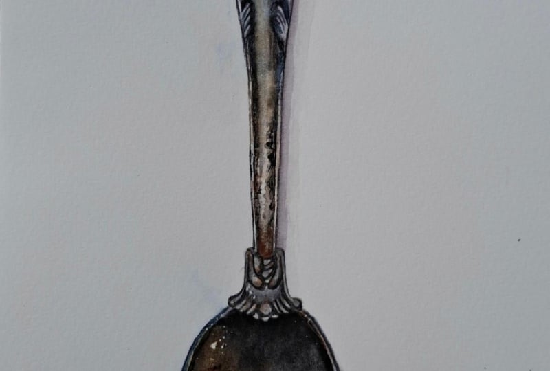
you're going to need. Because the silver has oxidized, we're seeing a lot of brown. And for this, I think the CPI is going to work really well. For those cool grays, we want a larger ratio of
indigo in our indigo CPI mix. And the indigo on its
own is going to work really well for the areas
that are the most blue. We can add a touch of yellow for the green tones
down at the bottom. And lastly, for the reflection
from that gold screen, we're going to mix
our red and yellow. Some parts of this
reflection are going to need more yellow and some
are going to need more red, but we're going to adjust
accordingly as we're painting. So here are my main mixes. We've got the black mix,
which is indigo and sepia. Sepia, Indigo Sepia and indigo more heavier on indigo
for those cool tone grays. For those light green tones, we've got indigo and yellow
with a touch of sepia. And finally, up here, we
have the red and yellow mix, the left side being
more heavier on red and the right side
being more heavy on yellow. Let's get started
with the painting.
10. Masking & Lifting: Before you start
painting, we can mask off any highlights
we want to preserve. You can mask off as many
details as you'd like, but depending on the
size of your painting, some details may be too
fine to mask off properly. I'm going to mask off just a few of those highlights we've got down at the base
or head of the spoon. And my preferred
method for masking off fine details like this
is to use a dip pen. First, I'm quickly going to use my needed razor to lighten
some of these graphite lines. Because if you do
this after masking, but before painting, you may end up lifting some
of the masking fluid. So I'm gonna dip my pen
into the masking fluid, wipe off some of the excess. I like to start with
one of the highlights that don't require me
to be too precise. That way, in case there's too much masking fluid
on the tip of the pen, you can kind of get that out of the way without
it bothering you. So I'm gonna go in just like this and roughly follow the placement of
these highlights. It doesn't have to be perfect. Similar is good enough. We are going to be painting
wet and wet for some of this. So even though these
highlights are not going to be left
completely white, it's easier to just
mask them off, so you don't have to worry
about painting over them. But you can see just how
fine we're able to get it. And while we're at it, I'm also going to mask off
the reflection from the window like this. And finally, I'm going
to see if I can get those tiny highlights
right here at the neck. If we don't get this
quite fine enough, we can always go in with
more paint because adding more paint is usually easier than retrieving highlights
that were lost. I'm gonna stick to this amount, but if you want to mask off
more, feel free to do so. If it starts to
catch or stick too much to the masking fluid
you've already put down, it may be because it's starting
to dry up on the ten nip. One of the best
things about this is how easy it is to clean. No mess, no hassle. If you accidentally painted over some of the highlights and
needed to lift the paint, there are a few
ways you can do it. Depending on the paper
you're using as well as the paint and the staving
power of those pigments. Lifting may have varying
degrees of difficulty. A brush may be able to do the
trick in some situations. If I need to get
it really clean, I prefer using a
mil mean sponge. But because this isn't exactly
ideal for detail work, you may use some
tape to help mask off an area and then
lift the paint. May not always come out perfect, but it's a pretty good solution. The main thing here is
you want to try and avoid having the water
seep in under the tape. So definitely don't
have too much water on your sponge and make sure the tape is stuck
down really well. Finally, for super fine detail, I like using an exact knife. This works great if you have tiny specs or need
teeny, tiny textures. Just be aware that this does ruin the surface of your paper. And even though you can smooth it out to some extent, at least, by bunishing on top of it using
the handle of your brush, I still don't like having too much of this on my painting, and I don't like using
it for everything. Once you've masked off the areas you want, let's start painting.
11. Background: I guess I technically
lie to you. The first part of the
spoon we're going to be painting is the head, but before we get to that point, we do one filling the
background first. When painting a background, especially when working
on hot press paper, it can be difficult to
get that flat wash, especially if you
have a subject in the center like this where
you have to go around it. One thing you could do is
mask off the entire spoon. I would recommend
using masking tape and only using the masking
fluid along the edges. That's up to you, of course. My favorite way if I want a
really nice smooth background is to wet the paper first going all the way
around the subject. And then go in with
my paint wash. The water is gonna help spread the pigment evenly across
the surface of your paper. But what I'm going to
show you here is how I go about fixing or at least improving on a background if it doesn't turn
out the way I want. So I've mixed up my paint
with a good amount of water, I'm going to take my brush, and I'm just going
to go straight in, not wetting the
surface beforehand. I'm also going to move
more sporadically than I usually would adding
some paint over here. Then the other side going back and forth
in a less planned way. Hopefully, what
we're going to end up with is an uneven wash. There are a couple of
things to note here. So, one, I usually use fabriano
artistico for my paper, which does tend to lift more
easily than arches or ash. So this may not go
well, but we'll see. Another thing to keep in mind
is the color you're using. In this case, I'm
using quinacrin red, which is a staining color. So this is also
not going to lift as easily as some
other pigments. So also not a good property
for this technique. But we're still going to try. Typically, when doing
a wash like this on hot press paper without
wetting the paper first, you want to make sure to
use a decent sized brush. You don't want it to be too small compared to your painting. You also want to
make sure it can hold a good amount of water, and you want to use
the entire brush, so the belly of the brush, not just the tip
like I'm doing here. Small uncontrolled movements
like this tend to result in an uneven wash. You want to try and get in and out
as cleanly as you can. So you want to work your way around your object
the best you can. Try to get as close to it
without painting over it. But if you do paint into
it a tiny bit, it's okay. Don't stress. In this
case, we didn't do that. We played around with that
paint for way too long. And so as we can see
here as it dried, we can see all that streakiness where the paint had
time to settle. What I want to show you is
not a perfect solution, but it can help make
it slightly better. So what we want to do is
take our large flat brush, and then we're going to go
in and rework the paint. We want to wet the
whole background, and we want to go in almost as if we were mopping the floor, moving our brush up and down, side to side, all
sorts of directions. And what this does is it
starts to lift some of the pigment and redistributes it at least to some extent
across the surface. It's by no means
going to be as good as if you did a clean
wash in the first go, but I do sometimes do
this if I'm in a pinch. I will say, though, that
the paper doesn't seem to work as well for this technique as the fabriano at sistico, but the pigment is moving
somewhat, and of course, we would probably have
better luck if we were using a colour that
wasn't as staining. But we want to continue and work the surface like this
until it evens out a bit. If needed, you can also
add some more pigment, which can help mask or
cover some of it as well. I don't necessarily
recommend that you do this on your
painting right now. If you do definitely
do a test piece first, just to try out the technique. But this is definitely
not something I recommend doing on purpose. Anyway, once dry, this
is what we're left with. It's definitely not perfect, but it's better
than it was before.
12. Spoon; Head Base Layer: Going to start
over here where we have more of those very clean, basic shapes and then we're
going to work our way over to this side where we've
got a bit more going on. We want the colors
to blend together, so we're going to wet
the paper one shape at a time, starting
with this one. I'm not going all the way to the edge because we have
some lighter colors here, so we want to keep
that clean for now. Starting with the indigo,
I'm going to pick that up. Apply that here where we
need the lightest color. Then I'm going to
pick up some of the blue toned indigo CPM mix. Add that right here. I am going to zoom in
in just a second, but I wanted to
make sure you could see how I'm working with my brush and my palette before going straight
into a close up. And then finally pick up
some of the black mix. So I'm keeping this layer light, and then we're going
to go in again, real nice and close up. If you're picking up colors that are very different
from each other, you may want to clean your
brush in between and then wipe off any excess water before
picking up the next one. But here we're starting
with straight indigo, so the most pure clean colour. And then we're moving on to color mixes that all
contain that same color. So as long as we're starting with the pure form of the color, cross contamination
is not an issue. Starting with the blue, then the blue toned mix. And and the black mix. You can see some of the
texture from the paper, and this is just from
doing some light lifting around that edge
after doing the background. You're not going
to see this once the paint dry, so don't worry. And if anything, it's not gonna hurt us in this situation. Because of all the patina and textures we have on the spoon, this is just going
to help add to that. Once dry, we can go in and add some paint to
this larger shape. We're going to
work the same way, starting out by
wetting out paper. We want this pad
to be pretty dark, but not all the way. We still want to have room to dog in some areas even more, especially up near the top
where we have the most shadow. I'm gonna go in with a touch
of the cool toned mix. Then the black,
and we're going to come back and deepen
this even more. Quickly doing a rough clean
and wipe of my brush, picking up the Cipia a touch of that green
and the indigo. You may also want
to clean your brush before picking up
the pure indigo, at least when putting it in the areas where you want
it to be the most blue. And that touch more of
the sepia right here. For now, we're
going to completely ignore the silhouette
of reflection of my arms and my camera and fill this area in with
background color instead. And so if you look
at the reference, you can see that right where I'm standing or
where my arms are, the brown base color kind of goes in a circular
motion like this. And so that's the part
we want to focus on. For those beige like
colors in the window, I'm going to take
some of this orange, add in some sepia
and touch of red. G to go in wet and dry, fill in the shape. And then follow
along right here, using some water
to blend that out. Gonna add a touchdown
here as well, slightly heavier on the sepia
and blend out that edge. Go to mix a tiny amount of the black into my CPI
and add that right here, clean my brush, and then
pick up the indigo. Right now, what we're
trying to do is just map out the different
sections and colors. And you can see
that just like with the study from the
beginning of the class, even though we have a lot of the details in place
at this point, we're still lacking dimension because everything is more
or less the same value. So we need to push that contrast for it
to look realistic. I'm going to go in
with the CPA and add some detail right here for those window frames going to roughly outline
these shapes as well. And then use Indigo to outline a few of the
shapes down here. For this last area over here, we're going to wet
the paper again. Then go in with a
base of orange. I'm going to use the portion
that is most red toned. Add some of the Colton gray, add touch of indigo, and then I'm going
to go straight in and pick up the sepia, dropping it in like this. I'm not being too concerned with getting it exactly
like in the reference. I'm just following
approximately what I see and then trying to
stay away from this area down here where we see less brown and more of
these golden tones. Once dry, we can go in
with a second layer. With this layer, we want to wet that whole base of the spoon still staying away
from the edges. We want to build
up some dimension. I'm going to go over
the background a few times here and you can see how the pigment is starting to kind of loosen like it
did with the background. Some of the edges are
starting to soften and some of the pigment is
starting to blend together. That's all good.
That's what we want. It's going to help make
everything look more coherent. We're going to go in
with the same colours, starting off with
a cool tone gray. CPA. Picking up some of our
black mix just like that. You may also notice that I'm not being particularly careful. My shapes and lines
are slightly uneven, but it's not going to be a problem for the
final painting. This is just the first layer, so we are going to
build onto this. And when I paint, it's rarely my goal for something to look
exactly like the reference. I look at which
parts are the most important to get right and which ones we can afford
to be more relaxed with. So in this case, with
the reflections, no one is going to
know exactly what those reflections look
like in our reference. They are going to
notice if something about the spoon
itself looks off. So if the handle of our spoon looks uneven or if it's crooked, or if one half of the
head of the spoon is dramatically larger
than the other half, that is the type of stuff
people are going to notice because they know a spoon is not supposed to
look like that. So CPO here as well. In go. A cool to gray. If the paint bleeds into areas
where you don't want it, just clean and wipe off
your brush and push it away like this and then keep
an eye on it as it dries. Already, we're starting to see much more dimension
in that spoon. We're going to do one more layer before moving on to the details. We're going to use
this layer to make any final adjustments
to that base color. So for me, I'm going to focus on the upper half where I want to deepen those dark
values even more. And then I also want to bring
in or bring back a few of those more crisp looking
details or lines. I'm going to go in wet and
wet again, but this time, I don't want it to
be too wet because I don't want things to
bleed together too much. Go over everything with
those same colors. Or if you're seeing some
colors in the reference that you didn't quite get in
the first couple of layers, you can go ahead and
make some adjustments. I am going to be bringing in
some CPA up near the top, but for the most part,
I'm going to be using the same colors in the
same areas as before. You don't have to copy every
step or detail religiously. Feeling stressed out or
pressured when trying to get every single detail
accurately is in many cases, not gonna lead to
a good painting. So allow yourself to have fun, play around, and experiment. Once you're done, let's move on and add some
details to the head.
13. Spoon; Head Details: Because we'll need
small quantities of paint for the details, I've moved all the
color mixes to the edge of the palette
so you can see them, and then I've switched to
my smaller detail brush. We want to get rid of some
of the masking fluid, but before we do that, we're going to add some
paint to the edges. So let's get right into it. We're going to go in
wet and dry for this, picking up one color at a time, going all the way
around the edge. For this first bit right here, we want to add some orange and then let it dry
before continuing. I'm going to start by mixing some of our black and the CPA. It's not really
gonna make much of a difference in an
area this small, but I don't want it
to be fully black. I wanted to have some of that warm undertone from the orange. We can then continue
down the side. I'm going to use a
cool toned gray. Following along this line. Then switching to black. Though I'm not going to be
using it in its full strength. We just want a dark gray. Switching to the CPA though it's still not going to make
much of a difference because it is so dark. And I think I might want
the indigo right here. This one didn't come
out quite right, but that's what it's like
when you're filming. So I'm going to see
if I can clean that up and go back in
with more paint. It's all good, though. Whenever
stuff like this happens, it gives me a chance to
show how to correct it. And we have a couple of options. One would be to
go in and correct the outer edge using
an opaque paint mix. I'm going to do
something different. So for now, I'm going to just even out the edge
as much as I can, and then we'll come back to
that later. Good enough. The truth is, I usually
keep my head pretty close to my paper when I'm
painting details like this, but I can't do that
when I'm filming. So this will have to do.
For the final portion, I'm going to go in with green, but you can also
use gray for this. Now we can use an eraser to go in and remove
the masking fluid. We don't want to mess
with the masking fluid o on that gold screen just yet, but we can remove
it from the window and the edges o here. Right here, where we've got the most light coming
in from the window, we need a softer transition between the window
frames and the light. And though you could
go in with a brush and agitate the paint like
we did with the base layers, I find the easiest
way is to take the mil meine sponge and lightly lift the
paint like this. Lifting doesn't have to be reserved for just
correcting mistakes. When you lift paint,
you may notice that it doesn't wipe clean
automatically all at once. You get kind of a splotchy look, and this texture is so good
for this type of project. We're not looking
to bring it all the way back to the white paper. We just want to lighten
the paint layer. We're going to go in wet and wet one last time so we can finish up the base here and remove the masking fluid
from those highlights. So let's wet the paper. We're going to start
with some orange. You can always start with a mix that has more yellow in it, and then if you feel
that's a bit too yellow, go in with some more red. Next, we can bring in the CPR. Gonna add that
down here where we see a lot of that oxidation and then bring that up into this area for some
of those deep tones. Then we can allow that to
fully dry and once dry, we can remove the masking fluid. Now that we're left with
these very crisp ks from that masking fluid, we want to try and soften
or distress these. I'm going to be using my
small lifting brush for this. I'm going to be
careful not to go over here where we have
the brightest highlight, but I'm going to go in and
soften the edges around it. I'm first going to scrap at
it and agitate that paint, and then I have my tissue ready to lift any of the excess. We don't want to
scrub at everything. If we look at the
reference closest to where our most
bright highlight is, we do have some smaller, still crisp looking
details or highlights, and we want to try,
for the most part, to keep those crisp. But a lot of the remaining
highlights are very soft and melt into
the surroundings, and this is going to help
us achieve that effect. Okay, now we're going to get started with my favourite pot. We're going to add
those final details and layers of patina. First, we're going
to look for places where we need to make
some adjustments. I'm going to start up
here with the black, get this outline nice and crisp. And then we're going to
make sure that we really push those values
within the shading. I'll be working wet on dry, so putting down my paint and then using a wet brush
to help blend it out. But you can work wet and dry or wet and wet depending on
your personal preferences. Whichever method you
find the easiest, there are no rules. And if you had too much paint or it ends up daga
than what you want, go ahead and lift some of it. And because we are
working in layers, more than likely it's
going to be enough to go in with a wet or damp brush, go oh it, and then lift some of the pigment
with the tissue. No scrubbing necessary. Bring in some of those
other color mixes as well. Build onto this layer with the same color you used
for the base layers. And if you notice
other colors in the reference, bring
those in as well. It really doesn't have to look exactly like
in the reference. Perfection is overrated. Focus on getting
the right value. So if you see Superdak values in one area, you
want to mimic that. Same with the mid tones
and the highlights. But the cos themselves
don't run the show. Another way to get some of this texture is to go in
with the side of your brush. This works best
if you don't have too much water in your
brush or your paint mix. Dab on some paint. Don't worry too much
about the placement. Use the reference as a guide, but feel free to add additional textures in places even if you don't
see it in the photo. And I really do mean
that have fun with it. One of the best things
about this is that this texture and patina
is completely random. If you feel it's missing
some texture in one area, go in and add it. Make room to play. Do we can also bring in some of the lines
we've got right here. It almost looks like wooden bots on the
ceiling, but it's not. It's just scratches and
smudges on that spoon. Which also means we don't
have to be too concerned with getting them to go in
the exact same direction. We only need a
similar impression. As long as we're not wopping
the shape or direction of the reflection from
that window and making that go in a completely
different direction, there really is quite a lot
of room to play around, especially with
some of the patina, some of those different
colors and textures we see. Keep looking back and forth
between the reference and your painting and look for
the areas you want to adjust. I definitely need
some deeper values over here where that
gold screen is. So I'm going to go in and build up those
layers of the CPA, roughly capturing what
I see in the photo. So And then maybe bring in some orange
down here to start bringing in more of that beautiful warm
golden reflection. And don't even focus so
much on the fact that it is gold because this is a
very odd looking object. It's not something you would
typically see in a scene. Is sole purpose is to
add some interest. I'm going to go in with
my clean wet brush and push some of the
pigment right here, lightening this up a bit and smoothing out that
transition a bit more. I'm gonna get in some of the details on that
window as well. Not worrying too much
about the accuracy. We just want to get in the
main shapes and shading. It may be worth noting that when you have a
painting like this, being able to ask the viewer to identify the objects within
these reflections is usually a good thing
because it gives us a sense of time and space
and helps set the scene, even when this
soon is sitting on a solid colored
background like this. So I do like having at least some sort of focal
point within the reflections. And in this case,
that is the window, something that gives us
an idea of where we are, even if we can't tell
which room it is. The rest can be left up to the
imagination of the viewer. If you find it easier, you can also move on
to the next part of the spoon and then come
back to this portion later. When I'm not filming, I'm often all over the place
with the way I work. So I'll paint the base
colour of one area, move on to the next,
while that dries, then come back at some details, move onto a third area, and so on and so forth. And sometimes that makes
it easier because you're not constantly looking
at the same details, and you also get
to see things come together in a more coherent way. It all depends on personal
preferences, though. We do have some more texture we can add, but before doing that, I'm going to go in
and take care of this area where my
arms and camera were. And we don't have to do
anything at all for this. It's perfectly fine as is. But I'm going to lightly wet my paper and add
not a reflection, but a dark spot that follows the shape or
curve of that spoon. You could definitely add a more identifiable
reflection of something that is
standing next to a spoon or across from it, but I really want some more of this rustic oxidized shading. This is completely optional, though the spoon looks
perfectly good without it. But adding these personal
touches, in my opinion, makes it even more fun, and it helps us tell a unique
story with our paintings. This may be my favorite
part of the texture, so get out your old wan brush, dip it in your water and
wipe off some of the excess. You don't want it
to be soaking wet. Then pick up some paint while
fanning out the bristles. Use it in a stippling motion to add additional
texture and patina. You can even do this
with no pigment, but just clean water. Use it up in those dark areas and instead of adding paint, lift paint in order to create a different but still
similar type of texture. You can play around with adding details or lifting details, adding textures, lifting
textures as much as you want. It's so easy to get lost in
this, but in the best way. Let's zoom in really close. Before moving on to the neck, I want to touch up some
of these highlights. So I've got my exact knife, and I'm going to go in and pick up on some of these small specs. If you want the highlights
to be super bright, just leave them and
have the paper showing. Otherwise, you can carefully go in on top with some paint, but be careful because
the surface of the paper is now
completely destroyed, this can easily turn
into a muddy mess. Remember the mishap
we had down here. Instead of trying to fix the
outer edge by either using opaque paint or going in and
doing some dramatic lifting, I'm just going to move
the inner edge instead. So I'm adding these highlights
closer to what is now the new outer edge than they were supposed
to be originally. This does mean the shape of the spoon is going to
be slightly wider here. But as long as we make sure the other side is much,
that's not a problem. Finally, to help
smooth out the paper, I'm going to burnish on top of this using the handle
of one of my brushes. You can rub or roll
the brush handle. It doesn't have to be
a metal brush handle. It can be made from wood, but make sure you don't
have any paint on it. That has happened to me
more times than it should. Once you're done, we
can move on and start painting the neck. I
14. Color Mixing; Neck: Going to be painting the neck or that decorative
piece right here, as well as the first
portion of the handle. So let's have a look
at the color mixes. We've got a lot of
dark tones here, so we definitely
need our black mix, starting with the sepia. Adding indigo. And then for this mix over here, I'm going to add a
small amount of indigo, make that CPR more muted. And then I'm going to
add in a touch of red. We want a muted brown
or almost warm gray. You can also use
the CPR on its own or the CPR with just the indigo. We are going to be
working very dark here, so it's not going to make
too much of a difference. We're going to be using this for the base and the black
folder dark detailing. We're going to want some orange. You may want to clean out
your brush better than I did. It's okay. We don't need a super
saturated or clean orange. This is going to be
right here where the gold screen is
casting the color. Finally, going to
take some indigo and add in a small
amount of SPIA. Just like with the
CPA mix on the right, we want a more muted indigo mix. So more of a cool to gray. We're not gonna need
that much of this, but this is gonna be
for the patina right here. Let's get started.
15. Spoon; Neck: We're going to start
with the base layer of that muted Zetia. I don't want to go too
dark just yet because I don't want to cover up my
pencil lines completely. Starting with a light layer, making sure that sketch
is still visible, or if you want it to be
on top of things and maybe combat this
problem beforehand, allow your sketch
to be more visible. Since this area of
the spoon is so dark, we're basically not
going to see this sketch no matter how dark it is. Gonna clean and wipe off my
brush and blend this out. Though really, you
don't have to. We're not gonna see it,
but old habits, you know. Then for the base
of that handle, we're going to start
with a base of orange. Keeping it fairly light, we can always add more. And then bring in the CPI mix, going down the sides of
that center portion. Make sure to not go too dark, especially right here where
we have that highlight. And then in between these
thin lines right here, and feel free to turn your
painting to make this easier. Doing fine line work
like this is not always easy depending on in which
direction your hand is moving. So you might as well make it as easy on yourself as you can. Now that we've got that
base color in place, I'm going to get rid of the
masking fluid straightaway. This way, we can see
exactly what we've got so that once we get
started with the detail work, we'll know if we need to add additional paint around
those highlights. We're going to go in with our black mix and start
outlining this pattern. I'm going to be moving very slow because I can't really
see the sketch that well. So I'm constantly
looking at my reference and trying to copy what
I see. But don't stress. It doesn't have to
be 100% accurate. Having it look like the
reference is not important. But whatever you do on one side, try making it symmetrical
on the other side. I'm going to go oh this
a couple of times. For the first round, I'm focusing on mapping
out the pattern, making sure I've got all those
little details in place, and then I'm going to go oh it again and deepen the values, both for the base
and the outline. Even though we don't
need this to be perfect, the one thing we do
want to make sure of is that we don't have
too much water in our brush or paint mix because then we're
going to struggle getting these fine lines. So when rinsing your brush, make sure to get rid of
most of the excess water either on your cloth
or on the tissue. A lot of this is
kind of repetitive, so it may not be the most
riveting to look at. I am going to be speeding
up sections of this. Though I'm still keeping
most of it in real time, I'd much rather show too
much than too little, because if you as the viewer
feel like there's too much, you can always make the
decision to skip around yourself or speed it up
using the settings below. I won't get offended. I know this is a slow process. Even though we've still got a lot of the spoon
left to paint, we are slowly completing
some of the sections. And so one tip is to
remember to take breaks. This goes for anything
you're painting really, but I find that especially for something like the
head of the spoon, it is kind of a strange abstract looking subject because
of all those reflections. So it can be really helpful
to just put things down, step away, go do something else, and then come back later. It'll give you a chance
to look at things with fresh eyes and better see if what is in
front of you does, in fact, look like a spoon. Then from there, it's
going to be much easier to see if there's anything
you want to adjust. And you can make adjustments to any area throughout the
entire painting process. If you notice
something you want to change, go ahead and do it. It's better to do it
and get it out of the way rather than potentially
forgetting about it. At this point, we can
start bringing in some of these fine lines that go along
the sides of the handle. If you find this difficult, feel free to turn your
paper to help get your hand to move in a more
comfortable direction. Or if you're still struggling, instead of having two lines on each side, you
can do just one. It's still gonna
look super pretty. When I'm going over
everything again, I'm also going to start
adding in the shading. Oh, I guess, technically, because everything
here is so dark, the shading is also
the base color. I'm going to be doing a lot
of it by almost dry brushing. So after doing the outlines or going over the
outlines again, whatever paint and moisture
is left on my brush is what I'm going to be using for that shading or base color. You can go in with
more water, though. It's completely up to you. The only goal here is
to deepen the values. How you get the paint on
there is not important. A wet layer of
paint, dry brushing, stippling, it's all going to look more or less
the same for this. So as we're going
over each shape, we want to add in that
base color as well. Get that nice and dark, but not so dark that we can't
see the details at all. We do want to be
able to see some of that filigree type pattern. And you can see that mine isn't an exact replica
of the reference. That's okay. That's
not the goal. As long as the spoon
in our painting looks like a fairly
symmetrical piece of cutlery, we are on the right track. Once we're happy with this, we can begin to bring some
color up onto the handle. For that bottom portion, I'm going to use the CPR mix. And then as I'm
moving my way up, I'm going to bring in
the cool tone gray, and we want to apply this
in a very imperfect way. The reason why we're
applying the paint like this is because most
of the shading we have here isn't technically a usual shading that comes
from light and shadow. Most of what we're seeing is the patina and the
oxidized metal. So we want to build
it up the same way, uneven layers of splotchy color that comes together to
make something beautiful. As we get further up the handle, we can bring in the orange and the CPgain and then back to the cool tone gray
closer to the top. You can do some pots with more water in your paint
mix and some with less. Everything you do, no
matter how you do it, is going to add to that texture. I'm barely following
the reference here. I'm only getting the rough gist for the placement for each color and making sure I have
the highlight that goes down slightly off center. But I'm not looking at the
details within this texture. And that's not to say you
shouldn't or you should never follow the textures or
the details more accurately. I want to make that very clear, but I want to make
sure to really emphasize the fact
that we have a choice. If we want to try
and copy something exactly down to the tiniest
details, we have that option. But just because
the detail is there doesn't mean we have
to copy it exactly. We can pick and choose both depending on our
individual style, but also what part of
the subject is most interesting to us or what
story we want to tell. We can also ask
ourselves a question, is it important to
the painting to get this to look exactly
like in the photo? And with certain things, it might be like having the correct structure
for a spoon. But having every mark
within the patina look exactly like in our reference probably isn't as important. Let's continue a bit further up the handle just until we get to those cast or carved
filigree details. We've got a very cool
tone base up here, so we're going to
continue with our cool tone gray like this. Add in a touch of our orange. And we can go with that a couple of times to
help smooth that out, add in some more of
the colton gray. Of course, we want to
go over these lines, so carefully outlining these, making sure we don't have too
much water in our brush or pink mix when doing
this, just like that. Finally, you can
take a step back and have a look at what
you've got so far. At this point, we won't
look for any textures, details or values we feel are missing or that
we need to build up. You still don't
have to worry about creating an exact copy
of the reference, but we want to look for
the areas that stand out either because they're
darker or lighter, maybe they have a
different color tone and try to at least approximately
capture what we see. If you find some of the texture you're putting down is
looking a bit too harsh, you can just go over it with a wet brush to help soften it. You can keep doing this
for as long as you want. There's no time limit. You can also move on to
the next part and then come back and make these
adjustments at a later time. It's completely up to you. But once you're ready,
let's move on and add some of those details to
the top of the handle.
16. Color Mixing; Handle: Before we get started on
the top of the handle, let's have a quick
look at the colors. We did add some of that
colton gray right here, and we're going to use this for our base pretty much
all the way to the top. We're going to need some of
that yellowy orange color for the reflection
from the house. Unless you don't want to add it, that is completely optional. And then for the pattern, we're definitely going to
be using a few colors, including our black mix, but it looks like the CPM mix, so CPM mixed with a
touch of indigo or a touch of the black mix is going to be a
pretty close match, at least for a lot of this. So I'm going to mix up
some more of that CPM mix. That was maybe a bit too much. Gonna add in some
of the black mix. Or maybe it's just
easier adding some of the indigo. Pretty close. Gonna add some more
CPA to warm it up. It's a bit too neutral. Something like that. We don't
have to be that precise. Just for good measure, I'm going to add some of
the pure CPA right here in case we need it and mix
up some more of the orange. Adding a touch of Sepia for this to help make that more of an ochre type color rather than orange because the reflection from that house is not
particularly bright. Mixing up some more
of our cool ton gray, so indigo with a touch of SPIA. And finally, pure indigo, because I want to
be able to bring in a touch of that pure
color right where the highlight from
that window meets the shadow side or the
darker side of that base. I think that's about
it. Let's get started.
17. Spoon; Handle Pt1: We're going to first
add a base layer to the main portion
of the handle. I'm going to go in wet and wet, so I'm going to wet
the paper, but you can also go in wet and dry. I'm going to start in top left kona and work
my way around, and we're going to pick up
the colors we see as we go. I'm going to start with
a tiny bit of that SPIA mix right here in the kona, wiping my brush, picking
up some of the orange. See if I can get rid of
some more of that sepia. Add that orange right here. Going into that cool tone gray. And this is going to dry much
lighter than what we need. This is just a
guideline for the base. To you're more than welcome to start with less
water down layers. Gonna add the pure indigo
right here near the center. And some more of
that CPA mix or CPA. Right up here. Perfect. We can use our black
mix for some of those really deep
and neutral tones. If needed, rinse and wipe
off your brush and use it to keep this highlighted area
clean. Just like this. I did get some colour right
here why I don't want it. So I'm going to take
my scrubbing brush and see if I can
gently lift that. Doesn't have to be perfect, but I do want a highlight here. If you want you can go in
with the second layer and deepen those values and
colors straight away, I'm going to get started with the pattern, or the details. Go to pick up the CPM mix. Now for some of these details, it may be easier to go in
with the outline first, like right here where we have
that main embellishment. So we're going to carefully
follow along this line. And just like before,
it doesn't necessarily have to be an exact
replica of the reference, but we do want our spoon on our painting to be
fairly symmetrical. In these sections right here, we do have more of
those super fine lines. And once again, if you
don't want to do two lines, you can do just one instead. Take your time and don't rush. Chances are, if your sketch
is more visible than mine, you're probably
going to be working faster than what I am right now. But I'm constantly looking back and forth between
my painting and reference to see how each of these details connect
to the next one. One thing that may be
worth considering is that although we are currently
working on an outline, there isn't technically any outlines present on the spoon. Anything we're seeing that to us appears to be an
outline is in reality, just light and shadow. So each of these raised areas on this pattern of filigree, whatever we want to call it, has a side where the light
hits and a shadow side. And it's the same with
most things we paint. Very few things
in real life have an outline unless
you have a product, so some sort of packaging
with printed text on it, but the object itself doesn't. So in this case, with the spoon, we do want to follow this outline we see because it's just a
way to simplify it. But if we really
wanted to break it down and get it
much more accurate, we would have to
look much closer at each individual
shape and line and see which shape each
shadow side belongs to. Rather than then filling it in like lines like
we're doing here, we want to fill it
in only as shapes. But for this painting, we're going to stick to outlining it. For this side over here, as well as remaining
buttom potion, I'm going to switch to the
cool tone gray because right in this
section is where we have the sky reflecting
onto the spoon. We've got less of those
browns or warm tones. I love this stage
in the process. Even though we still
have some details to go and we're still lacking
some shading and shadows, we're really starting to
see it all come together. And even though this
line work isn't perfect, in the end, once the
painting is done, we won't even notice
those small flaws or mishaps unless we were
specifically looking for it, because we're going
to be looking at that spoon much more as a whole, not dissecting it, trying
to look for errors. So don't worry about
small imperfections. Once we've got this, we
can go with the base one more time and deepen
these values and colours. This time, I'm going
to start wet and dry, but you'll see how I'm very quickly switching to
working wet and wet. And we want to go in with basically the same
colos we did before. I'm going to start with
the CPI mix up here, add a thin layer of this I'm using my clean brush
to blend it out. Alpha blending that out, my
paper is now slightly damp. If you want, you can
wait for this to dry. I'm just going to continue and kind of progress into
working wet and wet. I'm using the Colton
gray and adding a touch of the indigo right
near the center portion. Gonna pull that clot
down along the handle. A you can also add in some of the plaque mix if you want or some of the CPM mix. We can also get started with
building up some texture. So with this, we can add
swift strokes like this going in with those same
clause because if we look closely
at our reference, it does appear that there are these very faint vertical
lines going down the handle, but you can also
add some texture by stippling or dropping in paint. And some of our
black mix over here. No need to be all that precious
about it. Just have fun. Gonna quickly go that with
a wet brush to soften it. Maybe drop in some
of the Quartum gray and indigo for
additional texture. Like this. Let's add them
shading to the embellishments. I
18. Pt2, Shadow & Class Project : Before adding any of the
shading to make it easier, you can definitely go in and mask off some of
those highlights. I'm going to take my chances, but either way, we're going
to do one shape at a time. Let's go straight in
with the CPI mix. We want to add a base layer, and we want to try and
avoid the highlights, but if you do paint
over them, no big deal. You can use your exacto
knife to help fix it. We can go in again, adding
some shading within the shape. So anywhere where we
see deeper values, it doesn't have to be perfect. Moving on to the neck shape, I'm going to start with
a light base layer, making sure to avoid
the highlights around the edges. Like that. And then once we've got that, we can add the shading, starting in the inner
corner right here. Pulling that out towards the
center. And blending it out. Uh For these textured end pieces, we could go in with
stippling or dry brushing. We could also go in and
meticulously paint those details. What I'm going to do is just add a slightly deeper base layer and then go in with
my exacto knife and lift some of that texture. And if you want,
you can also bring in some of the other colors. I'm going to add some of our orange or ochre mix right here, maybe some right here as well, although the background is making this slightly
more difficult to see. Any shift in color
like this is going to help add more life and
dimension into that metal. Once dry, we can go
in with the knife, allowing it to kind of skip across the
surface of the paper, which is going to create
this really nice texture. And if we need to
enhance some of those highlights, we
can do that as well. Talk class project.
For the project, I'd love for you
to paint a spoon. It doesn't have to be
this spoon, specifically. If you want to paint a more simple spoon
with less detail, you can do that as well, or if you want to use
your own reference. The one thing I
really want you to focus on is creating dimension. So push those values, make sure you have both
the brightest brights and the deep ducks, as well. If you're able to include some texture or patina,
that's awesome. But if you decide to paint either the first
spoon we used for the study or use your own reference of a
polished Chinese spoon, then it's, of course,
completely fine to leave it out unless
you want to add it. And if you want to
share your study as well, I would love to see it. Either way, I'm looking forward
to seeing your projects. For this one right here, I'm going to start with a
base of the Colton gray. A light layer. And then I'm going to go straight
in with the CPM mix. Because the paper is now wet, these may start to blend. So we want to keep an
eye on that portion over here and make sure we can still see some
of those blue tones. Once dry, I'm going
to go in again with the CPM mix and add some shading following
along the shape. For the highlight Owanda side, I didn't mark this off
with the outline properly. So what I'm going to do is
while the paper is still wet, I'm going to take my exact knife and carefully scratch into the surface of the paper just until I see that lighter
value coming through. Like that. And then we can
outline the shadow side. No need to panic. You
can also go in with white paint or white mixed
with some of your base color. If you want to use a less
aggressive approach, but I want to make sure to
show you different options. We're going to do pretty much
the same on the other side, starting with the light
layer of the CPA mix. Going in again with some shading. And then for those
deeper values, you can go in with your
cool tone gray or black. I'm gonna use a black mix. If we take a step
back, we can see that even though the line
work wasn't perfect, and the shading is fairly simple and definitely
not perfect either, it's all looking pretty decent. So let's continue. For
this bit right here, I'm going to use
the CPI mix again, going in with a base layer, not worrying about the details. Then making sure my
paper is not too wet, I'm going to go in again the same colour and add
some more around the edges. Just like this. Same for the other side,
using the quartmGrastead. Avoiding those highlights. Using the black mix
for the shading. Finally, we can go over these
last couple of shapes going in
with a base layer, adding some light shading, keeping it super simple. If you want to spend
more time on it, you can, but I'm going to stick to the most basic shading. I'm going to go over it
using my clean wet brush. This is going to help
soften everything. And then I want a touch
more of plaque right here. We're going to go in
with some stippling to finish off the texture. But before we do, if you want, we can go in and add a
couple of lines right here to finish off the details
for that embellishment. I'm not worrying about
being all that accurate and you could also
leave this space empty. It's going to work either way, and I don't necessarily
think it needs this detail. And then for that very
last bit of texture, let's go in and do
some stippling. I'm going to use the CPI
mix and the cool tone gray. That's maybe too high, so I'm going to use my finger
to smudge it a bit more. We can add this wherever we feel like we don't necessarily
have to follow the reference. But having these bits of texture adds so much to the painting, and it's going to
help make something like this look more realistic because the surface in real
life isn't completely smooth. The last thing we're
going to add is a shadow. Take your background color, in my case, the Conacon red, and then we're simply
going to mix in some of our other colors to help create a darker, less vibrant mix. You can add in more of
your CPI if you want a very warm shadow or more of your indigo if you want
a cool tone shadow. This looks pretty good. Gonna create one more
mix that's even darker. We want to start with the
lightest of our two mixes. So we're first
going to go in and wet the paper, and this time, we want to be careful to not
go in over the spoon itself because we want the shadow to be under the spoon,
not on top of it. It doesn't have to
be soaking wet, but we want it wet enough
for the pigment to spread. I also have a habit of wetting the paper way outside of the area where I want
to add the paint. This is not a necessity, but I do find that sometimes when you're only wetting
a portion of an area, you may start to
see some hot edges from where that water
stops and settles. Starting with the light
of the two mixes. We're gonna start up here. Move our way down. Add some down here going around the hip of
the spoon, as well. For this bit in the center, we do want some shadow, but we don't want to
be very heavy handed. So I'm gonna add the pigment and then use a clean brush
to help blend it out. You can rinse and wipe off your brush and use
it to either blend the edges or help guide the pigment into
the shape you want. Picking up our taco mix, we're going to add this to the areas where the
shadow is the darkest, which is going to be
up here where there's less space between the
spoon and the background. And down here where we have
that cast shadow as well. Blend that out, make sure we
don't have any hard edges. Gonna add some more
pigment close to the spoon to tacking up
that shadow some more. If you don't want to
go in wet and wet, you can also work wet and dry. I'm going to do that
for the second layer, but you can do it straight
away if you want. For the second layer, I'm going to flip my
painting upside down, making it slightly easier on
a left handed person here. I'm going to go in wet and dry, and I'm going to go in with the lightest of our color mixes, adding some more
intensity to that colour, and at the same time, create a more smooth looking
transition for that shadow. So we're going to
add our colour rinse and wipe off our brush
and blend that out. Going in with our color rinsing and wiping the brush
and blending that out. And that's it.
Feel free to go in and play around with the
details some more if you want, but I really hope you enjoyed this class and I can't wait
to see what you create.
 Tanja Jensen, Artist - Sculpting, drawing and painting