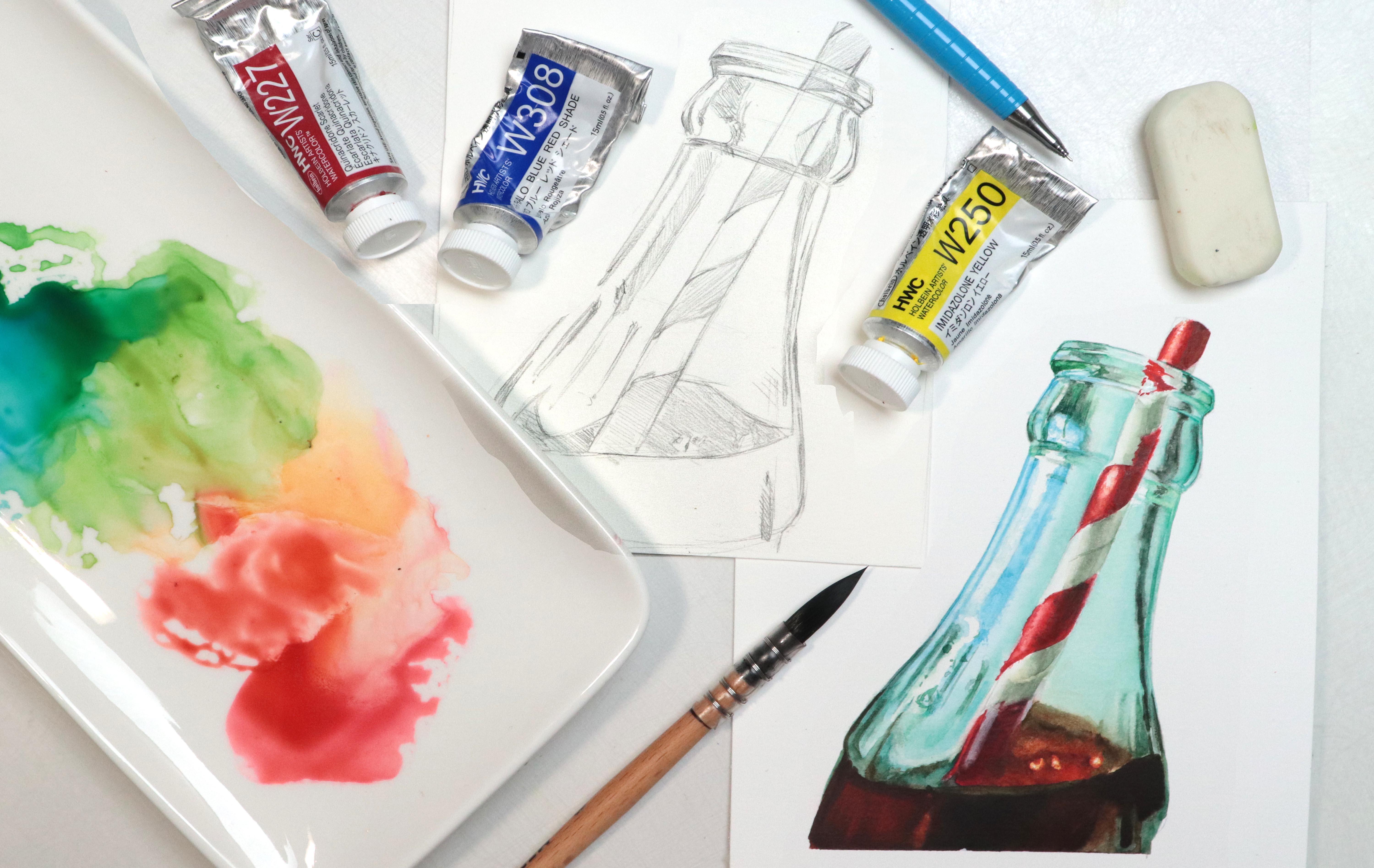
Transcripts
1. Intro: Glass and metal are two of my
favorite subjects to paint, because in both cases, we're dealing with illusions. Painting transparent objects
can feel intimidating, but with the right
approach, they become much more manageable. Hey, there, I'm Tanya. I'm an artist based in Denmark, and in this class, we'll explore how to paint
glass in watercolo. I'll walk you through the
process step by step of simplifying our subject and
break it down into smaller, easier to understand shapes from the initial sketch
to the final piece. If that sounds fun to you,
let's get right into it.
2. Supplies: Let's have a look at the
materials we're going to need. Of course, we're going to
need some watercolors. We're going to have
a look at exactly which colors in the class, but I recommend having at least some version of your primaries, a red, yellow, and a blue. We're going to need some paper. For a couple of lessons, I'm going to be
using my sketchbook. And for the two paintings, I'm going to be using
watercol paper. I'm going to be using fabriano
artistico extra white, hot pressed, but you can use any watercolor paper you have. Masking tape if
you're working on loose sheets of paper
and some brushes. The main brush I'm
going to be using is by mating and it's size three. And for the final painting, I'm also going to
be using size one. However, due to their shape, they're closer to a size six and ten in your
average round brush. Finally, for brushes,
I'm going to be using one flat brush for
lifting paint. We're going to need
some masking fluid and a tool to apply
the masking fluid. I'm going to be using a dip pen, a pencil and some erasers, a cloth, and some tissue
for wiping out brushes, and to help lift paint. And finally, some water.
Let's get started.
3. Understanding Our Subject: We are going to jump
straight in and do a study, so get out your sketchbook. We're going to go a few
of the characteristics that we may want to consider
when painting class. And to illustrate things more clearly,
here's a reference. Somewhere in the
corner of the page, we're first going to do a
quick sketch of the glass. It does not have to be perfect. I'm going to start with the ellipsis or the top,
something like this. This is not a perfect match to the reference,
but that's okay. We don't need to
worry about that. I'm going to add in the
sides of the glass, and technically, we
only have one side. But if we're not going to concern ourselves
with perfection, we're not going to concern
ourselves with grammatics. The bottom is quite thick, so we're going to add that in. And we got the base of the glass as well, something like that. Perfect. Once we've got that,
I'm going to do one more. You don't have to, but
you can if you want to. The size doesn't matter, but I'm going to try and keep it somewhat similar
to that first one. So I'm going to
lightly draw this in. And then with this one, we want to change the shape. So instead of this
circle or ellipsis, we want to create a hexagon. So we're going to line
up the front and back. And then we're
going to create the four remaining sides by drawing lines from
here to right here. Next, we can connect
that to the bottom. And drawing the base
just like we did before. So now what we've
got is on the left, we have a glass with
one side or one wall, and on the right,
we've got a glass with multiple sides plural. The sole purpose of
which is to hopefully illustrate some of these
talking points more clearly. Okay, so when looking
at the reference, what you can't
necessarily tell is that the main source of light is
coming from this direction. This isn't something we need to know in order to paint
something from a reference, but in this case, I have that knowledge because
I took the photo. Okay, so when it comes
to painting glass, the first thing we're gonna
have a look at is shape. The shape is the foundation, and we need a solid
foundation in order to render this
glass realistically. So we want to make
sure the shape of our glass is correct
according to the reference. And one of the most
important things for a glass like this
is the perspective, which due to these ellipses is usually also one of the
more challenging paths. So we're going to
have a hot look at our reference and try to make sure that these line up with
what we see in the photo, at least close to It
doesn't have to be perfect. It's just a study. But what
we don't want to end up with is something like this where the perspective no
longer makes sense. We also want to make sure that our glass is even
and symmetrical. And this might tie
into perspective, but we want to make sure
that our shapes are even. So we don't want the ellipses as an example to be
wider in one end. We don't want one side of the glass to be more
slanted than the other, and we don't want
things to look wobbly. Aside from just the shape, symmetry is also
important when it comes to actually adding
shading to the glass. Because glass is transparent, what happens on one side usually happens on the
opposite side as well, which means that if the light is coming
from this direction, this side or this panel is going to be lighter because this is where the
light is hitting. And because the glass
is transparent, this means that the
light is also hitting this panel or side straight
across from the first one. So on the sides where the
light isn't hitting directly, we're going to find
our dark values. Anything from our
plain background coll up because of that transparency, all the way to our
deep docks depending on what the glass is picking
up from the surroundings. If there is a highlight
right here on the edge, we need a highlight
on the opposite edge. If it was here, we needed
to be over here as well. With glass, we can
just add shading into it the same way we would
with an opaque object. Even if we are seeing some of the same shading which shows
us the form of the subject, this is going to be
broken up by reflections. Either reflections
in the form of light or highlights
or in the form of different shapes because
everything around the glass is going to
reflect onto that surface. So when painting glass, we want to pay close
attention to our reference, so we're able to capture and
render the glass accurately. If you're ready, let's move on and do a quick
what a call study.
4. Exercise: Study: Let's get some paint onto our palette and get
started with the study. We're going to keep
it super simple, so we're going to use white, and then we need one
additional color. I'm going to be
using Paine's gray, but you can use any
color you want. Next, we want to do a quick
sketch of our reference. It does not have to be perfect, but try to get the two
ellipses to line up with what we're seeing in the photo to the best of your ability. Something like that.
And then for the sides, you can either eyeball it or use your pencil and hold it up to your reference to help
get the right angles. Try to keep the angles both on the left and right,
fairly symmetrical. We don't want one side of the glass to be more
slended than the other. Go to add in the base, keeping it pretty loose. We don't need to
add in the details, just the basic shapes. Keep your sketch light. When painting or rendering something in a realistic manner, we don't want visible outlines. And with something
like glass where all we're painting is
light and shadow, it can really mess
with the illusion. We're going to begin by
adding in a base colour. Now, typically with Watercolor, we would want to preserve
the brightest highlights. But since this is just a study, I've removed those from the side of the
glass in Photoshop. And so right now,
all we're going to focus on is the basic shading. The paper in my sketchbook
is not Watercolor paper. It's some sort of
mixed media paper, but I'm still going to
use a good amount of water to hopefully get
in some soft shading. So we're going to add
in the base colour. And then we're going to
go straight in and add some shading to this main shape. Don't overthink it. We just
want to paint what we see. So we've got some daga values up against the sides.
Gonna add that in. If your paper is too dry or doesn't allow for wet
and wet techniques, you should brush to
soften the edges. It doesn't have to be perfect, but try to avoid hot edges in this area as
much as possible. We've also got
some deeper values in the sensa so we're
going to add that in and avoid the
temptation of filling in any outlines like
on the top edge. Only focusing on
light and shadow. My paper is already too dry, so I'm going to use my brush to manually soften these edges. It really doesn't matter
if we end up with some hot edges.
It's just a study. And if you do have
some shapes with hot edges appearing on
the side of the glass, it's just going to look like the surroundings being
reflected onto the surface, so it's really not a big deal. Next, we can add in some of
the details for the base. Again, just focusing on some of the basic shapes
or value changes. We don't need to nitpick. And lastly, we fill in
the inside of the class, just one basic shape, and we're not going
to outline anything, but we do want to stay away from the top edge in the front. Once we've got that, we can see if anything catches our eye. In my case, I definitely need to deepen the values
down at the bottom. I'm going to do that, just like this and add in a
couple more details. I'm not worrying about
perfection or accuracy. The exact details are
not that important, but we can see just
how little it takes for this to really start
looking like a glass. The final area we need to add shading too is the top edge. And I'm specifically saying shading because we're
not adding outlines. What we've got up here is the
top flat edge of the glass. So we want to fill
in the shape with a deeper value, just like this. Awesome. Next, we're going to have a look at
pushing the values. Even though glass
is transparent, there are often lots
of really deep tones. So we want to find the areas in the photo where we have
the deepest values. Don't be afraid to
push these values. We can even make them
darker than what we see in the reference.
Just have fun with it. Finally, all we need to
add are the highlights. So we're going to
take a white paint, add that to any other places where we see highlights
in the reference photo. So up here on the top edge. And a few down here
at the bottom. And to really make it pop, we're going to add
in the highlights on the side of the class. So we want one over here where
the light is coming from. And one on the opposite side. So this is actually on the
inside of the class being reflected just across from the
first one, just like this. A Willa we've painted glass.
5. Building the Foundation: Knowing the basics
and understanding how class behaves can
be really helpful. But when rendering
a subject from a reference like this picture, knowing that information,
although it will give us more freedom in our
creative process isn't enough by itself. We need to understand how to bring our subject
down onto our paper. Of course, there are many
ways you can do this. You could trace your reference. You can use a grip or any other tools you
have available to you. But in my opinion, nothing beats practicing
the fundamentals, in this case, sketching. And so when faced with
a subject like this, what we want to do is break this down into more
manageable portions. And no, I agree, there is a difference
between sketching a basic glass like we did in the last study and
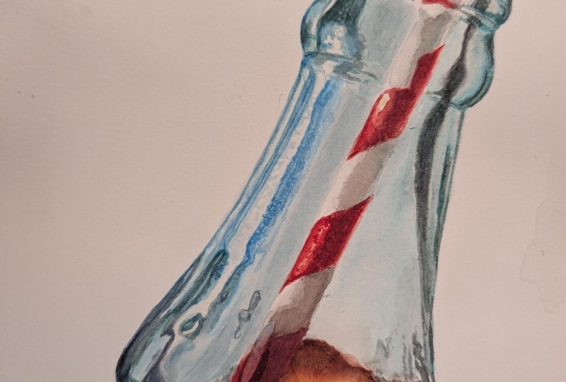
sketching something like a coke bottle which we'll be
doing in the final project. But the techniques
behind it are the same. We want to simplify our subject. Just for a second, ignore
the fact that this is a picture and focus
on the basic shapes. That already makes the idea of sketching this a lot
more manageable. So let's see. First, we can
sketch in the bottom portion. You can also hold your pencil up to your reference to help
get the right angles. But for now, I'm
not going to worry too much about the accuracy. Next, we want to find out
what this shape can tell us about the rest of the picture
in terms of proportions. If we take the
distance right here, so the width of the bottom, this is going to be slightly longer than the
height of the shape. And you can also tell
us that the top half of the picture is going to be about the same height
as this shape. And if we go in a vertical line, we can tell that these as line up with the top
portion up here. Once we've got that, the rest suddenly seems a lot
less complicated. From here, it's
all about breaking these longer shapes into
smaller and smaller shapes, making sure to check the
angles and the proportions. The sketch is our foundation, and we need a strong foundation in order to render our subject. Now, it is possible to go in and create
amazing paintings, rendering subjects realistically without
creating a sketch first or having a very
simplistic sketch. But that doesn't mean you
don't have a foundation. In those cases,
the foundation is a strong knowledge and
understanding of the basics. Having put in the miles and the work that allows you to go in with so much confidence. Whether you choose to work with a very simple sketch or a very detailed sketch
is completely up to you. It all depends on
personal preference. But no matter which
one you prefer, it's always worth
practicing the basics. Once we've got the shape and the basic foundation in place, we need to focus on the values, bringing in light and
shadow to give it form. If everything in
our painting is too light or if everything in
our painting is too dark, we won't be able to
create the illusion of this being a three
dimensional object. So we want to locate our brightest highlights
and our deepest darks. And, of course,
we want to locate our midtones and the
values in between, because when all of these come together in just the right way, that's when the magic happens. In this class, we're going
to create two paintings. For both of them, we're going to go through the process of creating the sketch or the
foundation for our painting, as well as rendering
the subjects by breaking them down
and simplifying them, focusing on small
sections at a time, rather than worrying about
the complete picture. So if you're up for it, let's get started with
the first painting.
6. Breaking Down Our Reference: Wine: Glass is already a cool subject. But where it starts
to get really fun is when we add liquid into
the equation because this adds another layer or opportunity for reflections,
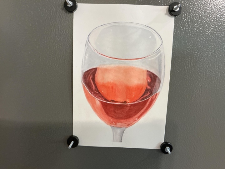
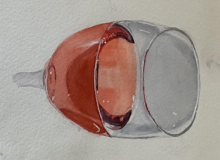
distortion, et cetera. I took this picture
of a glass of rose, so let's try and paint it. First, we need to
create the sketch. I'm going to provide
my sketch in the projects and resources tab, so feel free to use
that if you want. You can also trace the reference or follow along if you
want to create your own. Let's start with the
ellipse at the top. Getting the right
shape can be hard, but try to really focus on and copy the curve you
see in the reference. It's also often a lot
easier if you do this in one smooth motion rather than doing a bunch of short
chopped up lines. You're sketching directly
on the Watercolor paper, you may want to try
and keep it light. That way, it's easier
to erase if you have any unnecessary
lines at the end. But if you're sketching on
a separate piece of paper, feel free to go with
the shape as many times as you want until
you're happy with it, and then trace it onto your Watercolor paper
when you're done. Next, we can try and look
for any proportions that might be helpful in figuring
out the height of the glass. If we take the width
of our ellipse, this distance is close to the same distance
that we have from the very top of the glass and down to where we've got
the edge from the wine. We can draw in the sides
of the glass, again, trying to follow
the curve we see in our reference,
something like this. Gonna draw that all the
way down along the bottom, almost looks like an
upside down egg shape, and then we're going to add in the ellipse for
the wine as well. Pretty much the same
shape as the first one. So we're going to follow
the shape of the curve. And up here at the top, we've got a small space between the edge of the glass and
the edge of the liquid. So we want to add that
second line around here. When we are faced with
a subject like this, we want to try and look past all the details and
all the reflections. Instead, we want to take
it one step at a time, starting by focusing
on larger shapes. And then once we've got
that, we can break it down into smaller and
smaller sections. So when we've got
this initial outline, we want to try and compare the different shapes to
our reference photo. So each individual
negative space within the class like the
inside of the ellipse, this bow tie looking thing, the second ellipse and this, I'm going to call
it half an egg. It does not have to be perfect, but we want to try and make
sure that those ellipses and perspective is as close as possible and that
our shape is even. Once we've got that,
we can clean it up and get rid of any
unnecessary lines. When sketching directly
on my Watercolor paper, I'm always very cautious of not resting my hand directly on
the surface of the paper. If the oil from our skin is
transferred onto the paper, it can change the
way the paint is absorbed or behaves
on the surface. In my case, I'm allowing my hand to kind of float
above the surface, but a lot of the time
when I'm working, if I want to rest my
hand on the paper, I usually put a piece of tissue paper or scrap
piece of paper in between. With the ellipses, aside
from looking at the curves, we also want to make sure
that we don't have any cas. It's so easy to
accidentally add corners or pointed sides where we have the side of the glass
when in reality, all we're seeing
are curvy lines. We don't want any pointy bits or shapes on these ellipses. Next, we want to try
and break it down into those smaller
sections and give ourselves as much
information as we can to ease the
painting process. Let's start with the
top rim of the glass. It's up to you how much of the detail you want to
add to your sketch. I'm going to add in the
shapes we're seeing right here which show us the
thickness of the glass. And then we've also got a similar shape right
here at the front. So I'm gonna roughly
draw that in as well. Oh right here where we've
got the edge from the wine, we don't have one strong line. Instead, we've got this
space with a lighter value. So if you want, you can add
that to your sketch as well. Continuing down the
sides of the glass, we've got a daca shape
right here as well, kind of like an
elongated triangle, and we've got a similar
shape on the other side, although on the side, the triangle itself
is not a stack. Instead, the duck value comes from the shading
just around it. We're not going to add in
too much more information, but we do want to add in
some of these reflections, just the main shapes. So near the bottom of
where we've got the wine, we've got a reflection going
down the side right here, and I actually don't think my bottom is quite pointed enough, so I'm
going to fix that. Maybe something closer to this. Adding in this daga kind
of oval reflection. And this curve
right here as well. They don't have to be perfect, but try to get them somewhat similar to what we
see in the reference. We've got something going
on right here in the front. And then we've got these, I don't know, bunny ears, one on each side. So we're going to add
those in like that. Some of these shapes
look really random, but they're all
there for a reason. They're reflections
from whatever is going on with
the surroundings. And so even though we don't need them to be absolutely perfect, we do still want them to be close to what's going
on in the reference. In a lot of ways, it's
kind of like a puzzle. Each piece on its own may
not make a lot of sense, but when it all comes together, it's going to
create an illusion, which is always
equally satisfying. Lastly, we're going
to add in the stem. If you feel it's needed, you can clean up the lines, and then let's move on
and pick some colours.
7. Picking Our Colors: Let's pick some colours
for this painting. There's never just one
way of mixing a color. So if you don't
have the specific paints I'm going to be using, have a look at the
colors you have available to you
because more than likely you'll be able to find
colors that are going to give you the same or
very similar results. So let's have a look. We've got two main colors in our reference
the color for the glass, which is more of a gray, and the color for the wine, which is closest to red. So starting with the red, if I have a look at my palette, the pyrol red could
definitely work. But quinacridone scarlet also appears to be a
really good match. So I think I might
start with this one. I love this color so much. It's beautifully
transparent, pink without being too pink
and super versatile. The wine is less pink and slightly more
yellow tone, though. So we need a yellow. Let's try the first
one in the palette, permanent yellow light,
a good basic yellow. That is definitely bringing
us a lot closer to the color we need for that
top half of the wine. But we do need some
deeper values as well. A simple way of deepening
red, although it will, of course, depend
on the exact color you need is adding blue. We don't have a bunch of blue
in this reference photo, so I don't think it's all that important which one
we're going to go with, but I do feel the glass
leans slightly more towards the turquoise or green
and yellow leaning blues. So I'm gonna pick
helio turquoise. And if we add that to the red, it doesn't look too far
off from those bunny ears. We also need some
gray for the glass. If you've watched any
of my other classes, I usually mix my own, and you can definitely mix a beautiful gray using
these three colors. As long as you've got
a version of each of your primaries,
you're all set. But for once, let's make
it easier on ourselves. I'm going to add Pains
gray to my selection, which is going to
make color mixing for the painting a bit faster. And of course, if
you don't have Pains gray and you still
want to use a neutral, you can also use something like neutral tint or even a black. Hving the exact colours
is not that important. So just to put my money where my mouth is or whatever
that saying is, let's say I didn't
have quinacroon scarlet and only had pyrol red. If we take that and add in
some yellow, this time, I'm going to go with
quinacalon yellow, which is more of a
green leaning version. Mix those together. We're still able to get a very similar mix. It may not be the exact
same but close enough. Or what if we didn't have any proper red and
we only had magenta? Let's take quinaquo magenta, add in permanent yellow light. Once again, we're able to get a color that's very
similar to the first two. It's not going to
be the exact same, and I do prefer the
first two versions. But if you're in a pinch,
this could definitely work. And you can also have a
play with switching out the yellows to potentially
get an even better result. But once you have
your color selection, let's move on and get
started with the painting.
8. Preserving the Highlights: Before we go in with any color, we want to preserve the
brightest highlights. It's not an absolute necessity,
but I do recommend it. And for this, we're going
to use masking fluid. You can use any tool you want. I'm going to be
using at dip pen. And so all we have to do
is go around the glass and mask off any of these
tiny white highlights. They don't have to be
in the exact same spot. As long as we get it fairly
close, it's good enough. But before you do any masking, you may want to have a look
at lightening your sketch. So use a needed eraser or a normal eraser to lighten the pencil lines to
make them less visible. And I recommend lighting them as much as you feel
comfortable with. Because I'm filming,
I need you to be able to see my sketch on camera. So I'm going to do
the masking first, and then at the end, I'm going to go in and
lighten some of my sketch. Although, for the most
part, I am going to keep my sketch darker than I would have if I was painting
without filming. These highlights are
what's going to help make the glass look
nice and sparkly. If you don't have masking fluid, you can go in with white paint, or at the very end when
you're completely done, you can take an exacto knife or a craft knife and kind
of kick the surface, basically getting rid of
that top layer of paint, revealing the white
paper underneath. I'm also going to mask
off right here where the liquid level stops or stops. Even though this highlight on these values may
not be as bright, they're pretty close
to being white. So it's going to make
it a lot easier than trying to avoid this area
when adding the paint. Might as well help ourselves
out as much as we can. I think that looks pretty good. The last thing I'm going
to do is like my sketch. I'm not going to do
too much because I do want you to be able
to see it on camera, but I do want to
lighten it right here because we really don't have
any hot edges in this area. Maybe lighten this
sketch a tiny bit right here and down here on those
reflections near the bottom. When you're happy with it, let's move on and start
adding some colour.
9. Painting the Glass: Rendering a subject like this isn't as difficult as it may look because once we've broken it down into
these smaller sections, we can focus on one
small area at a time, and each one individually
is not that complicated. But once they all
start coming together, that's when the process
becomes really satisfying. Let's start at the top
with the glass itself. We're going to need some gray. So I'm going to take
my paints gray, add that to my palette. And then I feel we've got
more of a cool tone gray. So I'm going to add
in some of the blue. Don't worry too much
about the color mixes. I've already said this in
quite a few of my classes, but the values are far more
important than the colors. If we get the values
right or close to, we can do pretty much anything
we want with the color. Don't stress. This looks
pretty good. Let's watch. I'm happy with that. So
we're going to start with the lips at the top to
help get an even layer, especially if you're
working on hot press paper, we're gonna wet out paper. Make sure we have
a nice even shin without any pooling of water. Then we're going to
pick up our colour and add that in like this. We want to try and get
close to the colour on the value we've got in the
majority of the shape. And then while the
paint is still wet, we want to lift some
of the paint along the top edge and on either side. We're gonna wipe our brush, or you can clean and wipe
off your brush if necessary, and then we're gonna go straight in and lift some of the pigment. I still have too much
water in my brush. I'm gonna use the tissue to
help get rid of some more, wiping that off, and
lifting the paint. You may need to
go at a couple of times not only to lift
more of the pigment, but also to avoid any of the color or pigment bleeding into this area as it's drying. Gonna do the same
to the other side, wiping my brush in between. And finally, along
the top edge as well. If your color ends up drying
lighter than what you want, you can always go in
with a layer on top as long as you allow
everything to fully dry first. Next, we can have a look
at the bow tie shape, and we want to make sure to stay away from the rim of the glass, especially if your first section
hasn't dried completely. So we're going to wet the
paper just like we did before, and we want to bring the water
down here where the wine is to help create
that soft transition. So once again, we're
going to pick up our color and add
that in starting on one side and pulling the color
across to the other side. Clean and wipe off our brush and lift some of the pigment
over here on the side. Along this edge, creating that smooth transition between
the wine and the glass. And over on the other side. Then we can allow that to
dry and see what we've got. I'm pretty happy with
the overall value, but I didn't manage to get crisp enough of an
edge right here, and I do need to slightly deepen the values both
here and over here. So I'm going to go in with one more layer just like before, wetting the paper, picking up the color, and
adding that in. We don't need it to be perfect, but we do want to
try and get it to a point where if we squint, thereby blocking out the finest
details that our painting then looks somewhat
similar to what we're seeing when looking
at the reference. So the color and value changes and the larger, more
prominent details. Finally, for the glass, we're going to have a look at the rim. We're not going to finish off this front section
just yet because we might as well wait until we have the color we
need for the wine, but we can have a
look at the shapes right here on the
sides and the back. Each of these is a slightly different
color to the other one. For the one on the left, we need more of a neutral gray. And though we could
bring out some more of the paints gray as
a starting point, I'm going to just add some red and some yellow to this mix, bringing it back
from that cool tone back to more of a neutral. Then for the shape on the right, we need more of a green. So if we add in just the yellow, we should get pretty close. Let's swatch. This one
looks pretty good. This one could use
some more yellow. That's better. We don't need it to be an
exact match, though. Let's add that in. And bring it all the
way to the back. This came out a bit too dark, so I'm going to go
with a wet brush and see if I can lift
some of this pigment. Gonna quickly define
the very edge and do the same to
the other side. Before we move on and while we still have
these color mixes, we can have a look
at the area down here where we see some
of those same grays. So we can add those in, starting with the base color and filling in those elongated
triangles as well. It's up to you how
accurate you want to be. I'm not going to worry
about perfection or being super accurate. Our goal for this painting
is not hyperalism and we can always come
back at the end and add a few final touches. For now, let's move on
and paint the wine. Oh
10. Painting the Wine Pt.1: Moving on to the wine, we're going to keep
it simple and do one shape or section at a time, starting with this
one in the center. For this coll mix, I'm going to start with quinaquion scarlet. Add in some yellow, not too much, but we
do want a warmer, slightly more orange hue. This looks pretty close. Let's watch it and see. That looks like a decent match. We're going to go
in with two layers. With the first layer,
we're going to establish a base color and add in some of those deeper
values we see. And then we can use the
second layer to make color and value adjustments or correct some of the details
or shading if needed. Once our paper is evenly wet, we're going to pick up our
color and add that in. We want the most color
saturation down near the bottom, and then as we move up
towards that top edge, we want to make sure to get that soft transition between
the wine and the glass. Then we can pick up some
more of our pink mix and add that in right here where
we have those deeper values. Do not worry about perfection. Subjects like this are
surprisingly forgiving. Of course, we do want to look approximately like it
does in the reference, but it really doesn't matter if the shapes are slightly off. If your paper is very wet, you may want to wait for a
few seconds before going in with more paint so the pigment doesn't
spread too much. But we also don't want
the paper to be too dry because we do want
these nice soft edges. And then once we're done,
we're gonna allow that to dry. Now that it's dry, I can tell that I need to
touch more yellow, and I want to deepen the values ever so
slightly near the bottom. So I'm going to add some
more yellow to my mix. Wet my paper again and go
in with that second layer. Starting with the top half, I'm going to bring
in a thin glaze to bring in some more
orange or yellow. Then I'm going to deepen
the values down here in the center and deepen
these two shadow shapes. Might need to bring in
some more paint for this. And as I'm working on
these tip of values, I am starting to
see some lifting, so I'm going to use a very
light touch and kind of dab in or drop in the color rather than using
prop up brush drugs. So Then we can allow that to dry and move
on to the next section. If you do have lifto paint, you don't have to clean up your palette because
we're working with a limited color palette and
a very limited color scheme, more than likely
you'll be able to use any lift o paint for new mixes. For this next section, we're going to start
with the lighter values. Up here, we're going
to need a colour that's very similar to the
colour we used before, and then we're going
to move down into a slightly more cool tone color. So for the first color mix, I'm going to start with
the unequiton scarlet and add in a touch of yellow. O and for the second mix, I'm going to start with
quinacrunsct again. But instead of the yellow, I'm going to add in some blue. We're going to go in
with two layers again. And just like before,
we're going to use the first layer to
establish a base color, and then we're going to use
the second layer to make any color or value adjustments and add in the deeper values. We're going to wet out paper. Then we're going to
pick up our warmer or more yellow toned red, add that in right here. Maybe a touch over here
on the other side. And down here at
the very bottom, picking up the blue or
more cool toned mix and adding that to the
rest of this area. The color difference is
going to be very subtle. So if you want to keep
it even more simple, you can use just one colour. We don't want to go too
dark with this layer. Try to stay somewhat
close to the values we're seeing around the
outer edge of the shape. For the second layer, I'm going to keep these
two mixes because I do want to dig in the values
near the center a tiny bit. And then we're going to
need a third colo mix for these dark reflections. I'm going to start
with conectan scallop. Add in a touch of yellow. And some blue to
deepen the colour. Maybe a bit more red. Let's see. Pretty close, but I do think I want
a touch more red. Not a perfect match,
and it may even be a bit too blue,
but close enough. So we're going to go
in, wet the paper. And then we're going to
start with that light glaze. Slightly deepening these values and adding some more depth. Something like this. Then we can pick up
our deeper color and add that in to
these reflections. I'm going to start right here as far away from those
edges as I can. This way, if the pigment bleeds too much and the
paper is still too wet, I can wait a few seconds
before continuing. Hopefully, I've got
enough paint mixed up. One downside to
inacton scarlet or this pigment is that it is technically a granulating color. And even though it usually doesn't show
in thinner washes, it does tend to show in
thicker applications, making these look a
bit more splotchy. So for something like this, where we do want
that smooth surface, it may not be the
most ideal color, but we're not going
to worry about that. Keeping an eye on the edges. I'm gonna clean and wipe off my brush and clean
up these edges right here. Much better. While that's drying, we can have a look at the rim of the glass, and we're going to
fill in that section using our yellow toned mix. Gonna allow that to
drive a few seconds, pick up a Daka mix, and add that in
to the very edge. Before moving on
to the bunny ears, I'm going to revisit
the bottom portion of the glass one more
time because I want to go over those reflections with one more layer of
the Cinqune scalet. This time, I'm going to use just the Quinaqune
scalet on its own, see if I can deepen the color
value of these shapes a bit more and add in that ring shaped reflection
near the very bottom. It's already starting
to come together. This type of subjects
really is not that difficult once
we break it down. It's all about
breaking it down into these smaller, more
manageable portions. And rather than focusing on it in its whole, in this case, as being a glass of wine
with different reflections, we want to try and see
it as simple shapes, something that's a
lot easier to tackle. I'm going to do a quick version of this ring shaped reflection. Not going to worry too
much about the accuracy. So something like this maybe add in a touch
of our Tipo Cox. And once we've got that, we're going to move on and
fill in those bunny ears.
11. Painting the Wine Pt.2: Let's get some color onto
these two remaining shapes. We're going to go
from light to dark, starting with the
most bright red. One thing to note is that depending on the
colors you're using, it may be worth bringing
in another one. With the colors I'm using, I may not be able to get
a red that is as bright or as red as the one we're
seeing in the reference. A color like Pyrrole red or Pyle red mixed with a yellow
may be a better option, but I'm going to finish
up this painting using just the colors
we've already selected. So let's get some paint
onto our palette and again, you don't have to
clean your palette. You can use the previous mixes. We want to add this
to any area within this bunny ear where we
see the brighter reds. So right here along here. And down here near
the second highlight. That's a fun shape. Let's be professional about it and move onto the other side. Even though the reds over
here aren't as bright, we're just going to
add this as a base. For the second mix, we want the color closer to the
one we have down here. So in my case, I'm going to
add in a touch of the blue. Something like this. Maybe a touch of yellow. And then we're going
to add that in. We don't have to be all
that neat about it. I'm going to start by outlining this shape going in between the two highlights at the bottom and fill in
this area around it, keeping it super simple. And for the other
side, I'm going to add a thin glaze just to tint
the base we already have. For our deepest comics, I'm going to add in some more of the quinacrne scald and then add in the
blue to darken it. O. So we want to go in and fill out
this remaining portion. Right here, we do have a curved line which comes
from the edge of the wine. So we can use that as a guide when filling
in these shapes. And once again, it does
not have to be perfect. We're just practicing
breaking down our reference into
these smaller portions, and we'll have plenty of chances to be more neat with
the next project. Gonna soften the edge. And bring in some more colour. You can always go in
with a second layer, but we want to build up these
values to try and bring in as much depth and
dimension as possible. Cleaning and wiping my brush, and then I'm going to clean
up this half just like this. Finally, I'm going to
bring in a touch more of the coacrne scallot just to
go at this shape right here. We're going to add in
the same deep values to this bit in the front. And fill in the other bunny ear just like we did
with the first one, although this one doesn't
have as much going on. And then once we've got this, we're almost ready to move
on to our final project. We need to get rid of
this masking fluid so we can see what we've got. But first, I'm going
to take my rough up brush or the brush that
I use for mixing my paint, clean and wipe it off to get
rid of most of the water, and then I'm going to go
in and lightly scrub at this area to soften the
edges and at the same time, lift some pigment to create
some soft highlights. Because if we look
at our reference, we do have some
lighter values here, so we want to see
if we can bring in or bring back some of those. And once the paper is dry, we can use an eraser to get
rid of the masking fluid. Right here where we have
that soft transition, you can still see
part of my sketch. So I'm going to rub
with a bit more force to see if I can get rid of it. Oftentimes, if you only have
a thin wash of Watercolor, you can still erase
the sketch underneath. Though if you're planning on
going in with more paint, you may want to do a test
on a separate piece, just to see how the surface of the paper reacts because
depending on the type of paper, it may rough up the surface. Cotton paper is
pretty resilient, but even then it may still potentially affect
any upcoming layers. We're not going to do too
much more to this one. The last thing I'm going to
do, and this is optional, I'm going to take my
rough brush and go over the highlights to make
the edges look more diffuse. It's not an absolute necessity, and you can also go in and add
some more paint instead to fix up those edges
or leave it as is. But even though we
haven't focused too much on the details or worried about getting everything exactly as it is
in the reference, we've still ended up with something that looks
like a glass of wine just by focusing on the
larger, more basic shapes. And if you want, we
can also bring in some gray to add in the stem
and a few final touches. When it comes to
rendering glass, so much of it is
in the foundation, not just in terms of
an actual sketch, because it is possible to go straight in with paint without any preliminary sketch and still end up with something
that looks like a glass. It's more so about
understanding the form, the shapes, the values, and lastly, the colors. If you're ready, let's
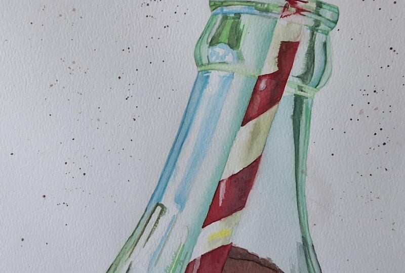
have a look at rendering the Queen of glass vessels
a classic coke bottle.
12. Glass Bottle Sketch Pt.1: Basic Shape: Glass bottles is one of my
favorite subjects to paint. And this one, though we
can't see a lot of it, is an absolute classic. So let's see if
we can sketch it. I have a piece of paper here, which is not my watercol paper. We're going to be dealing with a lot more lines on this one. And since I want those lines
to be visible on camera, there's really no point in messing up the Watercolor paper. So I'm going to create
the sketch on here and then transfer onto the
watercolur paper when I'm done. First, let's rough
out the shape. We're going to keep
it super simple, three lines, focusing on
getting the right angles. And remember, you can use
your pencil to measure the angles by holding it
up against our reference. But aside from the angles, the reason why we're doing
this is to get a general sense of the size of our sketch and where it's going
to sit on the paper. Now, we're going to be
grown up about this. It's not my fault if
there are funny shapes, but we're going to divide this into the top of the bottle, which is called the
finish and the neck. Just like with the picture we did in the beginning
of the class, it doesn't have to be too neat
because in the next step, we're going to see
if we can find anything that can help
us with the proportions. M. Something like this. If we take the top, the lip or the top edge is about one third of
the shape in height. And if we take the height
of this entire shape, we should be able to fit
it just over three times into the remaining length of
what we see in this photo. And if we do 1.5 times, we'll get pretty
close to the point on the neck where we see the top of those details
within the glass or reflections right
before the neck start to flare out a bit more. That same height
from this line and down plus a small extra bit is going to be just about the
level of where the liquid is. So we're going to draw that in. And we've got our basic bottle. Let's clean it up, get
rid of some of the lines, and refine the shape. Focus on following
the shapes, curves, and angles you see in the photo and don't worry about
perfection. Try your best. If it ends up not turning
out the way you want, you've still put
some important miles into your art practice. And then if you prefer
for the actual painting, you can use either my sketch
or trace the reference. But either way, I
still encourage you to practice sketching because
practicing the fundamentals, even though you're not playing
with paint at the second, you can still help us become stronger painters and especially in a medium like Watercolor, where we're working
with transparent paint and mistakes are a lot
more difficult to hide. Practicing drawing and sketching help you practice accuracy, and it can help you become more confident not only
with your lines, but also with your
brush strokes. When we're finding the shape, we also want to focus
on the symmetry, so making sure that
the two halves of the bottle are about
the same shape. Next, we can add in the straw. Go to put that somewhere around here using what we've already sketched to help
guide the placement. And honestly, if
the straw is a bit further to one side or the
other, it's not a big deal. Straws can move around. That looks pretty good.
Gonna add in the stripes. And again, we can use
the shapes we've already added to help line up
where we want these to go. Once we've got this,
it's really up to you how much detail you want to add to the inside of the bottle. The more we add, the easier the painting process
is going to be because each of these shapes
are fairly simple in color, which means that if we add a bunch of these
details to our sketch, we're giving ourselves the best and strongest
foundation to build from. But at the same
time, we don't need to add in all the details. It's okay to add some of
them using just paint, and it's also okay if some of them end up being
slightly off. I
13. Glass Bottle Sketch Pt.2: Details: We're going to go over each
shape or section at a time, adding in as much
or as little detail to our sketch as we'd like. So let's start at the top. Any of the details or
information we add to our sketch could potentially help us play
some of the other details. And right now, we
can play around with adding as much
detail as we'd like. If it ends up being too much, we can always leave it out when transferring our sketch
to our watercolor paper. Up on the lip, we've got a few vertical lines going straight across from
one side to the other, one going from corner
to Ca right here. The next one sits about halfway between that
line and the top edge. And we've got one
about halfway from that line to that
top edge as well. Next, we've got kind of like a green triangle coming
in from this side. And if we look closely, it kind of transitions
into a soft highlight, which ends about halfway or
at the center of the bottle. We've also got some
stuff going on here, but I'm not going
to add that in. On the opposite side, we've got the same shape but
different color. Down in the next shape, we can add in these lines
and details closest to the outer edge. Something like this. Looking at the distance
between these edges, we can then add in
the next shape. It can definitely
be overwhelming, and being able to
take what we see and capture that on a piece of
paper does require practice, but try to focus on the symbol
shapes within the subject. This bottle in its whole
may look intimidating, but each of these shapes
individually are much less so. Let's move on to the shape. We need this one to
continue down the side. But we also have a second
line coming in right here, which is going to be
a very short distance from the outer edge, and then it's going to follow that shape all the way down. We've also got some stuff going on down here
at the bottom, but we're not going
to worry about that. Some of that detail is due
to the shape of the bottle, but a lot of it is made up from the droplets that are sitting against the
side of the glass. And if we have a look
at the shape over here, we need this shape or reflection to continue
down the neck, and this line specifically
sits almost in the center between the straw and the outer edge
of the bottle. We constantly and continuously want to simplify the
subject in our mind. Ignore the fact
that it's a bottle and look at the shapes
of the reflections, the highlights, and
the negative space. And Every time we're breaking the subject down
into smaller shapes, we're giving ourselves
more information. So use what you've already sketched to help yourself
get to the next point. Like right here, we can use the stripes on the straw to help figure out where we want these reflections on
shadow shapes to go. Finally, we've got the
shape at the very bottom. We don't need to do
a lot to this area, but one thing we can note is that we've got this
duck shape right here, which just about lines up with whatever is
going on up here, because part of that was caused by the shape
of the bottle. And I think that's about
the information we need. You'll be able to find my sketch in the projects
and resources tab. So if you want to use
that, feel free to do so. You can also use your
own Otracer reference. But either way, once you're
happy with your sketch, we want to transfer it onto
our Watercolor paper and move on to picking
some colours. Oh
14. Glass Bottle: Picking Our color palette: Now that we've
transferred our sketch, we're going to pick the colors
we're going to be using, and we should be able
to get away with a fairly simple color palette. Some of my favorite pink colors to use for painting
this subject, specifically are
turquoises, and I'll often bring in a few
different ones because I like what each of
them has to offer. One of my favorites is
this one called mint, which is more green in color, but all of them are so
perfect for this subject. Two of these do contain white
pigment or titanium white, and all of them
are semi opaques. You can paint a transparent
subject using opaques or semi opaque as long
as we know what to expect when using them for
glazing and stuff like that, we can plan our painting
process accordingly. If sticking with the colors
I have in this palette, the closest we would
get to those turquoises would be helio turquoise
or peacock blue. So what would be considered a cool tone or a more
green leaning blue. And if we add in a
touch of yellow, in this case, I'm
going to go with a green leaning yellow. We'll be able to
mix colors that are pretty perfect for
this reference, and both of them are
equally good options. And if we add in
some more yellow, we'll be able to get
some brighter greens, which we do see some of within some of the smallest
reflections near the top. With these blues under own, if we look at the more
watered down version, it's also the perfect color for this highlight or reflection
that we have right here. Next, we need a color for the straw, and
without a question, the most logical choice would be to take the most clean red, in this case, pyrole red. But we've also got both highlights and shadow
colours on the straw. If we water down
the red on its own, it's not quite warm enough. But if we add in a
touch of yellow, It's pretty close
to what we need. And for the shadow color,
we could use a deeper red. But just like with
a glass of wine, I'm going to simply deep
no red color using blue. Finally, we need some colours
for the liquid or the soda. We're going to
need some yellows, some oranges, maybe even
some reds and some browns. And if we mix together the
colors we've already selected, we'll be able to
mix all of those. If you wanted an even
brighter orange, you could definitely add Iwama yellow as an addition
to this color palette, but I'm going to
stick to these ones. So my color palette
for this painting is Pyrrole red quinacloon yellow. And peacock blue. Have a look at the colors
you have available to you, and once you've
selected your colours, let's move on and get
started with the painting. H
15. Glass Bottle: Masking: Whether or not you
want to mask off any highlights is
completely optional. I'm going to mask
off just a few, so I don't have to
worry about them. But first, I'm going to use my needed eraser to
light my sketch. Just like with a glass of wine, I recommend lighting them as much as you feel
comfortable with. But for the sake of filming, I'm going to light my sketch
less than I would otherwise. I'm not going to mask
off all of them, just a few of the
main ones I see. If you want, you can also
mask off those areas under straw that are bright white
or just the very edge, almost like an outline to help protect it when adding
paint to the butter itself. I think that should do it. Let's get some paint
onto our palettes. O.
16. Glass Bottle: Straw: We're going to start
with the straw, and because I know
I most definitely want to rest my hand on
the surface of the paper, I'm going to put down a piece of tissue to help
protect it so the oil from my skin don't transfer
onto the watercolur paper. For the red stripes, we're
going to create three colomix. The first one is going
to be our base color, and this is going
to be plain red. The second one is going
to be a shadow color, and for this one, we're
going to add in some blue. Finally, we've got the color for our highlights or
lighter values. And for this one, we can add in a small amount of our yellow. And, no, I have no idea why mixed up this
much of this color. We only need a tiny bit. If you've got room on
your palette and you do mix up too much of
one of the colours, just keep it on your palette
for future color mixes. You can use it to mix the
browns for the coke itself. It doesn't have to be a waste. Let's see what we've got. That looks pretty good. Then for the white, we're
going to need two color mixes. The first one is going
to be the shadow color, which is going to
be our main color. I'm going to start
with some blue. Add in a touch of yellow. And then add in red to
help neutralize it. We're looking for something
that lives right on the edge of being a really
sad green and a gray. So almost gray, but not quite. That looks pretty close. Maybe a touch more red
and at touch more yellow. I think that's a pretty
decent starting point. Let's swatch. So the shadow colour
looks pretty good. For the second mix,
we're going to need a slightly less sad green. If we start by mixing a colour that's very
similar to the first one, but less neutral and then
add a bit more yellow, we should get pretty close. The exact color is
not that important, and we're only going to be
using a tiny bit of this. It's going to sit
right in between the brightest highlights
and the shadow color. And honestly, you could do
without it if you wanted to. When painting something
that requires a certain amount of detail, I'll often let my paints dry out on my palette
before continuing. That way, we'll be able to control the amount
of water we're using with our brush
rather than the pink mix. And for the second mix, need this in a very
watered down version, almost non existent, but it
looks pretty good as well. I'm going to switch to
my small brush for this, and there are a
couple of things to note about brush sizes. A larger brush is, of course, able to hold more
water and paint, but that means it also
disperses more water, which can make detail
work more difficult. And because it's able to hold
more water and more paint, that means that if
we have a paint mix, like with our greens
where we don't necessarily have a lot
of paint mixed up, it's going to suck
up more of that. And so when we go to clean
out brush or wipe out brush, we're going to waste
more paint or use up our paint mix faster than
when using a smaller brush. We're going to do one
stripe at a time, starting by wetting the paper, and we want that nice even sheen without any
pooling of water. We're going to start
with the lighter colomics and we want this to start or stop right
around the center, and we're going to
fill in the rest. If needed, we can
rinse and wipe off our brush and clean
up the edges. Pick up our daca Comics
and add this in on top, leaving a small portion of
the lido coomis visible. I don't want to
control that edge of the watercolor too much
because the way it spreads and kind of spiders out looks very similar to the
texture in our reference. And as the paper starts to dry, we can add in a line right
here where the paper overlaps. Perfect. We're going to
continue with the next drip. Let's do the one up
here, wetting our paper. Going in with the lighter
colmics like this, continuously looking
back and forth between the reference and
our painting to see where we need to
place the colour. And finally, the Taka mix. We want to try and get fairly close to the correct
values, though, if needed, we can
always go in with a second or even a third layer. You can build up the values in whatever pace you feel
comfortable with. Don't rush it. And while we're at it, we might as well add some paint
to this last bit up here. One more strip to
go. We're gonna wet our paper and do the
exact same thing. For this one, we do see a hint of yellow or
orange in the photo. So I'm gonna bring in a
small amount of out yellow, mix in some of this
red, and add that in. For the red stripes, we're
going to go in two times. For the first layer,
much like before, we're going to wet out paper, and we don't want the paper
to be too wet for this. So we're gonna allow it to dry a few seconds before
going in with the paint. Then we're going
to take the basic red place it right here, and we don't want
this to spread too much because we don't want
to cover up the highlight. Then we're going to
add in our shadow mix. Like this. And finally, add the basic red to the other
side of the straw as well. And while that
dries, we can fill in this area with the basic red. Following approximately what
we see in the reference, and I'm going to let
you in on a secret. I generally don't care that much about
being 100% accurate, especially not with
something like this. No one is going to be able to
point to painting and say, that's the wrong shape
in that reflection, unless they're comparing it
directly to the reference. With some pots, we do
want to be more accurate, like with the general
shape of the straw. And with the shape and main
details of the butle itself, because that's a very
recognizable object. The same counts for if we're
doing fonts and littering. But with these distorted shapes, it doesn't matter all that
much. So don't stress. For the second layer, I'm going to go in wet and dry, and all we want for
this is to deepen the values and create a
more saturated color, starting with our basic red, filling in the entire thing, and then we're going
to deepen some of this using our shadow color. For the highlight,
I'm going to take our last comics and add
that in gas like this, mimicking that subtle texture. But you can see
that once we have that initial foundation
and sketch in place, and when we break it down and focus on one small
shape at a time, it's really not that bad. Moving on to the next stripe, we're going to wet
the paper again. Pick up our basic
red. Add that in. And adding the shadow color. Gonna allow that to dry and go in with the second
layer just like before. On this stripe, we've also got a shadow shape coming
in right here. I'm going to do a
quick representation of this using the red paint, but you could also
use the shadow color from the green mixes, which would be a better match. We still need to
have a look where the highlight or
masking fluid is, but for now, we're
going to allow that to dry and move on to
the next stripe. We're going to do
the exact same thing as we've done to
the other stripes. What's great about this straw is that even though a
straw is straight, the outside edges look kind
of wobbly due to the bottle, so we don't even
need to worry that much about being neat
with our application. Mm The last stripe is slightly more
abstract in shape, and it also has a couple
of purple highlights, one to the left, and one right at the
outer right edge. We're going to ignore
those now and start with a mix of our basic red
and our shadow mix. It's okay to be
messy with this one because we've got quite a
lot of distortion going on. For the second layer,
I'm going to bring in some of our basic red
here on the left, fill in the rest and bring in
our shadow color to deepen the overall value. Back to our highlight. First, we're going to get
rid of the masking fluid, then we can take our brush
with a small amount of our highlight color and work that in around
the edges right here. I'm going to rinse and
wipe off my brush, and then I'm going to go back
in and soften these edges. Finally, for this lesson, for those purple highlights
of reflections down here, we're going to mix
some of our blue into red and add that
in just like this. I am going to keep
these paint mixes for the final touches, so I'm going to just turn my
palette in the next lesson. If you're ready, let's get
started painting the glass.
17. Bottle Pt.1: For the glass
bottle, we're going to start with three color mixes. The first one is going
to be pure blue, and this is for those
reflections on the left side. The second mix is
going to be the base or our main color
for the bottle. For this one, we're going
to mix blue and yellow. We want a nice kind
of minty color, not too blue and not too green. Though depending on your
personal preference, you could go more green or
blue than the reference. And For the third co mix, we're going to mix
blue and yellow again. This time we want more yellow. We want a fresh green, similar to some of those
green tones near the top, but one we can alter by adding in some red to
help neutralize it. We're not going to do
that just yet, though. We're going to start
with the top of finish of the bottle and to keep it as
simple as possible, let's start on the right side where we've got the
least going on. First, we're going to
add in a base layer. Just like with the rest,
we're going to go in wet and wet so we
can wet out paper. Pick up our main comics
and go straight in. We want it to be slightly
lighter towards the left side, closer to the straw and slightly deeper or more saturated
closer to the outer edge. Just like this, keeping
it super simple. While waiting for that to dry, we can go in and
alter the paint mix because now that these have had some times dry
on the palette, we'll be able to mix
some paint into half of this color without
affecting the other half. We're going to
start with some red and see where that gets us. Maybe a touch more blue. And some more red. We want a very deep, kind of neutral green, one that'll work
for those really deep tones in the bottle. Let's see what we have. That
should be okay. Let's see. We're going to
take our base cola and fill in these fine details we see kind of like outlines, but I'm trying to not use
that word since I said in the beginning of the class that we're not supposed
to outline glass. Let's call them scrawny
reflections. Just like this. This one came out
a bit too thick, so I'm going to go
in with a wet brush. Lift some of this
pigment, much better. Fill in this last one. Perfect. Next, we can go
in with the deeper tones. You can go in wet and
wet or wet and dry, it's completely up to you. In order to have better control, I'm going to go in wet and dry. So I'm going to go straight
in with the paint. Following the shapes we
see in the reference, it does not have to be perfect. Rinse and wipe off
my brush and soften the edges. Just a tad. Tiny bit right here as well, and blend that out. When painting glass, it's one of those things where you kind of just have to ignore what it is you're painting and
trust the process. Because when looking at this, even though each of these
reflections all stem from something being
reflected onto that surface, they don't always
appear to make sense. But as long as we get in the right proportions
and shapes, once we take a step back,
it all comes together. We're going to
finish off this area by adding in a touch of color, both using our base
mix and the green mix. Follow the approximate colors
you see in the reference, and don't worry
about perfection. Focus on what you're seeing, the shapes, colors, and
especially the values. Before moving on to the other
side of the finish on top, let's do the bottom
shape down here. We can use this to ease our way into the
more detailed areas. For this one, we do have some color details and a
highlight near the top. So let's start with that. We're going to take
our green mix, add that in just roughly like this,
avoiding the highlight. And finally, our base
color. Just like this. Now we can move down into
the rest of this area, starting by wetting the paper, avoiding that bid at the top, going in with our base color. And slightly deepening
values towards the edge, giving it more of that
three dimensional feel. We can bring some of this onto the straw on the white pants, but be careful around the red, especially while the paper is wet because the
colour may bleed. Oh gonna allow that to dry. And then just like
with the top portion, we're going to go in
with the details, going in wet and
dry, adding them in, and softening the edges, starting over here on the side, using a mix of these two
cull mixes, adding that in. And blending it out. Gonna go in with our daga culmx oh, wait, no. That is way
too close to the edge. Let's see if we can lift it. Look at me trying to
freestyle without looking at the reference.
Not a good idea. Maybe a bit more like this. That's definitely better. Gonna give this a
few seconds to dry and then go in and
deepen some of it. For right now, we're not going to do the details
near the bottom, so we're going to move on
to the top left portion. U
18. Bottle Pt.2: This side has a lot more detail, so let's take it shape by shape. We're gonna start
at the very top, add in our base color
just to this thin strip. And add in some of
our deeper colmics. And we want to allow each of these sections to dry
before continuing. The paper doesn't
have to be fully dry, but dry enough to
where the pigment doesn't spread if we do
accidentally paint into it. Right below this shape, we've got a thin line which is mostly white or clear
on the right side, and green on the left side. So we're going to add
in that green colour. Tiny bit of the shadow color
or our deeper color mix. Like that. Perfect. Onto the next shape. Just like with the
one at the top, we're going to start
with our base color. For this one, we want
to introduce some of our blue mix it over
here on the left side. And then we're
going to go in with our Deepa colmix again. Some of these color
and value changes are going to be very subtle, but being able to notice
and capture them will help us achieve a higher level of realism in our paintings. I'm going to quickly go in and add one of those
scrawny reflections. Most definitely not an outline. Right here to this edge. I know I'm making fun of myself, but it really is a reflection, not an outline, but I will admit it does look
like an outline. You and I, we know
better, though. Next up, we've got
our green triangle. I'm going to start
with a base of green. This is pretty wet, so I'm gonna wait
for it to dry a bit, add in the deeper tones. And fill in the remaining
section right here. Rendering this isn't that difficult once we break it down. If anything, it's more
of a test of patience. But it always feels like such a mesmerizing
process seeing these random shapes
come together to form not only a
recognizable object, but something that looks three dimensional
and transparent. Moving down into
this larger shape, it may look complicated, but we're going to break it
down into smaller shapes, starting with this inner
shape near the straw, where we're going to
add in our base colour. And just like that, we've filled out almost half of the shape. Because we do have quite
a few different details here before filling
in the next section, I'm going to go in and
outline a few of these. And yes, you heard
me say outline, but this doesn't count. We want to map out
some of these to simplify the process
as much as possible. So we've got the
big green shape. Then a highlight
surrounded by green. And some of these deep green
details over here as well. A touch over here and down here. That
wasn't so bad, right? And it's already starting
to look like reflections. And now that we've got this, we can start filling in
the different shapes, going in wet and wet. Let's start with that
big green shape. We're going to pick up a green, not the deepest color just yet. Add that in, keeping an eye on that edge and
filling in the space. Then as the paper starts to dry, we can go in with
our Diba cool mix and a touch of our
brightest green. The exact details
are not important, and honestly, we're not going to see the details all that much. As long as we have
just some variation in color and value,
it should be fine. We're going to continue
over on the left side, starting with our base color. And a touch of our blue
or to the far left side. We can add in some of our green. And finally, a Pigma Blue, right here on the very edge. Before getting rid of
the masking fluid, I'm going to fill in this area with a pale wash of our blue, then allow that to dry
and remove the mask. The reason why I'm adding this wash of blue
is so that we still maintain some of that detail of pattern from
the masking fluid. You don't have to
do it this way. You could just remove
the masking fluid and add in the blue detail. The odd in which you do this
doesn't affect our painting. The masking fluid is
just there to protect those highlights in case we
went over it with paint. I'm still going to go in and
make a few adjustments here. So which way you choose to
do this is really up to you. If you've made it this far into the painting process and you're currently working on
your glass bottle, take a moment to just step back and admire what
you've painted so far. Honestly, the joy of seeing a metal or glass
object coming to life on paper is
so insanely cool. And I'm so looking forward to
seeing what you've created. And what's also really cool is, do you remember that shape with all the details? We
just completed it. It's not about perfection, but about breaking it down into smaller shapes or portions
that are easier to manage. So let's move down into
the final section. We're going to start by you
guessed it wetting out paper. And for this one, it's easier if you just wet the whole thing. Then we're going to
add in the base color over here on the right side. And at the bottom
of the left side. Then as the paper starts to dry, we can bring in the blue. We're going to add that
to the side over here and bring it in onto the
highlight right here, keeping an eye on the edges because we don't want the
paint to bleed too much. And then we're going to see if we can build up this color, getting a good start
to this first layer. We are going to go in again. For the second
layer, I'm going to deepen the values or
increase the saturation, mostly for our base color, but also a tiny
bit for that blue. And then while we're at it, we can see if we can
get into more detail, namely on the left
side or outer edge, and maybe some of that
detail near the bottom, although we do still have
some masking fluid here, so we'll probably have to remove that in order to properly
see what we're doing. But it's really starting
to come together. Fingers are a great tool
to help smudge the paint, and it kind of perfectly mimics the texture of
those water droplets, at least in a more
abstract sense. Add in some rough detail. Doesn't have to be super neat. And then once dry,
we're gonna get rid of the masking fluid
and see what we've got. Okay, let's see. I don't think I'm going to do much more to this right now. Just a few final touches before moving on and
finishing up the soda. I'm not going to worry about the details about being neat, some quick, rough texture, and deepen a couple
of the values. We can always come back at the end with more
detail if we want. For now, let's move on.
19. Glass Bottle: Soda Pt.1: We're almost done. Let's finish up the soda and
add a few final touches. So starting with
the color mixes, we're going to need a
few different ones. These bright highlights, we're
going to need an orange, so let's mix our
yellow and our red. I'm going to start
with an orange that is more yellow than what I
think I'm going to need. It's much easier to go in and add more red to an
orange that is too yellow than it is
to go in and add more yellow to an
orange that is too red. Once it's on the
painting, that is, when it's on the palette,
it doesn't really matter. Next, we need some warm browns
around those highlights. For now, I'm going to create just one mix, starting with red, and I want mostly red, add in some yellow and some
blue to help neutralize it. I'm going for something like a burnt sienna type of colour. Finally, we need some deep browns. Now, just like with
the green from before, we're going to start with
one color that we can then alter once it's had some
time to dry on the palate. We're going to start with a base that is mostly red again. Add in our yellow. And the blue to neutralize it. This time we want
more of the blue. This looks close, but I do
think I want a bit more red. Let's see what we've got. We're going to start with this section, wetting our paper. Working around those highlights. We don't want any paint
to bleed into these, so we're going to keep
them dry for now. We can go in with
our first layer, starting with our lighter
brown mix and adding that in to any of these areas where we have the lighter
values or colours. So those deep burnt
oranges and reds. Just like with almost
everything else, it does not have to be perfect. Once we've got that, we can pick up our second brown mix and add that in to any area where we see the darker
or more neutral brown. Something like this, rinsing and wiping my brush and
cleaning up the edge. While that dries, we're
going to mix it up at green. We want a colour that is similar to the base
color of our bottle, but a slightly deeper version. So we want mostly blue. This is way too much yellow, but going to add in my blue. I need to bring this from
this more green colour to a more blue colour. Add in some more. Maybe a bit more. Close. Let's add in some red. Touch more blue. Definitely getting closer. A bit more red. Let's watch. That looks decent. Doesn't have to be
a perfect match. We're going to use this
to try and get in some of the shadow tones or
deeper reflections. So let's start over
here on the left side. We're going to wet our paper. Then add this in. This is going to be our base. As it dries, we're
going to keep an eye on the edges and clean
them up if needed. So I'm gonna wipe my brush and bring this back into place. We're gonna allow that
to dry a few seconds. We don't want the
paper to be too wet, but we do want it to
be wet enough to where the edges of any paint we
add still feather out. We're going to mix some of the deeper colour
with our brown and then add that in adding some
of these finer details. Just a quick, rough version. We want to approximately follow the shapes we
see in our reference. It doesn't have to
be fully accurate. Then we're going
to go back over to the other side and do
the exact same thing. So we're gonna wet our paper. Add in some of the
softer detail like this, keeping an eye on those edges. We can also bring some of
this color onto the soda because right here closer to the opposite
side of the bottle, it does have more
of that green hue. And as the paper dries, we're going to add in some of those finer details or shapes. Next up, we're going to add some color to this bottom
portion down here. This mix should work pretty well for the left
side over here, but we do need a darker or more neutral brown
for the right side. So let's add in some more blue to co mix to help neutralize it. And in my case, because mine is a bit more
yellow in colour, I'm also going to
add in some red. This time, I'm not going
to go in wet and wet. You can if you want,
but I'm going to explain why I'm going
in wet and dry. We're going to start with the lighter or less neutral brown. I'm going to add this in
keeping my brush well saturated and making sure not to water down the
paint mix too much. Then as we move towards
the right side, we're going to bring in
some of the daga brown, allowing those to mix, creating a good
variation in colour. And finally, we're going
to bring in some of the green mix for those lighter reflections
on the far right. The reason why I'm adding
the colour wet and dry is because layers of watercolor
that need to be this deep, dark, or saturated
can be quite tricky. If we go in wet and wet, it can be more
challenging building up enough pigment or saturation, at least in the first layer. And the problem
with that is that when we're working with
layers, this duck, if we then need to go in
with multiple layers, what usually ends
up happening is that we're going to see
quite a lot of lifting. Going in wet and dry can make it easier to achieve a deeper
value right from the get go, so we'll be able to create
a layer of color that is close to the col and
value we need at the end, minimising the amount of
layers we need to add. Before going in with
a second layer, we want to make sure
that this is fully dry. And then we want to
make sure we have a plan so that we can
minimize the amount of movements and brush strokes
we are adding on top. I
20. Glass Bottle: Soda Pt.2 & Class Project: Before we go in with
the second layer, we want to make sure
we have a plan. So we want to make sure
that we're prepared, that we have the
col exies we need, and that we know what we want to achieve and how
we're going to do it. I'm pretty happy with this, but I do want to bring
in some more red and deepen some of
the dark areas. I definitely don't
have enough dark paint or paint all left on my palette. So let's mix up some more. For those red tones, I'm going to bring
in some more red on my palette and add
in some more yellow. And depending on
your exact color, you may want to add
in some blue as well. For the duck mix, I'm going to add in some
more red and some more blue. Finally, before we go in, we're going to have a
look at what we've got so far and see if we need
to make any adjustments. Right here, where we
got those reflections, I don't like how that dried, so I'm going to lift
some of that paint, and it's going to
lift really easily. Soften those edges and
bring in some new colour. That looks a lot better. Once dry, it's time to go
in with that second layer. My goal is to go in
just like before, deepening the ducks and adding more of a red
tone to the rest. Because I'm left
handed, I'm going to start over on the right and work my way to left in order to get as smooth an
application as possible. Pulling the color towards you is usually less of a struggle
than pushing it away from you. I'm going to ignore
the edges right where the highlight is for now and then come back
to it at the end. You may also want to consider
it the brush you're using. Using a brush with
really soft bristles is going to make this a lot easier because what we want is to barely touch the surface. If the fibers or bristles
of the brush are too rigid, it's going to lift a
lot more of that paint. Aside from the
type, you may also want to consider the
size of the brush. Going in with a small brush means you'll have to do
a lot more movements to cover an area than what you'd need if using a larger brush. Flat brushes can also be a great alternative to
round brushes in this case, because with those,
we'll be able to do one swooping motion
on one stroke, covering a wider space. Once we've got that, we can allow that to fully dry again. Once dry, I'm going to rinse
and wipe off my brush and carefully go in and soften these edges using a light touch, being careful not to disturb the paint underneath too much. Now, if we do want to
go in with more paint, like right here, I could do with some deeper values
around that edge. We want to again just
go in really carefully, use a super light touch, add that in and blend
it into the rest, barely touching the
surface of the paper. Et's go in with the second
layer to this area. First, we're going to
soften these edges. I'm going to use my
mixing brush for this so I don't wear down the
point on my good brush. And then much like before, I'm going to go in wet and dry, but you can also
go in wet and wet. We're going to go in and
add one color at a time, starting with those
yellow highlights. Bring in some red and orange. From here, we can bring
in our burnt sienna mix, and we're just
going to carefully add in the different colours, blending out the
edges if needed. We want to surround those
highlights with deeper colours because in order
to have something appear as if it's
sparkly or glowing, it's not enough to just
have the bright colours, we need some darkness as well. At this point, we're
pretty much done. All we need to do
is have a look and see if we want to make
any more adjustments. I'm going to do a
few final touch ups, but for the most part, I'm
going to leave it as is. Have a look and see if you want to deepen some
of the values, if you want to add in
a few more details or even try and bring
back some highlights. I et's talk about the class project. For this class, I'd
like for you to paint either the glass of
wine or this bottle, and of course, you're more
than welcome to do both. But the goal is to practice
rendering glass objects, going from the sketch
to the final painting. Whether you want
to create your own sketch or you want to use mine or trace the reference
is completely up to you. But even if you use mine
or trace the reference, I'd still love to
see your sketches. For the very final step, I'm going to take my lifting
brush and go in and see if I can bring back some slightly
lighter values right here. Glass is such a fun subject, and you can expect to see
more classes on this, but I'm going to leave
it here for now. I really hope you
enjoyed this class, and I can't wait to see
what you've painted.
 Tanja Jensen, Artist - Sculpting, drawing and painting