Transcripts
1. Intro: Painting transparent
subjects is a lot of fun, and citrus fruit is a perfect
subject for getting to play with both light and
transparency. Hey there. I'm Tanja, I'm an artist
based in Denmark, and in this class,
we'll be painting wedges of citrus in Watercolor. We're not going to
focus on details, and our goal is
not hyperrealism, but we'll take a look at some of the key points that can
help improve our paintings, ways to add texture, and we'll go through the
process of painting a couple of wedges of orange
and a wedge of lemon. So if that sounds fun to you,
let's get right into it.
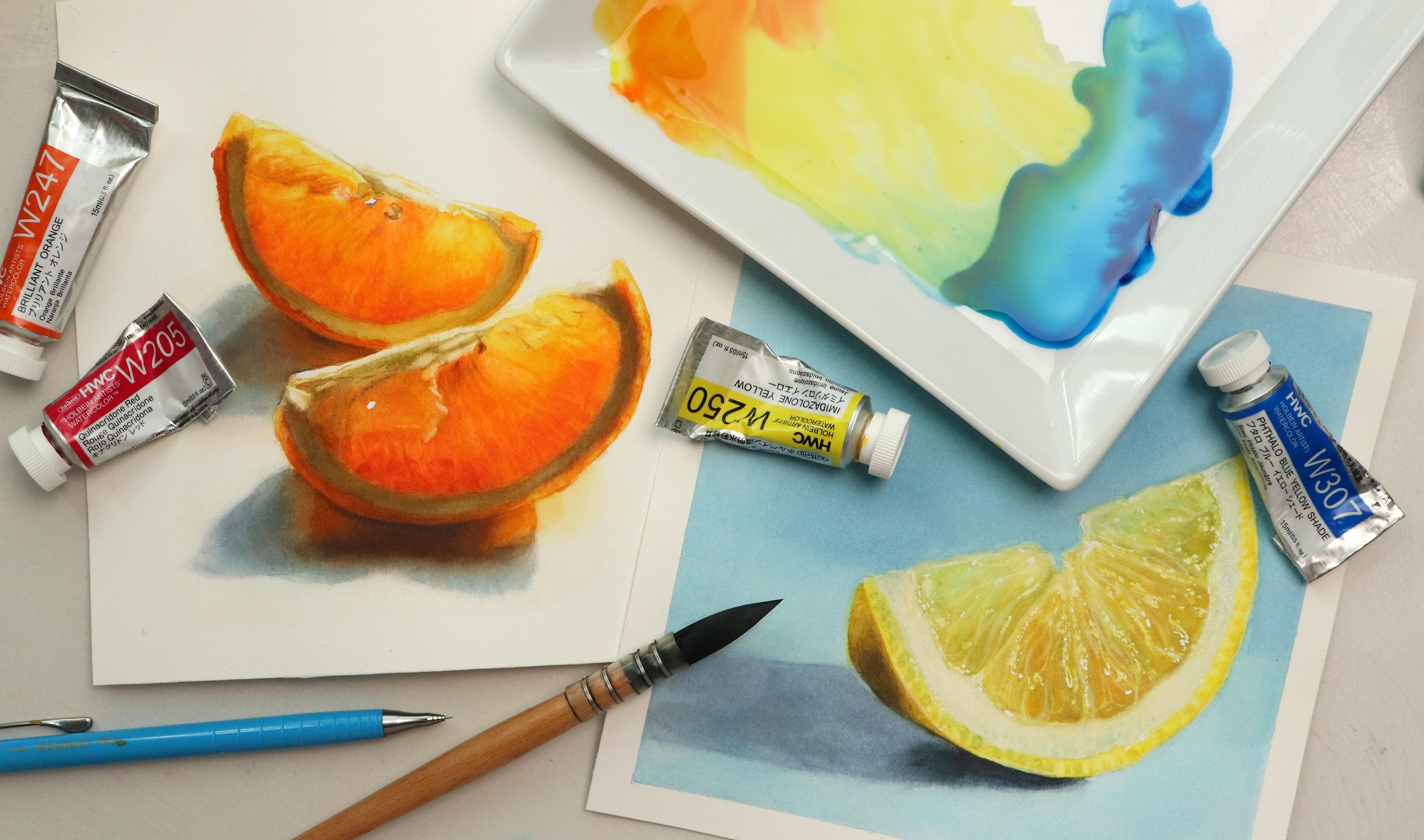
2. Supplies: Let's have a look
at the supplies. For this class, you're going
to need some watercoloors. I recommend having at least some version of your primaries, but we're going to go exactly
which colos in the class. You're also going to need
some watercolor paper. I'm using fabriano artistico
in extra white hot press. I do recommend
using cotton paper, but you can use any
watercol paper you have. And if you want to create
your own sketches, you may want some
sketching paper as well, unless you're fine
with sketching directly on the
Watercolor paper. You may need some tape to tape your paper onto
your work surface. And of course, we're going
to need some brushes. The main brush I'm going to be using throughout this class is bimten and it's number five. These brushes are slightly different to your
normal round brushes. They're more of a
mop brush shape, so they may take some
getting used to it. But these are going to
be the main brushes I'm going to be
using in my classes moving forward because I've fallen absolutely
in love with them. I'm going to be
using one flat brush to help apply a
background color. And you may want one or
two brushes for lifting. I've got some flat brushes
where I've cut down the bristles and one round
brush with more firm fibers, and as always, I'll be using a separate brush for
mixing my paints. You'll need some masking fluid. I'm using this one
by whole bind. We will also need a tool to
apply the masking fluid. I'm going to be using a dip pen, but you can use any
tool you prefer. You will need a pencil
and some erasers. I'm using a mechanical
pencil in 0.2, a normal eraser, and
a needed eraser. Some sort of palette
for mixing your paint. I'm going to be using a plate that I found in a thrift shop, cloth to wipe out brushes, some tissue to help get rid of excess water from the brush, and to help lift paint, and finally, some water.
Let's get into it.
3. Before Choosing Your Colors: Before we move on to picking any of the colors we're
going to be using, we're going to have a
look at a few paint or call qualities that may
be worth considering. But I do want to preface that
anything I'm going to say, although it may
have the potential to help you get a
better end result, none of it are hard set rules because in the end it all
comes down to technique, style, personal
preference, et cetera. They're just guidelines. So I've got a good selection of paints here that
I'm going to be narrowing down to
a smaller number according to these qualities. Doesn't mean that you can't use the colors I'm
going to be taking away, and it also doesn't mean that
using the colors that are going to be left are instantly going to give you a good result. It depends on how you use them. But we'll get to that
all in good time. The first quality we're going to have a look at is granulation. Granulation is a
pigment property, so some pigments granulate
and some don't so, although this feature or quality isn't exclusive
to watercolor, it's usually more prevalent in watercolor due to the
way we use the paints. It can give you really
cool effects and textures or unwanted textures depending on your style or what
you're painting. As an example, granulation may be really fun
if you're painting landscapes and you're painting something like stormy skies, moss, stone, concrete,
and stuff like that. Whereas if you're
painting portraits, and let's say you're painting a baby or a child with
very smooth skin, this texture may not
be what you want. Some of the most commonly
used colors are granulating, such as ultramarine
blue or cobalt. Lot of them are going to have
very subtle granulation. So for something like citrus, it's usually not
going to be an issue. I will quickly add
that it's worth knowing your pigments and
colors in your palate. The reason being is that
here as an example, we've got two colours peacock blue and
quinaqudon scallet. Both are marked as
being granulating, and technically they are, but I do find that the granulation in the
quinaquidon scalet doesn't show up enough for me to count it as being a
granulating color. It may show up in some mixes, but it usually
doesn't bother me. So I'm allowing the quinacudon
scalet to stay in the mix. Second quality worth
considering is opacity. So how transparent
opaque your paint is. This is also a pigment quality. And again, depending on
what you're painting, this may or may not be
something you want to consider. So if painting a glowy, transparent or
translucent citrus fruit, using transparent
calls are going to allow for more light
coming through the paint, allowing us to see more
of the paper underneath, which is going to help give
us a really glowy effect. On your paint,
you'll see a symbol, and depending on the brand, this may be a square or a circle. For Holbein, the
circle indicates the opacity and the square
indicates the staining power. Empty circle indicates a
fully transparent cola, half filled circles, semi opaque or semi transparent, and the fully cod in circle
considered opaque colas. I'm not getting rid of all the semi transparent
or semi opaqes, but if you are playing along, we want to get rid of any of the colors that contain white. I am by no means a watercolor purist in
the traditional sense, and white definitely
has its place. The problem with white is
that when using it in mixes, it tends to muddy up
colors a lot more easily. It also allows for less
light to come through, which to some extent is
true for all semi opaques. But with white, it's
on another level, so we want to get rid of those. Third quality is the number
of pigments each color has. Some colors like
quinaquiomagena, has one pigment,
pigment red 122. Others are made up of
multiple pigments, and these formulas or combinations can vary
from brand to brand. So for color like indigo, each brand may have a
different color recipe for what their indigo
is made up of. But why is that important? Mixing colours, every time we add another
pigment to the mix, we run the risk of muddying
up our colour a bit more. Kind of like cooking
where a couple of spices are going to
make the dish super tasty. But adding all the spices from your cabinet doesn't
necessarily mean that it's going to make the
dish even tastier because some spices
just don't go together. The same with color mixing. You could create one mix using just two pigments to
create an orange. And even though there are other
factors that are going to play into what this orange
is going to look like, there's at least a
good chance we'll end up with a decent, clean orange. Whereas if we mix
together a bunch of different yellow pigments and a bunch of different
red pigments, there is a high chance
or risk that some of these pigments or spices are going to muddy
up the flavor. This is also one
of the reasons why some artists prefer using
only single pigment colors. Now we don't have
to exclude colors that include multiple
pigments in this class. But for the sake of this lesson, let's get rid of
all the colors with multiple pigments so we're left with single pigment colors. That certainly leaves us
with a lot less colors. And if we want, we
can take it a step further by going
back to opacity. So even though we took away
the colors with white, when it comes to
mixing and layering, transparent colors are
often the best for this. We're going to allow the
semi opaques to stay, but let's get rid of
the folio opaques. I have a couple of cadmiums here, so I'm going
to get rid of those. There is one more
thing to consider, and that is the
temperature of each color. We're not going to
worry too much about this because it's
not a hot set rule, and we are going to see the difference when
we start mixing. So if something doesn't
work, we will find out. But the reason why
this may be important is that in some cases
when mixing a colour, so let's go back to the
example of mixing an orange, and let's say we want a
really bright sunny orange. If we take a warm yellow and
we mix that with a cool red, it may not look very sunny. But if we mix that same warm
yellow with a warmer red, it'll very likely be
closer to what we wanted. So once again, none of
these are hot set rules. You don't have to follow them, but it's worth having at least
some sort of awareness of these factors when
picking colors for a painting.
So let's move on.
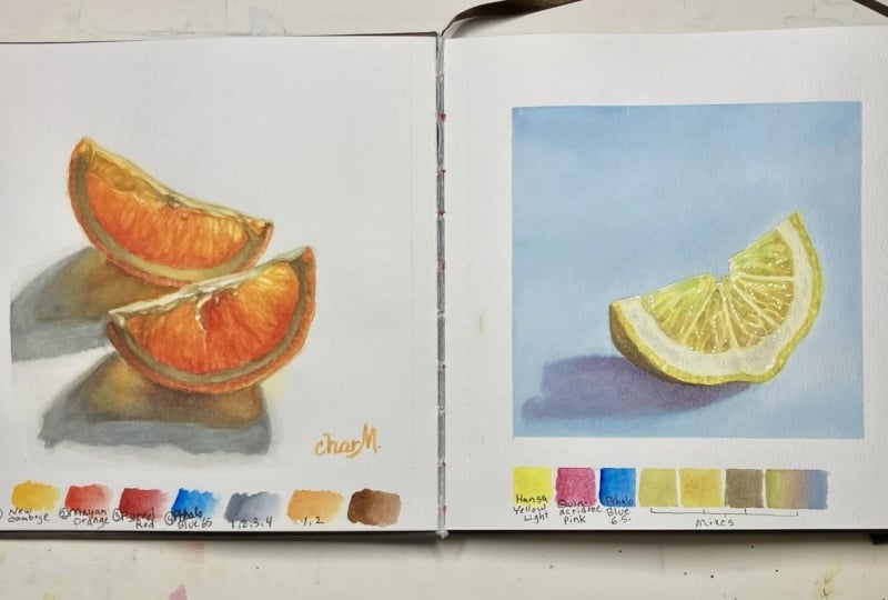
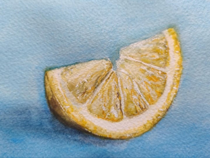
4. Study; Sketch: We're going to do a
study of the lime, so we first going
to do a sketch and then move on to
picking the colors. Now, you don't have
to exclusively use colors that match the
deduction process from the last lesson because depending on the selection of colors you have
available to you, that may not leave you with
the most ideal color options. To keep things simple, I'm going to use some of these
colors in the class, but we'll get to that
in the next lesson. For now, let's get
started with the sketch. You can do both
wedges if you want. I'm going to focus on the one in the front or to the right. If we hold our pencil
to our reference, we'll be able to get
the approximate angle for this top line. This does not have
to be accurate. It's just a study.
Now, the length of this line is just under two times the
length of the height. So if we sketch in
the basic shape, something like this, we can quickly check the proportions
by taking the height. And then if we place it two times next to each
other up here, we want this to be just a tiny
bit longer than that line. And minus a tiny bit too
short, but it's okay. One of the best
things about painting food is that it's so forgiving. We can alter the shape of this
wedge of lime quite a bit, and it's still gonna look
like a wedge of lime, so don't worry about it. Then we can finish
off the shape and add in a couple of those
remaining details. Something like this, it does
not have to be perfect. We've also got that very highlighted area
up near the top. So I'm gonna draw that in. And then we've got the shadow
coming out somewhere around here as well as down here. And then I think I'm going
to finish off my shadow, making it slightly shorter and more slended on
that final line. I feel like that looks better
with the crop of my papa, and that's about
it for the sketch. Before moving on to pina colors, I've also made this little
troubleshooting checklist. You can go ahead and
make one if you want. We'll use this to go over a few key points that are common mistakes a lot
of people make when trying to paint
realistic wedges of citrus or other
translucent fruits. So we know what to avoid. And we can fill in the
first one right now. Outlines. When painting
something like this, especially around
that top section where the light is
really coming through, we want to try and avoid
having visible outlines. Outlines tend to make things
look more illustrated. So for a stylistic choice, you could choose to keep them. But they can also
make things like this look more heavy and boxed in, and that's not what we want. At least not if we want
this to look realistic. So we want to get rid
of any heavy outlines using our needed eraser. Wherever we're
going to have those daca values or omit tones, we may be able to leave some of our sketch lines a bit heavier, but I'd recommend just
lightening the whole sketch, especially up on that top
section as well as in the shadow because shadows definitely don't have
outlines either. Awesome. Let's move on
and pick some colors.
5. Study; Color palette: We're going to pick our color palette so
get out your paints. As I mentioned
before, you can pick any of the colors you
have available to you. They do not have to follow the criteria from
the previous lesson. But to keep it simple and keep
my selection at a minimum, I'll be using the
colors I was left with, and I realized I forgot this one, I'm going
to add that in. A couple of things though
before we get started. This one, so manganese blue is typically a
granulating color, but the one by Holbein
is not a true manganese, so that is why it still
remains in the selection. I'm also going to get
rid of these three. You can use purples
and browns for mixing, but by
taking these away, I'm going to be left
with only primaries, making my selection as clean and limited or minimal as possible. This is what they
look like on watched. It's actually a really
good mixing palette for mixing pretty
much any color. Oh we've got all three primaries represented in what would be considered both warm
and cool versions. But I encourage you
to not worry too much about color temperature,
and this is why. So if we take a look at
our reference and see which colors we need
to mix for the pulp, we basically have one color but slightly different versions of that color for the light areas, mid tones, and the dk. But there's never
just one right answer when it comes to color mixing. So instead of worrying about
the color temperature, we want to look at the
colors we have available and figure out how
to mix those colors. As an example, we
could choose to look for the color in
our selection that is the closest to
the color we want to end up in order to mix green, we need blue and yellow, so let's start with the yellow. And in this case, I
would say that the imidazloon yellow or the imidaz lone lemon
are the closest. Let's try imidazloon yellow. This is one of my
favorite yellows. It's a very neutral yellow. It's not really warm nor cool. It does have a very
low tinting strength, though, so when
using it in mixes, you do tend to need
quite a lot of it, but it's a very
transparent yellow, so perfect for painting
these glowy wedges of lime. We don't want our mix
to look too vibrant. We need more of a dirty green. So let's try and mix it with
the Vallow blue red shade, which is a red leaning blue. This is not too far off, at least not for the lightest
of the mixes we need. Just for the sake of
it, let's try and mix that same blue with
the imitazon lemon. So more green, leaning yellow. Very similar and also a good option. Both of these are still a tattoo clean for those mid
tones and the dogs. But all we need to do to mix our neutrals is to mix
all three primaries. And since we've
got our yellow and our blue pigment,
let's add some red. I'm gonna go for
quinacrium scalt. And so if we mix
these trios together, we should be able to
create some mixes that are perfect
for this lime wech. We're just going to
do some quick semi sloppy mixing to illustrate it. So this may not be perfect, but hopefully you'll be able
to see that they'll work. But what if we use
colours that were less close to the mix we
wanted to end up with? Let's try and use
the Manganese blue. This is a very yellow, leaning blue under color wheel. If we mix that with
Imidazilon yellow, we're going to get a
green that is very vivid, too clean for what we need. But if we add a touch of that
red to dirty it up a bit, it's going to work perfectly. Of course, you may have
colors that are going to be less ideal for the
mix you want to create. As an example, if we take
a very orange yellow, mix that with our blue. The midtones and
darks may be close, but it's just not yellow enough. It doesn't mean we
can't use it, though, but because our yellow
is already so orange, instead of adding red, we want to add more yellow. So we don't always
necessarily have to include all three of
our primary pigments, so a red, yellow,
and blue pigment, but including multiple
colors in one way or another will often allow us to create not only more accurate mixes, but also more interesting mixes, which is going to
add more life and oftentimes more realism
to our paintings. So have a look at the
colors you have available to you and pick the
colors you want to use. For my blue, I think
more people have theos in their palette
than Manganese. So I'm going to use a h blue. And just for fun, I'm going to use the yellow
leaning version, which is technically
further from what we need than if I use the
red leaning version. But both are going
to work just fine. For my yellow, I'm going to
use the Imidazoon yellow, so the most basic yellow. And then to help bring in that warmth and
dirty of the color, going to add the
cinacrone scarlet. This red together
with either one of the theto should also allow us to make some
version of a purple. And although that is not
an absolute necessity, we can add some of this in the shadow areas completely
optional, of course. Let's move on to
some color mixing.
6. Study; Painting: We're going to get some
color onto our study, but first we can
fill out the next two key points on our checklist. Opaque versus transparent, and this goes back to the
pigment qualities. One of the best things about
watercolor is luminosity. So when painting
something like this where the subject is transparent
or translucent, using transparent or
semi transparent colors will allow for a lot more
light to go through, making everything look
more glowy and luminous. But also, if we're
planning on doing a lot of glazing and mixing, transparent colors just
tend to do better for this. We can also put down flat
versus interesting color. So what does this mean? We want to really
look at and study the colors of our
subject and notice all the small shifts
in color as it reacts to the light and
colors of the surroundings. Instead of using a color straight from the
tube, so in this case, I'm going to go in
with leaf green, which is a pretty
good lime color, and then we need some shadow. So we're going to use black. Black is great, by the way. I'm not against having black
in your watercolor palette, but this is not
the way to use it. This is going to result in flat, uninteresting washes of color. We could still use leaf
green for our base, but we want to mix
it with other colors like yellow or blue to
create these subtle changes, which is going to breathe a lot more life into our painting. So let's mix up our colors. We're going to start
with two color mixes. The first one will be
for the lightest values. I'm going to start
with the yellow. Then carefully add in a touch of blue to
create a bright green. You may not have to be as
careful with your color mixes, but the yellow I'm using has such a low tinting strength that it barely takes anything
to overpower it. Finally, a touch of red to give it more of that dirty or olivi tone. That looks pretty good. It
doesn't have to be perfect. For the second mix, we're going to do pretty
much the same thing, but adding a touch
more of the blue and red to create a
slightly deeper color. You really don't have to
worry about getting it to be exactly like in the
reference. It's just a study. The goal is to go over the different points
on our checklist, as well as familiarize ourselves with the different techniques we're
going to be using. Et's watch and see
what we've got. Close, but a bit too green. Maybe something like this. Close enough. Before
going in with any paint, we can fill out the next
point on our checklist, preserving or planning
our lights or highlights. So either masking of highlights
or painting around them. In either case, it's about
being aware of them, so we don't paint over them. On this study, the
only extreme highlight we have is right
along the top edge. So we're just going to paint
around it in this case. For the first layer, we want
to establish a base colour, as well as add in a few
details or texture, both by adding and
lifting paint. So let's wet out paper, wetting just the pulp. We want it to be
nice and wet with an even sheen without
any pooling of water. If it's too dry, we may not have enough working time
to add the details. Then we can go straight
in with the lightest of the colmixes adding this
along the top portion, just a thin wash. Instead of going
straight across, we want to mimic the texture we're seeing
in the reference. So we're just going to go in with small strokes like this, making some of them form small U shapes or
tear drop shapes, and we can then
pick up our second colmix and add that in. Don't worry about
copying the reference. Right now, we're just looking to get a fuel for the
different techniques. While the paper is still wet, we can add in some highlights, so we can rinse and
wipe off our brush, getting rid of as much of
the excess water as we can. And we can then go in and use the brush and pick up small
teardrop shapes as well. But We're going to allow that to dry, and then once dry, we can
go in with a second layer. For this layer, we want to add in the deeper tones
near the bottom. And in my case, I
definitely need to increase the saturation
up here as well. We're going to turn
the second Clomix into our shadow color
on deepest Clomix. We want a green that
is more cool toned, so we're going to use more of the blue and less of the red. That looks okay.
Let's go straight in. We're gonna wet our paper again, and then this time
we're gonna apply both colors using the
technique from before, adding in texture as
we're adding the color. I'm gonna pull this colo mix down along the bottom as well, where the pulp becomes
slightly lighter right before we get to the
white portion of the rind, which I know is technically
not called the rind, but hopefully you
can forgive me. I'm not claiming to teach botanicals and then the
shadow color as well. If you're not a fan of lifting the highlights while
the paint is still wet, you can go in after
the paint is dried, take a clean, damp brush, and lift out the
highlights like this. Depending on the staining
power of your pigments, this may be super easy
or slightly challenging. Let's quickly finish this off by adding some green
right here to the top. And right here for the
outside of the rind. What we've got so far
looks pretty good, but it doesn't appear
to be very luminous. And that brings us to the
last point on our checklist, pushing value and contrast, which may be one of the
most common issues. In order to have
a sense of light, we need to have ducks. But when looking at this, we
still have the most light coming from the white of the paper. So we
need to fix that. We're going to add colour
first to the white portion of the rind and then the
background and the shadow. According to our reference, the rind is green, but why not have some fun and add some more interesting color? You can mix up any
shadow color you want. I'm going to go for a
fairly neutral blue and a fairly neutral purple. Any color will technically work, but we may want to avoid
making it too saturated. Shadows are typically less
saturated than the rest. Et's go straight in. I'm
going to start with the blue. Transitioning into the purple. D. Back to the blue. And back to purple. There is no rhyme or reason to when I'm adding
blue or purple. A good rule of thumb
could be that wherever your eyes perceive the
color as being warmer, add maybe the
purple and wherever you perceive it to be
more cool, add the blue. In this case, the difference between the colors is minimal, so it really doesn't matter. Lastly, we want to
get some colour onto the background and onto the
shadow underneath the wedge. To keep it simple,
I'm going to use the same colours I
used for the rind. So I'm going to mix up a
bit more of the purple. We're going to first wet
the whole background. This is going to
help the pigment spread evenly
across the surface. Once we've got that, we can
pick up the background color. In my case, that's the blue. If you want, you can
allow this to dry before going in and
adding the shadow. I'm going to fill it
in straight away. Because the paper
is still quite wet, this may cause the edges to feather more than
what we'd like, but we really don't need to worry about that for this study. Even though most of the
values are quite light, hopefully you'll be able to tell that already it's
starting to look more luminous because we're no longer comparing the wedge to a
bright white background, and the pulp is now
encapsulated or outlined by those
deeper shadow tones. So if you're ready,
let's move on and paint a beautiful luminous
wedge of orange. I
7. Oranges; Picking Our Colors: Going to provide my sketch in the projects and
resource steps, so feel free to use
that if you want. You can also create your
own or trace the reference. It's completely up to you. But before we get started
with the painting, get out your paints and
let's pick some colors. When looking at the reference, the main colors we're
seeing yellows and oranges. Starting with the yellow,
the Imidazlon yellow I used for the study could definitely be used for this
painting as well. It's a beautiful, clean and
very transparent yellow, but because it has such
a low tinting strength, I don't think it's quite strong
enough for these oranges. Another one of my go to yellows is permanent
yellow light. This is a beautifully bright, warm yellow, and it
definitely packs a punch. So I'm going to
go with this one. If you wanted to keep
your color palette as limited as possible, a good option would
typically be to go with one of each
of your primaries. So a red, yellow, and a blue. So let's take a look at that. Depending on the colors
you have available to you, you may have some
better options. But just as an example,
I've got two reds here, acron red and pyrolRd. If we were to mix
these with our yellow, we'll definitely get
some beautiful oranges. And both of these could be
used for this painting. However, I would love to be able to really enhance that light and that glow by bringing in some
clean, saturated colours. So these may not be the best
solution for this painting. Let's have a look at
some premixed oranges. I've got three of
my favorites here. We've got transparent
orange by Sminke. Brilliant orange by Albin, And yellow orange by Michello. Let's watch those and compare
it to the other mixes. Water colour does lose some
of the vibrancy as it dries. So in order to do
a fair comparison, we can allow all the
swatches to dry completely. It's worth noting that all of these oranges are beautiful
in their own right, and what you're
going to consider the most ideal choice will depend on your personal
style and preferences. There is no right or wrong. I love clean and
saturated colors, so my eye instantly
goes to these two. The brilliant orange
will be able to offer deeper values on its own
than the yellow orange. So I think I'm going
to go with that one. Limited can mean many things. It could be three
colors, four, five, six, or even more, and there are many advantages to using
a limited palette. But sometimes depending
on what you're painting, it's worth bringing in
one or two more colors. In this case, I'm going to
go with four colors for this painting permanent yellow
light, brilliant orange, quinaquidone red in
order to be able to get even deeper tones and
to help mix neutrals, and they look blue, yellow shade also for mixing. Just a quick tip
before we move on. Most often when painting, I work from a palette with half pens or whole
pens for that matter. But whenever I'm working from a separate palette like this, sometimes I've got
paint left over, and this may not
look like a lot, but it can go a long way. So what I'll do is
take an exact knife, pick it up and transfer
it to my palette. That way you don't have to
get rid of usable paint. Once you've picked your colors, let's move on and get started.
8. Oranges; Planning: Before we get started
with the painting, it's always a good
idea to have a plan. So we're going to do a quick
study both to help plan our light and to help familiarize ourselves with
the different colors. So let's do a quick
drawing of the two wedges. It does not have to look good. If we look at the pulp, where we've got the most light
coming through is up here, where the wedge is the thinnest. So here, here, and here. We've got less light coming
through down here because this side is affected by the shadow from
the second wedge. The deeper cool tones
are going to come in somewhere around here. So something like that. And up here as well. And when I say deeper, I'm not
only talking about values, but also the colors going from those bright yellows to a
more yellow tone orange, mid tone orange, and
then a red toned orange. The deepest tones we've
got are going to sit somewhere around here
along this line. This may seem really obvious, but the reason why
it's a good idea to consider these things
before we get started with the painting is so that
we're able to go in with more confident
layers and color mixes. Because in order to really
keep this sense of light, we want to keep these layers as clean and vibrant
as possible. The more we go in and mess around and we add some
color and then lift it, et cetera, the more of
that light we risk losing. Let's have a look
at the color mixes. It's up to you if you want to color match to the reference. I'm going to go for
super clean colours. We're going to create four
color mixes for the pulp. The first one is going
to be pure yellow. The second mix is going to be yellow with a touch of orange. For the third mix, I'm going to mix orange with a
touch of yellow. And for the fourth
mix, I'm going to mix orange with a touch of red. The exact amounts
are not important. What we want is a range
of colors that go from a bright sunny yellow and gradually goes down to
the deeper oranges. My mixes are not an exact
match to the reference, and it truly does not matter. We will also need a color for the white portion of the rind, which I think is technically
not called the ind, but please bear with me. I'm going to mix up my
orange, yellow, and blue. I'm going for something
like a brown tope. This should work
as a decent base, though we are going to glazer
it with different colours. And again, don't worry
about the exact color. We don't have to match everything
to our reference photo. It's okay to do an artistic interpretation
of what we see, and that's part of what
makes art fun, right? You can go more
purple, green, blue. I'll still work. The most
important thing is the values. When we move on to our painting, the first thing
we're going to put down is a base
color for the rind, or at least the white portion. This will make it easier to
work on and control the edges for this section without affecting the color
layers within the pulp. And as we go through
the painting process, we will bring in more
colors to this area, like right here where the
color from the wedge in the front affect the color
of the rind on this one. For the pulp, we're going to start
with a base of yellow. Then transition into the
bright yellow orange Then the mid tone
or deeper orange. And finally, near the bottom, we're going to introduce
the deepest orange or the red toned orange. Of course, we'll also need to add some colour to
the rest of the rind. And again, we're
going to be using a variety of yellows or oranges depending on the
area we're painting. We're then going to go
in with a second layer, and you can work wet
and wet if you prefer, but I'm going to keep it super relaxed and work wet and dry. With this layer, we're going to bring in an interpretation of the texture we see.
And don't worry. I will be explaining and showing this in more detail
as we get into it. For now, let's just do
some swift strokes. And aside from texture, we're also going
to use this layer to intensify the
colour saturation. And then finally for the pulp, we're going to go in
with some light glazes. I'm going to mix up some
more of each of my colors, and then let's move on and get
started with the painting.
9. Oranges; First Layer; Base: Cleaned up my sketch, and the first thing
we're going to do according to our checklist
is get rid of the outlines. So we want to take our needed
eraser and lighten them, and I recommend lightning them as much as you feel
comfortable with. But of course, we want to
be able to still see them. I'm going to keep mine
slightly darker than what I normally would
because I still want you to be able to
see them on camera. Next up, we can have a
look at our highlights. It's up to you how much
you want to mask off. I'm going to do just a few
of the brightest highlights. So this one right here. I'm going to keep this
one lighter as well. Up here, I'm not worrying too much about
copying the reference, but I do want to try and capture a similar glistening effect. And of course, you're
also more than welcome to Mask off more
than what I'm doing. It just depends on
your comfort level. And then some right
here as well. Et's go straight in and add the first layer to the
white portion of the rind. We're going to wet our paper. Just like this, I
want an even shine, but I don't want
it to be too wet. Then we can pick up our color and go in with that first layer. The reason why we want
to work wet and wet for this is to avoid getting
super crisp edges. This may seem counterintuitive because when looking at a wedge
of orange in front of us, that line between
the white portion and the pulp is crisp. But because we're dealing
with a semi opaque or semi translucent object where the light is coming through, those edges may look softer. And so having a slightly
less crisp line is going to help
with the illusion of our subject glowing. As it dries, we're
gonna keep an eye on those edges and clean
them up if needed. As you can see with
my application, I'm trying to mimic
those wobbly edges. You don't have to, but it
does give it a nice effect. I'm going to go in
again straightaway without waiting for it to dry, just to deepen the values. We don't need the
values to be perfect. We can always come back
and darken them later. Same with the colour,
we are going to come back later and
do some glazing. For now we're just looking
to get a start with the rind with this
first color layer. Work in your own
pace. Don't rush it. I feel one of the benefits of starting with this
part of the wedge is it's the only part where we really don't need to worry
too much about the colour. We don't need to keep
it clean or cloy, so it's a nice way to
ease into the painting. Gonna move up to the
second wedge. Same thing. Gonna wet the paper.
For this one, we want the call to gradually become lighter as we
go down the side. Something like this. And just so that we're
not leaving this empty, we're going to pick up some
of our brightest orange. Add that in. It does not have to be perfect. I'm gonna quickly rinse
and wipe off my brush, clean up the edges, and then I'm just gonna go in
and fill in the rest. If you choose to go in
multiple times like this, you want to be aware of
how wet your paper is. If it's too dry, it
may be better to let it dry completely and
then go in again. I don't think I'm able to get in a second layer of this one without causing too many issues. So I'm going to wait for this to dry and then go in again. I'm gonna use whatever
little color I've got left to just slightly
deepen these values. Even though this may look dark compared to the
white of the paper, we still need to go danger, but we're not going
to do that just yet. Once dry, we can get started with the first
layer for the pulp. Our goal for this layer is
to establish a base color. This is going to be
the lightest values we see within the
texture and the pulp. We want to keep it
one or two values lighter than what we want
the end result to be because we are going to go
in with more glazes and texture on top. So
let's get started. Starting with the
wedge in the front, we're going to wet out paper. And then we're going to
pick up our color mixes one by one, starting
with the yellow. Gonna put that up here. So anywhere where we see those really bright
yellows coming through, it's okay if some of the
colo bleeds onto the rind. Just keep an eye on it as it
dries to avoid hot edges. Gonna pick up the next one, add that as a transition color. Maybe a touch over here just
to help bring in that glow. Not too much, though,
because we really don't have a lot of those
yellows going on over here. But it's going to
help add some warmth once we go it with some
of the deeper colmixes. You can do this using glazing in those
final layers, though. Gonna bring in the deep orange, follow along here and really just fill in this
entire remaining section. You don't have to be too precious or worry about the
placement of the colas. Just follow approximately what
you see in the reference. And finally, some of
our last calmics still keeping everything
fairly light and less intense than what we want
on our final painting. Gonna move around the
shape, something like that. Gonna push the pigment
away from this bit. Like that. Onto the next one. Same thing. We're gonna start by
wetting the paper. Oh going in with our yellow onto the
bright bits up here. And over here, we can be more generous with the
yellow and this one because we've got more
light coming through, so we've got more of
those brighter tones. Picking up the next one. Don't worry about perfection. We just don't want
to go too dark. Going in with the deeper orange. And And finally, our deepest colmis. Let's clean up the edges. Like that. I also have this
tiny bit up here. I'm going to clean
that up before it dries completely. I
don't recommend this. Wait for it to dry
before lifting, but I'm going to soak up any
moisture really quickly, so hopefully it's
going to be okay. Really, this is just
me being impatient. If you've run out of
the color for the rind, just like me, we're going
to mix up a bit more. We're going to use this to add some of the deeper
values up near the top, so we don't need a lot. I'm going to go in wet and wet, but you can also go in wet and
dry and then blend it out. So we're going to add that here, following this line, keeping
an eye on the edges. Gonna rinse my brush
and clean this up. For the second one
tiny bit up here. And maybe over here as
well. Blending that out. Finally, for this first layer, we're going to add
some colour to the outer portion of the rind. For this, I'm just going to
go in with the bright orange. But you're more than
welcome to go in with more color mixes to get it
closer to the reference. My main goal for
this is just to get some colour onto the paper to
finish up the first layer. But if you find it
distracting to have these bright values
near the shadow areas, you may want to go in
with some darker mixes. Hh Okay, we're going to allow
this to dry and then go in with a second layer. You can go in wet
and dry if you want. I'm going to go in wet and wet, but I'm only wetting
the paper within the sketch or wedge
itself because I want the outside edge to stay
crisp and still have a soft edge between the white and orange
portion of the rind. And
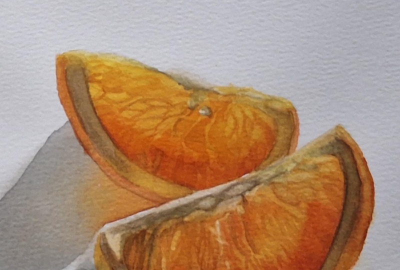
10. Oranges; Second Layer; Pulp : With the second
layer, our main focus is going to be
adding the texture. We're not going to
worry about recreating the exact details
of the reference. Our goal is not hyperrealism, but we do still
want some texture to give it a more
realistic look. So let's have a closer
look at the texture, and I think it goes without
saying that you should not look at this as a
scientific explanation. If we look at the
wedge very close up, the pulp consists of small
shape similar to this. Some of them may look
like teardrop shapes, some of them may be slightly longer or
tapered in both ends, and some of them may
look really squished. So what we want to do
is imagine these shapes within our wedge and
create a similar pattern. For the most part, I'll be
filling them in like this. And then in some areas, we may want to go in with
some outlines just like this or in some of the areas where we really don't see a lot of detail at all, we may want to go in with a solid layer of
color, deal us choice. This is not going to give
us a fully realistic, completely accurate
rendering of the reference, but it's a fairly easy
technique that will give us a nice texture
without too much effort. This is optional, but
I'm going to mix up another shade of orange
using my yellow and my red. It's not a necessity, but it's to give me an orange
that is I can't really describe it in any other way than less clean or
more dirty looking. It's not at all a bad thing. It just has more of a neutral
feel or less vibrant. Another way of mimicking this, depending on the
colors you're using is to add a tiny bit of blue or maybe even some
sienna into an orange mix. Let's start with the
wedge in the back. The details are
soft on this one, so it'll give us a chance to practice without it
feeling as detrimental. We're going to go straight
in, and we want to at least approximately follow the
colors from the base layer. So up in the yellow areas, we want to use mostly yellow, maybe some of the
brighter orange. And in the more orange areas, we want to use those
same colors and maybe some of the deeper tones. Use the reference as inspiration to figure
out where you want to add outlines or where you want to fill in the center
of the shapes. But exactly where you do what isn't really
that important. One tip, I guess, is to not go in with a
paint mix that's too dry, so one with very little water. And the reason for this is the
more dry your paint mixes, the more of the pigment is going to sit on
top of the paper, which means it's going
to be easier to lift or smudge if we go
it with more layers. Some smudging or lifting
is unavoidable, though. That's just how
Watercolor works. The more layers you build up or the more intangible
layers of colours are. The more pigment concentration
you have on your paper, the more easily some of that pigment is
likely going to lift, and we're okay with
some lifting for this. In fact, because the
lifting is going to cause the edges to look
softer or more blurry, that's exactly why I'm
choosing to go in wet and dry. We're not looking for
super crisp texture, so we want those
edges to soften, at least to some extent. You may want to rinse your brush between some color changes. So if we've been using orange and want to
go in with yellow, we may want to rinse our brush. Keep referring back
to the reference. Look at the direction of which those small shapes go and look
out for any color changes. Even though we're not concerned with creating an exact copy, we still want it
to look similar. And I know it looks
strange at this stage. If you don't feel too
comfortable with this technique, I recommend going in and doing a test on a
separate piece of paper. Just trying out the technique, get more comfortable with it, and then come back
to the painting. But honestly, don't worry
about it. Just have a go. The worst thing
that can happen is we mess up a painting,
and so what? We'll still learn
something from it. Actually, if you
do have paintings that you're not happy with. So paintings where you
have them in a pile, you don't really want to show
them to anyone or paintings that you just never quite
finished for whatever reason. Take a few minutes and write some notes on the
side or on the back, analyze what it is
you're not happy with or what it is you
want to improve on. Maybe you used a color
combination that you didn't like, or maybe a certain
technique didn't work out. Write down any and all
information like that. You could even cut out
pieces from the painting and clue into a sketchbook
and write the notes in there. The reason why I
recommend this is because it can really
help our future selves. One, writing something down
makes us remember it a lot better because how many times have you tried
doing something? Realized you didn't like it, and then a few months down
the line, we do it again. I know I have. And it's
also a good way to keep track of things you may want
to practice or improve on. Once we've done, we should have something similar to this, and we want to allow
that to completely dry. Once fully dry, we're going to go in and glaze
on top of this, basically using the same
colours we used for the base. So we're going to go
in, pick up our colour, add this in one stroke
with minimal pressure, pick up our next color, add that in, and continue repeating this step
over and over. So in the yellow areas, we want to use mainly yellow. In the bright orange areas, we may want to use mostly
bright orange, et cetera. Don't be too strict
with this, though. It's just a guideline
because we also want to use this
as an opportunity to make color adjustments. So if we need daca values or daca colors in some
areas, we can add that. If we want to try and
brighten up some areas, we may want to add a more
yellow base, et cetera. The only thing is we want to try and do this in one layer. Because as we're adding this, some of the pigment is going to lift and some of those
edges are going to soften. And so the more we do this, the more that pigment
is going to lift, and the more detail
we're going to lose. Now, you may be able to go over the same area
multiple times. Use a light touch
and keep an eye on how the paint
underneath reacts. Reasons why you may
want to go over the same area could
be either adjusting the color or if you simply want to smudge the
texture a bit more, so soften those edges. Just be careful. We don't
want to lose all the texture. When we're done, we should
have something like this. Let's go ahead and do this to the wedge in
the front as well. Same way, building up the pattern followed
by the glasses. You can also use the same
technique with more precision. So go in and follow
the reference more accurately both in terms of the pattern and
the colours you see. That is, if you want an
even more realistic look closer to the reference. But I really hope you
agree with me when I say that this is a fairly
easy technique to use. I wanted to include a
technique that would give really good results with
minimal difficulty. A For this wedge to
save you some time, I'm going to speed up the
footage. Not too much. I definitely still want you to be able to see what's going on. But since the technique
is very repetitive, I believe it'll be okay. Citrus fruits are so
much fun to paint, and it's warm I go to subjects whenever I feel like
painting something, but I don't quite
know what to paint. It's also visually a
really appealing subject. Because the wedge in
the front is less out of focus and has
more crisp detail, I am spending a bit longer
on building up the texture. It's not necessarily
going to reflect in the final painting because once we go over it with glazes, a lot of the detail
is going to soften or be somewhat hidden behind
those new layers of color. Another way of painting
these orange wedges with a very similar technique
would be to go in wet on wet. So wet the paper,
pick up the color, and then add the texture. And if I were to render
this in full realism, that's probably the
technique I would go for because that
way we'd be able to control how soft or how crisp the edges are depending on
how wet or dry our paper is. Doing it that way, you
may want to consider adding in the base
color at the same time. So rather than going
in with glazes, after adding the texture, zoom into your reference and follow not only the
pattern itself, but also the color
surrounding it. It may take more
time and precision, but it may also be a better way of getting a more
realistic result. I recommend trying
both ways, though. So for this painting, let's
focus on this technique, and then in the next project, we can have a look at
doing it the other way. I think this texture
looks pretty good, so let's go in with the glasesPicking up
the cols one by one, just like before, adjusting the colos depending on what we're seeing
in the reference, at least what we
interpret seeing. It doesn't have to be accurate and it does not
have to be perfect. Oh Once we've got that, there may still be things
you want to adjust, but we're going to leave any final touch
ups till the end. The final thing we're
going to have a look at in this lesson is lifting. So if there are any
areas where we want to bring back some lighter tones, depending on the area we can use either our normal
brush or our scrub up brush and go in and lift it. So damp or wet brush. We just don't want
too much water on it, go in like this and bring
out those lighter values. We're gonna allow that to dry and move on to the next lesson.
11. Oranges; Second Layer; Rind: Okay, we've got this
beautiful orange pulp, and in some ways you
could say it's glowing because of how vibrant
and bright it is. But in order to really emphasize and show off that
light coming through, we need some darkness as well, something to compare it to. Next up on our list, pushing the values and contrast. If you're having a
hard time seeing the values, that's okay. Sometimes it's
difficult when there's so much saturation
on everything. If we add a black
and white filter or turn down the saturation, it may be a bit easier. You can take a picture
of your painting as well and do the same thing. I'm not too far off down here. And right here on the brightest portion of the
orange part of the rind, I'm also pretty close to
the final values I need. But I definitely need to darken the rest, so let's get into it. I've cleaned up my palette but if you have space
on your palette, definitely use the left o paint you already have to
mix the new color. We're going to start with the
white portion of the rind, so we're going to need
to mix up at brown. And to do this,
we're going to mix some combination
of our primaries. I'm going to start
with my orange, red and blue and see
where it takes me. Don't be scared of color mixing and don't worry about using the exact colors or the exact
amounts that I'm using. You don't even have
to add orange. You can use just the yellow, red and blue, and it'll
be perfectly fine. Right now, my mix
is looking too red, so I'm going to add
in some more yellow. I could have saved
myself that trouble if I just use the yellow
instead of the orange, but it doesn't matter. Every road leads to Rome. Or in this case, any combination of our primaries is going
to lead to a brown. I'm going to add in some
blue to help neutralize it. Something like that. If you're unsure whether or not
you've got the right color, swatch it close to the edge of the paper and hold it
up to your painting. I think I'm going to add just a touch more blue to my neck, make it slightly more neutral. We're going to wet our paper just like we did in
the first layer. This time we don't
want the color to go all the way up to
the orange pod. So we need to use our brush
to help control that edge. I'm gonna wet the paper. Pick up my color and begin adding
that in like this. We're going to pull that
colour down the side, gradually fading it out,
using water to help. We can also drop in
a small amount of pigment like this
for some texture. It's going to be very subtle, but it still adds
something to the painting. And I'm going to add just a
thin wash on the other side. Starting up here where I want the most concentration,
but still not a lot. And blending that out, as well. We're gonna allow that to dry. In the meantime,
we're going to mix up a color for that
bit in the center. I'm going to mix my
yellow and orange. Something like this and
a touch of a brown. It doesn't have to be
an exact color match, but we do want some version
of a yellow or light orange because the color in
this area is caused by that reflected color from
the wedge in the front. This is going to
be fairly light, so I'm just going
to add it wet and dry and blend out the edges. Make sure the other colour
or layer has already dried. Otherwise, you may
cause blooming. While that dries, we can move on to the wedge in the front. Same thing, wetting the paper. Picking up the color.
And then for this one, I'm going to go in
with a heavier layer. How heavy or light
you want to go is, of course, going to depend on
the base you already have. So compare your painting to the reference or a black
and white filtered version. I'm still going
to leave room for some light glazing on this one, not so much to
deepen the values, although that is, of course, a side effect, but mostly to leave room
for color adjustments. Sometimes during the course
of the painting process, you end up making decisions that you weren't necessarily
planning on. And so having that room to make those final adjustments at
the end can be really useful. Gonna drop in some
colour here as well, just like with the other wedge. Due to the amount of
water I have on my paper, this isn't really going
to add much texture, but it is going to
add some unevenness. And I do really like that. Already, the contrast between that orange pulp and the
shadow color on the ring has helped push that orange forward and made it
light up so much more. Don't be afraid to
push those contrasts. And in fact, for this
type of subject, it's better to go a bit too dark than too light.
And you know what? Why not? A duck or shadow
color or shadow tone is going to give a
more dramatic effect. I might as well demonstrate
it on this painting. I'm going to add
another thin layer to deepen the values
a tiny bit more. This time, I'm just
going to go in wet and dry to make the
process faster. And you could deepen
these values even more. The darker you go, the brighter those oranges
are going to glow. So it really just depends on what you want the
painting to look like. Softening the edges. I love how it brings out
and enhances that light. Let's add some more colour to that white portion or membrane
near the top of the wedge. I'm going to bring
some more yellow and orange into this mix. We're going to use this for
the base before going in with the brown and a
touch of the brown. You can go in wet and wet. I'm going to go in wet and dry. So I'm going to
pick up my colour. Add that in. Rinse and
wipe off my brush, soften that edge, and
add in the brown mix. We can also bring some
of that color down here to get a bit closer
to those shadow tones. I know it may feel
a bit weird to ruin that bright
orange like this, but it's just going to
put even more emphasis on how bright the
rest of the wedge is. If you dare, we can get some of both mixes and do a
thin glaze right here. It's not necessarily going to
make much of a difference, but it is going to shut out
some more of the light. Moving on to the orange part, we're going to mix
up two colours, a bright orange, so I'm going to mix my
yellow and orange, mostly yellow, and I'm
going to mix it right here. And we'll need a Diba orange. I'm going to mix orange
with a touch of the red. You could definitely mix more color variations
if you want. But for now, I'm just
going to keep it simple. Okay, we're gonna wet the paper. Get that nice even sheen. Pick up our brightest comics, add that in as a base. Wipe out brush? We can use the tissue to get rid
of more of the water. Pick up the daga mix, and then we're going to
add that along here. Between those two colors, it's okay if some of the pink gets onto the brown portion. Just watch out for any
harta just forming. Then as the paper starts to dry, we can bring in some detail. I'm gonna pick up some
of my color and then go in and draw small circular
shapes like this. It does not have to be perfect, and some of them may soften
to the point where you can barely see what it
is, but that's okay. Just like that. Then we can move on to the other
half and do the same thing. This time keeping
the call mixes daga. So we can still start with
the base of the do mix, but go in with a
more saturated layer like that and then add
in the daca details. Once again, these details are not the most important part. They're just sprinkles. They're great to
have, and they can add some realism
to the painting, but they're not going
to make or break a painting the same
way values are. So focus on pushing those
values and contrasts. I run out of my Diba orange. I'm going to mix up some
more and then continue. It's important to note that the details are
not the important part. We want to keep an
eye on those values. So the deep orange tones, especially on this half, need to be about the same value as the deep brown
we added before. Because we are working with
Depo values down here, I'm going to mix in some of
the brown for those details. Another thing to note is
that on the first half, you are okay with some of that orange bleeding
onto the brown. But for this half,
because it is in shadow, the colors are far
more separated. So even if not by much, we want the brown in this area to have a slightly
more cool tone. If you do get some color onto the white portion,
though, it's okay. We're not going to
be that strict. For the wedge in the back, I'm going to go in wet and dry. You can also go in wet and wet. It just depends on your
personal preference. We're going to add
the bright base, and I'm going to pull some of this colour onto
the white portion. We don't necessarily have a lot of texture or detail here, but we do have some slightly
deeper values right here, so we go to add those in. Onto the other half, same thing, starting with
the bright orange base. Add in the deeper orange. And pull some of that
onto the white portion. Just a tiny bit like that. We are definitely
approaching the finish line. Let's add the shadows
and final touches.
12. Oranges; Shadow & Final Touches: Going to finish up the details
and add in the shadows. So first, we need
to take an eraser and get rid of the
masking fluid. We are going to start
with the shadows, but first, let's just fix
these two areas right here. They're kind of sticking
out like a saw thumb. I'm going to take the brush that I usually use to mix my paints, dip it in my water, and
wipe off most of it, and then go in and use it
to soften these edges. Just like this. And I'm allowing
some of that pigment to bleed into that empty space because we don't need
this to be bright white. And here, while
softening the edges. I'm also going to
use a pigment to fill in the area
with a pale colour. And if needed, we can always
bring in some more pigment, but for now, I'm
going to leave it and come back to it at the end. For this one, however, I do want a tiny
bit more colour. So I'm gonna pick up
some of the colour from before and add that in. And again, we can
always come back to it for a few final touch ups. Let's move on to the shadows. If you've got room
on your palette, keep the paint you already have. The shadow color we see
in the reference is a pretty proper gray color. And if you want to
stick to those colors, definitely mix up a gray. I'm going to mix up a
very cool tone gray or more of a muted blue just to
have some color contrast. I'm not looking for a
particularly vibrant color. First off, shadows are
usually less saturated, but also, I don't want anything to compete
with those oranges. Mixing together my
blue, red and orange. There's no specific
ratios or mixing recipes. Just keep adjusting the color
until you're happy with it. Your colmix doesn't even
have to be close to mine. If you want slightly
green or purple shadows, go for it or if you want
to stick with the gray, that's perfectly fine, as well. You genuinely cannot go wrong. For the shadows,
we're going to go in with two to three layers. For the first layer,
we're going to establish where the
different colors are and also try and somewhat
match the values of the outer portion to where
the shadows are the lightest. For the second layer, we want
to adjust the values and the colors and get
closer to what we want the final
shadow to look like. And then if needed, we can go in a third time and make a
few final adjustments. We're also going to
need some orange for that reflected color
we're seeing right here. And even though it's subtle, there is a slight
yellow tone right here. If you still have the other
mixes on your palette, you can go ahead
and mix into those. You can also do the shadows
in one layer if you prefer, but I like how gradually
building it up allows us to look at
what we've already got, assess, and then make
decisions from there. We're going to wet out paper. We want an even shine, but we don't want to be too
wet because we still want to be able to control the color
without too much trouble. We're going to start
with our orange, add that right here and pull that color out following the shapes we see
in the reference. It doesn't have to be
perfectly accurate. Then we can pick up some
of our shadow colour. I'm not rinsing my brush. The pigments are going to
mix anyway. Add that in. Right in this area,
the shadow is daca. So if you do get more pigment
here, that's totally fine. Gonna quickly rinse
and wipe off my brush, pick up the shadow colour, and add that to the
rest of the shadow. Being careful not to introduce more water than what is
already on the paper. I'm going to pull some of this color into the orange area. You only want to do this if
your paper is wet enough. Otherwise, it's
better to wait till the second or even
a third layer. All I'm doing is mixing the pigments and getting rid
of some of the vibrancy, but you can do this
with a glaze as well. Then we can rinse and wipe off our brush and clean up
the edges if needed. For the shadow in the
front. Same thing. We're going to wet our
paper just like before. This time, we're going to
start with the Btu mix, add that in right here. Then transition into the orange. I definitely don't
have enough mixed up, but we want to follow along
here near the bottom. And if you do have more
paint mixed up than I do, you can go in with a daga
almost saturated layer. Picking up and adding in the shadow color without
rinsing the brush. And rinsing and wiping the brush before picking up the
shadow colour again. Even though we still need to go in and deepen the shadows, it's already making such a
difference to the painting, and it's making those wedges
look even more glowy. Once we've got this, we can allow this to fully
dry and go in again. For the second layer,
I'm only wetting the paper within the lines
or within the shadow shape. Now that we've got those
initial colors in place, we can use the second layer to adjust both the values
and the colors. I'm going to make
some of my shadow color into my Diba orange, and you can add in more or less depending on how vibrant
you want the colour. There's nothing wrong with
exaggerating and making that reflected color more
vibrant if you want. Maybe a bit more. That looks pretty good. We're going
to start with this. Transition into more
of the shadow tone. Even more of the shadow color. And blend out the edges, making sure they're
nice and soft. For the shadow in the front, I'm also going to wit
the paper where that yellow is because I do want
a touch more color here. Gonna add in a bright
orange right here and then a Tiba more dirty
orange for the rest. And to make it easier,
I'm gonna save those final deep values
here for a third layer. Rinsing and wiping my brush. Adding in those deep
blue or gray values. And blending that out.
Something like this. Looking at this, I think
I'm going to go in with a third and technically
a fourth layer for that shadow in the front. So what I'm going to do
is go in wet and dry, deepen some of those values and colors closest to the wedge, allow that to dry, finish up the details on
the wedge itself, and then come back with a final wet and wet
wash for that shadow. That way, I'll be able to
make any final decisions regarding that shadow by comparing it to
the wedge itself. Whether you want
to do the shadows in one or multiple
layers and whether you want to use wet
and wet or wet and dry all depends on
personal preference. I don't always use
the same technique. It depends on the painting. But as with everything else, I recommend trying multiple
different techniques. That way, you'll be able
to tell what works best for you or what
works best for what, depending on the situation. In order to finish
up the details, I'm going to bring in some
more paint on my palette. And when I say there is
no coll mixing recipe, that is not an understatement. I want a variety of
oranges, tans, neutrals, so we can pick and
choose any coll we need depending on the
area we're working on. Uh It's up to you how detailed you want to go. I'm going to look for some of the most obvious differences. But as I've already mentioned, the goal is not hyperrealism. You can make it as loose or
as rendered as you want, depending on your preferences. The first thing I'm noticing is the deeper value right here, as well as those small
bits from seeds. So I'm going to bring in an
orange brown or dirty orange, add that in, and blend it out. And we can paint a super
quick impression of that bit right here by adding in
a base of some yellowy, dirty orange and adding
some deep brown on top. Same right here. Okay,
that was maybe a bit too dark. Not a big deal. Gonna quickly lift some of that. And go in with the dark brown. And while we're in this area, let's deepen the values
over here as well. Just like that. I'm going to use a deep orange or orangy
brown to deepen that rind. Each of these changes, although they may seem small, can make a huge difference. Look for any place or area where you want
to make adjustments, and that is in terms of
detail, color, or value. The changes you may want
to make to your painting may vary from the ones I
need to make on my painting. So compare your painting to the reference to see where you may want to go back in or where you want
to leave it as is. I don't want to add
too much more detail to my painting,
for the most part, I'm looking for the
areas where I need to darken or deepen the values, like for the rind and shadow. But whatever you do, don't stress about the exact approach, with the exact
colours, et cetera. There is no right or wrong. Use this as an opportunity to play around with
different techniques. And then if you're interested
in future classes, we can have a look at painting
a more detailed version as well as playing around
with changing the colors. Focus on the main shapes
and the main values. Oftentimes, when
those are in place, a lot of the details are
going to seem less important. I am pretty close to
calling this done. Finally, I'm going to go in
and do some light lifting. Pick up a few of
these highlights. Something like that doesn't
have to be perfect. And maybe for a final touch, I'm gonna make some
orange with my red, go in wet and dry and add that right here
in swift strokes, mimicking those reflections
on the surface. I'm gonna leave it as is. If you want, we can move
on and paint a wedge of lemon using a similar but
slightly different approach.
13. Lemon; Colors & Sketch Prep: We've got an image here that's very similar in style
to the oranges. We've got the light coming
in from behind our subject, shining through
the pulp of flesh, and we can even see some of the background
color through it, both because of how thin the wedge is, but also
because the pulp, in this case, being a lemon has a lot less
colour than an orange. We're not going to create a finished painting
of this one because it's too close in style to
the one we already painted. But I'm still going to
upload the reference for you to use if you do
feel like painting it. Instead, we're going to
have a look at this one. So how do we show transparency
in a wedge of citrus when it's lit from the
front rather than the back and we don't have
that light coming through. With this wedge, specifically, we do still see some
of the background call coming through near the top. So that is definitely one way. But for the most part, it's all those subtle color and value changes within the flesh. These are what inform
our eyes that there is a certain depth or
thickness to the wedge. And because of the transparency, even if we don't
feel like we can see through the wedge near
the bottom of that flesh, so in the thickest part, in
a way we still can because those calls and
the way they look do partly come from
the background color. In order to really
show the transparency, we need to capture
those color changes. Let's take a look at the colors
we're going to be using. The color palette for this
one is fairly simple. We've got bright yellow. We've got the background color, which is a tone down sky blue. And we've got the
deeper yellows, some more warm tone
and some more cool toned and more heavily affected
by the background color. You can pick any colors you feel would be suitable
for this painting. I'm going to use
a limited palette of our three primaries. Looking at the color palette
from the previous project, the thalo blue yellow shade should work well for
this project as well. So I'm going to
keep that. We could use either a red or an
orange for this one. If I were to use an orange, I would like one
which could offer deeper values and also
one that is less bright, maybe something closer to the
Shminge transparent orange. I do, however, think
the inacon red could work. So let's
go with that one. Lastly, we need a yellow, which is really the most important color
on this painting. Now, you could use a color
like permanent yellow light, but I do think it's a bit
too warm for this one, at least when looking at the
colors in the reference, a color like Imidaz on lemon
could be a great option. And if you do have
a similar yellow, which is more of a lemon colour, definitely give it a go and try doing some mixes with that. But for the sake of the class, I don't want to pull out
too many different colours. I'm going to go
back to Imidaz Loon yellow from the initial study. So let's have a look. We
have our bright yellow. If we add in a touch
of our red and blue, we can get some of those deeper, more neutral looking yellows. For the background, the
blue on its own could work. But if we add in a
touch of our yellow, we may be able to get a
color that's even closer. And, of course, with
our red and yellow, we are able to get some warmer, more orange tones as
well, should we need it. Once again, I'm going to
be providing my sketch in the projects and resources
tab if you want to use mine. As always, you're also more than welcome to create your
own or trace a reference. Even more so with this sketch compared to the previous one, I recommend
lightening the sketch as much as you feel comfortable with because these
light yellow colours are not going to cover up much. I'm still going to keep my
sketch slightly darker than I normally would to hopefully
have it be visible on camera. Once we've got that, we can
mask off our highlights. Now, there are a lot of surface
highlights on this one, and we don't need
to get all of them. We also don't need them to be an exact match to the reference. Get out your masking fluid. What I recommend is first looking for some of
the main highlights. So some of the
larger ones you see. They don't have to be
in the exact same spot, but look at the placement and try to get yours fairly close. And once you've
added some of those, it's usually easier
to add the rest. Or at least some more. If our goal was to create
a hyperrealistic painting, we would want to get these as close to the reference
as possible, or we would need to
adjust the pattern on the inside to fit these highlights because
in all technicality, the way the highlights sit on the surface are directly
linked to the texture. But honestly, this painting is not worth losing
our sanity over. So let's just add in some highlights similar to
what we see in the reference, and we'll be just fine. Once you've got your color palette and your sketch prepped, let's move on and get
started with the painting.
14. Lemon; Pulp pt. 1: We're going to paint the
segments one by one. We're going to take
it from the top, starting with these two. And in this case, we're going
to start with the one on the left because it has the least dramatic
shift in colors. All of these mixes are
going to be pretty similar. We're going to create three, starting with the lightest one. For this one, we're going
to need a base of yellow. And because these colors are
going to be fairly similar, it may be difficult to
describe them properly, but hopefully it's going to help when you see them
next to each other. We're going to add
in red and blue. Now, we're looking for a
slightly green to yellow, so just a touch of blue. But we also don't want the
color to be lime green, so we need the red
to balance it out. And again, just a touch. And because I know it doesn't take a lot to
overpower this yellow, I'm adding tiny
amounts at a time. Keep in mind that
your pink mixes don't have to be an
exact match to my mixes, and they also don't have to be an exact match
to the reference. But to see if you're close, you can hold your swatches up to your reference. That may help. Unfortunately, there
is no way for me to give you an exact
color mixing recipe, but I promise you, as long
as you're in the ballpack, it's going to be okay. And just like you heard me say many times if you watch
my other classes, the colors are really
not that important. Focus on the values. They really do carry most of the weight. So let's watch it. And just for good measure, let's watch the plain
yellow as well, just so we can see the
difference a bit better. For both the second
and third mix, we want to start with a
base of yellow as well. Both of them will
need to have more red and more blue than
the previous mix, but one of them is going to be slightly heavier on the blue, and one of them is
going to be slightly heavier on the red
or orange tones. We want to end up
with one that appears slightly warmer and one that
appears slightly more cool. We want to keep
making adjustments until we have a color
we are happy with. You can also swatch multiple times throughout
the mixing process. But no matter what you do, please don't stress when
it comes to the colors. I know it can feel important to get those same
colors and mixers, but it really isn't You can also use a
color R just like we did in the last
portrait class I posted. Take a piece of your
watercolor paper and cut a small hole in the center and hold that over your reference so you can
see a color through it. Comparing the color directly to the watercolor paper rather than comparing it to the rest of the reference photo can
make it a lot easier. So these are our
three color mixes for those first two segments.
Let's get started. We're going to go
in wet and wet. With this first
layer, we're going to add in our lightest
colour as a base and then use the
other two mixes to add in the first layer
for the texture. We're going to wet out paper
and making sure it has enough water because
I don't want the paper to dry
out too quickly. So we want a good amount of
water and a nice even sheen, but we still don't want any
pooling on the surface. We're going to add
in our base color. This color also represents the lightest values
within the segment. And even though we are going
to come in with more paint, in for color value
that is close to the lightest values we're
seeing in the reference photo. Once we've got that, we can
pick up our next color. I'm going to start with
the WamaOmoGlden mix. All we want to do is
fill in those shapes within the flesh with these
deeper colors and values. And we don't have to worry
that much about the accuracy. Of course, we do want a
pattern that is similar. And if you want to
follow the pattern exactly as it is, you're
more than welcome to. I'm going to keep it very
relaxed and use the reference more so as inspiration rather
than a heart set rule. On the right side or
bottom of the segment, we've got more of
those warmer tones, and up near the top, we've got more of the
cooler and more blue tones, and those blue or
green tones are definitely the most
prominent in this segment. So we don't want to come in too strong with that golden mix. You should brush to
help control how hard or how soft the edges are. The more water we have on our paper and within our
brush and paint mix, the more those shapes
are going to soften. We do want some shapes or
areas with very soft blends, but we also want some
with more fine detail because the combination of the two is what's going
to give us depth. Right here where we see more of the background
coming through, we're going to drop in some of our pure blue and
blend that out. We want it to be subtle, and that is not the
personality of theos, so we only need a tiny bit. If needed, we can clean and wipe off our brush
using the tissue to help get rid of
more of the water and then go in and pull
out some highlights, which is going to be
the lighter values or the outlines for those
shapes we're seeing. Once we're done, we're going to allow that to dry completely. And in the meantime, we can do the same with the
segment up here. So we're going to wet out paper add in our base colour. As well as a touch of that blue. Just like that. And then we're going to start adding in some of that texture. If your hand is moving
in an awkward direction, you can always turn
your paper to help. When we're dropping in
the color wet and wet, we want to be aware of the fact that every time we
lift our brush, it tends to disperse more
pigment at that point. So be careful if you're
adding fine details. If you want to add fine lines or maybe give some of these
shapes a fine point, start with that and then pull your brush down to a safe
place before lifting it. On the other hand, if
you want a soft effect, you may want to lift a brush
to help the pigment spread, but it all depends on
what effect you want and how much water is present on your paper and
within your brush. If you're unsure, start light and then build up
those deeper values, and you can always go in with more layers as well.
So don't stress. Once again, it does not
have to be perfect. But if you're not comfortable going straight in like this, either use a pencil
to lightly sketch out a few guidelines or create
fine lines using watercolor, wet on dry just to
get you started. We don't need to capture
every single color shift. Look for some of the
more prominent ones, so the ones that catch your eye, try to break it down
and simplify and just take it one step
at a time. Don't rush. While that dries, we
can get started with the base for the three
remaining segments. I'm going to turn my
palette because we'll need to create two
color mixes. A
15. Lemon; Pulp pt. 2: I'm going to turn my palette because we'll need to
create two color mixes. Both of them are going to
start with a base of yellow, and once again, I'm going to
do my best to describe them. For the lightest mix, if you mix up a color similar to the
lightest color we had before and then add in a touch more of the blue
as well as the red, you should be pretty close. We want a similar but
slightly deeper color. Though, honestly, you could also use the same type of color, and then at the end, use
glazes to adjust it. But really the best
help here is to swatch your colors and hold them
up to the reference. This is definitely too orange. I'll have to add some
blue to adjust it. Sometimes it really only takes a small amount of paint to
throw off the entire mix. Luckily, it's not a big deal. We can always find a
way to correct it. And even if we
completely messed it up, it's not that big of a deal. We could just clean our
palette and start over. We are working with fairly
small amounts of paint, so even though it is annoying, we're not losing
that much material. Mix these colors to the
best of your ability. And again, you can use the color re I mentioned in
the last lesson. I'll hold your swatches
up to the reference. I know the mixing takes a while, but I'm being careful not
to speed up too much of the footage because I want you to be able
to follow along. The second color is
going to be very similar to the golden
mix from before. We want it to be
just a tad deeper, so a tiny bit more red
and a tiny bit more blue. And if you want to bring
in some more vibrancy, you can make it less
neutral and more orange. Just be careful not
to go too bright, because the colours
we're seeing are determined by the
background color. The main thing to
keep in mind for this deeper colomx is that we don't want
it to go too green. We do need the blue to
balance out the red, but we still want to
maintain a certain warmth. These are looking pretty good, so let's try and swatch them. Or if you find it easier to see the colors
when they're on the palette, here they are compared
to the previous mixes. Let's give it a go. We're going to wit the paper again and
go in with our base colour. We've got some pretty light
values out towards the side, so we want to try
and maintain those. So we're going to pick
up our base colour and start adding it in. The pattern or shapes within the segment are a
lot more defined. So when adding these in, we may either want to get rid of
more water from our brush so that the pigment
doesn't spread as much or use lifting just like we did before to bring back some of those highlights or outlines. And of course, we can use
a combination of the two. Use whichever technique you prefer or feel the
most comfortable with. I think I may want to add some more green
tones in this area. So I'm going to say that
for the next layer. This may not be classified as
the most riveting footage, but I hope you find them as
enjoyable to paint as I do. And even though I
do tend to mostly paint the wedges where the
light is coming through them, it's a lot of fun
getting to play with the colours and the texture
in a different way. It's just a really nice and relaxing type of
project to work on, and they always look so
cute when they're done. That looks pretty good. Let's finish up the last two. We're going to go
in the same way, wetting our paper, adding
in our base color, building up the base
for the pattern, and finishing off by lifting or bringing back
those lighter values. Work on your own pace and
don't stress about perfection. As you can see on my painting, I'm not following the
pattern that closely at all. I'm definitely taking
inspiration from it and trying to capture some of those similar
shapes and details, but I'm being very loose
in terms of precision. We don't need to
chase perfection, but we do want to chase
similarity in the structure. Try and capture similar shapes to what we're seeing
in the photo. Pay attention to the
most prominent shapes, even if you don't put them
in the exact same spot, getting in a similar version
is a great place to start. And then once we've got those, we can add in more of the
smaller shapes around them. I'm pretty sure you've
got the technique by now, so I'm going to speed
up some of the footage, and I do want to
apologize in advance. Coming up, there
are a few clips or places where my camera
goes into autofocus. It's only for a
few brief moments, so it should be okay. It's one of the most
heartbreaking things to see when you're filming. Before going in
on this last one, make sure the two next
to it have fully dried. We don't want to cause blooming. Can you guess what
we're going to do next? That's right. We're
gonna wet our paper, pick up our paint mix, add in our base layer, build up the texture, and finish off
with some lifting. I really love subjects
like this where we don't just get to
practice a technique, but also get to go on autopilot. Having to repeat techniques
and steps like this makes it an ideal project to work on
while listening to podcasts, maybe listening to one
of your favorite movies or being a project that you
can kind of walk to and from. It's a great project
to work on a little at a time if you don't have
much time for painting. Once you're ready, let's move on and get started on
the background. H.
16. Lemon; Background: We're going to add
in the background. We could add it in later, but the reason why I'm choosing
to add it in now is that not only is it going to help
us see the colours better, especially on that
flesh or pulp, but also because if we do get
some paint onto the rind, we'll be able to lift it
or at least lift it more easily without messing up something we've already painted. For the background color, we're going to start
with a base of blue, and we want to mix
up a good amount. We don't want to run
out halfway through. The thalo blue is more blue
than the background color. So we're going to add
some yellow to help pull that color into the right area or closer to the color we need. And we're also going to add some red to help balance it out. We don't want it to
be too bright because the color in our reference
is slightly muted. Let's watch it and
see what we've got. Very pretty, but
a bit too bright, at least for what I'd like, so I'm going to
mix in some more. Oh Okay, I do like this color, but we're getting into
goldilock territory. This one is a bit too muted. Kind of makes sense a more blue. Definitely goldilux. This one is just right. We're also going to need
a color for the shadow. For this one, I'm just
going to mix up a gray. The reason why is because if
we add in the shadow first, then once we add
in the background, we're going to glaze
it with that shadow, making it appear more blue. So I'm going to mix
together my red, yellow, and my blue. We want to mix up a gray that is neutral or slightly
more cool toned. We just don't want
it to be too warm. This looks pretty
good. Let's watch it. That should be okay. We're gonna wet our paper, and we want to wet it outside the lines to make sure
we get soft edges. Let's pick up our color. Hopefully, I've mixed up
enough and add that in. If looking at the reference, the shadow does have a
certain unevenness to it. It's not just one solid color. These are the reflections from the pulp of flesh from
that light coming through. You don't have to
worry about this. You can add just a
solid layer of colour. Just for the sake of it, I'm
going to try and get down a somewhat messy application to see if that's going to
give a similar effect. That could definitely work, but I'm not sure it's
worth it for this one. Although these reflections do help show transparency
in some way, they're not a hugely
important part. So whether you want
to add some of this or not is completely up to you. And if you do want to add it, it may be easier using
lifting for this after you've allowed it to dry or even at the very end after adding
the background color. Once fully dry,
we're going to go in again and add
in the background. So it's wet the paper, we can use a round brush, but I'm going to go in with a flat brush just to
make it easier. This may not be a necessity, but it does help spread
the pigment more evenly, especially when working
on hot press paper. Take your time and make
sure it's evenly wet. This will help ensure
a smooth application. So we're going to load up
Brush and begin adding it in. I'm going to start up here
and work my way down. When adding backgrounds,
it's a good idea to have your paper on
a slended surface. Whenever I'm not using
an easel like right now, I usually prop up my paper and bout on a roll of
painter's tape. And so if you're applying your paint working
top to bottom, gravity will help you as
well as the moisture in the paper and the
paint mix is going to go down towards the
area you're working on. We're going to
allow that to dry. And once you're ready, let's move on and get
started with the rind.
17. Lemon; Rind: Once everything has dried,
this is what it looks like. My background is a tad more
vibrant than the reference, which is okay, but it's
also a tad too light. If you're in the same boat, it may be easier to go in with another layer straightaway
rather than wait. But I'm gonna wait till we
get to the final touches. I do want to go in and deepen the values and
the shadow later. But in this lesson, we're
going to paint the rind. I sadly didn't have enough
room on my palette, so I had to get rid of
the background colour. I chose that one
specifically because it's the one I spent the
least time on mixing. For the white
portion of the rind, we're going to mix up a cream
colour, so a very pale, slightly yellow of white, which of course means we need to use it with a lot of water. We're going to be working
with teeny amounts here, but we want mostly yellow and still with a touch of
both red and blue. Now, the difference is
going to be minuscule, but according to our reference, it leans slightly
more green in color, and not that it's going to
make a huge difference, but I'm going to start with
a base that is slightly less green and more of
a typical cream color. So this is close to the color it's supposed to be
slightly more green. I'm going to add
in some more red. So this is what
I've ended up with. We're going to wet the
paper and add this in. If you're following
along with my mix, in a few seconds, you'll be able to question
your own sanity, because once we've
added this in, we're going to add a tiny
bit of blue into our mix, bringing it back to that
original green tone. We can then add that
starting up here where the wedge is the
thinneest and we see some of the background
shining through. Pull it down the side. And on the other half, I'm going to add
it close to where the white of the rind
meets the yellow, kind of like an
in between color. And, yes, you are allowed to question my level
of sanity as well. It's really not gonna make
much of a difference. But either way,
clean up the edge. Then we're going to
allow that to dry and then we're going to come back
and paint the yellow pad. Before we can go in
with the yellow, we need to clean up any hot
edges from that background. If you don't have
any, that's great. But if you do, we're going
to take a damp brush. I'm going to use a brush I
use for mixing my paints. Then we're going to
go in lightly scrub at it and blood it
dry using the tissue. Continue all the way
around the subject or wherever you see
those dark hot edges. F the yellow portion, we're going to start
with three colomxesO that is pure yellow, so let's get some paint
onto our palette. And then for the shadow side, we're going to mix
two shades of brown, one that is slightly warmer
and one that is more neutral. He Starting with the yellow, we're going to go
in wet and dry, and we're going to
add a beautifully saturated layer along this edge. And as we're adding that in, we can add a few
wobbly bits like this because the edge is
not completely straight. Continue down the bottom and up along the other side. Over here, we're going to first add in a base of the yellow. Then add in the lighter brown or the more warm toned brown. Finally, we're going to add in the
Deepa more neutral brown. I'm going to add that right here and down towards the bottom. Then let that dry. Once dry, we're going to
go in with a second layer, and we're going to start over
here on the shadow side. So first, we're
going to go in with some more yellow
starting at the top. And then as we
work our way down, we're going to introduce
the lighter brown and then the darker brown. I'll have to be very
gentle because I'll most definitely have a lot
of lifting when doing this. Lifting will depend
on multiple factors. In this case, it's partly due to the way the
paint was applied. Knowing that the imidazolon
yellow lifts super easily, and then having that as a base
layer underneath the brown means that those brown mixes are likely going to lift
more easily as well, especially due to how thick
I applied that yellow color. If you're experiencing this, using a very light
touch can help make the application of
the second layer easier. You may even find it easier to go in with some dry brushing. B Next up, we're going to have a look
at this bubbly kind of texture within the
yellow part of the rind. Over here, we're going
to need a deeper yellow. I'm going to go for a
slightly warmer tone. And over here, we need a greenish yellow with
a touch of red, so it's not too clean. I'm going to start by
mixing up the green. Maybe something like this. I'd like it to be
slightly more Olivi That's better. It's not
too important, though. Onto the yellow mix, starting with a base of yellow, mixing in some red. Adding a touch of blue,
maybe a bit more. Something like that. Let's start with
the yellow side. Okay, well, first off, I'm going to fill in
this bit right here. We don't want to
leave that empty. What we're going to do is
follow along the edge. We can add some of this yellow to the outer portion
of that edge. But mostly what
we want to use it for is draw small
circles like this. They don't have to be perfect, and we can blend the edge
of some of them out, so they merge with
that outer edge. We don't want to go too dark. If you accidentally add
in too much pigment, just blend it out and
lift it and go in again. As we get closer to the bottom, we're going to start
introducing some of our green mix into
the yellow mix. And then the further we
get to the other side, we're going to use mostly green with a touch
of the yellow. I actually think my green
mix may be a bit too warm. I didn't account for the fact that we have that yellow base. So I'm going to add in some more blue and see if that helps. Yeah, that's definitely better. My apologies for
leading you astray. Anyway, we're gonna continue all the way up to
the other corner. Once we've got that,
the final step for the yellow part
is some lifting. If you're using a yellow
that doesn't lift as easily as the
imidazin yellow, you may want to go in
with a more firm brush, but we want to go
in and lift some of the lighter base
color like this. H. And over on the other side, we're gonna follow
along the edge, making it look nice and crisp. We still have a few
final touches to add, but for now, let's move on
and finish up the pulp.
18. Lemon; Pulp pt. 3: We're getting closer to
completing this painting. In this lesson, we're going
to finish up the pulp, starting with the three
segments in the center. The first thing we're going
to do is go in and add additional detail to the pattern or texture within the segments. I've turned my palette
so that we're back to the two call mixes we
used for these segments, so let's get nice and close. The more orange of
the two mixes is a pretty good match to the deeper tones
within these segments, but I want to liven
it up at Tad mow. I'm going to bring in some more yellow and some
more red to give it a slightly brighter orange
tone. Not too much, though. This does technically bring the colmix further away
from the reference, but we can use the color in combination with
the green mix to adjust the colors accordingly to the areas we're working on. So even though the colmi does look quite different
from the one before, that doesn't necessarily mean it's going to make a
dramatic difference. It depends on how we use it. You can work wet and
wet or wet and dry. It's completely up to you. I'm going to start by
going in wet and wet, although I'm only
dampening the paper. I feel this is a good
way of easing into it, so we don't go in with
a hash line right away. Even if our pattern doesn't match up completely with
our reference image, we're still going
to compare the two, and we're going to use
a reference to help inform us where we
need deeper values, where we might need
more orange or more green and where we
want the lighter values. So basically what we're doing
is defining the pattern we already created and at the same time looking for
things we want to adjust. So the colors and values, as well as add in
additional details to the shapes themselves. So maybe some smaller
shapes around the larger ones or maybe some fine lines in
between some of them. It's up to you how
detailed you want to go. It's also important to
note that I'm going to be going in with
a glaze on top, just like we did
with the oranges. And so it's worth considering
that any glazes you add on top may affect the colors
you already put down, meaning that the
colors we're placing now may end up
looking more yellow, more orange or more green depending on the glaze
we're adding on top. So because Watercolor is
a transparent medium, those are some things
we need to think of, so we are able to plan ahead
in our painting process. For this project and this class, I don't want you to worry
too much about that, though. If you do end up with a painting of a lemon
that is more yellow or more orange
compared to what you were initially planning
for, that's fine. It's still gonna
look like a lemon. Don't worry. Continue working on this detail for
as long as you want. And once again, to
save you some time, I am going to speed up a
small portion of the footage only because we are repeating the same steps over and over. In some areas, the pattern
within my segments on my painting are fairly close to what I see
in the reference, and in other areas, less so. And if you've got
these areas where your pattern is further away
from the reference photo, just invent your own. When we look at these segments, we can see how much variation
there is in those shapes. Some of them are shaped
like tear drops, and some of them are triangular. Some are almost rectangular, and a few of them are even
moon or banana shaped. Adding in a few shapes of our own is not going to
ruin the painting. Just have fun with it and make
it look however you want. If you add in a line
that looks too harsh, go over it with a wet or
damp brush to soften it. And if you end up
going over some of those values or
lines, don't worry. If you want, you
can go in straight away and lift some of the
pigment to bring them back. But otherwise, wait till the next step where we'll
go over exactly that. Hopefully, by now, you can
see that even though I haven't copied the reference
down to the tiniest detail, when we zoom out, it's still
coming together nicely. So, if anything, one of
the main lessons you should take away from this is that when painting
certain subjects, especially something
very organic like food, there's a lot of leeway to make changes or mistakes
without anyone noticing. There may be areas of a
painting where we need to follow certain structures
or rules more intensely, but there will also be areas
where we can be more loose with the detail and where the
subject is more forgiving. Et's finish up the
texture within those two final
segments as well. So I'm going to turn my
palette again to get back to our three
initial color mixes. We're going to do the exact
same thing for this one. The main difference is that
we want the values to be lighter and for the
details to be softer. So you may consider going in
wet and wet, or in my case, I'm going to use
our glazing layers to help soften some
of those details. It all depends on which
techniques you prefer. And Remember, when working on these two
final sections or segments, we see more of the
background color through it. So we want to use more of those greens rather than
yellows and oranges. Keep this in mind both
when adding the texture, but also when you choose which colors you want
to use for the glazes. A Once you're happy with the amount of
texture you've added, we can go in and
do some lifting. This time, I'm going to
use the smaller brush because I want to be able to
go in with more precision. What I'm looking for are
places where I want to go in and redefine some
of those lines. So either ones that
were lost when adding the texture or to bring it closer to what I'm
seeing in our reference. So maybe I missed out of some of these lines completely when
adding those initial layers. In which case, we get
a chance to bring in some more of those
with this step. When doing this, something
to keep in mind is that we are going to
go with some glazes, which means that
the values we're seeing right now
may be affected. This means that we may have
to go slightly lighter with these values than what we want the final
result to look like. But at the same time, it
depends on how transparent, opaque or how thin or
thick our glazes are. So there are lots of
factors to consider. I don't want you to
worry too much about it in this lesson
or in this class, but knowing this and
keeping this in mind may help even more with future paintings as we
know what to expect. Lifting paint in Watercolor
is often seen as a way to correct mistakes,
but it doesn't have to be. Sometimes it may be a crucial part of the
painting process. In fact, it's a really
useful technique that can be used to create lots of
different textures and details. It's not just about erasing. I am going to call it for now. I think it looks pretty good. So let's do some glazes. And remember, we can
always come back after and do some more
lifting if needed. I'm going to clean up this
paint from my palette. I want to give myself some
extra room to bring in other colors if I want
to go in with pure blue, pure yellow, et cetera. Colors you're going to
need for your coless are going to depend on what
your painting looks like. So we need to compare
our painting to a reference to figure out which colors we
want to bring in, whether that would be yellow, orange, blue, red, green, et cetera, or where we want to bring in some of our
premixed colo mixes. I'm going to go in wet and dry, but you can also
go in wet and wet. Let's give it a go
and go straight in. I'm going to start up here, and I'm going to start with
our lightest colo mix here. Gonna pull that down here. Maybe even a touch of green. Add in a touch of blue for
that background color. Make sure I don't
have any hot edges and move on to the next segment. For my painting, a
lot of it is going to be all about bringing
back some of the yellows because when doing both the initial layers
and the later details, the lifting caused me to lose a lot of those
initial light washes, which coincidentally
was the yellow washes. So I'm bringing those back in. I'm gonna allow this to dry, then reassess and go
in with a final glaze. We can see just how much
of a difference that made. And up here with that
blue shining through, we're really starting to get an impression of this
being transparent. But I want to go in
with a final layer of a nice clean yellow and
some Tipa yellow down here. I'm going to bring
some more yellow onto my palette right here. And some red and
yellow to brighten up and make this mix
slightly more vibrant. Be careful and use
a light touch. The more we go in and mess
around with these glazes, the more detail we may lose. Of course, we can always
bring it back using lifting, but it's gonna save us some
time if we don't have to. On the other hand,
it's nice knowing that we have that option
should we need it. No. Once dry, I'm left with
something like this. So let's move on and
add the final touches.
19. Lemon; Final Touches & Class Project: We're almost there.
Lastly, let's have a look at those
final touches. First off, if you know you're not going to go in
with any more glazes, go ahead and get rid
of the masking fluid. If you want, you can
keep it like this. But since these
highlights don't match 100% with the ones
in our reference and because the ones
I've added look more dramatic due to the
amount or size, I do want to soften
some of them. So I'm going to grab
my small brush, wet it, and then go in and
lightly scrub at them. By doing this, we're spreading
the pigment around them and turning them from a stark
white to a soft yellow. Just like that. A I'm also going to scrub down
here at these edges. I want it to appear
slightly softer, but I'm not looking to
make any dramatic changes. Next up, in order to properly see if we need to make
any other changes, it may be worth going in and readdressing
that background. So if your background
is too light as well, we can go in and
add another layer. It's not an absolute
necessity, though. It's going to help us bring
in even more dimension, but it can also work just fine with this lighter
background color. I'm only going to focus
on deepening the values of the background in
this top half section. And so before we
move on to that, let's deepen the
values of the shadow. For the shadow, you're going
to mix up one to two colors. I'm going to mix up a color
for the main portion. This is going to be a
very muted bluish color, and the exact color is
really not that important. Mine is going to
be a deeper blue, so slightly more purple than the color it's meant to be
according to our reference. But the most important thing is that it is darker
than what we've already got and that it's
not too saturated in color. I'm also going to mix up some paint for the
deepest value, so the ones closest
to the witch. And for this, I'm going to
mix up more of a deep gray. Et's start with the dark gray. I'm going to go in wet
and dry in order to have more control and to
be able to get a deeper, more concentrated pink
mix a lot more easily. We're going to add that in. I definitely didn't
mix up enough, but let's see how
far it gets me. And blend out the edges. I may still need to go Dang up, but for now, I'm gonna
allow that to dry. Once dry, we can go in again this time with the
light of our two mixes, so the main shadow color, I'm going to go in the
same way, wet and dry, add my color like this and blend out the edges. While that dries,
I'm going to get started on the
background colour. So I'm gonna mix into
the shadow color. And just like with
the first layer, I'm looking for a
slightly muted blue, a touch more muted than my
initial background layer. And just like with
the first layer to help the pigment spread, we're going to wet the paper. Not looking to deepen the
background values that much. It's just not as dark
as I'd like it to be. Go to pick up my color and go in just like with
the first layer. Let's talk about
the class project. For the project, I'd
love for you to create a watercolor painting of either the orange wedges
or this wedge of lemon. And you are, of
course, also more than welcome to do both of them. But the goal is to use
the techniques from the class to show light or
transparency in your subject. For the full details, check out the project description
below the class. And like with the
first layer as well, once dry, we want to
soften the edges. If you're interested, I'd
love to post a class going into more detail on doing a
fully rendered citrus fruit, including painting the
outside texture of the rimed. I'm not going to do
much more to this. For now, before going in and adding those final deep
values to the shadow. The last thing I
want to touch up is the bubbly
texture right here, and I want to add
the smallest amount of texture right here. I'm going to take advantage of the blue background
collim mixed up, add in some yellow,
and create a nice, cool, slightly muted green. And I'm going to bring that
straight in like this, going over the same
texture we already created to deepen the values
and adjust the colour. I think that looks a lot better. For some subtle texture on the white portion of the rind, I'm going to wet the paper. Drop in my color like this and use my finger as a stamp to both
soften some of it, but also use it
literally as a stamp. So by touching the wet paint, we're coping it
onto our finger and redistributing it onto other
areas, copying those dots. And finally, the shadow. I've mixed up a deep gray
or a really deep neutral. I'm gonna go in just
like before wet and dry, pick up my car, add it in, and blend out the edges. And that's it. I really hope
you enjoyed this class, and I cannot wait to
see what you create. Thank you so much for
sticking with me.
 Tanja Jensen, Artist - Sculpting, drawing and painting