Transcripts
1. Paint All Four Minis: If you're looking for a quick, low pressure watercolor painting session, this is for you. Let's have some fun with
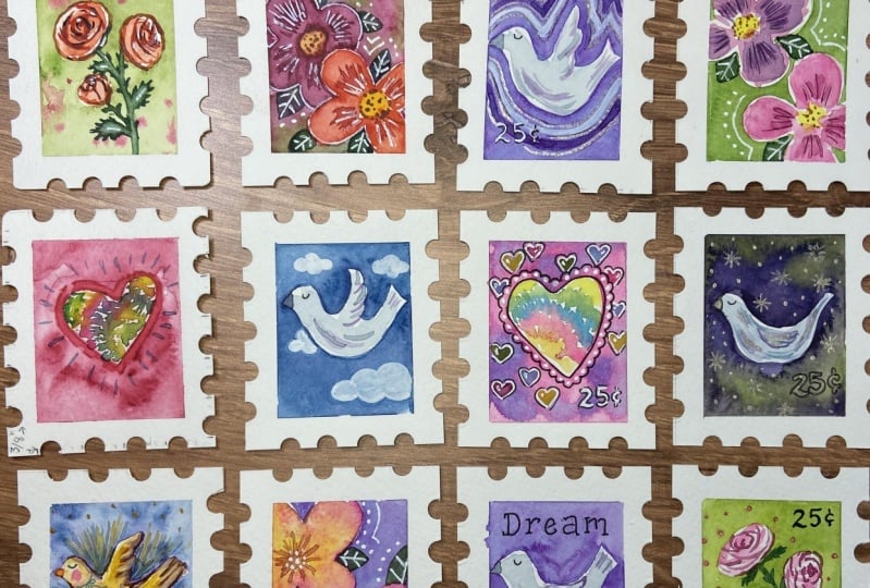
some watercolor love stamps. As an illustrator, we all have appreciation for this art form. These make beautiful
little sets. You can try different things
holiday, travel, food, but we're going to focus
on some love notions and keep it simple
because oftentimes it's simple that works the best. I'm Amarils Henderson. I'm a watercolor illustrator and surface designer
for about 20 years, I get to see my art on
all kinds of products. Working small has been
really handy for me. One, working Small helps you
create serieses or cohesive. Second, it's obviously
low maintenance. I can squirrel away a
little bit of time, not totally disrupt my day, but actually fuel it
with something fun. Bit your scrap watercolor paper
out so that we can create a nice little set of paintings in just
under half an hour.
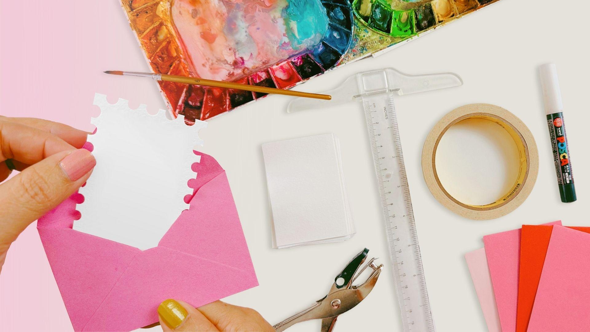
2. Simple Supplies: What you see here is a
collection of supplies. You don't need all of them. We're going from left to right of what's absolutely necessary
and what's not so much. You're going to need
watercolor paper. Please use watercolor
paper if you are going to paint in watercolor.
Makes sense, right? You can cut it to whatever size you'd like and you
can do that freehand, or you could use a ruler. I did use a T square to help me measure these papers
to be just right. The reason is I'm using
some optional envelopes. I want these little
guys to fit nicely in their envelopes and be very
giftable after I scan them. I'll be using masking tape
to mask off the edges so we have a nice clean rectangle
with clean edges. Also do this free
hand, just like this. But you can see that
it's a little bit wonky. If you want it to be
crisp and accurate, use that ruler, use
that masking tape. I always like to have a
little bit of white on hand. With watercolor, you
can't go back to white, if you maybe lose the
twinkle of an eye or there's an area that
you wanted to keep white and just for
whatever reason, especially since
we're working small, it's nice to have
a white medium. In this case, I
will use a marker. Paint markers work great
because you have a lot of control and accuracy and towards the end of
your painting session, you're going to want to
tighten up those details. And create some nice definition, some highlights, and
maybe some contrast. If you want to have that
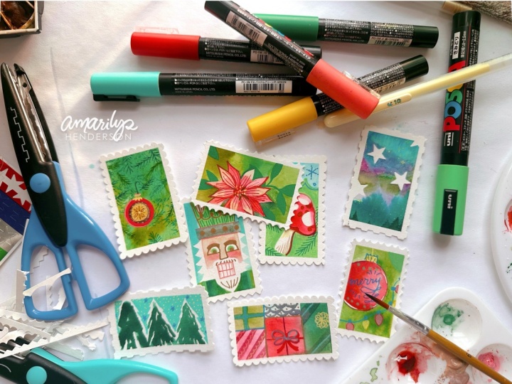
classic border of a stamp, I used a hole punch. You can find scissors that
have a nice fun little stamp, but I actually found
more joy in punching out the silhouette and discovering how fun and
simple it could be. It'll be a little irregular, but I think it'll be all
the more quaint for it. Now that I have all my
supplies, my water, my paint, my paper, my whole puncher,
what you see here, I'm going to take four of these little watercolor
papers and line them up on a piece of cardboard or right on my desk
and tape them down. That way, I'm forced to work
on many at the same time and we'll talk more
about how that is important or helpful to do.
3. Paint Your Set of Four: All right. I told you to
get your watercolor paints out for the color selection. I'm going to challenge you to narrow it down to
a limited palette. I'm going to use four colors, but it could easily
be three because what I'm using are colors that are pretty
similar to each other. They just are of
different values. I like using these doctor PH Martin's radiant
saturated watercolors. It is a mouthful. But I like them because they really do live up to their name. They are radiant,
they are saturated, and they help me work fast. You can use whatever
watercolor paints you have, maybe yours look more like
this or they come out of a pallet that already has
them squeezed out for you. It's not going to make
a huge difference. Use what you got. I've taped up my four pieces and the first thing
that we're going to do is to fill in a background, get a sense of what each one
of these is going to be. Just to keep things
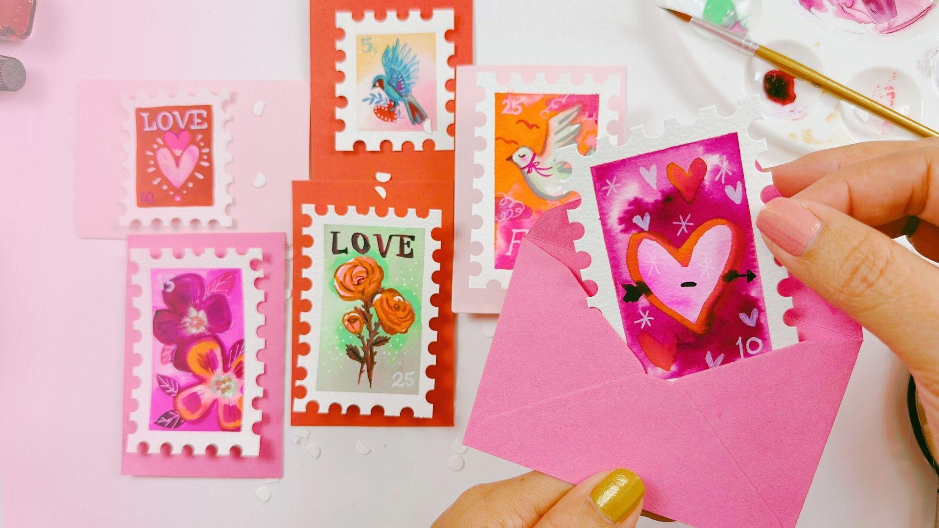
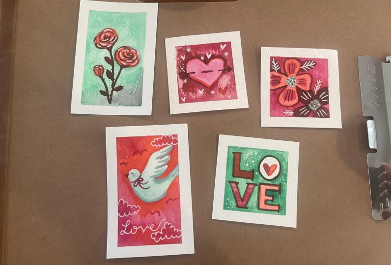
nice and simple. I'm going to do a heart. Everybody can do a heart. Let's create that background. I'm doing the background first because it's going to need
the longest time to dry. It's also really
fun to loosen up with the most wet on wet area. We're working with painting
with a lot of water. Outlining our heart, but then using the background,
everything else, the negative space, as we like to say in those
fancy art ways, filling that with water and
placing the color inside. I'm going to press down
on these edges and make sure that they are baked in because we are going quite
heavy on our washes. I'm putting all this water in what I want to do is
drop in all that color. I'm going to go with a dark
color so we can really get just a fun sense of
this wet on wet look. Something that makes wet on wet special is using
a lot of contrast, so you really see how it bled. This is for those of
you who are okay with a little loss of control
and probably more for those of you who are not because we all need something to
challenge us in that way. Just one color looks great. We're going to try
different colors later. Right now, since I
have four stamps, four colors, they can each
have that color background. I'm going to do some roses. Again, working on
the negative space. Why do I keep doing this? The reason is I want to
show how these colors are going to show on the
backgrounds and we're going about it in a
very strategic way. I want to show you
how simple shapes can end up being some
very beautiful things. I'm making the green
background because these three irregular circles
are going to be roses. We can add some
variety and drama with more colors in
our wet on wet style. It doesn't just have
to be one color. You'll notice that
since I'm using two different kinds
of watercolor paints, there is something
different going on. These paints are both the
fluid sort and the tube sort and so they have a
different consistency and that's going to lead to
some inconsistent results, which I think is the beauty and nature of working in
a traditional medium. Those little surprises. Next up, it's probably
going to be one of our more challenging
shapes, a bird. I just feel like birds
are a very classic motif for both stamps and love themes. I'm going to show you how I'm
going to go about my bird. Creating an upside down V shape. We can then go under our pretty bird with its
belly floating upward. This is, I don't know what
degree angle is that? Is that a 30? I don't
know, 30 degree angle. You're starting to see the
wings that I just represent as waves and then go back
upward for the tail. Everything else in
the background, it's going to be a nice
bright, vermilion red. Since I did my outline, I'm ready to add just
water and then add paint makes for a
really dramatic look. Just because I can, I'm going
to drop in another color. See how that looks. So pretty. If you ever feel like you used too much paint and
you want to get more of that splashy ti i look, add water to areas, water is what's going to
spread the paint out, and then dry your brush off. And blot the color away. You're lifting the color from the paper and you don't
want to touch it too much. If you want it to have
that textured look, texture comes in watercolor from not touching
it much. Very cute. Finally, we'll try a
different variety of flowers, think Andy Warhol's pansies, where he has just these
very simple silhouettes of these flowers. And again, we'll fill
in the background. Now, let's work on
our subject matter. Now since my background
is dark on this heart, I'm going to go very light
with the heart itself making a light colour
just by adding extra water to my brush
with a little bit of paint. Water is what makes
these colors lighter. If you have white watercolor or white ink that you like
to add in, that's fair game. It's going to feel much
more like a pastel color, which would be really pretty. But it's also going
to get thicker, so you're not going
to be able to move it around quite as easily
with watercolor. Next up our roses, which I'm going to make
a nice tangerine red. You don't have to color
them in entirely. We're going to come in
with some lines later. A bird can be this minty green. The reason why I chose
a Mini green is because the three colors that are fluid are pretty
similar. They're analogous. They're next to each
other on the color wheel, the mahogany, the cyclamen
and the tangerine. This one is a complimentary
color to red. Green being complimentary
to red makes it for a more dramatic take because it's on the opposite
side of the color wheel. Go ahead and adding a
little bit of dimension, some spots of slightly
darker green, but not really going into
defining our bird just yet. There's one more thing
that I like to do, and this is just me personally. I like to give rosy
cheeks whenever possible. While it's wet, I'll go
ahead and drop just a tiny bit of pink
there and let it dry. The great thing about
working on all of these at the same time
is that we're allowing these things to dry as
we're working away on more. Now we haven't
done anything with this dramatic mahogany color, but I want to make sure
that the centers are still allowed to
be a light color. I'm going to work from
the outside inward. Now, be sure that your
background paintings are dry. If not, you will
see things bleed. While that's sometimes
something I welcome. I'm happy to see
bleeding simply because it really feels a
lot more handmade. The lack of predictability
of the watercolor, I think is what we came for. But in this case, we
want to have room for some center action,
some lighter color. If we go with a really dark color and
don't leave the centers, go with a really dark color and it blends with
the background, you won't be able to
see the definition of the thing that
you've painted. Since we have two flowers, I'm going to go ahead and
choose a second color. What a luxury? I have two
colors for this subject matter. Being careful not to
touch what is wet. Because I want each of these colors to be
their own thing. I don't want my
mahogany to look like red and I don't want my
red to look like mahogany. I'm washing my
brush pretty often. So that I am able to assess with a dry brush
what is going on here? Because working
wet on wet can get pretty messy and maybe
a little confusing. But it's pretty simple
when you consider, I want more color,
you get more color. I need it to be lighter,
you get some water. I need to have more control, I'll dry my brush and soak it up
4. Paint Your Subjects to Develop: This is side eye
to see what's dry. See what's dry and what's not. I really like to
work on these roses. That's just my personal
desire, let's get to it. I have this red and
they're already red. I could bring in
a layer of that. To create my roses,
I'm creating a lot of parentheses shapes that
are working radially. So that they are collapsing
within themselves. So pretty the way
those flowers work. These are not going to be my
last lines on this flower. These are going to be
my middle grade value. In other words, I'm going
to go darker with these. I don't feel like you have to have everything
defined at this point. We're not quite there yet. We're going to go darker
and that'll give us some flexibility to
define even further. When things are a
little imperfect, it's also nice It gives
a bit of a vintage feel. I think with our digital age, we have come to stretch the ways of finding perfection and defining edges and making sure
everything is right. We've gotten a
little obsessed with it so much so that
many of us are wanting to go back to looking
at things that are not quite perfect
and enjoying that. I'm going to give
these some stems with our darkest color.
Working very lightly. I'm just creating a line
with my round brush. This brush is
really inexpensive. It came in a set of
15, 30, I don't know. But the reason why I
like them is because working with cheap supplies makes me more
confident to paint. When I work with things
that feel too precious, it halts my creativity.
That's one reason. But when it comes to
selecting a brush, all that really matters is that these hairs are
going to stay within, that they're not splayed out, and then I get a nice tip. That nice tip is coming in
handy as I paint the leaves. The interesting thing about
rose leaves is that they have a bit of texture on
the outside on the edges, so I'll draw my leaf shape and then I'll add a few
ridges to the outside. Little details like
that go a long way when it comes to looking at art because you get the
sense that the artist really has an understanding
of the subject matter. They paid attention.
I think that's half our jobs as artists. Now that I have this
dark color on my brush, I'm going to go ahead and
bring in the darkest shades. I'll continue in
the same C shape parentheses shape
format that I've been giving these rose petals. But instead of doing
the full line, I'm just doing little
bits of the line basically implying where
the shadows might drop in. What might be the darkest areas and it tends to be the center. If you go to dark in your center and you
feel like it doesn't look like a rose much
anymore, that's okay. You can make it a ranunculus
where the center is a pit of darkness and
that will work just fine. No one said it had to be a rose. Setting my sights on my heart. How do you like this
working all over the piece? Is it stressing you
out or is it fun? It's definitely a different
way of working and what I appreciate about it is
that what I learn from one, I can put into the other. What I enjoy with one, I can enjoy in the other or gives me confidence
to do the next one. To give this heart an arrow. Because it's cute. That's all. It's just cute. Let's
get to our bird. I've still got this
darkest dark on here, so I'll go ahead and
give the bird an eye. Give it a sleepy eye
and a little beak. There's something about painting the eye that just
makes me feel like, I know this thing now. I know this bird.
He has an identity. I want a color that's
a little darker, a little bit of a darker green. I'm going to mix the
colors that I have mixing the pink with a bit of my green. I have a color that
is within our scheme. You might need to
add a little water. The screen is really thick. I love mixing colors and
seeing what happens. The best part about mixing colors is that you
know it's going to be a harmonious color to what you already
have on the page. Let's define some
of those wings. I only made three ridges, but I can make more than that many feathers coming
out of our pretty bird. A few lines for
the tail feathers. I'm not a fan of
outlining everything. I like to leave some
things not quite outlined. There's one more
little detail that I want to create here. Maybe two more details. That is a little ribbon around its neck because I
think it would be super cute. Flying in the wind with
our bird and with it, some more birds in the distance. Just to add a little
storytelling. I might want to add some clouds. H. This is, this is our most
detailed stamp design. I'm going to finish
up on these flowers, giving them some
green in the centers. Then I'm just going
to let it dry because I do want to
add more definition, but as I've said before, I want to give it a chance. The places that I can touch are not the places that are wet. Might add a little
bit of pink to spruce up some of what's going on here with
these pretty flowers. I'll add more
definition in a bit.
5. Add Your Details to Finish: Waiting for that to dry. The last step, a
little lettering. Think of short words that
can be placed on a stamp. I certainly have
seen the word love. I'm just going to use a serif hand lettered font, all caps, adding little feet to
whatever letters may require and feeling free to take another stab at it if
the first go didn't work. I think there's this
misnomer probably from watching too many
videos on Instagram, that the first time you do
it, it should be perfect. But we might not be
getting the full deal and that might not be the
way that you need to work. I always go over my
letters a second time. No shame. What might
spruce up our heart? I'm going to put a few more
hearts in the background. Since this is our final step, I can bring out my white marker. Before I do that,
give this flower, a few buds, a little more
definition now that it is dry. We're working in layers, we're bringing in
some darker values, darker and darker
and darker as we go. Darker and darker and darker
does not sound very nice. Darker but it is. We need dark to show light. These leaves are a little small for a flower of this size, but I'm going with it. It's probably the best
thing you could do for your art is just keep going. Just go with it. Don't worry that it's not panning out the
way you thought it would. Who knew that your idea
was the right one anyway? What it's become is what it is. Maybe that's what it
was always meant to be. Let's get that white marker. I'll oftentimes do some little
dots just to warm up to the marker and make sure that the paint is coming
out at the right. These guys can be a little
unpredictable sometimes, and yet we still love
them because they provide these hints of interest. Highlights and hints is what we're doing
now with the white, whether it be a paint marker or you've dipped your brush
into some white ink, give our bird a little lettering
with the white marker. I have a lot more freedom. Writing letters with a
marker than with a brush, but it might be
less interesting. This is where we get
nice and whimsical. Whether you're happy with
your painting or not, taking off this tape is
going to feel so good. Two
6. Your Sweet Stamp Finish: All right. The final step, whether you're happy
with your paintings or not, once they're dry, you will love them more
once we take this tape off, and we'll get to use our whole punch to make
them feel more like stamps. Be very careful when you're
taking off the tape. Always work from the
lightest corner inward. We're not pulling on a chunk of tape that is going to want
to pull paper back with it. Always make sure that
your painting is dry and do it with time. You don't have to
do this super fast. Just do it delicately. If it tears a little bit, that's okay because our next step is to use the whole punch. Can't forget one important
element, the postage. This can be really
in any corner. And as small or big as you wish. When you're using
your whole punch, make sure that you have an idea. I play around a little bit with where to punch
those holes and how many of those I'm going to
see needed on the stamp. If you get tired, take a
break. Might be a lot. There are specialty scissors with a nice curvy edge to them, and you could definitely do
it with scissors as well, regular ones if you want
to create that effect. But I always find it
fun to do it with a whole punch because it just
gives it a little quirk. I hope you had fun with
me creating your stamps. They might fit pretty nicely
into a little envelope. Maybe you have the
envelope first and you measure to scale as I did. That was super fun, or you
line them up on a line to show or you scan them and create a very
fun pattern with them. These can be applicable to just about anything,
just like stamps are. They can be travel related, they can be Christmas related. They can be any
celebration related, whatever you feel that you
want to create a lot of mini paintings of
adding that touch of it being a stamp is
going to make it so much more interesting for
both the viewer and yourself. Show me what you did. I want to see them
because they're going to be so adorable. Look at these. Let me know which parts
you enjoyed the most. Even tell me at what
point you were thinking, this lady's crazy, this
is not going to work out. That would be fun to hear too. I'm looking forward to seeing your adorable little
watercolor stamps. Find me on Instagram and
around these here parts, I'm open to chatting and
seeing more of your work.
 Amarilys Henderson, Watercolor Illustrator, Design Thinker