Transcripts
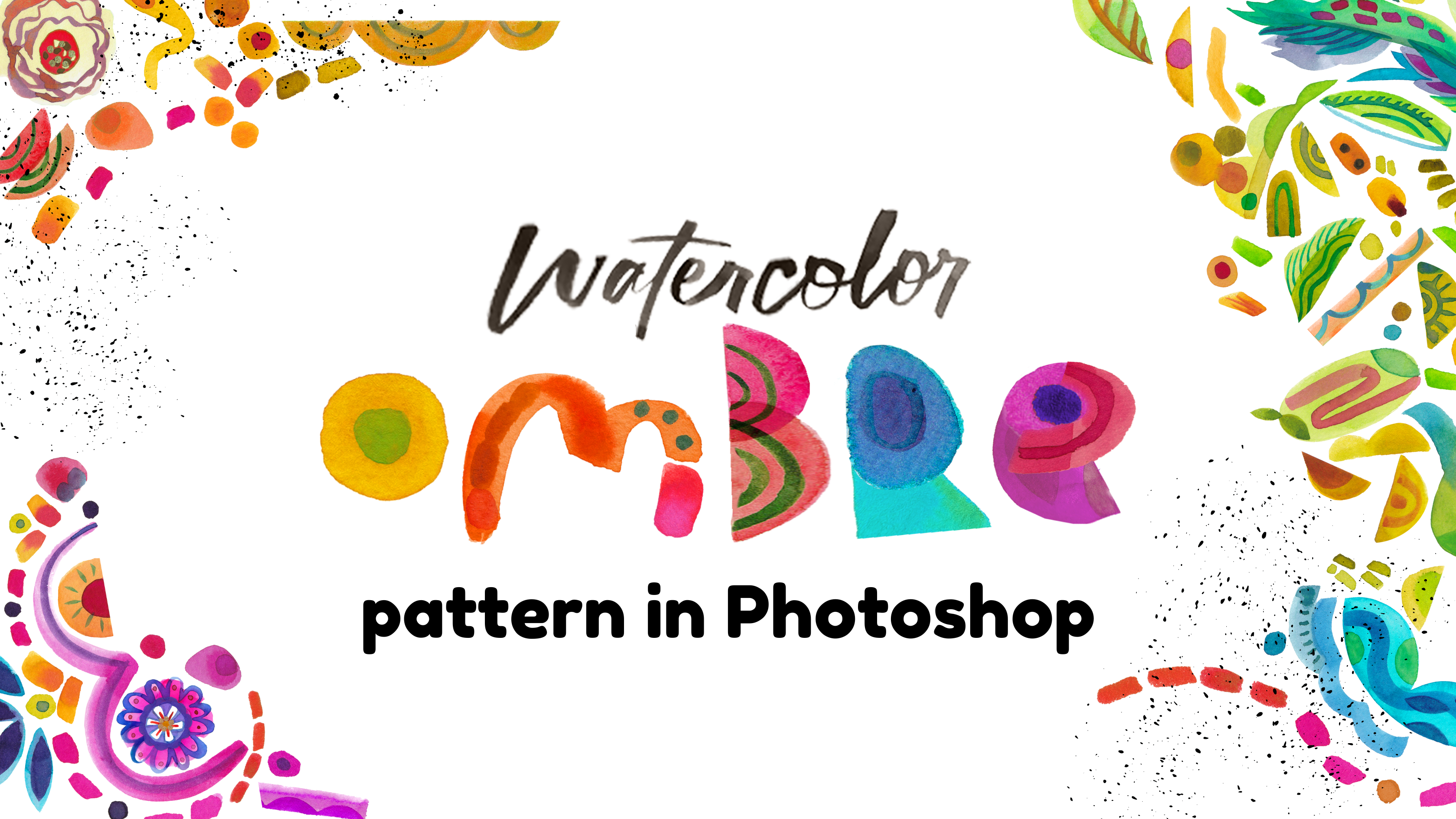
1. Simple Powerful Ombre: Is the simplest pieces
that make the best design. So much thought goes into, how am I going to stand out in the saturated market?
What's my style? What is it that makes me
different from everybody else? When you are doing it, when you're the most
carefree about it. I'm Amarillis Henderson,
and I have been doing illustration and surface
design for over 20 years. And it's still what I come
back to the watercolor art. Now, I'm a big
believer in creating art with your hands
that then ends up being designs because if you can do a simple painting
with me of just shapes, I'm going to show you
how to take those into photoshop and create
beautiful repeat patterns. You're probably going
to be blown away by your intricate design that came from the
simplest of places.
2. Which Paints & Why: Comes to painting supplies, that is totally up to you. Everybody has a different way of creating art and designs,
their own patterns. But I'm a big believer in sticking to a
traditional medium. I know that isolates
me quite a lot. I love to look at art, whether it be on a tote bag
or in a gallery that was made by human hands and just has a quality that
cannot be replicated. So even though you
have your world of copycats and your
bots of copycats, we can always keep creating
with our own hands. What I believe is that
they'll never catch up. Even if they do, I'm going
to have more fun trying. So I'm going to create my art in watercolor. That's what I love. I'll bring in some
gouache sometimes, I'll bring in some
markers sometimes, but being able to take
my artwork and make it designs instead of starting with a digital medium
gives me like that. That edge. That's
my personal edge, and I'm happy to
share it with you. The paints that I'm going to use are going to be monochromatic. Yeah. I guess it depends if
you call this a red violet, we can call it an
analogous color scheme. But at any rate, I
have my tangerine, which is a reddish orange. I've got cyclamin or cyclamine. I don't know. But
it's a red violet. Or pink. Now that I
have my grounding of, well, I know where I'm going.
I'm going to let it roll. That is how I work because in letting it
develop, letting the idea, the art develop and
unfold before me, I'm usually surprised
and find that it works out way better than what I originally
had planned anyway.
3. Start By Hand: So I'm going to create
some very simple shapes with a half inch flat brush. You might call it a flat
shader or a square brush, but it just has bristles that are cut along the
top like a flat top. With these colors, I'm just
going to make some shapes. The reason why I
go to this brush is because it makes
a nice crisp edge. One of my favorite
things to do with this brush is just
to block out shapes. And let the brush do most
of the shaping work. I'm not using a round brush, a round brush I would
have to pretty much draw with just like you would a
marker or something like that. I'm adding water and really the painting skill in this is pretty free and open. If you can paint shapes, you can do this design. We're going to do some
really basic shapes. I want to show you
how I do circles. I place my brush perpendicularly from the page and
I twirl it around. Until I have a circle
that I really like. If I need to, I can
make a larger circle. This will rely on my drawing scales to make
sure that it's proportionate, more so than when I just twirl from the center because
essentially it's like using a compass in
school where the center is the middle of that circle as it goes
around and around, it's going to make
that shape naturally. Creating these shapes
is really therapeutic. It's a great warm up exercise. What's fun is that
this warm up exercise is actually going to turn out
to be this beautiful piece. I love to bring in a
little wet on wet, dropping color in to
something that already has some water or
paint already there. It has a place to
just spread out. Try some wiggles. As much as possible,
I'm going to keep my shapes from
touching each other. Reason being, we are going to cut them out each
individually in Photoshop and when they are
isolated, not touching. They're easier to cut
out in Photoshop, so we don't have to be tied to whatever composition
I create here. I can make a rectangle by just creating a few stripes
next to each other. Wherever I have one, I might echo another to add some rhythm. Whenever I say the word rhythm, I think of some good
old 90s dance music. I started creating these shapes with my watercolor playgrounds, which is also a class I taught and a subsequent fabric
collection among other designs, so fun to see how things
that you expected to just be for fun showed
your true self, your real work and became work W. Is going to
do a few more shapes. I'm not going to take
too long with this. I want to show you the method, and I take joy in showing how simple processes can lead to some really
incredible results. I'm going to scan this to
take it into Photoshop. Pretty much done. If there's more you want to do to
it, you're welcome to. Just try as much as you can to keep your shapes
from touching each other. Otherwise, we'll need
to cut them by hand. Simple is hard, and it's often the simple ideas that
just really translate a lot faster to everybody universally and end up being
some really strong designs.
4. Scan Cut Correct: Now, this is my
computer desk station. I like to have two different
stations, at least two. There's also the laptop that
I float around the house with to kind of put me in a
different mode of thinking. So now I'm in design mode, and I should button
up my sweater and feel all official, ready to go. Here is my art scanned. Now, I scan my art at a ridiculously high
DPI resolution of 600 pixels per inch, not necessary, but it just
helps me sleep at night. So that's what I do. It makes
for some very large files. If you have some difficulty
with your scanned images, I don't give a lot
of advice with this because it depends
on your scanner. It might wash out your colors so that
everything is very white. It might make everything
look dim and less saturated. And so those color repairs, those adjustments are necessary, as well as setting up the
scanner to scan as a photo, I like to scan as a TIF file because JPEGs
corrupt over time, and a TIF file is
nice and chunky. And then with any
color adjustments, you can do those here. I honestly don't really think you need to learn
a lot about that. Just camp out in this
section, these top two, maybe just even this as a
top priority brightness, contrast, levels,
curves, and exposure, they're all going
to be related to contrast, light, and darkness. And that will really help
you a lot with your colors. When it comes to then isolating your artwork,
separating each piece, you're going to end up
needing each one of these little bits to be a separate layer here
in your layer palette. So I'm going to show
you the fastest way to select objects and isolate them using the Photoshop Object
Selection tool. It's all here under the
magic wand kind of assets. And if you want to
access it really fast, you hit W on your keyboard
and you're good to go. I always want to try the
easiest thing first. I'm going to select it
all and see how well it does at selecting all
of my little pieces. I did a fantastic job. Because there is high
contrast in this art, there's not a lot of
really light colors that are mixing with the paper. This works pretty well. I'm just going to
hit Command X to cut and Command V to paste it. This background layer, I
don't really need it anymore, but I will fill it with just plain white again
so you don't see those little crummy outlines
by hitting Command delete. Alright. Now that this
is isolated and I don't have any more
of that white paper, now I'm going to go
into selecting each one of these to make
it a separate layer. With the Quick Selection tool, that's the second tool in
the Magic Wand section. I can hold down my cursor
pressing down and saying, Yes, this is all one thing
that I want you to select. Command X. And just to keep
things right where they are, I like to actually, instead
of doing Command V for paste, I like to do paste in place, which is Command Shift
V. You can also go up here and you'll see pay
special, paste in place. That's kind of a lot
of working around. So I like my keystrokes. Once something is selected, I just hide that layer. It created a whole other
layer when I pasted, come back to the one with
everything in it, and continue. I keep hitting Command
X and Command Shift V until everything is
an isolated layer. And I might decide that some
of these shapes are really supposed to be on one layer because they kind of go
together as a group. I'm going to delete this with my keyboard because we
don't need that anymore. And again, that's just going to be some random little pieces, a little bit of
noise in our art.
5. Layer Up Colors: All our pieces selected
and line it up. I'm actually using the
Transform tool that automatically happens
when I start to toggle at the corners
of my selection. The reason I am doing that is because I want
to duplicate this and create another bit of shapes that are going to be
a slightly different color. It's exciting. If you
remember my original file, it's a long strip of art that
repeats forever and ever. I'm going to loosely define maybe three areas of
different colors that I like. I have this pinkish purplish. Maybe we'll go into
purplish, bluish and blue. Let's say by pulling
on my rulers here, which if you don't have
your rulers viewable, you just hit Command R
and they'll show up. I'm not going to be really
precise about this, but just a rule of thirds. I have just an idea of how
much of each color to show. Now I'll make sure
that everything is in this left hand side quadrant. This is where it
gets fun because I can move things around
just by selecting them, especially if you
have auto select on while you're using
your move tool. But also look at
the layer order. So this little guy got
lost behind my circle. I can just pick that layer
up and drag it upward. And that way, it'll be
on top of that circle. I can also play with
scale by again, hitting Command T to transform or by toggling on any
of these corners. Because that circle
was really big. And so it stands out so
much more than the rest. You want to pay attention to anything standing out
a little bit too much. We're creating a pattern, so it's supposed
to flow together. I have all my red violet pieces. I'm going to select them all
by hitting Shift while I select all my layers and hit
Command G to group them. It's always good to
label your layers. And now we're ready to take what we've already designed and make many of them so that we can place them nicely
and make a pattern. Alright, this
folder, I'm going to duplicate that by
hitting Command J. You can also find duplicate up here from the layers
palette Hamburger menu, and you can duplicate
group there. I already did, so
I'm going to select that group and bring it all
the way over to this side. Now the reason I'm doing that is because I want to be mindful of how these guys
are going to be meeting up with each other
in the repeat pattern. So being mindful of that, I want to make sure that
what is on this edge, that far right edge is going to be on the far
right edge over here. I realize that some
of this cut off here, but I'll deal with that later. I'm going to duplicate
this 11 more time after naming this guy. We'll just name
him three for now. Command J. Now with
this middle one, I have a little more freedom. I can rotate it run. I could make it a mirror image. Regardless, the point is that
I can transform it a lot. Alright, since this guy, I keep calling him a guy. Number two, these guys are going to be a
slightly different color. I can adjust that pretty easily. I'm actually just going to
double click on the layer itself and hit color overlay. Take it down to color. And basically this color is affecting what all of
these layers look like. I now can change this
white to any color I want, and the layers within that folder are going to
change to this color. Now, this is all fun, but it's really monochromatic and maybe you don't want
it to be that obvious. There's a couple of ways
you can go around that. We can dial back
this layer property. You can see how this
is 0% opacity of that layer style,
and that's 100%. So by sliding somewhere
in the middle, you're going to get just
a hint more violet. You can also bring
it back up to 100 and play with some
other presets. Sometimes these can be
a little unpredictable. It just depends on what
your design looks like, what colors you're using,
et cetera, et cetera. So I just want to show you
something that's kind of tried and true and should
be straightforward and work for everybody
about the same way, but feel free to play with whatever layer style might
suit your design best. Since I knocked back the
opacity of that layer style, I'm going to bring it up back towards a saturated
color just to make sure I get a little punch of color and it's not
dimming its light down. I'm going to do the same
thing for number three here, color overlay. But of course,
this time, we will shift going a little
more into blue. It's fun. I'm going to
knock it down even more. There we go. Now we can get a little more nitty
gritty about these things. I'm going to make sure
that with my move tool, I have layer selected. Before I had group selected, so when I clicked on anything, it would select that entire
group, that entire folder. But now that I have
layer selected, it's going to go straight to
that little piece of art. And here is where you can
give it some extra movement. We will be moving things
around quite a bit in the next stage we
have before us. But it's nice to feel good at each phase and to feel
like this is looking good. This is going somewhere
and feel some sense of, Okay, I did it as
well as I could. Now, I'm ready for
the next stage. Kind of rock the boat again.
6. Ombre Infinity Pattern: Now we are going to make sure
that all of our layers are within this bounding box, and we can bring
them back out later. But right now, the reason
why they need to be inside is because pattern preview will work
better that way. Go up to view Pattern Preview. I'll give you this warning, and I keep it on
just so that you can see what it says and not be surprised when you
get this warning. I will say that you want to have smart objects instead
of regular layers, and there might be some
unexpected results. Rather than converting
everything into smart objects, since I have so many layers, and that would make
a gigantic file, I'm going to say, Okay, and then I'm just
going to work a little differently because I know how pattern preview will work in
those now expected results. I love being able to see
things in pattern preview, having an idea for
how things are going. I'm going to clear these guides. So it's a little
easier for you to see everything. Those
lines are gone now. You zoom out and you get a
real sense of the pattern. So the flow within
the tile looks great. You can see the
flow of the colors. That's so nice. But obviously, we've got a grid that's really easy to see in this pattern. So we are going to now
work on the edges. So with Pattern Preview, when I place this in the corner, it'll be nice enough, smart enough to repeat
that elsewhere. But should I transform it. Let's say I want to
make it smaller now, it's going to do those
unexpected results. It does not work very well. So what I'm going to do is
I am not going to move it. I am going to duplicate it. So just like we did the groups, I will duplicate this
layer, hide that one. So I know that layer
17 is the original. Just in case I need to move
it or transform it later. But what I'm going to
do right now is to go ahead and hit Transform. Now I can move and
transform it. No problem. It's after I commit to it that then program kind of memorizes where to
slice and dice it, and it will always
slice and dice it that way from now and forever. And so that's why I
want kind of, like, my backup so that I can move that around
later if I need to. And that's why I move it
around this first time and, you know, get to feeling
really good about it. Look, I can still move it, and the program is
adjusting just fine. Alright, so let's
continue in working on these edges to make sure
that this is a nice flow. We want it to be a
nice flow of things. And then always remembering to duplicate that shape if
you want to move this guy, if you want to move that guy, knowing that we are going to
maybe want to move it again, and we might not be able to. So that way, instead of
having each layer be a smart object that
is requiring a lot of memory and therefore
making a very big file, I'm just duplicating or
having extra layers, which is more information
for Photoshop for that file, but it's not going to be as much as affecting every single layer. You'll find yourself
zooming in and zooming out to see where the
necessary gaps are to fill, how you might want
to rotate things, how you might think,
You know what? I think that this should
have a little shape here. Where can I find
another little shape? Oh, just about anywhere. And duplicating that and sizing it up and down
however you need to. You can also change the layer
order, and that'll help. I'll give you some
more flexibility for how you might want things to
pile on top of each other. When you're happy with your
piece and you are thinking, This is what I want
my pattern to be. Then you can go to
edit, define pattern, name it however you would like, and create a new file
to get to use it. When you create a new file, place your rectangle over
your whole artboard. And then here on
this smart object, I will say New layer, please, and click to say use previous layer to
create clipping mask. It's going to create this weird looking layer
with an arrow on it. Let's just add our
pattern, boom. But, oh, no, our pattern is way too big for us to
see this scale. So just double click
on that little icon of the pattern and
you can bring down the scale. As big
as you want it. You can even angle
it if you like, and it is linked
with your rectangle. And so this way, you can
show it forever and ever. If this is, you know, what you'd want to show
in your portfolio. If you'd want to
use it in a mockup, this is the kind of expression that you'd want to
have of your pattern. And so if you want
to export this, save as a JPEG, a TIF, whatever you'd like, just be sure to save this
file as a Photoshop file. And also you can save it as a tif or a JPA, something flat. What you are then
saving or exporting is actually the tile and not this huge expression
of the pattern. This is your tile. So save that and then play with it in another
document to make it large to play with how it would
look as a pattern expressed and even use it on something if you want to
try a different mockup.
7. Share & Repeat: Know how I created that pattern, really those two prints
used with black and white. I hope you found
that useful in that you will enjoy making
lots of patterns that make a nice
little rainbow array of the simplest
pieces of shapes.
 Amarilys Henderson, Watercolor Illustrator, Design Thinker