Transcripts
1. Introduction: Hello, everyone. I'm Shalika,
a watercolor artist, and I welcome you today to this quick and relaxing
watercolor class inspired by the
beauty of spring. In today's class,
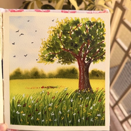
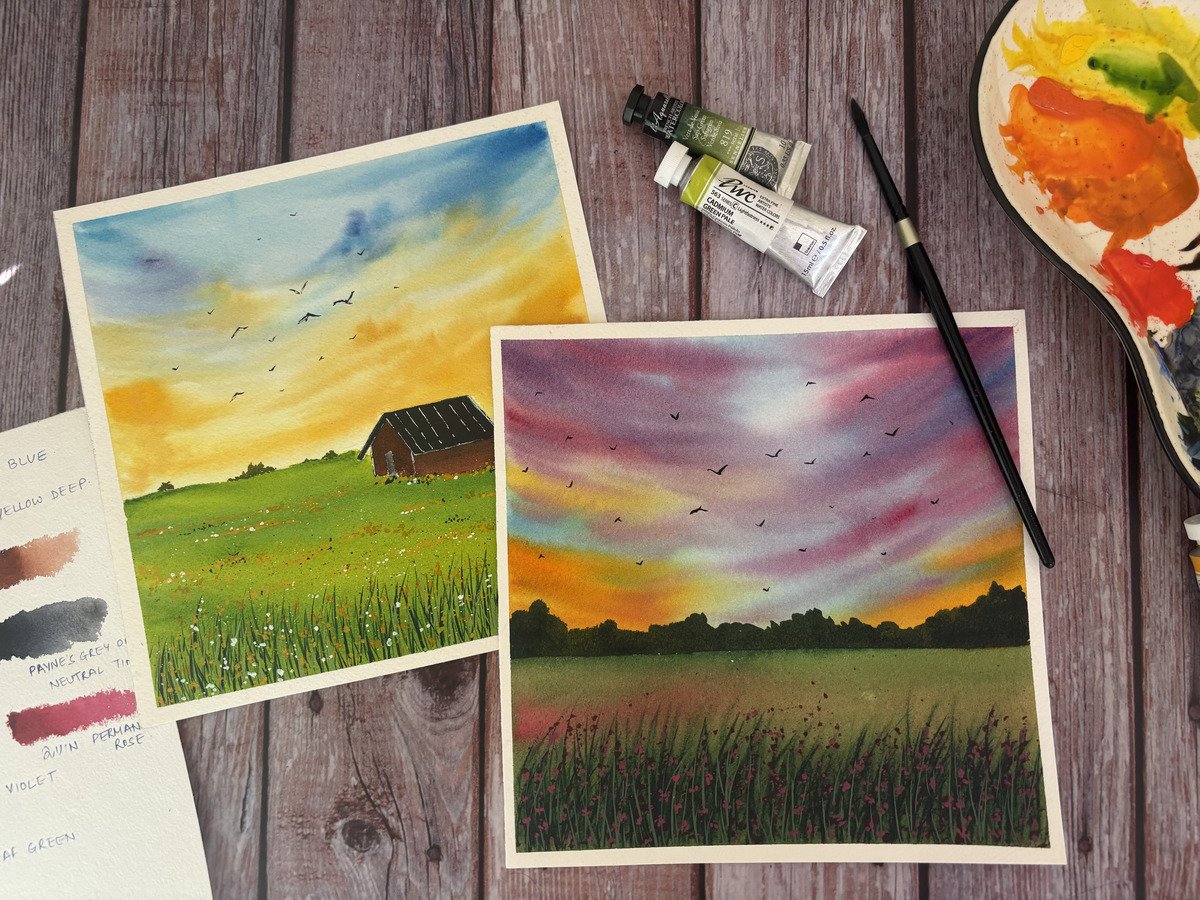
we will be painting a simple spring landscape
featuring a bright meadow, delicate wildflowers, and a fresh green tree
swaying in the breeze. This class is designed
to be beginner friendly and can be completed
in around 15 minutes, making it perfect for
anyone who wants to enjoy a short creative break
without feeling overwhelmed. We will focus on loose watercolor techniques,
layering greens adding texture to the grass
and foliage and creating a soft light filled atmosphere that captures the
freshness of spring. By the end of this class, you will have a beautiful
spring them painting and a few easy techniques
that you can use in your future landscape
paintings as well. So gather your supplies
mentioned in the next section, and let's begin to paint
the spring landscape.
2. Materials: Let us have a look
at the materials that we require for this class. Starting with the paper. I'll be using Archis 300
GSM, 100% cotton paper. I have this paper pad with me, which then I cut into
different sizes that I want, and that's how I used this
paper for this class project. Looking at the colors, these are the colors that I have used. It's a mix of brands like Shin hen, Sennelier,
megaloms, okay? Looking at the brushes. These are the brushes
that I've used. This is a large size mop brush, large size round brush, medium size round brush, and two detail brush. You can use any brush that
you have of any brand. This is the masking
tape that I've used to tape the
paper onto the board. This is the palette
that I have used. It actually has the colors
that I've used for this class. I've used a rag rough cloth
to wipe down my brushes. You can use a tissue
paper as well. This is the board that I've used to tape down
the paper onto this, using the masking tape. Yep, I think that's
all the materials that we need for this class. Gather whatever you have, and then I'll see you
in the glass project.
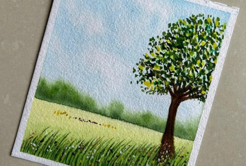
3. Sketch: So I have my paper here ready. Using the maskin tape, I will tape down this
paper onto the board. I'm just running my fingers
across the edges to make sure that there is no gap between the tape and the paper. Now moving on to the quick
sketch for this painting. Say this is our horizon, we will have some bushes and
far away trees over here. Our main tree will
come on this side. I'm just sketching out
the major branches. We might not need to
add in all the details, we will paint those out directly when we work
with the colors. And this always
will be the meadow, which we will paint directly.
4. Sky: For the clear sky,
I'll go ahead and get some bright blue
onto my palette. You can use any
blue that you have. Using my large size
brush, mop brush, I will just apply even coat of water at the top of the paper. And now using my medium
size brush and bright blue, a diluted tone of it, dabbing of all the excess
water onto my rag cloth, I will just add in the sky. There's no definite way we
want to paint in the sky. Just add in the sky, leaving a lot of white spaces as well. It's a clear blue sky, so you will have
white clouds as well. So I'm just building on top of the sky that we
have already added, maintaining the
white spaces that we have left with
the first layer. Okay, that's it. And now going ahead
with hooker's green, take out all the
colors very quickly. We would need sap cream. We would need enilia yellow or any other
yellow that you have, and we would also
need neutral tint. So quickly remove
all our colors. Now what I'm going to do is using hookers green
and adding in a very little tinge of neutral tin to get that
darker, very dark green. I'll just tab off
all the excess water and add in over here to give in the shape of the bushes that we
have a the faraway. I'll also keep on adding
in a little bit of sap green or directly
hookers green to bring in the variety or
the different colors that we could have in
the faraway trees. Okay. Again, going back with the darker tone and adding
that dropping that color. You can see because
the paper is wet, you can already see that the
colors are spreading out. They're giving a blur effect. Dropping in very dilute tone of your painscreen some places. Trees also would be
would be very far, but between some of them, we would have different tones
and the distance, right? So just trying to
get that captured, okay? That's it for the sky.
5. First layer of Meadow: Taking in my large
size brush and yellow, we'll just add in the
color on the foreground. Taking a little
bit more of yellow and trying to build
in the tones. Now I'm going ahead
with sap green. We'll be just playing around
with these colors to get different tones and variations to build the green landscape. Taking a little bit
more of yellow, adding that somewhere
in between, as well. So I'll just clean my brush
because I have green already. So when I take in yellow, I do get lighter green tone. I think that's it.
This looks perfect. I'll take a little bit of
darker green, hooker's green, or you can also add in paints
gray to your sap green and add in some streaks of darker tone as well and
just blending it out. Now, using my detail
brush and hookers green, I'll just add in some grass streaks like this while
the background is wet. O. These streaks can be different in size. They could be
different in the way they are swinging, right? So I'm just adding
in different ways of showing the meadow
grasses that we have. I'm taking a little bit
of sap green as well, adding that tone too. And what I'll do is I'll take a little bit of neutral tint, add that to sap green to
get a very darker tone, and I will add those as well. Okay. I'll add in some
streaks here as well. So between the grasses, right, because these grasses
would overlap each other, you would have some darkness, some shadow of the other
grasses coming in. So they will be areas
where it would be darker. So I'm just trying
to get that effect. Again, going back to sap green and adding some
more details to it. We will also add
in once this dries off to get that crisp
layers as well. But for now just
adding these to get the blur effect and show that these are
there in the distance. I think this is good. We'll wait this to quickly try and then add
in another layer.
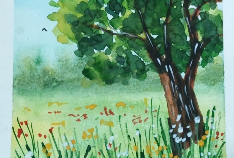
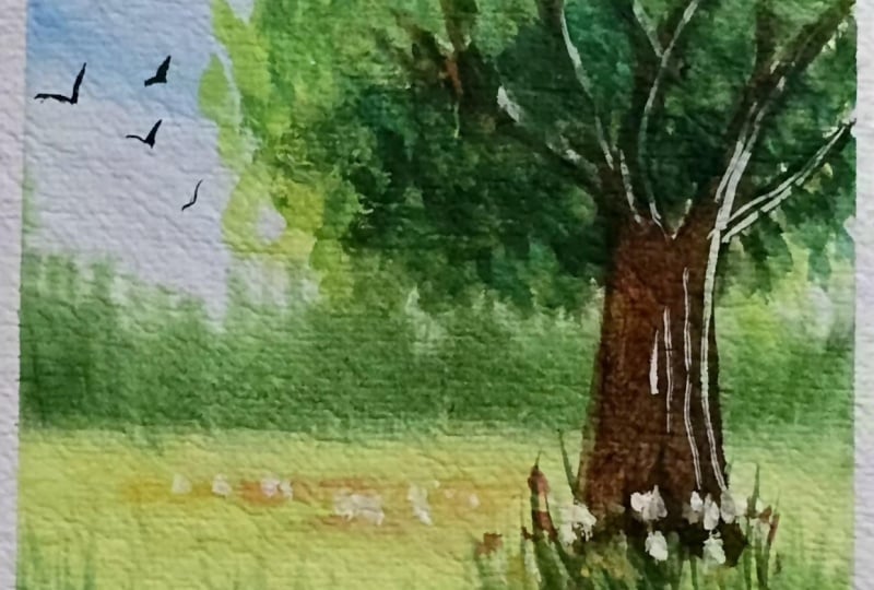
6. Tree Part 1: Okay, this is not right. Now we'll paint the tree first, and then we will add
in the dried grasses. Okay, so for that,
I'll just quickly take out burn sienna onto my palette. Just pure born sienna
and add in the color. Okay? Then just play around with the shade and add it to the branches that
we have sketched out. I've just cleaned up my brush, dabbing off the excess water, and I'm just merging this out. I'm trying to give this part
of the tree glows that say, the sunlight is coming
from this side. So that's why I have
added that Okay. Now, what I'll do is
taking a little bit of neutral tint and mixing
it with burn sienna, you get a shade called sepia. So we'll just drop
that across as well. You can see I've again tried to maintain the brightness
of that branch. So for now, this is all that
I'll paint for the trees. We'll add in more
details once this dries off and after we have
added in the leaves. So now, once I'm just
done with adding another layer of neutro tint
and bone sienna mixture, which is basically your sepia, Now, what we'll do is using
yellow and sap green mix. So basically more of
yellow and less of sap green to get a lemon
green sort of shade, we'll start painting the trees. This is how your
leaves would be. This side as well. So the top of your trees usually have lighter
tone leaves. I'm just trying to build that Now, taking in sap green, try to add in the colors between the lemon yellow
shade that we have added. Okay? You can see my
brush strokes are just I'm just pressing my brush
to release in the color. That is all we are
doing it right now. And that is all would
be the way we would paint out the tree that
we have over here. Now, taking in a darker tone, which is basically
hookers green, or you can also add in paints
gray to your sack green. We will add in the
darker leaves. So you can see, and these darker leaves
are usually towards the bottom of your tree
lump or say tree leaves. You have lighter leaves, then you have little darker, then you have more darker. So that's what I'm just
trying to add in here. Now, I'm going to add a
little bit of paints gray or neutral tint to this hooker's
green to get a very, very dark tone of green, dabbing off the excess water, and we will add that at
some places only where the sunlight might not
be reaching and then the leaves are not showing the reflection of the sunlight, so they are the darkest
corner of your trees. I think that's it. Now,
what I will do is, I'll take in lemon green and try to add in some tinges
here and there, as well. Just trying to build
that up a little bit in between these
darker tones as well. Wherever we have the gap, we can add these leaves. Okay. And towards
the corner side, when you are ending your trees, so you can just add in very small dots to depict that branch
has very less leaves. I'm just adding some small
darker tones here and there, just to bring in the
depth. That's it.
7. Tree and Meadow Final Touches: Now, using my three by zero
size brush and neutral tint, a very dark tone of
Sepia basically, you can add in more neutral
tint to your bone Siena, as well as to your
sepia and we will add in the details to the branches
that we already have. Similarly here as well. Just some places adding
in the three branches. You can just play around the same branches that
we had drawn, right? Just starting from there,
you can just add in a few more branches
emerging from that. Now, what I'm going
to do is using my medium size brush
and the Sepia mix, the same mixture, we'll add in that tone towards
this tree as well. Just adding a little
bit of texture to the branch that we have to
the tree trunk that we have. I'm dabbing off all
the excess water, the very dry brush, just trying
to bridge in the texture. We'll add in some highlights
with white towards the end. Now for the grasses, using sap green, I'll just
add in more of these grasses. Okay. With the
same thing that we did wet-on-wet,
different lengths, different width different
tones of green, we will just add in these grass. Taking in some
darker tone of green now and just adding
in these streaks. So there will be grass covering the trunk of
your tree as well. So I'm adding some of
those over here, too. Okay. Now what I'm going to do is the sap green that we have, I'm going to add
in white quash to get a very light
tone of sap green. And with that as well, we will add in the
grass streaks. So we basically already have a light color on
the grass, right. So if I want to add in a
lighter shade of sap green, say something like what we
painted the leaves with right, we won't be able to because in watercolors you
cannot paint in a lighter tone of color or
shade on top of the darker. So for that, what I do is I have mixed in sap
green white quash. It gives you the opacity that
we want, and using that, we can add in the
lighter tone of grasses, the green grass that
we want to add in. Now, going back to
the darker tone, just adding in a few more
specifically in between.
8. Final Touches: Now what I'm going to
do is using white, just add in some flowers. So just at some
places we'll add in these flowers because
it's spring, it's meadow. You will have some flowers blooming in between
these grasses. So just added that. What I'll also do
is I'll use in quin rose and add in more
flowers to the meadow, so you can add in
more dots together. And I'll also take in cadmium yellow and
adding some of those. The meadow looks
beautiful now, right? Bright with flowers and the tree blooming
with new leaves, whereas the grass beneath
filled with wildflowers. Now, what I'll also do is I'll
take a little bit more of water color and try to
just dab off like this. We'll do the same with quin
rose and white as well, doing the same with quinrose And with white, too. This is a meadow, right? So you would have some group of flowers here and there as well. So just adding that
in white as well. And similarly, there is a bed of yellow cadmium
flowers as well. Now, spring cannot be
complete without birds, so I'm just going to take
my small size brush, round brush, take in paints
gray or neutral tint, and just add in some birds. That's it. Now, the last is, I'll use this white elpin
and we'll just try to add in some highlights
on the trees. That's it. That's it. For this class, we'll just
peel off the masking tape. A very simple, quick 15
minute class on springs.
9. Conclusion: And that's a spring
landscape complete. I hope you enjoyed painting this peaceful little
meadow with me and found this class
relaxing and inspiring. Through this
project, we practice creating soft backgrounds,
textured grasses, loose wildflowers,
loose foliage, and adding tiny floral details to bring the scene to life. The best part about
projects like these is you can experiment
with color palette, flower placements,
or even tree shapes to make it uniquely yours. If you paint this project, don't forget to upload it into
the class project section. I would love to see
your creations. You like this class, do leave a feedback or review
in the review section. And for any questions
or queries, use the discussion portal. I will be happy to help you out. Thank you so much for
joining me in this class, and I will see you
in the next one. Till then, bye bye.
Happy painting.
 Shalika Gupta, Watercolor Artist