Transcripts
1. Skin intro: Skin is fascinating. It's complex but subtle, constantly changing and
never just one flat color. It changes with light, temperature, undertones
and surroundings. But that's also part of what
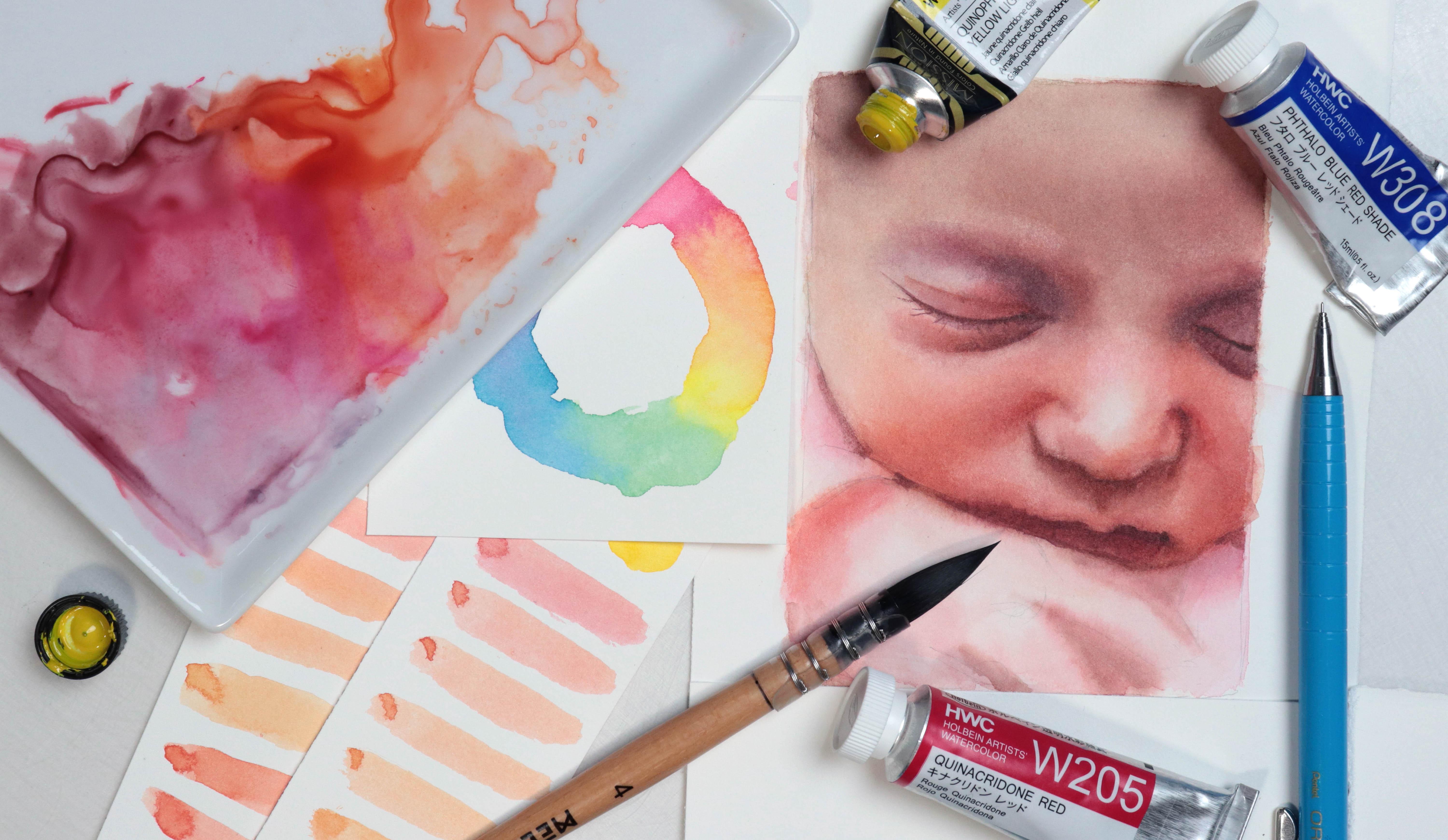
makes it so fun to paint. Hey, there, I'm Tanja. I'm an Altis based in Denmark. And in this class, we'll
explore mixing skin tones in watercolor through a few simple
but practical exercises. We'll have a look at some
pigment of paint qualities, basic skin tone mixes. Skin tone is based on
references, and finally, we'll go through the
process of painting a study using our knowledge of color mixing for both
the initial layers and for building up the
skin tone using glazing. So if that sounds fun to you, join me for this class.
2. Supplies: I for the class, you're going to need
some watercolors. We're going to have
a look at exactly which colors in the class, but I recommend having at least some version of your primaries, a red, yellow, and a blue. We're going to
need some brushes. The main brush I'm
going to be using is by meting and it's a size four. But due to the mob shape, it's closer to a size ten in
your average round brush. You can use whichever
brush or brushes you want. As always, I'm going to be using a separate brush for
mixing my paints. You're going to need some paper. For the majority of the class, you can use any paper you want. But for the studies, I do recommend using some sort
of watercolor paper. I'm going to be using fabriano artistico extra white hot press. Masking tape if you're working
on loose sheets of paper, a pencil and some erasers, a palette for mixing your paint, and finally, cloth for
wiping your brushes, tissue to help get rid of
excess water from your brush, and to help lift paint, and some water.
Let's get into it.
3. Paint & Color Characteristics: Which colors do we need?
Before we ask that question, we're going to have a look at some pink qualities
that may be worth considering when
you're selecting your colors or
setting up a palette. There are so many things you can consider when
picking your colors, like light fastness, toxicity. Or the number of
pigments that color has, each of these qualities
and properties may affect you or your paintings
in different ways, and all of them are
individual choices. In this lesson, we're going to have a look at three of them. And these are three of the
ones that might especially be worth considering when painting
something like portraits. But again, it's
worth noting that all of them are
individual choices. A quality of property
that I dislike may be one of your favorites because in the end it all comes down
to personal preference. If you watched any
of my classes, you may already know the
first one granulation. Some pigments granulate and some don't the way the paint settles on the
surface of the paper, creating this to some extent,
unpredictable texture. And of course, it can be a stylistic choice,
but for the most part, if you're wanting to paint
realistic portraits, this may not be an effect
you want when painting skin. Two of the colors in my portrait palette are
marked as being granulating, and this is a perfect
example of no matter how much information you're able to gather from different
sources around you, most things should be
seen as guidelines. With these two colors specifically and
the way I use them, I don't have any problems
with granulation. Least nothing noticeable. Next, we have transparency, so transparent versus
opaque colors. And there are different
types of opaque colours. Some pigments are
opaque like cadmiums and sometimes when making colours that consists
of various pigments, manufacturers will
add in white to achieve certain
colors or nuances. I'm a big fan of both
transparent and opaques. It just depends on
what you're painting. And if you're going to
do a lot of glazing, like when painting skin tones, opaques may not be
the best option. The third quality is whether your color is staining
or non staining. Non staining colas
are easier to lift, whereas staining colas are not and will often stay in
the paper permanently. There could be
different reasons why some people choose to
use one or the other. But here's why I think it may be worth considering
in this case. When we apply a
wash of watercolor, the first layer usually
seeps further down into the layers of the
paper than the second wash, third, fourth, et cetera. So the more layers or the thicker of an application
of pigment we have, the more likely it is that we're going to start
seeing some lifting, maybe even while adding
new layers of paint. So if we were to
paint a portrait with maybe a deep skin tone
or a portrait where we're planning on going in with multiple layers and really
building up the color, using a bunch of colors that
are all really easy to lift. May not be the
most ideal choice. Whereas if we were to paint someone with a very
fair skin tone, being able to easily
lift color in certain areas might be a good thing because
then if we go too dark, it's easier to bring
back the highlights. I do want to talk about one
final quality reluctantly, and that is temperature. But let's get into it. If
we have our color wheel, we've got the cool cs, green, blue and purple, and we've
got the warm colours, red, orange and yellow, but someone decided
that wasn't enough. So each color can
also be warm or cool. A warm red leans more towards
orange on the color wheel, and a cool red leans
more towards blue. A warm yellow leans
towards orange, and the cool yellow
leans towards green. A warm blue leans
towards purple or red. And a cool blue leans
towards green or yellow. In this case, having one
version of each, red, yellow, and blue is what's referred to as a split primary palette. Here's the thing. Sometimes
it's hard to tell, and sometimes you have colors
where people don't agree. As an example, if we take blue, this is what basic
color theory tells us, but lots of people would argue that it should be the
other way around. And I'm of the belief
that they're both warm and cool depending
on the context. Knowing that a color
like scarlet lake, which is perceived as
being a warm red is better for mixing warm
oranges than KunagRumgenta, which is perceived as
being a cool red is genuinely useful knowledge
when color mixing, and it can definitely
help you out. But what I don't
recommend is getting too caught up in any of these, whether that is transparency, granulation, staining
power or temperature. There is no such thing
as a good or bad mix. It just depends on what
you want to use it for. The best tip I can
give you is to play around with the colors
you have available to you. Have a play and mix them in any and all ways
you can think of, get to really know them and understand their strengths and weaknesses and understand where they may fit in in
your paintings.
4. Choosing Your Colors: In this class, I'm going
to be using this palette, which we put together in one of my other portrait classes. This has a range of colours, including cool and
warm up pinks, a good solid red, deep red, orange, a few shades of
yellow, blue, and neutral. And then there's
one empty space. I left one half pen empty because we already have
the colors we need. But aside from that, it also represents
personal preference. We all have certain colors
we gravitate towards or certain colors we really
love using in our paintings, and so that empty space could be filled
with one of those. It could also just be that
for certain paintings, we might need one
specialist color. So one color that isn't
already in our palette. So it's kind of like
the joker in the set. When setting up a portrait
palette a good place to start is with a
split primary palette. So what would be considered a warm and cool version of
each of your primaries. And if that split primary
palette doesn't already include magenta and
a turquoise or cyan, I highly recommend
adding that in as well. Once we have that, if you
want to add in more colors, it's all about closing the gaps, which could mean adding in more versions of our primaries, so some with
different undertones, or ones that will offer a wide range of values than
the ones we already have. Having a wide range of values
within each color group, although it may not be
an absolute necessity, it can help make for a
more versatile palette. And lastly, we can add
some convenience colors. Now, whether a color is convenience or
essential is objective. But a couple of examples of
colors that I would see as convenience cars are colors that you end up
having to mix a lot. So it could be
neutrals like browns and grays or something
like our secondary colors. So orange, purple and green. And even though green may not feature as frequently
in portraits, it can still be a
useful mixing color, even for skin tones. Pick the colors you
like working with or the colors you personally
find the most useful. Pick the ones that have the right color compared to what you want to paint and the ones that have the qualities
you're looking for. Don't get too caught up
in the names or using the exact color someone else
is using. It's not worth it. If you shop colors by name, different brands may have different recipes for how
they made their version, so they may look
completely different. And even if you
have a color with the same name and
the same pigment, they may still look different
across different brands. You also don't have to set up
a potterid palette at all. If you want to just grab
your usual palette or your usual selection of
colas, go ahead and do that. You can work with as
many colas as you want. But with that being said, one of the benefits of working
with a small selection or a limited palette is that it can help us get really
good at color mixing, which is probably one of the
most useful skills to have. So these are the
colors I have in my palette and that I'll be
using throughout the class. Quinacrine magenta.
Quinacrodone red. Quinacridone
scarlet, Pyle Ruben, Pyrole red, transparent
orange, quinacridone gold. Permanent yellow light,
quinathllon yellow. Heliourquoise. Peacock blue. They blue, red shade, and paints gray. Once you've got your palette, let's move on and have a look at some basic skin tone mixes.
5. Exercise: Match the Color: Going to go over mixing
some basic skin tones. But first, we're going to have some fun and
do an exercise. I want to show you exactly how much we do not need
to worry about having a bunch of specialist colors or the
exact colors as someone else. All you need are a few colors in a well put together
mixing palette. So I have my palette here, and I've got three
beautiful colors that will work great
in skin tone mixes. So let's have a look. I've got Qunaquo de gold by Daniel Smith. Cunequdon Sienna,
also by Daniel Smith. And finally, Sepia. This version is by Holbein. Now, I am going in blind, meaning that I have not tried pre mixing these cars already, and I have specifically
chosen to include two unacton colors
because there are some of the more specialist
colas and some of the colors that could be
more challenging to mix. So let's see if we
by using the cols in our palette can get anywhere
near these watches. Let's do CPA first. So let's see for our red, let's try unacudo magenta. And we're just going to
go through the primary. So next up, we need some yellow, and I'm not sure
it really matters, but let's do permanent
yellow light. Oh And finally, for our blue, let's try that blue red shade. Gonna mix that up and
see what we have. That looks pretty good already. Could maybe do with
a touch mob blue, but other than
that, pretty close. Oh let's try one
more combination. How about Pyl Ruben? That's a beautiful red. For the yellow, I'm thinking
maybe cunathlon yellow, but I know that one
is very strong, so I'm going to
add that one last. So for the blue, I'm
going to do peacock blue. Add in our yellow. Oh I touch more blue. Oops, wrong one, gonna rinse
and wipe off my brush. I don't want you to
think I'm cheating and pick up the right one. Now, with all of these
watches, if we took out time, we could probably
get even closer, but this is just an exercise. It's a good one, though, so I do recommend practicing
column mixing like this, either by coluxing
two different paints or different reference photos
or objects around you. Let's see. Maybe a bit
more red and yellow. That's pretty close. Next, let's do Quinacrne Siena. Okay, so I do have
a few quinacrones, and even though they're not necessarily the same pigments, let's try and mix
a couple of those. So we can do quinactne scallot. And quinacuidon gold. The quinacdon gold already has this light brown undertone, so we may not even need to add any blue. Let's watch. It could do with a
touch more yellow, but it's close enough. Cacuodones are some of
the more bright pigments, so it almost feels
like cheating. Let's try a different
combination. If we were to think
logically about it, the one that is
closest to this color in our palette is the
transparent orange. So let's start with that.
This is not red enough. So if we add in some Pyl red, And then some blue
to help utilize it. Maybe a touch more red. That is, again, pretty
close. I'm happy with that. Finally, let's do
Konecrne deep gold. It almost feels like cheating
to use Konecrne gold, but I'm not seeing any fingers pointed at me, so I'm gonna try. For the red, I'm thinking
maybe a deeper red. So I'm going to use
Pyl Ruben again. And a teeny bit of the
thalo blue red shade. I think that might even be a bit too much gonna try
and balance that out. And swatching. Definitely a bit too much blue,
but it's very close. Gonna do one more. It's very tempting to use a transparent orange,
but I'm not going to. I'm going to try Pyl red. Codones are transparent,
so this may create a more opaque mix in
comparison, but it's okay. Maybe some permanent
yellow light. And a teensy bit of blue. They look blue, red shade. I didn't mix up a
lot for this one. So let's see if we
can get a swatch. Could do with a bit more blue. That's pretty close. And all of these
were quick mixes. What I'm hoping
comes across is that you don't need that
many different paints. If you practice color mixing, you'll be able to do so much more with much less
than you expected. So for any of my
classes that you join or for any other
classes for that matter, use the paint you have
available to you. Unless, of course,
you want to shop for more colors because sometimes
that's fun as well, but you don't need it. Let's move on and go over
some basic skin tone mixes.
7. Exercise: Mixing Real Skin Tones: Great. So we understand how
to mix the basic skin tone. We need some version of orange, whether that is on
the brighter side of the spectrum or on the more
brown side of the spectrum. We can add in water to lighten the color or add in something like blue
to help neutralize it. That's perfect. All we
need to know, right? Okay, so all we have
to do is use one of these skin tone mixes to paint our model.
Let's take a look. Hmm. Weird. I mean, this one might
be close to the shadow. Hm. I don't really see the
calls we need, do you? That's a problem with having something called
a basic anything. And with these as well. In all fairness to Fabo Castel, this isn't just
called flesh tone. It's called light flesh, and it is a pretty
good starting point. With these mixes as well, these could be really
good if you're just practicing in your sketchbook or if you're doing quick
plenary studies. They're great for
illustration work or simplified skin tones. This is still genuinely useful, but skin can be so
much more than this. And so for portraits, if we want to recreate
our reference, this isn't necessarily
what we're interested in. The part of this that
we do want to keep in mind is how to mix a color, how to lighten it, and how to desaturate or neutralize it. Let's try and mix
these skin tones. Last bit of color theory here. So if we want to mix a warm
colour and not just red, orange or yellow,
but a warm red, warm orange or warm yellow, using warm leaning colours. So the colors that lean warm in the color wheel may
be the best option. Likewise, if we want to mix a cool tone skin tone
or a different color, using cool colors from the
color wheel may work better. But I'd like to ask you to not worry about the
temperature at all. We can mix warm and cool colors
in any which way we want. And instead, we're going to use our eyeballs to decide
if it's the right color. Let's start with
the lightest color. We're going to need some
version of purple or lavender. A solid choice for mixing
a purple would be pink. So I'm going to start
with quinacotoma genta. We then need to
add in some blue. I'm going to just
use helio turquoise. We want to try and
get as close to the purple or lavender shade that we see in the reference. So we don't want one
that is too red. We need more of a
blue leaning version. Feel free to use different
color combinations. Try creating different mixes, just like we did in
the previous exercise. That's looking pretty good. Let's try and swatch it. Of course, there's
always a chance that you still
have a tiny bit of pigment in your brush or maybe some of the pens
were slightly dirty, but this is already
a really good match. If we wanted a slightly
more neutral version, we could add in a teeny
bit of yellow like this, but we don't really need it. For the second color mix, if we stick to
this same palette, so quinacomgenta, heliourquoise, and quinacloon yellow, we need a higher
concentration of pigment, and we may want to start with a more red leaning
purple mixing that up. Gonna add in a bit more. Maybe something like this. It could do with a
bit more yellow, but that's a very close match. On a side note,
you don't have to clean your palette as
frequently as I am. One of the benefits of paint and especially
something like watercolor is it so easy to reuse the paint
on our palette. Use it for new mixes. For the deeper
tones, since we are still working with the
same color palette, instead of cleaning
your palette, just mix into those same colors. For our third mix, we want less red and back to more of
a purple, but very deep. I'm going to mix up a purple
that leans more blue. We don't want quite as
much warmth in this one. Add in our yellow. Well, that is
definitely too much. It's fine. Let's go with it. G to try and balance that out, adding in more red
and more blue, trying to bring it back
to more of a purple. In some ways, I wish
I could just give you exact color mixing
recipes in my classes. But even if I could, the truth is it
wouldn't benefit you. Practicing and understanding
color mixing really, truly is one of the best tools
you can have in your belt. Let's do one more. I'm also going to add a few more to the projects
and resources tab. And if you do decide
to mix those, I would love to see the
color pads you've chosen. Okay, so this one is closer
to the basic skin tone mixes. We've got a slightly
more yellow toned, maybe even a touch of green and a more red toned
mix. What's see? Mini mini mini mo I think
QuacudonGld. Why not? For my red, let's do Pyl Ruben. I don't usually pick this one for a lot of lia
mixes, but why not? If it hasn't already come
across clearly enough, I'm really trying
to show you that you shouldn't stress
about the colours, and I'm going to continue
throughout this class. Okay, these need to be
quite neutral or muted. Let's add in some blue. I'm going to use the
thalo blue red shade. Even though I'm picking my
cars kind of willy nilly, and I do recommend
trying this just to really explore how
far you can push it. Generally speaking,
go for colors that are as close to the colors
you need as possible. If you need to mix
up a warm orange, choose a warm yellow, and maybe a warm red. But you don't necessarily have to worry about
the temperature. Use your eyeballs,
look at the reference, and compare it to the
colors in your palette. Once you've created a mix, compare that to your reference. If you needed to be
more warm toned, more cool toned, more red, blue, et cetera, make
those adjustments. Either swap out some
of the colors for different ones or add more of the ones you've
already mixed in. Keep making adjustments until
you're happy with the mix.
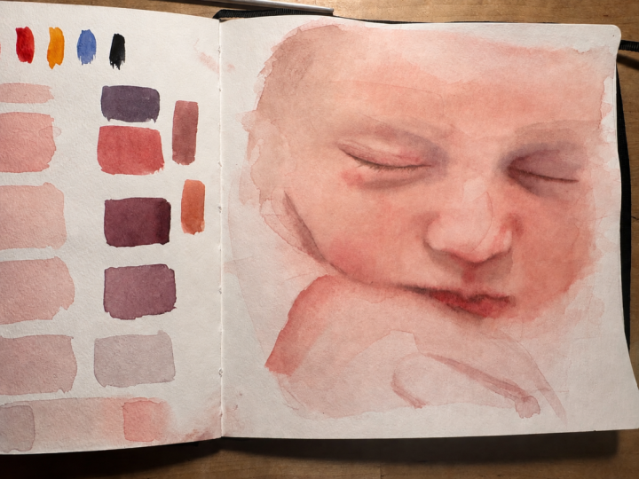
8. Light Skin: Color Palette: And we're going to do a study. This one is a fair skin. And the reason why I've
chosen this reference specifically is because we don't have to worry
about the eyes. We don't have a lot of textures. Babies don't tend
to wear makeup, and they don't
usually have beards, so we can focus on
just the colors. Before we get started,
one tool you can make to help is a color viewer. So take a piece of your watercolor paper and cut a hole somewhere
in the center. If we then hold
this OA reference, we're able to isolate
different colors and values, comparing them directly to the white of our
watercolor paper. So if you do find colors
and values challenging, I highly recommend
making one of these. Because this is a study, I'm not going to be
using it in this class, but you definitely
can if you want. First, we need to pick our
color palette for the study. So get out your paints
and let's have a look. Now, there are many
different ways you can mix these colors. But just to keep it tip, we're going to be using some
version of our primaries, a red, yellow, and a blue. So let's start by
mixing up the orange. We're not going to overthink it, so let's just try and
pick some version of red. I'm going to pick
quinacodoma genta. We're also not going to worry
about color temperature. Next, we need a yellow. I'm going to try
permanent yellow light. So what is perceived as being a cool red and a warm yellow. And we're just going
to mix these in different ratios and see
which colors we get. These would work as a great base for the
skin for this reference. But I really want to
show you that there's never just one way
of mixing a colour. So let's try and pick a
different combination. Let's try the next one in
row, quinaquidone red. And for our yellow
quinathalon yellow. So this time as slightly warmer pink and a
more green leaning yellow. Of course, when
doing these watches, we need to take
into account that the amount of water
we're adding or the exact ratios of each color may vary from combination
to combination, but it should still give us a pretty good idea
of the colors, the undertones, et cetera. These again, would work
wonderfully for this reference. And it also looks very similar to the first
set of swatches. Let's try and do two more. This time, I'm going to
use the same red for both. I'm going to use Pyrrole red. And for the first yellow, I'm going to do inequidon gold. So here we're dealing
with what would be perceived as being a warm
red and a warm yellow, which means that as an example, these sit much closer to each
other in the color wheel compared to colors like Qunaquo magenta and
Quinathalon yellow, which means the range of colors we're able to get
will be shortened. We don't necessarily need that much color variation
for this reference. So these could still
work perfectly fine, but they probably wouldn't be my first choice because I do like having more
color options. Finally, let's mix that same
red with quinatalon yellow. So this yellow does
sit further from the red in the color wheel
compared to quinacilon gold, which is more of
an orange almost. But the range of colors
still won't be as white as if we were to
use a cool toned red. We are able to get
more variation with these than
the previous set, but not as much as
in the first two. Either one of these could work, but I am leaning towards
the first two sets. It genuinely doesn't matter. There's no such thing as a
good or bad color combination. Or good or bad mix. It just depends on what we're
going to be using it for. So in this case, I'm
going to be using Caqudon red and
quinathalon yellow. Once we've got that, we're
going to pick a blue. When picking out a
limited palette, I usually try and
find an area in the reference where
each color is featured. So with blue, it could
be the white of the eye, which even if it's
not a pure blue, could still help us
find the best option. With this reference photo, we don't really have any blue. At least nothing worth noting. The most important thing is
not whether or not we have the right class or if you have the same
colors, I have, et cetera. The most important thing is that we're able to mix
the colors we need. And in this case, the blue
is not the main character. Only really need it to help
neutralize the other colors. And so in this case, whether we choose to use a
blue that leans more green or one that leans more red may not make that
much of a difference. It may give us a slightly
different undertone, but nothing to worry about. So pick whichever colors
you have available to you. Being completely
honest, personally, I'm more drawn to this one because I really like
this version of blue. So just for the sake of it, I'm going to go
with the other one, which means my blue
for this study is going to be thereto
blue, red shade. So just to make
sure we're going to check and see if we can
get the colors we need. If we mix our red and yellow, we should be able to get
a good skin tone base. If we add in some of our blue, we're able to get
some shadow tones. And I know we're
able to get some brighter oranges
and reds as well, which we will need
for the cheeks. If we mix together
all our primaries, we're going to get our neutrals. And even though we may not need grays and blacks, we
do need some brown, so let's just make sure
we can mix those as well, which I'd be surprised
if we couldn't. Once you've selected your colors, let's move on and get
started with the study.
9. Light Skin: Base Layer: I'm going to provide my sketch in the projects
and resources tab, but you can also create your
own or trace a reference. We're not concerned
with accuracy. Our goal is to practice mixing
and painting skin tones. Because it's a study, it
doesn't technically matter, but I don't really want a lot of heavy outlines on my portrait, especially with
this being a baby. So the first thing we're going
to do is mix up at Brown, which we can use to mark
off some of the features. I'm going to go for a
fairly muted brown, so I don't want it to be
too yellow or golden. I want it to lean
slightly more red, and then I'm going to add
in a decent amount of blue. The exact color
is not important. We just don't want it
to be overpowering. And so since we've got
mostly reds in the photo, a brown that's too yellow
may stand out too much. We're going to use this
color to mark off some of the features and get
started on the shading. But we also don't
want it to affect the colors of the
upcoming layers too much, so we do want to keep it light. Since we want the shading, especially to remain soft, we're going to wet out paper. And then all we want
to do is go in and add a touch of colour to any of the areas that have
the deepest shadows. And as the paper starts to dry, we can go in with some
more defined lines like the shape of the eye or
lash line and the mouth. Having just a pencil line doesn't provide us
with a lot of context. So sometimes having a
bit more information on our paper can
be a great help, and it's going to give
us that first layer of form or structure. But again, we do want
to keep it very soft. Okay. I know that going in with some
of the shadows first may seem counterintuitive. Typically with
watercolor, we want to go in with the
lightest values first. But it's worth
trying it both ways. And with this, we're not
really going in all that dark. We still need to go
quite a bit darker. And I do think this helps make that line art look
a lot more human. And if you do find
that this helps, you can use this technique for your normal
watercolor portraits. There really are no rules. Use whichever techniques you like and that you feel
comfortable with. Right now we're mostly just enhancing the sketch. But in the next lesson,
we're going to go in with very similar layers to really help build the
form of the face. So one way to look at this
is to see it as a trial run. Try out the technique
without going too heavy. Once we're done, we
want to allow that to dry and get ready for
mixing our skin tones. If you have enough
room on your palette, feel free to keep the brown mix. You can use it on its own, or use it to help
mix other colors. But for the sake of the
class, I'm going to try and keep my
palette fairly clean. We're going to start by creating two color mixes for
the skin, a light, fairly neutral one, similar to the far left of
the face right here. This is going to be our
main basic skin tone mix. For the second one, we
want one that is more red, somewhat matching the
color of the cheeks. Starting with my red and yellow, I'm gonna mix those
two together, and I want to be careful to not add in too much
yellow to start because the cinathalon
yellow does tend to be pretty
strong in mixes. Gonna add in some blue and
adjust the color from there. With watercolor, it's not really possible to give exact
color mixing recipes. But please don't stress
about the colours. It's not that important. Try your best to match
it to the reference. As long as we're close,
it's good enough. Keep adjusting the mix until
you get the color you want. And if you find it difficult, use the color viewer to help. This mix is a bit too red, so I'm going to add
in some more yellow, just a tiny bit and
see what we have. I actually don't think
this is too far off, and as long as we
don't go into dark, we can always add glazers on top to help adjust the color. For the second comics, I'm
going to start with red and yellow again and add
just a touch of blue. You can definitely go in
with more vibrant Clomixs, but I want to keep
it fairly close to the reference using these as a soft base and then go in
with more vibrant glazes. H. Let's go in with the first layer. I'm going to wet the whole face. But if you prefer, you can also go in in smaller sections. We want an even sheen without
any polling of water. Then we're going to
pick up our first color and add this in as a base, starting up on the forehead, working our way
over to the side. As I get closer to the
center of the face, I'm going to transition
into a next color. So I'm going to pick up
some of that, add that in. Rinse and wipe off my brush
and pick up the next color. I'm going to keep most of the red on the
cheeks themselves. And then for the lower
portion of the face, even though I'm still
using mostly this color, it's very watered down. H go to pick up the first mix and
add that to the nose. With this first layer, even though everything is
going to dry lighter, I'm still being careful
not to go into dark. And since the nose has some lighter values compared
to the majority of the face, I am keeping this slightly
lighter than the rest, going back to our red mix and adding in some right
here, just a bit. And finally, I'm going
to clean up the edges. Before the paper dries too much, I'm going to rinse and wipe
off my brush really well and use it to lift some of
the pigment right here. It's not a necessity. Everything is going
to dry much lighter, but I like being able to see where some of those
highlights are. Before moving on, we can add a quick base layer to
the hand, as well. When doing this, we want to make sure the wrist is dry enough. Otherwise, we're going
to cause blooming, and I'm going to keep
this super loose because the focus is
going to be on the face. Once we've got that, we're going to move on and get started on building
up the layers.
10. Light Skin: Deepening the Values: We're going to go in
with another layer. This time, I'm going to go in on each section of the
face individually, but you can also do this
in one layer if you want. Starting with the
eye on the left, I'm going to wet my paper. I'm going to be using the
same two color mixes. And so what we want is
to look at our reference and further enhance some of the color and value
changes we see, focusing on the deeper values. So the shading and shadows. And in areas where we see
more red in the skin, we want to bring in
more of our red mix. We still want to keep everything lighter than what we want
the end result to be. Our goal for this layer is
to further enhance the form. And then in the next lesson, we're going to practice glazing. It does not have to be perfect. All we want to do
is further enhance this sense of form using
these basic mixes, which is then going to act as a perfect base fighting
glazes on top. Once you're done
with one section, move on to the next. Breaking it down and focusing
on one small section at a time makes painting a
face much more manageable. And we're not looking
for perfection. It's just a study. Focus on building up the colours and the
layers of the skin. And if you're
looking to practice without painting a portrait, practice by trying to coll
match different pink colours, different references, just like we did with the exercises. Better you know the colors and the pigments
in your palette, the more you'll be able
to do without feeling the need to add additional
colors to your collection. To be fair, there's nothing wrong with adding more pink
colors to your collection. Even if you're able to
mix a certain color, you might still want a pre
mixed version for convenience, and there are of course colors that are more difficult to mix. One of the types of
colours that I think have the most uncertainty surrounding
them, bright colours, not necessarily fluorescence, but bright oranges, bright reds, bright blues, et cetera, because it might be difficult to imagine where they fit
in in your paintings. But the thing is,
with bright colors, we can always use color
theory to tone them down, but we can make muted
colors more vibrant. So don't be scared of the
brighter colors because, if anything, they only allow you to get a wide
range of color mixes. Practicing and
mastering col mixing is one of the most useful
skills you can have. And some of my goals
in this class is to show you that if you
know how to col mix, you can do a lot more
with a lot less, but hopefully also show you that you don't need to
stress about having the exact same colors
as someone else or being able to make your paints
in the exact same ratios. I truly does not matter. If our color mixes are
not an exact match to the reference or if your mixes are not an
exact match to mine, that's okay because for one, color is not the most
important thing. Values are far more important. Secondly, if you know
how to color mix, you will be able to color
correct on your own and hopefully feel a lot more
confident when painting. One of the great things
about this reference is that we're dealing with a
very limited color palette. So the soft reds and
browns that we're adding now already exist within the
mixes we would need to add, which means that as long
as we don't go too dark, we don't really have
to worry about how these tones are going to
affect the upcoming layers. Work in your own pace. It's up to you how much time you want to
spend on this study. The main goal is to practice mixing and
painting skin tones. So in all technicality, you don't need to
worry about creating soft edges or making
the layers look neat. As long as we get to practice
building up these layers, colors, and values, it
doesn't matter how you do it. Continue working
your way through each feature within
one area at a time, adding or defining some of this soft shading and adding
in a few of the details. Oh Finally, I'm going to use this last
bit of paint to further enhance the line where the
mouth is and the lash line. And then once you're ready,
let's do some glazing.
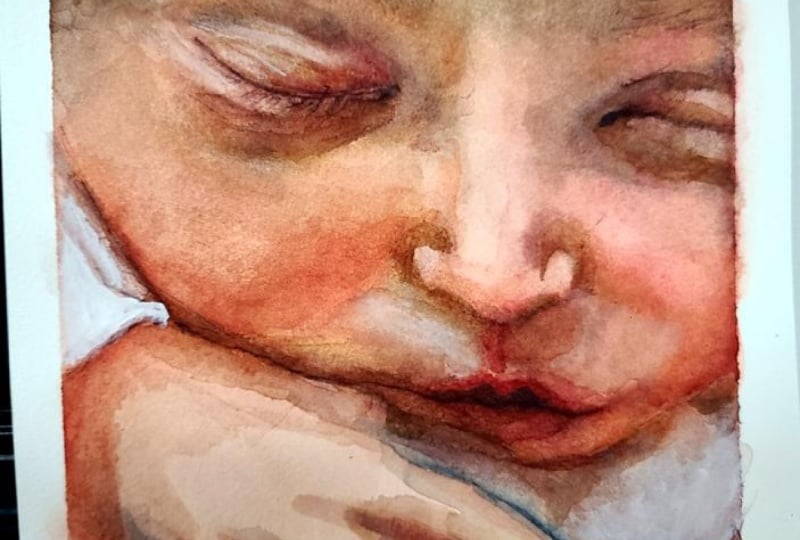
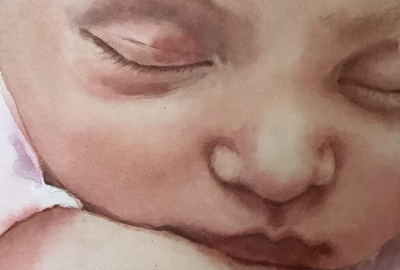
11. Glazing Example: In this lesson, we're
going to practice color correction using glazing, and this is why I have the
printout of our reference. I want to show you the basics of what we're going to be doing. So if we compare our
painting to the reference, we need to look at each
area and figure out what we need to do in order to get it
to where we want it to be. As an example, if we look at
the forehead on my study, the forehead is currently
one of those colors that could be a basic flesh
tone in a box of crayons. It's a pale, pink
or peachy color. But if we then look
at our reference, aside from obviously
being much darker, it also appears more neutral and maybe more yellow
toned in color, not much but a tiny bit. So if this is where
we are currently at, we need to figure out
how to get over here. The values are going to
build up automatically, so we're going to
ignore that for now. So if our color is too red, we need something to cancel that out to make
it more neutral. Green is the opposite of
red on the color wheel. So let's mix up a color that is mostly green with
just a touch of red. Maybe something like this. I don't want it to be too green, but I do want it to be more
green than what we want, just to show you. Let's see. If we add this on top, and I'm just going to go in
with a fairly heavy glaze, we are getting closer in value, and we're canceling out the red. But now we went too green. And this could be
one of the reasons why we might not want to go in with a glaze that's stuck unless we're sure of the color. But red cancels out green. So we're going to add
in a bit more red, and now we've got
the right color as well as the right
value, more or less. Likewise, if this was a color
we'd mixed for our cheek, aside from being too light, it's not too far off, but our mix is too
warm or orange. So in order to fix
that, we're going to go in with a glaze that
is more cool toned, one that has less yellow
and more blue and red. And in other areas, we may simply need to go in with a glaze that is the same
color as our base layer. So if you're up for it,
let's give it a go.
12. Light Skin: Glazing Pt1 : We're going to use
glazing to build up the colors and the
values of the skin. First things first, glazing and layering in water colour is
basically the same thing. But typically, glazes
are transparent and are only applied to
already dried layers. And the goal with glazing is to adjust the colors of
values in some way, which is basically what we're doing with watercolor anyway, so we can use the
words interchangeably. Can go in with a few thick
glass or a lot of thin glass. It's completely up to you
and as with everything else, depends on your
personal preferences. So you can do this as quickly
or as slowly as you'd like. The main thing to
keep in mind is that the adjustments
you need to make on your study may be different from the ones I need to
make on my study. It depends on the colors of
our study at this stage. We're not looking
for perfection, but try your best to adjust
the colos on your study to the colors in the reference by adding layers
that lean more red, yellow, blue, et cetera. You can start anywhere you want. To keep it simple, I'm
going to start with the forehead and
work my way down. For my first color,
I'm going to begin by mixing yellow and
blue to get a green. And once I've got that,
I'm going to start adding red until it begins
to look less green. This is going to be the
first of a couple of glass. So I'm not too concerned with getting the right
color in the first go. Gonna add in a touch
of blue as well. We want to adjust
the colours until we feel at least okay about them. Let's see. I'm going
to go in wet and wet, and for some, I'm going
to go in wet and dry. And since this is a larger area, I'm choosing wet and wet. This is a surprisingly
good match. I still need to
deepen the values, and I do want some more red on the lower portion
of the forehead, but we're getting closer. Before the paint settles, I'm going to push the pigment
away right here where we do have some slightly lighter
values on that forehead. Gonna add a touch more red and blue to my mix and go in again. Et's go in with
the second layer. For this, I'm going to focus the colour on this lower half, making sure the edges
are nice and soft. I think I want a touch
of red right here. Continue oa to the side. Then for the hair, we want
a more neutral color. So I'm going to add
in some more blue, blending out the edges. And of course, we want
to allow each layer to dry before going
in with a new glaze. I still want to bring
in some more warmth, but now I'm going to move on to the next section of the face. Let's have a look at the eyes, starting with these deep
values we've got right here. Starting with my red and yellow, I'm gonna mix up at deep, I guess orange, but
more red than orange. Gonna add some blue to help
deepen and neutralize it. Maybe a bit too red and
not neutral enough. I'm going to add in a touch more yellow and some more blue. Not quite that much blue. Gonna get rid of some of that. So maybe something like this for the main portion
of the shadow. We've also got some more
blue or more neutral tones. So I'm going to
pick up some blue without rinsing my brush, putting that right here,
ready to add it in. Glazing for something
like skin tones can definitely seem like
a complicated process, but I promise you, it's not. Just take it one step at a time. Look at the color you have and compare it to the color
you want to end up with, and then try and imagine
which colours or pigments you would
need to add to that mix to get that color. The more you practice
color mixing, the easier this will become. It's all about
basic color theory and understanding how to
mix different colours. And if you're really not sure, try going in with
much simpler glazes. If your base, as an example, is not red enough, add a thin glaze of red and
then take it from there. You can glaze with just one primary or one
secondary color at a time. It's just going to
take a bit longer. Also, if you don't have any real idea of how many layers you're
going to be adding, it may be more difficult
to control the values, but it's all a
matter of practice. If you prefer going
in with simpler mixes or individual colors,
feel free to do so. Before going in with the
next glaze on the eyes, I'm going to mix up a neutral, just a deep brown,
which I'm going to be using for the lash line. That's going to be too yellow, so I'm going to add in my blue and then go in with
some more red. Pretty close. I'm not really going for
any specific color. I just don't want it
to be too yellow. Wetting my paper again. Starting with the red mix, adding some more colour
to the soft shadows. We can also begin adding
some detail to the eyelid and that touch
of color under the eye. Gonna be careful not to
pull this color too far to the left because we
definitely want a less neutral, more vibrant glaze in this area. Still need to bring
in some warmth, but I'm going to save
that for the final glaze. Like I've already said earlier in the class, don't
overthink it. But if it doesn't go
to plan, it's okay. Remember, it's just a study. One way to test your col mixes before you
go in with the glazes is to have swatches of the colors you've already used on a
separate piece of paper. That way you can practice
glazing on those before going in on the actual
painting on this case study. We're going to move
on to the nose, but I still have a good
amount of paint left. So I'm trying to find an area on the study where I can use some of this column
before getting rid of it. I'm going to add in some
more yellow and see if I can use it for
some of the shading under the nose and near the mouth because we need some pretty deep
values here anyway. And, of course, as I've
already mentioned, if you have room
on your palette, just keep the colors. You can always use them
to help create new mixes. I'm not going to make it too
yellow, orange, or warm. I'm saving that for
that final glaze. So for now, I'm focusing on
just deepening these values. This brown may not be the
right shade for the shadows, especially down here around
the mouth, but that's okay. It's close enough, and
that's all we need. But already we're seeing
much more form on the face. And once we get
some more color and deepen the values on the
nose and the cheeks, it's going to really
start coming together. So if you want, let's move
on and get some color onto those cheeks. H.
13. Light Skin: Glazing Pt2 & Class Project: Let's continue by adding a
couple of glass to the nose. On the lower half of the face, the colours are
much less neutral, so we want to keep that
in mind when mixing. I'm going to create two mixes. The first one is
going to be more red, and I'm going to go for
something like a soft coral, mixing together red and
yellow, but mostly red. Something like this. Let's watch it and see that
looks pretty good. The second mix is going to be much more of a basic skin tone. I want it to be very similar
to the color of the forehead because I want to use this for the top half of the
bridge of the nose. I don't want it to be too cool because we do have some
warmth in this area, but I also don't want it
to be too warm because we are going to be going in with
a warmer glaze at the end. So we're looking for more of a very basic or somewhat
neutral skin tone. So let's wet the paper. I'm going to be
wetting the nose, the bridge of the nose, and the lower portion of the face. And for the first
glaze, I'm going to be focusing on the soft shading. Starting with the
bridge of the nose, I'm going to pick up the basic skin tone mix, add that in. Blend out the edges. Gonna pick up the red mix
and add that in right here, adding some blushy
colour to that nose. Gonna mix it two to
create an in between color and go in with
that right here. Pulling that down, keeping
it fairly soft for now. While waiting for that to dry, I'm going to go in with one
more layer to the hand. For the most part, using
these same tune mixes, but I'm also going
to bring in some of the red on its own to add a light layer of pink both right here and to
the hand itself. I'm going to spend the
absolute minimum amount of time on this hand. Our focus is the face. The hand just happens to exist. We're going to go in with
one more wet and wet layer before we start going
in wet and dry. For this layer, I'm going
to wet the entire face. But first, I'm going
to mix up some more of the basic skin tone mix or at
least a very similar color. It does not have to
be 100% accurate. I'm also going to add some more red and some more
yellow to this mix. This time, I want much
more of a pale orange or golden color because I'm still lacking some
warmth in the face. So hopefully this should
take care of that. We're going to wet out paper, and I'm making sure
it's well saturated because I want to give myself as much working time as possible. Recommend going from
largest to smallest, meaning that we start
with the larger shapes. So if we need to add a glaze to the entire face, we're
going to do that first, and then we can charge into
that color with more mixes, looking at some of
the softer shading, slowly focusing on smaller
and more detailed areas. If you want to go in with even more wet and wet
glazes, you definitely can. There's no limit to how
many layers you can add. Just allow each layer to dry before going in
with the next one. I'm going to pick up
the basic skin tone mix and use this for the lower
half of the forehead. For some of the shading,
I want to go in with both the rosy mix and
the skin tone mix. So we can all mix those together to get an in between colour. With each layer, we are adding more depth
to our painting. It's definitely not
the fastest process, but it does give us time
to really think about our next move or step in
the painting process. And again, depending on
your level of patience, you can go in with lots of thin layers or a
few thicker ones. It really does just depend
on what you prefer. Even though going in in these thin layers
does take more time, I really do love and appreciate this gradual
buildup of color, and it really is a great way to practice color
mixing as well. Don't worry about the likeness. That is not the
focus of the class. Et's talk about
the class project. The project for this class
is to create a study. It does not have to
be this reference. Specifically, you can do a partridge study of
any reference you want, but the goal is to practice mixing and capturing
the skin tones. So try and capture
both the base color of the skin as well as some of
all the color changes we see. So as an example,
red on the cheeks, maybe a slight blue, purple or green tint under
the eyes, et cetera, but you're also more
than welcome to show me the result from
the other exercises. Whether that would
be color matching to certain pink colours, basic skin tone mixes, or the mixes based on the
quote real skin tones. I would love to see all of it, so feel free to share. At this point, I'm pretty
happy with the colors. And even though there are still small adjustments to be made, the main thing I need
to focus on now is to further build up some of
those deep shadow tones. For this, I'm going
to go in wet and dry, picking up on mixing colours and adding those in
to make those final changes. I do want a bit more colour
and value onto the forehead. So I'm going to go
in with some of this and then blend
out the edges. Gonna continue down here
onto the shading around the eye and onto the cheeks, bringing in a bit more color and vibrancy and building
up the values. At this point, you also don't
need to worry as much about hot edges because we have quite a few layers of
watercolor built up, we should be able
to blend those out with a damp or wet brush, even after the paint has dried. But if you do have hot edges
at the end, it's okay. We're not going to
worry about that. I'm going to quickly
mix up some more paint, just a few random colours
for those final touches. I'm not gonna do too much more. I want some more of our
red mix, some orange, maybe some purple tones, and definitely more
of a neutral brown. And I'm going to use these
for those final tweaks. What I also really love about this process is that it shows us that even when
working on what is considered fair
skin and grinded, you could have references with even lighter looking skin tones. But even with this being in the category of
fair or light skin, we still need to
build up the cost and values quite a bit. So if you do have a tendency to go to light with
your paintings, this might be good practice. Honestly, we could continue going back and forth for ages. It's a really enjoyable process, and there's always
something you can adjust. It may not be perfect
at this stage, but I think I'm going
to call it a day. I really hope you
enjoyed this class, and I can't wait to
see what you create, whether that is
the portrage study or swatches from some
of the exercises.
 Tanja Jensen, Artist - Sculpting, drawing and painting