Transcripts
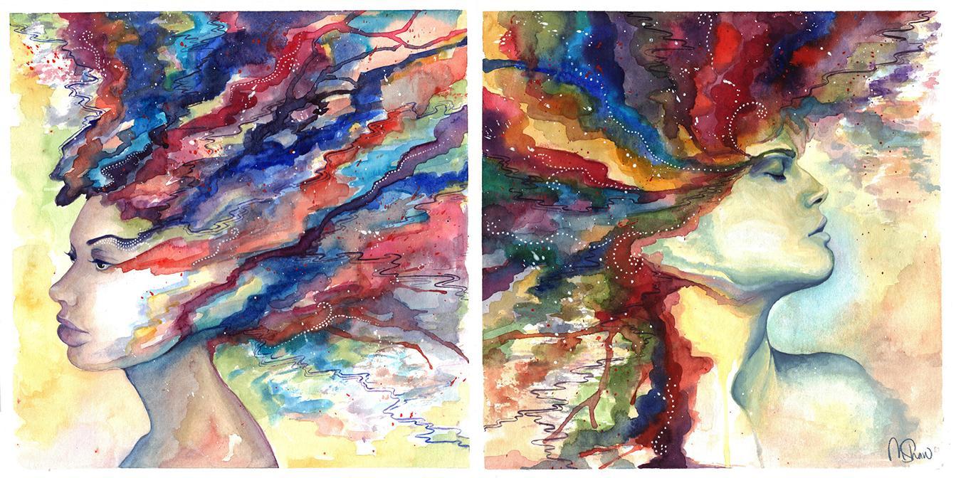
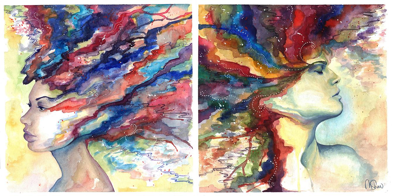
1. Introduction: Hello. My name is Melissa Shaw and I'm an artist and illustrator based in Sacramento, California. When I tell people that I'm an artist and they ask me what medium I work in, it's always a little bit difficult to answer because I work in so many different mediums. I am a traditional painter, a digital painter, an illustrator, surface pattern designer, a cut paper illustrator, etc. So to save time, I usually just tell them that I am a digital artist and a watercolor painter because watercolor is absolutely one of my favorite mediums to work in and definitely my favorite traditional medium to work in. In this class, I'll be taking you through my entire process for creating a watercolor portraits and more to these. From using reflex, to the initial sketch, to painting the facial features, and finally, the abstract elements. But before I do that, I'm also going to be showing you some standard watercolor techniques, tips and tricks, as well as some fun texturing techniques that will be particularly helpful for you if you're just a beginner. I went to school for art and all the time I would have classmates coming up to me and telling me that watercolor is a particularly difficult medium for them to master and then ultimately they prefer using oils and acrylics. While there's nothing wrong with oils and acrylics, I really just want to show people that watercolor is not as unforgiving of medium as it may seem to be at first. So hit enroll and let's get to painting.
2. Gathering Materials: Hello, welcome to the class and thank you so much for enrolling. First, I just want to go over the materials you'll need to proceed. Obviously, we're going to need some watercolor paints. I really like using tubes, but as long as you use artist grade watercolor, you should be fine. I suggest getting a one-and-a-half to two inch flat wash brush for our washes. Otherwise, all I use is an assortment of different size round brushes. I have a 10, and a six, and a four, and a zero etc. I also have this really nifty 20 over zero round brush. It's Princeton Art and Brush Co, and it's part of their mini-series. It's so tiny and how you probably can't even see. But I use that for details. You don't have to get this, but I really recommend getting the master's Brush Cleaner and Preserver, and it does exactly what it says on the tin. I'd also recommend getting some masking fluid, which is a really nice tool for watercolor in particular. I really like the Sminky Brands because it's blue and you can see it really easily on the paper. I have two different kinds of masking tape because I'm always on the hunt for the best kind of masking tape to use with watercolor. So far, these two have worked pretty well for me. I have a duct tape and then regular old scotch 232. I like these because so far they're the best at not ripping or damaging the paper once you wrote when you remove it. Another masking tool that you can use is called a color shaper. It's essentially a brush but with a rubber tip. I use that for shaping the masking fluid. Otherwise, you can just use a cheap watercolor brush. I stressed cheap because I made the mistake of using a expensive one, and now I can't use it as watercolor brush because it's essentially been rubberized by the masking fluid. Pencils and erasers, pretty standard. One thing I do recommend though is blue LED. I really like using it because it's nice and light for an under drawing and it kind of mixes with watercolor really well. Now, paper. If you're like me and you don't like to deal with stretching your paper, I recommend watercolor blocks. Essentially you keep the paper on the book and then take it off once you're done with the painting. They have a little slot here for you to remove it. As brands go, Arches is a great brand and it's super high-quality paper, however, I think that Kansan is just as good. I haven't noticed much of a difference and they tend to be half the price. So I go with that. These are both a 140 pound cold press paper because that's just what I prefer. If you don't want to use watercolor blocks, don't worry. I am going to demonstrate how to stretch paper later on. Next is classic rub, rubbing alcohol and salt. We'll be using all three of these things in various different texturing methods. Two different containers. One for mixing with paints and one for cleaning your brushes. Last but not least, you need a palette. I like to use a butcher tray just because it's nice and clean and big, and no water is going to run off the edges or anything like that. That'll do it. I'll see you in the next video.
3. Setting Up Your Workspace: As far as setting up your workspace goes, I suggest putting down a piece of plastic or a cutting mat to protect whatever surface you're working on. Again, I stress the importance of two different water containers because you don't want to mix your paint with dirty water or you might risk diluting the color, and that wouldn't be good. I also highly suggest using a piece of scrap paper for practice strokes and checking the intensity and saturation level of your colors on your brush, and of course, a bunch of different paper towels for dabbing and lifting colors.
4. Using References: Personally, I've drawn so many faces and profiles now that I don't really need reference for it anymore but if you're not comfortable free handing it, I have a couple of reference resource recommendations you could use. The first is this Character Design References Pinterest Board, which is awesome because not only do they have a ton of references, but they also have tutorials and interviews with established artists and such. My favorite thing about it though, is how it's organized by every category imaginable. For example they have character poses, but they have it separated by profile pose, back pose, hand gestures, walk cycle, etc. They have animal boards, machinery, environment, the list goes on. For the purposes of this class, something like character design or character anatomy head might be useful. They have head angle expression, shading, all that good stuff. That's awesome. Another website I recommend is called artists.pixelovely.com. This website's neat because essentially it's a huge database of stock reference photos. But unlike regular stock photo websites, the pictures are randomized and timed. As you can see, you can choose from figure drawing, animal drawing, hands and feet, and faces and expressions. Then from there, you can choose expression type, gender, let's just keep it on all expressions. Then they have their standard times, which is 30 seconds to 10 minutes and the class mode, which is 30 minutes to six hours. You can skip forward or back and pause on, if you like a certain expression or you can just use it like a really quick drawing tool. That's how I use it most the time. So that's cool. The last thing I'm going to recommend is called the Handy Art Reference Tool and it's for iPhone and iPad, sorry Android users and Windows users but if you do have either of those things, this is really cool because it has feet, hands, heads, and skulls apparently, I didn't know that. That was added recently and they have a male-looking head and a female-looking head, as well as more "Masculine looking hands and feminine looking hands". So that's useful. You can turn the head however you want to turn it and light it however you want to light it and the thing that I've used at the most for is tricky head angles. So that's a really cool thing to have. I'm not sure how much it is. I know I bought it, but it's cheap. It's no more than a few $. I hope that one or all three of those references will be helpful for you.
5. Stretching Your Paper: Unless you use pre-stretch watercolor paper or watercolor blocks, you should stretch your paper to prevent it from becoming warped. First, you soak your sheet of paper thoroughly in water. Then you wipe off the excess moisture with a paper towel, taking special care of the edges because you'll be taping them. Then lay the paper flat on a drawing board, tape down all four sides with masking tape and let the paper dry completely before painting. Don't remove the paper from the board until you're finished with your painting, and don't remove the tape from your painting until it's completely dry. Keep in mind that taping the edges of your paper also gives you a really nice clean white border. So you may want to do that even if you're using a block.
6. Watercolor Techniques: Flat and Graded Washes : Why should seem like a simple enough thing, but they can be a little bit tricky to make even with watercolors. First, tape your paper down to a drawing board, and then slightly damping it with a sponge or a paper towel. If you keep your surface a little bit of an angle because when you're doing the wash it's nice to have the water and pigment drip towards the bottom of the page. Before the previous stroke dries, drag the second stroke below and slightly overlapping with first so it's nice and even. Avoid going back and retouching your areas until it's dry because small variations and blemishes will usually smooth themselves out as it dries. Because the paper is completely dry, when I remove the tape it doesn't effect it at all. Now you have a nice smooth wash. For a graded wash, you essentially do the same thin only you dilute the paint a little bit with water every time you do a new row. Again, minor inconsistencies will smooth themselves out as the surface dries, so resist the urge to fiddle with it. I'm going to take the tape off of this one before it dries just to show you what happens. You see because it's still wet, the tape damages the paper.
7. Watercolor Techniques: Crisp Edges, Lifting, and Paper Types : If you want to create clean edges, you need to work wet on dry. Don't make the mistake of not waiting long enough for sections of your painting to dry before continuing. With not enough time that's left for the surrounding color to dry, it will bleed into the newly applied color next to it. All it takes is a minute or so of waiting to avoid that. I've painted these little mushrooms really quickly just to demonstrate what I'm talking about. Because the paint is dry, I can apply a new color next to it and not have to worry about the colors bleeding together. So as you can see, there's a nice, crisp edge between the burnt red and blue. Now I'm going to demonstrate what happens if you don't wait for it to dry. So as you can see, the colors bleed together. There are a couple of things to consider when it comes to successful lifting, which is when you remove pigment from the paper after it's applied. The most important thing to consider is the type of paper you choose to paint on. Watercolor paper is usually categorized by its surface texture. There's rough, cold press, and hot press, where hot pressed is the smoothest. Pigments on hot press paper will lift easily because the paint mostly sits on the surface, whereas rough paper is more resistant to lifting because it's more absorbent. Cold press paper has a good mid-range texture that is pretty tough and resilient and can handle a lot of layering and lifting. So I think it's the best type of paper to use if you're a beginner, and it's what I still use. Another thing to consider is that some colors lift easier than others. I've noticed that reds lift easily while blues are a little more stubborn.
8. Watercolor Techniques: Texturing with Salt, Plastic Wrap, and Rubbing Alcohol : One of the main reasons I love watercolor so much is because of the beautiful effects you can get. You can achieve a lot of cool texturing effects by using things like salt, rubbing alcohol, and plastic wrap. With salt, you just sprinkle it onto wet paint and once it's dry, gently brush away the salt crystals. The salt absorbs some of the pigments surrounding it, leaving a really interesting blooded feathery pattern. I've used it for organic things such as foliage and moss. It's the same principle with plastic wrap. Lay it on wet paper. Wait for it to dry and voila. Although, be sure it's completely dry before removing the plastic wrap. It takes a little bit longer than usual because of the plastic wrap, so I will give it at least 20 minutes. I think I'll let this sit for 40. Finally, rubbing alcohol. You sprinkle it on wet paint and it makes a really cool bubbly effect.
9. Sketching Your Portrait: As I said before, I like to use blue LED because it's nice and light. I like how the watercolors look painted over the blue more than over regular graphite. First, you should decide if you want an asymmetrical or symmetrical composition. Then roughly sketch where the head is going to be before going into detail. Essentially, you just want to make sure your drawing is nice and light. Remember to leave the top of the head blank to leave room for the abstract portion of painting. Remember, using reference is okay, just don't copy things directly.
10. Painting The Face: I'm going to use masking fluid to mask out the areas where I don't want paint to cover, like these little detailed dotted areas I have on this piece. As I said before, I like this brand of masking fluid because it's light blue and I can see it very easily on my paper. I'm using my color shaper to apply the masking fluid. I ended up squeezing some masking fluid onto my palette and then dipping my color shaper into that. To start out, I choose a color palette for the face. In this case, I want it to be mainly blue and purple and then I just block out some of the main areas that need shading. Here I'm using my tiny 20/0 size brush to outline the eyes. Because my brush is so wet, the glaze is going on nice and light and I might have to go over this again, because I might have lightened this too much. But the thing about cold press paper that's so nice is that you can wear as much as you want, really. What I like about using white paint so much is that it religiously helps you smooth out your transitions. It's not really the traditional way of using watercolor, but I get some really nice results with it, so that's what I like to do. I don't think that you should be restricted by your medium. I think you should use it however you want to use it, so that pretty thick white on. This blue, it's really thick, not much water. For watercolor that's very thick consistency. But that's what I want for to this because I do what I want. That's white right color, but I'm taking that through here, I'm leading it into this blue of his shoulders or their shoulders. I don't know what gender this person is. I just added water just now, and as you can see it becomes more of a glaze rather than a really thin acrylic. I've got too much white on my paintbrush now, so I keep lightening that up too much. I'm going to go back in, pick up more blue and purple on my brush. Now I added some darker blue here because I'm keeping [inaudible] little bit lighter than I want it to be. It really is just a bonding process because this paint is still wet. I can blend this dark blue in with it really nice. If I stopped and let that dry, it wouldn't be able to blend as well. I use tissue sometimes to blot and lift just because it's gentler than the paper towel, but both work. I'm going to go ahead and let that dry this bit, just to see how it will look, and if I'm satisfied with it, if not I'll come back in here and smooth some more out. Sometimes when I just let things go, I like the effect. I give it a minute or two while I work on another part of the painting, I come back to it and the effects can be really neat. Like right here, I really like how this turned out. Next thing I'm going to work on is this. Because I don't really like how that dried. It's a little bit too cel shady rather than the blended quality I want to get. I don't remember what color is on my brush, so I'm testing it out on my scratch paper. Watercolor tends to dry lighter than it goes on. The key really is to just let it dry for a minute. It dries about 50 percent lighter than it looks when you first paint it. Tiny amounts of paint go a long way unless you're painting in a large format, just put a tiny amount of paint on your Butcher Tray on your palette, and a tiny amount of paint on your brush goes along way. I want to fix this bit, but I'm not going to go at it right now because I want that edge to be cleaned and it's still a little bit damp. I'm adding a little bit of purple. There's another thing you could do if you have a wet edge, just blot it a little bit and that can smooth it over. This paper is tough, so it's taking all the water in the layering I'm giving it. You're going to want to be a little gentler with rough paper. It will not take that wearing as well, and also want lift as well. I use white paint like white out almost. People say you can only cover up paint in acrylics or oils because you can just let it dry and then paint over it. But I really think the same applies to watercolor. You just have to wait for the paint to dry or you have to use it more like acrylics. But at the same time, even though I'm using it like acrylics, I still can't get some of the same qualities that I can get with these watercolors as I do when I use acrylics, and I do use my acrylics much differently than this. I don't want them damp so much and they're thicker obviously. I don't think there's any right or wrong way to use paint. Use it however you want. Now, got that thick stripe in between the two areas I want to blend. I've wetted my brush more, not nearly as much paint on it this time. Now I'm just going to go over that, and the paint stripe that I just put on is now mixing with this purple on the edge of his jaw. Because I've wetted my paintbrush, and I didn't have to go in and add another color to blend that made a little more. All I did was wet it and just smooth it into the purple. I'm going to do same thing for the other side, smooth it into that light blue. I'm going to go over a lot of this shading and just do essentially what I did here to fill in bits and pieces of the shading. I've been using the Handy Art Reference for shading guidance. That's how I know where to shade. I've also just done this a lot, so there's that as well. I intuitively know where to shape. But like I say, if you don't have that intuition yet, then look at some reference. Another thing to keep in mind too, is that you paint over somewhere that you want to be white. Don't panic because you can just take your white paint and paint over that. Let the colors dry, take a thick global white paint and paint over it. The lighting that I want, it's coming from this direction, so the set of space is a lot lighter, and this side is darker and then his cheekbone is catching the light here. That's why I'm making that choice.
11. Painting the Abstract Elements: Now, for the fun part. This is my favorite part about doing these paintings because really anything goes, just pick some colors and go crazy. I usually start out at the eyebrow just because it's nice transition. Then I just let my instincts take me where they'll take me. For this bit I'm not nearly as careful as I am when I'm painting the face. As far as choosing colors goes, I don't just follow the rainbow. I like to put a lot of complimentary colors next to each other. There's a lot of blue next to orange, and purple next to yellow, etc. I thought this was looking a little bit too light so I went back in and added contrast. To remove the masking fluid, all you do is rub it gently with your fingers. For another cool texturing effect, add color to your brush and make sure it's somewhat dry, and then drag it along the paper on its side.
12. Final Thoughts: My headline for Skillshare is "Allow yourself to fail before you succeed." What I mean by that is essentially, you shouldn't discount the art that you make that you consider to be bad because it's still practice, and the only way to succeed is through practice. So you need to allow yourself to fail and make that bad art. I think one of the biggest mistakes that artists can make is to assume that the first 10 or 20, or even 100 bad drawings they make, are going to be the only drawings they make. But if you keep at it, you will make something you're proud of. With that, I hope you've enjoyed this class and thanks again for taking it, and don't forget to post your project in the project gallery.
 Melissa Lee, allow yourself to fail before you succeed