Transcripts
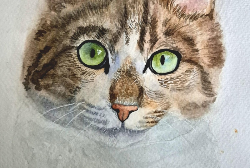
1. Intro: Hey, there. I'm Tanja. I'm an Attas based in Denmark. In this class, we're going
to go through step by step the process of painting a
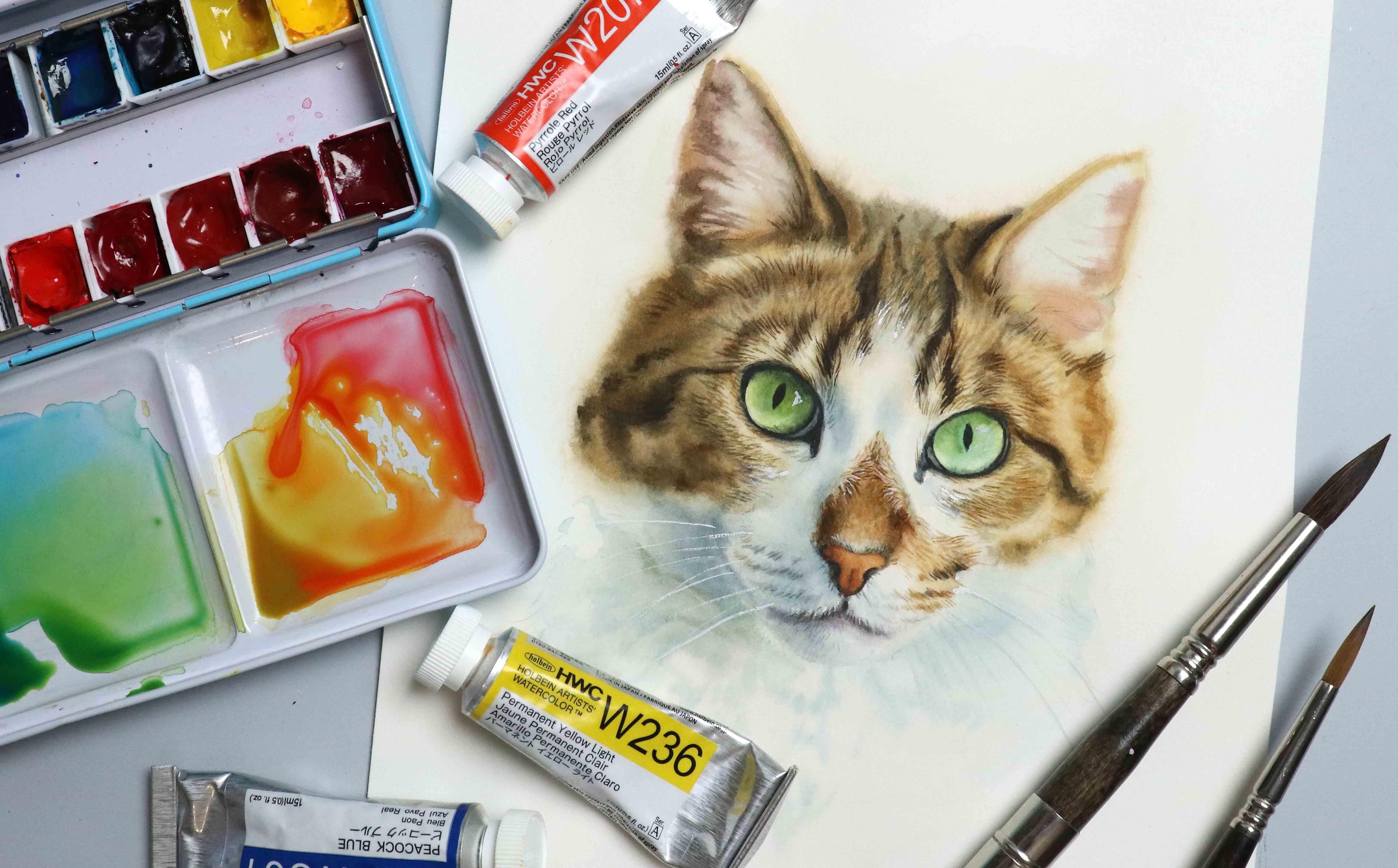
pet portrait in watercolor, using a cat as our model. We'll go through the supplies,
picking the colours, creating the initial
base layers, and building some fur texture. The goal for this class is to practice rendering
animal portraits. And if you enjoy this class, I'll definitely make
a more advanced pet portrait class
in the future. So if you're
interested in painting your fairy family members, please join me for this class.
2. Supplies: Let's go over the supplies. You're going to need some
paint, so get out your palette. We're going to talk
about which colors we're going to be
using in the class, but you're going to need some
version of your primaries, a red, yellow, and a blue. I'm also going to
be using white. You'll need some
paper. I'm using Ash, 300 USM, cut and paper. I'll be using a piece
that is seven by 9 ", as well as a couple
of scrap pieces for swatching. You'll
need some brushes. At the very least, I recommend having a brush for
overall shading. So a nice soft brush, I'm going to be using
an escota versatile in size ten and one or
two detailed brushes. I have an escota Prato in size ten and an escota
oimo in size six. But one good detailed
brush will do. You may also want to
use a few brushes for lifting or
different effects, but we're going to go through
that throughout the class. If you're working on a
loose sheet of paper, you're going to
need some tape to tape it onto your work surface, a cloth to wipe your
brushes, some water, and tissue to help get rid of excess water from your
brush and for lifting. And finally, you may want
to have a pencil and maybe an eraser on hand
for the exercises. So grab your paint and
your favorite brushes and let's get right into it.
3. Pick Your Colors: So I've got my sketch
and my setup ready. We're not going to be
sketching in this class, so feel free to sketch your own. You can trace the reference,
or you can use my sketch, which I'm going to be
linking below the class. But either way, I still highly
recommend that you check out my previous class on
sketching animal portraits, focusing on cats because
practicing the fundamentals, even if you still decide to
trace the reference or use my sketch for this class can make you a much
stronger painter. Especially with a
medium like watercolor where every brushstroke
is going to be visible. Practicing accuracy by drawing and sketching can
help out so much. But once you've got your sketch, let's figure out which colors
we're going to be using. As with most of my classes, we're going to be using some
version of our primaries, so a red or magenta, a yellow, and a blue or yen. There's never just
one right answer when it comes to which
colors you want to use. So don't worry if you don't have the same pigments that
I'm going to be using. Play around with the colors
you have available to you. Okay, so let's start by
having a look at the fur. Now, we have the white with some shadows and then
a few shades of brown. So let's see if we can mix that. We could definitely use a pink, but I don't see any
real pink in reference. So just for the sake of using a different color palette
than what I usually do, let's try and do Pyl red. For the yellow quinacridone
gold would be a great option, but I do tend to use that one
in my classes quite a bit. So let's see what happens if we take permanent
yellow light instead. For our blue, any of
these blues could work, but I think I'm going to go with one of the
cool tone shades. So either kilo turquoise
or peacock blue. Let's do the peacock. So this will give us the ability to mix a
good green for the eyes. And if mixed in
the right ratios, we'll get some really
nice browns as well. Oh Now, what I really hope comes
across in the way I'm picking my class is that I'm not being that specific
or particular. I just really want to
show you that you don't have to worry a whole
lot about having the same class as you see
someone else is using because most often the calls will come
to a very similar result. So let's say we took Quinacidon b and then
the quinacidon gold. And then Helio turquoise. Different pigments, but they're gonna give a very
similar result. The only thing that you
want to make sure of is to check if you can mix all the colors
you're going to need. So if you need it pink for
the inside of the ear, you want to make
sure you have the ability to create that color, the same with the color
of the eyes, et cetera. In this case, we know
we're going to be able to mix the
browns for the fur, which means we're
likely going to be able to mix a color
for the nose as well, which is very kind of deep
orange brown as well. We can mix a color for the eyes. And so the only other color
that I need to be able to check to see if I can mix
is at deep gray or black. Sometimes depending on the
pigments you're using, certain colors and
pigments don't have as deep of a value range, which means that they can
end up lighting a mix. So we just want to make sure to check mixing a deep purple
with a touch of yellow. And once you're happy with
your color selection, let's move on to
the next lesson.
4. Eyes; Base: We're going to start by adding some color to the
eyes and the nose. But before we get started
with any color mixing, I want to quickly address some critique I
received on a class. Not in a negative way, but I thought it
would be helpful to have it included in the classes. So it was, I guess we
can call it a complaint about how I don't give
accurate color mixing recipes. I'll typically say,
take some red, then a touch of blue and
a tiny bit of yellow. That's obviously not
going to tell you how much exactly of each color
you're going to need. The thing is that with
something like this, it's impossible to give exact color mixing recipes
because the amount of paint is going to depend
on multiple factors like the amount of water that is already present in your brush, how much you're
diluting the paint, the exact pigment you're using, the tinting strength
of those pigments. It's a trap, that's also one of the reasons why one
of the main things I recommend any beginner
is to just sit down and practice col mixing, play around with the colors
you have available to you. Get to know the pigments
that are in your palette because much like having the ability to draw
and sketch accurately, having the ability to color mix can help you out so
much in the long run. And use swatch cards, use scrap pieces of paper
to test your colors on and compare them
to your reference to see if it's a color
you're going to need. And the more you paint, the more intuitive it's going to be. And honestly, color is
not that important. It's okay if your color mixes are not the exact same as mine. Value is far more important
than the colors you're using. So focus on getting the right values and getting
down the techniques, and then with time, you can adjust the colors
to your liking. Let's begin by
mixing our blue and yellow to create some
greens for the eyes. I'm going to create one with more and one with less yellow. For now, I'm not going to worry too
much about the exact colour. We're gonna be swatching
them in a bit. We're also going to need a plex, which is gonna mix
all three primaries until we get a really
nice deep colour. Because there is quite a
lot of water in my mixes, I'm going to allow them to dry for a few minutes
before continuing. Rather than working
with very watery mixes, I prefer controlling
the amount of water I have present
using my brush, and also working with very wet mixes can make
it difficult to achieve fine details and deep values.
Let's see what we have. That looks about right. It
does not have to be perfect. We can always adjust
the colors by glazing. Gonna take my softer brush and then go straight
in wet and dry, adding a thin wash
of the yellow green, and then adding some of the other green for
the deeper values. For the other eye, same thing. But going in with
thinner washes, because there's a lot more
light coming in on the side, so we don't want to go in
with too much saturation. Allow that to dry. Then I'm going to go in
with my detailed brush. We can start by filling
in this area near the inner corner where we
have more of a gray color. And then if the paper
is not too wet, we can go straight in and
outline the eye with the black. For the black pod, I'm going to keep it more
of a dark gray to start. We can always go in
with a second layer, but we're not going
to be finishing up the ice in this lesson. And the thing is that the
more concentrated paint or pigment you're working with, the more of it is going to sit on the top surface of the paper, which means that once we get
started working on the fur, we could risk having some of that dark pigment bleed
into the surrounding areas. And we definitely
don't want that, at least not unintentionally. Gonna fill in the
pupils as well. Just like. Just in case before we go in
with any more shading, to make sure that the pupil
is not going to smudge, we can go over it
with a wet brush like this and then use our tissue to pick up
any excess pigment. You can also fill in the pupil
after adding some shading. Just make sure your
sketch is not too faint, so it disappears when you start layering
the water cloths. I'm going to mix
a small amount of blue into some of the
black or gray mix. Then for the first eye, I'm going to wet the paper, pick up some of my gray mix, and start dropping
it in like this. We want to keep an eye on the
edge over here on the left, where there's a highlight
in the reference. We don't want to go too
dark with the shading, but we also don't want to
be afraid to add pigment. Building up the values
is what's going to help really give the
portrait some depth. We can use our brush to push away some of the
pigment if needed. If you find it difficult to
know how dark you want to go, you can also use the color or value viewer we used in my
previous portrait class. I'm going to link that in
the discussions below. And then before it fully dries, what we can do if we want
is just take the corner of our tissue then use it in a small dapping motion to
pick up some of the pigment, which is going to help create some highlights and texture. Once dry, I'm going
to take my wet or damp brush and
just go in again, see if I can lift some of this color to create
some highlights. If the brush is very soft or if your pigment
is more staining, you may need more firm
brush to do this. It's going to look very subtle, but I'm just going
to gently scrub at it and then use the tissue
to lift the pigment. Gonna go in one more
time and wet the paper. Then pick up some of that blue gray color and drop
it in something like this, making sure to avoid
the highlights. Just like that. Okay,
for the second eye, we're going to need
some pure blue. I'm also going to
pick up some of our green mix and
add some red to get more of a brown or
dirty olive type color. We're gonna go in
with the paper. Then pick up some of
our brown or olive mix. Grub that in along the top
and a tiny bit at the bottom. Oh. And then right here
near the pupil, but we want to make
sure that we have a clean line between this and the pupil itself because we need some of that blue
to go in between. If it bleeds a bit too much, you can use your tissue to
help lift some of the color. As the paper starts to dry, you can go in with
some detail going in in small strokes like this doesn't have
to be too accurate. We just want some texture. And then once dry,
we can go in and wet the paper again and go in
with some of the blue. If your base is less
yellow than mine, you may want to mix in some of the yellow to
get more green tone. But since mine is
more yellow toned, I'm going to counteract that by adding just the pure blue. I'm going to avoid adding it to the right side where there's
the most yellow in the eye. So I'm gonna keep an
eye on it as it dries. With this blue, we want to go in with a fairly
watery mix as well, because although gorgeous, the eyes don't have that
much colour saturation. There is also a tiny highlight
over here on the left, so I'm going to
avoid that as well. And let that dry for now. If you want, feel free to work around the white
highlight of the eye. I'm just going to
completely ignore that for now and
worry about it later. Final thing before moving on, I'm going to add some of the
gray mix or black mix right here to fill out that tear duct area
or the black portion, since I didn't quite get
that in the first round. And then once
you're ready, let's move on and add some
color to the nose.
5. Nose: Definitely use the left or
color mices like the green, blue, and the brown to mix
the color for the nose. But for the sake of the class, I went ahead and
cleaned my palette a bit and then I'm going to
mix the color for the nose, which is going to be a deep, burnt orange or terracotta type color. G to take some red. Add in some yellow. And a touch of blue. Let's see what we have. That
doesn't look too far off. Okay, so I'm going
to go straight in. You can do wet and
wet if you want. I'm gonna go in wet and dry and cover the whole
nose in one even layer. Not that there's
that much to cover. Maybe a bit more
water on my brush. There we go. Let that dry, and then
we can go in with the black mix and
outline the nose. Keeping it fairly light
over on the right side. And for the top portion, I'm going to go in wet and wet to get more of a
soft shading effect. Gonna start light
and use the brush to help push back some
of the pigment to get that dip in the center. Also make sure it
doesn't go too far out. Then as the paper starts to dry, we can go in with a
bit more color or pigment and deepen the
value closest to the nose. Before going in again,
I'm going to add a touch more red to a portion of my terracotta mix because the shadows have
more of a red tone. And we can even tap
into a black mix if we want or that left side where
we have the most shadow. I'm gonna wet the paper. Drop in the original
terracotta mix. And then as the
paper starts to dry, we can go in with
the shadow color. With the brush that I'm using, I find it much easier
to kind of drop in the pigment rather than
adding actual strokes. It just depends on the
brush you're using and the way it disperses
the pigment and water, as well as how wet
your paper is. So don't be afraid to experiment and find what works for you. Just like with the
eyes, we're going to come back to this at the end. So don't worry if you still need to make
a few adjustments, but I feel it's time to
get started with the fur, so let's move on to
the next lesson.
6. Fur Base: We're going to create
a base for the fur. We're not going to be
focusing on a lot of detail, but we want a base
color that will act kind of like a guideline
for the upcoming layers. We're going to focus on the main color for the
different sections. So up here, we want kind of
like a light up brown tone. We don't want to go to dot
because we want to be able to build up that detail and
value at a later time. And down here, we
want to add more of a blue toned, gray color. Let's start with the brown. So we're going to mix that up. I'm going to start with red and yellow and then
add in some blue, trying to get
something that looks similar to what I see
in the reference. It does not have to be perfect. Remember, value is far more
important than the color. Besides, if we look
closely at the fur, we'll see both light
and dark browns. We'll see some white
hairs coming in. But because we're not
going to focus on adding in all those
individual hairs, we just want a color that kind of sums up all of them in one. This is probably too red, but let's just swatch it to see. Let's add in some more yellow. And some more blue. This looks a bit closer, more of a golden or
yellow toned brown. You could even go a
bit more neutral, but I'm just going
to go with this and not worry too much about it. On the left side, we have
more shadow coming in, so I want a similar shade, but darker and a
bit more neutral. Going to start with my
red and yellow again. Add in some blue, more
blue than before. This looks a bit too green. So I'm going to add
in some more red, which is complimentary to green and some more blue
to help neutralize it. As long as we don't
add too much, this looks like a pretty
good shadow colo. I'm going to switch
to my softer brush. Then we're going
to wet the paper. Okay, so because
I'm working with hot press paper and
just to make it easier, I'm going to be working
in small sections. So I'm going to start with
the right side over here. And I'm going to get it nice and wet since I'm working
on hot press paper, and I want to try and give
myself some more working time. We also want to wet
the paper around the sketch and some
of the paper within the other areas because this is going to help us get
that soft focus look. I'm going to pick up my pink
mix and start up here on the ear, pull it down. Then onto the forehead
and the side of the face. And then we want to keep an
eye out for the areas with lighter fur or where some of the white fur
is starting to come in, so right above and
below the eye. We want to make sure
to not get too much of a concentrated or saturated
pink mix onto these areas. Once I've got that, I'm going to go back in with some more of the same paint mix and go over some of the
markings or stripes. Once again, we want to make
sure to not go in too heavy. This is going to help work as a guideline for
those stripes. But I also feel it's going to help make this cat
look a bit more recognizable in these
first washes of color. We're not adding any texture. We're just adding a
base color to make it easier to see where
those markings are. And we are working
with layers that are a bit lighter than what we
want the final result to be, so don't worry too much if
it's not 100% accurate. Going to do the same for the
nose, wetting the paper. Going in with the colour. And again, making
sure to not get too much colour saturation up near the top where we
have more white fur coming in as well as on
the side of that muscle. You can rinse and wipe off your brush to help get rid
of any excess pigment. I'm mostly just wiping my
brush to avoid getting any more water onto
the surface of the paper because I don't
want to cause any blooms, but it all depends
on how much water is present on the paper as
well as within the brush, so you can do whatever
works for you. But don't stress. While
the paper is still wet, I'm quickly going
to take some of our daga brown just mix some of this into
the lighter brown mix. And then we can use
that to go over some of the markings or Daco values
on the sides of the nose, as well as up here in
kind of like a curve, kind of wipe my brush, see if I can get rid
of some of the excess. And then I'm also
going to add some down here where
the whiskers are. Once your paper is dry enough, we can go over the rest of the
brown portion of the head. I'm going to go
ahead and just do the rest of this in one section. But if you want,
you can definitely divide it into smaller sections. M I'm going to start
with the light of brown. Up here. And then I'm going to tap into
my dark of brown mix. Going to put that up here, and then I'm going to go
back in with the light of brown mix for the lower
portion of the cheek. Don't worry too much about this. It's all going to kind
of blend together. It's just a guideline.
We're still working lighter than what we want
the final result to be, so there is plenty of room for adding molyers or
color adjustments. Gonna wipe off my brush, see if I can get rid
of some of the paint from right here where we have
the light of fur coming in. And then for the section, I'm definitely going to
want to clean the brush as well to help keep
that white fur clean. And we're going to keep an
eye on it as it dries to help keep the paint away from the areas where
we don't want it. So I'm going to go in and lift some of the pink
from right here, make room for that
white fur coming in. Gonna add in some more of the brown for those
darker markings, as well. And I'm gonna continue
cleaning some of the edges as the
paper is drying. How often you decide
to either wipe and or clean your brush is something you'll kind of
have to get a feel for. And it's going to depend
on different factors. So even if we follow
the same steps, we may still need to rinse or wipe out brushes
at different rates. Generally speaking, if
your paint feels too dry, maybe add some more water to your paint mix
or to your brush. If your paint feels too wet, you can wipe your brush to help get rid of some
of that excess water. If you want to lift pigment, sometimes it's
enough to just wipe the brush depending on the
color you're working with, how much pigment you want or
where you want to lift from. Other times you
may need to clean your brush first to
get a cleaner lift. It's one of the things that are difficult to fully
explain in a class because a lot of
it just comes down to practice and experience. But please don't stress. Use this class as a guide, but make room to
experiment and play. More than anything, I just want you to
have fun with this. Now that it's dry,
I have some brown right here where I didn't
quite keep an eye on it. So I'm gonna take my
melamine sponge and gently scrub at it to help
get back some of that white. This won't be perfect,
and I'm not gonna overdo it because it will affect the surface of the paper, but it's gonna at least
look a tiny bit better. I'm going to go in again
over the same area and add in a few more of the daca tones I didn't
get in the first round. Even though this is very loose, we can already start
to recognize this cat, and it goes to show that the fine details are
not the most important. With portraits, whether
it's humans or animals, focus on getting in those
larger shapes first. Get the proportions down first, and then fill in the
different value shapes. Highlights, midtones and shadows because all of this is what's going to give everything
the right shape. The details are just sprinkles. They're super fun, but
they are not going to do much if the cake
is still uncooked. So practice getting really
good at the basics, sketching, shading, color mixing, and
it'll help you out so much. For the white fur, I cleaned off most of the dark brown
mix from my palette. I'm then go to add in some blue. And a touch of red, we don't want this to be too blue. Something like that. It doesn't matter if
your mix is more purple, more gray, or more blue. It's all gonna be just fine. Really, it's not that important, but try and get a similar call to what you see in reference. So we can put that starting
up here on the side of the nose, pull it down. Then we want to add it both
to the muscle and the cheek. I'm not going to focus
on the neck for now. We want to put it down approximately where we see the different value
changes in our reference, but still keep it lighter than what we want the end result to be keeping it nice
and soft like that. Likewise, if you see some of those highlights
around the mouth area, you may want to keep those
fairly clean for now. Even though we are going
to play around with lifting for some of the texture, we're going to make
it much easier on ourselves if we don't have to lift too much just
because we went in a bit too heavy
with this layer. And with the shadow
that we're putting in, we're still working lighter than what we want the
end result to be. So make sure to leave some room to deepen
the values later. Once you're happy with this base layer, we can move on and start
working on some details.
7. Short Fur Exercise: Once we've got this base, we can start adding some
details to the fur, and there are lots of
different options. We can keep it super
loose and watercolory or we can keep it super tight
with lots of detail. Throughout the
rest of the class, I'm going to show you a few different options for
the different types of fur so you can decide how you want to
finish your portrait, starting with that super
short fur and the nose. There are lots of
different ways you can do this depending
on the effect you want. I'm going to show you four
different techniques. The first one being
super fine detail. So I've got a smaller
detailed brush. This is an coda
optimo in size six. The other detail
brush I've been using in this class up until this
point can also be used, but it is a larger brush, and so because it
holds more water, it is more difficult to control for fine details
and small strokes, which is what we're going
to be doing for this. But you can use any
brush you want. It doesn't have to be a
specific type of brush. I'm gonna wet my brush, then wipe it to get rid of
some of the excess water, and then pick up my paint. We then want to go in and add lots of tiny strokes like this. This is just a quick example. I'm not following
the reference photo, but you want to keep
adding tiny strokes to build up the values either by watering down
your paint mix or applying thicker paint and
depending on your reference, alternating between a
few different shades or colors of paint. If you want a super
realistic look, this may be the option
you want to go for. Depending on your
reference, of course, if the texture is not
visible in the reference, it's probably not worth
your time painting it. The second option is in the complete opposite
end of the spectrum. For this, we don't want
to add any texture. Because the fur is so
short in this area, a lot of the time
we can get away with simply adding
some shading and not really worry
about any detail until maybe when we get
further up on the nose, where we start to see some of the longer strands
of fur coming in. You can't even go back in and disturb the paint as it's drying to help create kind of some texture without
really adding texture. Make it look a bit less smooth, depending on your
preference, of course. For the third option, we
want to add quick texture. So we're going to go in
wet and wet wet out paper, and then pick up our color. We can then start adding
some of the softer shading. So not worry about
the details just yet, but focus on the
main value changes. So the sides of the
nose where we have Daco values that curve on the bridge of the nose
and stuff like that. And then as the paper is drying, we can start dropping
in small dts. Like this, which should
soften to some extent. This will give kind of
an illusion of having the short fur without us having to spend a
lot of time on it. Something like this, bearing in mind that all of these
are quick examples, so they're not going
to look perfect. For the final technique, you'll need an old worn brush that you're no longer
precious about. I rarely throw out any brushes
because even when they look like this and they can no longer hold a point at all, they work really well for stippling and similar techniques
when creating textures. For this, I'm going
to wet my brush. Why above most of the excess, I want to really spray
out those bristles. Pick up the paint, and again, really spray out or fan out those bristles to get
them nice and separated, and then go in like
this, stippling away. To build up value, you
want to allow this texture to overlap so that the
texture becomes more dense. And in areas with
lighter values, you want to keep the
texture light as well. You can even go in
at the end with a wet brush and go over the
texture to help soften it, giving it a more natural look. One more option that
I'm not going to demonstrate could be
using granulating paint. So having that texture be present within the paint itself. This is not something
I personally use, but it can create great results, and it's all about
personal preference. So let's add some
shading to the nose.
8. Nose; Fur: On the nose, we don't
have a whole lot of color variation going on, but I still want a couple
of different options. So I'm going to mix up or revive the leftovers from that
golden brown color mix. Then I'm going to add in
some red and some blue to a portion of that to give us a couple of
variations to work from. I'm then quickly
gonna take some of this leftover blue mix and
mix into the brown because we do need a pretty
neutral shade for the bottom of
the nose bridge. I'm gonna take my
small detailed brush and begin by wetting the paper. Going to focus most of
the shading in this area. Then we can pick up our paint
and start dropping it in. I want texture, but
I'm not looking for high bar or
even photorealism. Within the center, we want more of the golden and
red tone browns, making sure to not go too dark. And then as we move
towards the sides, we can build up
the saturation and the values and use some of the more
neutral tones as well. Keep referring back
to the reference to see where the different
coloortnes and values are. We don't need to get
it exactly right, but we do want it to at least somewhat resemble
our reference photo. This is such a
great way to create something that we
when looking at it, will perceive it as being realistic without too much work, and it's still gonna stay true
to that watercolory look. If your paper starts
to dry out too much, which is what I'm
experiencing right now, we can allow it to dry
completely and then go back in, rewet it, and continue. There we go, and now
we can continue. And, of course, now
we just have to be prepared for the fact
that the paper is more wet and so any details we add is going to spread out a lot
more than it did before. So we can either
allow it to dry a bit before continuing
with the fine detail, or we can use this
to our advantage and build on some of
the softer shading. One tip for painting
really anything, and I've talked about this in some previous classes is
to think before doing. So go over what you want
to do in your head, figure out what it is
you want to create, what effect you want, figure out how you want to
achieve that effect, and really just plan it out before going in
with actual paint. It sounds really simple, but having thought through
in your mind, you know, if you want to go in wet
and dry or wet and wet, in which order you want to
pick up the different colors. How you want to build up layers? Do you want to start with
the fine details and then go with softer washes
or vice versa? And not only that, but also
do you need to have something ready like tissue paper to lift paint in
case you need it? Do you have the right brushes on hand if you need to switch
brushes in one layer. I know it probably
sounds really obvious, but sometimes it's not, and sometimes we
forget these things or we don't plan things
enough and we end up scrambling to get a
brush to fix a mistake or we realize we didn't mix enough paint
to finish a wash. Anything you can do to have a plan in place can really help. I'm going over the same areas multiple times and gradually
building up that shading. And even though we are just
dropping in the paint, we can really start to see how this still creates
some sort of texture. It doesn't look like
a smooth surface. We do have the impression
of some sort of fuzziness. Then once again, as the
paper starts to dry, we can go in with some of
the more fine details. Now that we've got that,
we can go in and add a few more individual
strands of hair if we want. And And then up here where that white
fur is going to come in, we can add a few swift strokes to bring in a base for
some of that texture. And for this, we want
to try and follow the direction in which
the hair is growing. Be careful to not go
too dunk or we will do it because although we do see
a lot of texture in here, we do also have a lot
of white coming in, and we can always address the
final details at the end. If we wanted to paint this as
a super realistic portrait, right here where we have all
that white fur coming in, we would maybe have wanted to
keep the base even lighter or not even have a base at all because of all those
white strands of hair, at least if we wanted to paint it in the
traditional sense, where the white is the
white of the paper. And you can definitely
feel free to do that. In this case, I'm going to say, let's not worry about
that and just use some white paint to go in and add a few extra
details at the end. You could also use
an exact knife or something similar to
scratch in the details, and definitely feel
free to give that a go. But depending on the
blade you're using, as well as your paper
and other factors, the techniques you're
using, this may or may not give you the
result you want. What I really love
about this technique or approach to painting
a pet portrait is rather than going in
with all that detail and spending a lot
of time on it, having that fuzzy texture blow, now when we go in with just
a few strands of hair, it all starts to come
together so beautifully. And when looking at it,
we're not going to focus on the lack of fur, but rather the overall
impression that we get, which is that this is a fairy creature because our brains are starting
to fill in the rest. I'm gonna leave it
like this for now. So once you're ready,
we can move on and get started on working on the fur around the mouth and muscle.
9. Fur Mouth Exercise: Let's have a look at
a few ways you can go about painting fur
that is still short, but longer than what
we did for the nose. Of course, we can do wet
on dry or wet and wet, but most of the variety
that I'm going to show you is going to come from the
brush we choose to use. I've gone ahead and mixed up the brown side
of the palette, added a tiny bit of red to get more of an even
color throughout, still a fairly golden brown. And then for the other side, I'm going to add in some
more blue and some more red. Once again, we want kind
of a bluish gray tone. So a neutral with a blue tint. So one way is to take your detailed brush,
pick up your color, and go straight in
like we did before, adding small strokes, gradually building
up that fur texture. And if working on the portrait, we would want to keep an eye on the reference because
whether we wanted to go for a photorealistic look or get more of a
suggestion of detail, we need to be able to see the length of the
fur so we know how long the strokes
are going to be and the direction in which
the hair is growing. One thing to note is that when painting realistic fur and
hair, most of the time, unless we see otherwise
in the reference, you want the hairs
to kind of cross or at least not go in the
exact same direction. So we don't want this
where every single hair looks exactly the same and points in the
exact same direction. Instead, make it slightly varied to make it
look more natural. You may also find that
sometimes it's easier to move your hand in certain directions as opposed to others. In which case, turning your painting and your
reference so that your hand can move
more naturally or more easily can
be a great help. You can also use a
different brush. So let's go back to
the old worn brush, load it up again and try
to fan out the bristles. Just like we did before. And now when we go in, we get to add more
strokes at once, which for some areas of
fur is really nifty, although we may have
slightly less control in terms of direction in which
each hair is growing. But for bunches of tufts of fur, this can be really helpful. Similarly, I've got
a different brush that is also super worn. This one is going to give
a different effect because the bristles are pointing
in all sorts of directions, which for something
like fur looks great. You could even
take a flat brush. This one is a cheap brush
I got off Timu and I just took a pair of
scissors and cut into it to create this
uneven texture. Absolutely perfect
for adding fur. So get out your old or
super cheap brushes, have a play and see
which brushes create which effects and which brushes
you prefer working with.
10. Mouth & Muzzle; Fur: I've mixed up a bit more
of the neutral color, still with a slight blue tint, but mostly just a neutral gray. We're going to be
using a variety of techniques for this area, and you may want to test out
some of the techniques on a separate piece of paper before going in on the portrait, or you can live dangerously
on the edge of the unknown. It's completely up to you. We're going to do each
step one side at a time, starting on the right side. So I'm going to get my
small detailed brush, and the first thing we
want to do is map out any of the most prominent
details we see. So any texture or detail that
kind of catches our eye. I'm going to start up here. Gonna make a few short
strokes that are gonna tell us in which direction
the hair is growing. I'm gonna use my
finger to quickly smudge that before
it dries completely. Finger is a great tool
for softening edges. Then we can go down here where
the whiskers are attached. I'm sure it has a
technical name, following what I see
in the reference, but I'm not going to worry
too much about accuracy. It does not have to be perfect. That's not the goal
for this class. So we're following the
direction of the fur, adding small strokes, continuously referring
back to our reference. Gonna pick up our neutral
and go in right here. Continuing adding these
small or short strokes. And then I'm going to go over a couple of these
areas up here again because it does
appear that there are some dark browns or even
blacks coming in right here, so we want to try and
get some of those. And even though we're not trying to capture all the detail, we do still want to try and
get some of these details and value changes that
are the most visible. But on the plus side,
we can skip most of the areas with
very light values. Gonna add some texture
down here as well. And here I'm going
to go back in with a wet brush to try and
soften some of it. So I'm gonna first
put down my paint. And then go back over it like this with a wet brush to
see if we can soften it. And you may want to avoid using your best detail
brushes for this. It's just gonna wear
them down too quickly. Now let's do the same
on the left side. The lines I've
already placed are slightly off, but
it's not a big deal. I'm going to use the
nose to help line up where I want
those whisker holes. Can we call it that to go? So kind of imagining
horizontal lines going from the nose and out to estimate
where I want ease to go. And if you have to do this
as well, if you want, you can use a pencil to lightly sketch this in before
going in with the paint. Take your time and keep looking
back at your reference. It doesn't have to be accurate or exactly like in the photo, but we want it to look at least
overall somewhat similar. Down here as well. Gonna pick up some
of our brown for the left side because we have a different warm
light coming in here. And even though we're not going to worry too much about this, I still want to
just get in some of those similar colours,
something like that. And then we also want to
add in a few strokes right here where the white and
brown fur meet at the cheek, giving us an idea of how
far out the muscle goes. So we're going to go in and
add a few strokes like this. Still referring back
to the reference if needed to see in which
direction the hair goes. And then a tiny bit right
here near the nose. We're going to do the exact
same thing for the chin, getting some of
that main texture. Right now, because we're going
through it step by step, it is going to take
slightly longer. Now I never encourage rushing. Always just take your time
and do it in your own pace. But once you've got
these techniques down, you can probably shave off
a few minutes, if not more. Now that we've got this, we have a more accurate guideline compared to our
initial base layer. Let's go over some of
the softer shadows. For the chin, I'm going to
mix some red and blue into the gray mix to get
a very muted purple, which is going to be
for the shadow on the bottom lip or
top of the chin. Once we've got this, we can wet the paper and then go
in with our shadow, adding in some of the
gray mix if needed. Hopefully, you'll
see those drugs from before starting to look
a lot more natural. And we are going to come
back and touch up some of that texture and add in the
final details or values. But for now, we're going to
focus on the soft shadows. For the left side, I don't want things to become too gray, so I'm going to mix
some more blue into the gray shade to get
a dusty or muted blue, but much more of a neutral. Then we're going
to wet the paper and looking at the reference, we're going to fill
in wherever we see the darkest shadows
in this white fur. So right here,
trying to maintain the white highlight or the ta highlight on the
side of the muscle. If we wanted, we could
study the reference closely and copy all the texture we
see exactly as we see it. But we don't necessarily
have to capture every single detail
in order to give the impression of focus on getting some of
those main textures. So the ones that really stand out because then when
looking at the painting, our brains are going to
start filling out the rest. And as I mentioned before, on the areas with
very light values, we can add very little, if not completely
skip the details. So start with the most visible and most
identifiable texture. And from there, you can
gradually add more if you want, or if you think it
looks good enough as is, simply leave it. You can add as much or as
little detail as you want. The detail on its own is not going to make or
break the painting. We want to make sure the
underlying structure, so the sketch and
base is correct. And the next step will be to have the correct
values in place, so have the highlights
and the shadows be where we see them in the reference to help give the cat
the right form. Gonna go back out
onto the cheek area and work on some of the
shadows we see in this area, not at all focusing
on the detail, but just on the value changes, making it look nice and soft. And you can work wet
and wet or wet and dry. It's completely up to you. It all depends on your
personal preference. And just a bit more right here, working wet and wet and allowing
that pigment to spread. A Once dry, I'm going to wit
the paper one more time because although I'm
pretty happy with this, I still want to
deepen the values on the left side a bit more, and I also want to bring in a tiny amount of shading
on the right side. Starting on the left side again, deepening the larger
and softer shadows. You don't have to keep
things too neat and tidy going in with somewhat of a messy approach
because this can help bring in more of an
organic texture. And then as the
paper starts to dry, I'm going to go in with some wet and wet strokes
over here on the other side. I want to be able
to see the texture, but I also want the
strokes to soften. Even though we
still have some way to go with the rest of the cat, it is definitely starting
to come together, and we are starting to
slowly get the look of fur. H. And just for good measure, we can do the same
without brown shades. I'm going to make
sure that my paper is wet and that I'm going to go in with those small
strokes again, making sure the paper
is not too wet, allowing it to still
pick up on the texture. And again, we don't
want to overdo it. We just don't want it to
be completely smooth. We're going to come back in at the end with some
final touch ups. But one last thing we can
do before moving on is grab our lifting brush and go back in and add a
few highlights. So as an example, we can touch up the highlight
right here if needed. And we can also go in and add a few individual
strokes like right here to enhance
that fairy texture without really doing
all that much. And then once you're ready, we can move on to the next lesson. And of course, when
we're doing this, we want to keep
in mind that this does ruin the surface
of the paper. So if we are planning
to go in with more shading or layers
at a later time, this could affect the result. So you can also do this at the
end instead if you prefer. Once you're ready, let's
move on to the forehead.
11. Forehead; Fur: Moving on to the large planes
of the face or the head, we're going to need
some more paint. So I cleaned up my palette and I'm going to
remix the colors. We're going to need
a very deep brown, which is mainly going to be
used for the stripes and, of course, the deep values. And then we're going to
need a mid tone brown, more of a golden tone, similar to what we
used for the base, and this is going to be for
some of the remaining fur. So for the dark
brown, I'm going to start with my red and blue. Now, you don't have to
clean up the palette. You can just use the
lifto paint mixes and add in some more paint. But for the sake of the class, I find this easier. And then add in some yellow, see what we've got and
adjust it from there. Once again, there's
no real way for me to give you a
color mixing recipe. You're gonna have to eyeball it. But please don't worry
if your color mixes are not the exact
colours that mine are. My mixes are not a perfect match to the reference, either. It's not that important. Going to swatch it and
see what we've got. This is a bit too neutral. I'm going to try and bring
some more life into it, adding in some more
red and yellow to warm it up and a touch of
blue to neutralize it. Close enough. And then we can move on and mix the
lighter brown, same as before, starting with the red and the yellow and adding in blue to neutralize it. Let's watch. Close, but I do want it
to be at Tad Mo Golden. Not an exact match to
the previous colors, but it looks pretty
good. Let's continue. Now, in the reference, the focal point is already set to focus on the inner
portion of the face, meaning that the outer portion
is slightly more blurry, which is perfect because
that's exactly what we want. We want this inner half to be more crisp and
have a bit more detail, although not too much, and then less detail as we move
out towards the edges. We're going to do
one half at a time. So I'm going to start over here, wetting the paper, And we're going to first go in
with the lighter brown, starting up here, adding a base. I'm using my soft brush
to wet the paper. And then when
building up the fur, I'm using my small
detailed brush to have more control of how
much water is present. Then while the paper
is the most wet, I'm going to start working
on the base for the stripes. We are going to go
with these again with the duck of brown and
some more detail, but now we're just
adding the base colour. If your paper is very
wet at this stage, you don't want to have too
much water in your paint mix or brush because then the pigment is going to
spread out way too much. This is also one of the reasons
why I tend to go in with very little pigment to start before then going in
again and building it up. It's simply a way to
kind of test the water, so to speak, and see how the pigment behaves on
the surface of the paper. And then as the
paper starts to dry, we can add in more detail. If your paper dries too much, just allow it to dry completely, maybe work on the other half. And then once dry,
you can come back, re wet the paper, and continue. Even at the stage where the pigment is going to
spread out the most, I still find it helpful to go in the direction of the fur. I do find it helps give it a more natural or
realistic look. And in case the pigment
doesn't spread out completely, we will be able to see the
direction of the brush stroke. So we may not want it to go
in the opposite direction. There are a couple of times throughout this lesson where I'm going to be speeding up a
small portion of the footage. I try my best to keep
everything in real time, but these steps are going
to be quite repetitive. And so although I am keeping
most of it in real time, I also don't want you to sit through more than
what is necessary. This is definitely the type of project where if
I'm not filming, I love listening to
a podcast or a movie because this is a rather slow but also very relaxing process. And because the technique
is quite repetitive, it somehow feels
extra therapeutic. Take your time. Don't rush it. Allow yourself to slowly
build up the details in the fur as we go through the different
drying stages of the paper. We're going to
allow that to dry. And in the meantime, we can
work on the other side, doing the exact same thing, wetting our paper, and then going in with our
lighter brown mix. Because the side
has more shadow, I'm going to start with a
light wash as a base layer, then slowly start to add in
some of the deeper values, and finally some of
the fine texture. Uh, If we wanted a more photo realistic look, we would have to try and take better care and avoid
those white hairs. But we're not going
to worry about that. We are going to allow for
a more watercolory look. And then at the end, add in a few details using white paint. And I really do love the look of animals painted in
watercolur when you allow for some of the
softer expression to come through rather than
keeping it very tight. We're taking it nice and easy, giving ourselves time to
build up layers of texture as we go through the
different drying stages of the paper and to finish off, and now I'm going to add You can also use one of
the other types of brushes for this if you want to create more strands of hair at once. It's really down to
your preferences. And to finish off now, I'm going to add in a few
fine strokes right here to that center portion before the paper
is completely dry. Something like that. One dry, we're going to go in again this time with the darker brown. And for this layer, I'm going to start over on the left side, same as before,
wetting the paper and then going in,
building up the detail. Now, there is no real reason for why I'm starting on
the opposite side. I do often find it
easier to start with the deeper values because then everything else is gonna
have to measure up to that. On the other hand, if you're someone who's not
comfortable adding in these dagger values
or someone who just tends to paint
too light overall, it may be helpful starting with the lighter areas and
making sure to get those to the value you need them
to be because then you're forced to making the
darker areas even darker. There's no right or wrong. You can go about it
however you wish. The best way is to experiment, try out both on multiple ways and figure
out what suits you best. For now, I'm going to
avoid adding pain to the center of the forehead and the center of
the top of the head. Reason being, if we
look at the reference, there are some cool light coming in at the very
top of the head, which gives it a blue hue. So we're going to
come back to that at the end of this lesson. So when building up
the fur like this, we are adding quite
a few strokes, but we're not adding
anywhere near as many as we would if we were to paint this in a
photorealistic manner. And if we were painting
a cat that had more of a solid base color rather
than this stripy pattern, we could work in
the same manner, adding just as many strokes
or we could approach it more like we did with muscle and just look for the most
obvious textures. It's actually impressive
how little texture you have to add for it to give off
the impression of being fur. So definitely play around with adding different amounts of these strokes to see what effect you get and
which one you prefer. When going over these
stripes with the dark brown, even though I'm not
being very precise, I'm still constantly
referring back to the reference because
I want to keep an eye on at least approximately
in which direction those hairs grow to at least
get a similar movement. It doesn't have to be perfect. I still have areas, especially on some
of those stripes where I need to deepen
the values even more. But at the end of the class, we are going to go everything
again and look for some of these areas where we may want
to make some adjustments. Whether that would be to make things look softer
and add more of this watercolor look to some
places or add more details. For now, we simply
want to focus on getting some of these
main shapes and values down and also try and capture some of the most obvious
detail and texture. My paper is pretty
dry this stage. So before moving on,
I'm going to go in with a few final fine
strokes like this. Giving the fur a slightly
more defined look, but also not worrying
about perfection at all. I'm using the reference as a guide to help with the
placement of everything, but I'm not
attempting to make it look exactly like in the photo. I'm going to save those
fine details near the end of portion where the
white fur is for the end. And so for now, I'm
going to move onto the other side with this
second layer of colour. We want to keep things overall a lot lighter
on this side, but we're still going to go up here with those deep values. There was a bit too much
paint on my brush here, so I'm going to clean my brush, use the tissue to
help get rid of most of the water and lift it. Then they find the stripes
right here near the front. Over here on the side, and then we're going to wait for the paper to be dry enough to go in with some of
those finer details. If you squint your eyes
and look at the reference, you're going to blur out
all the fine details and be able to see the
overall values instead. And so if you then compare
it to your painting, you want those same
approximate values, at least when it comes to the difference between
the two halves, so you don't necessarily have to match your values exactly
to the reference. But percentage wise, when comparing the dark and lighter
values on the reference, you want that same or similar percentage
on your painting. Hopefully, that makes sense. But also don't stress.
Just have fun with it. As I mentioned, once we get
to the end of the class, you'll be able to decide
if you want to go in again and make
some adjustments. This stripe right here is maybe a tattoo chunky,
but it's okay. We're going to come
back and improve on this in one of
those final lessons. For now, we're just
gonna ignore it. If anything, it's proof of how much you don't have to
stress when painting. Focus on the process. Have fun with it and
allow yourself to play. Okay, so for the
top of the head, what I'm going to do with that tender portion is
I'm going to take some blue and mix it into the dark
brown mix, a small amount. Gonna wet the paper. Then go in and add this right here. And as the paper starts to dry, I'm going to go in with both the dark brown
and light brown mix to add a few strokes
for some texture. Because we've got
so much texture from the white fur near
the bridge of the nose, I'm not gonna pull this
color all the way down. I'm gonna stay up here
and save that last bit for later when we're
going to go in and touch up the fine details. Okay, I think it looks
pretty good so far. Once you're done, we can
move on to the cheeks.
12. Cheeks: Cheeks are pretty
straightforward. We're going to be
focusing on the base cola, not the detail. So we're going to stay away from that detail close to
the eye and the muscle, where we got all that white fur coming in and the most texture. So I'm going to go straight
in and wet the paper, and I'm going to wet the side of the face right here where
we got the most shadow. Now, as the artist,
when painting portrait, you have the ability to make
changes to the reference. So if you wanted less of
a shadow on the side, feel free to keep it lighter. And although I may not be
going as dark as reference, I do really like the
amount of depth it adds, so I'm going to stay fairly close to what I
see in the photo. I'm going to mix together the
lighter and back of brown. The ratio is not important. We want a color that sits
somewhere in between the two. Then I'm going to add this to the side of the
face and down here. I'm going to tap
into the dark brown and define the stripes. Aside from the fact
that this area is already pretty blurry
in the reference, even if it wasn't areas like this is the perfect
place to skip details. So for now, I'm not going to add any of those textured strokes. We don't want to be careless, but we can be fairly loose. It doesn't have
to be that exact. As long as we get the
approximate placement of the different
colors and patterns, it's going to be just fine. No need to stress. I'm switching to my smaller
brush for some more control, not in terms of detail, but in order to control the
amount of water better. It's not a necessity, though. Each time we go
over the stripes, we're deepening the values. And because the paper has
more time to dry in between, the pigment is also going
to spread less and less, which is going to make
those stripes more defined. We don't want them to be too
defined or crisp, though. We do want them to
stay very soft. If you're not a fan of how loosely I'm painting this cheek, you can go ahead and add
some texture to the fur, but I am going to
add some detail closer to the eye
and muscle later, which should bring
it all together. Just like that. Then moving on to
the second cheek, go to wet the paper again. On this side, I'm also going to wet the
side of the head right here because I do want to deepen that area
a tiny bit more. This side has a more
color variation, so keep referring back
to the reference to see where you need to place
the different colours. I'm going to start with
the lighter brown, add it right here
as a base for that stripe up onto the
side of the head. Then down here. And a tiny
bit on this section as well. We can also add some
of this right below the eye and off to the side
right here as a base color. And you know what? Now
that I think about it, once we're done, we can go back and add this to the
other eye as well. Gonna pick up the dark
brown, define that stripe. I tiny bit down here. Then we can go in with a few strokes for some
texture, not too much. Just like this. I'm going to add in a bit more
of this texture or detail, and then just like we
did with the other side, we can go over everything again using the dark brown
to deepen the values. Lastly, I'm going to add that base color
to the other eye. I'm going to go in wet and dry, but you can also go in wet and wet, putting down the paint, and we want to try and avoid
painting over the line right below this section where the fur appears to
be slightly lighter. Then I'm going to
go over that with a wet brush to soften the
edges just like that. Once you're done, this
is what we have so far. So once you're ready, let's
move on and paint the ears.
13. Ears: We're getting close
to the finish line, so let's paint the ears. I need room in my palette for more of a pink or coral tone, but we can use both light brown and this bluish
gray for the ears. So let's start with those
and at the same time, clear out some space
in our palette. So we can wet the paper and we're going to do
one ear at a time. Starting with the lighter brown, we're going to go in here
and follow that shape, deepening the value
from before if needed, and we're going to keep
an eye on the edges to make sure the pigment
doesn't spread too much. Some down here. And then for the inside of the ear, we can add a light wash
of the bluish gray. While that dries, we can go ahead and do the same
to the other ear, wetting the paper, using the light brown to follow
this line or shape. Let's drop in some
paint right here. And near the bottom. And finally, I wash
off the bluish gray. Oh We're going to be keeping the details within the ears pretty
soft focus as well. Although if you do
want to go in with some more crisp detail,
feel free to do so. So for the pinks or coral tones, I'm going to mix some red
into the light brown mix, and I'm going to save a
portion of the light brown at the bottom of the palette
for a few final touch ups. And then we can mix some
more red and blue into a portion of this mix
to get a shadow color. So wetting the paper again. We're going to pick
up the lighter of the red mixes and then add this to any areas where we see this more blush like color. So down here, some up here picking up the shadow color and adding that to
the shadow portions. Letting that dry, going back to the other ear and doing
the exact same thing. The only difference
is that we want the values on this
side to be darker. So to help with that,
I'm going to add in some of our dark
brown mix as well. And then as the
paper starts to dry, I also want to add in some of that fluffy texture because it is more visible on this side. I'm going to use
both the dark brown and the red mixes for this. So we can start bringing in
some of that fluffy texture, a few strokes while the paper is still wet enough for
the pigment to spread. Gonna add in some more
of these deeper values, slowly building up those colors. You can go back and forth
as much as you want, and you can add as
much or as little of this fluffy texture as you
want. It's your painting. You don't have to follow
what I'm doing to a I love seeing when you bring
in your own personal touch. Gonna go in with some
of that dark brown, starting to really bring
in those deeper tones. Gonna add some of that
dark brown here as well, giving the inside of the ears a mod depth and making it
look more dimensional. Tiny bit over here as well. The paper is also
starting to dry, so I'm gonna use my brush to
manually help soften this. Blend that out. And
maybe just a tiny bit of that fluffy texture. But I also don't
want to add too much because I love this more simple, flowy watercool look,
and I'm going to lean into that in
the final lessons. We can add a few final brush
strokes wherever we see fit. For the most part, the pigment here is still going
to spread on its own, and I'm just going
to allow that and allow it to look super soft. I may want to add just a touch
more of that dark brown, adding even more depth right
here to that inner portion. And then to finish off, we can go and add some texture
to the other ear as well. Though for that side, because we have all that
light coming in, I do want to keep
that super light. So for now, let's move on and add a touch of colour
to the neck, as well.
14. Neck: For the neck, we're
going to need a cool toned bluish gray. I still want to
keep both some of my light and dark brown
mix in my palette. But I'm going to start by mixing some blue into this section. This appears to green, so to counteract that, I'm going to add in some
red. And some more blue. That looks more like a gray. I'm also going to add in
some blue to this section, using the dirty brush
to help neutralize it. Perfect. Okay, so for the neck, we're going to keep it
fairly simple and soft, just like we did with the ears. So let's start over on the right side where we've
got the least going on. All we want to do
for this side is wet the paper and
pick up the blue. Then we're going to
add a super pale base staying away from the
most highlighted areas. And deepening that just amiche right here under
the chin and cheek. I'm also going to add
a touch right here just to separate the neck
from the background. I know this is going to be very difficult to see on camera, but we've got so
much light coming in that it's almost
completely white, and we don't want to go too dark in this area because
the darker we go, the more it has to match up to the rest of the
white fur on the face. So the bridge of the
nose and the muscle. Keeping the neck and or
surroundings very loose is also a great way to keep the focus on the most important
parts of the portrait, which is the face or head. For the other side, we
want to add some texture, but still keep it very soft. So what I'm going to do
is first wet the paper, then I'm going to pick
up some of the blue, add in some of the gray mix, and then use this to go in and draw small segments like this. I'm using the reference to see what type of shapes I need, but I'm not too concerned with
the scale or proportions. We want it to be similar, but it's okay if the
shapes that we create are slightly smaller or slightly larger than in the reference. So because the fur tends
to gather in small tufts, we're basically
going around those rather than focusing on
the individual strands. Gonna add in some of the light brown for this shadow area right
under the chin or cheek. Just like that. Once dry, I'm going to go in again with the paper and simply go over some of those
same areas again, giving them some
more definition. I do feel like the mid section
is missing some things. I'm going to go in and add a touch of paint to
this area as well. You can build up the shading and the texture on the neck
as much as you want. I'm going to go in with
one final pass and use that gray mix to ever so slightly enhance the soft
shadow on the left side. This is what we've got so far. Don't worry. We're almost done. Let's move on and make
those final adjustments.
15. Make It Pop pt.1: So you know those
cooking shows where they prepare things in advance,
right? Okay, cool. So I still have some of my
light and dark brown mix. I have some of the gray. I also mixed up a
black or at least a very dark color mixing
together all three primaries. And then I added a small
amount of that into some blue to create more of a
tone down or muted blue. We're going to be
using these mixes in these last couple of lessons. So what we've got at this
stage is a portrait that could technically be deemed finished or at least close to finished. We've got all the
important components, but let's take it a bit further, make it pop, and add
a few final details. Gonna mix up just a
couple of more colors. I do want to freshen
up the irises and give them a slightly
more vibrant color. So I'm gonna mix up some green, one with more yellow,
and one with more blue. Then similar to the
muted blue mix, I want to mix up one more blue, but this time
adding in some red. This is going to be a great
colour for shadow areas like the one right here on that white fur near
the corner of the eye. We're going to start
with the inner portion and work our way out,
starting with the eyes. I'm going to go over
the eye on the left with some of this green
mix to make it pop. Adding in some of
the darker green, mixing in a touch of the light brown and adding
this as a shadow colour. We can even go in with some of the muted blue to
deepen it a tad more. Very similar for the other eye, starting with a wash
of that green mix, keeping this side lighter. And a touch of pure
blue right next to the pupil and near the bottom. So shadow colour.
Once we've got that, we can go ahead
and really amp up those dark colors or the
black within the eye. I'm going to add a wash of this blue mix just right
here near the inner corner. Give that some time to dry
so the colos don't blend. And then go in with
the black mix. Making sure you've got
both those very bright, but also these super dark values in your painting is going to
bring so much life into it. If everything stays within
more of a midtone range, it can look quite dull, although it can, of course, be a stylistic choice. But in general, especially
with portraits, I do feel it's worth
pushing those values. We want to have a look at our reference and
our painting and compare the two and see where we may want to
make some adjustments. And if you want to make
any adjustments that I'm not making,
definitely go for it. Just have fun with it. Gonna add some more along this line. And then using my clean brush, I'm going to blend that
out and bring some of that dark color into the iris. Adding this makes
such a difference. If your paper is wet, you want to allow that to dry, and we can then go
over the pupil. Moving on to the second eye, we're going to
outline this as well, keeping everything a tap bit lighter than
on the left side. Already, that has added so much. Next, we can have a
look at this area, so the top of the bridge of the nose and the inner
corners of the eyes, make a few adjustments
to the shadows. I'm going to go in wet and wet, pick up the muted blue, and then use this alongside the other blue mix to
go over the shadows. The shadows in the reference are more neutral than
these blue mixes, but sometimes it's just
really fun bringing in a pop of color,
even if it's subtle. I'm going to keep
this fairly light. So I'm not going to go quite as dark as in our
reference picture, but you definitely
can if you want to. Enhancing these
shadows is going to really help bring out
some form in the face. Next, we can have a
look at the muscle, and I do think this could do with some slightly
deeper values as well. So I'm going to wet the paper. And go in with those say mixes, just like this, keeping
it really simple. Okay. And now that
I've got that, I think I want a bit more of
a red tint near the mouth. I'm going to mix in
some red to this blue and apply a
tiny bit right here. One quick tip is while painting, no matter what subject it is. Remember to sometimes
take a step back. Sometimes it's good to get
a different perspective. And seeing that, I definitely feel I need to adjust
the values on the nose. So I'm gonna make some red into my light brown to get
a more red tone brown. And then use this together
with the dark brown to slightly deepen the
shading on the sides of the nose like this and also add a deeper shadow
on the bridge of the nose. I'm only doing it
this way because I know I'm going to come
back at the end with white paint because otherwise we would want to avoid all
those little hairs. But we all know that sometimes
life's just too short. Blend that out like that. Finally, for this lesson, we're going to have a look at the fine fur texture on
the bridge of the nose, as well as around the eyes and the right side
of the muscle. I definitely did not have enough paint mix to
go over everything, so I mixed up some more
light and dark brown. They're not an exact match
to the previous mixes, but close enough. A
16. MIP pt.2 & Class Project: Let's get started with
that final furry texture. This is the final stretch. You can do it. I believe in you. We're going to add in this
final layer of texture, so small brush strokes to
really make it look furry. For the bridge of the
nose, I'm going to go in with the light brown, followed by the dark brown. For the nose, it's mostly a matter of bringing back
what's already there. So whatever got lost when adding that final
layer for the shading, adding a few hairs, enhancing the texture, but
also not overdoing it, I want to still keep
it fairly simple. One of the most
important things when adding this texture
is water control. You don't want too much
water in your brush or your paint mix because then you won't be able to
get as fine detail. So use the tissue
to help get rid of excess water from the brush before dipping into
your pink mix. And if the paint mix in
your palette is wet, you may want to consider
letting it dry out. It's just gonna make
everything a lot easier. Now, for this
portion right here, I want a color that is
darker than the light brown, but I also don't want the
color to be too dark. So I'm going to make some of my black into the light brown, and I am so sorry this is out
of the view of the camera. I didn't realize that
when I was filming, but you basically just
want a colour that is lighter than dark brown and
darker than the light brown. As long as you've got
that, it's all good. And even if it's lighter
or darker than mine, it's still gonna
be perfectly fine. Just like I mentioned in one
of the previous lessons, Micha makes us not an exact match to the
reference either. So we're going to
continue adding these small brush strokes. And if you feel
it looks too hot, you can go in with a wet brush and go oh it to
slightly soft net. And with this color, we can
also continue blue the eye, adding a few controlled
brushstrokes. And then for the section, I also want a darker tone, so I'm going to mix
some black into my dark brown and
use this as well. Finally, using a clean wet brush to go with it and just
soften it slightly. For the texture closest
to the eye right here, I'm going to use the
light brown. Like that. And then finally, if you want, you can add a few strokes
to the white fur. I'm gonna be using my
black mix for this, a few brush strokes right here. And how effective is that? Just enough detail without having to spend too
much time on it. Gonna do the other side as well. Same way, but for this side, you may want to bring in some of the light brown as well
when you get to the cheek, because we do have
more color variation over here due to the light. You can render as much or as
little detail as you'd like. It all comes down to
what you want with your painting and which
type of styles you like. The last thing I'm going
to touch on in terms of this fine fur texture
are the stripes. We want to dark on the
value and some of those, make them pop and then add in some of this
texture as well. And we can use our dark brown
and pluck mix for this. Starting with dark brown, I'm going to go in right here. We want some of these to go into or come out from the
stripes like this. The closer I am to the
features of the face, the more of this
texture I'm adding. And then as I move out towards the edges or outer
portion of the head, I'm adding less and less. Really only adding a few of these brush strokes in order to tie together
with the rest. Okay, so over here where
we have our choppy stripe. What we can do if we want is we can go in and add some white
paint to help remedy this. Or we can lift paint. So I'm gonna be using
this flat brush that I gave a haircut, use it wet or damp and go in in a small six sac kind of motion to create some
lighter strands of fur. And once the paper is dry, we can continue like before. I'm gonna speed up this footage and leave you with some music, but I'm gonna come back when
we get to the forehead. For the forehead, we're going to be using the same technique. I'm going to start
with the black mix, add some of this main
texture that I see. And once I'm happy with that, I'm going to go in with
the lighter brown mix, add a few more of
these brush strokes, and then fill in the rest
using a solid base colour. If you want to back in the
stripes without having to go in with more of this fine
detail, you can, of course, wet the paper like
we did previously and go in with another
layer of paint, deepening those values and
allowing the edges to soften. You can also add much less
texture than what I've done. There is no right or wrong. I'm not too concerned with remaining portion of the
pattern or stripes here on the top of the head because a lot of the details
here are kind of blurry. I don't mind if some
of them are missing. We can go ahead and deepen
some of the values, drop in some dc of paint
to get a slight impression of some pattern being there without really
seeing the detail. Gonna tarten the stripes on the cheeks. Like this. And go in with some
final touches of ducks. And I'm not going to worry
about blending this out. And then once you're happy
with what you've got, the final step is adding some detail
using the white paint. Again, you can add as much
or as little as you want. I'm going to add the
highlights to the eyes. And then I'm going to go in with some textra on the
nose right here. You can add a lot
more if you want, but I'm gonna keep it simple. On the tip of the nose? I'm not gonna add too
much around the eyes. I'm gonna add some up here on
the forehead, just a touch. And right here where the
muscle meets the cheek. Let's talk class project. For the project, I'd love for you to create a
portrait of a cat. It can be this cat, but I also want to keep the doors
open in case you have your own cat that
you'd rather paint a portrait of because I
completely understand. Either way, the
goal is to practice painting a fairy
creature in watercolor. And if you decide to use some of the other techniques
for the fur, where we use different
types of brushes, I'd love for you to
tell me which type you prefer because that's
always super interesting. Only thing left to add are the whiskers. If you want more depth to these, you can add some that are very opaque and some where you water down the
paint a bit more. You can also go in with some light gray to
paint some that appear to be more in the back or ones that go over
white fur on the neck. But that's it. I really hope
you enjoyed this class, and I can't wait to
see what you create.
 Tanja Jensen, Artist - Sculpting, drawing and painting