Transcripts
1. Introduction: Paintings ask for careful
planning and crisp edges. These ones just want you to add a little bit of water
and see where it goes. In this class, we are
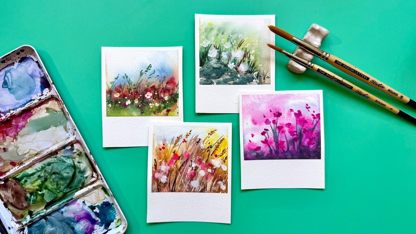
painting four loose, little watercolor scenes in
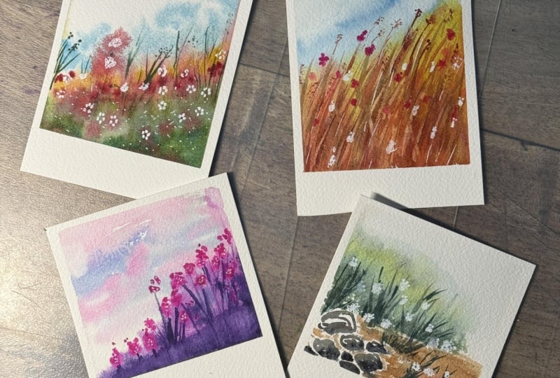
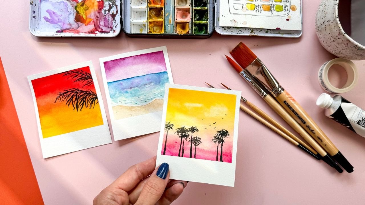
a bite size polroid format. We're painting a colorful
meadow, wild grasses, a mossy river bank, and a dreamy
monochrome twilight. Each one clearly
has its own mood, and fair warning stopping at four is harder
than it sounds. Welcome to Watercolor polroids
atmospheric Wildflowers. I am Peggy Dean. I am an artist and
educator who loves finding ways to make the creative process feel
approachable, playful. Full of possibilities. Working this small takes
so much pressure away. If a bloom wanders off
somewhere unexpected, you can work with it
or you can just grab another scrap of paper
and jump right in again. That kind of freedom
makes this class a sneaky good way to
practice water control. We will cover how
to read your paper. We'll also cover how much water your brush actually needs. We'll look at soft
blends and hazy edges, so you'll be able to build these dreamy
atmospheric transitions without everything melting
into a giant puddle. We'll look at mood
through color, and you'll see how the palette actually change the whole
feeling even in a small scene. This class is for you if
you love loose watercolor and you want more control
without losing that looseness, maybe you just want a
satisfying art project you can finish in one afternoon. Or maybe you painted along
with my other polroid classes. And you're ready for even more fun polroid paintings
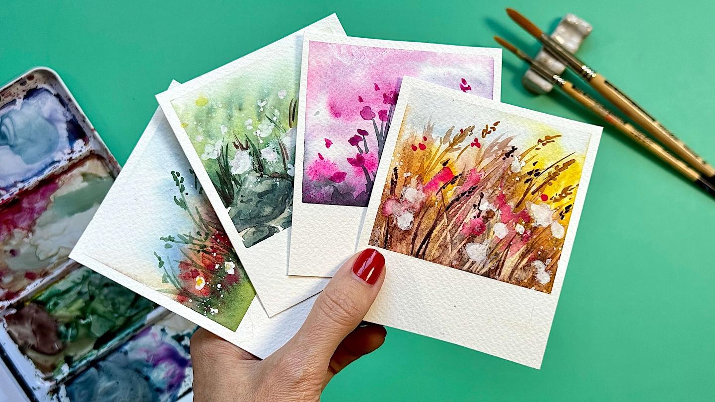
in your life. By the end of this
class, you'll have four atmospheric
little paintings that you can keep,
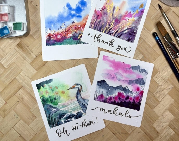
you could frame. You could tuck into a card
for somebody special. So grab your brushes
and paint in a jar of water, and I
will see you inside.
2. Class Project: Last project, we will build a little collection of
four watercolor polaroids, and each one is going to give us a slightly different excuse to play with paint to water ratio. We'll start with a
colorful meadow, and then we will move into wild grasses and then
a mossy river bank. And finally, a dreamy
monochrome twilight scene. I chose these four because they're different
enough that you'll keep running into new water
control situations instead of repeating the exact
same technique four times. We're finished, you can upload your favorite polaroid,
all four polaroids. You could even keep
going and make a whole stack of them.
So that's the project. Four finished little
paintings, yes. But also four chances at reading what watercolor is doing while it's happening.
Let's paint.
3. Supplies: For supplies, we want
watercolor paper, and you want to make sure
that this is cold press and you want it to be
140 pound or higher, and that is 300 GSM. The reason why is
because you want it to be able to withstand a
large amount of water. We're going to be using
watercolor washes. And if those aren't if
it's not nice and thick, if it's not thick, it's not going to withstand the
way that we need it to. From here, because we're
doing a wet-on-wet, it will naturally want to warp
a little bit on the paper. So we're going to
grab some washi tape. And you can use I mean, you can use other types of tape, but I like washi because
it's not going to make the paper tear or
hopefully not make the paper tear when we bring it up when we lift it
up when we're done. We're going to use a wash
brush to fully wet the paper. We'll use a large round brush. This is a number 12, and you want it to have
a nice fine point. You'll also want a
smaller round brush. I'm not really sure
if I'm gonna be using a two or something larger yet, but just a smaller
round brush is great. If you do have a
large round brush that has a nice pointed tip, you probably don't even
need the smaller one. From there, you need
a jar of water. And your watercolor paint. You might also want to
get a hard piece of plastic or metal or something
like the edge of card, a bank card of some kind because we're going
to actually carve away some of the wet-on-wet as just an extra little thing, and it's not necessary, but it's something
that you can do. Okay, now, I want to create
little poloids with this, so I'm also going to use my Washi Tape to divide
the page up to do that. So we'll start there.
4. Set Up Polaroid Frames: You can absolutely
measure this out. So it's the polaroid
that you want. The polaroid. You
can use a ruler. You can use however
you want to do this. I like to eyeball it because I just want to
jump in and paint. And to be honest
with you, I have never been disappointed
in how this looks. The one thing I do
want to make sure is that it's about even. It's okay if it's
slightly uneven. But for the most part, we want, like this chunk right
here to be pretty even. And again, if you want
to use a ruler, you can. And then we're going to
tape that right down to your surface and go ahead
and make sure that's firm. We're going to go
around the edges, too, so it doesn't have to be crazy. And then for the tape, don't press down the whole
center, just the edges. The reason why is because we want the adhesion to
be easy to come off, but we do want the
edges to be nice and firm so that paint doesn't
slip underneath it. When we're done. Okay. Now, for the actual size of the polaroid, we're going to want the
white space above it, but not a crazy amount. So what I usually do is
just eyeball, a thin area, so you can see right through
my tape that thinner area at the top. Okay. And that's about even. So I'm just going to make
sure that's taped really well to my surface
and the edge here. I'm going to use
about that same space to do the edge on the side. So you can just, like, kind
of hold one side down, lift up until it's about right. Make sure that's a nice
firm nice firm application. Sure. And then we'll do the
same thing to the other side, and I'm just going to
lift this up until it looks to be about
the right thickness. I'm going to have
a little overlap there or a little actually, I think it's going
to be fine cause the thickness itself is fine. It's a little bit off, but really, remember, it doesn't have to be
straight the whole way down. I'm going to end up
cutting the like, they're going to
end up being four. And so as long as
this area is fine, I don't care if
this matches this. Doesn't matter where we put
the bottom because it's probably we're
probably going to put another piece of tape here. So it's because we're gonna
use it as the sizing. So think about it
like this. If you want a square polaroid. Then you're going to want to put your tape just
underneath that square. If you want it to
be more landscape, you're going to want to
put it underneath there. So when we're measuring this, think about it like that because all this is going to be white
space. This is an example. So if I have this square, let's say about right here, then you could see this
would be my square area, and then down here is
where I would cut, and that would be
that white space. So I'm going to keep
this here to be square. I'm going to just press the
edges of this part down. And leave the rest because this part's
not going to matter. That's the measurement
that we're going to leave open for our white space. And then we can
drop below there. It doesn't really matter
where because we're going to end up
trimming that anyway, but this will be the top
of our next section, and then we're going
to do the same thing where we measure about the same. I understand if you want to
use a ruler for this part, but I am, again, just
gonna eyeball it. And so the part that
I'm going to paint is, are these squares and
these squares, okay? So this is basically just
letting us work all on one piece of paper,
while maintaining. It's letting us work on
multiple pieces at once. So painting space,
painting space. We'll deal with the
rest later, okay?
5. Polaroid #1: Colorful Meadows: So I mentioned we're going
to get our pages quite wet, and I want to do this one
at a time because while one is in its drying process,
we can move to the next. So what we'll do to
start is go ahead and get your largest
brush wet with water, plenty of water, okay? Make sure that your edges
are nice and tape down, and I'm going to come in from over the tape rather than
scooting underneath it, and I'll do the
same to the bottom. That's just going to make it so that the water isn't being shoved underneath just in case it is better
safe than sorry. And what we're going to
look for is a nice sheen. So you don't want
anything puddling, but you also want it
to be nice and wet. Okay, so from here, we can start dropping in
our first color. So go ahead and grab
your round brush. We're going to submerge
that in water. I like to roll the
brush on the edge here so that the bristles open up and really let the
water go on the inside. And then we'll grab a sky color. So I don't want you to be picky about the color of your sky. I just want you
to grab a blue or a purple if you want to do something that is,
like, sunsety. It really doesn't matter the color. I just
use what you have. And I'm grabbing paint the
same way that I grab water. I'm, like, pressing
down and rolling, so it gets nice and saturated. And then I don't
know where you live. I live in the Pacific Northwest, so there's plenty of humidity. My page is not dry yet, but if you need to
add another wash, just go ahead and make sure
that it is ready and primed. And then we can just drop
in this color, okay? So when we drop in
this background sky, I just want you to do
something in the middle that just allows it to bleed, then we can rinse the
rest of that color off and then just
kind of give it a little bit of a encouraging
nudge, and that's it. I know it's crazy.
While it's still wet, we can grab our secondary color, which is going to play as the background of a
watercolor field. This also can be
anything that you want. It could be a pretty fuchsia. I'm going to go for a light orange or I guess that's yellow. I'm going to mix
some red in here. We can get a nice orange. There we go. It's
a little brown. So this one, we're just going to create some sweeping strokes, and they're gonna look messy, and that's okay because they're going to end up blending
and that's what we want. Let's go ahead now
and just add a few. As it dries, we're going to add a few just darker strokes. To give it a little
bit of depth. It's going to dry
a little bit more, and we can do that again. But while it's still wet, well now want to go in
and add some of our land, like, our grass area. If you're noticing any pooling, like I am, this is
because my paper, while even though
it's taped down, it's starting to warp because of how much water I put down. So, if that happens, one of the ways that
I like to remedy this is to rinse my brush really well and go ahead and just completely I mean,
you could squeeze it. We just want it kind of damp, and you can set your brush down to soak some
of that water up. And then that should
do the trick. I'll do it a little
bit on the edge, but we still want that
color throughout. So don't get fussy with it, but just if you
have a huge pool, you don't want those pools. Okay. Now, let's see.
I'm good for grass. I'll go ahead and grab this pile of green that's
already on my palette. And I'm going to start
to sprinkle that in just right next to
the other color. And it's totally okay if it
starts to blend into that. I'm going to grab another hue so that I can vary
that a little bit. And white space is great or not. It just depends on
what you're feeling. Okay, so I'm going
to grab another green and just
sprinkle this in here. I want a little more
depth in some areas. So maybe I'll bring that green over and grab a darker hue. Okay, so now that this is starting to dry a
little bit more, we can go in and add just those, you know, straighter lines to add some depth, not
throughout the whole thing. So you want to be
kind of sparing. I know it's hard because we
want to just keep going, but then it's going to
end up bleeding into a big pile, which we don't want. So you can see that
the marks that I just made with the grass are blending quite
a bit. That's good. That's what we want, because
we do want this to look really ethereal and have
a lot of, like, movement. While that's drying, though, the thing with what
on wet is it's nice because you can have the
effect of what on what you can have the
effect of what on what depending like vary depending on how wet your
paper actually is. So this is going to dry a bit
more, and when it's, like, middle of the way, I
can then go in and add those additional
marks and add the depth. But for now, we are
in a drying stage. And again, I'm more
humid right here, so mine might take a little
bit longer to dry than yours. But if you just tilt your
head, I'm taped down. But if you tilt your
head, you'll see a sheen And that sheen is what we are
going to be watching. Okay, so I'm about halfway, and I'm just going to add a little more of these
clusters in here. You'll still see that
bleed quite a bit. It may not do it right away, but it will enough to where
it still feels part of, like, that atmospheric
vibe that we're going for. I'm gonna get a little
more of an orangy tone. M It also depends on how
wet your brush is. My brush is pretty wet with these orangy ones
that I just put in. But if I have a
little less water, you can see that it's not going to go everywhere everywhere. But again, I'm still
pretty wet right here, so I'll give it a sack. If you look at the sheen now, we have that glaze. So this is where I can go in and do those more
concentrated marks. We do want the page to be
a little bit wet still. Okay. And then once that's in, we can go in and add some
depth to our ground area. So I'm going to go
in with some green. And I'm going to focus this
kind of at where they meet, where the flowers
meet the ground. Maybe not the whole way through. I think it would be nice to
have some variety there. And that's pretty
wet on my brush, I think that was
my brush's fault, and by that I mean my fault. But I can then go in and
just along that line, push a little bit
more of that in. And then there's going
to be some areas that aren't as wet as others. And if it's just sitting static, I think this
will bleed okay. But let's just say if it was sitting static, I'm
going to rinse my brush. It's just damp, and I'm just going to drag it
along the edge right here so that it has some
water to pull through, too. And then if you have some areas that you think are
just too saturated, you can get your brush damp
and then lift some of it up, and then you can kind of
push that to flow again, but you can see that just created some depth
pretty easily. So there we go. What we just sat down is going to be
wetter than the rest, but this is a fun time to add some variety of the
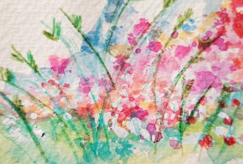
blooms themselves. So you can pick up a
good amount of pigment. We're going to actually
cover the rest of the page. We don't want splatter
going anywhere besides where we want to put it. So you can grab I
have my scrap here. I want to cover the sky. Maybe just like this because I don't mind if
it goes up a little bit. And then the rest of this, you can just use any scrap paper. So I'll just use this here, and I move this by room.
Okay, there we go. And then I'll take
this and just use my finger to splatter. You might want to
cover up the grass, depending on how you want
this to end up looking. I don't mind some flowers
being in my grass. I'm going to get this a
little more concentrated. Okay, that's about enough,
so I'll bring this up now. There we go. Okay, so
that is going to be fun. I'll move all of these. Okay, so you can see that
just gave it a little umph. We'll wait for it
to dry fully now before we do our final
touches on this one. I know that this is the
hard part because we really want to keep working
on it, but trust me, the drastic before and
the drastic after, and the way that it
combines is way too fun. And I want you to experience that instead of overworking it. So we'll be working on the
rest of our polaroid frames, and then after we're finished with the
base of all of them, that's where we'll go in and do the final details on
all of them in one go.
6. Polaroid #2: Wild Grasses: For this next one, we're going
to do some wild grasses. And so we're going to
start the same way. We're going to go ahead and
coat our paper with water, so it has that nice shen again. And I'm pulling down from the tape and then
up from the tape. And then I'm going to wipe the water off and just go
over it one more time. So it just has a shen but I
picked up any excess water. And then from here,
we're just going to use our large round brush, and we're going to put
some color in the sky. And I want this to be
really, really light. So I'm just going to bring
it through like this, rinse my brush, and then
come through one more time. And so this one instead of setting it down,
it's more swoop. I'll add a little bit more. But that's about it. So it's nice and wet still, so that's going to do
the bleed that I want. I'll rinse my brush off. And then it doesn't matter if we wait for that
to dry or not. We're just going to jump
right into our grasses. I'm gonna grab kind of
a yellowy ochery color, but I'm just again, go to push it over
into my mess palette my messy palette so
it's not gonna be a big deal if it's the
exact color or not, 'cause you can just
use whatever you want. Pink grass would be cool. Okay, so we're going
to take our brush, and we're just going to
do loose strokes that are kind of loopy, just up
and down like this. They can be thicker or thinner. It doesn't even matter.
And that's it, okay? So that's our first coat. And then go ahead and rinse
and then I'm going to add another hue in here.
It could be darker. It could be the same
color, but darker. It could also be
a different hue. I think I might grab. Like a brownish color. And I'm just going to
go through here with a little more saturation
and same thing, but it's still giving
me that peekaboo behind rinse my brush
and grab another hue, I could go back to the first
one because it's going to communicate on the top
a little differently. See what I mean?
Where it blends, but you could also grab a
slightly different hue. And I'm not going to go crazy
because this is yellow, but I'm just going
to kind of peekaboo some of this throughout just to kind of give
it the variety. It looks so cool when um like a natural color can
have that much going on. I think it's so fun. Okay. So this is getting to be
a good amount of wet. So I think that it's good to wait for this to dry for a sec. I'm going to speed mine
up with a heat tool. So I did that enough to
where I still have that sheen that we do need
for our next parts, but enough to where
it will give me a little more concentration
in the next few grasses. And if you put your
first stroke down, it looks like it's
just blending. It just means that you could use a little
more drying time, and it might be different
from one side to the other, even on a small painting. So now, instead of the loops, I'm going to actually go up
and kind of flick these up. And it looks like this part got pretty dry. I'm okay
with it, though. I think that that
also looks lovely. We're going to need
some thicker or I mean, more concentrated lines anyway. But I don't want to
go crazy with those. What you can do is
rinse your brush, drag the excess
water off the side, and then just kind
of go up along the side of what
you just painted, and that's going to actually
allow that paint to carry a little bit so that it
does feel more wet-on-wet. Just a little trick to
soften those if you want to. Definitely don't have to. And then I'm going to add even darker just toward the front. I'll grab that same color, and this time it's just
going to be less wet, so it's going to come
through a little darker, and I'll bring those
down a little bit. So that we have some layering. And then I also want some of those more intentional
lines in the lighter color. Now that that's pretty dry, I can I would recommend
flicking I would recommend flicking upward above your paper until it makes contact because otherwise
it might be too thick. So if I flick and
then make contact. It's going to be lighter. This is where if you want to, you can use a lighter or a thinner brush if you don't
have a super fine tip. Right here, definitely
it was still too wet, but up here is where
I'm really looking for. So I can fix that in a sack. But right now, I just want these fine wispy
lines toward the top. And then maybe. Okay. So I'm gonna fix
this just by rinsing my brush and then
picking some of that up. And then I can drag this down, so it just kind of blends in. And then I'll do the
same thing right here. I just got a little
too wet. That's okay. There we go. Okay. Now we let this part dry and
we'll come back to it. For our details and move
on to our next one now.
7. Polaroid #3: Mossy Riverside: One is going to be a lot of fun. We're going to actually
paint some river rocks, and you can use, like, gray. You can use a bluish gray or a bluish black or something that's a
little bit more subdued. I am just going to use this blue that's
already on my palette. I might add a little
bit of a neutralizer. So let's see blue
opposite would be orange. I'll just grab some of
this, bring it on over. Just to have a little
more of a muted tone. And then I'm just
going to create general shapes of rocks, okay? And I'm not going to have them touch, which I know is hard. But I mean, if it touches slightly, it's
not the end of the world. But let's just have a little collection
here of these rocks. And then what we're
going to do is when you've got them painted, we will take a darker color, so I will grab a deeper blue. And then I'm just going
to at the base of these only add maybe too much
water on my brush. We'll pick some of this up now. And I'm just going to add this to the bottom of all of these. And again, it's okay if they're touching a little bit. It's
not the end of the world. But we just want a
little bit of that blur. Let that dry a little bit, and then we'll add in a few more of those just throughout, so it looks like
there's some texture, but we do want it to dry
quite a bit more than this. So while we're waiting for that, we can add in the little
sandy area just right here. I'm going to do less Less paint, and it's okay if
some of it bleeds. The whole idea here is to
be a little bit more wispy. Okay? So that's about it. We don't have to carry this
the whole way through. It can just be suggestive, and I'm going to actually
pick up some of this water to have it fade a little
bit more. There we go. Then I might bring
some of it up higher. And then I think that we can go back in and add
a little bit of that darker color too. A top. I'm just going to do,
like, a few little marks throughout the tops of these. And maybe not even all of them. That seems good. So we're
just adding a little depth. And then if you
want to go back in, add a little more to the bottom since it
did bleed quite a bit, to ground it a little
bit more, you can. See how it just like the
contrast is night and day. Okay. And then on
the ground here, I'm going to add a
little more water right here since that one,
I lifted it up. But it's still going
to be pretty light. And then what I'm going
to do on this area, I'm going to connect
it to the side. I'm going to bring
some of that color in here when it dries, but I think that just right over here could use a little texture. So what I'll do
is just go in and grab maybe a brownish,
more of a neutral tone. And I don't want a
lot of water on here. I'm going to cover the area. Even though this is going to
be a very small splatter, I still want to be careful not to get it everywhere
I don't want it. But I'll cover this area. I'm still gonna leave that
open because it's wet, but I'm just going to
come real close and just dab in maybe a
little bit more of that. Just a little bit of texture
in to the ground area. So we do still want it to
be a little more ethereal, so this might feel wrong because that's not
all the way dry yet, but I'm grabbing
the lighter color, and I'm just going to bring
it through to the base here. Between these rocks, and there's going to
be some bleeding. If there's not, that's okay. But if there is,
that's also okay. Now we're going to actually
wet the paper now that this part is in because we want the background to really
work with wet-on-wet. So mainly, what I want to do is just outside
of the rocks, I'm not going to go right
up against it because I don't want those
to bleed upward. And I don't really care
too much about this area. I could go into it a little bit, but mostly we want
above the rocks to be that nice sheen and then we'll go in and
add some mossy colors. I'll start off with a lighter hue and just
dab that throughout, and we're going at an
angle a little bit, and it can come into
the ground area, but mostly it's going to
be concentrated here, and then I'll grab
a deeper color. I'm going to push that into the middle and a bit toward the base of where it's
coming from the rocks. Okay. Now I'm going
to rinse my brush, but not all the way
because I still want some of that darker color, but I'm going to put it just at the top of that lighter color. So we have some
graduation of color here. And then I can go in once
this is bleeding a bit more and add a little more
depth just at the base, and then it'll
continue to bleed up, but the main contrast
will be at the bottom. And then as the rocks dry
more, you can get closer. I just didn't want
it to bleed into it while it was still wet. And then we can dab
in a little bit of that throughout once
that starts to dry more, too, so that it
has that balance. Okay, we're going to grab we're gonna grab
our white paint again, and we're going to do
the same thing where we splatter a little
bit of white in here. Cover that up. And it might bleed quite a bit, depending on how
wet your paper is. We can always come back to it. No. We're gonna let that
dry to that, like, not super wet shen, but
we still have a sheen. And when we're at that point, we'll go ahead and
grab our white paint, and we want that real thick, and we're going to go ahead and cover what we don't
want splattered on. So we're gonna make sure these rocks are covered up
and then this one here, and we're just going
to dab on here. If you're not getting a ton, you can dip it in water real fast, but remember, we don't want
a ton of water on the brush. Okay. And then we will also come in with our darker
green and just add a few blades of
grass in that real thin, use the very tip of your brush. It's fine if it goes
through some of the white. And you can do these
at varying heights. And if it goes
through the white, it's going to give it
some softness, too. So we'll have a variety
of height and a variety of wet as well. And then once that fully dries, we'll come back and we'll finish the details. You see
how this is going?
8. Polaroid #4: Dreamy Monochrome Twilight: Last one, I want to play with
a little cluster of color. So let's go ahead and we're
going to get our shen going. We don't want it
to be crazy wet, but we do want that
sheen. I will grab. I know we went with
blue, blue, green. Let's go into more of, like, a purplish or lavender, something that's a
little bit more dreamy. Dreamy. That's what I'm
going to do for my sky. I think that I might put more
in here than I have been. It's okay to move that around. You know, it's going
to bleed, splotch it through. I know
it looks terrible. Don't judge it, let
it do its thing, let the watercolor work for you. Then we'll do a
thicker clump of that like a monochromatic ish vibe, we'll do a thicker clump
toward the bottom. And let's come in
from this side. So we're just kind of doing more of an expressive
mountainous shape, if you will, but more of maybe a mound because it's
going to be closer to us. I have a little too
much water on the edge. I'm going to catch that right
away by rinsing my brush, dragging my brush
on the side here, and then just lifting up the extra and then let that bleed. Alright. That's in there, and
I'll go ahead and grab a darker color now. Maybe even just a
little more pigment and come into the base and then sprinkle a little
bit of that through a couple areas toward the
top, mostly in the base. I have a little too
much water on my brush, and I can tell because it's getting a little more
soupy down here. And so that's just telling
me I could go with a little more paint than water. So I don't I don't need to get water every single time that I grab more paint, basically. Okay. Now, you can see already
the wet-on-wet is kind of pulling upward and making it look like grasses without
us having to do anything. And it doesn't really
matter that we have a monochromatic,
if you will. See, I know we have
analogous colors here, but the sky is lighter and we
kept that separation there so that we have that contrast
still, which is great. And I'm going to add a little darker Just to the base because I want to
have a nice contrast cause I want to have
some nice depth, and I'll bring that
throughout just a little bit. And then maybe just a
couple small areas here. Perfect. Okay. And this one is pretty simple. We are going to add
a pop of color. If you want to stay
monochromatic, you can go in and grab the same color you were doing and just don't water
it down first, and then you can add
just a bloom, a bloom. I know it's like it's such a pop of color. It
makes it really fun. You could also grab
a different color, a different hue and see
where that takes you. But that's what I'm
going to do and then leave it at
that and then I'll come back and do the details
on this one afterwards. So that one is really simple, and that's where
it's going to start. And now we can go through now that we're
done with all four and do our final touches to really make each of
these come to life.
9. Finishing Touches That Add POP: Alright, detailed
time. This first one, I know that we did a lot of splatter on the rest
of these with white. We're gonna do it
now on this one now that it's dry, wild, I know. So we'll go ahead and grab the paper to cover what we
don't want splatter on. And then grab the white,
grab our white paint. And again, we don't
want this watery. I mean, we want it watery
enough to splatter, but not enough to where it's
going to be translucent. We want that bright
white, and we'll just sprinkle that
in, and that's it. Okay. Now we can take
these papers away. And then I want to take
you can use the tip of your brush or you can
use a smaller brush. I think a smaller brush
would be easier to use. So I'll go ahead and switch
over to my This is a two and just grab some
of my white paint. And then we're going to go in and paint some flowers in here. I don't want you
to get you know, think that this
has to be perfect, careful if anything is still wet to not run your hand through it. I probably will end up
running my hand through. But what I want to
do is just create kind of a little
sea curvy type of shape and then separate three
blobs that are near it. You could even do one blob
and then just two next to it. Like, these don't have
to take much form, maybe even two blobs
next to each other. So they're really just
insinuating some flowers. I'm not going to do
too many of these, maybe six or seven of them. And nature is not perfect. These petals aren't necessarily going to need to
look a certain way, just enough to show, these are some flowers
and we're going to add a pop of color
within those two. You can grab any color, any medium, whatever
you want to do to add a pop of color
to the inside of those. Uh, because this is guash, it's really because
this is acrylic guash, it won't really let me put watercolor on top
of it too easily, but let's see if it will
when it's still wet, otherwise, I'd probably
just use some guash paint. But I just want a
teensy bit of yellow. It's going to make such
a small difference, but still that pop,
it does something. Okay, so that's done. Now, the last thing we
want to do on this one is use the tip of our brush again and I'm on the small ones that's actually going to
make it easier for me. I'm going to grab the same
color or a dark green, whatever can match ish because obviously the same color
for me doesn't mean much since I just really
work off of this mess. But I want to have some of these grasses,
but just real thin. And so I don't want a ton
of water on my brush. That's a big one because
when you're going thin, you don't want to pool. So I'm going to use just the
tip and I'm going to do what I told you how I'm just going to flick until
it makes contact, and that's going to make
sure it's nice and thin. And it's okay if it
skips a little bit, that just adds to that
expressiveness of it. I'm going to do this
throughout the whole thing, and I'm going to have
them go up pretty high. And if they start
looking transparent, that's okay because it's
adding to that depth, but you can also go back
in and add more paint. Then if you start
having areas like this, I'm going to actually
get my brush wet and just come up into
that so that it blends down because I don't
want any of those to be concentrated
underneath that green. So just going through and
getting some texture in. And they can overlap, that adds more to it so it doesn't
feel so concentrated. I actually add some
water to this part so that I can have a little
bit of that blending. And then we're just going to add some texture to the tops
of some of these grasses. And so that might just look
like some dots throughout. And so they're like,
imperfect, though. So we have some
dots in a cluster, skip down a little bit, add a little cluster,
skip down a little bit. Skip down a little. Then you have the definition that gives it the
finished piece, but you still have
all of that energy. Great. The next one is very, very simple because
we've already added those hard lines in. What you could do is
you could go in with a darker tone of whatever you have in here and add
just a few more. I need a little more water
on my brush than that. Clearly, I'm leaning into, Hey, let's not saturate our
brushes with water. But just a few more so that
it has some more depth. But I really like the negative space that
we created on this one. And then maybe just a few
coming from behind here. Okay. From there, we can add in, like, kind of like
what looks like wheat. And so I'll grab the
lighter color and just have some marks that
are kind of darting outward, and then or angled
outward, rather. And same thing up here. This area is a little too wet. If you see any pooling, you don't want that because
when watercolor dries, it's going to make those
areas a lot more faded, and we don't want
these to be faded. We want them to be nice and
crisp. This part anyway. And then I'll go in
and do a little bit with that darker color, too, just so I have the variety
in and not as much, though, just a little bit of texture, a little bit of texture, and then maybe some
peekaboos back here. O. And that's it. So that one is super expressive, right? I love it. You could also go in with
a lighter color and do even some more flicks
coming from the back. And then if you find that
the white has lightened, I had too much water on my brush. You can
just go through. I'm not going to
pull it out toward the outer edge because I like
that it kind of fades in, but I will just add that pop
right back in the center, so it's a little bit more defined as far as contrast goes. And then for this
area down here, you can paint a few more like crisper flowers
if you want to. And I'm just doing
a sea curve and then a little blob on top
of that a blob next to it. It's essentially going to
look the same as these, but you're just defining some
so that you can put maybe a center color in
if you wanted to. You could also add a pop of white on top of
what's already there because it's probably
blended out a little bit. And so adding some just in the foreground gives it the separation to
make it seem like, you know, petals
in the foreground in the background,
which is nice. And it looks like these grass
has held up pretty well. I think that we could add one more layer of that
and maybe with more of a neutral and more Yeah, 'cause it's just a
little more grounding. I think I need a
little more paint on my brush if that's going
to be Oh, you know what? I think that that would
be fun. Let's do this. Let's get most of the water off our brush and
go in with a dry brush. So it's going to be
kind of scratchy, which is just a fun
texture to play with. There we go. I don't
want to do too much of that cause I
don't want to take away from the the green. And then for this one, I'm
going to use white again, and I just want to create
little buds up higher. Like, they look like
they're floating, but it's because this is more of an abstract ethereal feel, it does make it
feel like they are connected to all of these
stems in some capacity. Then for this final
one, I'm going to switch back over to
my large round brush because I want this
one to be pretty loose and more atmospheric. So I'm going to go in with a super dark hue and
just add the base here and then come in with the tip of my brush to connect
to some of these blooms. And then a little bit
in the background. And then from that, we can take that same color or we can switch the
hue a little bit. But I think I'm going
to use the same color and just kind of create some buds or just a little
more concentrated flowers. I have too much
water on my brush, and I can tell because
of that pooling, so I'm going to pick
some of the pooling up and get more paint. There we go. That's
a little bit better. And I'm just again, this is just all mark making. And this can overlap over the ones that we've
already done. It just gives it
the depth again. This one's kind of like a
midnight midnight magic garden. And then some little
floating buds. And that is it, my friends. We have our fun
watercolor meadow. We have more of a grassy field. We have more of like
a side of a river, and then we have this like
a romantic garden feel. So it creates a very fun mixture of options for us as we continue
painting more and more. Florals or fields or landscapes. We have a lot of options, and this gives you
that information on how you can use What on wet, how you can use different
phases of What on Wt, and also how you can render different results
very, very simply. Now we're going to let
this dry completely, remove the tape and cut these
into cute little poloids.
10. Cut Your Polaroids: Alright, when it is time
to remove this tape, I want us to be very careful. I don't want you
to rip your paper. And so we're going to
do this one by one. I know that's so boring,
but listen, it's important. So what we're going to do
is I want you to stay flat. And so instead of
pulling up like this, if you stay flat
like this and you just kind of peel
away bit by bit, you're going to be able to
see if it starts to lift. You're also going to be
able to control it better. And I think that we're
gonna be doing pretty well, at least on mine, and I
hope that we are on yours. But see, I'm staying
really flat to the paper. I don't want to
lift up like this. Lifting up like that, you can already see how I
picked some paper up. I learned this in I used
to do hair and makeup. And in my aesthetics class, this is how you wax. So with wax strips,
if you're like, Oh, I've tried that at home before, and it hurts so bad, well, chances are you lift it up. You want to make sure
you lift parallel, too. You didn't know that you were
taking a class on waxing. This one I pressed a
little too hard on, and it's showing,
but that's right. Okay, so I mean, it really
is the most satisfying part. But for poloids, I think the most satisfying
part is actually cutting them to size. Now, if you do lift some of
your paper, um, it's okay. That's really what I
have to say about it. It's okay. Down here
isn't gonna matter. We're gonna cut
that part off, but these parts do matter,
the rest of them. So the edge, just
be kind. Be slow. Once you get to about here, go up toward the
closest part again. It's going to give
you more control. Slow and steady is your friend. I'm not going that slow because I don't want you to
have to watch me do this. I'm gonna tear this one off, no problem, because I don't
care about that part. This part, I'm gonna
go away and flat. Slow as our friend. Perhaps perchance, I
should sing you a song. No, I won't don't want that. Oh, jokes. Alright, so
you can already see. Oh, I love this part because
you can already see how these scenes have really
come to life as soon as you remove all
the mess around it, all the mess that came from or that was on
top of the tape. Like, it's so crisp. It's so satisfying. Okay.
And this last part. And then once these are off, you can cut by hand, you can
cut with a paper cutter. Your frames are mostly done
because we just need to go right in the center here
and then the bottom. So I'll start with the bottom, and I'm just going
to leave about this much and that seems to be right. I mean, I like to leave a little more rather than less
because that way, I can always take more off. You can't add more back on. Okay, so then we have this part, and then I'll go ahead
and cut the top of this one about the same
width as the sides. And it doesn't really matter
if it's straight between the two as long as the top of the part you painted
is straight. So, from here to here,
it doesn't matter, although this part is a little wonky, so let's clean that up. Okay. I'll go right
down the center. I think we're actually
going to end up needing to shave a little
bit off the center. Yeah, I'll have to cut both
of them, but that's okay. Is you just a little more. There we go. And we
have a polaroid. Oh, my gosh, they're so cute. Oh, my gosh, they're so cute. It's like if you can give yourself the gift of looking away for a second,
after you cut these, look away, do something,
clean up your mess, and then look back at them, and you're like,
Oh, my gosh, these are just absolutely adorable. Like, that's the thing I love about painting in bite size. Look at how cute this is. Come on. Come on. Like, it's so cute. All of these like stand alone,
totally different vibes. Sort of. I just love them.
So there we have it.
 Peggy Dean, Artist | Author | Educator | The Pigeon Letters