Transcripts
1. Intro Pet Portrait Tutorials: Hello, and welcome.
My name is Emily, and I am the artist behind
Emily Marie Watercolors. Welcome to my home studio
here in Madison, Wisconsin. In this tutorial, you'll
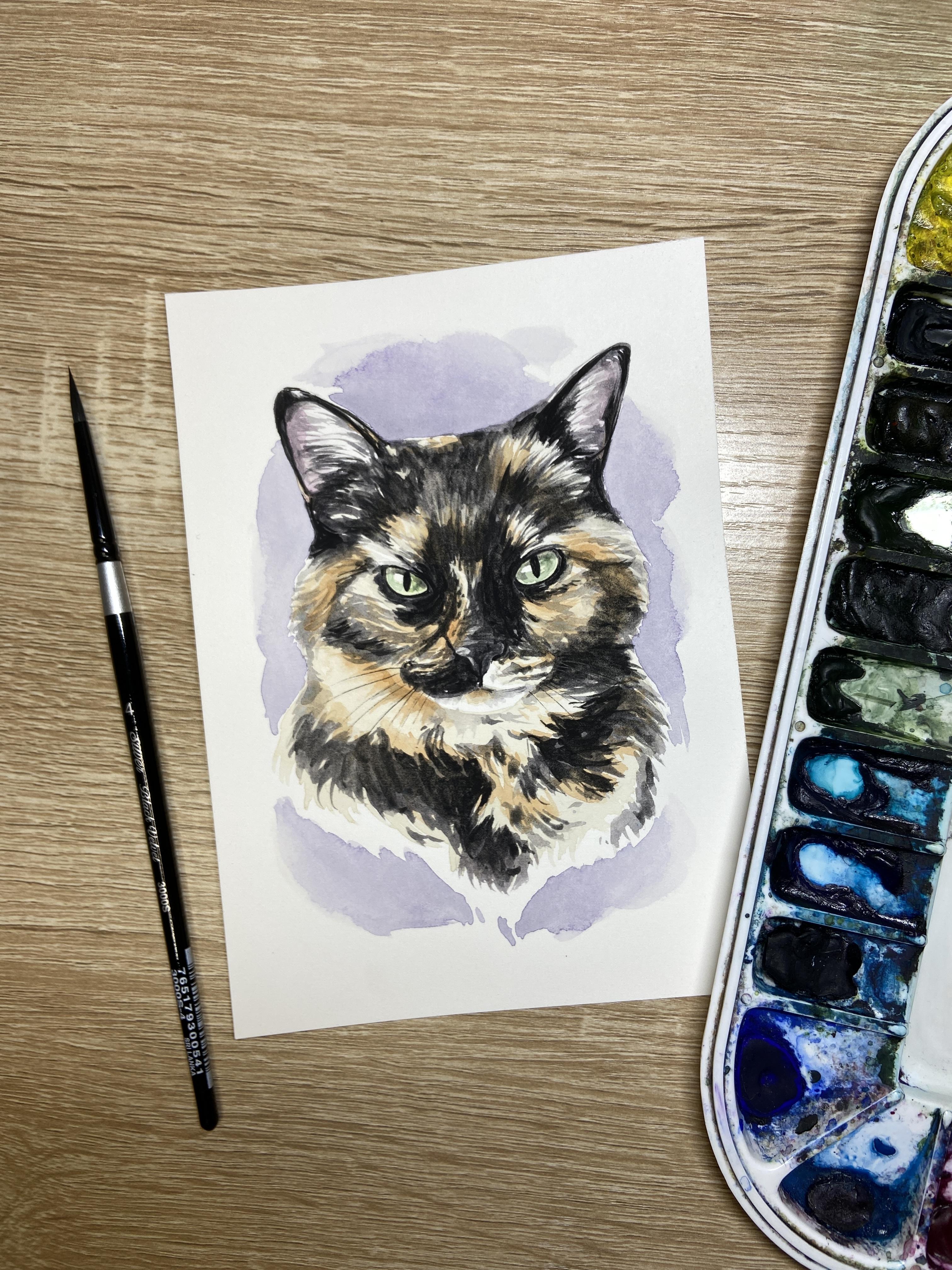
learn how to paint Callie, a tortoise shell cat,
using watercolors. As a watercolor artist, I have found a passion for
painting pet portraits. If you already know the
basics of watercolor, painting pet portraits can
be a great way to turn your hobby into a part time
or even full time career. My style is characterized by adding details to
the mouth, nose, and eyes, but not
getting caught up in painting every
single hair or curl. You'll have access to both a tracing template and a color reference
photo of Callie, the tortie cat, or you can use your own tortie cat as
reference to paint. You'll also have access
to color guides and supply guides with links of what I'm using and
where to purchase. We'll start by painting a transparent layer of
orange under our entire cat. We'll then look at how
to gradually darken your torties patches in a
way that keeps their eyes, nose and mouth
from disappearing. I'll include some
easy tips to blend the modeled fur so their patches look connected instead
of disjointed. We'll finish with a colorful
splash in the background, and we'll add some final details
with a black micron pen. As an added bonus, I've even included a quick guide with step by step pictures so that you have
an easy way to see how all these layers
come together. So grab your supplies, and let's get ready to paint. Don't forget to upload any
questions that you have, and I'll try my best to answer them along the way.
Let's get started.
2. Supplies: Alright, so let's talk supplies a little bit before
we get started. So first of all, let's
talk about paper choice. So for this tutorial and for
all of my pet portraits, I do like to paint on
arches, 140 pound paper. This is 100% cotton. I do like to use hot press when I'm painting
my pet portraits. Hot Press is a lot smoother. I feel that it's a lot
easier to use my micron pen. It's a lot easier to
add fine details like whiskers and highlights of
eyes and things like that. However, if you prefer using cold press paper,
that's 100% okay. Just know that your
drying times might vary just slightly from
those in the video. In my opinion, hot press paper
tends to dry a lot faster. Those layers dry a lot
faster than with cold press. If you're doing, for example, your first layer of orange that we paint when we're
painting our tortie cats, that light orange tan layer, you might need to wait a
little bit longer than what I need to wait in
the video because mine will dry a
little bit faster. If you do decide to
try hot press paper, I like to buy the ten by
14 inch pads of paper, and then I cut them into
four, five by sevens. I do suggest that you try
this tutorial out for the first time on a five by
seven instead of much larger. The reason being is
because with torties, we have so much detail here and so many different
colors and patterns. And sometimes, to be
honest, the larger you go, the more details you feel
you have to add to make it be a general
likeness of your cat. I do suggest if this is
your first time painting a tortie or if you've
painted a few cats before, but you're still
testing things out, try it first on a five by seven, if it goes well, and you
want to practice it again, maybe then try on
an eight by ten. Remember that there
is a tracing template that's included in the sutorial. You can either print it out on a regular sheet of paper and then use either a light box
or a window to trace it. You can also print directly onto your watercolor paper
if you have the back feeder, rear feed, and you're able to
print with waterproof ink. You can check out my
website if you want more information on how to
print on watercolor paper. I like to paint on
these plastic boards. I get them from Michael's. It's a full poster board, and then I cut
them down to size. And then I use kiwi hub tape. This is specific for
Watercolors around all four sides to hold my
painting onto my plastic board. You can use an artboard, you can use a wooden panel,
whatever you have at home. These are just lightweight.
They're waterproof. They clean easily. It's kind of a nice
little thing to have. Other supplies that you'll need. Once you sketch out your cat, you will need to mask
the eye highlights. I like using Windsor and
Newton masking fluid. I use an old brush that I make sure that I mark
with masking tape. The highlighted areas
that we're going to mask, there's a little highlight on
the left side of each eye. There's also a little highlight
on the nose that I do mask in the tutorial just
to keep it preserved. It's not that bright
of a highlight, but instead of risking
losing it, I do mask it. Um, the rest of the cat, though, unlike my
other tutorials, where I show you how
to mask the whiskers, torties tend to have
darker whiskers, and so I like to use a micron
pen at the very end to add some little details
to trace around the eyes and just kind of darken the eyes and the
nose and the mouth, and then I add
whiskers at the end. I did not add whiskers on the tracing template because
there's a lot going on, and I didn't want
to add to that. So you can add your own
whiskers afterwards, using the reference photo. The other option that I did
not add in the tutorial, I did not add to my
painting is there's always the option to
add white highlights at the end using bleed proof
white gouache or a gel pen. If you wanted to skip
the highlight of the e step and just use white gouache at the
end, feel free to. You can also use
white guash in some of the highlighted
areas like above the eyes or if you
aren't able to keep some of the highlights or the
white hairs out of the ears, if you weren't able to keep
those light enough in color, you can always add
a little bit of bleed proof white
at the very end. Brushes and paints while we
are painting our tortie cat. For brushes, the majority
of the painting, I'm going to be
using a round size four anywhere
between a size four, size six, even size two for
some of the smaller details. I like size four for
painting all of the fur, and I do like using a slightly
larger brush for the fur. And not using a small detail
brush because I do want to keep that fur a little
bit more generalized. I don't like my paintings having very small
tiny, fine hairs. You can choose to use a slightly larger brush for your fur or you can use a smaller brush if you want to see those
individual hair details. This is a silver limited
black velvet round size four. You might also choose a small
detail brush for the eyes, nose and mouth, something
similar to round size zero. This is an escota brush, um, like I said, you can also use that
small detail brush fur. You will not see me using
that in the tutorial. For water colors, whatever colors you have in
your palette will work well. I am using all of my colors
are Daniel Smith brand. The colors that you will notice me use quite a lot
in the tutorial. I am using a quinacridone
burnt orange. I need to replace
it, as you can see. Any burnt orange or
or quinacridone gold, anything that's
leaning orange brown, rusty brown color is going
to work well for you. If you don't have
a burnt orange, you can use an orange
and kind of muddy it up with a warm brown. So anything like an orange mixed with a piamintite genuine or some other sort of warmer brown color
can also work well. You will also notice me
using shadow violet, which I also need to replace. My shadow violet is right here. You can tell I use
these colors a lot. Shadow violet is a
granulating color that I use for all
of the shadows. I also am using it for all of the black patches and the modeling for the
first layer of my color, actually, for the
first two layers of the dark modeled color. It is, like I said,
a granulating color. It leans warm, so
it's going to work really well with your
oranges of your tortie cat. I'm also using it for the first layer of details
in the eyes, nose and mouth. If you do not have
shadow violet, you can mix up your
own warm gray. You can use a Paine's gray
just straight like that. You can add a little bit of the quinocrado burnt orange to your pains gray just to
keep that color harmony. Then after our pains gray
on top and the very end, we'll be using a black. I am using lunar black, which is another granulating
color by Daniel Smith. I do like using granulating
colors for my pet portraits. They do tend to
model very nicely, and the grains will separate, the colors will separate. You get a little bit of texture. You also get multi Colors in the circumstance
of shadow violet. And I think it looks really
nice with pets because pet fur tends to have that
little slight idscent quality, where in the sunlight, your pet will move and you
might see some blues or some purples or some
browns in their black fur. So I do think it works nicely. If you do not have a
black granulating color like lunar black, you can use any black. Just know that your
black might be a little darker than the black
that I'm using. You might have to lighten it up with a little bit of water. And then I'm also going to
be using a little bit of quinarcadon magenta for
the pinks of the ears, and I believe that is it around the outside of
the pet, at the very end, when it's time to paint the highlight or the
splash of color, you can choose any colors. I used a carbizol violet mixed
with a little bit of blue. I think I mix it with a
little bit of indigo, just to give it more of a
periwinkle purplish blue tone. And lastly, you
might need to kind of offset your orange with
a little bit of yellow. So I'm using a warm yellow. This is a gamboge
from Daniel Smith. You might notice me adding
a little bit of gamboge for the first layer of color for the orange that goes
all over your cat. You might also need
to glaze a little bit of orange for the fur. Oh, and the eye color,
the iris color. Now this will
depend on your cat. A lot of torties though, do have green eyes and
Sap green works really well for tortie eyes because you've got that
brighter yellowish green eye. If you have very, very light, you can also use
something that's a little bit more of
a lighter color like a green gold by Daniel
Smith or you can drop in a little bit of
yellow into that green. With the shadow of the eye way later on in the tutorial where we add
a little bit of a shadow, a little bit of a second
layer on that iris. You might use a deep sap green or something that's a
little slightly darker, maybe even with a little
hint of blue in there to turn it slightly more
teal leaning than green. Obviously, that also
depends on your cat. I think that's it. We will now get started
with our tutorial.
3. First layer of Color: Alright, so like always, I like to start with
the first layer and for the eyes,
nose, and ears. So these are my
lightest of colors. I'm going to start with
the eye color first. So Cali has these
bright green eyes. They're fairly light in color, so I'm using a sap green. And I already have, of course, my masking
fluid in place. I'm just doing one layer
of sap green on each eye. Now, I can always
make these darker. I can drop in a
little bit of yellow. If your torti cat has a
little bit of yellow, I can drop in a
little darker green if your torti has a
little darker green, especially around
the center pupil, or if the eyes are like, Cali very, very light, I can just leave one
layer of light sap green. Next, I'm going to paint the
first layer of Cali's nose. So I've mixed up a
shadow violet here. Shadow violet is a warm gray. You can also mix your
own gray at home. I just suggest not
using black right away. I do have a little tiny
bit of masking fluid over the highlight on the
left section of the nose. I normally don't add highlights
to my pet portrait noses, but I did in this instance, just because the face there
is so dark in the nose area, I wanted to make sure that I kept that little highlight
on the left hand side. So this is the only
place that I'm adding. My masking fluid is the
highlight of the eyes, and then this little tiny
highlight in the nose. I'll paint one full layer of shadow violet all over the nose. I'll pull down that
little center line between the nose and the mouth. And now I'm drying
off my brush and lifting wherever I'm
noticing highlights, so along the top of the nose. And then along this
left side of the nose, it seems like the light is
coming from the left side. Alright, moving on to
the pinks of the ears. Now, I know there's not a
ton of pink in Cali's ears. I'm going to kind of pump
up that pink a little bit. So I've got some
quinocrido magenta with quite a bit of water. I'm going to paint
one solid line along the outer edge of the ear. I'm not going all the way to
the edge because, of course, I've got a little bit of
black at the outermost edge. And then whatever liquid is
left in that line of pink, I'm going to then
pull it inward. And what that's doing is it's creating some negative hairs, some negative white hairs
that are sticking out. So I do the same thing
on this right here. A line of pink on the
outermost edge of the ear, and then I'm pulling some
strands of pink inward. Now, it's important that
you're pulling inward to the very center of that other triangle on the
other side of the ear, and you're not pulling
down towards the head. So just kind of be cautious
about the angles there. Alright, so now I'm going to paint the first layer of fur. Now, with torti cats, being that you've got
this dual tone fur, I do want to start with
my lightest color of fur, and I want to paint that over
the entire body of the cat. So I'm going to mix this tan. It's this orangish tan color. I just need to be very,
very cautious that it's very light and transparent. So I'm adding quite
a lot of water. I'm not focused here. At this point, I'm not
focused on any fur strokes. I just want to get that
color down over everything. Now, the only
exception to this rule is if you have patches of white. So say you're painting more of a calico cat
instead of a torti, you'd want to leave any
of those sections of white open with your paper. But wherever the black
is of my torti cat, I'm also painting that
first layer of tan color. Now the reason I'm doing this is because I don't want to have any hard edges between
my tan and my black. So I found if I paint just the tan where the tan is and just the black
where the black is, I get this weird edge of paper where it doesn't
quite overlap well, or I overlap my
black over my tan, and then I get a third
color out of that. So I get this darker ring. So I found that it works the best for me personally to paint this light layer of tan and then paint my blacks over
this light layer of tan. Now, like I said, you just have to make
sure that you keep this first layer really
nice and light in color. So I'm looking around the chin area where
it's the lightest tan, and that's the
color I'm matching. I'm going to add more
layers of this orangy tan, so I know that I can
build up this color, but my first layer,
wherever the black is, as well, needs to be
really nice and light. Alright, the transition to the neck line and
knowing where to stop, my painting can be a
little challenging. So as I'm coming
down into the neck, I'm making sure that my neck is connecting
in the right location. So I've got it just right
below that outermost cheek. And now I'm going to paint a thicker swath
of this tan color, but I'm going to kind
of feather it out. I'm also going to make this neck line be
somewhat triangular. So I've got my point of my triangle that's
immediately under the mouth. Having this kind of upside down triangle is going to really help with the shape
of my painting. You can kind of see a natural
downward triangle shape in the reference
photo to begin with. I'm just going to that's where I'm going to be
stopping my neck line. I've got that large chunk
and now I'm just feathering out at that edge and trying
to keep that general shape. I noticed that I forgot to
paint the little tiny section of ear we want to make sure
that everything is uniform. Okay, now that I've done
this first layer of tan, you can go in and
add a little bit of darker orange
where you see it, where you notice it
a little bit darker. This step, though,
I want to be clear, this step can happen
either now or it can happen after you
add your blacks. I almost prefer adding it after
I start placing my blacks only because then
I can kind of know where exactly these darker oranges are going to be placed. So you might want
to try it out at home and see what
works best for you. You might want to do just
one slightly darker layer of this orangy tan, and then your blacks, or you might want to do all of your shading with
your blacks first. Now, where I'm doing this
next layer of orange, I'm still keeping it
fairly transparent. I'm not going as dark as
I necessarily need to, and I'm only taking
a peek at where am I finding these
darkest of oranges. So on the right side of
the face, around the eye, I'm also noticing it around
the neck line there. This is where I'm keeping
a really feathered hand. So I'm moving and
making these lines, these fur lines in the direction
that the fur is going. So around the eye, it's going in the direction
around the eye. Here at the eyebrow,
it's kind of going in the direction
of the eyebrow. Under the neck, it's going in
the direction of the neck. This is really important that your individual hairs here are going in the
right direction. It's also important that
you're leaving some of that underlayer of
color to shine through. So we're not doing a full
second layer of this color. We are letting some of that
under tone shine through. So we're leaving space for that. Of course, as you're watching this section of the tutorial, I
want to make note. Hopefully, it's apparent
enough that the sections of my cat that are the
darkest blacks, I am not painting a second
layer of orange over that. This is where it can be
tricky if you accidentally go over those sections of deep
black with this orange color, you will see some of
that orange color shine through because of the transparent
nature of watercolors. This is where, again, I will re emphasize you can skip this step and do the orange layer later and
do your black layers first. It all depends on what
you want to place first and how you
see the picture. If it's easier for you to place the Blacks, place
the blacks first, skip this step, go to the next step and place
the grays and blacks, and then come back and
place your oranges.
4. First layer of Gray, part 1: Alright, now that we're
ready with our oranges, now we're going to start with
our first layer of gray. Now, I'm still using
my shadow violet. I'm using it a little bit more concentrated because I'm
going to start on the eyes. I do want to kind of block
out the eyes, outline them, figure out how far that black extends before I start on
the gray patches of fur. I just it helps me place the eyes and make sure
that I have enough room. For any of the oranges
around the eyes. So here I'm starting by
outlining both of the eyes, and I'm looking at how thick that eyeliner is
around my cat's eyes. This is going to vary
depending on your cat, but I am noticing that there's
a little bit thicker of eyeliner on the base of the
eye underneath the eye. It's still following the
curves of the eye here. It's a little bit
thinner on the top. Now, when I paint the
pupil of the eye, I'm starting small in kind
of the center of that pupil, and then I'm bulging
the pupil outward. I always like to
start with gray at this stage because it helps me. It's a little bit easier to actually lift up that
gray if I make a mistake. And now I'm going to continue around this left eye because
I am noticing that there's quite a dark shape around the inside of
this corner of the eye. And so I'm going to continue so that I don't have
any hard edges here. I'm still using that
same shadow violet gray. I'm making little hash marks as I'm moving around the eye. And these hash marks
are connected. But the ends of these hash marks is what you're going to see in on top of the
orange fur there. So I'm trying to kind of outline where I'm seeing the
darkest of shapes, so you're noticing
I'm outlining kind of these lines that I'm
seeing around the eye, kind of going down towards the cheek and now into the nose. And I'm going to I'm basically working wherever I'm noticing
my eye is taking me. So your progress and your progression
on your torticat might look a little
bit different. But I'm kind of looking at where are these
darkest chunks of fur? And then it's helping to
kind of guide my eye around. So I'm seeing there's a dark chunk on the
left side of the mouth. When I'm getting to
the edge of where that dark chunk is and where it's starting to turn
into just a little bit of orange mottled with that gray, I can always dab my brush on my paper towel so it
releases some of that gray. And then I'm just leaving a little bit more space in
between those hash marks. And that's going to give you a little bit of that
torti modeled look. Alright, so I'm going to
continue working on the face. I'm looking at where are
those darkest chunks? And I'm kind of then filling in those
darkest chunks first. And then I'm moving on
to those medium tones. And those medium tones,
those lighter grays. Remember, I'm dabbing my
brush on my paper towel, and then I'm extending that medium gray on
top of that tan, and I'm making for more space. So more of that tan
is shining through. Remember that we're not blending
the edges at this point. So you'll notice all of
my edges are hard edges. The only thing I am doing is
if I have too much contrast, I might dry my brush
and soak up some of that dark gray if it looks like there's too much
contrast at this point. Remember also that
you're following the curve of the face and
the curve of the fur. So here where you're
going underneath the eye, you're following those curve of the eye pain the curve of the
eye with your paint brush. When you go around the nose, you're following the
curve of the nose. When you go around the cheek, you're following the
curve of the cheek. So we're just doing
these little dash marks. We're connecting the dash marks, and then we're making
lighter dash marks and more space in between
where it's a lighter gray. Now, I'm going to keep
this video on real time. I don't want to speed this
up because I do want you to see how I'm creating the different tones with
this gray and where it might be a little darker and a little lighter in between. So this is a good example
of I did the darkest spot. I tapped my brush
on my paper towel, and now I'm coming up and
in the corner of the eye, which is a little
lighter of gray, and my brush doesn't have
as much liquid on it, so it's gonna be a little
bit lighter in transparency. So I'm constantly
correcting how transparent my color is by either tapping
it on my paper towel, adding just a
little bit of water or grabbing a little
bit more pigment, okay? So this first layer of gray is going to be
the most challenging. So take your time as you're
doing this first layer. As we get to the section
around the mouth, it's important that you are not connecting that smile line to the outer edge of the cheek, otherwise it might look a
little bit too joker like. Then when we're adding the dark dots by where
the whiskers are, our dots are going
to be darkest on cats on the outermost cheek. And then as they come inward, your dots get lighter. This is the opposite for dogs. Dogs, it's darkest in
the center of the nose, and it gets lighter
as you go outward. Cats is the opposite. It's
the darkest on the outside, and then it gets lighter
as you come inward. To lighten up those dots, you can dry your brush and lift after you've
added that pigment, you can tap it with
your paper towel or you can just add water to your brush to make it
a little bit lighter. Alright, so with this neck line, we have to figure out how
we're going to stop the neck. So as I'm painting the
neck line, remember, I'm doing like blobs of
color in the center, and then I'm looking at pulling some of
that color upward, and then I'm pulling some
of that color downward. The direction that you pull
your brush does matter. So I'm trying my best to kind of curve the fur here
along the bottom edge. So I'm curving it with
that triangle inward. I'm kind of making this up. I see that big dark spot
on my reference photo, but the bottom edge of
that spot, I'm making up. So I might add a few
individual strands there of dark fur just to kind of connect it at the
base and turn it into a little bit more of
a triangular neckline.
5. First layer of Gray, Part 2: Now, remember when
you're working in a section like the
left cheek here, where you notice that
it's not fully dark, I suggest that you start painting in the darkest
spot that you see. So this kind of
lower left corner of the cheek is where I'm
noticing the darkest. And then after I fill
in that darkest shape, now I blot my paper towel and I brush on my paper towel so I have less liquid and less paint, and now I can go
in and add some of those strokes where it's
a little bit lighter. Okay, so I'm only
leaving a few sections completely open with
that tan undercolor. But a lot of this lower cheek
here is that model defect. So I am going to add
dash marks on top, but I'm following the
shape of the cheek here. So I'm following that
U shape of the cheek. I'm just making sure that I'm
leaving that little section to the lower left
of the eye that I'm leaving that without any gray. That's where I'm noticing
the brightest of highlight. So I'm just kind of outlining it now to make sure I
don't go over it. And now I'm doing
these hash marks in a U shape under the eye. Now, as I've been painting, I noticed that section that's the darkest just got
diluted a little bit, so I might go back in and
add a little bit more color on top just so that it's differentiated from
the lighter gray. You can either do that in
the same step or you can come back and do your darker
grays in a later step. Alright, same thing as I come around the top of the eye here. I'm trying to keep clean that section above the eye that's really
nice and bright tan. And then I'm noticing it's really dark above that section. So I'm still continuing
these hash mark lines. They're a little bit longer
of lines now extending all the way to the ear and to this little highlight
above the eye. Um, and I'm trying my best just to keep
that general shape open. Now, there's some
little tiny patches of tan right next to the ear that if I
can't keep those open, I'm not going to stress over it. Torticats are
challenging to paint. So we're looking at what are the largest of these orange
patches and to preserve those. Some of the smaller
orange patches you can try your best to
preserve, but honestly, it's not going to make or break your painting
if you have some of those little tinier ones
that you accidentally cover. Now, I am stopping at
the top of the head, and I am doing a horizontal line across the top of the head. I don't want these
little wispy hairs to poke out of the
top of the head. I want that to be
really nice and clean. Now, what you're noticing
me do is I'm going back with just the tiniest
amount of gray on my brush, and I'm coming through and I'm kind of fixing
some of these edges, and I'm also pulling a little
bit of that really light gray through those gray
through those tan patches. So what this is
doing is it's just helping to connect and to, um to keep those tan patches from looking like they're just
placed on top of the fur. So these sections are still slightly wet and
actually, I want that. I want to be able to pull
some of that liquid across. And that's how I'm
softening up the edges. I'm not blending them
out, but I am kind of taking a little bit of
that light gray inside those patches just
to kind of set them into the face instead of
sitting on top of the face. Hopefully, that makes sense. All right, as we make
our way to our ear, I'm first going to do that layer of gray in between where the
ear is attached to the head. Now I'm outlining with this
gray around the entire ear. Before I finish
with the outline, I can always pull a few
strands of gray outward. Okay. And then I'm going to
do the outer edge of the ear, still outlining with that gray, and then from there, I'll
pull some strands in. So it's important
that you're pulling this gray out and
you're pulling it in. And that's going to
give you the effect of these little whiter hairs that are coming out of your ear. So I know I'm kind of
jumping around here. Basically, when I'm
painting tortis, I'm really allowing my eye to jump from dark
spot to dark spot, and I'm constantly
going back and forth from my reference
to my painting. And if I'm noticing an area
that's too bright, like, here, I noticed this area under the left chin
is too bright. And so I'm coming in with a
little bit of of that gray. It kind of dulled down
that section a little bit. It was just there
wasn't enough contrast. It was sticking out a
little bit too much. So I'm adding some
extra little gray so that it doesn't look like it's
sitting on top of the fur. Sometimes when we have too
much contrast and we don't blend the two colors together
with this lighter gray, sometimes it looks
like too patchy. So if yours is starting to
look a little too patchy, you can go in with the
lighter gray in on top of those tan patches and
those orange patches. And you can add just
some really fine little light gray lines, and it's going to
connect your patches to the gray so it doesn't look like it's too much contrast. And the same thing
with this left ear, we pulled some strands
in from the outside, and now we're pulling
some strands out. So we're going on the inside
and pulling some outward. And this is creating
the negatively painting these white hairs that are coming
out from the ear. Now, if this is hard
for you and you end up covering up some
of those white hairs, we can always use some white
gouache or some bleed proof white afterwards to kind of add some of those hairs
in that got lost. But I do really suggest that you try this technique
of pulling in, pulling some hairs inward and
pulling some hairs outward, because I do really feel like it makes a difference
in your painting when you have that paper shining
through instead of whitewash.
6. Color Corrections: Mm. Alright, so before I
do any color corrections, I want to go back in and darken
up the nose a little bit. This is going to help
to have that nose pop slightly from all of the chaos that's kind of
going on around the nose. So I'm finding that
center line in the nose, and then I'm also finding
where my highlight is. So I'm noticing that there's a highlight on the
left side of the nose. So I'm going to try my best
to keep that highlight open, but I am going to darken the nose just to make
sure that you can see it. Now, this stage
might be something that depending on your
picture at home of your cat, you might have to kind
of just make this up. So we do want to
make sure that we can see the edge of the nose. So sometimes with tortie cats, on the darkest edge there, you might not be
able to see where the nose ends and where
that black fur starts. But we do want to make sure that you can see that
in your painting. So I do definitely
suggest that you go back in and you outline the
nose a little bit, at least where it's the darkest. Um, I'm going back,
and I'm also going to add just a little bit of light gray to the bottom of that
lower lip and that chin there. It just is kind of sticking out a little bit
too much for me. So I'm going to add just a little bit more
color to the eyes. I'm using some sap
green and a little bit of blue to turn it
slightly turquoise. And here, my goal isn't to cover the first layer
that I painted, but to add just a little
extra second layer. So I'm looking at where these darkest sections
are on the eye. So there's, like, a little
U on the underside, and then there's
a little section on the right of that pupil. On the left eye,
it's a little bit more challenging because
it is in shadow. I'm not going to paint
the whole shadow, that eye in shadow. If I paint that eye in shadow, it might look a little
awkward for my painting. So I'm just trying to look at where the darkest
tones of that green are. I don't want to put the
whole eye in shadow. And, of course, once
those little sections are wet, you can adjust them. So while it's still wet, I'm going to take
a little bit of that green directly from my pan, a little dark green, and
I'm going to drop it in that wet section just to
darken it up a little bit. So I can control
the darkness and the color while it's wet either by dropping in more
or lifting it up. Adding a little bit more
colour correction here, so I'm using a
little bit more of my quinacridone
magenta and adding a little bit more pink to
the outer edge of both ears. Alright, we're going
to continue on with the color corrections
with the orange fur. But before we do that, I noticed I'm not really happy
with the neck line, so I'm going to add
just a little chunk of gray to the base of the neck. I want this neck line to be a
little bit more triangular. It's looking a little
bit too flat for me. So I'm gonna go in and just add a little bit more just to
kind of correct the shape, and then I'll move on to my color correction
with the orange. Alright, so I'm still keeping this layer quite transparent. So I'm using water and
adding a little bit of that kind of burnt orange color. The key here is that
you're looking at glazing a little bit more orange where you
think it needs it. Remember that glazing is
a very transparent layer. We want the color to be in
the sections that we want. We can go over the black or
the gray parts, excuse me. But we want to kind of add just a little bit more depth where we're missing
some of that orange. So I'm going in the
corners of the eyes. I'm looking at under the
cheeks, doesn't need any more. I'm wanting to do the color corrections at
this stage before I add the black because the black is what's going to
unify everything. So I can go over the gray. It will slightly change
the color of the gray. So only do this in sections
where you're noticing that gray is slightly
orange tinted. But it's really
important that you're doing these color corrections at this stage instead of at the
very end after you're black. You want to do it in between so that the black is
the last layer that seals all the details and seals all of the shapes
where they should go.
7. Black Layer: Alright, so for my
black layer of color, I'm using lunar black
by Daniel Smith. This black is a
granulating color. What I like about using
lunar black is that it will still you'll
still be able to see the colors
that are underneath. So if you are heavy handed, I do feel like lunar black is a great place
for you to start. Now, we're going to start with
lunar black fairly opaque. I'm still adding
water to it, though. I'm not using it
directly from my pan. And now, I'm starting where I want the blacks
to be the darkest. And so that's the
features of my cat around the eyes and in the pupils, as well as now the
nose and mouth. As I move down to the nose, I'm outlining the
lower V of the nose. So on each side of the nose, that V that you see,
I'm outlining that. And then I'm filling in a
little bit of the inside of the nose on the right side
where it's the darkest. Now, after outlining my
eyes, pupils and nose, now I'm going to
move on to where I'm noticing the darkest
blacks in my tortie. We do want to move and use that pigment in multiple
areas of our tortie. If we're only using
it in one section, your eye is going to be
drawn to that one section. So even if you're not if you're using if you only have one
patch of really, really dark, for a your tortie, you're still going
to want to lighten up that black color and use it around on some of
the lighter areas. Callie, this tortie is fairly evenly dispersed
of the black patches. So I'm starting where I'm
noticing it the darkest, which is going to
be around the ears. I'm noticing this darkest
patch above the eyes. Now, I still want to leave
some of that under tone, some of that gray
to shine through. So I'm going to
try my best to not have solid patches of black, but to kind of allow
some of that gray to shine through at insections. Alright, one thing to note as we're moving along with our
black layer is that you don't need to be blending
the edges of your black and your like the black going
into your lighter sections. We're going to have a step
after you add the black, where we blend
where you need to. So I try to keep myself from
blending at this stage. Obviously, I'm
adding these strokes in the right direction. But if the edges
are looking really harsh at this
point, that's okay. I will blend after my
black is all laid down. So as I start working
on the forehead, this is one of the
more challenging spots because it's fairly dark. I'm using a very watered down, so it's quite watery. It's not watered down,
but it's quite liquidy. The reason I'm doing
that is because then I can adjust the amount of black that's left on my paper by simply
touching my brush, drying my brush
off, and lifting up any of that black if
it gets too dark. There's a difference
between using a dark black with little amount of water and a dark black with
a lot amount of water. And this is the difference here. If you use a little
bit amount of water and mostly pigment, you're going to get these lines that you won't be able to lift. They're going to look very,
very sharp and hard edges versus if you're using
a lot of pigment, but also water with it. When we keep that water in
our dark black pigment, we give ourselves
the ability to still lift the pigment if it gets
too dark in any section. So this is why I'm not using that black directly from my palette I have it
mixed with water. It's still an opaque black. It's still dark,
but it's mixed with water so that I can control it a little bit better
once it's on the paper.
8. Blending with water and adding a shadow in the Eyes: Alright, now that we've finished
with our layer of black, now I'm going to just grab
some water on my brush. It's a clean brush with
just a little bit of water. Now I'm going in on top of where these edges are
happening between my black and my grays
and my oranges. And I'm using water just to
blend some of those edges. Sometimes our black can be
a little bit too harsh. And so we can use just
water to blend out those edges where we're noticing it's a little
bit too hard of edges. Now, this is another reason
why I love using lunar black. There are some blacks that because they're
not granulating, they tend to not lift as
easily as lunar black does. Lunar black lifts really well. And shadow violet, which
is your gray underneath, also lifts very well. And so we can adjust
not only the edges, but we can also adjust
the shape of the black. When we paint it,
if you paint in the wrong with the wrong brush stroke in the wrong direction, we can actually adjust
that using a wet brush. So this whole section, I'm just using a wet brush. I'm using a wet brush
against those edges where maybe the white and orange fur that's
sticking into the black, maybe that's a little
bit too intense. I can use that white brush
to just soften it slightly. Now, don't over soften. You still want those hard edges because that's what
makes it look like fur. But this is going
to be where you can let your cat shine
stylistically. Maybe you do want these edges to be softer than what I have. So you can soften, as
much as you need to. And, of course, as I
started softening, I noticed a little area that maybe should be a little darker. So I'm just adding a
little bit more of that shadow violet just to
darken up this section. So it's a mix of blending and color
correcting at this point. Alright, the last little step here that I'm going to do is add a little shadow to the
upper lid of the eye. So I've got shadow violet, and I'm just painting an arch along on top of the colored section of
the iris over the pupil. It's just a little
rainbow arch on top. And what that does
is it's going to set the eye that eyeball
into the eye socket. Now, you notice
that I'm not adding shadow completely
covering that right eye. I don't want to add that
shadow or might look awkward. So I'm just adding a
little bit of shadow on that upper lid just
to set the eye in.
9. Optional Color Splash and Final Details: Alright, now we have
an optional step. You can add a colorful splash in the background
behind your pet. With torties, I definitely
suggest the color doesn't have to be like a light
color versus a dark color, but the opacity should
be fairly transparent. So I'm using a purple, which goes really well with
this tannish orangy color, and I'm mixing quite
a bit of water, so it's nice and transparent. I'm painting this in little chunks around
the outside of my cat. I'm starting with a
little bit of water where I want that pigment
and then dropping my pigment in just
to keep it wet a little bit longer so that
I can adjust the edges. So I'll drop the pigment
closest to the body, and then I'll dry my brush off and kind of soften up
the edge a little bit. I'm going to do that
all around my cat. Knowing how far to extend
this color is tricky. And my main suggestion to you is to look more
at the white space that you have so I'm
making sure that I still have even amounts of white space around my portrait. So I'm going to be
putting some purple around the ears and just a little hint under the head in
that triangle space there. But when I look at
the white space, I want to try to keep an even amount of white space
all around my portrait. Alright, so I let the
background color dry totally, and now I'm ready for
the final details. So I'm going to start by
taking off the masking fluid. Remember that masking fluid was covering the
highlights of the eyes, as well as we've
got a little bit on the highlight of the nose. Then I'm going to switch
to using a micron pen. So Micron pens,
Black micron pens are great ways to add
extra fine detail, especially to our kind of darker more details
in our darker cats. So I'm using a black micron
pen to add some whiskers. Most torties, you
can't see the white. They don't look white,
like some of our cats do, where we add masking
fluid for white whiskers, instead, they look really dark. And so I'm just adding
some dark whiskers there. I can also use my micron pen to make
any sort of adjustments or to fill in any section of the eye or adjust the highlight. So here I'm using
my micron pen to just outline that top eyelid and to fix the
highlights if there was any section of the highlight that needs a little adjustment. And with that
highlight of the nose, it's now looking a little bit
too bright of a highlight. And so I'm just using
a little bit of shadow violet with a wet brush just to tone down
that highlight. I still want to keep it, but I just want to tone
it down a little. Congratulations on
painting one of the most challenging cats
to paint in watercolors.
 Emily Marie Watercolors, Watercolor Artist and Dog Lover