Transcripts
1. Intro: Hey there, welcome to
my studio. I'm Tanya. Amounts of space in
Denmark and I've been a professional artist for
the past eight years. Though I enjoyed creating art within a variety of categories. In my work, my main
focus is usually food. And in my paintings, I like combining and histologic field with new and
fun components. Sometimes I also create some
slightly obscure pairings. The first time I
tried painting with water clause properly
was back in 2016. Even though this was
a medium I'd spent my entire life avoiding
for different reasons. I instantly fell in love. In this class, we're going
to take a look at some of the basic watercolor
techniques and practices. Water control, flat
washes, wet on dry, wet and wet, blending, lifting and different effects. And we're going to finish
off by creating this fun painting that allow us to practice using
these techniques and hone our watercolor skills. Food is one of my absolute
favorite things to paint. And it's such a beginner
friendly subject as well as the visuals of food is
never about perfection. It's okay to make mistakes. Sometimes that's
not a bad thing, but rather something that can add personality to
your paintings. So painting food is
opportunity to experiment. I'm really excited
about painting this little ice cream
or popsicle with you. So whether you're a beginner and you want to practice
your basics, whether you have
some experience, but you just want a chance
to play around all you here only because you want
to paint this popsicle. I'm excited to have
you here and I hope you'll join
me for this class. So let's jump right into it.
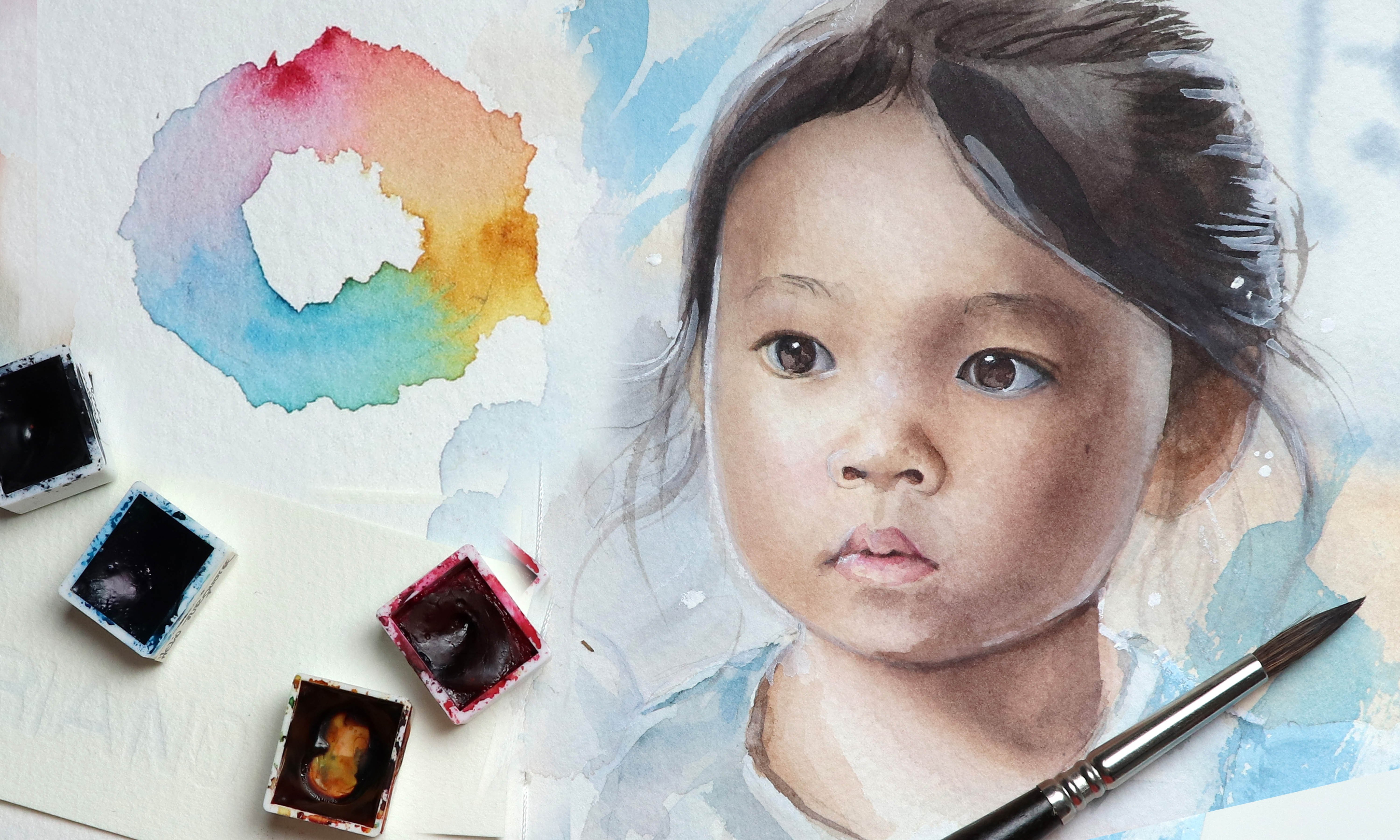
2. Supplies: Let's take a look at this place. You're going to need some paint. I'm going to be
using my Schmidt, get what are called pains. Throughout this class,
you've got to meet a minimum of three colors. So you're three
primaries are red, yellow, and a blue. I'm using scarlet, red, lemon yellow, and Phaedo blue. And optionally, if you like, me, want to add a fun
color background to your final painting, you can add one or maybe
even a few more pins. And again, this is
completely optional, but I'm also going to be using some metallic watercolor paints. Just to have something
fun and a bit different. You'll need some
watercolor paper. I'm going to be using Fabriano
artistic who extra white, which is a 100% cotton paper. And I'm using hot pressed for the demonstrations of the
different techniques. I'm also going to be using
this 50% cotton paper, which is cold pressed. You're going to
need some brushes. And all you really need
is a couple of brushes. But we're going to talk
about one choosing to add another couple of brushes
later in the class. Since we are working
with watercolors, you're going to meet some water. A cloth, awesome tissue
to wipe your brushes, as well as some
tissue to help lift paint, some white gouache. If you don't have
this, you can also use white watercolor
pencil for sketching. I'm using my point to
mechanical pencil. And then you're
going to need one or two erasers of your choice. But if you do have
a kneaded eraser, I do recommend using
that just so you don't damage the surface
of your watercolor paper. You're also going to need a
pallet to mix your paints. I'm going to be using
two different ones. One of them being an actual
watercolor palette and one of them being a tap
as type snack plate. And of course we cannot
make a class about basic watercolor
techniques without salt. Okay, let's get started.
3. Paint & Paper: When it comes to your three main watercolor tools or supplies, paint, paper, and brushes. Paper is a one-word
recommend that you prioritize getting
a quality product. You can get lots of paper
that is advertised as being suitable for wet
mediums like watercolor. And if you have
some experience or just wants to do
some quick sketches, swatches or something like that. That paper may be okay, but where I think a
lot of people go wrong when they first decided
to give water closet go, is that they go out and get a few materials that are
maybe not the best quality. Because, why get higher-quality
supplies if you end up not enjoying the
experience today, you can get brushes
that are really good and at the same
time very affordable. And the same with paint. A lot of it comes down
to personal preference. The two main watercolor brands
that I use are Srilanka. I love that they're often more
natural looking in color. And unless you'd get their
new super granulation paints, they don't tend to
granulate all that much, which is something I personally, unlike a lot of watercolor
artists prefer, as I like to really be
able to control my paint. I don't want it to
create random textures if I don't ask for it. And then I use Holbein again
from there, 108 P set, not a lot of the
coolest granulate, so I love that and they offer
lots of fun costs as well. Or design a cause, which means that they've
had an opaque pigment, usually white, added to
create these pastel colors. That's not something
I would recommend using if you're
painting something that requires lots of mixing or layering because they can quickly make your
paintings look dull. But again, everything
when it comes to paint is down to
personal preference. You might get better
light fastness or pigmentation in some of the top brands or
artist quality paints. But a lot of the
student grade paints like Cotman from Winsor Newton, which is a really
well-respected brand, a great place to start. But when it comes to paper, I highly recommend getting
100% cotton paper. It is going to make the
experience of painting with watercolors
much more enjoyable. It's more resistant. I can take more abuse than your typical non cotton papers. And it can hold a lot of water, which will allow you to use those beautiful techniques that are so unique to water color. I'm not going to give
a long speech and all the basics of properties
when it comes down to paper. But just a few main points. There are two main types of watercolor paper that
you'll see most often. Hot pressed, which
is very smooth, cold press, which has
some texture to it. The way I used to remember the difference is
that when your iron, your clothes, the iron is hot. And so pressing the hot iron onto the fabric
will smooth it out. The brand you choose is up to you and comes down again
to personal preference. Fabriano, artistic cool, extra white is my
personal favorite. I like how it performs. Its not one of the
most expensive brands. And more importantly to me, is the fact that
it's more white in color than a lot of
the watercolor papers, which tend to be more of a
creamy or off-white color. And getting your paper or on a pad like this means
that you don't have to worry about taping it down or stretching it if
you don't want to. When you go to play
watercolor paper on the pads other than the brand, the size, and the
surface texture. You'll also be able to see
this thing called sizing. This is something I didn't know what meant until
I experienced it firsthand and saw
how it can affect a painting if the paper
is not properly sized. There are two types of slicing, internal and external sizing. So if we take a look
at these two paths, the Fabriano paper is both internally and externally sized, whilst the one by Lana is
only externally sized. So what does this mean? Well, sizing is a gelatin
or starch treatment. It can be added to the pulp during the
manufacturing process, which would make the
paper internally sized. Or it can be added to the surface after the
paper has been made, which is the external sizing. This treatment is what
allows the water and the pigment to not just be
soaked up by the paper. And instead allows you to
create these beautiful effects. I'm going to paint a wash onto
this paper that I know has some sizing issues so that you can see how it
affects a painting. Sizing can deteriorate
over time. Starting your paper in a
place with higher humidity, also in the paper for too
long when I'm stretching, it can affect the sizing. There's not much to do really. You can apply what are
called ground or a sizing medium to restore those
surface properties. But if this is something you noticed early on in a painting, it's often better to just plot. And if this happens with a brand new pad of
watercolor paper, maybe contact the
manufacturer fault possible replacement. But other than that, any 100% cotton paper
in the texture of your choice should give you a good start to your
watercolor journey.
4. Choosing the Right Brush: So we've got our paper ready and now we need to find the
right brushes for the job. Although there are lots of different options out
there in this class, we're going to
keep it simple and just focus on round brushes. Because really with
a few round brushes, you can paint anything. So when choosing which
brush or brushes to use, we want to consider what
are we getting to paint and what is the size of
our painting and subjects? There are two main
types of brushes, natural inherent and synthetics. Synthetic brushes are often
associated with holding less water than a brush
with natural fibers. But that's not necessarily
the case state because there are so many amazing and
affordable options out there. And synthetic brushes
have come a long way. But just for the sake
of this demonstration, I'll be using three very
contrasting brushes. We want it to be
able to lay down a nice flat wash as the base. So we want a brush that can hold enough water and one that's big enough to fill in our subject before the
pain starts drying. For these first two examples, I'll be using n number
0 or not sized brush. This is a Winsor and
Newton sable brush from their series
seven line of brushes, which are top of the line
in terms of quality. I'm using the same paint mixed
for all of these examples. And as you can see,
we can fill in the smallest square without
too much of a hassle. If we then try and use that same brush for this
latch square or rectangle, it won't do as good of a job. Now, to be fair, this one
has had a rough life, so it doesn't work as well
for fine details anymore. But that's not what
we're looking at here. Depending on the
paper you're using, as well as the climate
in your location, you may be able to get away with using a smaller brush like this. The paper I'm using here
is cold pressed and it's very forgiving in terms of how much working
time you have. This flat wash is not
looking terrible, but it is splotchy because
of brushes running out of paint you frequently to keep
up with the drying paint. And just for the fun of it, let's repeat this on a piece of hot press paper which
will dry faster. So this blushing is, is going to be a lot
more noticeable. Let's do another rectangle. Clearly we need a larger brush, so let's use this one. This is a cheap
synthetic student. Greg brush potentially
even meant more as a craft
brush for children. And it's a number six
by fabric Estelle. Now, this one will be able to better fill in the rectangle because of its size and
ability to hold more water. However, it would still
be struggling to keep up if we were working on paper
that was less forgiving. And it doesn't
hold as much water and paint as I would like, at least not for this purpose. Lastly, we'll have a quick look at another natural fiber brush. In this case, we're
using a mop brush. Mop brushes are made to whom
large amounts of water and paint under ideal for
creating washes of color. And on top of that, this is squirrel hair, which is extremely
soft and again known for its ability to hold
large amounts of water. Now we don't need a
brush like this or a mop brush to fill in a
rectangle of this size. But just to put things
into perspective, you can see how
easily it fills out this entire area without
us having to reload it. So far in this
class, I'll be using this number eight is
good at versatile. This is a synthetic
Kolinsky brush. The bristles are nice and soft, which is often a
good indication that it'll be able to hold a
decent amount of water. And they find that soft
bristles are especially good for creating soft
shading and transitions. We also need a brush
that will work for creating some fine details. And even though you could
use a lot of brush, if it has a nice point, sometimes it's helpful
to use a small brush. One of the reasons
for this is that a small brush is not able
to hold as much water. Instead, the water and paint it does hold will be
more controlled. But we'll get back to that
when we're going to take a look at paint consistency and water control brushes
like this one where the fibers are not
as soft as let's say with the vesicle are
often better for details because there'll be able to hold their point better. So we're *** off the bristles. All fibers are going to
be more limb and floppy. A fiber like this
is going to have an easier time springing
back to its original shape. And you can use a
bit more pressure when painting with
them without worrying about the fibers fanning out when we're
spreading as easily, which is going to
cause wider lines. With these two brushes
really have only need for this class and
the final painting. But I am going to add in
another couple of brushes. These are some old Kolinsky brushes that I've
completely destroyed. And in this class we're
going to do some stippling. So if you have a cheap or
an old beaten up brush, I recommend using that so you don't destroy your good brushes. And while on the topic, if you're working
from pens like I am especially half pans
but any pinch really, I recommend that you
don't use your brushes to pick up paint
directly from the pans. Because all this swirling
around and being bashed up against the edges
can damage your brushes. You use a brush that you're
not as precious about. In my classes, you'll often
see me using this one, which is n squared at Perla. This too is a synthetic brush, but the fibers are not as
soft as the versatile. And even though I
love this brush, I'm not going to be assayed if I just draw the fine
point on this one. So for this class
with a few exceptions quite brain decide to
forget about my own rules. I'll be using this brush to pick up the paint from the pains.
5. Paint Consistency: Understanding you
want to call it can help you a lot
when painting. Different subject
matters are styles may require different
consistencies of paint. So we're going to take a look at the three main pink
consistencies. The first one we're going
to mix up is a watery mix. This pink mix contains a lot more water than
it does pigment. So the colon intensity or the value is not going to
be very strong at all. Watery mix is great for
painting large surface areas, for creating smooth flat
washes and for glazing. Because we're going to
talk about this later in the class when going through the different exercises
and techniques. The key to a nice even flat wash is that you don't want to
leave any dryer just behind. All this water is going to
help keep your paper wet so the pigment can evenly spread and disperse on the surface. Because in water caught, the pigment is going to
move where there's water. If you're looking
to paint details, this may not be the right
consistency to use though. Next, we're going to create a wet but not as
watery other pink mix. This is a good all-purpose mix. You can use it to cover some decent areas before you start seeing those drying
lines or drying edges. But you can also use it
to paint some details. I particularly like using this for more
controlled shading. And we're going to practice that as part of the exercises. Well, depending on what you're going to paint
and what you need, you can add a bit more
and less water to this mix and still be able
to control it like this. I mean, there's no
wrong amount of water, whether you add tons of
water to your mixes or check the watercolors straight out of the tube on any
consistency in-between, they all serve a purpose. And a lot of it comes down to personal preference as well. So I encourage you
to play around and really get to
know your paints. The third mix is a
much more dry mix. This will give you a lot of
control and the paint is not going to budge from where you placed
it on your paper. Unless you go in with some
water and help push it around. It's great for
extremely fine details, especially if using
very small brushes. The only thing you have
to note about this mix is that usually when you
paint with watercolor, the pigment will seep into
the layers of the paper, allowing you to work on top of those layers without disturbing
the underlying paint. But in this case, almost all of that pigment will remain on
the top surface of the paper. So if you go over it
with a wet brush, even after that
stride, it will smear. So have a go at mixing and playing around with these
different consistencies. Trend create different types
of brushstrokes or lines. You can also go in with some of your other watercolor
brushes to see what combination of
watercolor brush and paint consistency
you prefer.
6. Water Control: Now, both with the brushes
and the paint consistency, water is the common
ground in both scenarios, we're trying to
control the amount of water that ultimately
ends up on our paper. But switching out our brushes for different size or adjusting the pink consistency on our palate is not
all there is to it. There are three places
you can add water. You can add water to your paint, to your brush, until your paper. But no matter where or how many places you've
added your wire, you want to know how much water you're working with at a time, how that is going to affect
your painting and techniques. As an example, let's
revive not the watery mix, but the slightly less runny
wet mix from the last lesson. Make sure your brush is
clean and nice and salt gently wipe off some of that excess water on
the edge of the glass, pick up some of the paint
and paint a small square. So this is going to be the
baseline for this pink mix. To darken the value, we don't necessarily have to
add more pigment to the mix. We just need to decrease the
amount of water precedence. So since we've got both water in our paint mix and in our brush, we've got two options. We can let our paint
mixed dry out a bit. All we can get rid of some
of the water in our brush. So let's do that. Then to lighten
the color compared to Alpha Square on the baseline, we need to increase the
amount of water present. And so again, we've
got a few options. We can add more
water to the mix. We can add water to our brush, but we already did that. And we can also add, I want to tell paper. So let's repeat what we
did with the first square. But this time we're going
to wet the paper first. Soak and gently wipe your brush, pick up some paint and
apply to your paper. For this one, I'm going to
wipe off some of the excess on my cloth and spread out the pigment we've already
put down on the paper. The water on the
paper is going to help disperse the pigment and thereby change the ratio
of water to pigment. So we're going to get
this lighter value. Let's do a similar exercise. This time we're starting
out with wiping out brush and picking
up some of that paint. Try and really soak
your brush in the mix. Then paint a square or a circle or whatever
shape you like. Dip your brush in the water to increase the ratio
of water to pigment. And paint another square to
move it along a bit faster. You can also gently
touch your brush to the cloth to get rid of
some of the pigment. The more you swirl your
brush in the water, or the more pigment you wipe off onto your cloth each time, the faster the
values will change. Next, we're going
to take a look at a way to get rid of
some of the water. If you applied your paint, it's too wet and it started to creating puddles on your paper. This is not something you
necessarily need to fix. What will often happen
is that you're going to create these harsh edges along the outside because the wet
paper will start to warp and the water will push
the pigment away from the most race point
on that paper. Which means it'll be
pushed out to wants the edges are certain things. You might want those edges. It can look really cool. But let's assume you don't. The ideal scenario is of course, to control the water you
got on your paper by controlling the water in
your pink mix, brush, etc. But in case you've
applied the paint already and started to pull in order to prevent
those hard edges forming, you simply want to wipe off
your brush and use it as a small vacuum to soak up
some of that excess water. So if we were working
with this very watery mix and wanted to avoid getting those edges and pulling
in the first place. We just want to pick
up the paint and take out some of the water from
our brush before applying it. Lastly, we'll take
a quick look at how the moisture in the
paper affects the paint. We're going to wet the paper to the point where it's visibly wet and you can see the shine or glossiness from the water. Then apply the different
pink consistencies and see how they react. After doing that, we want to wait for the paper to dry a bit until it's more of a
damp feel but still wet. And then apply the
same mixes again. To really properly
test this out. You can time it and make sure
you apply the paint after, let's say 15 seconds, 30 seconds, 60
seconds, etcetera. I just eyeballed
it and looked at the paper in order to find
out when to add the paint. But timing, it can
be super helpful, especially if you're a beginner, to really learn how much time
it takes for the paper to dry and for you to get
the different effects. Different types and brands of paper are going to dry
at different rates and different brands
of paint will react and spread
in different ways. So practice, experiment, and get to know
your tools and materials. The goal here is to understand which
consistency of paint and what level of
moisture you want in your paper in order
to get either vary, just slightly soft edges
and dispersion of pigment. This way you'll be able to pick the best combination
for your paintings.
7. Flat Washes: Let's go with some
basic watercolor exercises and techniques, starting with flat washes. So just a flat layer of color. Now, I'm going to have some
fun and paint popsicles, but you can also fill out a standard rectangle
if you prefer. I have provided my sketch in the projects
and resources tab, so feel free to
either trace that all printed onto your
watercolor paper. If you don't feel like
drawing your own. There are two ways of doing a flat wash. You can
paint wet on dry, which means that you go in
with wet paint on dry paper. Or you can paint wet-on-wet, which means you use wet
paint on wet paper. So let's do wet on dry first. We want to mix up our pink and we want to have a good
amount of water present. Clean and wipe off your brush and then get it nice and
soaked in the pink mix. For this first step
into the paint mix, it's a good idea to give it
a good mix at the same time. Because if there is
water in your brush, that is going to change
the ratio of water to pigment in that brush compared to the rest
of the pink mix. So by mixing it around, you're making sure that
the paint within the brush as well as outside of
the brush is consistent. Then fill in the
popsicle starting from the top and working away
to once the bottom. If your brush thoughts
running out of paint, just quickly redeployed into
the paint mix and continue. And as we talked about in
one of the previous lessons, want to use a brush
off the right size compared to the area
you want to paint. If you're having
troubles filling out the entire area without
getting those dry edges, you may need to use a larger brush or add more
water to your paint mix. What you don't want
to do when doing a flat wash is to go in like this and start adding paint to chew launch of
an area at once. This will give the edges more time to dry before
I get back to them. Because this specific
paper is very forgiving as we discovered
previously in the class. I'm really trying to work slowly and give it some time
to start drying. The next thing you don't
want to do is to try and fix something like this before
the paint has fully set. If you go in and you introduce
more water to an area with less water because that area
has already started drying, the water's going to
push the pigment around. The best thing to do is to
leave it to dry completely. Once dry, you can either
try and go in and lift some of the car all
blend some of the edges. Another solution is to work in very thin or very
transparent layers and gradually build up that
color saturation and value. In that case, these mistakes you might see in the first layer will be much less visible as
you build up more layers. Now, let's do a wash by
painting wet and wet. So we're going to
wet my paper first. Then get out, brush
nice and soaked in the paint mix and
applied to the paper. The water that is on
the paper already is going to help
spread and disperse the pigment in an even layer. And so even if you get some uneven areas,
awesome patchiness, the edges of those
patches will be soft and feathered out and thereby less noticeable and distracting. When painting, my pad of paper or surface is
slightly tilted. I'm just using a
thick sketchbook to lift it up on the
side opposite of me. And so because of that, I have these pools
forming at the bottom. So I'm just going to get rid
of those using my brush. The third wash
We're going to take a look at is a gradient. There are different ways
you can approach this. But in this case I'm
choosing to go to straight in like in the first wash
with our first color. Then I'm picking up
the second color. And because these
calls are so similar, I'm not worrying about
cross contaminating them. So I'm not worrying
about cleaning my brush. And then I'm picking up my setColor and
applying that as well. Because the area is still wet as you go to
apply the next color, the edges school blend together. Now, I just told you that you shouldn't go back in
before a washes dried, but we're just
practicing and having fun at it because I can tell that my paper is still very wet. I'm going back in to this top section with
some more paint, which means that we're
not working wet and wet. And so we can use this
to our advantage and get a softer transition
between those costs. Don't be afraid to just
experiment and play around. If you end up getting
some harsh edges, awesome effects you
didn't necessarily want. Don't worry about it. Besides, food is not
meant to be perfect. Those monks or effects could be IC frosty effects
on your popsicle. I just make the whole
painting look more playful. To finish off, we
just want to apply some color to the
sticks as well. You don't have to mix the color directly on the paper like I am. And depending on the
paper you're using, I don't necessarily
recommend it. If you aren't interested in a quick breakdown
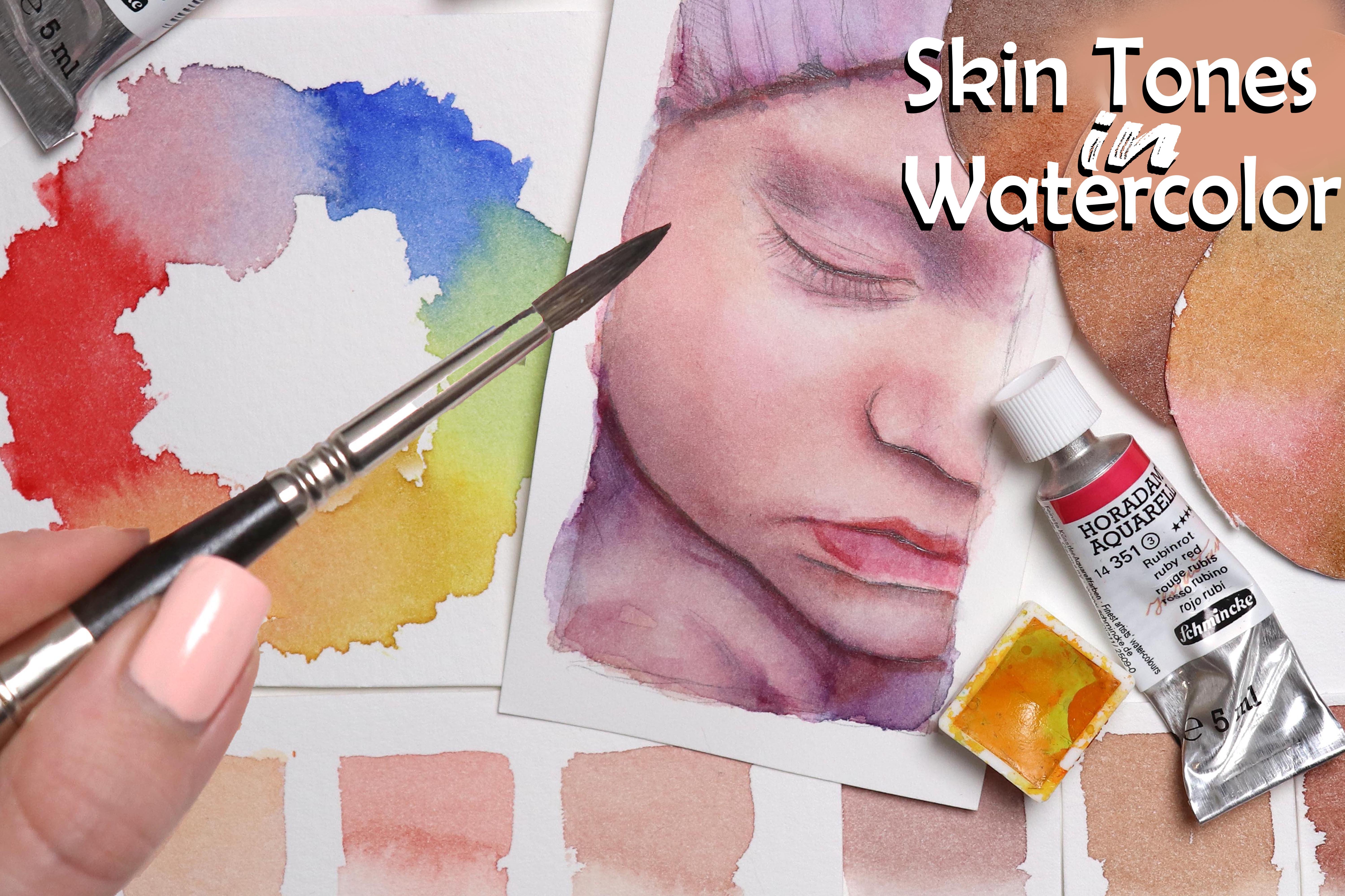
of color theory, I recommend watching my
class on mixing skin tones, but basically by mixing
together a lot primaries all by mixing together
complimentary cause you're going to get neutrals. So by adding some
blue into the orange, we're going to get a more
muted tone down orange, or a more brown color, which is going to work perfectly
for the wooden sticks.
8. Glazing: Another term or
technique you'll often hear in watercolor is glazing. I believe the term comes
from oil painting, but it basically means to apply thin or transparent layers of
color on top of each other, which is something you
might choose to do to either teeth null value
or adjust the color. Super quick and simple. Let's say we want this
popsicle to be a bit brighter, more saturated, and more yellow. We just going to
take out yellow mix here and apply a thin wash. And that's all there is to it. When glazing, generally
better to use a softer brush and a light touch so you don't disturb layer
of paint underneath. As I mentioned previously, when you paint with watercolor, the pink or the pigment seeps
into layers, the paper. Now, the more layers you apply, the close to the surface of the paper that paint
is going to sit. When you go to apply, let's say the fifth
or sixth layer, there's a greater risk of affecting the
underlying pink layers. And using a soft brush and a light touch can
help prevent that. Also means that if
you're working with more concentrated washes where the ratio of pigment
to water is higher, you're going to saturate
the paper Foster. So dark rich layers of paint
are often easier to affect or disturb than very
watered-down layers. So using glazing you can
also deepen the value. And so you can use this
technique to add shading, adding one layer at a
time like this to get that gradual
transition in color or value is going to
be time-consuming. The one thing to bear
in mind when glazing is that watercolor is
a transparent medium. That means that at least
with a traditional approach where you don't use white
to lighten and Ariel, but rather avoid getting paint on that area
in the first place. With every layer you apply, you're automatically going to D1 or dark the color and the value. So as an example, let's take this magenta paint. We're going to
apply a thin wash. We then decide that we want it to be brighter and more vibrant. So we add another layer. And we might even
add a third layer. But if you look at the pen, you can see how dark
that ping is able to go. So at some point, this beautiful pink
or magenta car is no longer getting
brighter and more vibrant, but instead it's getting darker. In this specific case, we may be able to remove some
of the paint to at least somewhat get back to a stage where we're happy
with the color. But it's worth being aware of the properties of a
color or a medium to understand what to
do or what not to do in order to get
the result. We want.
9. Blending: Next, let's take a
look at blending. Just like with the washes, you can do this wet on
dry, on wet and wet. Let's do wet on dry first. So what do you want
to do is pick up your paint and it's up to you how much water you
want in your pink mix. It depends on how
dark you want to go. Though, if you are
painting a larger area, It's a good idea to
have enough water in the mix for the paint
to not set to quickly. Then apply this to the paper. Quickly go back and
clean your brush, and then use the moisture in the brush to blend
out the edges. The amount of water
in your brush may determine how much your
edges will further out. Because as we know, paying all pigment will go where there's water until
the paint set. You want to keep an eye on the edge to see if there
are any hard edges forming if the pigment gets to that line where
there's no more water. Or to just generally see
if you need to help push the pigment into the right
shape to keep it controlled. So going over to one of our popsicles so we can
add some shading and dimension by laying
down some layers of paint and blending or
softening those edges. And if you want to go in
and apply another layer, just wait till that
first layer has dried. To then blend wet and wet. We're going to apply
water to the paper first. Make sure that the paper
has that nice wet sheen, but try to avoid pools
of water and then go in with the paint doing
a wet and wet wash. This will give you
those nice soft edges a lot more easily. You may still want to
keep an eye on it as it sets just to make sure the paint behaves
the way you want. Blending wet and
wet is especially useful if you want to apply
multiple cores in your blend. So let's add some shading
to this popsicle. We're going to wet the paper, add some paint, and
then keep an eye on it. Can just help control
where that pigment flows.
10. Lifting: So lifting, lifting can be
used to make adjustments on correct mistakes and how
easy or difficult it is to live paint will depend
on the paper you're using, as well as a pigment
in your paint. When you go to buy water costs, they'll usually have
an indicator on them that tells you how staining
that particular paint is. Staining paint will be
more challenging and sometimes impossible to remove
once it has been applied. But as we talked about
previously in the class, different papers will also
react differently to lifting. Some papers hold onto
the pink font year life, whilst others will
allow you to lift almost any paint fairly easily. And so this is just
yet another reason why you want to
familiarize yourself with the tools and
materials you are using when lifting paint. It's a good idea
to maybe not use your most precious brushes because you can
damage the points. And it can also be helpful
to use a brush that is on the more stiff or rigid
side of the spectrum. So in my case, I'll be using this is called
appellate brush. And you may in some
cases even want to use a brush that is made
for acrylic painting, just to be able to really scrub away some of that pigment. Let's try and go back to the
magenta square to lift car. We want to wet our brush, get rid of some of
that excess water, and then go in and gently scrub on the surface
of the paper. Be ready with a piece of
tissue to dab away moisture. Because in some cases, again, depending on the paint, that paper and how
dry the paint is, the moisture can end
up pushing some of that pigment and form those hard edges that we've
been trying to avoid. It's worth noting that
scrubbing the paper like this works best on good quality
paper, acids more resistant. But with that being said, it's also worth noting that when the paper is wet or damp, that is when the paper is
at its most fragile state. When you scrub on the
surface like this, you can damage the
surface of the paper and no matter how
good the quality is. So even though lifting
is a great technique, in a lot of cases, It's maybe not a
technique you want to use repeatedly on the same section on your paintings
because new layers of paint may not go
down as smoothly. A more gentle way of lifting pain is a dude right
after applying it. So while it's still wet. So if we were painting as
fear and wanted to highlight, but we accidentally got too much paint on
the highlight spot. We can gently dab away some of that pink using our tissue. Because the paper has
now been dried off. This also means that
the water won't continuously flow
into that area. And because there's this line between the wet and damp paper, you will need to keep an eye
on those edges as the paint sets just in case you need to soften them
with your brush. I didn't have a lot of
water in my paint mix, so I have to help
soften those edges. Sr going absolutely
nowhere on their own. We can also live
paint with our brush. This will usually create ***
off the effect if there is more water on the paper because it brush still has
some moisture in it, whereas the paper or the
tissue is completely dry. So we're going to
paint another sphere, clean and wipe off our brush, and then use that to
lift some of the paint. In my case, I'm still not
working with a lot of water, so I'm able to get
a very clean edge. So moving over to our Popsicle, I'm not going to
add any highlights, but we can try and get rid of
some of the paint that went outside of the
sketches or lines. And even if you don't
get back to it, completely white background, it can still improve the overall look and
make it look more clean.
11. Textures & Effects: Finally, let's take a look at a few different
techniques you can use to achieve some
interesting textures or effects in your paintings. I'm not going to go through
every technique out there, but I feel like that five that I feel as some of
the most useful, number one being
blooms of blooming. Some people also refer to
this as cauliflower ears. So going back to when we made the flat wash is one of
the things we wanted to avoid was introducing
more water or moisture into an area
with less water, I said would push
the pigment and create these well blooms. So for this first effect, that's exactly what
we want to do. We want to drop in
paint and water at different stages in
the drying process to get some really
interesting patterns. I typically paint in a
more realistic style. So don't use this
technique a lot, but I do really
love how it looks, especially when used
for backgrounds. The second effect
we're going to take a look at is dry brushing. For this, I'm going to switch to one of these
beaten up brushes. You can use any brush you want, but I like what is messy parcels contribute to this
technique? For dry brushing? You want to work with
a very limited amount of water or moisture. So wipe off your
brush really well and just add enough water to
your paint to get it moving. You can use this technique
to create textures, and you can even
use it to paint or draw or repair small area. Well, water for
whatever reason could ruin what's already
on the paper. Before moving over
to our popsicles, we can also take a
look at stippling. You can do this with any
consistency of paint. Look may just vary a bit. And again, this is
a technique you can use to create some
interesting textures. But please don't use your
good brushes for this. That's how my Winsor
Newton Series seven brushes ended
up like this. And you don't want that. So if we go back
to the popsicles, we can use stippling to add some more shading and texture, which is going to help bring
out this more rough look, which in this case
translates into a more frosty appearance. Then if we take the
white gouache and go in with a combination of
dry brushing and stippling. We can use this to
then also paint a really nice frosty or IC look. Next up, we can do
some splatter effects. There are a couple of
ways you can do this. One way is to dip your
brush in the pink and then use your fingers to flip back
the Harris or the bristles. I don't tend to personally use this technique because
they don't have a brush specifically dedicated
for this and it can be rough on the bristles. So instead, what
you can also do, which is going to be a lot
more gentle on your brush, is to pick up the
paint and tap it on your finger or
hand like this. If you don't want
the splatters to hit your main subject specific
area of your paper. You can just simply cover it up with a piece of scrap paper. This is another
technique that can quickly add a lot of interests and playfulness than just some really interesting
effects to your paintings. Lastly, let's bring
in some salt. This is another
well-known technique. You can use any basic
solid you have in your kitchen. I
like pretty stuff. So the only salt we have at home right now is Himalayan salt, but any salt will work. The salt is going to suck up or draw in the moisture
surrounding it. So for this effect, you want to simply apply some of the paint, sprinkle on some salt
and let it do its thing. The effect may vary depending on how large or small
the grains of salt or how much solid you add all how much
water on your paper. But once dry, brush
away any excess. So have a go at playing around with these
different effects, even if you think you may not use all of them
in your own work, getting comfortable with using them could spark some new ideas. Or if you find yourself in a situation where
you need to fix a mistake or maybe you want to add something
to your painting, but you're not sure what to add. One of these could
be the answer.
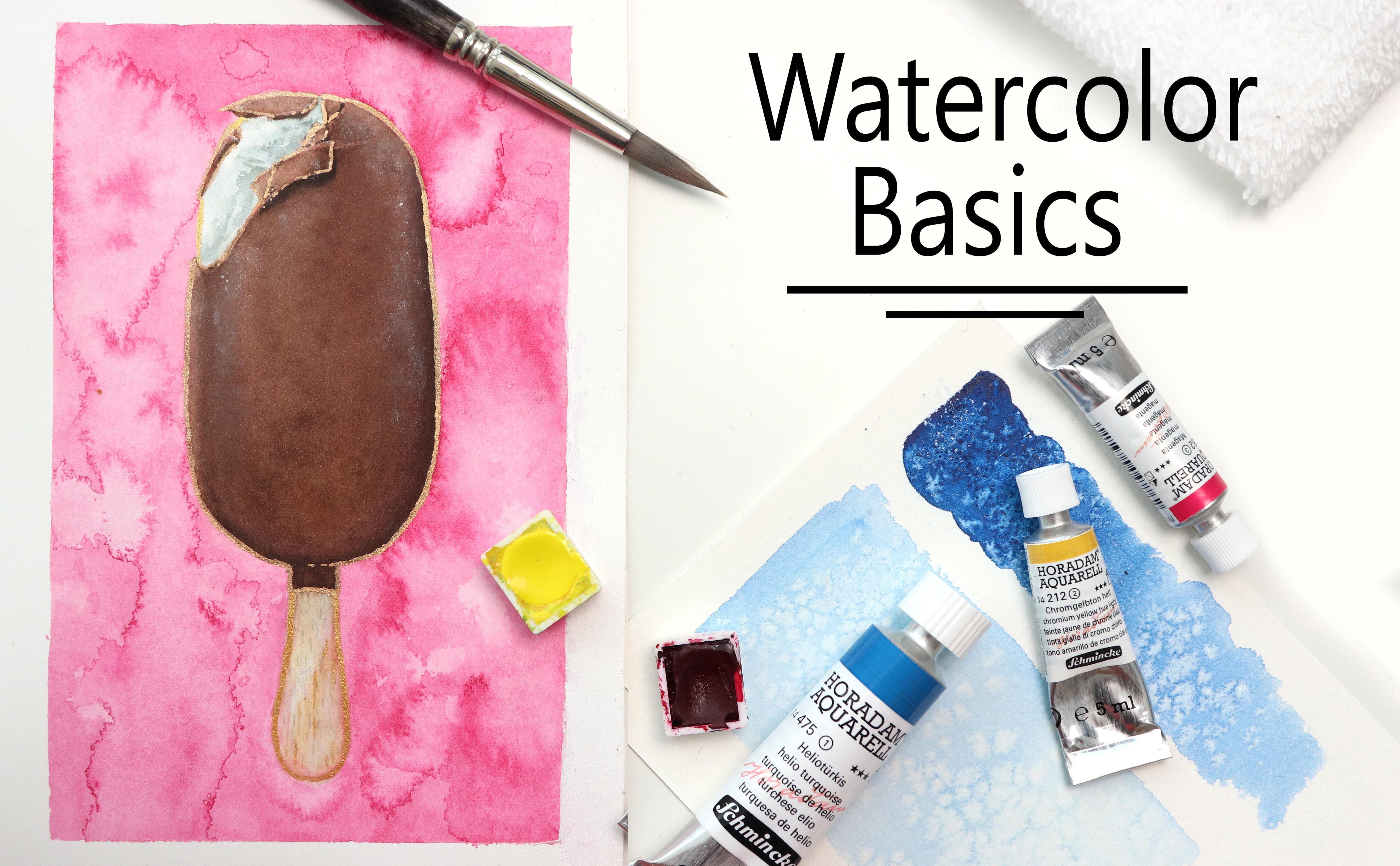
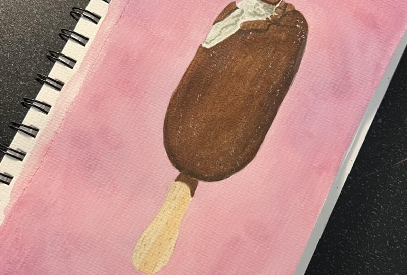
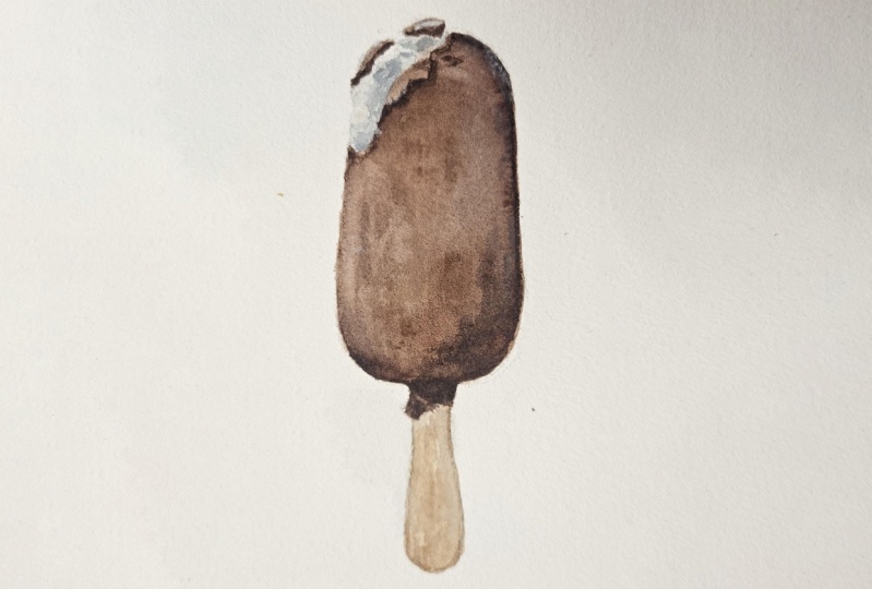
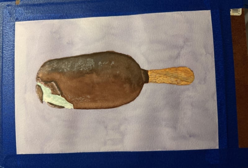
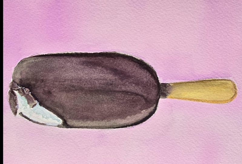
12. Final Project: Sketch: Okay, so I think
this is a critical though I might refer to it as a popsicle, and I apologize. But either way, I've
provided my sketch in the Projects and Resources tab in case you don't
want to draw your own. So feel free to
either trace that all print that onto your
own watercolor paper. For the sketch, we want to
take a look at our reference. And we want to begin by getting the basic proportions so we
can see that the height of the stick is about a third of
the length of the popsicle. See, I already said popsicle,
please don't take me. And we can also tell Pat
this distance is about the width of this top
section of the popsicle. So using that information, we can make our first marks. For this popsicle, I'm
choosing to sketch directly on my watercolor paper. But if you're not
comfortable doing this, definitely feel free to sketch on a separate
piece of paper and then use a window or
light box to trace it. There's no wrong
way of doing it. From there, we can
draw the basic shapes. And once we have that,
we can draw in some of the details from this
broken chocolate. I find that for
upticks like this, which are fairly symmetrical, it can be helpful to
draw a central line, sometimes even a
vertical one as well. Just like if you were to
draw a portrait of a person. It just helps your brain process the information and what you see if you create these smaller, more
manageable portions. But most importantly
for this one, you really don't have to
worry about being accurate. Food is not perfect
and no one is going to know if each piece of chocolate was broken off in the exact spot or the exact
way in your reference. Just have fun and
make it your own. As long as you have some sort
of potato shape on a stick, it's a popsicle.
You're good to go. Use your eraser to
get rid of some of the more rough lines and
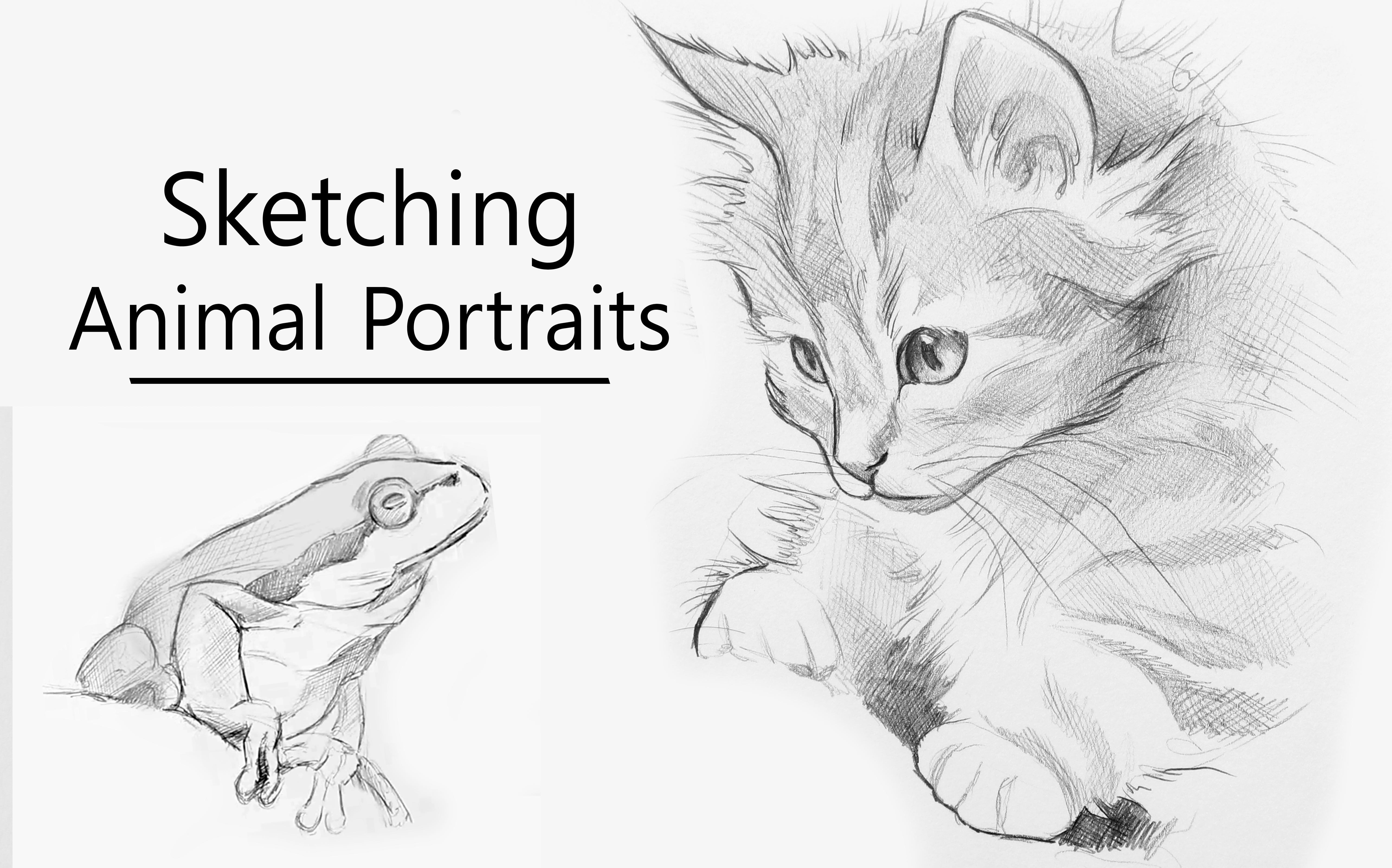
create a more clean outline. If you haven't seen my class
on sketching portraits, I really do recommend
watching it if you want to get better at
drawing from a reference. Because even though we are tackling at different
subject in that class, a lot of the principles
and basic you use when drawing from a
reference are the same, no matter the subject. The techniques I talked
about in that class can be applied to something like
drawing a popsicle as well. Once I was happy
with the sketch, I use the kneaded
eraser to just go over the lines and make
them a bit less visible. Because this popsicle does have a lot of dark browns
in the chocolate. The lines are not necessarily
going to be visible. So this wouldn't
necessarily be an issue, but I'm just doing this
more so out of habit. Now, let's move on
to the fun part, which is the painting process.
13. Final Project: Basic Color Mix: Let's take a closer look
at the paints, all colors. We've got some variation
of our primary colors. So red, yellow, and a blue. In my case, I've got scarlet, red, lemon yellow,
and fallow blue. Super quick crash course
in terms of color theory, when you mix it, gather
your red and your yellow, you're going to get orange. And when you mix together
on your primaries or two, couple of mentor college, you're going to get neutrals. The complimentary color
to orange is blue. So by adding in some blue, we're going to get a more
neutral orange or a brown. Different ratios
of the primaries will give you a more
red and more golden, one more muted and
tone down brown. And some of the Lidar, more golden brown can give you some really nice colors
for the wooden stick. If we mix together blue and yellow, we're
going to get green. And again, if we add in
the complimentary cost to the complimentary
color to green is red. We're going to get a
more neutral color. And that means that within this column mix
you're going to get some really nice tones
that can be used for the vanilla
ice cream portion. I'm going to say
something that's going to sound not very helpful, but it is true when mixing these colors
for this painting, you don't have to
worry about getting the exact color
you want or need. In other words, it's okay if you are looking to get
a more red brown, but you end up with
a more golden tone. I'm actually purposefully
not worrying about mixing the exact cause I need for
this class or this project, because we want to try and
go through and cramming as many of the basic
techniques as we can. And so one of those is
going to be glazing, which means that
we'll be able to make some slight adjustments
to the colors. So instead, what you
want to focus on is mixing up some paint that is going to give you the right values or close
to the right values. So a light, medium and dark mix. Maybe don't go too crazy
with the color choices. You still want some browns that makes sense
and look decent. So as I'm mixing up these three main calls
for the painting, I'm just going in
with different ratios of these three costs or paints, creating some nice
wet but not too watery mixes because
there's no need to build up the color to
gradually or the values when we know we're going to want
this nice chocolate color. You can see that on
my final swatches, although they are
not too dissimilar, the second and the third
color a definitely a lot more muted and time-bound
than that first color. But that's completely okay. So we've got our column mixes
and let's get painting.
14. Final Project: Building up Value: We're going to go
straight in and start off this painting with
a nice flat wash. I'm loading up my brush
with my lightest color, starting at the top and
moving my way down. And as I come down to
what's the bottom, I'm allowing some
of that pain to start pulling to
get a darker shade. If you're not a fan
of this technique, feel free to come in once
the paint has dried and add another layer to
allow me to go to that slightly darker value. You want to work quickly, but you also don't want
to stress because that usually doesn't lead
to anything good. So just make sure that there's
enough water present in your pink mix to allow you to create this nice even layer. And then fill in the rest of those little bits of chocolate. Watercolors going
to glide out once dry compared to when
you first apply it. And so as the paint is drying, you'll be able to see that
we do need to build up the value on that ice cream or the chocolate
quite a bit more. So I'm going to be
adding some more water to that second column x. And this is where
you have to trust your own instincts and experience because as we
progress with this painting, the ratio of water to pigment in the wells in our palettes
are going to change. That's an inevitable factor. That's going to vary depending
on how much time you spend on your painting and
geolocation on your climates. But I want to be able
to use this model on neutral comics and
be able to apply it in a glaze that is going to determine the value without
darkening it too much. If, like my comics is, your first column mix is a bit more golden or
vibrant and bright. You can also apply
that and adjust the value followed up
by a layer of blue, just a thin layer or wash, just enough to make that
slight color adjustments. And wildlife wash is still wet. I'm going to go in with my third comics and
just thought building up the shadows near the
right side and the bottom. Depending on how much water
you have in your mix, those may or may not make
too much of a difference. But we can then go in with more layers and really
build up that shading or shadow in a more
controlled or targeted way. And then blend out those edges. So the light source is coming from the top and left
portion of the picture. So over here on the left side, I'm just going to be using
my brush to lift off some of the pigment just to lighten
this area at tiny bit. We can then go in with those more targeted layers and start working on that shading. And from here it's really just a matter of
going back and forth, looking at your
reference and seeing where you need to
deepen the values, where you need to make
some more adjustments in the car or at some more shading to
get this popsicle to a point where you're
happy with the result. It doesn't have to look exactly like the reference at all. It's completely up to your
own personal interpretation. The goal for this
painting all project is just to practice these
different basic techniques. So in this instance, mostly placing or layering, water control and blending. And further along
in the process, we are going to get a chance to really practice control
when it comes to painting details while still
keeping it very relaxed. Not a lot can go wrong when
painting food because food, as I've mentioned previously, really doesn't have
to be perfect. And most quote unquote, mistakes are just going to add some more interest
to your painting. I'm going to clone or the
wash to slightly turned down the cost them
more and make it a bit more neutral on doll. It's also going to ever so
slightly deeper in the value. And more importantly,
it's going to give us a nice wet phase so
we can work with. When adding some more shading, some of these super soft
transitions and just a lot easier to get down in a wet and wet layer like
this rather than having to apply multiple wet
and dry layers. Although as with anything, it's completely up to you. Feel free to use whichever
technique you want. All the one that makes you feel the most comfortable
when painting. We want the painting process
to be fun and enjoyable. And so even though I
encourage you to try out multiple techniques to really practice them and
hone your skills. This class. And everything I'm saying
is just the guideline. You make up the rules. And we don't want
to forget about these other bits of chocolate. If you're like me, happened
to end up with some pain, worried, don't want it to us. Well, can practice lifting. Let's just pretend I did
this on purpose, right? Next, let's get some
color on the stick. I mixed up orange and add some blue to get a slightly
more neutral shade, but still pretty orange, applied a thin wash. And
then at different stages, ask the paint was drying. I added in some
shading or detail. The more wet the paper is
when you apply the color, the more the pigment
is going to spread out and less wet the paper is, the more detail you
will be able to get in, but still maintaining
those soft edges. And then for the shading where the stick
meets the chocolate, I'm just going to be
using my third color mix, which is my most neutral shade. All I'm going to do
for this final bit of this lesson is just go over everything and
deepen the values, especially on the edges of that broken chocolate
and the client one final wash to further
deepen the value, just a tiny bit on that main portion of our
ice cream or chocolate.
15. Final Project: Details & Class Project: Even though we still
want to adjust the values and the carpet, we also want to begin bringing
in some of those details. So up here near the top, I'm starting out by doing some lifting because I
want to bring out a few of those highlights
where the light hits the surface of the small
pieces of chocolate. And there's also a
small highlight, the line that goes onto this
main portion of chocolate. So we can bring out
those details by just lifting some
of the pigment. Next, we're going to
really take a look at the color of our ice
cream or popsicles. So I can see that I
want the color to be a lot more red
or less yellow. So I'm going to go in
with a watered-down wash, which is mostly red with
a tiny bit of blue. And I'm going to apply this, although it's not bound or knock back some of
that yellow color. It's still not quite
the color I want. So I'm going to go in
with a watered-down wash of blue to further change
the tone of that chocolate. Next up we can begin adding some detail to that
vanilla ice cream. So I'm going to be
mixing through shades. The first one being more of a bluish green,
blue, and yellow. The second one is
going to be similar, but I'm going to
be adding some red to make it more of a dirty blue, green, all kind of grayish tone. And the third one is
going to be more of a dirty or olive green. These adjusted cause I'm
choosing to mix and use. You can use whichever
color you want. White can be painted
in any cost. So if you want to add
some purple shading, make it more blue, or maybe even keep it within these browns,
oranges and yellows. Feel free to do so. Again, you want to focus on the value rather than the color. Value in general, is so much more important than the
color choices you make, as long as you have highlights
and shadows and you have this and some different values, your brain honestly
doesn't care all that much when it
comes to what colitis. So for the ice cream portion, I started out by painting some
of the more crisp details, taking inspiration
from my reference, but not really worrying
about making it accurate. I'm just trying to get bits of the shading in some
of the same areas, leaving some very harsh
edges and soften in others, is going to give the ice cream
some really nice texture. And your eye is going to
pick up on that variation. So just have fun and experiment. You really can't go wrong. Even though the calls I
mixed up for this ice cream, we're kind of in the green
zone within the color palette. Once you start mixing on
them, on your painting, it becomes more
of a gray tone or gray color scheme because you're mixing all
three primaries. And I've talked about
this in other classes, but one of the advantages of using a limited color palette like this is that you really can't go wrong
on the college. You can mix from
these three cars are going to go well together. You're not going to get
any question of cost. If needed, you can make a
final few adjustments and beaten value or define the final details
on that chocolate. Then bringing your whitewater
color on white gouache, mixing it with your watercolors, you can create a more opaque
like chocolate color to add some highlights to those edges and make everything
look nice and crisp. Time for some stippling, Let's add that frosted
look to the chocolate. Be careful about
overdoing it though. Too much is going to make your chocolate look
pale and mute it. You just want to add
a tiny bit to clot off and then work your way up. And if you add a bit too much, just weathered and dab
it off using a tissue. And for some of those
final highlights on the edges of those small
pieces of chocolate, I'm mixing and
using it very peel almost like a light
flesh tone type color. That may seem a bit weird, but it's really just
because I don't want that stock white contrast. Let's add some
details to the stick. The column mixing here is really just a dirty yellow or orange
car or a very golden brown. So you want to use
mostly yellow, then add in some red and
finally a tiny bit of blue. You should detailed brush
or just careful use of point on your larger
brush and make a bunch of tiny lines to soften the look and make it look
a bit more realistic. I'm using my wet brush and
gently scrubbing on it and then using my tissue to lift off some of that excess pigment. If you want, you can
definitely leave it like it is without
any background. I think it looks great with that white background up
against the chocolate color. But I want to have
some fun and bring in another one of
those techniques. So for this, I'm
going to bring in the magenta color that we used
for some of the exercises. And I'm going to apply this
all of the background. I'm not worrying about
making it look neat and I'm not worrying about getting
a nice even layer. I'm just quickly getting some
paint onto that surface. And while the paint
is still wet, I'm going to go in and
drop on some water. Because I think that blue all cauliflower
effect is going to really nice together with
the ice cream theme. And to me it almost looks like a frost or ice
crystal type effect. Again, if you want to leave it like this, feel free to do so. I'm gonna go in with one tiny detail and that is
some metallic watercolor. This is another one of
those effects that I love, but I don't really get to
use it all that often. So just for some
added interests, I'm going to be
applying my popsicle or ice cream using some gold
metallic watercolors. And that's it. Your project
for this class is of course, to paint this popsicle or ice cream or a different
subject of your choice. The goal is to really
just practice and include as many of these basic
techniques as you can to try to use
glycine or layering, blending, maybe some lifting, soft effects and crisp
detail to really show water control
and brush control. If you want, you
can include some of the texture so effects
so that blooms, splatters, stippling or
maybe even the salt. Just a fun and work on
mastering those basics.
 Tanja Jensen, Artist - Sculpting, drawing and painting